Online
Manual
Application
Bachelorstudy Industial DesignFinal report - version 1.6
1
Title page
Bachelor study final report
Title: Online manual application Subtitle: It’s difficult to keep it simple. Author: Jan Tijssen
Version: 1.6
Date: February 25th, 2005
University of Twente
Faculty of Engineering Technology Industrial Design
PO Box 217 7500 AE Enschede The Netherlands
www.io.utwente.nl
Contact University of Twente: Prof. Dr. Ir. Arthur Eger
PANalytical Lelyweg 1 7602 EA Almelo The Netherlands
www.panalytical.com
Contact PANalytical: Folke Meijer
Manager Marketing services
PARK Hamburg
Advanced design management An der Alster 1
20099 Hamburg
Germany
www.park.bz
Contact PARK: Frans Joziasse
Director
Copies: 15 Pages: 94 Attachments: 3
2
Preface
“It is difficult to keep it simple.”
A phrase that did pop up in a phone conversation in the middle of this project. Personally, I think that this phrase sums up the core of this bachelorstudy. My goal in the whole project was to keep my product, an online manual application, as simple as possible at all times. But an online application did turn out to be a difficult ‘product’ by all means. It was a constant challenge to change complex structures in concrete solutions. I hope I have succeeded in this challenge.
I want to thank Folke Meijer, my supervisor at PANalytical. I also want to thank Frans Joziasse and Arnold van Bezooyen from PARK advanced design management. Finally I want to thank prof.dr.ir. Arthur Eger from the University of Twente for his support during this bachelor study. The help and inspiration of all these people was more than useful in the progress of the whole project.
Jan Tijssen
3
Contents
Titlepage...1
Preface ...2
1 Introduction...6
2 Task description...8
2.1.1 Main objective ... 8
2.1.2 Research questions ... 8
2.1.3 Deliverables... 8
3 The EBL Project ...10
4 Manuals...13
4.1 Introduction... 13
4.2 Overview... 14
4.2.1 Graphic ... 14
4.2.2 Copy... 15
4.2.3 Imagery ... 16
4.2.4 Web ... 17
4.2.5 Product ... 18
4.2.6 Booth... 19
4.2.7 User-Interface ... 20
4.2.8 Facility/3D... 20
4.2.9 Behavior ... 20
4.3 Differences... 21
4.3.1 Structure Manuals ... 21
4.3.2 Information Manuals ... 22
4.3.3 Layout Manuals ... 22
4.3.4 Writingstyle manuals ... 22
4.4 Relations ... 23
4.5 Similarities ... 24
4.5.1 Understand, Use & Create... 24
4.5.2 Content types in current manuals... 26
4.5.3 Possibilities ... 27
4.5.4 Other similarities ... 27
4 Manuals ...28
4.6 Recommendations... 28
4.6.1 Structure... 28
4.6.2 Content ... 28
4.6.3 Lay-out ... 28
4.6.4 Writing style... 28
5 Communicate...30
5.1 Communication media... 30
5.1.1 Paper ... 30
5.1.2 CD/DVD application... 30
5.1.3 Online application... 31
5.1.4 Choice... 32
5.2 Online application... 33
5.2.1 Demands ... 33
5.2.2 Available online applications ... 34
5.2.3 Choice... 35
5.3 Market Survey ... 36
5.3.1 City of Amsterdam Stijlweb ... 36
5.3.2 Akzo Nobel ... 37
5.3.3 DSM ... 37
5.3.4 Raytheon ... 38
4
6 Users ...40
6.1 First overview ... 40
6.1.1 Intern... 40
6.1.2 Extern ... 44
6.2 Usermapping ... 45
6.2.1 The Manual User map (MUM) ... 46
6.2.2 The Personal User Profile (PUP)... 49
6.2.3 MUM Product Manual... 50
6.3 Conclusion ... 51
7 List of Demands ...53
8 Concepts...55
8.1.1 Web Copycat... 55
8.1.2 Choices ... 56
8.1.3 Icon ... 57
8.1.4 Concept choice... 57
9 PANpoint...59
9.1 Introduction... 59
9.2 Structure and Navigation ... 60
9.2.1 The system... 60
9.2.2 The manual (use & create) part... 62
9.3 UNS Product Manual... 63
9.3.1 Current Manual ... 63
9.3.2 Navigational Methods Product Manual... 63
9.3.3 User Test/Questionnaire... 65
9.3.4 Proposal UNS Product Manual... 67
9.4 UNS Other Manuals... 68
9.4.1 Fixed division ... 68
9.4.2 Suggestions Task Based Guides ... 69
9.5 User Interface ... 70
9.5.1 Basic structure... 70
9.5.2 Top layer ... 71
9.5.3 Side columns ... 71
9.6 Graphical design... 75
9.6.1 Basic Lay-out ... 75
9.6.2 Color Use ... 76
9.6.3 Typography... 76
9.6.4 Icongraphy ... 77
9.6.5 Imagery ... 77
9.6.6 Left & Right Column... 77
9.6.7 Middle column... 79
9.7 Operation ... 80
9.7.1 System Task Force (STF)... 80
9.7.2 Manual Task Force (MTF) ... 81
9.7.3 Procedures... 81
9.8 Version 0.1 ... 82
9.9 Unique Selling Points... 83
10 Prospect ...85
10.1 Resources... 85
10.2 PHQ adjustments ... 86
10.3 Assuring sustainability... 87
11 Reflection...89
11.1 Objectives ... 89
11.2 Milestones ... 90
11.3 Whole project ... 91
Introduction
6
1
Introduction
PANalytical is the world’s leading supplier of analytical instrumentation and software for X-ray diffraction (XRD) and X-ray fluorescence spectrometry (XRF). The materials characterization equipment is used for scientific research and development, for industrial process control applications and for semiconductor metrology. The companies headquarters are in Almelo, the Netherlands. PANalytical was founded in 1948, as a department of the worldwide electronics concern Philips. Formerly, the name of the company was Philips Analytical.
In 2002 Philips sold Philips Analytical to the Spectris group. The Spectris group is listed on the London Stock Exchange and has 15 other business units besides PANalytical. Philips Analytical was sold because Philips wanted to focus on their main markets, like consumer electronics and semiconductors.
From that day, Philips Analytical changed into PANalytical. PANalytical did become an independent brand, which was not the case when it was a division of Philips. The safe and sound position behind the superbrand Philips was suddenly no longer there. PANalytical can operate semi-autonomous within the Spectris group. PANalytical is now fully responsible for the marketing and promotion of their brand new brand.
When Philips Analytical changed into PANalytical there was of course no instant new brand identity. Everything and everyone was still simply thinking ‘Philips’. The first PANalytical slogan was simply: “Same people, same products, same support.”
The top management decided to start a large project to create an own new independent brand identity. The project is called the EBL project. EBL stands for Experience Brand Language.
Marketing Services Manager Folke Meijer leads this enormous operation. Within the EBL project falls everything related to creation of the new brand identity of PANalytical. This involves a new corporate strategy, brand personality but also a new graphical housestyle. PARK advanced design management, a company specialised in branding processes, assists PANalytical with the entire EBL project.
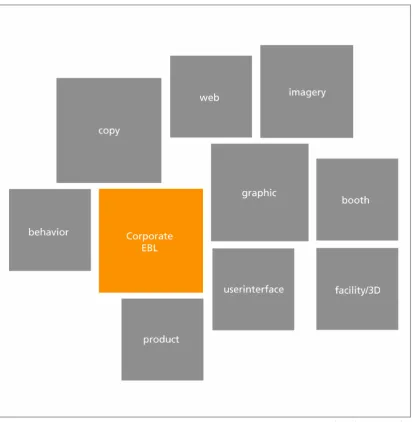
An important part of the EBL project is the creation of nine design manuals, each for a different design discipline within PANalytical. These nine disciplines are: graphic, imagery, copy, product, user-interface, web, booth, facility/3d and behavior. In these nine manuals all the guidelines for these new brand identity elements are formulated. These manuals are an important tool for implementing PANalytical new brand identity in the own organisation, but also for
communicating the PANalytical brand identity to the external market.
The current nine manuals are made by various external design bureaus. There is missing consistency between the manuals. PANalytical is searching for a new unambiguous navigation and ‘look and feel’ for all EBL manuals. In this new navigational form, the needs of the everyday users of the manuals must be taken into account very seriously.
A new unambiguous navigation and look and feel for all the nine design manuals with a strong emphasis on usability. That is the core of this bachelorstudy.
Task
8
2
Task description
In the beginning of this project a so called project plan was made. This project plan was
formulated based on the first inputs from PANalytical. The whole original plan is attached to this
report. This original plan also contains the original project planning. (attachment A1) The
main objective and main research questions from the project plan are summarised in this section.
2.1.1
Main objective
The main objective of this research is the design of a unambiguous navigation and a ‘look and feel’ for all design manuals within the EBL project. The base for this design is an analysis of the needs of the future internal and external users.
2.1.2
Research questions
Five main research question have been formulated in the original project plan:
1) What is the function of the nine manuals?
2) What are the differences and similarities between the current manuals?
3) What are the needs of the future internal/external users of the different manuals?
4) Which navigation and design is applicable on the manuals, so that the needs of the users are satisfied?
5) Is the new design for all manuals, applied to the product manual, satisfying the needs of th intern users within the Asterix1 project.
This answers of these five main research question together will together fulfil the main objective. These five questions will also form the thread throughout this report.
2.1.3
Deliverables
Four so called ‘deliverables’ have been agreed at the start of this research project.
A navigational design that is applicable on every manual
This navigational design worked out for the product manual
An user map for the product manual
A written report that describes the whole research trajectory.
PANalytical made the choice for working out the product manual in the new navigational design. This is the case because the product manual is the most close to the study Industrial Design.
1AsteriX is the codename for the next generation XRD product family, developed in accordance with the guidelines from
EBL project
10
3
The EBL Project
The EBL project was started because PANalytical wanted to have an clear own brand identity. The safe position behind the superbrand Philips is no longer there. PANalytical is now semi-autonomous within the Spectris group. The project was started mid 2003 from the marketing services department. The objectives were a new brand identity and new design
standards/principles.
The foundation of the brand PANalytical is born in the EBL project. EBL stands for Experience
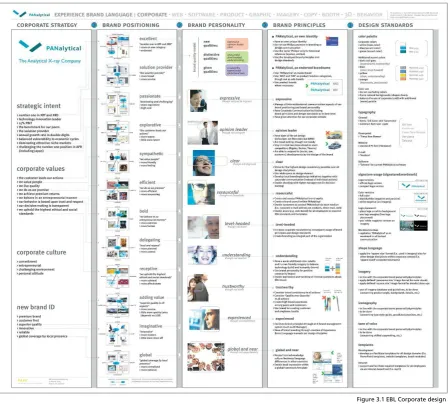
Brand Language. This is a ‘system’ in which a brand and a corporate identity are being created in steps. The system is created by PARK advanced design management. The first part of the EBL project is the so called EBL corporate design:
The corporate design is the most important and is the starting point for all nine design manuals. The corporate design exists of five steps. First a corporate strategy is formulated. This is done top
down from the BU management2. The corporate strategy is split in strategic intent, corporate
values, corporate culture and the wished new brand identity. The whole strategy is summed up in one sentence: ‘Enhancing customer productivity by turning (X-ray) technology into high added value analytical solutions’
2 Business Unit Management. The top management team of PANalytical.
11
The second part is ‘Visual Position Mapping’ This is the bottom-up part of the EBL project. In so called workshops 120 employees of PANalytical did cooperate in this part. In schematic drawings the brand is positioned in the market. On the drawing there is the current position and the desired position of the brand. These desired positions will produce descriptions that describe the new Brand identity of PANalytical.
These descriptions are converted in the third step to the nine core qualities of PANalytical. These nine qualities are the heart of the EBL project. The nine qualities are:
Expressive – Opinion Leader – Clear –
Resourceful – Level Headed – Understanding – Trustworthy – Experienced – Global and near
The qualities can be divided in three categories: New qualities, distinctive qualities and given qualities. The new qualities are the ones that have to be achieved in the EBL project.
In the fourth step of the EBL corporate design there is an investigation of what’s needed to change in the company to achieve all the nine qualities. This is done for each quality separately.
In the fifth and final step the corporate identity is transformed to general design standards for
the brand PANalytical. These are the colour palette, typography and the PANalytical logo3.
After the corporate design is completed for the whole company, manuals have to be created for different design disciplines in the company. These manuals have to make sure that the new corporate brand identity is being expressed in all these different design disciplines within PANalytical.
3 Comment: The design standards in the EBL corporate design have been altered in the new Graphic Manual by Eden. Figure 3.2 Visual Position Mapping
Manuals
13
4
Manuals
4.1
Introduction
The brand identity of PANalytical is created within the EBL project. The foundation of this project is the EBL corporate design with the nine core qualities. The brand of PANalytical has to be expressed in various design principles inside the company. For all these design disciplines within PANalytical there are manuals designed by various design bureaus. There is a total of nine design disciplines:
There is an order in importance in the nine manuals (left to right). This order has been made by Marketing Services Manager F. Meijer and PARK advanced design management adviser F. Joziasse. The function of these separate manuals is that the nine core qualities of the EBL corporate design are reflected in these nine aspects. The principles and brand standards for the future design are being laid out in all of these manuals for the specific design principle. The manuals contain guidelines, examples, templates for each aspect. The manuals will be used by both internal and external users.
The manuals are made by various design bureaus. An overview of all design bureaus and their produced manuals:
EDEN Design & Communication Amsterdam -> Graphic, Imagery
Van Berlo Studio’s Brand and Identity design Eindhoven -> Product, User-Interface Kapler Communications London -> Copy
Wit Design Zoetermeer -> Booth <theFactor.e> Groningen -> Web
The manuals have been designed by these bureaus with keeping in mind that other designers will have to work with the manuals.
The manuals ‘Imagery’ and ‘Booth’ were not completely finished during this bachelor study, but temporary manuals were available. The manuals ‘User-Interface’, ‘Facility/3D’ and ‘Behavior’ were still in a very premature stadium and temporary versions were not available. They have been excluded in most analyses in this report.
14
4 Manuals
4.2
Overview
In this paragraph an overview is given of all manuals that are completed within the EBL project. With each manual there is extra attention for the design and structure of it. How has the design bureau designed the manual?
4.2.1
Graphic
Designed by: Eden Design & Communication Amsterdam Medium: Paper
Format: Landscape A4 format & Landscape A3 format Language: Dutch
Date of review: Nov 5th 2004
The graphic manual contains guidelines for the use of color, typography and formats in all expressions of PANalytical. The graphical house style is being defined in this manual. The graphic manual consists of two parts. In the first part of the manual the basic elements of the graphical
house style are described. The basic elements are colors4, grids, images, silhouettes and
typography. In this part there is also some textual explanation in the form of guidelines. After the description of the basic elements in the first part, there is a second part with a lot of inspiration examples. There are inspiration examples for different formats of paper and a different use of columns. Specific templates such as stationary, visiting-cards are not available in the manual. The manual is an inspiration for designers intern or extern. There are no strict dimensions, it’s a toolbox of building blocks with inspiration examples to show what’s possible.
Present:
Building blocks Inspiration examples
Not Present:
Fixed lay-outs for stationary, forms, visiting cards, powerpoint slides. Best/Worst Practises
4 EDEN has made adjustments in the colorpalette from the Corporate EBL in this graphic manual. The
original colors in the EBL corporate design have changed. The colors blue (PMS279) and yellow (PMS108) are totally gone from the color palette, and the other colors (grey and orange) are different.
15
Figure 4.2.2.1 Powerpoint format copy manual
4.2.2
Copy
Designed by:Kapler Communications
Medium: Powerpoint presentation Language: English
Date of review: Oct 28th 2004
The copy manual contains guidelines for all the copy material within PANalytical. This material can be a presentation, an advert, an article for a magazines, content for the website, etc. Everything that contains writing.
The copy manual is designed as a non-linear document, in the form of a Powerpoint
presentation. It has an user-centered taskbased design. This means that the user can access information in the manual by clicking through
a system of hyperlinks. It is designed as a user-centered design because of the future application of the manual. The usability has been taken into account very seriously.
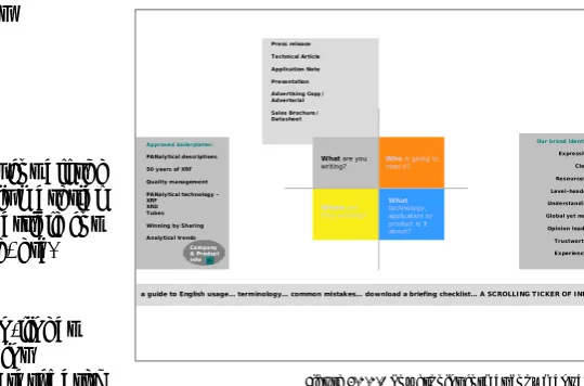
The manual asks the user different questions to come to the right information. The four main questions in the copy manual are:
What are your writing? Who is going to read it? Where are they working?
What technology, application or product is it about?
Besides this division in four main parts, there are some other copy guidelines. For example there is a complete survey of all the correct notations of data, reading marks, capitals, etc. An other part is a directory filled with standard copy boilerplates, ready to be copy-pasted by a user. A final part of the copy manual is a investigation how the nine qualities have to be expressed in the copy material.
The powerpoint presenation is designed with the lay-out of the current PANalytical website. The current website is designed within the EBL project, but not according to the new graphic EBL style by Eden. Because this is a copy manual, the only content of this manual is text.
Present:
Specific copy guidelines en example text boilerplates.
Not Present:
?
What are you writing?
Our brand identity Expressive Clear Resourceful Level-headed Understanding Global yet near Opinion leader Trustworthy Experienced Who is going to
read it?
Where are they working? Approved boilerplates:
PANalytical descriptions 50 years of XRF Quality management PANalytical technology – XRF XRD Tubes Winning by Sharing Analytical trends Company & Product info What technology, application or product is it about?
16
4.2.3
Imagery
Designed by: Eden Medium: Paper
Format: Portrait A4 format Language: Dutch/English Date of review: Nov 5th 2004
The imagery5 manual describes which photo’s should be used in different publications of
PANalytical. The manual starts with some general guidelines for photography within PANalytical. After that part, there are examples of stockphotos that can and should be used in publications. These examples are divided in four categories: machines of PANalytical, materials, clients and imagination of the unique qualities. Oddly enough these qualities are not the same as the nine qualities of the EBL corporate design.
The manual is written in two languages. English and Dutch. The language is changing constantly within the whole manual. There is a very small table of contents. The example photos in this manual are all stockphotos. That’s not the intention for the final manual, that should consist of authentic PANalytical photos. These stock photos are purely there for inspiration.
Present:
Example stockphotos.
Not present:
A image database of authentic PANalytical photos.
17
4.2.4
Web
Designed by: <theFactor.e> Medium: Paper
Format: Landscape A4 Language: English
Date of review: Oct 28th 2004
In this manual there are specific descriptions of the design of the new website of PANalytical. The website of PANalytical is made with the content management system PublishHQ.
The manual contains parts about navigation, templates, graphical elements and other components of the PANalytical website.
The information in these parts is very specific, with a lot of templates. There are dimensions, tables, size of fonts, etc. All specific information about the lay-out of the website. There is no guidelines for the content of the website. Maybe this content guidelines are found in the copy manual? The structure of the web manual is linear, divided in chapters and paragraphs.
The web manual is outdated. The graphical elements in the website do not match with the graphical guidelines from the EBL graphic manual from EDEN. This is because the website was made before the new EBL graphical standards arrived. At the moment there is a research how the lay-out of the website can be changed to correspond to the new graphical house style.
Present:
Specific lay-out dimensions website. Outdated graphical guidelines
Not Present:
Content guidelines.
18
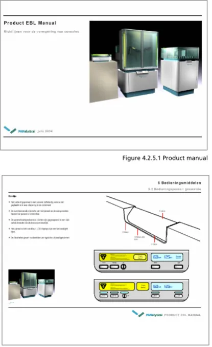
Figure 4.2.5.1 Product manual
Figure 4.2.5.2 Text, 2D & 3D Illustrations
4.2.5
Product
Designed by: Van Berlo studio’s Medium: Paper
Format: Landscape A4 format Language: Dutch
Date of review: Oct 28th 2004
In the product manual the guidelines for the next generation products are formulated. These guidelines are formulated on basis of the nine qualities from the EBL corporate design. The manual applies for all products produced from 2004 till 2010. In the manual there is more attention for the free-standing products then the desktop products. That is the case because the research and development for the free-standing products is more intensive at the moment.
The product manual is presented as a manual that is in constant evolution. This will happen through constant additions and changes of the technical product developers. In a later stage the manual will be completed with design standards for specific product lines.
The product manual is a paper document of about 40 pages. In these 40 pages there are quite specific guidelines for the future line of products. The guidelines are given in text, 2D and 3D
illustrations. The document has a linear structure, with chapters and paragraphs. The structure is simple. It starts with the whole product body and it ends with the small texts on the products. It goes from large to small.
Present:
General design standards for all products
Not present:
19
Figure 4.2.6.1 Booth manual
4.2.6
Booth
Designed by: WitDesign
Medium: Powerpoint presentation Language: English
Date of review: Oct 28th 2004
In this manual guidelines are formulated for the design of PANalytical booths. These booths are used on congresses, exhibitions and other promotional activities.
According to the manual from WitDesign there are four basic elements in a booth:
1) The Company 2) Products 3) Information 4) Communication
All these elements have to come back in a booth design. It’s very important that first the
company is presented and after that the products. “Present the company, not just the products”
The manual describes three levels of size of booths:
Level 1 Large: A large booth for big occasions. The booth has products, a presentation wall , meetingpoints etc. These booths are specially designed by a external bureau three a four times a year. On level 1 the manual serves as a reference for the external designer.
Level 2 Medium: A middle-sized booth, also called an ‘Octanorm’. It’s a standard box that you’ll get as a company on some congresses. The surface is about 10 square metres.
Niveau 3 Small: Beauty case principle. To create with as few as possible objects an PANalytical booth. Think about a tablecloth or a instant background wall. On level 3 the manual serves as a specific instruction for creating the small booth. Level 3 is being used the most by far. (Around 70% of all the booths)
The final manual was unfortunaly not available when writing this report. What’s known is that the manual will also get a user-centered design like the copy manual. That means that the user of the manual will get a menu with some choices to make. A choice can be what size the booth will be. After the user makes that choice, he/she will get specific guidelines for that kind of booth.
Present:
Inspiration examples booth designs
Not Present:
Specific building instructions booth
S ta n d e x am p le s C o m m u n ic atio n
In fo rm a tio n P ro d u ct p res e n ta tio n P ANalytical ~ 1 s q u a re m e te r
~ 1 – 6 s q u a re m ete r ~ 6 – 1 8 s q u are m e ter ~ 18 – 3 6 s q u are m e ter ~ 36 – 7 2 s q u are m e ter ~ 72 – 1 4 4 sq u a re m e te r
W hat ty pe of sta nd
G raphics S olutions
Visitor
Experienced T rustw orthy
20
4.2.7
User-Interface
Work in progress, not finished Designed by Van Berlo Studio’s
The User-Interface manual is not yet finished. This manual describes the lay-out and the structure of the software part of the PANalytical products. It describes what a future user will see on the screen of the PANalytical machine.
Present:
Nothing
Not present:
Everything
4.2.8
Facility/3D
Not finished
De Facility manual is not yet finished. This manual has to give guidelines for all three
dimensional objects within PANalytical. Think about the whole carpark, the flags, the bording, the teacups. Everything that is threedimensional. There is no design bureau assigned yet.
Present:
Nothing
Not present:
Everything
4.2.9
Behavior
Not finished
The behavior manual is not yet finished. But the manual has to describe the desired behavior of the personal of PANalytical. The behaviour that’s necessary for the expression of the corporate identity to the outside world. The manual could contain the following things:
• code of conduct
• houserules
• values
• clothingrules
This ninth manual is considered as the icing on the cake in the internal branding process.
Present:
Nothing
Not present:
21
4 Manuals
4.3
Differences
The information from the current manuals has to be structured in a new navigation and look and feel to the intern and extern users. To come to a consistent navigation, the current inconsistencies between the manuals must be investigated. Because, without pointing out the differences, there cannot be a uniform design. In table 4.3.1 there is an first quick overview about the external marks of all the manuals.
Manual Designed by Media Content Structure Languag
e
Length
Graphic EDEN Paper Text, Illustrations, Photos, Example lay-outs
Linear Dutch 30 A4
Copy Kapler communications
Powerpoint Text Non-linear
User centered
English 100 A4
Imagery EDEN Paper Text, photos Linear English/
Dutch 15 A4 Web <theFactor.e> Paper Text, illustrations,
Photos
Linear English 20 A4
Product VanBerloStudio’s Paper Text, illustrations,
Photos, 3D models Linear Dutch 30 A4 Booth WitDesign Powerpoint Text, Photos,
illustrations (2D & 3D) Non-linear User centered English ?
User-Interface
VanBerloStudio’s ? ? ? ? ?
3D/Facility ? ? ? ? ? ?
Behavior ? ? ? ? ? ?
The various manuals differ in structure, lay-out, content and writing style from each other. These various differences will be discussed below.
4.3.1
Structure Manuals
There are major differences between the structure of the current manuals. This is an important difference, because in the new look and feel the structure of all the manuals has to be the same. There are two groups of manuals when it comes to structure.
4.3.1.1 Content based
The manuals web, product, imagery and graphichave a traditional linear structure. There is a
table of contents which divides the whole manual in chapters and paragraphs. The way the contents are structured in the manuals do differ. This is because the manuals are addressing very different subjects. In the product manual information is structured on size. The manual starts with the design of the whole product and ends with small graphical details on the product. The graphical manuals is also somewhat structured on size. It starts with the building blocks (color, typography) and it ends with the products of the building blocks, the so called inspiration examples.
4.3.1.2 User Centered
The structure of the manuals copy and booth is fundamental different then the other manuals. Kapler Communications and WitDesign have taken the future use of the manuals into account. The manuals are designed with a user-centered design. What does the user want from the manual? For example, the copy manual starts with a couple of questions for the user: ‘What are you going to write?’, ‘Who is going to read it?’ If the user answers these questions, he/she will get specific guidelines and instructions for those area’s. The user will reach the right information by clicking through a system of hyperlinks.
22
What are you
writing?
Our brand identity
Expressive Clear Resourceful Level-headed Understanding Global yet near Opinion leader Trustworthy Experienced Who is going to
read it? Where are they working?
Approved boilerplates:
PANalytical descriptions 50 years of XRF Quality management PANalytical technology – XRF XRD Tubes Winning by Sharing Analytical trends Company & Product info What technology, application or product is it about?
a guide to English usage… terminology… common mistakes… download a briefing checklist… A SCROLLING TICKER OF INFO… Press release Technical Article Application Note Presentation Advertising Copy/ Advertorial Sales Brochure/ Datasheet
Figure 4.3.3.1 Similarites copy manual PANalytical website
4.3.2
Information Manuals
The various sorts of information in the manuals are different from manual to manual. It’s important that the future design can handle all sorts of information. In table 4.3.2.1 there is a survey of all sorts of information in the various manuals.
Manual Text 2d
illustrations 3d
illustrations
2d photos 3d models Dimensions Grids
Graphic X X X X
Copy X
Imagery X X
Web X X X X
Booth X X X X
Product X X X X X X
UI
Facility/3D
Behavior
The manuals also differ in specificity.Some manuals do specify more than others. The manuals
web and product give pretty specific instructions (dimensions in cm), while other manuals like imagery are only giving inspiration examples.
4.3.3
Layout Manuals
Because of the fact that the manuals are designed by different bureaus, there are quite some differences in the lay-outs of the manuals. The EBL corporate design standards have been taken into account, but still there are a lot of differences.
The lay-out of the manuals booth and copy do resemble the most. Both manuals have taken the lay-out of the PANalytical website as a foundation. The manuals do use the colors of the EBL corporate design. These colors are unfortunaly out-dated. They have been replaced by the colors given in the graphic manual by EDEN.
The lay-out of the manuals product and web is very much the same. This is mainly because the structure of the manuals is the same, namely a linear structure. The typography and the colors of these manuals are not consistent with the guidelines from the graphic manual. The manuals imagery en graphic have also a very similar lay-out. Of course this is because the manuals are both designed by Eden. These manuals do have the right typogra- phy and color palette. Obviously this is the fact, because the manual graphic describes the typography and color palette.
4.3.4
Writingstyle manuals
What is striking, is the difference in language between the manuals. Three manuals are in English, two manuals are in Dutch, and one manual even uses both languages.
Obviously there is also a difference between the writing styles of the various manuals. They are designed by different bureau’s and every bureau has his own tone of voice.
23
4 Manuals
4.4
Relations
Each manual describes a different aspect within the EBL project. But of course there are relations between all of the manuals. And these relations can become important in the new design. Some manuals have a large influence on other manuals, but other manuals are fairly independent. Below there is a visual survey of the relations between the manuals:
The first notably mark of this schematic drawing, is the position of the graphic manual. The graphic manuals has an influence on five other manuals, which are web, imagery, booth facility/3D and user-interface. In all these manuals the graphical elements come back from the graphic manual. The imagery manual is the only manual that has an backwards influence on the graphic manual. The product manual and the user-interface manual have a connection with each other, because the user-interface is a part of a product. The behaviour manual has an influence on the copy manual, because your desired behaviour must be expressed in your copy material. Imagery and copy have an influence on the web manual, because the website contains copy and imagery.
24
4 Manuals
4.5
Similarities
In the preceding paragraph all the inconsistencies between the manuals were described. And the number of inconsistency was not small. There were a lot of differences in structure, lay-out, content and writing style. But in the future look and feel there must be consistency between the manuals. So the current similarities will be more important for the future look and feel than the inconsistencies. Point is, it is much easier to find the numerous differences between the manuals, then it is to find the one similarity between all the manuals. But they do have a similarity that can be very important for the future structure.
4.5.1
Understand, Use & Create
In the preceding paragraph the differences in content were described. Each manual has different types of content in it, structured in a different way. But there is also a similarity in content between all the manuals. Namely the division between certain types of content. There are three types of content: Understand, Use & Create. This is the most important similarity between all the manuals.
4.5.1.1 Understand
The part with the largest audience but with the most basic information about the aspect in question. In this part there are the general thoughts and elements that describe the aspect in question. In the graphic manual this could be for example the basic colors and typefaces of the graphical style. The understand part is the part that is suitable for communicating also to the outside world. It is an introduction to the basic thoughts behind that specific design discipline. The understand part contains information that everyone (intern and extern) should and may know.
4.5.1.2 Use
In the use part we find practical templates that are used by a large group within the company. They’re the products of the guidelines and elements in the create part of the manual. These are files who can used instantly by a larger group of common users. Examples of templates are the PowerPoint slide, stationary and copy boilerplates. The use part is for people within the company and maybe some external guest users.
4.5.1.3 Create
This is basically the largest part of the current manuals. But the information in this part will be used by a much smaller group of people then the ‘use’ and ‘understand’ parts. Within the
25
This division in Understand, Use & Create comes back in every manual. In figure 4.5.1.1, the basic principle behind Understand, Use & Create becomes more clear.
Understand -> little information, large audience (intern & extern) See - > more information, medium audience (mostly intern) Create -> most information, small audience (intern & extern)
The use and create part form together the real ‘manual part’ with guidelines for using and creating the aspect in question. The understand part is much more a general informative part intended for a much larger audience.
4.5.1.4 Example
To clarify this division between understand, use & create, there is an example for the graphic manual.
The basic element orange falls certainly within the understand part. It is part of the explanation of the graphical EBL style and can be explained to a large audience, also outside the company. A powerpoint slide is a perfect example of a template that falls in the use part of a manual. The slide is something that is used by a large group of people within the company. The final specific guideline is a typical example of information that falls within the create part. Only designers of graphic material will need this specific guideline.
Figure 4.5.1.1 Three Contentypes
26
4.5.2
Content types in current manuals
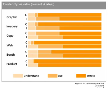
4.5.2.1 Ratio
The current manuals all have a focus on creating the aspects. But some manuals have more templates then others, and other ones contain only guidelines. Most manuals should get more practical in the future by adding more practical ‘use’ content for a larger group of internal users. There is an overview with the current ratio between understand, use & create and the desired ratio between understand, use & create This overview is made by analysing the current manuals made by the various design bureaus.
Most manuals should get more practical for the average user with the addition of use content. The biggest desired changes in content types are in the manuals Graphic, Imagery and Web. These manuals must become way more practical for everyday users. The manuals are now only useful for the designers of the materials. The amount of templates must be elevated, especially in the graphic manual. Templates like PowerPoint sheets, stationary, visiting cards are not in the current manual, but they have to be in the future look and feel. Otherwise no average
PANalytical employee will ever use these manuals. The web manual should also be more practical in every day use. The current web manual is only about lay-out standards. There must be more practical guidelines such as content guideline. The content of the website is changing much more often than the lay-out of it.
27
4.5.3
Possibilities
The Understand & Use parts of the manuals are still somewhat underdeveloped. In table 4.5.3.1 there is an overview about the possibilities in the understand, use & create parts
Manual Understand Use Create
Graphic Colors
Typography PPT templates Stationary
Visiting cards
Inspiration examples Grids
Best/Worst practises
Copy Copy philosophy Copy boilerplates Copy guidelines
Imagery Basic image elements Image database Imaging guidelines
Web Web philosophy Content boilerplates Content & Lay-out
guidelines
Product Basic product
elements X Product guidelines
Booth Basic booth
Elements Booth use guide, how to act on a booth? Booth build guide
Booth creation guide
UI Basic product
elements X UI Guidelines
Facility/3D Facility guidelines
Behavior Introduction to EBL
Behaviour
Behavioral guide, code of conduct
Guide to affect behavior
4.5.4
Other similarities
Besides the similarity between understand, use and create there is another similarity between the nine manuals. They have all been created with the EBL corporate design as a basis. The nine qualities from the EBL corporate design were given to the design bureaus as a starting-point. So all the nine manual have been created on basis of the same EBL standards.
28
?
4 Manuals
4.6
Recommendations
In this paragraph there is a look in what has to happen to make a consistent whole of all the manuals. There are a lot of inconsistencies between the manuals, and they have to disappear in the new look and feel. There has to be a general ‘canvas’ where all sorts of information of the manuals will fit.
There will be recommendations for changes in structure, content, lay-out and writing style.
4.6.1
Structure
Inconsistency :
The structure of the manuals differs (content based/ user-centered)
Recommendation:
Restructuring all the manuals with as result a unambiguous structure. The division between understand/use/create content should be important in structuring the information. A user-centered approach is preferred above a content based approach. The user-user-centered structure is preferred, because usability is one of main criteria of this project.
4.6.2
Content
Inconsistency: Different sorts of information (text, illustrations, 3d models)
Recommendation: The new design has to be compatible with all sorts of information.
4.6.3
Lay-out
Inconsistency: The lay-out of the manuals differs
Recommendation: Follow the guidelines from the graphic and web manual for a new lay-out.
4.6.4
Writing style
Inconsistency: Different languages (Dutch/English)
Recommendation: First only use one language: US English, because PANalytical is an international company.
Inconsistency: Writing style of the various manuals differs.
Recommendation: Rewrite the manuals following the guidelines in the copy manual.
Communicate
30
5
Communicate
5.1
Communication media
A important part of this assignment is to find the best navigation for the information from the manuals. There has to be a fixed ‘canvas’ or ‘platform’ where the information from the manuals will be available. When we are looking for the best navigation method, we must keep in mind the demands of the various users from the manuals. In this paragraph there is a look into the various communication tools that are available for communication of the information from the manuals.
5.1.1
Paper
Printed versions of all the manuals
Pro’s:
Tangible
Cheap
Easily available, you don’t need electricity
Con’s:
Almost no flexibility
Threshold to read
Easily damaged
Takes a lot of space
Hard to find the right information
Linair structure, not very practical
Distribution
Version-conflicts
Access problems, who has access and who hasn’t?
Not possible to make easy connections between the nine manuals.
5.1.2
CD/DVD application
A tangible digital medium that you can access from a computer.
Pro’s:
Tangible
Easy to find the right information
Easy to combine information from different manuals
Easy to reproduce
Con’s:
Moderate flexibility
Easily damaged
Only access through a computer
Distribution
Version-conflicts
31
5.1.3
Online application
An online application that is accessible on the intra- or internet
Pro’s:
Flexibility
Everywhere accessible
Easy to find the right information
Easy to combine information from different manuals
Distribution
Version management
Advanced user rights system
Con’s:
Not tangible
Possible securtiyrisks
32
5.1.4
Choice
An online application is preferred above all other communication tools. The online application has SIX major advantages that the other media don’t have. They are discussed one by one below.
Advantages online application:
Distribution
An online application has major distribution advantages above the other mediums. With one mouseclick you can distribute all the manuals in the whole worldwide
organisation of PANalytical. With another one mouseclick you can replace an old version with a new version
worldwide.
Flexibility
An online system is the far most flexible medium. When you do
have paper or digital cd-rom versions of the manuals, you have to press new ones if something in the manuals changes. The old version becomes garbage. With an online system, when you make a change, the old version simple disappears for the users.
Access from everywhere.
The only thing you need for access to the manuals is a pc with an internet/intranet connection. You don’t need to send the manual material to possible external users, they can access it through the internet.
Navigation
An online application is perfect for the preferred user-centered design (as seen in the booth and copy manual). Such a design is not possible in a paper manual. It is possible in a CD-ROM version though. But the navigation of an online application is still preferred above a cd-rom version, because there are possibitlies to combine an online application with current online applications like the corporate website or the PANalytical intranet.
Version control system
There is no need for a psychical archive were all the old versions of the manuals are stored. The old versions are automatically stored in a digital archive when someone
makes a change in the manual.
Workflow management system
The online application is one and only medium to give different users different rights in a easy way. You can build a workflow management structure where each user has specific rights. This is not possible with an paper or cd-rom version.
33
6 Communicate
5.2
Online application
So there is a choice for an online application. But what does that mean, online application? There are several possibilities for communicating the information online within PANalytical. All these online services got their advantages and disadvantages. In this section we will investigate which online application is preferable above the others. First there is a list of demands that the application must fulfil, and then there is a look which application fits the profile.
5.2.1
Demands
There is a list of demands that the online system should satisfy. This list of demands of the application is formulated below.
Lay-out
The application must be capable of displaying a lay-out conform to the EBL
graphical house style.
The application must be capable of displaying all sorts of content of the manuals
(text, images, 2d illustrations)
Structure/Interface
The application must be able to handle a user-centered interface (like the
powerpoint examples of the manual booth and copy)
The application must can handle a search function.
The application must be capable of creating a flexible and intuitive
user-interface.
Content/User Management
The application has to be capable to recognize different users (internal/external)
and give the users certain rights (accessibility certain sections, edit rights)
There must be some kind of version control
It must be a content management system with workflow possibilities.
Access
The application must be accessible for external users like guest users or the
general public
The application must be accessible for internal users
34
Figure 5.2.2.1 PANalytical Intranet in Lotus Notes
5.2.2
Available online applications
There are basically two online applications already available within PANalytical. Why search and pay for a new application if one of the current applications can do the trick. The two
applications are called PublishHQ (PHQ) and Lotus Notes. PHQ is used for the PANalytical internet site. Lotus Notes is used for the PANaltyical Intranet. They are both Content Management Systems (CMS) and they are discussed below.
5.2.2.1 PublishHQ Internet
PublishHQ is the name of the Content Management System in which the current PANalytical website is built. The system is developed by a external webcompany called <theFactor.e>. They made also the
accompanying web manual for the current site. The PublishHQ is system is used by internal employees to keep the website up-to-date. The PHQ application makes it easy to manage all the data that is on the site. Employees can’t change the lay-out of the site with the PHQ system, only the content.
5.2.2.2 Lotus Notes Intranet
This system is used for managing the intranet of PANalytical. On this Intranet a lot of useful information is placed for employees of
PANalytical. The latest news from the company is available, there is a address book of all employees of PANalytical. You can also find a lot of documents and announcements of all the departments within PANalytical. The intranet is basically a ‘reservoir’ of all sorts of data that could be useful during a normal working day. The application can be accessed from every working place within PANalytical through the internet explorer. At the moment there is no possibility to access the system from a computer outside the PANalytical internal network.
35
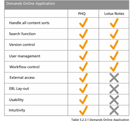
Table 5.2.3.1 Demands Online Application
5.2.3
Choice
Together with company webspecialists Reiner Sulter (Lotus Notes), Kim Bekhuis and Raymond Oude Wolbers (PHQ) the demands in comparison with the functionality of the two current online applications were discussed. Both applications will satisfy most demands on the area’s of user management and content management. They are both capable of displaying all kinds of content. But PHQ is the superior when it comes to external access possibilities and lay-out possibilities. And PHQ has much more intuitive and flexible navigational and structural options. In PHQ you can get your wanted
information on a number of ways in a very intuitive way. PHQ has already proven this in the corporate website.
Lotus Notes has a far more inferior intuitivity. Employees find it very difficult to find the needed information in Lotus Notes. The PHQ application works on the Internet, so external access will be no problem. With the collaboration with <theFactor.e> it will take less time to convert the current website templates to EBL templates. Lotus Notes is an intranet application and external access will be a problem. It will take a lot of more time to make the Lotus Notes system
compatible with the external access demand and the lay-out demands. It did become clear that the PublishHQ CMS application is preferable above the Lotus Notes intranet application. The only one factor that Lotus Notes can be become the preferable application, is the cost factor.
Choice:
36
Figure 5.3.1.1 Homepage Amsterdam Stijlweb
Figure 5.3.1.2 Seven qualities Amsterdam
6 Communicate
5.3
Market Survey
On the Internet there are numerous Corporate Identity sites from various companies and
institutions. The pubic accessible sites give an overview of the corporate identity op the company in question. Things like the company strategic intent and corporate values. On most sites you can even find the design principles an brand standards. Logo’s, colors, typography and other
standards are available for the general public. Most available material on these sites belongs to the graphic manual and to the EBL corporate design. Below four examples of CI sites are discussed.
5.3.1
City of Amsterdam Stijlweb
Date of review: Nov. 17th 2004
Very extensive site with a strong main point on the graphic part. The site is very flexible, there are often updates. The site is roughly divided in five section: Introduction, Approach, Buildingblocks, Means, and Sub areas.
The Introduction section has strong similarities with the general EBL corporate design. Corporate values and corporate culture are being addressed in this section. There are also seven core qualities of the city of Amsterdam in this section. That sort of
formulation strongly resembles with the formulation of the nine qualities of PANalytical.
In the Approach section of the site we find some ‘steps plans’ in how the new style should be implemented in the different parts of the City of Amsterdam. This is really a practical guide for application of the new style.
In the Buildingblocks section we find all parts that together form the graphical house style. These are the logo, the use of colors, the typography, use of images and grids. The part ‘use of images’ has a strong resemblance with the Imagery manual within PANalytical.
The section Means gives us an overview of all the means in which the new house style is applied. The means are divided in three categories: press, electronic and three-dimensional. All the press and electronic means can be downloaded by everyone for practical use. The three-dimensional means have similarities with the content of the Facility/3D manual within PANalytical.
This site is for accessible for everyone. There are no parts that are restricted. Probably this is a conscious choice of the City of Amsterdam. The city belongs to everybody, and so does the identity and the style of the city.
Information available of similar PANalytical manuals:
37
Figure 5.3.2.1 Homepage Akzo Nobel CI site
Figure 5.3.2.2 Unstructured list of items
Figure 5.3.3.1 Homepage DSM CI site
5.3.2
Akzo Nobel
Date of review: Nov. 18th 2004
Akzo Nobel is a company that stands nearer to PANalytical then the City of Amsterdam. Akzo Nobel has a more sober and less structured corporate identity site then the City of Amsterdam.
De left column of the site is filled with unstructured table of contents. It contains a lot of different sections of AKZO Nobel in which the house style is expressed. It goes from stationary to the car park. A good structure is missing. By various sections, there are publicly available downloads. Everybody can download most documents, without any registration or login system.
After manually searching the site (it has no automatic search function) it seems that there is information on the site similar to the manuals copy, graphic, web, booth and facility/3D. There is no description about the general corporate design. It seems that this site is purely for the intern users within AKZO.
Information available of similar PANalytical manuals: Copy, graphic, web, booth and facility/3D
5.3.3
DSM
Date of review: Nov. 18th 2004
DSM is in about the same market than AKZO Nobel. They are both industrial companies. DSM has decided to integrate the corporate identity site into the main DSM website. This is really different than the other two discussed sites. The most parts of the DSM corporate identity site are password protected. Not everything is accessible for everyone. In the public part you find the house style and the corporate strategy. This information is similar to the graphic
38
Table 5.3.4.1 Same structure Amsterdam and Raytheon
5.3.4
Raytheon
Date of review: Nov. 26th 2004
Raytheon is a large American defence company. They develop all sorts of military equipment, like radars, missiles, aircraft. They also have a corporate identity site purely for their own employees, but for some reason it is publicly accessible. The corporate identity site is pretty extensive. The frontpage as has structured table of contents divided in three categories: ‘Logo, Tagline and Identifiers’, ‘Guidelines’ & ‘Templates’.. In the first section you will find all the identifiers, for example the logo, that identify the company. The Guidelines section gives a lot of textual and graphical guidelines to design a lot of things, like presentations, web design,
imagery. The Templates section contains various downloadable templates like a powerpoint slide, stationary, email signatures etc. Basically the whole site has the same structure as the City of Amsterdam Stijlweb.
Section City of Amsterdam Raytheon
1 Building blocks Identifiers
2 Approach Guidelines
3 Means Templates
5.3.5
Conclusions
The market survey brings up the fact that that there are some choices that have to be made when communicating your corporate design online. The most important choices in a row:
• Which information is suitable for communicating outside the company?
• Integrate in the current website or not?
• The structuring of the information, how do you present it to the users?
Users
40
Figure 6.1.1.1 Organisation PANalytical
6
Users
6.1
First overview
If the manuals are going to be implemented in a new design, a lot of different users will hopefully going to use the manuals. Who those people are must have an implication on the design of the new look and feel for all the manuals. In these paragraph there is a first survey of which intern and extern users are going to use the various manuals..
6.1.1
Intern
The manuals will first be communicated to all employees of PANalytical. These are the intern users of the manuals. The communication of the manuals to the employees is part of the internal branding process. In this internal branding process the employees of PANalytical have to come to know the corporate identity of the company. Because, if your own employees don’t know it, they also won’t express the identity to the outside world. And then your corporate identity will fail miserably.
The communication of the corporate identity to your own employees is a complex process, especially if changes are needed. Employees that are working for PANalytical for about 20 years will probably meet these wanted changes with some scepticism. More will follow on this problem in a later stage. The art of a successful internal branding process is to make your
employees see the cause of the whole process. Therefore an analysis of all the intern users within PANalytical is crucial for a successful internal branding process.
6.1.1.1 The organisation
Within PANalytical there are dozens of departments that all have different tasks. Different tasks demand different information from the various manuals. Below there is a global structure of the whole organisation of PANalytical:
In the organisation chart the BU management is standing above all. The BU management gives the main direction over the company. Below the BU management, there are the Supplycenters. There are two supplycenters, one large one in Almelo and one small one in Eindhoven. The supplycenter in Almelo is also the company headquarters. Finally there are the regions, the international aspect of the company. Together the three regions cover the whole world. APR stands for Asian Pacific and Australia. AMEC stands for North-, South- and Middle-America. EMEA stands voor Europe, Africa and the Middle-East. Every region has his own Sales and Service organisation and they operate quite independent from the supply centers.
BU management
SC Almelo SC Eindhoven
41
Figure 6.1.1.3 SC Almelo Figure 6.1.1.2 BU Management
BU Management
First the structure of the BU management. The management is, with all due respect, a small group within the whole company. But the management needs the deliver the EBL message to all of the PANalytical employees in the different departments. Therefore the structure of the
management is important during the internal branding process.
Especially the commercial director an the human resource director will have a larger roll in the internal branding process.
SC Almelo
The supplycenter in Almelo is by far the largest place of business of PANalytical, with the most employees. In Almelo all products are developed and constructed. It’s also the head quarter of the company. SC Almelo consists of a dozen departments that all have specific needs of the manuals.
SC Eindhoven
The SC Eindhoven is much smaller then the SC Almelo. In this supply center the tubes for the x-ray machines are fabricated. The SC Eindhoven is all about production of materials, but it also has a small development department.
Regions
The three regions are there for sales and service. The regions all have roughly the same
organisational structure. Every region has his own regional management. All the countries in a region have also got a national management. Each region has his own marketing department. The employees in the region’s are also to going to use the manuals. This brings in extra problems like distribution and the adjustment to local cultures.
Management Director Commercial Director Financial Director Human Resource General Manager SC Lob Manager Industrial & LOB Manager Process &
General Manager APR General Manager AMEC General Manager EMEA
Management SC Almelo
Development
Purchasing
Customer Support
Markering Services
Human Resource Financial Controller Industrial & Scientific
Research (XRD)
Process & Quality control
(XRF)
42
Now we have some insight in the organisation of PANalytical we can look which manual is going to be used by who in the company. Firstly, we can make a rough difference between the manuals. Some manuals will have a broad intern audience and some manuals will have a small intern audience.
The manuals product, web, booth, facility/3D & user-interface will never be interesting for most employees. This is because these manuals are for very specific aspects within the company.
The opposite is true for the manuals copy, behavior, graphic, imagery and the EBL corporate design. In these manuals you’ll find information that can be important for every single employee at PANalytical during the daily working process.
6.1.1.2 Intern audience by manual
All manuals have a specific intern audience where they are intended for. In this paragraph there is a first concise overview about the possible internal users. This overview is about the use and create parts of all the manuals. The understand part of all the manuals does not have a specific audience, and should be available for everyone.
Graphic
BU management SC Almelo SC Eindhoven Regions
The graphical manual describes the house style of PANalytical. This house style needs to be implemented in the whole company. The style is expressed in stationary, powerpoint slides and visiting cards. Everyone in the company uses these things.
The manual also describes how stationary etc. should be designed with building blocks and inspiration examples. This information, belonging in the create part, is only useful for the DTP employees within PANalytical.
Imagery
BU management > Commerical Director
SC Almelo > Marketing Services > DTP employees Regions > Marketing Services > DTP employees All Employees
The imagery manual will have a broad internal target group. Everyone who makes an presentation for example will need imagery and should therefore use the imagery manual.
Copy
BU managment
SC Almelo > Copywriters Regions > Copywriters
The copy manual has a broad public within PANalytical. Everyone who’s writing copy, will do good if he/she consults the copy manual.
Broad intern audience
Corporate EBL Imagery Copy Behavior Graphic
Specific Intern Audience
43 Web
BU management
SC Almelo > Marketing Services > Webmasters SC Almelo > ICT
Regions > Marketing Services > Local site webmasters
The web manual will be used by a small specific audience within PANalytical. The web employees in the SC Almelo will be the prominent users of it. Besides them, the webmasters for the local sites will probably also use this manual.
Product
BU management
SC Almelo > Development SC Almelo > Marketing Services
The product manual has also got a specific internal target audience. The employees that are directly or indirectly are involved in product development will have to consult this manual. The product manual also has the highest classified status of all the manuals, because the information in it can be interesting for concurrent companies.
User Interface
BU management
SC Almelo > Development SC Almelo > Marketing Services
The user interface has the same specific internal audience as the product manual. The only difference can lay within the departments that have access.
Booth
BU Management > Commercial Director SC Almelo > Marketing Services
Regions > Marketing Services Booth workers
Visitors conferences
The Booth manual has a small internal target group. Only the people who are directly involved in the organisation and building of booths will consult this manual. Also someone who needs the PANalytical beauty case for a conference, will use the booth manual.
Facility/3D
BU Management > Commercial Director SC Almelo > Marketing Services
The facility/3d manual has also a small internal target group. Only the people who are actively involved in the creation of EBL elements in the facilities should consult this manual.
Behavior
44
6.1.2
Extern
After the EBL manuals have been communicated to the intern users, they also can be deployed to possible extern users. Below you will find an concise overview of all the manuals with the possible external users. Also this overview is only for the use & create parts of the manuals. The understand part is intended for a large not specific audience.
Graphic
External graphic designbureaus
Imagery
External graphic designbureaus Printing offices
External photographers External press
Copy
External PR bureaus External consultants External copywriters External press
Web
External webdevelopers
Product
External productdevelopers Suppliers materials products
User-Interface
External UI developers Suppliers materials UI
Booth
External boothdesigners Boothbuilders
External workers booth Suppliers materials booth
Organisation congresses/exhibitions
Facility/3D
Suppliers materials facilities External facilities designbureaus
Behavior
External consultants
45
Figure 6.2.1 Different Users, different needs
6 Users
6.2
Usermapping
There is now a first basic idea of which people the manuals going to use. That was the easy part. But now the difficult part. In this paragraph there is an investigation about when and where exactly the different intern/extern users will need information from the manuals. This facts will surely have an tremendous impact on the future navigation of the manuals. The navigation has to be practically orientated towards the future internal and external users.
First of all, the mapping of all the moments of all different users when they will maybe consult the manuals is a huge job. Even more complex is the fact what kind of information they will need and what rights the different users will have to possible edit the information in the manuals. The trick is to keep a complex process like this so simple as possible!
The situation is as follows:
46
6.2.1
The Manual User map (MUM)
The MUM (Manual user map) should give an well-ordered overview of all the users of a certain manual. The MUM also summarizes what parts of the manual are accessible for the user and which rights certain users have for a part of the manual. For example, can they edit information or can they just read it? The user map should give a fully overview of all the needs and rights of all different users of a manual.