Table of Contents
1. Graphing Data
1.1. Starting the Chart Wizard 1.2. Selecting the Data
1.3. Selecting the Chart Options 1.3.1. Titles Tab
1.3.2. Axes Tab 1.3.3. Gridlines Tab 1.3.4. Legends Tab 1.3.5. Data Labels Tab 1.4. Selecting the Chart Location 1.5. Changing an Existing Graph 1.6. Changing the Look of the Graph
1.6.1. Editing Titles 1.6.2. Formatting Axes
1.6.3. Changing Data Markers 2. Graphing Multiple Data Series
3. Fitting a Curve to a Data Series 4. Adding Error Bars to a Data Series
5. Estimating Uncertainty in Slope of a Linear Trendline 5.1. Drawing the Line
5.2. Rotating the Line
1. Graphing Data
1.1. Starting the Chart Wizard
When the data worksheet has been set up (the data entered and the columns labeled), it is time to graph the data. Before starting a graph, it is important to have a clear idea of what values go on what axis. Usually, the independent variable goes on the x-axis and the dependent variable goes on the y-axis.
For example, consider a data series that measured the distance from the motion detector to a glider which moved along a track. To know the distance to the glider, one must pick a particular time. The distance depends on the time. The independent variable is time and the dependent variable is distance. Therefore, the distance versus time graph of that data would have the time on the x-axis and the distance on the y-axis.
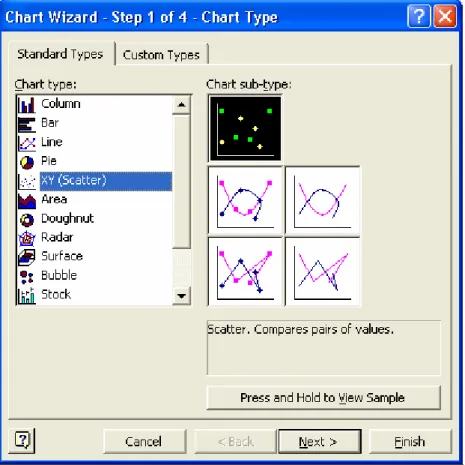
To create a graph, click the Chart Wizard button in the area beneath the top menu bar or go to the top menu bar, click Insert and select Chart. The Chart Wizard will go through the different steps of making a graph. In the window that pops up, the Chart Type window, choose the XY (Scatter) type from the list of standard graph types. In the Chart sub-type area make sure the highlighted image is the one without any lines or curves, as shown in Figure 1.
Click the Next button when done.
1.2 Selecting the Data
In the window that pops up click the Series tab. Here is where the data will be assigned to the x- and y-axes. If there are any data series already
entered, click on each one in the Series area and then click the Remove button until there are none left. Click the Add button to begin a new data series. There are three fields on the right-hand side of the widow: Name field, X Values field, and Y Values field. Click the Data Range box next to the X Values field.
The Source Data window will collapse to a small window only showing the X Values field, as shown in Figure 3. Go to the worksheet with the data and select the data for the x-axis. A dashed box around the cells indicates what has been selected. If a mistake is made in selecting data, click in the field in the shrunken Source Data window and delete the range information in the field. Then, select
the correct data range. Be careful that the range selected includes all of the desired cells and only the desired cells.
When done, click the Expand Window button to right of the X Values field. The Source Data window will expand back to the view in Figure 2.
Figure 3: Chart Wizard with the Chart Source Data window showing the correct data range being selected. Click the button to expand the Chart Source Data window and select the Y values.
Click the Data Range box next to the Y Values line and select the data to go on the y-axis. Again, when done, click the Expand Window button to right of the Y Values field to expand the Source Data window.
Make sure the x-axis data isn’t put into the y-axis line by mistake! Double check to make sure the data ranges look correct after selecting them both. If both fields look fine, click on the field next to Name and enter a name for the data series. This is especially helpful if there is more than one data series on the graph (see Section 2Graphing Multiple Data Series). The name should describe the data. For example, if the data reflects the distance measured to a glider, which was moving along a track, then the series might be called “distance to glider” or “distance trial 1”.
Click the Next button when done.
1.3 Selecting the Chart Options
Graphs mean little without appropriate labels! Here is a run-down of the five tabs in the Chart Options window.
1.3.1 Titles Tab
The first tab in the Chart Options window is the Titles tab. Excel will automatically use the name of the data series as the title of the graph. Descriptive names should be entered for the chart title and the x-axis and y-x-axis values. For example, a good title name might be “Distance vs Time of Glider on Track” with the x-axis named “Time (s)” and the y-axis named “Distance (m)”. Notice that the units for each axis are included in the name. If they weren’t, someone looking at it would have no idea of the units of the graph. Even if it seems redundant, always include the units!
1.3.2 Axes Tab
The second tab in the Chart Options window is the Axes tab. Both boxes should be checked, so that the number scales are displayed on both x- and y-axes.
1.3.3 Gridlines Tab
The third tab in the Chart Options window is the Gridlines tab. Gridlines are the lines on graph paper, and the options are given to have lines on only the major divisions on the axes, such as every 5th or every 10th number or to have lines on only the minor divisions, such as a line on every number instead of only on the major intervals. These intervals may be chosen, as will be mentioned in Section 6
Estimating Error in Slope of Graph.
1.3.4 Legends Tab
The fourth tab in the Chart Options window is the Legends tab, which allows you to place the key to the graph symbols and colors at different places around the graph. This is not so important to do, since it is far easier to position the legends
box by dragging it with the mouse once the graph is created. However, it is important to make sure the Show Legend box is checked, so that the legend actually appears on the graph!
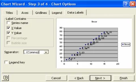
1.3.5 Data Labels Tab
The fifth tab is the Data Labels tab, which allows each point to be labeled with its coordinate values or with the data series name. This is not
necessary to do, for it makes a graph look cluttered.
Click the Next button when finished with choosing Chart Options.
1.4 Selecting the Chart Location
In Excel a graph may be created as an object floating in the data worksheet or as a separate worksheet in itself with its own tab at the bottom of the workspace. Creating a graph as a separate sheet makes it easier to ensure that the whole graph prints out properly. Do this by clicking the radio button next to “As new sheet”. The name typed in the field will be the name which appears on the tab of the worksheet. Click the Finish button when done.
1.5 Changing an Existing Graph
Once the graph is created it is quite easy to go back and change an option. Put the mouse pointer over a blank area in the graph and right mouse click and select from the options. They can also be accessed by going to the top menu bar and clicking on Chart. For the Macintosh, use the top menu bar. Chart Type, Source Data, Chart Options, and Chart Location call up the corresponding Chart Wizard screens mentioned in steps 1.1 through 1.6 and allow changes to be made. Note that the buttons at the bottom of the window only say Ok or Cancel. To apply the change, press Ok; to go back to the graph without any changes, press Cancel. The changes will be implemented in the graph as soon the Ok button is clicked.
1.6 Changing the Look of the Graph
1.6.1 Editing Titles
Once the graph is created, it might be necessary to fix up the appearance a bit. The graph can be resized to fit the page by putting the mouse pointer over one of the outer borders and dragging it to make it as large as it is allowed to be. It might also be necessary to do a little cleaning up with the title box, axis
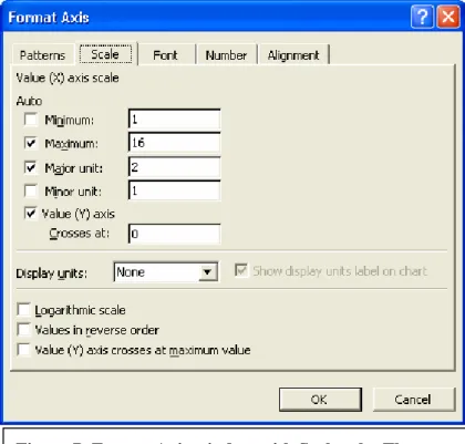
Figure 7: Format Axis window with Scale tab. The Minimum for the X-axis has been specified as 1 and the Minor Unit for the X-axis has been specified as 1. These choices override Excel’s automatic values, as noted by the box next to these lines being unchecked.
titles, and legend box. These can all be moved by clicking on them with the mouse pointer, holding down the mouse button, and dragging them with the mouse into the desired position.
The titles of the graph and axes may be changed by clicking on the title to select it and then clicking the text. Now the text can be edited by typing. Click anywhere else on the graph when done editing the title.
It is possible to change the background color of the graph as well as the color of the border. Excel sometimes has the default setting of a gray background, while a white background looks a lot cleaner. When the mouse pointer is in the graph area (but not directly over the data, legend, or any title boxes), click the right mouse button and select Format Plot Area from the menu that appears. This window can also be access by clicking a blank area inside the graph, going to the top menu bar, clicking on Format and selecting Selected Plot Area from the menu that appears. For the Macintosh, double click instead of clicking the right mouse button.
1.6.2 Formatting Axes
The axis font type and size, scale, minimum, and maximum values may all be changed by putting the mouse pointer over any number on the axis and double clicking, which calls up the Format Axis window.
When creating a graph, Excel will look at the range of data and pick minimum and
maximum values for a graph. The checks in the boxes to the left of the fields mean that the graph is using Excel’s default values instead of values entered by a user. In Figure 7, notice that the Minimum value and the Minor Unit have no check marks in the boxes on those lines. Numbers have been entered by a user on those lines, overriding the Excel default values.
In the Format Axis window on the Scale tab, the Minimum and Maximum fields set the minimum and maximum values of the axis. If a graph runs off the page or if the graph is
unclear because it is just too small, this is the window to change that.
The Major Unit field affects the numbers displayed on the axis as well as the Major Unit Gridlines (used in Section 5 Estimating Error in Slope of Graph). Figure 7 shows that a custom Minor Unit of 1 has been entered, meaning that the graph will show x-axis Minor Gridlines for each number, and a Minimum of 1, meaning that the x-axis will starting at 1 and not 0. To restore the automatic values that Excel picks, just go to the Format Axis window and click the boxes next to each line until they all have check marks. Click Ok when done, and notice that Excel’s default axis settings have been restored to the graph.
Changes made to the scale, maximum, and minimum values of the x-axis won’t affect the y-axis. To change the y-axis as well, double click on the y-axis to call up the Format Axis window.
The Font tab affects the way the axis labels are displayed. This is just like formatting data, mentioned in the Introduction to Excel document, Section 1.2.2 Formatting Data.
1.6.3 Changing Data Markers
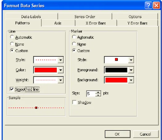
Each point is displayed with a data marker. The color, shape, and size of the data marker may all be changed. When the mouse pointer is over any of the data markers on the graph, click the right mouse button and select Format Data Series from the menu that appears. For the Macintosh, double click on the data marker instead of clicking the right mouse button.
The Format Data Series window will appear. In the Patterns tab, the Line section creates a connect-the-dots line among the data points. The Automatic radio button creates a line with Excel’s default Style (dashed, straight, etc.), Color, and Weight (thickness). The Custom radio button allows each of these to be specified.
Checking the Smoothed Line box makes the connecting line appear smoother, less jagged.
In the Patterns tab, the Marker section changes the appearance of the icon that marks each data point. Again, the Automatic button means the graph is using Excel’s default values. To change any of these, click the Custom button. The Style menu selects the shape (square, triangle, circle, etc.) of the data marker, the Foreground menu selects the border color of each marker, and the Background menu selects the fill color of each data marker. The Size menu affects the size of each data marker, much like changing text font size.
2. Graphing Multiple Data Series
In the course of these labs it will be necessary to graph more than one data series on a graph. Multiple data series can be included on the same graph either when the graph is first made or added to an already
existing graph. To add another data series in the process of making the graph with the Chart Wizard, go to the Source Data tab, click the Add button, and go through the process of selecting the appropriate data. Don’t forget to give each data series a descriptive name. When looking at a graph, it is easy to confuse data series labeled “series1” and “series2” versus data series “resistor” and “lamp”. To change the series displayed in the Name, X Values, and Y Values boxes, just click on the series name in the Series area on the left.
If a graph has already been created and another data series should be added, put the mouse pointer in a blank spot in the graph area and right click. From the menu that appears, choose Source Data, which will then call up the Source Data window from the Chart Wizard, where data series may be added. For the Macintosh, go to the top menu bar and click on Chart; from the menu that pops up select Source Data.
3. Fitting a Curve to a Data Series
Graphs are powerful for they help show patterns in data; it’s useful to see what kind of pattern or curve a data series follows. Excel has the capability of fitting a few types of curves to a data series and calls these fits trendlines. To add a trendline to a data series, either put the mouse pointer over any data marker and double click or right click and select Add Trendline from the menu that appears. For a Macintosh, click on any of the data markers, go to the top menu bar and click on Chart, and select Add Trendline from the menu that appears.
In the Patterns tab the style, thickness, and color of the trendline are chosen. Excel will use a default style, color, and thickness. To change any of these, click the Custom radio button and then make changes with the pull-down menus. The Style menu changes whether the trendline is solid, dashed, dotted, or any of the other patterns listed. The Color menu changes the color of the trendline. The Weight changes the thickness of the trendline. The sample picture at the bottom of the Format Trendline window gives an example of how the line will appear.
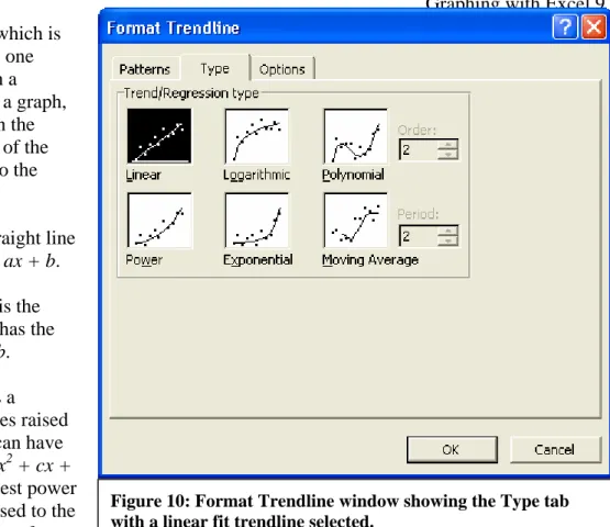
In the Type tab, Excel gives the option of fitting six types of curves to a data series. Below are short descriptions of each as well as an example of the equation of the trendline. The letters a, b, c, and d in the equations are all numbers that Excel will pick to make the curve fit the data series. The equations are given in the form where the vertical axis is the y-axis and the horizontal axis is the x-axis.
Usually, in a lab it will be known ahead of time what kind curve should fit the data. All of these curves Figure 9: Chart Wizard with Source Data window
increase in a different way, which is why it is useful to see which one matches a data series. When a trendline has been added to a graph, an entry for it also appears in the legend box with an example of the line and the name assigned to the trendline.
A Linear curve is a straight line and has the equation y = ax + b.
A Logarithmic curve is the natural log function and has the equation y = a[ln(x)] + b.
A Polynomial curve is a combination of x variables raised to different powers and can have the equation y = ax3 + bx2 + cx + d. Excel allows the highest power of the equation (the x raised to the largest power) to be chosen from a
range of 2 to 6, which is selected from the field next to the Polynomial option and labeled Order. The Polynomial option must be highlighted in order to choose a value for the Order.
A Power curve is the x variable raised to some power, which does not have to be an integer. It has the equation y = axb.
An Exponential curve raises the irrational number e to some variable (which does not have to be an integer) and has the equation y = aebx.
Moving Average is where Excel breaks the data series up into intervals and then computes an average value over that interval. This tends to smooth out the curve. The interval is chosen in the field labeled Period. The Moving Average option must be highlighted in order to choose a value for the Period.
The Options tab in the Format Trendline window gives a few more possible tweaks to the curve. Excel gives a generic name to the trendline much like it gives a generic name to a data series or a worksheet tab. That name is displayed in the Trendline Name section next to the word Automatic. A specific name can be typed in the field by clicking the Custom radio button and typing a name in the field next to Custom.
In the Forecast section the Forward field allows the trendline graph to be drawn beyond the last or first data point, extending it. The Backward field allows the trendline graph to be drawn before the first data point. How much before and after the data the trendline will be drawn depends on the number of units chosen in the fields. Use the arrows next to the field to select how many units Forward or Backward to forecast. These units reflect the units chosen for the Major Units and Minor Units in the Format Axis window (the Scale tab). Half of a unit will extend the graph one Minor Unit and a whole
unit will extend the graph a Major Unit.
An important button is the Display Equation on Chart button. By clicking this, Excel will show the equation it calculated for the trendline on the graph. This equation can then be moved around and resized much like the title, axis labels, and legend box can be moved around and resized. The font color, size, and type may even be changed. All of this may be done by putting the mouse pointer over the equation and double clicking. The equation text may be formatted by using the Format Data Label window that appears, which has the same Patterns, Font, Number, and Alignment tabs as the window that appears when formatting the title or axis text (mentioned in the Introduction to Excel document, Section 2.6.2 Formatting Axes).
Once a trendline has been added, it can be changed or even removed. Do this by putting the mouse pointer anywhere on the trendline (just not over a data marker!) and clicking the right mouse button. For a Macintosh, double click on the trendline. If the Format Error Bars window appears, the error bars were clicked by mistake; try again!
To change the trendline, choose Format Trendline in the menu that appears; appropriately enough, the Format Trendline window will open with the Patterns, Type, and Options tabs described above. Make the desired changes and then click Ok.
To remove the trendline choose the Clear option from the menu that appears. For a Macintosh, click on the trendline, go to the top menu bar, click on Edit, choose Clear from the menu that pops up, and then choose trendline from the menu that pops up. To get the trendline back, go through the process of adding a trendline, again.
4. Adding Error Bars to a Data Series
When doing a lab the final calculated result is important but the error of that number is just as important. Excel can add error bars to data based on laboratory-measured error and also based on a fixed number error (such as a percentage or a number). Saying “laboratory-measured error” sounds misleading, as if the exact error from the lab measurement is known and can be corrected to get the precise, true
measurement. What is meant is that each measurement is associated with a degree of uncertainty based on how precise the equipment is, how accurate the measuring method is, and how many times a particular measurement was done. Actually, the term “uncertainty” is a better description than the term “error” but Excel refers to it as “error.” Methods of finding laboratory error are detailed in the error section at the end of the lab manual.
Thus, data taken during lab will have associated error values. It is convenient to record the errors in a column to the right of the measurement with which they are related. See Figure 11 for an example. The error in
the other --- usually, the greater error is associated with the dependent variable.
In order to add this error information to the graph, go to the graph worksheet. Put the mouse pointer over one of the data markers and either double click or right mouse click and select from the menu that pops up the Format Data Series option. For the Macintosh, just double click on a data marker.
In the Format Data Series window there are two tabs for error, X Error Bars and Y Error Bars, indicating error bars in the direction of the x-axis and the y-axis, respectively. Click the X Error Bars tab first.
If the error is from the lab and recorded on the data worksheet, in the Error Amount section select the Custom radio button. Click the Data Range box to the right of the field next to the “ ” (upper error). The Format Data Series window will collapse, leaving only the field with the range of data for the error visible. Switch to the data worksheet and select the cells with the error values, making sure to select all of the cells and only the cells desired. If a mistake is made in selecting the cells, erase the value in the shrunken
Format Data Series window field and select the appropriate cells.
When done, either hit the Enter on the keyboard or click the Expand Window button on the right of the Format Data Series window. Do the same procedure for the Data Range button to the right of the field next to the “ “ (lower error). Please be sure to enter the data ranges for both the upper and the lower error fields! When done, press Ok.
Repeat this process for the
Y Error Bars tab. When done, press Ok.
5. Estimating Uncertainty in Slope of a Linear Trendline
Sometimes it is easier and faster to estimate the uncertainty in a number using uncertainty slopes based on a linear trendline rather than by propagation of error through a formula. In order to use the
following methods, please be sure to have the Drawing toolbar available.
Figure 13: Drawing toolbar
Essentially, two lines are drawn to represent the greatest slope the error allows and the smallest slope the error allows. These lines represent the maximum and minimum possible uncertainty in the slope of the trendline.
If the drawing toolbar is not available, it can be selected by going to the top menu bar of the window in the Tools menu and selecting Customize. In the Customize window that pops up, go to the Toolbars tab and click the box next to Drawing. When done, press the Close button. The Drawing toolbar should appear either as a small box or along the upper or lower border of the Excel program window.
5.1 Drawing the Line
Select the Line tool from the Drawing toolbar. Put the mouse pointer at the very beginning of the linear trendline, hold down the mouse button, and move the mouse pointer to the very end of the linear trendline. This draws a line right on top of the linear
trendline.
Immediately click the Line Color button in the Drawing toolbar and select a color for the newly-drawn line; something lighter than
the linear trendline is recommended. Otherwise, it will be tough telling which line is the linear trendline and which is the drawn line.
5.2 Rotating the Line
The next step is to click on the drawn line (don’t click on the linear trendline or any of the data markers!). Two white circles will appear at either end of the drawn line, indicating that it is selected. From the Drawing toolbar select the Draw button . From the menu that pops up select Rotate or Flip and then from the menu that pops up select Free Rotate. The circles at the ends of the drawn line will turn green, indicating that the line may be rotated by hand and the mouse pointer will change to show a black rotation arrow, , indicating that the Free Rotate ability is currently active.
Position the mouse pointer at one of the green circles at either end of the drawn line. Notice that the mouse pointer changes to just a black rotation arrow . While the mouse pointer is just a black rotation arrow , hold down the mouse button and carefully move the mouse pointer away from the linear trendline. Notice that the drawn line rotates to follow the mouse pointer, which has changed to four, small, black rotation arrows, .
The drawn line may be rotated as much as desired as long as the mouse button is held down. Once the mouse button is released, the drawn line stays put in the last position it was moved to. As long as the
Figure 15: A solid red line was drawn on top of the linear trendline. The small red arrow on the top right part of the line shows the direction the mouse pointer moved to rotate the drawn line. The dashed lines are to illustrate the rotation motion and won’t appear during rotation.
mouse pointer still has the rotation arrow symbol and as long as the circles at both ends of the drawn line are green, it is possible to grab on of the green circles and rotate the drawn line again.
If any other part of the graph aside from the green circles at either end of the drawn line is clicked, the Free Rotate ability will be ended. In order to get it back, go back through the process of selecting the drawn line by clicking it, going to the Drawing toolbar, and using the Draw menu to select Rotate or Flip. Excel can be finicky about ending the Free Rotate ability, so be careful (or be patient with going through the menus!). Once done rotating, just click anywhere else on the graph area.
How much should the lines be rotated? How are the upper and lower bounds on the slope found?
Lower Bound of the Slope (red line): The first drawn line should be rotated so that it goes through the bottoms of the error bars on the right half of the graph and so that it goes through the tops of the error bars on the left half of the graph. Notice that the slope of the drawn line is less steep than the slope of the linear trendline. Is an estimate of the lowest (minimum) slope allowed by the error in the data.
Upper Bound of the Slope (blue line): The second drawn line should be rotated so that it goes through the tops of the error bars on the right half of the graph and so that it goes through the bottoms of the error bars on the left half of the graph. Notice that this time the slope of this drawn line is steeper than the slope of the linear trendline. It is an estimate of the highest (maximum) slope consistent with the error in the data.
In practice it can be tricky to maneuver the drawn line when it is very close to its original position, over the trendline, for Excel will tend to snap it back into original position. If this is a problem, just rotate the drawn line far away from the trendline (for example, almost horizontal!) and let go of the mouse button. Then select the drawn line again and rotate it to where it should go.
Figure 16: Graph with best fit line (black) and lines estimating upper boundof the slope (green) and
5.3 Estimating the Slope of the Line
Once the lines are drawn both of their slopes must be estimated. To figure out the slope of a line, get the coordinates of two points on the line and use the definition of the slope as “rise over run” to calculate it. But how to go about getting the coordinates? Make sure that the Minor Gridlines are visible. If they are not, pull up the Chart Options window, go to the Gridlines tab, and make sure the boxes next to Minor Gridlines are checked for both axes.
Try to find points where a drawn line crosses exactly at the intersection of a vertical and horizontal line as shown in Figure 17, which will make reading the coordinates far easier. Estimate the coordinates of two points for one of the lines and then do so for the other line. It might useful to zoom in on the graph by 200% using the Zoom feature from the top menu bar.
It may be necessary to adjust the Minor Unit of the graph to get Gridlines fine enough to determine coordinates. Do this by calling up the Format Axis window and changing the Minor Unit value on the Scale tab to a smaller number. More detailed instructions on formatting the axes are mentioned in the Introduction to Excel document, Section 2.6.2 Formatting Axes. Keep track of what units are assigned to the Minor Gridlines so that a mistake is not made in determining the slope. Don’t forget that the units may be different for each axis! In fact, most of the time the units will be different for each axis!
Once coordinates are found for two points for each drawn line, they can be used to find the slope of the line using the definition of the slope:
) (
) (
1 2
1 2
x x
y y x y slope
− − = ∆ ∆ =
The two slopes from the drawn lines are the upper and lower bounds on the slope of the linear trendline consistent with error. The difference of the upper and lower bound slopes is actually twice the error of the slope.
(2.42, 9) (2, 12)
Figure 17: Estimating points on the drawn lines using gridlines. The red arrow points to an easy spot to determine coordinates, at the intersection of the drawn line and the gridlines. The blue arrow points to a difficult spot to determine
2 slope bound lower slope bound upper trendline linear for error
slope = −
For example, two points on the lower bound of the slope are (1.0, 7.0) and (3.5, 19) and two points on the upper bound of the slope are (6.5, 32) and (9.5, 49).
s m s m s s m m x x y y slope bound
upper 4.8
5 . 2 12 ) 0 . 1 5 . 3 ( ) 0 . 7 19 ( ) ( ) ( 1 2 1
2 = =
− − = − − = s m s m s s m m x x y y slope bound
lower 5.6
0 . 3 17 ) 5 . 6 5 . 9 ( ) 32 49 ( ) ( ) ( 1 2 1
2 = =
− − = − − =
The lower bound of the slope within error is 4.8 m/s and the upper bound of the slope within error is 5.6 m/s. s m slope bound lower slope bound upper trendline linear for error
slope 0.40
2 80 . 0 2 8 . 4 6 . 5
2 = =
− = −
=
From the equation of the linear trendline the slope of the graph is 5.1929. Therefore, the slope of the linear trendline with error is 5.2
± 0.40 m/s.
Why isn’t it 5.1929 ± 0.40 m/s? Follow the rules in the sections at the end of the lab manual for reporting error. If there is an error of 0.40 m/s, it makes 5.1929 m/s more accurate than error allows --- a bit silly!
6. Glossary of Excel Terms
Data Marker – Symbol used to designate a data point.
Gridlines – Like the lines on graphing paper.
R2 value – This is a number between 0 to 1 that indicates how closely the data fits a particular
trendline. A perfect fit, meaning that data fall exactly on a line, would have an R2 value of 1, and an abysmal fit, meaning that the data is scattered all over the place, would have a value of 0. The closer the R2 value is to 1, the better the data can be modeled by an equation of a line. The R2 value is also known as the linear correlation coefficient. See the document Least Squares Fitting with Excel for more information.
Trendline – Excel’s term for a curve fitted to a set of data. The program uses the method of Least Squares to determine the coefficients of the equations
JB 8/6/2004