MOVING BEYOND THE DESKTOP:
SEARCHING FOR INFORMATION WITH
LIMITED DISPLAY SIZE
Laura Haak Marcial
A dissertation submitted to the faculty of the University of North Carolina at Chapel Hill in partial fulfillment of the requirements for the degree of Doctor of Philosophy in the
School of Information and Library Science.
Chapel Hill 2012
iii
Abstract
LAURA HAAK MARCIAL: Moving Beyond the Desktop: Searching for Information with Limited Display Size
(under the direction of Brad Hemminger)
Increasingly, users are performing more sophisticated types of tasks, like
information search, across computing platforms including desktops/laptops, tablets, and smartphones. While much research has been done to improve efficiency for each of these devices in the area of information search, few investigations have taken a pragmatic approach to determining the real efficiency costs across current state of the art devices and searching paradigms (typically browser based). The study examined comparative task execution times for searching tasks under three different conditions: varying screen sizes (desktop, tablet, smartphone), varying interaction devices (mouse & keyboard and touchscreen), and varying types of search (Within Document, Known Item, and Exploratory).
iv
v
Acknowledgements
"Our information lives will be better served when we are free to get to our information from wherever we are, with any device available."
--Donald Norman
I am grateful to have been guided by many thoughtful and conscientious people during the completion of this dissertation, particularly the members of my committee: Brad Hemminger, Gary Marchionini, Barbara Wildemuth, Diane Kelly and Bernard
Fuemmeler. In the final stretch, I also received incredible support from the Department of Human Centered Design and Engineering at the University of Washington where I was able to actually run my subjects. Other wonderful and helpful researchers I met at the University of Washington include: Andrea Civan, Pedja Klasjna, Leah Findlater, Wanda Pratt and Jake Wobbrock. Thanks to Meir Gottlieb from Salar, Inc. who provided critical coding support for a portion of the study. Friends and fellow doctoral students Laura Christopherson, Lori Richards and Jewel Ward, offered me a great deal of their time and feedback and wonderful conversation, thank you so much for your encouragement and support. Helping me maintain my interest in health informatics, I very much appreciate the support I received from Julie Blatt, the UNC Department of Pediatric
Hematology/Oncology and the American Society of Hematology. SILS is an awesome part of the legacy of UNC Chapel Hill, and its impact is still fruiting. I am glad to be a part of this.
vi
supporting me and showing me how this is done. My parents Ed and Linda Haak and my in-laws, Fred and Araceli Marcial have also been there cheering me on.
My greatest hope is that this effort, which stole precious time and resources from my young family, will serve as inspiration and guidance for Sophia, Augustin and
Sebastian as they mature into this ever-changing world. My life partner, Fred, has been unyielding in his support, showing me the utmost respect, patience, and, most
vii
Table of Contents
Abstract ... iii
Acknowledgements ... v
Table of Contents ... vii
List of Tables ... xv
List of Figures ... xx
List of Abbreviations and Terms ... xxiv
1 Introduction and Background ... 1
1.1 Mobile Context ... 3
1.1.1 Comparative Studies ... 7
1.1.2 Important characteristics ... 12
1.1.3 This approach ... 13
1.2 Display Size ... 13
1.2.1 Factors: Resolution, Visual Acuity, and Field of View... 17
1.2.2 Comparative Studies ... 20
1.2.3 Presentation ... 21
1.2.4 Display Size and Search ... 25
1.3 Information Presentation and Interactions ... 27
1.3.1 Design ... 30
viii
1.3.3 Context ... 35
1.3.4 Keyboard ... 36
1.3.5 Text Entry ... 39
1.3.6 Pointing and Mousing ... 41
1.3.7 Pagination ... 43
1.3.8 Gestures and Multi-Touch ... 44
1.3.9 Impact of Age ... 49
1.4 Search ... 50
1.4.1 Information need, search behavior, and intent ... 54
1.4.2 Search tactics, search task and search success ... 56
1.4.3 Query Formulation and Log Analysis ... 58
1.4.4 Mobile Search ... 61
1.4.5 Search Context ... 78
1.4.6 Improving mobile search ... 79
1.5 Research Problem ... 81
1.5.1 Research Context ... 81
1.5.2 The Technology Paradox ... 84
1.5.3 Research Questions ... 88
2 Research Design and Methods ... 89
ix
2.2 Setup ... 92
2.3 Protocol ... 95
2.4 Participants ... 96
2.5 Task Construction ... 96
2.6 Within Document Task ... 97
2.7 Known Item Task ... 99
2.8 Exploratory Task ... 101
2.9 Training and Trials ... 103
2.10 Task Execution Time ... 103
2.11 Questionnaires ... 105
2.11.1 Demographic Questionnaire ... 106
2.11.2 NASA Task Load Index (TLX) ... 106
2.11.3 Usability ... 107
2.12 Interviews ... 108
2.13 Data Characteristics ... 108
3 Results ... 110
3.1 Summary of data ... 110
3.2 Demographics ... 112
3.3 Task Execution Time Analysis ... 113
x
3.5 Usability Analysis ... 114
3.6 Missing Data and Error Trials ... 115
3.7 Modeling Approach ... 116
3.8 Within Document Analysis ... 119
3.8.1 Task Execution Time ... 119
3.8.1.1 Pagination Technique Task Execution Time ... 122
3.8.2 Task Load ... 124
3.8.2.1 Pagination Technique Task Load ... 127
3.8.2.2 Comparison of Pagination Technique Task Load ... 129
3.8.3 Usability ... 131
3.8.4 Overall Results ... 134
3.8.5 Overall Results for Pagination Technique ... 135
3.9 Known Item Analysis ... 137
3.9.1 Task Execution Time ... 137
3.9.1.1 Adjusting for Latency (Mobile Generic condition) ... 139
3.9.1.2 Known Item Generic Website versus Mobile Website ... 141
3.9.1.3 Evaluating the Effect of Slower Mobile Communications (latency) .... 143
3.9.2 Task Load ... 145
3.9.2.1 Known Item Generic Website versus Mobile Website ... 147
xi
3.9.3 Usability ... 150
3.9.4 Overall Results ... 153
3.9.4.1 Effect of Slower Mobile Communications (Latency) ... 155
3.9.4.2 Generic versus Mobile Website ... 156
3.10 Exploratory Analysis ... 158
3.10.1 Task Execution Time ... 158
3.10.1.1 Search Exploration Style Variable ... 161
3.10.2 Task Load ... 162
3.10.2.1 Search Exploration Style Variable ... 165
3.10.3 Usability ... 166
3.10.3.1 Search Exploration Style Variable ... 168
3.10.4 Overall ... 168
3.10.4.1 Search Exploration Style ... 170
3.11 Interview Analysis ... 171
3.11.1 Similarity Among Searching Interfaces ... 171
3.11.2 Search experience ... 172
3.11.3 Screen size ... 173
3.11.4 Within Document Pagination Technique ... 173
3.11.5 Generic Website or Mobile Website ... 175
xii
3.11.7 Tasks: Likes and Dislikes ... 176
3.12 Results Summarized Across Task Types... 178
4 Conclusions ... 182
4.1 Extending Prior Work ... 182
4.1.1 Interaction Style, Display Size and Task Type ... 182
4.1.2 Beyond the Device ... 183
4.1.3 Paging versus scrolling ... 183
4.1.4 Interaction Technique ... 184
4.1.5 Generic versus mobile website ... 184
4.1.6 Exploratory search ... 184
4.2 Limitations ... 185
4.2.1 In the laboratory ... 185
4.2.2 Task type ... 186
4.2.3 Characteristics of the participants ... 186
4.2.4 Fixed display size (desktop and tablet) and portrait orientation ... 186
4.2.5 Mobile devices in non-mobile context ... 187
4.2.6 Possible novelty effect of iPad ... 187
4.3 Summary of Primary Findings ... 187
4.4 Design Implications ... 189
xiii
4.5.1 Age ... 190
4.5.2 Gender ... 191
4.5.3 Special populations ... 191
4.5.4 Experience and Habit ... 191
4.5.5 Task Type ... 192
4.5.6 The 7 inch market ... 192
4.5.7 Voice recognition ... 193
4.5.8 KLM/GOMS Analysis of the Within Document task ... 193
4.5.9 Analysis of keystrokes for the Known Item task ... 193
4.5.10 Addressing latency effectively ... 193
4.5.11 Followed links versus search results ... 194
4.5.12 Next phases of research ... 194
Appendix A. Counterbalancing Arrangement ... 196
Appendix B. Protocol for a Participant ... 198
Appendix C. Tasks for the Within Document Task Type ... 203
Appendix D. Tasks for the Known Item Task Type. ... 216
Appendix E. Tasks for the Exploratory Task Type. ... 232
Appendix F. List of Guidelines/Reminders for a Participant Session. ... 233
Appendix G. Links to Training Videos ... 234
xiv
Task Execution Time ... 235
Task Load ... 236
Pagination Technique Task Load By Question ... 237
Usability ... 239
Appendix I. Known Item Analysis Details ... 241
Task Execution Time ... 241
Task Execution Time Adjusting for Latency ... 242
Task Execution Time Generic versus Mobile ... 243
Task Execution Time for Generic versus Mobile Adjusting for Latency ... 244
Task Load ... 245
Task Load for Mobile ... 246
Usability ... 247
Appendix J. Exploratory Analysis Details ... 249
Task Execution Time ... 249
Task Load ... 250
Usability ... 252
Appendix K. Demographic Questionnaire ... 254
Appendix L. Within Document task load Pagination Technique Comparison Results 255 Appendix M. Known Item task load Generic versus Mobile Website Results ... 264
xv
List of Tables
Table 1-1. Display Comparison Matrix. ... 15
Table 1-2. Current and maximum possible display resolution according to human limitations. Reprinted from “Fostering a Symbiotic Handheld Environment,”
Raghunath, M., Narayanaswami, C., & Pinhanez, C. (2003). Copyright 2003 by
Computer. Reprinted with permission. ... 18
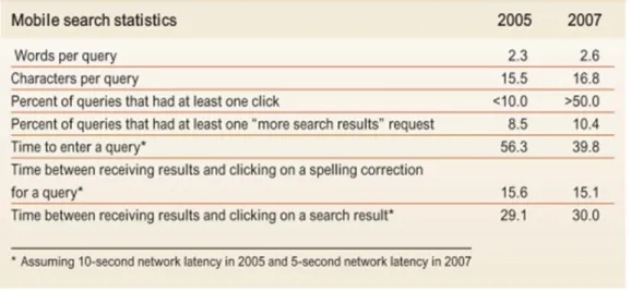
Table 1-3. Summary of mobile search statistics in 2005 and 2007. Reprinted from “A large scale study of wireless search behavior: Google mobile search,” by M. Kamvar and S. Baluja, 2006, . Proceedings of the SIGCHI conference on Human Factors in computing systems. Montréal, Québec, Canada. Copyright 2006 by the ACM Press. Reprinted with permission. ... 62
Table 1-4. The top five categories in mobile search. Reprinted from “A large scale study of wireless search behavior: Google mobile search,” by M. Kamvar and S. Baluja, 2006, . Proceedings of the SIGCHI conference on Human Factors in computing systems. Montréal, Québec, Canada. Copyright 2006 by the ACM Press. Reprinted
with permission. ... 64
Table 1-5. Comparison with USA mobile search study (*=subcategories were used). Reprinted from “A study of mobile search queries in Japan,” by Baeza-yates, R., Dupret, G., & Velasco, J. (2007), Social and Technological Challenges. WWW 2007 Workshop. Copyright 2007 by Baeza-yates, R., Dupret, G., & Velasco, J.. Reprinted with permission. ... 66
Table 1-6. Mobile search engine usage in order of popularity. Reprinted from “Mobile Information Access: A Study of Emerging Search Behavior on the Mobile Internet”, by Church, K., Smyth, B., Cotter, P., & Bradley, K. (2007). ACM Transactions on the
Web1(1). Copyright 2007 by ACM Press. Reprinted with permission. ... 68
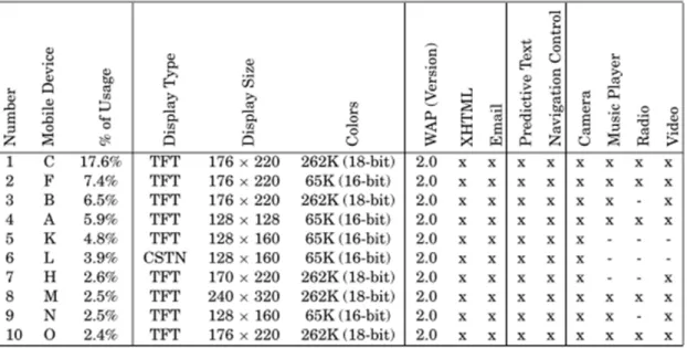
Table 1-7. Top-10 mobile devices used in browsing sessions. Reprinted from “Mobile Information Access: A Study of Emerging Search Behavior on the Mobile Internet”, by Church, K., Smyth, B., Cotter, P., & Bradley, K. (2007). ACM Transactions on the
Web1(1). Copyright 2007 by ACM Press. Reprinted with permission. ... 69
Table 1-8. Top-10 mobile devices used in search sessions. Reprinted from “Mobile Information Access: A Study of Emerging Search Behavior on the Mobile Internet”, by Church, K., Smyth, B., Cotter, P., & Bradley, K. (2007). ACM Transactions on the
Web1(1). Copyright 2007 by ACM Press. Reprinted with permission. ... 70
Table 1-9. Query Distribution. Reprinted from “Deciphering Mobile Search Patterns: A Study of Yahoo! Mobile Search Queries,” by Yi, J., Maghoul, F., & Pedersen, J., (2008), Proceeding of the 17th international conference on World Wide Web,
257-266. Beijing, China. Copyright 2008 by the ACM Press. Reprinted with permission. ... 71
Table 1-10. Mobile Query Categorization. Reprinted from “Deciphering Mobile Search Patterns: A Study of Yahoo! Mobile Search Queries,” by Yi, J., Maghoul, F., & Pedersen, J., (2008), Proceeding of the 17th international conference on World Wide Web, 257-266. Beijing, China. Copyright 2008 by the ACM Press. Reprinted with
xvi
Table 1-11. International Mobile Query Categorization. Reprinted from “Deciphering Mobile Search Patterns: A Study of Yahoo! Mobile Search Queries,” by Yi, J., Maghoul, F., & Pedersen, J., (2008), Proceeding of the 17th international conference on World Wide Web, 257-266. Beijing, China. Copyright 2008 by the ACM Press. Reprinted with
permission. ... 72
Table 1-12. A comparison of summary statistics (approximate) for existing mobile search studies. Reprinted from Church, K., Smyth, B., Bradley, K., & Cotter, P. (2008). A Large Scale Study of European Mobile Search Behaviour. Proceedings of the 10th international conference on Human computer interaction with mobile devices and services, 13-22. Amsterdam, The Netherlands,: ACM Press. Copyright 2008 by the ACM Press. Reprinted with permission. ... 73
Table 1-13. Single-session user statistics. Reprinted from Kamvar, M., Kellar, M., Patel, R., & Xu, Y. (2009). Computers and iPhones and Mobile Phones, oh my! Human Factors, 801-810. Copyright 2009 by the ACM Press. Reprinted with permission. ... 75
Table 1-14. Results of classifying diary entries by intent and Percentage of diary entries associated with each goal/intent(i.e. informational, geographical, and PIM). Non-mobile refers to entries generated while the user is at home, at work or in college, while mobile refers to entries generated in all other instances, e.g. commuting, traveling, etc, respectively. Reprinted from Church, K., & Smyth, B. (2009). Understanding the Intent Behind Mobile Information Needs. IUI'09, 247-256. Copyright 2009 by Church & Smyth. Reprinted with permission. ... 77
Table 1-15. Results of classifying diary entries by intent and Percentage of diary entries associated with each goal/intent(i.e. informational, geographical, and PIM) by the location context (i.e. mobile and non-mobile). Non-mobile refers to entries generated while the user is at home, at work or in college, while mobile refers to entries generated in all other instances, e.g. commuting, traveling, etc, respectively. Reprinted from Church, K., & Smyth, B. (2009). Understanding the Intent Behind Mobile Information Needs. IUI'09, 247-256. Copyright 2009 by Church & Smyth. Reprinted with permission. ... 77
Table 1-16. Results of classifying diary entries by topics. Reprinted from Church, K., & Smyth, B. (2009). Understanding the Intent Behind Mobile Information Needs. IUI'09, 247-256. Copyright 2009 by Church & Smyth. Reprinted with permission. ... 78
Table 1-17. Typical tasks broken down by display device and general usability. ... 83
Table 2-1. Detail of data collection elements and their type, vehicle for collection and format. ... 109
Table 3-1. Summary of data by task type. ... 110
Table 3-2. Detailed summary of data elements. ... 111
Table 3-3. Group membership. ... 112
Table 3-4. Summary statistics on data used in task execution time models. ... 113
xvii
Table 3-6. Summary of task execution time error trials. ... 116
Table 3-7. Six steps of the modeling process. ... 117
Table 3-8. Generic example of model results presentation. The syntax for the models includes indication of the fixed effects either interacting (*) or taken individually (+). 118
Table 3-9. Generic example of post-hoc Tukey comparison results. In this table the * indicates significance to the .05 level. ... 119
Table 3-10. Overall means and variances for the Within Document task execution time data. ... 120
Table 3-11. Summary of the best fit model for the Within Document task execution time data. The syntax for the models includes indication of the fixed effects either
interacting (*) or taken individually (+). ... 121
Table 3-12. Post-hoc Tukey comparison results. In this table the * indicates
significance to the .05 level. ... 121
Table 3-13. Overall means and variances for the Within Document task execution time pagination technique data. ... 123
Table 3-14. Means and variances for the Within Document task execution time by pagination technique and display device. ... 123
Table 3-15. Means and variances of Within Document task execution time for each pagination technique by group membership, gender and display device. ... 124
Table 3-16. Summary of the best fit model for the Within Document task load data. Note that there is only one variable in the final model: display device. ... 126
Table 3-17. Post-hoc Tukey comparison results for the Within Document task load data. ... 127
Table 3-18. Summary of Within Document Pagination Technique task load Pairwise Regression tests of significance results (shaded areas are significant). D=desktop, T=tablet, M=mobile, C=computer science, I=information science, O=other,
F=female, M=male. ... 130
Table 3-19. Summary of the best fit model for the Within Document usability data. . 133
Table 3-20. Post-hoc Tukey comparison results for the Within Document usability data. ... 133
Table 3-21. Overall means and variances for the Known Item task execution time data. ... 138
xviii
Table 3-23. Post-hoc Tukey comparison results for the Known Item task execution time data. ... 139
Table 3-24. Means and variances for Known Item task execution time data with
adjusted time. ... 140
Table 3-25. Summary of the best fit model for the Known Item task execution time data using adjtime. ... 141
Table 3-26. Post-hoc Tukey comparison results for the Known Item task execution time data using adjtime. ... 141
Table 3-27. Means and variances for Known Item task execution time data generic versus mobile website. ... 142
Table 3-28. Summary of the best fit model for the Known Item task execution time data generic versus mobile website. ... 143
Table 3-29. Summary of the post-hoc Tukey tests of significance for the variable components of the best fit model for the Known Item task execution time data
generic versus mobile website. ... 143
Table 3-30. Means and variances for Known Item task execution time data generic versus mobile website with adjtime. ... 144
Table 3-31. Summary of the best fit model for the Known Item task execution time data on generic versus mobile website using adjtime. ... 144
Table 3-32. Summary of the post-hoc Tukey tests of significance for the variable components of the best fit model for the Known Item task execution time data on
generic versus mobile website using adjtime. ... 145
Table 3-33. Summary of the best fit model for the Known Item task load data. ... 146
Table 3-34. Post-hoc Tukey comparison results for the Known Item task load data. . 147
Table 3-35. Summary of the best fit model for the Known Item task load data on
generic versus mobile website. ... 148
Table 3-36. Summary of the post-hoc Tukey tests of significance for the variable components of the best fit model for the Known Item task load data on generic
versus mobile website. ... 149
Table 3-37. Summary of Known Item Generic versus Mobile Website task load
Pairwise Regression tests of significance results (shaded areas are significant). ... 150
Table 3-38. Summary of the best fit model for the Known Item usability data. ... 152
Table 3-39. Post-hoc Tukey comparison results for the Known Item usability time data. ... 152
xix
Table 3-41. Means and variances for Exploratory task execution time data. ... 160
Table 3-42. Summary of the best fit model for the Exploratory task execution time data. ... 161
Table 3-43. Post-hoc Tukey comparison results for the Exploratory task execution time data. ... 161
Table 3-44. Summary of the best fit model for the Exploratory task load data. ... 164
Table 3-45. Post-hoc Tukey comparison results for the Exploratory task execution time data. ... 165
Table 3-46. Summary of the best fit model for the Exploratory usability data. ... 167
Table 3-47. Post-hoc Tukey comparison results for the Known Item usability time data. ... 168
Table 3-48. Summary of 21 responses to questions regarding preferred pagination technique. ... 173
Table 3-49. Remaining comments (8) regarding preferred pagination technique. ... 174
Table 3-50. Reported likes and dislikes per participant. ... 177
Table 3-51. Significant results by task type (WD=Within Document, KI=Known Item and EXP=Exploratory) and display device (D=desktop, T=tablet and M=mobile). ... 181
xx
List of Figures
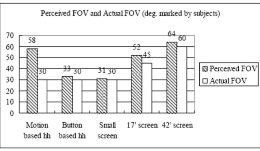
Figure 1-1. Broadband penetration and traffic for Wireline and Mobile data networks in the US (1996-2013). Reprinted from Chetan Sharma Consulting. Copyright 2009 by Chetan Sharma Consulting. Reprinted with permission. ... 5
Figure 1-2. Perceived FOV (marked by subjects). Left is the perceived and right is the actual. Reprinted from “Hand-held Virtual Reality: A Feasibility Study,” by Hwang, J., Jung, J., & Kim, G. J., (2006), VRST '06: Proc. ACM Symp. on Virtual Reality Software and Technol., pp. 356-363. Copyright 2006 ACM Press. Reprinted with
permission. ... 24
Figure 1-3. Time to query. Graph of the time it takes to enter a query versus the length of the query. Reprinted from “A large scale study of wireless search behavior: Google mobile search,” by M. Kamvar and S. Baluja, 2006, . Proceedings of the SIGCHI conference on Human Factors in computing systems. Montréal, Québec,
Canada. Copyright 2006 by the ACM Press. Reprinted with permission. ... 63
Figure 1-4. Reduction in query-entry time due to faster typing. It took less time in 2007 to enter a query than it did in 2005.. Reprinted from “A large scale study of wireless search behavior: Google mobile search,” by M. Kamvar and S. Baluja, 2006, . Proceedings of the SIGCHI conference on Human Factors in computing systems. Montréal, Québec, Canada. Copyright 2006 by the ACM Press. Reprinted with
permission. ... 65
Figure 1-5. A comparison between daily search and browsing sessions in terms of session duration, bytes downloaded, and numbers of requests. Reprinted from “Mobile Information Access: A Study of Emerging Search Behavior on the Mobile Internet”, by Church, K., Smyth, B., Cotter, P., & Bradley, K. (2007). ACM Transactions on the Web1(1). Copyright 2007 by ACM Press. Reprinted with
permission. ... 67
Figure 1-6. Average number of sessions and percentage sessions per S-User and B-User per day. Reprinted from “Mobile Information Access: A Study of Emerging Search Behavior on the Mobile Internet”, by Church, K., Smyth, B., Cotter, P., & Bradley, K. (2007). ACM Transactions on the Web1(1). Copyright 2007 by ACM Press. Reprinted with permission. ... 68
Figure 1-7. Titled “The Paradox of Technology”. Reprinted from Mahler, T., & Weber, M. (2008). Mobile Device Interaction in Ubiquitous Computing. Computing. Advances in Human-Computer Interaction, 311-330. Copyright 2008 by Mahler &
Weber. Reprinted with permission. ... 86
Figure 2-1. Flowchart of the Experimental Procedure. ... 91
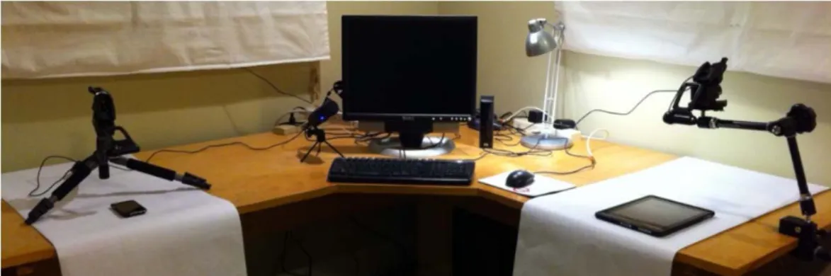
Figure 2-2. Picture of sample setup to show basic configuration of devices. ... 93
xxi
Figure 2-4. Screen shot of participant performing a known item task on the iPad. Taken from actual data captured to illustrate the video that was reviewed for task
trial performance. ... 94
Figure 2-5. Screen shot of participant performing an exploratory task on the iPod. Taken from actual data captured to illustrate the video that was reviewed for task
trial performance. ... 95
Figure 2-6 (a)-(d). Example of Within Document task. The sequence of steps is provided in a, the first step; locating the heading is demonstrated in b, the second step; locating the subheading is demonstrated in c; and the final step, find the
missing information, is demonstrated in d. ... 98
Figure 2-7 (a)-(f). Example of Known Item task. This example is using the mobile version of web site in the Safari browser. Sequence of steps provided on task prompt in (a). ... 101
Figure 2-8. Example of Exploratory task prompt. ... 102
Figure 3-1. Box plot of Within Document task execution time data by display device (D=desktop, T=Tablet and M=mobile). ... 120
Figure 3-2. Box plot of Within Document task execution time data by pagination technique and display device (AP.D=paging on the desktop, S.D=scrolling on the desktop, AP.T=paging on the tablet, S.T=scrolling on the tablet, AP.M=paging on the mobile and S.M=scrolling on the mobile). ... 122
Figure 3-3. Within Document task load responses by display device and question and question and display device (PP=poor performance, M=mental load, F=frustration
and E=effort). ... 125
Figure 3-4. Box plot of Within Document task load data by display device
(D=desktop, T=Tablet and M=mobile). ... 126
Figure 3-5. Within Document task load responses display device, pagination
technique and question, (S=scrolling, P=paging and PP=poor performance, M=mental load, F=frustration and E=effort). ... 128
Figure 3-6. Detail and summary characteristics for Within Document task load
pagination technique data. (P.D=paging on the desktop, S.D=scrolling on the desktop P.T=paging on the tablet, S.T=scrolling on the tablet, P.M=paging on the mobile and S.M=scrolling on the mobile). ... 129
Figure 3-7. Comparison of Within Document task load pagination technique by display device and question, E=effort, F=frustration, M=mental load, PP=poor
performance. ... 130
Figure 3-8. Within Document usability responses by display device and question. .... 132
xxii
Figure 3-10 (a), (b), and (c). Side-by-side boxplots of Within Document task execution time (TET), task load (TLX) and Usability data by display device
(D=desktop, T=tablet and M=mobile). ... 134
Figure 3-11 (a) and (b). Boxplots of Within Document task execution time (TET) and task load (TLX) data by display device and pagination technique (P.D=paging on the desktop, S.D=scrolling on the desktop P.T=paging on the tablet, S.T=scrolling on the tablet, P.M=paging on the mobile and S.M=scrolling on the mobile). ... 136
Figure 3-12. Box plot of Known Item task execution time data by display device
(D=desktop, T=Tablet and M=mobile). ... 138
Figure 3-13. Box plot of Known Item task execution time data with adjusted time by display device (D=desktop, T=Tablet and M=mobile). ... 140
Figure 3-14. Box plot of Known Item task execution time data generic (G) versus mobile (M) website data. ... 142
Figure 3-15. Box plot of Known Item task execution time data generic versus mobile website using adjtime by display device (D=desktop, T=Tablet and M=mobile). ... 144
Figure 3-16. Known Item task load Responses by display device and question,
E=effort, F=frustration, M=mental load and PP=poor performance. ... 145
Figure 3-17. Box plot of Known Item task load data by display device (D=desktop, T=Tablet and M=mobile). ... 146
Figure 3-18. Known Item task load Responses by generic versus mobile website and question. ... 147
Figure 3-19. Detail and summary characteristics for Known Item task load for
generic (G) versus mobile (M) website data. ... 148
Figure 3-20. Comparison of Known Item task load generic versus mobile website by question. ... 149
Figure 3-21. Known Item Usability responses by display device and question and
question and display device. ... 151
Figure 3-22. Detail and summary characteristics for Known Item usability data by display device (D=desktop, T=Tablet and M=mobile). ... 152
Figure 3-23 (a), (b), and (c). Side-by-side boxplots of Known Item task execution time (TET), task load (TLX) and Usability data by display device (D=desktop, T=tablet and M=mobile). ... 153
Figure 3-24. Boxplots of Known Item task execution time (TET), data for both time and adjtime by display device (D=desktop, T=tablet and M=mobile). ... 155
xxiii
Figure 3-26. Box plot of Exploratory task execution time data by display device
(D=desktop, T=Tablet and M=mobile). ... 160
Figure 3-27. Boxplot of Exploratory task execution time by display device and search exploration style (FL.D=Followed links on the desktop, SR.D=Search results on the desktop, FL.T= Followed links on the tablet, SR.T=Search results on the
tablet, FL.M= Followed links on the mobile, SR.M=Search results on the mobile). ... 162
Figure 3-28. Exploratory task load Responses by display device and question. ... 163
Figure 3-29. Detail and summary characteristics for Exploratory task load data by display device (D=desktop, M=mobile and T=Tablet). ... 164
Figure 3-30. Boxplot of Exploratory task load data by display device and search exploration style (FL.D=Followed links on the desktop, SR.D=Search results on the desktop, FL.T= Followed links on the tablet, SR.T=Search results on the tablet, FL.M= Followed links on the mobile, SR.M=Search results on the mobile). ... 165
Figure 3-31. Exploratory Usability responses by display device and question. ... 166
Figure 3-32. Detail and summary characteristics for Exploratory Usability data by display device (D=desktop, M=mobile and T=Tablet). ... 167
Figure 3-33. Boxplot of Exploratory Usability data by display device and search exploration style (FL.D=Followed links on the desktop, SR.D=Search results on the desktop, FL.T= Followed links on the tablet, SR.T=Search results on the tablet, FL.M= Followed links on the mobile, SR.M=Search results on the mobile). ... 168
Figure 3-34 (a), (b), and (c). Side-by-side boxplots of Exploratory task execution time (TET), task load (TLX) and Usability data by display device (D=desktop, T=tablet and M=mobile). ... 169
Figure 3-35 (a), (b), and (c). Side-by-side boxplots of Exploratory task execution time (TET), task load (TLX) and Usability data by display device and search
exploration style (FL.D=Followed links on the desktop, SR.D=Search results on the desktop, FL.T= Followed links on the tablet, SR.T=Search results on the tablet, FL.M= Followed links on the mobile, SR.M=Search results on the mobile). ... 171
Figure 3-36 (a) and (b). Boxplots of task execution time (TET) data across task types (WD=Within Document, KI=Known Item and EXP=Exploratory) overall and by participant. ... 179
Figure 3-37. Boxplots of task execution time data across task types (including
xxiv
List of Abbreviations and Terms
Concept Definition
Cellphone Cellular telephone, also known as a mobile phone and differentiated somewhat from smartphones and PDAs
Cellular/mobile networks
radio network distributed over land using base stations/cell towers to create an area of radio availability for portable transceivers (like mobile devices)
Generations of this technology include: 1G (analog, 1981) > 2G (digital, 1992) > 3G (multi-media support and 200kb/s, 2002) > 4G (IP packet switched, gigabit speeds, multi-carrier, to be released))
clamshell mobile phone form factor that closes via a hinge (flip)
CMN GOMS original Card Moran and Newell Goals Operators Methods and Selection Rules Theory; used to disambiguate other versions of GOMS
CogTool CogTool is a general purpose UI prototyping tool with a difference - it automatically evaluates your design with a predictive human performance model (a "cognitive crash dummy"). (http://cogtool.hcii.cs.cmu.edu/)
CPM GOMS Bonnie John and John Kieras’s proposed revision to GOMS to include Cognitive-Perceptual Motor attributes
DigitalDesk developed by Pierre Wellner in 1991, the DigitalDesk
included a typical work desk, a camera, an LED pen and (in a more advanced version) a computer-driven projector
EXP Exploratory portion of the project
Gaming device a mobile device oriented toward gaming
generic website Unmodified web site accessible using the browser of any display device
goal according to Xie (2009), goal can be any of the following: a. Long-term goal refers to a user’s personal goal that
xxv
b. Leading search goal refers to a user’s current task-related goal that leads to a search (e.g. writing a paper).
c. Current search goal refers to the specific search results a user intends to obtain (e.g. find relevant literature on task).
d. Interactive intentions refer to sub-goals that a user must achieve to accomplish their current search goal. Task and goal are inseparable in the information-seeking and -retrieving process.
GOMS Goals Operators Methods Selection Rules
GUI Graphical user interface
Identical query a query within a session that is a copy of a previous query within that session
Jansen, Spink and Pedersen (2005) based on Jansen and Pooch (2001)
Information behavior the totality of human behavior in relation to sources and channels of information, including both active and passive information seeking, and information use. Thus, it includes face- to-face communication with others, as well as the passive reception of information as in, for example, watching TV advertisements, without any intention to act on the information given.
Wilson (2000)
Information searching
behavior the ‘micro-level’ of behavior employed by the searcher in interacting with information systems of all kinds. It consists of all the interactions with the system, whether at the level of human computer interaction (for example, use of the mouse and clicks on links) or at the intellectual level (for example, adopting a Boolean search strategy or
determining the criteria for deciding which of two books selected from adjacent places on a library shelf is most useful), which will also involve mental acts, such as judging the relevance of data or information retrieved.
Wilson (2000)
Information seeking behavior
the purposive seeking for information as a consequence of a need to satisfy some goal. In the course of seeking, the individual may interact with manual information systems (such as a newspaper or a library), or with computer-based systems (such as the World Wide Web).
xxvi Information use
behavior consists of the physical and mental acts involved in incorporating the information found into the person's
existing knowledge base. It may involve, therefore, physical acts such as marking sections in a text to note their
importance or significance, as well as mental acts that involve, for example, comparison of new information with existing knowledge.
Wilson (2000)
Initial query the first query submitted in a session
Jansen, Spink and Pedersen (2005) based on Jansen and Pooch (2001)
Initial query stage stage in which the search strategy is constructed Rieh and Xie (2006) based on Efthimiadia (1993)
interaction device Device used to interact in a human computer system; includes input and output display devices
interaction style According to Shneiderman (1997) and Preece (1994), the basic forms of interaction style include command language, natural language, form fill in, menu selection, direct
manipulation, and virtual reality
interaction technique Method of using an interaction device to perform a task
ISO 9241-11 usability standard which provides guidance on the extent to which a product can be used by specified users to achieve specified goals with effectiveness, efficiency and satisfaction in a specified context of use
Information search process (ISP)
introduced by Kuhlthau (1991), The Information Search Process (ISP) is a six-stage process that information seekers go through when seeking information. The six stages include Stage 1: Initiation, Stage 2: Selection, Stage 3: Exploration, Stage 4: Formulation, Stage 5: Collection, and Stage 6: Presentation.
Keyboard (varieties) main input device for computers; based on a typewriter keyboard, a set of buttons or keys which produce or
correspond with letters, numbers, symbols or actions when pushed or touched. Variants include: full sized, laptop sized, thumb sized, numeric, chorded, soft, and projection among others.
Keyboard (layouts) any specific mechanical (ANSI, ISO, JIS), visual or
xxvii
are very similar across devices and languages with the exception of mobile devices which have several variants. Visual layout is language dependent and functional layout is software dependent. For most Latin script languages a QWERTY style keyboard is used.
Keypad (numeric and alphanumeric)
set of buttons arranged in a block or pad with number letters and some symbols. Modeled after telephones, use of keypads on a mobile phone for text input requires either single tap, multi-tap or predictive text entry.
KI Known Item portion of the project
KLM Keystroke Level Model, the simplest of the GOMS variants
MDITIM Minimal Device Independent Text Input Method introduced by Isokoski and Raisamo (2001)
Microsoft surface Microsoft’s multi-touch enabled computing surface released in 2008 and designed for multi-user gestural recognition computing
mobile device Any of a number of devices designed for use in a mobile context
mobile website A form of a generic website tailored to a mobile device
Multimedia device mobile device which supports interaction with multimedia (music, images, movies, and games, etc.), typically an iPod or similar
Multi-point interface which allows user to interact via multiple points— allows parallel processing of information from multiple points and supports bimanual input; see also multi-touch
multi-touch Describes a touchscreen capable of receiving input from three or more distinct touches; has properties of multi-point devices
netbook small lightweight and inexpensive laptop designed for web based use (to augment other computing devices)
xxviii
pagination technique Technique used, whether scrolling or paging, to look for information
PDA Personal digital assistant, the precursor to modern smartphones
predictive text Single keypress of the keypad of a mobile phone for commonly used words (rather than multipress)
QGOMS Quick (and dirty) Goals Operators Methods and Selection Rules (Beard, Smith & Denelsbeck, 1996)
Query The entire string of terms submitted by a searcher in a given instance
Jansen, Spink and Pedersen (2005) based on Jansen and Pooch (2001)
QWERTY Modern day keyboard layout that takes it’s name from the first six keys in the upper left corner of the keyboard
RSVP Rapid serial visual presentation; displaying text in a fixed position
Reformulation query
stage stage in which the initial query is adjusted manually or with the assistance of a system Rieh and Xie (2006) based on Efthimiadia (1993)
Repeat query a query submitted more than once, irrespective of the user Jansen, Spink and Pedersen (2005) based on Jansen and Pooch (2001)
Search move an identifiable thought or action that is a part of information searching
Bates (1990)
Search stratagem a complex of a number of moves and/or tactics and generally involves both a particular identified information search domain anticipated to be productive by the searcher, and a mode of tackling the particular file organization of that domain
Bates (1990)
Search strategy a plan which may contain moves, tactics and/or strategems for an entire information search
Bates (1990)
xxix related
Bates (1990)
search term Specific word or phrase used in a search
Session the entire series of queries submitted by a user during one interaction with the Web search engine
Jansen, Spink and Pedersen (2005) based on Jansen and Pooch (2001)
simple search Can mean either an uncomplicated search goal or an uncomplicated search term or an uncomplicated search process
(Jansen, Booth and Smith, 2009)
smartphone Synonymous with converged device, preceded by a PDA and differentiated from a cellphone
Softkey programmable key such as the F key of a keyboard; typically in use near the display of a mobile device
tablet computer A laptop equipped with a stylus and/or touchscreen
Task what someone does to achieve a goal
(Xie, 2009 referencing Hackos and Redish, 1998, p. 56)
task card Card used to guide user in the performance of a task trial
task trial A single run of a task type (WD, Known Item or EXP) in this study
task type One of the searching task types in this study: Within Document (WD), Known Item (KI) or Exploratory (EXP)
Term Any series of characters separated by white space or other separator
Jansen, Spink and Pedersen (2005) based on Jansen and Pooch (2001)
Touch sensitive responding to touch as in touchscreens
Transaction log
analysis the study of electronically recorded interactions between on-line information retrieval systems and the persons who search for information found in those systems.
xxx
word completion Automatic completion of commonly used words in text entry (or suggestion of possible terms in a list)
word prediction Automatic prediction of possible words from a list that refines as the user types
Work task a work task represents a task that leads to information searching
(Xie, 2009)
WD Within Document portion of the project
Wifi Term used in advertising any wireless local area network capable device based on the IEEE 802.11 standard
1
Introduction and Background
While mobile devices and desktop systems are ubiquitous, a new class of tablet-sized computing devices has emerged like the Apple iPad. Despite the growing number of devices of different screen size and interaction technique, little is known about the degree to which a commensurate experience for a given task can be accomplished on all three of these classes of display devices (mobile, tablet and desktop system). Previous studies have indicated that small screen size is a significant impediment in task
execution. To some extent, recent improvements in interaction technique (direct
manipulation including multi-touch and gestures) can help overcome this. Comparisons of similar tasks across these three platforms to elicit the degree to which task
performance is the same or different and why, are important.
The majority of mobile device users are still largely using them for voice
communication, text messaging and personal information management but smartphone use for web browsing and information search is increasing (Keinänen, 2011). The fastest growing sector of the mobile industry, smartphone users are trying more and more to perform tasks that they typically do at the desktop (Kamvar, Kellar, Patel and Xu, 2009). New smartphone designs involving larger, high resolution displays combined with multi-touch interaction help make important strides in reducing the overall
2
As small form factor display devices become ubiquitous, specialized applications that leverage the resident featureset of these display devices have increased. Although they offer sometimes significant improvements in usability, specialized applications can be associated with other types of usability ‘overhead’ like application and library
management as well as novel interaction. Browsers appear to still be an important choice, even for smartphone users, because they are consistent across platforms AND they leverage much of the resident featureset of each display device. They are
increasingly end user customizable while at the same time they serve as standardized portals for serving up content.
The integration of these devices into the existing work patterns of users has altered the overall level of experience with them as users move quickly from novice to advanced and then expert use. As a product of this shift, users are increasingly attempting to complete work related tasks using a variety of computing devices. System designers and content developers are taking myriad approaches to support movement across devices (Keinänen, 2011). As demand increases, shifts in the software development arena and corresponding changes in content development are also occurring (Keinänen, 2011). This can result in a specific application interface for each display device or a mobile-centric browser interface. Uniformly, access via the traditional browser interface(s) is becoming increasingly ‘acceptable.’ (Maurer, et al., 2010)
While the desktop remains the gold standard for most tasks due to display size and interaction style, new display devices with touch interaction and high quality small (or smaller) displays make performing tasks typically relegated to the desktop
achievable for the first time. Coupled with improved processing speeds and shorter latency times, users are increasingly attempting to perform searching tasks similar to those done at the desktop on a variety of smaller form factor display devices,
3
areas of computing development currently. Much work has been done in the area of interaction techniques to compensate for small screen size on mobile devices. Little research has been done to date comparing execution times for searching tasks across devices of differing display sizes and interaction techniques.
1.1
Mobile Context
Modeled after the desktop calculator, music players like the Sony Walkman introduced in 1979-80 made the music experience highly personal and private. The advent of personal organizers like the Apple Newton (way ahead of its time in 1993) and the Palm Pilot (1996), took the notion of a pocket–sized paper-based organizer and calendar and made it digital. Initially, the one big drawback to this was the lack of a connection to any network and some technical difficulty synchronizing data with the desktop. Moreover, once the PDA existed, it was evident that the newly popularized cellular phone could easily be merged with a PDA to create a ‘converged device’. Though the first of these emerged in 1992 (IBM Simon), their success in US markets came with the introduction of the Handspring Treo in 2002 which merged the popular Palm OS features, phone features and a full keyboard with wireless web browsing.
4
“Mobile cellular has been the most rapidly adopted technology in history. Today it is the most popular and widespread personal technology on the planet, with an
estimated 4.6 billion subscriptions globally by the end of 2009.” (International Telecommunications Union (ITU) Measuring the Information Society (MIS) Executive Summary, 2010, pg. 1) In this information age, the typical consumer is regularly overwhelmed with options for hardware, software and peripherals. The number of available types of mobile devices alone has climbed into the thousands in the US with wide ranges in capability, features, interaction device and style, display size,
communications options and form factor. Why then, do these devices not adhere to some basic standards for operation, use and evaluation?
In 2009, a report from the Interactive Data Corporation indicated that the
number of people accessing the internet by 2013 will reach 2.2 billion compared with 1.6 billion (24% of Earth’s total population at the time) in 2009 (IDC, 2009). The mode of access, traditionally through desktop or laptop computers, however, is changing. According to the same report, “over 450 million users sought access to the Internet through mobile devices this year”, the article also asserts that 1 billion mobile devices will be used to access the internet by 2013 (IDC, 2009).
According to a recent Pew Internet and American Life survey (2009), of the 83% of US adults with cellphones, 35% have accessed the internet via their phone. The same survey indicated that 32% of Americans have used a mobile phone to access the
5
year-olds where one in three lived among the wireless only households (Blumberg and Luke, 2008).
The first of the cellular networks emerged in the late 1970s and they have continued to rapidly evolve from analog (1G) to digital (2G) to wideband mobile (3G) and, recently, broadband mobile (4G) has emerged. The current expectation is that 4G will offer ‘anytime, anywhere’ access for voice, data and multimedia. Carriers launched 4G networks in 2011. Figure 1—1 from Sharma (2009) helps demonstrate how wireline and mobile technologies have developed and may be developing.
Figure 1-1. Broadband penetration and traffic for Wireline and Mobile data networks in the US (1996-2013). Reprinted from Chetan Sharma Consulting. Copyright 2009 by
Chetan Sharma Consulting. Reprinted with permission.
6
skipping landline phone technology with the development of mobile phone infrastructure, bringing voice communication to places that have not had ready access as well as
internet access, albeit unreliably and without any training or prior exposure.
In the late 1990’s mobile phones grew small enough to carry in a pocket. In the early 2000’s the PDA or personal digital assistant, a non-networked, non-communication ready device was introduced. As the decade wore on, the Smartphone was introduced— a converged device which offered both the computing power of a PDA and the
communications capability of a mobile phone. The earliest of these were clunky
(weight/size), tied to a given operating system (Palm OS) and offered novel (stylus) and often limited styles of interaction (keypad). Today there are thousands of mobile
devices available for use ranging from traditional, communications-oriented cell phones to feature phones and smartphones, multimedia players, gaming devices, etc.
It may be hard to overstate the advantages mobile devices have afforded the typical individual since they first became available. Initially used primarily for
emergency purposes, use has grown to a point where an increasing number of households maintain only a mobile phone for household use and no longer have a landline at all. Remote areas of the globe, where infrastructure for water/sewer and transportation alone have not been built out much less for telephone and electricity, can utilize mobile devices with longer battery life and cellular towers and practically leap beyond these infrastructure hurdles. If information access for all is the goal, mobile devices have done more toward achieving this than any other technology to date.
While the majority of mobile device users may be convinced about their virtue and remain steadfastly optimistic about the improvements they represent, there is a growing concern about their addictive nature. Instant access to information and
7
addition, these ‘wearable’ devices may also pose an electromagnetic radiation exposure risk in those who use them for long periods of time (Moulder, Foster, Erdreich, &
McNamee 2005). If indeed these devices and the ubiquitous electronic access (Mahler and Weber, 2008) they represent is here to stay, these problems and more will need to be addressed.
1.1.1 Comparative Studies
As a result of trends in the use of technology, in recent years, research on computing devices has evolved toward an increased focus on mobile devices and environments. While early studies focused on issues of adoption and usability, more recently studies have been emerging that attempt to address direct comparisons of specific features between or across a variety of devices.
Many comparison studies look at the advantages and/or disadvantages of using mobile devices versus a technology used prior (often paper and pen), of the utility of one device versus another or at adoption and ease of use. Some studies look at specific software comparisons or task comparisons, others at just a single function of the devices (display for example). Fewer studies look carefully at advantages mobile devices may have over other computing methods or at notions of equivalence beyond mobility. This is largely due to the fact that, until recently, more factors than display size and
interaction style were still central problems with mobile devices. While some issues like battery life and software availability have improved significantly, issues with network availability and processing speed remain, especially for more sophisticated tasks. Context, a crucial element of mobile technologies, is a great challenge to research and evaluation and existing theoretical frameworks are often thought to be inadequate or at least in need of modification(s) to fully address this.
Device variation has remained a significant challenge to software developers and many device comparison studies are aimed at reducing this design burden.
8
differing interaction styles and concluded that writing an application once (J2ME) and executing it on different platforms was achievable but that this may inherently be at a cost to usability. Chae and Kim (2003) describe an important relationship between small display size and horizontal depth when designing for small form factor devices. Moreover, their work helps identify significant differences in the perception of users of very small display devices where the cost of navigation is very high versus displays which facilitated fewer than four horizontal depths of navigation. Chan, Lam, Fang, Brzezinski, Zhou, and Xu (2002) compared a wireless application protocol (WAP)
browser, a Palm PDA browser and a PocketPC PDA browser in the usability of 10 wireless sites and found that designing for both the novice and experienced user was important, and that flattened sites which emulate that of a desktop system were more easily navigable. Since this early study, many of these issues have been aggressively addressed by software developers.
Domain or task specific comparisons, while more replete in the literature, suffer from a lack of generalizability. Clegg, Bruciatelli, Domingos, and Jones (2006)
conducted an interesting study of digital geological mapping using a Global Positioning System (GPS) on a PDA versus a TabletPC. While PDAs proved convenient for remote mapping, the TabletPC outperformed the PDA in most tasks. Small display and limited processing power were considered to be the significant inhibiting factors.
9
alternative ways of achieving desirable levels of speed and accuracy without regard to task.
Schulz (2007) outlines an important area of study, how well the predictive models of traditional desktop systems apply to the use of mobile devices. In his
dissertation work, Schulz (2008) created and investigated the use of KLM-Qt, a software application designed to facilitate recording of Keystroke Level Model (KLM, see List of Abbreviations and Terms for more details) operators ‘derived from events that are delivered to an interface’ (Schulz, 2008 p. 4). The second part of the study used the software to do a comparative study of three different devices, a Greenphone (keypad based), an iPhone and a Neo1973 (both touchscreen based). KLM Qt and hand generated KLM results from a series of 15 routine tasks ranging from creating a new address book entry to adding a meeting date/time were compared across the three devices. It was not possible to run KLM Qt on the iPhone so these models were generated by hand. The Neo1973, like the iPhone, employs a touchscreen so a new input operator called ‘I’ was added to the KLM model to handle text composition and ‘commitment’. No multi-touch gestures were used or studied in this work. Findings suggested that KLM is useful in predicting interaction times on mobile devices, though some question remained about the accuracy of the model for all types of interaction mobile devices typically facilitate.
10
Another important point drawn from this research regards the notion of the expert. In this study and others, an expert can be cultivated but it can be more difficult to retrain an expert. This is a significant barrier to making the transition from one device type to another. While many differences exist between devices, the similarities are important and may be suggestive of a trend toward ‘replacement use’ (of the desktop system) becoming increasingly plausible. There may also be an underlying ‘best in class’ set of features or device characteristics which reduce the burden of usability thereby increasing uptake for more sophisticated use(s).
The work of Kamvar, Kellar, Patel and Xu (2009) reinforces the notion that, for higher-end phones, what the user already knows about human computer interaction in terms of personalization and feature set in the desktop system can be leveraged to promote commensurate use of mobile devices. Their work also suggests that no single search interface is appropriate for the range of mobile phones available. The results of this work indicate that iPhone query formation is nearly similar to computer based query formation and that only a small percentage of these searches are locally oriented, that is specific to a geographic area, refuting the notion that mobile searching is largely locally based. Another important finding is that the ‘tail’, a measure of diversity in query formation, is longer among iPhone users than traditional mobile phone users and is increasingly comparable to computer based users among whom the ‘tail’ is the longest. The most interesting result in this work suggested that iPhone users, because of
11
Qiao, Feng and Zhu (2008) take an important approach in surveying existing research into interface design differences between desktop systems and mobile systems with particular emphasis on ways to improve the mobile user interface for web search. In particular, they examine leading display and serial display of query results taking into account optimal display speed and jump length for the human user. They found that providing the ability to pause, continue or stop functions, to allow fast page turning and the option of enlarging what is being displayed are important elements of design for mobile browsing.
Silvey, Macri, Lee and Lobach (2005) conducted a comparison study between a Palm PDA and a Windows TabletPC of the same clinical observation software for eye care. They used both focus groups and usability surveys to determine user preferences with specific regard to care setting. Their findings suggested that the TabletPC was preferred over the PDA and that display size was the most significant limitation of the PDA. Cost and weight were limitations of the TabletPC. While the researchers made every effort to create ‘functionally identical’ applications for both environments, the environments themselves may be so inherently different that this was itself a major factor. For example, the authors mention that on average a single screen of data on the TabletPC may be broken down into five screens on the PDA.
An interesting study by Toomey, Ryan, McEntee, Evanoff, Chakraborty, McNulty, Manning, Thomas and Brennan (2010) focuses on a comparison of monitors for
12
1.1.2 Important characteristics
There is a tension between what constitutes real innovation in HCI and what is more aptly described as innovation on a theme. Bill Buxton (2008b) describes this tension very succinctly by saying that technology innovations are simultaneously like a rocket and a glacier. The faster work, he argues, is more like variations on a theme to reduce cost and the slower technologies, while they may be truly innovative, take so much time to test and prepare for adoption that their ‘novelty’ has worn off by the time they are readily available.
Indeed, the critical innovations in mobile device design have yet to be made. While the concept of mobile devices is now no longer novel, the variations on a theme that exist in the market today do little to broach the incredible distance between user and device. The comparative studies outlined above draw our attention to the two remaining central issues with increased use of mobile devices: their display size and interaction style. These comparisons highlight a lack of strong evidence to help guide the use of specific devices in specific settings as well as the selection of the right device for a given task. As developers strive to add features which bring value to the user, devices become increasingly complex in their design and operation. This is often mistaken for improvements in functionality which few users really derive benefit from. On the other end, designers are also keenly aware that users derive significant benefits from efforts made to utilize HCI elements with which a broad user base is already familiar, like the keyboard and mouse.
13
1.1.3 This approach
We are reaching a critical point where the core capabilities of small scale devices have increased (battery life, usability, processing speed, network redundancy and availability and display quality), barriers to adoption have all but vanished and, unlike previously thought, use of these devices appears to be less and less task dependent. Many well tested evaluation methods have been used to analyze the usability of desktop computing systems though these same approaches have only just begun to be used in the study of mobile devices. As users migrate across devices and balance access with efficiency, it is imperative that we begin to understand and quantify the ways in which mobile devices perform in a manner commensurate with that of a traditional desktop or laptop system.
1.2
Display Size
Since the advent of the personal computer, the display has been a relatively fixed element of human computer interaction. Several key factors have played a role in
14
One significant development has been the miniaturization of the display. Initially, small displays were very simple like early televisions; but with technological
improvements, the field has grown unwieldy in terms of display options. Though devices with nearly every possible size of display exist in the computing arena, some small displays are beginning to approximate the quality of more traditional desktop and laptop displays. Display variations for use in cell phones, PDAs and smartphones, have grown most significantly in recent years and soon we can expect to see them employed in a wide variety of wearable devices (watches, etc.). This shift has occurred in large part because of a need to ‘go wireless’ or become no longer tethered to the desktop.
15
Table 1-1. Display Comparison Matrix.
Performance
Measurement Apple 30” Cinema Display Dell E178FP 17” Display iPad Tablet Apple iPod Touch
Size: typically measured on the diagonal but also in maximum width and height
29.7”
21.3 x 27.2 x 8.46 in 15 x 14.8 x 5.5 9.7” 9.56 x 7.47 x .5 in 3.5” 4.3 x 2.4 x 0.33 in
Type TFT-LED LCD display / TFT
active matrix
LED-Backlit IPS Display
LCD
color transflective TFT display
Support Multi-touch No No Yes Yes
Aspect ratio: ratio of
width/height, typically 4:3 4:3, 16:9 5:4 4:3 2 (horiz) 3 (vert)
Field of view: extent of
observable area 55 Not indicated Not indicated Not indicated
Resolution: in pixels or
dpi? 2560 x 1600 1280 x 1024 / 75 Hz 1024-by-768-pixel resolution at 132
pixels per inch (ppi)
320 × 480 pixel resolution at 163 pixels per inch (ppi) Dot pitch or pixel pitch
ratio: distance between pixels of the same color, the smaller the better
.250 mm .264mm 132 pixels/inch 164.6 pixels/inch
(0.15428
millimetre/pixel)
Color range 16.7 million 24-bit (16.7 million
colors)
Not indicated 262,144-color
Refresh rate: # times in a second that a display is illuminated (max by response time)
60 Hz Max Sync Rate (V x
H): 76 Hz x 81 kHz 60 Hz 2.5 Mbps, 30 frames per second
Response time: time for a
16
(active) to white (inactive)
Performance
Measurement Apple 30” Cinema Display Dell E178FP 17” Display iPad Tablet Apple iPod Touch
Contrast ratio: luminosity of brightest color (white) to darkest color (black)
700:1 800:1 Not indicated Not indicated
Luminance (measurable amount of light per given area)
115 cd/m2 300 cd/m2 Not indicated Not indicated
Brightness (perceived amount of light dim, bright, very bright given certain conditions)
400 cd/m2 300 cd/m2 Variable (responds
to sensors) and adjustable
Variable (responds to sensors) and
adjustable
Power consumption: watts 150W max on 40W on, 2W standby Up to 10 hrs when
fully charged Up to 6 hrs when fully charged
Viewing angle: max angle at which images on display can be viewed in degrees
178 (horizontal) 178
(vertical)
160 (horizontal)
160 (vertical)
178 Not indicated
Weight: dependent upon technology used (CRT much heavier than LCD)
27.5 lbs 10.1 lbs 1.5 – 1.6 lbs 4.05 ounces
Viewing distance 24” 24” 16” 12”
Cost: dependent upon
17
1.2.1 Factors: Resolution, Visual Acuity, and Field of View
It has long been thought that the most important factor in display quality was resolution. Early displays were riddled with communications issues like static,
interference and signal interruption. The cathode ray tube is now known more for its sheer size and weight than for anything else. As technologies have changed, display profiles have trimmed and optimal resolution has become a moving target. LCD and plasma displays now tout incredible resolutions but each come with tradeoffs in achieving this. More and more we move into the realm of emulating reality (and beyond) through displays and the advent of three dimensional display technologies is upon us.
But how much does resolution really matter? What about luminance, aspect ratio, brightness, contrast ratio, viewing angle, refresh rate and response time? Are there minimum standards which should apply to the manufacture of all displays? Beyond readability and accurate representation are notions like immersion and presence. Some researchers suggest that displays have evolved beyond the limits of human visual acuity (Raghunath, Narayanaswami, & Pinhanez, 2003). Others suggest that resolution and visual acuity do not matter as much as field of view for quality of experience and degree of immersion (Lin, Duh, Parker, Abi-Rached, and Furness, 2002). In the field of virtual reality, it could be argued that feelings of immersion are linked to interactivity (Hwang et al., 2006)
18
viewing capacity (at least for a certain viewing distance) by packing more pixels per inch (ppi, 326 for 4G and 130 for 3G). An improvement in the viewing angle and increase the contrast ratio are also enhancements in iPhone 4 display capabilities. In Table 1-2, the relative resolution of a variety of display devices is presented along with the
maximum possible display resolution according to human limitations.
Table 1-2. Current and maximum possible display resolution according to human limitations. Reprinted from “Fostering a Symbiotic Handheld Environment,” Raghunath, M., Narayanaswami, C., & Pinhanez, C. (2003). Copyright 2003 by Computer. Reprinted with permission.
Deering (1998) adds that a typical CRT is as immersive (in terms of resolution and FOV) as a head mounted display device. Note that the optimal FOV for the human eye as noted in the table can be ‘saturated’ by some of the visual configurations
currently being produced. As Deering states, due to advancements in visualization technologies, particularly as 3D graphics, frame rates and resolution improve, “The ultimate limits of human visual perception must now be included in hardware trade-offs” (Deering, 1998, p.1).