Full Terms & Conditions of access and use can be found at
http://www.tandfonline.com/action/journalInformation?journalCode=ycaj20
Download by: [178.63.86.160] Date: 21 June 2016, At: 10:40
The World of Mapping
ISSN: 0008-7041 (Print) 1743-2774 (Online) Journal homepage: http://www.tandfonline.com/loi/ycaj20
How to Assess Visual Communication of
Uncertainty? A Systematic Review of Geospatial
Uncertainty Visualisation User Studies
Christoph Kinkeldey, Alan M. MacEachren & Jochen Schiewe
To cite this article: Christoph Kinkeldey, Alan M. MacEachren & Jochen Schiewe (2014) How to Assess Visual Communication of Uncertainty? A Systematic Review of Geospatial Uncertainty Visualisation User Studies, The Cartographic Journal, 51:4, 372-386, DOI: 10.1179/1743277414Y.0000000099
To link to this article: http://dx.doi.org/10.1179/1743277414Y.0000000099
© The British Cartographic Society 2014 Published online: 01 Sep 2014.
Submit your article to this journal Article views: 1420
View related articles View Crossmark data
S U R V E Y
How to Assess Visual Communication of Uncertainty? A
Systematic Review of Geospatial Uncertainty Visualisation
User Studies
Christoph Kinkeldey
1, Alan M. MacEachren
2and Jochen Schiewe
11HafenCity University Hamburg, Lab for Geoinformatics and Geovisualization, U¨ berseeallee 16, Hamburg 20457, Germany.2GeoVISTA Center and Department of Geography, Penn State University, University Park, PA 16802, USA Email: [email protected]
For decades, uncertainty visualisation has attracted attention in disciplines such as cartography and geographic visualisation, scientific visualisation and information visualisation. Most of this research deals with the development of new approaches to depict uncertainty visually; only a small part is concerned with empirical evaluation of such techniques. This systematic review aims to summarize past user studies and describe their characteristics and findings, focusing on the field of geographic visualisation and cartography and thus on displays containing geospatial uncertainty. From a discussion of the main findings, we derive lessons learned and recommendations for future evaluation in the field of uncertainty visualisation. We highlight the importance of user tasks for successful solutions and recommend moving towards task-centered typologies to support systematic evaluation in the field of uncertainty visualisation.
Keywords: uncertainty, geovisualisation, information visualization, scientific visualization, evaluation, user studies
INTRODUCTION
All geospatial data contain uncertainty and ignoring this fact can have severe consequences for spatial analysis and decision making (Zhang and Goodchild, 2002). Past research has suggested that communicating information about data uncertainty has the potential to increase trust in the results when analyses are conducted (Fisheret al., 2012) and to support decision making that uses the data (Aerts
et al., 2003; Deitrick and Edsall, 2006; Leitner and Bu-ttenfield, 2000). Visualisation of uncertainty has attracted substantial attention over more than two decades. Much of the work has focused on developing typologies of un-certainty that represent various aspects of data and how it might be signified (Buttenfield and Weibel, 1988; Pang
et al., 1997; Sanyalet al., 2009; Thomsonet al., 2005) and on developing methods to depict uncertainty visually (e.g. Cedilnik and Rheingans, 2000; Ehlschlaegeret al., 1997; Sanyalet al., 2010; Wittenbrink et al., 1996). A compre-hensive review of uncertainty typologies is provided by MacEachren et al. (2005) and a review of uncertainty visualisation across science by Brodlie et al.(2012). From the broad literature, five common dichotomous categories for uncertainty visualisation can be identified:
N
explicit/implicitThis category distinguishes between directly expressing uncertainty, e.g. using glyphs that signify levels of
uncertainty (explicit) or signifying it indirectly, e.g. through multiple visualisations showing different possible outcomes (implicit) (Deitrick, 2012). Explicit depiction of uncer-tainty graphically is most common. Implicit unceruncer-tainty depiction is given less attention in the uncertainty visualisation literature.
N
intrinsic/extrinsicThis commonly used distinction was introduced by both Howard and MacEachren (1996) and Gershon (1998) in cartographic and information visualisation contexts, respec-tively.Intrinsictechniques alter the existing symbology to represent uncertainty, basically through manipulation of visual variables, e.g. colour value. In contrast to this,
extrinsicapproaches add new objects to the display to depict uncertainty, e.g. glyphs or grids.
N
visually integral/separableThe third dichotomy focuses on the visual cognitive response of the viewer: A visually integral signification of uncertainty cannot be perceptually separated from the data signification while a visually separablesignification can be read independently (MacEachren et al., 1998). These categories show some overlap with intrinsic/extrinsic because intrinsic methods tend to be visually integral and extrinsic ones visually separable, but there are exceptions. DOI: 10.1179/1743277414Y.0000000099
N
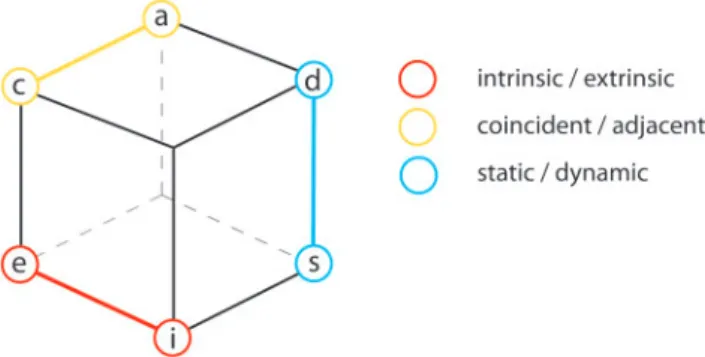
coincident/adjacentThis categorisation refers to view organisation, i.e. if data and uncertainty are represented in an integrated view (coincident) or in separate views (adjacent) (MacEachren, 1992).
N
static/dynamicThe distinction here is between a classicalstaticmap versus a dynamic map using animation and/or interactive controls. One example of the latter is dynamic alternation in which a map depicting the data is alternated with one depicting data uncertainty, often with user control (‘toggling’).
Based on these categories, we propose a structure to describe uncertainty visualisation approaches in a systematic way using the following three main dichotomies:
N
coincident/adjacent;N
intrinsic/extrinsic; andN
static/dynamic.We represent these three dichotomies as axes of an
Uncertainty Visualisation cube (UVis3, Figure 1). We left out ‘explicit/implicit’ and ‘integral/separable’ from the list, since most approaches are explicit. And, as already discussed, ‘visually integral/separable’ on the one hand corresponds to ‘intrinsic/extrinsic’ in most cases and on the other hand is a distinction focused on human visual processing rather than signification. Thus, the cube distinguishes eight main combinations that help us to discuss uncertainty visualisation approaches in a systematic way in the remainder of the paper.
As the range of methods for signifying uncertainty has grown, so has the need to assess their usability and applicability for various use contexts. This need has stimulated a range of studies focused on evaluating uncertainty visualisation methods, but the studies have been idiosyncratic, thus difficult to compare and develop generalisations from. To address this gap, we present a review of user studies directed to evaluation of uncertainty visualisation methods and tools. The first step is to give an overview of past research and summarize the state of the art in uncertainty visualisation assessment. In the second step,
after a critical review of existing studies and their findings, we derive lessons learned and recommendations for future work. Our focus lies on user studies from the early 1990s until the present that involve uncertainty visualisation in the domains of cartography and geovisualisation, scientific visualisation and information visualisation. We concentrate on visualisation of geospatial uncertainty, thus, this review is more comprehensive for studies that include some geo-graphic component than those that are primarily aspatial. Apart from that, we focus on empirical studies involving users, typically using metrics such as map reading accuracy and speed or user confidence. Studies that do not appear in our list include, e.g. conceptual evaluations that use heuristics derived from general guidelines and rules for data visualisation coined by Bertin, Tufte, Ware and Chambers (Riveiro, 2007a; Riveiro, 2007b; Wittenbrinket al., 1996; Zuk and Carpendale, 2006). Such studies, while not our focus here, do provide basic statements on the usability of different methods and therefore can help to choose suitable visualisation techniques. Another type of study we did not consider are case studies (without users involved) that demonstrate the basic usability and utility of a method (e.g. Allendes Osorio and Brodlie, 2008; Dooley and Lavin, 2007), sometimes in connection with assessing display performance (Rhodeset al., 2003).
Owing to the volume of literature, differences in goals and diversity of methods, this paper reviews and analyses studies focused on communicating uncertainty (together or separately from communicating data) and not on those that investigate uncertainty visualisation impacts on reasoning and decision making (which we will address in a follow up paper). Some studies contribute to both aspects and will thus appear in both papers.
This paper is organized as follows: In the section on ‘Analysis of the literature’, we describe the methodology of the review and outline the main characteristics of the studies. This includes the distribution of studies over the years, the types of uncertainty and the visualisation techniques that have been assessed, the kind of application domains the studies deal with, the groups of participants that were involved and the tasks that were conducted. In the section on ‘Discussion of findings’, we summarize and discuss the main findings of the studies, organized using the UVis3we introduced above. From the discussion, we derive lessons learned and identify open questions. In the conclusion, we summarize the main findings, discuss the limitations of the review and suggest future directions for evaluation of uncertainty visualisation.
ANALYSIS OF THE LITERATURE
In this section, we analyse the main characteristics of the user studies we included in the review; we have identified 44 studies described in 34 publications. Every sub-study that involved a different group of subjects was treated as a separate study, e.g. the Boukhelifa et al.’s (2012) paper contained six studies. We analysed each study by summar-izing its main characteristics such as the study methodol-ogy, the visualisation techniques used, the data and scenario that were involved and the reported findings. Based on this Figure 1. UVis3 (‘Uncertainty Visualisation cube’) for
categorisa-tion of uncertainty significacategorisa-tion in visualisacategorisa-tions
description, we were able to make comparisons and thus identified commonalities and differences.
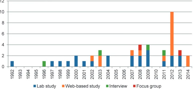
We have included study reports published between 1992 and 2014. Over the years, there has been an increase in the number of studies that evaluate (rather than just categorize or suggest methods for) uncertainty visualisation, but the numbers are generally small with considerable fluctuation (Figure 2). As shown in Figure 3, the majority of studies apply quantitative methods (38 out of 44), i.e. controlled lab experiments (22) and web-based experiments (16).
Web-based experiments have emerged since 2002 and their number has become comparable to traditional laboratory experiments (16 web-based versus 15 lab studies from 2002 to 2014). Just a small fraction of studies (6 of 44) are based solely on qualitative methods, i.e. interviews (4) and focus groups (2).
In the remainder of this section, we analyse five specific aspects of the studies: uncertainty categories, visualisation techniques, application domains, participants and tasks, organized in subsections.
Figure 2. Number of studies over time separated by their type. The peak in 2012 is due to the six studies from the Boukhelifa et al.’s (2012) paper
Figure 3. Number of studies per type
Uncertainty categories
When uncertainty of geospatial data is depicted, it can be quantified and represented for each of the three core information components: attribute (what), positional (where) and temporal (when) uncertainty (MacEachren
et al., 2005). Studies dealing with uncertainty information mainly cover the first component, attribute (also called thematic) uncertainty. Typically, they relate to uncertain model outputs (Aerts et al., 2003; Alberti, 2013), classification uncertainty (Blenkinsop et al., 2000; Drecki, 2002; Kinkeldeyet al., 2014) or reliability (e.g. variance) of statistical data (MacEachrenet al., 1998). Just one study (at least from those focusing on communication of uncer-tainty) deals with positional uncertainty visualisation exclusively (Grigoryan and Rheingans, 2004). There are no studies in the set assembled here that solely deal with temporal aspects of uncertainty. Less than a fourth of the studies (10/44) involve multiple types of uncertainty. These studies fall into two categories: either different types of uncertainty are evaluated separately, such as the symbol sets for attribute, positional, and temporal and uncertainty in MacEachrenet al.(2012). Or a combination of types is involved in the evaluation, as in Kardoset al.(2003; 2007; 2008) or Zhanget al.(2008) with a focus on attribute and positional aspects of uncertainty at the same time.
Visualisation techniques
One of the basic criteria for the selection of studies for this review was that the studies reported upon involve a visual representation of uncertainty. To systematize the appro-aches used in the studies, we use the three dichotomies from the UVis3(refer to the introduction).
Intrinsic/extrinsic
Most of the studies involve intrinsic approaches, i.e. when visual variables of existing map content are manipulated to represent uncertainty. Examples include colour hue and colour value (a term under which we subsume value, lightness and brightness) (e.g. Aertset al., 2003; Edwards and Nelson, 2001; Leitner and Buttenfield, 2000; MacEachren et al., 1998; Nadav-Greenberg et al., 2008; Retchless, 2012; Schweizer and Goodchild, 1992; Slocum
et al., 2003), transparency (e.g. Drecki, 2002; Newman and Lee, 2004; Slocum et al., 2003; Viard et al., 2011), or colour saturation that is used in a number of studies (e.g. Drecki, 2002; Kubı´cˇek and Sˇasˇinka, 2011; Kunz et al., 2011; Leitner and Buttenfield, 2000; Retchless, 2012; Sanyalet al., 2009).
While in the minority, we also identified multiple studies that focus on extrinsic techniques, i.e. when additional graphical objects are used to represent uncertainty, typically approaches using glyphs or error bars (Alberti, 2013; Drecki,
2002; Sanyalet al., 2009; Slocumet al., 2003), grid-based techniques (Kardos et al., 2007; 2008; Kinkeldey et al., 2014) or contouring (Senaratneet al., 2012).
Coincident/adjacent
Starting with the earliest research on uncertainty visualisa-tion, coincident approaches (with data and uncertainty integrated in the existing display) have been contrasted with adjacent approaches with data and uncertainty in separate views (MacEachren, 1992). While most studies assess coincident approaches, there are a number of studies that involve a direct comparison between adjacent and coin-cident views (Aertset al., 2003; Edwards and Nelson, 2001; Evans, 1997; Gerharz and Pebesma, 2009; Kardos, 2003; Kardos, 2007; Kubı´cˇek and Sˇasˇinka, 2011; Kunz et al., 2011; MacEachrenet al., 1998; Retchless, 2012; Senaratne
et al., 2012; Viardet al., 2011).
Static/dynamic
The majority of studies deal with traditional static visualisa-tion. As the display typically can become complex when uncertainty is added to data depictions, there have also been numerous attempts to utilize dynamic views. Some of these use non-interactive animation (Aertset al., 2003; Blenkinsop
et al., 2000; Evans, 1997; Kardoset al., 2003; Kardoset al., 2007; Zhanget al., 2008) and some incorporate interactive interfaces (Alberti, 2013; Blenkinsop et al., 2000; Evans, 1997; Gerharz and Pebesma, 2009; Slocum et al., 2003; Senaratneet al., 2012).
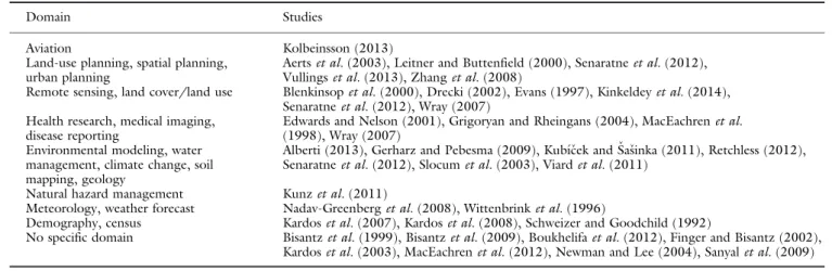
Application domains
The majority of studies (29 out of 44 studies) use applications from a defined domain, e.g. from environmental science or health research (Table 1). An advantage of this strategy is that it increases logical validity for the focus domain. However, by not systematically attempting to pick tasks that are general and representative of applications that cross domains, it is difficult to know the extent to which generalisation from the results is valid and it is difficult to relate results among studies. For example, when a study assesses the intuitiveness of an approach the results are often domain-specific: A symbol set used in aviation may be highly intuitive for a pilot, but this result cannot be easily transferred to other domains – for an expert with a different background, the symbol set may not be intuitive at all.
Participants
The reported number of participants per study differs substantially (Figure 4); one important factor is whether evidence is quantitative or qualitative. Owing to require-ments of statistical analysis, the number is much higher in studies using quantitative approaches. Lab studies, the most common evaluation type, range from 9 (Zhanget al., 2008) to 123 (Viardet al., 2011) participants – the median is 31. Compared to studies carried out in a laboratory, web-based studies have the advantage that high numbers of subjects can easily be recruited; the participant numbers in web-based studies reviewed reflect this as they range from 32 (Kinkeldey et al., 2014) to 274 (Retchless, 2012) with a median of 82. As noted above, studies involving qualitative methods (i.e. focus groups, and interviews) use fewer participants – all have less than 15 subjects.
Another crucial aspect regarding participants is their expertise. Expertise is described in many ways that are usually not directly comparable across studies, e.g.
experience in using geographic information (Gerharz and Pebesma, 2009; Kardos et al., 2008), experience with the concept of uncertainty and its visualisation (Kardos et al., 2008; Kinkeldey et al., 2014), experience in maps and mapping (Evans, 1997, MacEachrenet al., 2012), training or knowledge in the application domain (Aertset al., 2003; Kolbeinsson, 2013; Kunz et al., 2011; Senaratne et al., 2012) or computer literacy more generally (Newman and Lee, 2004). Self-assessment was often used to determine the subjects’ expertise, especially when participants were recruited via the web (Aerts et al., 2003; Kinkeldeyet al., 2014; Senaratneet al., 2012). A number of studies define groups with different levels of expertise (e.g. novices versus experts) to assess its impact on the results (Evans, 1997; Kubı´cˇek and Sˇasˇinka, 2011; Nadav-Greenberget al., 2008; Schweizer and Goodchild, 1992; Slocumet al., 2003). All in all, the type and level of expertise of participants often remain unclear and groups are usually heterogeneous in expertise.
Figure 4. Number of participants
Table 1. Domains used in the reviewed studies. Some publications cover more than one domain and thus appear more than once
Domain Studies
Aviation Kolbeinsson (2013)
Land-use planning, spatial planning, urban planning
Aertset al.(2003), Leitner and Buttenfield (2000), Senaratneet al.(2012), Vullingset al.(2013), Zhanget al.(2008)
Remote sensing, land cover/land use Blenkinsopet al.(2000), Drecki (2002), Evans (1997), Kinkeldeyet al.(2014), Senaratneet al.(2012), Wray (2007)
Health research, medical imaging, disease reporting
Edwards and Nelson (2001), Grigoryan and Rheingans (2004), MacEachrenet al.
(1998), Wray (2007) Environmental modeling, water
management, climate change, soil mapping, geology
Alberti (2013), Gerharz and Pebesma (2009), Kubı´cˇek and Sˇasˇinka (2011), Retchless (2012), Senaratneet al.(2012), Slocumet al.(2003), Viardet al.(2011)
Natural hazard management Kunzet al.(2011)
Meteorology, weather forecast Nadav-Greenberget al.(2008), Wittenbrinket al.(1996)
Demography, census Kardoset al.(2007), Kardoset al.(2008), Schweizer and Goodchild (1992)
No specific domain Bisantzet al.(1999), Bisantzet al.(2009), Boukhelifaet al.(2012), Finger and Bisantz (2002), Kardoset al.(2003), MacEachrenet al.(2012), Newman and Lee (2004), Sanyalet al.(2009)
Tasks
Assessing effectiveness of map communication, whether of the data in the map or uncertainty of those data, typically involves having participants complete some task and measuring accuracy and speed with which they do so. From the papers reviewed, we identified two major categories we discuss below:objective assessmentthat includes tasks with measurable correctness of results such as value retrieval, ratings, comparisons or rankings, and subjective assessment, a category of tasks for evaluating the intuitiveness of an approach, the preference compared to other options or the subjects’ confidence in their responses when using it. As noted above, this review focuses on studies directed to the communication of uncertainty in visualisations and a complementary paper about impacts of uncertainty visualisa-tion is being prepared. Thus, we do not report on decision tasks based on uncertain data here, although some papers included in this review involve such tasks in addition to communication tasks.
Few authors explicitly justify the choice of tasks, e.g. Sanyalet al.(2009) asked domain experts which tasks they would find important for their application. For this reason, they chose the search of hotspots in uncertainty (‘[the expert said he] would be interested in looking at regions of extreme (high or low) uncertainty’, p. 1213) and the count of features of a specific combination of data and uncertainty (‘He also wanted to be able to discern features in the data, in the presence of uncertainty’, p. 1213).
Objective assessment
Not surprisingly,value retrievalwas found to be a common task in the uncertainty visualisation studies we reviewed. It is a task with a long history in cartographic communication research, tracing back to at least Flannery’s 1956 disserta-tion on graduated symbol map interpretadisserta-tion (results of which were re-assessed more than a decade later and published in Flannery, 1971). We identified two kinds of value retrieval tasks that are used. In the first, data and/or uncertainty values have to be retrieved separately (Aerts
et al., 2003; Alberti, 2013; Kubı´cˇek and Sˇasˇinka, 2011; MacEachren et al., 1998; Nadav-Greenberg et al., 2008; Wittenbrink et al., 1996). In the second, retrieval of both data values and uncertainty happens simultaneously (Blen-kinsop et al., 2000; Drecki, 2002; Kolbeinsson, 2013; Kubı´cˇek and Sˇasˇinka, 2011). While generally, value retrieval tasks help assess basic map reading, the first kind corresponds to univariate and the second one to bivariate map reading.
A rarely used extension of value retrieval tasks is
aggregation of uncertainty over an area (Drecki, 2002; Evans, 1997; Kinkeldeyet al., 2014). This task type assesses the users’ ability to retrieve an overall estimation from a spatial distribution of uncertainty.
Some studies useratingtasks in which levels of uncertainty have to be estimated, typically on a continuous scale (e.g. from 0 to 100) (Bisantzet al., 2009; Boukhelifaet al., 2012; Finger and Bisantz, 2002) or on a Likert scale (Drecki, 2002). The difference from value retrieval is that no legend is provided or needed. These tasks emphasize accuracy of relative judgments rather than precise value estimation or legend matching.
Another type of tasks includes comparisons of the uncertainty of different entities (e.g. ‘which entity is more uncertain?’) (Alberti, 2013; Blenkinsopet al., 2000; Evans, 1997; Kinkeldey et al., 2014; MacEachren et al., 1998; MacEachrenet al., 2012; Schweizer and Goodchild, 1992; Viardet al., 2011). Some studies involve comparisons for which subjects have to aggregate uncertainty over an area or several entities first. An example for this is the second experiment in MacEachrenet al.(2012) where the overall degree of uncertainty of two sets with nine icons each have to be compared.
Additionally, there are ranking tasks that let subjects assign an order to a number of entities by their data value (Bisantz et al., 1999; Finger and Bisantz, 2002) or their uncertainty (Bisantz et al., 1999; Bisantz et al., 2009; Blenkinsopet al., 2000; Boukhelifaet al., 2012). Ranking tasks by combined data value and uncertainty require interpretation and are thus not included since we focus on the communication aspects here.
In contrast to the tasks mentioned so far that were dealing with specified map objects, there are other tasks including the
search for entities that fulfil a certain characteristic, e.g. extremely high or low values. Several studies incorporate such tasks, for example, the search for the highest data value (Viard et al., 2011), the lowest and/or the highest uncertainty (Sanyal et al., 2009; Wray, 2007), or the identification of patterns such as clusters in the data (Edwards and Nelson, 2001; MacEachrenet al., 1998) or in uncertainty only (Drecki, 2002; Edwards and Nelson, 2001; Sanyalet al., 2009). Sanyalet al.(2009) extend this task type further to multiple entities using acountingtask for data values and uncertainty meaning that the number of clusters in data and uncertainty has to be determined.
Subjective assessment
Beside tasks used to measure accuracy and speed of users, there is another category of tasks used to let subjects directly assess different aspects of usability, typically by choosing from a list of options (on a Likert scale or similar) or by giving a rating (e.g. on a scale from 0 to 100). For instance, this is used to assess the confidence with a response (Alberti, 2013; Blenkinsopet al., 2000; Edwards and Nelson, 2001; Evans, 1997; Grigoryan and Rheingans, 2004; Kolbeinsson, 2013; Kubı´cˇek and Sˇasˇinka, 2011; Leitner and Buttenfield, 2000). Other studies determine the users’ preference for a certain technique (Boukhelifa
et al., 2012; Gerharz and Pebesma, 2009; Kardos et al., 2003; Retchless, 2012; Senaratneet al., 2012), assessment about ease-of-use of a map or visualisation (Grigoryan and Rheingans, 2004; MacEachrenet al., 1998) or judgment of map attractiveness (MacEachren et al., 1998). Subjective assessment is also used to determine or the intuitiveness of different symbols (MacEachrenet al., 2012), the difficulty to identify data and uncertainty (Newman and Lee, 2004), or the degree of visual overload (Newman and Lee, 2004) perceived by participants. Alternatively, open questions are used to collect different interpretations without the influence of predefined answers. For instance, Boukhelifa
et al.(2012) posed open questions to find out how users interpret the meaning of the sketchy line technique.
DISCUSSION OF FINDINGS
In this section, we summarize findings from the collection of studies reviewed here. The following subsections contain findings related to five visual representation method success metrics. The first, and the main part, focuses on objective measures of user performance (accuracy, speed) that are subdivided into the visualisation categories as defined in the UVis3(see the section on ‘Introduction’). This is followed by study results on the general acceptance of uncertainty visualisation and those from user confidence as a subjective measure of task performance. The last two subsections deal with users’ judgments about representation forms, i.e. preference for and intuitiveness of different representations.
User performance
In this subsection, we discuss findings related to user performance that is typically measured as accuracy and response time. This discussion is divided into subsections represented by the three main dichotomies: intrinsic/ extrinsic, coincident/adjacent and static/dynamic.
Intrinsic/extrinsic
In the studies we reviewed, most uncertainty visualisation
techniques under assessment were intrinsic ranging from manipulation of colour hue, value or saturation to other visual variables, such as transparency, blur or resolution.
A straightforward approach to depict uncertainty is to use
colour hue and/or value. As an example, Leitner and Buttenfield (2000) compared the representation of attri-bute uncertainty in base maps using colour value, saturation and texture. They found that darker colour value for high uncertainty yielded the highest accuracy, followed by
coarser texture and lower saturation and recommended colour value as the first choice in terms of response accuracy. Boukhelifa et al. (2012) contributed a number of studies focused on uncertainty with line features, comparing known signification methods (greyscale, blur, dashing) to a novel representation called sketchiness (an imitation of hand-drawn lines). They found that in terms of response accuracy, a greyscale representation performed better than blur, dashing and sketchiness. While up to four levels of uncertainty could be distinguished for greyscale and blur, only three were discriminable for dashing and three to four for sketchiness (depending on the task).
Since colour hue and value are often already used for representing the data itself, and ‘purity’ of colour has been hypothesized to be intuitive as a method to signify uncertainty, the manipulation of colour saturation to represent uncertainty has been subject to a number of studies. Sanyalet al.(2009) compared different uncertainty representations for line charts (1D) and surfaces (2D data in a 3D display) using artificial data. Colour-mapping from saturated blue for low and unsaturated blue for high uncertainty was compared to coloured glyphs, glyphs of different size and error bars to represent uncertainty. Response accuracy for colour saturation was not consis-tently higher with all tasks, but all in all the authors encouraged its use. However, in other studies, colour saturation was found to be less effective than other approaches (e.g. Drecki, 2002; Kunz et al., 2011). In direct comparison to colour value, Leitner and Buttenfield (2000) recommended saturation only if colour value or texture are not available - with less saturation for higher uncertainty (unless short response times are more important for which they recommended more saturated colours for higher uncertainty). In an extensive evaluation of intrinsic representations of uncertainty in symbols, MacEachrenet al.
(2012) suggested that saturation was amongst the techni-ques with lower accuracy, together with colour hue, orientation and shape. Thus, from current knowledge, colour saturation cannot be recommended to represent uncertainty. Instead, colour hue and value as well as transparency are better alternatives (Figure 5).
As an alternative to colour value and saturation,
whitening can be used, the representation of uncertainty by whiteness in the HSI colour model (Hengl, 2003). Kubı´cˇek and Sˇasˇinka (2011) found that the combination of hue and whiteness was not suitable for continuous uncertainty with an unclassed bivariate display, because the legend was too complex to read. Supporting this, Gerharz and Pebesma (2009) measured low performance for whiteness during retrieval of uncertainty values from a coincident uncertainty display, compared to colour-coded adjacent maps. But all in all, evidence is still rare to make well-founded assumptions about the effectiveness of whitening.
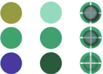
The visual variabletransparency(or opacity) is a popular alternative for intrinsic uncertainty representation. In a study involving land cover maps, Drecki (2002) measured higher effectiveness for transparency signifying classifica-tion uncertainty than for colour saturaclassifica-tion. Newman and Lee (2004) support this observation; they compared transparency to colour mapping and to a number of Figure 5. Three of the recommended intrinsic techniques w.r.t.
user performance: colour hue, color value and transparency (from certain5bottom to uncertain5top)
extrinsic techniques in static 3D scenes. Regarding ease of identification, subjects ranked transparency among the best techniques for both data and uncertainty. All in all, there is evidence that transparency generally has higher potential for uncertainty depiction than colour saturation.
In order to depict data plus uncertainty for area data, an alternative to manipulating colour attributes is to integrate
texture and colour. While texture is often added as an overlay on top of a data depiction (thus could be considered extrinsic), the visual result is that colour and texture are integrated into the areas, thus becoming intrinsic. There is some evidence that texture on colour fill leads to good results (Kunz et al., 2011; Leitner and Buttenfield 2000; MacEachren et al. 1998; Retchless, 2012).
Another intrinsic approach to represent uncertainty is to varyresolution. It was used for uncertain symbols in several studies by Bisantz and colleagues who called the technique ‘icon degradation’. In an early study (Bisantzet al., 1999), they compared five sets of symbols (from abstract to iconic) representing uncertain hostile and friendly identities. Using resolution to represent uncertainty (with coarser resolution depicting higher uncertainty), they found that subjects could appropriately sort both the abstract and iconic versions of the symbols representing identity (‘friendly’ or ‘hostile’) combined with six levels of uncertainty, resulting in 13 different symbols. This result was basically supported by the first experiment in Finger and Bisantz (2002) with a similar setup, but they observed lower user performance in the ‘hostile’ than in the ‘friendly’ condition. However, this observation was not made in other studies by the group. In a study by Kolbeinsson (2013) referring to the work by Bisantz and colleagues the icon degradation technique led to decreased user performance compared to symbol shape when users needed to read a data value and uncertainty in combination. These findings suggest that resolution can be a viable alternative to the manipulation of colour attributes and transparency.
The study by Bisantz et al. (2009), unlike the studies before, did not use resolution to represent uncertainty, but colour saturation, value and transparency. The authors compared two different backgrounds the symbols were placed on: a uniform grey area and a map. Surprisingly, they did not observe a significant effect of the background on user performance. More insight regarding the use of symbols on maps is provided by the Edwards and Nelson’s (2001) study that assessed bivariate circle symbols with size representing data and colour value representing uncertainty. They compared bivariate symbols to an approach using univariate symbols and an additional depiction of uncertainty as a reliability diagram in the legend. Alternatively, uncertainty depiction through verbal statements in the legend was utilized. The authors found that generally, circle symbols on a map were much more effective than a verbal description of spatially-varied uncertainty and also more effective than the uncertainty diagram in the legend. In particular, ‘focus-size’ (colour value of the boundary of unfilled circles depicts uncertainty) surprisingly resulted in higher accuracy and confidence rates
than ‘value-size’ (the same approach with filled circles), but the difference was not statistically significant.
Extrinsic methods for representing uncertainty have a long tradition in scientific visualisation, e.g. Pang and colleagues designedglyphsto represent data and uncertainty in combination. In an early study by Wittenbrink
et al.(1996), the authors compared arrow glyphs including uncertainty information (‘verity visualisation’) to common arrow glyphs without uncertainty and found that they encoded bearing, magnitude, and uncertainty with almost the same effectiveness as with the simple arrow glyphs. In the study by Newman and Lee (2004) already mentioned above, three extrinsic techniques received the highest ratings regarding effectiveness: multi-point, ball and arrow glyphs. In the static 3D displays they used, these techniques outperformed intrinsic techniques such as colour mapping, transparency and aliasing (a combination of transparency and blur). In related research, Grigoryan and Rheingans (2004) found that with a spatial task in a 3D display (tell if a marker is inside of the error margin of a surface), subjects were significantly more accurate and faster when the error margin was represented by points than with pseudo-colouring of the surface. In the above mentioned study by Sanyalet al.(2009) subjects performed well with two kinds of spherical glyphs (varying size and colour value) in a 2D and a 3D display. Regarding the use of extrinsic methods in maps, Drecki (2002) showed that what he labeled as the ‘squares’ technique (square glyphs coloured by land cover type that are varied in size with smaller squares representing higher uncertainty) performed as well in terms of effectiveness as transparency and better than a display where uncertainty was represented by heights of a 3D surface.
Another set of extrinsic approaches that have rarely been assessed are grid-based techniques. In two recent studies, Kinkeldeyet al.(2014) assessed ‘noise annotation lines’, a technique that signifies classification uncertainty by a noise grid. The web-based studies incorporated qualitative com-parisons of attribute uncertainty between areas in land cover maps with four to eight uncertainty classes, using different grid designs. The authors recommend the technique for up to six uncertainty classes when the most salient grid design is used. They point out that noise annotation lines can be a viable alternative to intrinsic methods, especially with complex map content. Another grid-based approach is the ‘trustree’ technique developed by Kardoset al.(2007) that varies the level of detail of a tree-structured grid to represent uncertainty. Since the evaluation did not include measure-ment of user performance, findings are limited to subjective measurement (see subsection on user preference).
All in all, results on extrinsic displays discussed here highlight the potential of glyph- and grid-based techniques for uncertainty representation in maps as alternatives to intrinsic techniques. On the question of whether to choose intrinsic or extrinsic techniques, the type of uncertainty to be displayed is deemed to play a role: Kunzet al. (2011) suggested that intrinsic approaches may be more suitable for communicating quantitative and extrinsic approaches for qualitative information. This was supported by Alberti (2013) and Kinkeldeyet al.(2014) who conclude that the extrinsic displays they used were especially successful for the communication of qualitative uncertainty. But there are also
other observations suggesting that types of tasks decide if intrinsic or extrinsic approaches are more suitable: Slocum
et al. (2003) evaluated the effectiveness of intrinsic vs. extrinsic visualisation techniques as part of a usability engineering approach. They compared intrinsic RGB colour coding, transparency, as well as extrinsic line glyphs and ‘gcm glyphs’ (vertical bars and pyramids). Based on the interviews the study relied upon, they found that subjects with a scientific background preferred glyphs and the less experienced preferred colour coding and transparency. Their explanation for this is that intrinsic techniques they used gave a better overview of uncertainty, but in-depth analysis was easier with extrinsic techniques. This suggests that there may be tasks for which intrinsic techniques are more appropriate and others for which extrinsic approaches work better.
Coincident/adjacent
This subsection deals with findings about comparison of adjacent to coincident (integrated) maps. The obvious difference between the two approaches is that adjacent maps require more eye movements (saccades) to retrieve information than coincident maps. But the latter tend to become complex and cluttering is a bigger problem when using a single view for data and uncertainty, compared to adjacent views.
Amongst the studies involving a direct comparison, some do not suggest general differences between adjacent and coincident views (Kunzet al., 2011; Retchless, 2012). Most studies report on non-significant differences between the two approaches, e.g. Kubıcˇek and Sˇasˇinka, (2011) who reported that when retrieving data value and uncertainty at the same time, users were slightly more successful using adjacent views than a coincident display. In a study already discussed above, MacEachren et al. (1998) compared adjacent maps to coincident displays that are visually-integral (colour and hue shift) and visually-separable (colour and texture). Adjacent maps were judged to be ‘more pleasant and easier to use’. But the coincident, visually-separable texture overlay yielded user performance comparable to the adjacent views. In the study mentioned above, Viard et al. (2011) compared adjacent maps to coincident maps using a texture with varying transparency to represent the degree of uncertainty. A simple comparison task yielded similar results for both approaches, but with a more complex ranking task, adjacent views led to less accurate answers than the coincident view. Coincident versus adjacent results for identification of spatial patterns were reported by Edwards and Nelson (2001). The use of a small uncertainty display in the legend of a map was less successful than the coincident alternative using circle
symbols. Gerharz and Pebesma (2009) compared colour-coded adjacent maps and a bivariate coincident map using whitening and reported that uncertainty retrieval was more successful with adjacent maps but no difference existed for data retrieval. In addition, all ten subjects found the tasks easy to accomplish with adjacent maps and only five subjects had this impression with the coincident map.
There are very few results regarding response time. The study by Kubı´cˇek and Sˇasˇinka (2011) is an exception, reporting that in a map reading task of either data or uncertainty values, coincident maps led to quicker responses than adjacent maps. This may again be explained by saccades that are necessary when retrieving values from two adjacent maps.
All in all, past research suggests that both coincident and adjacent approaches have their applications. There is evidence that adjacent views may be usable for retrieval of single values, but less usable when tasks become more complex and more saccades are needed. Generally, coin-cident maps can be seen as preferable because the integration of uncertainty into the display makes it easier to retrieve data and uncertainty simultaneously. However, they naturally become more complex than adjacent views and the map content is more likely to be obstructed by the additional uncertainty display. For instance, the use of bivariate colour schemes for data and uncertainty can be challenging. So, as shown in several studies, adjacent maps can be a viable alternative to avoid clutter.
Static/dynamic
A number of studies directed to representation of data uncertainty deal with the use of dynamic approaches such as animated displays or user interaction. The range of possible approaches is wide because elements from animation and interaction can be combined in numerous ways. This makes it even more difficult to come to consistent conclusions about the effectiveness of dynamic approaches.
In an early study by Evans (1997) an animated (non-interactive) ‘flicker’ map and an interactive version (‘toggling’) were compared to static maps. The results showed that static and (non-interactive) dynamic appro-aches did not differ significantly in terms of user accuracy or speed. This result was not supported by Aertset al.(2003). since they observed significantly higher accuracy for uncertainty estimation with a static adjacent view than with toggling. Referring to these results, Blenkinsop et al.
(2000) reported that a static grey scale display showed better user performance than serial animation (series of animated maps) or random animation (animated display of possible outcomes). In another study comparing static and dynamic, Drecki (2002) found that blinking (variations in display time of map entities according to their uncertainty; Fisher, 1993) was less effective than static representation through glyphs or opacity, but more effective than a 3D surface or the manipulation of colour saturation. Senaratne
et al. (2012) also observed higher user performance with static than with dynamic approaches.
All in all, there is evidence that animated views have a potential to successfully represent uncertainty when static solutions are not feasible but little evidence that they perform better (or even as well) as more traditional static depictions. However, as Blenkinsopet al. (2000) suggest, animated approaches may be suitable for specific tasks – for instance, for exploration of uncertainty of a dataset in an early stage of analysis because they provide ‘a very effective first impression of uncertainty’ (p. 11).
Acceptance
An important overarching evaluation question is how users generally react when uncertainty is depicted visually. A number of studies report on this aspect and the findings are not consistent: some authors report that adding uncertainty information to a map had negative effects on map readability (Schweizer and Goodchild, 1992; Slocum et al., 2003) and that subjects wanted the display to remain unobstructed (Kardoset al., 2003). One obvious reason for this is that displays become more complex when uncertainty is added. Besides, users tend to be overwhelmed by the additional information when they make analyses or decisions – an aspect we discuss in the second paper on effects of uncertainty visualisation. But there are also findings suggesting that visualisations including uncertainty were not judged as too complex or even that addition of uncertainty clarifies the view instead of cluttering it (Aerts
et al., 2003; Alberti, 2013; Edwards and Nelson, 2001; Kunz et al., 2011; Leitner and Buttenfield, 2000; MacEachrenet al., 1998; Viardet al., 2011). This suggests that, when appropriate solutions are found, users do not necessarily see depicted uncertainty as a burden.
User confidence
When assessing the usability of uncertainty visualisations, the level of confidence that subjects have with their answers can be an important aspect. However, in many studies, confidence was not measured at all. From those that did, most studies reported that user performance and confidence were in agreement, e.g. in the study by Blenkinsop et al.
(2000) cited above they observed higher confidence as well as better user performance with a greyscale display compared to an animation approach. Edwards and Nelson (2001) found that bivariate symbols depicting data and uncertainty (size combined with either focus or colour value) yielded higher confidence (along with more accurate results) than verbal and graphical depiction of uncertainty in the legend. Grigoryan and Rheingans (2004) suggested significantly higher confidence (as well as higher accuracy and shorter response times) when a point-based representa-tion of posirepresenta-tional uncertainty was used, compared to colour coding. Kolbeinsson (2013) reported higher confidence for shape changes than for icon degradation that also corre-sponded to higher response accuracy. All in all, the majority of studies measuring confidence provide evidence for the assumption that the successful use of a technique (in terms of accurate and/or fast answers) at the same time leads to high user confidence.
User preference
A number of studies measured user preference for the visual techniques under evaluation. Generally, it can be stated that in contrast to confidence, user preference did not always correspond to user performance, i.e. subjects often preferred techniques that did not necessarily work best for them. For instance, although users were not successful with colour saturation they had a preference for using it (Drecki, 2002). This effect was also measured in the above mentioned study by Boukhelifaet al. (2012) with respect to uncertain lines: Dashing was preferred over blur, greyscale and sketchiness, but this did not correspond with user performance in which dashing yielded only three discriminable levels of uncertainty (fewer than with blur or greyscale).
However, there are also results suggesting a match between performance and preference. Gerharz and Pebesma (2009) reported that most participants preferred adjacent maps over a coincident view with whiteness representing uncertainty and they could also retrieve uncertainty values most accurately using the adjacent display. In a study focused on similar datasets but in a web-based environment, Senaratneet al.(2012) also found a strong correspondence between preference and user performance but only for the static techniques they assessed (contouring, symbols, adjacent maps), not for the dynamic approaches.
All in all, these findings show that measuring preference does not suffice to determine the effectiveness of uncer-tainty visualisation techniques, but that it can give hints about what approaches are popular with different user groups. This information can be taken into account for choosing useful methods to depict uncertainty when user acceptance is essential.
Intuitiveness
The intuitiveness of different techniques was assessed by a few studies only. The first part of the study reported by MacEachren et al. (2012) included three common meta-phors suggested as appropriate to uncertainty signification including: colour purity (manipulating colour saturation), fog (transparency) and blur (fuzziness). Fuzziness ranked as the most intuitive of all signification methods, while transparency was above average (but with wide variation in reactions) and colour saturation was not judged as intuitive. Boukhelifaet al.(2012) tested the intuitiveness of sketchiness as a representation of uncertainty. Overall, it was perceived as less intuitive than blur, greyscale and dashing; since blur corresponds to fuzziness in the MacEachren et al. (2012) study and greyscale to colour value, these results support each other. This provides further evidence for the assumption made above (from objective measurement of user performance) that manip-ulating colour saturation is not a recommendable way to depict uncertainty, compared to other techniques such as transparency and blur.
Besides the intuitiveness of a method itself, a number of studies address the question of ‘which end is up’: should high uncertainty be matched with low or high colour value and low or high colour saturation? Lighter values signifying uncertainty result in a ‘fading out’ effect, whereas darker
colours make regions with high uncertainty more promi-nent. Bisantzet al.(2009) measured a tendency to assign lower uncertainty to darker colours when using colour value, and to more saturated colours when using saturation to represent uncertainty. This was supported by Kubı´cˇek and Sˇasˇinka (2011) as the majority of participants picked the lighter values as the best choice for higher uncertainty (thus darker value corresponds to lower uncertainty). In addition, subjects were faster when using this alternative. In the most recent ‘which end is up’ research, MacEachren
et al. (2012) reported that for colour value, light for uncertain and dark for certain was much more intuitive than the reverse. Unsaturated colours were also more intuitively associated with uncertainty than saturated colours, but only slightly. Colour saturation in either order scored near the mean of all visual variables tested, while colour value (with light depicting uncertain) scored near the top (just below fuzziness and location depicted as a point in a coordinate space – see Figure 6).
LESSONS LEARNED
Several lessons learned and recommendations can be derived from the discussion, the first ones referring to study design in general. While empirical studies of map reading and use have been carried out for 60 years or more and uncertainty visualisation has been addressed explicitly for at least half of that time, the methods used in uncertainty visualisation evaluation remainad hoc. Studies are often approached more from a usability engineering perspective of assessing and improving a specific product than from a cognitive psychology or science perspective of developing general understanding of how and why repre-sentations work or do not work. However, even if consi-dered from a usability engineering perspective, studies often do not follow any methodology commonly agreed upon. This lack of formalisation and rigour in empirical methods is an issue that is much broader than the study of un-certainty visualisation focused on here; it is an issue that cuts across research in cartography, information visualisation
and related domains. Empirical research focused on geographically varied uncertainty (geo-uncertainty) visuali-sation is probably no less formalized or rigorous than that in other aspects of geovisualisation, but it is clearly no better. Thus, all comparisons and generalisations that we offer here, based on our analysis of the 44 studies reported on in 34 papers, must be considered as starting points toward developing a deep understanding of geo-uncertainty visua-lisation, not a definitive summary.
Evaluation goals
From the publications included here, two major goals for existing research can be identified. The first is the assessment and improvement of visual displays representing uncertainty. Here, the question is often ‘does method A work better than method B’ (with ‘better’ defined in ways we outlined above). These studies (while not always saying so explicitly) are essentially following a usability engineering approach where the goal is to improve a particular product using a summative assessment rather than to create general principles. One problem in many of these studies is that the authors tend to attempt generalisation beyond the specific constraints of the test, even though the conceptual framing of the test was not designed to do this.
The second goal is to advance understanding of the cognitive processes involved in using visual displays (both static and dynamic) for interpreting information that contains uncertainty. Here, the question is often: how/why does method A work better than method B or how does any method of interest change the cognitive process? Such studies usually are grounded in perceptual and cognitive theory and as a result have the potential to provide a framework for relating the generally ad hoc results from studies that adopt a usability engineering approach. Studies from the second category are in the minority of those reviewed.
Uncertainty visualisation techniques
When evaluating uncertainty visualisation the appropriate choice of techniques to be assessed and compared can be a challenge. As discussed in the introduction, typologies can help to choose from the universe of possible techniques and heuristics derived from general guidelines and rules for data visualisation can support the choice. But when different techniques are to be compared, it is important that the scenarios and datasets are informationally equivalent, i.e. according to Larkin and Simon (1987, p. 67) ‘[t]wo representations are informationally equivalent if all of the information in the one is also inferable from the other, and
vice versa’. A goal in testing, then, is often to determine whether they are also computationally equivalent, or whether one depiction has an advantage over another, i.e. ‘[t]wo representations are computationally equivalent if they are informationally equivalent and, in addition, any inference that can be drawn easily and quickly from the information given explicitly in the one can also be drawn easily and quickly from the information given explicitly in the other, andvice versa’ (Larkin and Simon 1987, p. 67).
Another crucial aspect is the role of visual metaphors that have been used to depict uncertainty since the beginning of this field of research, e.g. fog or blur (MacEachren, 1992). Figure 6. Three best options w.r.t. intuitiveness from MacEachren
et al.(2012): fuzziness, position and colour value (the top depic-tion in all cases was interpreted to be most uncertain)
The contention is that fog and blur are metaphors for lack of clarity or focus (as in a camera) and thus directly signify uncertainty. These metaphors have been suggested to have the potential to enable a better understanding of uncertainty (Gershon, 1998) and we make the assumption that the use of metaphors can lead to more intuitive approaches (Kinkeldey
et al., 2014). But the usefulness of metaphors generally has rarely been investigated. It would be worthwhile to evaluate whether metaphors increase the intuitiveness of uncertainty visualisation, the understanding of geo-uncertainty and the success of reasoning and decision-making under uncertain conditions. One start toward addressing this goal is offered in MacEachren et al. (2012), in which the authors assess the intuitiveness of several strategies for signifying uncertainty (see the section on ‘Discussion of findings’). Follow-up work is needed to assess the sensitivity of these findings to the specifics of the visual signification and the experimental design and to then address the more challenging questions of the relation-ship between metaphor-grounded intuitiveness of uncertainty signification and subsequent information interpretation, reasoning with that information and decision-making.
Is uncertainty ‘just another variable’?
A question that has not been extensively discussed in the literature is: Do we treat uncertainty as ‘just another variable’ to be visually represented or does it need to be treated differently? For example, when we picture a map showing air pressure distribution in combination with temperature, these two variables are certainly dependent on each other (in physical terms). The same is true with air pressure and its uncertainty, but we see a stronger dependency: Uncertainty can be seen as metadata of air-pressure which we argue makes a difference. Thus, we support Edwards and Nelson (2001, p. 35) who stated that ‘[p]erhaps data certainty information is unique and will require a new type of framework for designing symboliza-tion’. Most studies that assess the usability of uncertainty visualisations do not contribute to this aspect since they test the retrieval of data and uncertainty separately, but from the perspective that there is nothing special about uncertainty. Traditionally, studies in this field focus on the ability to read both the map content and its uncertainty at the same time. This may be the mandatory criterion for a successful use of uncertainty, but the question that remains is whether this is sufficient to ensure that a user does not only have two separate values in mind but an integrated uncertain data value.
Classed/unclassed representations
Another aspect that is often neglected in past studies is whether to use classed or unclassed schemes for uncertainty categories. When classed uncertainty is used, the choice of the number of classes is rarely explained. In the studies reviewed here, classification schemes range from binary classed, i.e. certain/uncertain (or reliable/unreliable), over six classes (e.g. Bisantzet al., 1999) to 15 classes (Schweizer and Goodchild, 1992). All in all, the colour scheme used in the latter study used 15615 classes; thus, subjects had to distinguish 225 classes. It is not surprising that the authors reported low user accuracy of judgments. They justify
the high number of classes ‘to give the appearance of continuous shading’ (Schweizer and Goodchild, 1992, p. 689). Their results raise the question of whether a high number of classes are more complex than a continuous uncertainty distribution or not; to our knowledge, this question has not been addressed. In contrast to studies that use a constant number of uncertainty classes, in the study by Kinkeldey et al. (2014) about noise annotation lines the number of classes was defined as an experimental factor. In this way, they could measure the impact of the number of uncertainty classes on user performance. More work is needed on the question of necessary level of detail in uncertainty representation to support different tasks using uncertainty visualisation (Smithet al., 2013).
Types of uncertainty
Traditionally, a distinction is made between attribute (or thematic), positional (or geometric) and temporal uncer-tainty (see the section on ‘Analysis of the literature’). Although these categories seem logical and match with conceptualisations of data used in geographic database research and development (Peuquet, 1994), their use may be limited for the majority of applications of uncertainty visualisation. In practice, it is hard to clearly distinguish between these categories: ‘[t]he categories of uncertainty are often interdependent, and the category boundaries are often hard to delineate’ (MacEachrenet al., 2005, p. 156). For instance, when a land cover map is created from a remotely sensed image, the boundaries shown in the map are uncertain. This can be a result of various sources, e.g. the vagueness and ambiguity in the definition of land cover classes (attribute uncertainty), measurement errors (posi-tional uncertainty) and the use of images from different capture dates (temporal uncertainty). If all three types could be estimated, it might help an expert analyst, but a domain specialist who is not a remote sensing expert might be confused. This raises the issue of how the complexity of uncertainty relates to the categories of user and task – if someone is trying to create a better satellite system, they might need the full range of uncertainty information; if they are trying to decide what crop to plant, they might need a simple composite depiction of uncertainty.
User issues
A number of lessons learned are related to participants and recruiting for empirical studies. A general objective should be to recruit participants who are representative for the target user group with respect to age, background, skills, experience, etc. However, the majority of studies we review here recruited students since they are easily available in the university context. Thus, most descriptions of expertise have to be judged critically. Students can be suitable parti-cipants for studies focusing on perceptual issues where only expertise in terms of visual literacy and experience with visu-alisation or maps is important. But even here, students may not reflect the general population well, if that is the target audience. Students have different levels of theoretical expertise typically combined with very limited or no work experience. Despite this fact, they are often described as do-main or map ‘experts’ without a more detailed specification
of their experience. Further, if domain expertise plays a role, e.g. when it is needed to understand the symbology of a map (e.g. with a geological map), students (even those studying within the domain of interest) are not yet experts. Thus, in recruiting and selecting participants for studies, it is important to differentiate between types of expertise, including at least:
N
expertise in use of maps and related visual displays;N
expertise in design of maps and related visual displays;N
expertise in statistics – thus in understandingprobabil-ities and related uncertainty metrics;
N
expertise in the application domain used for test scenarios (if any);N
expertise in using uncertainty estimates in the application domain; andN
expertise in using any technology that might be relevant (e.g. if the focus is on interactive interfaces, expertise in that)Beyond recruitment of appropriate participant groups, it has also been shown thattrainingis important for effective empirical analysis of complex information display inter-pretation, but it is usually not carried out to a sufficient extent. An extensive training phase is often necessary, not only to clarify the scenarios, data and tasks, but also visualisation techniques used (especially when they are still unknown to the users) and measures of uncertainty that are needed. This is an aspect that has rarely been considered by the studies from our review.
Task dependency
Some studies provide evidence that the usability of uncertainty representations can be highly user and task dependent. For instance, in the study conducted by Sanyal
et al. (2009), search tasks for the lowest and highest uncertainty values resulted in different user performance (although using the same data). From their study about weather forecasting uncertainty, Nadav-Greenberg et al.
(2008) suggest that ‘it is extremely important that designers of such displays consider both user and task demands because the usability and usefulness of uncertainty information depends on these factors’ (Nadav-Greenberg et al., 2008, p. 44). In their study, a box plot was successful for precise information whereas the colour-coded maps worked better for relative comparisons. Similar to this, in a study discussed above, Slocumet al.(2003) reported that participants who wanted the ‘big picture’ preferred intrinsic techniques (RGB-encoding or transparency) whereas others who were aiming for detailed information tended to prefer extrinsic methods (i.e. glyphs). These findings show how tasks can differ between groups with a different level of expertise in the problem domain. Further evidence for task dependency of visual depiction of uncertainty is provided by Blenkinsop
et al.(2000) who support the hypothesis from MacEachren
et al. (1998) that visually separable representation of uncertainty is preferable for exploratory use, i.e. when it is not clear what questions will be asked exactly during analysis. In a focus group initiated by Zhanget al.(2008), domain experts were unable to articulate what their preferred uncertainty visualisation methods were because they were convinced that this strongly depends on the task.
All this supports the hypothesis that the nature of tasks plays an important role for the usability of uncertainty visualisation techniques. This may explain many of the inconsistent outcomes from the studies under review; two studies assessing a specific technique are likely to yield different results when tasks and user groups are not comparable. We further address this aspect in the next section.
CONCLUSION
In this review, we systematically analysed 44 user studies from 34 publications dealing with uncertainty visualisation. More precisely, we focused on uncertainty of geospatial data and geographic displays. The first step was a description of characteristics of the study under review (types of studies, visualisation techniques under assessment, number and type of participants, etc.), as well as a summary of the main findings regarding user performance, acceptance of uncer-tainty visualisation, user confidence, preference and intui-tiveness of techniques. From this, we derived lessons learned and identified gaps in past evaluation research. Furthermore, a number of recommendations and open research questions for future studies were discussed.
This article focused on evaluating how uncertainty can be communicated. It did not include issues with reasoning and decision-making based on uncertainty visualisations – we will address these aspects in a follow-up publication. Since this work focused on visualisation of uncertainty in geospatial data we did not try to be exhaustive for fields such as information visualisation or scientific visualisation (although we did include publications from those domains when representa-tion of geographic informarepresenta-tion uncertainty was a compo-nent). The fact that we dealt with visualisation of uncertainty means that we did not review literature on decision-making under uncertainty. We only included literature on non-visual communication of uncertainty in cases where that topic is included in a paper having a visual focus (e.g. studies that compare uncertainty visualisation to a control of verbal description or numerical specification of uncertainty).
Generally, the most important outcome is that we need to systematize future empirical studies on uncertainty visualisation to better enable comparison and generalisation of the findings. As mentioned above, one way to advance this goal is the use of uncertainty visualisation typologies. However, as also discussed above, existing typologies are focused on data types, uncertainty categories and representa-tion types, i.e. they map a descriprepresenta-tion of the data being displayed to a recommendation of techniques. Based on the discussion about task-dependency of uncertainty visualisation usability (see the section on ‘Lessons learned’), we suggest that future typologies should additionally take different categories of tasks into account. We propose that at least the following three high-level task categories deserve attention:
N
communication tasksThis category comprises map reading tasks involving data and uncertainty value retrieval (which location is most uncertain?). For tasks from this category, visualisation techniques can be chosen following the traditional rules from cartography.
N
analytical tasksTasks that occur during analysis fall into this category, meaning that defined analytical questions have to be answered (what area is most suitable to build a power plant?). Approaches for uncertainty visualisation should be tailored to these tasks (e.g. by choosing uncertainty representations with the number of classes and level of detail needed to conduct the task).
N
exploratory tasksTasks from this category occur during exploration of the data, i.e. tasks for which the strategies for and outcomes from use of visual displays can hardly be foreseen. Because of this, visualisation methods need to be versatile. This can be accomplished through adaptable and adaptive approaches. Dynamic approaches, especially those involving interactivity, play an important role here.
But this is only one piece of the complex characterisation of visual depiction of uncertainty. Complementary typolo-gies are needed to characterize static and dynamic methods for signifying uncertainty visually, for user tasks related to uncertainty signification, and for the ways in which interactivity can apply to enable user access to data, its uncertainty and their combination. The key goal in developing and applying such typologies is to support repeatability of, make comparisons among, and make generalisations from empirical studies. Thus, we propose the following main topics for future research in the field:
N
the role of intuitiveness and metaphors;N
special requirements of visual depiction of uncertainty compared to other data;N
systematic description of expertise and investigation of the role of training; andN
development of task-centred typologies and guidelines.Dealing with these topics will help advance the goal of systematic evaluation of uncertainty visualisation, and, as a result, will facilitate the development of practical guidelines in this field. Such guidelines are needed to approach the goal of a wide application of uncertainty visualisation in geospatial analyses, reasoning and decision making.
BIOGRAPHICAL NOTES
Christoph Kinkeldey is a research assistant and PhD candidate at HafenCity Uni-versity Hamburg, Germany (Lab for Geoinformatics and Geovisualization). He recei-ved a university diploma (Dipl.-Ing.) from Leibniz University Hanover in civil engineering with a speciali-zation in computer science. After several years of practi-cal experience as software developer in the field of web mapping, GIS and remote sensing he became interested in the
role of uncertainty in geospatial data and started his PhD in 2010. His dissertation project deals with uncertainty-aware geovisual analytics of land cover change. The main question is if and how users can incorporate visually depicted uncertainty in change analysis.
REFERENCES
Aerts, J. C., Clarke, K. C. and Keuper, A. D. (2003). ‘Testing popular visualization techniques for representing model uncertainty’,
Cartography and Geographic Information Science, 30, pp. 249–261.
Alberti, K. (2013). Web-based visualization of uncertain spatio-temporal data. MSc thesis. Utrecht University. Utrecht, The Netherlands.
Allendes Osorio, R. S. and Brodlie, K. W. (2008). ‘Contouring with uncertainty’, in Proceedings of 6th Theory & Practice of Computer Graphics Conference (TP.CG.08), ed. by Lim, I. S. and Tang, W., pp. 59–66, Eurographics Association, Manchester. Bisantz, A. M., Finger, R., Seong, Y. and Llinas, J. (1999). ‘Human
Performance and Data Fusion Based Decision Aids’, in 2nd International Conference on Information Fusion FUSION’99, pp. 918–925, Sunnyvale, CA, Jul 6–8.
Bisantz, A. M., Stone, R. T., Pfautz, J., Fouse, A., Farry, M., Roth, E., Nagy, A. L. and Thomas, G. (2009). ‘Visual representations of meta-information’, Journal of Cognitive Engineering and Decision Making, 3, pp. 67–91.
Blenkinsop, S., Fisher, P., Bastin, L. and Wood, J. (2000). ‘Evaluating the perception of uncertainty in alternative visualization strategies’,
Cartographica: The International Journal for Geographic Information and Geovisualization, 37, pp. 1–14.
Boukhelifa, N., Bezerianos, A., Isenberg, T. and Fekete, J.-D. (2012). ‘Evaluating sketchiness as a visual variable for the depiction of qualitative uncertainty’,IEEE Transactions on Visualization and Computer Graphics, 18, pp. 2769–2778.
Brodlie, K., Allendes Osorio, R. and Lopes, A. (2012). ‘A review of uncertainty in data visualization’, inExpanding the Frontiers of Visual Analytics and Visualization, ed. by Dill, J., Earnshaw, R., Kasik, D., Vince, J. and Wong, C, pp. 81–109, Springer, London. Buttenfield, B. P. and Weibel, R. (1988). ‘Visualizing the Quality of Cartographic Data’, in Third International Geographic Information Systems Symposium (GIS/LIS ’88), San Antonio, TX, Nov 30–Dec 2.
Cedilnik, A. and Rheingans, P. (2000) ‘Procedural Annotation of Uncertain Information’, inIEEE Visualization 2000, pp. 77–84, Salt Lake City, UT, Oct 8–13.
Deitrick, S. (2012). ‘Evaluating implicit visualization of geographic un-certainty for public policy decision support’, in Proceedings of AutoCarto International Symposium on Automated Cartogra-phy. http://www.cartogis.org/docs/proceedings/2012/Deitrick_ AutoCarto2012.pdf (accessed April 2014).
Deitrick, S. and Edsall, R. (2006). ‘The influence of uncertainty visualization on decision making: an empirical evaluation’, in
Progress in Spatial Data Handling: 12th International Symposium on Spatial Data Handling, ed. by Riedl, A., Kainz, W. and Elmes, G. A., pp. 719–738, Springer, Berlin.
Dooley, M. A. and Lavin, S. J. (2007). ‘Visualizing method-produced uncertainty in isometric mapping’,Cartographic Perspectives, 56, pp. 17–36.
Drecki, I. (2002). ‘Visualization of uncertainty in geographical data’,in Spatial Data Quality, ed. by Shi, W., Fisher P. F. and Goodchild, M. F., pp. 140–159, Taylor & Francis, London/New York.
Edwards, L. D. and Nelson, E. S. (2001). ‘Visualizing data certainty: a case study using graduated circle maps’, Cartographic Pers-pectives, 38, pp. 19–36.
Ehlschlaeger, C. R., Shortridge, A. M. and Goodchild, M. F. (1997). ‘Visualizing spatial data uncertainty using animation’,Computers & Geosciences, 23, pp. 387–395.
Evans, B. J. (1997). ‘Dynamic display of spatial data reliability: does it benefit the map user?’,Computers & Geosciences, 23, pp. 409–442.