© Global Society of Scientific Research and Researchers
http://ijcjournal.org/
Higher Education Institutions Data Viz 1.0: Visualization
Tool for Decision-Making
Christianne Lynnette Cabanban-Casem
*University of the Cordilleras, Baguio City, Philippines Email: [email protected]
Abstract
As part of the Commission on Higher Education’s (CHED) thrust for improving efficiency and effectiveness by
simplifying the collection process for all the stakeholders, the CHED DataViz 1.0 tool will drastically improve
the availability of data for making informed decisions and efficient generation of reports by presenting it in a
visualized format. This research outlines opportunities associated with the implementation and governance of
Big Data in higher education through development and implementation of CHED Higher Education Institution
DataViz 1.0, a data analytics tool for decision-making.
Keywords: Big data; Data Visualization; Data-driven Decision Making.
1.Introduction
As per Joint Memorandum Circular No. 2012-01, Medium-Term Information and Communications Technology
Harmonization Initiative (MITHI) is a process that harmonizes and ensures interoperability among ICT-related
resources, programs, and projects across the government. It is the process for coordinating the planning,
budgeting, implementing, and evaluation of ICT resources and projects in government. MITHI hopes to institute
a mechanism to ensure a systematic process for the planning, budgeting, implementation, monitoring, and
evaluation of a harmonized government-wide ICT blueprint. Thus, the pertinent Joint Memorandum Circular
here attached was executed by the Convenor-Agencies in fulfillment of their respective and collective mandates.
MITHI covers all ICT-related resources, programs, and projects of NGAs, GOCCs, and SUCs [1].
To fully realize the objective of Joint Memorandum Circular No. 2012-01,the Commission on Higher Education
continue to streamline processes in data collection pursuant to CHED Memorandum Order No. 45, s. 2016, the
Commission is mandated to collect, collate, store and disseminate data and information needed by the public
and stakeholders to make informed choices and decisions.
---
The Commission also needs higher education data/information as basis for formulating policies on instruction,
research and extension as well as for monitoring the higher education sector’s progressive relative to CHED
strategic plan. All the Higher Education Institutions (HEIs) in the region are hereby requested to
accomplish/update the forms in the CHED Electronic Collection and Knowledge (CHECK) System [2].
To strengthen the higher education institutions in the region, organizational and human development programs
shall be conducted, and facilities and operating systems shall be upgraded and modernized. The complexity of
these changes has far-reaching impacts that affect every aspect of provision. There are also growing regulatory
demands for transparency and accountability, further as management strives to implement better evidence-based
decision-making processes using Big Data and Data Analytics.
This research outlines opportunities associated with the implementation and governance of Big Data in higher
education through development and implementation of CHED Higher Education Institution DataViz 1.0, a data
analytics tool for decision-making.
2. Big Data Emergence in Higher Education
Big Data is a knowledge system that is already changing the objects of knowledge and social theory in many
fields while also having the potential to transform management decision-making [3]. As learning technologies
continue to penetrate all facets of higher education, Big Data can be utilized by policy-makers to adapt better in
response to changes happening within and outside their environment.
Big Data brings new opportunities and challenges for higher education institutions and its framework efficiently
utilize the vast array of data and ultimately shaping the future of higher education and technological
developments. The utilization of big data served as catalyst for the move towards the growth of analytics in
higher education.
2.1 Big Data
The Open Data Philippines (ODP), as a program, is a key commitment by its program managers to the Good
Governance and Anti-Corruption (GGAC) Cluster, and consequently by the Cluster to the people. The program
is likewise a commitment to the Open Government Partnership (OGP), a multilateral initiative that aims to
secure concrete commitments from governments to promote transparency, empower citizens, fight corruption,
and harness new technologies to strengthen governance. The program also seeks to drive government decision
making based on available and sound data [4].
This ensures that data is broadly accessible to civil servants and government decision makers to create a
data-driven culture within the government bureaucracy. The program recognizes that a citizenry empowered with
In a broad range of application areas, data is being collected at unprecedented scale. Decisions that previously
were based on guesswork, or on painstakingly constructed models of reality, can now be made based on the data
itself. The concept of Big Data gained momentum in the early 2000s when industry analyst Doug Laney
articulated the now-mainstream definition of big data as the three Vs namely Volume, Velocity and Variety [5].
Volume refers to the organizations’ collected data from a variety of sources, including business transactions,
social media and information from sensor or machine-to-machine data. Velocity streams in at an unprecedented
speed and must be dealt with in a timely manner. RFID tags, sensors and smart metering are driving the need to
deal with torrents of data in near-real time. Variety of data comes in all types of formats – from structured,
numeric data in traditional databases to unstructured text documents, email, video, audio, and financial
transactions.
2.2 Data Visualization
Data visualization concentrates on use of tables and graphs for presenting data, especially quantitative
information, to the user and for the user to communicate with the data for better decision making. Media outlets
and research organizations alike have invested in the production of data visualization, committing to the belief
that visualization is an effective form of communication.
Dr David Tarrant of the Open Data Institute explains that the brain finds it easier to recognize and process
patterns and trends than numbers, meaning products that visualize trends and patterns within data, as opposed to
whole data sets, are more meaningful and accessible for audiences and can be understood more quickly than text
and numbers [6].
"The purpose of visualization is insight, not pictures," according to computer scientist Ben Shneiderman. Data
visualization creates a method through which ordinary people can better consume and understand large volumes
of data. When data is properly visualized, patterns become obvious. Visualizations can help individuals quickly
draw simple, actionable conclusions. The ideal state is for companies to spend less time compiling large
volumes of data and leverage data visualizations to better identify and mitigate risks as well as proactively
uncover valuable opportunities. Without data visualization, readers instead need to compile and compress the
information on their own. Not only does this take more time and effort, but it can also lead different people to
different conclusions [7].
The data visualization process works best when it is envisioned, implemented, and managed at an organizational
level, rather than within a single department or by individual staff members. Regardless of the size of the
organization, it is important to view data visualization as an initiative that will be carried out by a team from
across all major data and reporting departments in the organization [8].
The terms “data visualization” and “infographic” or information graphic are often used interchangeably. While
similar in concept, data visualizations are designed specifically to convey the meaning of datasets, whereas
Figure 1: Data Visualization vs. Infographic
Data visualizations present larger amounts of data than infographics, which usually focus on only a few pieces
of data. Data visualizations can be repurposed for other datasets, whereas infographics tend to be tailored to
convey the meaning of a specific data value. The primary purpose of data visualization is to clarify the meaning
of data with an emphasis of accuracy, on the other hand, an infographic displays a data-driven point or argument
in a more compelling manner with aesthetic design. Big data will fundamentally alter education environment by
implementing techniques and tailor the data to the precise needs of higher education institutions in a visualized
format that will immensely improve the educational processes and decisions for the sake of the stakeholders.
3. Problem Statement
This research attempts to develop data analytics tool that provides a better Monitoring of HEI Performance,
Enrolment and Graduates, and HEI Programs for a data-driven decision making with the following research
questions:
What are the data elements needed in decision-making in terms of:
a. Enrollment and Graduate Data
b. HEI Programs
c. Discipline
d. Sex-Disaggregated Data
4. What are the features of CHED DataViz: A higher education data visualization tool of the
Commission on Higher Education -Regional Office 1?
5. What is the level of software product quality of the CHED DataViz as to
b. Performance Efficiency
c. Compatibility
d. Usability
e. Reliability
f. Security
g. Maintainability
h. Portability
The significance of the Study
The developed CHED DataViz 1.0 will run on a cloud facility for faster processing. The data generated from
CHED Electronic Collection and Knowledge System (CHECKS) is pre-processed to improve the data quality
required for analysis and decision-making. Based on the collected data, it can facilitate an understanding of the
role of big data in managerial decision making for the HEI, CHED Regional Offices and CHED Central Office
in a visualized form. CHED DataViz 1.0 provides Innovative Governance, wherein the platform provides
accurate and high-quality management information searching, filtering and reporting.
To stay ahead in an increasingly data-driven world, the CHED DataViz 1.0 tool provides a better Monitoring of
HEI Performance, Enrolment and Graduates, and HEI Programs for a data-driven decision making with
Real-time Database and visualization of HEMIS data. In terms of accessibility, the data analytics tool enables
efficient delivery of Higher Education Data, by providing access to HEIs.
6. Methodology
In this chapter, the methodology is used in the study is described in the details. Included in the discussion are the
details in identifying the data elements needed in the decision-making of the Commission on Higher Education
and developing the data analytics tools including the information gathering and preprocessing of data.
The researcher will use the Systems Development Research Methodology which includes the following steps
1. Construct a conceptual framework by selecting a research objective that proposes a new way of doing
things, based on the suggested new methods, techniques, or design.
2. Develop system architecture by providing a roadmap for the systems building process by placing the
system components into perspective using the functional descriptions and structural relationships
between the system components.
domain, and how to apply scientific and technical knowledge in creating, synthesizing and evaluating
alternative solutions.
4. Build an information system that involves the application of software engineering principles in
constructing a prototype to demonstrate the feasibility of the design and the usability of the
functionalities requested.
5. Experiment, observe and evaluate the developed information system by testing its level of acceptability.
The study will be conducted at Commission on Higher Education - Regional Office 1 and total enumeration will
be used to the administrative and technical division due to their manageable number of thirty-one (31);
therefore, using any other techniques may not be necessary.
Instrumentation. To determine the level of satisfaction of the developed CHED Data Viz, the researcher utilized the USE Questionnaire by Lund (2001). Respondents will be asked to rate agreements with the statements,
ranging from Strongly Disagree to Strongly Agree. “The questionnaires were constructed as five-point Likert
rating scales. Users were asked to rate agreement with the statements, ranging from strongly disagree to strongly
agree. Various forms of the questionnaires were used to evaluate user attitudes towards the CHED DataViz 1.0.
The respondents were evaluating the products primarily using three dimensions, Usefulness, Satisfaction, and
Ease of Use.”
Data Analysis. Frequency counts and means are the primary statistical treatment to be used to analyze and interpret the survey results. The mean scores obtained along the different areas will be analyzed using the
following scale of equivalents: 4.20- 5.00= “Strongly Agree,” 3.40- 4.19= “Agree,” 2.60- 3.39= “Neutral,” 1.80-
2.59= “Disagree,” 1.00- 1.79= “Strongly Disagree.” The mean scores ranging from 2.60-5.00 indicate a high
level of acceptability of the respondents which means that they accept and are ready with CHED DataViz 1.0
implementation. On the other hand, mean scores ranging from 1.00-2.59 indicate a low level of acceptability
which means that respondents may not be ready to be introduced with CHED DataViz 1.0 application.
Systems Architecture. The CHED DataViz 1.0 was developed by implementing Model-View-Controller (MVC) programming technique using Code Igniter (CI) as a framework.
MVC is an architectural pattern usually used in web-based applications. It provides three main layers; model,
view, and controller. Many developers use MVC as a standard design pattern. It is a complete framework that
provide three types of classes: Model classes are used to implement the logic of data domains. These classes are used to retrieve, insert or update the data into the database associated with our application. Views are used to prepare the interface of our application. By using that interface users interact with our application. Controller classes are used to respond to the user’s requests. Controller classes perform the users requested actions. These classes work with model classes and select the appropriate view that should be displayed to the user according
to user requests [9].
PHP. Its goal is to enable programmers to develop projects much faster than they could by providing a rich set
of libraries for commonly needed tasks, as well as a simple interface and logical structure to access these
libraries. CodeIgniter lets the programmer creatively focus on a certain project by minimizing the amount of
code needed for a given task. The following graphic illustrates how data flows throughout the system:
Figure 2: Application Flowchart of Code Igniter
The index.php serves as the front controller, initializing the base resources needed to run CodeIgniter. The
Router examines the HTTP request to determine what should be done with it. If a cache file exists, it is sent
directly to the browser, bypassing the normal system execution. Before the application controller is loaded, the
HTTP request and any user submitted data is filtered for security. The Controller loads the model, core libraries,
helpers, and any other resources needed to process the specific request. The finalized View is rendered then sent
to the web browser to be seen. If caching is enabled, the view is cached first so that on subsequent requests it
can be served [10].
7. Developed data analytics tool
The researcher worked on initial modules based on CHED Electronic Collection and Knowledge System
(CHECKS) for both Regional and Central Offices. Upon entering the correct username and password will bring
the user to the “Dashboard”. The functions which a user can access through the Dashboard will differ depending
on the level of authority assigned to the user.
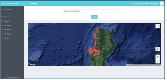
The dashboard as seen on Fig. 3 displays a location map of every region. The right menu comprised of different
modules such as HEI, Faculty, Programs (Program Search and Program by Region), Enrolment Data, Graduate
Data and System Settings.
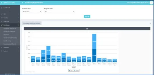
Figure 4 shows the enrolment module particularly the “Enrolment by Program”. The module displays a bar
graph depicting the highest enrolment to lowest enrolment number per program. It can also display the
enrolment by region, discipline, and congressional district. The same is also reflected in the Graduate module.
Figure 4: Enrolment Module (by program)
The availability of sex-disaggregated statistics in CHED DataViz 1.0 can lead to the development of policies
and projects benefitting both men and women.
Figure 5: Enrolment Module (Sex-disaggregated)
By detecting trends in big data, it’s already possible to develop a contextual visual story and by presenting this
data with the assistance of CHED Data Viz 1.0 — which can translate data and numbers into easy-to-grasp
charts, graphs and visualizations.
8. Results and Discussions
Functional Suitability. This characteristic represents the degree to which a product or system provides functions
that meet stated and implied needs when used under specified conditions.
Table 1: Functional Suitability Evaluation
Functionality Suitability Rating
Functional Completeness 4.77
Functional Correctness 4.51
Functional Appropriateness 4.87
Mean 4.72
As reflected in table 1, the respondents evaluated the criteria “Functionality Suitability” with a mean rating of
4.72 (strongly agree). The evaluation shows that CHED DataViz provides functions that meet the implied needs
when used under specified conditions specifically the criteria “Functional Appropriateness” to which the
functions facilitate the accomplishment of specified tasks and objectives Performance efficiency. This
characteristic represents the performance relative to the amount of resources used under stated conditions.
Table 2: Performance Efficiency Evaluation
Performance Efficiency Rating
Time Behaviour 4.77
Resource Utilization 4.65
Capacity 4.73
Mean 4.72
Table 2 shows, the respondents evaluated the criteria “Performance Efficiency Evaluation” with a mean rating
of 4.72 (strongly agree) the evaluation shows that CHED DataViz met its stated functions in relation to the
correctness and completeness with which respondents were able to utilize the tool in decision-making.
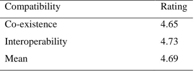
Table 3: Compatibility Evaluation
Compatibility Rating
Co-existence 4.65
Interoperability 4.73
As reflected in table 3, the respondents evaluated the criteria “Compatibility” with a mean rating of 4.69
(strongly agree). The evaluation shows that the CHED DataViz met its stated functions as to the application can
exchange information with other products, systems or components, and/or perform its essential functions, while
sharing the same hardware or software environment. The criteria “Interoperability” was evaluated with a mean
rating of 4.73. This explains that other CHED Higher Education Management Information System components
can exchange information and use the information that has been exchanged.
Table 4: Usability Evaluation
Usability Rating
Appropriateness Recognizability 4.90
Learnability 4.65
Operability 4.73
User Error Protection 4.77
User Interface Aesthetics 4.65
Accessibility 4.73
Mean 4.74
As stated in table 4, the respondents evaluated the criteria “Usability” with a mean rating of 4.74 (strongly
agree). The evaluation shows that the criteria “Appropriateness recognizability” which described as “the degree
to which users can recognize whether a product or system is appropriate for their needs” garnered the highest
mean rating of 4.90.
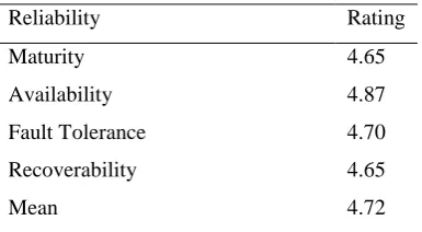
Table 5: Reliability Evaluation
Reliability Rating
Maturity 4.65
Availability 4.87
Fault Tolerance 4.70
Recoverability 4.65
Mean 4.72
Table 5 mentions that the respondents evaluated the criteria “Reliability” with a mean rating of 4.72 (strongly
agree). The evaluation shows that CHED DataViz met the specified functions under specified conditions for a
specified period of time, particularly the sub-criteria, “Availability”, which the tool is operational and accessible
when required for use, 24/7. The tool is uploaded in a cloud platform so the users can access it anytime and
Table 6: Security Evaluation
Security
Confidentiality 4.65
Integrity 4.73
Non-repudiation 4.77
Authenticity 4.83
Accountability 4.65
Mean 4.72
Presented in Table 6, the respondents evaluated the criteria “Security” with a mean rating of 4.72 (strongly
agree). The evaluation shows that the CHED DataViz met its stated functions as to the degree to which it
protects information and data so that persons or other products or systems have the degree of data access
appropriate to their types and levels of authorization. The tool that can be accessed through URL utilized a
Secure Sockets Layer (SSL) that is used to encrypt the information on the Internet so that data can be transferred
safely.
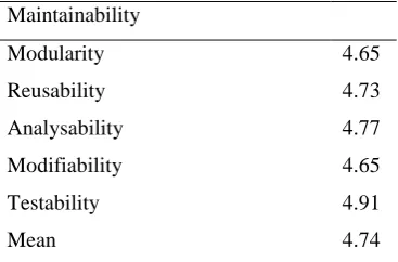
Table 7: Maintainability Evaluation
Maintainability
Modularity 4.65
Reusability 4.73
Analysability 4.77
Modifiability 4.65
Testability 4.91
Mean 4.74
Shown in Table 7, the respondents evaluated the criteria “Maintainability” with a mean rating of 4.74 (strongly
agree). The evaluation shows that the CHED DataViz can be modified to improve it, correct it or adapt it to
changes in environment, and in requirements. Modifications can include corrections, improvements or
adaptation of the software to changes in environment, and in requirements and functional specifications.
Modifications include those carried out by specialized project technical staff, and those carried out by
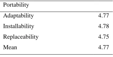
Table 8: Portability Evaluation
Portability
Adaptability 4.77
Installability 4.78
Replaceability 4.75
Mean 4.77
Seen in Table 8, the respondents evaluated the criteria “Portability” with a mean rating of 4.5 (strongly agree).
The evaluation shows that the CHED DataViz has the ability to run on any instance of the supported platform,
including plug-compatible, virtual, outsourced or cloud-based environments.
References
[1] Joint Memorandum Circular No. 2012-01
[2] CHED Memorandum Order No. 45, s. 2016 . Commission on Higher Education
[3] B. Daniel, “Big Data and analytics in higher education: Opportunities and challenges,” British Journal of
Educational Technology.
[4] OPEN DATA PHILIPPINES ACTION PLAN 2014-2016. (2014). Retrieved from
https://data.gov.ph/sites/default/files/Open Data Philippines Action Plan 2014-2016.pdf
[5] L. D. (2001). Application Delivery Strategies. Retrieved from
https://blogs.gartner.com/doug-laney/files/2012/01/ad949-3D-Data-Management-Controlling-Data-Volume-Velocity-and-Variety.pdf
[6] I. R. (n.d.). Data visualization: Contributions to evidence-based decision-making. Sci Dev Net. Retrieved from
https://www.scidev.net/filemanager/root/site_assets/leanring_reports/data_visualisation_learning_report_scidev
net.pdf.
[7] There’s Magic in Graphs: How Data Visualization Leads to Better Decision Making. (2017). Retrieved
March/April, 2019, from https://www.crgroup.com/wp-content/uploads/data-visualization-eBook.pdf
[8] Forum Guide to Data Visualization: A Resource for Education Agencies. (2016). Retrieved March, 2019,
from https://nces.ed.gov/pubs2017/NFES2017016.pdf
[9] A. M., & I. R. (2018). MVC Architecture: A Detailed Insight to the Modern Web Applications Development.
Peer Review Journal of Solar & Photoenergy Systems. Retrieved from
https://crimsonpublishers.com/prsp/fulltext/PRSP.000505.php.