Reflecting on the Physics of Notations applied to a
visualisation case study
ROAST, Chris <http://orcid.org/0000-0002-6931-6252> and URUCHURTU,
Elizabeth <http://orcid.org/0000-0003-1385-9060>
Available from Sheffield Hallam University Research Archive (SHURA) at:
http://shura.shu.ac.uk/12901/
This document is the author deposited version. You are advised to consult the
publisher's version if you wish to cite from it.
Published version
ROAST, Chris and URUCHURTU, Elizabeth (2016). Reflecting on the Physics of
Notations applied to a visualisation case study. In: CORNEJO, Raymondo and
MAYORA IBARRA, Oscar, (eds.) MexIHC '16 : 6th Mexican Conference on
Human-Computer Interaction. ACM.
Copyright and re-use policy
See
http://shura.shu.ac.uk/information.html
Sheffield Hallam University Research Archive
Reflecting on the Physics of Notations applied to a
visualisation case study
Chris Roast
Culture, Communication and Computing Research Institute
Sheffield Hallam University Sheffield
United Kingdom +44 (0)114 2255555
Elizabeth Uruchurtu
Culture, Communication and Computing Research Institute
Sheffield Hallam University Sheffield
United Kingdom +44 (0)114 2255555
[email protected]
ABSTRACT
This paper presents a critical reflection upon the concept of 'physics of notations' proposed by Moody. This is based upon the post hoc application of the concept in the analysis of a visualisation tool developed for a common place mathematics tool. Although this is not the intended design and development approach presumed or preferred by the physics of notations, there are benefits to analysing an extant visualisation. In particular, our analysis benefits from the visualisation having been developed and refined employing graphic design professionals and extensive formative user feedback. Hence the rationale for specific visualisation features is to some extent traceable. This reflective analysis shines a light on features of both the visualisation and domain visualised, illustrating that it could have been analysed more thoroughly at design time. However the same analyse raises a variety of interesting questions about the viability of scoping practical visualisation design in the framework proposed by the physics of notations.
CCS Concepts
• Human-centered computing → Visualization design and evaluation methods • Applied computing → Spreadsheets
Keywords
Spreadsheets; Visualisation; Notations.
1.
INTRODUCTION
The design of visual notations is driven by a number of factors normally motivated by humans' impressive visual processing and interpretation powers. However the quality of a visualisation for supporting users in their tasks and activities is difficult to assess. Despite the intuitive appeal and rationale for visual representations, identifying general material benefits can be hard [21].
In this paper we critically examine a framework that provides rational basis for designing and assessing a visualisation. The framework is call the physics of notations ([15]) and reflects a synthesis of scientific findings relevant to visualisation quality grouped into a set of principles. Here we examine some of these
principles through applying the framework to an existing visualisation tool, called EQUS. The benefit of using EQUS is that it was researched and developed within our centre following an iterative development process and employing significant user feedback.
Contrasting the designed visualisation of EQUS with the theoretical physics of notations demonstrates important differences that are relevant to basic assumptions underlying the physics of notations. The key outcomes illustrate that the meaning of visualisation can be an emergent property process of by which it is developed. Therefore it is unhelpful to presume the existence of a semantic domain to be visualised before initially developing a visualisation. Complimenting this point it is difficult to know what semantic constructs should be focused upon in an analysis, in order to get the most valuable feedback.
1.1
The Physics of Notations
Moody's ‘physics of notations’ [15] presents one account of visual representation analysis and design that has the benefit of being grounded in existing research findings regarding human visual processing and representation. The objectives of the physics of notations are ambitious in attempting to provide both a robust descriptive theory of visual notation effectiveness and the prescriptive theory offering justifiable principles to be employed in visual notation design. The principles are oriented to improving cognitive effectiveness. Although the work is motivated principally by Software Engineering, the arguments are not specific to software engineering and should be applicable in many visualisation design contexts.
The resulting principles are posited as providing a scientific basis for comparing, evaluating, improving and constructing visual notations. The natural benefits of such an approach are that it should diminish, if not eliminate, guess work, subjective judgment and reliance upon design-time empirical studies.
assessments finding opportunities where a physics of notation principle appears to fit. In none of these studies is the framework itself the subject of the research or critically assessed. The studies welcome the potential to improve the quality of their visualisations using evidence based principles. Conversy presents ‘ScanVis’ [5], an interesting alternative to the physics of notations through presenting an operationalised descriptive theory of visual interpretation. In addition, unlike the physics of notations, ScanVis is driven by the tasks users are engaged in.
In this paper we explore a case study of applying the principles to an example visualisation system. However this is done critically reflect upon the framework. Hence, our example of how Moody's framework might be used in a real design context, assesses its appropriateness as analytic tool. Methodologically this approach may not reflect the intended use of the framework but it does provide insights regarding the immediate utility of the framework and its possible relationship with other approaches to visualisation development (such as, professional design practice and user centred design).
2.
PHYSICS OF NOTATIONS APPLIED TO
A CASE STUDY
As part of supporting a programme of rationally justifying visualisation design theory and principles, we describe a physics of notations 'driven' analysis of a recently development visualisation tool. The EQUS tool is the outcome of a project to support the more effective use of spreadsheets, especially focused upon teenage learners [18]. Despite being established tools, spreadsheet important since they are a familiar technology that is widely accessible and they enabling significant user empowerment [16]. In particular the EQUS concept was motivated by the spreadsheet formula bar being an inappropriate device for composing and comprehending formula that can become very complex [18, 14]. The advantage of using EQUS project as a case study is that the visualisation has been developed following a pragmatic realistic quality design process. The process has been iterative and lead by a professional graphic designer. It initially involved a review of visualisation research, and then paper based design studies with end users and later using digital prototypes. As part of this process formative user feedback directed the evolution of visualisation. In addition, tutors for teenage learners, learner support services and experts in mathematics education were also consulted. Hence, resulting design reflects a combination good visual design practice informed by stakeholder feedback.
In terms of our knowledge of EQUS's visualisation design (and the rationale for it), we are well resourced. In addition, we've extensive knowledge of the intended context of use and user goals. However it should be noted that the design rationale has not itself been comprehensively documented.
2.1
Applying the ideas
Given this context we assess the concepts from the physics of notations by attempting to apply the theory to the EQUS visualisation. In doing so, a 'claims'-like analysis is used in attempting to identify the conditions under which the physics of notations becomes informative in reviewing the EQUS visualisation. If the conditions are not overly contrived and judged to be relevant to EQUS, the analysis serves as an illustration of using Moody's framework constructively. However in cases where the conditions appear to stress the interpretation of the framework or EQUS, it can expose weaknesses in the framework. Such weaknesses can range from it being difficult to apply or irrelevant
emphasis through to even weakening the quality of the EQUS visualisation.
3.
THE EQUS CASE STUDY
3.1
What is EQUS?
EQUS is an 'add-on' to spreadsheets that is designed to help teenage learners develop numeracy confidence and an improved foundation for academic progression and employability. The relevance of this is evidenced by the value placed on the development of numeracy skills within science, technology, engineering and mathematics (STEM) education. In the UK there are various programmes to develop mathematical skills and skills for employment in engineering and IT. Within this setting spreadsheets offer a common available tool for powerful numeric computations [2]. However, there is good evidence of them not being developed and used correctly [12,22].
Research into addressing issues of spreadsheet quality have motivated many enhancements. This includes additional features to ensure they are more transparent, as well as mechanisms to encourage, or enable, greater discipline in their use. [4,3,20]. Similarly alternative ways of presenting and visualizing spreadsheets have been examined [1,13,19]. However, these works mainly consider the wider structure of spreadsheets, and the dependencies between cells. None appear to have addressed a simple observation that the formula language is computationally powerful language but formula are composed, read and corrected using a restrictive single line editor.
The pedagogic basis for the EQUS visualisation is one of transparency – making explicit structures and details within the formula visually evident. Educationally we argue that exploratory learning benefits from being able to quickly experiment and gain the benefits of the rapid feedback offered by spreadsheet responsiveness. One side effect of rapid experimentation is that users prefer not to experiment with spreadsheet structures (that can simplify individual formula), but as an alternative “build” longer formula to generate speculative models and views of data. This account concurs with considerably anecdotal evidence that spreadsheets, used operationally, tend to incorporate complex formula. Once they function as required, they tend not to be re-engineered as well structured solutions.
It is important to note that the target audience for EQUS was initially was a broad range of teenage learners developing skills and knowledge in STEM subjects. Hence, one influence upon EQUS's design was to ensure that it could be easily deployed and adopted. As a consequence an early design objective was to ensure that the behaviour of the add-in was primarily to visualise formula and not directly support formula editing.
3.2
What EQUS does
Figure 1. An example of EQUS output, for the spreadsheet formula: = (-B1+sqrt(power(B1,2)-4*A1*C1))/(2*B1)
The visualisation was developed exploring various designs allowing the authors, tutors and learners to explore and provide feedback on characteristics their perceived appropriateness. Initially good visual design practice was followed, informed by learning scenarios and educational uses of spreadsheets (e.g. see: [11]). The design principles governing the initial design phase where:
• Evidencing structure. Within a given formula, the syntactic structure is core to comprehending meaning.
• Visual mapping. The ease of mapping between the formula and visualisation. Clearly, if this mapping is complex for a learner, the visualisation may be of little value.
• Evidencing categories. Within a given formula, being able to recognise the different categories of tokens and structures. • Evidencing abstractions. There are various abstractions
apparent in the way formulae are used. Simple abstraction follow the syntactic structure of the formulae. More complex examples might be, say, the use of a common sub-expression appearing in a number of places in a single formula. A simple example would be the formula for a quadratic, such as, =A1*X1*X1+B1*X1+C1. The recurring use of X1 is what "makes it" a quadratic.
• Evidencing computation. In contrast to abstractions, there is the value of evidencing the specific values used in determining the resulting value of a formula. Hence, when a formula such as, =2+3*4 produces the result 14, it is important to understand that arises from 2+12 and the 12 arises from 3*4.
• Visual simplicity and scalability. Although not easily defined, this principle discourages apparently empty space, redundant arcs or overlapping lines or structures. In view of our motivation, this point is most relevant for complex formulae.
Various visualisation approaches were identified based on a data flow metaphor with components interconnected by flows that represented results passing between operations within a formula. The approach settled upon was one termed "Explicit Visualisation". This graphically represented each computation step in processing a formula, specifically:
• The visualised formula is a direct match to the original spreadsheet formula. Thus supporting the concept of visual mapping.
• Cell references include the numeric values in those cells. While this detracts from the visual mapping it does support evidencing computation at a basic level.
• Values, functions and operators flow down into additional nodes ("monitors") which themselves show the result of the associated operator or function applied to its arguments. This supports evidencing computation.
To help understand the resulting visualisation, we provide an illustration in figure 1, representing the positive component of the equation for solving a quadratic formula.
3.3
Pragmatic Design Rationale Resources
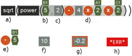
The development of EQUS has involved the engagement of over one hundred learners ranging from work based trainees and secondary school pupils, through to first year university students. From these engagements qualitative feedback has identified specific requirements regarding features and behaviours. Collectively, feedback and requirements have informed the principles (above), the "Explicit Visualisation" approach, and also the details of the visualisation style as it has been iteratively developed. In addition, qualitative feedback from tutors and experts in Mathematics education has informed design decisions and clarified the specific tasks that learners are likely to be engaged in. Hence the design rationale for EQUS is not explicit but has emerged as a consequence of balancing prior findings, with good design principles and stakeholder feedback. However, it is important to note that the physics of notations was not employed as part of this design process.Figure 2. An illustration of EQUS symbols: a) a function, b) a cell reference and value, c) a constant value, d) an infix operator, e) a unary prefix operator, f) a result, g) a final
result and h) an error.
4.
PRELIMINARIES
In this section we commence the physics of notations analysis by establishing the basis on which concepts from the framework are to be interpreted in terms of the EQUS visualisation. This involves identify the visual notation level and the domain being visualised. In the following main section we critically assess six of the physics of notation concepts, given our preliminary assumptions.
4.1
The Visual Notation Level
[image:4.595.312.540.392.489.2]Figure 3. Examples of EQUS data flow arcs. The arc colour matches the source token.
Using these terms the visual notation in EQUS immediately can be identified as consisting of the tokens used to represent formula, and the specific symbols used in the flow diagram. It seems sensible to categorize these into localised tokens and connecting tokens: • localised tokens: infix binary operators and prefix unary
operators in an 'orange' circle; numeric constants in solid rectangles; cell referenced values in green hexagonal blocks (with the cell name above them); functions in black rectangles, intermediate results and results in grey rectangles. In addition we'll class open and closed braces as separate localised tokens. (All illustrated in figure 2).
• non-localised tokens: the connectors between localised tokens consist of directed arcs (running top to bottom), normally with a colour matching the colour of the source localised token. (See figure 3).
The general visual syntax is one of downward connectivity. The arcs join the localised tokens to result rectangles, following the convention that an operator and its arguments flow into the same result rectangle.
A more detailed notation of visual syntax is that the top row of tokens reflects the textual form of the formula being visualized (as encouraged by EQUS's concept of visual mapping). Hence the top row maps to the spreadsheet formula, and reflects the one dimensional syntax of the formula. We shall not focus upon articulating formula syntax but for the case of bracketed expressions. In attempting to identify visual tokens of our visual notation we propose the following token type:
• bracketed zones: Balancing brackets denote a zone, normally containing localised tokens. The zone is displayed with the area darkened. As a consequence, nested brackets show zones darkened proportionately to the level of nesting. (See the bracketed zones in figure 2.)
Hence the visual syntax for EQUS will have bracketed zones requiring an opening and closing brace.
4.2
Domains and Semantics
In considering the application of the physics of notations the notion of the semantic domain needs to be established. While in some visualisation design contexts a semantic domain may be well defined and obvious, it is not the case for EQUS. The domain to be visualised was never initially identified or defined. Clearly the domain is grounded in elements of spreadsheet operation but which elements belong in the domain being visualised is something that was determined from our extensive engagements with learners, tutors and expert. Hence the basic physics of notation assumption that an existing domain is being visualised does not correspond to our design and development experience in which the domain emerged from iterative design.
Preliminary concepts in EQUS's development focused upon visualisation approaches that would accommodate the numeric functionality available in a spreadsheet. Relating spreadsheet use to specific educational purposes that it might be used for, in effect,
drew the design activity into the distinct discipline domains that we intended to support. Hence, educators in Engineering would have examples in which the units of variables are explicitly given. So, for example, a learner might be expect to think of a value computed for acceleration (as being in metres per second per second) but all a spreadsheet would show is the value (and not the unit). These points interestingly touch on Moody's principle of ‘cognitive fit’. This interpretation would such that each discipline wishing to use a spreadsheet has its own ‘visual dialect’ and as such the visualisation should accommodate relevant differences. However this does not reflect the fact that the visualisation is of a spreadsheet not capable of supporting alternative dialects.
As a consequence, we conclude that it is the domain of Mathematics that is the common basis for spreadsheets being of value in so many contexts. Hence, in trying to apply the physics of notations we presume that the semantic domain of EQUS is that of spreadsheet mathematical formula, spreadsheet values and their results.
It is also worth noting that mathematics educators were not always accepting of traditional spreadsheets. Specific concerns included: • differences in notations used, such as the sheet function
“POWER(X,Y)” being appear quite different to the notation in, say, a textbook ܺ.
• differences in values computed, for instance,−2ଶ expressed
“=-2^2” is parsed and computed as (−2)ଶ and when it should be
−(2ଶ).
5.
APPLYING PHYSICS OF NOTATIONS
Having described the primary visual notation and semantic domain, the principles identified by Moody in the physics of notations can each be examined in terms of the EQUS example. Of the 'principles' that the physics of notations proposes we look at six that appear to be the most relevant to EQUS visualisations.5.1
Principle of Semiotic Clarity
This concerns the relationship between the symbols of a notation and their corresponding semantic concepts. The primary analysis is the nature of the mapping between them, characterised by the four questions below. However, initially, we need to identify 'symbols' within our visual notation. A simple interpretation of the word would suggest that localised tokens in EQUS are the most likely 'symbols'. In addition, to symbols we should to clarify what semantic constructs can be considered as legitimate. For the present we shall consider semantic constructs to be defined in terms of formula (and any cells on which they rely) paired with their result.
5.1.1
Redundancy
Do different symbols represent the same semantic construct? Assessing this question immediately raises the point as to whether the 'surface'/lexical appearance of a formula is treated as being semantic. If not then a number of symbols have the same semantics, such as the up-arrow “^” and the function “POWER”. However, design commitment to visual mapping within EQUS suggests that lexical representation should not be dismissed, hence “POWER” and “^” would be treated as semantically different.
and final results. Hence formally the final result box is visually differentiating values that have no differentiation semantically.
5.1.2
Overload
Do different semantic constructs have the same symbol representation? One example of this is the use of the gray rectangle to represent both a constant value (within a formula) and also a result of a formula. Taken purely as symbols, without context their semantic reading is ambiguous. However during development, one of the judged strengths of this characteristic was that it supports the notion of referential transparency. For instance it is important for learners to understand that, say, 3+5, can be replaced with 8 without any untoward consequences. Hence, in our example the result of 3+5 is in effect no different to the constant 8.
One other example of overload is the error visualisation. In EQUS at present any spreadsheet error is visualized by a single token (see figure 2h). Whether we would have identified this overloading formally is another challenge. Our account of semantic constructs include formula results but it is not comprehensive enough to clarify whether types of result errors are to be discriminated between.
5.1.3
Excess
Do some symbols have no semantics constructs? Since all the symbols have been derived from spreadsheet formula none represent an excess.
5.1.4
Deficit
Do some constructs have no symbol? Attempting to answer this question provokes the exploration of what semantic construct might be envisaged that we have no visualisation for. We can implicitly identify deficits as any constructs that EQUS cannot parse. Parsing takes a conventional approach though it does limit the functions that will be parsed to over 200 pure mathematical functions. Hence, any expression involving an impure function, such as one having a side-effect, will not be parsed successfully and will not be displayed.
This analysis appears relatively straightforward, it is potential valuable as it does highlight that EQUS makes no attempt to visualise formula involving impure functions. As with the errors, there might be visualisation of such functions that help the user (despite being impure).
In fact since the time of the analysis described in this paper such a category of function has been included in parsing and visualising. Specifically, ‘volatile functions’ – functions that can generate a different result each time they are evaluated have their results visualised distinctively.
5.2
Principle of Discriminability
Perceptual discriminability concerns the differentiation between symbols that can be easily or efficiently recognized by humans. The principle is based on the rationale that better discrimination means more efficient visual processing and fewer erroneous interpretations.
Taking the symbols of EQUS they can be differentiated by two primary visual features colour and shape (by using the two features together they conform to the notion of 'redundant coding'). Braces are also distinctive by do not have the benefit of employing a primary shape - since they mirror their textual equivalents. The two symbols that are closest in terms of visual distance are result rectangles and final result rectangles. (The orange boarder distinguishes the latter.) Because of this they risk being confused
during visual processing. However it can be argued that their semantic similarity (they are both results) means confusing them is not a high risk. (In addition, they can always be distinguished in terms of visual position on the visual canvas, the final result is always are the bottom.)
The visual notation of EQUS as posited in section 4.1 focuses upon the types of symbols used and not the specifics of their content. However, if we take the notion of discriminability to consider content it is perhaps appropriate to recognize that spreadsheet functions can only be discriminated by their textual content. Focusing just on functions, EQUS visualises them with limited discriminability. One obvious method of improving this is to relate functions to the classes of functionality they support. For example spreadsheet support materials, differentiate functions by mathematical domain, such as: trigonometric, boolean, etc. and also purpose, such as finance, statistics, etc.. Categorisations such as these could be the basis for discriminating functions visually. This reflection on discriminability demonstrates the open-ended nature of the 'deficit' question. The assessment of discrimination between over 200 instances of the function symbol type, provoked, a richer semantic construct attribute based on function categories. Thus, at the risk of going round in circles, we have identified that: if we think of function categories as semantic construct attributes, then we have a deficit (no visualisation for such a construct) and/or overloading (differing function categories having the same symbol).
Interestingly this same assessment can be applied to operators and also results. For example infix operators could be visually differentiated on a categorical basis, such as, whether or not they are commutative.
5.3
Principle of Semantic Transparency
Semantic transparency concerns how well a visualisation suggests the meaning of what is being visualized. Given that the EQUS visualisation is focused upon visual mapping with the formula, the semantic transparency should be high. The symbols predominantly include the textual representation of what they mean, such as function names. One exception is the use of "x" to represent multiplication in the visualisation, whereas, "*" is used in the spreadsheet. Only one expert evaluator raised this point by did not consider it significant. The other symbol without a textual equivalent is the error symbol. In this case the use of a distinctive colour and a relevant text supports semantic transparency.5.4
Principle of Cognitive Integration
Cognitive integration concerns support for integrating information from different sources. Within EQUS the primary integration activity that the user requires is relating the spreadsheet content and behaviour with that of the visualisation. We'd recognised this with the visual mapping principle, primarily supported through Semantic Clarity and Semantic Transparency. In terms of display structure EQUS prototypes operated in an independent window and in doing so required that the users put the visualisation side-by-side with the spreadsheet. The need to manage the visualisation window separately raised some concerns from users; feedback that could be attributed to poor cognitive integration. More recent versions are plug-ins that default to the visualisation being in a task pane within the spreadsheet.
formula has focus. This provides a synchronisation between the two views. However, the behaviour has disappointed users as the visualisation disappears as soon as the focus is lost.
Hence the close behavioural integration appears appropriate but inherits existing behaviour annoyances that users may have. The argument in favour of this would be that as an add-on EQUS does not disrupt priori familiarity with the spreadsheets.
5.5
Principle of Visual Expressiveness
Visual expressiveness refers to exploiting a range of visual variables to ensure 'computational offloading'. The more visual attributes used to differentiate a set of symbols the greater their visual expressiveness and the higher the possibility of discriminability and efficient recognition.
For EQUS the information carrying visual attributes of the symbols are primarily: colour, size and shape. Position is used for overall layout and the visual syntax means that the final result is always placed lowest on the canvas. Brightness, orientation and texture have not been used.
From applying this concept and reflecting upon its application in EQUS the following points seem relevant. First, the potentially low level of visual expressiveness was settled upon during development. The level was never pushed 'high' enough to provoke feedback, hence a level of expressiveness that was never challenged acquired a momentum.
From the point of view of the physics of notations, it is not clear the scope of visualisation features that expressiveness is concerned with. Above we have kept to what we've termed symbols (localised visual tokens), whereas including the non-localised tokens would enrich the assessment. For example bracketed zones involve shade of brightness.
Another facet of expressiveness is the combination of textual and graphical encoding. Clearly this is widely evident in EQUS. All tokens include a corresponding relevant textual content.
5.6
Principle of Graphic Economy
This principle is concerned with ensuring the cognitive manageability of the symbols used. The risk being that overloading the user with symbols results in the value and efficiencies of a visualisation being undermined.
5.6.1
Reduce Semantic Complexity and Symbol
Deficit
Visual complexity within a visualisation goes hand-in-hand with the complexity of the semantic domain being represented. Thus to support manageability, the ideas of partitioning or simplifying a semantic domain are options to consider.
For EQUS, and our analysis, this is an interesting view, the process of development and analysis so far has been one that has clarified and enriched a semantic domain. Simplifying the semantic domain would appear to be contrary to what the analysis has revealed. However, one can envisage a prioritization of the semantic domain. For example, our initial development with EQUS focused upon reflecting the expressive power of spreadsheets. However our experience with prototypes identified a significant unmet need in terms of visualizing error values and their causes. Hence one could conclude that the semantic domain is as detailed as our analysis suggests but some components of it deserve prioritization.
5.6.2
Increase Visual Expressiveness
This is a 'tactic' suggested by the principle that proposes that the wider use of visual attributes improves the potential for users to select between symbols and in doing so improve the overall manageability.
Our interpretation of EQUS's visualisaton in response to this suggestion was that the consistent visual style of EQUS of a greater merit than visual expressiveness. One point worth raising concerning visual expressiveness is that the visualisation at any one time reflects a specific formula in focus, hence immediate expressiveness is dependent upon the user being able to relate the visualisation to just the one formula in focus.
6.
REFLECTION
Our analysis has focused upon what is a relatively simple visualisation example: EQUS, as analysed here, visualises declarative numeric expressions. However as a case study for analysis this appears to have been adequate as an example facilitate reflection upon the physics of notations framework.
We have limited ourselves to only six of the principles in the physics of notations and have also avoided some of the complexity of EQUS. Specifically, we have not explored conditional expressions (as represented by the spreadsheet function 'IF'). Designing the visualisation for conditionals involved significant effort and experimentation.
6.1
Discovering Meaning
It is clear from the analysis that a recurring question has been: what constitutes and defines the semantic domain that is being visualised? In the case of EQUS the domain was ill-defined from the start, despite spreadsheets as a technology being well established. The posited semantic constructs have been challenged repeatedly in response to attempting to interpret and apply the principles of the physics of notations. This has included: whether equivalent functions should be recognized as such, whether types of formula error should be identified, whether categories of functions should be identified, and also whether the function in focus has a special status. The specific details asked of EQUS by the analysis have largely been derived from the feedback gathered during development.
It is also interesting that the existence of semantic domain 'behind' the visualisation was never considered during development. The semantic domain, to speak of, transpired to be a mixture of known characteristics and features of spreadsheets (relatively formal and relatively well documented) combined with a user oriented account of learning, tutoring and users emerging from trialing early versions. Such a domain thus would be more conventionally described in terms of goals, task and/or activities (as found in main stream Human-Computer Interaction).
Therefore, one challenge for using the physics of notations is whether is suited to situations where the meaning of the visualisation is in fact determined post priori and not a priori.
6.2
Scoping and Expectation
taken into account or scrutinized. On reflection one cannot help wondering if their inclusion might have yielded a richer analysis and greater insights. For example, EQUS explicitly shows operator precedence and overall syntactic structure. However, in our attempt to apply the physics of notation analysis, these features did not become apparent. Having completed the analysis, one can speculate that subexpressions (and parse tree) would need to be ‘semantic constructs’. However, looking back at the analysis it seems inappropriate to grow the domain in an unprincipled manner.
6.3
Specific Outcomes
Attempting the analysis has focused attention upon design details that may impact upon EQUS design. Two cases in particular are likely to influence future versions of EQUS. The discriminability of symbols (especially functions) could be improved by recognizing the different purposes of functions. In addition, the fact there is a number of types of spreadsheet error, but they overload the single error symbol.
7.
CONCLUSIONS
We reported upon exploratory application of the physics of notations framework to analyse a case study with a development history. The analysis highlighted various overarching factors that might inform the effective use of the physics of notations in the future.
First there is an implied rational account of visualisation design and development with the physics of notations, which presupposes a semantic domain being defined from the outset (a priori). Our experience suggests that such a rationale account is unrealistic. Specifically in our case study semantic domain has been established post priori, in effect constructed in response to user feedback and visualisation refinements.
Second, the level for analysis and applying the physics of notations needs to be right. There is limited guidance on this and perhaps not unexpectedly it appears to benefit from a setting in which the semantic domain is well established.
Third the principles developed as part of Moody's framework have the merit of being closely related to findings in the domain of cognitive psychology. However, their rationalisation at the level of principles generalizes over the specifics. As a result the principles appear to be at best a means of focusing attention to justifiable design options and possibilities. Despite having clear objectives they are not complementary and in some cases could be interpreted as contradictory. It may be the case that the most important questions for the use of the set of principles are: "How should each be applied?", When each should be applied?" and "How is overall design improvement recognised?"
8.
ACKNOWLEDGMENTS
EQUS was developed with design and technical input from project team: Tony Day, Michael Gunning and Roxanne Leitão. We are indebted to local colleges' staff and students that were willing to support and participate in the studies reported.
9.
REFERENCES
[1] Ballinger, D., Biddle, R. and Noble, J., 2003. Spreadsheet structure inspection using low level access and visualisation. In Proc. Fourth Australasian User Interface Conference (AUIC2003). Biddle, R. and Thomas, B., Eds. ACS. 91-94. [2] Burnett, M., Atwood, J., Djang, R., Gottfried, H., Reichwein,
J. and Yang, S., 2001. Forms/3: A first-order visual language
to explore the boundaries of the spreadsheet paradigm. Journal of functional programming 11(2): 155-206. [3] Burnett, M., Sheretov, A., Ren, A. and Rothermel, G., 2002.
Testing homogeneous spreadsheet grids with the "what you see is what you test" methodology" in IEEE Trans. Softw. Eng., 28(6) pp. 576-594.
http://dx.doi.org/10.1109/TSE.2002.1010060
[4] Chambers, C. and C. Scaffidi, 2010. Struggling to excel: A field study of challenges faced by spreadsheet users. IEEE Symposium on,Visual Languages and Human-Centric Computing (VL/HCC).
[5] Conversy, Stéphane. 2014. Unifying Textual and Visual: A Theoretical Account of the Visual Perception of
Programming Languages, Proceedings of the 2014 ACM International Symposium on New Ideas, New Paradigms, and Reflections on Programming & Software, October 20-24, 2014, Portland, Oregon, USA.
[6] Dobesova, Z., 2013. Strengths and Weaknesses in Data Flow Diagrams in GIS, International Conference on Computer Sciences and Applications (CSA), pp. 803-807. [7] Fish, Andrew and Störrle, Harald, 2013. Towards an
operationalization of the “physics of notations” for the analysis of visual languages,16th International Conference MODELS, Miami, Florida, 2013.
[8] Fors, N.; Hedin, G., 2014. "Intercepting dataflow connections in diagrams with inheritance", IEEE Symposium on Visual Languages and Human-Centric Computing (VL/HCC).
[9] Genon, N., Amyot, D., Heymans, P., 2010. Analysing the cognitive effectiveness of the UCM visual notation, Proceedings of the 6th international conference on System analysis and modeling: about models, October 04-05, 2010, Oslo, Norway.
[10]Genon, N., Caire, P., Toussaint, H., Heymans, P., Moody, D., 2012. Towards a more semantically transparent i* visual syntax, Proceedings of the 18th international conference on Requirements Engineering: foundation for software quality, March 19-22, 2012, Essen, Germany.
[11]Gretton, H. and Challis, N., 2008. "Fundamental Engineering Mathematics; A Student Friendly Workbook" Woodhead Publishing, 2008, ISBN-13: 978-1898563655.
[12]Hendry, D.G. and Green, T.R.G., 1994. "Creating, comprehending and explaining spreadsheets: a cognitive interpretation of what discretionary users think of the spreadsheet model." in International Journal of Human-Computer Studies, 40(6), pp. 1033-1065,
DOI=10.1006/ijhc.1994.1047
[13]Igarashi, T., Mackinlay, J.D., Chang, B-W and Zellweger, P.T., 1998. Fluid Visualization of Spreadsheet Structures, Proceedings of the IEEE Symposium on Visual Languages, p.118.
[14]Leitao,R. and Roast, C., 2014. Developing visualisations for spreadsheet formulae: towards increasing the accessibility of science, technology, engineering and maths subjects, 9th Workshop on Mathematical User Interfaces, Coimbra, Portugal.
Software Engineering, IEEE Transactions on Software Engineering, 2009. 35(6): pp. 756-779.
[16]Panko, R. R. and Sprague Jr., R. H., 1998. "Hitting the wall: errors in developing and code inspecting a simple
spreadsheet model" in Decision Support Systems 22(4): pp. 337-353.
[17]Popescu, Gabriel, and Alain Wegmann, 2014. "Using the Physics of Notations Theory to Evaluate the Visual Notation of SEAM." IEEE 16th Conference on.Business Informatics (CBI), 2014 Vol. 2.
[18]Roast, C., Leitao, R. and Gunning, M., 2016. Visualising formula structures to support exploratory modelling, International Conference on Computer Supported Education, Rome, Italy, 21-23 April, 2016.
[19]Saariluoma, P., Sajaniemi, J.,1991. Extracting Implicit Tree Structures in Spreadsheet Calculation. Ergonomics 34(8), pp. 1027-1046.
[20]Sajaniemi, J., 2000. Modeling Spreadsheet Audit: A Rigorous Approach to Automatic Visualization in Journal of Visual Languages and Computing. 11, pp. 49-82.
doi:10.1006/jvlc.1999.0142
[21]Sorva, J., Karavirta, V. and Malmi, L., 2013. A Review of Generic Program Visualization Systems for Introductory Programming Education. In Trans. Comput. Educ. 13(4). DOI=http://dx.doi.org/10.1145/2490822