Eurographics/ IEEE-VGTC Symposium on Visualization 2009 H.-C. Hege, I. Hotz, and T. Munzner
(Guest Editors)
Volume 28(2009),Number 3
Semi-Automatic Time-Series Transfer Functions via
Temporal Clustering and Sequencing
J. L. Woodring and H.-W. Shen Ohio State University, USA
Abstract
When creating transfer functions for time-varying data, it is not clear what range of values to use for classification, as data value ranges and distributions change over time. In order to generate time-varying transfer functions, we search the data for classes that have similar behavior over time, assuming that data points that behave similarly belong to the same feature. We utilize a method we call temporal clustering and sequencing to find dynamic features in value space and create a corresponding transfer function. First, clustering finds groups of data points that have the same value space activity over time. Then, sequencing derives a progression of clusters over time, creating chains that follow value distribution changes. Finally, the cluster sequences are used to create transfer functions, as sequences describe the value range distributions over time in a data set.
Categories and Subject Descriptors(according to ACM CCS): Computer Graphics [I.3.7]: Applications—
1. Introduction
For time-varying data, it can be unclear how to create a trans-fer function [Lev88] for classification [Ma03]. Most transfer function implementations have the user generate the map-ping. This assumes that the user knows a priori the dynamic value ranges. With lack of foreknowledge, a user generated classification may not accurately visualize his or her time-varying data, except through trial and error. It is possible that a conservative static classification map will fail to visu-alize anything after time progresses and values move out of the mapped range. Conversely, if the mapped value ranges are wide, the visualization may become too cluttered. Also, there is tedium in creating transfer functions for every single time step to get around the aforementioned problems.
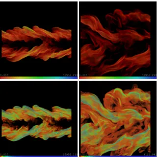
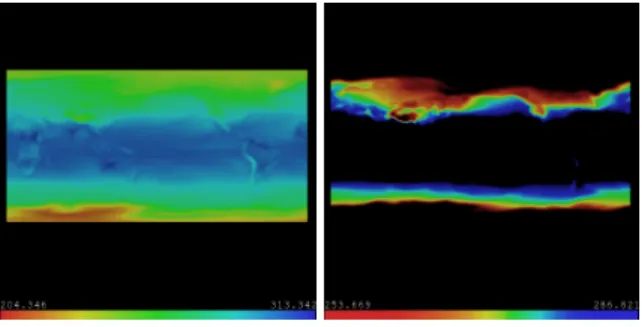
In Figure1in the upper left image, we have data visu-alized with a static transfer function. If we use the same transfer function for a time later in the series, we get the image that is in the upper right. It appears that the visual-ized feature is dissipating over time. In the lower two im-ages, we use transfer functions created through analysis of the time-varying data, applied to the same two time steps. This transfer function is optimized to map the value ranges that correspond to similar temporal activity in the data. The feature doesn’t dissipate, rather we detect that the values
cor-responding to the visualized feature shift in downward in value space and we alter the map to visualize the new range. In order to support the traditional visualization pipeline, we seek to semi-automatically generate transfer functions for time-varying data. The reason for this is to solve the pre-viously stated problems of manual time-series transfer func-tion creafunc-tion. Our premise to generate transfer funcfunc-tions is that we can analyze the time-varying data to find points that share similar value activity. We use this information to nar-row the transfer function map into these ranges of interest over time. Our hypothesis is that data points that behave sim-ilarly at a window in time belong to the same feature, and thus are the same class of data. This derived information can be used to create a time-series transfer function. Included in the supplemental electronic material are videos showing time-series animations using transfer functions generated by our method.
In the following, we outline the paper organization. Sec-tion2describes the related work in transfer functions and time-varying visualization. Section3explains our method-ology of finding sequences, used for classification of time-varying data. Section4describes how sequences are used to generate of transfer functions for visualization. We conclude with Section5.
c
Figure 1:A combustion data set of two time steps, left to right, with different transfer functions applied to it. The top images use a single static transfer function, and the feature appears to vanish over time. The bottom images use a dy-namic transfer function created through time-series analy-sis.
2. Related Work
Levoy first described the use of transfer functions for vi-sualization of volume data [Lev88]. The following authors use methods of analysis to construct transfer functions. He et al. described a method for genetic selection of trans-fer functions to find an optimal rendering from user input [HHKP96]. Bajaj et al. allow the user to search the data pa-rameter space for isosurface values, which in turn can be used to generate transfer functions [BPS]. Kindlmann and Durkin used histogram volumes to find boundaries between materials [KD98]. Kniss et al. provided methods to allow the user to manipulate transfer functions in higher dimensional data space in order to locate surfaces and features [KKH01]. Petersch et al. performed real time opacity adjustment for visualization of ultrasound imagery by searching for inter-faces, taking point-of-view into consideration [PHHH05].
The generation of transfer functions for time-varying data has been attempted with various different methods [Ma03]. Jankun-Kelly and Ma generate static transfer functions for time-varying data by merging several transfer functions over time [JKM01]. Tzeng et al. and Akiba et al. generate dy-namic transfer functions using the global histogram as it evolves over time. Tzeng [TM05] uses neural network tech-niques to adapt the transfer function over time from trained transfer function keyframes. Akiba [AFM06] uses time
his-togram [KBH04,DMG∗04] quantization to create equiva-lence classes over time to track value populations.
Data value activity has been used in the classification of time-varying data. van Wijk clustered time-series activity to find similar temporal patterns [vWvS99]. Fang et al. used time activity to segment medical data, assuming that data points that behave similarly over time are part of the same tissue [FMHC07]. Woodring and Shen [WS09] use wavelets to filter time-varying data into several time scales and clas-sifies data by clustering the entire time series by time scale. Lee and Shen [LS09] visualize time-varying data using the dynamic time warping distance to estimate when an activity signature exists. Wang et al. [WYM] use multi-dimensional histograms to cluster time-varying data based on similar in-formation entropy. Temporal value activity relates our work in that it is the foundational basis for how we find groups or features of similarly behaving data points. Similar to these past works, we treat features or classes in our data as groups of points that behave similarly in value over time.
Feature tracking is used in time-varying visualization as well. Silver and Wang have used temporal volume overlap to track volume objects over time [SW97]. Ji and Shen treat 3D time-varying data as a 4D dimensional field, and per-form high-dimensional isosurfacing and slicing to track iso-surfaces over time [JSW]. Reinders et al. use methods of fea-ture extraction and path prediction to track classified feafea-tures over time [RPS01,PVHL03]. The work in feature tracking is significant in our work as the concepts continuation, cre-ation, termincre-ation, merging, and splitting, and the sequence of events influenced our work in graph and sequence genera-tion. The features that we extract are “events” on a time line per time step, and we sequence them together into a contin-ual chain of events. The sequences in turn are used to create a time-series transfer functions.
3. Temporal Clustering and Sequencing
Figure 2:The process of temporal sequencing to create a transfer function.
Our method of generating time-series transfer functions utilizes a semi-automatic process that we calltemporal clus-tering and sequencing. The method attempts to generate a classification for a time series data set by identifying groups of points that change in value similarly [FMHC07,
vWvS99,WS09] and creating sequences of groups over time [RPS01,PVHL03]. In Figure2, we show a diagram of the process. Below, we show an outline of the process, and the user interaction required per step.
1. Process:Generate activity clusters per time step
Input:time-series data set
User Parameter:k, w
Output:k clusters of points per time step
The user inputs their time-series data into a clustering al-gorithm. The clustering will findkactivity clusters (fea-tures) per time step, wherekis a user input.kis roughly equivalent to the number of transfer functions or clas-sifications that will be generated. w, also a user input, governs the time window (vector length) for clustering. The output is clusters of data points (features) that be-have similarly in value space over a time windowwat a particular point in time.
2. Process:Generate sequences from clusters
Input:k clusters of points per time step
User Parameter:γ
Output:cluster graph and n sequences of clusters The sequencing process takes the clusters (features) gen-erated by step 1 and creates a graph of clusters. Clusters are nodes in the graph connected by edges to the clusters in the previous and next time steps. Edges are a probabil-ity estimate that one feature (cluster) is the same feature in the next time step, but with a slight change or evolu-tion.γis a user input which culls low probability edges from the graph. A find-all-paths algorithm extractsn se-quences from the culled graph, such that one sequence represents a feature evolving over time.
3. Process:Visualize the process
Input:cluster graph and n sequences of clusters
User Parameter:selection of a sequence of clusters
Output:sequence of clusters
The graph and sequences generated in step 2 are shown to the user in a visualization interface. The graph shows information about the clusters after edge culling by pa-rameterγ. Thenresulting sequences are also shown with the information about the sequences. A user browses the data from this interface and picks a sequence to be used for generating a transfer function.
4. Process:Generate a transfer function
Input:sequence of clusters
User Parameter:transfer function type, optional initial color/opacity map
Output:time-series transfer function
The sequence the user picks in step 3 is used as input to the transfer function generation. A sequence describes a class of data that evolves over time. The information con-tained in a sequence is used to generate a time-varying transfer function of the user’s choice. The user can op-tionally input an initial color/opacity map to visualize a feature that is automatically updated over time to create a temporally coherent transfer function.
3.1. Windowed Time Activity Curve Clustering
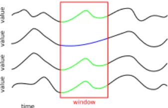
To find features per time step, data points are grouped to-gether if they exhibit the same value activity in a local tem-poral neighborhood. We assume that points that have the same value and change in value over time belong to the same phenomenon or feature. A common way to repre-sent the change over time is thetime activity curve(TAC) [FMHC07]. It is a vector representation of a data point that hastelements ordered by time, representing the values of a data point over time. TACs can also be thought of graphi-cally as a plot of time vs. value for a data point, as in Figure 3.
To group or cluster data points by similar activity, we use parallelizedk-means [HW79] clustering on the input time-varying data set that has been transformed to TAC vector representation. The clusters of TAC vectors describe data points that have similar value activity over time. We perform clustering for each time step, creatingkclasses that behave similarly for that time step. We record the histograms of the TAC data in the time window and the spatial extent of each cluster, which is used later in the sequencing and transfer function generation.
Figure 3:Four graphed time activity curves (TAC) for four data points. The 1st, 3rd, and 4th data points have similar temporal activity in a time window, and would be in one cluster for that time window.
Instead of classifying data points by their entire time se-quence, we cluster per time step and window the TAC vec-tors, like in Figure3. A window kernel of lengthwis used, when clustering a time step t. Therefore, we only clus-ter the points that have similar activity in a local tempo-ral windoww. In previous work, temporal activity classes are defined using the entire time sequence for TAC vec-tors [FMHC07,vWvS99,WS09], which is adequate for spa-tially static features. This is a problem for data that have fea-tures that move in space. If we use the entire time sequence to cluster data points, a point in space can only belong to one classified feature, thus features become spatially static. By windowing, a point in space can then belong to multiple features (clusters) over time, as a feature moves in space. For the window kernel in our implementation, we used the box kernel, as there is an unnoticeable difference between a box and a Gaussian kernel.
section, we need to have clusters that are relatively similar over time, or temporally continuous. If clusters vary signifi-cantly over time, the sequencing process will not be able to match clusters very well. Additionally, the generated transfer functions will be visually discontinuous, because value dis-tributions vary wildly over a sequence. In in our work, hav-ingkthat is too high leads to over-fitting and it may lead to temporally discontinuous clusters. Choosing the rightkhas perpetually been a problem, and there are no known good so-lutions to findingk. Ultimately, we left it as a user decision, askis roughly proportional to the number of independent transfer functions (features) that are extracted by the pro-cess. The final number of possible transfer functions how-ever is greater than or equal tok, depending on how many sequences merge or split in the sequencing process. In our tests, we pickedkranging from 2 to 4.
The windowwcan have an impact of the temporal con-tinuity of clusters if the value activity ranges are very close together, overlap, or if there is over-fitting. To helpk-means to disambiguate classes, the length of the kernel is increased, thereby increasing the feature vector. A length of 5 (neigh-borhood of 2 time steps) was adequate in most cases to sep-arate data for the data sets we used. For one particular case, the argon bubble data in Figure5, we extended the length of the kernel to 7, due to overlapping values in activity, to result in temporally continuous clusters. The optimal length of aw and size ofkis ultimately data dependent, and further study would be needed to algorithmically determinewandk. Po-tentially, we can add more information to the feature vector (TAC) to allowkto increase, and shortenw.
3.2. Cluster Sequencing
The second step in our process is the creation of sequences from the clusters found per time step. We do this to follow the evolution of a feature or cluster over time. To link clus-ters into a sequence, we assume that the change in value distribution of a cluster from one time step to the next is a gradual change. For a cluster at time stept, we assume there is one or more near matching clusters (though there is the possibility of dispersion or merging) in the next set of clusters att+1. If a cluster int is similar to a cluster int+1, we link them together as being a sequence of clus-ters [RPS01,PVHL03], or the evolution of a feature over time.
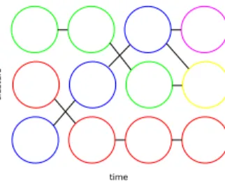
Using these assumptions, we create a directed graph that describes relationship of clusters over time. An abstract ex-ample of the graph can be seen in Figure 4. Each node in the graph is one cluster generated by the time activity clustering process. A node in the graph is connected by an edge to all of the nodes forward and backward one step in time. A strictly forward or backward path taken through the graph forms a potential temporal sequence, which describes a feature evolving over time. Since not all paths are valid sequences describing evolving features, we evaluate which
paths in the graph describe a likely sequence class (the evo-lution of a value distribution over time).
Figure 4:An abstract representation of a cluster graph af-ter edge culling. Each node is a clusaf-ter found in clusaf-tering process per time step. Remaining edges represent high prob-ability that a cluster is the same cluster (feature) over time. Sequences are paths through the graph that do not reverse direction in time, which represent a feature evolving over time.
3.2.1. Edge Probability
To estimate which paths in the graph are valid sequences, we approximate the probability a valid progression of a clus-ter (feature) evolving over time. To do this, the edges in the graph are labeled with estimate probability that a cluster is the same cluster in the next (or previous) time step with a slight change. We assume that we are working in a Markov process, such that a state (in this case a cluster) described in a sequence of events contains all the necessary information. Therefore, probability estimate of an edge is dependent only on the two linked clusters.
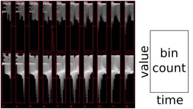
Given a clusteraand a set of clustersB={b0,b1...bn}, we estimate the probability thatais one of the clustersbi from the setB, with a slight change. To generate this proba-bility, we use similarity based on the value activity distri-butions between two clusters, by measuring thetime his-togram[KBH04,DMG∗04] distance between two clusters. A time histogram is a series of histograms over time, like a single box in Figure5, which records the value distribu-tion of a cluster over time. Our time histogram notadistribu-tion in our images, where each box is a time histogram, has time on the x-axis and value on the y-axis. Pixel intensity is the bin count of (time, value).
Given a time histogram function H(x), it returns the column-majorn∗m2D histogram matrix for clusterx, where the rows are value bins and columns are time steps. The time histogram distanceD(a,b)between clusterato clusterb, is the sum of the histogram distance calculated on each column ofH(a)andH(b). Equation1is the time histogram distance whered(x,y) is a histogram distance metric on histogram vectors of lengthm. Histogram metrics,d(x,y), that we have tested are EMD (Earth Mover’s Distance), L2 norm, andχ2 histogram distance. There is little difference in the results between the metrics.
Figure 5:The left image shows a series of clusters over time, shown as small multiples of time histograms, from the argon bubble data set. Even though clusters share value ranges over time, they are separated into two distinct activ-ity classes. An abstract representation of a time histogram is shown on the right.
D(a,b) =
n
∑
i=0
d(H(a)[i],H(b)[i]) (1)
From the time histogram distance function, we generate a probability estimate. We calculate this using Equation2, where thePis the probability that clusterais clusterbiin the next time step. We calculate it as one over the histogram distance, normalized by sum of all of the histogram distances to the clusters in setB.pincreases the sharpness of the prob-ability distribution among choices ofatobi. We have mainly usedp=2, similar to the 1/d2model used in many scientific and engineering methods.
P(a,bi) =1/D(a,bi)p/
∑
∀x∈B1/D(a,x)p (2)
3.2.2. Edge Culling and Sequence Generation
We could potentially find all of the paths in the graph, but that would overload the user with choices. Additionally, only a small number of paths are valid sequences (high probabil-ity of an evolution of a feature). To reduce the paths to a small set, we perform edge culling on the graph, removing edges whose probability is below a certain thresholdγ. The threshold removes edges that possibly couldn’t represent an evolution of a cluster over time.
When sequences split or merge, an edge will have a lower probability, because the probability estimation favors contin-uation. We use the maximum probability that is the between the forward and backward probability, to account for split-ting and merging. Secondly, to retain split or merge edges or edges,γ needs to be low enough to retain those edges. The rule of thumb for calculatingγ is that it is (expected
probability of continuation / maximum splits or merges per time step). For example, we useγ=.45, which assumes a split or merge of 2 clusters at most, as many of the continua-tion edge probabilities, in our experience, are greater than.9 (.45=.9/2).
After edge culling, we scan the graph for possible starting and ending clusters. Then, we use a strictly time forward or backward find-all-paths algorithm between all of the starting and ending pairs to generate the sequences from the graph. The generated sequences and graph are shown to the user in the next section.
4. Visualization
In this section, we describe how to visualize a data set from the previous processes. We show the sequences, sequence graph, and clusters that are extracted from the time-varying data set. Visualization of the clustering and sequencing pro-cess gives a user the ability to see a summary of his or her time-varying data. From the collected information in clus-tering and sequencing, we generate a time-varying transfer function from a user selected sequence.
4.1. Sequence Visualization
Figure 6:After the data is analyzed, the sequences are vi-sualized by the user. In this interface, the user can see the results of the clustering and sequencing process. An abstract example of the visualization is shown on the bottom.
To visualize the sequencing process, we show the infor-mation contained in the graph and sequences. An example visualization is seen in Figure6. In this interface, the user can update the edge culling throughγ, add or remove edges manually, and rerun the sequence generation after altering the edges. The clustering process has to be re-run if the user
wishes to changekorw, which would generate a new graph and clusters.
In Figure6, shown at the top left, is the cluster graph. A node (cluster) is shown as a small time histogram of the data contained in a cluster. The edges shown in the graph are the remaining edges afterγculling, colored by probability. At the bottom left, we show each of the sequences which were found from traversing the culled graph. Their display format is similar to the graph. To the right of each sequence, we show a summary time histogram for each sequence. Con-fidence statistics are shown for each of the sequences, in an information box on the right. The confidence metrics we have used are the minimum edge probability of a sequence, the average edge probability, and the multiplication of the edge probabilities. Additionally, through visual inspection, a user can also make an evaluation of the time histograms and graph to see if a sequence is valid.
4.2. Time-Varying Transfer Functions
We have previously assumed that in a sequence of clusters is there is a small shift in value distributions or histograms over time for a feature. We referred to this as temporal conti-nuity of clusters. To create a transfer function, we histogram equalize a color and/or opacity map over time to match the value distributions (histograms) in a sequence. By updating the color and/or opacity map to reflect the continuity of value distributions in a cluster, we achieve visual continuity of a feature over time.
We can generate dynamic transfer functions, with respect to color and/or opacity, or a static transfer functions, by remapping a transfer function map using the CDF (cumu-lative distribution function) of the histograms in a selected sequence. For a dynamic transfer function, we use the me-dian (w.r.t. time) histogram of each cluster over time in a se-quence. For a static transfer function, we create a single his-togram by summing the median hishis-tograms. The hishis-tograms represent the activity distribution in value space for a feature over time.
To create a transfer function from sequence data, we use an initial color and/or opacity mapM(v)that maps a value vto a visual (color and/or opacity)c. The mapMis defined over a value range with some distribution, which could be the histogram in the first cluster of a sequence.I(p)is the inverse cumulative distribution function for the value range thatMmaps over, which returns the value that cumulative probabilitypmaps to.C(v)is the CDF of a histogram from a cluster in a sequence that we wish to remap to, which returns a cumulative probability given a valuev. We can create a new mapN(v)by simple construction in Equation3.Ncan be for a dynamic map, whereCwould change for every time step (use the a cluster’s histogram for every time step), or for a static map, whereCis the same for every time step (use a summed histogram of all the clusters in a sequence).
N(v) =M(I(C(v))) (3)
This histogram equalization method also can be used for isosurfaces, except it is a forward value mapping, remov-ing the classification map M. Our difference from other histogram equalization and quantization methods [TM05, AFM06] is the clustering and sequencing process that pro-ceeds it. If we apply the equalization to the global time his-togram, with no sequence extraction, the result may not be the same. Specific features (value activity) can be hidden in the overall histogram, as can be evidenced in the overlapped histograms of the argon bubble data in Figure5.
If we use an initial color map that is uniformly distributed, the first equalized map will redistribute the colors to reflect the distribution of values in value space. This will apply more colors in dense value distribution ranges, increasing the color contrast and fidelity. The difference between uni-form color map and an equalized color map can be seen in Figure7.
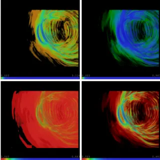
Figure 7:Visualization of CCMS temperature data. The left image uses a uniformly distributed color and opacity map. The right image uses histogram equalized color and opacity map based a temporal sequence, focusing in on the sequence of interest.
4.2.1. Dynamic vs. Static
We have noted a semantic distinction between a static color map and a dynamic color map. Traditionally, the color to value mapping has been fixed, such that a particular color always has the meaning of a particular value. When a color changes over time in a visualization, this has the meaning of absolute value change. If we use a dynamic color map, the color to value map is not static. Color change over time now indicates a relative value change. A user who is analyzing his or her data can become confused if they are not aware of this distinction. While this can be confusing, having a dynamic color map does have the benefit of increasing color fidelity by using more colors in a packed value distribution range. An additional benefit is that dynamic color map subtracts the mean (average) trend, and only shows the differences.
independent of the color map. Using a dynamic opacity map is easier to use over a dynamic color map. It allows the visu-alization to be focused on the current value range of interest, excluding colors (values) that are not part of a feature. When using a static opacity map, all values of the color map are shown, with no distinction on whether the visualized values are part of the feature.
We show the different combinations of dynamic and static color and opacity described below and in Figure8: • Static Color, Static Opacity : Color change means
abso-lute value change. Context values outside of the current cluster value range are visible.
Use this when the user just wants one map, and/or wants absolute value meaning of color.
• Static Color, Dynamic Opacity : Color change means ab-solute value change. Only current cluster values are visi-ble.
Use this when the user wants absolute value meaning of color, and also wants to focus on the current feature over time.
• Dynamic Color, Static Opacity : Color changes mean rela-tive value changes, and colors are compressed to the value range. Context values outside of the current cluster value range are visible.
Use this when the user wants higher color fidelity, and/or wants to subtract the mean trend.
• Dynamic Color, Dynamic Opacity : Color changes mean relative value changes, an colors are compressed to the value range. Only current cluster values are visible. Same as above, but this has the added benefit of only showing values in the current feature over time.
4.2.2. Cluster Masks
There may be a value collision between two clusters in one time step, like in Figure5. It is not necessarily true that af-ter the clusaf-tering process the only points that have a value xat time steptare in one cluster. For example, one clus-ter of points may have an upward trend, and another clusclus-ter of points may have a downward trend, but they both start at the same value. This is one way that global time histogram methods for transfer functions cannot classify temporal ac-tivity as accurately, because they do not have any knowledge of local change in value.
When using traditional transfer functions, the map usu-ally only takes value into consideration. With value collision in sequences, transfer function maps could overlap in value space. We can disambiguate between two or more trans-fer functions that share a value withcluster masks. Cluster masks are the spatial extent of clusters, recorded as cluster membership per data point over time. Masks can be used as alpha volume masks, as in Figure9. By masking, we cull data points by position that do not belong to the currently visualized feature (sequence), that a value to color map can-not account for. Furthermore, the spatial boundaries between
Figure 8:The earthquake data set with different transfer functions computed on a temporal sequence. Top row is static color, bottom row is dynamic color. Left column is static opacity, right column is dynamic opacity.
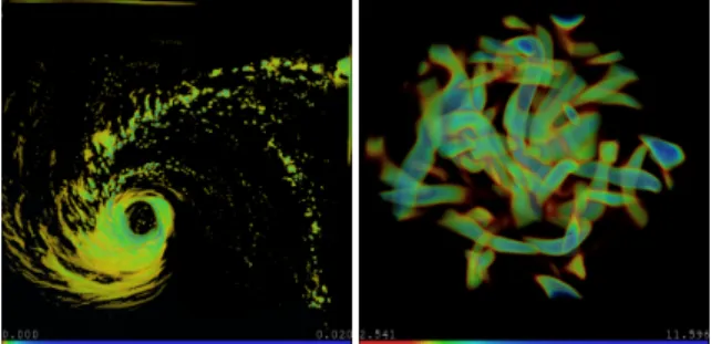
Figure 9:The argon bubble data set, visualized with a dy-namic color/static opacity transfer function. The right image uses a cluster mask to only show the data points that are ex-actly part of the sequence.
clusters can also be used for visual enhancement, such as a gradient filter for lighting and opacity enhancements.
5. Conclusion
Our semi-automatic generation of transfer functions for time-varying data reduces the majority of guesswork and te-dium of manually creating a time-series transfer function. We find features in time-varying data sets corresponding to similar value activity, and create transfer function maps based on value distributions shifting over time. During the process of creating a transfer function, the graph and se-quence interface can provide additional insight.
For future work, the algorithm could become more auto-matic by algorithmically estimatingk,w, andγ. If we can integrate spatial filtering and locality into our clustering, se-quence confidence would be increased through additional in-formation [WYM]. This may allow us to increase the num-ber of features (k) in a reliable fashion, by increasing the feature vector (TAC), without causing temporally discontin-uous sequences from over-fitting. Multi-scale temporal fil-tering of time activity [WS09], for detecting long vs. short temporal trends could also augment the TAC vector. This may also lead to multi-scale transfer functions that reveal long vs. short trends. Currently, the majority of the com-putational time is spent in the clustering process, which is run on a parallel machine. Clustering runs in tens of min-utes, while the sequencing and transfer function generation is done on a single machine, in seconds. Multi-scale spatial filtering methods would reduce the amount of data that is processed, and speed up the clustering and the overall pro-cess.
This work was supported in part by NSF ITR Grant ACI-0325934, NSF RI Grant CNS-0403342, NSF Career Award CCF-0346883, and DOE SciDAC grant DE-FC02-06ER25779. A reference implemen-tation source code for this work can be downloaded at http://www.cse.ohio-state.edu/~hwshen/ Research/Gravity/Download.html.
Figure 10:Visualizations using transfer functions generated via clustering and sequencing.
References
[AFM06] AKIBAH., FOUTN., MAK.-L.: Simultaneous clas-sification of time-varying volume data based on the time his-togram. InEurographics Visualization Symposium(2006), pp. 1– 8.
[BPS] BAJAJ C., PASCUCCI V., SCHIKORED.: The contour spectrum. InProceedings of Visualization ’97.
[DMG∗04] DOLEISCHH., MAYERM., GASSERM., WANKER
R., HAUSERH.: Case study: Visual analysis of complex, time-dependent simulation results of a diesel exhaust system. In Pro-ceedings of the 2004 Eurographics/IEE TVCG Symposium on Vi-sualization(2004), pp. 91–96.
[FMHC07] FANGZ., MÖLLERT., HARMARNEHG., CELLER
A.: Visualization and exploration of spatio-temporal medical im-age data sets. Proceedings of Graphics Interface 2007.
[HHKP96] HET., HONGL., KAUFMANA., PFISTERH.: Gen-eration of transfer functions with stochastic search techniques. In Seventh IEEE Visualization 1996 (VIS’96)(1996), p. 227. [HW79] HARTIGANJ. A., WONGM. A.: Algorithm as 136: A
k-means clustering algorithm. Applied Statistics 28, 1 (1979), 100–108.
[JKM01] JANKUN-KELLYT., MAK.-L.: Study of transfer func-tion generafunc-tion for time-varying volume data. InProceedings of Volume Graphics 2001 Workshop(2001), pp. 51–65.
[JSW] JIG., SHENH.-W., WENGERR.: Volume tracking using higher dimensional isosurfacing. InIEEE Visualization, 2003. [KBH04] KOSARA R., BENDIX F., HAUSER H.:
Timehis-tograms for large, time-dependent data. InProceedings of the 2004 Eurographics/IEEE TVCG Symposium on Visualization (2004), pp. 45–54, 340.
[KD98] KINDLMANNG., DURKINJ.: Semi-automatic genera-tion of transfer funcgenera-tions for direct volume rendering. InIEEE Symposium on Volume Visualization, 1998(Oct. 1998), pp. 79– 86, 170.
[KKH01] KNISSJ., KINDLMANNG., HANSENC.: Interactive volume rendering using multi-dimensional transfer functions and direct manipulation widgets. InVisualization, 2001. VIS ’01. Pro-ceedings(2001), pp. 255–562.
[Lev88] LEVOYM.: Display of surfaces from volume data.IEEE Computer Graphics and Applications 8, 3 (1988), 29–37. [LS09] LEET.-Y., SHENH.-W.: Visualizing time-varying
fea-tures with tac-based distance fields. InIEEE Pacific Visualization Symposium 2009(2009).
[Ma03] MAK.-L.: Visualizing time-varying volume data. Com-puting in Science and Engineering 5, 2 (2003).
[PHHH05] PETERSCH B., HADWIGER M., HAUSER H., HÖNIGMANND.: Real time computation and temporal coher-ence of opacity transfer functions for direct volume rendering of ultrasound data. Computerized Medical Imaging and Graphics 29, 1 (2005), 53–63.
[PVHL03] POST F. H., VROLIJKB., HAUSER H., LARAMEE
R. S.: The state of the art in flow visualization: Feature extraction and tracking.Computer Graphics Forum 22, 4 (203), 775–792. [RPS01] REINDERSF., POSTF. H., SPOELDERH. J. W.:
Visu-alization of time-dependent data with feature tracking and event detection.The Visual Computer 17, 1 (2001), 55–71.
[SW97] SILVERD., WANGX.: Tracking and visualizing turbu-lent 3d features. IEEE Transactions on Visualization and Com-puter Graphics 3, 2 (June 1997), 129–141.
[TM05] TZENGF.-Y., MAK.-L.: Intelligent feature extraction and tracking for visualizing large-scale 4d flow simulations. In SC ’05: Proceedings of the 2005 ACM/IEEE conference on Su-percomputing(2005), p. 6.
[vWvS99] VANWIJKJ. J.,VANSELOWE. R.: Cluster and cal-endar based visualization of time series data. InINFOVIS(1999), pp. 4–9.
[WS09] WOODRING J., SHENH.-W.: Multiscale time activ-ity data exploration via temporal clustering visualization spread-sheet.IEEE Transactions on Visualization and Computer Graph-ics 15, 1 (Jan.-Feb. 2009), 123–137.
[WYM] WANGC., YUH. Y., MAK.-L.: Importance-driven time-varying data visualization. IEEE Transactions on Visual-ization and Computer Graphics (Proceedings VisualVisual-ization / In-formation Visualization 2008) 14, 6.