UNIVERSITY OF OSLO
Department of Informatics
Visualization of
PRADS Output
Data Using
Open-source
Visualization
Tools For
Improved Log
Analysis
Dawit Hailu Desta
Network and System Administration
Oslo University College
Visualization of PRADS Output Data Using
Open-source Visualization Tools For Improved Log
Analysis
Dawit Hailu Desta
Network and System Administration Oslo University College
Abstract
The ever growing network traffic complexity has brought new threats and vul-nerabilities that can affect our day to day activities. This lead to high demand for network monitoring and detection system to tackle the emerging threats . Consequently the inspection and assessment of security incidents has become a daily activity for network and system administrators. Network analysts need to have the awareness about every network activity, the status of the network system and the network assets in the network system. Many tools have been developed to detect and monitor network activities using active scanning and passive scanning mechanisms. This thesis focuses on Passive Real-time Detec-tion System, PRADS, the smartest and powerful asset detecDetec-tion system that creates the network awareness required by network analysts. This asset detec-tion tool reports everything it detects in the network and puts it in a log file. Analyzing the log file using a traditional way of textual log analysis is really hard to analyze and inspect especially when the log file is big. So this thesis tries to implement the visualization of the PRADS log file using open-source visualization tools for better analysis and network awareness. A survey is made on the available open-source visualization tools with regards to their suitabil-ity and applicabilsuitabil-ity to visualize PRADS output data. The second phase of the project continues by suggesting different visualization methods for PRADS data. Finally a prototype is developed to demonstrate a proof of concept by using the relevant open-source tools Afterglow and Graphviz. The prototype developed tries to visualize wide range of log file data collected by PRADS in different network scenarios that is often difficult to readily search for patterns and trends using traditional log file analysis methods. The data from PRADS is parsed and fed to the Afterglow scripts to produce inputs suitable for use by the graph layouts in Graphviz. This project tries to successfully show the importance of visualizing log files to reveal the most important properties such as the status of running services on the network, rapid recognition of patters and trends, creation of status awareness on the network mapping. The final results achieved show that the project is successful and the project paves a way for further similar researches.
Acknowledgements
I would like to express my appreciation to the following people for their support in many different ways:
• First of all I would like to thank my beloved family for all their help and understanding; they have been there whenever I need them.
• I am also grateful to Norway, University of Oslo, and Oslo and Akershus University College for providing me a conducive environment to proceed my study.
• Professor H˚arek Haugerud who has been supervising me throughout the whole thesis and encouraging me during some challenging times. He has spent a lot of time reading my reports and guiding me. He was the one giving me confidence whenever I encounter challenges in my project.
• Kyrre Begnum for his useful seminars on how to write a good thesis, his excellent teaching methods and his helpful attitude to support students when needed.
• Redpill Linpro for proposing me this interesting project to be the master thesis I work on.
• Ismail Hassan for his positive attitude when asked for help and his inter-esting classes.
• Kacper Wysocki for providing me the necessary information on this project whenever I ask for clarification.
• Amir Maqbool Ahmed for helping me to create the experiment environ-ment setup and his cooperation when I encounter problems with the lab-environment.
• AfterGlow developer Raffael Marty deserves a lot of credit for developing the main tool implemented in this project and for his inspiring ideas which made me to have the interest to implement it.
• Finally my dear friends especially Abraha Desta who have always been very helpful by commenting on my work and giving me a hand whenever I needed help.
Contents
1 Introduction 4
1.1 Motivation. . . 4
1.2 Problem Statement . . . 7
1.3 Thesis Structure . . . 7
2 Background and literature 9 2.1 PRADS . . . 9
2.2 Database. . . 11
2.3 Network Topology Visualization . . . 13
2.4 Data Formats . . . 15
2.5 Network Data Visualization Tools. . . 15
2.5.1 AfterGlow. . . 16 2.5.2 Graphviz . . . 18 2.5.3 Gephi . . . 19 2.5.4 Cytoscape. . . 20 2.5.5 NodeXL . . . 21 2.5.6 Cichlid. . . 22 2.6 Previous Work . . . 23 3 Methodology 25 3.1 System Requirements . . . 26
3.2 Experiment Environment Setup . . . 26
3.3 Visualization Tool Selection . . . 29
3.4 Proposed Visualization Methodology Setup . . . 30
3.4.1 Data Collection . . . 30 3.4.2 Data Normalization . . . 31 3.4.3 Data Visualization . . . 33 3.4.4 Data Presentation . . . 33 3.5 Database Configuration . . . 34 3.6 Alternative Approaches . . . 35 3.7 Implementation. . . 36 3.7.1 Prototype . . . 37 3.7.2 Properties File . . . 40 4 Results 43 4.1 Summary of Open-source Visualization tools for Security Anal-ysis and Monitoring . . . 43
4.1.1 Afterglow . . . 44
4.1.2 Graphviz . . . 45
4.1.3 Gephi . . . 46
4.2 Possible Methods of Visualizing PRADS Data . . . 46
4.2.1 Bar Chart Visualization . . . 49
4.2.2 Visualization in Tree Maps . . . 53
4.2.3 Internal and External IP Mapping . . . 55
4.2.4 Visualization Using Asset-Port-Service Mapping. . . 57
4.3 Proof of Concept . . . 61
4.3.1 Prototype Testing . . . 61
4.3.2 Visualization from Running PRADS in Eth1 . . . 63
4.3.3 Visualization from Running PRADS in Eth0 . . . 69
4.3.4 Visualization of HiOA Network . . . 73
4.3.5 Visualization Test on Alto-Openstack . . . 75
5 Analysis 79 5.1 Open-source Data Visualization Tools . . . 79
5.2 Suggested Visualization Methods . . . 82
5.2.1 Bar Chart Visualization . . . 82
5.2.2 Tree Map Visualization. . . 84
5.2.3 Internal and External IP Mapping . . . 84
5.2.4 Visualization Using Asset-Port-Service Mapping. . . 86
5.3 Demonstration of the Prototype . . . 87
6 Discussion and Future Work 92 6.1 Evaluating PRADS and The Selected Open-source Visualization Tools . . . 92
6.2 Evaluating the Suggested Visualization Methods . . . 93
6.3 Prototype Evaluation . . . 94
6.4 General Evaluation of the Project. . . 96
6.5 Contribution of the Project. . . 98
6.6 Future Work . . . 99
7 Summary and Conclusion 101 A Scripts 107
List of Figures
2.1 Functioning of afterglow 1.x . . . 182.2 Functioning of afterglow 2.0 . . . 18
3.1 Experiment environment Setup . . . 28
3.2 Visualization Methodology Setup . . . 30
3.3 Database Based Approach . . . 35
3.4 Shared Memory Based Approach . . . 36
3.5 Prototype Implementation . . . 38
4.1 Afterglow Functioning . . . 44
4.2 Graphviz Functioning Principle . . . 45
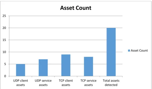
4.3 Asset Count . . . 49
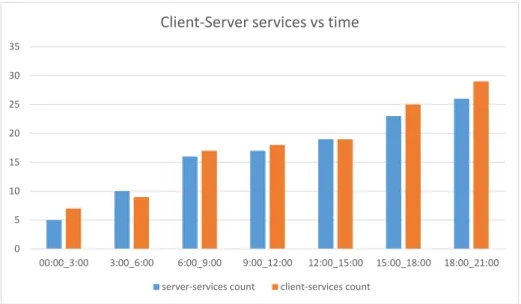
4.4 Client and Server services vs time. . . 50
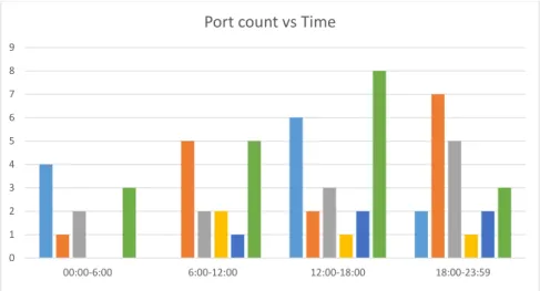
4.5 Ports Count vs Time . . . 51
4.6 Age of Services . . . 52
4.7 Protocol-Service Mapping. . . 53
4.8 Clustering in Subnets . . . 54
4.9 IP-Port Mapping Appearance Count . . . 55
4.10 Clustering and IP-Port Mapping . . . 56
4.11 Internal-External IPs Clustering By Mapping with Ports and Services . . . 57
4.12 IP-Service Mapping . . . 58
4.13 Source-Event-Target Mapping . . . 59
4.14 Node-Edge Based Customization . . . 60
4.15 Emphasis on Common Ports Using Dot Layout. . . 64
4.16 Emphasis on Common Ports Using Neato Layout . . . 66
4.17 Clustering of similar Nodes . . . 67
4.18 Node Count Consideration . . . 68
4.19 Neato Layout During Large logfile Visualization . . . 70
4.20 Neato Layout Using Ports Clustering . . . 71
4.21 Clustering Similar Nodes . . . 71
4.22 HiOA Network Data Visualization . . . 73
4.23 HiOA Network Data Visualization Using Clustering . . . 74
4.24 HiOA Network Data Visualization Using Filtering . . . 75
4.25 Alto-Openstack Network Data Visualization Using Filtering . . . 76
4.26 Alto-Openstack Network Data Visualization . . . 77
List of Tables
2.1 Free network visualization and Monitoring Tools . . . 233.1 System Requirements . . . 26
Chapter 1
Introduction
In this chapter the first section explains the motivation for choosing the visu-alization of the output from PRADS which is a passive detection system and its importance for network and system administrators. The problem statement and research questions are defined in the second section and finally the structure of the thesis report is presented in the last section.
1.1
Motivation
It is clear that computer networks have since become the backbone of organi-zations information systems and IT infrastructures. Humans’ social activities are becoming fully dependent on IT infrastructures which makes IT the soul mate of mankind currently. Starting from home activities to every business firm and organization , everybody tends to use IT applications directly or indi-rectly. Consequently this daily interaction of humans with network systems has lead to increased network traffic complexity.[1]. According to Cisco’s forecast network traffic will be increasing at an alarming rate where the annual global data center IP traffic will reach 7.7 zettabytes by the end of 2017. By 2017, global data center IP traffic will reach 644 exabytes per month (up from 214 exabytes per month in 2012). Which shows that Global data center IP traffic will nearly triple over the next 5 years. Generally, data center IP traffic will grow at a compound annual growth rate (CAGR) of 25 percent from 2012 to 2017 [2]. Consequently this growing complexity increases the severity of the security threats to our networks and risks the security of the network and com-puters [3]. This security threat potentially could go to the extent of making high profile attacks other than computer network attacks like military satellites and nuclear power plants [4]. Networks are getting more complex in terms of their scale, topology, and traffic flows. As a result, the inspection and assess-ment of security incidents becomes a regular business for network and system administrators .
Therefore it is important to apply different security measures like firewalls, antivirus, intrusion detection system and then intrusion prevention system to secure our networks [5]. Network traffic can be detected in two ways either using active detection system or using passive detection system. An active scanning usually generates network traffic and can cause service interruptions as it usually generates network packets and makes use of network band width. Active scanning also requires manual involvement to collect the network traf-fic data to check open and vulnerable services and for this reason it could be time consuming to actively scan a network system and network traffic. The other method, passive network scanning takes longer time but simply sniffs the network and collects network traffic data passively without sending any packet where the gathered information can be used for further analysis [6] .
Consequently passive network detection and continuous monitoring can give useful information regarding the assets to be protected. This can help network and system administrators address the problem of false positive alarms in intru-sion detection and intruintru-sion prevention system. The availability of critical as well as relevant information can limit the number of alerts to deal with, which in turn saves considerable amount of time and resources for security analysts. Due to the continuous change and complexity of networks, it is important to detect changes in a specific network system such as the addition of hosts or services, changes regarding protocol usage or operating system versions. Fur-thermore new active elements attached to the network can be discovered and registered passively as they join the network traffic [6].
There are many applications that are used to passively listen to the network traffic and gather information on hosts and services they see in the network. To mention some there are pOf, PADS, SinFP and PRADS where PRADS will be discussed more in the next chapters in this paper. These passive scanning tools gather information and put the information in log files. PRADS is selected as the sniffing tool to collect network data passively on this research paper because PRADS has more advantages the other aforementioned passive scanning tools don’t have. PRADS is developed by a linux company calledLinpro and one of the main advantages of PRADS is that it shows network and system adminis-trators about all the services running and the assets residing in their network systems in advance. PRADS also shows the operating systems the hosts in the network are running. Therefore it gives network analysts the the detail about the services and the operating systems on the hosts enabling network mapping. This knowledge can create more awareness in the concerned network analysts and will help them analyse their system and protect any further vulnerability.In addition, this is all done without generating any traffic in the network for ev-erything is done passively and silently [7].
Consequently, network and system administrators have to analyze the actions of the intruder starting from scratch from system logs, where the entire
sys-tem behavior is recorded. Traffic flows are rapid and the number of different applications that are producing the flows get bigger and bigger without limit. Although network traffic is an ideal place to monitor and inspect for security events as all security events have some form of network feature, there is a major problem in that security events can also be hidden among the huge amount of desired traffic. It is often not an easy task to just capture and store network traffic for further analysis. Therefore analyzing and detecting network attacks in almost real-time with the currently available text based tools can be chal-lenging specifically for users with less technical knowledge [8][9].
However, it is believed that humans are excellent at visual processing and find-ing out abnormal visual trends. By definition visualization is the act or process of interpreting in visual terms or of putting into visual form. But defining it in a more technical way, it is a method or a tool for interpreting image data that is fed into a computer and for generating images or graphs from complex multi-dimensional data sets. Visualization tools can translate the text based network logs into animations that capture the patterns of network traffic in a sufficient way, thus enabling users to quickly identify abnormal patterns that require closer attention and consideration [10]. Such visualization tools enable network and system administrators to filter huge amount of daily network data more effectively than searching text based logs. However visualization of net-work traffic data is one of the most challenging problems netnet-work experts are facing. It has been difficult to graphically represent large amounts of informa-tion and be able to show high level of detail for the visual representainforma-tion to be meaningful [8] [11]. Some of the challenges of visualization could be
● Hard to relate the right data with the right visualization way
● Understanding some of the data syntax and the semantics is difficult ● The size of the log file could be too much
Therefore it is important to use the right technology and approach to solve these challenges. The challenges could be simplified with the help of different commercial and open-source visualization tools.
Network analysis and monitoring is a daily activity by administrator in either network traffic detection or network intrusion detection [12]. This process is al-ways performed to determine what is going on the network. It is very important for administrators to understand and monitor their network very well. Network and system administrators need to manage every service, operating system or the network topology in their system. We deploy network traffic monitoring solutions that scan the network either actively or passively to provide infor-mation on the current status of a network [13]. The analysis and monitoring is performed by making log inspections to support the detection of possible breaches and other suspicious network activities.
We visualize information so that we can see the patterns and features that matter to us the most, and depend on that information to make a point to pass a message or tell a story and this allows us to focus on the most important information. It is really hard to simply see and analyze log files as they are, because there are thousands of lines which makes it difficult to analyze using our eye only. So it is a good idea to make use of some visualization tools to analyze the log files and to know what is really happening on the network. Graphical presentation is much more interesting and easier to look into and analyse than textual presentation . That is why it is said that ”a picture is worth a thousand words”. This project will mainly focus on the visualization of PRADS output data using open-source visualization tools. The idea of this project came from the linux company,Linpro, which developed PRADS because the company needs an optimal way of visualizing PRADS log file contents.
1.2
Problem Statement
Considering the current information technology’s rapid evolution, growing com-plexity and distribution of network data, log analysis and correlation has be-come one of the main tasks of network and system administrators. It is therefore very important to plan and implement a best way to analyze and investigate the ever increasing network traffic data. This master thesis will investigate how to present the network data collected using a passive real-time asset detection system (PRADS) in a way that is easy to understand and analyze. The thesis will mainly focus on the following activities step by step:
● Investigate the contents of PRADS output and make a survey of open source
network data and/or log file visualization tools.
● Investigate on how to visualize statically and/or in real-time the output
gathered from PRADS using the available open source visualization tools.
● Demonstrate a proof of concept to visualise statically and/or in real-time
the host, service and connection data produced by PRADS. This proof of concept will be demonstrated by implementing a prototype solution, by choosing the best free open-source visualization tools to visualise the output which is obtained from PRADS.
1.3
Thesis Structure
The structure of this thesis is as follows:
Chapter 1: Explains the motivation and problem statement for this thesis project.
Chapter 2: Provides background and literature review.
of PRADS, and scripts used for data collection and automation. Chapter 4: Provides the results achieved during the research work.
Chapter 5: Explores and analyses the obtained results from the previous chap-ter.
Chapter 6: Presents the discussion of the whole project and future work. Chapter 7: Provides the conclusion addressing the main research questions.
Chapter 2
Background and literature
On this chapter there will be a brief presentation with the utilities and terms used throughout the project.Similarly the main visualization technologies and tools for network mapping will also be discussed briefly. In addition, a survey of previous works within visualising host and service data as well as operat-ing system from passive and active network scans will be made and discussed accordingly.
2.1
PRADS
Since the whole project depends on the output manipulated from PRADS, it is worth discussing PRADS and its features briefly. PRADS stands for Passive Real-time Asset Detection System. It is passive finger printing approach used to sniff a network in a silent mode without generating a network traffic. PRADS uses digital fingerprints to recognize services on the network as well as the operating systems, and can be used for network mapping and awareness of possible changes in both real time and static ways. Real-time passive traffic analysis will also make the detection of assets that are just connected to the network for a short period of time possible, since PRADS can gather important information from every packet and saves its output textually in CSV file format that will be able to do anomaly detection [14] [7].
PRADS, unlike other passive asset detection approaches is the most useful approach for passive asset detection, and currently does MAC lookups, TCP and UDP OS fingerprinting as well as client and service application matching and a connection state table. PRADS detects operating systems running in hosts by using different TCP-flag modes like SYN, SYN+ACK, RST and FIN. Various output plugins involved in PRADS can be its default logfile, FIFO, a ring buffer mode, and a logfile which can be created manually. As a result These different possibilities make PRADS a useful replacement for p0f and PADS which are other passive finger printing approaches, hence PRADS will be serving us as the main data source for the network data visualization [15]
[7] [16].
There are many ways to use PRADS. It has many commandline options. Al-though it is worth refering to the prads man page it has of course different options used for different purposes. To mention some of the common ones are [17]:
Listing 2.1: PRADS Commandline Arguments
1 −i<iface>
2 Network device<iface>(default: eth0). 3
4 −r<file>
5 Read pcap<file>. 6
7 −c<file>
8 Read config from<file> 9 −p<pidfile>
10 Name of pidfile−inside chroot 11
12 −l<file>
13 Log assets to<file>(default: ’/var/log/prads−asset.log’) 14
15 −f<FIFO>
16 Log assets to<FIFO>−C<dir>Chroot into<dir>before dropping privs. 17 −a<nets>Specify home nets (eg: ’192.168.0.0/25, 10.0.0.0/255.0.0.0’).
18 −D Daemonize
If you run the prads commandline ”prads -i eth1 -v ”, the assets it sees will be dumped into/var/log/prads.log and look like this:
Listing 2.2: PRADS Sample Output
1 216.99.152.155,0,6000,6,RST,[0:120:0:∗:.:QA:Cisco:LocalDirector (dropped 2)],8,1 394241028 2 198.50.158.175,0,80,6,SYNACK,[8192:117:1:44:M1460:A:UNKNOWN:UNKNOWN 208.83.20.10⤦ Ç 2:link:ethernet/modem],11,1394240277 3 94.23.73.143,0,8079,6,SYNACK,[16384:53:1:44:M1460:A:Windows:2000 (2):link:ethern⤦ Ç et/modem],11,1394240286 4 111.253.5.237,0,53,17,SERVER,[unknown:@domain],14,1394241840 5 177.129.49.101,0,53,17,SERVER,[unknown:@domain],12,1394241927 6 190.41.54.11,0,17717,17,CLIENT,[domain:DNS SQR No Error],17,1394241932 7 37.44.162.242,0,53,17,SERVER,[unknown:@domain],9,1394241971 8 202.133.113.53,0,53,17,SERVER,[unknown:@domain],13,1394242065 9 178.249.154.30,0,33225,6,SYN,[3036:247:1:40:.:.:unknown:unknown],8,1394242094 10 82.190.144.36,0,53,17,SERVER,[unknown:@domain],13,1394242138 11 89.28.87.15,0,53,17,SERVER,[domain:DNS SQR No Error],8,1394242142 12 115.161.72.154,0,53,17,SERVER,[unknown:@domain],14,1394242186
To sort it more this information can be processed further and inserted into MySQL database and so on.
the general format for this data is [16] [15]:
Listing 2.3: PRADS Column Description
1 asset, vlan, port, proto, service,[service−info],distance, discovered 2
3 asset = The ip address of the asset. 4 vlan = The virtual lan tag of the asset.
5 port = The port number of the detected service.
6 proto = The protocol number of the matching fingerprint.
8 service−info= The fingerprint that the match wasdoneon, with info. 9 distance = Distance based on guessed initial TTL (service = SYN/SYNACK) 10 discovered = The timestamp when the data was collected
As mentioned earlier the output obtained from the passive scanning of PRADS is a comma separated format. The scanned data contains information from the fingerprint or signature which PRADS detects passively. The service field indicates the fingerprint type. These can be SYN, SYNACK, RST or FIN de-pending on the flags set in the TCP datagram, it can be SERVER and CLIENT depending on the type of service detected. Therefore we will be depending on the PRADS output to visualize the IP address, service and OS mapping. Any of the fields mentioned right in the above can be used for our network data visualization [14].
So far we have seen the data collected by PRADS by passively scanning our network and the collected data doesn’t show the incoming and outgoing traffic, it simply is collecting the metrics it sees on the network accordingly. On the other hand we can capture network traffic flow data from PRADS as well by running different options like [16] [15].
Listing 2.4: PRADS Network Traffic Options
1 −x Connection tracking output−New, expired and ended. 2 −O (all flow data, per packet)
3 −L <dir>:(sguil−style output) or log cxtrackertypeoutput to<dir>(will be owned by<uid>) 4 −B Log connections to ringbuffer
2.2
Database
Database is a collection of logically and coherently related data. A lot of orga-nizations can have tons of data but they cannot have a meaningful data unless they organize their data and make them usable in a logical manner. Databases are everywhere and every one using computer and the internet use databases di-rectly or indidi-rectly but we can never see them. They are hidden behind the tools and services that we use every day. Large companies such as google, amazon or famous social network web pages such as facebook and twitter use databases. Considering our cell phones, our contacts in our mobile phone are stored in a database a lot can be listed on the applications making use of databases. Databases are not random collections of data , they are rather well organized and structured collections of data. Databases consist of entities, attributes and relationships between the attributes and the entities. The simplest databases are called flat file databases and they store data in column of fields and rows of records.This implies the databases are also a collection of related tables where one can make any operations to manipulate or retrieve data from the databases.In fact the usability of the database is measured by its ease of access
[18].
In database all the knowledge about the data; the way the data is supposed to be or the way the data is related to each other is also stored in the database itself. Therefore the entities in the database and the relationship between the entities are stored in the database where the program or library called the database management system (DBMS)is used to access the database. DBMS is a software or program used to control the database and provides the means of using the database. DBMS only deals within a single table and with the re-lationship between the entities in the table, it doesnt deal with the rere-lationship between tables.
A decade after the introduction of the DBMS, a Relational Database Man-agement System abbreviated as RDBMS was introduced in order to solve the limitations of DBMS.RDBMS avoids the limitations in old DBMS and intro-duces Relational model. The relational model has relationship between tables using primary keys, foreign keys and indexes. Thus the fetching and storing of data become faster than the old Navigational model in DBMS. So RDBMS is widely used by the enterprises and companies for storing complex and large amount of data. MySQL is a relational database management system that al-lows us to put information into a database or to retrieve information from a database. With the highly increasing demand of information by customers and enterprises, database technology is growing and evolving fast, as a result new database technologies like NOSQL are emerging [19].
A database is a separate application that stores a collection of data. Before the introduction of MySQL, each database in the DBMS used to have one or more distinct APIs for creating, accessing, managing, searching and replicating its data. Other kinds of data stores such as files on the file system or large hash tables in memory were also used, but data fetching and writing was not so fast and easy with those types of systems. So nowadays, we use relational database management systems (RDBMS) like MySQL to store and manage huge volume of data. This is called relational database because all the data is stored into different tables and relations are established using primary keys or other keys known as foreign keys [20].
MySQL is a relational database management system that allows us to put information into a database or to retrieve information from a database. Un-like the oracle database and the microsoft database , MySQL is a free, open-source database engine. MySQL represents an excellent introduction to modern database technology as well as being a reliable mainstream database resource for high-volume applications. Therefore a modern database system like MySQL is an efficient way to organize, and gain access to large amounts of data [21].
As a result we will be applying the use of MySQL database to simplify the visualization of the PRADS output. The use of MySQL database enables us to use the different mysql commands to fetch the columns we are interested in visualizing. Which means the output obtained by running prads on our network will be entirely converted to a database where we will later use it for further visualization. The data to be visualized will be fetched from the database using MySQL commands and used as an input for the visualization tool we are going to implement. More details on how the database is created can be further explained in the approach part.
2.3
Network Topology Visualization
Humans have more tendency to visual presentations than to textual presen-tations, so the best way to understand complex information is to draw us a picture. The significance of data visualization is very high in order to have a good awareness of our network system. A well represented visualization solves the visibility problem for network and system administrators by effectively ex-pressing the status of the environment we are dealing with, enabling network status analysis in static and real-time data, and making visual link graphs and tree maps any laymen is able to utilize. Good visualization can aid any number of critical measures such as capacity planning, forensics, and root cause analysis [22].
As mentioned in the PRADS section above, the output obtained from executing PRADS resides in a log file in texts with CSV format. Therefore it is really hard to simply see and analyze the log files as they are, because there are thousands of lines which makes it difficult to analyze using our eye only. So it is a good idea to make use of some visualization tools to analyze the log files and to know what is really going on. The look when represented in graphs is much nicer than the CSV textual information. Network topology visualization gives more situational awareness and visualizes status of the system in charge when ever required. Visualization also facilitates communication for it uses graphs and/or maps to communicate with other teams which are interested in the network data analysis. There is not much doubt that graphs are easier to understand than textual events. The customers with little technical background understand visual data better than textual data. That’s why a picture tells more than a thousand lines of log files specially for those who are concerned with the most important points and properties of the network [23] . We use visualization to have the following advantages
● Visual representation of textual information. ● Visual display of most important properties ● Reduce analysis and response times
We use visualization using graphs or tree maps when we need to know what is happening in a specific system or business area. That is to make sure what’s happening at a specific network, what are certain servers and clients doing , and look at specific aspects of the events. Visualization can also be used when forensics and investigation are needed on a specific system. This can be done by selecting arbitrary set of events for investigation, understanding the big picture and analyzing relationships between the network assets . During visualiza-tion log-files or different network events are recorded using a tool for example PRADS in this project’s case and parameters like source IP, destination IP, Ports and services are parsed using a parser accordingly and finally visualized in an understandable way using a visualization tool [23].
It is very important to understand the data type of the log file for a visualization designer for the visualization options depend on the type of data on hand. Otherwise the available data to be processed will need to be parsed accordingly in a way it is suitable for the visualization tools.There are many network data visualization tools available both commercial and open-source. In the next subsections we will be discussing those available open-source tools in general. In the next approach chapter, the most suitable visualization tools to visualize PRADS’ output will be selected and implemented. In fact a PRADS output visualizer we will be implementing could be anything from a static GraphViz dotfile generator (making static maps) or a java script-driven svg visualizer to a WebGUI or standalone application displaying the changes occurring in real-time.
2.4
Data Formats
The most commonly used data formats used in the network data visualization process by the visualization tools are as follows.
CSV/TSV:
Data format with comma separated values. e.g 12.43.23.45, 22, server, [ssh].
TM3: Data format with the following look.
Source port destination Action 12.43.23.45 22 129.89.39.120 failed DOT:
DOT is a plain text graph description language .It is like an assembly language where both humans and computer programs can use it.Dot files have .gv or .dot extentions. It can be represented as follows.
digraphs structs { A->B->C;
B->D; } GML:
This is the Geography Markup Language which serves as a modeling language for geographic systems as well as an open interchange format for geographic transactions on the Internet
2.5
Network Data Visualization Tools
Due to the rising network security and complexity challenges, network data visualization has become a very important issue. As a result there has been de-veloped a series of commercial visualization tools and open-source visualization tools. Be it commercial or open-source the main purpose of the visualization tools is to enable the network and system administrators to have good control of their network and simplify their load. The network data visualization tools that will be discussed in this paper are designed and applied in network data visualization system which are partially for users with advanced programming and network knowledge and partially for common users of computers [24]. In addition to the commercial and non-commercial visualization tools, the tools can also be classified as static and real-time visualization tools. The different tools have different functionalities and can give us different outputs for our visual presentations. Some can give us graphs and some can give us tree maps or bar charts. Furthermore, some visualization tools function in a graphical user interface mode and in graphical webs, others work in command line formats or linux shells. The biggest challenge with using visualization tools is using the right sniffing tools to collect the data of our interest and presenting the
data to the visualization tools in a way that enables sysadmins to monitor their system.Therefore the tools that have been surveyed are from all sorts of possibilities and finally the most suitable tools for PRADS output visualization will be chosen.
There are many network data visualization tools which consist of network data and network security visualization tool. To mention some of the network data visualization tools they are Afterglow, Graphviz, Gephi,Cichlid, SeeNet, NodeXL, WatchPoint, Cytoscape, ntop, Nodemap and NAV [24]. Some of these mentioned visualization tools will be discussed in the next subsections. Most of these visualization tools visualize the network data containing IP addresses, ports and services they receive from different network monitoring and sniffing tools. Finally it is worth discussing some of the open-source visualization tools.
2.5.1 AfterGlow
Afterglow is an open source toolkit/application visualization tool developed by Raffael Marty and is used to visualize a text based logfile for the sake of network information visualization. It is a series of perl scripts designed to be used with Graphviz, another visualization tool, to generate link graphs from Comma Separated Values (CSV) formatted files [25]. Afterglow takes CSV files and generates a graph language from the CSV files. Afterglow comprises of two modules1.x and 2.0. Where afterglow 1.x is a toolkit which consists of a collection of scripts written in Perl which can be used to transform the contents of log les into a format which can be used for generating visualizations in the form of link graphs. The link graphs show the communication or relationship between different nodes(machines).The link graph configurations in the after-glow can be reconfigured according to our interest for example the event names, IP address and ports. It can show the security analysts which IP address is talking to which destination address [23].
Afterglow 2.0 on the other hand is a tree map visualization application and shows everything that we see in our network traffic. Afterglow 2.0 is written in Java is designed with only the capability to view log les based on groupings of source IP addresses and intrusion detection log les, but not application log les [26].This version of afterglow can be used to visualize the service-protocol mapping (protocol -¿ service ) in our network system. It can be used to analyze the percentage of UDP and TCP protocols and the services they consist of in a certain network traffic [23].
Furthermore afterglow has 3 types of parsers that can parse a log file into a comma separated version file which will be further converted into a graph lan-guage. The parsers are written in perl scripts and are pf2csv.pl, tcpdump2csv.pl and sendmail2csv.pl. These parsers parse a given logfile and change it to CSV which will in turn be fed to afterglow. The Afterglow data parsers take a raw input file (tcpdump, Snort, iptables and Argus logfiles), process it and output a comma separated list of records for each of the specific formats accordingly.
The final records are based on the data present in the file and according to the network analyst’s interest. Mainly the process is one way of the transformation of the data into meaningful sets for analysis and final graphical representation. Afterglow can work well in conjunction with graphviz, which is another open source visualization tool [23] [25].
When visualizing link graphs we make use of filtering nodes based on the names as well as the number of occurrences on the network traffic data. We can also use different colouring mechanisms for the edges and nodes for the sake of good visualization. As there are thousands of machines connected to our network , afterglow uses clustering to overcome the problem of having many machines. The color and cluster configurations are made in the property file of the afterglow and can be applied to all parameters in the link graphs. Afterglow 1.x has command line parameters represented in the following.
1 −h : help
2 −c configfile :configuration file 3 −d :print count of nodes 4 −e :edge length 5 −n :no node labels 6 −o threshold :omit threshold
7 −f threshold :fan out threshold for source node
On the other hand after being processed by the conversion scripts or parsers, the extracted CSV files are then fed through scripts that produce one of two formats. Either it generates a DOT attributed graph language file ,the in-put required by the graphviz library, or it can generate inin-put for the large graphing library (LGL) that is used extensively in bioinformatics. Afterglow preferably accepts either 2 or 3 columns of raw input data to map. For network forensics the 3 column format is the most useful as it can be used to map inter-action/events between two entities or attributes within a networked exchange. This operation is particularly useful in tracking or visualizing behaviors that are hard to interpret from text files or represent readily by other graphical or statistical methods [25]..
The figure below shows how the visualization process using link graphs in af-terglow 1.x works [23][27].
Similarly the visualization process using afterglow 2.0 can be represented as follows [23][27] :
The second version of afterglow which is the java based one is more interactive and can be zoomed in and out into different parts of the tree map. It also provides different colouring properties for the different hierarchy levels of the tree map to show the mappings between services and protocols or operating systems and has the following command line arguments to run the visualization process.
1 −h :help
2 −c file :property file 3 −f file :data file
PARSER CSV Files AfterGlow 1.x
Graphlangu
age file Graph
Figure 2.1: Functioning of afterglow 1.x
PARSER CSV Files AfterGlow 2.0
Java Tree Maps
Figure 2.2: Functioning of afterglow 2.0
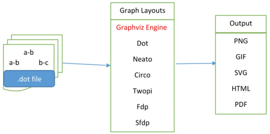
2.5.2 Graphviz
Graphviz is an open source visualization software/tool and can be run on all operating systems. Graph visualization is a way of representing a log file which is in textual information as diagrams of abstract graphs and networks. It has important applications in different areas such as networking, bioinformatics, software engineering, database and web design. It also has web and interactive graphical interfaces, and auxiliary tools, libraries, and language bindings. The Graphviz layout programs take descriptions of graphs in a simple text language, and make diagrams in useful formats, such as images and SVG for web pages; PDF or Postscript for inclusion in other documents; or display in an interactive graph browser. Graphviz has many useful features for concrete diagrams, such as options for colors, fonts, tabular node layouts, line styles and custom shapes. Unlike afterglow the algorithms of graphviz are meant to deal with static
lay-outs where as for dynamic or real-time visualization there is a modified version of graphviz called dynagraph [28].
Additionally graphviz can work in conjunction with Afterglow and give a nice looking graph. As CSV output is an input for afterglow, it is possible to pipe the fields we are interested in and use pf2csv.pl parser from the afterglow, configure in the property file and feed to the graphviz to make the graphs. For example the outputs could be a combination of the sourceip, destinationip and destinationport fields [23].
Graphviz has four different layout algorithms that are used to make different visualizations. They are dot which generates the hierarchical layout, neato that generates the organic layout, circo which uses a circular approach, and twopi which generates radial layouts. As a result we can choose any of the layouts mentioned according to our point of interest [25].
2.5.3 Gephi
Gephi is another open source visualization tool used to visualize textual data for all kinds of networks and complex systems, in dynamic and hierarchical graphs and enables network analysis. Gephi uses a 3D render engine to display large networks in real-time and to speed up the data analysis and investiga-tion. A flexible and multi-task architecture brings new possibilities to work with complex data sets and produce valuable visual results. Gephi has several features in the context of interactive exploration and interpretation of networks. It provides easy and broad access to network data and allows for spatializing, filtering, navigating, manipulating and clustering [29].
Gephi can be used in the following applications
● Exploratory data analysis ● Link analysis
● Social network analysis ● Biological network analysis
Gephi’s developed modules can import, visualize, spatialize, filter, manipulate and export all types of networks. The visualization module in gephi uses a special 3D engine to produce graphs in real-time. This technique uses the com-puter graphic card and leaves the CPU free for other computing. It can deal with large network (i.e. over 20,000 nodes) and, because it is built on a multi-task model, it takes advantage of multi-core processors. Node design can be personalized, instead of a classical shape it can be a texture, a panel or a photo. Highly configurable layout algorithms can be run in real-time on the graph win-dow. For instance speed, gravity, repulsion, auto stabilize, inertia or size-adjust are real-time settings of the Force Atlas algorithm, a special force-directed algo-rithm. Several algorithms can be run at the same time, in separate workspaces
without blocking the user interface. The text module can show labels on the visualization window from any data attribute associated to nodes [29].
In order to set up gephi we download Gephi to our computer from [30], install it and open it. The graph file format for gephi can be GEXF,CSV, GDF,GML, GraphML or pajek NET [31]. Gephi is run on a GUI manipulation mode where we specify the number of nodes, number of edges and type of graph. We can also use the mouse to scale the graphs to zoom in and out. Layout algorithms set the graph’s shape which is the most important part. The purpose of layout properties is it controls the algorithm and makes the representation of a nice looking graph.There are also ranking modules which enable us to configure node’s colour and size. The force atlas algorithm puts into consideration the number of nodes when layouting . Gephi can also be used for network analyses of factors such as betweenness, closeness and clustering coefficient [32]. Gephi can run on windows, Linux, Mac OS X running Java 1.6 ,but the drawback is can only be used for GUI manipulation [29].
2.5.4 Cytoscape
Cytoscape is an an open-source network visualization software platform which is used to visualize different components of a network data. It can also be used for visualization of biotechnological relationships such as gene expressions and different bio molecules. Cytoscape has additional features like plugins. The plugins can be used for network and different molecular analyses. Cytoscape allows us to explore networks relationships and similarity interactively in real-time. It is a very multidimensional visualization tool which can be used for multiple purposes. It is a java based visualization tool [33].
In general Cytoscape is a suitable tool to visualize and analyze any type of data with relationships and interactions among the data using network graphs of any kind involving nodes and edges . This is possible because Cytoscape has a good software architecture which makes use of plugins for specialized features. The plugins can be developed by core developers and the user community. It is still under development and many dynamic features of it are being developed. In fact this tool was originally developed in the Institute of Systems Biology in Seattle in 2002. The latest version of Cytoscape is version 3.0.2 and was released in august 2013 [33] .
In addition cytoscape has attribute values that are used to control the visual aspects of nodes and edges of the graph such as shape, color and size . Also the attribute values can be used to perform different network searches, visualizing network topology ,filtering operations and other network traffic analysis. This tool provides different options to visualize and analyze network data. It can be used by users with ordinary knowledge or for non-programmers using Custom
node graphics and at the same time it can also be used by advanced users for advanced transformations and combination of network data sets using attribute equations [34].
2.5.5 NodeXL
NodeXL (Network Overview for Discovery and Exploration in Excel) is an open-source visualization tool. NodeXL is a useful and straight-forward interactive network traffic visualization and analysis tool that uses MS Excel application as its environment for generating generic graph data, making complex network analysis and visual investigation of networks. NodeXL is supposed to be easy to implement for existing users of Excel, making use of common spreadsheet capabilities such as filtering, sorting and creating formulas. NodeXL extends the spreadsheet into a network analysis and visualization tool by incorporating a library of basic network metrics such as degree, centrality measures, elemen-tary clustering for better graph visualization features [35] [36] .
In the same way we draw graphs and charts in MS Excel, data can be en-tered or imported into the NodeXL template and it will quickly be displayed as a graph. It is specially meant to help the increasing number of community analysts who have neither the time nor desire to practice through static visual-izations or to experience complex programming interfaces. NodeXL is used for static network visualization and network analysis. NodeXL is still an evolving open source project, and it is not meant to be only for normal users but for users with programming skills too. The tool includes an Excel template for simple exploitation of graph data. It is usually used for analyzing social networks like facebook and twitters. The tool looks like the MS Excel as it has a plugin that works with excel and it has also different tabs for customizing the graphs [36]. NodeXL workbooks contain four worksheets: Edges, Vertices, Groups, and Overall Metrics [35] . In the excel sheet we can enter each node one by one or we can import the network data file and we can choose the directed or undirected graphs too. Where the nodes are entered as vertices and we can give them labels, colors as well as sizes for the nodes. We can also select the nodes and move them around to whatever distance we want and use different graph matrix functionalities which enables manual editing of the graph. What makes NodeXL so special is its ability to apply a variety of visual features to the network data elements based on the various individual services and field metrics to be analyzed and visualized. In addition the tools ability to couple spreadsheet and graph visualization, and the more possible ways of its entertaining to allow the different metrics and attributes to be interpreted onto graphs makes it very useful tool among the other network data visualization tools [36].
2.5.6 Cichlid
Cichlid is a distributed, animated network data visualization tool which is writ-ten in C programming language and uses the OpenGL and GLUT graphics li-braries and it is used to visualize and animate network data sets in bar charts and graphs. The Cichlid code is portable and it is platform independent where it can be applied in Linux, Microsoft windows, FreeBSD, IRIX platforms [37] .Cichlid is a visualization tool for visualizing clients and servers which func-tions with remote data output and machine autonomy so as to enable the user to view real time network data in 3D visualization. The data being visualized is transmitted from servers to the client engine [37]. The servers will be providing the raw data using TCP connections to the client on which the users will be observing the visual presentations.
Cichlid presents the user with a kind of high-quality 3D, animated visualiza-tions of a wide range of network data presentation [38]. Cichlid is used for real-time, interactive, dynamic visualization of data but not used for static analysis. It just presents the network data to users in a way which seems as if the animations are physical objects. This tool provides network and system administrators with some sort of new insights with the data they collect which makes them analyze their data more. Cichlid presents its visualization in two ways namely 3D bar charts used for showing numeric values and vertex/edge graphs usually used for visualizing network topology [37].
This particular visualization tool follows different functionality procedures to present the network data in a user interactive way. The first functionality is the abstraction and modeling where the real world data is represented in an isolated and independent manner. The second functionality of this tool is data collection and distribution which enables the data to be normalized and passed to the visualization phase. Finally the third functionality is the end product which is the visualization where the data collected will be presented to the users in an interactive way [37].
Summary of Free Visualization tools for Security Analysis and Monitoring
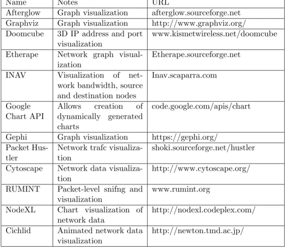
The network data visualization and monitoring tools are summarized in the very next table to give a general view of the purpose of each tool and where they can be obtained from [39] [40] [41] and [42].
Name Notes URL
Afterglow Graph visualization afterglow.sourceforge.net Graphviz Graph visualization http://www.graphviz.org/ Doomcube 3D IP address and port
visualization
www.kismetwireless.net/doomcube Etherape Network graph
visual-ization
Etherape.sourceforge.net INAV Visualization of
net-work bandwidth, source and destination nodes
Inav.scaparra.com Google Chart API Allows creation of dynamically generated charts code.google.com/apis/chart Gephi Graph visualization https://gephi.org/
Packet Hus-tler
Network trafc visualiza-tion
shoki.sourceforge.net/hustler Cytoscape Network data
visualiza-tion
http://www.cytoscape.org/ RUMINT Packet-level snifng and
visualization
www.rumint.org NodeXL Chart visualization of
network data
http://nodexl.codeplex.com/ Cichlid Animated network data
visualization
http://newton.tmd.ac.jp/
Table 2.1: Free network visualization and Monitoring Tools
2.6
Previous Work
There have been many network security related papers studying about network monitoring and detection tools as well as log file visualization tools for improved log analysis. The researches on applying information visualization techniques to network security analysis specially log analysis and correlation are increas-ingly applied to help security analysts manage and monitor their networks. ”LogView: Visualizing Event Log Clusters” [26] studies on how visualization can be customized using clusters for improvd log analysis to make the task of network analysts easier. There have been some international presentations and conferences on the visualization techniques to present data interactively for users and security analysts. As a result [13] presents an architecture which en-ables data-sharing between computer security and network traffic visualization tools. Many of the research papers give emphasis on analyzing the network traf-fic to crate network awareness for network analysts and users. Research papers like [12] presents about a specific tool for investigating sophisticated network events used for network analysis visualization.
Flamingo: Visualizing Internet Traffic [11] This paper describes a set of visual-ization techniques that are able to help the task of monitoring and analyzing a network by representing network traffic information in a manageable and inter-active way. The software tool that can be used to explore Internet traffic flow data, Flamingo, is able to process live Netflow data in real-time and present a set of interactive visualizations and related processing tools that aid users in network data analysis. Flamingo is made of a server and a client component. The Flamingo server is responsible for receiving raw Netflow feeds from devices in the network that can sample traffic, and then sending processed information to the client for visual presentation. This visualization technique is similarly presented in [37].
”Visualisation of Honeypot Data Using Graphviz and Afterglow” [25] This pa-per investigates the how data of a honeypot is visualized using afterglow and graphviz and how analysis is made from the visual presentation of the com-plex textual data. Another paper which studies about ”Visualizing Firewall Log Data to Detect Security Incidents” [43] is based on the idea of AfterGlow developer Raffael Marty to visualize the firewall log data and implements after-glow as the visualization tool. Similarly in [?] it is described how network data visualization helps to pick malicious patterns easily.Similarly in the research paper in [26] it is described how clustering simplifies the visualization and anal-ysis of large logfiles which can be complicated and difficult to understand in case the logfile size increases. It explains and shows that clustering is the best solution to handle the increasing size of log files.
There are many papers discussing the possible ways of visualizing network data, but there are few papers explaining PRADS. Petter Bjerke explains how passive detection of OS is done using PRADS [7]. He further explains the difference between pOf and PRADS OS detection. Similarly Mats Erik discusses ”Passive Asset Detection using NetFlow ” [44]. In this paper Mats Erik explains how passive asset detection system using NetFlow data is highly scalable and capable of processing a lot of data. Finally Jostein Haukeli:” False positive reduction through IDS network awareness” [14] discusses how PRADS creates network awareness for system and network analysts by reducing false positives.
Chapter 3
Methodology
”Research is to see what everybody else has seen, and to think what nobody else
has thought.” -Albert Szent-Gyorgyi
Chapter 1 and chapter 2 presented a detailed explanation of PRADS and the network data visualization tools. Using PRADS, network and system admin-istrators can get good awareness of their network system for PRADS reveals services which the network and system admin was not aware of in advance, along with the operating systems hosts are running. This special functionality of PRADS is the reason why PRADS is used as our data collection tool. Us-ing different network data visualization tools the output found from runnUs-ing PRADS on the required network system can be presented to different users or network security analysts in the form of graphs, tree maps and different anima-tions. This visual presentation of network data obtained from running PRADS will make the log analysis easier and better.
In order to implement the visualization of PRADS output there are a number of open-source network data visualization tools which are explained in chapter 2. According to the problem statement a survey and research has been made on similar projects to this particular thesis. As a result an experiment environ-ment is established for running the PRADS and enabling data collection. In addition PRADS software is installed and configured fully on the experiment environment and PRADS and its output syntax and semantics will be investi-gated in detail.
This research work is all about presentation of data particularly network data to users in the best possible way which is a simplified form of data presentation and on the way making the task of network and system administrators easier. Therefore this paper demonstrates on how we present a certain knowledge/anal-ysis to a normal user or security expert where it will be easier to understand and deduce the pattern by looking at the visual presentation than looking at
each line of a textual presentation of data. As a result this research paper is an exploratory research that investigates on how to visualize PRADS output data using open-source visualization tools. This paper tries to look into how some of the mentioned network data visualization tools function and in what platforms they work better. Therefore the visualization tools are compared with one an-other on their suitability and ability to best visualize PRADS data accordingly which makes this research paper a mix of exploratory and comparative studies. This chapter presents the experiment environment setup design, system re-quirements, data collection strategy, database configuration and the proposed visualization methodology setup to visualize the network data. This is the ap-proach to visualize the network data output obtained by running PRADS on a certain network. In fact it seems that the project needs somehow advanced technical ability to visualize the PRADS data as it is intended to show the net-work and system administrators. Therefore due to the newness of the PRADS detection tool and the semantics and syntax of its output which creates some complexity difficulty, it is expected to encounter some technical difficulty while doing this research paper.
3.1
System Requirements
PRADS will be run in a gateway with the following requirements in a virtual lab environment.
Item Description
FQDN masterfw.vlab.cs.hioa.no
Machine model Quad-Core AMD Opteron(tm) Pro-cessor 2376
Processor CPU 2294.332 MHz (Dual core)
NIC 2
Operating System Ubuntu 12.04.1 LTS x86 64 Linux kernel 3.2.0-36-generic
RAM 630884 kB
Table 3.1: System Requirements
3.2
Experiment Environment Setup
The goal of this thesis is to find the best way to visualize the output network data obtained from running PRADS in a network and listening to a network traffic so that network analysts will get better help from the visual presenta-tion. It is believed that our eyes are excellent at recognizing visual patterns
than many lines of textual data. Therefore the experiment environment is set up in a way that enables PRADS listen to a network traffic and collect what it sees in the network passively and logs its content to a log file where the log file will be further used for the visualization process to finally give visual presenta-tions in graphs, tree maps or bar charts.
For network and system administrators it is really important to know our net-work in advance. It is necessary to know the subnets of our netnet-work so that we will be able to recognize which one is the external network and which one is the internal network from the PRADS output and this in turn will help us have a good visualization plan to make for future network mapping and analysis. In addition when we have good control of our network we can manage to make some automated processes to check if services can be recognized by PRADS. For example we can start and stop some services in our network and see if PRADS does detect this.
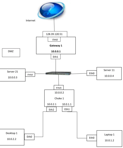
The experiment environment in the next figure is a virtual lab environment in the university college of HIOA consisting of a gatewaygateway1 with external interface Eth0 and internal interface Eth1. PRADS is installed and configured in the gateway1 and data can be collected passively by running PRADS in ei-ther of the interfaces according to our point of interest. PRADS usually detects TCP packet services but it can also detect UDP packets like DNS. It detects what it sees in the network traffic. Therefore it is necessary to generate some network traffic activities from the internal machines deliberately to create some internal activities. This can be done by writing some scripts that create network traffic or scripts that start and stop some services. This process is important when it is required to run PRADS in the Eth1 because there may not be a lot of traffic in this specific network topology. But for the case of running PRADS in the Eth0 ( the external interface) there is a lot of traffic movement and there is no need of making deliberate traffic generation. This data collection process will be extended to the whole network of HIOA and the Alto-Openstack. The following setup is our virtual network experiment setup.
Internet Gateway 1 10.0.0.1 Eth0 DMZ 128.39.120.51 Eth1 Server 21 10.0.0.3 Server 11 10.0.0.4 10.0.0.2 Choke 1 10.0.2.1 10.0.1.1 Eth0 Eth0 Eth0 Eth2 Eth1 Desktop 1 10.0.2.2 Laptop 1 10.0.1.2 Eth0 Eth0
Figure 3.1: Experiment environment Setup
In the above network set up we have three different internal networks with 10.0.0.0/24, 10.0.1.0/24 and 10.0.2.0/24 networks.
Although this virtual lab environment is not a big one, this is just for the sake of testing how PRADS output can best be visualized using the available visu-alization tools. PRADS has been tested in previous works in larger networks. The visualization process can also be tested in larger networks than this net-work set up according to our point of interest. Therefore it is part of the plan of this project to test the visualization process by considering the network data collected from HiOA and the Alto-Openstack using PRADS.
3.3
Visualization Tool Selection
A survey has been made on how the different visualization tools function, the platforms they use and their ease of use according to the first part of the problem statement. Most of the visualization tools investigated are open-source visual-ization tools where the tools are free for every body to use. As a result some of the open-source visualization tools will be investigated in relation to their us-ability to visualize PRADS output data. In this paper, as far as PRADS output is concerned the ideal tool to visualize its output is Afterglow for its simplicity and ease of use for automation. Infact Afterglow has two versions the perl ver-sion ( Afterglow 1.X ) and the java based verver-sion ( Afterglow 2.0) which is used to visualize hierarchical graphs of different depth but for the sake of simplic-ity in the prototype development we will be using the perl based Afterglow [45]. The output obtained from PRADS is in the form of CSV files and the Afterglow has parsers that pars a certain log file into CSV files because Afterglow takes CSV files as its input to visualize them. That’s why Afterglow has become the ideal tool to visualize the data collected using PRADS. Afterglow will be im-plemented in the proof of concept demonstration in conjunction with Graphviz, another open-source visualization tool which has different graph layouts that enable us look into the network data from different angles and different visions. Therefore due to their simplicity and their automation capability Afterglow and Graphviz will be implemented in the prototype development. Both tools have good customization options that increase the usability and understandability of the visual presentation for users and network analysts. Graphviz has different layouts that make the visualization process flexible and applicable. Similarly Afterglow has properties file options to make some clustering and colouring methods. The clustering and colouring methods make the visualization process easier and more purposeful [27].
3.4
Proposed Visualization Methodology Setup
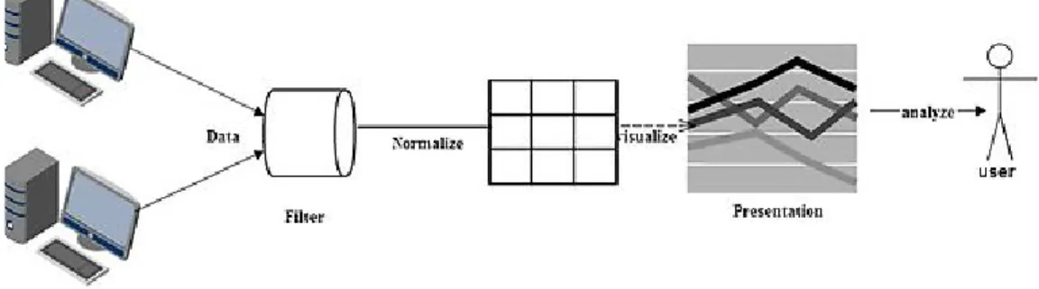
Network Data Data Collection Normalization Data Visualization Data presentation Data
Figure 3.2: Visualization Methodology Setup
3.4.1 Data Collection
For the sake of visualization data can be collected either in active scanning way or passive scanning ways. With active traffic scanning we have active scanning tools like nmap or Nessus and the scanning is done through sending multiple probe requests and recording the probe responses. But with passive scanning tools like PRADS Records and identifies traffic seen on a network without ac-tively scanning a system. Passive scanning tools do not send traffic to detect network assets. The tools just record what they see on the network to a logfile. PRADS (Passive Real-time Asset Detection System) is the program that is used to collect the data by passively listening to the network traffic, and uses the information gathered to map the network [16]. PRADS passively reports everything that it sees on the network including all the hosts that are in the network including the services the hosts are running. PRADS does use the protocols ICMP, TCP and UDP traffic to detect the network data including the IP address of each asset, ports being used, etc. PRADS is a very powerful tool and it has the ability to detect hosts based on ARP packets.
The output from PRADS can be put in a logfile where the default logfile is
/var/log/prads-asset.log or in a FIFO device to send the results to another
application or can be put into a database for further use. In addition to logging to logfiles to collect the information from PRADS, There are developing new ways for the upcoming PRADS releases, we can have access to assets via shared memory using the ring buffer options in the prads options. That will make it easier for extracting information from the running PRADS process that is cur-rently running. PRADS also has a perl script prads2db.pl which parses a prads asset log-file and inserts the info to a DB so we can query it for information using different MySQL commands. Generally the output is collected in a CSV
format. The format has usually eight (8) fields namely asset, vlan, port, proto-col, service, service-details, distance and timeslot(discovery time) orderly. The asset field usually refers to source IP but it can also sometimes be a destination IP too.
The data collection process depends on which data we are interested to visu-alize, for example whether we want to figure out the outgoing traffic from our internal network or the incoming traffic to our internal network. This will en-able us to focus on our point of interest and reduce the amount of data we must look into. Similarly When collecting data In order to identify which subnet we are dealing with and which asset belongs to our network and which one is external and internal we need to run PRADS by specifying our home network it should look into. For example we ran PRADS as follows:
prads -a 128.39.120.0/24, 10.0.0.0/255.255.255.0
In addition we can check if PRADS really scans every service running by ex-ecuting some services on the specified network.In this case whenever we run services from outside to the specific network like ssh services,the details will be displayed in the PRADS logfile.
3.4.2 Data Normalization
After data is collected, it can not be simply passed to a visualization tool and get presented visually. It needs to be parsed according to our interest. We need to rectify the fields we want to visualize. The data needs to be customized in a way that is understandable for the users and analysts of the data as well as for the visualization tool. As a result we can use some scripts to pipe or take out the required fields that we want to visualize and put the parsed file as an input for the visualization process. Actually the parsed field are also CSV files. Therefore, we need to start normalizing the data, we need to extract the data that we have like the end nodes source IP, source port, destination IP, destina-tion port, the services or other fields of interest. We can use some perl scripts, or some commands like pipe, grep, awk to pull out those fields. It is also pos-sible to use some ready made parsers that enable the same job like the perl script or the mentioned linux commands. While parsing it is a good idea to remember or give focus on who is the client and who is the server, which is the source and which is the destination. It is important to note who is initiating the communication by looking at the SYN, SYNACK packets as the clients usually send the SYN packet and the servers also reply with SYNACK as a means of three way handshaking and connection will be established consequently. In fact there are some PRADS options that help us keep track of the connection tracking. Even if the final result is logged into the log files in the same format of PRADS default options ”prads”, there are options that show the connection
tracking on the screen. The options are as follows.
prads -i eth0 -O... gives the following output
128.39.120.51:22 -> 37.191.132.112:54916 128.39.120.51:22 -> 37.191.132.112:54916 128.39.120.51:22 -> 37.191.132.112:54916 128.39.120.51:22 -> 37.191.132.112:54916 128.39.120.51:22 -> 37.191.132.112:54916 128.39.120.51:22 -> 37.191.132.112:54916 128.39.120.51:22 -> 37.191.132.112:54916 128.39.120.51:22 -> 37.191.132.112:54916 128.39.120.51:22 -> 37.191.132.112:54916
prads -i eth0 -x...gives the following output.
Listing 3.1: prads -x 1 1398211438000000243|2014−04−23 00:03:58|2014−04−23 / 2 00:03:58|0|0|128.39.120.29|0|224.0.0.251|0|1|8|0|0|0|0|[expired] 3 1398211399000000242|2014−04−23 00:03:19|2014−04−23 / 4 00:03:19|0|6|128.39.120.8|30296|198.100.150.99|53|0|0|1|24|0|18|[expired] 5 1398211778000000251|2014−04−23 00:09:38|2014−04−23/ 6 00:09:38|0|6|198.100.150.99|53|128.39.120.156|30444|1|24|0|0|18|0|[New] 7 1398211779000000252|2014−04−23 00:09: