R E S E A R C H A R T I C L E
Open Access
Presenting simulation results in a nested loop
plot
Gerta Rücker
*and Guido Schwarzer
Abstract
Background: Statisticians investigate new methods in simulations to evaluate their properties for future real data applications. Results are often presented in a number of figures, e.g., Trellis plots. We had conducted a simulation study on six statistical methods for estimating the treatment effect in binary outcome meta-analyses, where selection bias (e.g., publication bias) was suspected because of apparent funnel plot asymmetry. We varied five simulation parameters: true treatment effect, extent of selection, event proportion in control group, heterogeneity parameter, and number of studies in meta-analysis. In combination, this yielded a total number of 768 scenarios. To present all results using Trellis plots, 12 figures were needed.
Methods: Choosing bias as criterion of interest, we present a ‘nested loop plot’, a diagram type that aims to have all simulation results in one plot. The idea was to bring all scenarios into a lexicographical order and arrange them consecutively on the horizontal axis of a plot, whereas the treatment effect estimate is presented on the vertical axis.
Results: The plot illustrates how parameters simultaneously influenced the estimate. It can be combined with a Trellis plot in a so-called hybrid plot. Nested loop plots may also be applied to other criteria such as the variance of estimation.
Conclusion: The nested loop plot, similar to a time series graph, summarizes all information about the results of a simulation study with respect to a chosen criterion in one picture and provides a suitable alternative or an addition to Trellis plots.
Keywords: Simulation study, Plot, Diagram, Graphical representation, Trellis plot
Background
After a new statistical method has been developed, it is usually investigated in an extensive simulation study in order to evaluate its properties for future usage in real data applications. Particularly, it is important to compare the new statistical method to existing approaches. To this aim, a number of simulation parameters is varied, so that the value of the new method can be investigated in many dif-ferent data scenarios. Moreover, there are usually several criteria. If the new method includes statistical hypothesis testing, size and power of the test are typically evaluated; if it is a method for parameter estimation, the criteria of interest are the absolute or relative bias, the mean squared error, the variance of estimation, and the coverage of the proposed confidence intervals [1-3].
*Correspondence: [email protected]
Institute for Medical Biometry and Statistics, Medical Center – University of Freiburg, Stefan-Meier-Strasse 26, 79104 Freiburg, Germany
For example, if each scenario is defined by setting a fixed combination of levels for five simulation parameters, each of which takes four levels, and we look at three criteria, we have for 45 = 1024 different scenarios for each crite-rion. For presenting simulation results in a manuscript for publication, tables, figures or regression analyses can be used.
Information is often presented in a number of figures. A very suitable way of presentation is a Trellis plot. This is a rectangle of n×m plots (corresponding to two dimen-sions of the parameter space of the simulation study), each of which has a common third parameter as its horizontal axis and one of the criteria as vertical axis. Results from several methods can be compared in a single plot using different line types or colors for each.
Thus, three dimensions of the parameter space can be presented in one Trellis plot. If there are four, five or even more dimensions, as is often the case, lots of these plots must be presented. Alternatively, a selection
is necessary due to restricted space. Trellis and related plots are frequent in the statistical literature, e.g., for test-ing and adjusttest-ing methods for publication bias [4-10] and meta-analysis in general [11-13].
It is also possible to present the results of a simulation study as a regression analysis, where the criteria are mod-elled in terms of the parameters. This way of presentation, however, is not frequent. One reason may be that the sim-ulation parameters, originally often continuous variables, take only few levels in the simulation study. Thus they are treated as ordinal variables, which makes modelling and interpreting of the regression coefficients more challeng-ing. Moreover, for adequate handling of variability within simulation scenarios, all simulation repetitions must be saved which is unusual. In addition, potential interactions must be modelled, so that many regression parameters are needed.
The method presented in this article originally arose from the desire to have all simulation results for a criterion in a single plot. The idea was to order all simulation scenarios in a lexicographical manner and arrange them consecutively on the horizontal axis of a plot. The crite-rion – e.g., treatment effect estimate, which shows poten-tial bias, or variance of estimation, or mean squared error (MSE) – is shown on the vertical axis.
The paper is arranged as follows. In the next section, a motivating example is introduced. Based on this exam-ple, we explain the method in the subsequent section. In the ‘Results’ section the method is applied to the example. After discussing strengths and limitations in the ‘Discussion’ section, the paper ends in a Conclusion.
Example: simulation study for selection bias in meta-analysis
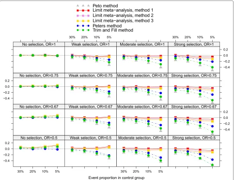
Before introducing the method, we present our motivat-ing example. We performed a comprehensive simulation study on various treatment effect estimation methods for meta-analysis with binary outcome, where selection bias (e.g., publication bias, or other kinds of small-study effects) was suspected because of apparent funnel plot asymmetry [9,10]. Figure 1 shows the bias of six treat-ment effect estimation methods for binary meta-analysis in several scenarios. Effect measure is the log odds ratio. One method is a standard approach of fixed effect meta-analysis, the Peto method [14]. The other five methods aim to estimate the treatment effect while adjusting for selection bias. We were interested in comparing three newly developed methods (here briefly called method 1, method 2 and method 3; for details see [9]) with two exist-ing methods, the Peters method [8] and the Trim-and-Fill method [15].
We emphasize that for the purpose of this article, this particular simulation study only serves as an example.
Background, methods and more details of the study are described elsewhere, where also similar Trellis plots are given, see ([9,10], Figure two).
Figure 1 is a Trellis plot covering results of several simu-lation scenarios. The plot consists of 4×4 layers, differing by extent of selection (levels: no, weak, moderate, and strong selection; in horizontal direction) and true treat-ment effect (odds ratio: 1, 0.75, 0.67, 0.50; in vertical direction). Within each layer, the event proportion in the control group is varied (four levels 30%, 20%, 10% and 5%, on the horizontal axis in decreasing order). Criterion is the bias on the log odds scale, shown on the vertical axis. The six methods are presented as six lines marked by different colors. In summary, the Trellis plot contains information of 4 ×4 × 4 = 64 scenarios. In the underlying simula-tion study, however, two addisimula-tional simulasimula-tion parameters were varied: the heterogeneity variance parameter of the random effects model,τ2(four levels: 0, 0.05, 0.10, 0.20) and the number of studies in meta-analysis (three levels: 5, 10, or 20 studies). In combination, this yields a total num-ber of 4× 4 × 4 × 4 × 3 = 768 scenarios. In the plot presented here, heterogeneity (τ2 = 0.1) and number of
studies (k=10) are fixed. Twelve Trellis plots would have been needed to present all results.
In both earlier articles [9,10], additional focus was on MSE and coverage of 95% confidence intervals. If all this information is presented, the number of figures triples, yielding 36 figures – far too many for most journal arti-cles. Apart from this, it would be a enormous challenge for a reader to capture the full information contained in 36 figures. For these reasons, usually only a small part of simulation results is presented in a publication.
In this paper we focus on the novel plot, not the special-ties of the motivating example. Nevertheless, the example is needed for explaining the features of the plot in detail. For this reason, we will refer to the example in each of the following sections.
Methods
We start with a dataset containing as many rows as sim-ulation scenarios considered. Let there be P simulation parametersp = 1,. . .,P, and let parameterphave levels xpj(j=1,np)wherenpis the number of levels of parame-terp. Then the total number of scenariosN(and thus the number of rows in the dataset) is given byN = Pp=1np. Each scenario is characterized by a unique combination of Pvaluesx1j1,. . .,xPjP.
Hence, each parameter adds one column to the data set. ForMmethods andCcriteria, simulation results will add M×Ccolumns. Accordingly, the dataset with simulation results has a structure as shown in Table 1.
Figure 1Trellis plot.Bias of treatment effect estimate on log odds ratio scale for the Peto method and five adjusting methods. Heterogeneity (τ2=0.1) and number of studies (k=10) are fixed.
simulation scenario which is available for six statistical methods. Additional criteria are the observed variance or the standard error of this estimate, the MSE and the cov-erage of 95% confidence intervals. For statistical tests, the observed rejection frequency under the given scenario is typically recorded. This is interpreted as the type I error if the scenario belongs to the null hypothesis, and as the power if the scenario belongs to the alternative hypothe-sis. For other statistical methods, other types of measures
Table 1 Structure of dataset with simulation results
Scenario
Simulation First Second
· · ·
parameters criterion criterion
1 · · · P C11 · · · C1M C21 · · · C2M 1 x11 · · · xP1 c111 · · · c1M1 c211 · · · c2M1 · · ·
. . .
. . .
. . .
. . .
. . .
N x1N · · · xPN c11N · · · c1MN c21N · · · c2MN · · ·
may be appropriate. The dataset with simulation results for our example is attached as Additional file 1.
The underlying idea of the new ‘nested loop plot’ is to reorder simulation scenarios into a lexicographical order and arrange them consecutively on the horizontal axis of a plot, whereas the criterion to evaluate simulation results – e.g., treatment effect estimate, which shows potential bias, or variance of estimation, or mean squared error (MSE) – is presented on the vertical axis.
such a way that the simulation parameter with the largest influence on the criterion of interest is considered first, and so forth.
Example
In our example, focus was on estimation of the treat-ment effect given as log odds ratio. Accordingly, the true odds ratio was chosen to serve as the first parameter in the order. We started with ‘no treatment effect’, that is an odds ratio of one, and increased the treatment effect by decreasing the odds ratio. Without loss of generality, only odds ratios less or equal to one were considered. As the second simulation parameter, we chose the selection parameter in increasing order, as the main issue in our study was selection. The third to fifth nested loops were chosen to be the event proportion in the control group (decreasing), the heterogeneity variance (increasing), and the number of studies in the meta-analysis (decreasing). The leading principle here was that we wanted to start with scenarios where the estimation was likely to be more accurate and end up with scenarios probably more diffi-cult to predict.
R functions for reordering the simulation dataset as well as generating the nested loop plot are given in Additional
file 2, together with an example of its use in Additional file 3.
Results
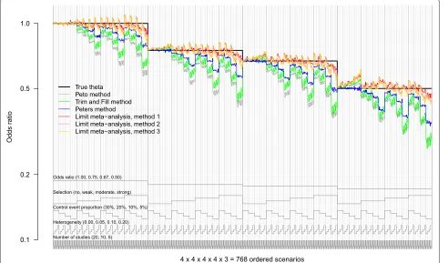
The method and its application are best explained using the motivating example. The nested loop plot for the example considering all 768 simulation scenarios is shown in Figure 2. The simulation results were arranged accord-ing to the order of loops described in the last section.
We here focus on the accuracy of the treatment effect estimate as our criterion of interest, depending on the estimating method and the simulation scenario. The true treatment effect for each scenario was known and served as a benchmark (black horizontal line). The difference of each estimate to this benchmark is the observed bias. We summarize the information in the plot as follows.
Odds ratios
Differences in accuracy between the various odds ratios were present, but not marked; see below.
No selection
With respect to selection, we observe marked differences. If there was no selection (the left quarter in each section),
the Peto method and the Peters method worked well. The other methods yielded estimates that were slightly biased upwards, the more so, the more the odds ratio deviated from one, and the less the control event proportion was. These observations confirm earlier results from the liter-ature: estimation becomes more biased if events are rare, and the Peto method is recommendable in this setting, except if the odds ratio differs markedly from one [11,16]. The adjusting methods 1, 2 and 3 were even more biased upwards.
Increasing selection
If selection increased, the Peto method became markedly biased. Also the Trim and Fill method and the Peters method showed large bias, particularly if the event was very rare (5%). The methods 1, 2 and 3 were also biased, but not so much and often in the opposite direction, except for strong selection.
Event proportion
As said before, all methods showed large bias if events were rare, particularly if accompanied by other problems, such as strong selection and also a large treatment effect.
Heterogeneity
The influence of heterogeneity was less marked than that of other simulation parameters. For the Peters method, heterogeneity had the least influence. For the Peto method and the Trim and Fill method, increasing heterogeneity led to less bias. For the methods 1, 2 and 3, increasing het-erogeneity led to treatment effect estimates farther from one, which increased bias if selection was strong.
Number of studies
A closer look at the smallest unit of the plot showed that, other parameters held fixed, the bias tended to slightly increase if the number of studies in the meta-analysis decreased.
Interpretation
Whereas the first four of these conclusions could have just as well been drawn from Figure 1, at least for the fixed combination of heterogeneity (τ2 = 0.10) and number of studies (k = 10), judgment of the latter two points was not possible from Figure 1 alone, as other levels of heterogeneity and number of studies were not considered.
Hybrid plot
As a variant of a nested loop plot, we also produced a sort of hybrid between Trellis and nested loop plot which is shown in Figure 3. For this figure, the 4×4 panels of the Trellis plot (Figure 1) and their order were kept as before, but in each panel all 4×4×3=48 scenarios are presented in the same order as in Figure 2). R code for producing a
hybrid plot is found in Additional files 2 and 3 in the web appendix.
Discussion
We proposed a novel figure type – the nested loop plot – to illustrate the results of simulation studies with many simulation parameters. The nested loop plot can be used as an alternative or in addition to established plots like Trellis plots. It is particularly useful if there are more than three simulation parameters, which makes it necessary to show more than one Trellis plot in order to present all results graphically. The basic idea of the nested loop plot is comparable to that of a time series diagram showing, for example, meteorological data, or secular and seasonal variations of the incidence of an infectious disease, or of the number of patients seeking medical advice. The outer loops (e.g., decades and years) correspond to secu-lar trends, such as a longtime increase or decrease of the incidence, whereas the inner loops (months, weeks, days or even hours) show seasonal, weekly or hourly variations of the criterion of interest.
The diagram is especially suited to illustrate the accu-racy and bias of parameter estimation. In this case, the vertical axis is given by the scale of the parameter to be estimated. This parameter should correspond to the first-level parameter in the order, and the true value of this parameter is clearly marked in the diagram as a step func-tion, such as the true odds ratio in Figure 2. In this case, the nested loop plot may replace dozens of Trellis plots, particularly if the fourth, fifth and so forth simulation parameter have many levels.
Interactions
An advantage of our approach as compared to regression analyses is that it is not necessary to model interactions between parameters explicitly. If there are interactions, they may be readily seen as patterns in the nested loop plot. For example, in Figure 2 it is seen that for odds ratios different from one and no selection, the Peto method and the Trim and Fill method tend to be upwardly biased (the more so, the lower the control event proportion is), whereas they are downwardly biased, if there is selection (the more so, the lower the control event proportion is). In other words, we observe an interaction between the extent of selection and the control event proportion. This could be confirmed by a regression model.
Figure 3Hybrid nested loop plot.A combination of trellis plot and nested loop plot showing 4×4×3=48 scenarios per layer: event proportion (5%, 10%, 20%, 30%); heterogeneity (τ2=0, 0.05, 0.1, 0.2); number of studies (5, 10, 20).
offered no great advantage over three or four Trellis plots, as there were only four parameters varied in this simula-tion study: selecsimula-tion (4 levels); number of studies (3 levels); heterogeneity (3 levels); true treatment effect (3 levels).
Ordering the loops
The order of the loops is arbitrary. However, this likewise holds for Trellis plots, as the choice of axes and layers is subject to subjective decisions, too. It is proposed to choose the true parameter as the first level of variation (outer loop). For the other levels, the principle is to sort parameters by the magnitude of their influence on the criterion of interest, with parameters with greater influ-ence coming first. The influinflu-ence can be investigated by a regression model. The aim is to avoid a large number of extremely close peaks in order to have curves as smooth as possible. R functions provided in the appendix can be used to easily change the order of simulation parameters.
Ordering the parameter levels within loops
The order of the levels within the loops is also arbitrary. The principle we used here is ‘from simple to difficult’. For example, in the framework of treatment effect estimation
in meta-analyses with binary outcome it is often more difficult to estimate the treatment effect if there are only few studies, if events are rare, or if heterogeneity is large. Therefore, we ordered the levels by decreasing the num-ber of studies, decreasing the control event proportion and increasing the heterogeneity.
It is possible to sort loops and parameters within loops on the basis of the results of a regression model. The order may then be determined using the magnitude and the sign of the regression coefficients. In principle, this might even be done automatically. However, since the magni-tude of the regression coefficients depends on the scaling of the various parameters, the coefficients are not directly comparable.
Again, R functions provided in the appendix can be used to easily reorder the levels of simulation parameters.
Limitations
The nested loop plot has a number of limitations.
Number of parameters and scenarios
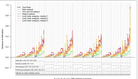
Figure 4Nested loop plot of the variance of estimation.768 simulation scenarios in total, order from outer to inner loops: Treatment effect (4 levels, increasing); number of studies (3 levels, decreasing); heterogeneity (4 levels, increasing); control event proportion (4 levels, decreasing); selection (4 levels, increasing). The periodic turn of the loops is illustrated by the gray lines at the bottom of the plot.
unlimited. In our example, we considered five parame-ters, leading to 768 scenarios. We think that no more than six parameters and about 1000 scenarios can be pre-sented in one plot, additionally depending on the extent of variation, particularly the lack of monotonicity between adjacent scenarios. The nested loop plot is the less read-able, the more peaks are observed. By contrast, the hybrid plot offers the chance to present more than 1000 scenarios.
Other criteria
In our experience, the nested loop plot is somewhat less suitable for criteria such as variance of estimation, MSE, or coverage of confidence intervals. At least in our sim-ulation study, the reason was that all parameters had a large influence on these criteria, as shown by Figure 4 for the variance of estimation. We obtained a large number of close peaks, regardless which order we had chosen, which rendered the plot confusing.
Monte Carlo error
Of note, there are important questions that are not answered by looking at a nested loop plot. One of these is the error associated with the estimated quantities, the so-called Monte Carlo error [2]. However, this is a disad-vantage the proposed plot has in common with the Trellis
plot. It is recommended to present this information in addition to a nested loop plot.
Conclusion
The nested loop plot, similar to a time series graph, sum-marizes all results of a simulation study with respect to a chosen criterion in one picture. It provides a suitable alternative to Trellis plots, possibly in combination with them (hybrid nested loop plot), at least for a first but comprehensive overview.
Additional files
Additional file 1: Data file of example data (res.rda).This file (res.rda) contains the data of the example.
Additional file 2: R functions.The filename is nestedloop.R, containing three R functions. R function nestedloop can be used to reorder a dataset with simulation results. Argument x is the simulation dataset, argument varnames is a character string giving the variable names of simulation parameters used for ordering. Both arguments x and varnames are mandatory. Arguments sign and varlabels are optional. R function lines.nestedloop can be used to plot vertical and reference lines in an nested loop plot. Only argument x is mandatory. R function panel.nestedloop can be used to plot vertical and reference lines in a hybrid plot. Only argument x is mandatory.
Competing interests
Both authors declare that they have no competing interests.
Authors’ contributions
GR had the idea of the plot, conducted the simulation study that served as an example, wrote the first version of the R code and the first draft of the manuscript. GS contributed to the simulations and overworked and refined the R code. Both authors revised and approved the final version of the manuscript.
Acknowledgements
The authors thank Arthur Allignol for helpful advice and Kim Harris for editing the English. The article processing charge was funded by the German Research Foundation (DFG) and the Albert Ludwigs University Freiburg in the funding programme Open Access Publishing. GR was funded by the German Research Foundation (DFG) (RU 1747/1-1).
Received: 1 August 2014 Accepted: 27 November 2014 Published: 12 December 2014
References
1. Burton A, Altman DG, Royston P, Holder RL:The design of simulation studies in medical statistics.Stat Med2006,25:4279–4292. 2. Koehler E, Brown E, Haneuse SJPA:On the assessment of Monte Carlo
error in simulation-based statistical analyses.Am Stat2009, 63(2):155–162.
3. White IR:simsum: Analyses of simulation studies including Monte Carlo error.Stat J2010,10(3):369–38517.
4. Harbord RM, Egger M, Sterne JAC:A modified test for small-study effects in meta-analyses of controlled trials with binary endpoints. Stat Med2006,25(20):3443–3457.
5. Peters JL, Sutton AJ, Jones DR, Abrams KR, Rushton L:Comparison of two methods to detect publication bias in meta-analysis.J Am Med Assoc2006,295:676–680.
6. Schwarzer G, Antes G, Schumacher M:A test for publication bias in meta-analysis with sparse binary data.Stat Med2007,26:721–733. 7. Rücker G, Schwarzer G, Carpenter JR:Arcsine test for publication bias
in meta-analyses with binary outcomes.Stat Med2008,27(5):746–763. 8. Moreno SG, Sutton AJ, Ades AE, Stanley TD, Abrams KR, Peters JL, Cooper
NJ:Assessment of regression-based methods to adjust for publication bias through a comprehensive simulation study.BMC Med Res Methodol2009,9:2.
9. Rücker G, Schwarzer G, Carpenter J, Binder H, Schumacher M:Treatment effect estimates adjusted for small-study effects via a limit meta-analysis.Biostatistics2010,12(1):122–142.
doi:10.1136/jme.2008.024521.
10. Rücker G, Carpenter J, Schwarzer G:Detecting and adjusting for small-study effects in meta-analysis.Biom J2011,53(2):351–368. 11. Bradburn MJ, Deeks JJ, Berlin JA, Localio AR:Much ado about nothing: a
comparison of the performance of meta-analytical methods with rare events.Stat Med2007,26:53–77.
12. Rücker G, Schwarzer G, Carpenter J, Olkin I:Why add anything to nothing? The arcsine difference as a measure of treatment effect in meta-analysis with zero cells.Stat Med2009,28(5):721–738. 13. Kulinskaya E, Morgenthaler S, Staudte RG:Combining the evidence
using stable weights.Res Synth Methods2011,3–4:284–296. 14. Yusuf S, Peto R, Lewis J, Collins R, Sleight P:Beta blockade during and
after myocardial infarction: an overview of the randomized trials. Prog Cardiovasc Dis1985,27:335–371.
15. Duval S, Tweedie R:A nonparametric “Trim and Fill” method of accounting for publication bias in meta-analysis.J Am Stat Assoc 2000,95:89–98.
16. Sweeting MJ, Sutton AJ, Lambert PC:What to add to nothing? Use and avoidance of continuity corrections in meta-analysis of sparse data. Stat Med2004,23:1351–1375.
doi:10.1186/1471-2288-14-129
Cite this article as:Rücker and Schwarzer:Presenting simulation results in a nested loop plot.BMC Medical Research Methodology201414:129.
Submit your next manuscript to BioMed Central and take full advantage of:
• Convenient online submission
• Thorough peer review
• No space constraints or color figure charges
• Immediate publication on acceptance
• Inclusion in PubMed, CAS, Scopus and Google Scholar
• Research which is freely available for redistribution