Worcester Polytechnic Institute
Digital WPI
Major Qualifying Projects (All Years)
Major Qualifying Projects
April 2018
Data Visualization in Games
Brian Copeland
Worcester Polytechnic Institute
Christopher Griffin
Worcester Polytechnic Institute
Christopher Earl Bianco
Worcester Polytechnic Institute
Natalia Kononenko
Worcester Polytechnic Institute
William J. Craft
Worcester Polytechnic Institute
Follow this and additional works at:
https://digitalcommons.wpi.edu/mqp-all
This Unrestricted is brought to you for free and open access by the Major Qualifying Projects at Digital WPI. It has been accepted for inclusion in Major Qualifying Projects (All Years) by an authorized administrator of Digital WPI. For more information, please [email protected].
Repository Citation
Copeland, B., Griffin, C., Bianco, C. E., Kononenko, N., & Craft, W. J. (2018).Data Visualization in Games. Retrieved from
Data Visualization in Games
Major Qualifying Project
Advisor: LANE HARRISON Written By: CHRISTOPHERBIANCO BRIAN COPELAND WILLIAMCRAFT CHRISTOPHER GRIFFIN NATALIAKONONENKO
A Major Qualifying Project WORCESTERPOLYTECHNIC INSTITUTE
Submitted to the Faculty of the Worcester Polytechnic Institute in partial fulfillment of the requirements for the
Degree of Bachelor of Science in Computer Science and Interactive Media and Game Development.
A
BSTRACTC
harts and graphs are becoming ubiquitous in daily life, regularly seen as people explore stocks, politics, social media, and more. Data visualization literacy is the measure of one’s ability to interpret visually-displayed data. In this project, we create a visualization-literacy-focused game as an engaging and entertaining method of testing and improving data visualization literacy. We evaluate our project through an experiment with pre- and post- tests based on peer-reviewed visualization literacy surveys. The results of these evaluations suggest that our game is capable of improving the data visualization literacy of a player. This success opens a path to future game-based methods of improving data visualization literacy.T
ABLE OFC
ONTENTS Page List of Figures v Executive Summary 1 1 Introduction 3 1.1 Background . . . 3 1.2 Motivation . . . 3 1.3 Current State-of-the-Art . . . 51.4 Proposed Design and Contribution . . . 7
2 Background 8 2.1 Data Visualization . . . 8 2.1.1 Bar Charts . . . 9 2.1.2 Line Graphs . . . 9 2.1.3 Pie Charts . . . 9 2.1.4 Scatter Plots . . . 9 2.2 Design Decisions . . . 9 2.2.1 Pandemic . . . 10 2.2.2 Fable 3 . . . 11 2.2.3 Crusader Kings 2 . . . 11 2.3 Summary . . . 13 3 Proposed Design 14 3.1 Main Goal . . . 14 3.2 Project Objectives . . . 14
3.3 Project Management and Tasks . . . 15
3.4 Design Summary . . . 15
4 Implementation 16 4.1 Introduction . . . 16
TABLE OF CONTENTS 4.2.1 Event Design . . . 17 4.3 Graph Tool . . . 18 4.3.1 Code structure . . . 20 4.3.2 Visual Choices . . . 24 5 Assessments 26 5.1 The Visualization Literacy Assessment Test . . . 26
5.1.1 Overview . . . 26 5.1.2 Structure . . . 27 5.1.3 Findings . . . 28 5.2 Our Assessments . . . 29 5.2.1 Alpha Versions . . . 29 5.2.2 Revised Versions . . . 30
5.2.3 In-Game Logging Features . . . 30
5.2.4 Testing Logistics . . . 30 6 Results 32 6.1 Assessment Data . . . 32 6.2 Player Feedback . . . 34 7 Discussion 35 7.1 Overview . . . 35 7.2 Game Design . . . 35
7.3 Assessment Design and Results . . . 36
8 Recommendations and Future Work 38 8.1 Next Steps . . . 38
9 Conclusion 39
Appendix A: Assessment Form 1 i
Appendix B: Assessment Form 2 vi
Appendix C: Assessment Answer Keys xii
A
UTHORSHIPSections
Natalia Kononenko 2.1, 3.1, 3.2, 4.3
Brian Copeland Abstract, Executive Summary, 1.0, 1.3, 7.1, 8.1, 9
Chris Bianco 5, 6, 7.2, 7.3, Appendices
Chris Griffin 1.1, 2.2, 3.3, 3.4
L
IST OFF
IGURESFIGURE Page
1.1 The results from a test ran in a museum on whether participants were familiar with various data visualizations suggest that a surprisingly large amount of people,
particularly youths, don’t understand some common data visualizations. . . 4
1.2 The generally accepted Game Object Model II, which demonstrates the interaction between games and education. . . 5
1.3 The six elements ("I’s") that are said to be essential to the design of educational games. 6 1.4 An example of one of the events in the game with the graph that accompanies it. . . . 7
2.1 An image of the evolution and mutation screen in Pandemic. . . 10
2.2 An example of a decision to be made in Fable 3. . . 11
2.3 One of the many events that can appear in Crusader Kings 2. . . 12
4.1 UML diagram of the game’s class structure . . . 16
4.2 Example of Unity development interface . . . 18
4.3 Example of Game Maker development interface . . . 19
4.4 Chart and Graph example . . . 20
4.5 UML diagram for the Graph Tool . . . 21
4.6 The Colorbrewer website layout . . . 25
5.1 Two questions that appear on the VLAT. The first asks the participant to determine the range of values from a line graph, and the second asks the participant to compare multiple values from a bar chart. The difference between the questions shows the way that the VLAT targets specific tasks for specific visualizations. . . 28
6.1 The results from our assessment questions that had a calculable percent error, split by visualization type with n=15 participants. We observed a general decline in percent error for bar charts, line graphs, and scatterplots, and we observed a slight increase in percent error for pie charts. The red bars denote a 95% confidence interval. . . 33
LIST OFFIGURES
6.2 The results from our assessment questions that had a calculable percent error, split by analysis task, with n=15 participants. We observed a general decline in percent error for comparison, extrema, and trend tasks, while identify tasks and outlier tasks remained approximately the same. The red bars denote a 95% confidence interval. . . 34
E
XECUTIVES
UMMARYThis report provides a detailed analysis of our attempt to create a video game designed to improve a player’s data visualization literacy. Data visualizations are important for many fields, and their usage continues to grow. Due to evidence of the general population having a relatively low data visualization literacy [1], we strove to find a way to improve that. Video games were chosen as the method, as video games (when used properly) have been proven to be an effective educational tool [2], and tend to be more capable of attracting and holding attention and motivation [3].
Our first step in deciding what kind of video game to make was determining what objectives we wanted it to accomplish. To meet our goal of creating a game that improves the player’s data visualization literacy, our objectives for the game were “useful,” “educational,” and “fun.” The game had to be useful to the player in that it needed to utilize the types of data visualizations that the average player would commonly experience, such as bar charts and pie charts. The game needed to be educational, so we would have to ensure that the player is actually learning from the decisions he/she makes. The game had to be fun so that players would actually have motivation to play and complete the game.
Our second step was to determine what game-related aspects we wanted to include. These aspects would have to be achievable with our limited time and resources, and lend themselves well to data visualizations. Thus, we chose “resource management,” “event-driven,” and “utilization of graphs” as our main aspects. With those aspects in mind, we searched for existing video games that included these aspects so that we could study how they used those aspects. We looked at Pandemic, Fable 3, and Crusader Kings 2. After studying those, we then began to what the video game would be like at its most basic levels. We chose medieval times as the setting, as it was something that interested us and tends to be common on the video game market. Managing a kingdom would be the main goal of the game, as it would directly incorporate our “resource management” aspect, and could lend itself well to our “event-driven” aspect, particularly as exemplified by Crusader Kings 2. As well, we figured that we could tie graphs to the events, thus meeting our “utilization of graphs” aspect.
We originally planned to have “down-time activities,” which were assorted things that the player could do between events, such as looking at a map, altering how the kingdom is run, or interacting with other kingdoms. Upon looking into assorted methods of including “down-time activities,” we decided that it would detract from the focus on graphs and therefore lessen its educational value, so we removed it from our plans and set our focus solely onto the event system.
LIST OFFIGURES
Once we were done planning the game, we then had to choose what we were going to use to make it. Our main contenders were Unity, GameMaker, and writing a game from scratch in Javascript. Unity was chosen for our familiarity with it, and its comparative ease of use.
The game itself was made to be based on “turns.” On each turn, the player would be presented with an event pseudo-randomly chosen from a pool of events. Some form of data visualization would accompany the event. Each event presents the player with some form of choice. The player would then be expected to utilize the given data visualization as well as his/her resources to make whatever is believed to be the correct choice. There were enough events and randomization within the events to ensure varying levels of difficulty. The events only utilized bar graphs, pie charts, and line graphs. Between events, the player is given a report on his/her kingdom, detailing resources such as population, tax rate, gold, and happiness of the people. This serves as feedback for the player to see how his/her choice in an event has affected the kingdom.
While making the game, it was found that Unity lacked a method of generating customized data visualizations at run-time, so we acquired a Unity package called “Chart and Graph” that we were able to modify and configure to our liking. As we were creating the game, we also considered how we were going to test players for improvements in data visualization literacy. We found that there was no widely-accepted method of testing data visualization literacy, so we chose to use the Visualization Literacy Assessment Test (VLAT) since it is a relatively standardized method of testing assorted data visualization literacy skills across different types of data visualizations. For each type of data visualization, it asks questions that test various analysis tasks. We tested player both before and after they played the game. We did make some changes to some of the VLAT questions, such as asking participants to provide as accurate a value as possible instead of multiple choice for some questions, as this would allow us to measure percent error and thus tell us if errors were increasing or decreasing.
Overall, our results showed a general decrease in percent error after playing the game, showing that data visualization literacy was improved after the game. Bar charts and pie charts had a decrease in error, though pie charts had an increase. Additionally, the scatterplot did not see a significant change in errors, and was not actually modeled in the game. This suggests that it was the game that caused changes in data visualization literacy.
With our success in improving data visualization literacy through a video game, it stands to reason that this project could be expanded. Our project could be used as a stepping stone from which other data visualization literacy improvements could be derived. An assortment of games could be created to test various aspects of data visualization. Games could be made that use graphs and charts that we did not use, could use data visualizations for analysis tasks different from ours, could change the feedback loop, or could even change the genre entirely. We’ve shown that it’s possible, now others can refine it.
C
H A P T E R1
I
NTRODUCTION1.1
Background
In today’s globalized world, data visualization is present everywhere. Quarterly reports, news articles, research, and most information is conveyed with the helpful presence of graphs and visualizations. Without visualizations, conveying information would become much harder and more cumbersome.
Understanding visualizations is not a trivial task. If visualizations are not suited for the data they represent, they cause misinterpretations from readers [4]. Different tasks are performed when reading different graphs, and these tasks have different difficulties [5]. Even the same type of graph can be misinterpreted in various ways [6]. Correct interpretation of visualizations is key to understanding the events occurring around us.
To address the difficulties present in graph reading, we decided to improve performance through repeated practice. In the form of a game, users interpret visualizations and make decisions based upon their interpretation. This is challenging, as keeping the game interesting enough to maintain attention is difficult when graph reading is the main focus. Furthermore, designing a game that integrates visualizations became a tough design challenge.
1.2
Motivation
Comprehending and creating data visualizations is essential in many different fields, such as news media, research and development, and business enterprises. Data is now rightly seen as an invaluable asset, something that can help change the world for the better or create a competitive goldmine, depending on your perspective [7]. Being literate with many common data visualizations is important, and many people in today’s society are not nearly as literate as they
CHAPTER 1. INTRODUCTION
[1]
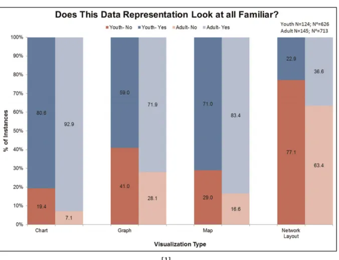
Figure 1.1:The results from a test ran in a museum on whether participants were familiar with various data visualizations suggest that a surprisingly large amount of people, particularly youths, don’t understand some common data visualizations.
should be. Studies show that most U.S. students leave high school with far below even minimum expectations for mathematical and quantitative literacy [8]. We made this game as an alternative to traditional teaching techniques, which either aren’t being employed or aren’t working.
Video games have been explored as alternatives to traditional education in other fields before [9]. A video game has the advantage of keeping the player interested while giving them experience reading data visualizations at the same time. Pedagogical results indicate the combination of game development and friendly student competition is a significant motivator for increased student performance [10]. Students will be motivated to get as much as they can from the graphs so that they can outperform their peers. Such tools can provide sufficient stimulation to engage learners in knowledge discovery, while at the same time developing new skills [11]. The intent of our project is to create a game which will increase the player’s graph literacy. If our game is shown to achieve this goal, it paves the way for more games being created that integrate graphs in this manner, which can increase the general graph literacy of the population.
1.3. CURRENT STATE-OF-THE-ART
1.3
Current State-of-the-Art
[12]
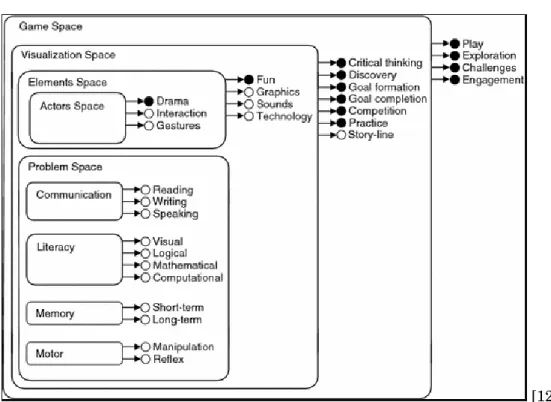
Figure 1.2:The generally accepted Game Object Model II, which demonstrates the interaction between games and education.
Graphs have been used in games before, but this close an integration is a fairly new concept. Previous graphs in games were usually separated somewhat from game play, being either post-game reports or statistics. RTS post-games have included reports in the end-post-game screen for many years. Usually, these only include line graphs, and are separated from the actual gameplay.
Educational games in general, however, are not a new concept [13]. There has been a decent amount of research in using games as learning tools recently. "The results of the evaluation show that educational virtual reality games can be very motivating while retaining or even improving the educational effects on students" [14]. The added interest and motivation a student typically feels when playing one of these educational games goes a long way to further their learning versus simply reading a textbook or attending a lecture [15]. As a matter of fact, it is said that “the academic debate about whether videogames have educational potential is decreasing” and that the “debate is actually starting to focus more on issues such as the cost of development, the complexity of integrating the games into the curriculum or the need to assess the quality of the learning process” [16]. Games that provide simulations are fairly common learning tools as well. Games like this present real-life situations and have the player make decisions about what to do themselves. These games allow educators to present students with real-life situations and help the students develop decision-making skills [17].
CHAPTER 1. INTRODUCTION
[18]
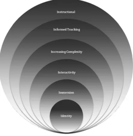
Figure 1.3:The six elements ("I’s") that are said to be essential to the design of educational games.
It has been posited that there are six “I’s” that are essential elements of the design of an educational game: Identity, Immersion, Interactivity, Increasing Complexity, Informed Teaching, and Instructional [18]. The Identity element is about making the player feel unique, and that he/she has been able to choose who he/she is. This is frequently done through avatars. Our game does not quite meet this. The Immersion element is about giving the player a heightened sense of presence through the game through identity, engaging content, and motivation to succeed in the game’s goal. Feedback on our game has told us that our game does have engaging content, and that players felt motivated to succeed. The Interactivity element requires that the player interact with elements in the game, commonly non-player characters or other players in a multiplayer game. The event system in our game provides plenty of interactivity. The Increased Complexity element demands that progression in the game leads to increasing complexity or difficulty, and is commonly associated with having multiple levels. The varying tasks and types of graphs in our game increase the difficulty of it, as opposed to having the player use only one type of graph and one challenge throughout the whole game. The Informed Teaching element is defined by the feedback and assessments within games. This is reflected in our game by the end-of-turn reports after each event, which give the player feedback on how his/her decision has affected the
1.4. PROPOSED DESIGN AND CONTRIBUTION
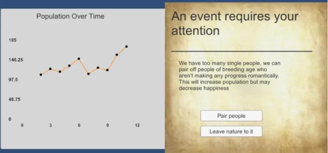
Figure 1.4:An example of one of the events in the game with the graph that accompanies it.
kingdom. Finally, the Instructional element posits that the player must have learned something after playing the game. We have determined through our assessment tests that the player does learn about data visualizations in our game.
1.4
Proposed Design and Contribution
Our game is turn based, wherein the player is presented with information about a kingdom through data visualizations and has to interpret those graphs and charts in order to make decisions. Every turn, the player is shown an event with choices to make, and a graph containing information to help the player make the best decision on that event.
Events are chosen randomly from a pool. These events are designed to have a wide variety of circumstances, and most importantly, a large swath of graphs. Each event is paired with a graph that requires the player to interpret it in a certain way. These graphs are generated from in-game data, such as population and gold. Events have several options to choose from, and there are positive and negative outcomes. When a player interprets a graph correctly, their kingdom benefits. When a player fails to interpret a graph, their kingdom suffers. If a player consistently makes incorrect choices and does not improve, their kingdom will fall into ruin and cause a game over.
C
H A P T E R2
B
ACKGROUND2.1
Data Visualization
Data visualization is the visual representation of patterns in data. It can help understand data, relate to it, communicate and represent it in a more comprehensive manner to others [19]. There are many types of data visualization, and the topic expands beyond the simple graphs most people think about when presented with the term. Data visualization applies to any organization of information that uses visual aids beyond words, from simple tables to complicated interactive pieces software like the one used in Google Earth.
Studies have shown over and over again that most humans rely on sight as their main source of information on the world around them [20]. This means that over thousands of years, mankind has relied on their eyes as the main source of any crucial data gathering. Until modern times, this skill was especially important since accurate and quick conclusions made from a certain sight may mean the difference between life and death. Although it’s not generally the case anymore, humans in modern times continue to rely on this skill. As a result, visual forms of data have proven to be one of the most effective ways of communicating it, especially when it comes to information with several data points that are not personally related to the participant.
Data visualization persists everywhere. It is used in many mediums, and most people en-counter it several times over the course of a day, especially when browsing information digitally. There are hundreds of ways to represent data, but the team has chosen to focus on several specific types. These have been picked from the most common types of data visualization that are not a simple way of organization, but rather platforms that rely on the user’s deduction skills in order to draw the correct conclusions, and thus are easiest to make mistakes on. Although many believe that the basic forms of data visualization are not very effective [21], they are still commonly used in modern media and as a result, education on the matter is very important.
2.2. DESIGN DECISIONS
2.1.1 Bar Charts
A bar chart is a type of chart that presents categorical data using rectangular bars with heights or lengths proportional to the values that they represent. Generally, bar graphs are used in order to show comparisons between discrete categories. For the most part, the categories on a bar chart are organized in a natural order (for example, months of the year), or in ascend-ing/descending order of the values of the categories in order to give them a specific flow. Bar charts can be simple (a single bar representing one data point per axis point) or stacked on top of each other in order to show the total of several related points over a few different categories.
2.1.2 Line Graphs
Line graphs serve a similar purpose to the bar chart, being drawn on a two-axis base. However, line graphs represent data where transitions between the data points are not discrete. Most commonly, this type of graph is used to note a change in data over time (usually called a histogram), as this type of information is the most common of non-discrete transitions between data points. Unlike the bar charts, which can be marked both vertically or horizontally, line graphs are drawn as moving on the horizontal axis in the vast majority of examples.
2.1.3 Pie Charts
Pie charts are usually used to indicate proportion. It commonly denotes the percentage of each category in a whole, where the ratio of the arc of each individual piece to the circumference of the circle (and consequently the ratio of the area between the center to the arc and the overall circle area) represent that percentage. Pie charts are used when dealing with a percentage each individual slice takes up in some whole (for example, the ratios of gases in air).
2.1.4 Scatter Plots
Scatter plots are a type of visual data representation which is used to denote correlation between two (or, when 3-dimensional, three) variables for a set of data. It can be used to draw information about association and dependency between two variables, as well as clusters of points and outliers [22].
2.2
Design Decisions
When we first began our design, we were uncertain exactly what we wanted the game to do. A game focused on graph-reading that is also fun seemed like an impossible challenge. Our brainstorming sessions focused on ways to make graph-reading interesting as well as how much the game should be focused on that aspect. It seemed clear that endless graph-reading would be boring, just as too few graphs would prove nothing regarding improvement in graph-reading
CHAPTER 2. BACKGROUND
abilities. To decide what we wanted to do, we first looked at current games that might be similar to the game we wanted to make.
We considered many different types of games during our brainstorming. Important factors included making sure the graphs were integral to the gameplay, ensuring that the game was reasonably scoped given our skills and time frame, and having engaging gameplay. We first brain-stormed existing games that graphs could integrate easily into, and we could make something similar to. Games brainstormed included Pandemic, Fable 3, Crusader Kings 2, and RTS games.
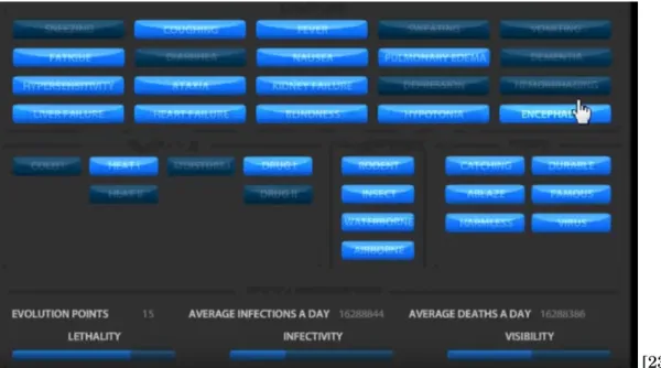
2.2.1 Pandemic
[23] Figure 2.1:An image of the evolution and mutation screen in Pandemic.
In Pandemic, the player makes many decisions about how to evolve a disease, and graphs could fit into this design by illustrating how each choice would affect your disease’s stats. The game as is tells you exactly how each choice will affect your stats. The graph version would instead show relevant graphs about diseases with and without each evolution. A statistic like lethality could be graphed over time infected with the disease (chance of dying at 1 month, 2 months, etc). Graphs could also be used to show how your disease has been performing in the past, and could compare it to other players’ diseases in a more interesting way than simply showing direct statistics.
In addition to graphing your potential upgrades, graphs could tell an interesting story about your disease’s history. Graphs could show spread rate through individual countries and the world as a whole, how often you have been detected per capita, lethality per capita over time, and many other statistics about your performance.
2.2. DESIGN DECISIONS
2.2.2 Fable 3
[24] Figure 2.2:An example of a decision to be made in Fable 3.
Fable 3 includes a brief section in which you become the ruler of a kingdom and must make decisions on its behalf [24]. The decisions made in this game were fairly broad, but graphs could help explain the impact they would have. The kingdom didn’t actually have any resources to manage, and the decisions were simply for flavor purposes, but graphs could still play into this, showing things like death rates, employment rates, etc.
2.2.3 Crusader Kings 2
Crusader Kings 2 presents the player with many events with a few options to choose from. The events in Crusader Kings either tell you exactly what is going to happen for each option, or nothing at all and you have to infer it. The addition of graphs could give the user an idea of what the potential results could be without outright telling them. In addition, this format would cause the users to engage with the graphs so that they could make the best choices. Most of the choices in Crusader Kings are centered on your ruler’s health and life, with a few about the kingdom in general which will affect non-player characters’ opinions of you.
The game deals with a wide variety of choices about running your kingdom and life. You go to war with other kingdoms, deal with succession issues, and try to politically maneuver yourself into the most advantageous position possible. It incorporates marriage alliances, and just as you have advisors, you can serve as an advisor on the court of your lord which gives you certain influence over them.
CHAPTER 2. BACKGROUND
[25] Figure 2.3:One of the many events that can appear in Crusader Kings 2.
Graphs could be added a myriad of different ways into Crusader Kings. Other than tying them to events (which is the main way), non-player characters (and you yourself) could have graphs showing how generally well-liked you are, graphs to measure how often certain people go to war and with whom, and graphs about lethality rates of leaders in different regions.
We decided to make a game similar to (the kingdom management section of) Fable 3 and Crusader Kings. The event style is similar to Crusader Kings, while the actual types of decisions are more similar to Fable. The type of game we decided to make is a resource-management game where the player must respond to events in order to keep their kingdom afloat. This design lets us make graphs an integral part of the gameplay, as in order to make the right decision on a given event, the player is forced to analyze the graph they are given. The design was also within our scope, requiring only 2D artwork and no animations. We considered having downtime activities that the player would do in-between making decisions on events, but ultimately felt it distracted from the point of the game without adding anything significant. An important issue considered to make sure the player learns from gameplay is the immediacy of feedback. If a player makes a decision based on a graph but receives no feedback, they are much less likely to learn than if they know the impact of the decision they made. To this end, we created an end-of-turn report in-between events, which lists the player’s current resources and briefly describes the result of the previous event.
There was a lot of discussion about whether or not we should have downtime activities that would take place in-between events, and have simple general graphs to describe how your kingdom is doing associated with them. In experimenting with a few systems for this, we found
2.3. SUMMARY
that while there is some gameplay value there, the educational value of these activities is much lower than that of the actual events, and people weren’t really using the graphs much in these sections. Due to our main focus being the educational value of our game, we decided to cut the non-educational section and focus entirely on the event-based system.
2.3
Summary
Through our research of games, both educational and recreational, we decided that our game should:
• Feature events with graphs to help players make choices
• Be set in a medieval age where choices can be fairly simple and there are fewer distractions • Focus on four graph types (Bar Charts, Line Graphs, Pie Charts, and Scatter Plots) • Be reasonably sized so that it can easily be played in one sitting
• Downtime activities in-between events are not worth it as they distract from our main goals
C
H A P T E R3
P
ROPOSEDD
ESIGN3.1
Main Goal
The goal of the project is to create a game that teaches its players how to correctly read, interpret, and draw relevant information from different types of visual data representation. The game should engage players and hopefully be as good as or better at educating people than reading about graphs for a similar amount of time.
3.2
Project Objectives
The goal can be divided into three separate objectives, which all assist in making the game increase data literacy.
1. Make a game that is useful to its players: The game needs to make use of charts and graphs that are commonly used within media. Although there exist many types of data visualization, the emphasis is on the types which are going to be frequently encountered by the users. As a result, the team needed to pick a starting point of several common graph types and expand upon those if possible.
2. Make the game educational: Feedback is a key ingredient in allowing players to learn. Although experience dealing with data visualization may help players get accustomed to it, the game needs to let the users know when they’ve made a mistake in order to help them improve faster.
3.3. PROJECT MANAGEMENT AND TASKS
3. Make the game fun: Both the setting and the gameplay loop need to be compelling enough for players to play the game throughout.
3.3
Project Management and Tasks
We had several main areas that needed to be done for this game. With the game focusing heavily on graphs, a robust graph-making system was developed. We also put heavy work into our core gameplay loop. Other areas of work included data analysis and creation of the events with their corresponding graphs.
Our main focus in the first term was building the fundamentals of the game, which included the graphs, event generation system, and resources. A major part of the term was brainstorming and game design, coming up with the different possible options for our game and figuring out what works best for our objectives. In this first term, we experimented with different core gameplay loops, and found the purely event-driven model was most effective.
Later terms focused on testing and refining our actual events to ensure we met our learning goals. Main tasks included measuring the difficulty of various graph-reading tasks, and balancing the amount of each graph that users are shown. Getting as much testing as possible was important not only for our data, but to refine our game to ensure that it is fun and meets our other objectives.
3.4
Design Summary
The game is an event-based resource-management game set in medieval times. The player is given events with decisions to make based on both preset data, and data generated from their play session. Through gameplay, the player will have to make many decisions with four different graph types (bar, pie, scatter, and line) to aid them, which will give them experience reading these data visualizations. The player is given feedback in-between events, and displayed information about various resources and metrics regarding their kingdom. In this feedback, we show the player their gold, population, current tax rate, and a measure of how happy the people of the kingdom are (unhappy, content, or happy). In additional to the visible resources the player must manage, there are hidden resources like birth rate and death rate which affect the player’s visible resources, and can be affected by events.
The events are tailored to use each of our four graph types, and to require the player to use the information on the graphs to make an informed decision. Events are designed to not have an obviously correct choice unless the graph is read correctly, and there are varying difficulties of events so that players of different starting literacies can improve.
C
H A P T E R4
I
MPLEMENTATION4.1
Introduction
In this chapter, we will go over how the game was implemented. This includes the programming of the game mechanics, as well as the implementation of the graph package. The game is programmed in the Unity game engine using C#. The various tasks that the game has to perform under the hood are controlled by manager classes to simplify the code structure. The graphs are done with a modified third party library to best fit our game.
4.2. GAME IMPLEMENTATION
4.2
Game Implementation
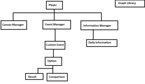
The main class is the player class, which contains all of the player’s resources and communicates with the various managers to run the game. Every turn, the player class will tell the canvas manager what values to update the outputs with, request a new event from the event manager, and update the information manager with what happened that turn. In addition, the player class calculates turn-by-turn changes in gold, population, and morale, as a result of taxes and birth/death rates.
The CanvasManager handles updating and drawing to the canvas. It contains Unity objects for each of the readouts, the graph window, and the event window. It has functions to update each of these, and these get called from Player as well as from the EventManager. The CanvasManager is the only way to draw to the screen so that it is easy to know where to go. Instead of having random draw calls in every different class, it’s much more organized to just have the CanvasManager handle everything.
The EventManager loads in and holds all of the events from the xml config file that they are stored in. When the Player class requests an event, it will select one and tell the CanvasManager to draw the event. Additionally, it will ask the InformationManager for what it needs to draw the graph associated with that event. This can include information for just this turn, or for past turns to graph resources over time. When the player makes a choice on the event being shown, a method in EventManager is called with the choice that was selected, and the EventManager will tell the Player class what the result of that choice is.
The InformationManager contains objects for each past turn, with all of the information saved from that turn. The manager contains an array of DailyInformation objects, adding one every single turn. This DailyInformation object stores each of the player’s resources, and which event the player received on that turn. Its primary use is for the EventManager to draw graphs with this information, but it is also written to a log file after the game so that we can analyze gameplay.
4.2.1 Event Design
We created events of varying difficulties so that users of different levels would find the game valuable, and so that perhaps the players will (at the end of their playthrough or in subsequent playthroughs) find themselves able to solve problems in the game that they previously could not. To this end, we created some very basic events such as "figure out which resource to focus on based on your current and past resources." Events like this ensure they have a baseline understanding of what is being graphed, and how to interpret that. More complicated events are events like a 4-part pie chart where you have to compare two sections subtracted from each other to a different two sections subtracted. This requires the user to be able to visualize multiple different parts of the pie chart at once (one of the harder visualizations to interpret), and compare
CHAPTER 4. IMPLEMENTATION
that to even more, which is a fairly difficult task. More complicated bar chart tasks included estimating what percentage one bar is of another, and trying to match up the length of a bar to a slider. Another thing that affects event difficulty is what player resources will be affected by it. The simplest resources for the player to understand and manipulate are the visible ones, gold and population, but many more complicated events deal with under-the-hood resources. Events can affect morale, which is a resource that makes all of the people in your kingdom more or less efficient depending on how happy they are, birth rate and death rate, which affect population change over time instead of just a flat change, and also any combination of these. Some of the most complicated events will ask the player to make a trade-off between these resources, getting an increased birth rate for a decreased morale over time, or paying a certain flat amount of gold for a large amount of instant morale boost.
4.3
Graph Tool
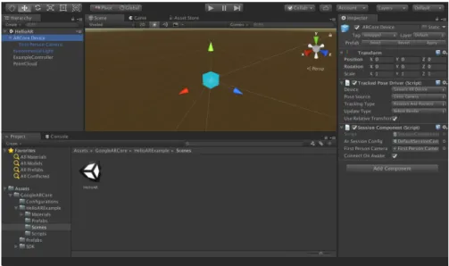
Initially, the team had to decide on the main platform to be used for the project. The main options were Unity and GameMaker engines, as well as writing the game in Javascript with several data visualization libraries. There were several trade-offs that came with each option: Javascript had by far the most built-in options for visualizing data with several vector-based libraries. Both Unity and GameMaker were considered due to the team’s familiarity with them, as well as the pipeline for making a game in those being well-established. After evaluating the pros and cons of each option, the Unity engine was chosen for the game in order to eliminate the learning curve that would come with the other two options.
4.3. GRAPH TOOL
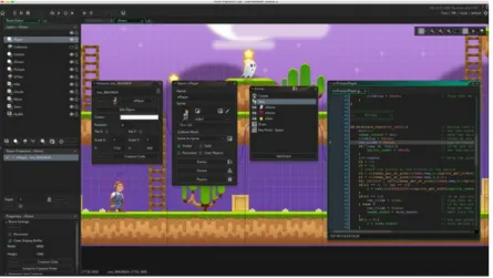
Figure 4.3:Example of Game Maker development interface
One of the major downsides of choosing Unity was the difficulty of generating data visualiza-tion tools which would display informavisualiza-tion in a pleasant, bug-free way. There are several Unity tools that assist with data visualization, however none of them have the ability to generate data at run-time. All of the graphs could have been made as Unity Prefabs, saved in the Unity folder and used, but not generated through code in an easy and accessible manner. This quality has been proven to be crucial for the game, since the team would not have the time to pre-generate enough data to make the game have enough variety. A certain level of data randomization was needed, and all of the graphs and charts needed to be generated accordingly. The solution to this problem was generation of the tools necessary to perform the task using modification of existing tools, a task that in retrospect, proved itself to be more complex than the team had initially anticipated.
The first step of building the proper tools was finding the Unity package that provided the largest variety of options to build upon. Upon research, several packages were brought up:
1. Graph and Chart, Prosource labs 2. Graph Maker, Stuart S.
3. ProChart, Creative Pudding
These three options were evaluated in terms of accessibility, user rating, and aesthetics, and the first option was picked. Graph and Chart provided the largest variety of charts, and had the best documentation as to how to use the tools properly. Unfortunately, the documentation did not give any insight regarding run-time implementation.
The Chart and Graph library allowed the user to generate new graphs and charts using a menu at the top of Unity. These graphs would serve as a template with placeholder values, which
CHAPTER 4. IMPLEMENTATION
Figure 4.4:Chart and Graph example
would later be changed in-editor by the user and placed in the game. As a result, we had to deconstruct that command and generate these templates via code. The next step would be to manually edit these default values through code into some basic form (removing the placeholder data). Finally, the tool needed to provide functions that would let the game designers easily access specific variables through code, by generating a set of wrapper functions. The structure of the generated code (referred to as “graph tool” in this paper) is as described in the UML diagram in Figure 4.5.
The main purpose of the tool was to provide the designers with an intuitive API-like structure that would let them generate, edit, and remove charts and graphs easily, while providing as much flexibility as possible.
4.3.1 Code structure 4.3.1.1 GraphGenerator
The graph tool uses a special class called the GraphGenerator, which functions similarly to a typical factory class. The GraphGenerator must be placed in the scene as a single instance, and has to be called whenever a new graph needs to be created. In order to do so, the designer must pass it a graph type (noted as a specific Enum), a name, and the name of the GameObject in the scene it will be placed under in the hierarchy (this usually would be a canvas for clarity reasons). The generator would initialize the right type of graph in the scene and return an object of the generic type Graph, which the designer can use to edit values in.
4.3.1.2 Graph
The Graph class is the most generic type in the tool. It helps keep consistency between all charts and graphs in the tool, but stores very limited amounts of data. It keeps a reference to a hashtable of points as the main way of storing data throughout the tool. The use of a hashtable allows flexibility in data storage, since data is saved in a slightly differing way based on the type
4.3. GRAPH TOOL
Figure 4.5:UML diagram for the Graph Tool
of graph or chart used. Graph extends the Unity-native MonoBehavior class and overrides the native function Update(). This function is called once per frame along with most objects in the scene. The graphs we display would only be updated when the designer calls for it, which means that updating it every frame would be wasteful in terms of resources. As a solution, a boolean named upToDate was implemented. This boolean defaults to True after generation, and only changes to False when the developer queues an edit to the graph. Inside Update(), each type of graph only performs the needed actions if the boolean is set to False, and when it finishes -sets it back to True.
4.3.1.3 DotGraph
DotGraph is a class that extends the Graph class, and includes two subclasses: LineGraph and ScatterPlot. This type of graph includes data represented in the form of points on top of a two-dimensional coordinate system. Initially, this data type was meant to only represent a simple line graph, since the Graph and Chart library did not have official support for scatter plots. However, the team soon realized that from a coding perspective, a scatter plot could be represented as a line graph with zero line thickness. As a result, both of the charts share the
CHAPTER 4. IMPLEMENTATION
vast majority of their data and functions in the DotGraph parent class. This class keeps track of categories, which are different types of data clusters. In a line graph, these would be represented by different lines. The data is stored in the catPoints hashtable in the form <string, Point[]>, where Point is a native class containing a pair of (x, y) values. Each entry in catPoints has the name of the category as the key, and the array of points associated with that category as the value.
Using the class, the developers can:
1. Generate new categories by providing their names (includes a check that an existing category does not share a name with a new one).
2. Add a point to a given category by providing its name (includes a check that the given category exists) and the (x, y) coordinates of the point. The DotGraph dynamically adjusts the minimum and maximum values of the axis to fit the points of the graph by making sure that the maximum of each axis is the value of the point with the highest value for that axis plus an additional 10% for aesthetic reasons. The minimum is set to 0 by default, but if any point consists of a value below zero, the function would adjust the minimum in a manner similar to the maximum.
3. Remove a point from a category by providing the category as well as the x and y coordinates of the point. This function is based on the assumption that points belonging to the same category and holding the same coordinates are equal, and the function would remove the first one of them that it stumbles upon.
4. Remove whole categories by providing their names.
5. Change the text color between black and white for visibility reasons.
4.3.1.4 PieGraph
PieGraph extends the Graph class, but unlike DotGraph, does not have any class extending it. It is heavily supported by the Chart and Graph CanvasPieChart class. This class implements the catPoints hashtable in the form <string, float>, where the key is the name of the category (i.e. - the “slice” of the chart), and the value is the numeric value associated with that category.
PieGraph options:
1. Add categories by providing their names and values associated with them. 2. Update values associated with specific categories.
3. Remove categories from the chart.
4.3. GRAPH TOOL
4.3.1.5 BarGraph
BarGraph is a class that extends the Graph class, and includes two subclasses: SingleBar and StackedBar. Each of those types stands for the comparison of individual bars and several stacked bars, respectively. The categories for both types of chart represent the title of each bar (the x axis). The SingleBar class is the more simplistic version of the two, implementing the catPoints as <string, float>, where the name is the name of the category and the value is the number assigned to it.
Using it, the developers can:
1. Add categories by providing the name for the bar as well as its numeric value.
2. Edit category values by providing the name of the category to edit as well as the new numeric value.
3. Delete a category by providing the name of the category to be removed.
The StackedBar is implemented slightly differently: The categories serve the same function, but the class implements “levels”. Each level represents a layer in the stacked graph. All of the levels are common among all the categories. In order to implement this, an additional data type was used, an ArrayList containing the name of each level. The catPoints is implemented as <string, LinkedList<float», where the key is the name of the category and the value is a LinkedList (of the same length as the string array mentioned earlier) of the numeric values of each level in the given category.
In a stacked bar, the developer can:
1. Add categories by providing its name and the LinkedList of values associated with it. 2. Add a level to all of the categories. At the current state, the level would always be added to
the top of the chart, and initialized to zero.
3. Edit a value by providing the name of the category and the level in the corresponding category that needs to be edited.
4. Remove a level from all the categories simultaneously. 5. Remove a category with all of its levels.
Unfortunately, stacked bars did not exist in theGraph and Chartasset package from the start. The first update which introduced stacked bars was update 1.22, which was performed March 15th, 2018. As a result, the team did not have enough time to include these in the game. The tool has been implemented and tested, so it is possible to use it for future work.
CHAPTER 4. IMPLEMENTATION
4.3.2 Visual Choices
Although not the main focus of our research, the team believed that we should modify the asset package visually in order to make it more appealing. The base color selection, along with several other attributes, needed to be modified in order to suit the team’s needs. Even though theGraph and Chartasset package does not allow for many visual changes to the tools it provides without having to edit the non-documented source code, some options were still available. Several parameters such as color palettes and line/dot textures were accessible and could be loaded into the game with relative ease.
4.3.2.1 Color Choices
Researchers have shown that color choice plays a crucial role in the way humans draw information from data visualization [26]. Although our research does not directly involve color schemes and their impact, our choice of color may have an effect on the player’s overall experience in the game. As a result, the color choice must assist with visibility and help players distinguish between categories or, at the very least, not hinder them.
The team agreed that the most important chart to pick the correct colors for was the pie chart. Traditionally, color plays a more crucial role in those than the rest of the data visualization types, since it is used to separate categories from one another. An additional chart type that requires close attention to color is the bar chart, although the colors are used differently between regular bar charts and stacked bar charts. In single bar charts, colors represent the different categories. These are picked in order to give the player a mental idea of the difference between categories. In stacked bar graphs, however, the colors are meant to separate different layers between all of the bars. If the stacking of the bar is an indication of relation between the data that is vertically aligned, the colors are meant to create a visual separation between them. Theoretically, it would’ve been possible to give each layer and stack a different color, but the general picture would give a chaotic feeling. Categories that are ought to be compared were marked by the same color in order to make the player understand the order of things. In addition, it helps in situations where some of the stacks have a value of zero. In those cases, the player would be able to see that much more easily (by a specific color missing from the bar).
The colors for the bar and pie charts have been taken from the websitehttp://colorbrewer.org which is a website made by Cynthia Brewer in order to allow users to quickly and efficiently pick colors for their data visualization purposes. Since maps were the main focus of the developer of the website, more research may be done to prove that these color choices were, indeed, the ideal choice for our purpose. However, by picking the “qualitative” data nature, the team ensured that the colors picked did not indicate any relation between the categories (since both bars and pies indicate discrete pieces of information, rather than a transition between stages). Generally, these colors were chosen since they were not overwhelming when placed together, and each two colors were easy to distinguish from one another. Overall, while testing, the team did not run into any
4.3. GRAPH TOOL
issues with players being troubled by the color choice, which for our goal, was enough.
Figure 4.6:The Colorbrewer website layout
4.3.2.2 Other Visual Choices
Several other modifications needed to be done to theGraph and Chartasset package in order for it to suit our needs. One of the modifications that required the most effort at the time of working on the graph tool was the removal of numbers from the pie chart. Since the game involved decision-making based on visual estimation by the player, attaching a number value to each section of the pie chart was counter-productive. However, while removing the numbering may seem like a simple task, the asset package was generated as a tool to give as much information as possible, not hide it away. As a result, the removal of the numbers required reasonably heavy modification of the asset package itself.
Graph and Chartsupports both a 3D and 2D variation of its data. Although the game was made in 2D, Unity does not actually make the distinction between 2D and 3D assets, since a 2D game is simply a flat render of what otherwise would be 3D. As a result, implementing 3D data visualization in a two-dimensional game would be possible. Although some of the 3D charts had more options (and in addition allowed the team to work with one extra dimension of information), the team agreed that they do not fit within the general aesthetic of the game.
C
H A P T E R5
A
SSESSMENTS5.1
The Visualization Literacy Assessment Test
5.1.1 OverviewFor our events and player assessments, we drew inspiration from the Visualization Literacy Assessment Test (VLAT), which was published in January 2017 [27]. The VLAT was created by Sukwon Lee, Sung-Hee Kim, and Bum Chul Kwon, a team of researchers associated with the Institute of Electrical and Electronics Engineers. The team realized that among those in the field of data science, there was not a widely accepted method of measuring an individual’s data visualization literacy. Furthermore, they knew that they could not create one type of question that would cover every form of data visualization analysis. For example, someone who is adept at reading values from a bar chart may not be able to compare slices of a pie chart, and vice versa. Lee, Kim, and Kwon sought to solve this problem by splitting the measurement of data literacy skills by the type of visualization as well as by the specific analysis task being performed. For all visualization types present on the VLAT, participants must retrieve specific values, find extremas, and make comparisons. However, participants must also complete additional tasks which are dependent on the type of visualization. The design of the VLAT allows researchers to analyze how an individual’s data literacy changes based on how the data is presented and the type of analysis the individual is performing.
We decided to base our events and assessments on the VLAT because it is the first major data literacy assessment tool that has been created and accepted by the data science community. After reading about the long process involved to design and calculate the efficacy of the VLAT, we decided that we should adapt its questions to our needs rather than spend time creating our own assessment. This decision allowed us to spend more time on the game design process, which we
5.1. THE VISUALIZATION LITERACY ASSESSMENT TEST
felt was a more efficient use of our limited time. Furthermore, because the VLAT was constructed in such a modular way, we could use the specific sections of it that applied to the visualizations and analysis tasks that we wanted to include in the game.
5.1.2 Structure
The VLAT included twelve data visualization types: line charts, bar charts, stacked bar charts, 100% stacked bar charts, pie charts, histograms, scatterplots, area charts, bubble charts, choropleth maps, and treemaps. For each visualization, they asked questions that included one of eight different analysis tasks: retrieving values, finding extrema, determining ranges, characterizing distributions, finding anomalies, finding clusters, finding correlations or trends, and making comparisons. In total, the assessment contains 53 questions, all of which are multiple choice. Each combination of visualization and analysis task was represented by exactly one question on the assessment. Examples of questions from the VLAT can be found in Figure 5.1.
Participants were also given the option to omit answering questions, because the researchers did not want to force participants to guess. They made this decision because they felt that if a participant guessed the correct answer to a question they could not answer confidently, then their performance metric would be artificially inflated and it would no longer reflect their actual level of skill. When administering the assessment, they encouraged participants to omit answering questions unless they were sure of their answer. The research team used omission data to adjust their results in order to minimize error due to guessing.
To measure the quality of the assessment, Lee et al calculated three values for each question that they could use for comparisons. The first value, which they named the content validity ratio (CVR), is a measure of how essential a particular test item is to measure the associated data literacy trait or skill. The CVR calculation was calculated using Lawshe’s CDR formula [28], which computes the proportion of data science experts that deem a particular item valid. The second value, the item difficulty index, is a measure of the proportion of participants that answered a particular item correctly. This is the measure that our team was most interested in, as items from the VLAT with a high difficulty index are representative of the types of skills that our project should prioritize. The third value, the item discrimination index, is a measurement of how accurately a participant’s answer to a particular item can be used to predict that participant’s overall performance on the assessment as a whole. The item discrimination index is calculated as a proportion of the difference in the number of high scoring participants who answered an item correctly and the number of low scoring participants who answered the same item correctly. The value can range from 1 to -1, with 1 meaning that a participant correctly answering the item is a perfect predictor of that participant scoring highly on the assessment as a whole, and -1 means that a participant answering the question correctly is a perfect predictor of that participant scoring poorly on the assessment as a whole. A discrimination index of 0 means that no conclusions can be drawn on a participant’s overall score based on their answer to that item.
CHAPTER 5. ASSESSMENTS
Figure 5.1:Two questions that appear on the VLAT. The first asks the participant to determine the range of values from a line graph, and the second asks the participant to compare multiple values from a bar chart. The difference between the questions shows the way that the VLAT targets specific tasks for specific visualizations.
In their testing, the team gathered responses from 37 participants.
5.1.3 Findings
From their study, Lee et al determined that retrieving values from a bar chart was easier for participants than performing the same task using a pie chart. However, they reached the opposite conclusion for making comparisons; their data showed that participants performed better at comparing slices of a pie chart than comparing bars on a bar chart. Our team found this to be surprising, since it ran contrary to other research we had discovered. Upon closer inspection of the specific test items, we found that every single participant answered the pie chart comparison question correctly, and that the item was a true or false question asking if one slice was larger than another slice, while the comparison question for the bar chart involved counting the number of bars that were smaller than a particular bar on the chart. We believe that the question for this task on the VLAT was too easy, and that it is something that could have been improved on the VLAT. This opinion is backed up by the fact that the pie chart comparison question had a discrimination index of 0, meaning that it is not a good indicator of an individual’s overall data literacy.
5.2. OUR ASSESSMENTS
project. Lee et al surveyed the frequency of specific data visualization types in K-12 curricula, data visualization authoring tools, and news outlets. They found that bar charts were among the top two most common visualizations in all categories. Additionally, line graphs were in the top 3 most common visualizations among K-12 curricula and news outlets, while pie charts were among the top two most common visualizations among data visualization authoring tools. Scatterplots were also in the top 10 most common visualizations in all categories, but were consistently less common than the other three visualization types. This confirmed our decision to focus primarily on bar charts, line graphs, and pie charts, as they were some of the most common visualization types, and they were also easier to implement in the game compared to some of the more obscure visualization types.
5.2
Our Assessments
Based on the VLAT, we created two assessment forms, one for players to take before playing the game, and one to take after completing their play session. One change we made from the VLAT was that we included some questions that were not multiple choice. Instead, we included questions that asked participants to provide as accurate a value as they could. These questions allowed us to calculate the percent error for each question, which we calculated as the difference between the given value and the actual value, taken as a percentage of the axis range for the particular question. We felt that being able to calculate percent error gave us more freedom to detect smaller improvements among our playtesters, which was important given the relative brevity of the play sessions, and the fact that our assessments were shorter and more focused than the VLAT. Each assessment form went through two revisions, one that coincided with the alpha version of the game, and one that coincided with the final version of the game. The final assessment forms along with their answer keys can be found in Appendices A, B, and C. The alpha versions of the assessments were the same as the first 8 questions of each of the revised versions.
5.2.1 Alpha Versions
The first versions of our assessments were created for a gathering of students showcasing alpha versions of games they have been developing. We took advantage of this opportunity to gather some feedback on our game and also to conduct our first round of testing. Because this environment involved players that would be short on time, we created the assessments to be short. Each assessment form consisted of eight questions, two questions for each of bar charts, line graphs, pie charts, and scatterplots. For each visualization type, one question was multiple choice, and one was open ended. Based on feedback from testers at this event, we refined the design of our assessments for our larger second round of testing. We also made note of the compromises
CHAPTER 5. ASSESSMENTS
that were made to prepare an abbreviated assessment for the event, and we prioritized the questions that were left out for the revised versions of the assessments.
5.2.2 Revised Versions
Because the second round of testing was not constrained in the same way as the alpha testing, we made the revised assessments longer than the originals. We preserved the questions from the original assessments, but added additional questions adapted directly from the VLAT. The questions from the VLAT were modified to ask for the participant to give their best approxi-mation of the value rather than choose from a selection of answer choices. Some of the questions also ask for a different value than the original VLAT question, but the questions use the same visualizations and data sets. The final posttest also includes open ended questions to gather feedback on the game and assessment designs from the players, so we could have qualitative data and player feedback to accompany the quantitative data.
5.2.3 In-Game Logging Features
To add to the amount of data available to us for each participant, we implemented an event logging feature in the game client. The logger would record each event a player encountered, along with the response that the player provided. Events were tagged with the visualization and analysis task required, and all of the results were written to an output file that would persist after the end of the play session. This system allowed us to match a player’s assessment scores against their event log to see if the change in their assessment scores matches the visualization and analysis tasks that they encountered while playing. The log file is saved as a .csv file, so it is easy to import as a spreadsheet for analysis.
5.2.4 Testing Logistics
For each of our two rounds of testing, one of us was physically present for the duration of each participant’s play session. Each participant was assigned a unique tester ID, so we could easily group the data for each participant to identify improvements on an individual basis while maintaining anonymity. Before the session, the participant would complete the pretest without any external resources. We then collected the assessment and their responses before the play session began. Their responses to the pretest were marked with their unique tester ID. Each participant played the game for approximately 15 minutes. Since participants played through the game at different speeds, this means that some testers encountered more events than others, but we felt that the total amount of time spent playing the game was more important to our research than the specific number of events. All players completed at least one full playthrough of the game. At the conclusion of the play session, we preserved the log file produced by the game client and marked it with their tester ID. The posttest was administered immediately following the
5.2. OUR ASSESSMENTS
play session, and their responses were once again marked with their designated tester ID. Ideally, we would have wanted to have a break of several hours or days between the end of the play session and the posttest, but because of our participants’ schedules and our own timeline for testing, this plan was not feasible. Although this precludes us from drawing conclusions about the long-lasting effects of playing the game, we still feel that showing short term improvements will validate the game’s efficacy. During our testing, we gathered data from 15 participants. All participants volunteered to take part in the study on the condition that their data and responses remained anonymous.
C
H A P T E R6
R
ESULTSFor our alpha testing, we gathered data from 5 participants. For our final testing, we gathered data from 15 participants. All qualitative data in section 6.2 is from participants from the final testing session.
6.1
Assessment Data
Our assessments showed a general decrease in percent error among participants after their play sessions for most visualization types present in the game. All confidence intervals use a 95% degree of confidence. Due to our relatively small sample size, some of the changes in confidence intervals between the pretest and the posttest are not statistically significant; however, a difference can still be noted.
For bar charts, before playing the game, the confidence interval for percent error of partici-pants fell within 5 and 8 percent, with a median of 6.8%. After playing the game, the confidence interval ranged from 2 to 6 percent, with a median of 4.1%.
For line graphs, before playing the game, the confidence interval for percent error of par-ticipants fell within 3 and 11 percent, with a median of 6.1%. There was an outlier for one participant on a line graph comparison task question, where the participant gave a response with a percent error of 30, but this was not typical of our other participants. After playing the game, the confidence interval ranged from 3 to 6 percent, with a median of 4.9%.
For pie charts, before playing the game, the confidence interval for percent error of partici-pants fell within 4 and 14 percent, with a median of 9.4%. There were also two participartici-pants that gave responses to a question with a percent error of 0. After playing the game, the confidence interval ranged from 8 to 13 percent, with a median of 10.2%. As the entire second interval falls within the range of the first interval, this change is not statistically significant.