Data Visualization Techniques
From Basics to Big Data With SAS
®
Visual Analytics
Introduction ...1
Tips to Get Started ...1
The Basics: Charting 101 ...2
Line Graphs ...2
Bar Charts ...3
Scatter Plots ...4
Bubble Plots – A Scatter Plot Variation ...5
Pie Charts ...6
Visualizing Big Data ...7
Handling Large Data Volumes ...7
Visualizing Semistructured and Unstructured Data With
Word Clouds and Network Diagrams...9
High-Velocity Visualization With
Correlation Matrices ...9
Filtering Big Data ...11
Data Visualization Made Easy With Autocharting ....12
See Into the Future With Forecasting Techniques ...13
Understanding Influence
With Decision Trees ...14
Visualizing Flow
With Sankey Diagrams ...15
Visualization for Mobile Devices ...16
Introduction
A picture is worth a thousand words – especially when you are trying to understand and gain insights from data. It is particularly relevant when you are trying to find relationships among hundreds, or even thousands, of variables to determine their relative importance.
Organizations of all types and sizes generate data each minute, hour and day. Everyone – from executives and departmental decision makers to call center workers and employees on production lines – hopes to learn things from collected data that can help them make better decisions, take smarter actions and operate more efficiently.
Regardless of how much data you have, one of the best ways to discern important relationships is through advanced analysis and high-performance data visualization. If sophisticated analyses can be performed quickly, even immediately, and results presented in ways that showcase patterns and allow querying and exploration, people across all levels in your organization can make faster, more effective decisions.
To create meaningful visuals of your data, there are some basics you should consider. Data size and column composition play an important role when selecting graphs to represent your data. This paper discusses some of the basic issues concerning data visualization and provides suggestions for addressing those issues. In addition, big data brings a unique set of challenges for creating visualizations. This paper covers some of those challenges and potential solutions as well.
If you are working with massive amounts of data, one challenge is how to display results of data exploration and analysis in a way that is not overwhelming. You may need a new way to look at the data – one that collapses and condenses the results in an intuitive fashion but still displays graphs and charts that decision makers are accustomed to seeing. And, in today’s on-the-go society, you may also need to make the results available quickly via mobile devices, and provide users with the ability to easily explore data on their own in real time.
SAS® Visual Analytics is a data visualization and business intelligence solution that uses intelligent autocharting to help business analysts and nontechnical users visualize data. It creates the best possible visual based on the data that is selected. The visualizations make it easy to see patterns and trends and identify opportunities for further analysis.
The heart and soul of SAS Visual Analytics is the SAS® LASR™
Analytic Server, which can execute and accelerate analytic computations through in-memory processing. The combination of high-performance analytics and an easy-to-use data
exploration interface enables different types of users to create and interact with graphs so they can understand and derive value from their data faster than ever. This creates an unprecedented ability to solve difficult problems, improve business performance and mitigate risk – rapidly and confidently.
Tips to Get Started
There are a few basic concepts that can help you generate the best visuals for displaying your data:
• Understand the data you are trying to visualize, including its size and cardinality.
• Determine what you are trying to visualize and what kind of information you want to communicate.
• Know your audience and understand how it processes visual information.
• Use a visual that conveys the information in the best and simplest form for your audience.
What Is Data Cardinality?
Cardinality is the uniqueness of data values
contained in a column. High cardinality
means there is a large percentage of unique
values (e.g., bank account numbers,
because each item should be unique). Low
cardinality means a column of data contains
a large percentage of repeat values (such as
a “gender” column).
The Basics: Charting 101
Here is a quick guide to help you decide which chart type (or graph) to use for your data.
Line Graphs
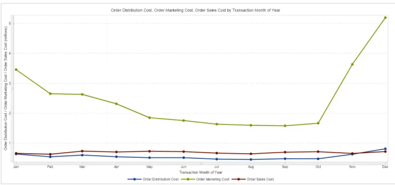
A line graph, or line chart, shows the relationship of one variable to another. They are most often used to track changes or trends over time. Line charts are also useful when comparing multiple items over the same time period (see Figure 1). The stacking lines are used to compare the trend or individual values for several variables.
You may want to use line graphs when the change in a variable or variables clearly needs to be displayed and/or when trending or rate-of-change information is of value. It is also important to note that you shouldn’t pick a line chart merely because you have data points. Rather, the number of data points that you are working with may dictate the best visual to use. For example, if you only have 10 data points to display, the easiest way to understand those 10 points might be to simply list them in a particular order using a table.
When deciding to use a line chart, you should consider whether the relationship between data points needs to be conveyed. If it does, and the values on the X axis are continuous, a simple line chart may be what you need.
Figure 1: Line graphs show the relationship of one variable to another. Shown here, multiple category line graphs compare multiple items over the same time period.
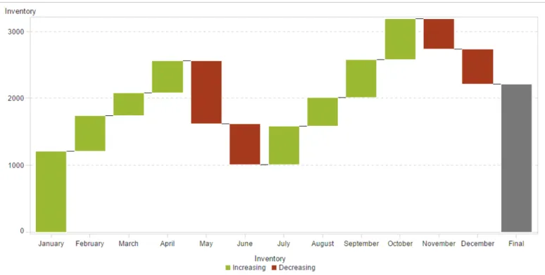
Another form of a bar chart is called the progressive bar chart, or waterfall chart. A waterfall chart shows how the initial value of a measure increases or decreases during a series of operations or transactions (see Figure 2). The first bar begins at the initial value, and each subsequent bar begins where the previous bar ends. The length and direction of a bar indicates the magnitude and type (positive or negative, for example) of the operation or transaction. The resulting chart is a stepped cascade that shows how the transactions or operations lead to the final value of the measure.
}
}
Bar charts can be configured with
either vertical or horizontal bars, with
the length or height of each bar
representing the value.
Bar Charts
Bar charts are most commonly used for comparing the
quantities of different categories or groups. Values of a category are represented using the bars, and they can be configured with either vertical or horizontal bars, with the length or height of each bar representing the value.
When values are distinct enough that differences in the bars can be detected by the human eye, you can use a simple bar chart. However, when the values (bars) are very close together or there are large numbers of values (bars) that need to be displayed, it becomes more difficult to compare the bars to each other.
To help provide visual variance, bars can have different colors. The colors can be used to indicate such things as a particular status or range. Coloring the bars works best when most bars are in a different range or status. When all bars are in the same range or status, the color becomes irrelevant, and it is most visually helpful to keep the color consistent or have no coloring at all.
Figure 2: This bar graph – a waterfall chart – shows how the initial value of a measure increases or decreases during a series of operations or transactions.
Scatter Plots
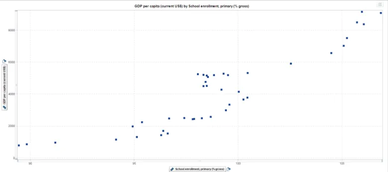
A scatter plot (or X-Y plot) is a two-dimensional plot that shows the joint variation of two data items. In a scatter plot, each marker (symbols such as dots, squares and plus signs) represents an observation. The marker position indicates the value for each observation. Scatter plots also support grouping. When you assign more than two measures, a scatter plot matrix is produced. A scatter plot matrix is a series of scatter plots that displays every possible pairing of the measures that are assigned to the visualization.
Scatter plots are useful for examining the relationship, or correlations, between X and Y variables. Variables are said to be correlated if they have a dependency on, or are somehow influenced by, each other. For example, “profit” is often related to “revenue” – and the relationship that exists might be that as revenue increases, profit also increases (a positive correlation). A scatter plot is a good way to visualize these relationships in data.
In a scatter plot, you can also apply statistical analysis with correlation and regression. Correlation identifies the degree of statistical correlation between the variables in the plot. Regression plots a model of the relationship between the variables in the plot.
Once you have plotted all of the data points using a scatter plot, you are able to visually determine whether data points are related. Scatter plots can help you gain a sense of how spread out the data might be or how closely related the data points are, as well as quickly identify patterns present in the distribution of the data (see Figure 3). Scatter plots are helpful when you have many data points. If you are working with a small set of data points, a bar chart or table may be a more effective way to display the information.
}
}
S
catter plots can help you gain a sense
of how spread out the data might be or
how closely related the data points are.
They can also quickly identify patterns
present in the distribution of the data.
Figure 4: A bubble plot can be animated to show data changing over time.
}
}
Bubble plots are a variation of
scatter plots. They’re especially
useful for data sets with dozens
to hundreds of values or when
the values differ by several
orders of magnitude.
Bubble Plots – A Scatter Plot Variation
A bubble plot is a variation of a scatter plot in which the markers are replaced with bubbles. A bubble plot displays the relationships among at least three measures. Two measures are represented by the plot axes. The third measure is represented by the size of the bubbles (see Figure 4). Each bubble
represents an observation.
A bubble plot is useful for data sets with dozens to hundreds of values or when the values differ by several orders of magnitude. You can use color to represent an additional measure, and you can animate the bubbles to display changes in the data over time.
A geo bubble map is a bubble plot that is overlaid on a geographic map. Each bubble is located at a geographic location or at the center of a geographical region. A geo bubble map requires a data item that contains geographical information and is assigned to a geography role.
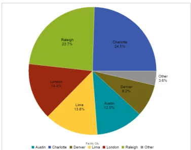
Pie Charts
There is much debate around the value of pie charts, which are used to compare the parts of a whole. However, they can be difficult to interpret because the human eye has a hard time estimating areas and comparing visual angles. Another challenge with using a pie chart for analysis is that it is difficult to compare slices of the pie that are similar in size but not located next to each other.
If you do use pie charts, they are most effective when there are limited components and when text and percentages are included to describe the content. By providing additional information, report consumers do not have to guess the meaning and value of each slice. If you choose to use a pie chart, the slices should be a percentage of the whole (see Figure 5).
}
}
P
ie charts are most effective when there
are limited components and when text
and percentages are included to
describe the content.
When designing reports or dashboards, another consideration for the efficacy of a pie chart is the amount of space the pie chart requires in the sizing of the report. Because of the round shape, pie charts require extra real estate, so they may be less than ideal when developing dashboards for small screens or
mobile devices. Other charts (like a bar chart) may provide a better way to represent the same information in less space (see Figure 6).
Of course, there are many other chart types you can use to present data and analytical results. The selection of charts usually will depend upon the number of categories and measures (or dimensions) you want to visualize. By following the tips outlined here and understanding the examples, you may need to try different types of visuals and test them with your audience to make sure the correct information is being conveyed.
Figure 5: A pie chart helps you compare the percentages of different components.
Visualizing Big Data
Big data brings new challenges to visualization because of the speed, size and diversity of data that must be taken into account. The cardinality of the columns you are trying to visualize should also be considered.
One of the most common definitions of big data is data that is of such volume, variety and velocity that an organization must move beyond its comfort zone technologically to derive intelligence for effective decisions.
• Volume refers to the size of the data.
• Variety describes whether the data is structured, semistructured or unstructured.
• Velocity is the speed at which data pours in and how frequently it changes.
Building upon basic graphing and visualization techniques, SAS Visual Analytics has taken an innovative approach to addressing the challenges associated with visualizing big data. Using innovative, in-memory capabilities combined with SAS Analytics and data discovery, SAS provides new techniques based on core fundamentals of data analysis and the presentation of results.
Handling Large Data Volumes
One challenge when working with big data is how to display results of data exploration and analysis in a way that is
meaningful and not overwhelming. You may need a new way to look at the data that collapses and condenses the results in an intuitive fashion but still displays graphs and charts that decision makers are accustomed to seeing. You may also need to make the results available quickly via mobile devices, and provide users with the ability to easily explore data on their own in real time.
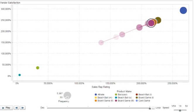
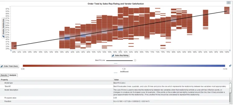
When working with massive amounts of data, it can be difficult to immediately grasp what visual might be the best to use. The autocharting capability in SAS Visual Analytics takes a look at the data you wish to examine and then, based on the amount of data and the type of data, it presents the most appropriate visualization. This intelligent autocharting helps business analysts and nontechnical users easily visualize their data. They can build hierarchies on the fly, interactively explore data and display the data in different ways to answer specific questions or solve new problems without having to rely on constant assistance from IT to provide changing views of information. In addition, “what does it mean” explanations in SAS Visual Analytics display information about the analysis that has been performed, and identify and explain the relationships between the variables that are displayed (see Figure 7). This makes analytics and the creation of data visualizations easy, even those with nontechnical or limited analytic backgrounds.
Figure 7: SAS Visual Analytics provides autocharting and “what does it mean” pop-ups to help nontechnical users create and understand data visualizations. The “what does it mean” pop-up (bottom) explains that the correlation shown in this binned box plot indicates a strong linear relationship between Sales Rep Rating and Vendor Satisfaction.
}
}
The autocharting capability in SAS
®Visual Analytics takes a look at all of
the data you wish to examine and
then, based on the amount of data
and the type of data, it presents the
most appropriate visualization.
Data volume can become an issue because traditional architectures and software may not be able to process huge amounts of data in a timely manner, thus requiring you to make compromises and aggregate the details you want to visualize. Even the most common descriptive statistics calculations can become complicated when you are dealing with big data and don’t want to be restricted by column limits, storage constraints and limited support for different data types. The SAS in-memory engine solves these issues by speeding up the task of data exploration, and a visual interface displays the results in an easy-to-understand visualization.
For example, what if you have a billion rows in a data set and want to create a scatter plot on two measures? It would be impossible to see so many data points. And the application creating the visual may not be able to plot a billion points in a timely or effective manner. One potential solution is to use
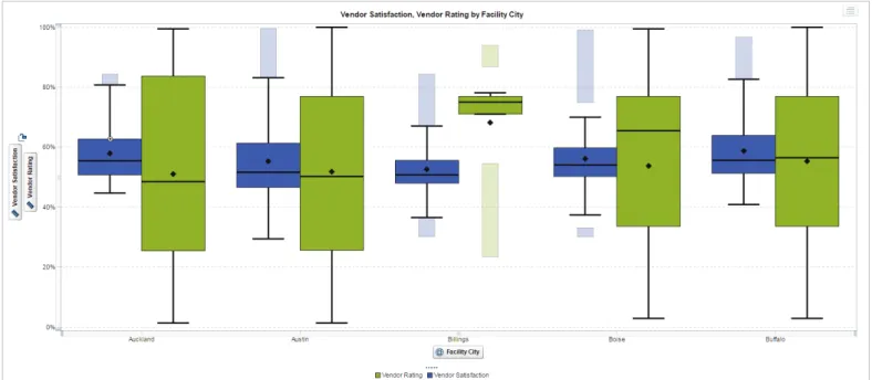
binning (the grouping together of data) on both axes so that you can effectively visualize the big data (see Figure 7). Box plots are another example of how the volume of data can affect the visual being shown. A box plot is a graphical display of five statistics (the minimum, lower quartile, median, upper quartile and maximum) that summarize the distribution of a set of data. The lower quartile (25th percentile) is represented by the lower edge of the box, and the upper quartile (75th percentile) is represented by the upper edge of the box. The median (50th percentile) is represented by a central line that divides the box into sections. Extreme values are represented by whiskers that extend out from the edges of the box. Usually, these display well when using big data (see Figure 8).
Often, box plots are used to understand the outliers in the data. Generally speaking, the number of outliers in the data can be represented by 1 percent to 5 percent of the data. With traditionally sized data sets, viewing this proportion of the data is not necessarily hard to do. However, when you are working with massive amounts of data, viewing 1 percent to 5 percent of the data is challenging.
For example, if you were working with a billion rows of data, the outliers would represent 10 million data points. If you bin the results and show a box plot with whiskers (Figure 8), you can view the distribution of the data and see the outliers – all calculated quickly on big data.
Visualizing Semistructured and Unstructured
Data With Word Clouds and Network Diagrams
The variety of big data brings challenges because
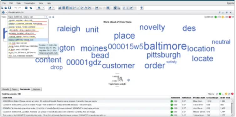
semistructured and unstructured data require new visualization techniques. A word cloud visual (where the size of the word represents its frequency within a body of text) can be used on unstructured data as a way to display high- or low-frequency words (see Figure 9).
SAS Visual Analytics takes the concept of word clouds a step further by taking advantage of taxonomies and ontologies to make associations . Words are then organized into topics based on how the words are used. SAS Visual Analytics word clouds can display the hot topics of the day gleaned from such text analysis. Users can drill down by clicking on an individual topic to see exactly what words or phrases comprise that topic.
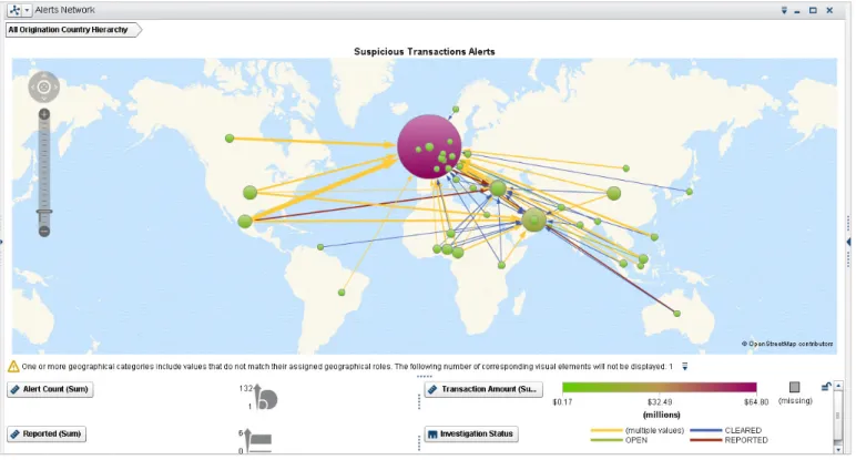
Another visualization technique that can be used for semistructured or unstructured data is the network diagram. Network diagrams view relationships in terms of nodes (representing individual actors within the network) and ties (which represent relationships between the individuals, such as friendship, kinship, organizations, business relationships, etc.). These networks are often depicted in a diagram where nodes are represented as points and ties are represented as lines. Network diagrams can be used in many applications and disciplines. For example, businesses analyze social networks to understand their interactions with customers, while counterintelligence and law enforcement might map a clandestine or covert organization such as an espionage ring, an organized crime family or a street gang. You can also superimpose the network diagram on a map, for example, to show the relationship or product sales across geographic areas (see Figure 10).
High-Velocity Visualization With
Correlation Matrices
Velocity is all about the speed at which data is coming into the organization. The ability to access and process varying velocities of data quickly is critical.
A correlation matrix combines big data and fast response times to quickly identify which variables are related. It also shows how strong the relationships are between variables. SAS Visual Analytics makes it easy to assess the relationships. Simply select a group of variables and drop them into a visualization pane. The intelligent autocharting function displays a color-coded correlation matrix that quickly identifies strong and weak relationships between the variables.
Darker boxes indicate a stronger correlation; lighter boxes indicate a weaker correlation (see Figure 11). If you hover over a box, a summary of the relationship is shown. You can double-click on a box in the matrix for further details.
}
}
A correlation matrix combines big data
and fast response times to quickly
identify which variables among the
millions or billions are related. It also
shows how strong the relationship is
between the variables.
Figure 9: A word cloud shows the words or phrases associated with a topic.
For example, you could use the topic cloud to categorize customer comments on Twitter about your products or services and then click on a topic to drill down to see the actual comments.
}
}
While visualizing structured data is
fairly simple, semistructured or
unstructured data requires new
visualization techniques, such as
word clouds or network diagrams.
Figure 10: Network diagrams explore relationships within a data set, including connections across geographic areas.
Figure 11: In this correlation matrix, darker boxes indicate a stronger correlation; lighter boxes indicate a weaker correlation. You can double-click on a box for further details.
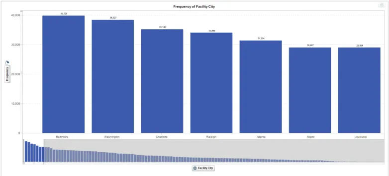
Another concern with big data is cardinality because the data may have many unique values per column. If there are too many columns in your bar chart, you cannot see the labels for each bar and the graph becomes less meaningful.
SAS has adopted a method for dealing with high cardinality in SAS Visual Analytics – bar charts with an overview bar that zooms into the bar chart and enables information consumers to scroll through the entire chart. The level of zoom can also be controlled. If you compare Figure 12 to Figure 13, it is easy to see that Figure 13 presents the information more clearly.
Filtering Big Data
When working with large amounts of data, being able to quickly and easily filter your data is important. What if you only want to view data for a certain region, product line or some other variable? SAS Visual Analytics has filtering capabilities that make it easy to refine the information you see. Simply add a measure to the filter pane or select one that’s already there, and then select or deselect the items on which to filter.
But what if the filter isn’t meaningful or it skews the data in undesirable ways? One way to better understand the composition of your data is through the use of histograms. Histograms provide a visual distribution of the data along with cues for how the data will change if you filter on a particular measure. Histograms save time by giving you an idea of the effect the filter will have on the data before you apply it. Rather than relying on trial and error or instinct, you can use the histogram to help you decide what to focus on.
Figure 13: An overview axis bar chart shows the high cardinality in big data more clearly. You can scroll through the entire chart. Figure 12: High cardinality in a bar chart with big data can be
Data Visualization Made Easy
With Autocharting
In SAS Visual Analytics, intelligent autocharting produces the best visual based on what data you drag and drop onto the visual palette. It is important to note that autocharting may not always create the exact visualization you had in mind. In that case, you also can select a specific visual to build. However, when you are first exploring a new data set, autocharts are useful because they provide a quick view of the data. You then have the ability to switch to another specific visual as desired. For example, with autocharting, when a single measure is selected, distribution of that measure is shown (Figure 14).
The addition of a second measure results in either an autocharted heat map (Figure 15) or a scatter plot (Figure 3). A category of data can be one of three types: standard, date or geographic. When the category type is standard, SAS Visual Analytics will show a frequency count of data (see Figure 16 below). If the category is a date, then a measure is also required and the visual will be a line graph (see Figure 1). If the category is geographic, then a map will be displayed.
Autocharting in SAS Visual Analytics also takes into account the cardinality of the data and adjusts the visuals accordingly. As mentioned previously, if cardinality is deemed high, a bar chart with an the overview axis is displayed (see Figure 12).
Figure 16: When the data category is standard, SAS Visual Analytics displays a frequency count in the form of a simple bar chart. Figure 14: Autocharting in SAS Visual Analytics produces a bar
chart to show the distribution of a single measure.
Figure 15: With autocharting, two measures can either result in a heat map (above) or a scatter plot.
mean” section at the bottom of the screen, as shown in Figure 17. This is just another way SAS Visual Analytics brings advanced analytics to nontechnical users in an approachable format. When additional measures are added to the forecast (as shown in Figure 18), three things happen in SAS Visual Analytics: 1 Each variable is evaluated to determine whether it
“influences” the forecast. Variables deemed to be influencers are added to the bottom of the screen for simulation purposes.
2 When influencers are found, the forecast is recalculated and refined. As you can see, the “confidence interval” (light blue bars) around the forecast in Figure 18 is much tighter than in Figure 17.
3 Users can manipulate the values of the influencing variables to see the potential impact on the forecast, in effect by performing simulations.
See Into the Future With Forecasting
Techniques
Forecasting estimates future values for your data based on statistical trends. As such, it is an extremely important tool for organizational planning. Fortunately, SAS Visual Analytics can help you expand the culture of forecasting in your organization. Easy-to-use capabilities take the complexity out of forecasting, so that users of all skill levels can see for themselves what might happen in the future.
A simple menu guides users through the process of generating forecasting results. Select the date, time or date-time data items you want to use for the forecast. The software automatically
chooses the most appropriate forecasting algorithm for the data chosen. You also have the option to select the forecasting intervals. When you click OK, a line chart is created, along with a clear explanation of the forecasting results in the “what does it
Figure 17: With automated forecasting capabilities, SAS Visual Analytics chooses the most appropriate forecasting algorithm for the selected data. “What does it mean” pop-ups (bottom of screen) provides explanations of analytic functions and data correlations, so even nontechnical users can understand what the data means.
Figure 18: By adding additional measures, these underlying factors are evaluated as to their potential impact on the forecast, the forecast is recalculated accordingly, and users can use these additional values to perform simulations.
Understanding Influence
With Decision Trees
Decision trees, also known as classification or regression trees, allow you to analyze problems (or even predict behaviors) that are influenced by multiple factors in a way that’s easy to understand. Decision trees present influencing factors incrementally as a series of one-cause, one-effect relationships that are easier to understand than more complex, multiple-variable techniques.
Decision trees attempt to find a strong relationship between input values and target values in a group of observations that form a data set. When the analytics identifies a set of input values as having a strong relationship to a target value, then all of these values are grouped in a bin that becomes a branch of
the decision tree. A strong relationship is defined as one where knowledge of the value of an input improves the ability to predict the value of the target.
The decision tree algorithm will immediately indicate which variable has the most influence and at what value it has the greatest impact. The next branching point shows the second most important factor and so on down the tree. Each branch in the tree increasingly refines the various elements that affect our analysis, and we segment our data according to the various branching out points, until we find the next potential segment that we want to investigate further. While business users with no background in advanced analytics can use this powerful tool, advanced users also have access to many parameters so they can further fine-tune this analysis.
Visualizing Flow
With Sankey Diagrams
Sankey diagrams use path analysis to show the dynamics of how transactions move through a system (e.g., how customers navigate your website). The diagrams display a series of linked
Figure 20: A Sankey diagram displays a series of linked nodes, where the width of each node indicates the frequency of the link or value of the measure.
Figure 19: On this decision tree, we can see the data segmented according to the various branching points. The right side shows the various fine-tuning parameters available in “Custom Mode.”
nodes, where the width of each link indicates the frequency of the link or the value of a measure. This enables you to see flow patterns and recognize trends such as where customers enter your website, where they navigate to and where they exit. You can identify successful flow patterns or isolate flows that failed to deliver the desired action.
To learn more about SAS Visual Analytics,
download white papers, view screenshots
and see other related material, please visit
sas.com/visualanalytics
. Or, try SAS Visual
Analytics for yourself at
sas.com/vademos
.
Visualization for Mobile Devices
Growing employee adoption of mobile devices means that businesses need to deliver company information to these devices at any time and from anywhere. SAS Visual Analytics comes with SAS Mobile BI to allow businesses to give front-line and mobile employees access to business intelligence. With SAS Mobile BI, employees can look at a vast array of different types of company business intelligence reports, KPIs and dashboards on their mobile devices. Rather than having to wait until they get back to the office, mobile users can quickly and easily gain a deeper analytical understanding of business performance.
Conclusion
Visualizing your data can be both fun and challenging. It is much easier to understand information in a visual compared to a large table with lots of rows and columns. However, with the many visually exciting choices available, it is possible that the visual creator may end up presenting the information using the wrong visualization. In some cases, there are specific visuals you should use for certain data. In other instances, your audience may dictate which visualization you present. In the latter scenario, showing your audience an alternative visual that conveys the data more clearly may provide just the information that’s needed to truly understand the data.
You can choose the most appropriate visualization by understanding the data and its composition, what information you are trying to convey visually to your audience, and how viewers process visual information. And products such as SAS Visual Analytics can help provide the best, fastest visualizations possible. The solution enables you to explore all of your data using visual techniques combined with industry-leading analytics. Visualizations such as box plots and correlation matrices help you quickly understand the composition and relationships in your data.
With SAS Visual Analytics, large numbers of users (including those with limited analytical and technical skills) can quickly view and interact with reports via the web or mobile devices, while IT maintains control of the underlying data and security.
The net effect is the ability to accelerate the analytics life cycle and to perform the process more often, with more data. Users can quickly view more options, ask more questions, make more precise decisions and succeed faster than ever before.
Figure 21: You can interact with dynamic reports from your iPhone®, iPad®, Android tablets and Android smartphones.
Visualizing your data can be both
fun and challenging. It is much
easier to understand information in
a visual compared to a large table
with lots of rows and columns.
Institute Inc. in the USA and other countries. ® indicates USA registration. Other brand and product names are trademarks of their respective companies. Copyright © 2014, SAS Institute Inc. All rights reserved.