Rita Kundu. Visual Analytics System Implementation in ICISS environment. A Master’s Paper for the M.S. in IS degree. April 2016. 45 pages. Advisor: David Gotz
The paper describes the process involved in implementation and evaluation of an existing visual analytics tool on Integrated Cancer Information and Surveillance System
environment. Dataset from the system contains information about breast cancer patients of North Carolina, which includes age, demographics, Medicare, and procedure reports of patients. The tool will enable researchers to compare different aspects of data thus
minimizing the effort spent on getting sample data for their study. User feedback has been analyzed to understand the pros and cons of the tool and if it is suitable for the new dataset.
Headings:
Systems Analysis
Visual Analytics
VISUAL ANALTICS SYSTEM IMPLEMENTATION IN ICISS ENVIRONMENT
by Rita Kundu
A Master’s paper submitted to the faculty of the School of Information and Library Science of the University of North Carolina at Chapel Hill
in partial fulfillment of the requirements for the degree of Master of Science in
Information Science.
Chapel Hill, North Carolina
April 2016
Approved by
Table of Conte
nts
1 INTRODUCTION ... 2
2 LITERATURE REVIEW ... 3
2.1 ELECTRONIC HEALTH RECORDS AND SYSTEMS– ... 3
2.2 ICISS -‐ ... 6
2.3 VISUAL ANALYTICS IN THE POPULATION HEALTH DOMAIN – ... 7
2.4 VISUAL ANALYTICS INTERFACES AND THEIR EVALUATION – ... 10
2.5 EXISTING TEMPO ANALYTICS SYSTEM WITH MIMIC DATA – ... 11
2.5.1 EXISTING VISUAL ANALYTICS TOOL – ... 13
2.5.2 EXISTING DATA MODEL – ... 15
3 METHODOLOGY ... 16
3.1 DATA COLLECTION AND MIGRATION -‐ ... 17
3.1.1 DATA CLEANSING – ... 19
3.1.2 IMPORTING SAS DATA TO RELATIONAL DATABASE – ... 20
3.2 UNDERSTANDING THE EXISTING VISUAL ANALYTICS TOOL – ... 21
3.3 IMPLEMENTING THE VISUAL ANALYTICS TOOL ON SEDAP SYSTEM – ... 21
4 EVALUATION OF THE IMPLEMENTED SYSTEM – ... 25
4.1 TOOL INTERFACE FEEDBACK – ... 26
4.2 ADDITIONAL FUNCTIONALITY FEEDBACK – ... 27
5 DISCUSSION AND RESULTS – ... 30
6 CONCLUSION – ... 32
BIBLIOGRAPHY ... 34
APPENDIX ... 39
1
Introduction
The growth in the use of Electronic Health Record (EHR) systems has been
phenomenal in the past 10 years. This growth has been majorly attributed to Medicare
and Medicaid incentives paid by the government to those who adopt meaningful use of
EHR systems. In a report published by the office of National Coordinator for Health
Information Technology (Dawn & Patel, 2014), physicians and hospitals primarily use
EHR systems either to get incentives or avoid financial penalties. Often studies
conducted using data from clinical trials and other controlled experiments fail to
represent the entire real world population and might have different biases. With the
adoption of EHR systems more data from real world population is available for study and
research. This data is easily searchable, often de-identified to protect patient privacy and
available in single file for easy collaboration.
ICISS (“Lineberger Comprehensive Cancer,” 2014) at UNC Lineberger cancer
research center is a multi-system platform, which provides cancer patient data from North
Carolina for large-scale research and studies. Due to the complexity of the system, time
spent by researchers in getting the final data sample varies from two months to a year
(Gotz & Meyer, 2015), depending on the complexity of the data requested. Currently, as
a step towards making this process simpler and time efficient, analysts from ICISS have
investigators to compare different subsets of data based on their distribution before
requesting the final sample.
2
Literature Review
2.1
Electronic Health Records and Systems–
Electronic Health Record is a digital version of a patient’s medical chart, which
includes data from physician’s office, hospital visits, any diagnosis in the past,
demographics, medication and allergies, immunization status, personal stats like age and
weight, reports from different tests like radiology images and lab tests, and billing
information. These records help capture patient’s health timeline and are useful for
medical practitioners and primary caregivers. In addition they considerably reduce the
effort and the time required to go through paper records, thereby providing the right
information to the right person anywhere. Collection of such records form repositories
called Electronic Health Record Systems. These systems store patient’s medical data
securely, which can be accessed efficiently by authorized users to provide retrospective
and concurrent information and can be used towards quality healthcare and treatment of
the patient (“What is electronic health record,” 2013). Though the definitions are unstable
(Häyrinen, Saranto & Nykänen, 2008), EHR system is comprised of wide range of
information systems compiled from large number of files i.e. patient records, which
provide exhaustive and comprehensive longitudinal patient data. Basic functionalities
provided by EHR systems are – identify and maintain patient record, manage patient
demographics, manage patient medication list, manage patient history, manage clinical
include – de-identified data request management and e-prescriptions i.e. digitally
generating patient prescription and sending it to requested pharmacy (“Understanding
features & functions”, 2015). Primary benefits of such systems are exchanging patient
information efficiently between different departments of facility or across different
facilities. Apart from increasing the quality of care given to the patients, some other
benefits also include staff efficiency, time management, and patient safety (Thakkar &
Davis, 2006).
The use of EHR systems has increased tremendously and about 48 percent of
physicians and 59 percent of hospitals in the United States have adopted some type of
EHR systems with advanced functionalities (“More physicians and hospitals,” 2014).
Majority of the hospitals used health information and data, results management and
administrative processes functionalities of the EHR systems (Thakkar & Davis, 2006)
and most of the physicians used EHR systems to record patient history and demographic
information, and to order prescriptions (Hsiao & Hing, 2012).
The widespread and growing use of EHRs has enabled extensive and structured
patient data collection, which can be useful for analysis and research in the field of
medicine. They enable collaborative research, thus making the assimilation of data from
real world and clinical trials a possibility, and also have the capacity for real time
learning (Etheredge, 2007). Few examples are Veterans Health Information Systems and
Technology Architecture, and Geisinger Health System. Large databases like these
provide computer-searchable systems, which enable researchers to collaborate and work
While EHR systems can be and have been efficiently used to improve patient care
by reducing medication errors and enhance administrative processes, researchers in the
recent years have also focused on use of these systems with Outcomes Research and
Disease Surveillance. Outcomes Research, a sub-field of public health focuses examines
the patient end results and the healthcare processes they go through, thus analyzing the
effect of the care on the patient outcomes (“Outcomes Research”, 2016). Similar to
operations research where the goal is to optimize processes in the manufacturing
industry, outcomes research is applied to healthcare industry to improve its efficiency by
analyzing patient data. Often it measures substantial events experienced by patients e.g.
mortality by analyzing any contributing factors throughout the patient care like
procedures and drug administrations. Clancy & Eisenberg (1998) emphasized the
importance of analyzing health outcomes data to improve quality of care and believed
EHR systems to be the best alternatives to achieve this. With the growth in EHR systems,
there is a great potential to effectively integrate clinical data, research and patient
research. Also, disease surveillance can be effectively practiced using EHR systems. It is
a field of epidemiology where the spread of diseases is monitored and thus patterns of
outbreaks or progressions are analyzed (“Disease Surveillance”, 2016). Center of Disease
Control and Prevention mandates the reporting cases with certain infectious diseases like
cholera and yellow fever, so that their source and progress can be monitored on a larger
scale. Sung (2014) explained the crucial role that EHR systems can play in surveillance,
which was elaborated by visualizing real-time EHR data reported by clients who used
With these growing systems, the applications of the data collected are enormous
once the focus shifts from storing the data to accessing and using them for research. Data
linkage is an important aspect for improving research prospects. ICISS, developed and
maintained by UNC, provides this linkage between cancer incidents data and data sources
that describe healthcare, economic, behavioral and other factors.
2.2
ICISS -
Integrated Cancer Information and Surveillance System (ICISS) at the UNC
Lineberger Comprehensive Cancer Center (“Lineberger Comprehensive Cancer,” 2014)
is one such system which houses almost 85% of the data for cancer patients of North
Carolina, thus enabling innovative research by linking various facets of the population
like demographics, primary care, and insurance details. To be precise the dataset is a
growing linked resource of cancer case data from North Carolina Central Cancer Registry
with administrative and medical claims (Medicare, Medicaid and private insurance
plans).
Figure 1: Adapted from Gotz & Meyer (2015). Explains the process of cohort
Data in the system contains information of clinical, behavioral, administrative,
economic, social and environmental data. Various groups like epidemiologists,
biostatisticians and oncologists use information in the above system. In their paper, Gotz
& Meyer (2015) outlined the steps involved in getting sample data from the system
(Figure 1). When investigators need sample data for their study they contact the ICISS
data management team. The team of analysts query the database and work with
underlying EHR systems to provide requested data from the system i.e. data that satisfies
the request parameters. This process to get relevant information from ICISS is laborious
and time consuming. Exploration, selection, statistical evaluation and refinement are
some important steps involved in cohort data preparation. At times, the selected cohort
data has obvious problems like skewed distribution, not enough data about requested age,
which makes the investigators to reformulate their filter parameters. The entire process is
repeated and, at times, it takes multiple iterations of the process to fetch the appropriate
data. Multiple revisits of the system by the researchers and analysts to fetch appropriate
data results in time delay and hence possible setback for the research (Gotz & Meyer,
2015).
2.3
Visual Analytics in the population health domain –
Thomas and Cook (2005) define visual analytics as the science of analytical
reasoning facilitated by interactive visual interfaces. Keim et al. (2008) define it as a
combination of automated analysis techniques and interactive visualizations which help
the process of understanding, analyzing and decision-making on the basis of large and
enable people to derive important insights from large datasets, communicate their
decisions or actions effectively and detect outliers, if any.
Similar to its counterpart information visualization or data visualization, visual
analytics is used to display datasets. But analysis using advanced decision-making
algorithms is an integral part of visual analytics and not of data visualization. Data
visualization can be considered a part of the visual analytics process. Other steps in visual
analytics involve data cleansing, applying existing or developing new models, decision
making through analysis of the results.
Researchers have used visual analytics for a long time now and their use have
been tracked back to the 19th century where Dr. John Snow, used a visual map to track
the source of cholera epidemic in 1854. Since then, the field has grown tremendously and
with exponentially growing data, faces new challenges. Gotz & Borland (2016) have
briefly categorized these challenges as breath-of-use, data complexity and statistical
vigor. Visual analytic systems in healthcare serve a variety of populations ranging from
single patient or physician, where data from single or similar individuals is analyzed to
provide better care, to systems developed for researchers where information from a broad
dataset is filtered as per research needs and analyzed to look for patterns contributing to
improved treatments. Healthcare data is multidimensional and often it becomes
impossible to use all variables on the visual system for analysis, which adds to the
challenges of developing appropriate systems. In addition to this the cost of wrong
analysis is much higher with medical data, since patients level of care is often at stake
with visual analytics system of medical data. For instance, over fitting is a known
due to random causal relationships or noise instead of actual underlying relationship.
Also selection bias, which means that results from a sample dataset cannot be generalized
to the entire population, is one of the challenges outlined by Gotz and Borland (2016).
Considering all these challenges it is principal to develop systems that efficiently
describes the underlying data, provides vital statistical information, which can help make,
informed decisions, and has room to incorporate researcher’s insights in critical
applications.
Visual analytics is an up-and-coming area of research, which can be used to
address the issues mentioned in current ICISS system. Few areas where visualization can
help analyze the ICISS data better are fast iteration, data cleansing, and missing data.
(Gotz & Meyer, 2015). Data visualization, an integral part of visual analytics, is the
pictorial or graphical representation of data and with huge volumes of medical data
available; visualization techniques can help analyze the data more effectively since it
helps convey the unseen aspects of the information available (“Beyond medical chart,”
2010). The amount of information generated by the EHR systems opens up new
opportunities to develop interfaces that will help visualize the data and further analyze
them efficiently by exploring large databases and employing computational methods and
algorithms (Gotz, Caban & Chen, 2015). Examples include LifeLines (Plaisant et.al.,
1998) and HealthMap (Kass-Hout, di Tada, 2008). LifeLines is a visual interface to view
personal history records, which gives a one-screen overview of the patient’s record with
different timelines and HealthMap gives an overview of disease outbreaks using online
2.4
Visual Analytics interfaces and their evaluation –
While the importance of visual analytics and data visualization is apparent and has
been beneficial for medical data in the recent past, it is also vital to design interfaces,
which are easy to understand and easy to work with. Effective visualizations are those
which are easy to comprehend and provide enough space for user interaction, through
which user is able to gain knowledge about the underlying data and apply it for decision
making tasks. Over the past few years, a variety of techniques have been developed to
convey visualizations effectively and lot of research has been done in studying which
technique to use for particular task. The type of task, underlying dataset and users govern
the choice of visualization technique to a great extent.
Visual interfaces should be created with keeping user in the loop and it is
important to get user feedback while they are using the system. Also, it is known that
users with less experience perform differently than users with more experience with
software and systems. In a study conducted with experienced and in-experienced users
(i.e. graphic designers and laypeople), experienced users preferred interfaces that were
attractive whereas in-experienced users preferred simple design that were easy to
understand (Quispel & Maes, 2014). Considering the diverse nature and preferences of
user groups, it is important to create visualizations that fit all. This means that systems
should not be very complex and all users including novice and experienced should be
able to navigate through the system effectively. Zhu (2007) stated that success of
visualization is largely dependent on user studies and their heuristic evaluation. Usability
evaluations are needed to analyze if the users can easily interpret the interface and
manipulate data to produce different views. Given the nature of the underlying data, the
understanding the data than the interface. Scholtz (2008) outlined few parameters that
will be useful for the evaluation of such interfaces, which include evaluation areas like
interaction, creativity, collaboration, and situation awareness. For our system, interaction
is a priority since the interface is dynamic, which allows user input to manipulate the
selected data and visualize the reflected changes on the same screen. Amongst the tasks
identified by Wehrend and Lewis (1990), “locate”, “identify” and “compare with
entities” are used to evaluate the current system.
Majority of the visual analytics systems are custom-made for specific type of data
and environment. The current paper focuses on the implementation of an existing visual
analytics system in ICISS environment. This system operates secure data analysis
platform (SeDAP), which provides secure research computing through a virtual desktop
(“ICISS-SeDAP Overview”, 2015). Users can login to the ICISS environment through
different devices after they are authenticated, through RSA and UNC onyen credentials.
Given the time constraint and the limited number of users available to evaluate the
system, the evaluation study is conducted on a small pool of participants from Lineberger
Cancer Center. The paper provides a qualitative analysis of the user feedback from using
the tool on ICISS dataset. The implemented system is evaluated on two primary factors –
Ease of Use and Sense-Making, considering the diverse group of investigators that would
use the system.
2.5
Existing Tempo Analytics System with MIMIC data –
EHR data has high-dimensionality and is also high in volume when compared to
traditional data collected specifically to test a hypothesis. In addition to the
and how it affects the research outcome variable (Wang et al., 2011). Visual analytics
systems have been incorporated to work with EHR systems thus enabling the analysts to
evaluate large and complex datasets. Important factors that improve an analyst’s
experience through a visual analytics tool over querying databases are: self-exploration of
data, communication of complex patterns and results easily through visual representation
than tabular data, cumulative display of results using huge datasets (Tufte, 1985). These
tasks are laborious when databases are queried using complex programs. Lack of a visual
analytics tool substantially increases an analyst’s work in terms of querying and
formulating results.
EHR datasets can be used for multiple research problems where all dimensions of
the data aren’t important. Filtering these dimensions such that appropriate cohorts are
selected for the study can result in possible loss of information if not corrected in early
stages given the iterative nature of the process. A visual analytics interface helps users to
understand nuance patterns within the data without having to go through large amounts of
data at every step. Analysts at ICISS often spend months together to generate cohorts
requested for study. For a recent study on breast cancer data, analysts applied complex
queries and statistical analyses, and generated the dataset with 12 dimensions, which
resulted in 2500 plus records (Gotz, Shun & Cao, 2016). Though the resulting dataset
was small, the process lasted for months due to large number of attributes and huge
primary dataset. Tempo Analytics build using MIMIC data is one such tool, which is a
step towards understanding the capabilities of a visual analytics tool in overcoming the
issues faced by analysts during exploratory data selection. Sections below describe the
2.5.1 Existing Visual Analytics Tool –
A visual analytics system has been developed using MIMIC data to compare
different subsets of a dataset with respect to distribution and other statistical parameters.
MIMIC is a data repository developed by MIT Lab which has de-identified patient data
(“MIMIC”, 2015) and is similar to the ICISS data. The underlying data and the problem
addressed by the system is that of “Health outcomes research” (Gotz & Borland, 2016),
where practitioners study broader populations across different systems and demographics.
This approach is often termed as secondary use, since data collected from individual
primary care and other visits is collated and analyzed to look for outbreaks or risk factors
in a broader population. For instance Ghasemi et al. (2014) used MIMIC dataset to
develop statistically optimal dosing strategies for medications that have sensitive curative
windows.
Figure 2: Adapted from Gotz, Sun & Cao (2016)
Visual interface efficiently incorporates a crucial aspect of the whole dynamic data
request data for their individual research, it is likely that the requirements evolve over the
course of time resulting in modification of parameters used for data selection. This is
time consuming and also can result in potential loss of information. Also, selections bias
is a known and common problem when dealing with large amount of medical data.
Selection bias arises when groups or individuals in the selected data fail to represent the
broad population i.e. proper randomization is not achieved. Gotz & Borland (2016)
identified the possible problems of the bias. These are non-generalizable insights with
respect to broad population and given the iterative data selection process in some
systems, bias can be injected at every step thus aggravating the bias further till the final
dataset is selected. Given the problems due to bias, they affirm the need to have a
baseline population for comparisons with different datasets.
The visual analytics tool with MIMIC dataset addresses this problem and helps the
user understand unseen changes that take place over the course of iterative cohort
selection. Gotz & Sun (2015) have documented the usage of the tool. Below are the key
features of the tool:
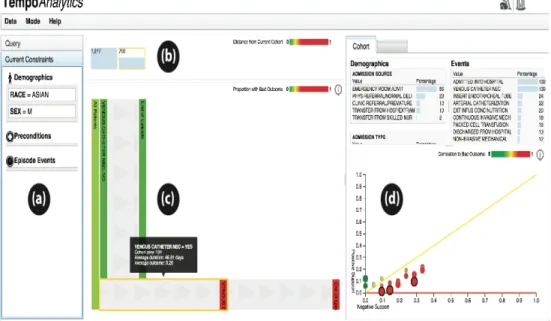
• Query constraint panel for users to select the base cohort (section a in Figure
2).
• A visual representation for breadcrumb, which denotes the progress in data
selection by displaying different cohorts and their size. On hover over these
sections, users can see the constraints applied to get the hovered dataset
(section b in Figure 2)
• Interactive visualization panel which gives users flexibility to choose patient
• Section visualizing demographic and event attribute statistics for the selected
cohort (section d in Figure 2).
With the tool, users can choose an initial dataset by selecting various parameters
available in the interface, which is visualized on the same screen, enabling user to add
additional features to filter the dataset further i.e. select more refined cohorts. Cohort
similarity is computed using Hellinger distance (Pollard, 2002), a measure of similarity
between two probability distributions, and has values between zero and one with zero
indicating identical cohorts. The tool uses a glyph based visual representation to show the
cohorts and contain two sections – size of cohort, similarity metric indicated by color bar
with identical cohorts represented by solid green color (refer section b in Figure 2).
Similarity metric of any cohort is computed with respect to the final cohort in the chain
and these colors dynamically change as new datasets get added to the chain. This design
addresses the problem of selection bias by integrating ways to measure how similar or
distant are individual cohorts.
Considering the time spent on selecting patient sub-groups in ICISS data, a tool
like above would be beneficial to the environment. This can help reduce cohort
comparison time, understand change in event patterns as sub-groups are selected and also
help analyze the effect of different attributes on the outcome variable.
2.5.2 Existing Data Model –
Existing data model consists of five tables – “patient”, “demographic_dict”,
“event_dict”, “patient_demographic” and “patient_event”. “patient” has information
related to the patient i.e. sex and date of diagnosis and patientID (pid) is the primary key.
demographic and event data respectively, mapped to auto generated primary keys.
“event_dict” has a class column, which specifies if the type is a procedure or a drug.
Patient demographic and event data are stored in “patient_demographic” and
“patient_event” table, which are mapped to “patient” and “dictionary” tables through
foreign keys. These tables have additional information about start and end dates (for
event data), and values (for both demographic and event data). For MIMIC dataset the
patientIDs (pid – patient table) are auto generated.
3
Methodology
Writing complex queries and making statistical analyses on the resulting dataset is
laborious in the absence of a visual analytics tool. Considering the similarities in MIMIC
and ICISS data, with respect to type of information i.e. demographics and events,
incorporating the existing tool in the ICISS environment will be the first step towards
understanding its benefits in ICISS environment. The tool implemented in the ICISS
environment will be beneficial to both researchers who use data for their studies/research
and analysts who provide the requested information. This system will enable researchers
to select filters before requesting the final data cut and will subsequently help reduce time
and effort spent by data analysts on the existing system due to multiple iterations of the
process, which involves cleaning, mapping and integrating the data from various sources.
The analysts will still be required to provide the final dataset, but the intermediate steps
to reach the final dataset will decrease.
This paper explains the process to implement an existing visual analytics system
new environment technologically and also different underlying data structure. The system
is evaluated by conducting a user study, which involves researchers from the Lineberger
Cancer Center. The underlying dataset is specific to cancer patients of North Carolina,
patients who have been detected by at least one type of breast cancer and are undergoing
treatment. The selected user group is appropriate to be generalized to a larger audience
since researchers who have adequate domain knowledge will use the system. The
investigators or researchers utilizing the filtered dataset can belong to various groups like
biostatisticians, oncologists and health policy researchers. Due to their limited
availability, it was difficult to get users from all groups who already use the existing
system or will use it in future. Hence, comprehensive pros and cons of the implemented
system could not be formulated. Though incomplete, the results will have important
insights about the usability of the new system and can be applied to other groups, since
users from different groups will still have similar domain understanding.
3.1
Data collection and migration -
For the current system implementation, the ICISS team has made available a
cohort data of breast cancer patients. The dataset contains 18945 patient records with 121
attributes, which have been further filtered using various parameters and the final count is
2640 plus records. All patients are women and have been detected with at least one type
of breast cancer. Few parameters associated with the data are – age of the patient,
whether they are enrolled in a health insurance policy (continuous or partial), medical
claims, race, has undergone surgery post diagnosis and has complete state emergency
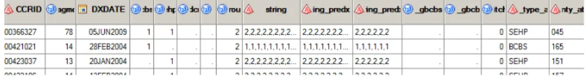
Figure 3: Section of sample record from the SAS file.
These are used to further filter the cohort dataset as per requirements from the
user. SAS programs are employed by the system programmers to apply the filters and get
the final data cut. The data is currently stored in SAS format (sas7bdat) files in the
SeDAP system. For the purpose of the tool, “cohort_alpha” was considered as the
outcome variable for the dataset. The criteria for the “cohort alpha” variable to be
positive is as follows:
Women diagnosed with breast cancer (stage I - III) between years 2004 – 2009 ->
Linked to an insurance provider -> Age less than 65 -> Continuous enrollment 1 year
before and after diagnosis -> Has only one breast cancer diagnosis -> Has medical
claims in 1 year period after diagnosis -> Has national drug code claims (NDCs) -> Had
surgery within 9 months post diagnosis -> Has complete SES information -> Has race
“white” or “black” -> Has ER/PR (breast cancer tumor characteristics) positive.
If a patient record met these requirements, it was set to “1” else left blank. Since
the dataset was used for a previous study, a positive cohort alpha meant that the
corresponding patients were eligible for the study. All 2640 records in the final dataset
had the cohort flag set to “1”.
The tool implemented using MIMIC data divides the dataset into two categories –
Demographics and Events. Examples of demographic data are age, race, gender and other
data without specific timeline. Events data is differentiated based on the availability of
as Events. Events are further divided into preconditions and episode events. Any event
that occurs before the diagnosis date is a precondition and one occurring after diagnosis
date is an episode event. For ICISS, data such as procedures and existing conditions with
dates associated with them was grouped into events and ones without start and end dates
like age, race, insurance continuity, cancer stage and tumor grade was grouped under
demographics.
3.1.1 Data Cleansing –
The tool designed using MIMIC data requires the underlying data to be stored in a
relational database, where referential integrity constraint is preserved between different
tables storing the patient records. Data from SAS files was modified such that it could be
stored in the database. Below are the modifications:
• Insurance enrollment was stored in an array string format, where array field
values were used to indicate enrollment indicators for 12 months before and
after diagnosis date. This data was split such that there was one record for
each month’s enrollment instead of an array string for 12 months.
• Some dates were out of range like “29-Feb” was stored for non leap years and
month of April had 31 days. These were modified to the last available date for
that month.
• Missing values were updated with “0” in case of cohort alpha (outcome
variable).
• Data related to diagnosis didn’t have exact dates associated with them, but had
time interval from the date of diagnosis. These dates were computed based on
• Based on the clarification received from analysts, race data was mapped as –
1->“White”, 2->”Black”, 3->”Hispanic”, 4->”Other”.
3.1.2 Importing SAS data to Relational database –
The database schema used for the tool has tables specific to demographic, event
and patient. This schema was used as is, without any modification. Given the highly
secure infrastructure of the ICISS environment, installation of Oracle database was time
consuming and had integration constraints. As an alternative to Oracle, SQLite was used
due to its high performance capability in combination with Python and no additional
installation requirements.
Data from these files were exported to relational database tables, so that it was
compatible with the existing visual analytics system. This data spreads across three
tables, which have information about – patients, demographics and events. Data
migration process included creating new tables on the ICISS system by running Python
scripts on the SQLite database and writing Python programs to read SAS files and
populating the database tables.
Python scripts were written to accommodate the changes described in the data
cleansing stage. PatientIds in the “patient” table were populated using the “CCRID”
column from the file, unlike MIMIC dataset where these were auto generated. Though
SQLite is compatible with python, there were issues with respect to serializability of
thread objects. This was fixed using a parameter “check_same_thread=false”, while
connecting to the database. This allows creating a new cursor object (new thread) every
3.2
Understanding the existing visual analytics tool –
The existing visual analytics system was developed for data from the MIMIC
database, which contains patient records from Intensive Care Units. Though developed
for a similar problem, the primary data structure used is different than that of the ICISS
system. For example, in the existing tool, the events data has temporal information about
the procedures that the patients underwent while in the Intensive Care Unit. Hence, for
majority event instances there is specific start and end date associated with it. This is not
the case with the SeDAP data. Some events i.e. procedures that the patients have
undergone, during their course of treatment, have binary value i.e. “true” or “false” value.
Considerable amount of time was spent on comparing these two datasets and
aligning the ICISS data as per MIMIC data standards, so that the tool eventually runs
smoothly with underlying ICISS data. The existing tool uses Python for statistical
calculations and d3 (javascript libraries) for visualizations. Programs were analyzed to
understand the changes that would be required with the new data like data connection for
querying ICISS database and query modifications.
3.3
Implementing the visual analytics tool on SeDAP system –
Integrated Cancer Information and Surveillance System (ICISS) operates the
Secure Data Analysis Platform (SeDAP) and is maintained by UNC ITS Research. This
environment enables collaboration and provides a virtual desktop environment for Big-
Data research with added security (“ICISS- SeDAP Overview”, 2015). Data on this
system is secure and one has to complete Health Insurance Portability and Accountability
Act (HIPAA) training for getting access into the system. For the project, user access was
also had the SAS data files for the research. As a step towards understanding the system
and data better, training sessions were conducted by analysts, where issues like system
security, project folders to be used, software installation processes were explained. Data
specific training was conducted to explain the research data, i.e. period and purpose for
which data was collected, different attributes related to the data and parameters which
records were to satisfy in order to be a part of final cohort i.e. have positive “cohort
alpha” flag.
For the visual analytics tool implementation code from GitHub repository was
pulled into the local system. Code was securely migrated to ICISS system over network
share, since it doesn’t allow transfer of data over the Internet. System administrators
installed the required python libraries and SQLite database was used instead of Oracle to
avoid additional integration. This code was later integrated with database created in data
migration process. No additional module installations were required for the tool. All
javascript libraries were either included in the code or referenced from online resources.
The first step in the code modification was connecting to the database, which was
different than MySQL connections. SQLite is not a client-server database engine, but
embedded into the end program and resides on local storage system. With the existing
tool, the program queries the database based on the input parameters and stores the data
in python dictionaries (storage structure is key-> value mappings). Existing code was
modified to accommodate querying ICISS database based on input filters and storing
records in data dictionaries. Date fields were stored in text format in the database. After
fetching the records, these were modified into date type so that they could be used
“mimic_coded_items” were used in the existing tool to populate the dropdowns in
“preconditions” and “episode events” fields of user interface. Since these files had event
specific information from MIMIC database, new files “iciss_coded_data” and
“iciss_coded_items” were added to modify the dropdown values with ICISS specific
event data.
A patient can have multiple admission and discharge dates in the MIMIC
database. For computation purposes, the existing tool considers only the first admission
and discharge date. For MIMIC data, filters from preconditions dropdown fetch patient
event records, which have a date prior to first admission date, while those from episode
event dropdown fetch event records which fall in between the first admission and
discharge date. However, ICISS data has only one diagnosis date associated with each
patient. For computation and simplicity purposes, the queries are modified such that
preconditions would have all events before diagnosis date and episode events would have
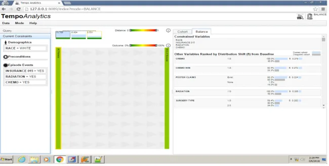
Figure 4: Tool with ICISS data. Current tab selection is cohort, which gives an overview
of attribute percentages related to the cohort. The top section of the page displays
different cohorts selected so far with the size of the cohort shown at the top of the
rectangle. The color bar at the bottom of the rectangle indicates its similarity with the
most recent cohort.
Figure 5: Tool with ICISS data. Current tab selection is “balance”. This tab shows the
similarity between selected cohorts with respect to their attributes. The attributes are
ranked in order of their distribution shift from baseline, with most dissimilar attributes at
the top and similar attributes at the bottom of the page. Two cohorts can be compared at a
time, and always parent cohort is compared to the most recent selected cohort.
Other errors with respect to the code were analyzed and fixed as and when they
were encountered. Few examples include – Cohort statistics were computed even when
there were no patient records in the selected dataset. This would throw an
in the code compute these statistics only if the input cohorts were not empty. Figure 4 &
5 show screenshots from tool implemented using ICISS data.
4
Evaluation of the implemented system
–
The primary users of the tool are researchers who request data from ICISS. The
principal purpose of any visual analytics tool is to provide useful insights about the data
to the users and help them “connect the dots” and “put pieces together” (Kang, Gorg &
Stasko, 2009).
To understand the usability of the tool from the users perspective, a study was
conducted where participants were briefed about the tool and asked to perform predefined
tasks like “selecting a cohort based with input parameters”, “analyzing the cohort in
terms of different attributes” and “comparing different selected cohorts”. User feedback
was recorded while they were performing the task and after the completion of tasks.
While post task completion questionnaire was useful for user interface related critiques,
data collected during tasks was useful to analyze how an existing visual analytics tool
(with a different underlying dataset) fits into the ICISS system.
The study was conducted over a period of four days with 7 participants, where
each participant spent an hour with the tool including demo of the tool, completion of
tasks and answering post task questionnaire. No identifiable information was recorded
during the study and the study was IRB approved. All participants were employees of
UNC Lineberger Cancer Center and had considerable experience with the dataset i.e. they
knew the attributes that were important, how the visualization affected their work and the
modifications that would be helpful for efficient analysis of the data. They were initially
that users answered. The feedback gathered from these interviews was analyzed and has
been divided into different categories based on its type e.g. feedback specific to the tool
interface was categorized as “Tool interface feedback”. Following section describes each
of these critiques in detail.
4.1
Tool Interface Feedback –
The primary goal of the implementation was to understand if the tool would help
the analysts to reduce the time spent in selecting appropriate cohorts, as requested by
researchers. The users were positive about the tool’s impact on their work and majority
believed that a tool like the one implemented would enable them to analyze data faster
and in less time. Visualizing the data made them compare the data as a whole rather than
breaking it and then analyzing the differences. From usability standpoint majority of the
participants agreed that the tool’s design was “easy to understand” and “easy to interact
with”, while one participant was neutral about the tool’s design. Below are some of the
points the participants shared for the interface design of the tool:
• Participant 1, Participant 3 – They particularly liked the correlation section in
the tool, where the effect of different attributes on outcome variable is
visualized. However, since the outcome variable (cohort alpha) wasn’t an
important attribute and was randomly selected, the current data didn’t serve
any positive purpose. Selecting an important attribute as outcome variable will
make the section more useful. Participant 4 had suggested the use of “ET”
attribute as the outcome variable for the dataset.
• Participant 2, Participant 4, Participant 5 – While other participants liked the
these users found the section crowded i.e. lot of useful information was fit into
a small space, thus making it difficult to locate variables. Thiscan be
improved by giving users more flexibility to choose the attributes that they
would like to see (dropdown with all attribute values) or segmenting them into
different categories like insurance, procedure, and hospital information.
• Participant 5, Participant 6 – These participants had difficulty in
understanding the balance tab attributes in terms of attribute and cohort
mapping. They felt the mapping wasn’t clear and legends could be better
incorporated to show the mappings.
• Majority of the participants found the timeline view to be confusing mostly
with respect to the background image. Since it was at the center of the tool,
they felt it provided less information but used more space, which would be
used by cohort and balance tab. Though these sections could be adjusted by
dragging them to the left or right, it wasn’t clear from the tool’s design. Also,
users wanted to see more information about timeline view like data on X and
Y axes, denoting what the visualization stands for. Participant 1 and
Participant 5 did like the timeline view since it gave them a brief idea about
which event happened at what point during a patient’s diagnosis or care.
4.2
Additional Functionality Feedback –
Another important purpose of this implementation was to understand the extent to
which the existing tool (built using MIMIC data) can be used with ICISS data. Given
that both the datasets are of different types, they serve entirely different purpose from an
whereas ICISS data is breast cancer research. Also, MIMIC data has more temporal
information when compared to the ICISS dataset. Given these differences, the users
were asked about their feedback for the tool i.e. if the implemented tool was useful in for
data analysis and cohort comparison. All the users felt that the tool was a good starting
point for their data analysis, but would like to see additional features, which would be
useful in their studies. Below are some of the points, which the participants shared for
additional functionality:
• Participant 1, Participant 2, Participant 5 – The tool enabled the users to
compare different cohorts by displaying the distribution shift for different
attributes of the compared cohorts. This distribution shift was displayed on the
“balance” tab in decreasing order of difference i.e the most dissimilar
attributes were at the top of the page. Even though the users liked the cohort
comparison, treating all attributes equally wasn’t very encouraging to them.
Given the ICISS data, they felt that the users should have the flexibility to
compare different attributes i.e. selecting attributes to be compared from a
dropdown or assign separate weights to attributes depending on their
importance in the cohort.
• Participant 1, Participant 3, Participant 6, Participant 7 – The tool enables
the users to overcome selection bias by making comparison between parent
and child cohorts through exploratory selection of cohorts. While this was
important, the users felt that dealing with confounding bias was more useful
comparison between both cohorts where “filter = yes” and “filter=no” will be
helpful.
• Participant 4, Participant 5 – Few participants appreciated the timeline view
specifically because it let them see a sequence of events within a given period.
Though important, these participants felt that the users should have more
control to change the start and end points of the timelines and see variation in
patient population with respect to a selected filter. This could be achieved
through a slider or dropdown field, which can used to manipulate the start and
end points.
• Participant 5, Participant 6 – These users felt that the categorization of data
into demographic and event was inefficient for ICISS dataset. Since temporal
and non-temporal events were considered as a baseline for classification,
some attributes like “medicaid” and “bcbs enrollment” were categorized as
demographic data (non temporal data). The analysts felt this to be misleading.
• Participant 3, Participant 5, Participant 7 – Once a filter is applied to the
cohort the timeline view gets split based on the attribute values. The user can
then select cohorts further from the timeline view and the selected cohort gets
added to the top of the page. The tool also gives user the flexibility to go back
to the parent cohort, but this takes off the child cohort from the top of the
page. The participants thought of this as a drawback, since they would have to
remember all the selections they have made before going back to a parent
participants’ thought that keeping the cohorts in place and navigating through
them when required would be beneficial for their analysis.
5
Discussion and Results
–
The main objective of the study was to understand the user expectations and their
importance by analyzing their interaction with the tool. The participant studies provide
useful insights on the needs of the users who would be interacting with the system and
the ways the tool can be modified to incorporate those requirements. Though the tool
wasn’t directly useful in cohort analysis, considering the absence of parallel comparison
of datasets, which forms an integral part of their analysis, other components of the tool
did prove beneficial. These were the correlation graph (section d in Figure 2) and display
of attributes in cohort and balance tabs. Also, division of data based on its temporal
nature doesn’t appropriately categorize clinical data. Some attributes like “chemo win”,
although classified as demographic data, doesn’t describe a population characteristic.
This categorization should be realigned to the needs of the ICISS environment. From
design perspective, classifying attributes as event data will interfere with the timeline
view, since timeline view requires all data to be temporal. Hence this can be a third
category, which can be displayed with an additional tab like “demographics” and
“events”.
Amongst the points retrieved user feedback, majority of the changes related to the
interface are achievable and would add value to the tool. Some of these are also important
from a usability standpoint and are described below:
• Representing the legends with better colors so that the mapping between
• Flexibility to select attributes in the cohort tab, which will make the section
less crowded and more interactive.
Also modifying the outcome variable to “ET” instead of “Cohort Alpha” would increase
the usefulness of the correlation graph.
While the cosmetic changes do make the tool “easy-to-use”, functionality changes
were more desirable by participants since they are useful to the users for analyzing the
underlying data. The analysts understood the ICISS data and the critiques they made were
through their experience while extracting cohorts from huge datasets.
From the above feedback below are the key functionality changes, which can be
implemented:
• Confounding bias was one of the key points in user feedback. They felt that
parallel comparison of cohorts after selecting the filter in addition to the
existing iterative comparison will be beneficial for analysis. Since the tool
currently selects the child cohort iteratively, implementing changes to
compare parallel cohorts will require branching out from the parent cohort in
multiple directions, which might affect tool performance, in terms of time
taken to visualize, due to high volume of data. Efficient software designs and
querying the database multiple times instead of one initial query would help
tackle these issues.
• Another important critique was with respect to attribute weights. Currently, all
attributes are considered equal in cohort comparison, which is not the case
when users select cohorts for research problems. Depending on the dataset and
outcome variable. Giving users flexibility to choose the attributes for cohort
comparison and also adjust their weights can be highly beneficial for analysts.
While other points are important, the above critiques stand out since they form the
basis of analyst’s daily work and hence should be prioritized. The primary goal of the
system, which is to reduce time between cohort request and cohort selection, can be
achieved significantly by implementing the above interface and functionality changes.
6
Conclusion
–
Given the exponential growth in EHR data, visual analytics tool can prove
beneficial for analyzing multivariate data. Implementation of such a tool with breast
cancer data was appreciated by the analysts at ICISS and considered a good starting point
for analysis. Though the MIMIC and ICISS data have different patient information, there
were common points on which the data could be classified and hence applied to the
existing tool. The correlation graph with the effect of attributes on the outcome variable,
cohort tab with attribute percentages in the filtered cohort, balance tab with distribution
shift between compared cohorts were the most liked sections of the tool. Feedback was
received from participants in which timeline view was the most confusing section of the
tool. Additional features like flexibility to choose the start-end points of the timeline,
parallel comparison of selected child cohorts, and ability to choose variables for cohort
comparison were requested by participants. Since the implementation was an initial
attempt towards understanding the requirements with ICISS data, the tool and the
feedback gathered from analysts provided important insights about future modifications
Lineberger Cancer Center. After the suggested modifications in the current tool
(suggested in the feedback), the next step would be to scale the tool for entire data at the
Bibliography
Clancy, C. M., & Eisenberg, J. M. (1998). Outcomes research: measuring the end results
of health care. Science, 282(5387), 245-246.
Dawn, H. & Patel, V. (2014). Physicians motivations for adoption of electronic health
records. Retrieved -
https://www.healthit.gov/sites/default/files/oncdatabrief-physician-ehr-adoption-motivators-2014.pdf
Disease Surveillance. (2016). Retrieved:
https://en.wikipedia.org/wiki/Disease_surveillance
Ghassemi, M. M., Richter, S. E., Eche, I. M., Chen, T. W., Danziger, J., & Celi, L. A.
(2014). A data-driven approach to optimized medication dosing: a focus on
heparin. Intensive care medicine, 40(9), 1332-1339.
Gotz, D. & Borland, D. (2016). Data-Driven Healthcare: Challenges and
Opportunities for Interactive Visualization. Unpublished Manuscript.
Gotz, D., Caban, J., & Chen, A. T. (2015). Visual Analytics for Healthcare. Healthcare
Gotz, D. & Meyer, A. (2015). Large-Scale Outcomes Research and the Need for
Visual Analytics. Unpublished Manuscript.
Gotz, D., & Sun, S. (2015). Visual Assessment of Cohort Divergence During Iterative
Cohort Selection.
Gotz, D., Sun, S., & Cao, N. (2016, March). Adaptive Contextualization: Combating Bias
During High-Dimensional Visualization and Data Selection. In Proceedings of the 21st
International Conference on Intelligent User Interfaces (pp. 85-95). ACM.
Etheredge, L. M. (2007). A rapid-learning health system. Health affairs, 26(2),
w107-w118.
Freifeld, C. C., Mandl, K. D., Reis, B. Y., & Brownstein, J. S. (2008). HealthMap: global
infectious disease monitoring through automated classification and visualization of
Internet media reports. Journal of the American Medical Informatics Association, 15(2),
150-157.
Häyrinen, K., Saranto, K., & Nykänen, P. (2008). Definition, structure, content, use and
impacts of electronic health records: a review of the research literature. International
Hsiao, C. J., & Hing, E. (2012). Use and Characteristics of Electronic Health Record
Systems Among Office-based Physician Practices, United States, 2001-2012 (pp. 1-8).
US Department of Health and Human Services, Centers for Disease Control and
Prevention, National Center for Health Statistics.
Kang, Y. A., Görg, C., & Stasko, J. (2009, October). Evaluating visual analytics systems
for investigative analysis: Deriving design principles from a case study. In Visual
Analytics Science and Technology, 2009. VAST 2009. IEEE Symposium on (pp. 139-146).
IEEE.
Keim, D., Andrienko, G., Fekete, J. D., Görg, C., Kohlhammer, J., & Melançon, G.
(2008). Visual analytics: Definition, process, and challenges (pp. 154-175). Springer
Berlin Heidelberg.
Lineberger Comprehensive Cancer Center, “Integrated Cancer Information
and Surveillance System: http://iciss.unc.edu/,” 2014
More physicians and hospitals are using EHRs than before (2015, August 7). Retrieved
http://www.hhs.gov/news/press/2014pres/08/20140807a.html
Plaisant, C., Mushlin, R., Snyder, A., Li, J., Heller, D., & Shneiderman, B. (1998).
LifeLines: using visualization to enhance navigation and analysis of patient records. In
Proceedings of the AMIA Symposium (p. 76). American Medical Informatics Association.
Quispel, A., & Maes, A. (2014). Would you prefer pie or cupcakes? Preferences for data
visualization designs of professionals and laypeople in graphic design. Journal of Visual
Languages & Computing, 25(2), 107-116.
Outcomes Research (2016). Retrieved: https://en.wikipedia.org/wiki/Outcomes_research
Scholtz, J. (2006, October). Beyond usability: Evaluation aspects of visual analytic
environments. In Visual Analytics Science and Technology, 2006 IEEE Symposium
On (pp. 145-150). IEEE.
Sung, I. (2014). The Future of Disease Surveillance with EHR data. Retrieved :
http://www.athenahealth.com/blog/2014/10/06/future-disease-surveillance-ehr-data
Thakkar, M., & Davis, D. C. (2006). Risks, Barriers, and Benefits of EHR Systems: A
Comparative Study Based on Size of Hospital. Perspectives in Health Information
Management / AHIMA, American Health Information Management Association, 3, 5.
Tufte, E. R. (1985). The Visual Display of Quantitative Information. Journal for
Understanding Features and Functions of an EHR (2015). Retrieved
http://idl.ils.unc.edu/rkundu/MainPage.html
Wang, T. D., Wongsuphasawat, K., Plaisant, C., & Shneiderman, B. (2011). Extracting
insights from electronic health records: case studies, a visual analytics process model, and
design recommendations. Journal of medical systems, 35(5), 1135-1152.
What is an electronic health record (EHR) ? (2013, March 16). Retrieved
http://www.healthit.gov/providers-professionals/faqs/what-electronic-health-record-ehr
Wehrend, S., & Lewis, C. (1990). A problem-oriented classification of visualization
techniques. In Proceedings of the 1st Conference on Visualization'90 (pp. 139-143).
IEEE Computer Society Press.
Whitney, H. (2010, October 14). Beyond the Medical Chart: Information visualization for
improving personal and public health. Retrieved
Appendix
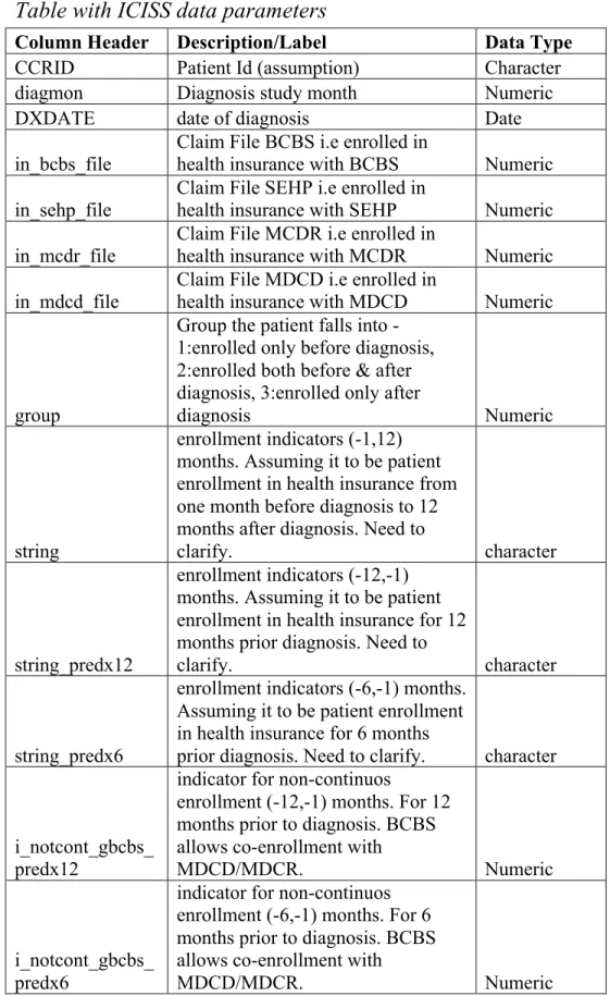
Table with ICISS data parameters
Column Header Description/Label Data Type
CCRID Patient Id (assumption) Character
diagmon Diagnosis study month Numeric
DXDATE date of diagnosis Date
in_bcbs_file Claim File BCBS i.e enrolled in health insurance with BCBS Numeric
in_sehp_file Claim File SEHP i.e enrolled in health insurance with SEHP Numeric
in_mcdr_file Claim File MCDR i.e enrolled in health insurance with MCDR Numeric
in_mdcd_file
Claim File MDCD i.e enrolled in
health insurance with MDCD Numeric
group
Group the patient falls into - 1:enrolled only before diagnosis, 2:enrolled both before & after diagnosis, 3:enrolled only after
diagnosis Numeric
string
enrollment indicators (-1,12) months. Assuming it to be patient enrollment in health insurance from one month before diagnosis to 12 months after diagnosis. Need to
clarify. character
string_predx12
enrollment indicators (-12,-1) months. Assuming it to be patient enrollment in health insurance for 12 months prior diagnosis. Need to
clarify. character
string_predx6
enrollment indicators (-6,-1) months. Assuming it to be patient enrollment in health insurance for 6 months
prior diagnosis. Need to clarify. character
i_notcont_gbcbs_ predx12
indicator for non-continuos
enrollment (-12,-1) months. For 12 months prior to diagnosis. BCBS allows co-enrollment with
MDCD/MDCR. Numeric
i_notcont_gbcbs_ predx6
indicator for non-continuos enrollment (-6,-1) months. For 6 months prior to diagnosis. BCBS allows co-enrollment with
switcher
Any enrollment switch indicator
within 12 months post diagnosis Numeric
insur_type_at_dx
Health Insurance at the time of
diagnosis Character
County_at_dx County Character
Derived_AJCC_6
_T Cancer Staging Code Character
Derived_AJCC_6
_N Cancer Staging Code Character
Derived_AJCC_6
_M Cancer Staging Code Character
Derived_AJCC_6
_Stage_Grp Character
Vital_Stats Character
Date_of_Death Date of Death Character
DXYR Year of Diagnosis Numeric
stage_ord Assuming it to be stage of illness Numeric
age_at_dx age at diagnosis Numeric
i_multi_diag indicator for patients with > 1 malignant diagnosis Numeric
race_num patient race or ethnicity Numeric
ER Numeric
PR Numeric
erpr_status Numeric
tumor_grade Numeric
COUNTY Character
RURAL_CAT
Rural County Categorical
(Continuum code : 1-3 Metro, 4-5
Larger Urban, 6-9 Rural) Character
PC_INCOME Per Capita Income in 2005[County] Numeric
HH_INCOME
Median household income in
2005[County] Numeric
LOW_ED
Percent leass than HS Eduction in
2000 [County] Numeric
POVERTY Percent Poverty in 2005 [County] Numeric
GENERALIST
General Physicians per 10000 in
2005 [County] Numeric
SPECIALIST
Special Physicians per 10000 in
2005 [County] Numeric
HOSP_ONC
Hospitals with Oncology services
per 10000 in 2005 Numeric
GASTRO
Gastroenterologists per 10000 in
2005 [County] Numeric
O01 INFARCTION (1) predx12_CVPRI
O02 Prior : OLD MYOCARDIAL INFARCTION (1) Numeric
predx12_CVPRI
O03 Prior : CHF(1) Numeric
predx12_CVPRI O04
Prior : PEREPHERAL VASCULAR
DISEASE (DX, 1) Numeric
predx12_CVPRI O05
Prior : PEREPHERAL VASCULAR
DISEASE (SURG, 1) Numeric
predx12_CVPRI O06
Prior : CEREBROVASCULAR
DISEASE (1) Numeric
predx12_CVPRI
O07 Prior : COPD (1) Numeric
predx12_CVPRI
O08 Prior : DEMENTIA (1) Numeric
predx12_CVPRI
O09 Prior : PARALYSIS (2) Numeric
predx12_CVPRI
O10 Prior : DIABETES (1) Numeric
predx12_CVPRI O11
Prior : DIABETES WITH
SEQUELAE (2) Numeric
predx12_CVPRI O12
Prior : CHRONIC RENAL
FAILURE (2) Numeric
predx12_CVPRI O13
Prior : VARIOUS CIRRHODITES
(1) Numeric
predx12_CVPRI O14
Prior : MODERATE-SEVERE
lIVER DISEASE (3) Numeric
predx12_CVPRI
O15 Prior : ULCERS1 (1) Numeric
predx12_CVPRI
O16 Prior : ULCERS2 (1) Numeric
predx12_CVPRI
O17 Prior : RHEUM (1) Numeric
predx12_CVPRI
O18 Prior : AIDS (6) Numeric
predx12_PCHRL
SON Prior Charlson Commodity Score Numeric
predx12_nci_com
bined Numeric
predx6_CVPRIO
01 Prior : MYOCARDIAL INFARCTION (1) Numeric
predx6_CVPRIO 02
Prior : OLD MYOCARDIAL
INFARCTION (1) Numeric
predx6_CVPRIO
predx6_CVPRIO
04 Prior : PEREPHERAL VASCULAR DISEASE (DX, 1) Numeric
predx6_CVPRIO 05
Prior : PEREPHERAL VASCULAR
DISEASE (SURG, 1) Numeric
predx6_CVPRIO 06
Prior : CEREBROVASCULAR
DISEASE (1) Numeric
predx6_CVPRIO
07 Prior : COPD (1) Numeric
predx6_CVPRIO
08 Prior : DEMENTIA (1) Numeric
predx6_CVPRIO
09 Prior : PARALYSIS (2) Numeric
predx6_CVPRIO
10 Prior : DIABETES (1) Numeric
predx6_CVPRIO
11 Prior : DIABETES WITH SEQUELAE (2) Numeric
predx6_CVPRIO
12 Prior : CHRONIC RENAL FAILURE (2) Numeric
predx6_CVPRIO
13 Prior : VARIOUS CIRRHODITES (1) Numeric
predx6_CVPRIO 14
Prior : MODERATE-SEVERE
lIVER DISEASE (3) Numeric
predx6_CVPRIO
15 Prior : ULCERS1 (1) Numeric
predx6_CVPRIO
16 Prior : ULCERS2 (1) Numeric
predx6_CVPRIO
17 Prior : RHEUM (1) Numeric
predx6_CVPRIO
18 Prior : AIDS (6) Numeric
predx6_PCHRLS
ON Prior Charlson Commodity Score Numeric
predx6_nci_comb
ined Numeric
predx12_depressi
on Numeric
predx6_depressio
n Numeric
product_type_at_
dx Character
postdx_ncds Character
postdx_ncds_365 Character
VING procedure Numeric
bcs_stdt procedure start Date
mast procedure Numeric
mast_stdt procedure start Date
mast_enddt procedure end Date
rad procedure Numeric
rad_stdt procedure start Date
rad_enddt procedure end Date
chemo procedure Numeric
chemo_stdt procedure start Date
chemo_enddt procedure end Date
statin procedure Numeric
statin_stdt procedure start Date
statin_enddt procedure end Date
et procedure Numeric
et_stdt procedure start Date
et_enddt procedure end Date
received_transtuz
umab procedure Numeric
received_transtuz
umab_stdt procedure start Date
received_transtuz
umab_enddt procedure end Date
et_initiation_type Character
postdx_claims Character
et_win procedure result (assumption) Numeric
et_win_18mon procedure result (assumption) Numeric
chemo_win procedure result (assumption) Numeric
rad_win procedure result (assumption) Numeric
surg_type Numeric
comorb_cat12 Numeric
comorb_cat6 Numeric
depression_cat12 Numeric
depression_cat6 Numeric
not_cont_inbcbs