Proceedings of the 55th Annual Meeting of the Association for Computational Linguistics-System Demonstrations, pages 25–30 Vancouver, Canada, July 30 - August 4, 2017. c2017 Association for Computational Linguistics
Proceedings of the 55th Annual Meeting of the Association for Computational Linguistics-System Demonstrations, pages 25–30 Vancouver, Canada, July 30 - August 4, 2017. c2017 Association for Computational Linguistics
ESTEEM: A Novel Framework for Qualitatively Evaluating and
Visualizing Spatiotemporal Embeddings in Social Media
Dustin Arendt1 and Svitlana Volkova2 1Visual Analytics,2Data Sciences and Analytics
National Security Directorate Pacific Northwest National Laboratory
Richland, WA 99354
Abstract
Analyzing and visualizing large amounts of social media communications and con-trasting short-term conversation changes over time and geolocations is extremely important for commercial and government applications. Earlier approaches for large-scale text stream summarization used dy-namic topic models and trending words. Instead, we rely on text embeddings – low-dimensional word representations in a continuous vector space where similar words are embedded nearby each other. This paper presents ESTEEM,1 a novel tool for visualizing and evaluating spa-tiotemporal embeddings learned from streaming social media texts. Our tool al-lows users to monitor and analyze query words and their closest neighbors with an interactive interface. We used state-of-the-art techniques to learn embeddings and developed a visualization to represent dynamically changing relations between words in social media over time and other dimensions. This is the first interactive visualization of streaming text representa-tions learned from social media texts that also allows users to contrast differences across multiple dimensions of the data.
1 Motivation
Social media is an example of high volume dy-namic communications. Understanding and sum-marizing large amounts of streaming text data is extremely challenging. Traditional techniques that rely on experts, keywords and ontologies do not scale in this scenario. Dynamic topic models,
1Demo video:http://goo.gl/3N9Ozj
trending topics are widely used as text stream sum-marization techniques but they are biased and do not allow exploring dynamically changing rela-tionship between concepts in social media or con-trasting them across multiple dimensions.
Text embeddings represent words as nu-meric vectors in a continuous space, where words within similar contexts appear close to one another (Harris, 1954). Mapping words into a lower-dimensional vector space not only solves the dimensionality problem for predictive tasks (Mikolov et al.,2013a), but also goes beyond topics and word clouds by capturing word simi-larities on syntactic, semantic and morphological levels (Gladkova and Drozd,2016).
Most past work has learned text representations from static corpora and visualized2 the relation-ships between embedding vectors, measured ing cosine or Euclidian distance similarity, us-ing Principal Component Analysis (PCA) pro-jection in 2D (Hamilton et al., 2016b; Smilkov et al.,2016) or t-Distributed Stochastic Neighbor Embedding (t-SNE) technique (Van Der Maaten, 2014). Unlike static text corpora, in dynamically changing text streams the associations between words are changing over time e.g., days ( Hamil-ton et al., 2016b,a), years (Kim et al., 2014) or centuries (Gulordava and Baroni, 2011). These changes are compelling to evaluate quantitatively, but, given the scale and complexity of the data, in-teresting findings are very difficult to capture with-out qualitative evaluation through visualization.
Moreover, the majority of NLP applications are using word embeddings as features for down-stream prediction tasks e.g., part-of-speech tag-ging (Santos and Zadrozny, 2014), named entity recognition (Passos et al., 2014) and dependency
2TensorBoard Embedding Visualization:
https://www.tensorflow.org/get_started/ embedding_viz
parsing (Lei et al.,2014). However, in the compu-tational social sciences domain, embeddings are used to explore and characterize specific aspects of a text corpus by measuring, tracking and vi-sualizing relationships between words. For ex-ample, Bolukbasi et al. (2016) evaluate cultural stereotypes between occupation and gender, Stew-art et al. (2017) predicted short-term changes in word meaning and usage in social media.
In this paper we present and publicly release a novel tool ESTEEM3for visualizing text represen-tations learned from dynamic text streams across multiple dimensions e.g., time and space.4 We present several practical use cases that focus on visualizing text representation changes in stream-ing social media data. These include visualizstream-ing word embeddings learned from tweets over time and across (A) geo-locations during crisis (Brus-sels Bombing Dataset), (B) verified and suspicious news posts (Suspicious News Dataset).
2 Background
2.1 Embedding Types
Most existing algorithms for learning text rep-resentations model the context of words using a continuous bag-of-words approach (Mikolov et al., 2013a), skip-grams with negative sam-pling (Mikolov et al.,2013b) – Word2Vec,5 mod-ified skip-grams with respect to the dependency tree of the sentence (Levy and Goldberg, 2014), or optimized ratio of word co-occurrence proba-bilities (Pennington et al.,2014) – GloVe.6
2.2 Embedding Evaluation
There are two principle ways one can evaluate em-beddings: (a) intrinsically and (b) extrinsically.
(a) Intrinsic evaluations directly test syntactic or semantic relationships between the words, and rely on existing NLP resources e.g., WordNet and subjective human judgements e.g., crowdsourcing.
(b) Extrinsic methods evaluate word vectors by measuring their performance when used for downstream NLP tasks e.g., dependency parsing, named entity recognition (Passos et al.,2014;Godin et al.,2015).
3Live demo:http://esteem.labworks.org 4Code:https://github.com/pnnl/esteem/ 5Word2Vec in gensim: https://radimrehurek.
com/gensim/models/word2vec.html
6GloVe: https://cran.r-project.org/web/
packages/text2vec/vignettes/glove.html
Recent work suggests that intrinsic and extrin-sic measures correlate poorly with one another (Schnabel et al.,2015;Gladkova and Drozd,2016; Zhang et al., 2016). In many cases we want an embedding not just to capture relationships within the data, but also to do so in a way which can be usefully applied. In these cases, both intrinsic and extrinsic evaluation must be taken into account.
3 Use Cases
For demonstration purposes we rely on the Word2Vec implementation in gensim, but our tool can take any type of pre-trained embedding vec-tors. To ensure the quality of embeddings learned from social media streams, we lowercased, tok-enized and stemmed raw posts,7 and also applied standard NLP preprocessing to clean noisy social media texts e.g., remove punctuation, mentions, digits, emojis etc. Below we discuss two Twitter datasets we collected to demonstrate our tool for visualizing spatiotemporal text representations.
3.1 Brussels Bombing Dataset
We collected a large sample of tweets (with geo-locations and language IDs assigned to each tweet) from 240 countries in 66 languages from Twitter. Data collection lasted two weeks, beginning on March 15th, 2016 and ending March 29th, 2016. We chose this 15 day period because it includes the attacks on Brussels on March 22 (a widely-discussed event) as well as one whole week before and after the attacks. We used 140 million tweets in English to learn daily spatiotemporal embed-dings over time and across 10 European countries.
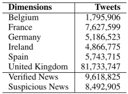
Dimensions Tweets
Belgium 1,795,906
France 7,627,599
Germany 5,186,523 Ireland 4,866,775
Spain 5,743,715
[image:2.595.351.481.543.638.2]United Kingdom 81,733,747 Verified News 9,618,825 Suspicious News 8,492,905
Table 1: Brussels and news dataset statistics: the number of tweets we used to learn embeddings.
3.2 Suspicious News Dataset
We manually constructed a list of trusted news accounts that tweet in English and checked
7Stemming is rarely done when learning embeddings. We
whether they are verified on Twitter. The exam-ple verified accounts include@cnn,@bbcnews, @foxnews. We found the list of accounts that spread suspicious news – propaganda, click-bait, hoaxes and satire,8 e.g., @TheOnion,
@ActivistPost,@DRUDGE_REPORT. We collected retweets generated in 2016 by any user that mentions one of these accounts and assigned the corresponding label propagated from suspi-cious or trusted news sources. In total, we col-lected 9.6 million verified news posts and 8.4 mil-lion suspicious news tweets. We used 18 milmil-lion tweets to learn monthly embeddings over time and across suspicious and verified news account types.
4 Visualization
Our objective was to provide users with a way to to visually understand how embeddings are chang-ing across multiple dimensions. Lets consider the Brussels Twitter dataset as an example where text representations vary over time and space. We ac-complish this by allowing the user to query our tool with a given keyword across set of locations, which produces corresponding visual representa-tions of the embeddings across time and space. The user can then inspect these visual embedding representations side by side, or combine them into a single representation for a more explicit compar-ison across regions.
4.1 Design
The main challenge we faced in designing dy-namic embedding representations was with the scale and complexity of the embeddings, which have tens of thousands of words and hundreds of dimensions. Existing embedding visualiza-tion techniques have primarily relied on scatter plot representations of projected data (Hamilton et al., 2016b), using principal components anal-ysis or other dimension reduction techniques e.g., t-Distributed Stochastic Neighbor Embedding.
However, these techniques are problematic be-cause they can create visual clutter if too many en-tities are projected, and they can be difficult to in-terpret. Embeddings, having high dimension, can not necessarily be projected into a 2- or 3- dimen-sional space without incurring significant visual distortion, which can degrade users’ trust in the visualization (Chuang et al.,2012). Furthermore,
8http://www.fakenewswatch.com/
[image:3.595.322.511.62.183.2]http://www.propornot.com/p/the-list.html
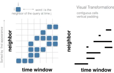
Figure 1: Our visual metaphor stems from an adjacency rep-resentationAof the nearest neighbors of the query term. The rows of the matrix correspond to nearest neighbors, and the columns correspond to time windows. The cellaijis filled if
wordiis a neighbor of the query term at timej. To this ma-trix to make the mama-trix more readable by the user, we apply a visual transformation.
in our experience, many non-expert users are con-fused by the meaninglessness of the x- and y- co-ordinate space of the projected data, and have to be trained how to interpret such visualizations.
These problems are amplified when we consider dynamic data, where entities move throughout an embedding space over time. In our case, because embeddings are trained online, the meanings of the dimensions in the embeddings are changing, in addition to the words embedded therein. So, it is not correct to use traditional approaches to project an entities at different time points into the same space using the features directly.
Our solution was to rely on a user driven query-ing and nearest neighbor technique to address these challenges. We allow users to query the embedding using a single keyword, as we as-sume the user has a few items of interest they wish to explore, and is not concerned with un-derstanding the entire embedding. This allows us to frame our dynamic embedding visualization problem as a dynamic graph visualization prob-lem (Beck et al., 2014), specifically visualizing dynamic ego-networks.
Our visual representation shows how the nearest neighbors of a user-provided query term change over time. The user can choose the k nearest
neighbor words shown in the visualization. We en-code time on the x-axis, whereas the y-axis is used to represent each nearest neighbor word returned by the query. This is a matrix representation of the nearest neighbors of the query term over time, as illustrated in Figure1.
(a) Belgium
(b) Germany
[image:4.595.72.291.57.520.2](c) United Kingdom
Figure 2: Visualization of dynamic embedding queries for the word “bomb” across the regions “Belgium,” “Germany,” and “United Kingdom” are shown. Time is encoded on the horizontal axis, and words are sorted by first occurrence (as a nearest neighbor) for the query term.
adding spacing between rows to help distinguish the query results. The words on the y-axis are sorted in the order they first become a neighbor of the query term. This helps the user see more recent terms, as they will float to the top, versus more persistent terms, which sink to the bottom, and have longer lines. Figure2shows a screenshot of our interface containing three of regional dy-namic embeddings available for the term “bomb.” Users can compare visualizations of query re-sults side by side in the interface, but we also de-signed a more explicit comparison of embeddings using a modified version of our visualization tech-nique. Our goal for this comparison was to
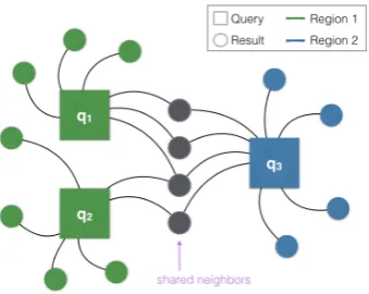
high-light similarities across two or more dynamic em-bedding queries over time. We accomplish this by first finding the shared neighbors of these queries within each time step, which is illustrated in Fig-ure3. We show the results of these queries using the same visual metaphor as described above with an additional embellishment. The thickness of the line at a given time now encodes the number of shared neighbors across the query results at that time. Also, when a query result is shared by more than one query in the combined chart, its corre-sponding line is filled black, otherwise it retains its original color corresponding to its region. Figure4 shows an example of combining the query results for “bomb” across regions “Belgium,” “Germany,” and “United Kingdom.”
4.2 Implementation
Our tool is a web application (i.e., client-server model) implemented using Python and Flask9for the server and React10 and D311 for the client. The server is responsible for executing the query on the embeddings, whereas the client is respon-sible managing the users queries and visualizing the results. This separation of concerns means that the server assumes a large memory footprint12and processing burden, allowing the clients (i.e., web browsers) to be lightweight. This enables the in-terface to be used on a typical desktop or even a mobile device by multiple users simultaneously.
Figure 3: Dynamic embedding queries are combined by find-ing the shared neighbors across their query results at each time step. This example shows how three separate queries {q1, q2, q3}across two regions could have overlap in the
re-sult words within a single timestamp.
9http://flask.pocoo.org
10https://facebook.github.io/react/ 11http://d3js.org
12For our Brussels data set, each dynamic embedding
[image:4.595.331.501.480.615.2]Figure 4: The dynamic embedding queries from Figure2are combined into a single chart to support a more explicit comparison of the dynamic embeddings across countries – Belgium (green), German (purple), UK (orange). Where the results overlap from the individual queries, a thicker black line is drawn.
Finding the k-nearest neighbors of a query term in the embedding could take a long time to query for dynamic embeddings with many dimensions and entities. We relied on the “ball tree” data structure available in scikit-learn13 to help speed up the query. This data structure relies on the Eu-clidean distance metric, instead of cosine distance, which is considered a best practice. However, af-ter spot checking a few relevant queries using co-sine distance, we did not see a qualitative differ-ence between the two metrics, and continued us-ing the ball tree because of the performance ad-vantage. One ball tree is computed for each re-gion and time window, which has a large up front cost, but afterwards our tool provides embedding queries responsively (within 1 second per region). This approach is scalable because each query can divided independently into (region × time win-dow) sub-tasks, allowing the overall calculation to be distributed easily in a map-reduce architecture.
Analyzing Brussels Embeddings Figure 4 shows an example of combining the query re-sults for “bomb” across regions “Belgium,” “Ger-many,” and “United Kingdom.” We observe that the shared neighbors of the query word “bomb” areIstanbul(March 22 - 25),suicide(March 20 -29), arrest (March 23 - 27), and bomber(March 22 - 29). The words ParisandAbdeslamare the neighbors only in Belgium, wound, Yemen and
Iraq– in the UK, andEurope, suspectandRussia
– in Germany.
13http://scikit-learn.org/stable/
modules/generated/sklearn.neighbors. BallTree.html
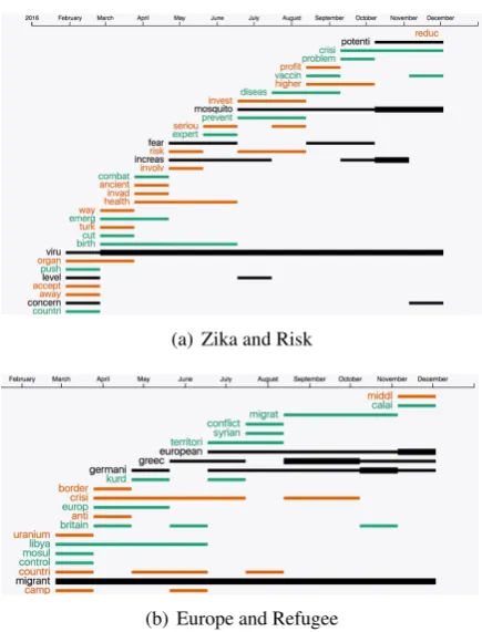
Analyzing Suspicious News Embeddings Fig-ure5shows the results for an example query word pairs: (a) “zika” and “risk” and (b) “Europe” and “refugee” learned from content extracted from suspicious and verified news in 2016. We found thatpotential, mosquito, increase, virusand con-cern are shared neighbors of two query words “zika” and “risk”. We observed that European, Greece, Germany andmigrant are shared neigh-bors of two query words “Europe” and “refugee”.
(a) Zika and Risk
[image:5.595.307.525.437.723.2](b) Europe and Refugee
5 Conclusion
We have presented ESTEEM, a novel frame-work for visualizing and qualitatively evaluat-ing spatiotemporal embeddevaluat-ings learned from large amounts of dynamic text data. Our system allows users to explore specific aspects of text stream-ing corpus usstream-ing continuous word representations. Unlike any other embedding visualization, our tool allows contrasting word representation differ-ences over time across other dimensions e.g., ge-olocation, news types etc. For future work we plan to improve the tool by allowing the user to query using phrases and hashtags.
6 Acknowledgments
This research was conducted under the High-Performance Analytics Program at Pacific North-west National Laboratory, a multiprogram na-tional laboratory operated by Battelle for the U.S. Department of Energy. The authors would like to thank L. Phillips, J. Mendoza, K. Shaffer, J. Yea Jang and N. Hodas for their help with this work.
References
Fabian Beck, Michael Burch, Stephan Diehl, and Daniel Weiskopf. 2014. The state of the art in vi-sualizing dynamic graphs. EuroVis STAR2.
Tolga Bolukbasi, Kai-Wei Chang, James Y Zou, Venkatesh Saligrama, and Adam T Kalai. 2016. Man is to computer programmer as woman is to homemaker? debiasing word embeddings. In Pro-ceedings of NIPS. pages 4349–4357.
Jason Chuang, Daniel Ramage, Christopher Manning, and Jeffrey Heer. 2012. Interpretation and trust: De-signing model-driven visualizations for text analy-sis. InProceedings of SIGCHI. pages 443–452.
Anna Gladkova and Aleksandr Drozd. 2016. Intrinsic evaluations of word embeddings: What can we do better? Proceedings of ACL.
Fr´ederic Godin, Baptist Vandersmissen, Wesley De Neve, and Rik Van de Walle. 2015. Named entity recognition for twitter microposts using dis-tributed word representations. In Proceedings of ACL-IJCNLP.
Kristina Gulordava and Marco Baroni. 2011. A distri-butional similarity approach to the detection of se-mantic change in the Google Books Ngram corpus. InProceedings of GEMS. pages 67–71.
William Hamilton, Jure Leskovec, and Dan Jurafsky. 2016a. Diachronic word embeddings reveal statisti-cal laws of semantic change. InProceedings of ACL.
William L Hamilton, Jure Leskovec, and Dan Jurafsky. 2016b. Cultural shift or linguistic drift? comparing two computational measures of semantic change. In
Proceedings of EMNLP.
Zellig S Harris. 1954. Distributional structure. Word
10(2-3):146–162.
Yoon Kim, Yi-I Chiu, Kentaro Hanaki, Darshan Hegde, and Slav Petrov. 2014. Temporal analysis of lan-guage through neural lanlan-guage models. Proceed-ings of ACL.
Tao Lei, Yuan Zhang, Regina Barzilay, and Tommi Jaakkola. 2014. Low-rank tensors for scoring de-pendency structures. InProceedings of ACL.
Omer Levy and Yoav Goldberg. 2014. Dependency-based word embeddings. InProceedings of ACL. Tomas Mikolov, Kai Chen, Greg Corrado, and Jeffrey
Dean. 2013a. Efficient estimation of word represen-tations in vector space. InProceedings of ICLR. Tomas Mikolov, Ilya Sutskever, Kai Chen, Greg S
Cor-rado, and Jeff Dean. 2013b. Distributed represen-tations of words and phrases and their composition-ally. InProceedings of NIPS.
Alexandre Passos, Vineet Kumar, and Andrew McCal-lum. 2014. Lexicon infused phrase embeddings for named entity resolution. InProceedings of CoNLL. Jeffrey Pennington, Richard Socher, and Christopher D
Manning. 2014. Glove: Global vectors for word representation. InProceedings of EMNLP.
C´ıcero Nogueira Santos and Bianca Zadrozny. 2014. Learning character-level representations for part-of-speech tagging. InProceedings ICML.
Tobias Schnabel, Igor Labutov, David Mimno, and Thorsten Joachims. 2015. Evaluation methods for unsupervised word embeddings. InProceedings of EMNLP.
Daniel Smilkov, Nikhil Thorat, Charles Nicholson, Emily Reif, Fernanda B Vi´egas, and Martin Watten-berg. 2016. Embedding projector: Interactive visu-alization and interpretation of embeddings. arXiv preprint arXiv:1611.05469.
Ian Stewart, Dustin Arendt, Eric Bell, and Svitlana Volkova. 2017. Measuring, predicting and visual-izing short-term change in word representation and usage in vkontakte social network. InProceedings of ICWSM.
Laurens Van Der Maaten. 2014. Accelerating t-sne using tree-based algorithms. Journal of machine learning research15(1):3221–3245.
Yating Zhang, Adam Jatowt, and Katsumi Tanaka. 2016. Towards understanding word embeddings: Automatically explaining similarity of terms. In