Data User Interface for a Clinical
and Research Audience
Mary Sheahen1(&)and Marjorie Skubic21 Department of Computer Science, University of Missouri,
Columbia, MO 65211, USA
2
Department of Electrical and Computer Engineering, University of Missouri, Columbia, MO 65211, USA
Abstract. Motion, bed, and gait analysis sensors are installed in the homes of seniors and monitored continuously for the purpose of detecting early signs of health change and functional decline. Automated health alerts are sent to clinical staff as part of a clinical decision support system. Embedded in each health alert is a link to a web interface for interactively displaying the sensor data patterns. The health alerts facilitate early interventions; however, the design and usability of the web interface greatly affect the effectiveness of the clinical decision support system. Here, we present the analysis and redesign of the interactive web-based interface for displaying the in-home sensor data. The current design is analyzed for inconsistencies and potential user frustrations, and a new design is proposed to correct these problems.
Keywords: User-centered interface
Iterative designWeb interface design Usability1
Introduction
In this paper, we discuss the analysis and redesign of a web-based interface for dis-playing in-home sensor data. Different types of sensor data are collected in the homes of seniors in order to capture health status and activity [1]. Sensors installed in the home include passive infrared (PIR) motion sensors, a bed sensor for capturing pulse, respiration, and sleep patterns, and a Microsoft Kinect device for capturing in-home gait and fall risk. Using these sensors, our team of engineers, computer scientists, and clinicians has developed algorithms that recognize changes in sensor data patterns that correspond to possible declines in health status or functional ability. When such a decline is detected, a health alert is automatically generated and sent to the clinical staff and research team via email [2]. Embedded in the health alert email is a link to a web-based interface for viewing the sensor data interactively. This allows for efficient access to the data and, with a well-designed interface, effective interpretation of the sensor data and the context in which the alert was generated.
©Springer International Publishing Switzerland 2015
C. Bodine et al. (Eds.): ICOST 2014, LNCS 8456, pp. 13–20, 2015.
The system functions as a clinical decision support system. Health alerts showing early signs of health change or functional decline allow the clinical staff to assess the seniors at the beginning of the problem and offer timely interventions [3]. Health changes are addressed early before they become serious health problems. Thus, it is important that the interface be intuitive, interactive, andflexible to accommodate dif-ferent views and allow the clinicians to display the sensor data in the context of individualized behavioral and activity patterns.
Recently, our team has added sensors to the health alert system, namely a new bed sensor that captures quantitative pulse, respiration, and restless in bed [4–6] as well as the Kinect-based in-home gait analysis system [7]. With the addition of the new sensors, we started a redesign effort to integrate the new, morefinely grained sensor data into our web interface. The interface has been evaluated on a weekly basis by the research team, and changes are made in order to improve usability. In a continuing study, this interface will eventually be modified so that senior residents themselves are able to view their data. Since most of the seniors are over the age of 70 and have varying levels of sensory limitations, the differences in user expectations and capa-bilities must be taken into account when designing an efficient interface.
Other research teams have developed in-home sensor systems for the purpose of early detection of health change, e.g., [8] but not all rely on user interfaces as part of a clinical decision support system. Hussain et al. proposed an architecture and a web application design for a monitoring network [9]. Cuddihy et al. introduced a visuali-zation display as a summary for activity [10]. As part of our team’s earlier work, Wang et al. proposed the density map as a visualization and summary of motion density and out of home activity patterns [11]; Galambos et al. showed how these can be used clinically [12]. Alexander et al. presented results of a usability study on the user interface [13]. In more recent work, Le et al. and Reeder et al. have explored visual displays of in-home sensor data that are suitable for elderly users [14, 15]. These related studies show the possibilities in using a variety of sensors for in-home moni-toring and visualization.
In this paper, our focus is on designing a user interface that supports the health alerts as a means of early detection of health change and functional decline such that early interventions are possible. We begin in Sect.2 byfirst analyzing the Version 1 system for inconsistencies and potential user frustrations. In Sect.3, we present our improved design. We conclude in Sect.4with a discussion of future work.
2
Analysis of Previous System and Components
The previous web-based interface (Version 1) displays data on a series of time based graphs. Researchers are able to log in to the web system, select a research subject’s ID, and then query the sensor database to return data given a date range. This interface has been used for several years in previous studies of evaluating in-home sensor data in the past [2,3]. By default, the user is shown data over a 2 week period which gives an aggregate or average value for each day. When the user wants to see more precise data, she can click on a data point and then is taken to a chart which shows data for each hour. The previous interface also contains information about the smart homes and
senior residents, such as what sensors each resident has installed, floor plans, and a history of health alerts for that resident.
2.1 Inconsistent Grouping of Controls and Poor Navigation Between Charts
Once users choose a resident, they are shown a web page of varying charts, each one showing a different measure, yet colors and styles of charts are displayed almost exactly the same, causing extra cognitive load on the user by having to inspect each title carefully tofind the chart they are looking for [16]. The charts are labeled with the measure they are presenting; however, it is not prominent. For example, see Fig.1. Users have reported that this is a problem.
Another problem is that the bar above each chart contains several buttons that have no correlation to each other and have different types of functionality. For example, one button labeled alerts will redirect you to another page, yet toggling check buttons labeled algorithm will affect the actual chart data. This leads to extra visual search by the user to determine what each button does and can cause fatigue in the user [17].
2.2 Frustrations in Navigating Through Time Data
Possibly the largest frustration for research users is that, in the Version 1 system, navigating through time can be cumbersome. The user must continually select a date Fig. 1. Screen-shot of chart for viewing pulse captured from the hydraulic bed sensor. Note that the use of space seems cluttered, and that the navigation bar contains date ranges with multiple drop-downs. Many unrelated buttons are placed at the top of the page
range in which to view (using a cumbersome interface), and then re-submit the page. Having to go through these steps every time does not result in a flexible navigation system because it forces the user to use mental math to compute which dates are relative to the ones currently being displayed [16].
Another frustration is that if there are no data present for that user during the requested time period, the site will simply show an orange screen, with no other information other than an error loading the chart. This is not an effective use of feedback, which further adds to user frustration [17].
3
Version 2
As the research of the in-home sensor network expands and more measures are added, it is important that the viewing of the data evolves along with the insight that is gained from studying. Development of a new user-interface is an ongoing process, and the idea is to not only improve upon issues that were present in the Version 1 system, but to plan for expansion and better accommodate changes that may arise in the future, such as adding more features or chart types to the interface.
3.1 Iterative Insight
Every week during the continuing development of the new version (Version 2), feedback is given by the user group. The interdisciplinary team evaluating changes and ideas include nurses, physicians, social workers, engineers, computer scientists, and students, who all use the interface for evaluating data.
3.2 Multi-device Friendly
One anticipated change in the interface is to implement the ability to access the chart data on a mobile device or tablet. There are two main reasons why it is important to allow a multi-device friendly interface. First, many researchers are using smaller, lighter devices, including tablets, as a portable means to be connected to the Internet while they are on the move. Making the website tablet-accessible allows research to be more convenient to these types of users, decreasing the likelihood of user frustration. The other reason is that with a touch screen, it may be easier for some users to access data; accessing the interface with a mouse or keyboard may cause more strain on users with limited mobility, such as those with arthritis.
In order to satisfy the need for a multi-device interface, a few major changes in design and tools were made in Version 2. First, the charting library now uses HTML5 and Javascript libraries including Flot.js instead of a Flash based product. Adobe Flash is not supported on mobile devices, whereas using HTML5 allows easy porting across browsers and platforms. Another change that was necessary was to make the website sensitive to different device and window sizes using Responsive Web Design [17] and media queries placed in the CSS. Responsiveness in the website will allow the same page to be viewed on varying devices, and look proportionate and relevant as the screen size decreases.
3.3 Improvement on Time Navigation
In order to reduce frustration in time navigation and to enable the user to have better control over date ranges, a range selection tool is used in Version 2. Allowing a user to adjust and move a window easily without having to re-load the page is an efficient interaction [16,17] because it reduces the time and thought put into changing the date range as was required for Version 1. The new date range selection bar is shown in Fig.2.
3.4 Visual Controls
The improved user-interface uses visual controls in order to tell the user what is selected (Fig.3). The user can see by referencing the control panel, which can be seen at all times on the right hand side of the screen. Features of the graph which are plotted have been highlighted, indicating that they are on. To turn a feature on or off, the user simply has to click the button to toggle it. The logical organization and consistency of these controls reduces the visual search required, leading to a more user-centered design [17].
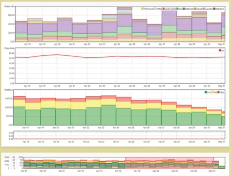
Fig. 2. View of sensor data on the improved Version 2 interface showing motion data (row 1) pulse rate (row 2), and bed restlessness (row 3). Notice the time range selection bar at the bottom (row 4). The highlighted date range is the range displayed in the large view.
3.5 Dynamic Options
One feature of the Version 2 interface is that users have control over what measures to add to the graphical display. For example, Fig.2shows stacked histograms of motion sensor data, a graph of pulse rate below, and stacked histograms of bed restlessness below that. Viewing features together was a suggestion made by the research team during the iterative design process. However, there are still measures that the user is more likely to want to see than others. This leads to the decision of what to put as defaults. The use of defaults can increase the pace of work [17] by anticipating the most likely scenario that the user will want.
One problem that may arise from dynamic options is that the user may be over-whelmed by too many options, causing mental fatigue and frustration. As the study continues, there will be more insight into how much control by the user is too much control. For now, one way of helping the user to not get overwhelmed is to only show options on the control panel that are relevant to the current display. For instance, if users view a chart showing the restlessness, breathing rate, and pulse rate for a senior, they will have the option to change the pulse algorithm. However, if they are only Fig. 3. User control panel, which is located on the right hand side of the screen, and dynamically shows the user which options are available. This attempts to reduce confusion as the user does not have irrelevant choices.
viewing restlessness and breathing rate, the‘Pulse Algorithm’sub-panel will be hid-den. This reduces irrelevant information as well as unnecessary visual search [16,17]. For the Version 2 interface, once a research subject ID is selected, the default is to show only the motion sensor data for the past month calculated at the daily precision level. The reason for this default is that researchers generally like to see a view of the senior resident’s general activity patterns over a broad time period if the interface is accessed from an alert email [3].
4
Future Work
The analysis and redesign have brought numerous improvements to the web interface design. However, there are still aspects that will need to be improved, as it is an ongoing development project. As the interface continues to evolve, more specific features for varying user types will be formed. Usability testing will be performed on both tablet and desktop configurations, and adjustments will be made. Ultimately, we will investigate usability for senior users who may have cognitive, mobility, or visual impairments.
4.1 Accommodating Different User Types and Motivations
Viewing health-related data may have significant usability differences depending on the types of users that are accessing it. For this particular interface, there are at least three types of users: clinical researchers, technical researchers, and consumers (elderly users and their family members). The technical researchers tend to want access to precise data, as well as raw signals from the sensors, in order to easily see if their devices are working properly and how they work under different conditions. Clinical researchers also like to see a wide variety of measures, but less detailed information than the technical researchers. Consumers are the most different from the other two types. Generally, too much information for these users can be fatiguing, as raw signals or extra data are likely meaningless. However, general trends in health such as seeing the trend line of the average heart rate can be very meaningful. User differences such as these will be investigated as part of our future work.
References
1. Skubic, M., Alexander, G., Popescu, M., Rantz, M., Keller, J.: A smart home application to eldercare: current status and lessons learned. Technol. Health Care17(3), 183–201 (2009) 2. Rantz, M.J., Skubic, M., Koopman, R.J., Alexander, G., Phillips, L., Musterman, K.I., Back,
J.R., Aud, M.A., Galambos, C., Guevara, R.D., Miller, S.J.: Automated technology to speed recognition of signs of illness in older adults. J. Gerontological Nurs.38(4), 18–23 (2012) 3. Rantz, M., Scott, S.D., Miller, S.J., Skubic, M., Phillips, L., Alexander, G., Koopman, R.J., Musterman, K., Back, J.: Evaluation of health alerts from an early illness warning system in independent living. Comput. Inform. Nurs.31(6), 274–280 (2013)
4. Heise, D., Rosales, L., Sheahen, M., Su, B.Y., Skubic, M.: Non-invasive measurement of heartbeat with a hydraulic bed sensor: progress, challenges, and opportunities. In: Proceedings of the 2013 IEEE International Instrumentation & Measurement Technical Conference, Minneapolis, MN, pp. 4356–4360 (2013)
5. Rosales, L., Skubic, M., Heise, D., Devaney, M.J., Schaumburg, M.: Heartbeat detection from a hydraulic bed sensor using a clustering approach. In: Proceedings of the International Conference on IEEE Engineering in Medicine and Biology Society, San Diego, CA, pp. 2383–2387 (2012)
6. Su, B.Y., Ho, K.C., Skubic, M., Rosales, L.: Pulse rate estimation using hydraulic bed sensor. In: Proceedings of the International Conference on IEEE Engineering in Medicine and Biology Society, San Diego, CA, pp. 2587–2590 (2012)
7. Stone, E., Skubic, M.: Unobtrusive, continuous, In-HomeGait measurement using the microsoft kinect. IEEE Trans. Biomed. Eng.60(10), 2925–2932 (2013)
8. Kaye, J., Maxwell, S., Mattek, N., Hayes, T., Dodge, H., Pavel, M., Jimison, H., Wild, K., Boise, L., Zitzelberger, T.: Intelligent systems for assessing aging changes: home-based, unobtrusive and continuous assessment of aging. J Geron. B Psych. Sci. 66B, 180–190 (2011)
9. Hussain, S., Enrdogen, S., Park, J.: Monitoring user activities in smart home environments. Inf. Syst. Front.11, 539–549 (2009)
10. Cuddihy, P., Hinman, R.T., Avestruz, A., Lupton, E.C., Livshin, G., et al.: Successful aging. Pervasive Comput.3(2), 48–50 (2004)
11. Wang, S., Skubic, M., Zhu, Y.: Activity density map visualization and dis-similarity comparison for eldercare monitoring. IEEE J. Biomed. Health Inf.16(4), 607–614 (2012) 12. Galambos, C., Skubic, M., Wang, S., Rantz, M.: Management of dementia and depression
utilizing in-home passive sensor data. Gerontechnology11(3), 457–468 (2013)
13. Alexander, G.L., Wakefield, B.J., Rantz, M., Skubic, M., Aud, M., Erdelez, S., Ghenaimi, S.A.: Passive sensor technology interface to assess elder activity in independent living. J. Nurs. Res.60(5), 318–325 (2011)
14. Le, T., Reeder, B., Chung, J., Thompson, H., Demiris, G.: Design of smart home sensor visualizations for older adults. Technol Health Care, July 2014
15. Reeder, B., Chung, J., Le, T., Thompson, H., Demiris, G.: Assessing older adults’ perceptions of sensor data and designing visual displays for ambient environments: an exploratory study. Meth. Inf Med.53(3), 152–159 (2014)
16. Smelcer, J.B., Miller-Jacobs, H., Kantrovich, L.: Usability of electronic medical records. J. Usability Stud.4(2), 70–84 (2009)
17. U.S. Dept. of Health and Human Services. The Research-Based Web Design & Usability Guidelines, Enlarged/Expanded edition. Washington: U.S. Government Printing Office (2006)