BIROn - Birkbeck Institutional Research Online
McBrien, P. and Poulovassilis, Alexandra (2019) A Conceptual Modelling
Approach to Visualising Linked Data. In: Panetto, H. and Debruyne, C.
and Hepp, M. and Lewis, D. and Agostino Ardagna, C. and Meersman, R.
(eds.) Proceedings of On the Move to Meaningful Internet Systems, OTM
2018 Conferences. Lecture Notes in Computer Science 11877. Springer,
pp. 227-245. ISBN 9783030332457.
Downloaded from:
Usage Guidelines:
Please refer to usage guidelines at
or alternatively
Visualising Linked Data
Peter Mc.Brien1[0000−0002−2153−9625] and Alexandra Poulovassilis2[0000−0001−8981−4104]
1
Dept. of Computing, Imperial College,
180 Queen’s Gate, London SW7 2BZ,[email protected]
2
Birkbeck Knowledge Lab, Birkbeck, University of London, Malet Street, London WC1E 7HX,[email protected]
Abstract. Increasing numbers of Linked Open Datasets are being
pub-lished, and many possible data visualisations may be appropriate for a user’s given exploration or analysis task over a dataset. Users may therefore find it difficult to identify visualisations that meet their data exploration or analyses needs. We propose an approach that creates con-ceptual models of groups of commonly used data visualisations, which can be used to analyse the data and users’ queries so as to automatically generate recommendations of possible visualisations. To our knowledge, this is the first work to propose a conceptual modelling approach to recommending visualisations for Linked Data.
1
Introduction
There are numerous Linked Open Datasets available on the web, and supporting their visual exploration and analysis by potential users is a pressing need. Con-versely, there are many possible data visualisations that might be appropriate for a given user task,e.g. as provided by a typical visualisation library such as D3 or Google Charts. It may therefore be hard for users to select appropriate visualisations to meet their specific exploration or analysis needs with respect to a given dataset.
browsing and exploration [6, 4, 19, 17, 31], faceted search [37, 2, 24] or structural summaries [5, 23].
Current approaches to visualising linked data provide a limited set of data visualisations that are oriented specifically towards visualising RDF graphs or ontologies, or that support more general data visualisation capabilities but with-out the intermediate conceptual abstraction and recommendation process for the user that we propose here (see Section 2). In contrast, to our knowledge ours is the first work to propose a conceptual modelling approach to recommending visualisations for Linked Data to users.
We continue the paper with a review in Section 2 of related work on data visualisation in general and visualising linked data specifically, contrasting this with our approach. Section 3 describes an example use case motivating our ap-proach. Section 4 presents OWL specifications characterising several groups of common data visualisations, as well as SPARQL query templates corresponding to the OWL visualisation patterns. Section 5 discusses transformations that can be applied to users’ SPARQL queries so that they match the SPARQL query templates. Section 6 summarises our contributions and presents possible direc-tions for further work.
2
Related Work
Data Visualisation. The field of data visualisation is a very active one (for reviews seee.g. [1, 43, 39]) and is continuing to expand with the advent of ‘big data’ arising from web-scale applications and the need to develop new techniques for exploring such data [15]. Current data visualisation tools (e.g. Tableau3, D34, Google Charts5) require users to manually select from typically tabular data, apply transformations, and select appropriate visual encodings from a vast array of possibilities. The user may therefore find it hard to understand the meaning of the data, the transformations that may be applied to it, and the range of visualisation possibilities, and may easily fail to ‘see the wood for the trees’.
For these reasons, there has been work towards automated recommendation of visualisation possibilities and for ranking recommendations [20, 35, 27, 47]. The SemVis system [14] reduces the visualisation search space by using a domain on-tology for mapping the source data into a visual representation onon-tology storing ‘knowledge about visualisation tools’, and a bridging ontology to map between the domain ontology and the visual representation ontology. Our work is similar in spirit to this, but we do not require the availability of a domain or a bridging ontology.
Other recent work that is close to ours is the Voyager system [48] which provides techniques aiming to aid the user in selecting appropriate visualisa-tions, including faceted browsing of visualisation recommendavisualisa-tions, and
auto-3
https://www.tableau.com/products/desktop
4
https://github.com/d3/d3/wiki/Gallery
5
matic clustering and ranking of visualisations according to data properties and perceptual effectiveness principles. However, this work focusses on the visuali-sation of a single relational table of data. It also does not undertake matchings between the data and conceptual-level representations of visualisations.
Several works have derived taxonomies of classes of visualisatione.g. [36, 11, 41]. However, they focussed on properties of the data (dimensionality, de-pendent/independent variables, discrete/continuous, ordered/unordered) rather than capturing different visualisations as instances of a conceptual visualisation schema.
Finally, languages proposed for manipulating graphical data (e.g. Tableau’s VizQL [38], Wilkinson’s Grammar of Graphics [46], R’s Tidyr package [33]) require programmers to manually select data, apply transformations, and select appropriate visual encodings.
Visualising Linked Data. Many research works and systems have ad-dressed the visualisation of linked data (for reviews see e.g. [12, 32, 8]). There have been many proposals for visualising ontologies [25, 26, 45, 13] and RDF graphs [10, 22, 3, 7]. These proposals typically provide a fixed set of tree- or network-oriented data visualisations for viewing the graph structure of the data and/or the ontology, with little extensibility or customisation capability.
There are also proposals that support more general visualisation capabilities for linked data which allow end users to interactively select data and visualisa-tions [18, 42, 34, 40, 9]. There has also been work on combining faceted search with data analytic visualisations, mainly in application-specific settings [21, 28, 24].
Graziosi et al. [16] discuss the difficulty of producing visualisations for linked data for users with little technical knowledge of semantic web technologies or programming. They present a reference model for building tools that generate customisable “infoviews” and conduct a survey of existing tools in terms of their customisation capabilities. Issues relating to the scalability of exploration and visualisation approaches in the face of large, distributed linked datasets are discussed by Bikakis and Sellis [8].
None of these works provide the conceptual abstraction of groups of visuali-sations nor a recommendation process for the user as we propose here.
Our own previous work [30] also proposed a conceptual modelling approach towards data visualisation. However, that was in the context of structured data sources with the assumption that strict schema information is available or infer-able, and with schema-level matching being undertaken between the schema of the data on the one hand and the visualisation schema patterns on the other.
Finally, we note that our abstraction of classes of commonly used data vi-sualisations generalises the visualisation capabilities of graph database systems such as GraphDB6which guide the user towards creating specific visualisations.
6
3
Motivating Example
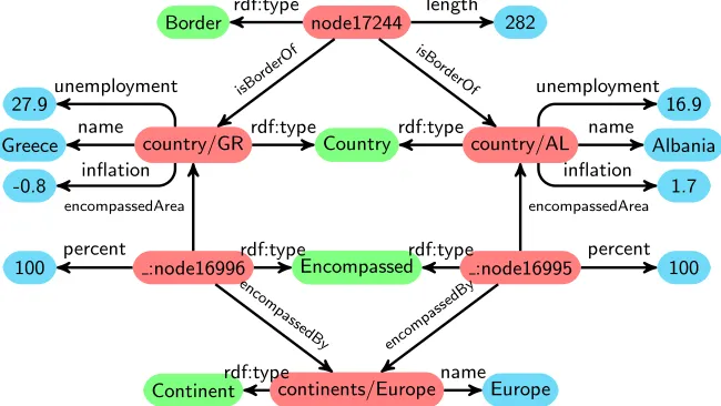
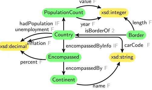
To motivate our approach we consider the Mondial database [29], which is avail-able in RDF. A small fragment of it is illustrated in Figure 1, with the relevant part of the OWL Schema illustrated in Figure 2. In these figures, the directional arrows represent properties, with the arrow going from the domain to the range to the property.
Country country/GRrdf:type
Greece name
-0.8 inflation 27.9unemployment
country/AL rdf:type
Albania name
1.7 inflation
16.9 unemployment node17244
Border rdf:type length 282
isB ord
erOf
isBor derO
f
Encompassed :node16996rdf:type
100 percent
encompassedArea
:node16995 rdf:type
100 percent
encompassedArea
continents/Europe
Continentrdf:type nameEurope
enco mpa
ssedB y
encom passed
[image:5.612.146.471.209.392.2]By
Fig. 1.RDF Graph of countries and their borders from the Mondial database
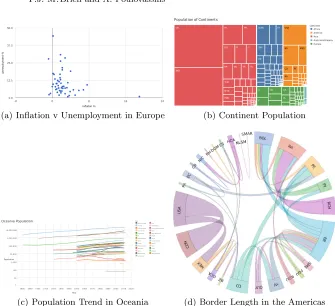
The fragment of the Mondial database that we consider here contains coun-tries, the continents they are within (some countries may span two continents), the length of the border between pairs of countries, and the population history of countries. Figure 3 shows a number of visualisations of this data. Each is presenting different information about the Country class, but in different ways according to the properties and datatypes being queried. In this paper we assume that users formulate SPARQL queries to extract the data they are interested in viewing, but then require guidance as to which visualisation method can be used, and we use OWL schema information such as that presented in Figure 2 to guide that process.
4
OWL Patterns for Visualisation
Country
xsd:decimal
unemploymentF
inflationF
Border isBorderOf2
Encompassed
encompassedByInfoIF
percentF xsd:string
carCode F
Continent
encompassedByF
nameF
PopulationCount
hadPopulationIF
xsd:integer
yearF
valueF
[image:6.612.181.432.121.270.2]lengthF
Fig. 2.Fragment of the OWL Schema for the Mondial Database. Functional properties
are labelled F, inverse functional properties are labelled IF, and maximum cardinality two properties are labelled 2.
with a class can be used to alter a channel of the mark associated with that class — we refer to such properties asdimensionsof the class instances.
Taking an approach similar to Tableau7, and our previous work [30], we distinguish two major types of dimensions (we note that these are different to the ‘discrete’ and ‘continuous’ dimensions of [41]):
– discrete dimensionshave a relatively small number of distinct values, that may nor may not have a natural ordering; they are used to label a mark or to vary a channel of a mark. Examples include the code associated with a country or the year associated with a population census.
– scalar dimensions have a relatively large number of distinct values with a natural numeric ordering (e.g.integers, real numbers, timestamps, dates); these are represented by a channel associated with a mark. Examples include the population of a country in a particular year, or the area of a country.
When a dimension is represented by a colour channel, then for a discrete dimension we assume that a colour key can be used, while for a scalar dimension we assume that a spectrum of colours can be used. Both discrete and scalar dimensions may have additional real-world characteristics,e.g. their data may be geographical, temporal, or lexical, which may suggest specific visualisations for their representation.
In the following subsections, we develop progressively more complex patterns of classes and properties, each characterising a group of possible alternative visualisations. Our approach aims to provide the user with assistance in selecting appropriate visualisations and should be viewed as being complementary to user interface design aspects such as interaction design and task-based visualisation design. To illustrate how the visualisation patterns could be applied in practice,
7
-8 0 8 16 24 0.0
12.5 25.0 37.5 50.0
inflation %
unemp
loymen
t %
(a) Inflation v Unemployment in Europe
UA
PL I GB
F D VN TR
THA RP
ROK RI
R PK
MYA J
IR IND
CN
BD
USA
RA PE
MEX
CO BR
ZRE WAN ET
DZ
Population of Continents
Continent Africa America Asia Australia/Oceania Europe
(b) Continent Population
[image:7.612.139.474.98.404.2](c) Population Trend in Oceania (d) Border Length in the Americas
Fig. 3.Example visualisation of country data based on patterns
we conclude the description of each by listing the SPARQL query template that is implied by the visualisation pattern, together with the user queries matching this query template that have been used to generate the visualisations shown in Figure 3.
4.1 Class with data properties
Starting from our two basic assumptions (1) and (2) above, we can identify the graph patternillustrated in Figure 4(a), showing a class,CA, with one or more functional data properties, DPA1. . .DPAn. This graph pattern can be formally specified by the followingvisualisation pattern, expressed in OWL:
DataPropertyDomain(DPA1 CA) DataPropertyRange(DPA1 TA1) . . .
DataPropertyDomain(DPAn CA) DataPropertyRange(DPAn TAn)
DataProperty(DPA1) FunctionalProperty(DPA1) . . .
DataProperty(DPAn) FunctionalProperty(DPAn)
CA DPA1 TA1
.. . TAn TAK DPAK
DPAn
(a) Class with a key data property
CA DPA1 TA1
.. . TAn TAK DPAK
DPAn
CB PAB
TB1 DPB1
.. . TBn
TBK DPBK
DPBn
(b) Two classes connected by a function object property
CA DPA1 TA1
.. . TAn TAK DPAK
DPAn CB
PAB
TB1 DPB1
.. . TBn
TBK DPBK
DPBn
CC PAC
TC1 DPC1
.. . TCn
TCK DPCK
DPCn
[image:8.612.163.447.116.413.2](c) Three classes connected by two functional object properties
Fig. 4.Graph Patterns for Visualisations
A; variablesTA1,TA2, . . . to denote the ranges of such data properties; variable
DPAK to denote a data property of a class A that is a key; variable TAK to denote the range of such a data property; and variablePABto denote an object property between classes A and B.
Some visualisations (such as scatter diagrams) do not require that each mark be labelled with a meaningful unique label, whilst others (such as bar charts) do require such labels if they are to be useful. We indicate such a key with a dashed line in the graph pattern, which adds the following additional statements to the OWL visualisation pattern:
DataPropertyDomain(DPAK CA) DataPropertyRange(DPAK TAK)
HasKey(CA () (DPAK)) DataProperty(DPAK) FunctionalProperty(DPAK)
Each instance of the classCAwill result in a mark, and its associated values of TA1. . .TAn will determine the channels of the mark. If there is a key TAK
Many visualisations match this visualisation pattern, and we list below an indicative sample, summarised in the table below:
– In ascatter diagramthe marks are points, and two scalar dimensionsTA1
andTA2 are used to alter thexandy coordinates of the points. If there is aTAK present it can be used to label the points. The colour, shape,etc of the point can be altered by additional optional dimensionsTA3, . . . . – In abubble chart, the concept of a scatter diagram is refined to use a third
scalar dimensionTA3to change the size of the point.
– In acalendar chartthe marks are entries in a calendar, and hence the value of dimensionTA1 must be a date to identify which slot on the calendar is used.
– Basic bar charts use each value of TAK to label one bar, and the scalar value ofTA1to change the length of the bar. There is a limit to the number of bars that can be displayed so that the chart remains comprehensible. In the table below, we therefore limit the cardinality of the classCA to be at most 100, constraining the selection of this type of visualisation to data that satisfies this constraint (the limit of 100 is of course subjective and would be tunable in an implementation).
– A choropleth map uses each value of TAK to identify regions on a map, and the scalar value ofTA1to change the colour of the region.
– In word clouds, the value of TAK is used to determine the word to be plotted, and the scalar value ofTA1to determine the size of the word.
The analysis above is summarised in the table below. All of these visualisations can support additional channels by altering the colour, texture, or other aspects of the mark. This is illustrated in the table by colour or texture dimensions in the optional column, which are extensible with additional dimensions of the data, mapping to additional channels in the visualisation. The notation |CA| is used to denote the number of instances of a classCA, so for example, we allow any number of instances to be visualised in a calendar chart, but restrict bar charts to have up to one hundred bars.
Visualisations for Classes with Data Properties
Name |CA| mandatory optional
Calendar Chart 1..* TA1temporal scalar TAK,TA2colour Scatter Diagrams 1..* TA1,TA2scalar TAK,TA3colour Bubble Charts 1..* TA1,TA2,TA3scalar TAK,TA4colour
Bar Chart 1..100 TAK,TA1scalar
-Choropleth Maps 1..* TAKgeographical, TA1colour TA2texture Word Clouds 1..* TAKlexical,TA1scalar TA2colour
SELECT ?TAK ?TA1 ?TAn WHERE {
?CA r d f: t y p e : CA ;
: DPK ?TAK ;
: DPA1 ?TA1 .
}
SELECT ? i n f l a t i o n ? unemployment WHERE {
? c r d f: t y p e : C o u n t r y ; : i n f l a t i o n ? i n f l a t i o n ;
: unemployment ? unemployment ;
}
A system implementing our approach would match the user’s query against the SPARQL query pattern corresponding to each group of visualisations (as presented here and in the following subsections); in this particular example, the user’s query matches the SPARQL query template shown above left. The system would then validate that the OWL visualisation pattern is satisfied by matching it against the RDFS/OWL statements in the dataset that is being queried which relate to the classes and properties mentioned in the user’s query. The group of visualisations that are satisfied (if any) would then be checked against the data for the additional constraints (see e.g. the above table) relating to individual visualisations. In our particular example, the Calendar Chart, Chloropeth Map and Word Cloud would be discounted due to the data type constraints onTA1or
TAK; and the Bar Chart would be discounted due to the cardinality constraint onCA. The remaining set of visualisations would finally be offered to the user as possible alternatives for generating their visualisation. In our particular example, a scatter diagram or bubble chart would be offered. If the user selects a scatter diagram, then the diagram shown in Figure 3(a) is produced.
We assume here that users’ SPARQL queries do not contain OPTIONAL
clauses and therefore only full matches with respect to the data are returned. Exploring the interplay of OPTIONAL clauses with the recommendation tech-niques that we propose here is an interesting area of future work.
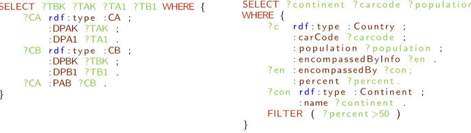
4.2 Two classes linked by a functional property
We now consider the case where in addition to having data properties and a key data property, a class CA is the domain of an object property PAB whose range is another classCB. This is illustrated in the graph pattern in Figure 4(b) which can be specified by the OWL statements below being added to those of the previous subsection, giving an overall OWL visualisation pattern for this second group of visualisations:
ObjectPropertyDomain(PAB CA) ObjectPropertyRange(PAB CB) DataPropertyDomain(DPBK CB) DataPropertyRange(DPBK TBK) DataPropertyDomain(DPB1 CB) DataPropertyRange(DPB1 TB1) . . .
DataPropertyDomain(DPBn CB) DataPropertyRange(DPBn TBn)
HasKey(CB () (DPBK)) FunctionalProperty(PAB) DataProperty(DPBK) FunctionalProperty(DPBK) DataProperty(DPB1) FunctionalProperty(DPB1) . . .
DataProperty(DPBn) FunctionalProperty(DPBn)
Visualisations that represent two classes together rather than a single class are less common, but some examples are listed below:
– In a tree map, rectangles representing instances of class CB are divided into rectangles representing instances of classCA, the area of which is pro-portional to the value of a scalar dimensionTA1. Typically it is a dimension
TB1of CB that is used to colour the rectangles, and additional dimensions such asTA2are used for texture,etc.
– In ahierarchy tree, nodes represent instances ofCBthat are connected by lines to circles representing instances ofCA. Since the nodes are at distinct levels, optionally it is possible to use TA1 to colour one level, and TB1 to colour the other level.
– A circle packing represents instances of CB by circles, with instances of
CAplaced as circles inside the circle of their parent instance ofCB. A scalar dimensionTA1 is used to determine the area of the circles ofCA. Similarly to a hierarchy tree, distinct dimensions can be used to colour distinct levels of the circles.
– Asunburstrepresents instances ofCBby segments of a central circle, with segments of an outer circle divided representing instances ofCA, placed out-side of the corresponding instance ofCB. The relative size of the segment is determined byTA1. Similarly to a hierarchy tree, distinct dimensions can be used to colour distinct rings of the sunburst.
We note that all of these visualisations support additional levels in the hier-archy, such that one could add a third classCCconnected by functional property
PBCfromCB giving an additional level to the hierarchy.
The table below summarises the above analysis, where|CA PAB CB|presents the number of instances inCA that are associated viaPAB to each instance ofCB. The upper cardinality figures given (such as 20 for the top level of a tree map) are there to guide the user towards selection of an uncluttered visualisation, and are not a rigid limit. The restrictions proposed are subjective, and aesthetics-driven, but serve to direct users to choosing appropriate visualisations so as to avoid sit-uations where the amount of data would ‘clutter’ a particular type visualisation. In any implementation these limits should of course be user-configurable.
Visualisations for functional properties
Name |CB| |CA PAB CB| mandatory optional
Tree Map 1..20 1..100 TAK,TBK,TA1 scalar TB1colour,TA2colour Hierarchy Tree 1..100 1..100 TAK,TBK TA1colour,TB1colour Sunburst 1..20 1..20 TAK,TBK,TA1 scalar TA1colour,TB1colour Circle Packing 1..20 1..20 TAK,TBK,TA1 scalar TA1colour,TB1colour
the concatenation of encompassedByInfo and encompassedBy to be functional, and hence matchPAB in the query template. Following such a transformation, for the Mondial database the tree map and hierarchy tree are offered as alter-native visualisations. If the user selects a tree map, then the diagram shown in Figure 3(b) is produced.
SELECT ?TBK ?TAK ?TA1 ?TB1 WHERE {
?CA r d f: t y p e : CA ;
: DPAK ?TAK ;
: DPA1 ?TA1 .
?CB r d f: t y p e : CB ;
: DPBK ?TBK ;
: DPB1 ?TB1 .
?CA : PAB ?CB .
}
SELECT ? c o n t i n e n t ? c a r c o d e ? p o p u l a t i o n
WHERE {
? c r d f: t y p e : C o u n t r y ;
: ca r Co d e ? c a r c o d e ;
: p o p u l a t i o n ? p o p u l a t i o n ;
: e n c o m p a s s e d B y I n f o ? en .
? en : en co m p a s s ed B y ? con ;
: p e r c e n t ? p e r c e n t . ? con r d f: t y p e : C o n t i n e n t ;
: name ? c o n t i n e n t .
FILTER ( ? p e r c e n t>50 )
}
4.3 Two classes linked by a key functional property
A different set of visualisations are specified if we change the HasKey(CA ()
(DPAK))definition in the previous subsection to
HasKey(CA () (DPAK PAB))
so that it is the combination ofTAKandCBthat identify instances ofCA. In this case, instances ofCAare in a sense dependent on instances ofCB, and a number of visualisations naturally support such a dependency, a selection of which are listed below:
– In aline chart each line represents an instance ofCB labelled withTBK;
TAKrepresents a scalar dimension to be plotted along the x-axis; andTA1
must be a scalar dimension to be plotted along the y-axis. XY variations of line charts allow an additional dimensionTA2 to be added to the y-axis. Optionally, additional dimensions TA3 could colour the points of the line, andTB1colour the lines.
– In aspider chart, each ring represents an instance ofCB, labelled byTBK, and each spoke a value ofCA labelled byTAK; the intersection of the ring with a spoke is determined byTA1. Similarly to line charts, additional di-mensions TA2 could colour the points of intersection, and TB1 colour the lines. For this visualisation type, we requireCA to be complete with re-spect toCB, by which we mean that all instances ofCBshould appear with the same (or almost the same) set of values for TAK so that the different instances ofTBKcan be can be compared for each instance of TAK. – In astacked bar chart, instances ofCBare represented by a bar labelled by
[image:12.612.136.479.197.294.2]– Agroup bar chartis similar to a stacked bar chart, with one group labelled byTBK, and each bar in the group having its height determined byTA1and labelled and coloured byTAK. There is no need forCA to be complete with respect toCB. OptionallyTA2could alter the texture of the bars.
The table below summarises the above analysis. Again the upper cardinalities shown for|CB|and|CA|are aesthetics-driven and would be user-configurable.
Visualisations of key functional properties Name |CB| |CA| complete mandatory optional
Line 1..20 1..* no TAKscalar,TBK,TA1 scalar TA2scalar,TA3/TB1colour Spider 3..10 1..20 yes TAK,TBK,TA1 scalar TA2/TB1colour
Stacked Bar 1..100 1..20 yes TAKcolour,TBK,TA1scalar TA2texture Grouped Bar 1..20 1..20 no TAKcolour,TBK,TA1scalar TA2texture
The SPARQL query template for this group of visualisations listed below left is the same as in the previous subsection. Below right is a user’s SPARQL query asking for the historical population trends of countries in Oceania that matches the query template and OWL visualisation pattern, and produces Figure 3(c) if the user selects to view the data on a line chart.
SELECT ?TBK ?TAK ?TA1 ?TB1 WHERE {
?CA r d f: t y p e : CA ;
: DPAK ?TAK ;
: DPA1 ?TA1 .
?CB r d f: t y p e : CB ;
: DPBK ?TBK ;
: DPB1 ?TB1 .
?CA : PAB ?CB .
}
SELECT ? c o u n t r y ? y e a r ? p o p u l a t i o n
WHERE {
? c r d f: t y p e : C o u n t r y ;
: name ? c o u n t r y ;
: e n c o m p a s s e d B y I n f o ? en .
? py r d f: t y p e : P o p u l a t i o n C o u n t ; : y e a r ? y e a r ;
: v a l u e ? p o p u l a t i o n .
? c : h a d P o p u l a t i o n ? py .
# F i l t e r c o n d i t i o n s
? en : en co m p a s s ed B y ? con .
? con r d f: t y p e : C o n t i n e n t ;
: name ” A u s t r a l i a / O c e a n i a ” .
}
4.4 Three classes linked by functional properties
As illustrated in the graph pattern in Figure 4(c), suppose that we introduce a third classCC structured in a similar way toCB, through the following OWL statements:
ObjectPropertyDomain(PAC CA) ObjectPropertyRange(PAC CC) DataPropertyDomain(DPCK CC) DataPropertyRange(DPCK TCK) DataPropertyDomain(DPC1 CC) DataPropertyRange(DPC1 TC1) . . .
DataPropertyDomain(DPCn CC) DataPropertyRange(DPCn TCn)
HasKey(CC () (DPCK)) FunctionalProperty(PAC) DataProperty(DPCK) FunctionalProperty(DPCK) DataProperty(DPC1) FunctionalProperty(DPC1) . . .
and that theHasKeyonCAis changed to
HasKey(CA () (PAB PAC))
so that instances of CA are identified by combinations of instances ofCB and
CC. With this visualisation pattern, we can regard CA as modelling a many-many relationship between the two classes CB and CC, leading to a group of visualisations that target a network view of data, such as the following:
– In sankey diagrams, the left hand elements of the diagram represent in-stances ofCB, the right hand elements represent instances of CC, and the width of the flow between the left and right elements represents scalar di-mension TA1. Optionally, a second attribute TA2 may be represented by varying the colour of the connection.
– In network charts, instances of CB and CC are represented by nodes in the graph, with an instance ofCA that is connected to both an instance of
CBand an instance of CC being represented by an edge between these two nodes. A optional scalar attributeTA1can vary the colour of the line. – In chord diagrams, instances of CB and CC are represented by points on
the perimeter of the circle, with the value ofTA1 varying the width of the connection between pairs of points. Again, a second attribute TA2 of the many-many relationship may be represented by varying the colour of the connection.
– Inheatmap tables, instances of CB and CC are represented by cells of a table, with the colour of the cell varied usingTA1. Optional attributeTA2, can be represented using texture.
We note that network charts, chord diagrams and heatmap tables can be used to represent reflexiverelationships where CB and CC are the same class (let us sayCB), so that the nodes/cells represent instances ofCB, andCA has two properties associating it toCB.
The table below summarises the above analysis. Whilst most of this group of visualisations support optional dimensions being represented as a colour channel, an exception is heatmaps, which require the use of colour in a mandatory channel, and hence in this case we illustrate the optional dimensions by the use of texture.
Visualisations for a non-functional property Name |CB| |CC| reflexive mandatory optional Sankey 1..20 1..20 no TA1scalar TA2colour Network Chart 1..1000 1..1000 yes - TAK,TA1colour
Chord 1..100 1..100 yes - TA1size,TA2 colour
Heatmap 1..100 1..100 yes TA1colour TA2texture
SELECT ?TBK ?TCK ?TA1 WHERE {
?CA r d f: t y p e : CA ;
: PAB ?CB ;
: PAC ?CC ;
: DPA1 ?TA1 .
?CB r d f: t y p e : CB ;
: DPBK ?TBK .
?CC r d f: t y p e : CC ;
: DPCK ?TCK .
}
SELECT ? c o u n t r y 1 ? c o u n t r y 2 ? l e n g t h WHERE {
? b r d f: t y p e : B o r d e r ;
: i s B o r d e r O f ? c1 ;
: i s B o r d e r O f ? c2 ;
: l e n g t h ? l e n g t h .
? c1 r d f: t y p e : C o u n t r y ;
: ca r Co d e ? c o u n t r y 1 .
? c2 r d f: t y p e : C o u n t r y ;
: ca r Co d e ? c o u n t r y 2 .
# F i l t e r c o n d i t i o n s
FILTER (? c o u n t r y 1<? c o u n t r y 2 )
}
5
Transformations to match Visualisation Patterns
It will often be the case that an RDF graph does not contain the precise structure required by a visualisation pattern. This is for two main reasons:
– The schema of the data is not fully defined, for example it is often the case that OWL hasKey properties are not specified (e.g. the original Mondial schema omits these, despite the keys being defined in the relational version of the database), and even RDFSfunctionalPropertydeclarations are some-times not specified where they could have been (e.g. in YAGO, www.mpi-inf.mpg.de/yago-naga/yago/).
– The loosely structured nature of linked data results in inconsistency and variants of data, so that data may need to be filtered and restructured before being used for a particular visualisation or group of visualisations.
We therefore describe in this section two indicative transformations that can be applied to users’ SPARQL queries to make them match a visualisation pattern.
Functional Subqueries: if a user SPARQL query can be rewritten to contain a subquery returning?Xand?Y, such that the value of?Xfunctionally determines the value of ?Y, then we can regard the subquery as matching any pattern requiring a functional property of the form ?X :PXY ?Y.
Taking the example from Section 4.2 we can apply a rewriting as follows:
User Query
SELECT ? c o n t i n e n t ? c a r c o d e ? p o p u l a t i o n
WHERE {
? c r d f: t y p e : C o u n t r y ;
: ca r Co d e ? c a r c o d e ;
: p o p u l a t i o n ? p o p u l a t i o n ;
: e n c o m p a s s e d B y I n f o ? en .
? en : en co m p a s s ed B y ? con ;
: p e r c e n t ? p e r c e n t . ? con r d f: t y p e : C o n t i n e n t ;
: name ? c o n t i n e n t .
FILTER ( ? p e r c e n t>50 )
}
Transformed Query
SELECT ? c o n t i n e n t ? c a r c o d e ? p o p u l a t i o n
WHERE {
? c r d f: t y p e : C o u n t r y ;
: ca r Co d e ? c a r c o d e ;
: p o p u l a t i o n ? p o p u l a t i o n .
? con r d f: t y p e : C o n t i n e n t ;
: name ? c o n t i n e n t .
SELECT ? c ? con
WHERE {
? c : e n c o m p a s s e d B y I n f o ? en .
? en : en co m p a s s ed B y ? con ;
: p e r c e n t ? p e r c e n t .
FILTER ( ? p e r c e n t>50 )
In general, we can determine that the variables of such a subquery obey the functional property if either the properties that bind them together are functional (which is not the case in this example), or if the subquery when executed obeys the functional property (which is the case in this example). Denormalisation of attributes: Suppose we wish to extend the scatter dia-gram in Figure 3(a) to include information about the population of a country, and the continent it is within, with the user SPARQL query below left:
User Query
SELECT ? c a r c o d e ? i n f ? unemployment
? c o n t i n e n t ? p o p u l a t i o n
WHERE {
? c r d f: t y p e : C o u n t r y ;
: ca r Co d e ? c a r c o d e ;
: i n f l a t i o n ? i n f ;
: unemployment ? unemployment ;
: p o p u l a t i o n ? p o p u l a t i o n ;
: e n c o m p a s s e d B y I n f o ? en .
? en : en co m p a s s ed B y ? con ;
: p e r c e n t ? p e r c e n t . ? con : name ? c o n t i n e n t .
FILTER ( ? p e r c e n t>50 )
}
Transformed Query
SELECT ? c a r c o d e ? i n f ? unemployment
? c o n t i n e n t ? p o p u l a t i o n
WHERE {
? c r d f: t y p e : C o u n t r y ;
: ca r Co d e ? c a r c o d e ;
: i n f l a t i o n ? i n f ;
: unemployment ? unemployment ;
: p o p u l a t i o n ? p o p u l a t i o n .
SELECT ? c ? c o n t i n e n t
WHERE {
? c : e n c o m p a s s e d B y I n f o ? en .
? en : en co m p a s s ed B y ? con ;
: p e r c e n t ? p e r c e n t .
: name ? c o n t i n e n t .
FILTER ( ? p e r c e n t>50 )
} }
The introduction ofpopulationmatches the pattern for an additional dimen-sion ofCountry, but thenameproperty is not a dimension ofCountry. However we can ‘denormalise’ thename dimension of Continentby using a subquery, which relates the instances of theCountryclass withname ofContinent.
6
Summary and Conclusions
In this paper we have proposed a conceptual modelling approach to match-ing linked data and visualisations. Our approach uses a set of “visualisation patterns” expressed in OWL each of which abstracts a group of potential visu-alisation alternatives. For each visuvisu-alisation pattern, we define a corresponding SPARQL query template. The OWL visualisation patterns and SPARQL query templates are used to analyse the data and the users’ queries, respectively, so as to make appropriate recommendations of groups of meaningful data visual-isations to the user. We have also described transformations for denormalising data, handling non-functional properties as classes, and applying filters to use non-functional properties in visualisations that normally require functional prop-erties.
of the data, in which case we can use the OWL visualisation pattern to validate that the data satisfies the requirements for generating that visualisation and we can instantiate the associated SPARQL query template in order to retrieve the data and populate the visualisation.
Future work includes implementing and empirically evaluating our approach with groups of users, investigating how the approach can be implemented as ex-tensions of tools such as Tableau, and investigating the possibility of using it in a “top-down” approach, starting with a desired visualisation type, and using that to generate SPARQL queries and drill down into data. We also need to perform an exhaustive analysis of the full range of visualisations supported by state-of-the art tools, and extend state-of-the indicative groups listed in Section 4 as necessary. This analysis may also give rise to additional visualisation groups, characterised by additional OWL visualisation patterns. Other directions of future work in-clude investigating and providing customisation features for users, and exploring the scalability of our approach when applied to large distributed heterogeneous linked datasets that need to be accessed via query or API endpoints.
References
1. N. Andrienko, G. Andrienko, and P. Gatalsky. Exploratory spatio-temporal vi-sualization: an analytical review. Visual Languages & Computing, 14(6):503–541, 2003.
2. Marcelo Arenas, Bernardo Cuenca Grau, Evgeny Kharlamov, Sarunas Marciuska, Dmitriy Zheleznyakov, and Ernesto Jimenez-Ruiz. SemFacet: semantic faceted search over yago. InInt. Conf. on World Wide Web, pages 123–126. ACM, 2014. 3. Ghislain Auguste Atemezing and Rapha¨el Troncy. Towards a linked-data based
visualization wizard. InCOLD, 2014.
4. S¨oren Auer, Sebastian Dietzold, and Thomas Riechert. OntoWiki–a tool for social, semantic collaboration. InISWC, pages 736–749. Springer, 2006.
5. Fabio Benedetti, Sonia Bergamaschi, and Laura Po. A visual summary for linked open data sources. InISWC, volume 1272, pages 173–176, 2014.
6. Tim Berners-Lee, Yuhsin Chen, Lydia Chilton, Dan Connolly, Ruth Dhanaraj, James Hollenbach, Adam Lerer, and David Sheets. Tabulator: Exploring and an-alyzing linked data on the semantic web. In3rd International Semantic Web User Interaction Workshop, page 159, 2006.
7. N. Bikakis, J. Liagouris, M. Krommyda, G. Papastefanatos, and T. Sellis. Graphvizdb: A scalable platform for interactive large graph visualization. InICDE, pages 1342–1345. IEEE, 2016.
8. N. Bikakis and T. Sellis. Exploration and visualization in the web of big linked data: A survey of the state of the art. arXiv preprint arXiv:1601.08059, 2016. 9. Nikos Bikakis, George Papastefanatos, Melina Skourla, and Timos Sellis. A
hierar-chical aggregation framework for efficient multilevel visual exploration and analysis.
Semantic Web, 8(1):139–179, 2017.
10. Josep Maria Brunetti, S¨oren Auer, and Roberto Garc´ıa. The Linked Data Visual-ization Model. InISWC, 2012.
12. Aba-Sah Dadzie and Matthew Rowe. Approaches to visualising linked data: A survey. Semantic Web, 2(2):89–124, 2011.
13. Bo Fu, Natalya F Noy, and Margaret-Anne Storey. Eye tracking the user experience - an evaluation of ontology visualization techniques. Semantic Web, 8(1):23–41, 2017.
14. O. Gilson, N. Silva, P.W. Grant, and M. Chen. From web data to visualization via ontology mapping. Computer Graphics Forum, 27(3):959–966, 2008.
15. E.Y. Gorodov and V.V. Gubarev. Analytical review of data visualization methods in application to big data. Electrical and Computer Engineering, 2013:22, 2013. 16. A. Graziosi, A. Di Iorio, F. Poggi, and S. Peroni. Customised visualisations of
linked open data. InVOILA@ISWC, pages 20–33, 2017.
17. Andreas Harth. Visinav: A system for visual search and navigation on web data.
Web Semantics: Science, Services and Agents on the World Wide Web, 8(4):348– 354, 2010.
18. Philipp Heim, Steffen Lohmann, Davaadorj Tsendragchaa, and Thomas Ertl. Sem-lens: visual analysis of semantic data with scatter plots and semantic lenses. In
7th Int. Conf. on Semantic Systems, pages 175–178. ACM, 2011.
19. Philipp Heim, J¨urgen Ziegler, and Steffen Lohmann. gFacet: A browser for the web of data. In Int. Workshop on Interacting with Multimedia Content in the Social Semantic Web (IMC-SSW’08), volume 417, pages 49–58. Citeseer, 2008.
20. J.Mackinlay. Automating the design of graphical presentations of relational infor-mation. Trans. On Graphics, 5(2):110–141, 1986.
21. Benedikt K¨ampgen and Andreas Harth. OLAP4LD - a framework for building anal-ysis applications over governmental statistics. InESWC, pages 389–394. Springer, 2014.
22. Jakub Kl´ımek, Jiˇr´ı Helmich, and Martin Neˇcask`y. Payola: Collaborative linked data analysis and visualization framework. InExtended Semantic Web Conference, pages 147–151. Springer, 2013.
23. Petr Kremen, Lama Saeeda, and Miroslav Blaˇsko. Dataset dashboard–a sparql end-point explorer. InInt. Workshop on Visualization and Interaction for Ontologies and Linked Data (VOILA 2018), 2018.
24. Petri Leskinen, Goki Miyakita, Mikko Koho, Eero Hyv¨onen, et al. Combining faceted search with data-analytic visualizations on top of a sparql endpoint. In
Int. Workshop on Visualization and Interaction for Ontologies and Linked Data (VOILA 2018). CEUR-WS. org, 2018.
25. S. Lohmann, V. Link, E. Marbach, and S. Negru. WebVOWL: Web-based visu-alization of ontologies. In Int. Conf. on Knowledge Engineering and Knowledge Management, pages 154–158. Springer, 2014.
26. Steffen Lohmann, Stefan Negru, Florian Haag, and Thomas Ertl. Visualizing on-tologies with VOWL. Semantic Web, 7(4):399–419, 2016.
27. J. Mackinlay, P. Hanrahan, and C. Stolte. Show me: Automatic presentation for visual analysis. Trans. Visualization and Computer Graphics, 13(6), 2007. 28. Michael Martin, Konrad Abicht, Claus Stadler, Axel-Cyrille Ngonga Ngomo,
Tom-maso Soru, and S¨oren Auer. Cubeviz: Exploration and visualization of statistical linked data. InInt. Conf. on World Wide Web, pages 219–222. ACM, 2015. 29. W. May. Information extraction and integration withFlorid: TheMondialcase
study. Technical Report 131, Universit¨at Freiburg, Institut f¨ur Informatik, 1999. 30. Peter McBrien and Alexandra Poulovassilis. Towards data visualisation based on
31. A.G. Nuzzolese, V. Presutti, A. Gangemi, S. Peroni, and P. Ciancarini. Aemoo: Linked data exploration based on knowledge patterns.Semantic Web, 8(1):87–112, 2017.
32. O. Pe˜na, U. Aguilera, and D. L´opez de Ipi˜na. Linked open data visualization revisited: a survey. Semantic Web Journal, 2014.
33. R Core Team. R: A Language and Environment for Statistical Computing. R Foundation for Statistical Computing, 2013.
34. Petar Ristoski and Heiko Paulheim. Visual analysis of statistical data on maps using linked open data. InESWC, pages 138–143. Springer, 2015.
35. S.F. Roth, J. Kolojejchick, J. Mattis, and J. Goldstein. Interactive graphic design using automatic presentation knowledge. InProc. CHI, pages 112–117. ACM, 1994. 36. B. Shneiderman. The eyes have it: A task by data type taxonomy for information visualizations. InThe Craft of Information Visualization, pages 364–371. Morgan Kaufmann, 2003.
37. Claus Stadler, Michael Martin, and S¨oren Auer. Exploring the web of spatial data with facete. InInt. Conf. on World Wide Web, pages 175–178. ACM, 2014. 38. C. Stolte, D. Tang, and P. Hanrahan. Polaris: A system for query, analysis, and
visualization of multidimensional relational databases. Trans. Visualization and Computer Graphics, 8(1):52–65, 2002.
39. A.C. Telea. Data visualization: principles and practice. CRC Press, 2014. 40. Klaudia Thellmann, Michael Galkin, Fabrizio Orlandi, and S¨oren Auer. Linkdaviz–
automatic binding of linked data to visualizations. In ISWC, pages 147–162. Springer, 2015.
41. M. Tory and T. Moller. Rethinking visualization: A high-level taxonomy. InProc. Information Visualization, pages 151–158. IEEE, 2004.
42. Gerwald Tschinkel, Eduardo E Veas, Belgin Mutlu, and Vedran Sabol. Using semantics for interactive visual analysis of linked open data. InISWC, pages 133– 136, 2014.
43. M.O. Ward, G. Grinstein, and D. Keim.Interactive data visualization: foundations, techniques, and applications. CRC Press, 2010.
44. C. Ware. Information Visualization: Perception for Design. Morgan Kaufmann, 3rd edition, 2013.
45. Marc Weise, Steffen Lohmann, and Florian Haag. Extraction and visualization of tbox information from sparql endpoints. InInt. Conf. on Knowledge Engineering and Knowledge Management, pages 713–728. Springer, 2016.
46. L. Wilkinson. The Grammar of Graphics. Springer, 2005.
47. G. Wills and L. Wilkinson. Autovis: automatic visualization. Information Visual-ization, 9(1):47–69, 2010.