Munich Personal RePEc Archive
Pattern of Distribution of Global CO2
Emission by Countries
Dinda, Soumyananda
S. R. Fatepuria College, Beldanga, Murshidabad, W.B., India,
Economic Research Unit, Indian Statistical Institute, Kolkata –108,
India
2005
Pattern of Distribution of Global CO
2Emission by Countries
Soumyananda Dinda*
S. R. Fatepuria College, Beldanga, Murshidabad, W.B., India. Economic Research Unit, Indian Statistical Institute, Kolkata –108, India.
2007
Abstract
This study examines carefully the distribution aspects in details, particularly the pattern of distribution of global CO2 emission. The paper investigates the share of CO2 emission for bottom 10 and top 10
percentiles, quartiles and their movements during 1960-1990.
JEL
Classification
:
Q
2, I
3, D
3Key Words:
Distribution, Quartiles, Percentiles, Carbon Emission, Inequality.
---*
Address for Correspondence: c/o, Dipankor Coondoo, Economic Research Unit, Indian Statistical Institute, 203, B.T. Road, Kolkata-108, India. Fax: +91-033 –2577 8893, Email:
[email protected],
,
[email protected]1. Introduction
A cleaner global environment and the phenomenon of global warming would call for a check on the growth rate of CO2 emission at the global level. As the global growth rate of CO2 emission is an
aggregate of the corresponding country-specific rates, it follows that any policy formulation for the control of global CO2 emission must pay attention to the country-specific emission rates and their changes over
time. Thus, any meaningful policy discussion for control of global CO2 emission require a careful
examination of the cross-country distribution patterns of global income and corresponding CO2 emission
and their changes over time. To investigate the distribution aspects in details, this paper examines the share of CO2 emission (following Kakwani (1980)) for bottom 10 and top 10 percentiles, quartiles, other
sub-groups and their movements during 1960-1990.
This paper is organized as follow: Section 2 describes data, results are discussed in section 3 and lastly paper concludes.
2.Data Description
For this exercise we have used annual per capita real GDP (PCGDP) and annual per capita CO2
(PCCO2) emission as measure of income and emission variable, respectively. The basic country-level time series data on population (Pop) and PCGDP (expressed in 1985 international prices, i.e., PPP dollars) for the period 1950-1992 were taken from the Penn World Table (Mark 5.6) available at the web site http://www.nber.org/pwt5.6. Country-level annual time series data on PCCO2 (expressed in metric tons) for the period 1950–1996 were obtained from the Tables of National CO2 Emissions1 prepared by Carbon
Dioxide Information Analysis Center (CDIAC), Oak Ridge National Laboratory (ORNL) of the USA. Combining these data, we could compile a panel data set for 88 countries covering the period 1960–1990 (Coondoo and Dinda 2002).
3. Results
The world is perceived to be a boundaryless unitary place known as global village. Conceptually, the world is one economy and each national representative behaves like individuals. The economic actions
1
1
of nation-representative individual are measured in terms of PCGDP and corresponding externality in terms of PCCO2, which is the main culprit for the global warming. As mentioned earlier, nature of the distribution would be observed in different percentile groups and their movements during 1960-90. For rigorous analysis, we also discuss the trade off between gainers and loosers (Ravallion et al. (2000)). The discussion of the major findings follows2.
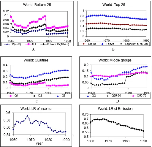
The quartile shares of CO2 emission increase over the period 1960-90. Second and third quartiles rise over
time while first quartile (Q1) declines from 9.42 per cent to 4.96 per cent (Table 1, Fig.1). The share of emission of bottom 25 and its components (i.e., bottom 10 (P0-10) and upper bottom 15 (P10-25) percentiles)
fall marginally during 1960-68, thereafter increase till 1978 (fig.1A). A sudden fall of the bottom 10 and first quartile are observed in 1979, after that increases marginally3. The emission share of bottom 10 drastically declines in post oil shock period, particularly after second oil shock in 1979 and the worldwide depression in 1981-82 (World Bank 1983). The emission share of the poorest or bottom 10 (P0-10) is 3.15
per cent in 1960 and reduces to 1.14 per cent in 1979, thereafter it rises to 1.75 per cent in 1990. So, the emission share of the poorest (P0-10) in 1990 is nearly half of that in 1960.
The share of median group (Q2) initially declines and after 1970 it increases over time due to gain in the emission share of lower middle (P25-50) group, which suddenly jumps up in 1979 (Fig.1D) and
continues to rise in 1980s. Its emission share is 3.98 per cent in 1960 and marginally increases to 4.20 per cent in 1978 and jumps to 9.67 per cent in 1979. Emission share of upper middle (P50-75) group improves
marginally over the period 1960 – 90.
The top 25% of emission share decreases slowly during 1960-90. Initially, it raises from 76.77 per cent in 1960 to 82.64 per cent in 1967 and thereafter it decreases continuously from 82.40 per cent in 1968 to 68.91 per cent in 1990. It should be noted that developed countries produce more than 2/3 of global emission during 1960-90. The developed countries are major contributors for accumulating CO2 emission
in the atmosphere during 1960-1990 and thus, they have major contribution towards global worming. The emission share of bottom rich (P75-90) group declines from 28.07 per cent in 1960 to 26.66 per cent in 1990
while emission share of top 10 percentile group decreases from 48.7 per cent in 1960 to 42.25 per cent in 1990 (Fig.1B). Thus, the richest nations emit nearly half of global emission in 1960 and marginally reduce in 1990.
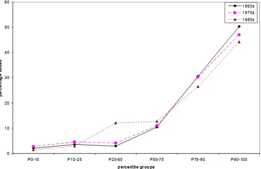
A comparative study on the decade-wise percentile groups is also important to perceive the pattern of distribution. Using Table 1, we calculate decade-wise (arithmetic) mean of each percentile group and sub-group of emission share. Figure 2 describes the distribution of average percentile shares for three decades (i.e., 1960s, 1970s and 1980s). Average emission shares of bottom 10 (P0-10) and upper bottom 15 (P10-15)
improve in 1970s but deteriorates in 1980s. It should be mentioned that poor nations suffer more in 1980s compare to 1960s and 1970s due to reduction of their emission as well as income shares. Average emission share of top 10 (P90-100) declines marginally in successive decades (i.e., 1970s and 1980s). The richest
countries enjoy better environmental quality (as emission declines) in next decades (i.e., 1980s). Fig.2 shows the evidence that lower middle (P25-50) and upper middle (P50-75) groups gain in successive decades.
Lower middle (P25-50) group gains maximum emission share in 1980s while upper middle (P50-75) group
gains marginally.
The oil shocks in 1970s and the worldwide economic depression in early 1980s affects the world economy and consequently distribution pattern of global emission4 (World Bank 1983). During these turmoil situations, lower middle (P25-50) group improves their emission share significantly while bottom 10
or less developed economies suffers more. The under developed economies loose the economic activities and thereby income due to international shocks (Unruh and Moomaw (1998), Roberts and Grimes (1997), Schmalensee et al. (1998)). The worldwide industrial recession in late 1960s has also adverse effect on the emission share of bottom 10 (Table 1).
The rising or falling tendencies of these percentile shares indicate that rich nations marginally reduce their emission shares while developing countries raise it during 1960-90. In this context it should be mentioned that Lorenz Ratio (LR) technique is used to measure the inequality of income and emission (Kakwani
2
We follow conventional methodology for calculation of income distribution (See, Kakwani (1980)). We have applied it in this study for the distribution of income and CO2 emission.
3
The oil crisises in 1970s were big shocks to the poor nations, which were highly affected (Unruh and Moomaw (1998)).
4
2
1980). LR of emission initially rises and later decreases in the World, specifically in the post oil shock period. So, emission inequality5 falls marginally over time (Fig.1F).
4. Conclusion
This paper examines the distribution pattern of CO2 emission of 88 countries spread over the
world for the period 1960-90. Emission share of top 25 decreases from 77 per cent to 70 per cent whereas bottom 25 reduces it from 9.42 per cent to 4.96 per cent during 1960-90. Only bottom 50 raises emission share from 13 per cent to 19 per cent. Emissions share of bottom 10 and top 10 decline whereas lower middle and upper middle groups raise it. So, the burden of global environmental damage (or cost of rebuilding it) should be distributed accordingly. Therefore, policy makers should be careful to formulate any policy for controlling global emission as well as global warming or global climate change.
Acknowledgements
I am grateful to Professor Dipankor Coondoo for valuable suggestions on this draft.
References:
Coondoo, D. and Dinda, S., 2002, Causality between Income and Emission: A Country group-specific Econometric Analysis, Ecological Economics, vol.-40 (3), 351 – 367.
Kakwani, N. C., 1980, Income inequality and poverty: methods of estimation and policy application, Oxford University Press, Calcutta.
Ravallion, M., Heil, M. and Jalan, J., 2000, Carbon emissions and income inequality, Oxford Economic Papers, vol.-52, 651 – 669.
Roberts, J. T. and Grimes, P. K., 1997, Carbon intensity and economic development 1962 – 1991: A brief exploration of the environmental Kuznets curve, World Development, vol.-25(2), 191-198.
Schmalensee, R. T., Stoker, M. and Judson, R. A., 1998, World Carbon Dioxide Emissions: 1950 – 2050,
The Review of Economics and Statistics, vol.-80, 15-27.
Torras, M. and Boyce, J. K., 1998, Income, inequality, and pollution: a reassessment of the environmental Kuznets Curve, Ecological Economics, vol.-25,147 – 160.
Unruh, G. C. and Moomaw, W. R., 1998, An alternative analysis of apparent EKC –type transitions,
Ecological Economics, vol.-25, 221 – 229.
[image:4.612.97.494.489.698.2]World Bank, 1983, World Development Report 1983, Oxford University press.
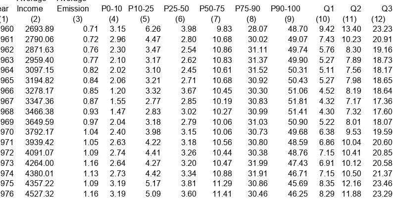
Table 1: Trend of Percentile Shares of Carbon Emission in the World during 1960 - 1990. Percentile Shares of Carbon Emission in the World
Average Average
year Income Emission P0-10 P10-25 P25-50 P50-75 P75-90 P90-100 Q1 Q2 Q3 (1) (2) (3) (4) (5) (6) (7) (8) (9) (10) (11) (12) 1960 2693.89 0.71 3.15 6.26 3.98 9.83 28.07 48.70 9.42 13.40 23.23 1961 2790.06 0.72 2.96 4.47 2.80 10.68 30.02 49.07 7.43 10.23 20.91 1962 2871.63 0.76 2.30 3.47 2.54 10.86 31.11 49.74 5.76 8.30 19.16 1963 2959.40 0.77 2.10 3.17 2.62 10.83 31.37 49.90 5.27 7.89 18.73 1964 3097.15 0.82 2.02 3.10 2.45 10.61 31.52 50.31 5.11 7.56 18.17 1965 3194.82 0.84 2.06 3.21 2.71 10.68 30.92 50.43 5.27 7.98 18.65 1966 3278.17 0.85 1.20 3.32 3.67 10.45 30.30 51.06 4.52 8.19 18.64 1967 3347.36 0.87 1.55 2.77 2.85 10.19 30.83 51.81 4.32 7.17 17.36 1968 3466.38 0.93 1.47 2.83 3.02 10.27 30.99 51.41 4.30 7.32 17.60 1969 3649.59 0.97 2.04 3.18 2.79 10.06 31.03 50.90 5.22 8.01 18.07 1970 3792.17 1.04 2.40 3.98 3.15 10.06 30.73 49.68 6.38 9.53 19.59 1971 3939.42 1.05 2.63 4.22 3.18 10.56 30.80 48.59 6.86 10.04 20.60 1972 4091.07 1.09 2.74 4.41 3.26 10.44 30.38 48.76 7.15 10.41 20.85 1973 4264.00 1.16 2.64 4.27 3.20 10.47 31.99 47.43 6.91 10.12 20.58 1974 4380.01 1.13 2.73 4.42 3.34 10.88 31.91 46.71 7.15 10.50 21.37 1975 4357.22 1.09 3.19 5.17 3.81 11.29 30.86 45.69 8.35 12.16 23.46 1976 4527.32 1.16 3.19 5.09 3.60 11.41 30.46 46.25 8.29 11.88 23.29
5
3
[image:5.612.60.572.296.791.2]1977 4629.15 1.16 3.49 5.64 4.14 11.56 29.74 45.43 9.12 13.27 24.83 1978 4747.39 1.19 3.66 5.97 4.20 11.84 27.90 46.42 9.64 13.84 25.68 1979 4866.84 1.22 1.14 3.08 9.67 11.85 28.50 45.76 4.22 13.88 25.74 1980 4952.19 1.23 1.25 2.88 9.77 11.83 28.07 46.19 4.13 13.90 25.73 1981 4991.56 1.18 1.25 2.78 10.03 12.08 27.96 45.90 4.03 14.06 26.14 1982 4957.94 1.15 1.35 3.16 10.83 12.25 29.12 43.28 4.51 15.34 27.59 1983 4970.11 1.13 1.44 3.35 11.46 12.43 27.01 44.32 4.78 16.24 28.67 1984 5063.22 1.15 1.34 2.65 12.04 13.26 26.24 44.47 3.99 16.03 29.29 1985 5153.58 1.17 1.39 2.71 12.83 13.20 25.95 43.92 4.10 16.92 30.13 1986 5263.58 1.16 1.58 2.74 13.06 13.10 25.57 43.96 4.32 17.37 30.47 1987 5382.49 1.18 1.52 2.86 13.59 13.13 25.29 43.62 4.38 17.97 31.10 1988 5505.51 1.14 1.64 2.94 13.90 13.00 24.80 43.73 4.57 18.47 31.47 1989 5633.70 1.17 1.70 3.06 13.72 13.02 25.25 43.25 4.77 18.49 31.50 1990 5716.86 1.18 1.75 3.22 13.62 12.51 26.66 42.25 4.96 18.58 31.09
Figure 1: Trends of emission shares of different percentile groups during 1960-1990.
A B
C D
World: Quartiles
0 0.1 0.2 0.3 0.41960 1970 1980 1990
Q1 Q2 Q3
World: Middle groups
0 0.05 0.1 0.15 0.2
1960 1970 1980 1990
Q2 Q25-50 Q50-75
World: Bottom 25
0 0.02 0.04 0.06 0.08 0.1 0.12
1960 1970 1980 1990
D1(co2) Q1 BTnext15(10-25)
World: Top 25
0 0.2 0.4 0.6 0.8 1
1960 1970 1980 1990
Top10 Top25 Topnext15(75-90)
World: LR of Income
0.54
0.56
0.58
0.6
1960
1970
1980
1990
year
World: LR of Emission
0.5 0.55 0.6 0.65 0.7 0.75
4
[image:6.612.22.541.252.588.2]E F
Figure 2: Decade-wise average emission share of percentile groups.
0 10 20 30 40 50 60
P0-10 P10-25 P25-50 P50-75 P75-90 P90-100
percentile groups
percentage values