Univariate description and bivariate statistical inference: the first
step delving into data
Zhongheng Zhang
Department of Critical Care Medicine, Jinhua Municipal Central Hospital, Jinhua Hospital of Zhejiang University, Jinhua 321000, China Correspondence to: Zhongheng Zhang, MMed. 351#, Mingyue Road, Jinhua 321000, China. Email: [email protected].
Author’s introduction: Zhongheng Zhang, MMed. Department of Critical Care Medicine, Jinhua Municipal Central Hospital, Jinhua Hospital of Zhejiang University. Dr. Zhongheng Zhang is a fellow physician of the Jinhua Municipal Central Hospital. He graduated from School of Medicine, Zhejiang University in 2009, receiving Master Degree. He has published more than 35 academic papers (science citation indexed) that have been cited for over 200 times. He has been appointed as reviewer for 10 journals, including Journal of Cardiovascular Medicine, Hemodialysis International, Journal of Translational Medicine, Critical Care, International Journal of Clinical Practice, Journal of Critical Care. His major research interests include hemodynamic monitoring in sepsis and septic shock, delirium, and outcome study for critically ill patients. He is experienced in data management and statistical analysis by using R and STATA, big data exploration, systematic review and meta-analysis.
Zhongheng Zhang, MMed.
Abstract: In observational studies, the first step is usually to explore data distribution and the baseline differences between groups. Data description includes their central tendency (e.g., mean, median, and mode) and dispersion (e.g., standard deviation, range, interquartile range). There are varieties of bivariate statistical inference methods such as Student’s t-test, Mann-Whitney U test and Chi-square test, for normal, skews and categorical data, respectively. The article shows how to perform these analyses with R codes. Furthermore, I believe that the automation of the whole workflow is of paramount importance in that (I) it allows for others to repeat your results; (II) you can easily find out how you performed analysis during revision; (III) it spares data input by hand and is less error-prone; and (IV) when you correct your original dataset, the final result can be automatically corrected by executing the codes. Therefore, the process of making a publication quality table incorporating all abovementioned statistics and P values is provided, allowing readers to customize these codes to their own needs.
Keywords: Univariate description; bivariate statistical inference; R; table; baseline characteristics; automation
Submitted Dec 25, 2015. Accepted for publication Jan 10, 2016. doi: 10.21037/atm.2016.02.11
Introduction
When data are well prepared by using previously described methods such as correcting, recoding, rescaling and missing value imputation, the next step is to perform statistical description and inference (1,2). In observational studies, the first table is usually a display of descriptive statistics of overall population, as well as statistical inference for the difference between groups. This table is important in that it gives an estimate of the differences in baseline characteristics, and provides evidence for further
multivariable analysis. The article first gives an overview of
methods for bivariate analysis, and then provides a step-by-step tutorial on how to perform these analyses in R. Finally, I will show how to make the table automatically. This can be useful when there are a large number of variables.
Univariate description and bivariate statistical methods
Varieties of methods are available for univariate description and bivariate inference. Table 1 displays central tendency and dispersion for different types of data. Mean and standard deviation are probably the most widely used statistics to describe normally distributed data. For skewed data, we employ median and interquartile range. For nominal data, mode can be used for description of central tendency. However, in practice we frequently describe it by the number of each category and relevant percentage. Student’s t test is typically applied when the test statistic would follow a normal distribution (3). Mann-Whitney U test is a non-parametric test that does not require assumption of normal distribution (4). For studies with multiple groups, analysis of variance (ANOVA) may be the best choice.
Working example
In the working example, I created three types of data that are most commonly encountered in practice. Nominal variables include those with multiple levels and those with two levels. Continuous variable include those with normal distribution and skewed data.
> set.seed(12)
> gender<-factor(rbinom(100, 1, 0.4),levels=c(0,1),label s=c("male","female"))
> set.seed(12)
> trt<-factor(rbinom(100, 1, 0.5),levels=c(0,1),labels=c(" treat","control"))
> set.seed(88)
> diagnosis<-factor(rbinom(100, 3, 0.5),leve ls=c(0,1,2,3),labels=c("heart failure","renal
In this dataset, gender is a binomial variable that is assigned by “male” or “female”. Variable trt is also binomial, but it is used for grouping purpose. Variable diagnosis is categorical variable with four levels. Variable age is normally distributed with mean of 67 and standard deviation of 20. The last variable wbc is skewed in distribution. The last line combines these variables into a single data frame.
Examination of skewness and kurtosis
Because the choice of statistical methods depends on the
distribution of data, the first step is to examine the skewness
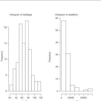
of data. The distribution can be visualized using histogram (Figure 1).
> par(mfrow=c(1,2)) > hist(data$age) > hist(data$wbc)
The first line called par() function to dictate that subsequent
> install.packages(“moments”) > library(moments)
> agostino.test(data$age)
D'Agostino skewness test
data: data$age
skew = 0.2462, z = 1.0571, p-value = 0.2905 alternative hypothesis: data have a skewness
> agostino.test(data$wbc)
D'Agostino skewness test
data: data$wbc
skew = 2.7039, z = 7.1426, p-value = 9.158e-13 alternative hypothesis: data have a skewness
The package employs the D’Agostino skewness test, details of this method can be found in reference (6). The Table 1 Central tendency and dispersion for difference types of data
Data type Central
tendency Description Dispersion Description Statistical inference
Nominal Mode Value of highest frequency NA NA Chi-square test
Skewed data Median Center value Interquartile range Difference between the upper and lower quartiles
Mann-Whitney U test
Normal distribution
Mean Mathematical average Standard deviation How much deviate from the mean
Student’s t-test
NA, not applicable.
Histogram of data$wbc Histogram of data$age
120 0 20000
data$age
50000 data$wbc 100
80 60 40 20
Fr
equency
Fr
equency
20
15
10
5
0
60
50
40
30
20
10
0
alternative hypothesis is that the data have a skewness. When P<0.05 as for the variable wbc, the alternative hypothesis is accepted and there is skewness.
> anscombe.test(data$age)
Anscombe-Glynn kurtosis test
data: data$age
kurt = 2.8616000, z = -0.0028691, p-value = 0.9977 alternative hypothesis: kurtosis is not equal to 3
> anscombe.test(data$wbc)
Anscombe-Glynn kurtosis test
data: data$wbc
kurt = 11.463, z = 5.209, p-value = 1.898e-07 alternative hypothesis: kurtosis is not equal to 3
Anscombe-Glynn kurtosis test is employed to test kurtosis (6,7). Data should have kurtosis equal to 3 under the hypothesis of normality. This test incorporates such null hypothesis and is useful to detect a significant difference of kurtosis in normally distributed data. As expected, the variable wbc has kurtosis that is significantly different from
normality.
Univariate description
Since we know the distribution of data, we need to provide central tendency and dispersion in our research. Variable wbc will be expressed as median and interquartile range, and age will be expressed as mean and standard deviation. Other categorical variables will be expressed as number and percentage.
> summary(age)
Min. 1st Qu. Median Mean 3rd Qu. Max. 26.18 52.18 68.59 67.21 78.78 118.10 > sd(age)
[1] 19.86663 > summary(wbc)
Min. 1st Qu. Median Mean 3rd Qu. Max.
1583 4479 8634 11360 12980 62670
> table(diagnosis) diagnosis
heart failure renal dysfunction ards trauma
11 38 37 14
> prop.table(table(diagnosis)) diagnosis
heart failure renal dysfunction ards trauma
0.11 0.38 0.37 0.14
The above codes are used for description of overall cohort. We also want to describe variables separately by the treatment group.
> tapply(data$wbc, data$trt, summary) $treat
Min. 1st Qu. Median Mean 3rd Qu. Max.
1639 4599 8414 10170 12630 60830
$control
Min. 1st Qu. Median Mean 3rd Qu. Max.
1583 4508 8634 12750 13380 62670
> table(data$diagnosis,data$trt)
treat control
heart failure 5 6
renal dysfunction 20 18
ards 18 19
trauma 11 3
> prop.table(table(data$diagnosis,data$trt),margin=2)
treat control
heart failure 0.09259259 0.13043478 renal
dysfunc-tion
0.37037037 0.39130435
ards 0.33333333 0.41304348 trauma 0.20370370 0.06521739
by treatment (trt). The results give summary values separately for each levels of the variable trt. The table() function is easy to use for cross tabulation.
Bivariate statistical inference
After univariate description, investigators can have a general impression on the effectiveness of a treatment. However, we still don’t know whether the difference is caused by random error, or there is a real difference. Varieties of sophisticated methods are designed to answer the question.
> wilcox.test(wbc ~ trt, data=data)
Wilcoxon rank sum test with continuity correction
data: wbc by trt
W = 1166.5, p-value = 0.604
alternative hypothesis: true location shift is not equal to 0 > chisq.test(table(data$diagnosis,data$trt))
Pearson's Chi-squared test
data: table(data$diagnosis, data$trt) X-squared = 4.1814, df = 3, p-value = 0.2425 > t.test(age ~ trt, data=data)
Welch Two Sample t-test
data: age by trt
t = -0.79721, df = 90.569, p-value = 0.4274
alternative hypothesis: true difference in means is not equal to 0
95 percent confidence interval: -11.229622 4.797661
sample estimates:
mean in group treat mean in group control
65.72955 68.94553
In above codes, the functions wilcox.test(), chisq.test() and t.test() are employed for skewed, categorical and normal data, respectively. The outputs of these functions include the name of the test, dataset, statistics and P value. These values can be assigned to an object for further use.
Making publication style table automatically
It is easy to copy and paste the above statistical outputs into a table in Microsoft Word when there are a limited number of variables. However, it is a tedious task when variables expand to dozens. Furthermore, making a blank table and input values by hand is prone to error. We may take the advantage of R that it allows for customized codes to automate the process of table making. It also allows to round number to desired decimal places.
> overall.age<-paste(round(mean(data$age),1),"±",roun d(sd(data$age),1))
> trt.age<-paste(round(t.test(age ~ trt,
data=data)$estimate[1],1), "±",round(tapply(data$age, data$trt, sd)[1],1))
> contrl.age<-paste(round(t.test(age ~ trt,
data=data)$estimate[2],1), "±",round(tapply(data$age, data$trt, sd)[2],1))
> age.p<-round(t.test(age ~ trt, data=data)$p.value,2) > row.age<-c(overall.age,trt.age,contrl.age,age.p)
Many journals require that description of a variable should be put in a single cell, thus we need to use character vector to store the output in the form like “mean ± SD”. The paste() function can connect mean and standard deviation by using the symbol “±”. The round() function is used to save only one decimal place. Skewed data can be store in a similar way.
> overall.wbc<-paste(summary(data$wbc)
[3],"(",summary(data$wbc)[2],"~",summary(data$wbc) [5],")")
> wbc.trt.all<-tapply(data$wbc, data$trt, summary)$treat
> wbc.control.all<-tapply(data$wbc, data$trt, summary)$control
> trt.wbc<-paste(wbc.trt.all[3],"(",wbc.trt. all[2],"~",wbc.trt.all[5],")")
> contrl.wbc<-paste(wbc.control.all[3],"(",wbc.control. all[2],"~",wbc.control.all[5],")")
> wbc.p<-round(wilcox.test(wbc ~ trt, data=data)$p. value,2)
> row.wbc<- c(overall.wbc,trt.wbc,contrl.wbc,wbc.p)
and standard deviation, and put them to a single cell. The second and third lines calculate the summary statistics for the treatment and control groups, respectively. Because not all summary statistics are wanted, we extracted the second, third and fifth values, which represent the first quartile, median and third quartile values. The last line combines all statistics into a character vector.
> overall.gender<-paste(table(data$gender)[1],"(",prop.
Next we need to combine all row variables into a matrix.
> table<-rbind(row.age,row.gender,row.wbc)
The matrix output appears nearly what we want. However, the column and row names are not exactly meet the requirements for submission. We can rename them easily. For the column name I added a new character vector so that each of the names can have a double quote.
> row.names(table)<-c("Age (years)","Gender (male,%)","WBC/ul")
> table.pub<-rbind(c("Overall","Treatment","Control","p value"),table)
> table.pub
[,1] [,2] [,3] [,4]
"Overall" "Treatment" "Control" "p value"
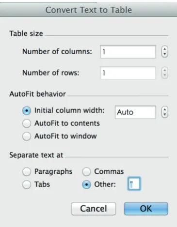
There are double quotes for each value, which is not the format for a publication quality table. The next task is done in Microsoft Word (MS). Users can copy the table from R console to MS and use the “convert text to table” function of the Word processor. In the “separate text at” option, you can use double quotes as the symbol to separate text. After click “OK” button, the double quotes mark will be replaced by lines forming cells of a table (Figure 2). Creating table in this way avoids you from copy and paste values one by one, which is less likely to make errors. Furthermore, because you have recorded every step for making the table in R code, you and others can reproduce the process. This is very important during revision. The rule of thumb in data management and statistical analysis is to make your results exactly reproducible.
Summary
The article provides a gentle introduction to univariate statistical description and bivariate statistical inference,
which is typically the first step in exploring data. Statistical
description includes statistics for central tendency such as mode, mean, median. Dispersion includes standard deviation, range, and interquartile range. They are applied to different types of data. Also, there are several statistical inference methods. They are Student’s t-test, Mann -Whitney U test and Chi-square test. The results of these analyses should be put into a table for publication or conference presentation. The process can be automated by using R code, which makes the process easily reproducible by others and in subsequent revisions.
Acknowledgements
None.
Footnote
Conflicts of Interest: The author has no conflicts of interest to
declare.
References
1. Zhang Z. Missing values in big data research: some basic skills. Ann Transl Med 2015;3:323.
2. Zhang Z. Data management by using R: big data clinical research series. Ann Transl Med 2015;3:303.
3. Fay MP, Proschan MA. Wilcoxon-Mann-Whitney or t-test? On assumptions for hypothesis tests and multiple interpretations of decision rules. Stat Surv 2010;4:1-39.
4. Corder GW, Foreman DI. Nonparametric statistics: A step-by-step approach. New York: Wiley, 2014.
5. Komsta L, Novomestky F. moments: moments, cumulants, skewness, kurtosis and related tests. 2012. R package version 0.13; 2014.
6. Ghasemi A, Zahediasl S. Normality tests for statistical analysis: a guide for non-statisticians. Int J Endocrinol Metab 2012;10:486-9.
7. DeCarlo LT. On the meaning and use of kurtosis. Psychological Methods 1997;2:292-307.
8. Breiman L. R: A language and environment for statistical computing. R Foundation for Statistical Computing, Vienna, Austria, 2012. Machine Learning 2001;45:5-32.