CRAFT, DAVID WESTON. A Method for Generation of Distribution Based Travel Time Reliability Performance Measures Using Clustered Travel Rate Statistics. (Under the direction of Dr. Billy Williams.)
This thesis proposes a new method for analyzing and evaluating the performance measure of
travel time reliability. It aims to exhibit that representation of travel time reliability can be
enhanced through the usage of a new method based upon a wide range of data. Provided
with a data source consisting solely of INRIX segment speed data, this method allows for
travel time reliability to be measured by observing statistical characteristics of travel rate
data. This thesis determined the statistical measures which best represent distributions of
speed data and travel rate data as they apply to different reliability conditions. Data was
evaluated in one-minute intervals, such that each one-minute time period could be measured
for its travel time reliability.
Filtering the data was of high importance in order to obtain meaningful results. Quality and
quantity of the data were also of importance in order to avoid erroneous conclusions.
“Clean” sites were selected for analysis and data used in analysis consisted of non-holiday
influenced weekdays. The premise of this study is that the results to be obtained were to
characterize each time period for a normal workday. In this way, the reliability presented to
a user confers the characterization of the time period for what might be a daily commute.
Current travel time reliability measures are insufficient as they do not consider the entire
distribution of data. Rather, they tend to look at a specific value of the distribution. These
measures do not provide additional information and can even be misleading. By identifying
and characterizing ranges of distributions as types of travel time reliability, one can observe a
larger picture of a route’s travel time reliability. By pairing distributions of speed or travel
rates with filters from statistical methods, improved travel time reliability measures can be
implemented. This method can prove to be helpful to decision makers and state agencies in
© Copyright 2013 by David Weston Craft
by
David Weston Craft
A thesis submitted to the Graduate Faculty of North Carolina State University
in partial fulfillment of the requirements for the degree of
Master of Science
Civil Engineering
Raleigh, North Carolina
2014
APPROVED BY:
_______________________________ ______________________________
Billy Williams Nagui Rouphail
Co-Chair Co-Chair
BIOGRAPHY
David Craft was born in Houston, Texas and raised in Houma, Louisiana. He completed his
undergraduate degree in Civil Engineering at Louisiana State University in December 2011.
After graduation, he pursued a Master of Science degree in Civil Engineering with a
concentration in Transportation Engineering from North Carolina State University. His
interest in Transportation Engineering stems from a combination of influential instructors,
inspiring research opportunities, and the interest and recognition of solving transportation
ACKNOWLEDGMENTS
I would like to acknowledge and thank the following people and institutions for their role in
the production of this document and my education:
North Carolina State University and Louisiana State University for providing me with the means to achieve a superior education through the allotment of financial and
educational resources.
North Carolina Department of Transportation for funding research projects, which allow for new and advanced research in the field of Transportation Engineering. Dr. Billy Williams, Dr. Nagui Rouphail, and Dr. George List for providing instruction
and direction in our weekly research meetings.
Dr. Brian Wolshon and Dr. Vinayak Dixit for piquing my interest in the subject and providing for the means to become involved in research.
The University of Maryland, Michael Pack, and RITIS for providing the data necessary for so much of my research.
The Institute for Transportation Research and Education and the Transportation Founders Fund for giving me the tools and financial support to continue my research
in graduate school.
TABLE OF CONTENTS
LIST OF TABLES ... vi
LIST OF FIGURES ... vii
1. INTRODUCTION ... 1
1.1 Motivation and Problem Statement ... 1
1.2 Literature Review... 1
1.3 Objectives and Scope ... 3
1.4 Thesis Outline ... 4
2. DATA DESCRIPTION AND STUDY LOCATIONS ... 5
2.1 Speed Data ... 5
2.2 Bottleneck Data ... 5
2.3 Segment Selection ... 8
2.4 Route Selection ... 9
2.4a Routes 1 and 2 ... 12
2.4b Route 3 and Route 4 ... 16
2.4c Route 5 and Route 6 ... 16
3. METHODOLOGY ... 17
3.1 Comparison of Travel Along Routes ... 17
3.2 Stitched Travel Times ... 18
3.3 Travel Rate Statistical Analysis ... 19
3.3.1 Average ... 19
3.3.2 Standard Deviation... 20
3.3.3 Coefficient of Variation ... 20
3.3.4 Skew ... 21
3.3.5 Cubic Root of the Third Moment... 21
3.3.6 Kurtosis ... 22
3.3.7 Quadratic Root of the Fourth Moment... 22
3.4 Data Processing ... 23
3.5 Distribution Cluster Creation ... 29
3.6 Segment Categorization and Definition ... 37
3.6a Reliable and Congested... 37
3.6b Reliable and Uncongested... 38
3.6c Unreliable ... 38
4. RESULTS ... 39
4.2 Route 2 Analysis Results ... 51
4.2 Route 3 Analysis Results, I-40 EB ... 56
4.4 Route 4 Analysis Results, I-40 WB ... 61
4.5 Route 5 Analysis Results, I-85 SB ... 65
4.6 Route 6 Analysis Results, I-85 NB ... 70
4.7 Combined Clusters for All Routes ... 70
5. CONCLUSIONS AND RECOMMENDATIONS ... 73
REFERENCES ... 76
APPENDICES ... 78
Appendix A: R Code ... 79
Appendix B: Unsupervised CLARA output from R ... 82
LIST OF TABLES
TABLE 1:ROUTE INFORMATION ... 11
LIST OF FIGURES
FIGURE 1:RITIS BOTTLENECK CONFIRMATION AND CLEARANCE METHOD [13] ... 8
FIGURE 2:STUDY ROUTES 1(SB) AND ROUTE 2(NB)[14] ... 12
FIGURE 3:COMMUTER ROUTES ON I-77NORTH OF CHARLOTTE [14] ... 13
FIGURE 4:AADT ALONG ROUTES 1 AND ROUTE 2[15] ... 14
FIGURE 5:BOTTLENECK ANALYSIS FOR ROUTE 1[12] ... 15
FIGURE 6:BOTTLENECK ANALYSIS FOR ROUTE 1[12] ... 15
FIGURE 7:STUDY ROUTES 3 AND 4[14] ... 16
FIGURE 8:STUDY ROUTES 5 AND 6[14] ... 16
FIGURE 9:AN EXAMPLE COMPARISON OF DATA RESOLUTION ... 24
FIGURE 10:TRAVEL RATE STATISTICS FOR I-77SB ... 26
FIGURE 11:CORRELATION BETWEEN I-77SBSTATISTICS ... 28
FIGURE 12:NUMBER OF GROUPS FOR I-77SB ... 31
FIGURE 13:SILHOUETTE PLOTS FOR I-77SB ... 32
FIGURE 14:I-77SBCLASSIFICATION TREE ... 36
FIGURE 15:CLUSTER 1(A)MEDOID DISTRIBUTION FOR I-77SB ... 43
FIGURE 16: CLUSTER 1(A)MAXIMUM DISSIMILARITY DISTRIBUTION FOR I-77SB ... 43
FIGURE 17: CLUSTER 1(A)NEW MAXIMUM DISSIMILARITY DISTRIBUTION FOR I-77SB ... 44
FIGURE 18:CLUSTER 3(B)MEDOID DISTRIBUTION FOR I-77SB... 44
FIGURE 19:CLUSTER 3(B)MAXIMUM DISSIMILARITY DISTRIBUTION FOR I-77SB ... 45
FIGURE 20: CLUSTER 2(C)MEDOID DISTRIBUTION FOR I-77SB... 45
FIGURE 21:CLUSTER 2(C)MAXIMUM DISSIMILARITY DISTRIBUTION FOR I-77SB ... 46
FIGURE 22:CLUSTER 2(C)NEW MAXIMUM DISSIMILARITY DISTRIBUTION FOR I-77SB ... 46
FIGURE 23:CLUSTER 6(D)MEDOID DISSIMILARITY FOR I-77SB ... 47
FIGURE 24:CLUSTER 6(D)MAXIMUM DISSIMILARITY FOR I-77SB ... 47
FIGURE 25:CLUSTER 4(E)MEDOID DISTRIBUTION FOR I-77SB ... 48
FIGURE 26:CLUSTER 4(E)MAXIMUM DISSIMILARITY FOR I-77SB ... 48
FIGURE 28:CLUSTER 5(F)MAXIMUM DISSIMILARITY FOR I-77SB ... 49
FIGURE 29:TIME SERIES CLUSTERS FOR I-77SB ... 50
FIGURE 30:CLUSTER 1(A)MEDOID FOR I-77NB ... 52
FIGURE 31:CLUSTER 3(B)MEDOID FOR I-77NB ... 52
FIGURE 32:CLUSTER 2(C)MEDOID FOR I-77NB ... 53
FIGURE 33:CLUSTER 6(D)MEDOID FOR I-77NB ... 53
FIGURE 34:CLUSTER 4(E)MEDOID FOR I-77NB ... 54
FIGURE 35:TIME SERIES CLUSTERS FOR I-77NB ... 55
FIGURE 36:CLUSTER 1(A)MEDOID FOR I-40EB ... 57
FIGURE 37:CLUSTER 3(B)MEDOID FOR I-40EB ... 57
FIGURE 38:CLUSTER 2(C)MEDOID FOR I-40EB ... 58
FIGURE 39: CLUSTER 6(D)MEDOID FOR I-40EB ... 58
FIGURE 40:CLUSTER 4(E)MEDOID FOR I-40EB ... 59
FIGURE 41:TIME SERIES CLUSTERS FOR I-40EB ... 60
FIGURE 42:CLUSTER 1(A)MEDOID FOR I-40WB ... 62
FIGURE 43:CLUSTER 3(B)MEDOID FOR I-40WB ... 62
FIGURE 44:CLUSTER 2(C)MEDOID FOR I-40WB ... 63
FIGURE 45:CLUSTER 4(E)MEDOID FOR I-40WB ... 63
FIGURE 46:TIME SERIES OF CLUSTERS FOR I-40WB ... 64
FIGURE 47:CLUSTER 3(B)MEDOID FOR I-85SB ... 66
FIGURE 48:CLUSTER 2(C)MEDOID FOR I-85SB ... 66
FIGURE 49:CLUSTER 6(D)MEDOID FOR I-85SB ... 67
FIGURE 50:CLUSTER 4(E)MEDOID FOR I-85SB ... 67
FIGURE 51:CLUSTER 5(F)MEDOID FOR I-85SB... 68
FIGURE 52:TIME SERIES CLUSTERS FOR I-85SB ... 69
FIGURE 53:COMBINED DISTRIBUTIONS FOR ALL ROUTES (A) ... 71
FIGURE 54:COMBINED DISTRIBUTIONS FOR ALL ROUTES (B) ... 72
FIGURE 56:CLUSTER 1(A)MAXIMUM DISSIMILARITY FOR I-77SB ... 85
FIGURE 57:CLUSTER 1(A)NEW MAXIMUM DISSIMILARITY FOR I-77SB ... 85
FIGURE 58:CLUSTER 3(B)MEDOID FOR I-77SB ... 86
FIGURE 59:CLUSTER 3(B)MAXIMUM DISSIMILARITY FOR I-77SB ... 86
FIGURE 60:CLUSTER 2(C)MEDOID FOR I-77SB ... 87
FIGURE 61:CLUSTER 2(C)MAXIMUM DISSIMILARITY FOR I-77SB ... 87
FIGURE 62:CLUSTER 2(C)NEW MAXIMUM DISSIMILARITY FOR I-77SB ... 88
FIGURE 63:CLUSTER 6(D)MEDOID FOR I-77SB ... 88
FIGURE 64:CLUSTER 6(D)MAXIMUM DISSIMILARITY FOR I-77SB ... 89
FIGURE 65:CLUSTER 4(E)MEDOID FOR I-77SB ... 89
FIGURE 66:CLUSTER 4(E)MAXIMUM DISSIMILARITY FOR I-77SB ... 90
FIGURE 67:CLUSTER 5(F)MEDOID FOR I-77SB... 90
FIGURE 68:CLUSTER 5(F)MAXIMUM DISSIMILARITY FOR I-77SB ... 91
FIGURE 69:CLUSTER 1(A)MEDOID FOR I-77NB ... 91
FIGURE 70:CLUSTER 3(B)MEDOID FOR I-77NB ... 92
FIGURE 71:CLUSTER 2(C)MEDOID FOR I-77NB ... 92
FIGURE 72:CLUSTER 6(D)MEDOID FOR I-77NB ... 93
FIGURE 73:CLUSTER 4(E)MEDOID FOR I-77NB ... 93
FIGURE 74:CLUSTER 1(A)MEDOID FOR I-40EB ... 94
FIGURE 75:CLUSTER 3(B)MEDOID FOR I-40EB ... 94
FIGURE 76:CLUSTER 2(C)MEDOID FOR I-40EB ... 95
FIGURE 77:CLUSTER 6(D)MEDOID FOR I-40EB ... 95
FIGURE 78:CLUSTER 4(E)MEDOID FOR I-40EB ... 96
FIGURE 79:CLUSTER 1(A)MEDOID FOR I-40WB ... 96
FIGURE 80:CLUSTER 3(B)MEDOID FOR I-40WB ... 97
FIGURE 81:CLUSTER 2(C)MEDOID FOR I-40WB ... 97
FIGURE 82:CLUSTER 4(E)MEDOID FOR I-40WB ... 98
FIGURE 84:CLUSTER 2(C)MEDOID FOR I-85SB ... 99
FIGURE 85:CLUSTER 6(D)MEDOID FOR I-85SB ... 99
FIGURE 86:CLUSTER 4(E)MEDOID FOR I-85SB ... 100
1.
INTRODUCTION
1.1 Motivation and Problem Statement
Travel time reliability as a performance measure gives insight into how consistent the travel
times along a segment are and how the traffic conditions vary. The Federal Highway
Administration (FHWA) states that travel time reliability is important because unexpected
delays have larger consequences than the delay caused by recurring congestion [1]. Proper
travel time reliability performance measures are also important for analyzing potential
improvement in a roadway segment or a route. There currently is a lack of a consensus on a
rigid definition and calculation method for travel time reliability. Multiple performance
measures are implemented across different agencies, which can yield resulting metrics that
are suboptimal. A performance measure which considers the entire distribution of travel
along a freeway route would be a preferred travel time reliability measure.
1.2 Literature Review
A literature review was performed in order to review materials from related research,
implementations, and case studies that could lend insight to useful travel time reliability
performance measures. Additionally, definitions of travel time reliability and categorization
of travel time reliability as a performance measure was also researched. By understanding
the goals of in practice performance measures, and determining their shortcomings,
discretion could be made regarding appropriate statistical measures to evaluate and included
in attempting to classify distribution of travel.
FHWA lists the current most effective measures of travel time reliability as the 90th or 95th
percentile travel time, the buffer index, and the planning time index [1]. The North Carolina
Department of Transportation (NCDOT) measures travel time reliability by using the
planning time index [2]. The planning time index is the 95th percentile travel time divided by
the free flow travel time. The Michigan DOT (MDOT) defines travel time reliability as the
the free flow travel time for that trip. This measure of reliability is also known as the Buffer
Index and MDOT classifies it as a system-wide congestion monitoring performance measure
[3]. The Washington DOT simply defines travel time reliability as travel time with 95%
certainty [4]. The National Traffic Operations Coalition (NTOC) identifies travel time
reliability as one of the performance measures useful for documenting operations
performance. NTOC identifies buffer time as the measure for travel time reliability and
defines it as the additional time that must be added to a trip to ensure that travelers making
the trip will arrive at their destination at, or before, the intended time 95 percent of the time
[3]. The Florida Department of Transportation (FDOT) has been reporting travel time
reliability performance measures since 2008. FDOT uses the Buffer Index to evaluate the
variability of congestion and the Travel Time Index to evaluate the level of congestion.
Travel Time Index is calculated as the ratio of the average peak travel time to the free flow
travel time. FDOT uses 60 mph as the speed from which free flow travel time is calculated
on freeways [5]. The Virginia Transportation Research Council considers travel time
reliability as a recommended performance measure for system traffic management [6].
In the United Kingdom, Vuren, Baker, Ogawa, Cooke, and Unwin evaluated the impact of a
managed motorway on the M42 near Birmingham, England. They classified variation in
average journey time as a primary indicator of improvements in traffic flow along a
motorway. Variation in average journey time, or travel time reliability, was calculated as the
standard deviation in the recorded journey times per route [7]. The Strategic Highway
Research Program 2 (SHRP2) project L02: Establishing Monitoring Programs for Travel
Time Reliability, has conducted much recent research into the subject of travel time
reliability. L02 produced a guidebook, which outlined methods such as those to determine
which factors affect reliability. L02 suggests the usage of semi-variance as a performance
measure to monitor travel time reliability. Observing semi-variance trends suggests that low
1.3 Objectives and Scope
The perspective taken of travel time reliability for this research is one in which a user or
operator of a network wishes to ascertain the travel time for a segment or route of interest.
Because travel times are variable, a single reported travel time cannot accurately represent
the expected travel time for all users over all trips. In an attempt to create performance
measures from observed and archived data, the philosophy was that the conditions of the
segment or route of interest were unknown to the user or operator before observing the
network data. The only applicable insight would be the knowledge of whether the travel is
occurring on a weekday, weekend, holiday, or a potentially holiday influenced day. This
distinction is key for filtering the observed data used in calculating statistical measures to
analyze travel time reliability. As such, statistical measures were calculated using weekday
data only, filtering out weekends, federal or state holidays, and days within 2 weekdays of
federal or state holidays. Travel time reliability is presented for a user whose only
knowledge for travel is day-of-week information, and not information regarding level of
congestion along the segment or route during the expected time during which it is travelled.
As such, data for statistical analysis and development of performance measures is grouped by
day of the week rather than by level of congestion.
The objective of this thesis is to propose a method for producing travel time reliability
performance measures that accurately characterize the distribution of travel along a freeway
route. These distributions of travel, comprised of one-minute average travel rates, are aimed
towards creating enough variations such that an adequate number of distinct states are
characterized, while keeping the number of distributions to a minimum. These distributions
are to be grouped into a few unique clusters which each encompass a range of possible
distributions with similar characteristics. The range of these distributions is based upon
statistical measures that can be applied across multiple routes with varying characteristics.
The final goal is to be able to take calculated statistics based upon provided segment speed or
travel time data, and classify the segment as one of several travel time reliability
route’s travel time reliability characterization may allow agencies to flag a route or segment
within a route as a site to potentially improve traffic conditions via incident or operations
management.
1.4 Thesis Outline
This thesis is organized as follows: Chapter 1 introduces the motivation for the research,
produces background information on previous research and current practice, and delineates
the objectives of the research. Chapter 2 describes the data used in the research, the sources
from whence it was acquired, and the specific route examples upon which it was calibrated
and validated. Chapter 3 includes the methodology which details how the travel time
reliability results were produced. Chapter 4 describes the results of the data and Chapter 5
discusses the interpretation of the results and the potential benefits of their application.
Accompanying the document at the end is a list of references and appendices with additional
2.
DATA DESCRIPTION AND STUDY LOCATIONS
This chapter describes the data sources from which any data used in the research was
collected. Additionally, it displays the segment locations and their respective information
upon which the research was tested. Two types of data were gathered from the same source:
speed data and bottleneck data from RITIS. Two types of study locations were chosen, first
individual segments, and then routes built from the chosen segments.
2.1 Speed Data
Segment speed data was collected from the Regional Integrated Transportation Information
System (RITIS) at the University of Maryland’s Center for Advanced Transportation
Technology Laboratory (CATT Lab) [9]. RITIS gathers and archives data from multiple
sources in order to combine them into more meaningful data, which can be visualized and
used to create performance measures [10]. The speed data provided by RITIS is one-minute
aggregated INRIX speed data, which has been archived in the RITIS database. Real-time
INRIX speed data is collected from probe vehicles along over 260,000 miles of interstate and
major roadway throughout the United States [11]. INRIX speed data is able to detect 100%
of all freeway slowdowns and INRIX also provides travel times with accuracy above 95%
[11]. The roadways for which INRIX provides this data are broken up into NAVTEQ Traffic
Message Channel (TMC) segments. These TMC segments are directional segments with a
fixed length ranging from tenths of a mile for internal segments to several miles for external
segments in rural areas.
2.2 Bottleneck Data
Bottleneck data was key information for identifying segments and routes, which had specific
distributions of traffic flow in order to select segments and routes best suited for displaying a
range of traffic flow distributions. The ranking system for the segments was provided by the
calculated and termed the “impact factor”. This impact factor is a representation of
congestion and is calculated using three variables provided by and calculated by RITIS using
the INRIX speed data. These variables are the number of congestion occurrences, average
maximum queue length (in miles), and average congestion duration (in hours and minutes).
The formula utilized by RITIS to calculate the impact factor is displayed below:
Impact factor = Number of occurrences x average duration (in minutes) x average max length
[12]
Each segment can be selected to display a map of the bottleneck along with a table listing of
the individual bottleneck occurrences for that segment along with their clear time, duration,
and maximum queue length. In order to interpret the data, it is important to understand that
that bottlenecks have the ability to merge or break up into multiple pieces. Two bottlenecks
will merge when the queue caused from a bottleneck downstream extends upstream and
reaches an upstream bottleneck. These two, previously spatially separated bottlenecks, are
now a single bottleneck with a continuous queue. Bottlenecks break into multiple pieces
when congestion within a single bottleneck with a single queue is alleviated at some point
and a queue no longer exists along the entire length of the original queue. However, there
still remains two bottleneck points with queues on both sides of this location. This is not
unexpected to occur in queues which may extend for several miles upstream. Because this
merging and diverging of bottlenecks can occur, the table listing of individual occurrences
produces instances of multiple bottlenecks that occur in the same location, during an
overlapping time period, with the same or varying queue length and a similar duration. This
is a characteristic of the method used to identify bottlenecks. These are in fact not multiple
bottlenecks, but the same bottleneck which may have broken into multiple pieces or merged
with another bottleneck. The information provided by RITIS and used to determine the
average duration, average maximum length, occurrences, and impact factor for each segment
occurrences statistic for each segment will often not match the number of individual
occurrences listed in the table listing. A spiral display of congestion is also provided which
visually displays daily congestion during the time period and shows when, how long, and the
maximum queue length of bottlenecks that occurred using colored lines to represent various
conditions.
RITIS identifies bottlenecks on segments by monitoring the archived one-minute INRIX
speeds. Bottlenecks are identified when reported speeds drop below a percentage of a
reference speed for a certain length of time. Reference speeds for each segment are
calculated as the 85th percentile speeds observed on that segment across all time periods. The
maximum value that RITIS allows reference speeds to reach is 65 miles per hour. When
reported speeds fall below 60% of the reference speed, and remain this way for a minimum
of five minutes, the bottleneck occurrence is identified on that segment. If neighboring
segments are also reporting speeds below 60% of their reference speed, then the segments are
joined together as a single bottleneck queue. In order for bottlenecks queues to clear, all
segments within the bottleneck must have their reported speeds return to values above 60%
of the reference speed for ten minutes. RITIS requires a minimum queue length of 0.3 miles
for a bottleneck location to be identified [13]. Figure 1 displays graphically how RITIS
Figure 1: RITIS bottleneck confirmation and clearance method [13]
The bottleneck analysis limits the time range available for data analysis to a three-month
period of time. Bottleneck data for all North Carolina freeway segments was downloaded in
three month periods and then compiled in an excel spreadsheet. In order to compile this data,
the impact factor values were then summed amongst the four time periods to produce an
overall impact factor for each freeway segment in 2012. The highest impact factor values
were reflective of the highest levels of congestion within the state.
2.3 Segment Selection
Segments were selected for analysis by reviewing all freeway segments in the state of North
Carolina. Segments were defined by using the pre-existing NAVTEQ Traffic Message
Channel (TMC) segments. All freeway segments in North Carolina were ranked on the basis
of the level of congestion they experienced according to the impact factor produced by the
entire calendar year of data and include any seasonal effects that may be present. 2012 was
selected because it was the most recently complete year at the time of analysis.
From the segment list, five sites were selected for further analysis and chosen in order to
evaluate a diverse range of reliable, unreliable, congested, and uncongested freeway
conditions. These sites were chosen by looking at their geographic location, their average
annual daily traffic, whether the segment was internal or external, and the impact factor and
variables of which it consisted. The first of these segments chosen was segment 125N04972,
a southbound internal segment along Interstate 77 with a length of 0.63 miles. This segment
is located at the Gilead Road Exit, Exit 23, is located in Mecklenburg County, and is the most
congested freeway segment in the state. Segment 125N04647 was chosen for selection
because it is the second most congested segment in the state. It is a 0.74-mile southbound
internal segment in Cabarrus County on Interstate 85 located at the Speedway Boulevard Exit
at Exit 49. Segment 125N04646 was chosen because it is the second most congested external
segment in the state. It is a 0.35-mile southbound segment in Mecklenburg County on
Interstate 85 located at the Interstate 485 Exit at Exit 49. Segment 125-04661 was chosen
because it is the most congested external interstate segment in the state. It is a 1.160-mile
long eastbound external segment in Mecklenburg County located on Interstate 485 at the
Read Road Exit at Exit 59. Segment 125+04656 was chosen in order to evaluate an
uncongested, rural segment. It is a 0.56-mile long northbound external segment in Rowan
County located on Interstate 85 at the Peeler Road Exit at Exit 71.
2.4 Route Selection
Routes were constructed using segment information along with data acquired from the RITIS
bottleneck analysis. Using the previously chosen segments as a starting point, routes were
created based off the bottleneck information reported by RITIS. In order to analyze travel
time reliability at a route level, routes which experienced the extreme instances of congestion
were chosen initially. These routes were selected in order to observe distributions of traffic
Consecutive segments were pieced together into routes based on the average maximum
queue length of the segment identified as the most congested bottleneck location.
Additionally, each segment was observed in the bottleneck analysis in order to ensure that
routes were constructed that encompassed a majority of the bottleneck during the highly
congested states.
The route level analysis provides more relevant information to users than what is provided
from a segment analysis. Individual segments are short in length such that travel rate
statistics can vary significantly and are not of significance to travelers on their own. Route
level travel rate statistics provide more useful information for commuters and key routes.
From the segment analysis, segment 125N04792, was chosen as the primary segment for
further route analysis. This site was chosen due to its high congestion ranking and its
interpretability based off of the travel rate statistics. Other routes selected were based on
known commuter routes from local experience. The routes selected for analysis are
displayed and described below.
Route 1 was selected due to its inclusion of the freeway segment with the highest impact
factor value in the state of North Carolina. It was constructed by observing the bottleneck
data along the upstream and downstream segments in an attempt to accurately include key
segments along the commuter route that experienced the most delay in the state. It is a
7.68-mile long segment on I-77 southbound spanning from the Mecklenburg County Line to
Gilead Road (exit 23). Route 2 is the Northbound direction for the same route, which has a
higher p.m. peak period compared to the southbound route, but experiences less extreme
levels of congestion. Route 3 and 4 were selected due to their inclusion in related previous
NCDOT research projects. These routes are important commuter routes in the Triangle area
along I-40. Route 3 spans 14.20 miles on I-40 westbound from Apex Highway to Interstate
440 and encompasses 23 TMC segments. Route 4 spans 14.22 miles on I-40 eastbound from
congestion primarily in the morning during peak hours, while Route 4 experiences
congestion primarily in the afternoon during peak hours. Finally, routes 5 and 6 are routes
that traverse Interstate 85 northeast of Charlotte. They are commuter routes that experience
heavy peak period congestion. These routes were constructed by looking at highly congested
segments and constructing routes based off bottleneck information, similar to the method
used to create the route along Interstate 77 southbound. Route 5 is a 9.37 mile route
containing 11 TMC segments while Route 6 is a 7.74 mile route containing 9 TMC
segments.
Table 1 displays a comparison of characteristics for each site analyzed.
Table 1: Route Information
Route Name I-77 SB I-77 NB I-40 EB I-40 WB I-85 SB I-85 NB
Route Number 1 2 3 4 5 6
One-Minute Data
Points Available 276603 260987 273240 199639 242971 255686
Percent of Possible One-Minute Data
Points 92.75 87.56 91.67 66.97 81.51 85.78
Route Length (miles) 7.68 7.73 14.20 14.22 9.37 7.74
Number of TMCs in
Route 8 8 23 23 11 9
2.4a Routes 1 and 2
Figure 5: Bottleneck Analysis for Route 1 [12]
2.4b Route 3 and Route 4
Figure 7: Study Routes 3 and 4 [14]
2.4c Route 5 and Route 6
3.
METHODOLOGY
This chapter explains how the aforementioned gathered data was utilized to produce travel
time reliability metrics for classifying interstate freeway routes. Explained herein is how the
data was filtered and processed, which data were chosen for analysis, how the data was
grouped and organized, and the calculations performed to obtain meaningful statistics.
Additionally, a comprehensive explanation of the methods used to create the eventual
clusters, and a description of how they are to be interpreted are provided.
3.1 Comparison of Travel Along Routes
The INRIX data collected for each freeway segment provided the one-minute aggregated
probe based speeds along with the segment travel time. However, neither travel time, nor
speed was chosen as the metric upon which further analysis was conducted. Instead, travel
rate was selected to be the metric upon which statistical analysis would be performed. From
the one-minute average speeds, corresponding travel times are created using the speed and
segment length. The travel rate is then determined for each one-minute average by dividing
the travel time along a segment or route by the length of the segment or route. Travel rate is
the preferred measure when compared to speed, as a comparison between the speeds of
multiple sites would be biased by the posted speed limit. Similarly an unbiased comparison
of travel times between segments would be infeasible due to differences in segment lengths
and posted speed limits. Travel rate was a preferred method over travel time index due to
Travel Time Index being a performance measure without units. Travel rates are measured in
units of minutes per mile such that it is easier to empirically understand the difference
between two travel rates or the change in a travel rate. Additionally, a distribution of travel
3.2 Stitched Travel Times
All speed data was gathered through data requests sent to RITIS for one-minute archived
speed data for the TMC segments and time periods of interest. When analyzing individual
segments, this data was filtered for each segment by removing speed data which received
confidence scores below “30”. The confidence score is a measure of the confidence of the
real-time accuracy of the data. The confidence score groups data into one of three groups:
“10”, “20”, or “30”. A score of “30” represents speed data that is based on real-time data for that specific segment. A score of “20” represents speed data that is based on real-time data
across multiple segments and/or based on a combination of expected and real time data. A
score of “10” represents speed data that is based primarily on historical data. This practice
was not duplicated for the route analysis. Although data with a confidence score of “30” is
desired data, filtering the one-minute speed data for each segment in a route could potentially
leave the data lacking in sufficient quantity, such that route analysis may produce misleading
data due to outlier values. Each one-minute speed data removed from a segment would result
in a travel time that would be unable to be stitched. Additionally, because there are several
segments in a route, data with a confidence score of “10’ for one segment, amongst data with
a confidence score of “30”, for the remaining segments in the route, would be of little
concern. After filtering by confidence score, the data was filtered to remove all weekend
data, all holidays, and the two nearest weekdays before and after each holiday. Holidays
considered were state and federal holidays such that all non-normal travel weekdays were
removed. In total, data from 207 weekdays were included for the route analysis performed in
this report.
In order to obtain route level data, travel times across multiple segments need to be combined
to create a single route travel time. A stitched travel time method was used in order to
emulate real world travel conditions. This method created travel times by considering the
speed of a potential vehicle along each segment at the point in time when the vehicle would
allow for improvements in travel time estimation [16]. Because stitched travel time require
data from multiple segments, rather than just one, missing INRIX speed data can present a
larger issue for producing travel time data. If a single segment has absent speed data for a
desired particular minute, the travel time for the route cannot be constructed for the time at
which the trip began from the original segment. While it was possible to create segment
level travel times for every minute of the year throughout the entire year in some cases, route
level travel times may have had up to several hundred missing one-minute speed data points
for a particular time period. This potential data constraint suggested avoiding routes with a
large number of segments or routes with a greater length in order to avoid losing too many
one-minute data points.
3.3 Travel Rate Statistical Analysis
The goal of this thesis is to create travel time reliability measures that represent the
distribution of travel along a route. It is through statistical measures that the different
distributions of travel can be represented. In order to derive information from a year of
segment or route travel rate data, summary statistics must be selected that provide an
accurate representation of the segment’s traffic conditions that allow for interpretation of
reliability. Several statistical methods were implemented and evaluated in an attempt to
determine a practical method for evaluating travel time reliability. Previous research has
indicated that statistical measures such as semi standard deviation, skew, standard deviation,
and coefficient of variation of travel rate may provide key assistance in evaluating travel time
reliability due to their low correlation with average travel rate [16]. The measures explored
in this research are inspired by traditional statistical measures, along with those explored in
recent previous research. The measures used are listed and defined below.
3.3.1 Average
The average travel rate for each time period is calculated as the average of all the one-minute
time period with a high average travel rate will produce a distribution of travel rates
considered reliably congested. Meanwhile, a time period with a low travel rate is expected to
produce a distribution recognized as reliably uncongested. Alone, it is a poor measure of
travel time reliability because while it gives a representation of the congestion level, it does
not relate any information regarding the variation of the distribution of travel rates along the
route. The following equation was used to calculate average travel rate:
Avg = ∑ Where: Avg = Average Travel Rate in Time Period
N = Number of Observations in Time Period
TR = Travel Rate for Observation i
3.3.2 Standard Deviation
The standard deviation for each time period is calculated with the use of the travel rate, the
square of the travel rate, and the count of data points in each time period. Standard deviation
as a measure of reliability gives insight into the variation of the distribution of travel rates as
higher standard deviations represent data sets with a larger spread from the mean. It is
expected that a time period with a low standard deviation will produce a distribution
considered reliable, and a high standard deviation will produce a distribution considered
unreliable. The formula used in calculating standard deviation of travel rate is displayed
below:
Stdev = √ ∑ Where: Stdev = Standard Deviation of Travel Rate in Time Period
3.3.3 Coefficient of Variation
The coefficient of variation is a similar statistical method when compared to standard
deviation due to its ability to measure the variation of the data. It represents the standard
deviation about the mean and is calculated by dividing the standard deviation by the average.
considered reliable, and a high coefficient of variation will produce a distribution considered
unreliable. The formula used in calculating the Coefficient of Variation is displayed below:
CoV = Where: CoV = Coefficient of Variation in Time Period
3.3.4 Skew
The skew is a statistical measure that gives insight into the shape and location of the tails of a
distribution of data. Travel rates tend to be positively skewed such that their tails lie to the
right side of a distribution of travel rates. This means that the deviations of the data on the
right side of the distribution, or the lower speeds and higher travel rates, tend to be further
from the mean. The travel rate, standard deviation, and count of the number of one-minute
data points are all used in skew calculation. It is expected that a time period with a low skew
is reliably uncongested or congested, while a time period with a high skew could likely be
reliably congested, uncongested or unreliably. The formula used to calculate skew is
displayed below:
Skew = ∑
3.3.5 Cubic Root of the Third Moment
The cubic root of the third moment is a statistical measure that is similar to skew in its
measure of tail dispersion. Because skew is the third moment about the mean, or normalized
third moment, the two measures relay similar information regarding distributions. The
formulation for cubic root of the third moment is obtained by taking the cubic root of the
skew and removing the standard deviation such that it is no longer about the mean. It is
expected that a time period with a low cubic root of the third moment is reliably uncongested
or congested, while a time period with a high cubic root of the third moment could likely be
reliably congested, uncongested or unreliable. The formula used to calculate cubic root of
CR3M = ∑ Where: CR3M = Cubic Root of the Third Moment in Time Period
3.3.6 Kurtosis
The kurtosis, or excess kurtosis, is a statistical measure that also evaluates the shape of a
distribution in that it measures the shape of the peaks. Kurtosis values tend to be positive and
have the largest absolute values of all data described in this report. Kurtosis is calculated
from the fourth moment and the standard deviation. It is expected that a time period with a
high kurtosis will produce a distribution considered reliable, and a low kurtosis will produce
a distribution considered unreliable. The formula used to calculate kurtosis is displayed
below:
Excess Kurtosis = ( ( ∑ ) ( ) ( ∑ ) ∑ Where: “-3” anchors the kurtosis value of a normal distribution to 0.
3.3.7 Quadratic Root of the Fourth Moment
The quadratic root of the fourth moment is a statistical measure that is similar to kurtosis in
its ability to measure the shape of peaks. The formulation for determining quadratic root of
the fourth moment is performed by taking the cube root of the kurtosis and removing the
standard deviation such that it is no longer calculated about the mean. It is expected that a
time period with a high quadratic root of the fourth moment will produce a distribution
considered reliable, and a low quadratic root of the fourth moment will produce a distribution
considered unreliable. The formula used to calculate quadratic root of the fourth moment is
displayed below:
3.4 Data Processing
The seven statistics were then developed from the one-minute travel rate data. Travel rates
were grouped by the time of day in which they occur. Time periods were broken up in
fifteen-minute windows for each minute of the day. This means that for vehicles leaving at a
certain time at a one-minute resolution, travel rates included in calculating statistics range
from the previous seven and a half minutes, to the next seven and a half minutes. A time
period spanning from 7:30 a.m. to 7:45 a.m. would provide data for a trip beginning at
approximately 7:37:30 a.m. These individual time periods included all filtered travel rate
data for the period of time under review, i.e. one year. The aforementioned one-minute
resolution between time periods with a fifteen-minute window was selected after comparing
its value to large and smaller resolutions of data. Lower resolutions provided data that lost
significant features when observing the time series plot of the travel rate statistics. However,
higher resolutions of data developed too much noise. A comparison between these
resolutions is displayed in Figure 9 and Figure 10. These two figures show time series plots
for some of statistical methods considered. Each data point in the low resolution plots
represents a one hour window of data for every fifteen minute period of time. Each data
point in the high resolution plots represents a five minute window of data for every one
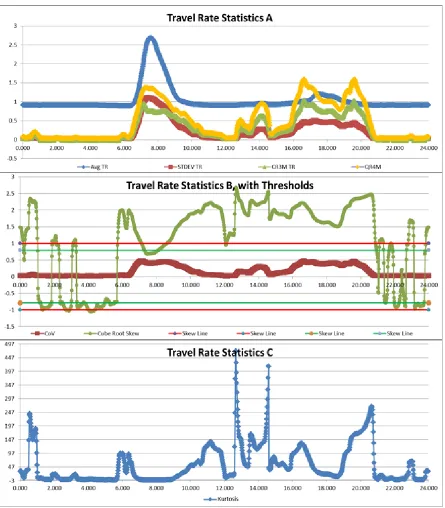
The summary statistics for the Interstate 77 Southbound Route are shown in Figure 10.
“Travel Rate Statistics A” is a time series plot which displays the average, standard
deviation, cubic root of the third moment, and quadratic root of the fourth moment of travel
rate for each one-minute time period with a fifteen-minute window. “Travel Rate Statistics
B, with Thresholds” displays the coefficient of variation and the cubic root of skew of travel
rate. The cubic root of skew was chosen to be displayed, rather than the skew, due to the
infeasibility of displaying much larger skew values on the same time series plot as coefficient
of variation. Additionally, skew thresholds are included which delineate the different levels
of skew. Where skew is greater than the absolute value of 1, the distribution is highly
skewed, if skew is between the absolute value of 0.5 and 1, the distribution is moderately
skewed, and if skew is between the absolute value of 0 and 0.5, the skew is approximately
symmetric [17]. “Travel Rate Statistics C” displays a time series plot of kurtosis. The
resulting distribution of the individual minute data allows for interpretation of the summary
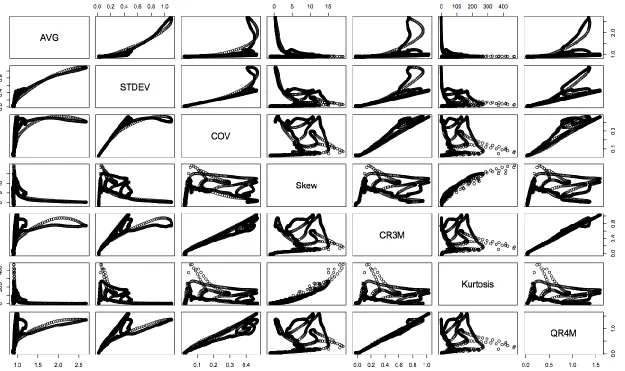
Because several of the seven statistical methods selected for analysis were closely related, an
analysis of the correlation between them was performed. Figure 11 and Table 2 display the
correlation between the variables for the Interstate 77 Southbound route. Figure 11 shows the
plots of the statistics against each other while Table 2 shows the R-square values, which
describe the linear relationship between them. Using this data, it could be determined that a
maximum of three values could be selected in order to avoid high correlations between any
of the variables in a grouping used to cluster the data. These high correlations were avoided,
as highly correlated statistics are redundant as one of the statistics would be unlikely to add
new information about the relation between the distributions and the statistics. The final
statistics chosen upon which further analysis would be performed were average, cubic root of
the third moment, and kurtosis.
Table 2: R Square for Linear Correlation Between Statistics
AVG STD COV Skew CR3M Kurtosis QR4M
AVG 1.000 - - - -
STD 0.796 1.000 - - - - -
COV 0.343 0.788 1.000 - - - -
Skew 0.045 0.001 0.077 1.000 - - -
CR3M 0.277 0.717 0.971 0.154 1.000 - -
Kurtosis 0.056 0.006 0.010 0.861 0.047 1.000 -
3.5 Distribution Cluster Creation
The selected statistical measures were calculated for each one-minute, fifteen-minute
window time period. These statistics represented the distribution of travel rate for the year
2012 along the route. Each distribution usually contained several thousand one-minute
average travel rates. A maximum of nearly four thousand one-minute average travel rates
was possible, determined by multiplying the number of working days in 2012 by the number
of minutes in each time period’s window. 1440 distributions were created, one for each
minute of the day. Each distribution was to be sorted into a cluster based on it’s the average
travel rate, cubic root of the third moment of the travel rates, and kurtosis of the travel rates.
These three statistics represented the distributions and their values were used to categorize
the distributions. The goal of this clustering was to group similar distributions of travel rates
which can then be classified as the same traffic condition in terms of travel time reliability.
Classification and Regression Trees (CART) were then created to analyze the travel rate
statistics instead of attempting to visually classify routes based solely on distributions of
speed and travel rate data. The final product was a grouping of all distributions into clusters
such that their impact on travel time reliability could be analyzed based on the statistical
measures which split them into the groups. Unsupervised learning was used to group the
data into clusters, while supervised learning was used to find the statistics upon which the
clusters split from one another. Additionally, the number of groups into which the data
should be split was determined and used in the unsupervised learning process. This process
was initially performed on the route that traverses Interstate 77 Southbound due to its
preferred characteristics. It is a commuter route that experiences recurring congestion
conditions that allows it to experience a wide range of traffic conditions. By using this route,
it was presumed that a high number of traffic conditions, and therefore travel time reliability
conditions, could be identified in its distributions. The resulting information determined the
statistical variables and values upon which the clusters of distributions would be separated.
This information was then applied to the other routes in order to create clusters of
were conducted using the R language and environment and its associated packages for all
clustering and classification and regression methods. .
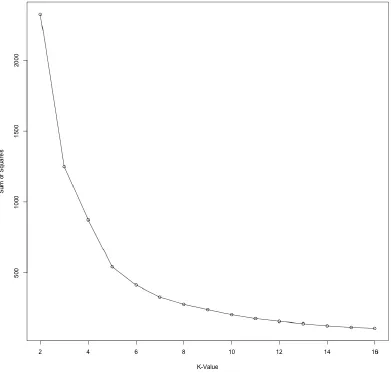
The optimal number of groups was determined by using k-means clustering. This method
clusters the data such that it attempts to minimize the sum of squares distances between the
statistical values that characterize each distribution for each group of distributions [18]. This
clustering method was plotted to display the average sum of squares for each cluster created.
As the number of groups increase, the average sum of squares decrease, due to the
distributions in each cluster becoming more similar to one another, and therefore closer to
that cluster’s overall mean with each additional group. The sum of squares distance is
measured as the Euclidean distance between each of the variables for each distribution. Due
to the different variables having large differences between their values and range of values;
the data was normalized prior to using the k-means algorithm. The method of normalization
used normalized the data by subtracting the variable’s mean value and dividing by the
variable’s mean absolute deviation [19]. This normalization method is similar to the standard score which subtracts the variable’s mean value and divides by the variables standard
deviation. By using the mean absolute deviation rather than the standard deviation, the effect
of outlier values is decreased. This was important due to the extreme statistical values that
were encountered for some routes which caused normalization techniques such as feature
scaling to be inadequate. This normalization technique can be found statistical analysis
software packages such as R. The k-means results for the route along Interstate 77
Figure 12: Number of Groups for I-77 SB
Additionally, a silhouette plot was created to visually display the number of data points in
each proposed cluster along with the density of the cluster. As shown in Figure 13, for each
plot with n number of clusters, the height of each cluster represents how close the data points
are clustered, while the width demonstrates the number of data points in each cluster. Using
these methods and the resulting information, further analysis was performed using a grouping
by increasing the number of clusters drops as the number of clusters increases past six as
seen in Figure 12.
Unsupervised learning attempts to create clusters of data based solely on the value of each
individual data point’s variables. It attempts to cluster the data points into groups and
determine the order of importance the variables play in separating these clusters. It also
determines how many different groups are desired based upon the preference of the user. In
this research, each data point is a distribution of travel rates, and each variable is a statistical
measure that characterizes that distribution. There are several classes in R which create
clusters of data by using the Euclidean distance between each data point’s variables to
minimize the distance of each cluster from the mean. These classes can be found in R’s
“cluster” package and provide ways to create clusters through agglomerative or divisive
partitioning means. The class used in this research was the Clustering Large Applications
class, or CLARA [19]. CLARA partitions data sets in a specified number of clusters using
the Euclidean distance between the variables. It returns information regarding each cluster
including the statistical values for each medoid distribution for each cluster, the number of
distributions in each cluster, the dissimilarity value of the maximum distance distribution,
and the average dissimilarity of all the distribution in each cluster. The medoid distribution
is the distribution which has the minimum combined dissimilarity, or distance, from all the
other data points, or distributions. It is comparable to the centroid of the cluster. The
maximum dissimilarity distribution represents the distribution which is the furthest from all
other points, or distributions, in the cluster. It is the largest outlier distribution in the cluster.
Additionally, a summary of CLARA returns the cluster in which it has placed each
distribution. CLARA gives the option of normalizing the data in R via the method described
previously, or not normalizing it if it has been previously normalized. The unsupervised
output used from CLARA used for this thesis can be found in Appendix B.
Supervised learning using CART attempts to sort pre-existing clusters of data, or
distributions, based upon features in their corresponding variables. There are several
packages, which can be installed and loaded in R to achieve this goal. The package “rpart”,
[20]. This package was loaded and used to create supervised classification trees for the
routes. The first step required to use unsupervised CART was to combine the information
obtained from CLARA with the variable information. Each distribution was assigned to one
of six clusters as determined by CLARA. Once this data was paired with the corresponding
travel rate statistics, a classification tree could be created for the distributions to determine
the significant variables and the corresponding values by which the data could be sorted. The
classification tree was created by examining the cluster grouping determined by CLARA as a
function of the statistical values of each distribution; average travel rate, cubic root of the
third moment of travel rate, and kurtosis of travel rate. The distributions were then grouped
based upon these three statistical measures and their values. The classification trees not only
showed how the clusters of distributions were broken up based on variable and variable
value, but also displayed the number of distributions for each category in each branch of the
tree. Figure 14 shows the classification tree output from R for the Interstate 77 Southbound
Route. This figure represents the supervised output and is interpreted by starting at the top
and moving towards the bottom in order to examine the necessary statistical variables and
values to sort the distributions into specific groups. For each split in the tree, if the
distribution under consideration has a variable value that fits the criteria, the branch to the
left is the next under consideration. If it does it fit the criteria, the branch to the right is the
next under consideration. In the case of the tree shown in Figure 14, distributions found in
cluster 2 have a cubic root of the third moment value that is greater than or equal to 0.04493
but less than 0.4941, and a kurtosis value less than 91.37. In this cluster, 226 distributions
were classified by CLARA as group 2, while 0 were classified as groups 1, 2, or 3, 1 was
classified as group 3, and 3 were classified as group 4.
Once the classification tree was obtained, the sites could be sorted into clusters based upon
the data provided by the tree. The Interstate 77 Southbound route also had to be sorted as the
classification tree was unable to split the clusters into perfect groups as determined by
a distribution of the travel rates was created. Additionally, the maximum dissimilarity points
for each cluster were also found and a histogram of their distributions was created as well.
Because the Interstate 77 Southbound route had several data points misclassified, the
maximum dissimilarity for each group had to be recalculated with the new cluster groupings.
The clusters produced by the classification tree all contained over 97% of the expected
distributions. In other words, 98.3% of the distributions in cluster 1 from the tree matched up
with cluster 1 from the CLARA output. These values for groups 2 through 6 were 98.2%,
Figure 14: I-77 SB Classification Tree
Classification Tree for I77Sd Clara with 6 Groups
| CR3M< 0.04493
CR3M< 0.4941
Kurtosis< 91.37 Kurtosis< 63.79
3.6 Segment Categorization and Definition
While the summary statistics provided information for each time period from which
assumptions could be made, a closer look at the distributions of the data included in each
time period was necessary. By comparing the trends seen in the summary statistics and the
values for each time period to the distributions of individual data points throughout the entire
year, inferences can be made regarding the information provided by the summary statistics.
Analysis of the distribution of all aggregated one-minute speeds for the entire data set
occurring in the time period was conducted. The speeds were segregated into individual
one-mile per hour bins. This distribution was also created for the corresponding travel rates.
While observing the distribution of recorded speeds gave insight to the correlation between
distributions of speeds and the resulting statistical values, a distribution of travel rates gave a
better visual representation of the data, especially for statistics such as skew or kurtosis. The
distribution of the travel rates was separated into 0.1 size bins.
The distributions of each medoid and maximum dissimilarity for each cluster provide the
representative and extreme distributions. These distributions allow the clusters to be visually
identified, described, and categorized. Ideally, individual segments can be categorized into
varying degrees one of three basic categories: reliably congested, reliably uncongested, and
unreliable. These three categories are the minimum number of categories used to classify the
range of potential segment reliability. These categories must be carefully and clearly defined
in order for them to have meaning amongst all people. Because terms such as congestion and
reliability differ between individuals, the four categories are defined here in order to
represent fully the goal of each.
3.6a Reliable and Congested
A segment considered reliable and congested is one which experiences congested conditions,
identified by a high number of low, or non-free flow speed values. This congested state is a
distribution of travel rates along this segment has a high peak near high travel rate values and
a short tail with few low travel rate values. These segments commonly experience recurring
congestion.
3.6b Reliable and Uncongested
A segment considered reliable and uncongested is one which experiences uncongested
conditions, identified by a high number of high, or free-flow speed values. This uncongested
state is a relatively common occurrence and high speeds along the segment are expected.
The distribution of travel rates along this segment experiences a peak in the uncongested
range of values, and a short tail with few high travel rate values.
3.6c Unreliable
A segment considered unreliable is one which experiences congested and uncongested
conditions. These congested and uncongested states fluctuate such that there is also a
mixture of free-flow speeds with congested speeds. The distribution of travel rates for this
segment will contain a number of high and low travel rates, with a smaller peak and a larger
spread of travel rates throughout either the congested region, uncongested region, or both. It
will also include longer and taller tails that spread amongst the two regions. These segments
may be subject to periodic recurring congestion on some but not all of the weekdays or may
be prone to incidents such as collisions, work zones, or other special events that bring about
infrequent congestion or higher traffic volumes. A combination of these scenarios may result
that also yields an unreliable distribution of travel rates among the congested and
uncongested regions.
Categorizing a segment as reliable or unreliable and congested or uncongested requires
careful analysis of the distribution of the speeds and travel rate data used in travel time
calculation. With the results obtained through R, an attempt was made to classify and
4.
RESULTS
This section details the results obtained for each route analyzed, including the calibration and
validation for each. The results provided display the resulting distributions for each site
analyzed according to the clusters created by the model route along Interstate 77 Southbound.
The interpretation of the distributions is also included for each site. From the classification
tree in Figure 14, it can be observed that cluster 1 contains all distributions with a cubic root
of the third moment less than 0.04493. Cluster 2 contains distributions with a cubic root of
the third moment greater than 0.04493 but less than 0.4941, and a kurtosis less than 91.37.
Cluster 3 contains distributions with a cubic root of the third moment greater than 0.04493
but less than 0.4941, and a kurtosis greater than 91.37. Cluster 4 contains distributions with a
cubic root of the third moment greater than 0.4941, a kurtosis less than 63.79, and an average
less than 1.807. Cluster 5 contains distributions with a cubic root of the third moment greater
than 0.4941, a kurtosis less than 63.79, and an average greater than 1.807. Cluster 6 contains
distributions with a cubic root of the third moment greater than 0.4941 and a kurtosis greater
than 63.79.
4.1 Route 1 Analysis Results, I-77 SB
Because the classification tree for Route 1 was unable to perfectly split the clusters into the
clusters created by CLARA, several distributions were “misclassified”. However a visual
analysis of these individual distributions showed that they were borderline distributions
which occurred during the transition from one cluster state to another. It was therefore not a
concern to classify these borderline distributions in the clusters determined by the
classification tree rather than those selected by CLARA. The medoid distribution and
maximum dissimilarity distribution were found for each cluster. After switching the cluster
grouping from those provided by CLARA to those determined by the tree, several of the
maximum dissimilarity distributions changed. These “new” maximum dissimilarity
distributions were also created and included for analysis. In order to display the transitions
containing the least congested distributions to the most congested distributions. Referring to
the cluster numbering created by CLARA, the clusters are ordered 1, 3, 2, 6, 4, and 5, where
cluster 1 is the least congested and cluster 5 is the most congested. For further discussion,
these clusters will be referred to as A, B, C, D, E, and F, respectively.
Figure 15 shows the distributions of the medoid, Figure 16 shows the distribution of the
maximum dissimilarity, and Figure 17 shows the distribution of the corrected maximum
dissimilarity for cluster A. The three resulting distributions indicate distributions and time
periods which occur during off-peak periods. This cluster represents uncongested conditions
and reliable travel times. The medoid distribution shows a nearly symmetrical distribution of
speed data points about a mean of 65 mph, which is the free-flow speed. The maximum
dissimilarity distributions suggest a data set that, even at its extremes, does not experience
congestion, except under rare circumstances, and a normal distribution of free flow speeds is
to be expected.
Figure 18 and Figure 19 show the distributions for the medoid and maximum dissimilarity
for cluster B. Both the medoid and maximum have very similar distributions with the
maximum dissimilarity graph containing a few extreme speed data points. This cluster is
reliable cluster of distributions that may potentially contain a few erroneous travel rate
readings which produces a separation from cluster A.
Figure 20 and Figure 21 display the distributions for the medoid and maximum dissimilarity
of cluster C, while Figure 22 exhibits the “new” maximum dissimilarity. The resulting
distributions for this cluster also show time periods that experience low levels of congestion.
The medoid distribution in cluster C is similar to cluster A; however, it has a more significant
tail extending towards the congested region. The “new” maximum dissimilarity distribution
also is primarily contained to within the uncongested region. However, this outlier point sees
an increase in the tail prominence that extends towards the congestion region. This cluster is
representative of an uncongested group of distributions. Distributions in this cluster seem to
occur in time periods during which traffic volumes are moderate and not significant to cause
congestion. They represent reliable, uncongested time periods, but may have a tendency to
experience special events such as incidents that may lead to rare unreliable travel times.
They also may be on the far end of shoulders of congested time periods.
Figure 23 and Figure 24 exhibit the distributions for the medoid and maximum dissimilarity
for cluster D. Cluster D is an uncongested segment which has distribution characteristics
similar to those found in clusters A and C. The medoid distribution is uncongested but has a
noticeable number of speed data points in the tail that stretch toward the congested regime.
The maximum dissimilarity has a nearly symmetrical distribution and can be considered
reliable. It contains extreme speed data points that are likely from a lone rare occurrence,
potentially a work zone, or may be erroneous. This cluster could be potentially grouped with
clusters A and B.
Figure 25 and Figure 26 exhibit the distributions for the medoid and maximum dissimilarity
for cluster E. Cluster E represents a range of distributions that can all be called unreliable.
![Figure 1: RITIS bottleneck confirmation and clearance method [13]](https://thumb-us.123doks.com/thumbv2/123dok_us/1570636.1193104/20.612.96.522.134.384/figure-ritis-bottleneck-confirmation-clearance-method.webp)
![Figure 2: Study Routes 1 (SB) and Route 2 (NB) [14]](https://thumb-us.123doks.com/thumbv2/123dok_us/1570636.1193104/24.612.90.424.182.638/figure-study-routes-sb-route-nb.webp)
![Figure 3: Commuter Routes on I-77 North of Charlotte [14]](https://thumb-us.123doks.com/thumbv2/123dok_us/1570636.1193104/25.612.90.527.127.647/figure-commuter-routes-i-north-charlotte.webp)
![Figure 4: AADT along Routes 1 and Route 2 [15]](https://thumb-us.123doks.com/thumbv2/123dok_us/1570636.1193104/26.612.88.422.127.693/figure-aadt-routes-route.webp)
![Figure 5: Bottleneck Analysis for Route 1 [12]](https://thumb-us.123doks.com/thumbv2/123dok_us/1570636.1193104/27.612.91.357.452.679/figure-bottleneck-analysis-route.webp)
![Figure 8: Study Routes 5 and 6 [14]](https://thumb-us.123doks.com/thumbv2/123dok_us/1570636.1193104/28.612.71.275.183.387/figure-study-routes-and.webp)