A story ofkpfonts: Reaching the limits of NFSS Christophe Caignaert
Like a bird on the wire,
Like a drunk in a midnight choir, I have tried, in my way, to be free.
Leonard Cohen,Bird on the wire
One day, some years ago, I was withDaniel Flipo, the author of the lettrine package and the French module ofbabel.
He reminded me that LATEX is community soft-ware, and, if I don’t find what I want, I have to write it! Without him, probably,kpfontswouldn’t exist.
Greetings to him. . . 1 Beforekpfonts 1.1 I’m not a. . .
I have been a mathematics teacher in a high school in the north of France since 1980. My students are 19 or 20. I have been interested in computer science since the middle of the seventies.
I’m not a typographer and I’m not a TEX, or LATEX, expert. I’m unable to program in the TEX lan-guage! Nothing fated me to become a font designer and package author. . . nothing at all!
1.2 First steps with computer typesetting The first computer I bought was an Appleiie. Then
I began writing some papers with the Apple Writer1 software, obviously text and not math documents. . . Then I bought anhppersonal computer with
an 8 Mhz 80286 processor! I began writing some mathematics using ChiWriter,2 shareware at that time.
Some years later, I used a student release of Scientific Word, Scientific Workplace,3release 2.5. It was a private LATEX editor with a limited wysiwyg formula editor. This was my first typesetting with good output. Scientific Word was good, but not very versatile, and month after month, I reached its limits. It was possible to insert any LATEX command, but if it was unknown tosw, it would appear on
the screen as a grey box. Some basic commands like\sum\limitsin math resulted in a grey box for \limits. Because I’m never fully satisfied, I got
more and more grey boxes in my documents with more and more (LA)TEX commands not interpreted
1http://en.wikipedia.org/wiki/Apple_Writer 2http://en.wikipedia.org/wiki/ChiWriter
3http://en.wikipedia.org/wiki/Scientific_WorkPlace
on screen. Therefore, I decided to forget it and I’m now using pdfTEX.
Perhaps it seems foolish to you, but during these years I was working alone to discover this soft-ware. In my high school, most math teachers are, still at this moment, writing math by hand; some use a too-well-known word processor, and I’m alone in looking for better output quality. . . with LATEX.
And you know it’s not easy to discover LATEX alone!
1.3 First interest in fonts
I have been interested in typography for a long time and I read that pdfTEX can use TrueType fonts. I fol-lowed the article ofDamir Rakityansky4to install my firstttf fonts.
Thus, I discovered ligatures, kerning, metrics, virtual fonts: pl, vpl, tfm,vf, fd, mapandsty files of the LATEX font world, and alsottf,pfb,afmfiles coming from typography.
Because some users, mainly Windows users, never use a console or command line, I wrote a new paper, in French5and in English,6about installing ttf fonts for pdfTEX and step-by-step instructions for those using TEXnicCenter. In addition, I built the necessary support files for many Windowsttf fonts and freettf fonts available from a web site.7
I also made an artistic document for a local exhi-bition combining computer handwriting fonts with the meaning of the message, perhaps unfortunately for you, in French, calledRendez-Vous.8
Doing that work, I also discoveredthefont edi-tor,fontforge, but also some other font editors: one of my friends works in typography and I used his professional computer during weekends.
I obviously discovered Bezier curves and the design of non-Metafont glyphs. . .
1.4 First steps of the futurekpfonts
My first font was calledChristophe; it was my first attempt to alter Palladio (the urw Palatino) as a
challenge . . . for myself!
From the beginning, the principles were: • very basic design, with a minimum number of
Bezier curves,
• dynamic design with a marked diagonal force line fromwswtoene.
4http://www.radamir.com/tex/ttf-tex.htm 5http://c.caignaert.free.fr/Installer-Police-ttf. pdf 6http://c.caignaert.free.fr/Install-ttf-Font.pdf 7http://c.caignaert.free.fr/ttf.html, http://c.caignaert.free.fr/ttf-english.html 8http://c.caignaert.free.fr/Rendez-Vous.pdf
We can see here the roman uprightaof both kpfontsand some other font packages, and the ap-proximate corresponding set of Bezier curves.
Kpfonts CM Palatino Utopia Times
a
a
a
a
a
Next, you can see here the force line (sharp cut) and its symmetrical echo inkpfonts:
e
L F T
2 The development
I saw a beggar leaning on his wooden crutch, he said to me, “You must not ask for so much.” And a pretty woman leaning in her darkened door, she cried to me, “Hey, why not ask for more?”
Leonard Cohen,Bird on the wire
2.1 Beginnings of the math set fonts
My first tests with math fonts was to useurw
Gara-mondwith the math symbols ofpxfonts, the package I use at this moment in my documents. I called this gxfonts. . .
I discovered the global organisation of math fonts, with the main
• operators, like0123 +−= Γ ∆, and math
opera-tors like “sin”, • letterslikeabc αβγ,
• symbols, the basic symbols, like→ 7→ ⇒ ∃, • largesymbols, the multi-size basic symbols, like
P X R Z
and a lot of other things likeamssymbols, etc.
I also learned about the math alphabets, math delimiters. . .
I was impressed by the special tricks ofDonald Knuthas
• long arrows made with minus sign and a regu-lar arrow: ‘−’ and ‘→’ gives ‘−→’,
• long double arrows with equal sign and regular double arrow: ‘=’ and ‘⇒’ give ‘=⇒’,
• the use of the fake width and italic correction in math mode, width for subscript and italic correction for superscript,
• the famousskewchar, fake kerning to create the math accents:a˜.
It’s like building the Golden Gate Bridge with three oz of spaghetti. . .
When thegxfontspackage was inβ-release, I sent a note to Michel Bovani, the author of the fourierpackage, asking him his opinion.
Many thanks to him: he told me, with chosen words, it wasvery bad! And, even better, he told me why! For instance, the roman and greek letters of gxfontswere like cats and dogs. . .
Thus, I saw, at that moment, I had designed the Greek letters according to the design of the roman letters ofChristophe. Even though the two projects were not linked at first, it was not so surprising: the same author and the same mood for design. . .
Therefore, it was obvious I had to combine these. . .
2.2 Thekpfontspackage 2.2.1 The 1.0 release
Then I decided to make afullpackage of fonts, i.e. needing only one\usepackageto run.
It was 2005/04/20, my fiftieth birthday. Often, many people think that your life is behind you at 50! And perhaps I had to prove I was not a has-been!
From that moment I decided to write a compre-hensive package including
• the roman, sans serif and teletype fonts, • all the symbols includingamssymbols, “not”
symbols, et al.,
• calligraphic and script alphabets,
• afrenchstylemath option needing upright up-percase and greek letters .
At that time, I had:
• the normal and bold text fonts including small caps, fromChristophe,
• the slanted greek letters, fromgxfonts, and my todo list was cluttered:
• the textcomp symbols,
• the symbols, large symbols,amssymbols,
• the upright greeks, calligraphic, script, full mathbb and fraktur alphabets,
• reading thefontinstdoc file carefully,
• fixing the font’s math dimensions: I keep the math font dimensions asDonald Knuthhad them, except for the position of a subscript with no superscript, lower inkpfontsthanCM. I didn’t realize the great deal of work needed at that time. The next two years were the busiest of the story. If you look at thereadme.txtfile, you
can find:
Release 1.0 2007/04/20
It was my 52nd birthday. For many years, the first new set of fonts designed for LATEX. I was very anxious about the feedback.
Since the beginning,kpfontshas supported the frenchstyleoption, with upright uppercase roman and lowercase greek letters in math mode. Even if, at that time, I had no idea about the future ofkpfonts, from the beginning, I thought I would propose some options to customize the typesetting.
2.2.2 Old style options
At that time, my birthday was obviously very impor-tant, because the next line ofreadme.txtis
Release 1.1 2007/05/04 New ’oldstyle’ option, and \sqrt bug fixed.
onlyfifteen dayslater!
I had built theoldstyleoption during the two previous years and it was almost ready when I up-loaded the 1.0 release. . .
In fact, I think it is a good thing to build a pack-age but a better thing to build adifferentpackage. A large set of options to customize the typesetting will make the difference. This appeared little by little during the work, like an obvious element.
In France, we have a well-known collection of books calledLa Pleïadeusing aGaramondfont set with theandold ligatures and a long tailQ .
I decided, because I liked them, to offer these possibilities as an option, with oldstyle numbers as the default. Later, asked by German users, I built anoldstylenumsoption without the extra ligatures (inRelease 2.1 2008/03/21).
Here you can see the design of the ligature forms compared to the standard forms, using the lightoption:
upright oldstyle upright oldstyle
ct
st
italic oldstyle italic oldstyle
ct
The font dimensions of the superscripts are al-st
tered with oldstyle numbers in math mode taking their design into account.
Because thet1 encoding is full, I had to find
two slots for the newandold ligatures. I chose to use the slots of two Icelandic letters. I had noth-ing against the Icelandic people or their language, but I had to make a decision. . . Obviously,kpfonts sends a warning in this case.
2.3 Thekpfontspackage, release 2
It was the first major evolution of the package:
Release 2.0 2008/01/01.
The new f ligatures, light fonts and very old style options appeared with this release. You can see that the second part of 2007 was a very intensive work period!
It was a new main number because, for me, the lightoption isthe major alterationofkpfonts.
At that time, I thought, once again, thatkpfonts was finished, except for the inevitable bug correc-tions. . .
2.3.1 Light fonts
In my opinion, too-bold fonts are in bad taste. Using the facilities of the font editors and a good deal of work, I built lighter fonts with the same metrics, corresponding to thelightoption.
It was necessary to design again the mathemati-cal symbols: when you have a line that is .7 pt in 10 pt, the light font would be .5 pt.
You can see below the normal weight and light, upright and italica:
upright light italic light
a
What’s more, it’s not insignificant to save up toa
a
a
20% toner when printing. . .2.3.2 Newf ligatures
A ligature is the way to combine two characters into one. The most common ligatures with TEX are thef ligatures:ff,fi,fl,ffiandffl.
There are different ways to design them. See examples below with thefiligature:
urw
Garamond Kpfonts 1.x Kpfonts Palladio
fi
fi
fi
fi
urw
Garamond Kpfonts 1.x Kpfonts Palladio
fi
fi
fi
fi
At first, I made a bad choice, like a bridge, as with Garamondfor instance. It was a bad choice relative to the design of thef of my fonts: the effect was not good because of the short terminal of its ascender. Thus, I decided to change it. It was neces-sary to change the design of the ascenders of these ligatures.
Note the old and newfiofkpfontsand the al-most fake ligature in uprighturwPalladioused by
thepalatino,pxfonts, andmathpazopackages. 2.3.3 Very old style options
In very old documents, instead of the rounds, we find a long s, except at the end of the word. I couldn’t find any package to typeset text and math with the longs. Then, I decided to built the neces-sary files and to offer these possibilities. It was done withRelease 2.1 2008/03/21.
For instance, here isstusing italic shape and light fonts; you can see I also installed new ligatures:
Default Old style Very old style
st
õ
At this moment, the idea to make a package with a large set of options to customize the typesetting was definitely established.
2.3.4 Large small capitals
It’s interesting in a font package to have real small capitals and not fakes. . . From the beginning, I de-signed some small caps. In fact, I dede-signed very smallsmall caps, approximately as high as anx. I like it because they are different!
It’s also not usual because in many cases, the small caps are fakes, scaled uppercase indeed. Don’t forget that a fake seems not too bad if the scaling is not too strong, i.e. if the small caps are not too small! This is another of the reasons why small caps are usually rather large.
I decided then to work on a large small caps set of fonts. Indeed, the font editors are able to “blend” some fonts. Blending the existing small small caps and usual uppercase letters gives a good design to begin the work. It was done inRelease 2.2 2008/05/21, shown here using thelightoption.
lowercase small cap largesmall cap uppercase
d
d
d
D
Thus,kpfontshas two sizes of small caps. It’s very rare and even the very extensive OpenType font file doesn’t allow for it!
As in the present article, I usually use small small caps for people’s names and large small caps for acronyms.
2.3.5 The lowercaseqrecord
Usually, with a given font set, you get four designs for a letter: upright and italic, normal and bold. If there are true small caps, you get also them in normal and bold, six designs in this case.
For the lowercase q inkpfonts, you get forty roman designs, and then more with the sans-serif and teletype fonts! Perhaps a record, even though there is no italic small capsq. Let’s start with the default designs:
upright bold italic bold
Light:
upright bold italic bold
q
q
q
q
Small caps:
default bold large bold
q
q
q
q
Light small caps:
default bold large bold
q
q
q
q
Long tail small caps:
default bold large bold
q
q
£
£
Long tail light small caps:
default bold large bold
q
q
£
£
We get all these glyphs with the lowercaseq!
2.3.6 Nof ligatures
The optionnofligaturesappeared withRelease 2.3 2008/09/09, requested by users who didn’t like the
ligatures.
With some packages, or modern TEX-based en-gines, you can disable these ligatures but the result can be ugly: Times f{}i Utopia f{}i Kpfonts f{}i Kpfonts nofligatures
fi
fi
fi
f
i
Times f{}i Utopia f{}i Kpfonts f{}i Kpfonts nofligaturesfi
fi
fi
f
i
And, don’t forget it’s worse at normal size! With upright Times,f andiseem incompatible, like cats and dogs, and with Utopia, the ascender of thef and the dot of theiare too close and don’t fit together.
You can see that the result is not too bad with my fonts, but, I preferred to shorten the ascender of thefletter in this case. In my opinion, the look is better at normal size!
2.3.7 Slanted small caps
In the LATEX new font selection scheme (nfss),
small-caps and slanted (or italic) areshapes. The result is the impossibility of getting slanted small caps.
Installing slanted small caps, a new shapescsl, requires only some lines in the installation file used byfontinstprogram, and also some lines in thesty file. Here’s an example:
Everybody, includingTed Slanted, can see it’s
better thanJack Uprightdoes usually!
Slanted small caps also appeared withRelease 2.3 2008/09/09. Later, a new optioneasyscslallows you to fit together \textsc and\textsl. It’s an
option because, if you use\textsc{\textsl{...}}
with other fonts, you get some edge effect. This op-tion appeared withRelease 3.3 2010/04/20, and
sent a warning to the console. This point will be discussed in a later section.
2.3.8 Math fonts during this time
For some time now, we have been speaking about text fonts but math typesetting is also going on!
First, theoldstylemath,veryoldstylemathand old-stylenumsmathappeared at the same time as the text equivalent.
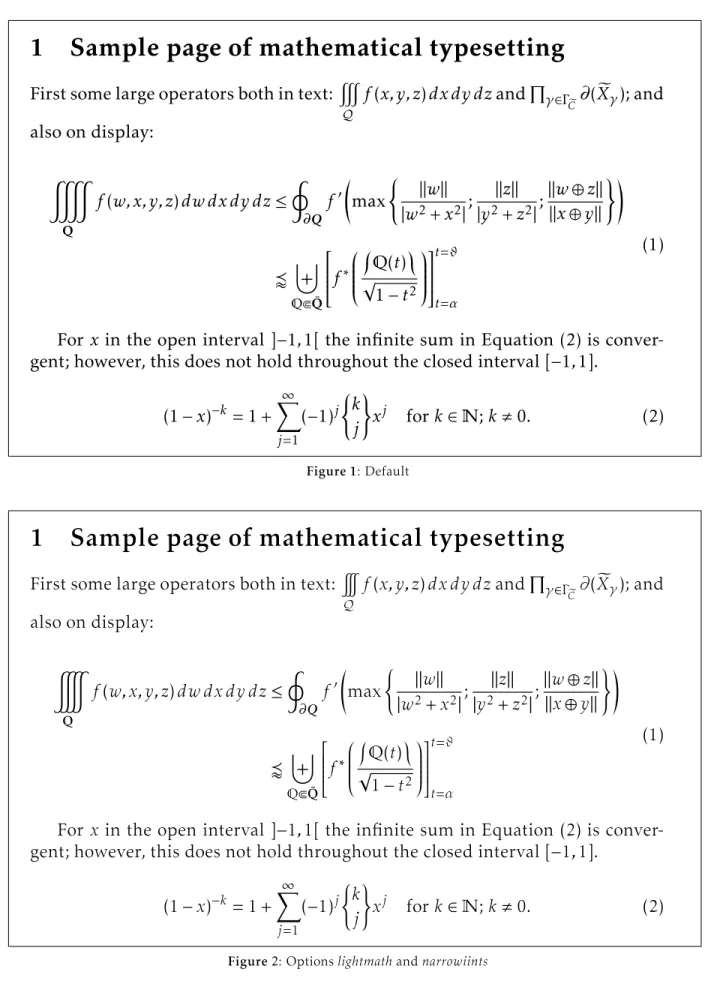
As ofRelease 2.2, you can usenarrowiints op-tion, For\displaystyle\iiint dx\,dy\,dz, let’s
default narrowiints
$
dx dy dz
dx dy dz
And with Release 2.3, the partialup option is added. For\dfrac{\partial z}{\partial x},
the output is:
default partialup
∂z
∂x
z
x
2.4 The 3.0 release: new text kerning and math accents
2.4.1 New kerning
There were some inherited defaults inkpfonts, and, even at that time, we could see that the main prob-lem was the kernings. One of the first lines of the
Readmefile is
Release 1.11 2007/06/03 Correct bad kernings of ’quote’ symbols
It proves that, from the beginning, the kerning was a problem. Perhaps it’s the biggest challenge for a beginner! The kerning by pairs is the way to tighten or spread two characters depending on their exact design. For instance, seeYewith and without kerning, here using thelightoption:
with without
Ye Ye
The font editors offer a lot of possibilities. One of these is automatic kerning. Usually you have to choose:
• the left and right characters to kern, • the required space between two characters, • the technique: minimum distance, average
dis-tance, average weight,
• the exceptions: numerals, lowercase-uppercase: in ‘LATEX’, for instance, there is a kerningT-e but no kerninga-T. . .
• the equivalents, o andô have often the same kerning. . .
These programs do their best but are regret-tably not very good. And a beginner like me was too confident in their results. Even if, at the time, I cor-rected all the generated kernings by hand, I was too
confident about the basic results of the automatic kernings. . .
Some users protest rightly about incoherent kerning. I asked onfctt, the French version ofctt, and everybody thought new kernings would be a good thing although it can change the typesetting. I decided to work on it. . .
At the same time, subscript and superscript position, i.e. width and italic correction, of all the math alphabets were revisited. It’s a very long hard job, with a large set of tests and much reinstallation of kpfonts. During these six months, I produced, withfontinstand batch files, at least 200 000 files. . .
It was available onCTAN as ofRelease 3.0 2009/03/03, and I thought now the work was not
too far from being good fonts. Therefore, the new main number version.
See for instance theAvkerning in upright shape andToin italic with the 1.xx or 2.xx release versus the same with 3.xx (default fonts here).
before 3.0 3.0 and after no kerning
Av
Av Av
before 3.0 3.0 and after no kerning
To
To To
Scaled this much, the first may not appear to spread, but it’s the case at normal size. That’s the reason why the first kernings are too strong. Then, I was working on a screen. . . Thus I bought a laser printer and work now with printed tests!
2.4.2 New math accents andwidermathoption Also with the 3.0 release, I installed new math ac-cents such as\widearc, as in some other packages.
Here are some examples:
\widearc \widearcarrow
M
0
M
1
M
0
M
1
\wideparen \widering
M
0
M
1
M
0
˚
M
1
You get also the new optionwidermath. The object is to provides slightly wider math typesetting, particularly for users working with 9 or 10 pt as the basic font size. Small sizes need proportionally bigger spaces. . .
2.4.3 amsmathoptions
Release 3.1 2009/05/20offers the possibility to
use the options ofamsmath as options of kpfonts. This affects the basic andamsmath fonts and also
the special math fonts ofkpfonts. . .
These too-little-known options affect the de-fault position of subscript in integral or summation symbols. To get more information, see the documen-tation of theamsorkpfontspackages.
2.4.4 Sans-serif math versions
The last major evolutionkpfontswasRelease 3.2 2010/03/03allowing math typesetting using
sans-serif fonts. You can do it with a new option,sfmath, or with the new math versionssf andboldsf. Ob-viously, for full support, you also get bothrmand boldrmmath versions.
Some default symbols are serifed, like \sum;
thus they have a new design, as you can see:
roman sans-serif
n
P
p
=0
n
X
p
=0
n
´
p
=0
n
¼
p
=0
In addition, I designed some sans-serif greek letters, uppercase and lowercase, slanted and upright:
roman sans-serif
α β
α β
Γ Ψ
Γ Ψ
Ó Ô
Ó Ô
È Ñ
È Ñ
In case you are getting slightly sleepy reading this, let me explain exactly what it means. For in-stance, when you type\alpha, depending on the
options and math version, you can get any of 12 different designs: normal or bold (×2); upright or slanted (×2); default or light roman; or sans-serif (×3)!
2.5 Special tricks
In fact, I don’t like to have special tricks in a package, but I still use this possibility sometimes!
• To get theveryoldstyle s, usually at the end of a word, I use a classic fake ligatures=.
• narrowiints
In the kpfonts.sty file, we find this code:
\re@DeclareMathSymbol{\iintop}{\mathop} {largesymbolsA}{\narrowiints33}
where
– \narrowiintsis 1 if thenarrowiints option is selected, empty if not, and, – the default \iintsymbol is decimal 33
and the narrower one is decimal 133. • Long tail Q is called:
– Qoldstylein theafmfiles and theetxfiles used byfontinstand,
– Qin thepfbandencfiles.
Thus, in pdf andpsoutput, it’sQ and the search functions of Acroread and Ghostscript can find it in any case. . .
I use the same trick for theveryoldstyle long s. 3 Some examples
3.1 Text
I use the example oftestfont.texand theLATEX
Companion, slightly altered when using the veryold-styleoption.
3.1.1 Default
For the price of £45, almost anything can be found floating in fields. ¡THE DAZED BROWN FOX QUICKLY GAVE 12345-67890 JUMPS! — ¿But aren’t Kafka’s Schloß and Æsop’s Œuvres often naïve vis-à-vis the dæmonic phœnix’s official rôle in fluffy soufflés?
For the price of £45, almost anything can be found floating in fields. ¡THE DAZED BROWN FOX QUICKLY GAVE 12345-67890 JUMPS! — ¿But aren’t Kafka’s Schloß and Æsop’s Œuvres often naïve vis-à-vis the dæmonic phœnix’s official rôle in fluffy soufflés?
3.1.2 Optionsoldstylenumsandlight or textlight
For the price of £, almost anything can be found floating in fields. ¡THE DAZED BROWN FOX QUICKLY GAVE-JUMPS! — ¿But aren’t Kafka’s Schloß and Æsop’s Œuvres often naïve vis-à-vis the dæmonic phœnix’s official rôle in fluffy soufflés?
For the price of £, almost anything can be found floating in fields. ¡THE DAZED BROWN FOX QUICKLY GAVE-JUMPS! — ¿But aren’t Kafka’s Schloß and Æsop’s Œuvres often naïve vis-à-vis the dæmonic phœnix’s official rôle in fluffy soufflés?
3.1.3 Optionnofligatures
For the price of £45, almost anything can be
found floating in fields. ¡THE DAZED BROWN FOX QUICKLY GAVE 12345-67890 JUMPS! — ¿But aren’t Kafka’s Schloß and Æsop’s Œuvres often naïve vis-à-vis the dæmonic phœnix’s official rôle influffy soufflés?
For the price of£45, almost anything can befound
floating in fields. ¡THE DAZED BROWN FOX QUICKLY GAVE 12345-67890 JUMPS! — ¿But aren’t Kafka’s Schloß and Æsop’s Œuvres often naïve vis-à-vis the dæmonic phœnix’s official rôle influffy soufflés?
3.1.4 Optionoldstyle
For the price of £, almoanything can be found floating in fields. ¡THE DAZED BROWN FOX
QUICKLY GAVE - JUMPS! — ¿But aren’t Kafka’s Schloß and Æsop’s Œuvres often naïve vis-à-vis the dæmonic phœnix’s official rôle in fluffy soufflés?
For the price of £, almoanything can be found floating in fields. ¡THE DAZED BROWN FOX
QUICKLY GAVE-JUMPS! — ¿But aren’t Kafka’s Schloß and Æsop’s Œuvres often naïve vis-à-vis the dæmonic phœnix’s official rôle in fluffy soufflés?
3.1.5 Optionveryoldstyleandlightortextlight For the price of £, almoõanything can be found floating in fields. ¡THE DAZED BROWN FOX QUICKLY GAVE - JUMPS! — ¿But aren’t Kafka’s Schloß and Æsop’s Œuvres often naïve vis-à-vis the dæmonic phœnix’s official rôle in fluffysoufflés?
For the price of £, almoõanything can be found floating in fields. ¡THE DAZED BROWN FOX
QUICKLY GAVE-JUMPS! — ¿But aren’t Kafka’s Schloß and Æsop’s Œuvres often naïve vis-à-vis the dæmonic phœnix’s official rôle in fluffysoufflés?
3.1.6 Quiz
Exercise: find the minimal set of package options that are used in each of these cases. Except when us-ing theveryoldstyleoption, the source file is always the same, sometimes upright, sometimes italic.
1. A.Queersays: makingaivecharaers is def-initely naõy!
2. A.Queersays: makingactivecharacters is
definitely nasty!
3. A.Queer says: making aive charaers is
definitely nay!
4. A.Queer says: making 29 active characters is definitely nasty!
5. A.Queersays: making aivecharaers is definitely nay!
6. A.Queersays: making 29activecharacters is definitely nasty!
7. A.Queersays: making 29activecharacters is definitely nasty!
8. A.Queersays: making 29activecharacters is definitely nasty!
9. A.Queer says: making 29 activecharacters is
definitely nasty!
10. A.Queer says: making 29 activecharacters is
definitely nasty!
Read the solution at the end of the article! If you were very attentive, you can get 10 points! 3.2 Math
The figures on the following pages show math sam-ples. These also use an example from the LATEX
Companion. . .
3.3 This document
This article uses only thetextlightoption. Obviously, in some parts, the options described are simulated using\fontfamily. . .
In the math examples, I use twospecial tricks to get the narrow\iiintand the upright\partial
symbol.
In both the text and math examples, the output is scaled to the available line length.
Personal names are in default small caps, and acronyms are in large small caps.
4 The limits ofnfss
4.1 Non-existing features
Some features ofkpfontsdon’t exist in the new font selection scheme:
• Two sizes of small caps:
– The commands\textothersc{...}and \otherscshapeallow you to use both sizes.
They are often used in this document. – The optionlargesmallcapschanges the
de-fault small caps size. Then, you can use standard commands for large small caps! • slanted small caps:
– The following commands allow you to use the slanted small capitals:
\textscsl{...} \scslshape
\textotherscsl{...} \otherscslshape
1 Sample page of mathematical typesetting
First some large operators both in text:
#
Q
f
(
x, y, z
)
dx dy dz
and
Q
γ∈Γ e C∂
(
X
e
γ); and
also on display:
&
Qf
(
w, x, y, z
)
dw dx dy dz
≤
I
∂Qf
0max
(
k
w
k
|
w
2+
x
2|
;
k
z
k
|
y
2+
z
2|
;
k
w
⊕
z
k
k
x
⊕
y
k
)!
v
]
QbQ¯
f
∗
Q
(
t
)
√
1
−
t
2
t=ϑ t=α(1)
For
x
in the open interval ]
−
1
,
1[ the infinite sum in Equation (2) is
conver-gent; however, this does not hold throughout the closed interval [
−
1
,
1].
(1
−
x
)
−k= 1 +
X
∞ j=1(
−
1)
j(
k
j
)
x
jfor
k
∈
N
;
k
,
0.
(2)
Figure 1: Default1 Sample page of mathematical typesetting
First some large operators both in text:
Q
f
(
x, y, z
)
dx dy dz
and
Q
γ∈Γ e C∂
(
X
e
γ); and
also on display:
Qf
(
w, x, y, z
)
dw dx dy dz
≤
I
∂Qf
0max
(
k
w
k
|
w
2+
x
2|
;
k
z
k
|
y
2+
z
2|
;
k
w
⊕
z
k
k
x
⊕
y
k
)!
v
]
QbQ¯
f
∗
Q
(
t
)
√
1
−
t
2
t=ϑ t=α(1)
For
x
in the open interval ]
−
1
,
1[ the infinite sum in Equation (2) is
conver-gent; however, this does not hold throughout the closed interval [
−
1
,
1].
(1
−
x
)
−k= 1 +
X
∞ j=1(
−
1)
j(
k
j
)
x
jfor
k
∈
N
;
k
,
0.
(2)
1 Sample page o
f
mathematical typesetting
First some large operators both in text:
#
Q
f
(
x, y, z
)
dx dy dz
and
Q
γ∈Γ e C∂
(
X
e
γ); and
also on display:
&
Qf
(
w, x, y, z
)
dw dx dy dz
≤
I
∂Qf
0max
(
k
w
k
|
w
2+
x
2|
;
k
z
k
|
y
2+
z
2|
;
k
w
⊕
z
k
k
x
⊕
y
k
)!
v
]
QbQ¯
f
∗
Q
(
t
)
√
1
−
t
2
t=ϑ t=α(1)
For
x
in the open interval ]
−
1
,
1[ the in
f
inite sum in Equation (2) is
conver-gent; however, this does not hold throughout the closed interval [
−
1
,
1].
(1
−
x
)
−k= 1 +
X
∞ j=1(
−
1)
j(
k
j
)
x
jf
or
k
∈
N
;
k
,
0.
(2)
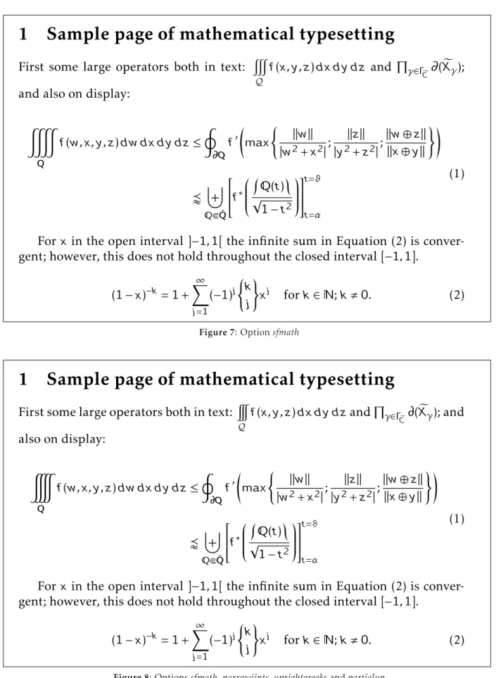
Figure 3: Optionsnofligaturesanduprightgreeks
1 Sample page of mathematical typesetting
First some large operators both in text:
#
Q
f
(
x, y, z
)
dx dy dz
and
Q
γ∈Γ e C
(
X
e
γ); and
also on display:
&
Qf
(
w, x, y, z
)
dw dx dy dz
≤
I
Qf
0max
(
k
w
k
|
w
2+
x
2|
;
k
z
k
|
y
2+
z
2|
;
k
w
⊕
z
k
k
x
⊕
y
k
)!
v
]
QbQ¯
f
∗
Q
(
t
)
√
1
−
t
2
t=ϑ t=α(1)
For
x
in the open interval ]
−
1
,
1[ the infinite sum in Equation (2) is
conver-gent; however, this does not hold throughout the closed interval [
−
1
,
1].
(1
−
x
)
−k= 1 +
X
∞ j=1(
−
1)
j(
k
j
)
x
jfor
k
∈
N
;
k
,
0.
(2)
1 Sample page of mathematical typesetting
First some large operators both in text:
#
Q
f
(
x, y, z
)
dx dy dz
and
Q
γ∈Γe C∂
(
X
e
γ); and
also on display:
&
Qf
(
w, x, y, z
)
dw dx dy dz
≤
I
∂Qf
0max
(
k
w
k
|
w
2+
x
2|
;
k
z
k
|
y
2+
z
2|
;
k
w
⊕
z
k
k
x
⊕
y
k
)!
v
]
bQ¯
f
∗
(
t
)
√
1
−
t
2
t=ϑ t=α(1)
For
x
in the open interval ]
−
1
,
1[ the infinite sum in Equation (2) is
conver-gent; however, this does not hold throughout the closed interval [
−
1
,
1].
(1
−
x
)
−k= 1 +
X
∞ j=1(
−
1)
j(
k
j
)
x
jfor
k
∈
;
k
,
0.
(2)
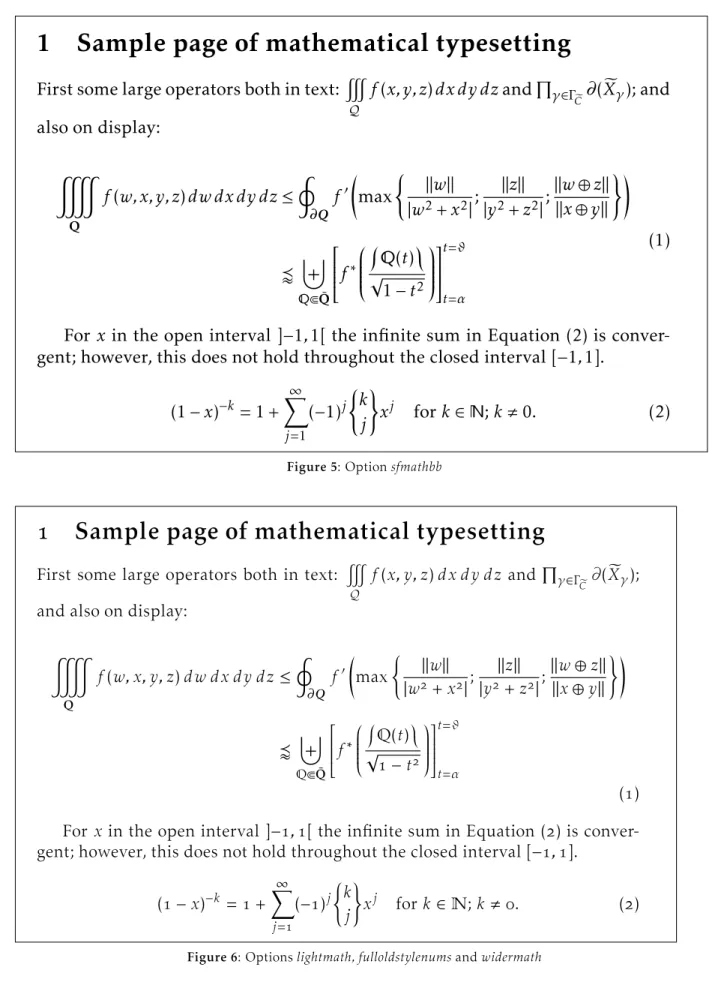
Figure 5: Optionsfmathbb
Sample page of mathematical typesetting
First some large operators both in text:
#
Qf
(
x, y, z
)
dx dy dz
and
Q
γ∈ΓeC
∂
(
X
e
γ);
and also on display:
&
Qf
(
w, x, y, z
)
dw dx dy dz
≤
I
∂Qf
0max
(
k
w
k
|
w
+
x
|
;
k
z
k
|
y
+
z
|
;
k
w
⊕
z
k
k
x
⊕
y
k
)!
v
]
QbQ¯
f
∗
Q
(
t
)
√
−
t
t=ϑ t=α(
)
For
x
in the open interval ]
−
,
[ the infinite sum in Equation (
) is
conver-gent; however, this does not hold throughout the closed interval [
−
,
].
(
−
x
)
−k=
+
X
∞ j=(
−
)
j(
k
j
)
x
jfor
k
∈
N
;
k
,
.
(
)
1 Sample page of mathematical typesetting
First some large operators both in text:
#
Q
f
(
x
,
y
,
z
)
dx d y dz
and
µ
Õ∈ÈeC
(
X
e
Õ)
;
and also on display:
&
Qf
(
w
,
x
,
y
,
z
)
dw dx d y dz
≤
I
Qf
0max
(
k
w
k
|
w
2+
x
2|
;
k
z
k
|
y
2+
z
2|
;
k
w
⊕
z
k
k
x
⊕
y
k
)!
v
]
bQ¯
f
∗
(
t
)
√
1
−
t
2
t=ë t=Ó(1)
For
x
in the open interval
]
−
1
,
1[
the infinite sum in Equation (2) is
conver-gent; however, this does not hold throughout the closed interval
[
−
1
,
1]
.
(1
−
x
)
−k= 1 +
∞¼
j=1(
−
1)
j(
k
j
)
x
jfor
k
∈
;
k
,
0
.
(2)
Figure 7: Optionsfmath
1 Sample page of mathematical typesetting
First some large operators both in text:
Q
f
(
x
,
y
,
z
)
dx d y dz
and
µ
Õ∈Èe C
(
X
e
Õ)
; and
also on display:
Qf
(
w
,
x
,
y
,
z
)
dw dx d y dz
≤
I
Qf
0max
(
k
w
k
|
w
2+
x
2|
;
k
z
k
|
y
2+
z
2|
;
k
w
⊕
z
k
k
x
⊕
y
k
)!
v
]
bQ¯
f
∗
(
t
)
√
1
−
t
2
t=ë t=Ó(1)
For
x
in the open interval
]
−
1
,
1[
the infinite sum in Equation (2) is
conver-gent; however, this does not hold throughout the closed interval
[
−
1
,
1]
.
(1
−
x
)
−k= 1 +
∞¼
j=1(
−
1)
j(
k
j
)
x
jfor
k
∈
;
k
,
0
.
(2)
– You can also use theeasyscsloption or the slantscpackage to get slanted small caps as expected: \textsc{\textsl{...}}. But,
you have to redefine these commands and the result can be disappointing!
\documentclass{minimal} \usepackage{palatino} \usepackage{slantsc} \begin{document} \textsl{\textsc{Hello}} \end{document}
gives you 2 warnings. . . and the output is anupright“Hello”inpalatino! This is the reason that theeasyscsloption ofkpfonts gives an explicit warning.
– The optionlargesmallcapsalso affects the default slanted small caps size.
• light variant fonts:
– Because of the edge effects described low, there are no commands to switch be-tween default and light fonts.
For instance, you have to redefine com-mands like\textit: therefore, you want
theitalicof theactualfont, not the default! – But the optionrmxallows you to use these
fonts without the usual
\fontfamily{...}\selectfont!
The corresponding table: option weight rmx
light m l
m m
light b/bx sb/sbx
b/bx b/bx
4.2 Exponential number of files 4.2.1 Usual case
In most cases, when you have a font family, like
urwGaramond, you get basically 4 fonts:
• upright or italic, and, • normal or bold. Thus
• 4 pairs pfb/afm, the design of characters and the metrics, and/or,
• 4ttforotf files including design and metrics. (LA)TEX doesn’t need the design of the characters, they need only the metrics, thetfmfiles to build the dvi. It’s one of the reasons whydvifiles are small.
Adviviewer ordvips(or equivalent) or pdfTEX does need the actual characters to produce the final document, of course.
We describe briefly the chain of events to find the good metrics. Now, imagine you are TEX (it’s easy if you try):
• You have an active family and encoding, for instancejkpandt1, i.e. defaultkpfontsfamily
and Cork encoding,
• you read thet1jkp.fdfile, for font definitions,
• you have an active shape and weight, for in-stanceitandn, i.e. italic and normal weight, • you read the line:
\DeclareFontShape{T1}{jkp}{m}{it} {<-> jkpmit8t}{}
in thefdfile. jkpmit8tis the neededtfmfile, including metrics, ligatures and kerning. Usual cases, likeGaramond, require less than 50 files for anot1 andt1 installation. . .
4.2.2 kpfontscase
For “hackers”, special use or curiosity, look at the rules to build the corresponding family names:
roman jkp[l,x][k][f][osn,os,vos]
sans serif jkpss[k][f][osn,os,vos]
teletype jkptt[osn,os,vos]
with the corresponding options: l, x light, rmx
k largesmallcaps
f nofligatures
osn, os, vos oldstylenums, oldstyle, veryoldstyle For the roman fonts, because we can choose betweenot1 andt1 encoding, we have 72 families,
excluding the ts1 ones fortextcomp. . . The total
number of families is 187 in the 3.12 release! Most of the roman families have 15tfmmetrics: • upright, italic, small caps, slanted,
slanted small caps,
• each in normal, bold and bold extended. . . But eachtfmcorresponds here to avf, virtual font, file because there is no direct link between thesetfmfiles and apfbfile!
In the 3.12 release, we get • 668 virtual font,vf, files, • 858 tex font metric,tfm, files.
Thekpfontstdstree has a total of 1,875 files. . .
I’m on my own and it’s impossible for me to be ensure with any probability that there is no bug! Indeed, writing this paper, I found one bug: light andveryoldstylemedium weight font were notlight but the default!
4.2.3 About a new option
A new option, long tailQwithout special ligatures ct andst, but with old style numbers or not, was requested by a user. This would mean 240 moretfm files, 240 morevffiles and 24 morefdfiles, this just fort1 encoding and roman fonts.
For sans serif fonts, it’s 96tfm, 96vf and 8fd new files. No action and no more files for teletype fonts!
The number required by theot1 encoding is
the same, for a complete sum of 1,408 new files. . . Increasing the total number ofkpfonts’ files about 75 %!
You see here the explicit exponential effect! In fact, this option would not be hard to install (2 newetxfiles, the encoding files forfontinst, and some new lines in the installation file), but I don’t agree with the request because there are already commands\othertailQand\othertailscqto do
the work. . .
4.2.4 Last way to be free
And if you want some options to choose freely: • classic LATEXf ligatures or not,
• ligature or not, • ligature or not,
• oldstyle or lining numbers, • roundsor longs,
• long tailQ or classicQ,
if I’m not wrong it’s about 20,000 files more. . . The object ofkpfontsis not to increase indefi-nitely the number of files on your hard disk!
The object ofkpfontsis not to be in the Guinness book!
I don’t think it’s sensible to exceed 2,000 files in a package, even if it’s possible!
To go further, to be free, I think somebody has to build someotf fonts using their advanced possi-bilities and has to use it running X E TEX or LuaTEX, but that’s another challenge. . .
Obviously,otf fonts will solve the above fea-tures problems without an exponential number of files, but won’t easily solve these:
• small or large small caps; • light or default fonts.
5 The end
Now I think the work is (almost) done and I’m proud of three things:
• the package runs mainly correctly,
• some people like the fonts and some people don’t like them,
• some people like to customize their text and/or math typesetting using the set of options. If everybody finds these three axioms are rea-sonable, you know what, I’m happy. . .
If I, if I have been unkind,
I hope that you can just let it go by.
Leonard Cohen,Bird on the wire
Christophe Caignaert
http://ctan.org/pkg/kpfonts
Solution to the quiz (p.168):
1. lighttext and veryoldstyle 2. oldstylenums and largesmallcaps 3. easyscsl and oldstyle 4. lighttext and nofligatur es 5. lighttext and oldstyle 6. nooptions 7. nofligatur es 8. lighttext 9. largesmallcaps 10. lighttext,lar gesmallcaps, easyscsl and nofligatur es