Kun Qian. Data Visualization in the Web-based Platform: Comparisons of Different Techniques / Data formats that Suit Web Information Design and Their Development. A Master’s Paper for the M.S. in I.S degree. April, 2019. 44 pages. Advisor: Ryan Shaw
Data Visualization has become an important way of visual communication today with the assistance of different media. The computer, because of its interactive features, has become a useful tool to help people analyze data, design visualized and interactive graphs and publish data visualization work for the public to view. The main goal of this research is to provide an overview of the development of data visualization techniques especially in the web platform. An analysis result was generated to give future technique
development suggestions for both web-based data visualization producers and web developers.
Headings:
DATA VISUALIZATION IN THE WEB-BASED PLATFORM: COMPARISONS OF DIFFERENT TECHNIQUES / DATA FORMATS THAT SUIT WEB INFORMATION
DESIGN AND THEIR DEVELOPMENT
by Kun Qian
A Master’s paper submitted to the faculty of the School of Information and Library Science of the University of North Carolina at Chapel Hill
in partial fulfillment of the requirements for the degree of Master of Science in
Information Science.
Chapel Hill, North Carolina April 2019
Approved by
Table of Contents
Introduction ... 2
Literature Review ... 6
Methodology ... 16
Results ... 19
Discussion ... 27
Conclusion ... 29
Limitations ... 31
References ... 32
Appendix I ... 36
Appendix II ... 37
INTRODUCTION
Background
Data Visualization has become an important way of visual communication today with the assistance of different media platforms. The computer, because of its interactive features, has become a useful tool to help people analyze data, design visualized and interactive graphs and publish data visualization work on the Internet for the public to view. World Wide Web, among different computer software, is the most accessible platform to publish and share data visualization work, based on its hypertext, multimedia and easy access traits. Most computer operating systems have web browsers installed by default, such as Internet Explorer (IE), Google Chrome, Mozilla Firefox, etc. If the data visualization production meets the browser compatibility requirement and, at the same time, the user has an Internet connection, the user can access the work easily through Uniform Resource Locator (URL).
Web Browsers have a relatively short history of evolution and changed throughout the years. If a visualization production is planned to be published through World Wide Web, it must follow data formatting and transferring rules as well as standards defined by World Wide Web Consortium (W3C). Such rules include HTML (the Hypertext Markup Language), CSS (Cascading Style Sheets) and ECMAScript (more widely known as
organization. Changes to popular technologies will influence the way people utilize them to create their web production. For example, Adobe Flash, as a tool for creating vector graphics and raster graphics, was previously a dominant platform for online multimedia content, and now has been deprecated by a lot of web browsers, using HTML5 instead.
Apart from the rapid change of technologies with the web, web browsers generally have limited memory capacity compared to other software run on the computer. This problem is especially obvious in mobile devices. Relatively low performance on mobile devices prevent extremely large data sets to be loaded or displayed. The process of optimizing large data is required to suit the capacity.
Another concern web-based data visualization work faces is the issue of cross-platform compatibility. Different web browsers have different levels of support through a same functionality and some functions do not even have a standardized specification. There are some other concerns such as the display difference between different sizes of screens. Moreover, different human interactive actions and gestures on different devices also have some influence on designing a compatible interactive visualization production.
Objectives
popularity, an analysis result can be generated to give future technique development suggestions for both web-based data visualization producers and web browser developers.
Research Questions
RQ1: What kinds of data organization suits data visualization in web-based platforms?
For answering this question, the research will dig into current data formats and organizations which are commonly used in web platforms. The research will investigate the easiness and efficiency of different data formats on the web.
RQ2: What are the key limitations of using web-based platforms to visualize data
compared to other software and how can they be improved?
Many other computer software provide features for visualizing data. Providing the capacity of the web browser mentioned above, the research will compare data visualization work on the web to those from platforms, stress limitations, and investigate how to improve them.
RQ3: What are the potential future features of the web browser that can be combined with
data visualization?
Definition of Terms
Data Visualization refers to the process of communication that uses statistical graphics, plots, information graphics and other tools to convey information efficiently instead of displaying raw data.
Web-based Data Visualization refers to the specific situation where web browsers participate as the display platform, along with using other web technologies.
The Semantic Web is a proposal to build an infrastructure of machine-readable semantics for the data on the Web (Claudio Gutierrez et al, 2011).
XML stands for eXtensible Markup Language. It is a markup language that defines a set of rules for encoding documents in a format that is both human-readable and machine-readable.
URL stands for Uniform Resource Locator. It is a reference to a web resource that specifies its location on a computer network and a mechanism for retrieving it.
RDF represents for Resource Description Framework. It is specified by World Wide Web Consortium (W3C) as a metadata data model.
LITERATURE REVIEW
Data Visualization History
Michael Friendly (2008) divided data visualization history into 50-year epochs starting from 1600. It evolved with mathematical developments such as analytic geometry and coordinate systems (Descartes and Fermat). The 18th century saw the first attempts at the thematic mapping of geologic, economic and medical data (p. 22). At the first half of the 19th century, there was explosive growth in statistical graphics and thematic mapping, which was a symbol of inventing modern graphics (p. 25). Later, the use of graphical forms expanded to the social realm (p. 30). By the end of 1975, the first exemplars of modern GIS and interactive systems for 2-D and 3-D statistical graphics appeared and they set goals for future goals (p. 40).
From 1975 to the present, data visualization turned into a mature, vibrant and multidisciplinary research area and a lot of software tools are available in every computer (p. 40). Widgets (sliders, selection boxes, pick lists, etc.), graphs, tables and statistical models in software tools provide an easily extensible object-oriented environment for statistical computing (p.42; Young, 1994).
Graph and Graph Representations
graph: Every page corresponds to a node, and every link between two pages is represented as a directed edge between the corresponding nodes (Claude, 2010).
Graphs that are used to represent bar charts, pie charts or other vector images are usually rendered via HTML, SVG and CSS. SVG is a form of XML used to describe an image. SVG (scalable vector graphics) is a form of XML used to describe an image (Butterfield, 2016). SVG were promoted by W3C as a format for images on the Web (Saleheen, 2018). They can be searched, indexed, scripted, and compressed, which makes it easy to be stored and modified on the web. The property of CSS3 also allows adding some motion graphics into the web page with the help of HTML.
For next generation web technologies, the HTML canvas element (MDN Web Docs, .n.d.b) is standardized to be used to draw graphics on the web page. Unlike vector-based SVG, canvas element is raster-based. The Canvas API largely focuses on 2D graphics, while The WebGL API, which also uses the canvas element, draws hardware-accelerated 2D and 3D graphics.
Data Visualization Catalogue listed 60 types of common graphics used for visualizing data (Data Visualization Catalogue, n.d.). They can be classified as Graphs/Plots, Diagrams, Tables, Maps/Geographical and other types.
In the aspect of dimension, there are one-dimensional, two-dimensional and three-dimensional graphics mainly used for web data visualization.
Data Visualization Methods
Gorodov et al. (2013) provided six visualization methods for big data, which has the criteria of large data volume, data variety and data dynamics (p. 5). These different methods have their respective advantages and drawbacks. Treemap is used to visualize hierarchically linked data, while not suitable for examining historical trends and time patterns (p. 5).
Circle Packing is based on the Treemap method (p. 5). Sunburst uses Treemap visualization and converts it to polar coordinate system (p. 5). Circular Network Diagram
makes relative data representation (p. 5). Parallel Coordinates extends data with multiple data factors for different objects (p. 6). Streamgraph is used to show many individual time series, while also conveying their sum (p. 6).
Jürgen Symanzik, Daniel B. Carr (2008) described different methodologies of making different kinds of data visualization graphs. It included 2-dimensional and multidimensional data visualization (p. 349) strategies. It introduced Web-Based Statistical Graphics using XML Technologies (Yoshiro Yamamoto, Masaya Iizuka, Tomokazu Fujino; p. 757). SVG (Scalable Vector Graphics) is an XML format for describing two-dimensional vector graphics (p. 765). JavaScript is also used to provide interactive functionality on web data visualization (p. 769).
Data Concepts in the Web
Some popular data concepts that can be used to store data in the web are investigated including RDF, DBMS, XML and JSON.
structured data with subject – predicate – object model. RDF follows the W3C design principles of interoperability, extensibility, evolution and decentralization (Claudio Gutierrez et al; 2011; p. 520). However, RDF requires data equivalence testing because it allows several representations for the same information (p. 521).
Traditional Database Management System (DBMS) is popular in most websites and is used to manage data using SQL language. Zhu et al. (2010) assume web databases as DBMSs and concentrate on transaction level and system level recovery of DBMSs. De Souza and Erico (2006) built a DBMS model used in J2EE-based Web Server to address how DBA (Database Administrator) can use the model to work efferently.
The eXtensible Markup Language (XML) is a simple, very flexible text format derived from SGML (W3C; n.d.). A huge amount of information is represented in XML and several tools have been developed to deliver, store, integrate, and query XML data (Algergawy, 2011). XML documents can be managed using different types of XML database systems (Marjani et al, 2017).
Another popular data format is JSON (JavaScript Object Notation), which is often compared with XML (Grinberg, 2017; p. 221). JSON has some advantages over XML and is the native file structure for NoSQL databases (p. 221).
Popular Data Visualization Tools
There are two popular tools that are usually used for web data visualization work, which are Tableau and D3.js .
2.5.1 Tableau with PNC Bank Web Dashboard Case Study
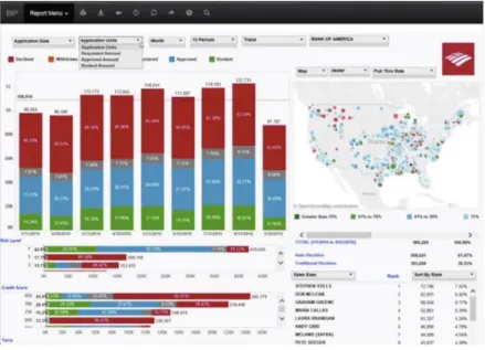
Tableau is one of the popular tools used on the computer to help produce interactive data visualization products. Tableau contains different products including Tableau Desktop, Tableau Online, Tableau Server, etc. to suit different kinds of individual or organizational needs. Tableau software is able to connect data from different sources including local machine or cloud resources. The PNC Bank Case Study: How a Single Dashboard Transformed Sales Management (Tableau, n.d.a) illustrates several use cases in the process of integrating Tableau into sale management workflow at PNC Bank as well as how they took advantage of web and data visualization technology in building the platform. The dashboard are shown as Figure 2-1.
In the online video seminar, one of the topics was what makes a great reporting experience in leading the company’s success. A checklist was listed to let everyone who works with the integration process concentrate on these factors when evaluating their systems, which are
“…easy to use, intuitive, drill down, google speed, actionable, printable, sharable, excel features, comfort, Filter, Pivot, Sort, Portable, Creativity & Accomplishment, custom Data...” (video 31’34’’)
A management report visualization dashboard on the web browser was implemented to o share company sales data with employees. Several factors listed below are their key concentration when they are implementing the platform as they emphasized on the web seminar.
2.5.1.1 Performance
Developers for the project took effort to improve the system performance by trying to make the dashboard fast, or they think “users won’t be engaged”. Loading speed is one of their major concerns. They used several techniques to track and test speed of the dashboard within different devices.
components in a workbook, and executing query, which runs an SQL based query to a dataset. So as other events like connecting to data source, geocoding, etc.
The above technique is used within the scope of Tableau workbook itself. In the real project, it is also influenced by the project container, which is the web browser in this case. Thus, they introduced another way to probe performance within the website. They set a simple timer using JavaScript to count the time from starting to fully loading the project, which integrates to the whole performance testing process.
2.5.1.2 Compatibility with Desktop and Mobile Web Platforms
To maximum the ability to access to the dashboard, developers also implemented a mobile application, which is a tablet friendly dashboard with additional usability concerns, such as hand gesture interaction over mouse clicking. Plus, they added some new use cases when exploring the mobile version. After they finished developing the tools, they took some time to train users the dashboard by offering several classes.
2.5.1.3 Including External Resources
2.5.2 D3.js
Unlike Tableau, which is a rich platform designed for direct end users, D3 is just a JavaScript library that provides programming interfaces for manipulating HTML, SVG, and CSS resources on web documents based on data. From version 4, D3 introduced Canvas as one of its available data formats. It provides a series of encapsulated APIs to help with efficient manipulation. Data visualization is one of its usages. It is friendly to developers to provide them with much flexibility to generate graphs on the web document. Several Chart JavaScript libraries are built on top of D3. Such as C3.js.
2.5.3 Acceptable Data Sources of Tableau and D3.js
Tableau uses Data Connector (Tableau, n.d.c) to maximum its ability to connect to more data formats and databases. Users are able to retrieve data from either local machine or remote server with the data format that is supported by the data connector. If default connectors are not listed, users may choose to use ODBC (Open Database Connectivity) standardized drivers. With proper implementation, users can nearly access any types of data, including CSV, XML, Common databases and RDF.
D3 supports primary data structures in JavaScript Programming language such as JSON and arrays. It provides libraries to convert other data formats such as csv into web supported data formats.
History of the Web
Figure 2-2
HTML5 Features
On October 28, 2014, W3C announced the finalization of HTML5 specification. (Ars Technica, 2014). It greatly enlarged the power of creating diverse web applications. HTML5 Developer Guides (MDN, n.d.a) classified HTML5 technologies into several groups, each representing a major area of function. Some of the following features are useful for creating web data visualization work.
Offline and storage. Nowadays, to view resources on the web page it is generally thought that one has to be connected to the Internet. Allowing webpages to store data on the client-side and operate offline jobs gives opportunity for users to use data visualization work when they are offline.
2D/3D graphics and effects. Improvements of 2D and 3D graphics rendering is beneficial to data visualization online since there are a lot of graphs and diagrams contained in the work and they need to be rendered properly.
METHODOLOGY
A variety of methods were used to gather enough data about users’ preference towards different kinds of web data set and their knowledge level of each. Comparison of literatures contributes to probing web data types on the basis of time and efficiency. Case studies were also conducted aiming to investigate current popular data sets used on the web and their pros and cons.
Comparison of Literatures and Documents
Comparison of literatures and documents was used to identify and analyze different data formats used in the web scenario. For the specialty of the World Wide Web area, a lot of standards have been defined by W3C Mission (n.d.b) to ensure long-term growth of the Web. In the Web of Data and Services section, it specified some views of data storage on the web (n.d.b). A review of these documents is needed to ensure the research reflects the right track of current status and development of web data.
Case Studies
Former case studies were used and analyzed to determine the effectiveness of some kinds of data types for web data visualization. There are currently a lot of web data visualization
tools and software available online and they focus on different aspects and professional settings. Famous software includes Tableau, Infogram, etc. They usually support exporting finished visualization work to be presented on the web. An analysis of data visualization production generated by this kind of software was conducted to evaluate the properness of the data format used for each production. Case studies were also be evaluated to determine elasticity and efficiency of using different techniques.
Semi-Structured Interview
Semi structured interview were conducted with users who have gone through part or whole process of using a web-based data visualization tool to generate data visualization work. Since they have a most direct contact with using and serializing data, they were asked questions mostly focused on their emotional and technological concerns about using data and putting it to web platforms. The way they overcome obstacles when visualizing data through web will also be of concern.
visualization work and interacting with the population pyramid. The usability test tasks can be seen in Appendix I. Post task interview questions are in Appendix II.
There are 5 participants who completed the study. They all have basic competence of using computers and they all hold a bachelor’s degree. All participants who are involved in the study were fully informed with what they would complete and they have the right to refuse to continue the interview at any time. Participants in the semi-structure interview received a consent form at the beginning of the interview and the interview would only continue if they agreed and signed the form.
Survey
RESULTS
Results are derived from observing participants’ behaviors in the semi-structured interview while there are completing usability test tasks, from conversations in post-task interviews, and from analysis of the survey.
Observations from Interview Data
4.1.1 Usage Environment for Tableau
4.1.2 User Interface Similarity Between Tableau Online and Tableau Desktop
In the aim of inspecting the user interface similarity between Tableau Online and Tableau Desktop, participants were asked to perform task 1 on Tableau Online and task 2 on
Tableau Desktop, respectively. Task 1 and task 2 have the purpose of achieving the exact same result. In order to eliminate learning effect, 2 out of 5 participants were asked to perform task 2 before task 1. We assume that if the user interfaces of the two software have much similarity, participants will perform the latter task, which is after they have finished the first one, with less time and more efficiency. The result shows that in the end, all participants successfully completed both task 1 and task 2. Once participants completed either one of the tasks first, they completed the other one with much less time and more confidence.
4.1.3 Clarity of User Interface
4.1.4 Comparison of Usage Scenarios
Post-task interviews focused more on the comparison of usage scenarios of the two software. In the post-task interview section, one participant who has experience using both software in actual work settings before mentioned that
“…I use it (Tableau Online) quite a bit. I generally build visualizations on the desktop version. But my work has the specific account. They have everything saved online. We will build things on the desktop and promote it online and we may do some additional manipulation and filtering online while giving presentations…”
This means the participant mostly use the online version as a platform to share work with others, make additional minor changes, and collaborate the work, as well as present it to the public.
Three participants mentioned that they felt desktop version has more functionalities and instructions over online version. One participant said the online version has
“…less instructions and hints…”. The other said
“…I think the desktop has more controls in some parts … when you are entering the introduction interface, the desktop one has more options…”
The other one mentioned
“…The desktop version may have more functions…” and
“when I tried to load the data…The online version did not show the preview of the data…but for the desktop version it will automatically show everything…with preview of the data.”
4.1.5 How Factors Besides Text Influence the User
To explore how factors besides text influence the user through a data visualization project, participants were asked to view and interact with Population Pyramid of Italy diagram for task 3 , as shown in Figure 4-2, and make assumptions on what some parts of the diagram mean. The meaning of the title “Population Pyramid of Italy” was told to them but none of the meaning of any remaining Italian words on the graph. None of the participants speak Italian. Italian language words were obscure to them so that they can push themselves to use some other factors, such as color, shape and contrast, to help make their assumptions.
Figure 4-1
Analysis of the Survey
4.2.1 Statistical Data of Survey Participants
Throughout the survey, 17 out of 19 participants knew about or had heard of Tableau, which is the most popular tool people chose in the survey. The second popular tools are “Microsoft Excel” and “R”, which take 9 out of 19 respectively. Among the participants, operating systems that they use are evenly distributed for MacOS and Windows. Nobody in the survey uses any Linux-based operating system. Nearly 80 percent of the participants have iOS operating system on their phone, which indicate they use mobile devices produced by Apple Inc. Among four factors (visual design, compatibility, easiness to reach and clearness of conveying idea) listed to determine the success of a visualization project, clearness of conveying ideas scores most. Among some common CMS (content management system), 18 out of 19 participants have heard of WordPress. Participants are generally familiar with different web image encoding formats such as PNG, JPEG and GIF.
4.2.2 Main User Platforms for Viewing Data Visualization Work
For those who have used the data visualization work that others created before (15 out of 19), A laptop is the most frequently used device to view these projects for 12 people. 13 out of 15 use a web browser as their primary platform to view data visualization work.
Figure 4-2
The result could imply that users will not bind with a specific operation system kit (such as iOS and Mac OS).
4.2.3 Main User Platforms for Creating Data Visualization Work
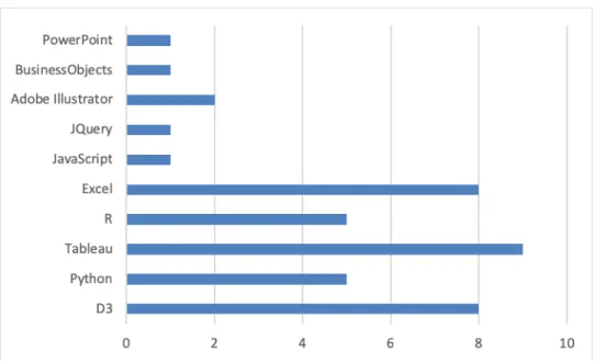
16 out of 19 participants have created some data visualization work themselves before. Tools and technologies they have used include Tableau, Python, R Studio, D3, Microsoft Excel, Microsoft PowerPoint, Adobe Illustrator, etc. The usage frequency of each tool in the survey is shown as Figure 4-3.
4.2.4 Audience Attitudes to Data Visualization Factors
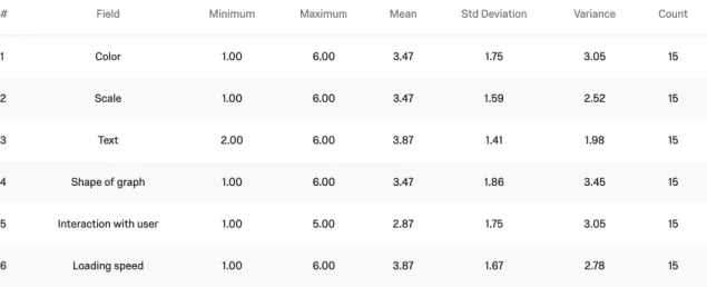
Among 15 participants who have used the data visualization work that others created, they have different ideas on what is the most important factor for data visualization work. Their attitudes towards ranking of six factors in data visualization work are shown as Figure 4-4. In the survey, they can adjust the order of each factor to rank them. The factor “interaction with the user” has the highest mean value in the statistic. 6 out of 15 thinks “interaction with the user” should be the most important trait while the other 5 participants do not think this factor to be very important.
From the Figure 4-4 we can see that the ranking range (maximum minus minimum) of each factor is at least 4, showing that participants have really different attitudes towards the relative importance of them. Participants did not reach an agreement on which of these factors to be relatively most important.
4.2.5 Audience Attitudes to Performance
For all participants, 7 out of 19 are not sure about the performance of the web browser and its capacity. For the remaining 12 people, two thirds of them agree that web browsers are capable of running large data visualization work. For those participants who have used the data visualization work that others created before (15 out of 19), they have opposite opinions about whether browsers are weaker than professional computer software to visualize data. Half think that web browsers are as capable as professional software to visualize data while the other half do not agree with this idea. However, for the capability of mobile devices, 15 out of 19 people think mobile devices are not as capable as laptops/desktops.
There is no significant relationship between whether people who have created data visulization work before and people’s attitude towards performance capability of web browsers in the survey (p > 0.05) as shown in Figure 4-5.
Figure 4-5
DISCUSSION
According to the survey, Tableau is the most popular tool to create data visualization work among participants, followed by D3.js and Excel. (Chapter 4.2.3) Web Technology helps integrating work between web and desktop applications., and web platform is mainly used as co-editing, sharing and publishing data. There is not a major trend in people’s attitude towards web browser’s performance compared to desktop applications. And most of the data visualization work is stilled viewed through desktop/laptop web browsers, instead of mobile phones or tablets, by the user.
For data visualization project creators, if the creator does not have strong programming skills, tools such as Tableau provide easy-to-use tool kits to generate projects and provides common connectors to link different data formats together. Custom data connectors can also be used if it follows ODBC protocol. Adding extra functionalities may need some programming work (Chapter 2.5.1.3). For advanced developers, frameworks such as D3.js provide rich APIs (Application Programming Interface) to give a lot of flexibility in creating data visualization work.
CONCLUSION
Data formats that are similar with or can be converted to web friendly formats such as JSON, JavaScript Arrays, or XML suit web-based data visualization work well. There are connectors that follows ODBC protocol can help with the process.
The visualization creator can access data from different platforms, either local or remote, if the data is properly stored there with commonly supported format. (Q1)
Internet connection status and speed can be one limitation for using web-based platform, as this factor is usually ignored if there is stable internet connection for the user, however it can be a key limitation if the user is in the environment with poor Internet connection.
Also, the same function can be achieved in a lot of different ways on the web, such as using SVG or Canvas element to draw graphs. Sometimes it causes confusion for users to decide with technique to use. (Q2)
One advantage of web data visualization is the ability for collaboration. When multiple members are working on the same project, storing the data at central repository lets each individual get access to it without having to save a copy locally.
visualization libraries with better performance and design level in which the person mainly concentrate on the effectiveness of conveying idea.
LIMITATIONS
Participant sample for interview and survey was not selected using randomized sampling strategy. Data are all from UNC Master students from Department of Information and Library Science, and may not be representative enough and sampling size are not sufficient. The result may not be generalizable.
REFERENCES
1. Andrew Butterfield, Gerard Ekembe Ngondi. 2016. A Dictionary of Computer Science (7 ed.).DOI: 10.1093/acref/9780199688975.001.0001.
2. Alsayed Algergawy, Marco Mesiti, Richi Nayak, and Gunter Saake. 2011. XML data clustering: An overview. ACM Comput. Surv. 43, 4, Article 25 (October 2011), 41 pages. DOI: https://doi-org.libproxy.lib.unc.edu/10.1145/1978802.1978804.
3. Ars Technica. HTML5 specification finalized, squabbling over specs continues. (2014). Retrieved from
https://arstechnica.com/information-
technology/2014/10/html5-specification-finalized-squabbling-over-who-writes-the-specs-continues/.
4. Berners-Lee, Tim. “Enquire Within upon Everything; Tangles, Links, and Webs; info.cern.ch.” In Weaving the Web. San Francisco: Harper, 1999.
5. Chun-houh Chen, Wolfgang Hrdle, Antony Unwin, Chun-houh Chen, Wolfgang Hrdle, Antony Unwin and Michael Friendly. 2008. Handbook of Data
Visualization (Springer Handbooks of Computational Statistics) (1 ed.). TELOS, Santa Clara, CA, USA.
6. Claudio Gutierrez, Carlos A. Hurtado, Alberto O. Mendelzon, Jorge Pérez,
7. Sciences, Volume 77, Issue 3, 2011, Pages 520-541, ISSN 0022-0000,
https://doi.org/10.1016/j.jcss.2010.04.009
8. Data Visualisation Catalogue. (n.d.). Retrieved from https://datavizcatalogue.com/.
9. De Souza, Erico. 2006 IEEE International Conference on Information Reuse and Integration, Waikola [sic], HI, 16-18 September 2006. DOI:
10.1109/IRI.2006.252378.
10.Evgeniy Yur’evich Gorodov and Vasiliy Vasil’evich Gubarev, “Analytical Review of Data Visualization Methods in Application to Big Data,” Journal of
Electrical and Computer Engineering, vol. 2013, Article ID 969458, 7 pages,
2013.
11.Francisco Claude and Gonzalo Navarro. 2010. Fast and Compact Web Graph Representations. ACM Trans. Web 4, 4, Article 16 (September 2010), 31 pages. DOI=10.1145/1841909.1841913
http://doi.acm.org.libproxy.lib.unc.edu/10.1145/1841909.1841913.
12.Grinberg, A. (2017). XML and JSON recipes for SQL server : A problem-solution approach(1st ed.). Berkeley, CA: Apress L. P.
13.MDN Web Docs. (n.d.a). HTML5 – Developer Guides. Retrieved from
14.MDN Web Docs. (n.d.b). Canvas API. Retrieved from
https://developer.mozilla.org/en-US/docs/Web/API/Canvas_API.
15.Mohsen Marjani, Fariza Nasaruddin, Abdullah Gani, Shahaboddin Shamshirband, Measuring transaction performance based on storage approaches of Native XML database, Measurement, Volume 114, 2018, Pages 91-101, ISSN 0263-2241,
https://doi.org/10.1016/j.measurement.2017.09.028.
16.Oxford Brookes University, History of the Web. 2002. Retrieved from
http://www.w3c.it/education/2012/upra/documents/origins.pdf.
17.Shibli Saleheen, Wei Lai, UIWGViz: An architecture of user interest-based web graph vizualization, Journal of Visual Languages & Computing, Volume 44, 2018, Pages 39-57, ISSN 1045-926X, https://doi.org/10.1016/j.jvlc.2017.11.006.
18.Nitish Sivaramakrishnan, S. (2009). Integration of sensor based XML data in flash based smart energy widget. I-Manager's Journal on Software
Engineering, 4(1), 41-51.
19.Strîmbei, C. (2013). SOA based data architecture for HTML5 web applications.Informatica Economica, 17(2), 84-95.
21.Tableau. (n.d.b). Record and Analyze Workbook Performance. Retrieved from
https://onlinehelp.tableau.com/current/pro/desktop/en-us/perf_record_create_desktop.htm.
22.Tableau. (n.d.c). Connect to Your Data. Retrieved from
https://onlinehelp.tableau.com/current/pro/desktop/en-us/basicconnectoverview.htm.
23.W3C. (n.d.a). Retrieved from https://www.w3.org/.
24.W3C Mission (n.d.b). Retrieved from https://www.w3.org/Consortium/mission/.
25.Young, F.W. (1994). ViSta: The visual statistics system, Technical Report RM 94-1, L.L. Thurstone Psychometric Laboratory, UNC.
26.Zhu, H., Fu, G., Feng, Y., & Lü, K. (2010). Dynamic damage recovery for web databases. Journal of Computer Science and Technology, 25(3), 548-561. DOI:
APPENDIX I
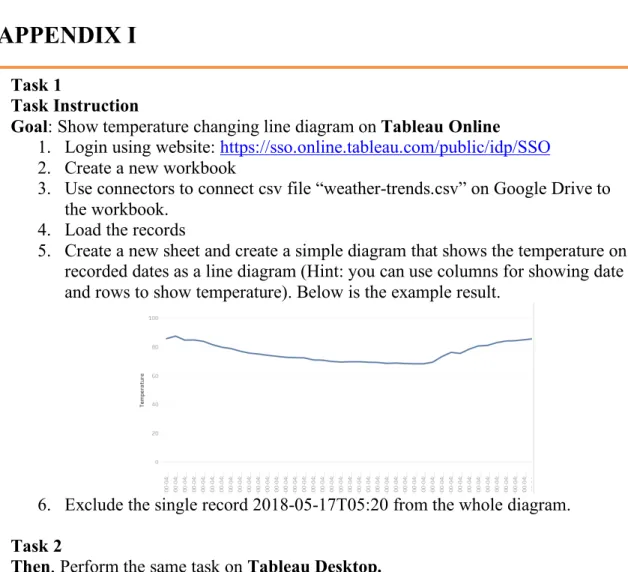
Figure 9-1 Usability Test Task Sheet Task 1
Task Instruction
Goal: Show temperature changing line diagram on Tableau Online 1. Login using website: https://sso.online.tableau.com/public/idp/SSO
2. Create a new workbook
3. Use connectors to connect csv file “weather-trends.csv” on Google Drive to the workbook.
4. Load the records
5. Create a new sheet and create a simple diagram that shows the temperature on recorded dates as a line diagram (Hint: you can use columns for showing date and rows to show temperature). Below is the example result.
6. Exclude the single record 2018-05-17T05:20 from the whole diagram. Task 2
Then, Perform the same task on Tableau Desktop.
Task 3
Open the following data visualization work (Population Pyramid of Italy)
https://public.tableau.com/en-us/s/gallery/population-pyramid-italy?gallery=featured
Answer questions:
1. By just looking at the diagram, briefly describe what you think the bar charts mean. What are your assumption criteria?
APPENDIX II
Interview Questions
1. What is your overall experience with Tableau online? Have you heard of this online tool before?
2. What do you think are the differences between Tableau Online and Tableau Desktop? Is there any obvious performance difference that you noticed?
3. Do you feel that you successfully completed all the tasks?
4. What factors do you think prevent you from getting the task completed?
5. How do you think you would publish the work (make it viewable to others) you just made?
6. Do you believe web browser is a reliable container to display large data visualization projects?
For developers (if the participant has developed data visualization work before):
1. What technologies(platforms) do you use to visualize data?
2. Do you think different platforms have strengths or weakness? Explain your thought.
3. Are you able to choose your own tools or are the choices made for you at work?
5. Who do you make data visualizations for?
6. What knowledge level do your stakeholders have of the data you are visualizing for them?
APPENDIX III
What of the following terms come to your mind when you think of data visualization? (If you don't know or think of any of these, skip this question)
Microsoft Excel Tableau
D3.js R Python SAS
What is the desktop operating system on PC or laptop you use most frequently? Mac OS
Linux Windows Ubuntu Other
What is the mobile operating system on your phone you use most frequently? iOS
Android Other
If you are looking at or interacting with some data visualization work that was created by others, how do you think each of the following factors influences the success of this work? Move the slider from 0-100 to reflect your opinion about how important each factor takes account, with 100 meaning most important and 0 meaning least important.
Not at all
Visual Design
Compatibility (supporting different platforms such as mobile and PC the same time) Easy to reach (no programs required to install before using it)
Clearness of conveying the idea (you can understand the work easily)
Check any of the following online content management systems (CMS) that you know or heard of. (If you don't know or think of any of these, skip this question)
WordPress Joomla Drupal Squarespace
Are you familiar with the following programming languages? (If you don't know or think of any of these, skip this question)
PHP ASP.NET Ruby jQuery HTML CSS JavaScript
What kind of image format have you heard of? (If you don't know or think of any of these, skip this question)
Do you think web browsers (such as IE, Firefox, Chrome, etc.) are capable of running large Data Visualization Work (work that contain thousands of entries and a lot of computing for generating the graphs)
Yes No Not Sure
Have you ever used any digital data visualization work that anyone else created? Yes
No
What is the device you use most frequently for viewing or using others' digital data visualization work?
Mobile phone
iPad or other Pad sized device Laptop
Desktop Other
What is the platform you use most frequently for viewing or using others' digital data visualization work?
Web Browser (Google Chrome, Firefox, IE, etc.)
Within Specific Software Programs that require pre-installing. (such as Microsoft Excel, SPSS, Tableau Desktop, etc.)
Other, please specify ________________________________________________ Rank the importance of following factors in data visualization work (1 means most important and the highest number means least important)
______ Color ______ Scale ______ Text
______ Shape of graph ______ Interaction with user ______ Loading speed
For the following questions, please answer Yes or No based on what you think or your experience.
I think Internet Browsers are weaker than professional computer software to visualize data.
I think mobile devices (mobile phones, iPads, etc.) are as capable as laptops or desktop computers to visualize data.
Yes No
I think web browsers (such as Chrome, Firefox, IE, etc.) are capable enough to run large 3D motion/animation graphics.
Yes No
I have ever created some digital data visualization work before Yes
No
Did you learn how to do data visualization in school or did you learn how to do it on your own?
In school On my own Both
I aspire to be better at:
The design side of data visulization The data side of data visulization Both
Other
What technologies/software do you use to visualize data? (Please write down 1-3 tools you use)
________________________________________________________________ Have you considered integrating data visualization work in your personal space on the web (such as blog, facebook, twitter, etc)?
yes no