Louisiana State University
LSU Digital Commons
LSU Master's Theses Graduate School
2014
Adopting Star Plot for Visualization of High
Dimensional Multivariate Data
Shabana Sangli
Louisiana State University and Agricultural and Mechanical College
Follow this and additional works at:https://digitalcommons.lsu.edu/gradschool_theses
Part of theComputer Sciences Commons
This Thesis is brought to you for free and open access by the Graduate School at LSU Digital Commons. It has been accepted for inclusion in LSU Master's Theses by an authorized graduate school editor of LSU Digital Commons. For more information, please [email protected].
Recommended Citation
Sangli, Shabana, "Adopting Star Plot for Visualization of High Dimensional Multivariate Data" (2014).LSU Master's Theses. 2077.
ADOPTING STAR PLOT FOR VISUALIZATION OF
HIGH DIMENSIONAL MULTIVARIATE DATA
A Thesis
Submitted to the Graduate Faculty of the Louisiana State University and Agricultural and Mechanical College
in partial fulfillment of the requirements for the degree of Master of Science in Systems Science
in
The Department of Electrical Engineering & Computer Science The Division of Computer Science and Engineering
by Shabana Sangli
B.E., Visvesvaraya Technological University, 2008 December 2014
ii
iii
ACKNOWLEDGEMENTS
I
would like acknowledge my major advisor and committee chair Prof. Bijaya B.Karki for his constant support, insightful guidance, and patience. I would like to extend my sincere gratitude to him for being more than generous in sharing his knowledge and expertise throughput the process and providing me with a great learning experience. I would like to specially acknowledge and thank my committee members Prof. Rajgopal Kannan and Prof. Jian Zhang for agreeing to serve on my committee and for providing their invaluable advice.I wish to acknowledge my manager at LSU Continuing Education Department, Mr. Nash Hassan, who has been the most wonderful person to work under. I would like to thank him for his constant support with funding, advice and kindness in this journey. I wish to thank him for providing me with the opportunity to work with the outstanding staff of the Continuing Education Department and making my work a learning experience by sharing his knowledge.
I would like to acknowledge my dearest Dad, Late. B.M Sangli, whose love, blessings, encouragement and teachings have been the source of motivation for all my achievements in life. I would like to acknowledge to my sweetest Mom, Zubeda. M. Kaladgi for her selfless and unconditional love which has been my core strength and for the unreserved pampering she has showered on me. You are the best parents any daughter can ever have. I would like to acknowledge my sisters Dr. Asheera Banu Sangli, Dr. Sageera Banoo, Shameena Sangli, Dr. Shahnaz Sangli, Asheeya Banu and others who have been my best friends forever, who have been there for me always, who have given me the best advice and showed me the way of life and always believed in me, who have loved me and taken care of me like their daughter.
iv
I would also like to specially thank all the Professors of Computer Science Department who have imparted their knowledge and contributed immensely in making this educational goal possible.
I would like to acknowledge all my Professors from undergraduate college, especially Prof. R Srinivasan, Prof. K.S Srinath and Prof. N.P Kavya for their encouragement and advice in this new chapter of my education.
I wish to thank the administrative staff of the Computer Science Department, specially Ms. Maggie Edwards and Vera Watkins for their continuous help throughout. I would also like to thank Mr. Nick Davis and the entire staff of Graduate School who were always available to answer my queries and making this journey an easy ride.
I wish to acknowledge my awesome roommate and friend Priyanka Rotti, my dear friends Umesh Chandra and Michael Stewart who were my first friends in this new path of life, who have been there for me throughout, I will always appreciate all they have done for me. I would like to acknowledge my best friend Deepa Shetty, for her constant support and encouragement even when miles away. I would also like to thank my childhood buddies Chatura, Chaithra, Divya, Priyanka and Zoya who have supported me and been with me all these years and to my awesome and loving roommates Anuja, Sreedeepthi and Areerut who have supported me and taken care of me like a family and have created a home away from home for me. I wish to acknowledge my dear friends Richie, Venkateswaran and Aswin. And all my co-members and friends from the Indian Students Association with whom I got a chance to serve the community. Thank you, friends for adding the fun element to school life.
Finally, I would like to thank all the people who have directly or indirectly contributed for making this work possible.
v
TABLE OF CONTENTS
ACKNOWLEDGEMENTS………...……….. iii ABSTRACT………. vii CHAPTER 1: INTRODUCTION……… 1 Visualization……… 1 Types of Visualization………. 1 Motivation……… 2 Overview……….. 3CHAPTER 2: VISUALIZATION TECHNIQUES………. 4
Classified on the type of display……….. 4
Classified on the principle involved………. 5
Multivariate Multidimensional Data……… 5
Parallel Coordinates………. 6
Star Coordinates………... 7
Scatterplot Matrix……… 8
CHAPTER 3: STAR PLOT………. 10
Star Plot………. 10
Star Plot of Car Dataset………. 10
Limitations……… 12
CHAPTER 4: PROPOSED STAR PLOT VISUALIZATION APPROACHES………. 13
Datasets………. 13
Approach 1: Overlapping Star Plots………. 15
Approach 2: Shifted Origin Plot………... 17
Approach 3: Multilevel Star Plot……….. 19
CHAPTER 5: IMPLEMENTATION………... 21
Overlapping Star Plots……….. 22
Shifted Origin Plot……… 23
Multilevel Star Plot………... 24
Graphical User Interface………... 25
CHAPTER 6: ANALYSIS AND CONCLUSION……….. 27
Overlapping Star Plots……….. 27
Shifted Origin Plot……… 29
vi
Multilevel Star Plot……… 32
Conclusion………... 33
REFERENCES………. 35
vii
ABSTRACT
The Star Plot is one of popular methods for visualization of multivariate data. This method displays each data record as a star-shaped icon by mapping all variables (dimensions) on radiating rays (axes) originated from a single point. The number of such icons is equal to the number of data items (records). As the number of dimensions and the size of data set increase, Star Plot visualization soon becomes too cluttered because many rays have to be accommodated within small circular area and individual icons also become too small. To overcome these problems associated with visualization of high-dimensional multivariate data, we propose different ways of effectively using the Star Plot method. First, instead of displaying multiple star-shaped icons, one for each data item, we plot all data items together. With this overlapping, the entire display space can be used for rendering. Second, we shift the origin outward to produce a circle in the center, the circumference of which provides the origin points for the respective axes and increase the spacing between rays toward low-value ends. Third, to accommodate a very large number of dimensions, we adopt a multi-level approach in which we partition the dimensions into groups and plot corresponding rays in multiple concentric circular rings. For instance, our two-level Star Plot draws a subset of rays (e.g., 1/4th of total dimensions) in inner small circle and the rest (3/4th dimensions) in outer larger ring. The GUI support allows the user choose desired Star Plot option and also dynamically adjust the dimension partitioning and the ring boundary. We have demonstrated the effectiveness and usefulness of the proposed Star Plot extension by visualizing three multivariate data sets of varying number of dimensions.
1
CHAPTER 1
INTRODUCTION
Visualization
With the increase in applications and research in the modern world, accumulation of data related to these applications has been enormous. The data gathered can belong to different fields of study like scientific, statistical, biological etc. The process of presenting this data in a visual graphics form which can provide an insight into the data can be termed as Visualization. The visual display is not just mere abstract data but information that can be comprehended to obtain knowledge. The insight gained provides the user the ability to perform future prediction of the properties of the data. It enables faster detection of problems which were otherwise hidden or would require time consuming careful study of the entire data. Comprehending the data would provide hypothesis conclusions about the behavior of the data.
Types of Visualization
Visualization can be classified into two major categories based on the field of application.
Scientific Visualization can be defined as the process of using computer graphic display to represent Scientific data in a three dimensional space in a format that can enable scientists to extract cognitive information from the display. Friendly defines scientific visualization as "primarily concerned with the visualization of three-dimensional phenomena (architectural, meteorological, medical, biological, etc.), where the emphasis is on realistic renderings of volumes, surfaces, illumination sources, and so forth, perhaps with a dynamic (time) component".[1]
Information Visualization can be defined as the process of using computer graphic display to represent abstract data which has no physical relevance like stock trends in business data, sports data. Since the information is abstract representing this data in a form which
2
can provide insight into the data is a difficult task. Many techniques have been devised over the last three decades to represent this data in a form that can convey maximum possible information to the users.[2]
Motivation
In Star Plot the values of the dimensions of every data item are represented on uniformly spaced axes radiating from a single fixed origin point on a 2D plane and connected together to get a Star-shaped Plot. The Star Plot technique represents a data set as a multi-plot consisting of as many small Star Plots as the number of data items. The human eye can perceive and understand the information conveyed by a visual display in a better manner when it is presented in a bigger scale, hence instead of plotting every data item as a small Star Plot, we present an Overlapped Star Plot where all the data items are plotted on a single large Star Plot. The Star Plot technique treats dimensions uniformly; as the number of dimensions increases the technique applies more compaction to accommodate all the dimensions into the display plane. The Star Plot technique should provide an overall insight into the larger dataset for further analysis, however when the number of dimensions is such that it is chock-full, there is cluttered visualization. The motivation for the proposed extensions is the need to eliminate the visual clutter that arises when the number of dimensions is high, hence providing users with better insight of the data. This is achieved using various methods
1. Plot the data items together on a single large Star Plot.
2. If the numbers of data points and dimensions are excessive near the origin, visualizing and gaining information become difficult. To overcome this limitation, the Shifted Origin Star Plot technique is introduced
3
3. To accommodate higher number of dimensions, the dimensions are divided and plotted on separate levels.
4. The user can visualize selected dimensions of his/her choice in an outer plot, which provides a zoomed view of the selected dimensions.
5. Additionally the user is provided with the facilities of zooming or shrinking the plots and highlighting the data items of his/her choice.
Overview
In this thesis, we show that extended Star Plot approaches as we present here enable users to get better visual display of data and help gain insight into the data by enabling visualization of high number of dimensions in a given visualization plane. Chapter 2 presents a brief overview of the types of visualization techniques based on different classification methodologies and some of the popular visualization techniques available for multidimensional/multivariate data. Chapter 3 describes the Star Plot technique, which is the main focus of this work. It details out the idea of the Star Plot technique by discussing a sample plot, and also discusses the weaknesses or limitations of the Star Plot technique. Chapter 4 details the proposed approaches for our Star Plot visualization approaches for high dimensional data. Chapter 5 presents the implementation details of the proposed approaches. Chapter 6 describes the analysis of the proposed approaches on various data sets followed by the conclusions.
4
CHAPTER 2
VISUALIZATION TECHNIQUES
The need to present abstract data in a form that can enable capturing of information from the mere abstract data has led to the development of numerous visualization techniques with the course of time. These techniques have been put into various categories and this categorization can be contributed to the kind of display involved, the underlying principle of visualization, the applications for which the techniques are used and so on and so forth.
Classified on the type of display
Wong and Bergeron[3] classify the visualization techniques based on the type of display. They broadly classify them under bivariate, multivariate and animations displays techniques.
Bivariate display
A Bivariate display technique presents two variables along with combinations of each bivariate data set in a single map. A very popular bivariate display technique is the scatter plot technique.
Multivariate display
A multivariate display technique presents multivariate display of sets of data points. Typically the data is large and more complicated and produced as colorful graphics with high speed graphics computations. It can be categorized into the following:
• Brushing technique facilitates direct manipulation of a multivariate visualization display.
• Panel matrix consists of plots of matrices where each variate is plotted against all the other variates to obtain a pairwise plot. Examples include hyperslide and hyperbox. • Iconography involves determining the values of parameters of graphical objects
using variates. Examples include the Chernoff face technique, the stick figure icon etc.
5
• Hierarchical displays involves mapping of subsets of variables in hierarchical levels. Examples are the hierarchical axis technique, dimensional stacking technique, and world within world.
• Non-Cartesian displays involve the mapping of variates into non-Cartesian axes. Example are the Parallel Coordinates technique, Star Plots etc. [3]
Animation display
Animation has found usage in many fields including Visualization. The technique involves visual graphic display of data using sequential single frames of data that are put together and which belong to the same time series.
Classified on the principle involved
Based on the principle involved, visualization techniques can be classified under geometric projections, graph based, icon graphics etc. In this section we confine our discussion to some of the three Geometric Projection techniques which have found widespread use in many domains. The popularity of these techniques can be attributed to the support they provide for high dimensional data. Examples are the Star Coordinates, Parallel Coordinates and Scatterplot Matrices. Before furthering the discussion on the popular multivariate visualization techniques a brief discussion on what is multivariate data is presented in the next section.[4]
Multivariate Multidimensional Data
In any field of study when data is gathered it usually consists of variables that define the parameters pertaining to the field of study involved. If the dataset consists of a single variable or dimension related to a single parameter of the data, then the data is categorized as a 1Dimensional data. For example a data consisting of the length of a given make of car is a 1 Dimensional dataset. If a dataset consists of two variables, the dataset is categorized as a 2
6
Dimensional dataset. A dataset consisting of the length of the car and its fuel efficiency would be 2 Dimensional dataset. Similarly a 3 Dimensional dataset of the car would consist of 3 variables related to the cars. Any dataset that consists of 3 or more than 3 dimensions is termed as a multidimensional dataset. Univariate data consists of a single variable with no relationships or dependencies on other variables. Bivariate data consists of two different variables, which are related to each other. Multivariate data consists of more than three variables with relationships between each other. Therefore in data visualization the dependent variables in a dataset are termed as multivariate variables and the variables that are independent are usually referred to as multidimensional variables.[3] Multidimensional multivariate visualization involves mapping of every variable of the multidimensional multivariate dataset onto some form of graphical entity. The visualization of multidimensional multivariate data is of great importance as it provides an insight into the data by helping in understanding the relationships among the variables, by helping in understanding the similarities or dissimilarities among the data items of the datasets and hence finds patterns for clustering.
Parallel Coordinates
First introduced by Inselberg [5] the Parallel coordinates is a Geometric Projection based technique where mapping of data points is done on uniformly spaced parallel coordinate axes. The parallel coordinate technique consists of vertically placed parallel axes lines which represent the number of dimensions of the data. The values of the data points are mapped on the corresponding vertical parallel axis representing the dimension the data points belong to and the mapped data point of a data item on the parallel axis is linked to the next data point of the same data item to produce a parallel coordinate plot. The parallel coordinate technique has found usage in a number of applications consisting of only small to moderate dimensions because of
7
the nature of the plot which expands horizontally due to the increase in the number of vertical parallel axes with the increase in the number of dimensions [5]. Figure 2.2 Shows an example of the Parallel Co-ordinate technique used to visualize sepal and petal data of three species of Iris namely setosa represented by red polyline, virginica by blue and versicolor by red. The dataset consists of four variables namely sepal width represented by first, sepal length by second, petal width by third and petal length by fourth parallel axes. A look at the Parallel Co-ordinates plot reveals that the setosa species is well separated whereas the vesicolor and virginica have overlapping values. It can also be noted that the species virginica has higher petal width and petal width values than the other two species.
Figure 2.2 Parallel Co-ordinates Plot for Iris dataset [6] Star Coordinates
8
Figure 2.1 Calculation of the data point location for point P [7].
2D plane. First presented by Eser Kandogan[7] , the Star Coordinates consists of equally spaced axes radiating from the center of a circle representing the dimensions of the observation. The data points belonging to the dimensions are scaled to the length of their respective radial axis, with the minimum being mapped to the origin and the maximum being mapped to the other end of the axes. The dimensions are mapped on the radial axes from the origin and a parallel path is followed along the mapped data point starting from the first data point. For each data point mapped the distance covered by this continuing parallel path would be summation of the data values of the data points on the radial axes lines. When all the data points are covered, the parallel path that followed these data points converges to a single point P. The Figure 2.1 shows the calculation of the location of point P.
Scatterplot Matrix
Scatterplot matrix is a technique in which the variables of the data are represented pairwise where each pair is a Scatterplot. If the given dataset contains n variables, a pairwise
9
representation would produce a hence a matrix like projection of size n x n. Since each variable is mapped against all the other variables, each pair will produce one mirror image; hence half of the matrix would be a mirror image of the other half. The Figure shows the cluster analysis scatterplot matrix of the Iris dataset [8]. An analysis similar as described for the Parallel
Figure Scatterplot matrix for iris dataset. [8]
Coordinates plot can be derived from the Scatterplot matrix. The matrix consists of 4 variables sepal length, petal length, sepal width and petal width mapped pairwise producing a 16 grid matrix consisting of 3 x 4 Scatterplots. We can observe that setosa species data points are plotted in a well separated fashion whereas the vesicolor and virginica have overlapping values and also that virginica has higher values for petal width and length. Consider the second Scatterplot of the first row and the first plot of second row; they are mirror images of each other. Hence plotting petal length Vs sepal length will produce a mirror image of sepal length Vs petal length.
10
CHAPTER 3
STAR PLOT
Star Plot
Star Plot is a display technique which enables visualization of multivariate data [9]. The observations related to the data are represented as a star-shaped figure where each variable is mapped on a ray. The plot consists of a uniformly spaced spokes, called radii, and one variable is mapped on each spoke. The magnitude of the variable is mapped onto the spokes and these data values are connected together with a line to obtain a star like display. For plotting a given set of data each row in the dataset is treated as a data item or observation and one Star Plot represents each data item. Therefore it is usually generated as a multi plot consisting of many Star Plots, one for each observation of the data. The Star Plot for single observation can provide information about the relative dominance of a variable with respect to other variables in the observation. A set of Star Plots can be generated for a given set of observations and these plots can be studied to identify the similarities in the observations and perform clustering operations on these observations. The Star Plots also help in the detection of outliers which are observations which usually lie in the range of values distinctly away from the dominant group of observations of the data. With these capabilities the Star Plots have enabled the user to gain insight into the data and comprehend information from it in a simple way and hence achieved the basic motive of visualization. [9]
Star Plot of Car Dataset
The dataset represented by the plot in Figure 3.1 [10] consists of data related to 16 cars with 9 different variables; these variables are a list that identifies the basic parameters of a car. The variables of a given car are mapped on the rays to obtain the Star Plots of the respective cars. Listed below are the variables of the car represented by the plots.
11
Price of the car
Mileage per gallon
Repair Record for the year 1978. (On a scale of 1 to 5 where 1 stands for worst repair record and 5 for best repair record.
Repair Record for the year 1977. (On a scale of 1 to 5 where 1 stands for worst repair record and 5 for best repair record.
Headroom of the car
Rear Seat Room of the car
Trunk Space of the car
Weight of the car
Length of the car [10]
The plot consists of data belonging to cars of the make AMC, Audi, BMW, Buick and Cadillac. The values of 9 variables of the 16 cars are mapped on the 9 uniformly spaced radii and Star Plots are obtained. The discussion in the previous section 3.1 revealed that a Star Plot is capable of providing information regarding the individual features of a given car as well as provide insight of the relative values of the car with respect to other cars and help in identifying the similarities or dissimilarities of values in the cars to facilitate clustering. For example consider the car Buick Le Sabre, the plot of the car shows that it’s an inexpensive car, has good repair record, and has average rear seat room and weight with low mileage, hence providing great amount of information about the car Buick Le Sabre. The Cadillac Deville, Eldorado and Seville models have data values close to each other for the most of their attributes. They all are expensive, are low on mileage and have large room space and length and weight. These plots reveal that they have similar properties and therefore can be identified as a cluster. The models
12
AMC Concord, Pacer and Spirit also share similarities in the values of their variables all the models fair average on the repair record for the year 1978, are low of room space, length, weight and mileage and all are priced low.
Figure 3.1 Star Plot for car data [10].
Limitations
For its ability to display multivariate data and provide an insight into the information about the relative values of the variables and their relationships with other data items in the data, the Star Plot technique has been found to be a useful visualization technique. However the technique falls short when the number of variables becomes large. In the subsequent sections we propose several techniques to overcome the problems associated with the Star Plot technique. [10]
13
CHAPTER 4
PROPOSED STAR PLOT VISUALIZATION APPROACHES
Star Plot has encountered its application in wide variety of data domains. A major concern has been its ability to convey information when the number of data items increases in a dataset, when the values lie near the low end of the rays of the Star Plot and when there is an increase in the number of dimensions which has been a known observation in many of the data obtained from current domains. The above mentioned factors are categorized as a concern because the presence of any of the factors in a given data set would result in clutter. Therefore, we seek to adopt and further develop the Star Plot to enable new ways of exploring and evaluating data sets 1) Containing large number of data items by overlapping the data items on a single Star Plot. 2) Containing large dimensional data by dividing the dimensions and displaying them at multiple levels. 3) Containing large dimensional data with data values lying in the low end value of the rays by shifting the rays away from the fixed central point. We will then use this technique in the visualization of datasets and explore their usefulness to end users in analyzing the data items of the data sets.
Datasets
The data sets used for the proposed extensions on Star Plot were obtained from the UCI Machine Learning Repository [11]. Three datasets were used for plotting and analysis of the Star Plot. The first data set consist of data describing the attributes of a car like the height, width, number of cylinders, price, fuel type etc. The variables from the data set that were considered for the plotting and analysis of the dataset are listed in Table 4.1. The second dataset consisted of US census data of 1990 consisting of 68 variables consisting of both numerical and categorical data of the data that was obtained from census all of which are scaled or coded to numerical data. The attributes list is as shown in Table 2.
14 Table 4.1. Car dataset variables [11].
Variable Num Values of the variable with their numerical scaled equivalent used
0 Fuel-type: diesel-1, gas-2.
1 Aspiration: std-1, turbo-2.
2 Number-of-doors: four-4, two-2.
3 Body-style: hardtop-5, wagon-4, sedan-3, hatchback-2, convertible-1.
4 Engine-location: front-2, rear-1.
5 Wheel-base: continuous from 86.6 120.9.
6 Length: continuous from 141.1 to 208.1.
7 Width: continuous from 60.3 to 72.3.
8 Height: continuous from 47.8 to 59.8.
9 Curb-weight: continuous from 1488 to 4066.
10 Number-of-cylinders: eight-8, five-5, four-4, six-6, three-3, twelve-12, two-2.
11 Engine-size: continuous from 61 to 326.
12 Bore: continuous from 2.54 to 3.94.
13 Stroke: continuous from 2.07 to 4.17.
14 Compression-ratio: continuous from 7 to 23.
15 Horsepower: continuous from 48 to 288.
16 Peak-rpm: continuous from 4150 to 6600.
17 City-mpg: continuous from 13 to 49.
18 Highway-mpg: continuous from 16 to 54.
19 Price: continuous from 5118 to 45400.
20 make: alfa-romero-1, audi-2, bmw-3, chevrolet-4,dodge-5, honda-6,
porshe-7,benz-8, mitsubishi-9,nissan-10,peugot-11
More detailed information on the scaling and coding of the variable values in the data set can be obtained from the UCI Machine Learning Repository. The third dataset consists of a hand movement type in LIBRAS which is the official Brazilian signal language. The values are obtained from video pre-processing and performing time normalizations on 45 frames from each video for capturing a discrete version of the curve F where the 91 features, represent the coordinates of movement.
Table 4.2 Census dataset variables.[11]
dAge 0 dIncome8 23 iRlabor 46
dAncstry1 1 dIndustry 24 iRownchld 47
dAncstry2 2 iKorean 25 dRpincome 48
15
Table 4.2 continued
iCitizen 4 iLooking 27 iRrelchld 50
iClass 5 iMarital 28 iRspouse 51
dDepart 6 iMay75880 29 iRvetserv 52
iDisabl1 7 iMeans 30 iSchool 53
iDisabl2 8 iMilitary 31 iSept80 54
iEnglish 9 iMobility 32 iSex 55
iFeb55 10 iMobillim 33 iSubfam1 56
iFertil 11 dOccup 34 iSubfam2 57
dHispanic 12 iOthrserv 35 iTmpabsnt 58
dHour89 13 iPerscare 36 dTravtime 59
dHours 14 dPOB 37 iVietnam 60
iImmigr 15 dPoverty 38 dWeek89 61
dIncome1 16 dPwgt1 39 iWork89 62
dIncome2 17 iRagechld 40 iWorklwk 63
dIncome3 18 dRearning 41 iWWII 64
dIncome4 19 iRelat1 42 iYearsch 65
dIncome5 20 iRelat2 43 iYearwrk 66
dIncome6 21 iRemplpar 44 dYrsserv 67
dIncome7 22 iRiders 45
Approach 1: Overlapping Star Plots
The data gathered for visualization in majority of the scenarios is not confined to few observations. The Star Plot represents the given dataset with N data items in the form of N Star Plots where the k number of radial lines are the number of dimensions in the dataset and the values of each of the data point of the dimensions (d1, d2, d3……..dk) in the dataset are scaled
from the fixed origin o(Ox,Oy) and mapped at a value (v1, v2, v3 ……… vm ) on the radials lines and
joined together to form the Star Plot. One of the weaknesses of Star Plot is that it is helpful if the data sets are of small size. If the data set consists of N data items or observations with Vm number of variables then the plot would consists of a glyph of N Star Plots with one Star Plot for each data item of Vm variables. The rendering area for displaying the Plots remains the same whereas the individual Star Plots have to be shrunk to accommodate all of them in the available
16
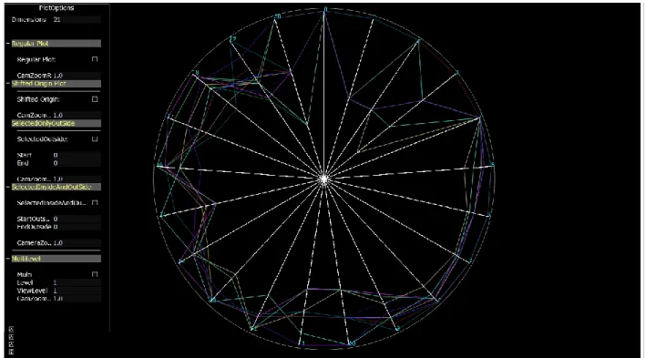
display area making it increasingly hard to view and analyze the Star Plots. In the first method we propose to overcome the problem of shrinking the individual icons with the increase in the number of data items in the data set by displaying all the data items on a single Star Plot icon, where all the icons share the same radial axes lines for the display of their variable values instead of mapping one data item to one Star Plot which would result in a multi plot consisting of Star Plots proportional to the number of data items in the data set. The Figure 4.1 shows an example of the Overlapping Star Plot consisting of 12 data items of the Car data set with 21 variables, all
Figure 4.1 Overlapping Star Plot for Car Data Set
the data items are displayed together on a Single Star Plot, this utilizes the entire display area for plotting every single data item making viewing of the each data item clearer and at the same time all the information that can be conveyed in a regular Star Plot is being conveyed with the Overlapping Star Plot.
17
Approach 2: Shifted Origin Plot
In the Star Plot technique data points are mapped onto the radii from the fixed center point o(Ox,Oy) and Star Plots are obtained. When the number of dimensions is large in the dataset, the
uniform division of the available 2∏ space for this large dimension would result in closely placed radial lines arising from the single fixed origin point. This closely placed radial lines produces clutter at the lower ends of the plot resulting in loss of information available at the lower scale values of the dimensions.
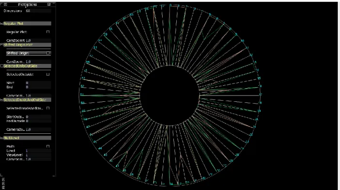
Figure 4.2 Star Plot census data with 2 data items
Consider the Figure 4.2 the figure displays two data items from the census dataset which consists of 68 dimensions or variables. An analysis of the figure would reveal that except for a few dimensions all the dimensions have a value that converges to 0, whereas the points at the lower end are hidden due to the clutter in the region. The core of visualization which is providing a
18
clear insight into the abstract data to gain information from it is lost when clutter is observed in the display. To overcome this problem the Shifted Origin Star Plot Visualization Technique is implemented where the data points (d1, d2, d3……..dk) in the dataset are scaled from origin
points (O1, O2, O3……..Ok) where each dimension di has a separate origin Oi which is at a
shifted distance of l from the fixed center origin. The shift from the fixed origin will increase the spacing between the radial axes, thereby eliminating the clutter that was present due to many rays arising from the same single origin point.
Figure 4.3 Shifted Origin Plot for census data with 2 data items.
The Figure 4.3 shows the Shifted Origin Star Plot for the same 2 data items of the census dataset. It can be observed that a major portion of the variables have values in the lower end values which remained hidden because of the clutter. From the Figure 4.2 and 4.3 which provides a comparison of the Star Plot Vs Shifted Origin Star Plot we can comprehend that shifting the
19
origin away from the center of the plot enables better viewing when data points are crowded near the origin.
Approach 3: Multilevel Star Plot
In visualization handling high dimensional data is a challenging. As the number of dimensions increases utilizing the available fixed space to accommodate all the dimensions without losing the cognitive information contained in the data is a laborious task. The Shifted Origin Star Plot discussed in section 4.2 shows that shifting the origin creates a void space around the origin. This void space can be utilized for representing a portion of the dimensions of a high dimensional dataset by dividing the dataset’s dimensions into multiple levels, hence allowing mapping of data points at multiple levels. The part containing more dimensions is plotted in the outer plotting space and the part containing fewer dimensions is displayed in the inner plotting area. The choice to increase the number of dimensions starting from the origin outwards is made because of the
20
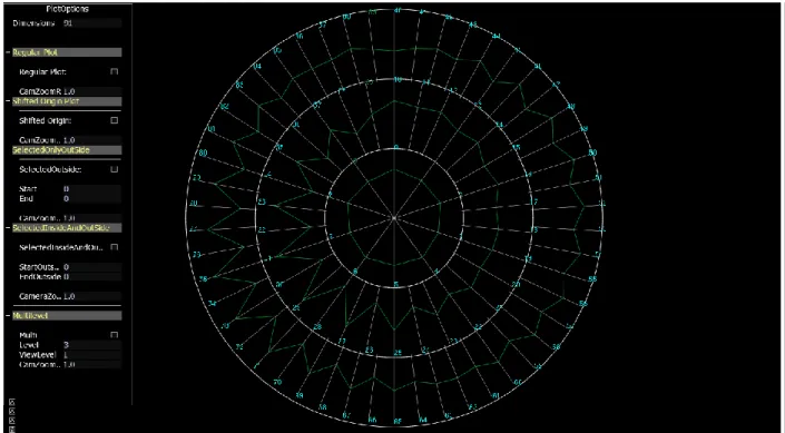
nature of the plot (ripple) where we have more plotting area available in the concentric circles as we move outwards from the origin. The Figure 4.4 shows the plot with 2 shift levels for a 91 dimensions of the LIBRAS dataset[11] where around 1/4th of the dimensions are plotted in the inner ring and the outer circle handles the remaining 3/4th of the dimensions.
Figure 4.5 Plot with 3 levels for data item of LIBRAS data set.
The Figure 4.5 shows a similar plot with 3 levels for the same data item of the LIBRAS data set consisting of 91 dimensions. As observed in the plot the dimensions are divided ay three levels with approximately 1/9th of the dimensions in the inner ring or first level, 3/9th in the mid ring or second level and remaining 5/9th in the outer ring or third level. Similarly Plots of L levels can be plotted as a function of the number of dimensions and the number of levels the dimensions is to be divided into. A further discussion on the decision of the number of dimension to be plotted at each level is present in Chapter 5.
21
CHAPTER 5
IMPLEMENTATION
The implementation of the system was done in C++ programming language on Visual Studio 2012 platform with OpenGL Graphics Library supported by freeglut utilities for rendering. The freeglut utility was used for window creation for OpenGL rendering. To enhance the limited user interactive features of freeglut we integrated it with the AntTweakBar library to provide an intuitive GUI. The Figure 5.1 shows the basic architecture of the application. The constructs are written using the C++ programming language on top of the operating system. The OpenGL graphics rendering library with the supporting free glut library is used on top of the C++ programming language constructs to render plots onto the screen. The Graphical User Interface is built on top of this system to enable the user to views different plots, tweak the parameters of the Plots and perform other interactive operations.
22
Overlapping Star Plots
The Overlapping consists of three stages that are common to all three methods proposed. The first stage consisted of file reading operations, the second stage involved finding the minimum and maximum values and scaling the variables accordingly. The third stage involved angular calculations for finding the vertices that represent the values that have to be plotted on the radial axes.
File read
The first stage involved reading data points or variable values from the text data files which consisted of numerical values, some of the variables were scaled for categorical text variables relative according to the values present in the variable. The file reading operations were performed using inbuilt C++ fstream file reading functions. Along with the values of the data text file, we extract the number of data items and the number of dimensions of the dataset which is required for the deciding the number of spokes required in the plot and the number of plots to be drawn.
Dimension Scaling
The second stage involved the scaling of the values in the dimension to the available viewing scale by extraction of the minimum and maximum values for each dimension. A dataset can contain varying range of values and it is important to scale these values to map them for visualization. Here we have implemented two scaling methods. The Local scaling gives the position of the data point relative to all the data points belonging to that dimension. The minimum and maximum of the dimension to which it belongs is used to map the data point. The
23
Global scaling scales the data points relative to the entire set of data points contained in the dataset values. The minimum and maximum values for the entire dataset is calculated and mapped against the values of the data points to translate them to this scale for plotting. This scaling helps us in visualizing the value of data points of a given dimension relative to the range of values present in the entire dataset. The minimum and maximum values obtained were then used to map the values present in the given dimension in accordance to the scale of the minimum and maximum values of that dimension. The scaling of the values of the variables between the maximum and minimum range was implemented as a function defined as
SVi = Scale * Vi/maximum
where i=(0,1,2,3………m) is the ith dimension or variable of the data set, Scale is the maximum length of the radial axis, Vi is the actual value of the variable, maximumi is the maximum value
of the entire dimension and SVi is the new scaled value of the dimension. Vertex Calculation
The third stage involved the calculation of vertices for the data points on the radial axes. Since each dimension requires a radial axis for mapping its value, the number of radial axes should be equal to the number of dimensions of the data set implying a division of the available 2∏ space into m dimensions i.e. the angular space between each spoke will be 2∏/m. Using the concept of finding the side of a triangle when one of the angles and sides is known we can obtain the vertices of the next connecting data point as a function of sin and cos is shown below
Vertex (xi,yi) = vertex ( [1]. The vertex point obtained for
the connecting links is used to render the data points of the Star Plot for all the data items present in the data set onto the same radial spokes.
24
The Shifted Origin Plot plots the dimensions of the data set at a distance of l from the single fixed origin point and hence creates separate origin points for each radial axis. The implementation follows the first three stages described for the Overlapping plot in the previous section. But before the third stage of finding the angular spacing and rendering the plot a shift of origin is performed as a function of the number of dimensions and the maximum scale available for plotting. This dependency function will create spacing according to the number of dimensions present, therefore with the increase in the number of dimensions the spacing between the rays also increases. The distance l of the shift is defined by the function
, where l is the shift distance from the origin, L is the maximum length of the available plotting area, m is the number of dimensions.
Multilevel Star Plot
Accommodating a large number of dimensions with the restricted 2∏ space will result in clutter because of over populated radial lines and connecting links. The clutter can be reduced to a large extent by eliminating the drawing of too many radial lines which in turn would present the data points represented by the connecting links in a clearer fashion hence lesser loss of information is incurred. This is achieved by dividing the dimensions and plotting them at multilevel instead of plotting all of them in a single level. The implementation of the Multilevel Star Plot shared the first three stages of the Star Plot. However before the angle calculations and plotting a decision is to be made on how many number of dimensions would appear at each level. If the number of levels is NL, the number of dimension Di where i = 1, 2….L at each level is calculated as a
function of the number of dimensions m and the level of plotting i . An important consideration that is to be taken care of is that the number of dimensions in the higher level or ring plot should
25
be greater that the number of dimensions in the lower ring because in a given circle consisting of many concentric rings of equal concentric radii, the area of the outer ring will always be greater than the ring below it. Hence making using of the relation of difference of squares and sum of the numbers of the area of the concentric circle which can be defined as if the areas are ∏(r)2, ∏(2r)2
, ∏(3r)2………∏nr2, we know that ∏(jr)2 - ∏((j-1)r2) = j+j-1 where j = 1, 2, 3…..n Applying this to divide the dimensions at each level we get,
Di = ((m*Ni)/NL2+ m*(N(i-1))/NL2
Where NL the total number of levels, m is the number of dimensions and Ni is the ith level of the
plot. The dimensions according to the values obtained using the above function. Graphical User Interface
The Graphical User Interface was developed using the AntTweakBar Library which is a GUI tool which works in integration with all OpenGL applications. The GUI provides options for selecting the type of plot to render on the screen and consists of the following options The Regular Plot which plots the Over Lapping Star Plot, the Shifted Origin Plot and the Multilevel Plot to render a Star Plot of the given number of levels. The user has the independence of selecting the number of levels he wants to plot and an option to view each level individually is also provided. The Multilevel Plot allows the users to view fixed number of dimensions in a given level. The users should be provided with an option to enable them to view the dimensions of their choice, the Selected Dimensions in outer plot option provides this facility. The Selected Dimensions in Outer Plot enables a user to input the dimensions that he\she wishes to view in the Outer plot, hence providing a zoomed view of the dimensions of their choice. The inner plot contains all the dimensions of the dataset. The user entered dimensions are highlighted by the same color in the outer plot to enable the user identify the dimensions selected by him\her.
26
Along with the features selecting the type of plot for viewing selected dimensions in the inner or outer plot, the user has the facility of shrinking or expanding the rings of the Multilevel plots and viewing the plots camera zoom in and zoom out modes using keyboard or the user interface menu. The user can view the datasets in both global and local scales hence enabling the user to understand the relative value of the data points within the dimension with respect to the data points in that dimension as well as all the data points in dataset. The user also has the facility to highlighting the data item of his/her choice by selection.
27
CHAPTER 6
ANALYSIS AND CONCLUSION
The analysis of the plots was performed on three datasets discussed in Chapter 4. The car data set consisting of the attributes of a car, the census data set consisting of data of US census 1990 and the third data set consisting of vector values of the movements of the Libras sign language. [11]
Overlapping Star Plots
The Overlapping Star Plot is motivated by the idea of providing a larger display of all the Star Plots of a data set instead of plotting one Star icon for each data item. A plotting of this kind provides a better picture of the scattering of the data points in the given scale and also provides better cluster analysis because of the concentration of the data points in the data set for a given
Figure 6.1 Overlapping Plot Car data set with 88 data items.
dimension can be seen in a single plot, which otherwise in a normal plot would require analysis of the Star Plot icon of each data item to decide the absence or presence of cluster. For example
28
in the Figure 6.1, the Car data set consisting of 88 data items is plotted. It is observed in the Plot that for the dimension 3 which depicts the type of car, maximum number of values fall in the upper range of scale implying that the most of the cars are either sedan, hardtop or wagon and the dimension 4 depicting the engine placement of whether it is in the front or rear, maximum cars have their engine in the front presented by the upper scale of the axis. Similarly the dimension 19 representing the car price provides an implication that most of the cars fall in the mid-price range. Another notable analysis that can be inferred out of the plot is the plots representing the car of make Nissan in the color yellow and Mitsubishi in the color light blue have most of their attribute values overlapping or in the same range including the price. Hence the two cars can be clustered together in the same category using the Overlapping Star Plot, instead of analyzing all the 88 Star icons for the 88 data items to get this cluster.
29
Shifted Origin Plot
A data set containing very less number of dimensions can be plotted as regular Star plot as there is very less probability of clutter arising for such data set. However when the number of dimensions increases, the number of radial lines will increase and if many values lie at the lower end values of the scale clutter will be observed in this region resulting in loss of information. In the Figure 6.2 which plots 100 observations from the Census dataset consisting of the 68 attributes, most of the values of the observations appear to lie in the upper end of the scale whereas the lower shows a cluttered display, hence giving out absolutely no information about the values that lie in the lower ends of the scale making it appear as though all the values present in the lower scale of the plot converge to the fixed point from where the radii of the Star Plot are plotted. The presence of clutter near the fixed origin in this can be mainly attributed to two factors. Firstly the number of dimensions is large which would result in drawing as many number of radial lines as the number of dimensions to be plotted from the fixed origin to represent all these dimensions and the second contributing factor is that many values lie in the lower ends of the scale adding to the clutter already produced by the huge number of dimensions. Presence of clutter in visualization results in suppression of data which in turn produces loss of information. Hypothesizing information which has concealed the data will often produce a hypothesis which does not match with the information presented by the actual abstract data. Consider the values plotted on the radial line of the numbered 65 in the Figure 6.2. It represents the variable YEARSCH of the data set which provides data about the education attained shown in table 6.1. The data presented in the display is a transformed and scaled data according to the educational qualification of the individual. The mapping is as shown.
30 Table 6.1 Values of educational attained[11] 00 N/a Less Than 3 Yrs. Old
01 No School Completed 02 Nursery School 03 Kindergarten 04 1st, 2nd, 3rd, or 4th Grade 05 5th, 6th, 7th, or 8th Grade 06 9th Grade 07 10th Grade 08 11th Grade 09 12th Grade, No Diploma
10 High School Graduate, Diploma or Ged 11 Some Coll., But No Degree
12 Associate Degree in Coll., Occupational 13 Associate Degree in Coll., Academic Program 14 Bachelor’s Degree
15 Master’s Degree 16 Professional Degree 17 Doctorate Degree
A careful observation of the display reveals that the range of values in the data set for the YEARSCH variable are in the mid to upper range of education with considerable range of points falling in the mid-range. Performing a hypothesis on plot would provide information that in the given census data major portion of the population has an educational qualification of at least 9th
31
Grade-10th Grade or more. However the information in the lower ends of the scale is hidden due
Figure 6.2: Shifted Origin for Census data
to clutter which would possibly result in wrong hypothesis of the given data. Performing a shift of the radii from the single fixed origin point to a distance (Oxl, Oyl) will create space at the lower
end values of the scale, hence reducing the clutter and revealing information that might otherwise be hidden due to the clutter. The Figure 6.2 shows the Shifted Origin Plot for the Census dataset containing the same 100 observations and 68 dimensions. For the variable YEARSCH represented by radial line number 65 in the Figure 6.2, a notable information that becomes apparent after the shift is that a major number of data points falls in the lower end scale of the radial axis implying that a considerable portion of the population in the data set has an educational qualification lesser than 9th Grade, an important information that remained obscure because of the clutter in the Figure 6.1.
32
Multilevel Star Plot
A dataset consisting of fewer variables can be plotted at single level where all the rays arise from a single fixed origin. As the number of variables increases, the equiangular space between the rays decreases. The Figure 6.3 shows such a scenario. The plot consists data items of the Libras movement dataset each consisting of 91 variables. It is observed that the spacing between the rays is very less, hence clutter arises leading to loss of information. Splitting the dimensions at
multiple levels will increase the space between the rays and hence decrease the clutter and provide a better insight into the data. The figure 6.4 shows a plot where the dimensions are split over three levels. The variables in the plot become much clearer after the split and help the user gain an insight into the data which was otherwise hidden due to the clutter. Hence dividing the dimensions into multilevel display will result is less clutter and clear presentation of the data.
33 Conclusions
The plotting of data items in a given data set on a single plot enables a larger visual display of the values of the Star plot instead of several small star icons as a multi plot. The analysis revealed that identifying clusters is easier in the overlapping plot because all the points lie in the same plane of the Star Plot. If the data points to be mapped near the origin are excessive, because of the limited and less visualization area available for display near of the origin, the problem of clutter arises. This problem can be overcome by shifting the origin away from the fixed-point origin hence reducing the clutter at the origin. In multi plot level plot by dividing the plotting of dimensions at different levels higher number of dimensions can be visualized in a given plotting area. Additionally the GUI provides options for viewing user selected dimensions in the outer ring and the remaining dimensions in the inner ring. It allows viewing of user selected dimensions in outer plot along with all dimensions in inner plot to enable the user to
34
identify the dimensions selected by him in the outer plot. It also facilitates zooming and shrinking the plots along with option for highlighting of data items.
35
REFERENCES
1. Scientific visualization. In Wikipedia, The Free Encyclopedia. 2014. 2. Information visualization. In Wikipedia, The Free Encyclopedia. 2014.
3. Pak Chung Wong, R.D.B. 30 Years of Multidimensional Multivariate Visualization. [Web] 1997; Available from:
http://wwwx.cs.unc.edu/~taylorr/Comp715/papers/Wong97_30_years_of_multidimensiona l_multivariate_visualization.pdf.
4. Keim, D.A., Ankerst, M., Visual Data Mining and Exploration of Large Databases Tutorial. Conference on Principles of Knowledge Discovery and Data Mining Freiburg, Germany, 2001.
5. Inselberg, A., Parallel coordinates [electronic resource]: visual multidimensional geometry and its applications / Alfred Inselberg ; foreword by Ben Shneiderman. 2009: Dordrecht; New York: Springer, c2009.
6. Parallel coordinates. In Wikipedia, The Free Encyclopedia. 2014.
7. Kandogan, E., Star Coordinates: A Multi-dimensional Visualization Technique with Uniform Treatment of Dimensions. 2000.
8. Example 1: Creating a Scatter Plot Matrix. Available from:
http://support.sas.com/documentation/cdl/en/grstatproc/62603/HTML/default/viewer.htm# a003155769.htm.
9. John Chambers, W.C., Beat Kleiner, Paul Tukey, Graphical Methods for Data Analysis. 1983.
10. NIST/SEMATECH e-Handbook of Statistical Methods. Available from: http://www.itl.nist.gov/div898/handbook/eda/section3/starplot.htm. 11. Bache, K.L., Lichman, M., UCI Machine Learning Repository
[http://archive.ics.uci.edu/ml]. Irvine, CA: University of California, School of Information and Computer Science. 2013.
36
VITA
Shabana Sangli is the daughter of B.M. Sangli and Z.M Kaladgi. She completed her undergraduate degree in Information Science and Engineering from Visvesvaraya Technological University in 2008 in Bangalore. After completing her Bachelor’s studies she worked as a Lab Assistant and Programmer where teaching the students, developing software applications and organizing several seminars and conferences has been a learning experience to her. With a goal of higher studies, she started her Master’s program at the Louisiana State University, Baton Rouge in 2012. She pursued her research thesis under the guidance of Dr. Bijaya. B. Karki in the Computer Science and Engineering department in the field of Visualization. She also worked as a Graduate Assistant at the Louisiana State University Continuing Education Department where she developed SSRS reports and also applications for the department under the guidance of Mr. Nash Hassan. Additionally, outside of academics and work, she served on the committee of the Indian Students Association at the Louisiana State University. She served as a Web Master and Public Relations Officer on the committee where she maintained the website for the association, helped new students with their initial needs for a peaceful stay in the university and organized events for the association.
![Figure 2.2 Parallel Co-ordinates Plot for Iris dataset [6]](https://thumb-us.123doks.com/thumbv2/123dok_us/11067934.2993364/15.918.169.697.534.877/figure-parallel-ordinates-plot-iris-dataset.webp)
![Figure 2.1 Calculation of the data point location for point P [7].](https://thumb-us.123doks.com/thumbv2/123dok_us/11067934.2993364/16.918.219.551.113.446/figure-calculation-data-point-location-point-p.webp)
![Figure Scatterplot matrix for iris dataset. [8]](https://thumb-us.123doks.com/thumbv2/123dok_us/11067934.2993364/17.918.110.530.270.688/figure-scatterplot-matrix-for-iris-dataset.webp)
![Figure 3.1 Star Plot for car data [10].](https://thumb-us.123doks.com/thumbv2/123dok_us/11067934.2993364/20.918.140.790.233.712/figure-star-plot-for-car-data.webp)
![Table 4.2 Census dataset variables.[11]](https://thumb-us.123doks.com/thumbv2/123dok_us/11067934.2993364/22.918.99.824.146.676/table-census-dataset-variables.webp)