East Tennessee State University
Digital Commons @ East
Tennessee State University
Electronic Theses and Dissertations Student Works
5-2014
Time Series Decomposition Using Singular
Spectrum Analysis
Cheng Deng
East Tennessee State University
Follow this and additional works at:https://dc.etsu.edu/etd
Part of theLongitudinal Data Analysis and Time Series Commons
This Thesis - Open Access is brought to you for free and open access by the Student Works at Digital Commons @ East Tennessee State University. It has been accepted for inclusion in Electronic Theses and Dissertations by an authorized administrator of Digital Commons @ East Tennessee State University. For more information, please [email protected].
Recommended Citation
Deng, Cheng, "Time Series Decomposition Using Singular Spectrum Analysis" (2014).Electronic Theses and Dissertations.Paper 2352. https://dc.etsu.edu/etd/2352
Time Series Decomposition Using Singular Spectrum Analysis
A thesis presented to
the faculty of the Department of Mathematics East Tennessee State University
In partial fulfillment
of the requirements for the degree Master of Science in Mathematical Sciences
by Cheng Deng
March 2014
Edith Seier, Ph.D., Chair Yali Liu, Ph.D. Robert Price Jr, Ph.D.
ABSTRACT
Time Series Decomposition Using Singular Spectrum Analysis by
Cheng Deng
Singular Spectrum Analysis (SSA) is a method for decomposing and forecasting time series that recently has had major developments but it is not included in introduc-tory time series courses. The basic SSA method decomposes a time series into trend, seasonal component and noise. However there are other advanced extensions and applications of the method such as change-point detection or the treatment of multi-variate time series. The purpose of this work is to understand the basic SSA method through its application to the monthly average sea temperature in a point of the coast of South America, near where “EI Ni˜no” phenomenon originates, and to artificial time series simulated using harmonic functions. The output of the basic SSA method is then compared with that of other decomposition methods such as classic seasonal de-composition, X-11 decomposition using moving averages and seasonal decomposition by Loess (STL) that are included in some time series courses.
TABLE OF CONTENTS
ABSTRACT . . . 2
1 INTRODUCTION . . . 6
2 LINEAR ALGEBRA TOOLS . . . 8
2.1 LU Decomposition and LDU Decomposition . . . 8
2.2 Eigenvalues and Eigenvectors . . . 9
2.3 Diagonal Form of a Matrix . . . 10
2.4 Spectral Decomposition . . . 10
3 THE ALGORITHM OF BASIC SINGULAR SPECTRUM ANALYSIS (SSA) . . . 12
3.1 Decomposition . . . 12
3.1.1 Embedding . . . 12
3.1.2 Singular Value Decomposition (SVD) . . . 13
3.2 Reconstruction . . . 13
3.2.1 Eigentriple Grouping . . . 13
3.2.2 Diagonal Averaging . . . 14
4 APPLICATION OF SSA - THE CASE OF THE SEA TEMPERA-TURE DATA . . . 15
4.1 Exploratory Analysis of the Time Series . . . 16
4.2 Step 1: Extraction of the Trend . . . 18
4.2.1 Deciding the Window Length . . . 18
4.2.2 Scree Plot and Eigenvectors Plot . . . 20
4.3.1 Deciding the Window Length . . . 24
4.3.2 Extracting the Harmonic Components . . . 26
5 COMPARISON OF SSA TO THE X-11 PROCEDURE . . . 33
5.1 Comparison of the Trend by SSA and X-11 . . . 34
5.2 Comparison of the Seasonal Components . . . 36
5.3 Comparison of Residuals . . . 37
6 COMPARE SSA TO THE CLASSICAL SEASONAL DECOMPOSI-TION BY MOVING AVERAGES METHOD . . . 39
6.1 Comparing Trends of SSA and the Classical Decomposition Method . . . 39
6.2 Comparison of the Seasonal Part Between SSA and the Decom-position Methods . . . 41
6.3 Comparison of Residuals of SSA and the Classical Decomposi-tion Method . . . 42
7 COMPARING SSA AND SEASONAL DECOMPOSITION OF TIME SERIES BY LOESS (STL) . . . 44
7.1 Comparing Trends of SSA and STL . . . 45
7.2 Comparison of the Seasonal Component in SSA and STL . . 46
7.3 Comparing of the Residual of STL and SSA . . . 47
8 ANALYZING AN ARTIFICIAL SERIES BY SSA . . . 49
8.1 Case of a Pure Harmonic Time Series . . . 49
8.1.1 One Period Harmonic Time Series . . . 49 8.1.2 Time Series formed by Harmonics with Different Periods 55
8.2 Case of Trend Plus White Noise . . . 58
8.3 Apply SSA to Trend Plus Harmonic Plus White Noise . . . . 60
9 ANALYZING AN ARTIFICIAL SERIES BY X-11 . . . 64
9.1 Comparison of the Trend by SSA and X-11 . . . 64
9.2 Comparison of the Seasonal Components . . . 65
9.3 Comparison of Residuals . . . 66
10 ANALYZING AN ARTIFICIAL SERIES BY THE CLASSICAL DE-COMPOSITION METHOD . . . 68
10.1 Comparison of the Trends by SSA and Decomposition . . . 68
10.2 Comparison of the seasonal part between SSA and the Classical Decomposition Method . . . 69
10.3 Comparison of the Residuals by SSA and the Classical Decom-position Method . . . 70
11 ANALYZING AN ARTIFICIAL SERIES BY STL . . . 72
11.1 Comparison of the Trends by SSA and STL . . . 72
11.2 Comparison of the seasonal component in SSA and STL . . . 73
11.3 Comparing the Residual of STL and SSA . . . 74
12 CONCLUSIONS . . . 76
13 FUTURE WORK . . . 78
BIBLIOGRAPHY . . . 79
1 INTRODUCTION
Singular Spectrum Analysis (SSA) is a time series analysis method which decom-poses and forecasts time series. It involves tools from time series analysis, multivariate statistics, dynamical systems and signal processing[5]. The main mathematical tool used is the singular value decomposition. The SSA method decomposes the original time series as a trend and oscillatory components that could be associated to season-ality and noise. It is a model-free method and can be applied to all types of series while some other methods such as X-11 have been programmed only for monthly or quarterly series. Currently, SSA is considered a good method to analyze climatic and geophysical series[4]. It is also applied in the field of engineering, econometrics and tourism. SSA is a method that is not frequently included in introductory time series courses. It called our attention in particular because it brings tools used traditionally in multivariate statistical analysis to the field of time series. The purpose of this work is to understand the method and to compare its performance to that of other well known decomposition methods such as X-11, Classical Seasonal Decomposition by Moving Averages (function decompose in R) and Seasonal Decomposition of Time Series by Loess (function stl in R).
In section 2 a review of the main linear algebra tools is done. Brief summaries of LU decomposition, eigenvalues and eigenvectors, and spectral decomposition are included. In section 3, a brief introduction of basic Singular Spectrum Analysis is presented. In section 4, we will apply SSA to a real time series. This time series was chosen by the following reasons. It is the monthly average of the temperature of the sea electing 30 years in a point of the coast of South America near the place
where “EI Ni˜no” phenomenon originals. “EI Ni˜no” later affects the Pacific Ocean in front of California and the weather in its site of original and California as well. The trend is not totally stationary but it has irregular cycles, there is a clear seasonal pattern and probable outliers toward the end of the series. The periodogram, a tool from the frequency domain approach to the analysis of time series, is used to examine the original time series and the output of the different methods. In sections 5 to 7, the performance of SSA of that real time series will be compared to the performance of X-11, classic decomposition and STL. These are methods that use tools that are very different from SSA. For better understanding of SSA, we will apply SSA to some artificial time series in section 8. These simulated time series were obtained using harmonic function and noise randomly generated by a normal distribution. In sections 9 to 11, the performance of SSA of the artificial time series will be compared to the performance of other three methods. We will discuss the conclusion and future work in sections 12 and 13. Most of the calculations and simulations were done with R but the X-11 method which was implemented in SAS.
2 LINEAR ALGEBRA TOOLS
2.1 LU Decomposition and LDU Decomposition
LU decomposition is a method of factorization of a matrix M. It will yield a prod-uct of a lower triangular matrix(A) and an upper triangular matrix(B). For example, given Mn×n, the decomposition is
m11 m12 . . . m1n m21 m22 . . . m2n .. . ... . .. mn1 mn2 . . . mnn = a11 0 a21 a22 .. . ... . .. an1 an2 . . . ann b11 b12 . . . b1n b22 . . . b2n . .. ... 0 bnn
If a matrix has nonzero pivots, it has a unique LU decomposition[3]. The LDU decomposition will yield a product of lower triangular matrix (A) with ones in the diagonal, a unit upper triangular matrix (B) with ones in the diagonal and a diagonal matrix (D). Therefore, M can be written as
M =ADB. That is m11 m12 . . . m1n m21 m22 . . . m2n .. . ... . .. mn1 mn2 . . . mnn = 1 0 a21 1 .. . ... . .. an1 an2 . . . 1 d1 0 0 d2 . .. 0 dn 1 b12/d1 . . . b1n/d1 1 . . . b2n/d2 . .. ... 0 1
If the determinant of a matrix equal to zero, the LU decomposition or LDU decomposition can not be applied, because the matrix will not yield nonzero pivots.
Matrices with the determinant equal to zero are called singular matrices. The focus will be on non-singular matrices.
2.2 Eigenvalues and Eigenvectors
Let M be a square matrix. Given a scalar λ, it is an eigenvaule of M if there exists a vector~x∈Rm,~x6= 0, such that the vector~xis called an eigenvector corresponding
to the eigenvalue λ. Let M be a k ×k square matrix
m11 m12 . . . m1k m21 m22 . . . m2 .. . ... . .. mk1 mk2 . . . mkk
with eigenvalue λ, then we have
m11 m12 . . . m1k m21 m22 . . . m2 .. . ... . .. mk1 mk2 . . . mkk x1 x2 .. . xk =λ x1 x2 .. . xk which is equal to m11−λ m12 . . . m1k m21 m22−λ . . . m2 .. . ... . .. mk1 mk2 . . . mkk−λ x1 x2 .. . xk = 0 0 .. . 0 ,
which can be written as
(M −λI)~x= 0. So
The eigenvalues and eigenvectors will be found using this equation.
2.3 Diagonal Form of a Matrix
Let N be k × k square matrix with k linearly independent eigenvectors. A set of vectors v~1, ~v2, . . . , ~vk are said to be linearly independent if and only if c1v~1+c2v~2+ . . .+ckv~k= 0 implies that ci =0, i= 1. . . k[3]. Then we build a matrix E, where the
columns of E are the eigenvectors of M, so
E−1N E = Λ.
Λ is a diagonal matrix and its nonnegative entries are the eigenvalues of N.
2.4 Spectral Decomposition
Let U be a real, symmetric matrix, so every eigenvalue of U is real too. If all eigenvalues are distinct, their corresponding eigenvectors are orthogonal[3]. This means that given any two eigenvectors x~i and x~j,
~
xiT ·x~j = 0
for all i6=j.
The eigenvectors can be normalized by dividing them by their norm or length in order for the normalized vectors to have length 1. Define
~ ei = ~ xi kx~i k . where kx~i k= p x21i+x22i+. . .+x2ni
So,e~i’s is a set of orthonormal eigenvectors with~eiT·e~j = 0 fori6=j ande~iT·e~j = 1
for i = j. Let Q be a matrix formed by the orthonormal eigenvectors of U. Thus, Q−1U Q = Λ. Then QT ·Q = I, so we have QT = Q−1, where QT represents the
transpose of the matrix Q and Q−1 represents its inverse[3]. Therefore, U =QΛQT.
It can be written as
U =λ1e~1e~1T +λ2e~2e~2T +. . .+λne~ne~nT.
3 THE ALGORITHM OF BASIC SINGULAR SPECTRUM ANALYSIS (SSA)
The basic algorithm of SSA contains two essential stages: decomposition and reconstruction. There are two steps of each stage. The decomposition consists of embedding and singular value decomposition(SVD). The reconstruction stage consists of eigentriple grouping and diagonal average.
3.1 Decomposition
3.1.1 Embedding
The purpose of the first step is mapping the original time series into the trajectory matrix. Consider YN = (y1, y2. . . yN), the time series of length N, where N is greater
than 2 and YN is not series with all zeros. In the first step, embedding, let L be the
window length, which is an integer with 2≤ L ≤N −1. Then letK = N −L+ 1. The ‘lagged vector’ is Y~i = (yi, . . . , yi+L−1)T (1 ≤ i ≤ K) of size L, which is also called L-lagged vector. The L-trajectory matrix is formed by all the L-lagged vectors. Define X = [Y~1, . . . ~YK] = (Xij)L,Ki,j=1 Then X = y1 y2 y3 . . . yK y2 y3 y4 . . . yK+1 y3 y4 y5 . . . yK+2 .. . ... . .. yL yL+1 yL+2 . . . yN which is L×K matrix.
The (i, j) component of the matrix is Xij =yi+j−1, which shows that the matrix, X, takes the same value for a constant value of i+j.
3.1.2 Singular Value Decomposition (SVD)
SVD is applied to the trajectory matrix X at this step. Let S = XXT,and
λ1, λ2. . . λL be the eigenvalues of S in decreasing order, λ1 ≥ λ2. . . ≥ λL ≥ 0. Let
U1, U2. . . UL be the orthonormal eigenvectors of the matrix S corresponding to those
eigenvalues[5].
Let Vi =XT ·Ui/
√
λi(i= 1,2. . . d), where d equals to the rank of the matrix X,
which is the maximum ofisuch thatλi >0. Usually, d equals to the minimum value of
LandK. Therefore, the trajectory matrix can be decomposed asX =X1+X2. . . Xd,
where Xi =
√
λi·Ui·ViT. The matrices Xi are called elementary matrices if Xi has
rank one. The triple (√λi, Ui, Vi) is also known asith eigentriple (ET) of the singular
value decomposition.
3.2 Reconstruction
3.2.1 Eigentriple Grouping
After the expansion, X = X1 +X2 +. . .+Xd, is obtained and the eigentriple
grouping step regroups the set{1,2, . . . d}into the disjoint subsets {1,2, . . . m}, such as {I =I1, I2. . . Im}, where each Ij contains severalXi’s. Then the expansion, X =
X1+X2+. . .+Xd, can be transfered toX =X1+X2+. . .+Xd=XI1+XI2+. . .+XIm.
The whole procedure is called eigentriple grouping. If m=d with Ij = {j}, where
3.2.2 Diagonal Averaging
After eigentriple grouping, each matrix XIj is going to be transformed into a new
series with length N. Let T be an L×K matrix then Tij is the element of T, T can
be transfered to series t1, t2. . . tN by tk = 1 k Pk m=1t ∗ m,k−m+1 1≤k < L ∗ 1 L∗ PL∗ m=1t ∗ m,k−m+1 L ∗ ≤k ≤K∗ 1 N−k+1 PN−K∗+1 m=k−K∗+1tm,k∗ −m+1 K∗ < k ≤N
where 1 ≤ i ≤ L,1 ≤ j ≤ K and L∗ = min(L, K), K∗ = max(L, K), N = L+K −1, i+j =k+ 1. For example, t1 =t1,1 when k = 1; t3 =
t1,3+t3,1+t2,2
3 when
k = 3.
After diagonal averaging applied to the matrixXIk, it producesYe(k)= (ey
(k) 1 ,ey (k) 2 . . .ey (k) N ),
whereYe(k) is reconstructed series. The original seriesYN is decomposed into the sum
of reconstructed series[5]; i.e.,
yn = m X k=1 e y(nk)(n= 1,2. . . N).
Elementary reconstructed series is the reconstructed series obtained by the ele-mentary grouping. In the following sections this method will be applied to a real time series and some simulated ones.
4 APPLICATION OF SSA - THE CASE OF THE SEA TEMPERATURE DATA
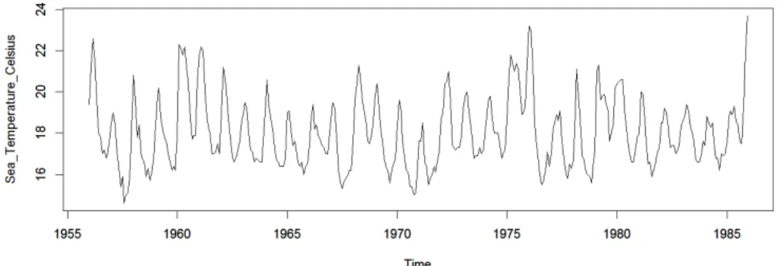
In order to illustrate the application of the Singular Spectrum Analysis(SSA) method. The time series formed by the monthly average sea temperature(C) in a point of the coast of South America(Callao, Peru) from January 1956 to December 1985. This location is of interest because it is close to where the “EI Ni˜no”phenomenon starts. This phenomenon later affects the temperature of the sea in the Northern hemisphere in the coast of California and the weather in South America and California as well.
Figure 1: Time Series plot of Sea Temperature Data
The time series plot in Figure 1 indicates that there is no clear simple trend, a seasonal pattern seems to be present and there seems to be an unusually high value towards the end of the series. The sequential SSA will be used to extract different components by different window length (L). The result of the SSA method will be compared with those of other decomposition methods that use different tools.
All the analysis was done using R[9]. The SSA part of the analysis was conducted using the package RSSA[7] and the code in [6].
4.1 Exploratory Analysis of the Time Series
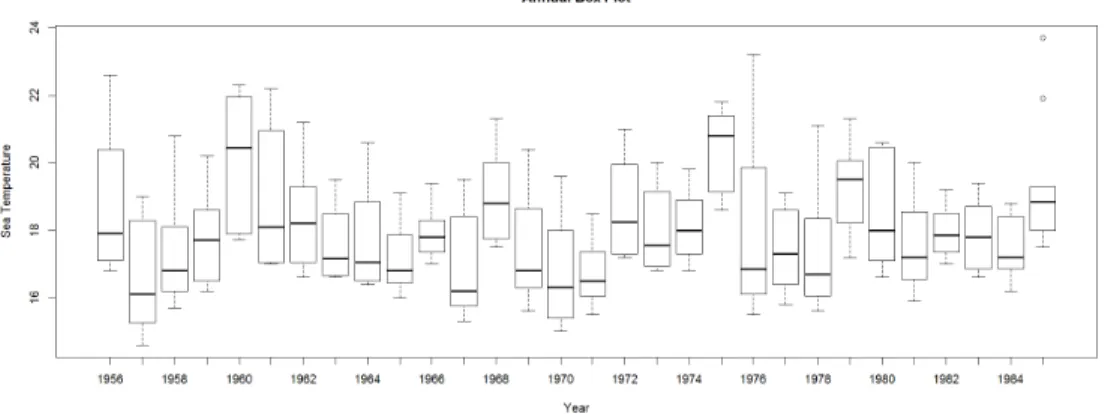
Figure 2: Monthly Box Plot of Sea Temperature Data
The monthly boxplot in Figure 2 shows a clear seasonal pattern where the median sea temperature of February tends to be the highest of all twelve months. The median of the sea temperature in September and October are the lowest compare to the rest. The boxplot of the values for each year in Figure 3 indicates that the trend in the long run is stationary, but it is not simple. The median of the sea temperature of each year goes up and down without a regular rule. Irregular cycles seem to be persistent. Therefore, the trend can not be modeled using simple linear regression or an exponential model as is the case of some time series. It indicates we need to use sequential SSA for this case. Sequential SSA means we extract some components with first window length by basic SSA and extract other components with second window length[5].
Figure 3: Annual Box Plot of Sea Temperature Data
(a) Periodogram (b) Cumulative Periodogram
Figure 4: Periodogram and Cumulative Periodogram of Sea Temperature Data
The periodogram and cumulative periodogram in Figure 4a confirms that there is a strong seasonal component in this time series as well as presence of several long cycles terms. Figure 4b confirms this point by showing the approximate percentage of each component. It shows that the trend and seasonal contribute 40% of the total variability each one and that the remaining 20% is associated with shorter cycles or white noise.
4.2 Step 1: Extraction of the Trend
4.2.1 Deciding the Window Length
The first step is to set a window length. For a short series the window length (L) should be proportional to the length (T) of the periodic component. In the temperature of the sea time series, the data are monthly and seasonal behavior is suspected so T=12 and L should be a multiple of 12. In the case of long time series, the L should be as large as possible and smaller or equal to N/2. In this case N=360, the the value of L=12M, where M is an integer.
The W-correlation matrix helps to decide the window length. The W-correlation matrix is the matrix of elementary reconstructed components. If two elementary re-constructed components are w-orthogonal, it means they are forcefully dissociable[5]. If two elementary reconstructed components are associable, it means they are highly w-correlated[5].
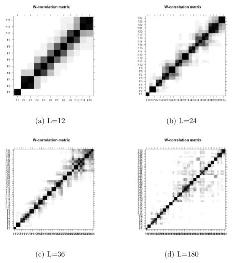
Then w-correlation matrix for L=12 is shown in Figure 5.
Figure 5: W-correlation Matrix of Sea Temperature Data with L = 12
between two components. The W-correlation plot shows for this case that the first component is w-uncorrelated with the other components. This means that the first eigentriple describes the trend.
The second and third components are highly correlated with each other and slightly correlated with the fourth one. This means they correspond to a harmonic component. Meanwhile, the second and third components are uncorrelated with the first one. The other squares can be associated to noise. The same relationship be-tween the first 3 components is observed in the W-correlation matrices in Figure 6 that use L=24,36,180, even when the components change because the matrix X changes when we change L.
Figure 6a almost suggests a diagonal shape because the eigentriples tend to be correlated mainly with the neighboring components and not with distant ones. When L increases, the components tend to be correlated with more other components even if the correlation is light sometimes. The Figure 6b, Figure 6c and Figure 6d confirmed this point[5]. This happens when L increases. Comparing the plots for different values of L, it is clear that as L increases we see the last eigentriples become somewhat correlated with more eigentriples. When L=12, the w-correlation matrix is almost diagonal shape. When L is increased to 180, the w-correlation matrix almost becomes a funnel shape. Therefore, it would be preferable to work with window length L=12.
(a) L=12 (b) L=24
(c) L=36 (d) L=180
Figure 6: Comparing Different Window Lengths of SSA for Sea Temperature Data
4.2.2 Scree Plot and Eigenvectors Plot
Scree plot is a plot of the eigenvalues of a correlation matrix in descending order of their magnitude. The “elbow” or “Shark break” is the key in the scree plot[3]. The principal components before the “elbow” are the important ones.
Figure 7: Scree plot of SSA for Sea Temperature Data
Figure 7 displays the scree plot for the sea temperature data. The “elbow” is at the second component. Therefore, the important component of this plot is the first one.
Figure 8: Eigenvectors Plot of SSA for Sea Temperature Data
The eigenvectors plot in Figure 8 indicates that the leading eigenvector has almost constant coordinates. This behavior of the eigenvectors is interpretable as the trend.
Figure 9: Reconstructed Series of First Step
The plot of the reconstructed series is given in Figure 9. The first component in Figure 9 corresponds to the trend and the rest correspond to high frequency com-ponents which are not related to the trend. The first plot in Figure 9 makes sense compared to the trend suggested by the medians of the boxplots in Figure 3.
Figure 10a displays the trend identified by the SSA method. Figure 10b displays the same trend now superimposed on the original time series.
Figure 10a indicates that the trend is an irregular one formed by cycles of different length. Figure 10b indicates that around the long cycles these are one year cycles corresponding to a seasonal pattern. The trend in Figure 10a was extracted by the first step. The harmonic component corresponding to a seasonal pattern will be extracted from the residuals in the next step.
(a) Trend
(b) Trend with Original Time Series Data
Figure 10: Trend of Sea Temperature Data
4.3 Step 2: Extraction of the Seasonal Part
The residuals are calculated by subtracting the values of the trend from the original time series. Those residuals are showed in Figure 11. In a second step, harmonic components will be identified in those residuals time series.
Figure 12 is presented to be compared with Figure 4. In Figure 12, most of the small peaks to the left of frequency 121 that were present in Figure 4 have disappeared. Those peaks were associated with cycles longer than a year and were removed in step 1.
The left plot in Figure 12 indicates that there is a dominant peak at frequency 1
12 and a much smaller one at frequency 1
6, which frequency equal to 1/12 and 1/6. Figure 12’s right plot confirms that there is clearly a seasonal pattern in the residuals from step 1, which accounts for almost 60% of the variability in the residual series in Figure 11.
Figure 12: Periodogram and Cumulative Periodogram of the Residuals From Step 1
4.3.1 Deciding the Window Length
Before doing the analysis, the window length needs to be decided. Because resid-uals from step 1 suggest the preserve of harmonic component with periods 12 and 6
and for better separability, L should be maximum number smaller than or equal to
N
2. Therefore, L should be equal to 180.
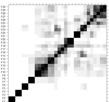
The w-correlation matrix is displayed in Figure 13.
Figure 13: W-correlation Matrix of Step 2
Figure 13 splits the first 30 eigentriples in to two groups, from the first to the 8th
and the rest. The first block corresponds to the seasonal part and the second corre-sponds to other possible components. Although 9th and 10th eigentriples are highly
correlated with each other, they are also correlated with many other eigentriples. It shows that 9th and 10th eigentriples corresponds to noise.
4.3.2 Extracting the Harmonic Components
The scree plot in Figure 14 shows the “elbow” around the eighth eigenvector.
Figure 14: Scree Plot of Step 2
Figure 15: Eigenvectors Plot of Step 2
Figure 15 shows that the first two components account for almost 66% of the residuals from step 1.
Figure 16: Paired Eigenvectors Plot of Step 2
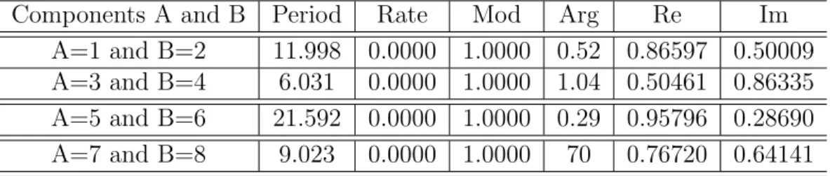
In Figure 16, the 1 vs. 2 , 3 vs. 4, 5 vs. 6, 7 vs. 8 plots show p-vertex polygons, which means they are pairs of sine/cosine sequences with zero phase and the same amplitude. In other words, they produce harmonic components with different periods.
Table 1: Summary of First Eight Components
Components A and B Period Rate Mod Arg Re Im A=1 and B=2 11.998 0.0000 1.0000 0.52 0.86597 0.50009 A=3 and B=4 6.031 0.0000 1.0000 1.04 0.50461 0.86335 A=5 and B=6 21.592 0.0000 1.0000 0.29 0.95796 0.28690 A=7 and B=8 9.023 0.0000 1.0000 70 0.76720 0.64141
ob-tained in R with the commandprint(parestimate(s2,groups=list(c(component A,
com-ponent B))). The output in table 1 indicates that the first two components produce
harmonic with period 12. The 3rd and 4th components produce a harmonic with
period 6. The 7th and 8th components produces harmonic with period 9. However,
the 5th and 6th components produce a harmonic with period 22, which implies the
long cycle. However, the long cycle is not the part of seasonal component. Therefore, these two components won’t be considered as seasonal part. Later, it will be added to the trend part. They might be associated with the long cycles showing in the peri-odogram in Figure 12 that account for 10 % of the variability of the residuals. Those cycles were not removed in step 1. Therefore, the seasonal part is the combination of 1st,2nd,3rd ,4th,7th and 8th’s components.
Figure 17 displays the reconstructed series of seasonal part.
When analyzing the seasonal part we noticed a long cycle remaining in the data. This cycle longer than a year was indicated by the 5th and 6th components in the second step. So we can go back and improve the trend by adding that cycle. The result of this modification is displayed in Figure 18.
(a) Final Trend
(b) Final Trend Compare to Original Trend
(c) Final Trend with Original Time Series
In Figure 18b, the red line is the original trend and the black line is the modified or final trend. The final trend looks more flexible and takes more extreme values. The high points are higher and the low points are lower. The comparison of Figure 18b and 18c suggest that the final trend follows more closely of the ups and downs of the original time series.
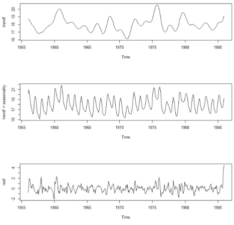
The result of the SSA method are now depicted in Figure 19, the first plot is the final trend, the second plot is the combination of trend and seasonal part, the third plot is the residual of SSA. After the trend and the seasonal part are taken out, the remaining is residual part. The last plot of Figure 19 shows that the residuals are around 0. However it would be interesting to observe the distribution of the residuals. The distribution is explored in Figure 20.
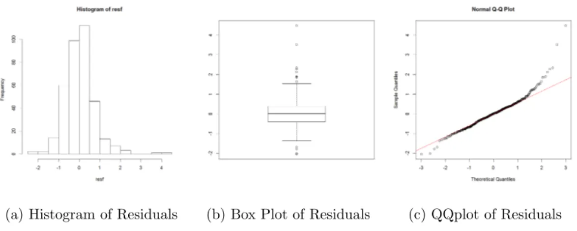
(a) Histogram of Residuals (b) Box Plot of Residuals (c) QQplot of Residuals
Figure 20: Analysis of Residuals
The histogram in Figure 20a shows that the distribution of residuals is a little bit skewed to right due to some distant observations. Figure 20b shows that there are some outliers in the residuals while the main body of box plot shows symmetric. The positive residuals correspond to the times when the temperature is higher than expected based on the trend and seasonality. Figure 20c shows that the distribution of smaller residuals (-2,1.3) is not far from a normal distribution. However, there
are larger residuals values which indicates a departure from normality. Based on the result of Shapiro-Wilk test, the p-value is smaller than 0.001. Thus, the residuals cannot be considered normally distributed. Since there are 360 observations, any small departure from normality might be considered significant.
Figure 21: The Cumulative Periodogram of SSA’s residuals
The cumulative periodogram of SSA’s residuals is given in Figure 21. It confirms that the residuals are not white noise.
5 COMPARISON OF SSA TO THE X-11 PROCEDURE
The X-11 procedure was created by the US. Bureau of the Census, and is grounded on iterative estimation of time series components by using moving averages. It will decompose the original time series data into seasonal, trend and irregular component. There are usually three steps of the X-11 procedure. First, estimate the trend by smoothing out the seasonality and noise by calculating moving average of length 13. Second, obtain the trend adjusted series by subtracting the trend from the original time series. Third, extract seasonal part out from previous step by applying moving average on a shorter length to smooth out the noise[2]. However, a good estimate of seasonal part cannot be obtained until the trend has already removed been trend from the series and a good estimate of trend cannot be obtained until the season part has already been removed from the series. Therefore, a recursive method is used by the X-11 procedure. There are two models used by the X-11 procedure, multiplicative and additive model[2]. The multiplicative model (Y=T×S×E) assumes that the seasonal part, trend, and irregular depend on each other while additive model (Y=T+S+E) assumes those components are independent[2]. The X-11 procedure can not only decompose monthly series but also quarterly series. SSA deals with time series that can be represented as sums of components[5]. Therefore, the comparison between SSA and additive model of X-11 will be done.
In order to compare these two methods, the additive model of X-11 procedure will be applied to the sea temperature data which is already analyzed by SSA in previous section. SAS is a good software to apply the X-11 procedure. The SAS procedure, proc x11 is needed to apply the X-11 procedure to the sea temperature
data. Because it is monthly data and the additive model of X-11 procedure is needed, the monthly statement with additive option is also needed for analyzing the sea temperature data. The SAS output of the X-11 procedure using an additive model is examined in following subsections.
5.1 Comparison of the Trend by SSA and X-11
Figure 22: Trend Estimated with the SSA and the X-11 Procedure
The black curve in Figure 22 is the X-11’s trend and the red one is SSA’s. The result shows that the SSA’s trend is smoother than X-11’ s. The Pearson correlation between the two is 0.9265, which means that the trends estimated by the two methods are highly correlated.
In order to compare the estimated values of the trends with the two methods (SSA and X-11 procedure), a scatter plot is prepared. If both methods gave exactly the same estimated trend, the points would be along the diagonal (red line).
Figure 23: Scatter Plot of Trends by SSA and X-11
Figure 23 shows that the relationship between those two trends is positive and relatively strong even when they are not identical. We see that for low & median monthly temperatures sometimes one method estimates the trend higher than the other and sometimes is the other way around. However, when the monthly average temperature is high, the trend estimated with X-11 method tends to take higher values than the SSA method. This indicates that the trend estimated with the X-11 method follows the data move closely when the values are high something we had already noticed in Figure 22.
5.2 Comparison of the Seasonal Components
Figure 24: Seasonal Components by SSA and X-11
In Figure 24, the black curve is the X-11’s seasonal part and the red one is SSA’s. The result shows that these two are almost same except X-11’s seasonal part has more extreme value at the peaks. Their Pearson correlation is 0.9691, which confirms that point.
Figure 25 shows that the relationship between seasonal components estimated by the two methods are positive and strong but not exactly equal. The points seem to be scattered around the diagonal without showing any special pattern.
5.3 Comparison of Residuals
Figure 26: Residuals of SSA and X-11
Figure 26 displays the residuals modeled by the SSA & X-11 method. The black line corresponds to the X-11’s residual and the red one is SSA’s. Figure 26 shows that even when they are not exactly equal they both reach the local minima and local maxima at the same times. The extreme values of the residuals seem to be more extreme for the SSA method than for the X-11 method. Their Pearson correlation is 0.7315. The sum of squares of X-11’s residual is 91.1140 and the sum of squares of SSA’s residual is 191.7636. By this criterion, X-11 has better performance than SSA.
Figure 27: Scatter Plot of Residuals for SSA and X-11
The scatter plot in Figure 27 shows some interesting patterns. The residuals tend to be both positive or both negative. There are several times in while one method produce a negative residual and the other a positive one. Also there are several data points for while both methods produce large residuals and they are very similar (close to the diagonal).
Figure 28: The Cumulative Periodogram of X-11’s Residuals
The cumulative periodogram of X-11’s residuals in Figure 28 indicates that the residuals of the X-11 method are not white noise either, similarly to the SSA’s resid-uals.
6 COMPARE SSA TO THE CLASSICAL SEASONAL DECOMPOSITION BY MOVING AVERAGES METHOD
Classical seasonal decomposition by moving averages (decomposition) is a decom-position method of time series. It will extract the trend-cycle at first by using moving averages. There are three kinds of moving averages: simple moving averages, centered moving averages, and double moving averages[1]. After that, the trend component will be removed from the original time series by subtracting if the original time series is additive model or by division if it is multiplicative model. The seasonal component is the periods average of each unit[1]. For example, if the original time series is a monthly time series, the seasonal component is the average of each month. After extracting trend and seasonality, the rest is noise or random component. Because SSA deals with time series that can be represented as sums of components[5], SSA can not be compared to the multiplicative model in the decomposition method. The comparison between SSA and decompose additive model will be presented now.
6.1 Comparing Trends of SSA and the Classical Decomposition Method
The black curve in Figure 29 is the trend obtained by the calssical decomposition method, and the red one is SSA’s. The result shows that the SSA’s trend is smoother than the one obtained by the other method. The correlation between them is 0.9657, which indicates that these two methods extract almost same trend out.
Figure 30 is the scatter plot of values of the trend obtained by these two methods.
Figure 30: Values of trends for SSA and the Classical Decomposition Method
In Figure 30, almost all the points are scattered around the diagonal line without showing any special pattern. It confirms that the two methods extract almost the same trend. There are small difference between the values but there is no systematic difference between the two.
6.2 Comparison of the Seasonal Part Between SSA and the Decomposition Methods
Figure 31: Seasonal Component from SSA and the Classical Decomposition Method
In Figure 31, the black curve is the seasonal part from the decomposition method and the red one is SSA’s. The result shows that these two are quite similar, and their Pearson correlation is 0.9727, which confirms that point. However, it looks that the seasonal component provided by SSA is more flexible, changing more through time and taking more extreme values.
The scatter plot in Figure 32 confirms that the seasonal part provided by the decomposition method is more rigid. It takes the same value for the same month of all years. The SSA provides a more flexible seasonal component, something that is describable. Although the correlation between them is very high, these two methods are different in the flexibility with which they approach the study of seasonality.
Figure 32: Scatter Plot of Seasonal Component from SSA and the Classical Decom-position Method
6.3 Comparison of Residuals of SSA and the Classical Decomposition Method
Figure 33: Residuals of SSA and the Classical Decomposition Method
In Figure 33, the residuals of the classical decomposition method appear in black curve and the red plot is SSA’s. The correlation between them is 0.8611 and they are scattered in Figure 34. No special pattern is noticed in the residuals. The sum
of squares of residuals from the classical decomposition method is 181.5146 which is smaller than SSA’s sum of squares of residuals.
Figure 34: Scatter Plot of the Residuals from SSA and the Classical Decomposition Method
Figure 35: The Cumulative Periodogram of the Residuals of the Classical Decompo-sition Method
The cumulative periodogram of the residuals of the classical decomposition method in Figure 35 indicates that the residuals of the classical decomposition method are not a white noise, similar to the SSA residuals.
7 COMPARING SSA AND SEASONAL DECOMPOSITION OF TIME SERIES BY LOESS (STL)
There are two recursive processes of this method. The outer loop and inner loop[8]. The inner loop is inside of every outer loop. During the inner loop, the seasonal component will be extracted by loess of the cycles-sub-series which is the series of all Mays or Octobers. The trend will be extracted by loess (locally weighted scatterplots smoothing) of seasonal-adjust series. The loess is the smoothing function of dependent variables given independent variables. The fit of a particular independent variable can be computed by the neighborhood and weighted by their distance from this particular independent variable. The neighborhoods size is decided by a parameter. When smoothing seasonal component, this parameter is called the seasonal smoothing parameter. When smoothing trend, this parameter is called the trend smoothing parameter. The seasonal smoothing parameter should be the odd integer which is at least 7 and the trend smoothing parameter is usually the next odd integer of nt ≥
1.5np
1−1.5n−s1, wherentis the trend smoothing parameter,nsis the seasonal smoothing
parameter, np is the number of observations in each cycle[8].
In the case of sea temperature, the seasonal smoothing parameter is chosen as 11. Because the larger the seasonal smoothing parameter is, the smoother the seasonal component is. However, in this case, the seasonal component is the combination of several harmonic components. Therefore, the seasonal component cannot be very smooth and the seasonal smoothing parameter cannot be very large. After comparing with the result of SSA and X-11, 11 is the proporiate value of the seasonal smoothing parameter.
7.1 Comparing Trends of SSA and STL
Figure 36: Trend estimated with the SSA and the STL methods
In Figure 36, the black curve is the Stl’s trend and the red one is SSA’s. The result shows that the SSA’s trend is smoother than STL’s and both methods have the similar estimate of local maxima and local minima except the beginning and the end of the time series. The correlation between them is 0.9310. The values of the trend are also displayed in the scatter plot in Figure 37.
Figure 1 showed that the temperature of the sea had a major increase in the final month. It is something that the trend estimated of the STL method captures and SSA does not fully capture in the trend.
Figure 37 shows that the most points are closed to diagonal(red line) meaning that for many months both methods estimated the same trend. However, there is also a few points that are far above the diagonal. Those are the months where the value of the trend estimated by the STL method are higher than those estimated by the SSA something that had already be noticed in Figure 36.
Figure 37: Scatter Plot of Trends for SSA method and STL method
7.2 Comparison of the Seasonal Component in SSA and STL
Figure 38: Compare Seasonal Component by SSA and STL
The seasonal component obtained by the SSA and STL methods is in Figure 38. The black curve is the STL’s seasonal part and the red one is the SSA’s. The two seasonal components are very similar and their Pearson correlation is 0.9732, which confirms that point. The scatterplot of the values of the seasonal component by the two methods for each time is in Figure 39.
Figure 39: Scatter Plot of the Seasonal Components of STL vs. SSA
The points are around the diagonal and show no special pattern.
7.3 Comparing of the Residual of STL and SSA
Figure 40: Residuals of STL and SSA
In Figure 40, the black curve is the STL’s residual and the red one is SSA’s. The correlation between them is 0.8235. The sum of squares of STL’s residual is 169.0723, which is larger than the sum of squares of residuals for X-11(91.1140) and smaller than the sum of squares of residuals for the SSA method(191.7636).
Figure 41: Scatter Plot of Residual by SSA and STL
In Figure 41, the points mostly close to the diagonal. However, there are a few times the SSA method has large residuals. That can be better identified if Figure 40 and 41 are compared. At those times while the temperature is high and the trend provided by STL follows more closely to the time series. The SSA trend is less influenced by the high temperatures so the residuals are large.
Figure 42: The Cumulative Periodogram of the Residuals of STL
The cumulative periodogram of the residuals of STL in Figure 42 indicates that the residuals of STL is not white noise. Comparing figures 21, 28, 35, 42, it is interesting to see that even when the residuals of the four methods are different their spectra is similar.
8 ANALYZING AN ARTIFICIAL SERIES BY SSA
In order to fully understand the output of the SSA method, several artificial time series will be generated under different conditions and the SSA method will be ap-plied. The output will be compared with that of other methods. The periodogram will also be obtained. The same length will be used for all the cases as well as the same normal white noise will be added in some of the cases. The commands in R to generate the time series are included.
To generate the times: N <−360
t <−1 :N
To generate the white noise: sigma <−1
a <−rnorm(N,0, sigma)
8.1 Case of a Pure Harmonic Time Series
8.1.1 One Period Harmonic Time Series
A time series is generated using a harmonic with sine and cosine functions with the same period (12) and amplitude 5. The plot of time series is in Figure 43. ts1 = 5·sin(π·t/6) + 5·cos(π·t/6)
Figure 43: Time Series Plot of Ts1
Both the sine and cosine components have period equal to 12(frequency 1/12). The divisibility of L can improve the separability, though it is not necessary. A small window length is always used in the extraction of the trend because it can act like a smoothing linear filter [5]. Meanwhile, the decomposition can get more detailed by using a large window length.
If the series can be considered relatively short, the window length should be in proportion to the harmonic period. If the series can be considered as long series, the window length should be as large as possible and smaller than N/2[5].
For this case, ts1 can be considered as long series because N is equal to 360. Therefore, the reasonable window length should be N/2 = 180.
Figure 44a identifies the period 12 or frequency 1/12 of ts1. Figure 44b shows that the first two eigentriples are the important components by current SSA, which means ts1 can be explained by first two components.
(a) Periodogram of Ts1 (b) Scree Plot of Ts1
Figure 44: Periodogram and Scree Plot of Ts1
Figure 45: W-correlation Matrix of Ts1
The w-correlation matrix is in Figure 45. The first two components are highly correlated to each other and uncorrelated to the rest. It means that SSA identifies that there is only one harmonic component in ts1. The same result will be obtained even if only either sine or cosine function was used to generated the time series.
Next is an example of a time series generated with one cosine function. The period(12) and the amplitude(5) are the same as in the previous example. The plot of the time series is in Figure 46. The Periodogram and the scree plot are in Figure 47. The window length of SSA is still 180.
Figure 46: Time Series Plot of Ts1a=5·cos(π·t/6)
(a) Periodogram of Ts1 (b) Scree Plot of Ts1
Figure 47: Periodogram and Scree Plot of Ts1a
Figure 47a shows that the periodogram identifies the period 12. Figure 47b shows that ts1a still can be explained by first two components.
(a) W-correlation Matrix of Ts1
(b) W-correlation Matrix of Ts1a
Figure 48: The Comparison of W-correlation Matrix Plots
The comparison of w-correlation matrix between ts1 and ts1a is in Figure 48. Figure 48a and Figure 48b are almost same. Their first two components are all highly correlated with each other and uncorrelated with the rest. It confirms that SSA uses a pair of highly correlated components to identify one harmonic part.
(a) Eigenvectors Plot of Ts1 (b) Paired Eigenvectors Plot of Ts1
Figure 49: Analysis of Ts1
are very important to the time series, which almost explain 100% of original series. Meanwhile, the rest components are all explain 0% of original series. Figure 49b shows that a p-vertex polygon of paired eigenvectors plot of first two components. It confirms that there is one harmonic part of ts1.
(a) Reconstructed Series of Ts1
(b) Original Ts1
Figure 50: Comparison Between Reconstructed Series and Original Time Series of Ts1
Figure 50a is the reconstructed series of first two components. It is exactly the same as the original time series. The sum square of the difference between recon-structed series and original series is 4.89×10⁻²⁵, which is very closed to zero.
8.1.2 Time Series formed by Harmonics with Different Periods
A time series is generated using two harmonic functions with different periods and amplitudes. The time series plot is in Figure 51.
ts2<−5·cos(π·t/6) +sin(π·t/6) + 3·cos(2·π·t/21)
Figure 51: Time Series Plot of Ts2
In this case, two of these three sine and cosine components have the same pe-riod(12) and one of them has period(21). None of them have the same amplitude. The window length can be either the lowest common multiple of periods or 180, the biggest number which smaller than N/2, which is 84.
The w-correlation matrix is in Figure 52. The first two components are highly correlated with each other and unrelated with the rest. So are the 3rd and 4th com-ponents. That is because 5·cos(π·t/6) and sin(π·t/6) has the same period. SSA can only separate different period harmonic parts.
(a) Eigenvectors Plot of Ts2
(b) Paired Eigenvectors Plot of Ts2
Figure 53: Eigenvectors Plot and Paired Eigenvectors Plot of Ts2
Figure 53a shows that first four components explain almost 100% of original series. Figure 53b shows that there are 2 p-vertex polygons. It means SSA identifies 2 harmonic parts of ts2.
The output shown in Table 2 corresponds to those components and were obtained with the command print(parestimate(s,groups=list(c(component A, component B))). It implies the components of first two correspond with the harmonic 5·cos(π·t/6) +sin(π·t/6) and the components of the 3rd and 4th corresponds the harmonic parts
Table 2: Summary of First Eight Components
Components A and B Period Rate Mod Arg Re Im A=1 and B=2 12.003 0.0000 1.0000 0.52 0.86609 0.49989 A=3 and B=4 20.969 0.0000 1.0000 0.30 0.95544 0.29518
(a) Reconstructed Series of Ts2
(b) Original Ts2
Figure 54: Comparison Between Reconstructed Series and Original Time Series of Ts2
Figure 54a is the reconstructed series of first four components. It is exactly same as the original time series. The sum square of the difference between reconstructed series and original series is 2.48×10⁻²⁵, which is very close to zero.
8.2 Case of Trend Plus White Noise
A time series is generated by a linear trend plus white noise, the plot of it is in Figure 55.
ts3<−1 + 0.1·t+a
Figure 55: Time Series Plot of Ts3
Because it is the case of linear trend plus white noise, the length of the window can be set to a small number.
(a) Scree Plot of Ts3 (b) W-correlation Matrix of Ts3
Figure 56a is the scree plot of ts3 with window length equals to 10. It shows the first component is important by current SSA and ts3 can be explained it. Figure 56b is the corresponding w-correlation matrix, which shows that the first component is highly correlated with itself and uncorrelated with the rest. It means there is a trend in this series.
Figure 57: Eigenvectors Plot of Ts3
Figure 57 indicates that the first component can explain 99.8% of ts3. Because it has almost constant coordinates, it corresponds the trend. The rest can explain 0.2% of the series, which corresponds the white noise.
Figure 58 indicates the reconstructed trend compares to the original trend which is the straight red line. The correlation between them is 0.99975, it confirms that the first component corresponds trend.
8.3 Apply SSA to Trend Plus Harmonic Plus White Noise
A time series is generated by a linear component, harmonic parts and white noise. Because we want to simulate data similar to the sea temperature data, the frequency of this artificial time series will be 12. The periods of the sine and cosine function are 60 and 12. Because the frequency of the series is 1/12, the harmonic component with period 60 (5 years) will be considered as the long cycle. The plot of time series is in Figure 59.
ts4<−1 + 0.1·t+ 3·sin(2·π·t/60) + 5·sin(2·π·t/12) + 3·cos(2·π·t/12) +a Where a is white noise.
Figure 59: Time Series Plot of Ts4
Because ts4 is harmonic components with linear trend, the window length should be the lowest common multiple of periods, which is 60.
Figure 60: W-correlation Matrix Plot of Ts4 with L=60
Figure 60 suggests that there are a trend and two harmonic components in this series.
(a) Eigenvectors Plot of Ts4 (b) Paired Eigenvectors Plot of Ts4
Figure 61: Anslysis of Ts4
Figure 61a indicates that the first components can explain 95.07 % of the series. Because it has almost constant coordinates, it corresponds the trend. The paried eigenvectors plot is in Figure 61b, and it shows that 2nd&3rd and 4th&5th shows
p-vertex polygon. It means each of these two pair of components corresponds to a harmonic part.
Table 3: Summary of First Eight Components
Components A and B Period Rate Mod Arg Re Im A=1 and B=2 12.014 0.0000 1.0000 0.52 0.86633 0.49947 A=3 and B=4 58.875 -0.0000 1.0000 0.11 0.99431 0.10652
Table 3 shows that the pair of 2nd and 3rd components corresponds with the harmonic 5·sin(2·π·t/12) + 3·cos(2·π·t/12), because their period is 12. The pair of 4th and 5th components corresponds with the harmonic 3·sin(2·π·t/60), because its period is 60. However, this artificial series is simulated to be monthly data. It means any harmonic component which period is greater than 12 will be considered as long cycle. Therefore, the reconstructed series of 4th and 5th components will be
added to the trend part.
Figure 62: Comparison of Ts4’s Trend
The comparison between the reconstructed series of 1st, 4th, 5th components and
the artificial trend(red) is in Figure 62. The correlation between them is 0.999313. It shows that SSA can extract trend well of this artificial series.
Figure 63: Comparison of Ts4’s Seasonal Part
The comparison between the reconstructed series of 2nd&3rd components and 5·
sin(2·π·t/12) and 3·cos(2·π·t/12) (red) is in Figure 63. The correlation between them is 0.9993. It indicates that the SSA can extract the seasonal part well of this artificial series.
Figure 64: The Cumulative Periodogram of the Residuals of Ts4
The cumulative periodogram of Ts4’s residuals is in Figure 64. It indicates that the residuals are white noise. The sum of squares of residuals is 295.9977. The sum of squares of the difference between residuals and the artificial noise a is 57.98. It shows that the residual of SSA is very closed to the artificial white noise.
9 ANALYZING AN ARTIFICIAL SERIES BY X-11
In order to compare the difference between these two method of decomposing an simple series, the additive model of X-11 method is applied to the artificial series ts4. Proc X11 statement of SAS is also needed at this case.
9.1 Comparison of the Trend by SSA and X-11
Figure 65: Trend Estimated of Ts4 by SSA and X-11
The black curve in Figure 65 is the X-11’ s trend and the red one is SSA’ s. The result shows that the SSA’s trend is more smooth than X-11’ s. The Pearson correlation coefficient between them is 0.999. It indicates that the trend estimates of ts4 by SSA and X-11 are very similar.
Figure 66 shows that the points are around the diagonal(red line). It indicates that these two methods extract almost the same estimates.
9.2 Comparison of the Seasonal Components
Figure 67: Seasonal Components of ts4 by SSA and X-11
In Figure 67, the black curve is the X-11’s seasonal part and the red one is SSA’s. The result indicates that these two are almost same because they are overlapped. Their Pearson correlation is 0.9963, which confirms that point.
Figure 68 indicates that the relationship between seasonal components estimated by the two methods are almost same because the points are around the diagonal. Due to the seasonal component of ts4 is the simple harmonic component with period 12, Figure 68 shows the points are gathered at several particular values around the diagonal.
9.3 Comparison of Residuals
Figure 69: Residuals of SSA and X-11
Figure 69 displays the residuals modeled by the SSA & X-11 method. The black line corresponds to the X-11’s residual and the red one is SSA’s. The figure shows that they are not exactly same because X-11’s residuals always have higher values than SSA’s at local maxima and SSA’s residuals have lower valuers at local minima. Their Pearson correlation is 0.777. The sum of squares of X-11’s residuals is 204.5536, which is smaller than SSA’s (295.9977). The sum of squares of the difference between X-11’s residuals and the artificial noise a is 118.79, which is bigger than SSA’s (57.98). It shows that SSA’s residuals are closer to the artificial noise than X-11’s residuals. By this criterion, SSA has better performance than X-11.
Figure 70: Scatter Plot of Ts4’s Residuals for SSA and X-11
The residuals in Figure 70 tend to be both positive or both negative. There are several times in while one method produce a negative residual and the other a positive one. Some points are far above the diagonal which indicates X-11’s residuals are higher than SSA’s. It is already noticed in Figure 69.
Figure 71: The Cumulative Periodogram of Ts4’s Residuals by X-11
The cumulative periodogram of X-11’s residuals in Figure 71 indicates that the residuals of X-11 method is not white noise, which is different from the SSA’s residuals. Because the noise in the artificial series is white noise, it confirms that SSA has better performance than X-11 of ts4.
10 ANALYZING AN ARTIFICIAL SERIES BY THE CLASSICAL DECOMPOSITION METHOD
In this section, the comparison of SSA and the classical decomposition method will be presented.
10.1 Comparison of the Trends by SSA and Decomposition
Figure 72: Trend Estimated of Ts4 with the SSA and the Classical Decomposition Method
In Figure 72, the black curve is the trend obtained by the decomposition method, and the red one is SSA’s. The result shows that the SSA’s trend is a little bit smoother than the trend obtained by classical decomposition method. Their Pearson correlation is 0.9995.It indicates that these two method extract almost same trend.
In Figure 73, almost all the points are around the diagonal without showing any special pattern. It confirms that the two methods extract almost the same trend.
10.2 Comparison of the seasonal part between SSA and the Classical Decomposition Method
Figure 74: Seasonal Component from SSA and the Classical Decomposition Method
In Figure 74, the black curve is the seasonal part from the decomposition method and the red one is SSA’s. The result shows that these two are quite similar, their Pearson correlation is 0.9993, which confirms that point.
The scatter plot in Figure 75 confirms that the seasonal component of these two methods are almost same. The points are gathered at several particular points in the diagonal.
10.3 Comparison of the Residuals by SSA and the Classical Decomposition Method
Figure 76: Ts4’s Residuals of SSA and the Classical Decomposition Method
In Figure 76, the residuals of the classical decomposition method appear in black curve and the red plot is SSA’s. The correlation between them is 0.9283. No special pattern is noticed in the residuals. The sum of squares of residuals of the classical decomposition method is 260.1323, which is smaller than SSA’s. The sum of squares of the difference between the classical decomposition method’s residuals and the artificial noise a is 41.3. It is also smaller than SSA’s.
In Figure 77, almost all point are around the diagonal. It confirms that these two methods all perform well of the artificial sereis.
Figure 77: Scatter Plot of Ts4’s Residual from SSA and the Classical Decomposition Method
Figure 78: The Cumulative Periodogram of the Residuals of the Classical Decompo-sition Method
The cumulative periodogram of the residuals of the classical decomposition method in Figure 78 indicates that the residuals of the classical decomposition method is white noise.
11 ANALYZING AN ARTIFICIAL SERIES BY STL
In this section, the comparison of SSA and STL will be presented. Because the artificial series only have the seasonal component with period 12, the seasonal com-ponent will be extracted by taking the means of each month[8].
11.1 Comparison of the Trends by SSA and STL
Figure 79: Trend estimated of Ts4 with the SSA and the STL methods
In Figure 79, the black curve is the Stl’s trend and the red one is SSA’s. The result shows that these two trends are very similar, which can be confirmed by their correlation, 0.999.
Figure 80 shows that almost all points are along the diagonal. It indicates that these two method extract almost same trend of this artificial series.
Figure 80: Scatter Plot of Ts4’s Trends for SSA method and STL method
11.2 Comparison of the seasonal component in SSA and STL
Figure 81: Compare Seasonal Component of Ts4 by SSA and STL
The seasonal component obtained by the SSA and STL methods is in Figure 81. The black curve is the STL’s seasonal part and the red one is the SSA’s. The two seasonal components are very similar and their Pearson correlation is 0.999, which
confirms that point. The scatter plot of the values of the seasonal component by the two methods for each time is in Figure 82. The points are around the diagonal and show no special pattern.
Figure 82: Scatter Plot of Ts4’s Seasonal components of STL vs SSA
11.3 Comparing the Residual of STL and SSA
Figure 83: Ts4’s Residuals of STL and SSA
In Figure 83, the black curve is the STL’s residual and the red one is SSA’s. The correlation between them is 0.9205. The sum of squares of STL’s residuals is 266.6586, which is smaller than the SSA method(295.9977) and larger than the decomposition
method(260.1323) and the X-11 method(204.5536). The sum of squares of the dif-ference between STL’s residuals and the artificial noise a is 47.6 which is larger than the decomposition method(41.3) and smaller than the X-11 method(118.79) and the SSA method (57.98)
Figure 84: Scatter Plot of Ts4’s Residual by SSA and STL
In Figure 84, almost all points are close to the diagonal. No special pattern is noticed.
Figure 85: The Cumulative Periodogram of Ts4’s Residuals of STL
The cumulative periodogram of the Residuals of STL in Figure 85 indicates that the residuals of STL is white noise, which is the same as the artificial white noise.
12 CONCLUSIONS
Singular Spectrum analysis (SSA) is a relatively recent method of time series analysis that decomposes time series into trend, seasonal components and residuals. It uses linear algebra tools such as eigenvalues that are traditionally used in principal components analysis (PCA) in the area of multivariate statistical analysis by creating a matrix from a time series by successive sliding of a window to create vectors. The package RSSA in R can be used to apply this method to time series data.
SSA requires making several decisions such as the window length and interpreting the output in intermediate steps to select eigentriples. It requires more work and more participation of the analyst than methods that are comparatively automatic such as the X-11 decomposition implemented in SAS. The X-11 method is based on the successive application of moving averages.
SSA has an advantage in terms of flexibility because it can work with seasonal effects or short cycles of any length. The X-11 method is only programmed to work with either monthly or quarterly data, i.e. seasonal components in which the period is 4 or 12. However when we compared both methods for the monthly average of sea temperature that has an irregular trend and seasonality of length 12, the trend estimated by X-11 was slightly more flexible and the sum of squares of residuals was smaller than the one for SSA (of course the results of the SSA method depend on the decisions we made in terms of window length and eigentriples to include). The trend extracted by SSA tends to be smoother than the one extracted by X-11.
The trend, seasonality and residuals produced by the different methods (SSA, X-11, classical decomposition and STL) for the time series of the temperature of
the sea are not identical but highly correlated. They use different tools but all aim toward the identification of the components giving a similar overall picture even when numerically the values are not the same. The X-11 method gives a smaller sum of squares of residuals in the case of this time series that presents several challenges such as irregular cycles that last several years and outliers toward the end.
The different methods give very similar results when applied to artificial time series created with harmonic functions ,to simulate seasonality and longer cycles, and a randomly generated normal noise. In this case, although the X-11 method has smaller sum of squares of its residuals, the SSA gave a more similar residuals of the generated normal noise than the X-11 method. That is because the seasonality of the artificial series only contains one harmonic component of period 12 while the X-11 method would like to estimate a flexible seasonality, which contains some noise.
For time series that are monthly or quarterly with very irregular trends and sea-sonal patterns the X-11 method seems to adapt better but for series with more regular sinusoidal patterns the SSA gives smaller residual errors. As mentioned above the SSA method could be applied to non-monthly /non-quarterly time series as well (such as weekly time series).
13 FUTURE WORK
The application of the SSA method is not limited to the decomposition of the time series. More advance applications include the identification of change points in a time series. I would like to explore it in the future using a biological time series that has several change points not only in terms of trend but also in variability and periodicity.
BIBLIOGRAPHY
[1] ´O. Burke, Statistical Methods Autocorrelation Decomposition and Smoothing. Accessed March 10, 2014.
http://alturl.com/eaiyg
[2] Central Bureau of Statistics. Seasonal Adjustment. Accessed March 12, 2014.
http://www1.cbs.gov.il/www/publications/tseries/seasonal/intro.pdf
[3] J. B. Elsner and A. A. Tsonis, Singular Spectrum Analysis: A New Tool in Time Series Analysis, Plenum Press, New York (1996).
[4] M. Ghil, M. R. Allen, M. D. Dettinger, K. Ide, D. Kondrashov, M. E. Mann, A. W. Robertson, A. Saunders, Y. Tian, F. Varadi, and P. Yiou, Advanced Spectral Methods For Climatic Time Series, Reviews of Geophysics 40 (2002) 3-1 - 3-41.
[5] N. Golyandina and A. Zhigljavsky, Singular Spectrum Analysis for Time Series, Springer, New York (2013).
[6] N. Golyandina and A. Zhigljavsky, Basic Singular Spectrum Analysis and Fore-casting with R, submitted to Computational Statistics & Data Analysis (2013).
[7] A. Korobeynikov, Computation- and space- efficient implementation of SSA, Statistics and Its Interface 3 (2010) 357-368.
[8] C. Robert, C. William, M. Jean, and T. Irma, STL: A Seasonal-Trend Decom-position Procedure Based on Loess, Journal of Official Statistics 6 (1990) 3-73.
[9] R Core Team. R: A language and environment for statistical computing. R Foun-dation for Statistical Computing, Vienna, Austria, 2012.
VITA CHENG DENG
Education: B.S. Statistics, North China University of Technology, Beijing, China 2012
M.S. Mathematical Sciences, East Tennessee State University,
Johnson City, Tennessee 2014
Professional Experience: Graduate Assistant, East Tennessee State University, Johnson City, Tennessee, 2012–2013