Two-variable choropleth maps as a useful tool for visualization of geographical relationship 33 © Lietuvos mokslų akademijos leidykla, 2006
Kartografija
Cartography
Two-variable choropleth maps as a useful tool for
visualization of geographical relationship
Anna Leonowicz
Polish Academy of Sciences, Institute of Geography and Spatial Organization E-mail: [email protected]
INTRODUCTION
Choropleth mapping is a common cartographic tech-nique used by cartographers, geographers and other researchers dealing with spatial information to visualize enumeration data. The major concerns of cartographers are focused on one-variable choropleth maps which allow single variables to be depicted on separate maps. This simple form of visualization is not sufficient in more complex studies when different phenomena and their interrelationships must be considered. Making a series of complementary one-variable choropleth maps is not an easy task; for example, the issue of the appropriate class selection still remains unsolved. Also, the perception of such maps often becomes a serious problem. Although choropleth maps are said to be readable and well understood by their users, in fact only information about distribution is easy to access. Reading relationship, i. e. discovering a similarity or difference among the map patterns, is possible only when individual maps are read separately and then compared with each other. As it has been proven in many experiments, the human vision is misleading in this process. The bias in judging about the relationship can result from such factors as map complexity, overall map blackness and similarity of map patterns (Steinke, Lloyd, 1981). Due to the fact that it is difficult to produce easily comparable one-variable choropleth maps, it seems necessary to find more efficient ways of visualizing the geographic relationship. Two-variable maps seem to be a reasonable solution.
TWO-VARIABLE CHOROPLETH METHOD
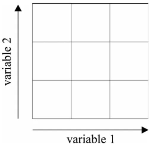
The two-variable choropleth method (called also bivariate choropleth method) can be defined as a variation of a simple choropleth map, which enables to portray two separate phenomena simultaneously. It is achieved by covering each aerial unit by a tone (or pattern) representing a combination of the values of two variables. The form of the map legend is based on a statistical scattergram in which each axis represents the values of one variable. The class selection method for each variable divides the rectangular legend into smaller boxes – each of them representing a unique relationship of the variables (Robinson et al., 1995) (Fig. 1).
Fig. 1. Two-variable choropleth map legend box
1 pav. Dviejų kintamųjų dydžių pagrindu sudarytos kartogramos legendos pavyzdys
Statistical data
The sense of this presentation depends on the proper choice of the mapped data. Most often two-variable maps are used to show a casual relationship between two phenomena. It should be noted that maps can only show the coincidence of the distributions; to state the casual relationship between variables, the phenomena must be interpreted in a broader context. Examples of such related phenomena are the use of fertilizers and yields, farm size and production value, income and education level. Two-variable maps are also used for presentation of two independent variables. The superimposition of such variables is often meaningful for the main map topic. For example, the birth and death rates taken together inform about the natural increase of the population, the density of the road and railroad networks shows the density of the transportation network in general, the sum of export and import values reveals the value of external trade.
Selection of class intervals
Data classification for two-variable maps is most often performed on a statistical scattergram. The number of classes should be possible to deal with by the reader. Therefore, the number of possible combinations is lim-ited to 4 (2 × 2) or 9 (3 × 3) classes. These classes can be easily interpreted – readers can intuitively select low and high values or low, medium and high values in the second case. Maps with more than 9 classes (e. g., 16 (4 × 4) classes) are too complex for the users; this was proved experimentally (Olson, 1981).
Because two-variable choropleth maps are intended to show a relationship between the variables, a distinc-tion between two kinds of observadistinc-tions should be made during the class selection. The first group of observa-tions consists of these units whose values confirm a strong relationship between the variables (in the case of a positive relationship: if the values of the first the variable are low, the values of the second variable are also low; and if the values of the first variable are high, the values of the second variable are also high). The other group is composed of units in which values are not expected – these are the values of positive and negative deviations from a linear relationship. The first group of units should fall into the classes of the main diagonal line of the legend box. The other units should be grouped into off-diagonal classes (Fig. 2). Such class division enables the regions of strong relationship and the regions where relations are different and not expected to be easily noticed by the map reader. Such classification can be performed only when the line of best fit is placed on the legend diagonal. J. Olson (1975) suggested using the line of equal standard deviations. To place diagonal classes on that line, class intervals should be selected at standardized values.
Figure 3 illustrates the classification method that meets this requirement. A two-variable map portrays the percentage of rural population and the percentage of population under the age of 18. The data were collected
for 37 counties (except the urban ones) of the Mazowsze Region (Województwo Mazowieckie) in Central Poland. Nine (3×3) classes were selected; the classification method is explained on a statistical scattergram: the data set division is based on the line of equal standard deviations (S), class intervals are placed symmetrically to the arithmetical means (x,y) at standardized values – middle
class intervals are equal with one standard deviation unit (σx,σy); class frequency, especially diagonal classes, does not vary greatly. In order to facilitate the reading of each of the univariate distributions, one-variable choropleth maps are enclosed.
Graphic representation
Two-dimensional colour schemes are used as a graphic representation for two-variable choropleth maps. Col-ours should enable the values for each of the variables to be read properly while at the same time allowing interpreting their relationship. A two-variable colour scheme is normally constructed as a combination of two sets of colours. Each distribution is represented by value differences; a hue separates the variables from each other (Brewer, 1994). An example of a two-vari-able colour scheme was used in the map in Fig. 3. Two single-colour progressions – magenta and cyan (seen on one-variable maps) – were combined, each representing one of the variables. Violet hues in the two-variable legend diagonal indicate a strong relationship between the variables, reddish hues denote the positive residuals and bluish hues the negative residuals.
Another graphic solution shown in Fig. 4A was proposed by J. R. Eyton (1984). This two-variable scheme uses complementary hues (cyan and red) for representing each of the variables. A mixture of com-plementary colour progressions produces shades of grey on the legend diagonal. The whole colour scheme is logically ordered – the grey colour indicates a strong relationship between the variables, reddish hues show Fig. 2. Two-variable choropleth map legend divided into classes, with group observations confirming a strong relationship among the variables and classes with group observations of positive and negative residuals
2 pav. Dviejų kintamųjų dydžių kartogramos legenda, skaidoma į klases, kurių grupės turi glaudžias teigiamas ar neigiamas priklausomybės sąsajas
the values above the diagonal, and bluish hues stand for the values below the diagonal. Therefore a distinction between the observations confirming a strong linear relationship and the observations of positive and nega-tive residuals can be made easily.
Reader’s perception
The quality of readers’ perception is considered to be an important limitation of two-variable choropleth maps. The negative opinion about their effectiveness is based mainly on maps published in the 1970s by the U. S. Bureau of the Census. It was evidenced experimentally that these maps were difficult to deal with by the map reader (Weiner, Francolini, 1980; Olson, 1981). Two-variable maps were found less effective than one-vari-able ones in reading specific as well as general infor-mation. They appeared hard to understand; especially the two-variable legend was found demanding for the users. Therefore cartographers became sceptical about the possibility to use two-variable maps in practice.
The poor readability of census maps does not, how-ever, result from the two-variable method itself but mainly from an inappropriate graphic representation developed by U. S. Bureau of the Census. The legend box consisted of too many classes – 16 (4×4), which were difficult to distinguish, especially in the map context; also, a controversial two-dimensional spectral colour scheme was used. As one can see in Fig. 4B, this colour scheme lacks visual logic – the lowest classes, marked in yellow, stand apart from the other ones, violet hues used for higher classes are difficult to discriminate; the green hue is intuitively perceived as an individual colour and not as a combination of blue and yellow. Given these problems, it is not surprising that Census maps were difficult to interpret. It can be assumed that two-variable maps could be better understood by their readers, if only they were properly designed – by the use of proper graphics and reduction of the number of classes. In order to check this assumption an experimental test was conducted, which is reported below.
EXPERIMENT
In this experiment, the effectiveness of one-variable and two-variable choropleth maps was compared. It was hypothesized that one-variable maps are more appro-priate to show spatial distribution and two-variable maps, if properly designed, make the geographic rela-tionship easier to interpret. The experimental design and testing procedure are reported in detail by A. Leonowicz (2006). The participants were 128 students of geography at Warsaw University. The test was per-formed also at Vilnius University where 10 students
participated*. The students were at the beginning of the
first year of studies, so they were not accustomed to
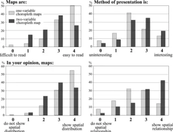
cartographic presentation methods. They were divided into two groups. Each student performed the test twice, each time using another type of maps – the first group worked with one-variable maps first, the second group worked with two-variable maps first. Students performed different typical map-reading tasks on one-variable and two-variable choropleth maps. The test consisted of six tasks. The students were asked to extract from maps information about the distributions (three tasks) and about the relationship among the variables (another three tasks). Questions were asked about specific as well as about general information; they referred to individual enumeration units, regions and whole maps. In order to design comprehensive two-variable maps, a complementary colour scheme proposed by J. R. Eyton (1984) was used, and the number of classes was limited to 9 (3×3). One-variable maps had five classes and they were designed by the use of colour schemes proposed by C. A. Brewer (Brewer et al., 2003). The maps compiled for the experiment looked like the actual Census maps. As a test result, the percentage of correct responses was calculated. At the end of the experiment the students expressed their opinion and preferences about both types of maps. They were asked to rate the maps on a scale of zero to four for six different criteria, which were formulated as polar word pairs. The students judged whether:
– the maps seemed “uninteresting” or “interesting”, “difficult” or “easy to read”,
– the method of presentation is “usual” or “unu-sual”, “uninteresting” or “interesting”,
– the maps “show” or “do not show spatial distri-bution”, “show” or “do not show spatial relationship”. In the last question the students were asked which information was easier to read – about the distribution or about the relationship; they had also to write a commentary on the answer chosen.
The results of the experiment performed at Warsaw and Vilnius Universities were quite similar. They are shown in figures. Figure 5 is a graph of the mean accuracy of responses to six test questions, Fig. 6 shows the histograms of response frequencies in the four cri-teria of rating. Differences in the accuracy of responses on one-variable and two-variable maps were checked for significance by the Wilcoxon matched pairs test. There were significant differences (at p < 0.05) in the accuracy of reading the general pattern of spatial dis-tributions and in reading the spatial relationship at every level of perception. Students were generally un-able to easily read the general pattern of univariate distributions on two-variable maps. On the contrary, reading the spatial relationship appeared more difficult on one-variable maps.
The sign test was applied to check for significant differences in students’ opinions. There were significant differences (at p < 0.05) in almost all criteria of rating (except the question of interest in maps). The students’ opinions generally confirmed the results of the test
questions. One-variable solution was found more ap-propriate to read the distribution and two-variable so-lution to read the relationship of variables. Two-vari-able maps were rated as a little more difficult to inter-pret, but this form of presentation seemed more unusual and interesting. Almost 90 percent of respondents decided that it was information on the distribution that could be more easily perceived on the one-variable maps. In case of two-variable maps, the students were not in agreement, with almost one half of the respond-ents regarding information on the relationship as easier to notice and the other half as more difficult to read.
The results of the experiment confirm the opinion about the poor readability of two-variable choropleth maps and bear evidence that one-variable choropleth maps are more effective while reading the spatial dis-tribution, and well designed two-variable choropleth maps are more effective in reading the spatial relation-ship.
CONCLUSIONS
To sum it up, two-variable choropleth maps seem an interesting alternative to the simple choropleth maps as a visualization tool that makes geographic relationship prominent in a map pattern. The advantage of such technique in comparison with one-variable solution is that both phenomena are depicted and can be perceived by the map reader simultaneously. The readability of two-variable maps is, however, considerably influenced by the way of graphic representation. Only using a proper graphic solution and limiting the number of classes can make these maps effective. The results of the performed experiment showed that two-variable maps, if properly designed, can be quite well understood by the map read-ers and can be useful in visual exploration of geographi-cal data, especially when the relationship among the phenomena is of main interest. We may hope that these results will encourage cartographers to use this form of visualization more often in practice.
Received 20 03 2006 Accepted 30 03 2006 References
Brewer C. A. (1994). Color use guidelines for mapping and visualization. A. M. MacEachren, D. R. F. Taylor (eds.).
Visualization in modern cartography. Oxford. Elsevier. 123–
147.
Brewer C. A., Hatchard G. W., Harrower M. A. (2003). ColorBrewer in print: a catalog of color schemes for maps.
Cartography and Geographic Information Science. 30(1).
5–32. <www.ColorBrewer.org>.
Eyton J. R. (1984). Complementary-color, two-variable maps.
Annals of the Association of American Geographers. 74(3).
477–490.
Leonowicz A. (2006). Czytelność kartogramów prostych i złożonych – badania eksperymentalne. Polish Cartographi-cal Review. 38(1). 5–23.
Olson J. (1975). The organization of color on two-variable maps. Proceedings of the International Symposium on Computer-assisted Cartography. Auto-Carto II. 289–294.
Olson J. (1981). Spectrally encoded two-variable maps. Annals of the Association of American Geographers. 71(2): 259–276.
Robinson A. H., Morrison J. L, Muehrcke P. C., Kimerling A. J., Guptill S. C. (1995). Elements of Cartography. New York:
John Wiley & Sons. 6th ed.
Steinke T., Lloyd R. (1981). Cognitive integration of objective choropleth map attribute information. Cartographica. 18(1).
Fig. 5. Test results: accuracy of responses for one-variable and two-variable maps
5 pav. Testo rezultatai: vieno ir dviejų kintamųjų pagrindu sudarytose kartogramose
Fig. 6. Students’ judgments on one-variable and two-variable choropleth maps
6 pav. Studentų nuomonė apie vieno ir dviejų kintamųjų medotu sudarytas kartogramas
13–23.
Weiner H., Francolini C. M. (1980). An empirical inquiry concerning human understanding of two-variable map. The American Statistician. 34(2). 81–93.
Anna Leonowicz
DVIEJŲ KINTAMŲJŲ KARTOGRAMŲ METODO TAIKYMAS GEOGRAFINIŲ REIŠKINIŲ SĄVEIKOS VIZUALIZACIJAI
S a n t r a u k a
Kartogramos yra plačiausiai naudojamos reiškinių vizualizacijai. Jos gali būti sudaromos naudojant vieną ar du kintančius, tarpusavyje susijusius reiškinius. Vieno kintamojo reiškinio naudojimas kartogramose neatveria visų erdvinės sąveikos pateikimo galimų. Tobulinant šias galimybes ir siekiant atsižvelgti į vartotojo poreikius, yra atlikta daugybė ekspe-rimentų. Nustatyta, kad daug lengviau fiksuoti dviejų reiškinių erdvinio sąryšio sklaidą, kai jie kartogramomis pateikiami viename žemėlapyje.
Straipsnyje nagrinėjami pagrindiniai dviejų kintamųjų metodo taikymo sudarant kartogramas aspektai: statistikos duomenų atranka, duomenų klasifikavimas, grafinis pateikimas ir jų suvokimas. Pastarasis aspektas gana retai yra nagrinė
-jamas. Neigiamas požiūris į dviejų kintamųjų metodo efektyvumą sudarant kartografas susiformavo po 1970 m. JAV Surašymo biuro paskelbtų publikacijų. Sunkiai skaitomi, netin-kamai sudaryti žemėlapiai panašėjo į nepavykusį eksperi-mentą, tačiau jokiu būdu neatspindėjo metodo galimybių.
Dviejų kintamųjų metodo efektyvumas kartogramų sudarymui buvo patikrintas moksliniu eksperimentu. Ekspe-rimente dalyvavo Varšuvos ir Vilniaus universitetų geogra-fijos studijų programų studentai. Jie nagrinėjo spalvotų kartogramų informaciją, pateiktą vieno ir dviejų kintamųjų metodais. Jų išsakyta nuomonė buvo metodo galimybių vertinimo pagrindas. Vienu kintamuoju perteikta informacija žemėlapiuose buvo suvokiama tiksliau, tačiau reiškinių tarpu-savio ryšius geriau atspindi dviejų kintamųjų metodu sudaryti žemėlapiai. Pagrindinė vartotojų nuomonė: dviejų kintamųjų būdu sudarytas kartogramas kiek sunkiau interpretuoti, tačiau jos atskleidžia platesnes ryšių nusta-tymo ir apibendrinimo galimybes. Tyrimo rezultatai rodo, kad dviejų kintamųjų metodu sudarytos kartogramos yra lengvai suvokiamos, o toks metodas gali būti plačiai taiko-mas vizualiai perteikti dviem tarpusavyje susijusiems reiškiniams.