Exploratory Visualization of Data with Variable Quality
byShiping Huang
A Thesis
Submitted to the Faculty of the
WORCESTER POLYTECHNIC INSTITUTE In partial fulfillment of the requirements for the
Degree of Master of Science in
Computer Science by
January 2005
APPROVED:
Professor Matthew O. Ward, Thesis Advisor
Professor Murali Mani, Thesis Reader
Abstract
Data quality, which refers to correctness, uncertainty, completeness and other aspects of data, has became more and more prevalent and has been addressed across multiple dis-ciplines. Data quality could be introduced and presented in any of the data manipulation processes such as data collection, transformation, and visualization.
Data visualization is a process of data mining and analysis using graphical presenta-tion and interpretapresenta-tion. The correctness and completeness of the visualizapresenta-tion discoveries to a large extent depend on the quality of the original data. Without the integration of quality information with data presentation, the analysis of data using visualization is in-complete at best and can lead to inaccurate or incorrect conclusions at worst.
This thesis addresses the issue of data quality visualization. Incorporating data qual-ity measures into the data displays is challenging in that the display is apt to be cluttered when faced with multiple dimensions and data records. We investigate both the incor-poration of data quality information in traditional multivariate data display techniques as well as develop novel visualization and interaction tools that operate in data quality space. We validate our results using several data sets that have variable quality associated with dimensions, records, and data values.
Acknowledgments
I am extremely grateful for the opportunity to have Matthew Ward as my advisor for the past three years. He is always patient and inspires me in our research talk. I learned a lot from him not only on our project, but on the method to do general research as well. I would like to thank Prof. Elke Rundensteiner for her invaluable feedback on our project. I would like to express my greatest gratitude to her for the strongest support and help she provided during my study years.
I would like to thank Prof. Murali Mani for being the reader of this thesis and giving me a lot valuable feedback.
I also would like to thank my team members, Jing Yang, Anilkumar Patro, Wei Peng and Nishant K. Mehta for our pleasant talk and coorporation in the past years.
I acknowledge and appreciated the love and support of my wife, Hong Zhao, without whom I would be lost.
Contents
1 Introduction 1 1.1 Motivation . . . 1 1.2 Data Quality . . . 4 1.2.1 Missing Data . . . 4 1.2.2 Uncertainty . . . 51.2.3 Consistency, Completeness and Other Aspects . . . 6
1.3 Information Visualization . . . 7
1.4 Thesis Approach and Contributions . . . 9
1.5 Thesis Organization . . . 10
2 Related Work 12 2.1 Missing Data Visualization . . . 12
2.2 Uncertainty Visualization . . . 15
2.3 Data Quality in the Database Community . . . 17
2.4 Data Quality in Information Management . . . 18
3 Visual Variable Analysis 19 3.1 Visual Encoding . . . 20
3.2 Algebraic Formalizational Analysis . . . 22
3.4 Metrics for Visual Displays . . . 25
4 Data Quality Metrics 27 4.1 Imputing Algorithms . . . 28
4.1.1 Nearest Neighbor . . . 28
4.1.2 Multiple Imputation . . . 29
4.2 Quality Measure Definition . . . 30
4.3 Data Quality Store . . . 32
5 Methodologies 34 5.1 Incorporation of Visualization of Data with Quality Information in 2D Displays . . . 34
5.1.1 Color Scale Selection . . . 36
5.1.2 Mapping Interpolation . . . 38
5.1.3 Parallel Coordinates . . . 38
5.1.4 Glyphs . . . 44
5.1.5 Scatterplot Matrix . . . 45
5.2 Incorporation Visualization of Data with Quality Information in 3D Displays . . . 48
5.2.1 Parallel Coordinates . . . 48
5.2.2 Scatterplot Matrix . . . 50
5.2.3 Star Glyphs . . . 51
5.3 Visualization in Data Quality Space . . . 52
5.3.1 Displays in Data Quality Space . . . 52
5.3.2 Operations on Data Quality Displays . . . 53
5.4.1 Linking and Brushing
in Data Space and Quality Space . . . 55
5.4.2 Viewing Transformations . . . 59 5.5 Animations . . . 60 6 Implementation 61 6.1 System Architecture . . . 61 6.2 Implementation . . . 63 7 Case Studies 64 7.1 Objectives . . . 64
7.2 Imputation Algorithm Comparative Study . . . 65
7.2.1 Methodology . . . 65
7.2.2 Results . . . 66
7.3 Quality Visualization Efficiency . . . 68
7.3.1 Methodology . . . 69
7.3.2 Results and Findings . . . 71
8 Conclusions 76 8.1 Summary . . . 76
8.1.1 Data Quality Measures . . . 76
8.1.2 Visual Variable Analysis . . . 77
8.1.3 Data Visualization with Variable Quality . . . 77
8.1.4 Evaluations . . . 77
List of Figures
2.1 Missing Data in XGobi . . . 13
2.2 Manet Display . . . 14
2.3 Uncertainty Visualization . . . 16
3.1 Retinal Variables . . . 21
3.2 Visual Variables for Data Quality Display . . . 24
4.1 Data Quality Definitions and Derivations . . . 31
4.2 Data Quality Computation for Simulated Missing Data . . . 32
5.1 Definition of Class HLS and Its Interface with RGB Color Scales . . . 37
5.2 Mapping Data Quality Measures onto Visual Variables . . . 39
5.3 Parallel Coordinates with Data Quality Display . . . 41
5.4 Quality Band in Parallel Coordinate . . . 43
5.5 Glyph with Data Quality Display . . . 44
5.6 Scatterplot Matrix with Data Quality Incorporated . . . 46
5.7 An Alternative Scatterplot Matrix with Data Quality Incorporated . . . . 47
5.8 3D Parallel Coordinates with Incorporated Data Quality Information . . . 49
5.9 3D Scatterplot Matrix with Data Quality Information Incorporated . . . . 50
5.10 3D Star Glyph with Data Quality Information Incorporated . . . 51
5.12 Ordering on Data Quality Display . . . 54
5.13 Brush Data Value Quality - Brushed Data in Data Display . . . 56
5.14 Brush Data Value Quality - Brush in Data Quality Display . . . 56
5.15 Brush Dimension Quality Slider - Brushed Data in Data Display . . . 58
5.16 Brush Dimension Quality Slider . . . 58
5.17 Brush Data Record Quality Slider - Brushed Data in Data Display . . . . 59
5.18 Brush Data Record Quality Slider . . . 59
5.19 Brush Data Value Quality Slider - Brushed Data in Data Display . . . 60
5.20 Brush Data Value Quality Slider . . . 60
6.1 Structural Diagram of XmdvTool with Data Quality Visualization . . . . 62
7.1 Complete Iris Dataset . . . 66
7.2 20% Missing Iris Data, Imputed by Nearest Neighbor . . . 66
7.3 Complete Iris Dataset . . . 67
7.4 20% Missing Iris Data, Imputed by Multiple Imputation . . . 67
7.5 Complete Cars Dataset . . . 67
7.6 40% Missing Cars Data, Imputed by Nearest Neighbor . . . 67
7.7 Complete Cars Dataset . . . 68
7.8 40% Missing Cars Data, Imputed by Multiple Imputation . . . 68
7.9 Parallel Coordinates Display with Data Quality Incorporated (Dataset A, Mapping Method 1) . . . 69
7.10 Parallel Coordinates Display with Data Quality Incorporated (Dataset A, Mapping Method 2) . . . 69
7.11 Parallel Coordinates Display with Data Quality Incorporated (Dataset A, Mapping Method 3) . . . 70
7.12 Parallel Coordinates Display with Data Quality Incorporated (Dataset B, Mapping Method 1) . . . 70 7.13 Parallel Coordinates Display with Data Quality Incorporated (Dataset B,
Mapping Method 2) . . . 70 7.14 Parallel Coordinates Display with Data Quality Incorporated (Dataset B,
Mapping Method 3) . . . 71 7.15 Parallel Coordinates Display with Data Quality Incorporated (Dataset C,
Mapping Method 1) . . . 72 7.16 Parallel Coordinates Display with Data Quality Incorporated (Dataset C,
Mapping Method 2) . . . 72 7.17 Parallel Coordinates Display with Data Quality Incorporated (Dataset C,
Mapping Method 3) . . . 73 7.18 Parallel Coordinates Display with Data Quality Incorporated (Dataset D,
Mapping Method 1) . . . 74 7.19 Parallel Coordinates Display with Data Quality Incorporated (Dataset D,
Mapping Method 2) . . . 74 7.20 Parallel Coordinates Display with Data Quality Incorporated (Dataset D,
List of Tables
5.1 Mapping of Data Quality Measures onto Visual Variables in 2D Parallel Coordinates . . . 40 5.2 Map Data Value Quality onto Transparent Band in 2D Parallel Coordinates 42 5.3 Map Data Quality Information onto Visual Variables in a 2D Scatterplot
Matrix Display . . . 45 5.4 An Alternative Method for Mapping Data Quality Information onto
Vi-sual Variables in 2D Scatterplot Matrix Display . . . 47 5.5 Key Definitions for Viewing Transformations . . . 60 7.1 Three Mappings of Data Quality Measures onto Visual Variables in
Par-allel Coordinates Display . . . 69 7.2 Number of Data Points with Quality Problems Users Found, Standard
Deviation and Average Time Used for Different Dataset and Mapping Methods . . . 75
Chapter 1
Introduction
1.1
Motivation
Data Quality (DQ) problems are increasingly evident, particularly in organizational databases. A data collector could neglect to collect some of the data; People who are surveyed could be reluctant to answer a specific question; Errors could be introduced during the post data processing. It was reported that50%to80%of computerized criminal records in the U.S. were found to be inaccurate, incomplete, or ambiguous [1]. The social and economic impact of poor-quality data is valued in the billions of dollars [2, 3].
In a broad sense, data quality can correspond to any form of data accuracy, complete-ness, certainty, and consistency, or any combination of these. To date there has been no uniform and rigorous definition of data quality. It can include statistical variations or spread, errors and differences, minimum-maximum range values, noise, or missing data [4]. All of these could be introduced in any phase during the data acquisition, transfor-mation and visualization process. The data set acquired may show some or all of these properties:
missing.
• Inaccuracy: Errors can be introduced during data collecting. For example, the
collected data could deviate from actual values because of an inaccurate sensor. • Inconsistency: the whole data set may be not consistent in terms of numeric values,
or units. For example, a text description may appear in a field where a numeric value is expected.
In practice, data quality problems often arise from the process of collection and ex-amination where human activities are involved. Generally, data quality issues are a result of the instruments and procedures implemented during data acquisition and constraints placed on the publication of data in certain situations, e.g. un-collected data because of negligence of collectors, data source confidentiality, statistical sampling that itself is not a reliable process, flawed experimentation, and estimated or aggregated data.
Data quality has been an important topic in many research communities. The nature of data quality means different things to different groups. Database researchers and devel-opers have focused on concurrency control and recovery techniques as well as enforcing integrity constraints. More recently data quality has emerged as an independent discipline related to (1) database management, security, real-time processing of data originating from different sources; (2) tradeoffs between security, integrity and real-time processing and (3) quality of service [5].
In Total Data Quality Management (TDQM), data quality, or information quality in this context, is studied in the context of quality management [2]. Here data are treated as a product and data quality is studied in terms of its definition and modeling in various aspects [1]. For instance, completeness, consistence, accuracy and other aspects involving data quality are defined. It is acquired by survey to the data administrator in the processes to get the measurements for these quality aspects.
For years many researchers in the Geographic Information System (GIS) community have been engaged in investigating the topic of data quality and uncertainty in spatial databases. Being listed as a key research initiative by both the National Center for Geo-graphic Information and Analysis (NCGIA) in the late 1980s and the University Consor-tium for Geographic Information Science (UCGIS) in the mid-1990s indicates the impor-tance of data quality in this community. To date, the research has spanned a wide variety of sub-topics ranging from uncertainty modeling and computation to data quality visual-ization, and using these procedures to help deal with spatial data uncertainty in decision making [6].
Information visualization is an increasingly important technique for the exploration and analysis of the large, complex data sets. Visualization takes advantage of the im-mense power, bandwidth, and pattern recognition capabilities of the human visual system. However, such power is limited by the visualization itself, that is, the conclusions drawn from the graphic representation are at best as accurate as the visualization. Therefore, to maintain the integrity of data visual exploration it is highly important to design a visual-ization so as to convey precisely the exact information represented by data itself. With few exceptions, most current practices have ignored data quality issues and presume that data have been filtered in previous procedures and are completely accurate.
The above mentioned assumption is incorrect, or inaccurate at least. Part of the reason is that different data records, dimensions, or data values for a specific field may have dif-ferent degrees of quality. By removing all imperfect data without consideration for their quality, the conclusion drawn from the rendered visualization of filtered data is inaccurate. This leads to the demand for visualization tools that incorporate data quality information into data displays. With existing techniques such as level of detail, linking and brushing and other user interactions, a user could be made aware of data quality measures when he(she) explores the data both in data space and quality space.
Visualization and communication of potentially large and complex amounts of data quality information presents a challenge. The data quality could be multidimensional and complex. It varies from data set to data set and the need for such information will vary by application. If we assume that data has been processed and checked sufficiently so that gross errors have been removed, we still face the problem of presenting to users the appropriate data for their needs. The volume of information required to adequately describe data quality is thus potentially quite large.
1.2
Data Quality
Data quality is a multi-faceted attribute of the data, whether from measurements and ob-servations of some phenomenon, or the predictions made from them. It may include several concepts, including error, accuracy, precision, validity, uncertainty, noise, com-pleteness, confidence, and reliability. Although there is no consensus or universally rec-ognized definition for data quality, several aspects of data quality that could be present in data are discussed below.
1.2.1
Missing Data
Missing data is a ubiquitous problem in data collection. In a typical data set, information may be missing for some variables for some records. In surveys that ask people to report their income, for example, a sizable fraction of the respondents typically refuse to answer. People often overlook or forget to answer some of the questions. Even trained interview-ers occasionally may neglect to ask some questions. Sometimes respondents say that they just do not know the answer or do not have the information available to them.
In data analysis, the simplest way to deal with missing data is called complete case analysis [7], where if a case has any missing data for any of the variables in the analysis,
the entire case is excluded from the analysis. The result is a data set that has no missing data and can be analyzed by any conventional method. Complete case analysis is effective in occasions where only a small portion of the data are missing, for example, less than 2%.
In many applications, complete case analysis can exclude a large fraction of the origi-nal samples and thus can generate results that don’t represent all the data collected. Alter-native algorithms have been developed to compute estimates for such missing data, such as maximum liklihood, multiple imputation and nearest neighbor methods [8], which of-fer substantial improvements over complete case analysis.
All these algorithms are developed based upon certain assumptions. For example, Missing At Random is assumed for these algorithms. It is essential to keep in mind that these methods, as well as others, cannot be used ubiquitously to treat all missing data cases with good results. Their performance largely depends on certain easily violated assumptions for their validity. Not only that, there is often no way to test whether or not the most crucial assumptions are satisfied. Although some missing data methods are clearly better than others, none of them can be described as perfect.
The above mentioned facts inspired us to examine and validate the correctness and effectiveness of missing data algorithms using the power of information visualization. This is one of the major motivations in this thesis, to visualize the data with derived quality value by the above mentioned algorithms and to evaluate these algorithms by visualization as well.
1.2.2
Uncertainty
Uncertainty is another aspect of data quality. It includes statistical variations or spread, errors and differences, minimum-maximum range values, and noise. NIST classified un-certainty into these categories [9]:
• statistical - either given by the estimated mean and standard deviation, which can be used to calculate a confidence interval, or an actual distribution of the data; • error - a difference, or an absolute valued error among estimates of the data, or
between a known correct datum and an estimate; and
• range - an interval in which the data must exist, but which cannot be quantified into either the statistical or error definition.
The major source of uncertainty of data is from data acquisition. It is clear that all data sets, whether from instrument measurements or numerical models, have a statistical variation. With instruments, there is an experimental variability, whether the measure-ments are taken by a machine or by a scientist. The same is true for data from numerical models and human observations or inputs.
Another source of data uncertainty is from data transformation. Raw data are some-times not rendered directly but are subject to further transformations with or without the knowledge of the person doing the visualization task. These transformations may be as simple as conversion from one unit of measurement to another, or may involve some algo-rithms to fuse several data sets into one, or to interpolate or smooth for certain purposes. All of these transformations alter the data from its original form, and have the potential of introducing some uncertainty.
1.2.3
Consistency, Completeness and Other Aspects
Data quality is a multi-dimensional concept in nature [10]. What type of metrics of data quality or an aggregation of these metrics is subjective to the request set by the user. Completeness is the extent to which data is not missing and is of sufficient breadth and depth for the task at hand. One can define the concept of schema completeness, which is the degree to which entities and attributes are not missing from the schema. Other cases
of completeness could be, for example, that a column that should contain at least one occurrence of each of the 50 states, but it only contains 43 states.
Consistency measures test if the data is presented in the same format. It can also be viewed from a number of perspectives, one being consistency of the same data type values across tables. Integrity checking [11] is an example of consistency measurement.
1.3
Information Visualization
Information visualization is a visual depiction or external representation of data that ex-ploits human visual processing to reduce the cognitive loads of task [12]. Endeavors that require understanding of global or local structure can be handled more easily when that structure is interpreted by the visual processing centers of the brain, often without conscious attention, than when that structure has to be cognitively inferred and kept in working memory. “External representations change the nature of a task: an external memory aid anchors and structures cognitive behavior by providing information that can be directly perceived and used without being interpreted and formulated explicitly” [13]. The field of information visualization draws on ideas from several disciplines: com-puter science, psychology, graphic design, cartography and art. It has gradually emerged over the past fifteen years as a distinct field with its own research principles and practices. In short, the principle of information visualization can be recapped as:
Visual encoding: In all visualization, graphical elements are used as a visual syntax to represent semantic meaning [14]. For instance, color can be used to represent the temperature of a place in a weather map where red represents hot and white or blue represents cold, even though the blue color has the highest color temperature. We call these mappings of information to display elements visual encodings, and the combination of several encodings in a single display results in a complete visual metaphor.
Interactions: Interactivity is the great challenge and opportunity of information visu-alization. The advent of computers sets the stage for designing interactive visualization systems of unprecedented power and flexibility. Interactive operations include:
• Navigation: Interactive navigation consists of changing the viewpoint or the
posi-tion of an object in a scene.
• Brush and Linking: Viewers are provided with a powerful utility to focus on a
specific data area by highlighting the user specified area.
• Animation: Viewers have a much easier time retaining their mental model of an
object if changes to its structure or its position are shown as smooth transitions instead of discrete jumps.
Evaluation: Evaluation plays a central part in information visualization. It not only provides facts about whether a visualization tool is helpful or not to a viewer, but also it can be used as clues to fine tune a visualization system by exposing the best choice from among similar alternatives. Evaluation can be carried out by a quantitive measure or a carefully designed user study. A visualization tool can be quantitatively evaluated on whether it is faster or harder than other tools. User testings ranges from informal usability observations in an iterative design cycle to full formal studies designed to gather statistically significant results.
XmdvTool is a public domain multivariate data visualization tool developed at WPI[15]. XmdvTool was initially developed to explore data by the integration of four kinds of plots: scatterplot matrix, parallel coordinates, glyphs and dimensional stacking. Techniques for linking and brushing were also developed to enrich the user interaction [16]. Recently, visual hierarchical clustering techniques [17] and InterRing [18] were developed to cope with large data sets with high dimensionality. We have implemented our data quality vi-sualizations on the current XmdvTool platform. In the development of vivi-sualizations for
data quality, we followed the recognized techniques from the information visualization community, such as multiple resolutions, linking and brushing, and other user interac-tions.
1.4
Thesis Approach and Contributions
The primary contributions of this thesis include:
• Data quality definition for visualization: We give a quality definition frame work
that includes data record, dimension and value quality. We provide a model for data quality estimation for data sets so that visualizations can be built that incorporate them.
• Visual variable analysis: The expressiveness and representation capability and
ef-ficacity of visual variables are analyzed in the context of data quality visualization. In a modest sense this effort is validated by our current prototypes for data quality displays.
• Integrating visualization of data with quality information: data quality was
incorpo-rated into several multivariate data displays so as to inform the user of data quality when he(she) explores the data.
• Visualization in data quality space: Displaying the data quality information in a
separate view has the potential to convey a clearer interpretation of data and its quality attributes.
• User interactions: Different interactive tools are provided so as to enable users to
1.5
Thesis Organization
This thesis begins with motivation for the visualization of data with variable quality and background introduction on data quality and information visualization, followed by a summary of our research approaches and contributions.
In Chapter 2, related work is discussed. Techniques for the visualization of missing data, uncertainty and data quality visualization are reviewed.
The next five chapters discuss our approaches and case studies.
In Chapter 3 we investigate the mapping from quality measures to graphic variables. The options for quality measures and graphics variables, the possible mappings between them, and applicability for our displays are analyzed in this chapter.
In Chapter 4, we provide the data quality definition in this thesis, where the data qual-ity is defined in terms of data records, dimensions and data values. Imputation algorithms for missing data that are used are discussed. Quality measures derived from these algo-rithms are stated.
Chapter 5 is dedicated to the discussion of our current approaches. Based on the analysis of visual variables, we incorporate our data quality visualization into the existing XmdvTool displays. The effectiveness of displays when incorporated with data quality are discussed. The display in quality space, interaction between data and data quality and animation are presented.
Chapter 6 discusses the implementation of the above approaches. Modules that are implemented for data quality visualization and their implementation and relation with existing system functions in XmdvTool are discussed.
Chapter 7 presents case studies. In this chapter the algorithms to tackle missing data, the prevalent data type with quality problems, are reviewed. The effectiveness and effi-ciency of visualization in lieu of checking the correctness of these algorithms are further
discussed.
We conclude this thesis in Chapter 8 with discussions and possible future research directions.
Chapter 2
Related Work
As mentioned before, data quality issues have been studied by different research commu-nities in a variety of aspects including missing data visualization, definition, modeling, and computation of uncertainty, concurrency control for heterogeneous database fusion, and analysis, control, and improvement of data quality in the context of global data tran-sitions. Some of these are elaborated upon below.
2.1
Missing Data Visualization
Missing data has a direct impact on the quality of a data set. When data is collected, the values for certain fields may be omitted for a variety of reasons, such as negligence of data collectors and data source confidentiality. Visualization of data sets with missing values is of interest to several research groups.
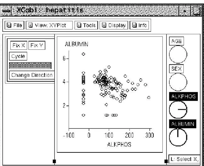
XGOBI [19] is a data visualization and analysis tool with the ability to handle miss-ing data. It employs statistical analysis algorithms such as multiple imputation to esti-mate values for missing fields, which are then used to represent missing data in displays. XGOBI allows the user a choice of different ways to view the missing data. The user can
plot the missing data with the rest of the data and then, on a graph next to that plot, just the records missing data or just the records that are not missing data. Figure 2.1 shows a view of the data with the missing values.
Figure 2.1: Missing data in XGobi. The missing fields were imputed and drawn with a mark to differentiate them from regular data records. The data entry whose horizontal field were missed were drawn with a vertical bar inside the data circles, while the data items with vertical dimension value missing were drawn with a horizontal bar inside the data circles [19].
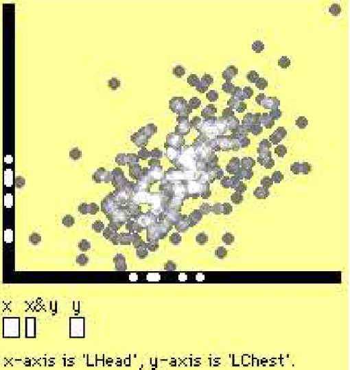
MANET (Missing Are Now Equally Treated) [20, 21] is another visualization tool that is specially designed to cope with missing data. MANET allows missing data to be imputed and displayed in many different ways. The imputed values can be displayed as
part of a bar chart, where the missing data are a different color than the rest of the bar. MANET will also allow the data to be plotted on a 2-dimensional scatterplot. Imputed values are plotted along the axis that corresponds to the value that is missing. Figure 2.2 shows such a plot.
Figure 2.2: Manet display. Missing data values were imputed and displayed by projecting them onto the axes. In addition, there are three boxes in the lower left corner for user selection. Users can view data items with only the x value missing, only the y value missing, and both values missing. Bright points indicate where overlapping has occurred [20].
Both Xgobi and Manet generate estimated values for the missing fields by the use of statistical inference algorithms. Then they present graphic displays where the missing fields are replaced by the estimated values with indicators attached to show that values for
those fields are missing. While they present the integrated data displays and make users informed that the values are missing and estimated values are used for certain fields, users often have no idea whether the estimated values can be trusted or not.
2.2
Uncertainty Visualization
Data uncertainty is a facet of data quality that has been studied for spatio-temporal databases in the GIS community. The NCGIA initiative on ”Visualizing the Quality of Spatial Infor-mation” [6] discussed the components of data quality, representational issues, the devel-opment and maintenance of data models and databases that support data quality informa-tion, and evaluation of visualization solutions in the context of user needs and perceptual and cognitive skills.
After the NCGIA initiative, a flurry of activities have focused on uncertainty defini-tion, modeling, computation and visualization [22]. Especially for visualizadefini-tion, different practices in terms of graphic variable mappings have been tested. Use of color, hue, tex-ture, fog and focus in static rendering of uncertainty and use of animation, flashing alter-natively of data and uncertainty in dynamic displays have been discussed in [6]. Several case studies for handling spatial data quality have been reported in [22].
Pang [23, 4] addressed the problem of the visualization of both the data and rele-vant uncertainty. He surveyed techniques for presenting data together with uncertainty. These techniques include adding glyphs, adding geometry, modifying geometry, modify-ing attributes, animation, sonification, and psycho-visual approaches. He presented the research results in uncertainty visualization for environmental data visualization, surface interpolation, global illumination with radiosity, flow visualization, and figure animation. Figure 2.3 is an example of uncertainty visualization applied to ocean currents.
Figure 2.3: Ocean currents are shown with arrow glyphes whose colors are mapped to the magnitude of the uncertainty. The background field indicates angular uncertainty [23]. - quality, three coordinate positions and time. It provides a tool to encapsulate the data readings and visualization so as to permit the easy transition from statistical analysis al-gorithms to visual incorporation. In this paper, a quality measure and estimation methods are presented. The resulting visualization system allows users to map five-dimensional data to five graphical attributes, where each attribute may be displayed in one of three modes: continuous, sampled, or constant.
These techniques are predominantly directed toward spatio-temporal data and do not always extend readily to multivariate data. For example, in most displays for spatio-temporal data, either 3D or 2D displays could be used where a sequence of displays convey the temporal variations. When dealing with multivariate data, we face many more challenges in that often limited resources (space and graphical variables) are available.
2.3
Data Quality in the Database Community
Uncertainty, imprecision and tradeoffs between precision and efficiency are topics of re-cent research in the database community [25, 26, 27, 28, 29, 30, 31]. [25, 26] studied probabilistic query evaluation in sensor databases where uncertainty is inevitable, and addressed the issue of measuring the quality of the answer to these queries. They also provided algorithms for efficiently pulling data from relevant sensors or moving objects in order to improve the quality of the excuting queries. Similarly, [30, 31] addressed the problem of querying moving object databases, which capture the inherent uncertainty as-sociated with the location of moving point objects by modeling, constructing and query-ing a trajectories database. [27, 28, 29] focus on cachquery-ing problems to achieve the best possible performance by dynamically and adaptively setting approximate cached values and synchronizing with source coorporation.
Uncertainty is another research aspect for temporal and spatio-temporal streaming data [32, 33, 34, 35]. Both [32] and [33] investigated aggregation computing over con-tinual data streams, where in [32] the authors take an approach of single-pass techniques for approximate computation of correlated aggregates over both landmark and sliding window views of a data stream of tuples, and in [33] the authors maintain aggreations over data streams using multiple levels of temporal granularity. [34] addressed contin-uous queries over streams by presenting a contincontin-uously adaptive, contincontin-uous query im-plementation based on the query processing framework. [35] proposed an optimization framework that aims at maximizing the output rate of query evaluation plans for query optimization for streaming information sources.
2.4
Data Quality in Information Management
Data quality research in the information management community focuses on the data quality improvement through a cycle of data quality definition, evaluation and improve-ment [2]. First an infrastructure is defined and prototyped, where data quality attributes on various data granules are defined. Then these values are obtained using user surveys, where the defined data quality measures are directly acquired from data managers by ask-ing them questions. Finally quality attributes values are made available to systems and people that use each data granule and track the impact of providing quality values on decision-makers and decisions.
Since Wang [2] launched a framework for analysis of data quality, many people have performed research on data quality, or information quality in this context. [11] addressed data integrity issues. They merged data integrity theory with management theories about quality improvement. [10, 36] discussed information quality assessment and improve-ment. They developed a methodology and illustrated it through application to severalma-jor organizations.
Researchers from both the database and information management commonly addressed the data quality from different point of views. People from the database area are more con-cerned with the analysis side of data quality such as query quality and quality of service, while information managers are more focused on management of the quality and how to improve the quality through practical approaches. We believe that data quality visual-ization, as a tool to incorporate data display and data quality display, will benifit these research group.
Chapter 3
Visual Variable Analysis
The visual communication channel between a data source and a data analyst experiences a process of information extraction, encoding, rendering and interpretation [37]. First the relevant information is extracted from the data source. It then is encoded in a display model, which is then rendered. The last step is the interpretation of the final display. In each step the data source is refined, limited by the capabilities and efficiency of the process. The resulting process may exhibit significant information loss. For example, the quality of information extraction is limited to the efficiency of the extraction algorithm; rendering is limited to the hardware capabilities; and interpretation is subject to the Gestalt laws of organization, which are rules that describe what humans should perceive under certain conditions.
The above mentioned visual communication channel can include a feedback loop for an interactive visualization. For example, when the user perceives the visual display of the data, he(she) can perform some operations either on the data or on the display to gain further insight.
3.1
Visual Encoding
The central part of the visual communication channel, encoding, which translates the ex-tracted information in the data space into a display model in design space, is the task of visual design. Visual design involves the data variable (dimension) properties analysis, vi-sual variable (such as color, size and texture) analysis, deciding on the mapping from data variables to visual variables, and determination of the visual metaphor (2D or 3D display, trees, networks, or any other metaphors) [38]. In certain situations, the visual metaphor is already decided, so the mapping from data variables to visual variables constitutes the predominant task for the visual design.
In [39] it is stated that every data dimension has an abstract measurement associated with it. These are nominal, ordinal, interval and ratio levels. The interval and ratio levels are sometimes combined as one quantitative level [40]. The nominal level includes all categorical information such as a product name, country code, or food type. The order of the items in this level is arbitrary. The ordinal level groups information into categories in a certain order so that the items in this level can be judged by relationships such as greater than or smaller than. In the quantitative level, the item is quantified and is represented by a numeric value. Quantified items not only could be grouped into categories and be compared and judged, but also could convey further detailed information such as ”how long ago A happened before B” and ”to what extent is A bigger than B”.
We notice that the levels of classification for dimensions have different properties and have different representational capacity or expressiveness. The quantitative level has the most power of expressiveness, followed in order by ordinal and nominal levels. More information can be expressed with a level of classification with greater representational capacity.
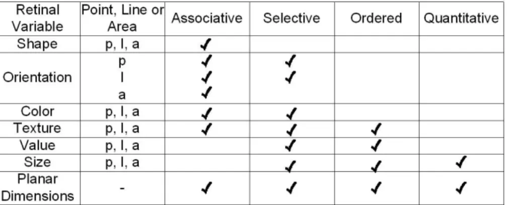
desig-nates the level of visual variable representation capability into four categories. They are associative, where any object can be isolated as belonging to the same category, selective, where each object can be grouped into a category differenced by this variable, ordered, which allows each element to be grouped into an order of scale, and quantitative, where each element can be compared to be greater or less than another element. He identified properties of graphical systems, along with the six retinal variables and two position vari-ables (for two-dimensional displays) that are perceived by the user. The retinal varivari-ables are size (length and area), shape, texture, color, orientation (or slope), and value. Each variable can be classified using points, lines and areas. Figure 3.1 shows properties of the six retinal variables. Moreover, color may be described by hue, saturation and brightness, and attributes such as transparency and animation may be added. The level of organiza-tion can be compared with the retinal variables in the classificaorganiza-tion of points, lines and areas.
Figure 3.1: Retinal Variables
The critical insight of Cleveland was that not all perceptual channels are created equal: some have provably more representational power than others because of the constraints of the human perceptual system [43]. Mackinlay extended Cleveland’s analysis with another key insight that the efficacy of a perceptual channel depends on the characteristics of the data [44].
The efficacy of a retinal variable depends on the data type: for instance, hue coding is highly salient for nominal data but much less effective for quantitative data. Size or length coding is highly effective for quantitative data, but less useful for ordinal or nominal data. Shape coding is ill-suited for quantitative or ordinal data, but somewhat more appropriate for nominal data.
Spatial position is the most effective way to encode any kind of data: quantitative, ordinal, or nominal. The power and flexibility of spatial position makes it the most fun-damental factor in the choice of a visual metaphor for information visualization.
Another issue in visual variable selection is interaction between them, namely, integral or separable dimensions. Perceptual dimensions fall on a continuum ranging from almost completely separable to highly integrated. Separable dimensions are the most desirable for visualization, since we can treat them as orthogonal and combine them without any visual or perceptual “cross-talk”. For example, position is highly separable from color. In contrast, red and green hue perceptions tend to interfere with each other because they are integrated into a holistic perception of yellow light.
3.2
Algebraic Formalizational Analysis
We seem to be able to target the corresponding visual variable for each data variable (dimension) by comparing their levels. That’s often not sufficient. Part of the reason is that data quality is multi-dimensional, where each dimension has a different measure on a certain aspect. Even though all these dimension values are quantitative, we cannot simply map quality to a visual variable that has quantitative expressive capability. For example, additional uncertainty is different from additional weight even though both of them are quantitative.
assess the potential for communication of a specific message through a visual channel [45, 46]. Under this concept, both the data variables (dimensions) and visual variables could be represented by an algebra, which includes a value set and a set of operations that can be applicable on them. For example, the operation of comparison (order) can be applicable to a quantitative precision measure. Communication of meaning is achieved by a correspondence between the behavior of the data and visual variables. This means that the same operations with the same properties should be available.
Under the assumption that data quality can only be effectively communicated using visual variables that have a similar behavior (operations) to the quality measure to be visualized, the task of visual mapping becomes one of searching for the visual variable that has as many of the same operations as possible as the data variable itself.
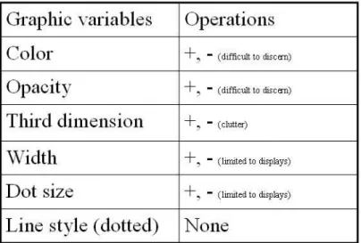
Taking into account four types of displays being considered - parallel coordinates, scatterplot matrix, glyphs and dimensional stacking, we choose six visual variables to investigate for communicating quality information. They are color, opacity, the third dimension, line width, point size and line style. Color and opacity are from the same type of visual variable and are often chosen because of easy implementation without additional space. The third dimension is chosen because all of our current displays are two dimensional, and using the third dimension to convey the data quality measure is a plausible approach. Line width and point size have similar properties but are only applicable to certain displays. Line style could be regarded as an alternative to texture and also is only applicable to certain displays.
Those chosen visual variables and the operations that can be applied on them are shown in Figure 3.2. Noticed that human Gestalt capabilities on addition and subtraction of color space is limited even though those operations are applicable to them. The third dimension, line width and point size, are from the same category where operations of comparison, linear production, addition and subtraction can be applied. Line style can
usually only be used to represent nominal data, except when combined with other visual variables, in that no operation can be applied to it.
Figure 3.2: Visual Variables for Data Quality Display
The data variables in our context are data quality measures. As discussed above, data quality measures are complicated and can correspond to multiple aspects of the data. Quality measures on different aspects of data could have different applicable operations. In this thesis we assume that the data quality measure is quantitative and scalar. Also we assume that operations of comparison, addition and subtraction could be applied to it.
According to the principle that the visual variable should have as many operations that can be applicable to it as the corresponding data variable, the best visual variables will be the third dimension, line width and point size. Although color also has similar operations to the data quality measure, it is limited to Gestalt interpretation even with the help of color scales. Taking a further look at the best visual variables, it is not difficult to conclude that in our situation the third dimension is the best visual variable for data quality measure in that line width and point size are only applicable to certain displays in the visualization methods being extended to incorporate data quality.
3.3
Pre-attentive Processing
Another fundamental cognitive principle is whether processing of information is done deliberately or pre-consciously. Some low-level visual information is processed automat-ically by the human perceptual system without the conscious focus of attention. This type of processing is called automatic, pre-attentive, or selective. An example of pre-attentive processing is the visual pop-out effect that occurs when a single yellow object is instantly distinguishable from a sea of grey objects, or a single large object catches one’s eye. Exploiting pre-cognitive processing is desirable in a visualization system so that cogni-tive resources can be freed up for other tasks. Many features can be pre-attencogni-tively pro-cessed, including length, orientation, contrast, curvature, shape, and hue [47]. However, pre-attentive processing will work for only a single feature in all but a few exceptional cases. Thus most searches involving a conjunction of more than one feature are not pre-cognitive. For instance, a red square among red circles and green squares will not pop out, and can be discovered only by a much slower conscious search process.
3.4
Metrics for Visual Displays
Metrics for visual displays are measures of how effective an information visualization is. Several efforts have focused on building metrics for visual displays. [48, 49, 50] gave guidelines for good graphic design practices and provided some basic metrics for 2D and 3D representations. Bertin [42, 41] classified and characterized some 3D information graphic types. [51] proposed four metrics for evaluating 3D visualizations: number of data points and data density; number of dimensions and cognitive overhead; occlusion percentage; and reference context and percentage of identifiable points. Card [38] inves-tigated the mappings between data and visual presentations and facilitated comparisons of visualizations by categorizing the visual data types present in the display and presenting
this information in morphological tables. Recent work on metrics for visual displays is presented in [52, 53], where metrics are developed based on a theoretical framework that incorporates task requirements, characteristics of representational elements, and correct mappings between task and representation. Information content measures based on math-ematical communication theory or information theory is used to quantify the information content of a display.
Chapter 4
Data Quality Metrics
As discussed in the previous chapters, data quality has multiple aspects and has a differ-ent definition and measure depending on the disciplines and applications for which it is applied. In information visualization, a dominant issue involving data quality is missing data. We take this problem as an opportunity to examine our data quality visualization methods and as a start to address data quality visualization.
Data may come with quality information implied in the data set itself. Some are explicitly defined, such as the missing values. Others are hidden and may need some statistical analysis to uncover them, e.g., data inconsistency, where data records did not follow patterns that are intrinsic to the data set. In addition, data quality information could be associated with data records, data dimensions, or a data value within a data record. All of this data quality information needs to be identified for effective evaluation and visualization.
Our focus was incomplete data, where values for some fields are missing. Statistical analytical methods (e.g., multiple imputation and maximum liklihood algorithms) were employed to estimate the missing fields, and simultaneously the quality information is acquired from these algorithms. A future goal for this analysis could be to incorporate more algorithms from other communities.
fields, namely nearest neighbor and multiple imputation approaches. Then we give the quality measure definition and algorithm used in this thesis.
4.1
Imputing Algorithms
In this section we intend to discuss two imputation algorithms that are implemented as part of this thesis, namely, nearest neighbor and multiple imputation.
4.1.1
Nearest Neighbor
Nearest Neighbor estimation is a process by which missing values in a dataset are filled in with estimated values based on similarity between a record with a missing value and those not missing the corresponding value [7].
To estimate a missing value in a data set, the k data items with the closest profile (smallest distance) to the data item containing the missing value are determined. The missing value is then computed as a weighted average of the k values in that group of neighbors. Thek nearest neighbors can be computed only on complete records. Missing values have to be filled in with an initial approximation. The distance between two data items is computed using Euclidean distance in an-dimensional space.
The input to this algorithm is an incomplete dataset; the output is a complete dataset.
K is an integer representing the number of nearest neighbors to be taken into considera-tion.
The Nearest Neighbor algorithm used in this thesis has these steps.
• Step 1: All missing values in the selected dataset are initially approximated with
the mean of the corresponding dimension from the complete data.
space are computed.
• Step 3: For each data item, select thekdata items with the smallest distance to it. • Step 4: Replace each value that was missing in the data item with the average of the
k values belonging to theknearest data items for the same dimension.
4.1.2
Multiple Imputation
Multiple Imputation is to repeat the imputation process more than once, producing mul-tiple ”completed” data sets [7]. Mulmul-tiple random imputation is used in this thesis, where for each imputation, a random number is drawn from the residual distribution of each imputed variable and those random numbers are added to the imputed values. Because of the random component, the estimates of the parameters of interest will be slightly differ-ent for each imputed data set. The Expectation Maximization (EM) algorithm is used to estimate the missing fields for each single imputation in this thesis.
EM Algorithm
The Expectation Maximization (EM) algorithm is a very general method for obtaining Maximum Liklihood (ML) estimates when some of the data are missing [7, 8]. It is called EM because it consists of two steps: an expectation step and a maximization step. These two steps are repeated multiple times in an iterative process that eventually converges to the ML estimates.
The E step essentially reduces to regression imputation of the missing values. Suppose our data set contains four variables, X1 throughX4, and there are some missing data on each variable, in no particular pattern. We begin by choosing starting values for the unknown parameters, that is, the means and the covariance matrix. These starting values can be obtained by the standard formulas for sample means and covariances, using data
items that are complete. Based on the starting values of the parameters, we can compute coefficients for the regression of any one theXs on any subset of the other three.
After all the missing data has been imputed, the M step consists of calculating new values for the means and the covariances matrix, using the imputed data along with the non-missing data. For means, we just use the usual formulae. For variances and covari-ances, modified formulas must be used for any terms that involve missing data. Specifi-cally, terms must be added that correspond to the residual variances and residual covari-ances, based on the regression equations used in the imputation process. The addition of the residual terms corrects for the usual underestimation of variances that occurs in more conventional imputation schemes.
Once we have gotten new estimates for the means and covariance matrix, we start over with the E step. That is, we use the new estimates to produce new regression imputations for the missing values. We keep cycling through the E and M steps until the estimates converge, that is, they hardly change from one iteration to the next.
4.2
Quality Measure Definition
Three types of data quality are defined, namely, quality measures in terms of data dimen-sions, data records and data values. Often the data set to be conveyed using information visualization is tabular in nature. We associate a quality measure for each data record and each dimension. In addition, each data field for a specific dimension and record can have an associated quality value. These quality values, for data records, dimensions and data fields, are assumed to be quantitative. How these quality values are acquired is not our focus. They could be the uncertainty, confidence level, or estimated value from some statistical analysis algorithm, such as multiple imputation.
neighbor or multiple imputation algorithm was used for imputation. Statistical numbers, fraction of standard deviation and the mean from multiple imputed values, were used to quantify the quality. The quality measures for data records and dimensions are estimated using the average for the quality of the data fields for that data record or dimension as in Figure 4.1.
Void DataQualityDerivation(double ∗ ∗ ∗imputed data, double ∗ ∗data quality,
double ∗dimension qua, double record qua, intN, intM, intK) /* N - number of records; M - number of dimensions; K - number of imputations; / Begin For (inti= 0;i < N;i+ +) Begin For (intj = 0;j < M;j + +) Begin
data quality[i][j] = standard deviationmean of(imputed data(imputed data[i][j])[i][j]) End
rec qua[i] = average of(data quality[i][j]) End
For (intj = 0;j < M;j + +) Begin
dimension qua[j] =average of(data quality[i][j]) End
End
Figure 4.1: Data Quality Definitions and Derivations
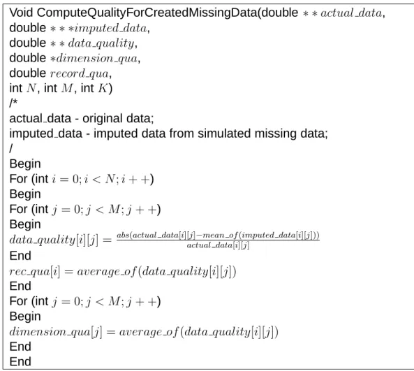
In the case study chapter, where the missing data are created from complete data to examine imputation algorithms using visualization, the data value quality computation is slightly different from the above. It is computed using the fraction of the difference between the actual value and imputed value to the actual value, as in Figure 4.2.
Void ComputeQualityForCreatedMissingData(double ∗ ∗actual data, double ∗ ∗ ∗imputed data,
double ∗ ∗data quality, double ∗dimension qua, double record qua, intN, intM, intK) /*
actual data - original data;
imputed data - imputed data from simulated missing data; / Begin For (inti= 0;i < N;i+ +) Begin For (intj = 0;j < M;j + +) Begin
data quality[i][j] = abs(actual data[i][actual dataj]−mean of[i(][imputed dataj] [i][j])) End
rec qua[i] = average of(data quality[i][j]) End
For (intj = 0;j < M;j + +) Begin
dimension qua[j] =average of(data quality[i][j]) End
End
Figure 4.2: Data Quality Computation for Simulated Missing Data
4.3
Data Quality Store
Taking into account data value quality, there is a quality measure for each data value. If the majority of the data values have quality problems, it seems to be reasonable to allocate a memory slot to the quality measure for each data value. However, the reality is that usually only a small part of data values have quality problems, while the rest are perfect in term of data quality.
Since this is a proof of concept study on data quality visualization, temporarily we do not need to worry about the scalability of these approaches. We can assume that the dataset is moderate or small in size. Under such an assumption, we can make the similar
quality dataset from imputation and derivation methods mentioned earlier. For the sake of consistency, we format the quality information in a manner similar to the raw data.
Chapter 5
Methodologies
High dimensionality can have multiple meanings in our context. One is associated with the multi-variate data set being visualized. The other applies to the multiple facets of data quality. Even if we assume that only one aspect of data quality needs to be visualized, we still are confronted with the high dimensional data set. Existing techniques for visualizing uncertainty and quality of spatio-temporal data cannot be applied because spatio-temporal data is low dimensional in nature.
In this section we discuss our current approaches to the visualization of data sets with quality attributes, namely, incorporating visualization of data with quality information, visualization in data quality space, and user interactions between data space and data quality space.
5.1
Incorporation of Visualization of Data
with Quality Information in 2D Displays
Even though the richness of information when data quality is incorporated into data dis-plays has the potential to enable more informed decision making, the large number of choices possible for mapping data quality onto graphical attributes makes the incorpora-tion of data quality into data displays difficult. If we chose six visual variables and three quality measures as discussed earlier, we haveP36 = 120choices of mapping quality
mea-sures onto visual variables, assuming we set a constraint that different quality meamea-sures cannot be mapped to the same visual variable in the same display. Otherwise we have a larger number of choices.
Data quality visualization must present data in such a manner that users are made aware of the locations and degrees of data quality in their data so as to make more in-formed analysis and decisions. The ways to present the data quality information, in a separate plot, in the same plot, or both, each could lead to improved interpretation or increased confusion. We have investigated several distinct classes of mapping methods from data quality to graphical entities or attributes, including:
• third dimension: transforming 2-D displays to 3-D displays by the introduction of
the third dimension, where the value of the third dimension is used to represent data quality information.
• animation: data with quality information are displayed in a 3-D space with moving
animation. The moving range and speed are determined by the user.
• opacity: for a 2-D display, the opacity is used to map the corresponding data quality
information for a given data record.
• color: where the data quality is mapped onto the color for a specific data record or
item.
• point size: in displays where geometric points are used to represent data, the size of
point could be used to convey data quality information.
Each of the above mentioned methods have their strengths and weaknesses as to the applicability to different displays (e.g., mapping data quality onto point size is only ap-plicable to scatterplot matrix displays, while the method of animation might be best for parallel coordinates displays) and visualization effectiveness (e.g., for a relatively large
data set, introducing the third dimension to convey data quality may not be effective in that it could make the case worse when the display is already cluttered). We explored these seemingly contradictory characteristics of visualization - on the one side, we hope to convey as much information content as possible to the user in a limited display space. On the other side, we need to prevent clutter where too much information is presented and users cannot discern any information from the displays.
If we follow the principle that line width, point size and the third dimension have the highest priority, color and opacity are the second choice, and the last choice is line style, the possible visualization methods for quality measures becomes more manageable.
Methods for data quality visualization have been implemented on three types of mul-tivariate displays, namely, parallel coordinates, scatterplot matrix and glyphs. In the fol-lowing sections, we first discuss the color scales we used for incorporation of data quality into the data display. Then the mapping methods from data quality measures to visual variables are discussed. Finally we examine the advantage and disadvantage of those displays when data quality information is incorporated into data displays.
5.1.1
Color Scale Selection
A color scale is a color metric definition and implementation in a certain situation. The RGB color scale, where R stands for Red, G stands for Green and B stands for Blue, is widely used in computer graphics. A carefully chosen color scale for visualization can dramatically decrease the visual processing load. It can effectively help a viewer discover the undiscovered, discern hidden patterns or outliers, mine a new rule and any other in-formation visualization target desired [54]. In [55, 56] the authors tried to optimize the color scales under different applications and scenarios.
The RGB color scale is good for implementation and has been a standard for almost all graphics utilities. Unfortunately, the RGB color scale has been proven not to be an
intuitive representation for human beings. People have difficulty to interpret what the color of 26R+30G+16B, or 55B-24G-60B is in situations where there are 256 levels for each color.
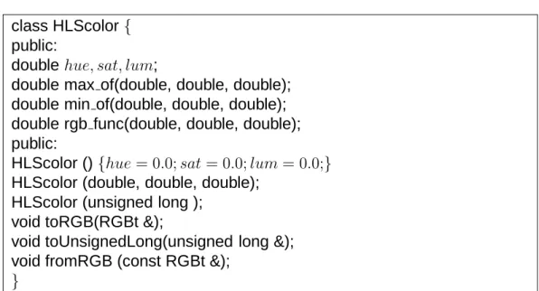
The HLS (H, L and S stand for Hue, Lightness and Saturation, respectively) color scale had long been used by human beings [57]. It is an intuitive representation of color and easier to interprete than RGB colors. Artists use HLS color scale to describe col-ors. To be more intuitive and easier to interprete, we chose the HLS color scale in our data quality visualization. Each time data quality needs to be mapped onto color, we interpolate the H and S values based on the quality measures.
Since XmdvTool uses the RGB color scale as the default interface color specification, we implemented an algorithm to accomplish the transformation between RGB and HLS color scales. Figure 5.1 shows the definition of class HLS and its interface with RGB color scales.
class HLScolor { public:
double hue, sat, lum;
double max of(double, double, double); double min of(double, double, double); double rgb func(double, double, double); public:
HLScolor () {hue= 0.0;sat= 0.0;lum= 0.0;} HLScolor (double, double, double);
HLScolor (unsigned long ); void toRGB(RGBt &);
void toUnsignedLong(unsigned long &); void fromRGB (const RGBt &);
}
5.1.2
Mapping Interpolation
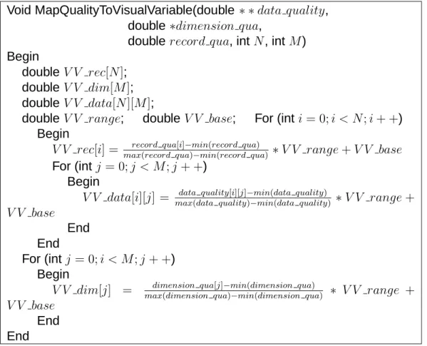
Three types of data quality measures are discussed in this thesis; dimension quality, record quality and data value quality, all consist of numeric values. When presenting those qual-ity types with data displays, we use the uniform interpolation equation to map the data quality measures onto visual variables such as the color, line width, dot size and all other visual variables used in this thesis.
Figure 5.2 shows the mapping process from data quality measures onto visual vari-ables. All these values are acquired by interpolating on the range of visual variable values in terms of data quality measures. Note thatV V baseandV V rangestand for the base value and range that the current visual variable could be assigned. For instance, if the cur-rent visual variable is color, its base value is from user initial specification and its range could be computed by its maximum or minimum values in the defined color spaces.
5.1.3
Parallel Coordinates
In parallel coordinates displays, each poly-line represents a data record and an explicit axis is used to represent a dimension. An intuitive insight into the parallel coordinates display is that the most challenging task is to incorporate data value quality into the dis-play, since the display is easily cluttered. We can use visual variables associated with poly-lines or axes to convey record quality or dimension quality. For each data value quality, the information content is overwhelming, since there is a quality measure corre-sponding to each data value.
The first visual variable set we tested was line width, color and line style as in Table 5.1, where the dimension quality is mapped onto line width, record quality is mapped onto color, and data value quality is mapped onto line style. Notice that the line style itself cannot express a quality measure. It only has the representative capability of two category
Void MapQualityToVisualVariable(double ∗ ∗data quality, double ∗dimension qua,
double record qua, intN, intM) Begin
doubleV V rec[N]; double V V dim[M]; doubleV V data[N][M];
double V V range; double V V base; For (inti= 0;i < N;i+ +) Begin
V V rec[i] = maxrecord qua(record qua[i]−min)−min(record qua(record qua) ) ∗V V range+V V base
For (intj = 0;j < M;j + +) Begin
V V data[i][j] = maxdata quality(data quality[i][j]−min)−min(data quality(data quality)) ∗V V range+
V V base
End End
For (intj = 0;i < M;j + +) Begin
V V dim[j] = maxdimension qua(dimension qua[j]−min)−min(dimension qua(dimension qua) ) ∗ V V range +
V V base
End End
Figure 5.2: Mapping Data Quality Measures onto Visual Variables
data. It can convey the extent of quality in combination with other features. In this case, the length of each dash in the dotted line is used to represent the quality measures for data values. The dotted line could maximally extend to the midpoint between a data value and its neighbor.
Without visualization efficiency and expressive capability consideration, this is a rather reasonable choice for 2D parallel coordinates, where due to the nature of the parallel co-ordinates display, there are not many visualization resources that could be used for extra information other than data itself. As we discussed before, color is not the best visual variable to represent numeric values. A Gestalt study shows that people tend to differenti-ate the geometric size more easily than color (section 3.2). People usually cannot discern
Data quality measures Record quality Dimension quality Value quality
Visual variables Color Line width Line style
Table 5.1: Mapping of Data Quality Measures onto Visual Variables in 2D Parallel Coor-dinates
the distance from dark blue to light blue. However, color is still well used to represent data quality through this thesis, since, in many situations, we have no other visualization resources available.
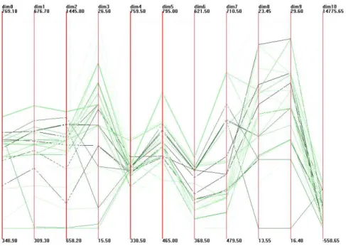
Figure 5.3 is a parallel coordinates display incorporating data quality information by the mapping method described in Table 5.1. For dimension quality, the thicker the dimen-sion axes, the worse the quality. We can instantly judge that dimendimen-sions 2 and 4 have the worst quality among other dimensions. Dimension 1, 3, 6, 8 and 9 have better quality and the rest of dimensions have moderate quality.
The color for each record polyline represents the record quality. the darker the color, the worse that data record’s quality. In other words, the lighter, the better. We may not easily find the lightest poly-lines, but the six darker data records are not difficult to differentiate.
The most challenging and difficult type of quality, the data value quality, is represented by the length of dotted lines around the data points. The dotted lines that reside on each side of the data point represent a quality issue for that point. The longer the dotted line, the lower the quality is for that point. A solid line represents that the data point is of the highest quality.
By a careful examination, it is not difficult to find that the dimension quality, record quality and data value quality are associated with each other. Dimension 2 and 4 have the worst quality among dimensions. The data points located in these two axes also have longer dotted lines that represent worse data value quality. In the mean time, several data values on the six darker record poly-lines show signs of worse quality.
Figure 5.3: Parallel coordinates with data quality display, where the record quality is mapped onto the color of a ployline, the dimension quality is mapped onto the width of an axis and the data value quality is mapped onto the length of a dotted line.
We can ascertain the pros and cons for this mapping method by examining the dis-play. An advantage is that it conveys an amazing information content by a simple mapping mechanism for data value quality. In a parallel coordinates display with a moderate num-ber of records and dimensions, we can expect that the dimension quality, record quality and data value quality can be displayed in an expressive manner and all can be discern-able.
In information visualization, the efficient use of space is critical and it often deter-mines the success of a display to a large extent. A number of information visualization packages focus on efficient space use algorithm design [12] since displays are apt to be cluttered for an average data set. The mapping method described in Table 5.1 satisfies the rule that space is used efficiently. It saves space by mapping data value quality onto line style and conveys the quality measure by the line length.