M E T H O D O L O G Y A R T I C L E
Open Access
Detection and visualization of
communities in mass spectrometry imaging
data
Karsten Wüllems
1,2,3*, Jan Kölling
1,2, Hanna Bednarz
3,4, Karsten Niehaus
3,4, Volkmar H. Hans
5,6and
Tim W. Nattkemper
2,3Abstract
Background: The spatial distribution and colocalization of functionally related metabolites is analysed in order to investigate the spatial (and functional) aspects of molecular networks. We propose to consider community detection for the analysis ofm/z-images to group molecules with correlative spatial distribution into communities so they hint at functional networks or pathway activity. To detect communities, we investigate a spectral approach by optimizing the modularity measure. We present an analysis pipeline and an online interactive visualization tool to facilitate explorative analysis of the results. The approach is illustrated with synthetical benchmark data and two real world data sets (barley seed and glioblastoma section).
Results: For the barley sample data set, our approach is able to reproduce the findings of a previous work that identified groups of molecules with distributions that correlate with anatomical structures of the barley seed. The analysis of glioblastoma section data revealed that some molecular compositions are locally focused, indicating the existence of a meaningful separation in at least two areas. This result is in line with the prior histological knowledge. In addition to confirming prior findings, the resulting graph structures revealed new subcommunities ofm/z-images (i.e. metabolites) with more detailed distribution patterns. Another result of our work is the development of an interactive webtool called GRINE (Analysis ofGRaph mappedImage DataNEtworks).
Conclusions: The proposed method was successfully applied to identify molecular communities of laterally co-localized molecules. For both application examples, the detected communities showed inherent substructures that could easily be investigated with the proposed visualization tool. This shows the potential of this approach as a complementary addition to pixel clustering methods.
Keywords: MALDI imaging, Networks, Clustering, Community detection, Visualization, Graphs
Introduction
Matrix-assisted laser desorption ionization mass spec-trometry imaging (MALDI-MSI) is a rapidly developing technology for investigating the lateral distribution of molecules in biological samples in form of multivariate bioimages [1].
*Correspondence:[email protected]
1International Research Training Group “Computational Methods for the
Analysis of the Diversity and Dynamics of Genomes”, Bielefeld University, Universitätsstraße 25, 33613 Bielefeld, Germany
2Biodata Mining Group, Faculty of Technology, Bielefeld University,
Universitätsstraße 25, 33613 Bielefeld, Germany
Full list of author information is available at the end of the article
Due to the technological improvements and the increased utilization of MALDI-MSI, the daily amount of generated data is constantly increasing [2]. Since the complete interpretation cannot be automated, semi-automated and assistive computational methods appear promising and are in the focus of our research.
Different methods for grouping MSI data have already been investigated for the analysis of MSI data, such as: k-means [3], hierarchical clustering [4], hierarchical hyperbolic self-organizing maps [5], high dimensional dis-criminant clustering [6], or probabilistic latent semantic analysis [7]. Many of these studies focus on clustering of all spectra in one data set to achieve a segmentation © The Author(s). 2019Open AccessThis article is distributed under the terms of the Creative Commons Attribution 4.0 International License (http://creativecommons.org/licenses/by/4.0/), which permits unrestricted use, distribution, and reproduction in any medium, provided you give appropriate credit to the original author(s) and the source, provide a link to the Creative Commons license, and indicate if changes were made. The Creative Commons Public Domain Dedication waiver (http://creativecommons.org/publicdomain/zero/1.0/) applies to the data made available in this article, unless otherwise stated.
map, i.e. the partition of the image into regions with high intrinsic spectra similarity [5, 6]. In other words: most approaches focus on spectral similarity to group pixels.
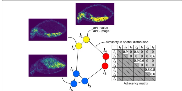
The approach presented in this paper focuses on the grouping of molecules into molecular communities. We assume that many functionally related molecules may fea-ture a similar lateral distribution in the sample. Thus, our method groups molecules into communities based on the similarity of their m/z-images. Graphs are well known data structures in biology. Therefore, we propose to use community detection for grouping [8, 9], also known as graph clustering. In our approach, one graph represents one MSI data set ofNVm/z-images. TheNVm/z-images
are usually selected by a user and/or an automated selec-tion ofNVpeaks. A nodevi of the graph corresponds to onem/z-imageI(m/z)i, withi∈1,. . .,NV, where:
NV=#nodes and #nodes=#m/z-images.
Each edgeek = {vi,vj}, with:
k∈1,. . .,NEandi,j∈1,. . .,NV, where: NE=#edges
has a weight wij, which represents the similarity of the spatial signal distribution:
wi,j=similarity(I(m/z)i,I(m/z)j) (1) between them/z-images of nodesvi andvj. In its initial form the graph is fully connected. Our goal is to iden-tify communities of similar spatial distribution in order to identify groups of functionally related molecules. The
method is illustrated in Fig.1for a hypothetical data set of
NV = 7 images and an adjacency matrix leading to three
communities.
To the best of our knowledge, community detection is a new approach for MALDI-MSI data. It provides an uncommon view on the data as we focus on groups of similar spatial distributions rather than spectra similarity (pixel similarity). Few previous works have already shown the benefit of the analysis of spatial distributions in MSI ([10,11]). Moreover, our approach provides a graph struc-ture that serves as an additional source of information.
To tackle the problem of finding communities ofm/z -images featuring a similar spatial signal distribution, we developed a modular analysis pipeline consisting of five major blocks : 1. data preprocessing, 2. computation of a
NV×NVsimilarity matrixS, 3. transforming the similarity
matrix into an NV × NV adjacency matrix A, 4.
com-munity detection and 5. interactive visualization. Step 5 aims to obtain additional information from the graph that is not available through the community detection result itself.
Methods Data sets
MALDI-MSI data forms a three dimensional data cube, where thex–axis and they–axis represent the lateral coor-dinates (pixels), which can be represented as intensity images also called m/z-images, while the z–axis repre-sents the mass spectra information. In this study three
Fig. 1Structure of them/z-image similarity graph. Each node represents anm/z-image, each edge represents the similarity between the
data sets are used. The first one is a synthetical benchmark data set and consists of nine generated 2Dgaussians (DG)
(please find details below), the second data set (DB) was
gathered from a germinating barley seed timeline exper-iment [12] and the third one (DT) was recorded from a
section of a human glioblastoma tumor [13].DBandDT
are in-house produced data sets.
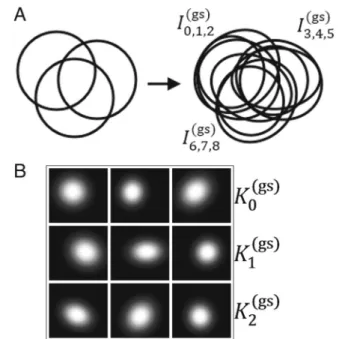
DG consists of nine synthetic m/z-images I0(gs). . .I (gs) 8
and is a synthetical 9× 205×190 MSI toy data cube. Each image contains a single localized 2Dgaussian inten-sity distribution. The gaussians were initialized with the same size, a slightly different amplitude and were placed in groups of three: K0(gs)= I0(gs)I1(gs)I2(gs) , K1(gs)=I3(gs)I4(gs)I5(gs), K2(gs)= I6(gs)I7(gs)I8(gs)
at three different spatial locationsL(gs)0 ,L(gs)1 ,L(gs)2 , respec-tively. The placement is made in such a way that it is ensured that the three groups overlap with each other in all possible combinations. This is followed by a small ran-dom distortion of the position,xsize andysize, combined with a randomized rotation. A sketch of the gaussians and their variation is shown in Fig.2.
If we think of a biological analogy for this experiment, each distorted gaussian represents the distribution of a different molecule. Each location Lgsi , with i = 0, 1, 2,
Fig. 2 aA sketch of how the groups of 2D- gaussians are located (left) and how they are distorted (right).bThe nine rendered 2D-gaussian distribution images
represents the area of a spatially bound metabolic pro-cess referred to as pseudo-network, meaning that the molecules distributed in this area are likely to take part in this process.
The original data output ofDBandDTwere transformed
to the form:D = NP ×NV, whereNVis the dimension
of vectorx ∈ RNV, representing the spectrum
informa-tion andNP is the dimension of vectorp ∈ N(m×n)with mandn are width and height of the visual field, repre-senting the lateral information. To be more precise, the elements ofpinclude only the measuring coordinates of the MALDI procedure, i.e. pixel grid cells. Regarding the renderedm/z-image,(xi,yj)are pixels matching the area of the measured sample. Furthermore, in our data sets the mass spectra informationx=(x0,. . .,xNV−1), calledm/z
-feature vector, does not represent the whole originally measured spectra, since a set ofNVinterestingm/z-values
were pre-selected by three of the authors (MG, HB, KN) based on their tissue specific and non-homogenous dis-tribution within the tissue section. Applied toDBandDT
this results in a dimensionality of:
DB=NP(2)×N( 2)
V =3422×101 and DT=NP(3)×NV(3)=28684×106.
The preprocessing finishes with winsorizing the upper 1% of intensities for each image:
xl =
Q99(xl), ifxl>Q99(xl),∀l∈[ 0,. . .,NV−1]
xl, otherwise
whereQ99is the 99thquantile.
Analysis pipeline
To compute the similarity matrixSwe propose to apply the Pearson correlation coefficient:
wij=
cov(pi,pj) σpiσpj
(2)
where cov(pi,pj)is the covariance of the intensity images pi,pjof the nodes (i.e. metabolites)vi,vjandσpi,σpj are the standard deviations ofpi,pj, respectively. The Pearson correlation coefficient is a commonly used similarity mea-sure in the area of MALDI imaging analysis [14–17] and provides a straight forward interpretation. The result is a similarity matrixS, withSi,j = wij. Please note that also other symmetric similarity measures can be applied here, such as mutual information or cosine similarity. For more information about considered alternatives we would like to refer the interested reader to S17 of the Additional file1. Next, we transform the similarity matrix into an adja-cency matrix (step 3)S →A, whereAis a much sparser adjacency matrix by thresholding withtS:
Ai,j=
0, ifwij<tS
1, otherwise
The objective is to filter out edges with values too low, so that we can assume that these are unlikely to represent a biologically relevant similarity. However, the selection oftSis a non-trivial task. To avoid time consuming
man-ual tuning we propose a strategy which is inspired by other works on biological network analysis [18–20]. The basic idea is to define an objective function that leads to an adequate threshold after optimization. The objective function is based on quantitative graph properties (QGP). Three QGPs are selected and combined (see [21] for an overview) to determinetS. The total number of edgesNE,
the average clustering coefficient (ζ) [22] and the global efficiency (ξ) [23].
To calculate tS we define a vector of candidate
thresholds:
t=(tmin,. . .,ti−1,ti,. . .,tmax), (3)
where tmin and tmax are the minimum and maximum
threshold, respectively andt=ti−ti−1is the step size to
reach fromtmintotmax. [tmin,tmax] defines the interval of
threshold candidates in which we search for the best pos-sible threshold to reduce the edges in our network. The interval is explored in a discrete manner. This implies that the resolution of the threshold detection is defined byt, i.e. the distance between two consecutive pointstitoti+1
in [tmin,tmax].
We calculateNE,ζ andξon each graph of an adjacency
matrixA(ti)and arrange the results in vectorsνNE,νζand νξ, respectively. Next, we useνNE →[ 0, 1] as baseline to
adjustνζ andνξ: ηζ =νζ −νNE
ηξ =νξ−νNE
We create a mean centered matrixX = ηζ,ηξand apply PCA as a weighting method. Therefore we calcu-late y, which is the projection of X on the first PCA component:
X=ηζ,ηξ and Xcov=cov(Xc)
Xcovui=λiui and y=Xu0,
whereXcis the mean centered version ofX,{ui}are the eigenvectors of the covariance matrixXcovofXcandλiare their respective eigenvalues labeled in decreasing order, λ0≥λ1≥. . .. To determine the final threshold we search
for the candidate threshold for which the value of y is maximized. This leads to maximizing the weighted com-bination of the baselined average clustering coefficientζ and the global efficiencyξ. Hence, we can settS, with:
S=arg max
k {yk}, k=0, 1,. . .,|y|} (4)
Since the primary objective is to achieve dense com-munities, it is a good choice to optimize a segregation measure likeζ. Nevertheless, we do not want to neglect the information provided from edges between communi-ties and integrateξ, which scales with integration. We use PCA as a weighting method because by construction ζ shows a higher variance thanξ. This leads to a stronger weighting. The idea to combine segregation and integra-tion is based on the small-world property, which occurs frequently in biological networks [19]. The small-world property describes a graph structure of densely connected subgraphs that are interconnected by a robust amount of edges.
NE serves as a baseline to avoid the effect that low
thresholds produce high values for ζ and ξ, which is induced by the construction of these measures. This way the applied measures scale rather with structural prop-erties than with the amount of edges. Since Pearson correlation (Eq.2) serves as our similarity measure, we set:
tmin= −1, tmax=1, =0.1.
Fortmin,tmax, andt one has to balance computation
time and resolution.
For considered alternatives we refer the interested reader to the Additional file1: S17.
Now,Arepresents an undirected, unweighted graphG, which serves as basis for the community detection. InG each nodevi, withi = 1,. . .,NV, whereNV = #nodes,
corresponds to a singlem/z-image and is calledm/z-node, while each edgeek = {vi,vj}indicates that:wij>tS, with:
k=1,. . .,NE;i,j∈ {1,. . .,NV}andNE=#edges.
For community detection we use the leading eigenvector method [8,9]. This method proceeds in a divisive style and maximizes a measure called modularity [24]. Since this is a divisive method, for initialization each m/z-nodevi is assigned into the same communityc, with:
c∈1,. . .,NCandvi=vci=1∀i, whereNC=#communities.
Thereafter, the method proceeds with:
1 For each existing communityc its modularity matrix
M(c)is calculated. Informally speaking, for each pair of vertices(vi,vj)the respective modularity matrix
entryM(i,cj)shows the existing number of edges substracted by the expected number of edges between these vertices (for more detail see [8,9]). 2 The leading eigenvectoru(c)ofM(c)is calculated,
which is the eigenvector corresponding to the largest eigenvalueλ(maxc) .
3 (a) Ifλ(c)>0: Allv(ic)are partitioned into two new communities by:
vci =
v(ic), ifui≥0
(b) else: labelv(ic)as “indivisible” and continue with a divisible community.
The procedure repeats for each community until all are labeled as “indivisible”.λ=0 is used as stop criteria as its u=(1,. . ., 1), which means that the best division is to set allviincand none inc, i.e. the best division is no division. It is important to mention that the original work [8,9] does not explicitly mention how to handle disconnected components. However, for MSI data sets disconnected components can be assumed to be quite common. In order to deal with this problem we propose a slight mod-ification of the algorithm, by changing the initialization. Instead of initializing everym/z-node in one community, we search for connected components and set each con-nected component in its own community. Using this as initialization we follow the leading eigenvector method as described above.
For alternative community detection methods we would like to refer the interested reader again to S17 of the Additional file1. To facilitate the description of a commu-nity size we will use the terminology of (n)-Community, wherenprovides information about the size.
Visualization
Molecular communities are characterized by two aspects that need to be explored simultaneously: localization and
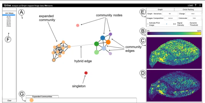
network structure. To analyse the computed communi-ties in this regard, we propose an interactive visualization framework that links two visualizations for these two aspects. The tool is referred to as GRINE (Analysis of GRaph mappedImage DataNEtworks) and can be tested for the data described in this paper using the provided links (availability or supplementary). The interface of the tool is shown in Fig.3. The functionalities are motivated and described below.
To visualize and explore the network structure dis-playthe user can choose between two different modes: In graph modethe communities’ graph structures are visu-alized, starting with a community graphG(see Fig.3a). Each community forms one nodevCi= {vj}i, where{vj}iis the set of allm/z-nodes with a community membership of
i. Two community nodes are connected by a community edgee(C)k , with:
e(C)k = {vCi,vCj},
if there exists an edgeel= {vp,vq}, with:
vp∈vCiandvq∈vCj.
The graph is fully dragable and repositions itself by a force layout. The user has the option to expand a commu-nity to show its subgraph and edgese(H)k = {vCi,vj}which we refer to as hybrid. Hybrid edges are edges between
m/z-nodes and community nodes, meaning that anm/z -node of an expanded community is connected with an
Fig. 3GRINE UI with graph mode active and hierarchy mode (circle packing) inactive. One community of the whole community-graphG, which is shown in (a), is expanded and them/z-node ofm/z-value 689.211 is selected. (A) Network display in graph mode. (b-d) Image Display.bLegend for color scheme (in this case: viridis).cCommunity-map.dm/z-image.eOptions box to configure the graph, image and hierarchy mode.fList of all
m/z-node of a non expanded community. Each node can be selected to activate the image display.
Inhierarchy modea circle packing is applied to visu-alize the networks while hiding the details of the graph structures (i.e. edges). This enables users to focus on com-munity memberships instead (see the Additional file1: S2 for a screenshot).
To analyse thelocalizationof communities and com-munity members, the user selects them either in the graph or in the hierarchy mode, which triggers the visualiza-tion of their spatial distribuvisualiza-tion in theimage display(see Fig.3c and d). The upper frame (Fig.3c) shows the com-munity mapwith a pseudo coloring chosen from a menu (Fig.3e). The community map is a summary of all images from one selected communityICi = Dp,{sj}i, i.e. allm/z -images corresponding tom/z-valuessjthat are members of communityCi.
Community maps can be computed and visualized in two modes: Inmaximum projection modethe maximal intensity in the community is displayed for each pixel:
(pk)=max sl ( (
pk,{sl}i),
where (pk) is the intensity of pixelpk. This mode dis-plays the total area covered by the entire community.
Inaveraging modethe intensity for each pixel is aver-aged across all images in the community:
(pk)= 1
|{sl}i|
l
(pk,{sl}i).
This emphasizes the quantity of signal coverage.
The lower frame (Fig. 3d) shows the single mass map visualizing oneI(m/z)i image (after selecting this commu-nity member in the network display or in the mass list on the far left (Fig.3f )). The pixel intensities are rescaled for a maximum contrast to enable the visual analysis of weak mass signals.
Furthermore, there is the option to visualize the rela-tion of community localizarela-tions with another kind of pseudocolor map, the PCA (principle component analy-sis) map. This visualization takes the full data setDinto account and thus accounts for variances in the entireNV
dimensions. The R, G, B color values in the PCA map are computed with a projection of the full data set onto the three most informative principle components (details given in Additional file1: S5). This map has been imple-mented to enable users to integrate global data features. In addition, PCA is a well established and familiar way to analyze high dimensional data so that it can be used as a reference despite its limitations.
Some implementation details can be found in S14 of the Additional file1.
Finally, we would like to refer the reader to S16 of the Additional file1 for further information on how the
similarity measure, threshold selection and community detection algorithm influence each other and their impact on the downstream analysis.
Results
Weblinks to all results obtained for data sets:DG,DBand DTcan be found underAvailability of data and material.
Gaussians
For the data set DG an edge reduction threshold within tS∈[ 0.6382, 0.9397] was computed (see Table1and Eq.4).
The specific value picked inside of this interval is irrele-vant, since the arg max function is maximal over the entire interval. Our community approach detects three commu-nities that corresponds to the groupsKigs, withi=0, 1, 2, meaning that we can distinguish the gaussians based on their spatial location (see Fig.4a).
If we discuss this result in relation to our biological analogy, each groupKigswith distribution atLgsi consists of molecules that are likely to be representatives of a metabolic process located in this area. Let us remember our initial assumption that functionally related molecules feature a similar lateral distribution within the sample, i.e. metabolic processes are spatially bound. If this assump-tion holds, the results obtained fromDGindicate that our communities can help to: 1. distinguish metabolic pro-cesses based on their spatial location and 2. identify their important molecules.
Figure4b showsk-means segmentation maps with dif-ferent k, i.e. clustering of pixel. Even with the correct number of clusters (k = 4, i.e. background and three pseudo-networks) the segmentation map cannot distin-guish the covered areas at the three different locations.
Compared to k-means clustering or hierarchical clus-tering, our method does not require to determine the number of groups, which can be considered an advantage. Barley
For data setDBwe computed the thresholdtS = 0.7085
(Eq. 4). This results in NE = 789 edges, meaning a
reduction of 84.376% (Table 1). Based on the resulting graph, the leading eigenvector method found NC = 11
communities (see Additional file 1: S4). Nine of them are interconnected, while two are singletons, i.e. nodes
Table 1Summarized graph information
Dataset tS NE NV NC NC2+ Gaussian Circles (DG) 0.6382 9 9 3 3 Barley (DB) 0.7085 789 101 11 8 Glioblastoma (DT) 0.5477 2371 106 11 6 Threshold for edge reduction (tS), number of edges (NE), number of vertices (NV), number of communities (NC) and number of communities of size greater than two (NC2+) forDG,DBandDTare shown
Fig. 4 aOur proposed method was applied to the syntheticalDGdata set. The three pseudo-networks were correctly detected as three communities. The communities are displayed as colored graphs (screenshot from the GRINE tool). For each community, the community-map is shown with a viridis color map.bk–means segmentation map after clustering of pixel, i.e.m/z-spectra, fork=2,. . ., 6. Each color represents one cluster
without any edge. Eight of the interconnected commu-nities are (n)-Communities, withn > 1, the others are (1)-Communities.
Most signal distributions of the community maps (Fig.5) show a strong correlation to anatomical structures of the barley seed, which is summarized in Fig.5e.
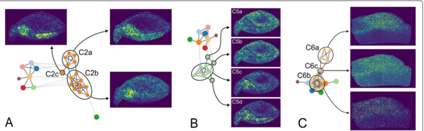
A view on the graph structure ofC2 (Fig.6a) reveals that this community can be divided into more detailed sub-communities (referred to as C2a - C2c). C2b shows an increased signal only at the embryo center, while the signal ofC2ais less specifically distributed in the entire embryo.
C2cis located between both and shows a specific signal
Fig. 5 aOptical image scan with marked and labeled anatomical structures.bAverage community-maps of all (n)–communities, withn>1 (network in Additional file1: S4).cImages of (1)–Communities (network in Additional file1: S4).dRGB image of the first three PCA projections, where the projections on the eigenvectors of the first, second and third largest eigenvalue is assigned to the red, green and blue channel, respectively and standalone images of these components. PCA images are not scaled like the community-maps andm/z-images. The color map viridis is used for images in (b) and (c) and inferno for images in (d).eCorrelation between the spatial signal distributions of all found communities and the anatomical structures of the barley seed.Xindicates that a community shows increased signal in the respective area
Fig. 6 aSubstructures ofDBin communityC2. The whole graph ofDBis shown with the corresponding community-nodeC2 unfolded. The substructures are encircled and refer to their respective subcommunity-maps.bCore-offshoot structure ofDBin communityC5. The left side shows
the graph ofDBwithC5 unfolded. The core structure and the offshoots are encircled. The right side shows the core-community-map and the
m/z-images of the offshoots.cSubstructure ofDTin communityC6. The left side shows the graph ofDTwithC6 unfolded. The two substructures, as well as their connecting link (single node), are encircled. The right side shows the subcommunity-maps of the marked nodes. For all images the color map viridis is used
distribution at the center and the shoot. A similar obser-vation can be found forC5. The subgraph ofC5 (Fig.6b) shows a structure that can be distinguished into core and offshoots. A core is defined by nodes that are densely interconnected, while offshoots are reaching out from the core and are less interconnected. The core of C5 (C5c) defines the main signal distribution of this community, which extends from the scutellum into the embryo center. The three offshootsC5a,C5b, andC5ddeviate from this distribution. A similar core-offshoot differentiation can be observed inC4 (not shown).
The identification ofm/z-values based on prior exam-ination of barley seed MSI [12] reveals a tendency for communities to mostly contain one class of molecules.C0,
C1,C3 andC7 contain only hordatines and hordatine pre-cursors, with one exception in C0, which is a lipid and three exceptions inC3, which are two unknown molecules and one lipid.C2 andC4 contain mostly carbohydrates, with four exceptions (three unknown molecules and one lipid). Further, carbohydrates in C2 are only potassium adducts and inC4 only sodium adducts.C5 andC6 con-tain mostly lipids, with two exceptions in C5 that are unknown molecules. The (1)-Communities are unknown (C8, C9) and a lipid (C10). This indicates that similar molecules have similar spatial distributions. One reason for this could be that similar molecules are part of the same spatially bound metabolic processes.
The identification also supports the structural features of C2 and C5. C2a is composed of three unknown molecules, one lipid and one carbohydrate, while C2b
consists only of carbohydrates. For C5, the two images that fit least to the main signal distribution of the commu-nity are both unknown molecules.
Glioblastoma
For data setDTwe computed the thresholdtS = 0.5477
(Eq. 4). The result is NE = 2371 edges, i.e. a reduction
of 57.394% (Table1). Compared to the barley data set the number of edges is clearly higher, although the number of vertices is nearly equal. The reason is a higher general similarity and a lower spread of similarity values, i.e. the algorithm classifies more similarities to be relevant. This indicates a higher degree of complexity for the tissue and its respective network of functionally related molecules. The community detection result showsNC=11
commu-nities with seven of them interconnected (see Additional file 1: S4). Five are (1)-Communities, the other six are (n)-Communities, withn>1.
The signal distributions (Fig.7) reveal three main pat-terns, which are summarized in Fig.7e.
Similar to the results obtained for barley data, a detailed view on the graph structure reveals more detailed infor-mation (Fig.6c). The subcommunityC6ashows a strong and specific distribution in one half of the sample. C6b
is distributed notably less specific, with a slightly biased signal distribution to the same half of the sample as
C6a. Both subcommunities are connected by am/z-image (C6c) that shows a weak similarity toC6a. We assumed thatC6cproduces a chaining effect during the community detection.
Based on communities C6aand C8 we can conclude that the sample is functionally divided into two halves, which is in line with the PCA result (Fig.7d) and (more important) the H&E staining information (Fig.7a), which indicates that the tumor in this sample is side specific. We can presume that at least some molecules ofC6aandC8 could be tumor specific.
Fig. 7 aOptical image scan of the sample used for MALDI analysis (left) and H&E stained image scan of the subsequent sample section (right). For the H&E stained image lighter color indicates tumor tissue and darker color indicates tumor infiltrated tissue, while this is reversed for the optical image.bAverage community-maps of all (n)–Communities, withn>1 (network in Additional file1: S4).cImages of (1)–Communities (network in Additional file1: S4).dRGB image of the second, third and fourth PCA components, where the projections on the eigenvectors of the second, third and fourth largest eigenvalue is assigned to the red, green and blue channel, respectively and standalone images of these components. PCA was done without the additional preprocessing steps of data squaring and image thresholding. The PCA images are not scaled like the
community-maps andm/z-images. The color map viridis is used for images in (b) and (c) and magma for images in (d).eAllocation of the spatial signal distribution of all found communities to specific pattern within the glioblastoma sample. We determine three main areas: Tumor tissue, tumor infiltrated tissue and outer border.Xindicates that a community shows increased signal in the respective area
Results of the publicly available mouse urinary blad-der data set fromms-imaging.orgare shown in Additional file1: S12. There we provide some basic results without detailed biological interpretation. The results are available for exploration in our webtool. The respective link can be found in Additional file1: S1.
Discussion Barley
The analysis of the barley seed data set shows that the community analysis approach delivers reasonable results, i.e. the spatial localizations of the communities reflect biological compartments with distinct functions. This is in accordance with previous findings for this data set [12]. For most communities, we are able to clearly detect correlations with different anatomical structures.
In contrast to other established methods for MSI seg-mentation, the presented approach offers a very fine iden-tification of the different tissues of a barley seedling based on the mass spectroscopy data. As shown in Fig.5, the root, the center of the developing seedling, the shoot, the scutellum, and the endosperm could be identified by a
unique combination of communities. This segmentation can be used to analyze the co-localization of specific sin-gle mass channels, representing known intermediates of the metabolism.
The fact that certain tissue regions or organs are rep-resented by a number of different communities indicates that these parts of the sample are physiologically more heterogeneous than would be expected if a singlem/z -signal were co-localized with that particular tissue or organ. An example for this kind of heterogeneity for the shoot can be seen in the communitiesC1,C7, andC10. Most interestingly, it shares communities with the root, but not with the scutellum. From a biological point of view, it can be speculated that these differences reflect metabolite compositions that are characteristic for devel-oping tissues, as roots and shoots, versus a tissue, which is metabolically active but not further developing just like the scutellum.
The appearance of substructures in individual communities within the graphs illustrates that our graph approach is able to convey information that would remain hidden if just cluster results were
considered. Interestingly, the three substructures investigated in this study show already three differ-ent kinds of motifs: Simple subgroups, core-offshoot structures, and bridging (or chaining) structures. There-fore we believe that substructures are worth further examination.
Glioblastoma
The results of the glioblastoma data set are not as easy to interpret as those of the barley sample, which was to be expected. This is due to its morphological homogeneity, combined with heterogeneity of the cell phenotype. On the other hand the community detection yields at least one clear insight: There are groups of molecules, whose signal distribution correlate with the tumor area that was defined by a pathologist [13]. This provides candidates for subsequent biological experiments.
Regarding their community compositions, the tissue compartments classified as tumor and tumor-infiltrated in data set DT are much more similar to each other than the different compartments of the barley sample. Five of the eleven communities are categorized as ubiq-uitous (Fig. 7), reflecting the fact that the tumor tissue is still closely related to the non-tumor tissue. Four com-munities are tumor-specific (Fig. 7), probably induced by the localization of lactate and other tumor metabo-lites (see [13]). The last two communities refer to the outer border of the sample (Fig.7), probably induced by matrix peaks.
We believe that even without any prior knowledge about the sample, like H&E staining, the results offered by this type of analysis provide a good starting point for biologists to set up further experiments.
Visualization
Our visualization tool GRINE is interactive, dynamic and responsive. This makes the usage very intuitive and almost no learning phase is required. The tool shows its main strengths in three areas. First, it combines the information of the graph domain and the image domain. Second, the interaction with the graph facili-tates the focus on specific communities and allows to spot structural characteristics. Examples are: Substruc-tures that can indicate more finely resolved commu-nities, cluster ambiguities and potential misclusterings. Third, its possibility to show and hide information, i.e. its interactivity, allows to encode much more infor-mation in a clear way than we could achieve with static visualizations [25], e.g. average and maximum images of all communities and correlation with PCA results.
At the current time, the visualization can only deal with distinct communities, whereas the analysis pipeline can also search for overlapping ones.
Comparison to other methodological approaches
A more common approach than the one presented for the analysis of the spatial distribution of imaging data is to employ dimension reduction techniques for segmenta-tion. We compared our method to visualizations of three different dimension reduction techniques: principal com-ponent analysis (PCA), non-negative matrix factorization (NMF) and latent dirichlet allocation (LDA) (results are shown and discussed in Additional file1: S13). We decided for PCA as it is probably the most prominent dimension reduction technique in biology. NMF is also a commonly used technique and does not produce negative intensity values, which can occur in PCA. LDA was chosen because it is a generalization of pLSA (probabilistic latent semantic analysis) that has been previously analysed [7].
The comparison showed that the computed visual-izations reveal similar coarse grained structures as our method. It is worth noting that LDA performs better as NMF and NMF performs better than PCA. For DBand
DTthe segmentation maps of LDA reveal the most details and detected structures show the highest contrast. This is followed by the ones obtained with NMF. The PCA maps provide the lowest contrast. All three methods show distributions that correlate with the main structures of the samples. However, compared to our method they fail finding finely detailed structures like the scutellum inDB. While the results obtained with PCA, NMF and LDA share similarities with the results obtained by our pro-posed method, we can report some new favorable features for our approach:
First, the grouping of spatial distributions assigns each image to one group. After analysing the lateral distribu-tion of a community image it is easy and unambiguous to identify which single m/z-images, i.e. molecules, partic-ipate in this distribution. This is much harder for PCA, NMF and LDA, where each component image consist of partial combinations of the originalm/z-images.
Second, we do not need to determine the number of clusters, i.e. communities, beforehand. Our method chooses this number automatically based on the given optimization criterion (modularity). If needed, a manual decision is still possible. This is different for NMF and LDA. For those methods the number of dimensions, i.e. components, have to be predefined. Finding the most fit-ting number of dimensions for a given sample is a non trivial task and especially important for NMF and LDA, since the number of dimensions influences the lateral distribution of the resulting components (see Additional file1: S13).
Third, the community images are based on simple aggregation functions. Therefore, in case of outliers or ambiguities it is easy to re-evaluate the community images without them. The same counts for potential optimiza-tions based on substructures in the clustering space.
Fourth, the network structure can reveal outliers, mis-clusterings, substructures and potential optimizations at first glance and allows an intuitive exploration of the clustering space.
We would also like to add the H2SOM ([5]), as another segmentation method to this comparison discussion. This method is also capable to reveal detailed structures inDB. A core difference is that in our method a single pixel can be a member of multiple community images. This means we can provide an ambiguous pixel labeling, which is more suitable to represent dynamic biological processes. Conclusion
In this paper we demonstrated the general applicability of community detection as an unsupervised clustering tech-nique for the analysis of MSI data from different types of samples. We have developed a pipeline to map lateral image data to an image similarity graph. We have also developed a new edge thresholding technique to trans-form a fully connected graph into a sparse one. Using lateralm/z-images as samples and their pixels as features, we utilized community detection as an example to group molecules with similar lateral distributions. By analysing the network structure with our interactive visualization, we have found finer subclusters within the detected clus-ters. This offers a possibility for manual refinement.
We stated the initial assumption that functionally related molecules are spatially bound. If this assumption holds, the presented way of clustering lateral imaging data provides a good starting point for targeted biological experiments. For some information on the limitations of this assumption and alternative considerations, we would like to refer to S18 of the Additional file1.
This paper is designed as proof of concept to demon-strate the general applicability of community detection to MSI data. Therefore, we did not discuss the question of performance. Since we do not want to ignore this question entirely, we refer to S15 of the Additional file1. There a rough analysis of the complexity is presented.
Finally, a webtool has been implemented to visualize and explain the results and to demonstrate the usefulness and benefits of the approach.
Future research
Further analysis of network patterns of substructures could lead to automated ways to detect finer cluster rela-tionships, like hierarchical structures and reveal and cor-rect misclusterings. Another promising approach, which was not discussed in this paper, is to employ more sta-tistical network properties for the analysis. An example could be the ratio of the in-group degree to the out-group degree to automatically detect very specific or very gen-eral latgen-eral patterns. These statistics could also be used to query specificm/z-images for their statistical properties.
Considering the sheer amount of network properties this offers a big area for future research.
Additional file
Additional file 1:Supplementary. (PDF 2459 kb)
Abbreviations
H2SOM: Hierarchical hyperbolic self-organizing map; H&E: Hematoxylin and eosin; GRINE: Analysis ofGRaph mappedImage dataNEtworks; LDA: Latent dirichlet allocation;m/z: Mass to Charge; MALDI: Matrix-assisted laser desorption ionization; MSI: Mass spectrometry imaging; NMF: Non-negative matrix factorization; PCA: Principal component analysis; pLSA: Probabilistic latent semantic analysis; QGP: Quantitative graph properties
Acknowledgements
Not applicable.
Funding
KW is funded and JK was partially funded by the International DFG Research Training Group GRK 1906. The funding body played no role regarding the design of the study, data collection, analysis or interpretation or the writing of the manuscript.
Availability of data and materials
All webapplication results are accessible at:Gaussians,Barley,Glioblastomavia Chrome or Firefox. All links are also given explicitly in Additional file1: S1. Data sets and demo code for network building and community detection:
Data sets, Code.
Demo code for the visualization:GRINE
A small overview video for our webtool is available at: https://www.youtube.com/watch?v=I40fe8TUijs.
Supplementary information:Supplementary data is available online.
Availability and Requirements
The source code and demos for the community detection workflow the visualization (GRINE) is available on github.
Project name:MSI Community Detection
Project home page:
https://github.com/Kawue/imaging_communitydetection_demo
Operating system(s):Platform independent
Programming language:Python
Other requirements:Python 3.5 or higher
License:GNU GPLv3
Project name:GRINE
Project home page:https://github.com/Kawue/grine_demo
Operating system(s):Platform independent
Programming language:Javascript
Other requirements:Firefox or Chrome
License:GNU GPLv3
Author’s contributions
Concept and design of study and software: KW, JK, TWN. Developed and implemented software: KW. Analyzed data: KW. Evaluation and interpretation of results: KW, JK, HB, KN, TWN. Contributed data: JK, HB, KN. Pathological structure analysis of the glioblastoma sample: VHH All authors read and approved the final manuscript.
Ethics approval and consent to participate
The collection and use of human tissue was approved by the ethical review committee of the University Duisburg-Essen. All patients (donors of the human tissue) provided their informed consent in written form. We obtained the data completely anonymised.
Consent for publication
Competing interests
The authors declare that they have no competing interests. Publisher’s Note
Springer Nature remains neutral with regard to jurisdictional claims in published maps and institutional affiliations.
Author details
1International Research Training Group “Computational Methods for the
Analysis of the Diversity and Dynamics of Genomes”, Bielefeld University, Universitätsstraße 25, 33613 Bielefeld, Germany.2Biodata Mining Group,
Faculty of Technology, Bielefeld University, Universitätsstraße 25, 33613 Bielefeld, Germany.3Center for Biotechnology (CeBiTec), Universitätsstraße 25,
33613 Bielefeld, Germany.4Proteome and Metabolome Research, Faculty of
Biology, Bielefeld University, Universitätsstraße 25, 33613 Bielefeld, Germany.
5Department of Neuropathology, Institute for Clinical Pathology,
Dietrich-Bonhoeffer-Klinikum, Salvador-Allende-Straße 30, 17036 Neubrandenburg, Germany.6Department of Neuropathology, Essen
University Hospital (AöR), Hufelandstraße 55, 45147 Essen, Germany. Received: 28 January 2019 Accepted: 10 May 2019
References
1. Herold J, Loyek C, Nattkemper TW. Multivariate image mining. Wiley Interdiscip Rev Data Min Knowl Disc. 2011;1(1):2–13.
2. Palmer A, Trede D, Alexandrov T. Where imaging mass spectrometry stands: here are the numbers. Metabolomics. 2016;12(6):1–3.
3. McCombie G, Staab D, Stoeckli M, Knochenmuss R. Spatial and spectral correlations in maldi mass spectrometry images by clustering and multivariate analysis. Anal Chem. 2005;77(19):6118–24.
4. Deininger S.-O., Ebert MP, Fütterer A, Gerhard M, Röcken C. Maldi imaging combined with hierarchical clustering as a new tool for the interpretation of complex human cancers. J Proteome Res. 2008;7(12): 5230–6.
5. Kölling J, Langenkämper D, Abouna S, Khan M, Nattkemper TW. Whide-a web tool for visual data mining colocation patterns in multivariate bioimages. Bioinformatics. 2012;28(8):1143–50.
6. Alexandrov T, Becker M, Deininger S.-O., Ernst G, Wehder L, Grasmair M, von Eggeling F, Thiele H, Maass P. Spatial segmentation of imaging mass spectrometry data with edge-preserving image denoising and clustering. J Proteome Res. 2010;9(12):6535–46.
7. Hanselmann M, Kirchner M, Renard BY, Amstalden ER, Glunde K, Heeren RM, Hamprecht FA. Concise representation of mass spectrometry images by probabilistic latent semantic analysis. Anal Chem. 2008;80(24):9649–58. 8. Newman ME. Modularity and community structure in networks. Proc Natl
Acad Sci. 2006;103(23):8577–82.
9. Newman ME. Finding community structure in networks using the eigenvectors of matrices. Phys Rev E. 2006;74(3):036104.
10. Alexandrov T, Chernyavsky I, Becker M, von Eggeling F, Nikolenko S. Analysis and interpretation of imaging mass spectrometry data by clustering mass-to-charge images according to their spatial similarity. Anal Chem. 2013;85(23):11189–95.
11. Wijetunge CD, Saeed I, Halgamuge SK, Boughton B, Roessner U. Unsupervised learning for exploring maldi imaging mass spectrometry ’omics’ data. In: Information and Automation for Sustainability (ICIAfS), 2014 7th International Conference On. IEEE; 2014. p. 1–6.
12. Gorzolka K, Kölling J, Nattkemper TW, Niehaus K. Spatio-temporal metabolite profiling of the barley germination process by maldi ms imaging. PloS ONE. 2016;11(3):0150208.
13. Giampa M, Lissel M, Patschkowski T, Fuchser J, Hans VH, Gembruch O, Bednarz H, Niehaus K. Maleic anhydride proton sponge as a novel MALDI matrix for the visualization of small molecules (< 250 m/z) in brain tumors by routine MALDI ToF imaging mass spectrometry. Chem Commun. 2016;52(63):9801–4.
14. Alexandrov T. Maldi imaging mass spectrometry: statistical data analysis and current computational challenges. BMC Bioinformatics. 2012;13(16): 11.
15. Widlak P, Mrukwa G, Kalinowska M, Pietrowska M, Chekan M, Wierzgon J, Gawin M, Drazek G, Polanska J. Detection of molecular signatures of oral squamous cell carcinoma and normal epithelium–application of a
novel methodology for unsupervised segmentation of imaging mass spectrometry data. Proteomics. 2016;16(11-12):1613–21.
16. Verbeeck N, Yang J, De Moor B, Caprioli RM, Waelkens E, Van de Plas R. Automated anatomical interpretation of ion distributions in tissue: linking imaging mass spectrometry to curated atlases. Anal Chem. 2014;86(18): 8974–82.
17. McDonnell LA, van Remoortere A, van Zeijl RJ, Deelder AM. Mass spectrometry image correlation: quantifying colocalization. J Proteome Res. 2008;7(8):3619–27.
18. Zahoránszky-K ˝ohalmi G, Bologa CG, Oprea TI. Impact of similarity threshold on the topology of molecular similarity networks and clustering outcomes. J Cheminformatics. 2016;8(1):16.
19. Humphries MD, Gurney K. Network ’small-world-ness’: a quantitative method for determining canonical network equivalence. PloS ONE. 2008;3(4):0002051.
20. Couto CMV, Comin CH, da Fontoura Costa L. Effects of threshold on the topology of gene co-expression networks. Mol BioSyst. 2017;13(10): 2024–35.
21. Rubinov M, Sporns O. Complex network measures of brain connectivity: uses and interpretations. Neuroimage. 2010;52(3):1059–69.
22. Watts DJ, Strogatz SH. Collective dynamics of ’small-world’networks. Nature. 1998;393(6684):440–2.
23. Latora V, Marchiori M. Efficient behavior of small-world networks. Phys Rev Lett. 2001;87(19):198701.
24. Newman ME, Girvan M. Finding and evaluating community structure in networks. Phys Rev E. 2004;69(2):026113.
25. Yi JS, ah Kang Y, Stasko J. Toward a deeper understanding of the role of interaction in information visualization. IEEE Trans Vis Comput Graph. 2007;13(6):1224–31.