April 9, 2013
Time Series Analysis
This chapter presents an introduction to the branch of statistics known astime series analysis. Often the data we collect in environmental studies is collected sequentially over time – this type of data is known as time series data. For instance, we may mon-itor wind speed or water temperatures at regularly spaced time intervals (e.g. every hour or once per day). Collecting data sequentially over time induces a correlation between measurements because observations near each other in time will tend to be more similar, and hence more correlated to observations made further apart in time. Often in our data analysis, we assume our observations are independent, but with time series data, this assumption is often false and we would like to account for this temporal correlation in our statistical analysis.
1
Introduction
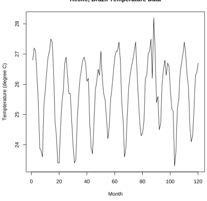
Figure 1 shows a plot of average monthly air temperatures (in Celsius) at Recife, Brazil over the period from 1953 to 1962 (Chatfield 2004). The data in Figure 1 looks like a random scatter of points. However, the data was collected as a time series over consecutive months.
If we connect the dots consecutively over time we get the picture shown in Figure 2 and in this plot a very distinctive annual pattern reveals itself. The following R code generates these figures:
recife<-as.ts(scan(’recife.dat’))
plot(recife,ylab=’Tempterature (degree C)’,
xlab=’Month’,main=’Recife, Brazil Temperature Data’)
The “scan” command reads in the data set and the “as.ts” tells R to treat the data set as a time series object. As we have seen previously, the “plot” command plots the data as seen in Figure 2. the “xlab” and “ylab” stand for the xand y axis labels and the “main=” gives a title for the plot.
Another example of a time series with a seasonal pattern as well as an overall increas-ing trend is shown in Figure 3. This figure shows atmospheric concentrations ofCO2 (ppm) as reported in a 1997 Scripps Institution of Oceanography (SIO) publication (Keeling et al 1997). The data are given in the following table:
0 20 40 60 80 100 120
24
25
26
27
28
Recife, Brazil Temperature Data
Index
Tempterature (degree C)
Figure 1: Average monthly air temperatures at Recife, Brazil between 1953 and 1962.
Recife, Brazil Temperature Data
Month
Tempterature (degree C)
0 20 40 60 80 100 120
24
25
26
27
28
Year Jan Feb Mar Apr May Jun Jul Aug Sep Oct Nov Dec
1959 315.42 316.31 316.50 317.56 318.13 318.00 316.39 314.65 313.68 313.18 314.66 315.43
1960 316.27 316.81 317.42 318.87 319.87 319.43 318.01 315.74 314.00 313.68 314.84 316.03
1961 316.73 317.54 318.38 319.31 320.42 319.61 318.42 316.63 314.83 315.16 315.94 316.85
1962 317.78 318.40 319.53 320.42 320.85 320.45 319.45 317.25 316.11 315.27 316.53 317.53
1963 318.58 318.92 319.70 321.22 322.08 321.31 319.58 317.61 316.05 315.83 316.91 318.20
1964 319.41 320.07 320.74 321.40 322.06 321.73 320.27 318.54 316.54 316.71 317.53 318.55
1965 319.27 320.28 320.73 321.97 322.00 321.71 321.05 318.71 317.66 317.14 318.70 319.25
1966 320.46 321.43 322.23 323.54 323.91 323.59 322.24 320.20 318.48 317.94 319.63 320.87
1967 322.17 322.34 322.88 324.25 324.83 323.93 322.38 320.76 319.10 319.24 320.56 321.80
1968 322.40 322.99 323.73 324.86 325.40 325.20 323.98 321.95 320.18 320.09 321.16 322.74
1969 323.83 324.26 325.47 326.50 327.21 326.54 325.72 323.50 322.22 321.62 322.69 323.95
1970 324.89 325.82 326.77 327.97 327.91 327.50 326.18 324.53 322.93 322.90 323.85 324.96
1971 326.01 326.51 327.01 327.62 328.76 328.40 327.20 325.27 323.20 323.40 324.63 325.85
1972 326.60 327.47 327.58 329.56 329.90 328.92 327.88 326.16 324.68 325.04 326.34 327.39
1973 328.37 329.40 330.14 331.33 332.31 331.90 330.70 329.15 327.35 327.02 327.99 328.48
1974 329.18 330.55 331.32 332.48 332.92 332.08 331.01 329.23 327.27 327.21 328.29 329.41
1975 330.23 331.25 331.87 333.14 333.80 333.43 331.73 329.90 328.40 328.17 329.32 330.59
1976 331.58 332.39 333.33 334.41 334.71 334.17 332.89 330.77 329.14 328.78 330.14 331.52
1977 332.75 333.24 334.53 335.90 336.57 336.10 334.76 332.59 331.42 330.98 332.24 333.68
1978 334.80 335.22 336.47 337.59 337.84 337.72 336.37 334.51 332.60 332.38 333.75 334.78
1979 336.05 336.59 337.79 338.71 339.30 339.12 337.56 335.92 333.75 333.70 335.12 336.56
1980 337.84 338.19 339.91 340.60 341.29 341.00 339.39 337.43 335.72 335.84 336.93 338.04
1981 339.06 340.30 341.21 342.33 342.74 342.08 340.32 338.26 336.52 336.68 338.19 339.44
1982 340.57 341.44 342.53 343.39 343.96 343.18 341.88 339.65 337.81 337.69 339.09 340.32
1983 341.20 342.35 342.93 344.77 345.58 345.14 343.81 342.21 339.69 339.82 340.98 342.82
1984 343.52 344.33 345.11 346.88 347.25 346.62 345.22 343.11 340.90 341.18 342.80 344.04
1985 344.79 345.82 347.25 348.17 348.74 348.07 346.38 344.51 342.92 342.62 344.06 345.38
1986 346.11 346.78 347.68 349.37 350.03 349.37 347.76 345.73 344.68 343.99 345.48 346.72
1987 347.84 348.29 349.23 350.80 351.66 351.07 349.33 347.92 346.27 346.18 347.64 348.78
1988 350.25 351.54 352.05 353.41 354.04 353.62 352.22 350.27 348.55 348.72 349.91 351.18
1989 352.60 352.92 353.53 355.26 355.52 354.97 353.75 351.52 349.64 349.83 351.14 352.37
1990 353.50 354.55 355.23 356.04 357.00 356.07 354.67 352.76 350.82 351.04 352.69 354.07
1991 354.59 355.63 357.03 358.48 359.22 358.12 356.06 353.92 352.05 352.11 353.64 354.89
1992 355.88 356.63 357.72 359.07 359.58 359.17 356.94 354.92 352.94 353.23 354.09 355.33
1993 356.63 357.10 358.32 359.41 360.23 359.55 357.53 355.48 353.67 353.95 355.30 356.78
1994 358.34 358.89 359.95 361.25 361.67 360.94 359.55 357.49 355.84 356.00 357.59 359.05
1995 359.98 361.03 361.66 363.48 363.82 363.30 361.94 359.50 358.11 357.80 359.61 360.74
1996 362.09 363.29 364.06 364.76 365.45 365.01 363.70 361.54 359.51 359.65 360.80 362.38
1997 363.23 364.06 364.61 366.40 366.84 365.68 364.52 362.57 360.24 360.83 362.49 364.34
The CO2 data set is part of the R package and the plot in Figure 3 can be generated in R by typing
data(co2)
plot(co2, main = expression("Atmospheric concentration of CO"[2]), ylab=expression("CO"[2]), xlab=’Year’)
Atmospheric concentration of CO2
Year
CO
2
1960 1970 1980 1990
320
330
340
350
360
Figure 3: Atmospheric concentrations of CO2 are expressed in parts per million (ppm) and reported in the preliminary 1997 SIO manometric mole fraction scale.
• Is there serial correlation.
• Is there a trend in the data over time?
• Is there seasonal variation in the data over time?
• Can we use the data for forecast future observations?
The first step in analyzing time series data is to plot the data against time – this is called a time plot. The time plot can tell us a lot of information about the time series. Trends and seasonal variation are often evident in time plots. Also, time plots can indicate the presence of outliers in the time series which are observations that are not consistent with the rest of the data.
2
Stationary Time Series
The main goal of a time series analysis may be to understand seasonal changes and/or trends over time. However, another goal that is often of primary importance is to understand and model the correlational structure in the time series. This type of analysis is generally done on stationary processes. Roughly speaking, a stationary process is one that looks basically the same at any given time point. That is, a stationary time series is one without any systematic change in its mean and variance and does not have periodic variations.
Strictly speaking, we say a time series y1, y2, y3, . . . , is (strictly) stationary if the
joint distribution of any portion of the series of (yt1, yt2, . . . , ytk) is the same as the
distribution of any other portion of the series (yt1+τ, yt2+τ, . . . , ytk+τ), whereτ can be
any integer. That is, if we shift the time series by an amountτ, it has no effect on the joint distribution of the responses. This definition holds for any value ofk. A weaker definition of stationarity issecond order stationaritywhich does not assume anything about the joint distribution of the random responses y1, y2, y3, . . . except that the
mean is constant: E[yt] =µand that thecovariancebetween two observationsyt and
yt+k depends only on the lag k between two observations and not on the point t in
the time series:
γ(k) = cov(yt, yt+k).
Recall that the covariance between two random variables, in this case yt and yt+k, is
defined to be the average value of the product (yt−µt)(yt+k−µt+k).For a stationary
process and k = 0 it follows that
E[yt] =µ and var[yt] =σ2,
for every value of t. In other words, the mean and variance of the time series is the same at each time point. If we take k = 2, then stationarity implies that the joint distribution of yt1 and yt2 depends only on the difference t2−t1 =τ, which is called
One of the primary interests in studying time series is the extent to which successive terms in the series are correlated. In the temperature data set, it seems reason-able to expect that the average temperature next month will be correlated with the average temperature of the current month. However, will the average temperature five months from now depend in anyway with the current month’s temperature? In order to answer questions of this sort, we need to define serial Correlation and the autocorrelation function.
3
Serial Correlation
Ifytis the response at timet, then we can denote the average value ofytasE[yt] =µt
and the variance of yt as E[(yt−µt)2] = σt2. The autocovariance function is defined
for any two responses yt1 and yt2 as the covariance between these two responses: Autocovariance function: γ(t1, t2) =E[(yt1−µt1)(yt2−µt2)].
The autocorrelation function can be computed from the autocovariance function by dividing by the standard deviations of yt1 and yt2 which corresponds to our usual
definition of correlation:
Autocorrelation function: r(t1, t2) = E[(yt1−µt1)(yt2−µt2)]/(σt1σt2).
Of course, in practice the autocovariance and autocorrelation functions are unknown and have to be estimated. Recall that if we have bivariate data (x1, y1), . . . ,(xn, yn),
the (Pearson) correlation is defined to be
r=
∑n
i=1(xi−x¯)(yi−y¯)
√∑n
i=1(xi−x¯)2
∑n
i=1(yi−y¯)2
.
If the time series has n observations y1, y2, . . . , yn, then we can form the pairs:
(y1, y2),(y2, y3),(y3, y4), . . . ,(yn−1, yn)
and treat this as a bivariate data set and compute the correlation as given in the above formula. This will give an estimate of the correlation between successive pairs and is called the autocorrelation coefficient or serial correlation coefficient atlag 1 denoted by r1. The formula obtained by plugging the successive pairs into the correlation
formula is usually simplified by using:
r1 =
∑n−1
i=1 (yi−y¯)(yi+1−y¯)/(n−1)
∑n
i=1(yi−y¯)2/n
.
Similarly, we can define the serial correlation at lag k by
rk =
∑n−k
i=1 (yi −y¯)(yi+k−y¯)/(n−k)
∑n
i=1(yi−y¯)2/n
3.1
Correlogram
One of the most useful descriptive tools in time series analysis is to generate the correlogram plot which is simple a plot of the serial correlations rk versus the lag k
for k = 0,1, . . . , M, whereM is usually much less than the sample size n.
If we have a random series of observations that are independent of one another, then the population serial correlations will all be zero. However, in this case, we would not expect the sample serial correlations to be exactly zero since they are all defined in terms ¯yetc. However, if we do have a random series, the serial correlations should be close to zero in value on average. One can show that for a random series,
E[rk]≈ −
1 (n−1), and
var(rk)≈
1
n.
In addition, if the sample size if fairly large (say n ≥40), then rk is approximately
normally distributed (Kendall et al 1983, Chapter 48). The approximate normality of therk can aid in determining if a sample serial correlation is significantly non-zero,
for instance by examining if rk falls within the confidence limits −1/(n−1)±1.96/√n.
Due to the multiplicity problem of estimating many serial correlations, the above confidence limits are used only as a guide instead of a strict statistical inference procedure. If we are observing twenty serial correlations say of a random process, then we would expect to see one of the rk fall outside of this confidence limit by
chance alone.
Figure 4 and Figure 5 show the correlograms for the Recife temperature data and the CO2 data sets (Figure 5 shows the correlogram for lags up to k = 100 although the horizontal axis is labeled differently). These plots were generated using the R software. These two correlograms show very strong autocorrelations and this is to be expected due to the highly non-stationary nature of these two time series. One of our goals is to explore the nature of the autocorrelations after removing trends and seasonality. The correlogram was generated in R for the Recife Temperature data using the following code:
recife<-as.ts(scan(’recife.dat’))
racf=acf(recife, lag.max=40,,type = "correlation")
plot(racf, type=’l’, main=’Correlogram for Recife Air Temp. Data’)
The “acf” function in R computes the autocorrelations.
The correlogram is not a useful tool for a non-stationary process. In theCO2 example with a strong increasing trend, it is obvious that the serial correlations will be positive. The correlogram is most useful for stationary time series. Thus, when evaluating a non-stationary time series, typically trends and periodicities are removed from the data before investigating the autocorrelational structure in the data.
0 10 20 30 40
−0.5
0.0
0.5
1.0
Lag
ACF
Correlogram for Recife Air Temp. Data
Figure 4: Correlogram for the Average monthly air terperatures at Recife, Brazil between 1953 and 1962.
0 50 100 150 200
0.0
0.2
0.4
0.6
0.8
1.0
Correlogram for CO2 Data
Lag
ACF
4
Removing Trends and Periodic Effects in a Time
Series
In order to study a time series in greater detail, it is helpful to remove any trends and seasonal components from the data first. There are a variety of ways this can be done. For the Recife Air Temperature data, there is a clear periodic effect for the different months of the year. The temperatures are highest around January and lowest around July.
4.1
Eliminating a Trend when There is No Seasonality
We briefly describe three methods of removing a trend from data that does not have any seasonality component. Consider the model
yt =µt+ϵt,
where the trend is given by µt.
1. Least Squares Estimation of µt. The idea here is to simply fit a polynomial
regression in t to the data:
µt=β0+β1t+β2t2+· · ·+βptp.
If the time series shows a linear trend, then we take p= 1. The residuals that result from the fit will yield a time series without the trend.
2. Smoothing by a Moving Average (also known as a linear filter). This process converts a time series{yt} into another time series {xt} by a linear operation:
xt =
1 2q+ 1
q ∑ i=−q
yt+i,
where the analyst chooses the value of q for smoothing. Since averaging is a smoothing process, we can see why the moving average smooths out the noise in a time series and hopefully picks up the overall trend in the data. There exist many variations of the filter described here.
3. Differencing. Another way of removing a trend in data is by differencing. The first difference operator∇ defined by
∇yt=yt−yt−1.
We can define higher powers of the differencing operator such as
∇2y
t = ∇(∇yt)
= ∇(yt−yt−1)
= (yt−yt−1)−(yt−1−yt−2)
and so on. If the differencing operator∇is applied to a time series with a linear trend
yt =β0+β1t+ϵt,
then
∇yt = yt−yt−1
= (β0+β1t+ϵt)−(β0+β1(t−1) +ϵt−1)
= β1+γt,
which yields a time series with a constant mean and the linear trend is eliminated (here γt = ϵt−ϵt−1 is the error term in the differenced time series). Similarly,
we can use∇2 to get rid of a quadratic trend.
Let us return to the CO2 example and use the least-squares approach to remove the clear upward trend in the data. From Figure 3, it looks as if there is a linear trend inCO2 over time. Thus, in R, we could fit the following model
yt =β0+β1t+ϵt,
and then look at the residuals from the fit. To do this in R, we use the following code:
t=1:length(co2) ft=lm(co2~t) summary(ft)
r=ft$residuals # get the residuals from the fit
plot.ts(r,ylab=’residuals’, main=’Residuals from CO2 Data From a Linear Fit’)
The plot of residuals from the linear fit versus time is shown in Figure 6 and clearly the linear fit did not remove the entire trend in the data. There appears to be some nonlinearity to the trend. This plot suggests that we probably need to include a quadratic term t2 to the least-squares fit. However, the residual plot from the quadratic fit (not shown here) still showed some structure. Thus a cubic model was fit to the data using the following R code:
ft3=lm(co2~t+I(t^2)+I(t^3)) summary(ft3)
plot.ts(ft3$residuals,ylab=’residuals’, main=’Residuals from CO2 Data From a Cubic Fit’)
The output from fitting a cubic trend is provided by the “summary(ft3)” as:
Call:
lm(formula = co2 ~ t + I(t^2) + I(t^3)) Residuals:
Residuals from CO2 Data From a Linear Fit
Time
residuals
1960 1970 1980 1990
−6
−4
−2
0
2
4
6
Figure 6: Residuals from the linear fit to the CO2 data
-4.5786 -1.7299 0.2279 1.8073 4.4318
Coefficients:
Estimate Std. Error t value Pr(>|t|)
(Intercept) 3.163e+02 3.934e-01 804.008 < 2e-16 ***
t 2.905e-02 7.256e-03 4.004 7.25e-05 ***
I(t^2) 2.928e-04 3.593e-05 8.149 3.44e-15 ***
I(t^3) -2.902e-07 5.036e-08 -5.763 1.51e-08 ***
---Signif. codes: 0 ‘***’ 0.001 ‘**’ 0.01 ‘*’ 0.05 ‘.’ 0.1 ‘ ’ 1
Residual standard error: 2.11 on 464 degrees of freedom
Multiple R-Squared: 0.9802, Adjusted R-squared: 0.9801
F-statistic: 7674 on 3 and 464 DF, p-value: < 2.2e-16
From thep-values, its clear that the estimated coefficients of the cubic fit appear very stable. The residuals from the cubic fit plotted against time are shown in Figure 7. There no longer appears to be any trend in this residual plot. However, there is still clearly a seasonal pattern remaining in this residual plot. Examining the raw data, one can see that theCO2 level rises from January to mid-summer and then decreases again. The next section describes methods of eliminating a seasonal or periodic effect.
Residuals from CO2 Data From a Cubic Fit
Time
residuals
1960 1970 1980 1990
−4
−2
0
2
4
Figure 7: Residuals from the cubic fit to the CO2 data
4.2
Eliminating a Seasonal or Periodic Effect
The differencing method just described can be used to eliminate a seasonal effect in a time series as well. For the Recife average temperature data, there is clearly a 12 month seasonal effect for the different seasons of the year. We can eliminate this effect by using a seasonal differencing such as ∇12 where
∇12(yt) =yt−yt−12.
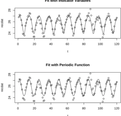
One way to remove the periodic effect is to fit a linear model with indicator variables for the different months:
yt=β1m1t+β2m2t+· · ·+β12m12t+ϵt, (1)
whereytis the temperature at time (month) tand mkt is the 0-1 indicator for month
k. To fit this model in R, we write:
fac = gl(12,1,length=120,
label=c("jan","feb","march","april","may","june","july","aug","sept","oct","nov","dec")) recifefit=lm(recdat~fac)
summary(recifefit)
The “fac” defines the month factor. The R function “gl” generates factors by spec-ifying the pattern of their levels. The first number in the “gl” command gives the
number of levels (12 for 12 months in this example). The second number gives the number of replications (1 in our case since we have only a single average for a given month). “length = 120” tells R that the time series has n = 120 observations. The “labels” statement is optional and we use it here to give labels for the different months. Fitting this linear model is done in R by the “lm” function which stands for “linear model.” Here, the raw data is called “recdat” and is treated as the response and the “fac” are the factors. This linear model fit has the simple effect of computing the 12 monthly averages and subtracting them from each of the corresponding terms in the data set. We have called the fit of the model “recifefit”. To see the results of the fit, in R type
summary(recifefit)
The output is given as:
Call:
lm(formula = recdat ~ fac) Residuals:
Min 1Q Median 3Q Max
-1.0700 -0.2700 -0.0200 0.2325 1.8300
Coefficients:
Estimate Std. Error t value Pr(>|t|)
(Intercept) 26.8200 0.1502 178.521 < 2e-16 ***
facfeb 0.2600 0.2125 1.224 0.2237
facmarch -0.0500 0.2125 -0.235 0.8144
facapril -0.4500 0.2125 -2.118 0.0365 *
facmay -1.2400 0.2125 -5.836 5.67e-08 ***
facjune -2.1800 0.2125 -10.261 < 2e-16 ***
facjuly -2.8600 0.2125 -13.461 < 2e-16 ***
facaug -2.8500 0.2125 -13.414 < 2e-16 ***
facsept -1.8400 0.2125 -8.660 5.07e-14 ***
facoct -0.9800 0.2125 -4.613 1.10e-05 ***
facnov -0.5400 0.2125 -2.542 0.0125 *
facdec -0.0900 0.2125 -0.424 0.6727
---Signif. codes: 0 ‘***’ 0.001 ‘**’ 0.01 ‘*’ 0.05 ‘.’ 0.1 ‘ ’ 1
Residual standard error: 0.4751 on 108 degrees of freedom
Multiple R-Squared: 0.85, Adjusted R-squared: 0.8347
F-statistic: 55.64 on 11 and 108 DF, p-value: < 2.2e-16
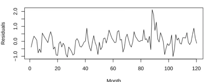
Most of the factor effects are highly stable indicated by small p-values. The top frame of Figure 8 shows the residuals versus time for the seasonally adjusted data and we see that the strong seasonal effect is now gone. The bottom frame of Figure 8 shows the correlogram for the seasonally adjusted data. This correlogram indicates
Seasonally Adjusted Recife Temp. Data
Month
Residuals
0 20 40 60 80 100 120
−1.0
0.0
1.0
0 10 20 30 40
−0.2
0.2
0.6
1.0
Lag
ACF
Correlogram for Seasonally Adjusted Recife Air Temp. Data
Figure 8: Seasonally adjusted data (top frame) and the correlogram (bottom frame) for the Average monthly air temperatures at Recife, Brazil between 1953 and 1962. that the first three serial correlations appear to differ significantly from zero (they lay outside the 95% confidence band) and they are positive. This indicates that if a given month has an above average temperature, then the following two months will also tend to have above average temperatures. Also, if a given month has a below average temperature, then the following two months will also tend to be below average.
4.3
Fitting a Periodic Function
The model (1) is defined by twelve indicator variables for the 12 months which is a lot of parameters. A simpler way of modeling the Recife temperature data is to fit a regression model that is periodic. Since the period is 12, we can fit the following model:
yt =β0+β1sin((2π/12)t) +β2cos((2π/12)t) +ϵt. (2)
One can readily check that the regression function in (2) is a periodic function with period equal to 12. If one wanted to fit a model with a different period, say m, then simply replace the 12 by m in (2).
The necessary code in R is given by:
t=1:length(recdat) x1=sin(t*2*pi/12)
x2=cos(t*2*pi/12)
recperiodic = lm(recdat~x1+x2) summary(recperiodic)
The “summary” statement tells R to print out the results of fitting the periodic fit (2) and the output is as follows:
Call:
lm(formula = recdat ~ x1 + x2) Residuals:
Min 1Q Median 3Q Max
-1.0553887 -0.3402542 0.0001944 0.2464723 2.1176721
Coefficients:
Estimate Std. Error t value Pr(>|t|)
(Intercept) 25.75167 0.04808 535.62 <2e-16 ***
x1 1.00372 0.06799 14.76 <2e-16 ***
x2 1.07718 0.06799 15.84 <2e-16 ***
---Signif. codes: 0 ‘***’ 0.001 ‘**’ 0.01 ‘*’ 0.05 ‘.’ 0.1 ‘ ’ 1
Residual standard error: 0.5267 on 117 degrees of freedom
Multiple R-Squared: 0.8003, Adjusted R-squared: 0.7969
F-statistic: 234.5 on 2 and 117 DF, p-value: < 2.2e-16
The regression coefficient estimates of β1 and β2 are both highly significant. Figure 9
shows the raw temperature data along with the fitted values from (1) in the top frame and (2) in the bottom frame. Also, Figure 10 shows a time plot of the residuals from the periodic fit in the top frame and the correlogram for the residuals in the bottom frame. The plots in Figure 10 looks very similar to the plot Figure 8 using the model (1).
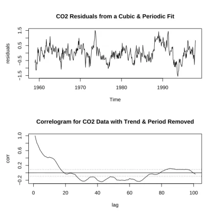
CO2Example revisited ... We saw in the previous section how to remove the trend
in the CO2 data by fitting a cubic polynomial to the data. However, the residuals from that model still show a strong periodic effect. We can fit a model to the data to account for the periodic effect and to account for the trend by combining models (1) with the cubic fit. In R, we can use the code:
fac = gl(12,1,length=468,
label=c("jan","feb","march","april","may","june","july","aug","sept","oct","nov","dec")) ftper = lm(co2~fac+t+I(t^2)+I(t^3))
summary(ftper)
co2acfper=acf(ftper$residuals, lag.max=100, type="correlation") par(mfrow=c(2,1))
0 20 40 60 80 100 120
24
26
28
Fit with Indicator Variables
t
recdat
0 20 40 60 80 100 120
24
26
28
Fit with Periodic Function
t
recdat
Figure 9: Recife Monthly Temperature Data with the seasonality fitted by the model with indicator variables (1) in the top frame and fitted using the periodic regression function (2) in the bottom frame.
Residuals from Periodic Fit to Recife Data
Month
Residuals
0 20 40 60 80 100 120
−1.0
0.0
1.0
2.0
0 10 20 30 40
−0.2
0.2
0.6
1.0
Lag
ACF
Correlogram for Seasonally Adjusted Recife Air Temp. Data
Figure 10: Periodic Fit: Seasonally adjusted data (top frame) and the correlogram (bottom frame) for the Average monthly air temperatures at Recife, Brazil between 1953 and 1962.
CO2 Residuals from a Cubic & Periodic Fit
Time
residuals
1960 1970 1980 1990
−1.5
−0.5
0.5
1.5
0 20 40 60 80 100
−0.2
0.2
0.6
1.0
Correlogram for CO2 Data with Trend & Period Removed
lag
corr
Figure 11: Top Frame: Residuals for CO2 data versus time from a fit that extracts the seasonal component as well as the cubic trend. Bottom Frame: Shows the corresponding correlogram from the residuals.
plot(co2acfper$acf, type=’l’,
main=’Correlogram for CO2 Data with Trend & Period Removed’,xlab=’Lag’,ylab=’corr’) abline(h=0)
abline(h=1.96/sqrt(length(co2))) abline(h=-1.96/sqrt(length(co2)))
This R code produces the plots shown in Figure 11. From the correlogram it appears that the autocorrelations for the CO2 are positive for successive months up to about 16 months apart.
5
Tests for Randomness
With many time series, a trend or seasonal pattern may be evident from the time plot indicating that the series is not random. The lack of randomness may be evident by noting short term autocorrelation. For instance, if the time series alternates up and down about the mean in successive values, then r1, the first autocorrelation will be
negative. On the other hand, if an observation above the mean tends to be followed by several other observations that are above the mean, then the autocorrelations for lags k wherek is small tend to be positive (or, vice-versa, if an observation below the
0 20 40 60 80 100
−2
−1
0
1
2
t
0 20 40 60 80 100
−2
−1
0
1
2
3
t
0 20 40 60 80 100
−2
−1
0
1
2
t
0 20 40 60 80 100
−3
−1
0
1
2
3
t
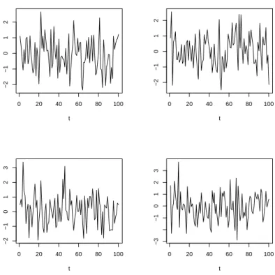
Figure 12: Time plots of four random time series with a standard normal distribution. mean tends to be followed by successive observations that are also below the mean is an indication of positive autocorrelations for small number of lags). If a time series exhibits these type of correlations, then the series is not completely random. One of the goals of time series analysis is to model this sort of autocorrelation. However, before pursuing this more complicated modeling, it would be useful to know if the series is completely random or not. In other words, are the observations independent with the same distribution?
Definition: A time series is random if it consists of independent values from the
same distribution.
Figure 12 shows four examples of random time series that were simulated in R using the code:
# Plot 4 random time series of white noise layout(mat=matrix(1:4, 2, 2, byrow=FALSE))
plot(1:100,rnorm(100,0,1),type=’l’,ylab=’’,xlab=’t’) plot(1:100,rnorm(100,0,1),type=’l’,ylab=’’,xlab=’t’) plot(1:100,rnorm(100,0,1),type=’l’,ylab=’’,xlab=’t’) plot(1:100,rnorm(100,0,1),type=’l’,ylab=’’,xlab=’t’)
This R code generates random time series from a standard normal distribution. There exist some well-known nonparametric tests for randomness in a time series:
1. Runs Test: This is an intuitively simple nonparametric test. First compute the median of the time series. Next, replace each numerical value in the series by a 1 if it is above the median and a 0 if it is below the median. If the data is truly random, then the sequence of zeros and ones will be random. Next, count the “runs”. A run is simply a sequence of all one’s or all zeros in the series. For instance, the series
1 2 3 4 5 6 7 8 9 10
has median equal to 5.5. If we replace the data by ones and zeros as described above we get
0 0 0 0 0 1 1 1 1 1,
and this sequence has M = 2 runs. In this case our test statistic is M = 2 which happens to be the smallest possible value such a test statistic can obtain. On the other hand, the series
1 10 2 9 3 8 4 7 5 6
also has median equal to 5.5 and replacing the data by zeros and ones gives 0 1 0 1 0 1 0 1 0 1.
This series has M = 10 runs which is the maximum number possible for a sample size of n = 10. The exact distribution of M under the hypothesis of randomness has been computed and exactp-values can be computed. For large samples sizes (n >20), the sampling distribution ofM under the null hypothesis of randomness is approximately normal with mean
µM = 2r(n−r)/n+ 1,
and variance
σ2M = 2r(n−r)){2r(n−r)−n}/{n2(n−1)},
whereris the number of zeros. Thus, for largen, the hypothesis of randomness can be conducted by comparing a standardized value of M with the standard normal distribution.
2. The Sign Test. From the raw data y1, y2, . . . , yn, compute the differences y2−
y1, y3 −y2 and so on. Let P be the number of positive differences. For large
n (n > 20), the distribution of P under the null hypothesis of randomness is approximately normal with mean µp = m/2 and σp2 = (m+ 2)/12 where m is
the number of differences. Thus, if the observed value of P from your data is too extreme to be expected from this normal distribution, then the hypothesis of randomness is rejected.
Note that when using a normal approximation for the above test statistics, one can obtain more accurate results using acontinuity correction. The continuity correction is helpful because the sampling distributions of the above test statistics is discrete (e.g. the number of runs) but the normal distribution is continuous.
6
Time Series Models
Time series fall into the general field of Stochastic Processes which can be described as statistical phenomenon that evolve over time. One example we have already dis-cussed is the purely random process which consists of a sequence of random variables
z1, z2, . . . that are independent and have the same distribution.
6.1
The Random Walk
Another type of process is theRandom Walk. Supposez1, z2, . . . ,is a random process
with mean µand variance σ2. Then we can define a new process
yt=yt−1+zt, for t >1,
andy1 =z1. This is a non-stationary process since the meanE[yt] =tµchanges with
t. A random walk is a stochastic process where the next observation depends on the current value plus a random error. One can consider a simple example of a random walk literally in terms of a walk: suppose a person begins at zero and will step to the right or left with probabilitypor 1−p. Then for the second step, the person will once again step to the right or left with probability por 1−p. Then, aftern steps, where the person ends up at the next step depends on where they are currently standing plus the random left or right step. Note that if we form the first difference
∇yt=yt−yt−1 =zt
gives a purely random process.
6.2
Moving Average Processes
Once again, let z1, z2, . . . , denote a purely random process with mean zero and
vari-ance σ2. Then we can define what is known as a Moving Average process of order q
by
yt=β0zt+β1zt−1 +· · ·+βqzt−q, (3)
where β0, β1, . . . , βq are constants. The moving average process of order q is denoted
by MA(q). One can show that the moving average process is a stationary process and that the serial correlation at lags greater than q are zero. For a MA(1) process with
β0 = 1, the autocorrelation function at lag k can be shown to be
ρ(k) =
1 if k = 0
β1/(1 +β12) if k = 1
0 otherwise.
Moving average processes can be useful for modeling series that are affected by a variety of unpredictable events where the effect of these events have an immediate effect as well as possible longer term effects.
Note that the mean of a moving average series is zero since the zt in (3) have mean
zero. We can add a constantµto (3) to make it a meanµseries which will not change the autocorrelation function.
6.3
Autoregressive Processes
Once again, let z1, z2, . . . , be a purely random process with mean zero and variance
σ2. Then we can define anautoregression process y
t of order p, written AR(p), if
yt =α1yt−1+· · ·+αpyt−p+zt. (4)
This looks just like a multiple regression model, except that the regressors are just the past values of the series. Autoregressive series are stationary processes provided the variance of the terms are finite and this will depend on the value of the α’s. Autoregressive processes have been used to model time series where the present value depends linearly on the immediate past values as well as a random error.
The special case of p= 1, the first-order process, is also known as aMarkov process. Forp= 1, we can write the process as
yt=αyt−1+zt.
By successive substitution, one can easily show that the first-order process can be written
yt=zt+αzt−1+α2zt−2+· · ·,
provided −1 < α < 1. Writing the AR(1) process in this form indicates that it is a special case of an infinite-order moving average process.
The autocorrelation function for the first order process is
ρ(k) =αk, k = 0,1,2, . . . .
The thing to note here is that terms in the AR(1) series are all correlated with each other, but the correlation drops off as the lag k increases. The correlation will drop off faster the larger the value of k.
For autoregressive series of high order p, determining the autocorrelation function is difficult. One must simultaneously solve a system of equations called theYule-Walker equations.
6.4
ARMA Models
We can combine the moving average (MA) and the autoregressive models (AR) pro-cesses to form a mixed autoregressive/moving average process as follows:
which is formed by a MA(q) and an AR(p) process. The term used for such processes is an ARMA process of order (p, q). An advantage of using an ARMA process to model time series data is that an ARMA may adequately model a time series with fewer parameters than using only an MA process or an AR process. One of the fundamental goals of statistical modeling is to use the simplest model possible that still explains the data – this is known as the principal of parsimony.
6.5
ARIMA Processes
Most time series in their raw form are not stationary. If the time series exhibits a trend, then, as we have seen, we can eliminate the trend using differencing ∇kyt. If
the differenced model is stationary, then we can fit an ARMA model to it instead of the original non-stationary model. We simply replace yt in (5) by ∇kyt. Such a
model is then called an autoregressive integrated moving average (ARIMA) model. The word “integrated” comes from the fact that the stationary model that was fitted based on the differenced data has to be summed (or “integrated”) to provide a model for the data in its original form. Often, a single difference k = 1 will suffice to yield a stationary series. The notation for an ARIMA process of order pfor the AR part, order q for the MA part and differences d is denoted ARIMA(p, d, q).
7
Fitting Times Series Models
Now that we have introduced the MA(q), the AR(p), and ARMA(p, q), processes, we now turn to statistical issues of estimating these models. The correlogram that we introduced earlier can greatly aid in determining the appropriate type of model for time series data. For instance, recall that for an MA(q) process, the correlations drop off to zero for lags bigger than q. Thus, if the correlogram shows a value of r1
significantly larger than zero but that the subsequent values of rk, k > 1 are “close”
to zero, then this indicates an MA(1) process. If, on the other hand, the values of
r1, r2, r3, . . . ,are decreasing exponentially, then that is suggestive of an AR(1) process.
Sample data will not yield correlograms that fit neatly into either of these two cases and hence it is very difficult to interpret correlograms.
7.1
Estimating the Mean of a Time Series
In usual statistical practice, one of the fundamental problems is to estimate the mean of a distribution. In time series analysis, the problem of estimating the mean of the series is complicated due to the serial correlations. First of all, if we have not removed the systematic parts of a time series, then the mean can be misleading.
Of course, the natural estimate of the mean is simply the sample mean: ¯
y =
n ∑ i=1
For independent observations, the variance of the sample mean isσ2/n, but for time series data, we do not generally have independent data. For instance, for an AR(1) process with parameter α, the variance of ¯y is approximately
var(¯y) = σ
2
n
(1 +α) (1−α).
Thus, for α > 0, the variance of ¯y is larger than that of independent observations. Nonetheless, one can show that under fairly normal circumstances that the sample mean will take value closer to the true population mean as the sample size increases provided the serial correlations go to zero as the lags increase.
7.2
Fitting an Autoregressive Model
For autoregressive time series, the two main questions of interest are what is the order
p of the process and how can we estimate the parameters of the process? An AR(p) process with mean µcan be written
yt−µ=α1(yt−1 −µ) +· · ·+αp(yt−p−µ) +zt.
Least-squares estimation of the parameters are found by minimizing
n ∑ t=p+1
[yt−µ−α1(yt−1−µ)− · · · −αp(yt−p−µ)]2
with respect to the parameters µ and the α’s. If the zt are normal, then the least
square estimators coincide with the maximum likelihood estimators.
For a first-order AR(1) process, it turns out that the first serial correlation r1 is
approximately equal to the least-squares estimator of α: ˆ
α1 ≈r1.
Furthermore, we can use ¯y to estimate µ, the mean of the process.
There are various methods for determining the least-squares estimators for higher order AR(p) models. A simple approximate method is to estimate µ by ¯y and then treat the data as if it were a multiple regression model
yt−y¯=α1(yt−1−y¯) +· · ·+αp(yt−p−y¯).
7.3
Partial Autocorrelation Function
Determining the orderpof an AR process is difficult. Part of the difficulty is that the correlogram for AR(p) processes for higher orders p can have complicated behaviors (e.g. a mixture of damped exponential and sinusoidal functions). A common tool for this problem is to estimate what is known as the partial autocorrelation function
Year
Feet
1880 1900 1920 1940 1960
576 577 578 579 580 581 582
Lake Huron Water Level Data
0 5 10 15 20 25
0.0
0.4
0.8
Correlogram for Lake Huron Data
Lag
ACF
5 10 15
−0.2
0.2
0.6
Lag
Partial ACF
Series LakeHuron
Figure 13: Lake Huron water level data. Top frame is the raw data, second frame is the correlogram, and the bottom frame is the partial autocorrelation function. (PACF). The last coefficient αp in an AR(p) model measures the excess correlation
at lag pthat is not accounted for by an AR(p−1) model.
In order to get a plot for the PACF, one fits AR(k) models for k = 1,2, etc. The highest order coefficients in each of these models are plotted againstk fork= 1,2, . . .
and this constitutes the PACF plot. Partial autocorrelations outside the range±2/√n
are deemed significant at the 5% significance level. If the time series data is from an AR(p) model, then the autocorrelations should drop to zero at lag p; for a given sample, the partial autocorrelations should fail to be significant for values beyond p. We now illustrate with an example.
Example. Annual measurements of the level, in feet, of Lake Huron 1875-1972 were
measured. The raw data for this data set are plotted in the top frame of Figure 13. This plot does not show any evident periodic behavior, nor does it indicate a notable trend. The second frame of Figure 13 shows the correlogram for the data showing significant autocorrelations up to lag 10. The bottom plot in Figure 13 is a partial autocorrelation plot for the Lake Huron data. In R, the partial autocorrelation plot can be generated using the function “pacf”. Note that the first two partial autocor-relations appear to be statistically significant which is indicative of an autoregressive model of order 2, AR(2). The R code for generating Figure 13 is as follows:
n = length(LakeHuron)
lhacf = acf(LakeHuron,lag.max=25, type=’correlation’) layout(mat=matrix(1:3, 3, 1, byrow=FALSE))
plot(LakeHuron, ylab = "Feet", xlab="Year",las = 1) title(main = "Lake Huron Water Level Data") # Plot correlogram
plot(lhacf$acf,type=’l’,main=’Correlogram for Lake Huron Data’,xlab=’Lag’,ylab=’ACF’) abline(h=0)
abline(h=1.96/sqrt(n),lty=’dotted’) abline(h=-1.96/sqrt(n),lty=’dotted’)
# Now plot the partial auto-correlation function. pacf(LakeHuron)
We can use R to fit the AR(2) model using the function “ARIMA” using the following R command:
fit = arima(LakeHuron, order = c(2,0,0))
The type of ARIMA model fit by R is determined by the “order” part of the command. In general, the syntax is “order = c(p, d, q),” where p is the order of the AR process,
d is the number of differences, and q is the order of the MA process. Note that if
d = 0 (as in the current example), then an ARMA process is fit to the data. To see the output from the ARIMA fit, simply type “fit” at the command prompt since “fit” is the name we have given to the ARIMA fit. The following output was generated in R:
Call:
arima(x = LakeHuron, order = c(2, 0, 0)) Coefficients:
ar1 ar2 intercept
1.0436 -0.2495 579.0473
s.e. 0.0983 0.1008 0.3319
sigma^2 estimated as 0.4788: log likelihood = -103.63, aic = 215.27
From this fit, the AR(2) model
yt−µ=α1(yt−1−µ) +αp(y2−µ) +zt,
was fit yielding ˆα1 = 1.0436 and ˆα2 =−0.2495 and ˆµ= 579.0473.
Akaike Information Criterion (AIC). In order to choose a model from several
competing other models, a popular criterion for making the decision is to use AIC. The AIC is used in a wide variety of settings, not just time series analysis. For a fitted ARMA time series of length n, the AIC is defined to be:
Residual Plot from the AR(2) Fit
year
residuals
1880 1900 1920 1940 1960
−1.5
0.0
1.5
Raw Data and Fitted Values
Year
Feet
1880 1900 1920 1940 1960 576
577 578 579 580 581 582
Figure 14: Lake Huron water level data. Top frame is the residual plot from fitting an AR(2) model and the second frame is a timeplot of the raw data along with the fitted values.
where ˆσ2
p,q is the residual error variance from the fitted model. The idea is to choose
the model with the smallest AIC value. Note that the AIC penalizes for additional model complexity with the addition of 2(p+q)/n. In the R output above, the AR(2) fitted model has an AIC of 215.27. Note that the AIC for fitting an AR(1) is 219.2, larger than the AIC for the AR(2) fit indicating that the AR(2) model is preferable in terms of AIC.
A plot of the residuals from the AR(2) is shown in Figure 14 in the top frame and the raw data (solid curve) and the fitted values from the AR(2) (dashed curve) are shown in the bottom frame of Figure 14.
7.4
Fitting a Moving Average Process
As with an autoregressive process, with a moving average process we would like to estimate the order q of the process as well as the parameters for the process. The simple method of regression used for AR processes will not work for MA processes. The least-squares estimators do not yield closed form solutions. Instead, iterative algorithms are needed. One possibility is to guess at some initial values for the parameters and compute the residual sum of squares. For instance, in a MA(1) model
the residuals are
zt=yt−µ−β1zt−1.
Note that this tth residual depends on the t−1 residual. After plugging in initial guesses forµand β1 (for instance, guess the value ¯y forµ), compute the residual sum
of squares∑z2
t. Next, do a grid search for values ofµandβ1 and find the values that
minimize the residual sum of squares. There exist algorithms in many time series software that are more efficient than the grid search.
The period of an MA process can be estimated fairly easily by simply inspecting the autocorrelation function – simply find the lag q after which the serial correlations do not differ significantly from zero.
7.5
Fitting an ARMA Process
Like MA processes, ARMA processes require iterative techniques to estimate the parameters. Exact maximum likelihood estimation is used primarily in practice. This requires more computation than the least-squares search procedure alluded to for the MA processes above, but this is no problem with current computing power.
8
Residual Analysis
Once a model (AR, MA, ARMA) is fit to the raw data (or the differenced data), one should check that the “correct” model has been specified. This is typically done using residual analysis as was the case for regression problems. If we have fit an AR(1) model yt=αyt−1+zt, obtaining an estimate ˆα, then the residual for an observation
is
et=yt−yˆt =yt−αyˆ t−1.
Perhaps the best way to evaluate the model via the residuals is to simply plot the residuals in a time plot and in a correlogram. Note that if the correct model has been fit, then the residual time plot should not show any structure nor should any of the serial correlations be significant different from zero.
There exists tests to determine if the residuals correspond to estimates of the random error in a time series model. One such test is the portmanteau lack-of-fit test:
Q=n
K ∑ i=1
e2i,
for some value of K usually taken to be in the range of 15 to 30. If the model is correctly specified, then Q follows a chi-squared distribution approximately with (K −p−q) degrees of freedom where p and q are the orders of the fitted ARMA process respectively. The chi-squared approximation is not very good for n < 100. There exist alternatives to this test (e.g. the Ljung-Box-Pierce statistic) in the hope of providing a better approximation.
Another popular test for residuals is theDurbin-Watsontest statistic which is defined as
V =
n ∑ i=2
(ei−ei−1)/
n ∑ i=1
e2i.
One can show thatV ≈2(1−r1), where r1 is the lag one autocorrelation. If the true
model has been specified and fit, then r1 ≈ 0 and in which case V ≈ 2. Thus, the
Durbin-Watson test is asymptotically equivalent to a test on the value of the lag-one autocorrelationr1 being zero.
As a general guide to the practice residual analysis in time series modeling (Chatfield 2004, page 69), it is recommended that one simply look at the first few residuals and the first seasonal residual (e.g. r12 for a monthly time series) to see if any are
significantly different from zero. Remember, if one is inspecting a correlogram with many serial correlations (say 20-40), it is not unusual to find one or two significant correlations by chance alone.
If the residual analysis indicates a problem with the fitted time series model, then alternative models should be considered. The model building process, as in multiple regression, often turns into an iterative process. One typically specifies a model. Then a software program is used to fit the model and produce residual plots (and tests). If there appear to be problems with the model, then the original model needs to be reformulated. In the process of model building, it is possible to arrive at several competing models. In such cases, a model choice can be aided by the use of model-selection statistics such as Akaike’s Information Criterion (AIC). The idea of these statistics is to balance a good fitting model and a parsimonious model.
9
Frequency Domain Analysis
We have been discussing thetime domainanalysis of time series data which is basically the analysis of the raw data. Another approach to time series analysis is thefrequency domain. The analogue to the autocovariance function in the frequency domain is the spectral density function which is a natural way of studying the frequency properties of a time series. The frequency domain analysis has been found to be particularly useful in fields such as geophysics and meteorology.
The spectral approach to time series is useful in determining how much of the vari-ability in the time series is due to cycles of different lengths. The idea is to represent the time series in terms of the trigonometric sine and cosine functions which are periodic. A time series can be expressed as a sum of trigonometric functions with differing frequencies. One of the primary theoretical results for the frequency domain analysis shows a one-to-one correspondence between an autocovariance function and the spectral density function.
References.
Keeling, C. D. and Whorf, T. P., Scripps Institution of Oceanography (SIO), Univer-sity of California, La Jolla, California USA 92093-0220.
Kendall, M. G., Stuart, A. and Ord, J. K. (1983),The Advanced Theory of Statistics, Volume 3, 4th Edition, London: Griffin.