Study on Color Coding for X-ray Imagery for
Security Control
D.M.Annie Brighty Christilin1,
Dept. Of Computer Science, Ms University, Tamilnadu
Synopsis: This paper discusses implementation of color-coding schemes for detecting a variety of potential threat objects in x-ray imagery of carry-on luggage by using color effectively. Using colors effectively refers to utilizing colors in a proper way to provide a more attractive and pleasing images to the screener’s eye, which will help them to detect the threat more easily without much strain. This capability will increase the efficiency of luggage inspection by decreasing the time required to perform inspection and reduce the probability of errors due to fatigue.
This work considers various aspects, which aid in effective handling of colors for image display. An extensive study of factors affecting color usage is performed and based on this study a final model is implemented. The focus is towards physiological and psychological factors, which govern color perception. Many basic questions such as how many colors should be used, which color spaces are to be used and what colors to choose are addressed in this study. Finally, an online survey is performed to determine how effective color-coding is in comparison to grayscale age display. The results are tabulated and a performance study is completed.
Keywords: study of factors affecting color, physiological and psychological factors
I. INTRODUCTION
A. Image Processing
A technique in which the data from an image are digitized and various mathematical operations are applied to the data, generally with a digital computer, in order to create an enhanced image that is more useful or pleasing to a human observer, or to perform some of the interpretation and recognition tasks usually performed by humans. Also known as picture processing. Manipulating data in the form of an image through several possible techniques. An image is usually interpreted as a two-dimensional array of brightness values, and is most familiarly represented by such patterns as those of a photographic print, slide, television screen, or movie screen. An image can be processed optically or digitally with a computer. To digitally process an image, it is first necessary to reduce the image to a series of numbers that can be manipulated by the computer. Each number representing the brightness value of the image at a particular location is called a picture element, or pixel. A typical digitized image may have 512 × 512 or roughly 250,000 pixels, although much larger images are becoming common. Once the image has been digitized, there are three basic operations that can be performed on it in the computer. For a point operation, a pixel value in the output image depends on a single pixel value in the input image. For local operations, several neighboring pixels in the input image determine the value of an output image pixel. In a global operation, all of the input image pixels contribute to an output image pixel value. These operations, taken singly or in combination, are the means by which the image is enhanced, restored, or compressed. Image processing is an active area of research in such diverse fields as medicine, astronomy, microscopy, seismology, defense, industrial quality control, and the publication and entertainment industries. The concept of an image has expanded to include three-dimensional data sets (volume images), and even four-dimensional volume-time data sets. An example of the latter is a volume image of a beating heart, obtainable with x-ray computed tomography (CT). CT, PET, single-photon emission computed tomography (SPECT), MRI, ultrasound, SAR, co focal microscopy, scanning tunneling microscopy, atomic force microscopy, and other modalities have been developed to provide digitized images directly. Digital images are widely available from the Internet, CD-ROMs, and inexpensive charge-coupled-device (CCD) cameras, scanners, and frame grabbers. Software for manipulating images is also widely available.
B. X-ray to color conversion for Security Control
problems are compounded by considerations of a screener constantly gazing at a screen and seeing almost the same type of objects over and over again.The purpose of this research is to enhance the x-ray image obtained form a luggage inspection to provide better differentiation of the scene components. The idea is to assist the operator in identifying items requiring hand inspection, by focusing his/her attention on regions whose image characteristics indicate the potential for containing a threat object. This capability will increase the efficiency of the operation of luggage inspection by decreasing the time required to perform inspection and reducing the probability of errors due to fatigue. By automating or semi-automating the process of inspection at carry-on luggage stations, an increase in speed and customer convenience will accrue. However, this increase in speed should not come at the expense of an increase in the rate of false alarms. This is why it is very important to consider speed of inspection, accuracy of detection of threat, and lower false alarm rates all simultaneously when designing an efficient system or implementing a new algorithm. This can be achieved in various ways, one of which is by using effective color-coding schemes. The advantages of using color over grayscale display are , Color is very commonly used in various applications including visualization, graphical user interfaces, imaging, internet browsers and many other computer related applications. Color shapes the perception, interpretation and memory of everything visualized. “Color can be a powerful tool to improve the usefulness of an information display in a wide variety of areas if used properly. Conversely, the inappropriate use of color can seriously reduce the functionality of a display system. Color is a major component in GUI’s. Appropriate color use can aid user memory and facilitate the formation of effective mental models. The effective use of color can be a powerful tool. However, ineffective use of color can degrade an application's performance and lessen user satisfaction.In order to create an expert system with effective colors the following constraints has to be included. They are effective colors chosen, In order to provide good differentiation between different objects what kind of colors can be displayed, The use of different color space , The factors which are used to determine target element color relative to the non-target elements.
C. Objective
The main objective of this thesis is directed towards physiological and psychological factors, which govern color perception. These factors are studied carefully and various guidelines are derived for developing an expert system. Color is used in a qualitative rather than a quantitative fashion, that is, to show that one item is different form another, rather than to display the relationship of degree. In this thesis various color space is used to make analysis on security control system.
The thesis is organized as the Literature Survey describes the background study related to this thesis. The System Specification describes the software requirements and specification. The Study on Color Factors briefly gives some information regarding color factors needed for the system study. The experimental a results and analysis drawn in the Conclusion and Future Enhancement and the conclusion and future enhancement followed by the References.
II. LITERATURE SURVEY
Colors are of philosophical interest for two kinds of reason [1]. One is that colors comprise such a large and important portion of our social, personal and epistemological lives and so a philosophical account of our concepts of color is highly desirable. The second reason is that trying to fit colors into accounts of metaphysics, epistemology and science leads to philosophical problems that are intriguing and hard to resolve. Not surprisingly, these two kinds of reasons are related. The fact that colors are so significant in their own right, makes more pressing the philosophical problems of fitting them into more general metaphysical and epistemological frameworks.
equipment). How then does experiential information or advice have value? One often feels set adrift without guidance in the design of multimedia, and it is comforting to have guidelines— any guidelines—to justify decisions. A convergence of opinion is a good place to start when facts are scarce. At the same time, one must always be careful not to confuse a collective opinion with fact; such guidelines may in fact conspire to constrict creativity and promote the development of products which, over time, become hackneyed and trite. With these cautions in mind, this paper examines some psychophysical aspects of color perception and then critically examines the advice available in non-empirical literature.
A fracture is a crack or break in the bone. This can be easily detected by taking an X-ray in that area. But sometimes these images lack sufficient details needed to diagnose. So these images can be enhanced by adding the color map[3] . To add the RGB color to the Destination image, the reference image ‘mood’ color is taken. Although adding color to the gray scale has no much impact, but the human labor is much reduced. After adding color to the original image, it adds up details to the target image. In the second part of this paper, Bit-Plane slicing method is used to extract the details of a Colored X-Ray Image. This method produces different bit level images. In this paper Bit Level 6 is evaluated for RGB colors of the Original image and it is evaluated with the Bit level 6 of the original image. The result shows that the colored Ray image Bit level6 yield more details than the Bit level6 of gray scale X-Ray image.
A fracture is a crack or break in the bone. This can be easily detected by taking an X-ray in that area. But some times these images lack sufficient brightness. So these images can be enhanced by adding the color map. In resultant image, only the chromatic information is changed. Instead of adding all the RGB color to the Destination image, the reference image ‘mood’ color is taken. Although adding color to the gray scale has no much impact, but the human labor is much reduced. After adding color to the original image, it adds up details to the target image. In this paper[4] , first the image is preprocessed, and then the colorizing step is done.
In the survey the paper [5] introduce a general technique for coloring the gray-scale images into the color images with and without texture synthesis. The general problem of adding chromatic values to a gray-scale image has no exact solution, the current approach attempts to provide a method to minimize the amount of human labor required for this task, rather than choosing RGB colors to individual components, we convert the entire color to the gray-scale image by matching luminance and texture information between the images. We choose only chromatic information and retain the original luminance values of the gray-scale image. Further, the procedure is enhanced by allowing the user to match areas of the two images with rectangular samples. We show that this simple technique can be successfully applied to a variety of images, provided that texture and luminance are sufficiently distinct. The images generated the potential utility of our technique in a diverse set of application domains.
In order to improve aviation security [6] , many airports apply Threat Image Projection (TIP) and computer-based X-ray image interpretation training (CBT). One difference between TIP and CBT X-ray images is the algorithm used to merge virtual threat items into X-ray images of passenger bags, resulting in different color nuances. In this study, we tested the influence of merging algorithms on threat object detection performance, reaction time and confidence rating of 12 airport security screeners. The image merging algorithms of the individually adaptive CBT X-Ray Tutor were used. We have found that the hit rate was higher for TIP images compared to CBT images. Accordingly, the mean of confidence ratings was increased for TIP images. The reaction times tended to be shorter for TIP images. The results of our study indicate that the CBT merging algorithm used in this study is more realistic than the tested TIP image merging algorithm.
The color fundamental process followed by the human brain in perceiving color is a physiopsychological phenomenon that is not yet fully understood, the physical nature of color can be expressed on a formal basis supported by experimental and theoretical results. Basically, the colors we perceive in an object are determined by the nature of the light reflected from the object. Due to the structure of human eye, all colors are seen as variable combinations of the three so-called Primary colors Red, Green and Blue (RGB). The characteristics generally used to distinguish one color from another are brightness, hue and saturation.
Brightness refers to intensity. Hue is an attribute associated with the dominant wavelength in a mixture of light waves. Saturation refers to relative purity or the amount of white light mixed with a hue. The Hue and saturation taken together are called chromaticity, and therefore a color may be characterized by its brightness and chromaticity. The amounts of RGB needed to form any given color are called the tri-stimulus value. The chromaticity is useful for color mixing because a straight line segment joining any two points, and define all the different color variations that can be obtained by combining these two colors additively.
in hue or saturation, the problem of coloring gray-scale images has no correct solution. Due to these ambiguities, human interaction usually plays a large role in the coloring process. Here, the gray-scale image is represented by only the luminance values that can be matched between the two images. Because a single luminance value could represent entirely different parts of an image, the remaining values within the pixel’s neighborhood are used to guide the matching process. Once a pixel is matched, the color information is transferred but the original luminance value is retained. In difficult cases, a few sample blocks can be used to aid the matching process between the source (color) and the target (gray-scale) image. After color is transferred between the source and the target sample blocks, the final colors are assigned to each pixel in the gray-scale image by matching each gray-scale image pixel to a pixel in the target sample blocks using the distance metric. Thus, each pixel match is determined by matching it only to other pixels within the same image. We have found that this simple procedure works well for a wide range of image types.
Even in the case of pseudo coloring, where the mapping of luminance values to color values is automatic, the choice of the color map is commonly determined by human decision. However, a few web articles describe software in which humans must meticulously hand-color each of the individual image regions. For example, one software package is described in which the image is first polygonal zed so the user can color individual components much like a coloring book. Then the system tracks polygons between frames and transfers colors in order to reduce the number of frames that the user must color manually.
Alternatively, photographs can be colorized using photo editing software to manually or automatically select components of a scene. The area is then painted over with a color selected from a palette using a low opacity level. There also exist a number of applications for the use of color in information visualization. For example, describe a simple approach for pseudo coloring gray-scale images of luggage acquired by X-ray equipment at an airport. The method uses separate transformations for each color channel which results in coloring objects with the density of explosives in bright orange and other objects with a blue tone. Further, color can be added to a range of scientific images for illustrative and educational purposes.
An image enhancement technique describes in because it can be used to enhance the detect ability of detail within the image. In its most basic form, pseudo coloring is a transformation T, such that, c(x,y) = T(f(x,y)) where f(x,y) is the original gray-scale image and c(x,y) is the resulting color vector for the RGB. A simplified example of this method is the application of an arbitrary color map to the data where a single, global color vector is assigned to each gray-scale value. The strength of this approach is that it does not alter the information content of the original data since no extra information is introduced. However, by using a color map which does not increase monotonically in luminance, pseudo colored images may introduce perceptual distortions. Studies have found a strong correlation of the perceived “naturalness” of face images and the degree to which the luminance values increase monotonically in the color map.
Colorization technique is to exploits textural information. Most of the work examines the luminance values in the neighborhood of each pixel in the target image and adds to its luminance the chromatic information of a pixel from a source image with best neighborhoods matching.
III. STUDY ON COLOR FACTORS
A. Factors
Color is a particular sensation created in the brain, caused when light radiation of a certain wavelength reaches our eyes. This definition is built up from two parts, which are quite different. The first is of a psychological nature. This portion deals with the way the sensation of color is processed by the mind. The second one is merely the eye’s detection of physical radiant energy. Therefore, color is in fact a psychophysical phenomenon, inter-relating both psychological and physical processes.
1) Physiological Factors: Color is determined by an interaction among three photopigments; the perceived color is a mixture of the relative responses of the red, green, and blue photopigments, in much the same way as a television camera creates color [3]. Given a dramatic imbalance among the percentages of cells containing red (approximately 64%), green (approximately 32%), and blue (approximately 2%) photopigments, it is clear that the perception of color is both highly specialized and physiologically biased (data from Murch, 1988).Color results from the interaction of light with the nervous system. There are several components that affect color perception, including the eye lens, the retina, and a color processing unit along the optic nerve. These areas are discussed in the following sections.
the lens is constantly changing shape and the eye becomes tired. A related effect is called chromostereopsis, here pure colors located at the same distance from the eye appear to be at different distances, e.g. reds appear closer and blues more distant. Sometimes pure blues focus in front of the retina and so appear unfocused. At night, a deep blue sign may appear fuzzy while other colors appear sharp. The lens also absorbs light about twice as much in the blue region as in the red region.As people age the lens yellows, which means it absorbs more in the shorter wavelengths. Therefore, the result is that people are more sensitive to longer 10 wavelengths (yellows and oranges) than they are to shorter wavelengths (cyan to blue) and these increases with age. The fluid between the lens and the retina also absorb light and this effect increases as people age, so the older people get the less sensitive they are to light in general (the apparent brightness level decreases) and especially the sensitivity to blue decreases.
b) Retina: The retina contains the photoreceptors that absorb photons and transmit chemical signals to the brain. There are two types: rods, which are night-vision receptors and have no color dependency, and cones, which have color sensitivity and require a higher level of light intensity than the rods.
Figure1. Spectral sensitivities of the three classes of photoreceptors in the retina.
As shown in Figure1, there are three types of photo-pigments in the cones; "blue" with a maximum sensitivity at 430 nm, "green" with a maximum sensitivity at 530 nm, and "red" at 560 nm. (This wavelength actually corresponds to yellow). Light at a single wavelength will partially activate all three types of cones, e.g. at a wavelength of 470 nm, blue is strongest plus some red and green components. The percentage of cones is not equal but is as follows: blue (4%), green (32%), and red (64%). In addition, the cones are differentially distributed in the retina. The center of the retina has a dense concentration of cones but no rods while the periphery has many rods but few cones. The color distribution is also asymmetrical. The center of the retina is primarily green cones, surrounded by red-yellow cones, with the blue cones being mainly on the periphery. The center of the retina has no blue cones. Objects are seen by edge detection, where an edge can be created by a difference in color or brightness or both. Edges formed by color differences alone, with no brightness differences, appear fuzzy and unfocused, so changes in brightness should be added to get sharp edges.
Photoreceptor adjusts their sensitivity to the overall light level, e.g. going into or out of a dark room requires some adjustment time. There is also a required minimum intensity level for the photoreceptors to respond. This minimum varies with wavelength with the highest sensitivity in the center of the spectrum. Therefore, blues and reds must have a higher intensity than greens or yellows in order to be perceived.
c) Brain: From the retina, the optic nerve (actually a collection of nerves) connects to the brain but before it reaches the brain, there is a color-processing unit, called the lateral geniculate body. This recombines the RGB color information into three new channels s follows:
R-G gives red or green color perception
R+G gives the perception of brightness and yields yellow (Y) Y-B gives yellow or blue color perception
d) Color blindness: About nine percent of the population has some kind of color perception problem. The most common is red-green deficiency, which can arise from a deficiency of either the red or the red-green photo-pigments. These people have difficulty distinguishing any color that is dependent upon the red : green ratio.
e) General guidelines based on physiology: These are some of the guidelines drawn from Murch [5] principles based on physiology. Avoid the simultaneous display of highly saturated, spectrally extreme colors. This causes the lens to rapidly change shape and thus tires the eyes. Desaturate the colors or else use colors that are close together in the spectrum. Pure blue should be avoided for text, thin lines, and small shapes. Since there are no blue cones in the center of the retina, these are difficult to see. But blue makes an excellent background color, e.g. for a computer display it tends to blur the raster lines. i) Avoid adjacent colors that differ only in the amount of blue. Since blue does not contribute to brightness, this creates fuzzy
edges.
ii) Older operators need higher brightness levels to distinguish colors.
iii) Colors change in appearance as the ambient light level changes.
iv) The magnitude of a detectable change in color varies across the spectrum.
v) It is difficult to focus upon edges created by color alone.
vi) Avoid red and green in the periphery of large displays.
vii) Opponent colors go well together.
viii) For color-deficient observers, avoid single color distinctions.Color selection guidelines based on human color vision ix) Avoid adjacent areas of strong blue and strong red in a display to prevent unwanted depth effects (colors appearing to lie in
different planes).
x) Never use the blue channel alone for fine detail such as text or graphics. Do not use, for example, blue text on a black background or yellow text on a white background.
xi) Areas of strong color and high contrast can produce afterimages when the viewer looks away from the screen, resulting in
visual stress from prolonged viewing.
xii) Do not use hue alone to encode information in applications where serious consequences might ensue if a color-deficient
user were to make an incorrect selection.
B. Color and Combination
As well understood as the physiology of color is, this factor provides little explanation for our opinions of color and color combinations. At the very least, opinions of color are learned and highly associative. For example, as children, we often had a “favorite color” and we liked everything: clothes, toys, books that matched our preference. Over time, we learned a variety of color schemes and in most cases, our tastes become more refined. But even as adults, we are influenced by fashion, and may still associate our more sophisticated sense of color with increasingly more sophisticated emotions, desires, or impressions. For example, even a cursory examination of changes in interior design from the 1950s to the present reveals a dramatic evolution of what was considered warm or even comfortable color combinations. A lively debate still rages about the psychology of color, and various claims are made for using color in the environment to stimulate, calm, or enhance the performance of individuals.
Color psychology is a vast field in which color-constancy, simultaneous contrast, the effects of various backgrounds on color perceptions, and so on, are examined, and competing explanations are debated.
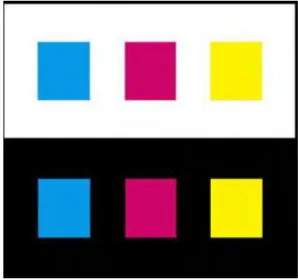
Figure2.Colors look darker and smaller against a white background and lighter and larger against black.
Adapted Colored surroundings can cause a colored region to appear tinged with the complementary hue of the surround, an effect known as chromatic induction. This relativity of color can be used to enrich a display, and it has many applications in art and design. Nevertheless, it can also cause the viewer to see colors differently from the way the designer intended them. Chromatic induction can make the same colors look different (Figure 4) or different colors look the same (Figure 5). With recognizable objects, judgments about the color are made in the present image according to memories that have been amassed from our experience of looking at similar objects.
Studies have revealed a discrepancy between memory colors and the colors of actual objects and significant changes in saturation may occur in some cases.
Figure 3.(a) Simultaneous contrast can make the same colors look different. (b)Simultaneous contrast can make different colors look the same.
Two objects of the same color may appear markedly different in color depending on background color. The ineffective use of colors can cause vibrations and shadows; images that distract the user and may cause eye strain.
The proper use of color communicates facts and ideas more quickly and aesthetically to the user. Color can also help develop workable, efficient mental models if simplicity, consistency, clarity, and language of color are followed [9,6].
1) Simplicity: There is an inherent simplicity in color, which should be used when developing the design. The four physiologically primary colors are red, green, yellow and blue. These colors are easy to learn and remember.A color scheme should be simple; according to Miller the magic number for short term memory is seven plus or minus two (7 ± 2) [5]. When using color in interfaces the number of colors should not exceed five plus or minus two (5 ± 2) . Limit the palette per screen to what the eye can actually keep track of at one glance, usually about six colors depending on the complexity of the screen design . The background color affects the effectiveness of the other colors. Pick an effective background color and use only about five colors. The number of colors on the screen should be limited accordingly. If the user is overwhelmed or confused by too many colors vying for his attention, he is unlikely to develop an effective mental model.
[image:8.612.232.381.87.227.2]interface. There are physiological aspects that hinder consistency in the use of color. Various shades of the same color should be avoided for different concepts and ideas. This is especially true for the blues. Different shades of blue are very difficult to distinguish and may not be recognized as different by the user. If the concept is different, use a different color. Avoid using colors that appear differently due to variation in background color.
3) Clarity: Clarity is also an important guideline for using color. Experiments have shown that the search time for finding an item is decreased if the color of the item is known ahead of time, and if the color only applies to that item. Standardized interface colors should be established and used across the development. The clear, concise use of color can help users find items more quickly and efficiently.
4) Color selection guidelines based on color perception Guidelines drawn from principles based on psychology are:
1) Surrounding colors, field size, and viewing conditions can all change the appearance of colors.
2) Where accurate visual judgment of a color is necessary, the surrounding should be a neutral mid-gray to avoid unwanted perceptual color changes.
3) Color can described more meaningfully in terms of the perceptual dimensions of lightness, hue, and colorfulness than in terms
of device signals. C. Selection of Color Model
Several color models are organized into two basic divisions. These divisions are perceptually based models and display based models. As the names suggest, the first is organized similar to the way color is perceived, and the second is based on the characteristics of a display device.
1) Perceptually based models: HSV (hue, saturation, and value) and HLS (hue, light, and saturation) are two perceptually based models Figure 4(a, b). Hue is the spectral wavelength composition of color that produces the colors seen by the human eye, such as orange, blue, etc. Saturation (chroma) is the relative purity of the color on a scale from gray to the most vibrant tone of the particular color. Value is the strength or darkness of the color.Lightness, also referred to as brightness, refers to the amount of light energy creating the color. The HSV system is based on the Munsell color system used by designers, artists and manufacturers]. HLS was developed at Tektronix in 1978 to provide a more perceptual model than the display-based model Tektronix was using at the time.
2) Display based models: The most common display-based models are RGB and YIQ/YUV. The RGB color model is composed of the primary colors Red, Green, and Blue. This system defines the color model that is used in most color CRT monitors and color raster graphics. They are considered the "additive primaries" since the colors are added together to produce the desired color. The RGB model uses the cartesian coordinate system as shown in Figure 5(a). Notice the diagonal from (0, 0, 0) black to (1, 1, 1) white, which represents the gray-scale. YIQ/YUV is used for TV broadcasting.
Figure5. (a) RGB color space (b) CMYK color space, Adapted from [11]
The International Commission on Illumination is a worldwide organization that developed the first version of the spectrally measured model known as CIE in 1931. CIE is a precise spectral measurement used to pinpoint colors and remove color ambiguity. The CIE model is physically based; therefore, it does not fit well into either the perceptually based or the display-based categories. All colors displayed on a computer must be translated into the RGB color space. Unfortunately, there is not a one-to-one mapping from the perceptually based models to the display-based. This fact can explain some of the difficulties encountered when recreating the right color for an interface screen. The exact shade is not always obtained. The CIE model allows translations from HSV to RGB.
a) Limitations of RGB model
i) The RGB color coordinates are device-dependent, so they won’t in general reproduce the same color from one display to another.
ii) The model isn’t perceptually uniform, meaning that one unit of coordinate distance doesn’t correspond to the same perceived
color difference in all regions of the color space.
iii) It’s difficult to relate this model to color appearance because its basis is device signals (drive voltages) and not display luminance values.
iv) The RGB cube doesn’t easily lend itself to perceptual tasks because there is no correspondence to the human dimensions of color perception (as described in the previous section).
b) Limitations of HSV and HLS:Although these models provide better approximations to the perceptual dimensions of color than the simple RGB model, they still have serious limitations:
i) They remain device-dependent because these models are defined directly in terms of the display RGB drive signals.
ii) None of the three axes is perceptually uniform, which makes it difficult to predict how adjusting the controls by a given amount will affect a color.
iii) The three axes are perceptually dependent. Therefore, a change in one component usually affects the appearance of the others. 3) General guidelines for color space: Guidelines drawn for usage of color space are:
a) RGB display signals are device-dependent, and the color they produce will generally differ from one display to another. b) When colors are to be rendered accurately, a calibrated display and gamma correction software should be used for best results. c) Use perceptual color models based on CIE uniform color spaces instead of the simplistic color models based on
device-dependent RGB signals should be used.
d) The RGB space does not correspond to the human color perception and does not separate the luminance component from the
chromatic ones. Thus, HSV space is preferred. HSV space is naturally intuitive and approximately, perceptual uniform. It is characterized by the coordinates of hue, saturation and value (brightness) based upon human color perception organization.
IV. SYSTEM IMPLEMENTATION A. Mathematical Function Based Color Coding
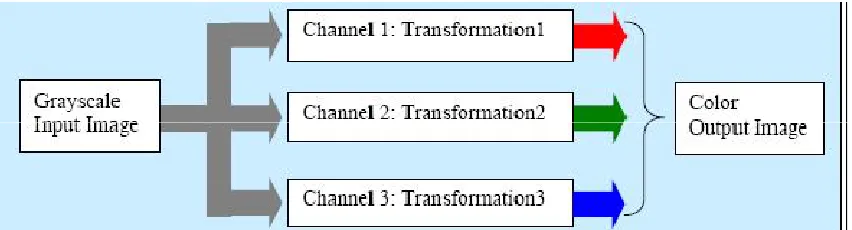
Figure 6.Functional block diagram for color-coding using transformation
Figure 6 explains the approach, using a functional block diagram. Channel1, channel 2 and channel 3 correspond to red, green and blue channel respectively. Trigonometric functions were used as the transformation function. Sine and cosine functions are used and in each channel and the gray values are transformed. By varying the phase and frequency of cycles different color-coding is achieved.
The cosine function is used for the mathematical transformation is shown below. F = 0.9 Frequency
P = 0.2 Phase
RGB (channel1) = cos(2* π *F* gray-value)
RGB (channel2) = cos(2* π *F* gray-value + 0.5*P)
RGB (channel3) = cos(2* π *F* gray-value + P)
In this thesis we implement the mathematical model based color coding in RGB Color Space. After that process we also apply the concept for various color space. The Color Space included in this thesis are LUV, Lab, YIQ,HSL,HSV and YCbCr.
This design is implemented with the help of Matlab. This design utilizes the functions available in the Matlab. The first phase of this design is to get the input of an image as
globalimg;
[Filename Pathname]=uigetfile('*.tif','Choose an Cover Image'); if(Pathname~=0)
y=[Pathname Filename]; img=imread(y);
if(length(size(img))>2) img=rgb2gray(img); end
axes(handles.axes1); imshow((img)); end
saveoimgimg;he cosine function coding for the image is generated using the following coding f=.9; % Frequency
p=.2; % Phase [r,c]=size(img1); figure,imshow(img1); z=double(img1(1:r,1:c))/256;
img2(1:r,1:c,1) = (abs(cos(2*pi*f*z))); img2(1:r,1:c,2) = abs(cos(2*pi*f*z+.5*p)); img2(1:r,1:c,3) = abs(cos(2*pi*f*z+p));
The image is normalized with the following commands mmax=max(max(img));
img1 = imadjust(img,[0 mmax],[0 1]); The RGB to HSV color Conversion is done by Image = rgb(Image,SrcSpace);
V = max(Image,[],3);
S = (V - min(Image,[],3))./(V + (V == 0)); Image(:,:,1) = rgbtohue(Image);
Image(:,:,2) = S; Image(:,:,3) = V;
B. Cosine based Look Up Table Approach
A look up table is a m-by-3 matrix of real numbers between 0.0 and 1.0. Each row is an RGB vector that defines one color. The kth row of the color map defines the k-th color, where map (k,:) = [r(k) g(k) b(k)]) specifies the intensity of red, green, and blue. These tables can be created using some mathematical functions. The following code shows to create such LUT.
level=input('Enter the number of COLOR levels:');
for i=1:level
map(i,1)=(1+cos((4*pi*double(i))/(3*255)))/2;
map(i,2)=(1+cos((4*pi*double(i)/(3*255))-(2*pi/3)))/2; map(i,3)=(1+cos((4*pi*double(i)/(3*255))-(4*pi/3)))/2;
end;
VI. EXPERIMENTAL RESULT AND ANALYSIS In this chapter we evaluate the performance of the color coding for security control.
A. Experimental Setup
In our experiment we are using the gray scale x-ray images in the mode of security control. The sample images are shown below
(a) Sample Image
The image - Color Coding -RGB
Look Up Table color Coding
From the above result we can find out the approach of mathematical function based coding improves the threat detection in the YIQ and YCbCr color space. In this thesis we make analysis on various color space role in x-ray to color image coding for the security control system.
VIII. CONCLUSION AND FUTURE ENHANCEMENT
Information processing time and for memory performance. The ability to detect and identify details from the image is inherently increased by using color. Among the different coloring schemes the YIQ and YCbCr was developed based on the color survey result was ranked highest by the greatest number of people. However, the other color maps were ranked very close to the RGB map. The cosine color map results were impressive. The cosine color map produced very continuous and smooth results when compared to the other maps. In addition, color-coding already enhanced images may produce better results. Currently color-coding is applied directly to the intensity stretched image. This thesis make clear study on color coding for x-ray images for the security control in various color space. In future we can improve the ability to find hidden material in the form of thresholding approaches for the sequence of images.
REFERANCES
[1] Barry Maund ,“Stanford Encyclopedia of Philosophy”, ., First published Mon Dec 1, 1997; substantive revision Mon Sep 18, 2006 [2] E. R. Misanchuk and R. A. Schwier, “The Art and Science of Color in Multimedia Screen Design, Part II: Science, Myth, and Legend”
[3] Dr.M.MohammedSathiket. Al, “Feature Extraction On Colored X-Ray Images By Bitplane Slicing Technique”, International Journal of Engineering Science and Technology Vol. 2(7), 2010, 2820-2824.
[4] N.RaviaShabnamParveen,Dr. M. Mohammed Sathik, “Gray Scale Conversion Of X-Ray Image”, Proceedings of the Int. Conf. on Information Science and Applications ICISA 2010 6 February 2010, Chennai, India.
[5] Mrs.V. Karthikeyani1, Dr.K.Duraiswamy, Mr.P.Kamalakkannan, Conversion of Gray-scale image to Color Image with and without Texture Synthesis”. [6] Claudia C. von Bastian, Adrian Schwaninger, Stefan Michel , “The impact of color composition on X-ray image interpretation in aviation security screening”. [7] Albanesi, M.G. Bandelli, S. Ferretti., M. Quantitative assessment of qualitative color perception in image database retrieval, Image Analysis and Processing,
2001Proceedings. 11th International Conference on, 2001 pp. 410-415.
[8] Philip K. Robertson, Visualizing Color Gamuts: A User Interface for the Effective Use of Perceptual Color Spaces in Data Displays, IEEE ComputerGraphics and Applications, Vol 8, No 5, Sept 1988 pp. 50-64.
[9] Taylor, J. M., and Murch, G. M., The Effective Use of Color in Visual Displays: Text and Graphics Applications. Color Research and Applications Vol. 11Supplement (1986), pp. S3-1
[10] MacDonald, L.W., Using color effectively in computer graphics, IEEE Computer Graphics and Applications, Vol 19, Issue 4, July-Aug. 1999 pp. 20-3 [11] Murch, G. M., Physiological Principles for the Effective Use of Color, IEEE Computer Graphics and Applications 4, Nov. 1984, pp. 49-54
[12] R. A. Schwier and E. R. Misanchuk., The Art and Science of Color in Multimedia Screen Design, Part I: Art, Opinion, and Tradition, Paper presented at the AnnualConference of the Association for Educational Communications and Technology,Anaheim, CA, February 8-12, 1995.
[13] E. R. Misanchuk and R. A. Schwier., The Art and Science of Color in Multimedia Screen Design, Part II: Science, Myth, and Legend, Paper presented at the AnnualConference of the Association for Educational Communications and Technology,Anaheim, CA, February 8-12, 1995.
[14] Barry Maund., Stanford Encyclopedia of Philosophy, http://plato.stanford.edu/ entries/color/