Interactions between luminance and color signals: Effects on
shape
St ´ephane Clery
Vision Lab, School of Psychology & Neuroscience,University of St. Andrews, St. Andrews, UK$
Marina Bloj
Bradford School of Optometry and Vision Science,University of Bradford, Bradford, UK#
$
Julie M. Harris
Vision Lab, School of Psychology & Neuroscience,University of St. Andrews, St. Andrews, UK#
$
Although luminance and color are thought to be processed independently at early stages of visual processing, there is evidence that they interact at later stages. For example, chromatic information has been shown to enhance or suppress depth from luminance depending on whether chromatic edges are aligned or orthogonal with luminance edges. Here we explored more generally how chromatic information interacts with luminance information that specifies shape from shading. Using a depth-matching task, we measured perceived depth in sinusoidal and square-wave gratings (specifying close-to sinusoidal and triangle-wave depth profiles, respectively) in three conditions. In the first, as we varied luminance contrast in the presence of an orthogonal chromatic grating, perceived depth increased (consistent with classical shape from shading). When we held the luminance at a fixed contrast and varied the chromatic grating in the other two conditions
(orthogonal or aligned), we found large and inconsistent individual differences. Some participants exhibited the expected pattern of enhancement and suppression, but most did not, either for the sinusoidal or square-wave stimuli. Our results cast doubt on the idea that the interaction demonstrates a single high-level heuristic linked to depth perception. Instead, we speculate that interactions are more likely due to early cross-channel masking.
Introduction
Our visual systems allow us to perceive the world in color. To do this requires a complex biological
apparatus and extensive processing. A key issue is to understand the advantages that color vision bestows
over a simpler achromatic system. It is well known that variations in luminance allow us to obtain information about object shape (e.g., Horn, 1975; Horn & Brooks, 1989; Kerrigan & Adams, 2013; Langer & Bulthoff, 2000, 2001; Pentland, 1982a, 1982b, 1989; Ramachan-dran, 1988; Schofield, Hesse, Rock, & Georgeson, 2006; Sun & Perona, 1998; Tyler, 1998). In this paper we explore a related phenomenon, where variations in color can affect the amount of shape from shading that luminance delivers. This has been called the color-shading effect (Kingdom, 2003; Kingdom, Rangwala, & Hammamji, 2005; Kingdom, Wong, Yoonessi, & Malkoc, 2006) but is relatively little studied. Here we explore the effect of color on luminance shape from shading across two different kinds of stimuli and a range of na ¨ıve observers. Below we review work that has been done in this area before describing our study in detail.
Natural objects of a uniform color can show gradients of lights across their surfaces. This is due to the changes in surface orientation with respect to the light source. Hence luminance gradients can, in principle, tell us about object shape, assuming a constant known (or inferred) light source. The shape from shading resulting from such gradients has been studied in detail both in terms of modeling what is possible (e.g., Horn, 1975; Pentland, 1982a, 1982b), and by measuring human performance (e.g., Todd & Mingolla, 1983, who showed that observers can extract information about curvature from shaded cylinders). Perceived shape can be affected by changes in the scene that are not related to the object for example, by varying the lighting direction (Nefs, Koenderink, & Kappers, 2005). Three-dimensional shapes inferred from 2-D images can be perceived as ambiguous (e.g.,
Clery, S., Bloj, M., & Harris, J. M. (2013). Interactions between luminance and color signals: Effects on shape.Journal of Vision,
13(5):16, 1–23, http://www.journalofvision.org/content/13/5/16, doi:10.1167/13.5.16.
Curran & Johnston, 1996). This is perhaps not surprising as luminance and chromatic gradients in a scene can be due to a host of factors: material or reflectance changes (e.g., the patterning on the surface of a leaf), differential reflection of light due to object shape (which we can interpret as shape from shading), shadows, and interreflections.
Gradient information is inherently ambiguous, and information from other sources might therefore be helpful in disambiguating what luminance delivers so that shape can be extracted (see recent review by
Kingdom,2008). However, under certain
circumstanc-es, luminance and/or chromatic gradients can act as a robust cue to shape. Gradient information can be combined with chromatic information efficiently. Har-ding, Harris, and Bloj (2012) showed that the
relationship between light direction, the object reflec-tance, and the shape of an object could be quickly learned by an observer. Gradient information can also be combined with binocular disparity cues: Lovell, Bloj, and Harris (2012) showed that this was done optimally and fast (Lovell et al., 2013).
Color provides a potential way to disambiguate luminance. We know that color and luminance are processed separately at early stages of visual processing (for early work, see Livingstone & Hubel,1988). As early as the retina, the human visual system separates visual input into one luminance and two chromatic channels. Each of these channels has different acuity, temporal properties, and spectral properties (for a review on pathways focused on color vision see Solomon & Lennie, 2007; Gegenfurtner & Kiper, 2003; and on achromatic channels see Wilson & Wilkinson, 2004).
When considering the encoding of visual informa-tion the brain is usually hypothesized to decorrelate the signal to save computing power and remove redun-dancy. This efficient encoding strategy has been hypothesized for stereopsis (e.g., see Li & Atick,1994) but also as the reason for separated luminance and color channels. Statistical independence has been shown between luminance and chromatic edges in natural scenes (Cecchi, Rao, Xiao, & Kaplan, 2010; Hansen & Gegenfurtner, 2009), although the exact value of mutual information might vary depending on how the edges and the correlation metric are computed and also depending on the dataset of natural images used. The data suggests that luminance and color edges do not tend to coincide. This makes sense when one considers the toy example of a cast shadow across a path: The shadow will cause a luminance edge, but hue will remain constant across the edge. As De Valois and Switkes (1983) pointed out, it makes sense for the visual system to use color differences rather than luminance ones to segregate objects from their backgrounds. Conversely, if the material changes, perhaps from stone
to grass, luminance and color edges will likely coincide (e.g., see illustration in Kingdom, 2003).
There are results from the literature suggesting interactions between color and luminance information, with shape information. For example, there is a proven influence of shape on color perception. Bloj, Kersten, and Hurlbert (1999) showed that when the stereo-defined shape of a real folded card (one side white the other red, the chromatic Mach card) was changed by optical means from an open book shape to that of a roof, the perceived color of the white side changed from white to pink. This was suggested as being due to the visual system’s interpretation of chromatic and lumi-nance gradients arising from interreflections. In a related phenomena (AMBEGUJAS, see Bergstrom 2004), perceived color was studied for a folded card stimulus that was bistable: Observers alternated be-tween perceiving pairs of panels as forming roof-shaped convexities or book-shaped concavities. The apparent color and brightness of panels changed when an object’s apparent shape flipped from one state to the other. In both studies 3-D shape information had an effect on color perception.
There is also evidence that color information can have an effect on perceived shape and depth. The specific effects of color edges on luminance edges during judgments of shading have been studied by Kingdom’s lab using sinusoidal luminance and color patterns that can be aligned or nonaligned (Kingdom,
2003; Kingdom, Rangwala, & Hammamji, 2005). They described the ‘‘color-shading effect’’ as the modulatory effect of chromatic components on the perceived depth of a luminance-defined (shape from shading) modula-tion. There were two modulatory effects found, an enhancing effect when the chromatic component was nonaligned with the luminance component (originally found when the two were orthogonal in Kingdom, 2003) and a suppressive effect, when the two compo-nents were iso-oriented and in phase. It has been suggested by Kingdom (2003) that these effects are the results of heuristics used to disambiguate the origin of luminance variations. When chromatic and luminance edges coincide, the edge is likely due to a reflectance change (perhaps a change in pattern or material). When the edges are not aligned, this is more likely to be because the luminance edges are caused by object shape change.
The color-shading effect was previously explored using combinations of sinusoids (Kingdom,2003; Kingdom et al., 2005) or with combined sinusoids and texture (Kingdom, Wong, Yoonessi, & Malkoc, 2006). Kingdom et al. (2005) showed that the effects
generalized from red-green to blue-yellow chromatic components. Kingdom et al. (2006) showed that the color-shading effect worked when combining shape from shading and shape from texture.1In all these studies the luminance component bore the shape of the object via shape from shading, and the color had specific effects on the shape from shading percept depending on whether color and luminance compo-nents were aligned or orthogonal. In the iso-oriented in-phase condition, it was found that chromatic contrast has a suppressive effect on perceived depth of the corrugations. This suppressive effect disappeared when the color and luminance components were out of phase. If the color-shading effect occurs because of heuristics applied by the visual system, it should extend to a wider range of stimuli than those previously explored. In this paper we explored a wider range of stimuli than those previously tested and used a larger population of na ¨ıve observers.
Aim
Our aim was to explore the generality of the heuristics proposed by Kingdom (2003) by testing if the color-shading effect works with different kinds of shape profiles. A straightforward manipulation is to replace
sinusoids with a hard-edged pattern, such as a square wave on screen (producing a triangle-shaped profile in depth). This effectively adds some harmonics of spatial frequency (Kingdom & Simmons, 1998). In terms of the shape perceived it turns a corrugated pattern that is close to sinusoidal in depth (Kingdom et al., 2005; Wright & Ledgeway, 2004) into a hard-edge folded triangular wave. It has been shown by Sun and Schofield (2012) that square-wave luminance patterns tend to be per-ceived as triangular surfaces in depth.
Another important point of our study was to simplify the experimental design and procedure that had been used before. In previous studies (Kingdom,
2003; Kingdom et al., 2005; Kingdom et al., 2006), stimuli consisted of three components: The color sinusoidal component was always paired with a luminance component of the same orientation. Exper-iments explored how this luminance-color pair affected the depth perceived in a third luminance-only or color-only sinusoidal component (which could have a range of orientations). Yet the logic behind the interpretation of the effects found suggests that the effect should work with only a pair of components. Here we used only two oriented components, one red-green chromatic and one luminance defined. This was done to avoid possible contamination of the results from low-level masking effects which have been described between luminance and color (e.g., Medina & Mullen, 2009).
Methods
Observers
A total of 12 observers were tested. All observers were na ¨ıve to the task and hypothesis tested. All of them had no color deficiency as screened using the Ishihara color plate test (38-plate edition, 1979). Observers also were screened for stereo-vision using the TNO test, and no participants were rejected using those criterion. Observers had normal vision or corrected to normal. Ethical approval was given by the University of St. Andrews ethics committee UTREC (reference PS6135) and followed university guidelines. Participants were given monetary compensation for their time.
Apparatus
The stimuli were displayed on a CRT color monitor Mitsubishi Diamond Pro (110 Hz, noninterlaced). The CIE-1931 chromaticity coordinates of the red, green, and blue phosphors were x¼0.620,y¼0.340; x¼
The gun chromaticity values were obtained by mea-suring the full spectra of the gun with a Photo Research spectroradiometer PR-650 and then converting into CIE-1931 (28 standard observer) values by multiplying the functions and spectra. The stimuli were generated using Cambridge Research Systems ViSaGe and Matlab. The screen gamma nonlinearity was corrected using a CRS ColorCal colorimeter. Details on stimuli generation as well as the color space used are described in the following sections.
Participants viewed the screen through a Wheatstone stereoscope. Using sets of mirrors, this stereoscope splits the available visual field on the CRT in two. Effectively the left part of the screen will be only visible to the left eye and the right part will be only visible to the right eye. A chin rest was mounted with the stereoscope to hold the observer’s head steady at the chosen viewing distance of 70 cm.
Stimuli and task: General
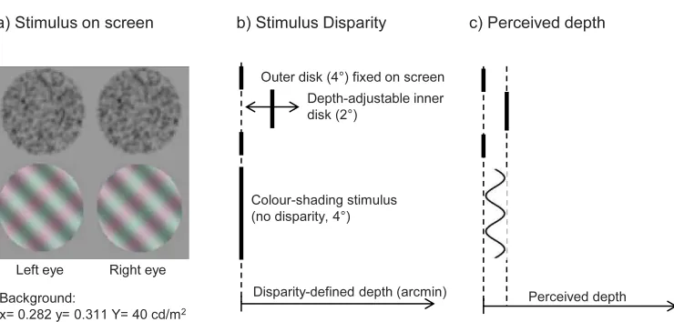
Stimuli consisted of combinations of luminance and chromatic sinusoids or square waves, positioned below a random dot stereogram depicting a circular slab at a different depth from its circular background (see Figure 1a). Below we describe the stereo-defined stimuli, represented in the upper half of Figure 1a. Observers were required to adjust the stereoscopic depth-match-ing stimulus until it appeared to contain the same depth (defined by binocular disparity, Figure 1b) as the peak-to-trough depth depicted by the luminance sinusoid or square wave (defined by shape from shading), see Figure 1c.
Stimuli: Depth matching
A stereoscopically defined depth pedestal was used to assess the amount of perceived depth in the target-luminance pattern. The stimulus (see top half Figure 1a) was a random-dot stereogram, composed of a circular patch (48 diameter) and made of prerendered circular Gaussian blobs (standard deviation of 0.8 mm on screen or 3.4 min arc). A central circular pedestal (28
diameter) could be adjusted in depth (see disparity profile, Figure 1b). We used a similar protocol to create our Gaussian blobs stimuli than Kingdom et al. (2005), but we did not use subpixel shifts in disparity. The blobs in the random dots stereogram were non-oriented Gaussian envelopes, darker than the background. The blobs with coordinates falling into the inner 28 disks were modulated in disparity, i.e., when the observer adjusted a dial the stimulus was redrawn with the central patch having a new disparity. The background blobs (outer circle) were presented at 0 min arc disparity (see Figure 1b).
Previous experiments on the color-shading effect used disparity defined matching stimuli that resembled the final percept. As we wanted to compare the depth perceived via sinusoids and square-wave patterns, we chose to use a disk-shaped pedestal. This matching stimulus makes no assumptions about the shape of the perceived object, which can vary between observers for the square wave (see Sun & Schofield, 2012). Observers were asked to turn a dial to match the depth between the central patch and the background (Figure 1c) with the amount of depth they perceived from shape from shading for the luminance grating: peak to trough from the lowest to the highest depth.
[image:4.612.121.491.53.230.2]Stimuli: Luminance and chromatic
The test stimuli were composed of one chromatic and one luminance component of the same profile type but different orientation and contrast. The luminance component carried the shape of the object according to shape from shading. In our experiment, the type of pattern used to generate the chromatic and achromatic components could be either sinusoids or square-wave modulations. A square-wave pattern on screen, corre-sponds roughly to a triangular profile in depth. A sinusoidal pattern corresponds to a corrugated material
with an approximate sinusoidal shape. All stimuli used are shown in Figure 2 for both sinusoids and square waves. Below we describe the methodology and color space used to create these patterns and later the experimental conditions tested.
[image:5.612.81.533.59.504.2]Both chromatic and luminance components had a spatial frequency (fundamental frequency for the square-wave) of 0.75 cpd. Equation 2below shows the mathematical formula used to generate the sinusoidal modulation, and Equation 3 shows the modification used to obtain a square-wave pattern. To avoid stimulus display artifacts, the two components (i.e.,
chromatic and luminance) were displayed on different video frames and temporally interleaved. Frame interlacing of a chromatic component is common in color-vision psychophysics (e.g., Kingdom et al., 2005; Michna, Yoshizawa, & Mullen, 2007; Victor, Purpura, & Conte, 1998). This technique has the advantage that it limits any nonlinear interactions on the screen (Victor et al., 1998). It also effectively divides the contrast by two. Contrast values reported in the rest of the paper take this effect into account and represent actual contrast as seen by the participant. The high frame rate of the monitor (110 Hz) allows seamless fusion for the observers.
Luminance variations were obtained by modulating all cone class receptors in phase. The luminance component, which gives the impression of shape, was always oriented at458(left oblique). The chromatic component could be either oriented at458 (left oblique, aligned with the luminance component) or
þ458 (right oblique, orthogonal to the luminance component). These two conditions are sometimes referred to in the literature as iso-oriented and cross-oriented, respectively.
The chromatic component was obtained by setting modulations of inputs to L and M cones to be out of phase (L-M). Thus when L-cone activation is at its highest, M-cone activation is at its lowest, and vice versa. The chromatic component does not change the overall shape of the object; however, we expect it to have a modulatory effect on the perceived depth of the corrugations.
Color space
Stimuli were created using the cone contrast space as defined by Cole, Hine, and McIlhagga (1993) and Cole and Hine (1992). Each of the three dimensions of this color space (Lc,Mc,Sc) is computed by dividing the cone intensity by the background intensity. Cone contrast is defined for each type of cone by Equation 1:
LC ¼
DeL ebL
MC¼
DeM ebM
SC¼
DeS ebS
; ð1Þ
whereDeL, DeM, andDeSare variations of the stimulus cone excitation from the background cone excitations,
ebL,ebM, andebS. The background intensity we used was x¼0.282, y¼0.311, andY¼40 cd/m2 in CIE
coordinates, the same values used in Kingdom, Rangwala, and Hammamji (2005).
The long/medium/short photoreceptor activations (LMS cone excitations) for the guns were obtained using a transformation from CIE 1931 to Smith and Pokorny (1975) cone fundamentals. These values were then used to create a linear transform from LMS to gun values (see method in Brainard, Pelli, & Robson, 2002). This allows us to display any triplet of Smith and Pokorny (1975) cone excitationseL, eM, eS, on the screen as long as they fall within the display’s gamut. However, as the visual system encodes information using contrast, we defined our stimuli using contrast metrics, as described below.
Luminance and chromatic components
Each component (luminance or chromatic) was defined as a sinusoidal modulation of L, M, and S cone contrasts. The contrast modulations for the cones were computed respectively using Equation 2 for sinusoids (CsinL,CsinM,CsinS) and Equation 3 for square waves
(CsqL, CsqM, CsqS).
CsinLðx;yÞ ¼ALsin 2f pf½ðycoshÞ ðxsinhÞg
CsinMðx;yÞ ¼AMsin 2f pf½ðycoshÞ ðxsinhÞg
CsinSðx;yÞ ¼ASsin 2f pf½ðycoshÞ ðxsinhÞg ð2Þ
CsqLðx;yÞ ¼
maxðCsinLÞ ifCsinLðx;yÞ.0
minðCsinLÞ ifCsinLðx;yÞ,0
CsqMðx;yÞ ¼
maxðCsinMÞ ifCsinMðx;yÞ.0
minðCsinMÞ ifCsinMðx;yÞ,0
CsqSðx;yÞ ¼
maxðCsinSÞ ifCsinSðx;yÞ.0
minðCsinSÞ ifCsinSðx;yÞ,0:
ð3Þ
of cone contrast modulation, i.e., parameterA. In the case of luminance modulation, all three classes of cone are modulated with the same amplitudeA (i.e., AL¼ AM¼AS), this parameter is equivalent to the Michelson
contrast (see Appendix A).
The luminance components were computed by modulating L, M, and S contrasts in phase. The chromatic (red-green) sinusoid components were com-puted by having L and M contrast modulated 1808out of phase (jALj ¼ jAMj) and settingAS¼0. We obtained square waves by transforming the sinusoid using Equation 3. This ensured that the spatial features of the stimuli are preserved between the two conditions. From Equations 2 and 3 we then used Equation 1 to
transform cone contrast values into cone excitation (eL, eM, eS); we then transformed LMS cone excitation
levels directly into gun values (as described by Brainard et al., 2002). The gun values were subsequently adjusted for linearity and gamma corrected.
Generally the contribution of L and M inputs to the luminance signal are not equal (Gunther & Dobkins,
2002). Consequently, when L and M cone contrast are out of phase the stimulus might not be equiluminant. In order to correct for this and create truly equiluminant stimuli, we adjusted the amplitude values,AL andAM.
This adjustment is different for each participant. A control experiment to set equiluminance for each participant was therefore required and was performed for both sinusoids and square-wave stimuli. Full details of equiluminant settings plus data on a minimum motion experiment for each participant can be found in Appendix B. In the remainder of this paper, we identify contrast modulation with the amplitude values before individual participant adjustment.
Experimental design and procedure
We measured perceived depth in the shape from shading delivered by the luminance component using the method of adjustment. Observers used a stereo-defined patch to adjust the perceived depth. We manipulated several different combinations of lumi-nance and chromatic components, which we will describe below as three conditions. Trials from each condition were randomly interleaved and the task was always the same. The experiment was split into two sessions, one for sinusoids and one for square-wave patterns (the order of which was randomized between observers). Before each session observers performed a minimum motion experiment with identical stimuli to those used during the main experimental sessions (see Appendix B). Observers performed 10 trials per contrast value for each condition and for each pattern profile. Figure 2a is an illustration of all stimuli for both sinusoids and square-wave conditions.
Condition 1
In order to measure the effect of increasing
luminance contrast on perceived depth, we set a fixed color component with a right-oblique orientation (þ458) at a constant contrast amplitude of 0.012. The luminance component was left-oblique oriented (458) and tested using six values of maximum contrast (0, 0.01, 0.02, 0.04, 0.08, 0.16; see Figure 2a for illustra-tions). In this case the luminance contrast measure is equivalent to Michelson contrast (Appendix A) and so these values can be also expressed as percentages.
Condition 2
The luminance left-oblique component was fixed at contrast amplitude 0.04 and we tested six values of color contrast (0, 0.004, 0.08, 0.012, 0.016, 0.02; Figure 2b). We expected, from Kingdom (2003), Kingdom et al., (2005), and Kingdom et al., (2006), that the perceived depth would increase as the color contrast increased. Note that the fourth stimulus of Condition 2 is exactly the same as the third stimulus of Condition 1 (0.04 luminance component and orthogonal chromatic component at 0.012 contrast amplitude) as can be seen in Figure 2b–c, fourth row.
Condition 3
The color component was left-oblique oriented and hence aligned with the luminance grating. The values of contrast used were the same as in Condition 2 (Figure 2c). Note that Conditions 2 and 3 are indistinguishable at zero color contrasts; this gives us the perceived depth for luminance only at a fixed contrast of 0.04. From previous work (Kingdom, 2003; Kingdom et al., 2005; Kingdom et al., 2006) we expect that aligned in-phase chromatic contrast would suppress perceived depth.
Data analysis
We analyzed sinusoid and square wave data
conditions separately. We recorded matched depth as a function of contrast for each of the three conditions separately for each observer. A function was then fitted to the matched depth versus contrast data, separately for sinusoids and square waves. For each observer, pattern, and condition, we performed a Kruskal-Wallis test on the data to check for a main effect of contrast (luminance or chromatic contrast, depending on condition), see Supplementary File 1 for details and values.
& Heeger, 2012) and is used in many perceptual models, sometimes referred as nonlinear transducer behavior (e.g., Legge & Foley, 1980; Schofield, Rock, Sun, Jiang, & Georgeson, 2010). Hence Condition 1 perceived depth data was exclusively fitted with a modified cumulative Weibull function2:
FðcÞ ¼cþr 1eð Þca b
: ð4Þ
Equation 4 has four free parametersc, the offset parameter, the scale parameterr, used to scale the functions output on they-axis,a the threshold
parameter, andbthe shape parameter. High values ofb
give step-like functions and lower values (,1) will deliver a more sigmoidal function. We define threshold as the value ofathat delivers a value for the function of 63% of maximum.
For Condition 1 we expect participants to perceive no depth at zero contrast; hence, we do not need an offset, so the fit is performed with three free parameters andc fixed at zero. For Conditions 2 and 3, if the Kruskal-Wallis test showed a significant effect of chromatic contrast on perceived depth, we would then proceed to fit a curve to the data. If the effect was positive we fitted with a cumulative Weibull, if negative we fitted with a decreasing Weibull, described with Equation 5, the parameters retain the same meaning.
FðcÞ ¼cþr eð Þca b
: ð5Þ
The direction of the effect of chromatic contrast was determined by a simple linear fit and the final fit was performed using either Equation 4or 5, depending on the sign of the slope parameter. Fitting was performed using function nlinfit from MATLAB Statistics Tool-Box. We should emphasize that the curve fits provide us with a convenient way to describe and summarize the data; they are not intended as a model that explains the underlying mechanisms of depth modulation perception.
Results
We will report the raw results for each condition below, followed by a description and discussion of the model fits.
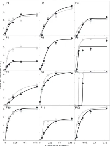
Condition 1: Fixed color contrast and variable
luminance component
In Condition 1 the independent variable was the contrast of the left oblique luminance component. The color contrast was fixed at 0.012.
Mean matched depth as a function of luminance contrast is plotted in Figure 3 for each observer (sinusoids: black circle, square wave: gray square). For all observers, the increase in luminance produced a significant increase in perceived depth (Kruskal-Wallis tests, v2 (5,54), p ,0.001, see Table 1, Supplementary File 1) for both sinusoids and square waves, except for Participant P5 who was unable to see the 3-D shape of square-wave pattern. For all participants, we obtain similar saturating functions. This allow us to use a Weibull function (Equation 4) to perform the fit to the data, plotted with solid lines on Figure 3. The results are consistent with what we expect from classical shape from shading, where higher amplitude shading corre-sponds to more perceived depth. Participant 9 is the only individual with a different pattern of responses from the rest of the group. For him, we can see a clear step-like function. On the whole, our observers set maximum depths in the range 1.22 to 4.41 arcmin (mean¼3.38,r¼0.9).
When comparing sinusoid and square-wave data, the response to the square wave tended to reach the highest perceived depth faster than for sinusoids. These results demonstrate that all our participants were performing the task properly, that is to say responding to the depth shown from the luminance-defined component. As all the conditions were interleaved, we can assume that participants were not switching tasks between condi-tions. Furthermore, as sinusoids and square waves were tested in different sessions, we can see from the results in Figure 3that, using our stimuli, shape from shading is a robust phenomenon, with similar maximum depth perceived and similar shapes of fitted function for both sinusoids and square waves.
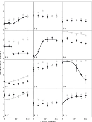
Condition 2: Fixed luminance contrast, variable
color contrast
In Condition 2, the independent variable was the contrast of the right oblique color component, pre-sented orthogonally to the shape-carrying luminance component. From previous research on the color-shading effect we expected to see an increase of perceived depth with increasing color contrast (King-dom, 2003; Kingdom et al., 2005; Kingdom et al., 2006).
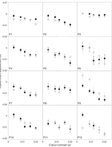
wave or both; the other four participants showed no significant effects at all (p. 0.05).
Second, and perhaps more surprising, of the participants with significant effects, three showed negative effects of color contrast (P4, P6, P9). Thus less depth was perceived as chromatic contrast increased. This is contrary to what was reported previously in the literature (Kingdom,2003; Kingdom et al., 2005; Kingdom et al., 2006) and does not fit the heuristic proposed to explain the effect (Kingdom, 2003).
[image:9.612.123.497.58.550.2]Participant P1 showed no significant effect on the square-wave condition; however, this might be due to lack of statistical power, in which case the direction of the effect would be similar in both sinusoid and square-wave conditions. Participant P12 had an outlier point at contrast zero that could suggest a step-like function and a positive effect akin to its sinusoid condition. However, with the amount of variation in the data (high error bars in this condition), it was found nonsignificant on the Kruskal-Wallis test.
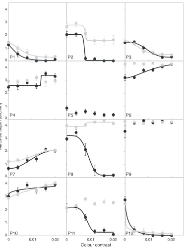
Condition 3: Aligned fixed luminance contrast
and variable color contrast
In this condition, we used the same values of luminance contrast (0.04) and color contrast as in Condition 2; however, the orientation of the color component was changed so that the chromatic and luminance components were aligned (iso-oriented and in-phase). We expected perceived depth to decrease as the contrast of the chromatic component increased.
[image:10.612.122.494.55.551.2]Figure 5 shows the results for all participants (and Table 3, Supplementary File 1 summarizes statistical analyses). As before, raw data were analyzed with a Kruskal-Wallis test for each participant and each pattern (sinusoid and square wave). When significant, data were fitted using a Weibull function, either positive or negative (Equation 4 or 5) depending on the direction of the effect. Curve fits for significant datasets are shown in Figure 5.
Participants P1, P2, P3, and P12 showed a decreased perception of depth with increased color contrast for both sine-wave and square-wave stimuli, consistent with previous literature (Kingdom,2003; Kingdom et al., 2005; Kingdom et al., 2006). However, we also have some participants showing the opposite effect, with a significant increase in perceived depth for both patterns (P7, P10). For the sinusoids, 10 out of the 12
participants showed a significant effect of color contrast. Six of them were negative, as predicted by
color shading; the rest were positive. For the square-wave pattern, only seven people showed significant effects of color contrast. Participant 9 showed no significant effect for either the sinusoid or square-wave condition, and Participant 5 saw no depth in the square-wave condition and no significant change of depth in the sinusoid.
[image:11.612.122.497.56.556.2]Participant P8 showed a reversal in effect direction between the two stimulus types, delivering a large negative effect for sinusoids wave and a small positive
one for the square-wave pattern. In total seven participants showed similar behaviors between sinu-soids and square stimulus types. Once again, we have a similar overall pattern of results as for Condition 2: A few participants showed no effect of color contrast on the perceived depth, and some of those with significant effects show a significant increase in the perceived depth in the opposite direction to that expected.
Discussion
Our aim was to explore how different combinations of chromatic and luminance components affect per-ceived depth, i.e., to test the effect of color contrast on shape from shading. We compared the effects on shape from shading for both sinusoidal and square-wave patterns. Overall, we found a wide variety of observer responses, not all compatible with the heuristic suggested to explain the color-shading effect, namely that when color and luminance variations are orthog-onal, luminance variation is more likely to be due to shape changes, and hence more depth may be perceived.
In the following sections, we will discuss in detail what we have learned from our experiments. We then suggest that some of our effects, and those of previous studies, could potentially be explained via a hypothesis that is independent of depth perception, using argu-ments about contrast masking. Alternatively, we will discuss how the individual differences observed could be due to use of heuristics but ones that are
idiosyncratic and not generic heuristics based on the statistics of the environment. Finally, we discuss the possibility that our results could have occurred due to luminance artifacts in chromatic masks and discuss how this work links to other recent literature.
Condition 1: Varying luminance contrast for
constant color contrast
We start by discussing results from a baseline condition (Condition 1) that simply tested how depth from shading increased with luminance contrast. For all participants, the zero contrast condition always corresponded to a mean perceived depth of 0 arcmin. This result provides evidence that the participants were correctly responding to the shape from shading and that the color alone did not elicit any depth. For all participants, luminance contrast had a robust effect on perceived depth: increasing the luminance contrast consistently increased the perceived depth. Observers behaved similarly to each other in this condition for both sinusoids and square waves.
The neutral nature of our matching stimulus, in terms of shape, allowed us to compare the perceived depth directly between the two different stimulus types used here. We observed that the perceived depth saturates with luminance contrast (Figure 3), the speed of saturation varies with the pattern, square waves tending to saturate faster. However, the maximum perceived depth for both stimuli showed a high correlation (r¼0.76) and is similar for the two stimulus types for almost all observers (with the exception of Participant P4). This suggests that the perceived depth might not be linked to the geometry of the object depicted by shape from shading but instead by the luminance contrast. As sinusoids and square waves would be expected to have different perceived contrast (Ginsburg, Cannon, & Nelson, 1980) there should be an advantage toward square waves (more contrast) and we indeed find that square-wave stimuli result in faster saturation (Figure 3).
Conditions 2 and 3: The effects of a chromatic
grating on perceived depth from luminance
Previous work in this area (Kingdom, 2003; King-dom et al., 2005; KingKing-dom et al., 2006) has suggested that color enhances perceived depth when presented orthogonally to luminance and suppresses perceived depth when aligned. In our hands, the chromatic components had dramatically different effects on different participants. Some showed the effects expect-ed from the previous literature, some no effects, or some the opposite of the expected behavior. In Condition 2 we found a surprisingly high number of participants with nonsignificant effects of color con-trast (Figure 4). For Condition 3, we had expected increasing color contrast to result in less perceived depth. This only occurred consistently for three participants (Figure 5). We will discuss each condition in more detail below.
Condition 2: Orthogonal color component,
effects of increasing color contrast
luminance contrasts specific to each individual. We know from Condition 1 (see Figure 3 and Table 1, Supplementary File 1) that the depth perceived is directly dependent on the luminance contrast. We also know that the perceived depth saturates more quickly for the square wave. One could therefore further hypothesize that the perceived contrast is actually different between the sinusoid and square. As discussed above, the faster saturation for square-wave stimuli in Condition 1 suggests that this might be true. In this case, the perceived contrast of the chromatic compo-nent might be different as well. Thus, individual differences in perceived contrast could account for the large individual differences in perceived depths found. All in all, these results suggest that if a color-shading enhancing effect exists, it only does so for a limited contrast range.
The second surprising result is the reduction of perceived depth with chromatic contrast, which was found for some participants. In previous work (King-dom,2003; Kingdom et al., 2005; Kingdom et al., 2006), suppression of perceived depth has only been observed when the chromatic and luminance compo-nents are aligned and in phase. These data therefore speak against a hypothesis based on the heurists suggested previously (Kingdom, 2003) to explain the color-shading effect.
Could stimulus specific differences explain why our results are not consistent with previous literature? The color-shading effect might be dependent on the
luminance contrast at which it is tested. Kingdom et al. (2005) showed a tuning of the color-shading effect depending on the luminance contrast tested, suggesting that there might be smaller enhancement at high luminance contrast. One hypothesis for why our results were mixed is that the luminance values our observers were tested at might have been too high. If so,
perceived depth had already saturated at its maximum level, leaving no space for further enhancement. But our choice of contrasts was low enough for this not to provide a convincing explanation. We used luminance contrasts (for Conditions 2 and 3) of 4%. Kingdom et al. (2005) found enhancement for luminance contrasts of 5% and 15%, but less so for 45%. To address this further, we considered all the individual data and looked for correspondence between the luminance level tested in the chromatic conditions (i.e., Figures 4 and 5) and the level of saturation of contrast in Condition 1. If the above hypothesis were correct, then we might expect to see nonsignificant effects or suppressive effects at saturation levels of luminance and increasing facilitatory effects for those observers who were not yet at their saturation level. However, this pattern was not found consistently; some participants showed increases or decreases at saturated value and others nonsignifi-cant effects even though we were testing at their
midrange. Thus, the saturation hypothesis does not explain why some participants showed nonsignificant effects of color contrast.
Condition 3: Luminance and color contrast
components aligned
When luminance and color signals were aligned, we expected decreased perceived depth, consistent with a suppression of luminance defined depth at borders that specify both luminance and chromatic changes. This was not consistently found. Compared to Condition 2, more participants showed significant effects of color contrast when the two components were aligned (compare Figures 4 and 5). There was greater depth modulation as a function of color contrast for the sinusoidal pattern than for the square-wave pattern (see Table 3 in Supplementary File 1 and Figure 5). We note also that the direction of the effects, when present, tended to be the same for sinusoids and square waves.
However, a few participants showed nonsignificant effects of color contrast increase on perceived depth.
Some participants with significant effects showed the opposite of the expected effect direction, i.e., they showed an increase in perceived depth. One example is Participant 7 (see Figure 5). Thus, once again, we do not find strong evidence for a systematic effect of color that would be consistent with the heuristic suggested to explain the color-shading effect. Furthermore, in the previous section we argued that some decreases in perceived depth might be because the luminance contrast was too high (i.e., the maximum depth was already reached), but this argument does not match the observed data in Condition 3. Participant P4 exemplifies this assessment. Consider their behavior for Condition 1 (Figure 1) and compare with Conditions 2 and 3 (Figures 4 and 5): The values of luminance contrast tested in Conditions 2 and 3 is already in the saturated part of the curve for the sinusoid, and we can see a suppression of perceived depth when color is orthogo-nal (Figure 4) and an increase when aligned (Figure 5), both significant (see Tables 2 and 3, Supplementary File 1). This is the opposite from what one would expect if perceived contrast was the only issue.
Difference between our stimuli and previous
studies
component. Kingdom et al. (2005) showed that a luminance component would have its depth enhanced by an orthogonal chromatic component (either L-M or S modulated) and suppressed by a third color
component (either L-M or S modulated) aligned with the luminance component. In our Condition 3, we used only one (aligned) color component.
We did not test the color shading with three components (two chromatics and one luminance); instead, we used two components (one chromatic, one luminance). We therefore cannot directly conclude that the individual differences we found would apply to the three-component situation. However, we can think of no reason, given the logic of the color-shading heuristics suggested, why different results would be expected. We discuss the possibility of specific observ-er- and stimulus-dependent heuristics in a following section.
According to the color-shading effect hypothesis, the alignment of chromatic and luminance should be interpreted as changes in reflectance, and hence perceived depth should be reduced. We think that the kinds of interactions found in previous studies could also be attributed to interactions between the two chromatic components. We explore this idea in more details in the section below on masking.
Masking: Within channel and cross channel
In this section we draw a parallel between our results and some of the literature on masking, and we consider whether effects attributed to the color-shading effect could instead be related to low-level masking. There are two main points we wish to cover: cross-orientation masking (usually studied within channel) and cross-channel masking (e.g., between red-green and lumi-nance channel), both of which can produce suppressive and facilitatory effects.
One way to interpret our results is to think in terms of masking. In other words, to what extent chromatic patterns might mask luminance patterns, at stages well before the luminance information is interpreted as depth. Most low-level interactions between sinusoidal luminance, or color, patterns are described in term of masking within channels (e.g., Legge & Foley,1980; Losada & Mullen, 1994) and between channels (e.g., Chen, Foley, & Brainard, 2000). Below we summarize the literature and relate it to our experiments here.
Facilitatory and suppressive effects within channels
Facilitation can occur when the mask is at detection level. The facilitation (manifested as a lowered thresh-old) is then followed by an increase of the threshold at higher contrast. The resulting pattern threshold
eleva-tion, as a function of mask contrast, is commonly referred to as the ‘‘dipper function’’ because of this initial facilitation, then suppression effect. This pattern of masking occurs within chromatic (e.g., Losada & Mullen, 1994) as well as within luminance channels (e.g., Bird, Henning, & Wichmann, 2002).
The strength of the mask is dependent on the characteristics of both mask and target. As a rule of thumb, the more similar mask and target are, the greater the masking effect. This is explained by hypothesizing that test and mask are processed by the same channel and that the mask is adding noise, rendering detection more difficult. For example, masking of a sinusoidal luminance pattern is greatest when the mask and test are about the same orientation (Phillips & Wilson, 1984), but cross-orientation mask-ing can also occur: Targets are still masked when masks are 908out of phase (Meese & Holmes, 2007; Phillips & Wilson, 1984).
In color vision, masking follows a different pattern: Masking appears to be isotropic, i.e., not dependent on mask orientation (Medina & Mullen, 2009). An orthogonally-oriented (also referred to as cross-orient-ed) stimulus usually shows suppressive effects, but masking can be facilitatory (Meese & Holmes, 2007) at low temporal frequency. Medina and Mullen (2009) compared cross orientation masking (XOM) within luminance and chromatic channels. Chromatic XOM was found to be independent of temporal frequency and generally stronger than achromatic XOM, i.e., stronger facilitation at low contrast and stronger suppressive masking at higher contrast. We used only two components per stimulus, one achromatic and one chromatic; Thus, there will be no within-channel masking. XOM could, however, be involved in causing the suppressive effects found for the three-component stimuli used in Kingdom’s studies.
Cross-channel masking
the suppressive effect that we find for some participants (Figure 5) and others have found (Kingdom, 2003; Kingdom et al., 2005).
However, Cole, Stromeyer, and Kronauer (1990)
found relatively no interaction between luminance and chromatic signals using a non-oriented patch but did manage to get facilitation when the pedestal used was slightly suprathreshold; this was dependent on the presence of a surround. They only found facilitation of chromatic detection by luminance pedestal when the two were presented in the same eye (monoptically). Furthermore Medina and Mullen (2007) demonstrated luminance and red-green interactions across eyes: Detection was left untouched but binocular summation was altered by luminance noise. This demonstrates the complexity of cross-channel interactions around threshold. In the next subsection we explore interaction at suprathreshold level in more detail.
Suprathreshold masking effects
In the suprathreshold domain, Pearson and King-dom (2002) found that superimposed chromatic (red-green) and luminance Gabors showed suprathreshold facilitation, as opposed to the sub-threshold facilitation showed in detection tasks. This study also showed marked individual differences in stimulus integration (for example, one participant did not show any facilitation but only the suppressive effect with a luminance target and chromatic mask). From the results of our Condition 3, we can hypothesize that some participants with increased perceived depth might misappropriate chromatic contrast for luminance contrast. This suprathreshold combination of contrast might be akin to results described in Pearson and Kingdom (2002). It is possible that the aligned configuration of Condition 3 is perceived as ambigu-ous; one hypothesis could be that the respective contrasts (luminance and color) get pooled together or color contrast somehow modulates luminance contrast. If this pooling mechanism exists, it could well occur before the shape is computed.
Gowdy, Stromeyer, and Kronauer (1999) tested XOM with sine- and square-wave patterns. They found that at 0.8 cpd there was larger facilitation for sinusoids than square waves. They concluded that the sharp edges played an important role in the facilitation. They also found that the facilitation was phase dependent. The facilitation was similar at 08 or 1808 phase (green on light bar or green bar on dark bar); however at 908
the facilitation was abolished. This is interesting when attempting to interpret the color-shading effect because we know from (Kingdom, 2003) that the color-shading effect is also phase dependent. However, De Valois and Switkes (1983) found suppressive (masking) effects of chromatic masks on luminance targets. Two of their
participants showed no phase effects but one did show a large suppressive effect for 08and 1808(in phase) and a small effect for 908. In their paper, they postulated that luminance and chromatic masks could have distinct excitatory or inhibitory effects on the detection of luminance targets.
To sum up, we do not know how the masking data obtained from other studies relates to the perceived suprathreshold contrast that was used in our study and in others on the color-shading effect. However, we note that phase dependence and orientation seems to be similar in masking and suprathreshold data; both can show large individual differences too. It would therefore be interesting, but beyond the scope of this study, to measure how the different chromatic components affects the perceived contrast of the luminance modulation.
Use of heuristics
Above we have suggested that individual differences could occur due to differences in low-level masking; it is also possible that individuals could be using different high-level heuristics to perform the depth task. In the original paper on the color-shading effect, Kingdom (2003) hypothesized that the interactions observed between color and luminance, in the context of shape from shading, were due to the use of heuristics based on the statistics of the environment (Kingdom, 2008). We would have expected these heuristics to be general, applying to potentially more complex, or indeed, less complex scenes (like the two-component patterns we used here) and used by most participants. However, our data suggest that observers could be using idiosyncratic, high-level heuristics that are not a common feature of everyone’s behavior. For example, we know that individuals combine cues differently for shape perception, favoring shading to lesser or greater extents (e.g., Lovell et al., 2012).
This implies that visual systems might be more flexible than expected and could evolve to match real-world statistics or become biased. Thus, we challenge the generality of the heuristics proposed by Kingdom (2003).
A role for luminance artifacts?
problem at medium and high spatial frequencies (Mullen,1985). For the spatial frequencies used here, (0.75 cpd) this should not be an issue.
The second possibility is that despite having tested individual isoluminant points for each participant and contrast value tested, there still exists some luminance artifact. The results of Condition 1, which showed how perceived depth increased with contrast for every observer (Figure 3), provide a compelling case that the depth perceived in our stimulus was mainly driven by luminance contrast. Any manipulation that decreases the perceived contrast of the right oblique luminance component should then also affect the perceived depth. Georgeson and Shackleton (1994) found, for a detec-tion task, that plaids have less perceived contrast than individual gratings and that it was minimal for
orthogonal gratings. If there were a luminance artifact at work in our Condition 2 (luminance and chromatic gratings orthogonal to each other), then it should decrease the perceived contrast of the shape-from-shading object. This might be a factor for those of our participants who showed a decrease in perceived depth with color contrast (P4, P6, P9). But for the remaining nine participants, where we found no change or an increase in perceived depth, this is not borne out. Furthermore, in Condition 3, where chromatic and luminance components are aligned, any luminance artifact in the chromatic component should directly add to the luminance one and result in enhanced depth. Such a pattern of data was present for only a few participants, not all the same as those consistent with the prediction for Condition 2 (P4, P6, P7, P10). Overall the pattern of data expected if a luminance artifact was at work was not displayed by the majority of our participants.
In order to explore the possibility of luminance artifact further we retested two participants, selected to have one with increased and one with decreased perceived depth on Condition 3 (P7 and P11). All depth-matching experiments were repeated (both sinu-soid and square wave) but with the phase of the chromatic stimulus altered by 1808. This should have no effect on the orthogonal conditions (Conditions 1 and 2) but would affect Condition 3 if a luminance artifact was present, resulting in a reduced or reversed effect on depth compared with original Condition 3. No such effects were found (Supplementary File 2), hence we were satisfied that luminance artifacts were not responsible for the results of the main experiment.
Links with second-order variations
The literature on second-order luminance effects is also of interest here. A first-order variation is
luminance change across space, what we usually
describe as contrast. A second-order variation is a change of contrast across space. The second-order luminance modulation is relevant to the effect of chromatic information on luminance-defined shading for two main reasons. First, because the channels responsible for detection of LM (local mean luminance, first order) and AM (local luminance amplitude modulation), sometimes also referred as contrast modulation, CM (Schofield et al., 2006), interact in a similar way to luminance and (red-green) chromatic channels (see Chen et al., 2000; Schofield & Georgeson, 1999). Second, it has been shown that both these channels have modulatory effects on shape-from-shading processing (for second order luminance: Schofield et al., 2006; and for chromatic components see Kingdom, 2003). Note that this connection has also been made by Kingdom (2008) and by Schofield et al. (2006).
Dovencioglu, Welchman, and Schofield (2013)
showed AM-LM interactions could be learned over time by na ¨ıve observers using positive reinforcement. From this work, two conclusions seem important. First, na ¨ıve participants might behave very differently until trained and this might extend to luminance and color interactions. Second, it indirectly raises a
cautionary note on the use of trained observers or non-na ¨ıve (usually authors) trained in psychophysics. Our relatively modest sample size of 12 na ¨ıve participants has shown tremendous interindividual differences in the effects of color contrast. However, the effects of luminance contrast on perceived depth were similar across all participants and robust between sinusoids and square waves. It has been suggested, in the case of a different mechanism, motion in depth, that the behavior of the general population can be quite different that of trained ‘‘expert observers’’ (Nefs, O’Hare, & Harris, 2010), and this is very much in line with what we found here.
Conclusions
We have shown that sinusoidal and square-waves luminance modulations have similar effects on per-ceived depth. We interpret the faster increase of perceived depth with contrast of the square wave as due to higher perceived contrast between sinusoids and square waves. However the maximum perceived depth was similar for both patterns for 11 of our 12
participants.
shape or a reflectance change. Dovencioglu et al. (2013) suggest that a similar relationship can be learned for AM-LM modulation with feedback. Consequently we argue that people usually described in the literature as expert observers might have learnt how to use a common heuristic to disambiguate the luminance information. It is possible that different observers use their own separate heuristics which might not match an optimal behavior, one observer could learn the
opposite (e.g., Dovencioglu et al., 2013). The time scale of these interactions is quite telling and could possibly distinguish between feedback loop and bottom-up effect.
The interactions that we observed for the iso-oriented (aligned) conditions could be considered as akin to masking and an alternate explanation of the color-shading effect could potentially be accounted for with low-level masking, but could also be due to idiosyncratic heuristics, not linked to the statistics of the environment. We think that the next step is to explore the possibility of low-level interindividual differences in the processing of luminance and chro-matic contrast. Furthermore a complete account of these interactions should test for suprathreshold inter-channel interactions. These approaches are currently being pursued in our lab to account for the large differences found in the effects of color on shape from shading.
Keywords: color-luminance interaction, color contrast, luminance contrast
Acknowledgments
Thanks to Anastasia Kolokolnikova for collecting some of the data and to the members of the vision lab at St. Andrews for inputs on the early version of the manuscript. This research was supported by the Engineering and Physical Sciences Research Council (EPSRC, UK) via grants EP/G038708/1 to JMH and EP/G038597/1 to MB and a Leverhulme Research Fellowship to JMH.
Commercial relationships: none.
Corresponding author: St ´ephane Clery. Email: [email protected].
Address: Vision Lab, School of Psychology & Neuro-science, University of St. Andrews, St. Andrews, UK.
Footnotes
1
Note that second order luminance information (changes in local luminance amplitude) can also be used
to help disambiguate luminance due to shading from luminance due to pattern (Schofield et al., 2006; Schofield, Rock, Sun, Jiang, & Georgeson, 2010; Sun & Schofield, 2012).
2
The choice of a Weibull function was arbitrary; any sigmoidal-shaped function could have been used to represent the form of the data.
References
Albrecht, D. G., & Hamilton, D. B. (1982). Striate cortex of monkey and cat: Contrast response function. Journal of Neurophysiology, 48(1), 217– 237.
Anstis, S., & Cavanagh, P. (1983). A minimum motion technique for judging equiluminance. In J. Mollon & L. Sharpe (Eds.),Colour vision: Physiology and psychophysics (pp. 165–166). London: Academic Press.
Bergstrom, S. (2004). The AMBEGUJAS phenomenon and colour constancy.Perception, 33(7), 831–835. [PubMed]
Billock, V. A. (1995). Cortical simple cells can extract achromatic information from the multiplexed chromatic and achromatic signals in the parvocel-lular pathway. Vision Research, 35(16), 2359–2369. [PubMed]
Billock, V. A., & Tsou, B. H. (2004). A role for cortical crosstalk in the binding problem: Stimulus-driven correlations that link color, form, and motion. Journal of Cognitive Neuroscience, 16(4), 1036– 1048. [PubMed]
Bird, C., Henning, G., & Wichmann, F. A. (2002). Contrast discrimination with sinusoidal gratings of different spatial frequency. Journal of the Optical Society of America A: Optics, Image Science, and Vision, 19(7), 1267–1273. [PubMed]
Bloj, M., Kersten, D., & Hurlbert, A. (1999). Percep-tion of three-dimensional shape influences colour perception through mutual illumination.Nature, 402(6764), 877–879. [PubMed]
Brainard, D. H. (1996). Cone contrast and opponent modulation color spaces. In P. K. Kaiser & R. M. Boynton (Eds.),Human color vision (2nd ed., pp. 563–579). Washington, D.C.: Optical Society of America.
Brainard, D. H., Pelli, D. G., & Robson, T. (2002). Display characterization. In J. Hornak (Ed.), Encyclopedia of imaging science and technology(pp. 172–188). New York: Wiley.
as a canonical neural computation. Nature Reviews Neuroscience, 13, 51–62. [PubMed]
Cecchi, G. A., Rao, A. R., Xiao, Y., & Kaplan, E. (2010). Statistics of natural scenes and cortical color processing.Journal of Vision,10(11):21, 1–13,
http://www.journalofvision.org/content/10/11/21, doi:10.1167/10.11.21. [PubMed] [Article]
Chen, C., Foley, J., & Brainard, D. (2000). Detection of chromoluminance patterns on chromoluminance pedestals I: Threshold measurements. Vision Re-search, 40(7), 773–788. [PubMed]
Cole, G. R., & Hine, T. (1992). Computation of cone contrasts for color vision research. Behavior Re-search Methods, Instruments & Computers, 24(1), 22–27.
Cole, G. R., Hine, T., & McIlhagga, W. (1993). Detection mechanisms In L-cone, M-cone, and S-cone contrast space. Journal of the Optical Society of America A: Optics, Image Science, and Vision, 10(1), 38–51. [PubMed]
Cole, G. R., Stromeyer, C., & Kronauer, R. (1990). Visual interactions with luminance and chromatic stimuli.Journal of the Optical Society of America A: Optics, Image Science, and Vision, 7(1), 128–140. [PubMed]
Curran, W., & Johnston, A. (1996). The effect of illuminant position on perceived curvature. Vision Research, 36(10), 1399–1410. [PubMed]
Dean, A. F. (1981). The relationship between response amplitude and contrast for cat striate cortical neurones. Journal of Physiology,318, 413–427. [PubMed]
De Valois, K. K., & Switkes, E. (1983). Simultaneous masking interactions between chromatic and lumi-nance gratings. Journal of the Optical Society of America, 73(1), 11–18. [PubMed]
Dovencioglu, D. N., Welchman, A. E., & Schofield, A. J. (2013). Perceptual learning of second order cues for layer decomposition.Vision Research, 77,1–9. [PubMed]
Gegenfurtner, K. R., & Kiper, D. C. (2003). Color vision.Annual Review of Neuroscience,26, 181–206. [PubMed]
Georgeson, M. A., & Shackleton, T. M. (1994). Perceived contrast of gratings and plaids: Non-linear summation across oriented filters.Vision Research, 34(8), 1061–1075. [PubMed]
Gheiratmand, M., Meese, T. S., & Mullen, K. T. (2013). Blobs versus bars: Psychophysical evidence supports two types of orientation response in human color vision. Journal of Vision, 13(1):2, 1–
13, http://www.journalofvision.org/content/13/1/2, doi:10.1167/13.1.2. [PubMed] [Article]
Gheiratmand, M., & Mullen, K. T. (2010). Cortical color-luminance contrast interactions revealed by dichoptic masking. Journal of Vision, 10(15):55,
http://www.journalofvision.org/content/10/15/55, doi:10.1167/10.15.55. [Abstract]
Ginsburg, A. P., Cannon, M. W., & Nelson, M. A. (1980). Suprathreshold processing of complex visual stimuli: Evidence for linearity in contrast perception.Science, 208(4444), 619–621. [PubMed]
Giulianini, F., & Eskew, R. (1998). Chromatic masking in the (DL/L, DM/M) plane of cone-contrast space reveals only two detection mechanisms. Vision Research, 38(24), 3913–3926. [PubMed]
Gowdy, P. D., Stromeyer, C. F., & Kronauer, R. E. (1999). Facilitation between the luminance and red-green detection mechanisms: Enhancing contrast differences across edges. Vision Research, 39(24),
4098–4112. [PubMed]
Gunther, K. L., & Dobkins, K. R. (2002). Individual differences in chromatic (red/green) contrast sensi-tivity are constrained by the relative number of L-versus M-cones in the eye. Vision Research,42(11),
1367–1378. [PubMed]
Hansen, T., & Gegenfurtner, K. R. (2009). Indepen-dence of color and luminance edges in natural scenes.Visual Neuroscience,26(1), 35–49. [PubMed]
Harding, G., Harris, J. M., & Bloj, M. (2012). Learning to use illumination gradients as an unambiguous cue to three dimensional shape. PLoS One, 7(4). [PubMed] [Article]
Horn, B. K. P. (1975). Obtaining shape from shading information. In P. H. Winston (Ed.),Psychology of Computer Vision (pp. 115–155), New York, NY: McGraw-Hill.
Horn, B. K. P., & Brooks, M. J. (Eds.). (1989).Shape from shading. Cambridge, MA: MIT Press.
Horwitz, G. D., & Albright, T. D. (2005). Paucity of chromatic linear motion detectors in macaque V1. Journal of Vision, 5(6):4, 525–533,http://www. journalofvision.org/content/5/6/4, doi:10.1167/5.6. 4. [PubMed] [Article]
Johnson, E. N., Hawken, M. J., & Shapley, R. (2008). The orientation selectivity of color-responsive neurons in macaque V1. Journal of Neuroscience, 28(32), 8096–8106. [PubMed] [Article]
Johnson, E. N., Hawken, M. J., & Shapley, R. (2001). The spatial transformation of color in the primary visual cortex of the macaque monkey. Nature Neuroscience, 4(4), 409–416. [PubMed]
disparity, and perceived gloss with convex and concave surfaces. Journal of Vision, 13(1):9, 1–10,
http://www.journalofvision.org/content/13/1/9, doi:10.1167/13.1.9. [PubMed] [Article]
Kingdom, F. A. A. (2003). Color brings relief to human vision. Nature Neuroscience, 6(6), 641–644.
[PubMed]
Kingdom, F. A. A. (2008). Perceiving light versus material. Vision Research, 48(20), 2090–2105. [PubMed]
Kingdom, F. A. A., Rangwala, S., & Hammamji, K. (2005). Chromatic properties of the colour-shading effect. Vision Research, 45(11), 1425–1437.
[PubMed]
Kingdom, F. A. A., & Simmons, D. (1998). The missing-fundamental illusion at isoluminance. Per-ception, 27(12), 1451–1460. [PubMed]
Kingdom, F. A. A., Wong, K., Yoonessi, A., & Malkoc, G. (2006). Colour contrast influences perceived shape in combined shading and texture patterns.Spatial Vision, 19(2-4), 147–159.
[PubMed]
Langer, M. S., & Bulthoff, H. H. (2001). A prior for global convexity in local shape-from-shading. Perception, 30(4), 403–410. [PubMed]
Langer, M. S., & Bulthoff, H. H. (2000). Depth discrimination from shading under diffuse lighting. Perception, 29(6), 649–660. [PubMed]
Lee, B. B., Sun, H., & Valberg, A. (2011). Segregation of chromatic and luminance signals using a novel grating stimulus.The Journal of Physiology,589(1), 59–73. [PubMed]
Legge, G. E., & Foley, J. M. (1980). Contrast masking in human-vision. Journal of the Optical Society of America, 70(12), 1458–1471. [PubMed]
Li, Z., & Atick, J. J. (1994). Efficient stereo coding in the multiscale representation. Network Computa-tions in Neural Systems, 5(2), 157–174.
Livingstone, M., & Hubel, D. (1988). Segregation of form, color, movement and depth: Anatomy, physiology and perception. Science, 240(4853),
740–749. [PubMed]
Losada, M. A., & Mullen, K. T. (1994). The spatial tuning of chromatic mechanisms identified by simultaneous masking.Vision Research,34(3), 331– 341. [PubMed]
Lovell, P. G., Bloj, M., & Harris, J. M. (2012). Optimal integration of shading and binocular disparity for depth perception. Journal of Vision, 12(1):1, 1–18,
http://www.journalofvision.org/content/12/1/1, doi:10.1167/12.1.1. [PubMed] [Article]
Lovell, P. G., Bloj, M., & Harris, J. M. (2013). Optimal
cue combination: Dynamic cue re-weighting over very short timescales. Submitted.
Medina, J. M., & Mullen, K. T. (2007). Colour-luminance interactions in binocular summation. Vision Research, 47, 1120–1128. [PubMed]
Medina, J. M., & Mullen, K. T. (2009).
Cross-orientation masking in human color vision.Journal of Vision, 9(3):20, 1–16, http://www.
journalofvision.org/content/9/3/20, doi:10.1167/9. 3.20. [PubMed] [Article]
Meese, T. S., & Holmes, D. J. (2007). Spatial and temporal dependencies of cross-orientation sup-pression in human vision.Proceedings of the Royal Society B: Biological Sciences, 274(1606), 127–136. [PubMed]
Michna, M. L., Yoshizawa, T., & Mullen, K. T. (2007). S-cone contributions to linear and non-linear motion processing. Vision Research, 47(8), 1042– 1054. [PubMed]
Mullen, K. T. (1985). The contrast sensitivity of human colour-vision to red-green and blue-yellow chro-matic gratings. Journal of Physiology-London, 359(FEB), 381–400. [PubMed]
Mullen, K. T., Gheiratmand, M., Medina, J. M., & Kim, Y. J. (2012). Two routes to suppression of signals in color vision.Journal of Vision,12(9):107,
http://www.journalofvision.org/content/12/9/107, doi:10.1167/12.9.107. [Abstract]
Nassi, J. J., & Callaway, E. M. (2009). Parallel processing strategies of the primate visual system. Nature Reviews Neuroscience, 10(5), 360–372. [PubMed]
Nefs, H. T., Koenderink, J. J., & Kappers, A. M. L. (2005). The influence of illumination direction on the pictorial reliefs of Lambertian surfaces. Per-ception, 34(3), 275–287. [PubMed]
Nefs, H. T., O’Hare, L., & Harris, J. M. (2010). Two independent mechanisms for motion-in-depth per-ception: Evidence from individual differences. Frontiers in Psychology,1, 155. [PubMed]
Pearson, P. M., & Kingdom, F. A. A. (2002). Texture-orientation mechanisms pool colour and luminance contrast.Vision Research, 42(12), 1547–1558. [PubMed]
Pentland, A. P. (1982a). Finding the illuminant direction.Journal of the Optical Society of America, 72(4), 448–455.
Pentland, A. P. (1982b). Perception of shape from shading. Journal of the Optical Society of America, 72(12), 1756–1756.
shading: A theory about human perception.Spatial Vision, 4(2-3), 165–182. [PubMed]
Phillips, G. C., & Wilson, H. R. (1984). Orientation bandwidths of spatial mechanisms measured by masking. Journal of the Optical Society of America A: Optics, Image Science and Vision,1(2), 226–232. [PubMed]
Ramachandran, V. (1988). Perception of shape from shading. Nature, 331(6152), 163–166. [PubMed]
Schofield, A. J., & Georgeson, M. (1999). Sensitivity to modulations of luminance and contrast in visual white noise: Separate mechanisms with similar behaviour. Vision Research, 39(16), 2697–2716. [PubMed]
Schofield, A. J., Hesse, G., Rock, P. B., & Georgeson, M. A. (2006). Local luminance amplitude modu-lates the interpretation of shape-from-shading in textured surfaces. Vision Research, 46(20), 3462– 3482. [PubMed]
Schofield, A. J., Rock, P. B., Sun, P., Jiang, X., & Georgeson, M. A. (2010). What is second-order vision for? Discriminating illumination versus material changes. Journal of Vision, 10(9):2, 1–18,
http://www.journalofvision.org/content/10/9/2, doi:10.1167/10.9.2. [PubMed] [Article]
Simmons, D. R., & Kingdom, F. A. A. (2002). Interactions between chromatic- and luminance-contrast-sensitive stereopsis mechanisms. Vision Research, 42(12), 1535–1545. [PubMed]
Simmons, D. R., & Kingdom, F. A. A. (1997). On the independence of chromatic and achromatic stere-opsis mechanisms. Vision Research, 37(10), 1271– 1280.
Smith, V. C., & Pokorny, J. (1975). Spectral sensitivity of the foveal cone photopigments between 400 and 500 nm.Vision Research,15(2), 161–171. [PubMed]
Solomon, S. G., & Lennie, P. (2007). The machinery of colour vision. Nature Reviews Neuroscience, 8(4),
276–286. [PubMed]
Sun, J., & Perona, P. (1998). Where is the sun?Nature Neuroscience, 1(3), 183–184. [PubMed]
Sun, P., & Schofield, A. J. (2012). Two operational modes in the perception of shape from shading revealed by the effects of edge information in slant settings. Journal of Vision, 12(1):12, 1–21, http:// www.journalofvision.org/content/12/1/12, doi:10. 1167/12.1.12. [PubMed] [Article]
Todd, J. T., & Mingolla, E. (1983). Perception of surface curvature and direction of illumination from patterns of shading. Journal of Experimental Psychology-Human Perception and Performance, 9(4), 583–595. [PubMed]
Tyler, C. W. (1998). Diffuse illumination as a default assumption for shape-from-shading in the absence of shadows. Journal of Imaging Science and Technology, 42(4), 319–325.
Victor, J. D., Purpura, K. P., & Conte, M. M. (1998). Chromatic and luminance interactions in spatial contrast signals. Visual Neuroscience, 15(4), 607– 624. [PubMed]
Wilson, H. R., & Wilkinson, F. (2004). Spatial channels in vision and spatial pooling. In L. M. Chalupa & J. S. Werner (Eds.),The visual neuroscience(pp. 1060– 1068). Cambridge, MA: MIT Press.
Wright, M., & Ledgeway, T. (2004). Interaction between luminance gratings and disparity gratings. Spatial Vision, 17(1-2), 51–74. [PubMed]
Appendix A: Definitions of
Chromatic and Michelson contrast
We show here that Parameter Ain the definition of sinusoids (Equation 2) corresponds to Michelson cone contrast. The Michelson contrast definition is based on periodic stimuli in which we take the highest and lowest values of luminance,LMaxand LMin, respectively to obtain contrast Mc:
Mc¼ LmaxLmin
LmaxþLmax
: ðA1Þ
The Weber definition of contrastWc is based on
variation from background luminance, Lb, of a particular test luminance, Ltest:
Wc¼LtestLb
Lb
: ðA2Þ
Contrast is usually defined in luminance terms but, for our purpose we use cone excitation values instead, as is common in the literature (e.g., Weber cone contrast, Cole & Hine,1992; Giulianini & Eskew, 1998; Michelson cone contrast, Gunther & Dobkins, 2002):
Cone contrast¼Ccone¼
Dcone
Coneb
; ðA3Þ
whereConetestis the cone excitation, at the test, of cone type Cone (Cone¼L, M, or S),Coneb is the cone