Integrated generation of graphics and text: a corpus s t u d y
M a r c C o r l o a n d G u y L a p a l m e < c o r i o @ I R O . U M o n t r e a l . C A > < l a p a l m e @ I R O . U M o n t r e a l . C A >
D 6 p a r t e m e n t d ' i n f o r m a t i q u e et de recherche op@rationnelle Universit@ de Montr6al, C P 6128, Succ C e n t r e - V i l l e
M o n t r 6 a l Q u 6 b e c C a n a d a , H 3 C 3 J 7
A b s t r a c t
We describe the results of a corpus s t u d y of more t h a n 400 text excerpts that accompany graphics. We show that text and graphics play complementary roles in transmitting informa- tion from the writer to the reader and derive some observations for the automatic generation of texts associated with graphics.
For the past few years, we have studied t h e a u t o m a t i c generation of graphics from statisti- cal d a t a in the context of the PostGraphe sys- t e m (Fasciano, 1996; Fasciano and Lapalme, 1998) based on t h e study of graphic princi- ples from such diverse sources as Bertin (1983), Cleveland (1980) and Zelazny (1989). Post- firaphe is given t h e data in tabular form as might be found in a spreadsheet; also input is a declaration of the types of values in the columns of the table. T h e user then indicates the inten- tions to be conveyed in the graphics (e.g. com- pare two variables or show the evolution of a set of variables) and the system generates a re- port in lATEX with the appropriate PostScript graphic files. PostGraphe also generates an ac- companying text following a few simple text schemas. But before adding new schemas, we have decided to make a corpus study of texts as- sociated with graphics and this paper presents the results of this study. We studied more t h a n 400 texts and we will show that the saying "a picture is worth a t h o u s a n d words" needs to be m o d u l a t e d because graphics and text are far from being interchangeable and that their in- teractions are quite subtle. With hindsight, this may seem obvious but, without a corpus study, we could not have documented this result. Al- t h o u g h multimedia systems have been studied for m a n y years, we are not aware of any previ- ous corpus s t u d y of the same scale.
1 O v e r v i e w o f
PostGraphe
Many sophisticated tools can be used to build a presentation using statistical graphs. However, most of t h e m focus on producing professional- looking graphics w i t h o u t trying to help t h e user to organize t h e presentation. To help in this as- pect, we have built PostGraphe which generates a report integrating graphics and text from a set of writer's intentions.
The writer's intentions can be classified ac- cording to two basic criteria: structural differ- ences and contents differences. We refer to in- tentions derived from structural differences as o b j e c t i v e i n t e n t i o n s a n d intentions derived from contents differences as s u b j e c t i v e i n t e n - t i o n s . This definition stems from the fact t h a t when differences between two intentions are more content t h a n structure related, t h e writer is choosing w h a t to say a n d not how to say it. T h e writer is thus making a subjective choice as to what is more i m p o r t a n t .
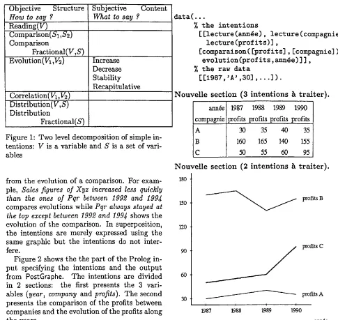
In our research, we have built a classifica- tion of messages, given in figure 1, based on Zelazny's (1989) work. At the first level, our classification contains 5 categories two of which have sub-categories obtained by using a frac- tional modifier.
For comparison, the fractional modifier indi- cates that the comparison should be done on fractions of t h e whole instead of t h e actual val- ues. For distribution, we obtain a specialized intention where the classes are presented ac- cording to their fraction of the total. At the second level, t h e intentions become specialized according to subjective criteria.
Objective Structure i Subjective Content How to say ? What to say ?
Reading(V)
Comparison(S1,S2) Comparison
Fractional(V,S) Evolution(V1,V2)
Correlation '<V1,V2) Distribution(V,S) Distribution
Fractional(S)
Increase Decrease Stability Recapitulative
Figure 1: Two level decomposition of simple in- tentions: V is a variable and S is a set of vari- ables
from the evolution of a comparison. For exam- ple, Sales figures of Xyz increased less quickly
than the ones of Pqr between 1992 and 1994 compares evolutions while Pqr always stayed at the top except between 1992 and 1994 shows the evolution of the comparison. In superposition, the intentions are merely expressed using the same graphic but the intentions do not inter- fere.
Figure 2 shows the the part of the Prolog in- put specifying the intentions and the output from
PostGraphe.
The intentions are divided in 2 sections: the first presents the 3 vari- ables (year, company and profits). The second presents the comparison of the profits between companies and the evolution of the profits along the years.We have also "ported" this idea of taking ac- count of the writer's intentions into the spread- sheet world by creating an alternative Chart Wizard for Microsoft Excel which asks for the intentions of the user (comparison, evolution, distribution ... ) instead of prompting for the sort of graphic (bar chart, pie chart ... ); see (Fasciano and Lapalme, 1998) for more infor- mation.
2 T e x t a n d g r a p h i c s i n t e g r a t i o n Graphics and text are very different media. For- tunately, when their integration is successful, they complement each other very well: a picture shows whereas a text describes. To create an
data(...
7. the intentions
[ [lecture (~nn4e), lecture (compagnie), lecture (profits) ],
[comparaison( [profits], [compagnie] ), evolution (profits,
~nn~e)
] ] ,7, the raw data
[[1987,'A' ,30]
, . . . ] ) .
N o u v e l l e s e c t i o n (3 i n t e n t i o n s h t r a i t e r ) .
annde compagnie
A
B
C
1987 1988 1989 1990 profits profits profits profits
30 35 40 35
160 165 140 155 50 55 60 95
N o u v e l l e s e c t i o n (2 i n t e n t i o n s h t r a i t e r ) .
180
150
120
90
60
30
profits B
profi~ C
/
profits A
1987 1988 9
1990
ann6e
De 1987 ~ 1989 les profits de la compagnie A ont augment6 de 30 $ ~ 40 $. Jusqu'en 1990 ils ont diminu6 de 40 $ ~ 35 $.
De 1987 h 1988 les profits de B ont augment6 de 160 $ h 165 $. Pendant 1 annfie ils ont diminu6 de 25 $. Jusqu'en 1990 ils ont augments de 140 $ h 155 $.
De 1987 h 1990 les profits de C ont augment6 de 50 $ h 95 $.
Figure 2: Input specifying the intentions and the French Report generated by
PostGraphe
[image:2.612.68.553.54.513.2]efficient report from tabular data, choices m u s t be m a d e between modes of expression (text vs graphics) by taking into account their strong points b u t also their effect on t h e reader.
Graphics are usually floating elements that do not appear just beside the accompanying text, t h e y are often moved to satisfy other graphical constraints such as avoiding blank space at t h e end of a page. Graphics make i m p o r t a n t ele- ments of the data standout and catch the eye of t h e reader. T h e text of the report does n o t only describe or analyse data b u t it also links with t h e graphics by means of references to re- inforce the intentions of the writer. Text a n d graphic coordination pose i m p o r t a n t problems identified in (Roth et al., 1991) as
s t r u c t u r a l i n c o m p a t i b i l i t y : text and graph- ics do not compose in the same way: for ex- ample, in a graphic representation of a tree, dependents are near the root b u t in a pre- order textual description, t h e links might be harder to make;
l a c k o f c o h e s i o n : for a text to make an ex- plicit link with the graphical elements of an illustration, t h e text generator must have access to the structural elements of t h e graphics;
r e d u n d a n c y : the text should not repeat infor- m a t i o n that is better given by the graphics, although in a few cases it is a good idea to re-emphasize important information in t h e text.
3 C o r p u s s t u d y
As we want to generate not only well formed text b u t appropriate ones that complement t h e information available from t h e graphics, we have built a corpus of 411 French texts asso- ciated with graphics from such diverse sources as "Tendances sociales" published every three m o n t h s by Statistics Canada, books on statis- tics, investment funds reports, governmental re- ports, etc.; see (Corio, 1998) for details. Like with most corpus studies, it is very hard to af- firm t h a t this s t u d y is representative b u t we have tried not to bias the kind of texts in any way except for cases when we detected t h a t ei- ther t h e text or t h e graphics were not appropri- ate given the principles alluded to in section 2.
The analysis of our corpus revealed 7 m a i n themes for texts combined with graphics. Ta- ble 1 gives t h e frequencies of each t h e m e for the intentions described in figure 2. We now briefly describe each theme w i t h a few examples. Fi- nally, we will raise some a u t o m a t i c text gener- ation issues t h a t were t h e main motivations for this study.
d e s c r i p t i v e gives an overview of the graphic or identifies its main visual aspect: for exam- ple, using a title or a legend, it describes the d a t a on the X or Y axis or t h e general tendency (increase or decrease). Often this description identifies a selection criteria for the d a t a such as Ten OCDE countries hav- ing the highest percentage of adults regis- tered to a University which indicate that the graphics only gives a partial view of the data.
This t h e m e is mainly associated w i t h read- ing (73%) and evolution intentions (22%). q u a n t i t a t i v e messages select the raw data
that should interest the reader because, for example, the reader is directly concerned with this value: for a bar chart giving the annual income of a group of cities The annual income of a Vancouver .family was 59 7005 in 1993 is particularly interesting for somebody who lives in the Vancouver area or if it illustrates an article t h a t deals with Vancouver.
It is interesting to see that m a n y quanti- tative messages of our corpus refer to d a t a that do not appear in the graphics; for ex- ample, the graphics shows a pie chart giv- ing a budget distribution for 1997 b u t the text compares those figures with t h e ones of the previous year.
This t h e m e is mainly associated w i t h com- parison (46%), evolution (30%) a n d read- ing (23%) b u t it is almost always possi- ble to generate a quantitative message from any data either as it is or after some trans- formation such as a mean, a sum or by giv- ing the range of t h e values.
Descriptive Quantitative Domination Deductive Discriminant Qualitative Justificative
reading comparison evolution correlation , distribution
%
98 23
11
6 46 65 16 7 2 4
30 30
3
5 31
8
33
17 3
Total 132 146 107 37 20
30 33 24 8 5
total % 134 30 99 22 85 19 68 15 38 9 13 3
5 1
442 100 100
Table 1: Counts of themes and intentions of messages in our corpus of 411 French texts; some texts carry more than one intentions and theme
clearly separated from the rest. The mes- sages can also indicate if the dominating values are for all possible cases. In Canada,
adults in the Newfoundland do the least sport can only be said if all provinces are shown on the graphics.
This theme is associated with comparison (76%) or distribution (20%) intentions; in the case of a fractional modifier, the domi- nating values are in terms of percentages but for distribution, domination is indi- cated by an interval instead of specific data. d e d u c t i v e messages draw a conclusion from
the shape of the graphics or the values of the data; it can be either some form of correlation, a characteristic or a constant value in the data. These messages often use extra information to draw some con- clusion. For example, Provinces of western Canada had the highest employment rate for teenagers in 1993 makes use of geo- graphic knowledge to link seemingly uncon- nected data: British Columbia, Alberta, Saskatchewan are part of western Canada but that fact is not explicitly given in the data for each of the ten provinces.
This theme is not closely linked with any particular intentions although correlation (49%) and comparison (24%) occur most often.
d i s c r i m i n a n t messages identify a particular fact that distinguish this value from the others: we show an irregularity, a turning point in a curve is identified or an exception in an otherwise constant situation.
This theme is associated with evolution (82%) and comparison (18%) intentions. q u a l i t a t i v e messages describe data in words
such as rare, weak, strong, frequent, high, low; the shape of the curve can also be given. Here the judgement of the writer has the highest influence because the same value can qualified differently depending on the context.
These messages are most often associated with evolution (62%) intentions but they can also be encountered with correlations (23%) and comparisons (15%).
j u s t i f i c a t i v e messages identify causes for phe- nomena such as Why is a bar the highest?,
Why the canadian dollar fell?, Why a given political party has more voting intentions?.
As our corpus has been mostly built from small texts we do not have enough data to associate this t h e m e with particular inten- tions. These kinds of messages are most often met in longer texts.
3.1 T e x t a n d g r a p h i c s i n t e r a c t i o n
[image:4.612.91.535.55.186.2]ics is really w h a t is important". R e d u n d a n c y only occurs when the text repeats exhaustively all t h e information and not when it pinpoints some i m p o r t a n t facts already "obvious" in t h e graphics.
Cohesion between text and graphics does n o t d e p e n d mainly on the type of graphics (bar chart, pie chart, etc.) b u t more on the type of d a t a on each axis. For example, in a graphic illustrating the sentence There are more gradu- ates in the highest salary brackets, data might be represented in salary intervals t h a t can either be shown as bars, as columns, as an area under a curve or even as pie pieces. T h u s each type of data has its own lexicon to insure cohesion: ten- dencies and evolution refer to a temporal axis no m a t t e r if t h e graphics is a curve or a bar chart.
In our corpus, there are few coreferences to visual elements of the graphics, b u t we believe that this p h e n o m e n o n is specific to our domain of statistical data. We are quite sure that in the domain of instructional texts, references to graphical elements occur more often.
3.2 L e s s o n s l e a r n e d for a u t o m a t i c g e n e r a t i o n
From this corpus study, we developped some rules for selecting appropriate comments asso- ciated with the graphics chosen by PostGraphe while not overburdening the user with special annotations for the data. But as we saw t h a t t h e texts are used to pinpoint some important aspects of the data, we need to know the inter- ests of the user in much the same way as Post- Graphe needs to know the intentions of the user like t h e Vancouver example given in the previ- ous section. T h e system must also know if a set of nominal values form a complete enumeration to affirm t h a t a value is the lowest ranking or if it deals with the ten most important countries. There is also t h e problem of knowing if it is ap- propriate to mention the crossing point of two curve or not or to speak about the reversing of a tendency.
Data must also be identified with sufficient detail to be described in the text. The system cannot infer t h a t a given percentage is the rate of persons charged of impaired driving without being given explicitly.
T h e system must also be aware of the ap- propriate vocabulary to qualify certain types of
data. For example 5% might be qualified as low for certain income tax rate b u t m i g h t be thought as high if it deals with an inflation rate in North America these days.
Messages t h a t draw a general conclusion such as Canadian families have been quick to adopt new information technologies in their home are quite difficult to generate automatically. T h e same can b e said of justifications or links w i t h the outside world such as those found in stock market reports (Kukich, 1983). For example, it is impossible to generate The price of gold dropped because of the BRE-X scandal from t h e raw data of transactions on gold.
For our text generation module, we will thus need a few more informations from t h e user such as the list of variables t h a t are more i m p o r t a n t to the writer and a slightly more explicit n a m i n g of the variables. As these informations are of utmost importance for t h e writer, t h e y should not be a burden to find and give. If t h e y are, then t h a t means t h a t t h e intentions of t h e writer are not clear.
4 C o n c l u s i o n
Our system is not t h e first one to combine text and graphics (see for example, multime- dia generation systems like COMET (Feiner and McKeown, 1991), SAGE (Roth et al., 1991) or WIP(Andr~ et al., 1993)). In our case, t h e out- p u t looks much simpler b u t our corpus analysis shows that, even in this case, the text genera- tion concepts necessary to combine w i t h these seemingly simple graphics is quite involved be- cause it must rely on t h e intentions of t h e writer which are often left implicit. Even w h e n t h e y are given, complexity comes from the combina- tions of b o t h media a n d intentions.
A c k n o w l e d g m e n t s
We thanks Massimo Fasciano for fruitful discus- sion about his work a n d his collaboration on this project. This project has been partially funded by a student grant from F C A R (Gouvernement du QuEbec) and a research grant from N S E R C (Governement of Canada).
R e f e r e n c e s
sentations. In M. T. Maybury, editor,
Intel-
ligent Multimedia Interfaces,
pages 75 - 93. AAAI Press, Cambridge, MA.Jacques Bertin. 1983.
Semiology of Graphics.
The University of Wisconsin Press. Trans- lated by William J. Berg.
William S. Cleveland. 1980.
The Elements of
Graphing Data.
Wadsworth Advanced Books and Software.Marc Corio. 1998. SElection de l'information pour la g6n~ration de texte associ~ ~ un graphique statistique. Master's thesis, Uni- versit6 de Montr6al.
M. Fasciano and G. Lapalme. 1998. Intentions in the coordinated generation of graphics and text from tabular data.
submitted to Natural
Language Engineering,
page 27p., January. Massimo Fasciano. 1996.Gdndration intdgrde
de textes et de graphiques statistiques.
Ph.D. thesis, Universit6 de Montreal.S. Feiner and K. McKeown. 1991. Automating the generation of coordinated multimedia ex- planations.
Multimedia Information Systems,
24(10):33-41, October.
Karen Kukich. 1983. Knowledge-b'ased report generation: A technique for automatically generating natural language reports from databases. In
Proceedings of the A CM SIGIR
Meeting,
pages 246-250. ACM.Steven F. Roth, Joe Mattis, and Xavier Mes- nard. 1991. Graphics and natural language as components of automatic explanation. In Joseph W. Sullivan and Sherman W. Tyler, editors,
Intelligent User Interfaces,
Frontier Series, chapter 10. ACM Press.Gene Zelazny. 1 9 8 9 .