Appendix A: Data selection
To conduct this analysis, a database was constructed that allows examining population
density distribution and its selected determinants across time. The primary source is US
Census data, and the sample consists of the entire population of the 351 municipalities in
Massachusetts in the state’s 14 counties.
1The term
municipality
is typical of Massachusetts,
where municipalities are established by a general act with a minimum requirement of 12,000
inhabitants. At present, Massachusetts’s municipalities include 39 city and 312 town
governments, whose identification is based on the existence of local, established institutions
to exert similar power and perform similar functions to govern civil life. According to the
historical information provided by the United States Census Bureau,
2the structure of the
census has experienced relatively few changes across time. In fact, changes that do appear are
mostly associated with the growth of new towns or the merging of others already in existence.
The first six censuses (1790-1870) were managed by the juridical branch of the federal
government. Each district was assigned a marshal who hired local assistants, typically
residents from a village or neighbourhood, to conduct the census. During this period, racial
classification was carried out by the enumerator, and people were not interviewed. Since 1880,
the census has been managed by the executive branch of the federal government. Notably, the
1890 census was the first to be organised by a tabulated scheme with precise questions
addressing race answered by people interviewed. Until the 1960s, data collection was
conducted by an enumerator and included interviews, while since the 1970s a self-enumerator
practice has been adopted. For this, a census questionnaire with instructions has been
delivered by mail. Once returned, the forms are reviewed by a census enumerator, and if
needed, follow-ups were performed. As for the accuracy of the data, US Census descriptives
1
As for the county composition of Massachusetts, a descriptive map is provided in Figure C1. 2
confirm the consistency of the design of the sample and the elaboration of statistics. Over
time, some changes in the structure and convergence of questions have been introduced,
though all editions are comparable. Concerning territorial composition, the number of
municipalities in Massachusetts was variable until 1930; the sample of the 19th-century census
reports only 270 municipalities per year against 351 since 1930.
Concerning determinants of population density distribution, this study’s choice is
motivated by reference to current literature. DURLAUF, 2004, has discussed that
individual-level decisions about location are mostly driven by a combination of three categories of
determinants: deterministic individual characteristics, predetermined neighbour-specific
characteristics, and individual subjective beliefs. HELSLEY and STRANGE, 2007, have
since refined that statement by arguing that the most relevant determinants in location
decisions are distance from the CBD, quality of the residential area, and accessibility of other
places of interest. These results are a generalisation of empirical results discussed in
QUIGLEY, 1985, for the Pittsburgh metropolitan area, for which the author found two main
determinants shape individual location choices: the commute to citizens’ principal places of
interests (e.g., the workplace) and the racial composition of the neighbourhood as the most
salient feature of neighbourhood characteristics.
Given these outcomes and accounting for the geographical structure of the sample
drawn from urban areas in Massachusetts, the study’s source of data allows considering the
distance from the common centre of interest (i.e., Boston), the presence of natural
amenities, and the racial composition of municipalities as location determinants. In addition,
the study includes some random effects to control for unobserved features.
By incorporating the relative ethnic composition of a municipality, some location
preferences are implicitly accounted for that may relate to ethnic or network features that
drive individual location choices. For instance, a territory highly dense in white population
can be more attractive for whites as opposed to blacks. This idea relies on the propensity of
individuals to interact or cluster with other individuals of the same ethnicity given their
common cultural habits (TOPA and ZENOU, 2015).
By contrast, not all censuses provide complete, detailed quantitative information of the
racial composition of the population. On the contrary, the division between whites and
blacks is nearly always present in all census editions since the inception of the institution.
More detailed information about other ethnic groups has been added in the most recent
years, though such plays a minor role in a great portion of municipalities. For the scope of
this research, the study privileges a strategy that splits the sample into two groups: whites
and other minorities, with the acknowledgment that blacks are pre-dominant among minority
groups. To be consistent over time, the percentage of white people over the total population
is used as a synthetic measure of a municipality’s ethnic composition. QUIGLEY, 1985,
stated that this type of division -namely, whites versus other ethnic groups- turns out to be
extremely effective in estimations. However, one unusual issue about the information remains
concerning; in the 1950 census, the word colour was removed from racially oriented questions
and reintroduced in 1960. Therefore, testing the impact of ethnic composition in shaping
population density distribution in 1950 was impossible.
As a proxy for accessibility, the geodesic distance of each municipality from Boston
provided by ArcView has been used. Furthermore, a proxy for natural amenities to represent the
quality of life in a municipality has been included. Here, amenities are measured as the
proportion of water areas over the total territory in each municipality, which has been treated
as constant over time. In the case of the proxy for amenities, this working hypothesis is not
extremely binding; in Massachusetts, nearly all artificial lakes and ponds (e.g., the Quabbin and
Wachusett Reservoirs) were created or completed in the 1930s, which aligns with the data to
which the study refers (SIMCOX, 1992).
As discussed in EPIFANI and NICOLINI, 2013, all of these variables jointly model
citizens’ desire for close proximity to Boston. As such, by estimating a type of population
density distribution function year by year, the relative importance of every covariate can be
assessed and their evolution tracked over time. Furthermore, the way in which priors are
modelled can allow a device to include the dimension of time: by creating a mechanism to
introduce individual expectations. Finally, some random effects control for poorly identified
territorial features and omitted variables.
Appendix B: Tables: statistics and estimations
A preliminary explorative data analysis of population density at the municipal level in the
14 counties of Massachusetts from 1930 to 2010 is shown in Table B1 and Figure B1 which
contains the sample means and standard deviations of population densities of each county
on a logarithmic scale. It reveals an increase in the standard deviation with a larger mean of
population density during each decade. Furthermore, the mean and variance of municipality
population densities exhibit a different trend in each county (Figure B1). The former feature
of the data - namely, an increasing standard deviation with larger mean of population
density- is consistent with a heteroscedastic model. The latter feature suggests that the
introduction of some spatial county effects in the model can capture heterogeneity among
counties.
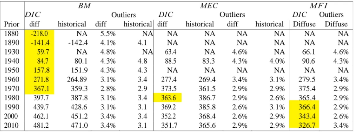
Table B1 shows that from 1930 to 1970 the simpler BM is sufficient for explaining
population density. Note that the percentages of outliers for BM, MEC and MFI remain quite
small (always under 5 percent) across time. By contrast, according to the DIC criterion, MEC
clearly dominates BM from 1980 onward, while MFI dominates the two others from 1990
onward.
Table B2 presents the statistics referring to the DIC criterion and Bayesian outlier towns in
details.
Instead, Table B3 summarizes the posterior distributions of the estimations with historical
priors.
Code County Obs 1930 1940 1950 1960 1970 1980 1990 2000 2010
1 Suffolk 4 12.860 (6.838) 12.224 (6.109) 12.556 (5.485) 11.673 (3.960) 11.162 (3.041) 10.007 (2.091) 10.308 (2.635) 11.345 (3.573) 11.568 (3.499) 2 Franklin 26 0.077 (0.141) 0.077 (0.142) 0.082 (0.157) 0.085 (0.160) 0.093 (0.164) 0.101 (0.166) 0.109 (0.168) 0.111 (0.164) 0.111 (0.159) 3 Playmouth 27 0.328 (0.587) 0.342 (0.575) 0.397 (0.597) 0.561 (0.775) 0.752 (0.973) 0.842 (0.980) 0.883 (0.974) 0.949 (0.997) 0.973 (0.970) 4 Middlesex 54 2.468 (4.911) 2.532 (4.862) 2.694 (4.977) 2.884 (4.630) 3.032 (4.402) 2.857 (3.938) 2.859(3.868) 2.948 (3.943) 3.012 (4.011) 5 Bristol 20 0.745 (1.400) 0.746 (1.379) 0.791(1.351) 0.841 (1.240) 0.956 (1.233) 1.009 (1.169) 1.064 (1.163) 1.114 (1.096) 1.138 (1.091) 6 Berkshire 32 0.130 (0.285) 0.132 (0.287) 0.142 (0.293) 0.151 (0.301) 0.160 (0.295) 0.155 (0.269) 0.149 (0.250) 0.143 (0.230) 0.139 (0.222) 7 Hampden 23 0.560 (1.111) 0.559 (1.092) 0.623(1.181) 0.747 (1.272) 0.824 (1.238) 0.795 (1.128) 0.814 (1.147) 0.814 (1.107) 0.829 (1.116) 8 Essex 34 1.427 (2.642) 1.430 (2.586) 1.515 (2.546) 1.644 (2.365) 1.783 (2.281) 1.740 (2.091) 1.815(2.201) 1.909 (2.290) 1.955 (2.358) 9 Hampshire 20 0.144 (0.230) 0.148 (0.226) 0.177(0.262) 0.213 (0.308) 0.254 (0.357) 0.283 (0.398) 0.296 (0.404) 0.306 (0.405) 0.316 (0.419) 10 Dukes 7 0.098 (0.112) 0.114 (0.134) 0.085 (0.116) 0.118 (0.143) 0.121 (0.145) 0.130 (0.167) 0.218 (0.245) 0.204 (0.233) 0.304 (0.333) 11 Worcester 60 0.349 (0.747) 0.359 (0.742) 0.388 (0.768) 0.426 (0.725) 0.475 (0.708) 0.482 (0.663) 0.531 (0.697) 0.565 (0.717) 0.598 (0.742) 12 Norfolk 28 0.896 (1.455) 0.969 (1.527) 1.166 (1.752) 1.486 (1.701) 1.743 (1.794) 1.729 (1.683) 1.740 (1.650) 1.819 (1.690) 1.871 (1.741) 13 Barnstable 15 0.090 (0.091) 0.100 (0.089) 0.120 (0.092) 0.167 (0.108) 0.229 (0.132) 0.353 (0.192) 0.434 (0.210) 0.512 (0.246) 0.492 (0.235) 14 Nantucket 1 0.077 0.071 0.073 0.074 0.079 0.106 0.126 0.199 0.213
Table B1: Number of the municipalities (Obs) and sample means (with standard deviations) of the population densities at municipalities level for every county from 1930 to 2010 (on linear scale). Source:
Prior BM DIC Outliers MEC DIC Outliers MF I DIC Outliers diff historical diff historical diff historical diff historical Diffuse Diffuse
1880 -218.0 NA 5.5% NA NA NA NA NA NA NA 1890 -141.4 -142.4 4.1% 4.1 NA NA NA NA NA NA 1930 59.7 NA 4.8% NA 63.4 NA 4.6% NA 66.1 4.6% 1940 84.7 80.1 4.3% 4.8 88.5 83.3 4.3% 4.0% 90.6 4.3% 1950 157.8 151.9 4.3% 4.3 NA NA NA NA NA NA 1960 271.8 264.89 3.1% 3.4 277.4 269.4 3.4% 3.1% 279.5 3.4% 1970 367.1 359.3 2.8% 2.9 373.5 361.5 2.9% 2.9% 375.4 2.9% 1980 397.7 387.8 3.1% 3.4 363.6 386.7 2.9% 2.6% 365.4 2.9% 1990 439.7 428.6 3.1% 3.1 369.2 385.8 2.6% 3.1% 366.4 2.9% 2000 462.1 451.2 3.4% 3.4 352.2 368.4 2.6% 2.9% 343.4 2.6% 2010 481.2 471.0 3.4% 3.1 351.7 365.6 2.9% 2.9% 326.7 3.4%
(a)
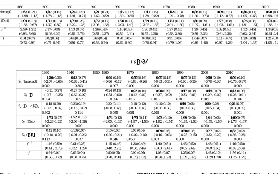
BM
1880 1890 1930 1940 1950 1960 1970 1980 1990 2000 2010 β0 (Intercept) −1.53 (0.21) −1.47 (0.15) −1.24 (0.31) −1.21 (0.21) −1.17 (0.17) −1.1 (0.15) −1.02 (0.13) −0.96 (0.12) −0.89 (0.11) −0.84 (0.11) −0.78 (0.10) ( -1.98 ,-1.13) (-1.78 ,-1.18) (-1.91, -0.71) (-1.62 ,-0.82) (-1.50 , -0.85) ( -1.39 ,-0.82) (-1.29 , -0.78) (-1.20 , -0.73) (-1.12, -0.67) (-1.05 , -0.63) (-0.98 , -0.59) β3 (Dist) −1.01 (0.18) −1.11 (0.13) −1.70 (0.25) −1.72 (0.17) −1.76 (0.14) −1.79 (0.12) −1.81 (0.11) −1.80 (0.09) −1.77 (0.08) −1.76 (0.08) −1.74 (0.07) (-1.38, -0.67) (-1.37, -0.87) (-2.22 ,-1.23) (-2.06 ,-1.38) (-2.03, -1.49) ( -2.02 ,-1.55) (-2.01 , -1.60) (-1.97 , -1.61) (-1.93, -1.61) (-1.91, -1.61) (-1.88, -1.60) 2.59 (1.21) 2.17 (0.88) 1.33 (0.57) 1.26 (0.48) 1.16 (0.40) 1.26 (0.45) 1.27 (0.45) 1.29 (0.45) 1.32 (0.46) 1.32 (0.45) 1.34 (0.48) (0.93 , 5.60) (0.93,4.29) (0.51, 2.76) (0.55 , 2.37) (0.54 , 2.11) (0.57 , 2.28) (0.58, 2.30) (0.59 , 2.33) (0.61, 2.36) (0.62 , 2.34) (0.61 ,2.44) θ 0.84 (0.07) 0.82 (0.06) 0.64 (0.04) 0.66 (0.04) 0.70 (0.05) 0.80 (0.05) 0.91 (0.06) 1.04 (0.07) 1.11 (0.07) 1.19 (0.08) 1.21 (0.08) (0.72, 0.98) (0.71, 0.94) (0.56 , 0.72) (0.58, 0.74) (0.62 , 0.80) (0.70, 0.91) (0.79, 1.03) (0.91, 1.18) (0.97 , 1.26) (1.04 , 1.35) (1.05 , 1.38) (b)MEC
1930 1940 1950 1960 1970 1980 1990 2000 2010 β0 (Intercept) −1.26 (0.36) −0.13 (0.27) −0.49 (0.19) −0.55 (0.16) −0.57 (0.13) −0.57 (0.12) −0.56 (0.10) −0.56 (0.10) (-2.07 , -0.65) (-0.63 , 0.41) (-0.86 , -0.12) (-0.86 , -0.26) (-0.83 ,-0.31) (-0.80 , -0.35) (-0.78, -0.36) (-0.75 ,-0.37) 0.000 0.303 0.007 0.000 0.000 0.000 0.000 0.000 β1 (Z) -0.11 (0.27) -0.27 (0.18) -0.24 (0.13) −0.22 (0.10) −0.20 (0.09) −0.17 (0.08) −0.15 (0.07) −0.13 (0.06) (-0.71 , 0.35) (-0.62 , 0.07) (-0.51 , 0.00) (-0.42 ,-0.02) (-0.37 , -0.02) (-0.33, -0.01) (-0.29 , -0.02) (-0.26, -0.01) 0.354 0.057 0.026 0.016 0.013 0.015 0.012 0.016 β2 (Z × Dist) 0.18 (0.29) 0.23 (0.19) 0.20 (0.14) 0.18 (0.12) 0.16 (0.10) 0.19(0.08) 0.20(0.08) 0.21(0.07) (-0.31 , 0.82) (-0.13 , 0.62) (-0.08 , 0.48) (-0.06 , 0.40) (-0.03 , 0.36) (0.03, 0.36) (0.05 ,0.34) (0.08,0.35) 0.302 0.114 0.085 0.061 0.048 0.009 0.004 0.001 β3 (Dist) −1.73 (0.27) -1.72(0.17) −1.74 (0.13) −1.75 (0.11) −1.73 (0.10) −1.69 (0.08) −1.64 (0.08) −1.60 (0.07) (-2.26 -1.23) (-2.06 ,-1.39) (-2.00 , -1.48) (-1.97 , -1.53) (-1.92 , -1.54) (-1.85, -1.52) (-1.79, -1.50) (-1.73, -1.47) 0.000 0.000 0.000 0.000 0.000 0.000 0.000 0.000 β4 (Mix) 0.12 (0.10) 0.13 (0.07) 0.10 (0.06) 0.08 (0.04) −0.09 (0.03) −0.20 (0.03) −0.27 (0.02) −0.32 (0.02) (-0.10 , 0.29) (-0.01 , 0.26) (-0.02 , 0.21) (-0.02 , 0.16) (-0.16, -0.03) (-0.25 ,-0.15) (-0.32 ,-0.22) (-0.36, -0.28) 0.113 0.037 0.046 0.050 0.003 0.000 0.000 0.000 1.16 (0.59) 0.61 (0.28) 1.15 (0.46) 1.30 (0.49) 1.40 (0.51) 1.45 (0.52) 1.48 (0.51) 1.46 (0.50) (0.41 , 2.73) (0.22 , 1.29) (0.48 , 2.23) (0.58, 2.44) (0.63 , 2.61) (0.65, 2.64) (0.68, 2.66) (0.69 ,2.64) θ 0.64 (0.04) 0.66 (0.04) 0.80 (0.05) 0.90 (0.06) 1.08 (0.07) 1.25 (0.09) 1.48 (0.10) 1.56 (0.11) (0.56 , 0.72) (0.58, 0.75) (0.70 , 0.90) (0.78, 1.03) (0.94 ,1.23) (1.09 ,1.43) (1.28,1.70) (1.35, 1.79)Table B3: Summaries of the posterior distributions of the parameters in Baseline model (BM ) and years t = 1880, 1890, 1930 −2010 and of the
parameters in Model with Ethnic Composition (MEC) from 1930 to 2010 (Data in 1950 for Mix are not available.) Statistical significant Bayesian estimations are in bold. Posterior means of the parameters are followed by (standard deviations) in the first row, 95 percent credible intervals are shown in the second row and Bayesian (posterior predictive) p-value only for the regression coefficients are in the third row. Part (a) refers to BM
(a)
(b)
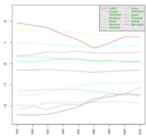
Figure B1: Sample means -(a)- and sample standard deviations - (b)- of the municipality population densities per
square mile of every county in Massachusetts, on a logarithmic scale, from 1930 to 2010. The values of sample means and standard deviations on original scale are shown in Table B1. Source: US Bureau Census, Calculus: authors.
Appendix C: Estimates of the county gamma frailties
The behavior of the posterior means of the random county gamma frailties
w
1(t),…..
,w
14(t),
under the diffuse prior across time, are shown in Table C1(a) for
BM
, in Table C1(b) for
MEC
and in Table C1(c) for
MFI.
For nearly all counties, the county random effects are less
important in
MEC
and
MFI
than in
BM
. This evidence is especially remarkable from 1980
onward, when
MEC
and
MFI
are actually preferred to BM, which could signify the increasing
importance of the ethnic predictor
Mix
(t)in describing population density distribution across
time.
Figure C1 points out the counties in Massachusetts having a county frailty far away from one on
average. The counties having random effect “
wi <<
1” are depicted in blue, and those with “
wi
>>
1” are in yellow, while the one whose county-gamma-frailty change over time in green. This
picture shows that counties with frailties significantly less than 1 are far from Boston, except
Suffolk. On the one hand, this outcome emphasises that population in municipalities
belonging to counties far from Boston might be attracted by CBDs other than Boston and
located in neighbouring counties or states.
3On the other hand, the case of Suffolk, the county in which Boston is located, might be
explained by the potential existence of another considerable point of attraction close to
Boston. Actually, in EPIFANI and NICOLINI, 2013, DIC exercises to identify Boston as
Massachusetts's CBD revealed the presence of other towns still in Suffolk or neighbouring
counties (e.g., Quincy in Norfolk County) that act as local points of attraction and whose
importance approaches Boston's.
3
Further investigation in this direction implies moving from a monocentric distribution function to a polycentric one. Nevertheless, given that the most geographical remote areas in Massachusetts are less sensitive to Boston's attractiveness is a clear signal that the geographical dimension considered here (i.e., Massachusetts) ts the analysis. In this sense, border states do not de facto limit the value of the results.
In addition, counties with a frailty term far greater than 1 are those near Suffolk and thus
reflect Boston's attractiveness. However, for both
BM
and
MEC
, the random county effects
seem to vanish over time, since their values concentrate close to 1 in the most recent decades.
In parallel, a progressive homogenisation effect seems to occur across time for these
countries, which makes the remaining covariates of estimations increasingly determinant in
shaping population density distribution. The only exception is represented by Barnstable
County, which exhibits an opposite trend, for there was no clear Barnstable effect until 1970.
Instead, since 1980 the impact of distance from Boston and
Mix
predictors on population
density are amplified by a county random frailty
w
13(t)concentrated around 0.65, which
signifies a peculiar county effect in this county's municipalities from 1970 onward.
Figures C2 and C3 display 95 percent posterior credible intervals of the gamma county
frailties
w
1(t),…..
,w
14(t), from decade 1930 to 2010, with posterion means shown with crosses and
their posterior medians by solid circles, under diffuse and historical priors, respectively. For each
decade, only the estimates under the best model -between
BM
and
MEC
and according to DIC
criterion- are given. These figures can be used for a robustness analysis with respect to the diffuse
or historical priors and for an analysis of the precision of the estimates
w
1(t),…..
,w
14(t). According to
these pictures, both diffuse and historical priors lead to highly similar temporal evolutions of
random effects; the smaller the posterior mean of the frailty, the more concentrated its prediction
interval. As expected, estimates based on historical priors are always more concentrated than those
based on diffuse ones.
(a) BM 1880 1890 1930 1940 1950 1960 1970 1980 1990 2000 2010 Suffolk 0.29 0.28 0.30 0.33 0.37 0.45 0.52 0.56 0.54 0.52 0.53 Franklin 1.30 1.12 0.76 0.76 0.71 0.84 0.91 1.05 1.20 1.23 1.31 Playmouth 2.39 2.47 3.14 3.13 3.12 2.79 2.46 2.20 2.12 2.10 2.11 Middlesex 0.88 0.86 0.90 0.92 1.00 1.05 1.12 1.16 1.14 1.16 1.18 Bristol 0.80 0.62 0.57 0.59 0.61 0.71 0.75 0.80 0.84 0.88 0.90 Berkshire 0.37 0.24 0.10 0.10 0.08 0.10 0.11 0.15 0.22 0.23 0.26 Hampden 0.41 0.30 0.12 0.12 0.11 0.11 0.12 0.16 0.19 0.20 0.20 Essex 0.68 0.69 0.76 0.80 0.86 0.96 1.02 1.06 1.04 1.05 1.06 Hampshire 0.69 0.62 0.41 0.42 0.35 0.37 0.38 0.42 0.50 0.50 0.51 Dukes 0.79 0.91 1.04 0.93 1.25 1.10 1.24 1.39 1.03 1.17 0.85 (b) MEC Suffolk Franklin Playmouth Middlesex Bristol Berkshire Hampden Essex Hampshire Dukes Worcester 1.43 1.41 1.57 1.74 1.77 1.76 1.67 1.58 Norfolk 2.62 2.62 2.25 2.16 1.88 1.81 1.66 1.70 Barnstable 1.33 1.18 1.00 0.86 0.64 0.65 0.57 0.65 Nantucket 0.77 0.79 0.78 0.82 0.73 1.00 0.89 0.96 (c) MF I Suffolk Franklin Playmouth Middlesex Bristol Berkshire Hampden Essex Hampshire Dukes Worcester 1.33 1.33 1.50 1.65 1.72 1.76 1.65 1.63 Norfolk 2.40 2.42 2.10 2.05 1.78 1.73 1.59 1.63 Barnstable 1.23 1.11 0.96 0.80 0.60 0.60 0.53 0.58 Nantucket 0.55 0.56 0.60 0.66 0.62 0.88 0.85 0.93
Table C1: Temporal evolution of the posterior means of the county gamma frailties under diffuse priors and BM (with only distance) for decades 1880, 1890 and from 1930 to 2010 in (a); under diffuse priors and MEC (with Dist, Mix and Z land) from 1930 to 2010 in (b); under diffuse priors and MFI (with Dist, Mix, Z land and the interaction Dist and Mix) from 1930 to 2010 in (c). Legend: the color blue denotes counties with mean frailty “much” less than one and color yellow is used to highlight the counties with mean frailty “much” greater than one. Lastly, Barnstable is green to denote a county effect changing over time.
Worcester 1.59 1.38 1.29 1.30 1.33 1.48 1.57 1.71 1.69 1.70 1.69 Norfolk 1.97 2.45 2.46 2.42 2.40 2.14 2.07 2.04 1.97 2.01 2.01 Barnstable 0.99 1.25 1.51 1.37 1.22 1.11 0.92 0.71 0.70 0.63 0.69 Nantucket 0.88 0.86 0.69 0.70 0.65 0.74 0.78 0.76 0.82 0.65 0.66 1930 1940 1950 1960 1970 1980 1990 2000 2010 0.25 0.27 0.35 0.39 0.50 0.50 0.67 0.68 0.75 0.70 0.79 0.91 1.08 1.13 1.41 1.42 2.70 2.77 2.58 2.28 2.04 1.70 1.50 1.33 1.18 1.23 1.32 1.40 1.34 1.44 1.34 1.38 0.55 0.55 0.68 0.74 0.87 0.83 0.86 0.83 0.10 0.08 0.09 0.11 0.19 0.23 0.35 0.41 0.12 0.11 0.11 0.12 0.24 0.28 0.36 0.37 0.68 0.71 0.85 0.91 0.93 0.91 0.88 0.84 0.41 0.38 0.35 0.38 0.48 0.57 0.61 0.68 1.10 1.07 1.11 1.17 1.26 1.20 1.23 1.19 1930 1940 1950 1960 1970 1980 1990 2000 2010 0.12 0.12 0.22 0.24 0.39 0.35 0.56 0.51 0.65 0.62 0.71 0.84 1.02 1.04 1.32 1.29 2.55 2.71 2.48 2.17 1.95 1.71 1.55 1.43 1.02 1.07 1.17 1.24 1.23 1.34 1.21 1.25 0.51 0.53 0.65 0.71 0.84 0.83 0.88 0.86 0.07 0.06 0.07 0.08 0.16 0.18 0.29 0.32 0.10 0.10 0.10 0.11 0.24 0.27 0.37 0.38 0.64 0.66 0.82 0.89 0.90 0.90 0.89 0.89 0.35 0.33 0.31 0.34 0.45 0.54 0.56 0.65 0.80 0.79 0.87 0.96 1.10 1.04 1.10 1.10
Figure C1: Map of the counties in Massachusetts colored according to the estimated county-gamma-frailty: blue when “wi << 1”, yellow when “wi >> 1” and green when the county-gamma-frailty changes over time. Source: US Census Bureau.
Figure C2: 95 percent credible intervals of the county frailties under BM with 1930, 1940, 1950, 1960 and 1970 Town Data in (a), (b), (c), (d) and (e), respectively. Credible intervals of the county frailties under MEC with 1980, 1990, 2000 and 2010 Town Data in (f), (g), (h) and (i), respectively. Posterior means are labeled by red crosses and posterior medians by solid blue circles. Estimates obtained under the diffuse priors.
Figure C3: 95 percent credible intervals of the county frailties under BM with 1930, 1940, 1950, 1960 and 1970 Town Data in (a), (b), (c), (d) and (e), respectively. Credible intervals of the county frailties under MEC with 1980, 1990, 2000 and 2010 Town Data in (f), (g), (h) and (i), respectively. Posterior means are labeled by red crosses and posterior medians by solid blue circles. Estimates obtained under the historical priors.
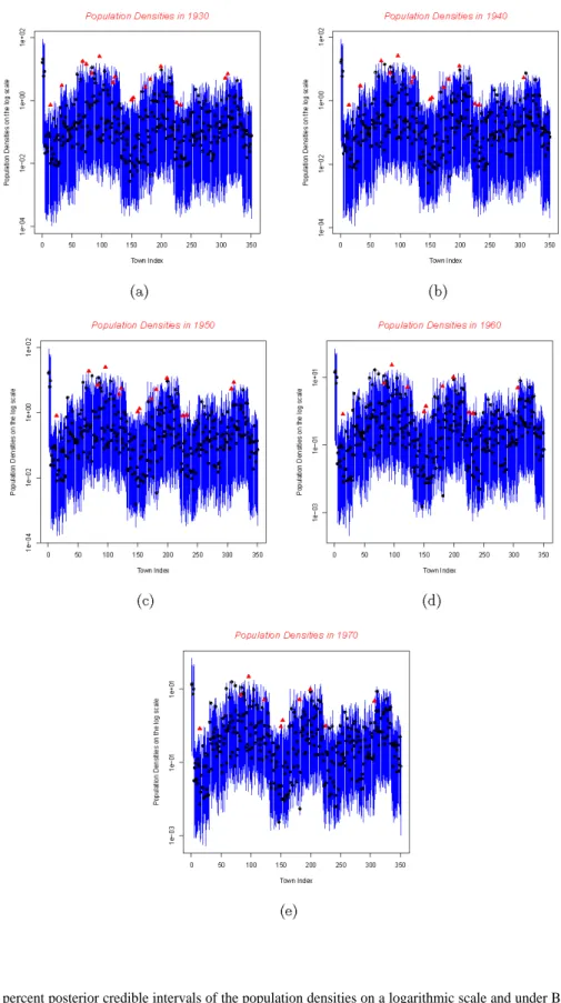
Appendix D: Credible intervals of the population density
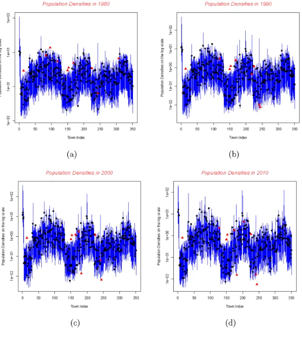
Figures D1 and D2 depict the 95 percent credible intervals of the population densities on the
logarithmic scale. The actual log densities
lnY
ij(t)of the town
i
in the county
j
are denoted by solid
black circles. Suspect outliers are marked by red-up pointing triangles. These images were
produced for the case of diffuse priors. In the most remote decades, a relatively large number of
outliers were identified, and the goodness-of-fit of the model in predicting population density
appeared quite weak. However,
MEC
succeeds in improving the quality of the estimations for the
most recent decades (namely from 1980 to 2010). Nevertheless, four towns are always outliers
across time as their real population density exceed the corresponding upper limits of the 95
percent credible intervals estimated under our Bayesian model; there cities are Greenfield in
Franklin County, North Adams City and Pittsfield in Berkshire County and Easthampton in
Hampshire County, all of which belong to remote, state-border counties far from Boston. It should
also be noted that nearly all these countries featured an important county effect that prevent any
distance-based model from selecting outlying observations.
Figure D1: 95 percent posterior credible intervals of the population densities on a logarithmic scale and under BM in 1930, 1940, 1950, 1960 and 1970, in (a), (b), (c), (d) and (e), respectively. Actual log population densities are denoted by solid black circles, suspect outliers are marked by red up-pointing triangles.
Figure D2: 95 percent posterior credible intervals of the population densities on a logarithmic scale and under MEC in 1980, 1990, 2000 and 2010, in (a), (b), (c) and (d), respectively. Actual log population densities are denoted by solid black circles, suspect outliers are marked by red up-pointing triangles.