Rochester Institute of Technology
RIT Scholar Works
Theses
Thesis/Dissertation Collections
11-14-1997
Twist
Takeshi Takamoto
Follow this and additional works at:
http://scholarworks.rit.edu/theses
This Thesis is brought to you for free and open access by the Thesis/Dissertation Collections at RIT Scholar Works. It has been accepted for inclusion
in Theses by an authorized administrator of RIT Scholar Works. For more information, please contact
Recommended Citation
ROCHESTER
INSTITUTE OF
TECHNOLOGY
A
Thesis Submitted
to the
Faculty
ofThe
College
ofImaging
Arts
and
Sciences
in
Candidacy
for the Degree
ofMASTER OF FINE ARTS
TWIST
BY
Date:
Approvals
Adviser: Philip Bornarth /
Date:
If
t
tf--
/11
7
IAssociate Adviser: Bob Heischman /
Date:
/ /
'/~'1
Z
Associate Adviser: Ed Miller /
Date:
II, /
<j,
9
7
Department Chairperson: Tom Lightfoot /
Date:
L
I .
/1<
q
7
I,
Takeshi Takamoto, hereby grant permission to the Wallace Memorial
Library of RIT to reproduce my thesis in whole or in part. Any reproduction
will not be for commercial use or profit.
Signature
Acknowledgement
I
wouldlike
to
expressmy
gratitudeto
all
my
professors whotaught
methe
joy
ofpainting,
all
my friends
who always supportedme,
and
my
family
who gave methe best time
ofmy
life
and
believed
in
me.Thesis
Proposal
The
purposeofthe thesis
is
to
exploreopposites,
such as naturalforms
contrasted with manmade
forms,
in
orderto
portray
the
coexistence of nature and man.In
addition,
I hope
to
seek natural and unique combinations and contrasts of realismand abstraction.
I
wishto
combine realisticimages
andfantasy
images
with symbolsCONTENTS
Introduction
My
background
in Japan
My
background
in Vermont
Influences
and
developments
ofmy painting
styleAt RIT-new development
Style
ofmy painting
My
recent works"Awakening"
"ONE"
"Circles"
"Surrounded"
"Light from
Paradise""Resistant"
Introduction
There
are somany
potential painters all overthe
world eventhough
they
know
that
being
a painter often meansit
willbe
tough to
make a
living. It
seemsthat
they
allhave
their
own reasonsfor
painting
and pursue whatthey
believe in
orderto
live
without a regret.
I
was one ofthose
potential painters and am now aboutto
earn aMaster's degree here
atRIT,
but
I do
not consider myself a risktaker.
By
knowing
whatI
am goodat,
I
would chooseto
pursuemy
careerin
the
artfield
no matter what.When
it
comesto
my background
andthe
way
I
choseto
be
apainter, that
showshow
life
can change
in
unexpectedways,
andhow
a person sometimeshas
to
acceptit. Now I
would
like
to talk
abouthow I
gotinvolved
in
painting,
my
development,
andmy
recentworks,
andI
hope
this
will encourage potential painters whohappen
to
readthis.
My
background in Japan
I
grewup
in
ahouse
which usedto
belong
to
a painterbefore
my
father bought
it from
the
artist.The
artisthad
to
sellthe
house because
ofbankruptcy.
One
goodthing
he did
for
me wasthat
he left
several paintings ofhis in
the
house
whenhe
moved out.
My
father
hung
some ofthe
paintings onthe walls,
soI
was surroundedby
these
paintings eversinceI
was ababy
andhad just
startedpaying
attentionto the
world around me.
In
addition,
my father's
youngerbrother
usedto
be
anillustrator
and a painterhad
a chanceto
look
athis
painting
tools in
his
studio.Even
though
I
had
noidea
ofhow to
usethem, especially
a paletteknife, they
interested
me.Growing
up in
Japan,
it
is very difficult
to
resistthe
temptation to
getinvolved
with comics and
animations,
andI
am no exceptionto this
rule.I
was not satisfiedby
just reading
andwatching them,
soI
startedcopying
superheroes.
Most
ofmy
childhood was
time
spentchallenging
myselfto
copy
cartoons accurately.Compared
withdrawing,
painting
and arthistory
did
notinterest
mevery
much.Travel to
Europe
during
high
school and visitsto
many
museumsthere
did
nothelp
increase my interest
in
painting
at all.Even
whenmy
high
school artteacher,
wholiked
the
workI
did
for his
class,
asked meto
join
the
artclub,
I
rejectedthe
offer.Soon
after
that,
creating
comicswith afriend
who asked meto
work withhim
occupiedmy
mind
completely,
andI
spentthe
nextfive
years ofmy life
drawing
comics.This
activity
helped
meto
improve my
drawing
skill andto
cultivatemy
imagination
alot.
My
imagination is
the
key
to
my
paintings right now.My
background
in Vermont
My
life
andmy
thoughts toward
painting
changeddramatically
in
the
summer of'91
whenI
visitedmy
youngerbrother
who wasstudying
atSaint Michael's College
in
Vermont. The
beauty
of naturein
Vermont
struckme,
andthat
made mefeel like
painting
nature.This became
the
prologueto
my
newlife
in the United
States.
I
wasto the
United
States,
I
felt like
learning
how
to
paintanddecided
to
study
abroad atSaint Michael's College. Although
it
was notmy
intention
to
study
art atfirst,
during
my
sophomoreyear
I decided
to
majorin
fine
art.It
seems asif
my
life
wasdirected
towards
painting
sinceI
first
visitedVermont.
Influences
and
developments
ofmy painting
style
After
setting my
aimto
getinvolved
in
painting,
it
waseasy
for
meto
decide
what
to
paint.Considering
what made mefeel like
painting, to
paint naturecameinto
my
mind naturally.At
the
sametime,
my life
in
Tokyo
andmy
father's
real estatebusiness
gave me aninterest in
architecture.Therefore
my idea
for
painting
cameto
depict
the
surreal combinations of nature andbuildings in
a realistic orimpressionistic
style.
In
my first
oilpainting
classI
waskind
of satisfiedby
painting
realistically.However,
just
asimpressionism
was popularamong Japanese
people, I
wasinterested
in
painting
impressionistically
too.
However,
this
was wheremy
former
professorcame
to
changemy
ideas
and style.He
taught
methat
abstraction wasthe
key
in
today's
artworld,
andthat
I
neededto
changehow
I
painted.Even
whenmy
former
professor explained whatit
was,
I had
noidea
whatabstraction was at
that
time
because
ofmy
poorEnglish
andmy
lack
ofknowledge
ofart.
My
originalidea
wasto
constructbuildings in
unusualplaces,
for
instance,
onthe
lake,
onclouds,
and so on.I
startedto
simplify
the texture
and reducethe
number offocus
ononly landscape
or naturepaintings,
an abstract symmetrical waterfallpainting
I
created out of nowhereimpressed
the
professor somehow.He
then
suggestedI
make a seriesof waterfall paintings
just like
that
one.This
turned
into
a greatopportunity
for
meto
exploremy
owndefinition
of abstraction.During
the
time I
exploredabstraction,
some people pointed outinteresting
influences
ofJapanese
culturein
some ofmy
paintings.It
was notactually
noticeableto me,
but I
could understandtheir
observations of similaritiesbetween
my
paintingsand
Japanese
prints.Although
I
had
nofavorite
artists atthat
time,
it is
almost surethat
I
had
been
influenced
by
alot
of paintingsthrough
outmy
life,
such asthe
Japanese
Ukiyoe
printmakers,
Hokusai
andHiroshige,
and western painterslike
Monet,
Toulouse-Lautrec
andPicasso. It is difficult for
meto
define
whatJapanese
paintingsare,
but I
musthave
been
absorbing
the
essences ofit
unconsciously.Perhaps
this
influence is
revealedthrough the
way I
usecolors,
draw,
orin
my
sense ofdesign.
After
I
startedtaking
foundation
courses atSaint Michael's
college,
I began
to
pay
attentionto paintings, prints,
andillustrations I
sawin
Vermont.
During
my
time
in
Vermont,
two things
interested
me,
one of which wasthe
prints ofSabra
Field,
wholived
in
Vermont,
andthe
otherone was printedT-shirts from
Ben
& Jerry's. The
two
are similar
in
that
they
both
werecolorful,
flat,
andhad
peaceful atmospheres.Those
two
features,
"colorful"and "flat,"have
somerelationship
to
my painting
style.Thus
it
might not
be
wrong
to
say
that
living
andstudying
artin Vermont
wasthe
majorAt RIT-new
development
Right before
I
graduatedfrom Saint
Michael's
College,
I
felt
that
I
needed moretime
to
think
aboutmy future
andto
improve
my
skilltoo.
So
I decided
to
goto
graduateschool.
At
my former
professor's
suggestion, I
sentmy
applicationsto
majorin
graphicdesign instead
ofpainting,
because he
told
methat
a persondid
nothave
to
go
to
schoolto
be
a painter.However,
there
was no schoolthat
acceptedme,
andonly
RIT
suggestedthat
I
switchfrom
graphicdesign
majorto
painting
major.This is
how I
got
to
RIT,
asif
someonedirected my
life
sothat
I
would continue painting.Coming
to
RIT
was abig leap
for
me,
andthis
pressure somehowturned
into my
motivation
to
be
a good painter.I
then
startedto
seek whatkind
ofpainting
style couldbe
rightfor
mein
orderto
develop. After I
made several experimental paintingsin
the
first
couple ofmonths,
I
decided
to
gather most ofthe
majorfeatures
ofmy
paintingsinto
one style.This idea
worked outperfectly,
andmy painting
style was established atthis
stage.I had
alsojust
startedto
paint on alarge
canvas aroundthat
time,
andI
have
nodoubt
that the
chanceto
work on alarge
canvas affected andhelped
meto
develop
my
styletoo,
because
nowI
had
morefreedom
of creation and moretime
to
think
andto
develop
paintings.To be
originalin
my
paintingsis
whatI
amalways after.At
the
sametime,
I
hope
that
my
paintings please myself and viewers.There
wastime
I
wasstanding
atthe
crossroads
to
decide
to
go either abstract or realistic.However
somehowit
wasStyle
of
my
painting
My
painting
style canbe described
in three
categories:color,
design,
andtheme.
First
ofall,
I tend to
use alot
of color asif to
make viewersdizzy. This
startedwhen
I tried
to
useevery
colormy
eyes could catchin
the
object.For
instance,
suppose
there
is
a greenleaf,
andit
looks like only
green color existsin it.
However,
several
different
colorsshouldbe
there
in
reality.Thus
I
expandthose
colors oncanvas.
The
words ofPaul Cezanne have influenced
me,
"Nature is
more oftenpresent
in depth
than
onthe surface,
andthus the
needto
addto
red and yellowvibrations of
light
enoughblue
to
make onefeel
the
air."(Joan
Minguest, 1995)
I do
not use
only
the
colorsI
seebut
alsothe
colorsI
imagine.
I
sometimesplay
with colorstoo.
There
seemsto
be
no rulein
the
way
I
usecolors,
but I
try
to
look
all over andkeep
them
in balance. Paul
Klee
says,
"
Every
color should notbe
usedtoo
much andtoo
little,
anddo
not attemptto
hand
ondeceptive
mixed colors without thinking."(MADO
Bijutsu-no-mado,
1
996)
I
follow my instinct
andtry
to
create some rhythmslike
musicwhen
I
play
with colors.Henri Matisse
also saysthat
whatis important in
constructing
colorsis only
to
bring
colors outto
make cleardifferences
like
a musiciandoes
in harmony.
(MADO
Bijutsu-no-mado,
1996)
In
my
paintings,
juxtaposition
ofcolors create rhythm
by
the
different
intensity
of colors andthe
contrast of warm andcool colors.
Secondly,
the
design
ofmy
paintingsis
often ruledby
the
way
I
use colors.My
break
objectsinto
pieces.Although
there
is
no specific rule ofhow
I break
an objectinto
pieces,
I
alwayslook for
the
shapes andlines
I like.
The
way I
create shapesreally
depends
onmy
mood whileI
ampainting,
andthis
can givethe
design
ofthe
painting
very
unpredictable effects.Since
I deal
withlandscapes
whichI like
to
makefun
andinteresting
to
look
at,
I do
not wantto
design my
painting
to
be
too
complicated anddifficult
for
viewersto
understand.My
paintings are given simple and symbolicfeatures
which
brings
an abstractquality
to them.
Finally,
the
theme
ofmy painting is
to
paintimaginary
andfantasy
landscapes in
order
to
showmy
appreciation of nature and remind myself ofthe
environmentalproblems we
have been
facing by depicting
the
coexistence of manmadethings
andnature.
I
usemy imagination
to
createfantasy
landscapes
andimages,
and use photosonly
as referencesbecause I have
noticedthat
using
photos oftenlimits my
imagination. When I
sketchideas from
imagination,
they
often change.Although
there
are
many
ideas I
wouldlike
to
try,
I
choosethe
idea
carefully
and useonly
oneI
feel
is
strong.
At
the
sametime,
I
seeksomething
newto
try
asa challenge.My
old paintingsor a previous
painting
sometimes give me ahint for
a newpainting,
but
I
attemptto
addnew
features
as a motivation of creationfor
me.My
interest
in
the
environmentoccurredfor
me whenI
movedto Vermont.
Tokyo
and
Vermont
have
quitedifferent
environments, andthis
gap
became
the
key
to the
theme
ofmy
paintings.I have
witnessedthe
pollution problems andthe
destructions
ofdirtier.
Many
dead
fishes
werefloating
onthe
river whereI
usedto
play,
andthe
greenfield
whereI
usedto
play
baseball
and soccerdisappeared
because
ofthe
buildings
constructed on
it.
However
I
stillhave
someinterest
in
architecturebecause
ofmy
father's
job,
andboth my
appreciation of nature andmy interest
in
architecture appearon
the
canvas.I
try
to
showviewersthe
worldfull
of coldgeometricforms,
the
convenient
lifestyle
in
exchangefor
losing
nature,
and afear
ofthe
possibledestruction in
the
future
by
making
contrastsbetween
buildings/
manmadeforms
andnature.
At
the
sametime,
I
wouldlike
to
suggestthe
coexistence of nature and man.Simple landscapes
also are one ofmy
themes
to
depict
the
energy
andbeauty
ofnature.
On
the whole,
painting landscapes
is fun
and alsohelps
to
remind me ofenvironmental problems.
My
recent
worksThe
six paintingsI
willtalk
about now arefrom
the
body
of workfor
my
thesis.
They
all are paintedin
oil oncanvas,
andthe
dimensions
vary.I
wouldlike
to
explainone
by
onein
chronological order sothat
my
change ofinterests in
style andtheme
will
be
clearerto
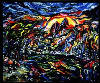
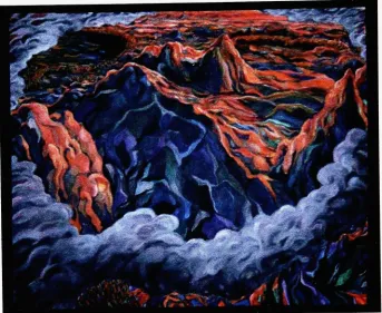
see."Awakening"
(Figure
1),
38"
x
46"
"Awakening"
is
aboutthe
energy
of mountains and nature.Basically
my
graduatestudy.
Therefore,
it
is
puzzle-like andhas
flatness,
andthis
time
it
wentextreme.
It
may
look too
busy
andhard
for
some viewersto
understand whatis going
on.
Unlike my
oldpaintings,
clear contrasts ofwarm and cool colors areintroduced,
especially
in
the
sky,
in
orderto
expressdynamism,
to
define
the
edges of mountainsand waveson
the
lake,
andto
use color realistically.It
wasoriginally designed
to
be
one of
the
fantasy
landscape painting
series "Where...,"and
it
was supposedto
be
titled
"Where Mountains Are
Born."In
my
originalidea,
stones arefalling
ontothe
ground
from
the
sky
to
build up
mountains.I
rejectedthis
idea because
the
stormy
sky
was
already
too
complicatedto
addthose
stones,
andinstead
I decided
to
focus
onthe
energy
ofthe
mountains andthe
nature aroundthem.
The
theme
was changedto
express
the
awakening
ofenergy
inside
ofthe
mountains asif
those
mountainshave
anger which
is
aboutto
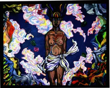
explode."ONE"
(Figure
2),
44"x
56"
The
secondpainting is
titled
"ONE". In
this painting, there
is
ahalf-naked
woman who appears
to
be
standing
but is
actually
floating
onthe
waterin
the
center.She is
surroundedby
mountains,
trees,
and clouds which are reflected onthe
surfaceof
the
water.This
time the theme
or concept cameinto
my
mind moreclearly
than
usual,
andits
designing
waseasy
to
realize.The
title
"ONE"means"to become
onewith
the
nature."It is
about a woman whois
a symbol ofthe
mother earth andthe
hope
nature,
including
the
nature onthe
surface of waterby
floating
onthe
water.Water is
asymbol of
life
too.
The
woman appears unconscious andinert, however,
the
vividcolors on
her
body
are a sign ofthe
absorption ofnature's essences.I decided
notto
make
it
too
complicated,
soI
created a clear separationbetween
the water, clouds,
figure,
and mountainsby
using different
colors andhues. In
orderto
provide
the
feeling
of a quietplace, I did
notbreak
the
water and mountainsinto
pieces.Introducing
afigure into
alandscape
was an unusualstep
for
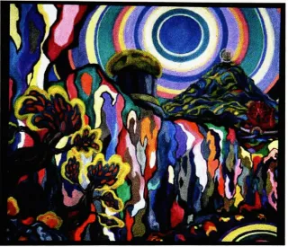
me."Circles"
(Figure
3),
42" x48"
In
"Circles,"I
attemptedto
mixmy
old style and pure abstraction whenI
had
avision of a
large
iceberg
meltedby
the
sun.It
was supposedto
be
titled
"Melting"andto
be
paintedin
variousmilky
colorsin
a puzzle-like style asif
it
were adream image.
However,
the
idea
did
not come out asI
imagined,
soI
changedthe
colorsto
be
brighter
and added otherelements,
such astrees,
atower,
an observatory-likebuilding
and an amusement park.The
theme
also changedto
showthe
relationship
between
nature and manmade objects onthe
earth:Like
the
suncreating
ahalo,
the
circles and round shapes are reflected
in
the
light from
the tower
in
the
distance,
aFerris
wheelin
the
amusementpark,
andthe
round roof ofthe
building
in
the
middleground as a symbol of relationship.
Thus,
this
painting
is
titled
"Circles". To
changeand
develop
an originalidea
was sometimesdifficult
but
gave me a chanceto
learn
to
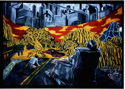
"Surrounded"
(Figure
4),
50"x 72"
I
neededto
waitfor
quite along
time
untilthe
idea for
the
nextpainting
"Surrounded",
cameinto my
mind.It
was atime for
meto think
of whereto
go next andwhatnew
thing
to
try.
Although
I
did
not get answersto those
questions,
astrong
image
whichsuddenly
cameinto my
mind made medecide
whatto
paint next andshowed me a new
direction
somehow.It
was animage
I
got whileI
wassitting
on achair
in
my
studio andlooking
atthe
walls which surroundedme,
andit
turned
into
asurrealistic
image
with ahuman figure.
However,
I
was concernedthat
it
couldbe
too
different
from
my
previous paintings.Nevertheless,
I decided
to
challengemyself,
because
it
seemedthere
was still a chanceto
leave
some marks ofmy
stylein
this
image.
The idea
ofmixing
my
style and a more realistic style was realizedby
creating
another
dimension
andcarrying my
style overinto
the
image
ofJapanese
screen ofthe
painting
in
the
middle ground.To
showmy
appreciation ofJapanese
prints,
I did
not make
the
screen part as colorful asI usually do but focused
onthe
sense ofthe
design
this time.
The
concept ofthe
painting is
to
suggestthe
irony
ofhuman
life
in
the
city
and awarning
of a possiblefuture
without nature.Except for
the screen,
most ofthe
painting
is gray
sothat the
color means coldness and oppression.This
helps
to
create astrong
contrast
between
colorlessinorganic
forms
and colorful organicforms.
The
big
screenis
a symbol of wealth andyearning like Japanese
culture,
especially
as exemplifiedby
prints and screen paintings which
became
aboom in Europe
as"Japonisme"
late
19th
century.The
design
ofthe trees in the
screen partis
influenced
by
the
Gustav
Klimt,
who wasinspired
by
Japonisme.
As
aresult,
this
painting
became very different
but
was still relatedto
my
oldpaintings
in terms
ofdesign
andthe
intent
to
build
afictional
world,
and alsoturned
outto
be
the
most narrative painting.I
think this
oneis
very
successful andled
meto
anew
level.
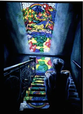
"Light
from
Paradise"(Figure
5),
44" x62"
Fortunately,
I did
nothave
any
problemsfor getting
anidea for
the
painting
"Light
from
Paradise."On
the
sameday
I
wassketching
for
"Surrounded,"I
gotthe
image for
this
painting
whenI
waswalking
down
the
stairs andthinking
about"Surrounded."
I
worked onthese two
paintings atthe
sametime, therefore,
the
similarities
between
"Surrounded"
and
"Light
from
Paradise"
may
appearinevitable in
terms
ofdesign,
realisticpainting
style,
and color.The
theme
ofthe
painting is
also similarto the
previouspainting,
"Surrounded,"
but it is
less
negative.It
is
notdealing
withthe
pictureofthe
future;
it simply is
aboutthe
hope
andyearning
of a mantrapped
inside
ofthe
building
andwanting
to
hold
the
beauty
of nature withinhim.
However,
he is
ironically
surroundedby
the
fake
naturejust
like
the
manin
"Surrounded."After
trying
adifferent
field
for
"Surrounded,"
there
wasnothing
to
make mebecause
ofthe
stained glasspart,
to
create a realistic space with asteep
angle,
andto
compose a quiet atmosphere
by
changing
the
intensity
oflights.
In
orderto
have
agood effectwith
the
stainedglass,
it
was requiredto
be
more realisticthan
before.
However,
it
was notmy intention
to
painttoo
realistically,
soI left
somelooseness
in it
in
orderto
let my
style remainin the
stained glass part andto
balance
the
stainedglass
painting
withthe
other areas ofthe
painting.Although
the
colorintensity
ofthe
reflection of
the
light
from
the
stained glass onthe
floor
became unrealistically
strong,
this
createddouble images
ofthe
stained glass andturned
outto
be
effectivein
keeping
the
image
stylized."Resistant"
(Figure
6),
50"x
60"
The
last
painting,
"Resistant,"is
based
on anetching
printI
madein
my
first
year.
After
the two
realisticpaintings,
I
had
an urgeto
paint a simplelandscape
andto
see
how it
wouldturn
out.I
decided
to
paintloosely
andto
stay
somewherebetween
realism and abstraction.
However,
I
felt
uneasy painting
asI had
planned,
andI
returned
to
my
oldhabit
ofbreaking
objectsinto
pieces.As
aresult, the
painting
became
a mix ofthe
puzzle-like style and realism.I had
nointention
ofrepeating
whatI
had already done
andgoing
back
to
my
old stylecompletely,
soI
figured
the
combination was suitable as a new style.
The
coloring
is
not as complicated asin
other paintings so
that the
contrastbetween
cool colors and warm colors canbe
clear.previous
two
paintings.I
have learned
that the
monochromatic
large
shape ofgray
helps
to
control and organizethe
diffusion
ofcolorsfor
painterslike
myself who usetoo
many
colors.The
contrastbetween
cool colors and warm colorsin
this
painting mostly
consists of
blue
and orange.I
seeblue
as symbol offear
andresistance,
and orangeas a symbol of
energy
anddestruction. The depiction
ofenergy
in
the
orange areaseems suggest either sunset or
sunrise, but in
my interpretation
it
suggests astrong
light
which comesfrom
the
explosion of an atomicbomb
in
the
distance. In
this sense,
the
huge
mountainin
the
middle ground canbe
a symbol ofdefense
andsomething
which stands
up
to
fight
againstthe
destruction.
My
interest
in
this
painting
wasto
depict
the
confrontation of cool colors and warmcolors,
andthat
idea
somehowhelped
this
painting
to
be
unusual.Conclusion
Through
the
process ofthese
sixpaintings,
my painting
stylehas developed
and
the
quality
ofmy
painting
has
alsoimproved
at some point.I
am proud ofthe
resultand
the
variety
of styles andthemes.
The
important
thing
I have
learned
through them
is
that
challenging
myselfis
the
key
to
success and satisfaction.Hopefully,
my painting
and
my interests
willkeep
changing
in
orderto
always motivate mein
the
future.
Life
is full
of surprises.I
am atthe
stage ofmy
life
whereI
could nothave
evenStates.
At
first painting
wasjust
one ofmy
hobbies,
and nowhere
I
am,
aboutto
earn aMaster's degree. The
fact
still seems unrealto
me sometimes.Though I feel uneasy
when
I
think
aboutmy
future,
I know
that
it
is wrong
notto
pursuemy
careerin
this
field
and
to
waste whatI have
learned
sofar.
Thus
I
shall not giveup
onthe
world ofBibliography
Fliedl,
Gottfried. Gustav
Klimt.
Colonge: Benedikt
Taschen,
1994.
Meuris,
Jacques. Rene
Maaritte.
New York: Barnes &
Noble,
1995.
Milner,
Frank. Henri Matisse.
New York:
Barnes
&
Noble,
1994.
Minguet,
Joan.
Cezanne: His
life
and complete works.Stamford
CT: Longmeadow
Press,
1995.
Murphy, Pat.,
andPaul
Doherty. The Color
ofNature. San
Francisco:
Chronicle
Books,
1996.
Slayton,
Tom.
Sabra Field.
Montpelier,
Shelburne: Vermont
Life,
Chapters,
1993.
Periodical:
"Lecture
on colorsfrom
greatpainters."
MADO
Bijutsu-no-mado
July
1996:
32.
Periodical:
"Hiroshiae."THE
SUN Series
No.3: Ukiyoe
seriesTokyo:
Heibonsha,
Autumn
1975.
Periodical:
"Hokusai."THE
SUN
Series
No.2: Ukiyoe
seriesTokyo:Heibonsha,
Summer
1975.
Exhibition: "Gauguin
andthe
School
ofPont-Aven"
7/26-9/15,1996.
Museum
ofFine
Figure 2. ONE. Oiloncanvas,
Figure4. Surrounded. Oiloncanvas,
[image:26.509.53.460.183.474.2]\W5^
f
< *
9k
1J
[image:27.509.113.398.134.528.2]
|4^|%-V
",
^**^^^^|;'4fr
.f
R
j
s
1 \
v&
i^fe
''-'{'$*# #*k,|**ww^ft
f
1 1 "JviiUMM Ml...
ffr^'TSSs
g
:#
Figure5. Light fromParadise.Oiloncanvas,
44' x
62"
Figure6.Resistant. Oiloncanvas,
50"
x
60"
[image:28.509.84.428.182.463.2]