The Derived Data Approach to Support the Construction
and Consumption of Explorable Visual Narratives
A thesis submitted to the
University of Dublin, Trinity College
For the degree of Doctor of Philosophy
Bilal Yousuf
Knowledge and Data Engineering Group School of Computer Science
Trinity College Dublin [email protected]
ii
Declaration
I, the undersigned, declare that this work has not been previously submitted as an exercise for a degree at this or any other University, and that, unless otherwise stated, it is entirely my own work.
iii
Permission to Lend or Copy
I, the undersigned, agree that the Trinity College Library may lend or copy this thesis upon request.
iv
Acknowledgements
Firstly I would like to thank my supervisor Professor Owen Conlan for his guidance, support and encouragement over the years. I would also like to thank Dr. Seamus Lawless, Dr. Alex O’Connor and Dr. Theresa Doyle for their time and feedback while I was compiling this thesis.
I would like to express my gratitude to the members of the KDEG research group and the ADAPT centre, both student and staff members who participated in the user trials conducted in this thesis, for their generosity with their time and their invaluable feedback.
v
Abstract
This thesis proposes a novel approach called the derived data approach that supports the construction and consumption of explorable visual narratives in Technology Enhanced Learning (TEL). Like many other domains, TEL environments generate valuable data which can be difficult to interpret. As TEL continues to grow in popularity, the challenge of addressing high student dropout rates remains, which is due to a low level of student involvement in the learning process. Learning Analytics aims to motivate learners and enhance their engagement by using the student-logged data generated by TEL environments and also enables educators to monitor students. It uses Information Visualisation to present interactive views using student-logged data that learners and educators can analyse. Information Visualisation research has demonstrated the value of visual narratives in communicating a message, by highlighting facts and making the message more memorable. In addition, visual data exploration can support users in gaining deeper understanding of data. However, in many domains and specifically in TEL, there are deficiencies in the presentation of explorable visual narratives which could enable the analysis of data related to it. In addition, there is limited support offered during the construction of explorable visual narratives, specifically in the automatic generation of sequences which present visualisations that can be applied in such narratives.
The derived data approach supports the creation of explorable visual narratives by automatically generating and presenting sequences of visualisations for a narrative under construction. It also supports the exploration of these narratives by deriving and presenting data related to it, which can be further investigated. A framework consisting of a set of models and components based on this approach has been designed and implemented in a technical infrastructure called VisEN (Visual Explorations through Narratives). The implementation of VisEN is tightly coupled to the design requirements to realise this approach, hence its evaluations validate the usefulness and effectiveness of this approach.
vi
Contents
Declaration ... ii
Permission to Lend or Copy ... iii
Acknowledgements ... iv
Abstract ... v
List of Figures ... xii
List of Tables ... xiv
Abbreviations ... xv
1 Introduction ... 1
1.1 Motivation ... 1
1.2 Research Question ... 4
1.3 Research Objectives ... 6
1.4 Contribution ... 7
1.5 Methodology ... 8
1.6 Thesis Overview ... 10
2 Information Visualisation: Making Sense of Digital Data ... 12
2.1 Introduction ... 12
2.2 Data Access and Data Transformation ... 13
2.2.1 Data Access ... 13
2.2.2 Data Transformation ... 15
2.3 Visual Encoding ... 17
2.3.1 Mapping Data to Graphical Marks ... 17
2.3.2 Mapping Data to Visualisation Techniques ... 18
2.4 Visual Interactions ... 20
2.4.1 Select ... 20
2.4.2 Explore and Elaborate ... 22
vii
2.4.4 Navigate ... 26
2.4.5 Multiple and Coordinated Views ... 27
2.5 Guidance ... 28
2.5.1 Constructing Visual Narratives ... 30
2.5.2 Consuming Visual Narratives ... 35
2.6 Personalised Visualisations ... 41
2.7 Summary ... 42
3 State of the Art: Visualisations in Technology Enhanced Learning ... 44
3.1 Introduction ... 44
3.2 Self-Reflection and Social Comparison ... 47
3.3 Open Learner Models ... 47
3.4 Educational Data Mining ... 48
3.5 Learning Analytics ... 49
3.6 Supporting Educators in monitoring student learning ... 50
3.6.1 Instructional Intelligence System ... 50
3.6.2 CourseVis ... 51
3.6.3 GISMO ... 53
3.6.4 SNAPP ... 54
3.6.5 LOCO-Analyst ... 55
3.6.6 Analysis ... 57
3.7 Supporting Students in monitoring their progress ... 59
3.7.1 SAM ... 60
3.7.2 CAM Dashboard ... 63
3.7.3 Moodog ... 65
3.7.4 MACE Zeitgeist ... 67
3.7.5 LARAe ... 69
3.7.6 eMUSE ... 71
viii
3.7.8 TrAVis ... 74
3.7.9 Navi dashboard ... 76
3.7.10 StepUp ... 78
3.8 Discussion ... 80
3.8.1 Best Practices and Trends ... 80
3.8.2 Limitations ... 81
3.8.3 Summary ... 82
4 Design ... 87
4.1 Introduction ... 87
4.2 Approach Definition ... 87
4.3 Approach Overview ... 90
4.4 Defining Framework Requirements ... 91
4.4.1 Supporting Visual Narrative Authoring ... 92
4.4.2 Supporting Visual Narrative Navigation and Exploration ... 92
4.4.3 Framework Requirements ... 93
4.5 Framework Description ... 94
4.5.1 Visual Narrative Construction Design ... 94
4.5.2 Visual Narrative Navigation and Exploration Design ... 95
4.5.3 Summary of Framework Components and Models ... 96
4.6 Overview of VisEN framework ... 97
4.7 Narrative Builder ... 98
4.7.1 Data Connection ... 98
4.7.2 Narrative Authoring ... 100
4.7.3 Derived Data Visualisation Model ... 102
4.8 Visualisation Engine ... 105
4.8.1 Visualisation Schemas ... 106
4.8.2 Query Builder ... 109
ix
4.9 Visual Narrative Explorer ... 112
4.9.1 Visual Narrative Viewer ... 113
4.9.2 Usage Pattern Store ... 113
4.9.3 Tailoring Engine ... 114
4.10 Scope of the Framework ... 115
4.11 Summary ... 117
5 Implementation ... 118
5.1 Introduction ... 118
5.2 VisEN Features ... 118
5.3 Technologies Employed ... 119
5.4 Narrative Builder ... 120
5.4.1 Data Connection ... 120
5.4.2 Narrative Authoring ... 123
5.4.3 Derived Data Visualisation Model ... 129
5.4.4 Analysis ... 132
5.5 Visualisation Engine ... 134
5.5.1 Visualisation Schema ... 134
5.5.2 Query Builder ... 136
5.5.3 View Generation Model ... 137
5.5.4 Analysis ... 140
5.6 Visual Narrative Explorer ... 141
5.6.1 Visual Narrative Viewer ... 141
5.6.2 Usage Pattern Store ... 145
5.6.3 Tailoring Engine ... 146
5.6.4 Analysis ... 147
5.7 Summary ... 148
6 Evaluation ... 149
x
6.2 Evaluation Strategy ... 151
6.3 Experiment 1: Proof of Concept Evaluation ... 154
6.3.1 Experimental Goals ... 154
6.3.2 Experimental Setup ... 155
6.3.3 Experimental Results ... 156
6.3.4 Analysis & Summary ... 158
6.4 Experiment 2: View Generation Model Evaluation ... 159
6.4.1 Experimental Goals ... 159
6.4.2 Experimental Setup: Part one ... 159
6.4.3 Experimental Results: Part One ... 161
6.4.4 Experimental Setup: Part two ... 165
6.4.5 Experimental Results: Part two ... 166
6.4.6 Summary & Analysis ... 167
6.5 Experiment 3: Visual Narrative Evaluations through Real World Settings ... 167
6.5.1 Experimental Goals ... 168
6.5.2 Experimental Setup: Part One ... 169
6.5.3 Experimental Results: Part One (Student Visual Narratives) ... 172
6.5.4 Experimental Setup: Part Two ... 186
6.5.5 Experimental Results: Part Two (Monitoring Student Learning Behaviour) 186 6.5.6 Analysis and Summary ... 187
6.6 Experiment 4: Authoring and Consuming Visual Narratives ... 188
6.6.1 Experimental Goals ... 189
6.6.2 Experimental Setup ... 190
6.6.3 Experimental Results ... 194
6.6.4 Technical Feasibility Study ... 207
6.6.5 Analysis & Summary ... 208
xi
7 Conclusions ... 211
7.1 Objectives and Achievements ... 211
7.2 Contributions to the State of the Art ... 216
7.3 Future Work ... 219
7.3.1 Extending VisEN ... 219
xii
List of Figures
Figure 2.1 Supporting Higher Selection Criteria ... 21
Figure 2.2 Table Lens zoomed view ... 21
Figure 2.3 Visual Explorations in Tibco Spotfire ... 23
Figure 2.4 Name usage frequency in NameVoyager ... 25
Figure 2.5 Ellipsis Narrative Authoring ... 31
Figure 2.6 Visual Authoring in SketchStory ... 33
Figure 2.7 Gapminder presenting world health data ... 36
Figure 2.8 The New York Times visual narrative on carbon emissions ... 38
Figure 3.1 Instructional Intelligence System ... 51
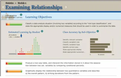
Figure 3.2 CourseVis Scatterplot ... 52
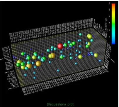
Figure 3.3 Student Access logs in GISMO ... 54
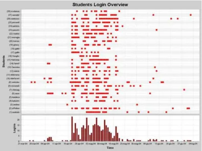
Figure 3.4 SNAPP ego-network visualisation ... 55
Figure 3.5 LOCO-Analyst Student performance view ... 56
Figure 3.6 SAM User Interface ... 60
Figure 3.7 CAM Dashboard... 63
Figure 3.8 Moodog Student Activity ... 66
Figure 3.9 Zeitgeist Dashboard ... 68
Figure 3.10 LARAe Dashboard ... 70
Figure 3.11 eMUSE Visualisations ... 71
Figure 3.12 ALAS-KA Class Visualisations ... 73
Figure 3.13 TrAVis Radar graphs showing peer comparisons ... 75
Figure 3.14 Navi Dashboard: Badges awarded over times ... 77
Figure 3.15 StepUp Dashboard ... 78
Figure 4.1 Approach Overview ... 91
Figure 4.2 Visual Narrative Construction design ... 94
Figure 4.3 Visual Narrative Exploration design ... 96
Figure 4.4 VisEN Framework ... 98
Figure 4.5 Data Connection design ... 99
Figure 4.6 Narrative Authoring design ... 101
Figure 4.7 Derived Data Visualisation Model ... 103
Figure 4.8 Generating Derived data transformations ... 104
Figure 4.9 Visualisation Engine design ... 106
Figure 4.10 View Generation Model ... 110
xiii
Figure 5.1 Data Source Specification and Connection ... 120
Figure 5.2 Narrative slice construction ... 124
Figure 5.3 Assembly of a visual narrative ... 125
Figure 5.4 Sample Schema ... 135
Figure 5.5 Visual Narrative Interaction and Explorer interface ... 142
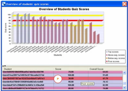
Figure 6.1 Arc diagram showing student relationships regarding recommended titles ... 156
Figure 6.2 Narrative slices and visualisation lists ... 160
Figure 6.3 A visualisation selected from a narrative slice dropdown ... 161
Figure 6.4 Visualisations corresponding to the four narrative slices ... 170
Fig. 6.5. Visual Narrative Revisits (left: improving students; right: other students) ... 173
Figure 6.6 Responses from improving students (left) and the rest of the class (right) ... 177
Figure 6.7 Responses from improving students (left) and the rest of the class (right) ... 178
Figure 6.8 Responses from improving students (left) and the rest of the class (right) ... 180
Figure 6.9 Responses from improving students (left) and the rest of the class (right) ... 181
Figure 6.10 Responses from improving students (left) and the rest of the class (right) .... 182
Figure 6.11 Responses from improving students (left) and the rest of the class (right) .... 183
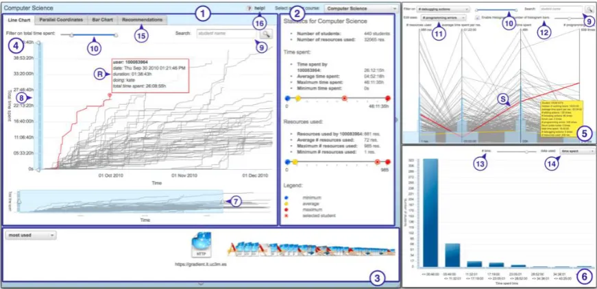
Figure 6.12 Visual Narrative Interaction and Explorer interface ... 192
Figure 1 Monitoring based on faceted browsing ... 235
Figure 2 Classroom Views ... 236
Figure 3 STEMscopes Dashboard ... 237
xiv
List of Tables
Table 3-1 System Summaries (ISD: Individual Student Data; PC: Peer Comparisons; SM:
Statistical Measures) ... 84
Table 4-1 Summary of functionality of framework sub-components and models ... 97
Table 4-2 Visualisation Schema Keys ... 108
Table 5-1 Presentation tier implementation details ... 121
Table 5-2 Data Connection Application tier implementation details ... 123
Table 5-3 Data Connection Data tier implementation details ... 123
Table 5-4 Narrative Authoring Presentation tier implementation details ... 127
Table 5-5 Narrative Authoring Application tier implementation details ... 128
Table 5-6 Narrative Authoring Data tier implementation details ... 129
Table 5-7 Implemented Transformations ... 130
Table 5-8 Derived Data Visualisation Model Presentation tier implementation details ... 131
Table 5-9 Derived Data Visualisation Model Application tier implementation details .... 132
Table 5-10 Supported Visualisation Techniques ... 135
Table 5-11 Query Builder Application tier implementation details ... 137
Table 5-12 Query Builder Data tier implementation details ... 137
Table 5-13 View Generation Model Implementation Details ... 139
Table 5-14 Visual Narrative Viewer Presentation tier implementation details ... 144
Table 5-15 Visual Narrative Viewer Application tier implementation details ... 144
Table 5-16 Visual Narrative Viewer Data tier implementation details ... 145
Table 5-17 Usage Pattern Store Application tier implementation details ... 146
Table 5-18 Usage Pattern Store Application tier implementation details ... 147
Table 6-1 Thesis Experiments Summary ... 154
Table 6-2 Data analysis and narrative slice construction questionnaire responses ... 157
Table 6-3 Data analysis and narrative slice construction questionnaire responses ... 158
Table 6-4 Questionnaire responses per narrative slice ... 163
Table 6-5 Correlation between course engagement and visual narrative usage ... 175
Table 6-6 First task questionnaire statements responses ... 195
Table 6-7 Hypotheses Tests results ... 197
Table 6-8 Second Task Questionnaire responses ... 198
Table 6-9 Hypotheses Tests results ... 201
Table 6-10 Narrative slice descriptions by data source for step 6 ... 202
xv
Abbreviations
AIED Artificial Intelligence in Education AJAX Asynchronous JavaScript XML API Application Programming Interface CAM Contextualised Attention Metadata CMS Course Management Systems CSV Comma Separated Values DSL Domain Specific Language EDM Educational Data Mining HCI Human Computer Interactions HTML Hypertext Markup Language ITS Intelligent Tutoring Systems KML Keyhole Markup Language
LA Learning Analytics
LMS Learning Management System MOOC Massive Open Online Course OLM Open Learner Model
PLE Personalised Learning Environment SQL Structured Query Language
SUS System Usability Scale
TEL Technology Enhanced Learning URI Uniform Resource Identifier
VisEN Visual Explorations through Narratives XML Extensible Markup Language
Abbreviations for Evaluation Features
EF1 VisEN provides visual interactions including drilldown, zooming, details-on-demand and filtering to facilitate view manipulations.
EF2 VisEN provides a process to facilitate visual encoding by mapping narrative slice data to a set of appropriate visualisation techniques.
xvi
EF4 VisEN supports authors, who have access to and an understanding of their own or others data, to produce visual narratives, through the automatic generation of derived data slices.
1
1
Introduction
1.1 Motivation
As Technology Enhanced Learning (TEL) environments are continuously growing in popularity1,2, the challenge of addressing poor student engagement and high dropout rates when using these technologies needs to be tackled. In such environments, students’ active involvement and engagement with the learning process is lower than traditional classroom settings, and hence they tend to get demotivated, leading to high dropout rates (Koutropoulos et al., 2012). Such environments typically generate large quantities of student-logged data including their interactions with learning resources, assigned activities, discussion forums and course-related quizzes. This data often contains valuable information that can highlight resource usage trends, reveal learner engagement levels and can be used to present peer comparisons. However, in its raw format, it can be quite difficult to interpret and explore by students, educators and other interested stakeholders, who can collectively be referred to as end users. Nonetheless, there is a need for these end users to make sense of this data, to communicate over it and to share it, as it may highlight trends and influence decisions. As a result, mechanisms are required to enable end users to understand and explore this data. TEL is indicative of many domains, in that it is rich in user data that can be presented through multiple contexts providing several opportunities to enable end users to visually scrutinise and explore the data. Guiding end users through TEL data can highlight important facts, such as learner engagement and resource usage trends, while at the same time presenting an authored message that can be consumed. In addition, supporting end users in exploring this data during consumption can enable them to scrutinise areas of personal interest and obtain a better understanding of the data. Guiding end users through complex data and supporting explorations into it requires mechanisms that enable effective authoring of messages with less prescriptive consumption.
One way of addressing these issues is to provide end users with visual stories that can be navigated and explored to help make sense of such data. These visual stories are constructed by users with knowledge of the data and are supported in the construction process through mechanisms that suggest sequences within the visual story.
1 http://www.forbes.com/sites/michaelhorn/2015/04/23/report-that-says-online-learning-growth-is-slowing-
misses-big-picture/
2
Information Visualisation facilitates an effective means to comprehend data as it maps data attributes to visual properties, forming visualisations that support pattern discoveries, communication and understanding of data (Card et al., 1999, Riche et al., 2010). Mapping appropriate visualisations to datasets or segments of data is common in visualisation tools (Gonzalez et al., 2010, Viegas et al., 2007) where a chosen dataset or data segments are automatically visualised. Storytelling in Information Visualisation or visual narratives can be defined as an ordered sequence of steps consisting of visualisations, which are linked or connected to make the communicated message more memorable (Austin, 2011). Visual narratives also provide effective ways of highlighting facts, making points and passing on information (Kosara & Mackinlay, 2013). Research in visual narrative has recently started to gain momentum and has been used in both journalism (Gao et al., 2014, Hullman et al., 2013b, Segel & Heer, 2010) and by visualisation tools3,4 (Lee et al., 2013). However, visual narrative has not been used to facilitate the exploration of data related to the visual narrative that may support its credibility and offer further insights into it. Visualisation tools currently support users in constructing visual narratives through mechanisms that enable data and filter specifications; however the automatic generation of suggested sequences for the visual narrative are not supported.
Data transformation (Card et al., 1999) is the process of providing derived values and structure for input data. The state of the art in both Information Visualisation and educational systems (that use visualisations to present student data) support data transformations, but these are limited to data parsing, data extraction and providing statistical measures such as aggregates and summaries. Derived data transformations5 are defined in this thesis as transformed data that is generated from the data source (input data) using predefined mappings to present data related to visualisations in the visual narrative. These transformations can provide statistical measures but they also provide related data views that can help end users to comprehend the data surrounding the visual narrative.
The derived data transformations are manifested as visualisations which can be used to support both the construction and consumption of visual narratives. In the case of consumption, the derived data transformations are appended to the visual narrative, rendering it as an explorable visual narrative. These transformations enable end users to
3 http://www.gapminder.org/ 4 https://viz.ged-project.de/
5 Derived data transformations are referred to as derived data slices in the context of visual narrative
3
investigate the data surrounding the explorable visual narrative and can help them in gaining certain insights that may not be achievable through the original message in the narrative. For example, a visual narrative presenting student performance and consisting of derived data transformations (rendered as explorations) can be used by an educator to assist him/her in comprehending the data surrounding the narrative. The derived data transformations (explorations) can provide the educator with useful insights, such as the time spent by the students against activities or resources used. In the case of visual narrative construction, the derived data transformations suggest subsequent visualisations for the visual narrative by displaying data related to the previous created visualisation.
Visual data exploration supports end users in gaining a better understanding of the data when little is known about it and exploration goals are vague (Keim, 2001). In addition, visual interactions such as selecting, filtering, and navigating support end users in making sense of data through view manipulations (Kosara et al., 2003). In addition, the drilldown interaction technique allows end users to explore details behind the presented visualisations6, as they render a more detailed view of a specific element within the visualisation that is under examination. Nevertheless, these drilldowns do not necessarily show related data that can include detailed views of specific elements, summaries and derived data explorations of a particular visual narrative.
Data tailoring addresses information overload by representing data customised for the individual which includes filtering out data the end user finds irrelevant (Gauch et al., 2007). As the derived data explorations present data related to the visual narrative (to support end users in gaining insights into the data), tailoring these explorations to the preferences of end users can reduce information overload and present explorations of interest to them.
Addressing the issue of enabling end users to make sense of and explore student-logged data through explorable visual narratives require:
mechanisms to enable and support individuals (who have some degree of knowledge of the data they have access to, but may not necessarily have any visualisation expertise) to build explorable visual narratives. In this thesis, these individuals are referred to as ‘authors’,
enabling end users to consume these explorable visual narratives. The end users will be referred to as ‘consumers’ throughout this thesis.
4
This leads to two key challenges; the first of these challenges is to support authors in constructing a story using student-logged data, which is complemented with automatically generated visualisations, resulting in a visual narrative. The visual narratives are further expanded with derived data explorations. Authors are supported in the construction process through suggested sequences, where the derived data slices are used to generate the suggested sequences. The authors have access to student-logged data (through systems they are responsible for or through open and freely available data), and wish to publish it to a target audience in a narrative format that can be easily followed and explored. The visualisations (both the narrative and the derived data slices) in the explorable visual narratives must be appropriate for the data and automatically generated to complement the story.
The second key challenge is to support consumers in navigating and understanding these explorable visual narratives. As mentioned above, exploring the data related to a story may provide end users with a deeper understanding or insight into the message communicated by the explorable visual narrative. Addressing this challenge requires a means to enable consumers to easily navigate and understand the message communicated in the explorable visual narrative, which is complemented by derived data explorations. These explorations are available to consumers as they view the explorable visual narratives and they can customise them by selecting which type of derived data they wish to have included in the explorable visual narrative. Based on the interactions of the consumer, the orderings of the derived data explorations can be tailored to the individual’s preferences.
By addressing these two challenges, authors would be assisted in sharing their understandings through a narrative format that is complemented by visualisations, and consumers would be supported in understanding and exploring student-logged data. This would enable the large quantities of TEL generated student-logged data, which contains valuable, sought after information and which is often quite difficult to decipher, to be presented in a format that can be consumed and explored by consumers.
1.2 Research Question
This body of work aims to address the following Research Question:
5
In the context of this research, authors are users who have access to student-logged data from systems they are responsible for and have an insight of, or have access to and an understanding of others’ open data. Authors are not required to have any expertise with visualisations. They may wish to communicate this data in a story format that is complemented by visualisations and that can be understood and further explored by a wide audience of consumers including a target set. For example a university professor may need to provide students who are participating in a personalised online course with live performance and learner engagement data and also highlight performance and engagement issues per individual. His students may wish to explore the time they spent on certain tasks and make comparisons with peers, which may not necessarily be available in the message provided by the professor. Or the professor may need to assess how well the learning needs of his students are being met and may wish to correlate the content they used with their assessments, and communicate his findings to the university and publishers, who in turn may require further details before making a decision.
The Research Question addressed by this thesis consists of two parts:
1. supporting consumers in understanding, benefiting from and gaining insight into TEL data they are interested in through explorable visual narratives,
2. supporting authors in constructing explorable visual narratives.
This thesis describes an innovative approach, which aims to address both parts of the Research Question, which are directly aligned to the two challenges discussed in section 1.1 (supporting the construction and consumption of explorable visual narratives). The research includes the implementation of a framework called VisEN (Visual Exploration through Narratives) which addresses both parts of the Research Question to support this approach. VisEN supports authors to construct explorable visual narratives (hereafter referred to as visual narratives), and addresses the second part of the Research Question as follows:
by generating visualisations for author specified data,
by suggesting sequences for the visual narrative through derived data slices,
by using these derived data slices (transformations) to append explorations to the visual narrative using appropriate visualisations.
VisEN addresses the first part of the Research Question by supporting consumers in: navigating and analysing visual narratives,
6
tailoring the derived data explorations according to consumer preferences.
Both sets of users need to have rudimentary computing skills, such as Internet browsing, while authors also require basic Microsoft Excel or CSV skills. The main difference between authors and consumers is that the former have some degree of knowledge about the dataset that they are using to build the visual narrative.
1.3 Research Objectives
There are four research objectives (stemming from the Research Question) that this thesis aims to address:
1. Research objective one is to analyse the state of the art to identify how well the two challenges discussed in section 1.1 are currently addressed:
Challenge One: Supporting users (authors) to communicate student-logged data in a format that is easily consumable.
Challenge Two: Enabling users (consumers) to understand student-logged data and gain deeper insights into it by providing mechanisms to facilitate explorations within the same dataset.
This analysis will examine the methodologies used by systems in the Information Visualisation domain to support the access and communication of data. It will also discuss best practices in Information Visualisation to support users in making sense of data through visual interactions and analyse the level of exploration supported by visualisation systems. Findings from the analysis of these systems will be used to create a list of important tasks and features that visualisation systems should support to help users in making sense of data. Relevant tasks and features from this list will be used to analyse the TEL state of the art systems which present visualisations using student-logged data in order to support users in making sense of data.
7
3. Research objective three is to design and implement a framework (VisEN – Visual Explorations through Narratives) that will realise the approach defined in research objective two. Since the vast majority of student-logged data generated by online learning systems is numeric and stored in tabular formats, such as task completion times, performance, number of resources used and discussion forum activity (Govaerts et al., 2012, Jovanovic et al., 2008, Charleer et al., 2014), the approach will be implemented using tabular and numeric data.
4. Research objective four is to evaluate the approach defined by objective two with authentic users through realistic use cases to assess the extent to which VisEN supports the construction and consumption of visual narratives (addressing both parts of the Research Question). This includes using the approach to support the engagement and performance of undergraduate students, by assisting them in understanding their logged data through visual narratives. It also includes using the approach to provide educators with visual narratives presenting student learning behaviour. A secondary aim of this objective is to evaluate the implementation of the approach on tabular and numeric data from a non-TEL domain in order to determine the effectiveness of the approach in a different domain.
1.4 Contribution
This thesis proposes an innovative approach called the derived data approach that incorporates derived data transformations (synonym for derived data slices and derived data explorations) into the process of constructing and consuming visual narratives from student-logged data. The primary motivation of this approach is to use derived data explorations to support consumers in exploring visual narratives and gaining deeper understandings of the student-logged data. The secondary motivation is to use derived data slices to support authors in creating visual narratives.
8
VisEN was used by the AMAS Personalised Learning Environment (PLE7) to provide individualised visual narratives (presenting learners’ course engagement breakdown, task durations and peer comparisons) to a total of 233 students pursuing undergraduate degrees across two academic years. The AMAS PLE was used by the learners (third and final year Computer Science and Computer Engineering students) as part of their course work for the Information Management and Data Engineering module run in Trinity College Dublin. Version 2 of the framework addressed the first part of the Research Question or challenge two (supporting the consumption of visual narratives). Version 3 of VisEN was used to produce visual narratives with the support of derived data slices. It was also used to support the consumption visual narratives through derived data explorations. Version 3 of the framework addressed both parts of the Research Question or both challenges one and two (supporting the construction and consumption of visual narratives).
This work has contributed to eight conference, work shop and journal publications in the area of TEL. The details of these publications are outlined in Chapter 7.
1.5 Methodology
A review of the state of the art was undertaken in the area of Information Visualisation to identify best practices and limitations in the construction and consumption of visual narratives and to support consumers in making sense of data. From this review a set of recommendations were made regarding important tasks and features visualisation systems should support. Relevant recommendations from this set were used to analyse educational systems using visualisation to support students in making sense of their logged data and assisting educators in viewing student learning patterns. The analysis of the state of the art in Information Visualisation and educational systems (trends and limitations) greatly influenced the definition of the approach and the design of the framework that realised this approach. The implementation of the VisEN framework closely adhered to the design requirements and was developed in phases (proof of concept prototype followed by three versions) which gradually integrated all of the design requirements.
A proof of concept prototype was first developed allowing participants of a user trial to take on the role of authors and construct narrative slices using a connected data source. It also enabled participants to take on the role of consumers and view, navigate and explore the AMAS PLE student-logged data presented through inter-connected visualisations and
7 A PLE is a learner-centric educational platform used by students for self-directed learning
9
coded explorations. The goal of the prototype was to present a partial implementation of the approach to participants familiar with student and educator needs in TEL and attain feedback using a questionnaire to determine suitability and effectiveness of this approach. The response to the proof of concept was largely positive with participants favouring navigating and exploring data through inter-connected visualisations. This response indicated that a framework supporting the construction and consumption of visual narratives in TEL would be valuable.
Following the positive feedback from usage of the proof of concept prototype, version 1 of VisEN was implemented which generated and ranked visualisations for specified data segments. This version implemented the design requirements to generate and rank a set of appropriate visualisations for specified data. This was evaluated by ten experienced visualisation users and their feedback was used to determine how comprehensible, accurate and appropriate the visualisations were for the data segments. This feedback was gathered using a questionnaire.
10
Version 3 of VisEN was implemented to include the functionality of narrative construction supported through derived data slices, thereby completing the full implementation of the approach. This version was evaluated by 40 users who constructed visual narratives from two data sources (including a data source from a non-TEL domain) and who viewed and explored a previously constructed visual narrative. The data used for this evaluation consisted of task completion times, system interactions, questionnaire responses and structured interviews.
A total of four user experiments were devised for the proof of concept and three versions of VisEN to evaluate the derived data approach. The proof of concept prototype and version 1 of the framework implemented aspects of the approach and participant feedback from user trials was used to improve implemented features. Versions 2 and 3 of VisEN addressed the two parts of the Research Question outlined in section 1.2. Specifically, version 2 addressed the first part and version 3 addressed the second part of the Research Question.
The research methodology adopted by this thesis was a combination of quantitative and qualitative research methods, which included the analysis of participant logged data, questionnaire responses and interviews. The quantitative method used in this thesis included the analysis of questionnaire responses of participants evaluating the proof of concept, versions 1, 2 (AMAS PLE students) and 3 of the framework. The quantitative method was also used to analyse student visual narrative usage data (version 2) and participant timings in constructing narrative slices (version 3). The remaining analysis in this thesis used the qualitative method which focused on participant interviews, including the Information Management and Data Engineering module course professor interview prior to the completion of version 2 of the framework and its deployment to the AMAS PLE. The evaluation of version 3 of the framework also consisted qualitative evaluations in the shape of structured interviews with 40 participants who used VisEN to construct and consume visual narratives.
1.6 Thesis Overview
11
can scaffold both the construction and consumption of visual narratives. The chapter concludes with a list of recommendations that visualisation systems should implement to support authors in constructing visual narratives that can be consumed and explored. Chapter 3 uses the relevant recommendations from Chapter 2 to analyse the state of the art in TEL systems that present visualisations using student-logged data to learners and/or educators. It identifies best practices including support for peer comparisons, visual interactions and the presentation of live student data. It also highlights limitations which include the lack of visual narratives in TEL and limited focus of data transformations which concentrate only on statistical measures and do not include the presentation of related data. Both Chapters 2 and 3 address research objective one (analysing the extent to which authors are supported in communicating a message using their data through visualisations and consumers are assisted in understanding and exploring this data).
Chapter 4 uses the influences from the Chapters 2 and 3 to define the derived data approach and design a framework to realise this approach. It provides an overview of the approach and identifies a list of design requirements. The chapter consists of detailed descriptions of all of the components of the VisEN framework which amongst others comprises of the Derived Data Visualisation Model (responsible for dynamically generating derived data transformations) and the View Generation Model (responsible for generating visualisations). Chapter 5 discusses the implementation details for the sub-components, engine and models of the VisEN framework that adhere to the design requirements to realise the approach. The chapter includes discussions on the features supported by the implementation of the framework and highlights the technologies and third party libraries used. Chapters 4 and 5 address research objectives two and three (defining, designing and implementing the approach).
Chapter 6 addresses research objective four (evaluating the approach using authentic users through realistic use cases) by evaluating the effectiveness of the derived data approach through the analysis of the results of four user-based experiments. The evaluation consists of quantitative and qualitative studies.
12
2
Information Visualisation: Making Sense of Digital Data
The amount of data that has been either created or replicated to date (2015) has almost reached eight trillion gigabytes and has been projected to reach a total of 40 trillion gigabytes by the year 20208. The vast majority of this data has been generated from user interactions, including those with social media and devices connected to the internet, in addition to data published by enterprises and government bodies. This data can quite often be difficult to interpret by ordinary people as it can be overwhelming and obscure. However, there is a need for individuals to make sense of this data, to explore it, to communicate over this data and to share it, as it often contains valuable information that can highlight trends and influence decisions. The need to understand and explore this data may result from requirements of individuals to report findings, or from requirements of analysing data where a user is a stakeholder and intends to take some particular action. As mentioned in Chapter 1, Information Visualisation maps data attributes to visual properties and forms visualisations which can offer simpler ways for users to understand and consume data (Card et al., 1999). In addition Visual Analytics aims to support users in the process of understanding data (Thomas & Cook, 2005). This chapter describes the state of the art in Information Visualisation, by identifying important visual analysis tasks and features to support users in making sense of data (research objective one). It includes a discussion on best practices and limitations in visual exploration and guidance and concludes with a list of features that visualisation systems should support in order to assist one set of users in constructing visual narratives and another set of users in understanding and exploring data. 2.1 Introduction
Information Visualisation taxonomies, reference models, and visual navigation patterns are used in this chapter to highlight important transformations, interaction techniques and models required for visual analysis. A number of taxonomies (Heer & Schneiderman, 2012, Yi et al., 2007, Chi, 2000) outline visual analysis tasks that support the data exploration process and briefly discuss implementations of these. The reference models (Card et al., 1999, Chi, 2000) highlight various abstractions, transformations and mappings applied to data as it is visually analysed by users. The visual navigation patterns (Schneiderman, 1996, Van Ham & Perer, 2009) outline tasks that support users in manipulating views. This chapter discusses best practices in these areas by describing the features supported and their implementations by the state of the art visualisation systems. These areas include data access
13
and data transformation, visual encodings, visual interactions, visual guidance and personalisation practices in Information Visualisation. This chapter provides a deeper analysis into these systems than that found in the taxonomies and models referenced above, by comparing and contrasting implementations, highlighting best practices, discussing evaluation results (where available) and identifying limitations.
The remainder of this chapter is structured as follows: section 2.2 discusses data access and data transformation; section 2.3 addresses visual encodings; section 2.4 describes visual interactions; section 2.5 discusses visual guidance and section 2.6 outlines personalisation directions in Information Visualisation.
2.2 Data Access and Data Transformation
Visualisation systems access data from several sources including single and multiple databases, spreadsheets and other file formats. However, this data may require transformations or derivations to alter values and its underlying structure to present new attributes or related data. This section discusses and analyses data access and data transformation research in Information Visualisation.
2.2.1 Data Access
A large number of visualisation systems (Tang et al., 2004, North, 2000, Woodruff et al., 2001, Derntl et al., 2012, Mazza & Dimitrova, 2007) support visualising data accessed from relational data models. Generally this is from a single specified data source, for example, Rivet (Tang et al., 2004) uses three layers to support data access. The first layer is the "ordered relational data model" where data sources use an abstraction to appear equivalent to the users. The second layer is a "named data sources and a data repository" to simplify data retrieval by users. The third layer is an "XML file specification" with information about a data source. Derntl et al. describe an architecture that allows specific users (widget creators) to create widget-based visualisations (Derntl et al., 2012). These visualisations are created by selecting a database connection from pre-configured database connection strings, constructing a query and defining the visualisation technique to be used to display the query results.
In some cases, such as Tableau9, née Polaris (Stolte et al. 2002), data can be accessed simultaneously from multiple data sources. Tableau uses data blending (Morton et al., 2012)
14
to create visualisations using data from multiple sources. Data blending consists of three steps10:
Data Acquisition (gathering data from the various specified sources), Joining Data (combining it into a dataset),
Data Cleansing (removing unwanted data).
Visualisation systems (Gonzalez et al., 2010, Viegas et al., 2007) also support users uploading data, either from file systems or entering it through web-based interfaces, which then gets visualised. In the case of systems such as Tableau and Tibco Spotfire11 users can upload data from the file system in addition to connecting to data sources. A system called Many Eyes (Viegas et al., 2007) uses a table based data model consisting of same-length named columns supporting numeric or text type data. Google Fusion Tables (Gonzalez et al., 2010) allows users to upload their data and explore it through appropriate visualisations proposed by the tool (based on the data types present). It supports data uploaded from sources such as CSV files, Spreadsheets and KML (Keyhole Markup Language).
Analysis
Relational models are very prevalent, offering access to existing datasets and allowing designers to decouple the visualisation system from the data (Tang et al., 2004). Users are also interested in viewing and querying related data from multiple data sources (Morton et al., 2012), and it is common to find related data across multiple data sources instead of residing in one dataset. Supporting user-uploaded data through files or web-based interfaces is also a popular mechanism to specify data. This allows users to upload data that is free from missing or erroneous values and allows data to be structured in a fashion that supports the process of visual encodings. However, such architectures introduce overheads where users are required to locate and structure the data according to specifications. This discussion highlights the importance of supporting data from both relational data and uploading data from user files, and it can be seen that commercial visual analytics tools such as Tableau and Tibco Spotfire support both formats. In the TEL domain, student-logged data is usually stored in databases. However learner reports12, including grades, are usually formatted for CVS and MS Excel files. Hence supporting both relational models and various file formats for accessing data can be considered important.
10 http://www.datawatch.com/what-is-data-blending/ 11 http://spotfire.tibco.com/
15 2.2.2 Data Transformation
Data transformation (also referred to as Derive or Connect) is the process of providing derived values and derived structure for the connected data source (Card et al., 1999), in addition to handling data errors and missing values. Data transformations are applied using source data, metadata and database schema including data types, keys and relationships. An example of derived values can refer to applying statistical measures to the data and derived structure can refer to sorting and classifying the data. These derivations can support various views of the data such as counts and aggregates. The derivations can also present attributes related to those shown in the visualisations and can assist users in gaining a deeper understanding of the data through exposure to related data. For example, a visualisation presenting resources used by a student for a selected course task can include transformations that display related data rendered through visualisations, such as the student’s performance against the task or resources used by top performing students for the same task. Heer and Schneiderman highlight the importance of such transformations in the data analysis process by noting that: “visual analytics tools should include facilities for deriving new data from input data” (Heer & Schneiderman, 2012).
16
network visualisation showing university study patterns between modules and degrees awarded for the student body across seven academic years (Mahoney, 2013). The system provides three statistical analysis graphs to support exploration by showing data related to the original view. The first statistical analysis graph presents the mean amount of modules shared between degree awards. The second graph shows the density of the graph by calculating the mean amount of connections for each degree award as a proportion of the maximum connections available. The final graph presents the modularity of the degree awards. Data transformations used in TitleBars (Hearst 1995) and Information Mural (Jerding & Stasko, 1998) involve parsing data into feature vectors to support the computation of data intersections (TitleBars) and facilitate dynamic value filtering (Information Mural). Matkovic et al. use a coordinated visualisation system to present an intensive care unit dataset consisting of logged entries of patient data including statistical summaries and differences of the selected data (Matkovic et al., 2012).
Analysis
17
can be generated and made available to the learner. Such dynamic transformations are not supported by the state of the art.
2.3 Visual Encoding
Visual encoding is the process of mapping data to either suitable graphical marks that are used to form a view, or to suitable visualisation techniques (a predefined view, such as bar charts, line charts, etc.). Graphical marks are areas, lines and points used to encode information through positional (one, two or three dimensions), retinal (size, colour, texture, shape, etc.) and temporal properties (Bertin, 1983). This section discusses 1) systems that map data to graphical marks to build visualisations and 2) systems that map data to a predefined visualisation technique, and compares and contrasts both methods.
2.3.1 Mapping Data to Graphical Marks
A number of visualisation systems (Livny et al., 1997, Tang et al., 2004, Stolte et al., 2002, Mackinlay, 1986) map data to graphical marks, which are combined to create a visualisation. For example, DEVise (Livny et al., 1997) consists of source data tables (TData) and graphical representations (GData). The records in the TData tables are mapped to visual symbols to create GData table entries consisting of visual attributes, such as colour, orientation, axes, size and shape, and the mapping process uses the TData schema. Rivet (Tang et al., 2004) uses an architecture which maps nominal values to colour and quantitative values to size and defines encodings which map certain data fields to certain visual variables, such as axes and colour.
18
Gantt bar, rectangle, glyph, polygon, circle and image. Finally the visual mappings component uses the selected mark to encode the relevant database fields.
A Presentation Tool (ATP) (Mackinlay 1986) uses compositional algebra consisting of graphical languages and operators to generate designs. It requires application designers to supply data, which is analysed for structural properties of inputs, such as qualitative, ordinal, numerical and nominal values when synthesising designs, which are produced as an abstract image description. ATP uses graphical objects, including points, lines, and areas as sentences of graphical languages (collection of tuples), and semantics, to encode arrangements of graphical representations. The graphical sentence specifies the location of the graphical object, which can be used to determine the height and width of the object (expressiveness). ATP also considers the perceptions of an individual viewing the image and encodes ordering, size and colour into the graphical design process based on the input data. The composition algebra is used to generate designs by using a set of primitive graphical languages and composing design by merging parts that encode the same information. The synthesis algorithm consists of three processes: 1) partitioning the set of relations until a match is found with a primitive language; 2) selecting of candidate designs for each partition; and 3) combining the designs using composition operators.
Analysis
Both more recent and historical visualisation systems have used, and are currently using, techniques to map data to graphical marks. Expressions, consisting of operands and operators and compositional algebra have been used effectively by Tableau and APT respectively to map data to graphical marks. These types of mappings offer several advantages such as increased generalisation, extensibility and flexibility as new mappings can easily be added (Tang et al., 2004). In addition various types of datasets can use existing mappings. However, the literature suggests that over-generalisation, which is a feature that can result from these types of mappings, requires additional work to create appropriate encodings for specific visualisations.
2.3.2 Mapping Data to Visualisation Techniques
19
columns where each column can either have numeric or textual data. The user-inputted data can also be interpreted by the system as unstructured (coming from freeform text entered onto the form), or it can be interpreted as a table if entered as tab-delimited. For tabular data, the system uses heuristics to determine a visualisation technique and it allows users to reverse this decision to select a different technique. Each dataset has metadata associated with it, some aspects of which are provided by the user and other aspects are automatically determined by the system. Many Eyes consists of over a dozen visualisation techniques, each of which has a predefined schema that specifies the data requirements. The schemas consist of mandatory and optional type slots, such as textual slots, multiple textual slots, numeric slots, multiple numeric slots and unstructured slots. The typed slots are matched against the typed columns to determine a visualisation technique to match the dataset.
Google Fusion Tables (Gonzalez et al., 2010) uses the Google Visualisation API13 to source the visualisation techniques. The data types in the input data are compared to the types needed for each visualisation technique to determine the appropriate set of techniques to be used. The set of visualisation techniques used by the infrastructure discussed by Derntl et al. (Derntl et al., 2012) are the chart-based techniques sourced from the Google Visualisation API. Gretl14 supports econometric analysis through a number of visualisation techniques, including line charts, box plots and scatter plots. The user is required to provide formatted data and select the technique to render it. Microsoft Excel15 supports data analysis by automatically generating visualisation techniques for user specified data, with users selecting the chart type from a number of available techniques.
Analysis
Some of the more recent visualisation systems map data to supported visualisation techniques or make use of available visualisation libraries and map data directly to appropriate visualisation techniques. Using these libraries offers the advantage of reducing the coding effort required to build the visual encoding component. Nevertheless, an understanding of the characteristics and affordances of each of the visualisation techniques used needs to be developed and integrated into the visual encoding component to allow the correct visualisations to be selected.
This section has addressed the two methods used for visual encoding and highlighted their advantages and limitations. In comparing and contrasting both practices, it can be seen that
20
mapping data to graphical marks is more extensible and flexible than mapping data to visualisation techniques as it can handle a broader range of mappings. However, it requires a greater coding effort as it cannot take advantage of existing visualisation libraries. In the case of mapping data to visualisation techniques, a myriad of literature (Dias et al. 2012, Chi 2000, Carr et al. 1987, Heer et al. 2010, Graham & Kennedy, 2010), including evaluation papers exist that can support designers in encoding characteristics for visualisation techniques. In summary, both practices serve their individual purposes quite well and depending on the system requirements one can be chosen over the other.
2.4 Visual Interactions
A primary aim of Information Visualisations is to support pattern discovery, communication and understanding of data (Riche et al., 2010). Visual interactions support individuals in understanding data better through mechanisms and techniques that enable them to analyse, manipulate and explore visual representations (Kosara et al., 2003). Yi et al (Yi et al., 2007) and Heer and Schneiderman (Heer & Schneiderman, 2012) define popular visual interaction categories that enable view manipulations. These include select, explore, elaborate, filter, navigate and multiple and coordinated views. This section presents best practices amongst visualisation systems using these visual interaction techniques to support users in manipulating views to make sense of data. Other visual interactions including zoom, panning, details-on-demand and drilldown are included within the discussions of this section.
2.4.1 Select
21
Figure 2.1 Supporting Higher Selection Criteria
Table Lens (Rao & Card, 1994) implements the focus plus content technique allowing users to select elements or regions of interest within the visualisation. This presents a zoomed view maintaining the surrounding context by distorting the layout, dividing the space appropriately for the cells in the focus space and dividing for cells in the context space (shown in Figure 2.2).
Figure 2.2 Table Lens zoomed view
Dust & Magnet (Yi et al., 2005) allows users to view and interact with multivariate data to extract information of interest by presenting data points as “dust” particles and variables as “magnets”. The tool allows users to select and drag magnets within the visualisation which cause the dust particles to readjust their positions. Changing the position of magnets enables users to identify data attributes with respect to the magnets in the visualisation.
Analysis
22
Heer et al. supporting selection ranges and query relaxation techniques (Heer et al., 2008), found that participants using the system benefited from the selection criteria. The evaluation of Dust and Magnet (Yi et al., 2005) highlighted how users were able to select several dust particles of interest and view their details in textual format. Table Lens uses select to support the analysis of large quantities of data present in a table. The select interaction technique has been implemented by most visualisation systems and is commonly used by users interacting with interfaces. This interaction technique supports users in establishing data interests, specifying ranges and boundaries within visualisations and hence implementations of select are very important for systems supporting visualisations.
2.4.2 Explore and Elaborate
Explore presents a different part of the data, usually not shown due to the size of the data, screen or cognitive limitations. Panning and direct-walk techniques are commonly used as a form of explore where a user scrolls across a view (panning) or moves the view position through selections or hyperlinks (direct-walk). The elaborate technique allows users to change the representation of the visualisation from an overview to a detailed view through techniques such as drilldown. The details-on-demand (revealing element details) technique also falls into this category.
23
change the target and enable exploration of different portions of the database or changing the visual display settings to a new visualisation.
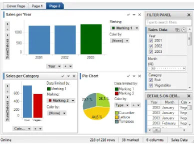
[image:39.595.124.513.220.508.2]Amongst several other interaction techniques, Tibco Spotfire supports drilldown, where items in the visualisation can be selected to view details through a different visualisation as shown in Figure 2.3. These visualisations are linked and the drilldown view shows a visualisation of the details-on-demand data. The tool supports linking of several visualisations in this manner and allows users to drilldown into various parts of the data.
Figure 2.3 Visual Explorations in Tibco Spotfire16
Analysis
The explore and elaborate interaction techniques enable users to view data that is not rendered, using the panning, direct-walk, drilldown and details-on-demand interaction techniques, which support the data exploration process. Three implementations of explore and elaborate are discussed above that incorporate drilldown and details-on-demand (Tibco Spotfire and Vizster), presenting detailed views, and facilitating data comparisons through small multiples (Elzen & Wijk, 2013). The evaluation of the visualisation system supporting small multiples exploration (Elzen & Wijk, 2013) found that small multiples did not improve
24
task execution times, nor reduce the number of errors made by users. Nevertheless, it found that users required fewer steps to answer questions and less time to explore the data. The explore and elaborate interaction techniques address user needs to view data that is beyond the capacity of a visualisation. They support the data exploration process by panning across views, drilling down to view items of interest and viewing details that can support users in making sense of data.
2.4.3 Filter
The filter technique allows users to specify the data to be shown in the visualisation by supplying a range or a condition. Ranges can be specified through sliders, search boxes, hierarchies or checkboxes made available through interfaces.
Tibco Spotfire and Tableau support the drag and drop operations, enabling users to select data to analyse and specify filters. Tibco Spotfire includes users controls, such as checkboxes, radio buttons and numeric range sliders that can be used to apply filters to the visualisations. It also supports the sorting of data within visualisations through properties to enable users to find patterns in the data. Vizster (Heer & Boyd, 2005) supports data filtering by keyword search of profile attributes through a search box provided by the interface. Resulting search nodes are highlighted and the remaining nodes are greyed-out. A second mode of filtering is supported through checkboxes provided next to attributes such as age, gender or number of friends in the profile panel. Clicking on one of these checkboxes causes Vizster to remove member images from the network visualisation and shows the filtered data.
Riche et al. discuss interactive legends (Riche et al., 2010) as controls that support interaction techniques such as selecting and filtering data that are dynamically updated as users visually explore the dataset. The interactive legends have references to nominal, categorical, ordinal and numerical data types presented by Bertin (Bertin, 1983). For categorical and ordinal data, the design supports click, shift-click and control-click to filter items, select ranges and toggle items.
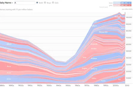
NameVoyager17 (Wattenberg & Kriss, 2006) presents visualisations presenting the most common baby names since 1900 in the US. The data is visualised through interactive stacked graphs, where the x-axis shows the year and the y-axis presents numbers to show the usage frequency of names. Users can filter the dataset by selecting either the Boys or Girls radio
25
[image:41.595.103.547.169.463.2]button and can type letters into the name search box. As a user types in letters, at every keystroke, NameVoyager immediately updates the visualisation, filtering the data for the names that start with the letters entered. Figure 2.4 shows popularity of names starting with the letter ‘A’ for both boys and girls for over a century. The darker colours show the most popular names used in recent times.
Figure 2.4 Name usage frequency in NameVoyager
Analysis
The filter interaction technique enables users to specify data attributes of interest to narrow the range of data that can be shown through a visualisation. In the case of NameVoyager, it is used to reduce the results displayed in the visualisation through user specifications. In the case of Tibco Spotfire, filter is used to specify data conditions when building visualisations and it is also used to manipulate existing views to show data of interest through checkboxes, radio buttons and numeric range sliders.
26
interactive legends was slower than widgets recorded the time taken by participants to complete two tasks. In the first task, participants were asked to filter values by a specified opacity and in the second task, they were asked to filter opacity for one or more values. The comparisons between the results of both experiments (interactive legends and standard widgets) showed that level of understanding amongst participants improved and tasks were conducted twice as fast with interactive legends.
Data filtering is fundamental for visual analysis as users are not usually interested in the entire dataset presented and more often require mechanisms to specify their interests or certain data attributes. Hence it is important that the filter interaction technique is supported by visualisation systems to help users in making sense of data.
2.4.4 Navigate
The visual information seeking mantra (Shneiderman, 1996) describes a commonly used navigation pattern which specifies "Overview first, zoom and filter, then details on demand". This pattern enables users to first have a broad view of the data before viewing details of areas of interest. However, at times, an overview may not be useful due to the size of the dataset and the "Search, show context, expand on demand" (Van Ham & Perer, 2009) navigation pattern can be more appropriate.
InfoZoom (Spenke & Beilken, 2000, Spenke, 2001, Spenke & Beilken, 2003) displays attribute relationships in databases presenting all the data objects in one view by using techniques to compress neighbouring cells with the same values into one cell. Double-clicking on marked cells zooms into the details of the attributes, removing other attributes at the higher level and offering a drilldown view of the clicked cell. Users can drilldown further by clicking on cells that appear in the zoomed-in views to analyse the data in more detail. Vizster supports navigation through the zoomed-in views, which appear by selecting a region within the display and the system draws higher resolution images or photographs for the updated view. In addition, focus plus context views are also supported by Vizster during zooming and distortion is used to increase the size of the nodes in focus while other nodes are greyed-out. DateLens (Bederson et al., 2004) provides users with a focus plus context calendar, supporting navigation through scrolling and magnifies selected elements (focal regions).