Readability Visualization for Massive Text Data
Hyoyoung Kim*, Jin Wan Park* and Dongsu Seo**
GSAIM, Chung-Ang University* [email protected], [email protected]
Sungshin Women's University** [email protected]
Abstract
In general, people read texts and decide by themselves to measure levels of understanda-bility and readaunderstanda-bility, which takes a lot of time and efforts. We believe visualizing readaunderstanda-bility gives intuitive impact on how difficult the texts will be before examining the texts further. Text visualization aims to provide structural characteristics of text contents in an efficient way. By using massive text data, such as books or documents, this study suggests readability meas-urement factors and formulas for the suggested methods that visualize texts by extracting a key factor ‘length’ for readability. In addition to the proposed methods, this study verifies effectiveness of visualization through the test of the case studies. The paper also includes case study findings that readers can have readability information not from independent texts, but from the comparison of previous texts, and therefore it becomes easier to accommodate diffi-cult level of new books.
Keywords: data visualization, text visualization, readability, information visualization
1.
Introduction
As a string of characters, text data deliver the meaning of contents to the readers in a con-cise way. However, while the volume of data has exploded so fast, it becomes more difficult to understand text data as the ability of human understanding grows slow. It is often the case that when the amount of texts from newspapers or books increases, we experience difficulties in understanding the overall subject, context, and the relationships between data. In this sense, it is essential not only to understand each word’s meaning itself, but to analyze text data, in order to grasp key information from the text. For the easy and direct delivery of elicited in-formation, and the relationships between data, more intuitive forms to provide information are needed, other than characters or numbers. Approaches to the new forms could be the begin-ning of text visualization research.
Text itself has many features such as structures, meaning, styles, understandability, as well as readability. Readability works as a direct factor in deciding the difficulty level of that text. Readers need to read parts of the text, and measure its difficulty level by themselves, in order to measure the readability of text, and decide whether it is the right material for their infor-mation processing ability. However, this process takes lots of time and effort for readers. Moreover, in some cases, it is impossible to read the actual text, for reasons such as copyright issues. Also, it is meaningless to measure readability for students, whose ability to process the information could improve further.
In this paper we explore possible ways of intuitive visualization of text readability, based on previously surveyed methods. This study also investigates the validity and effectiveness of visualization tools and results, through experiments on proposed visualization outcomes.
try to find the right reading materials for their use. According to research data from the Insti-tute for Curriculum and Evaluation (KICE), finding the right text for students’ reading ability is a very important process in reading education. KICE also emphasizes the importance of considering students’ reading ability before choosing text materials for them. Various formu-las of text measurement have been used to determine the difficulty level of text, and, in turn, to measure text readability.
In many cases, researches of text readability tend to focus on aspects of the text itself, in-cluding the length and frequency of words and sentences. Kitson and Gray (1923) prepared the basic form of readability formula, based on word syllables. Thorndike’s work presented a new readability formula, based on word frequency. Since Thorndike’s formula was first pre-sented, nearly 100 readability formulas had been invented by the 1970s, but now only a few formulas are widely used. Harrison (1980) evaluated the validity, age-dependent accuracy, and the usability of nine of the most highly used formulas (Table 1).
According to Harrison’s evaluation, Flesch’s readability formula (1968), Fry’s readability graph (1948), and Dale-Chall’s readability formula (1948) show the best validity and age-dependent accuracy. These three formulas were invented a long time ago, but are still widely used. This study investigates the main factors of readability measurement, by reviewing the three formulas above, and different ways of readability analysis.
Flesch’s formula was developed in 1948. Since then, it has been one of the most widely used formulas in many different fields. For instance, in 1991 the state of Indiana legislated the minimum Flesch Reading Ease Score (RES) of 40 for insurance policies. MS Word, Mi-crosoft’s word processing software, also used Flesch’s formula. Average syllables per word and average words per sentence are the two main aspects of Flesch’s formula.
Dale and Chall used the average words per sentence, and Number of unfamiliar words not on the Dale-Chall List, to measure readability. The Dale-Chall Formula has been used for decades to measure the difficulty level of spoken and written language in English education. This formula is judged to be one of the most accurate readability formulas in history.
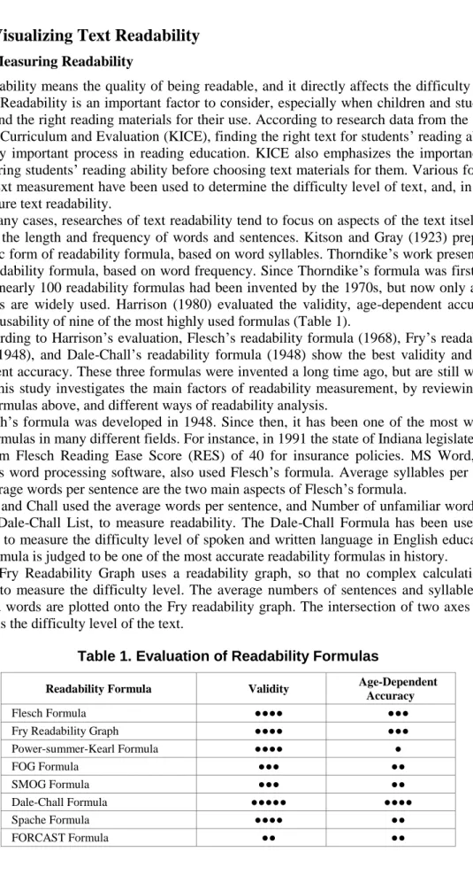
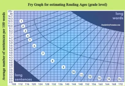
The Fry Readability Graph uses a readability graph, so that no complex calculation is needed to measure the difficulty level. The average numbers of sentences and syllables per hundred words are plotted onto the Fry readability graph. The intersection of two axes (Fig. 1) means the difficulty level of the text.
Table 1. Evaluation of Readability Formulas
Readability Formula Validity Age-Dependent
Accuracy
Flesch Formula ●●●● ●●●
Fry Readability Graph ●●●● ●●●
Power-summer-Kearl Formula ●●●● ● FOG Formula ●●● ●● SMOG Formula ●●● ●● Dale-Chall Formula ●●●●● ●●●● Spache Formula ●●●● ●● FORCAST Formula ●● ●●
Figure 1. Fry Readability Graph
2.2
Designing the Readability Visualization
The readability measurement formulas stated above have three measurement factors in common: the average number of words and sentences, and the average sentence length. Therefore, it is necessary to focus on those three factors, to visualize text readability. This paper finds out the key attributes shown in those factors, and uses them as a main factor for visualization. We focus on the fact that all three factors are related to the numbers and the length information. Also, we found out that the number of words could mean the length of a sentence.
Key attributes, such as the length of words, sentences, and paragraphs, are derived from the review above. Before the start of visualizing based on three attributes, it was necessary to investigate the validity of each attribute. To do that, we chose different texts having distinc-tive features and difficulty levels, and analyzed the average sentence and paragraph length of each text through graphs.
Table 2 consists of graphs showing the average paragraph length of four books (Alice’s Adventure in Wonderland, My Sister’s Keeper, Ethics, and The Critique of Pure Reason), as the story progresses. Data were collected from the English editions of each book, for easier data gathering.
The first graph (left) shows the average paragraph length of Alice’s Adventure in Wonder-land, a famous fantasy by Lewis Carroll. This text consists of shorter sentences containing 200 or fewer letters, as the y axis shows, which is a pattern commonly found in conversation-al stories. This graph conversation-also shows that every paragraph has simple sentences, and contains fewer than 1000 letters.
The second graph (upper right) shows the average paragraph length of My Sister’s Keeper, a bestseller by Jodi Picoult. This story is about family and romance, and contains lots of short conversations. Other than the short conversations, the rest are descriptions and narrations about characters and situations. This graph tells that most paragraphs are shorter ones, con-taining 200~400 characters. Higher spots indicate long descriptive parts.
The two lower graphs in table show two very famous philosophy books: The Ethics by Benedictus de Spinoza and The Critique of Pure Reason by Immanuel Kant. These two sto-ries are significantly different from the other two stosto-ries above. They axis indicating the aver-age paragraph length tells that these books have relatively longer paragraphs, containing from 1,000 ~ 2,000, up to 15,000 letters. Long narratives appear constantly, which makes the books more difficult to read. In particular, in the case of Ethics, after the story progress rate hits 75%, very long paragraphs continuously appear.
Based on the graphs from Table 2, we compared the length of sentences and paragraphs from the books whose difficulty levels were already measured. As a result, we found out that the difficulty level and the average paragraph length have a positive relationship.
2.3
Results of Readability Visualization
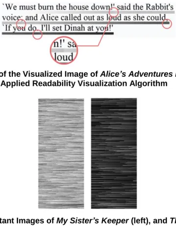
As mentioned in section 2.2, the length of text is the key factor of effectively showing the characteristics and difficulty level of a whole text. Therefore, this research ultimately aims to efficiently visualize changes of text readability, depending on its ‘length’, the key attribute of text. In other words, this paper tries to intuitively visualize the relationships between the length and the difficulty level: the longer a random sentence gets, the harder it is for readers to understand the text. We visualized the process of reading every sentence with consecutive dots from start to end. Also, we visualized the difficulty level and complexity of the text, by changing the shade of dots for each sentence, as the sentence gets longer. Longer sentences have darker dots. For example, a sentence starts with a white dot, and as it gets longer, the dots become darker. When the sentence ends, the dot becomes almost black. When commas and periods that could affect the readability of the text appear, the dots get lighter, since punc-tuation marks, including commas and periods, enhance readability. Moreover, we designed dots to be darker as the paragraph gets longer, because splitting a paragraph eventually affects the readability (Figure 2).
Figure 2. A Part of the Visualized Image of Alice’s Adventures in Wonderland Applied Readability Visualization Algorithm
Figure 3. Resultant Images of My Sister’s Keeper (left), and The Critique of
Pure Reason (right)
Figure 2 is a visualization result showing the length of sentences and paragraphs from each book, based on the readability visualization algorithm this paper suggests. When sentences and paragraphs of a book are simple and short, the overall image appears light, and the level of lightness fluctuates with various patterns.
The left side of Figure 3 is a visualized image providing the readability information of My Sister’s Keeper, a bestseller by Jodi Picoult. This story progresses rapidly, with descriptions on family relationships, and short conversations between characters. On the other hand, as the image on the right shows, Immanuel Kant’s philosophical work The Critique of Pure Reason
consists of longer sentences, which makes it difficult to read. As a result of the readability visualization of various books, stories that consist of simple conversations and stories for children have light visualization images, while classics and philosophical or scientific stories have darker images.
Figure 4 shows the visualized images of nine books of three different genres. This research visualized three typical stories of fantasy, family/romance, and philosophy genres, in order to compare each genre’s visualization result. The first three images are the visualization results of three Harry Potter series (Harry Potter and the Sorcerer’s Stone, Harry Potter and the Prisoner of Azkaban, and Harry Potter and the Goblet of Fire). These images are lighter than the images below, which means higher readability. In fact, Amazon.com (www.amazon.com), one of the biggest online bookstores, recommends Harry Potter to 9 year olds or 4th graders. Texts for children have a low difficulty level, and inevitably a high readability. The next three images in the middle are the visualization results of three famous novels by Jodi Picoult (My Sister’s Keeper, House Rules, and Nineteen Minutes). These stories consist of short conversa-tions, and longer descriptions of conflict resolution, romance, and family stories of characters.
Ethics. Philosophy books normally consist of very long sentences and paragraphs. Therefore, their visualization results are so dark, that they almost look black. Readers could intuitively predict the difficult level of a book, by seeing the darker visualization images.
Figure 4. Resultant Images of Three Different Genres – Fantasy (above), Fami-ly/ Romance (middle), and Philosophy (below)
3.
Case study
3.1 Experimental Method
This study used experimental methods to investigate the readability of 9 books. The sub-jects of the experiment are 20 graduate students. We investigated the relationship between readability measured from skimming through the text, and readability predicted from reada-bility visualization images. We carried out a survey on readareada-bility of parts of the text from sample books, and scored them on a 5 point scale (1: very easy, 5: very difficult). We first
images, while the relationship between the books and the images were not open to the sub-jects. After that, we compared the two scores, to find the relationship between them. Also, we timed how long it takes the subjects to judge the book’s readability by each method.
3.2 Result of the Experiment
Overall, 180 pairs of responses show a meaningful relationship between readability pre-dicted from reading the actual text, and readability prepre-dicted from the readability visualiza-tion image. The Pearson correlavisualiza-tion coefficient r is 0.78 (p < 0.01), which means there is a strong linear relationship between the two variables. The average time to measure each book’s readability by skimming through the text is 117 seconds (1 minute 57 seconds) (mini-mum: 52, maxi(mini-mum: 263), whereas the average time to measure each book’s readability based on the visualized images is 3.2 seconds (minimum: 1, maximum: 6). When subjects predict or measure the text readability by reading it, it takes a substantial amount of time, although there is always a difference between individuals. On the other hand, subjects tend to measure readability almost intuitively when they see the visualized images, and they were correctly as often as subjects who actually read the text.
4.
Conclusions
To visualize information on text readability, this paper extracted the ‘length’ factor, which is the key factor of readability measurement, based on the case study on readability measure-ment factors and formulas. Also, this study examined the validity of visualizing methods, and the effectiveness of the visualized results. When readers read the actual text to measure its readability, it takes a longer time, although there is a difference between individuals. On the other hand, when readers measure the text readability based on visualized images of the read-ability information, they could intuitively predict the readread-ability relatively accurately, alt-hough they did not read the text.
As this study suggests, text readability visualization shows visualized images of the whole text. As a result, readers could have readability information on the whole text, not just on the parts of the text they skim through. Also, readers could compare the readability of multiple books at the same time, or compare the readability of a new book to the readability of books they already have read more easily. To measure one book’s readability, readers have to read the text, by either skimming through the actual pages of the book, or downloading digital text, which takes considerable time and energy in both ways. Some Internet bookstores offer imag-es of the few first pagimag-es, but those are only a fraction of the whole text. Moreover, in many cases, Internet bookstores do not provide pages, due to copyright issues. In this sense, text readability visualization minimizes the search cost for information on text readability, and maximizes effectiveness of measuring text readability. Each text should have different visual-ized images of its readability information. Therefore, these visualvisual-ized images could be a use-ful tool for providing information on text readability and different text characteristics, just like book covers do.
Acknowledgements
This research was supported by the MSIP (Ministry of Science, ICT and Future Planning), Korea, under the ITRC (Information Technology Research Center) support program (NIPA-2014-H0301-14-1023) supervised by the NIPA (National IT Industry Promotion Agency)
[4] R. Flesch, “A New Readabiltiy Yardstick”, Journal of Applied Psychology, vol. 32, no. 3, pp. 221-233, (1948).
[5] E. B. Fry, “A readability formula that saves time”, Journal of reading, vol. 11, (1968), pp. 513–516.
[6] E. Dale and J. S. Chall, “A Formula for Predicting Readability”, Educational Research Bulletin, vol. 27, no. 1, pp. 11-20, (1948).
[7] C. Ware, “Information Visuialization: Perception for Design”, Morgan Kaufmann, (2013).
[8] A. Silic and B. D. “Basic Visualization of Text Streams: A Survey”, 14th International Conference, KES (2010), Cardiff, UK, September 8-10.
Authors
Hyoyoung Kim, she is a Ph.D. candidate at the Graduate School of Advanced Imaging Science, Multimedia, and Film Department at Chung-Ang University in South Korea. She received the Master of Science de-gree in Art and Technology in 2011 from the Chung-Ang University. Her research interests include user study of data visualization and HCI.
Dongsu Seo, hereceived his M.Sc. and Ph.D. from the University of Manchester, England. Currently, he is a Professor at the School of Infor-mation Technology at Sungshin Women’s University, Seoul Korea. His research interests are software engineering, multimedia application, and security engineering.