Airport Restroom Cleanliness Prediction Using Real Time User
Feedback Data and Classification Techniques
Kilian Ros
[email protected] University of Twente
Enschede, Overijssel
ABSTRACT
Amsterdam Airport Schiphol aims to offer a maximized airport ex-perience to its passengers. A main contributor to this is the cleaning of restrooms, of which the cleanliness is rated by the users. This paper reviews to what extent real-time feedback data and classifica-tion techniques can be useful in practice to predict the cleanliness of restrooms. Within this topic, different class definitions of clean and unclean are studied and a distinction is made between a com-bined prediction model that includes the entire environment and restroom-specific prediction models that focus only on a single restroom. The dataset is imbalanced and visualizations show that there is class overlap. The combined prediction model outperforms combined baselines but the precision is not high enough to be use-ful in practice. Restroom-specific prediction models of the busier restrooms outperform the combined prediction model but do not outperform simple restroom-specific baselines. Restroom-specific prediction models of the least busy restrooms perform very poor and sometimes are not even capable of correctly classifying a single unclean sample. Sampling methods do not improve the performance of the combined prediction model but do improve the performance of some of the restroom-specific prediction models, especially those with a high class imbalance. The major cause of the unsatisfying performance is not class imbalance, but the data ambiguity that leads to class overlap. To obtain prediction models that are useful in practice, the dataset should be enriched with features that are capable of distinguishing the two classes more clearly.
KEYWORDS
Real time, User, Feedback, Classification, Prediction, Restroom, Sat-isfaction, Machine learning, Class overlap, Class imbalance
1
INTRODUCTION
Amsterdam Airport Schiphol is the largest airport of The Nether-lands and the third busiest airport in Europe in terms of passenger volume [4]. Being an important international airport, Schiphol is always looking for ways to improve their services and offer a maxi-mized airport experience to its passengers.
One of the main contributors to the overall passenger satisfac-tion is the cleaning of restrooms located all over the airport. To monitor the user satisfaction of restrooms, most restrooms are equipped with so-called smiley boxes. These devices have three buttons which allow the user to rate the cleanliness of the restroom
Computer Science: Data Science and Technology Master Thesis, August 21, 2019, Enschede
© 2019
using a green, orange or red smiley, corresponding to good, average and bad respectively.
With this technology in place, real time user feedback data is obtained and Schiphol requires their cleaning contractors to utilize this data to improve on the current situation. The main objective that the airport has given them is to increase the overall percentage of green votes by a certain percentage.
In order to increase the overall percentage of green votes, the number of non-green votes, orange and red, has to be reduced. The assumption is that cleaning activities at the right moments will improve the cleanliness and prevent users from rating the cleanliness with a non-green vote.
Preliminary analysis of the data already identified two weak spots in the scheduling of cleaners. The first one is that the earliest shift of cleaners start their workday at six in the morning while there is an observed peak of bad votes between five and six. The second one is that all cleaners take their lunch break at the same time. During this lunch break, there is also an observed peak in the number of bad votes. These flaws can easily be exploited to increase the overall percentage of green votes. Minor changes to the way of organizing cleaners and cleaning tasks can quickly yield benefits with very little effort. Although manual analysis of the data can certainly contribute to the increase of user satisfaction, it is non-adaptive to the dynamic environment of the airport and it is a very tedious exercise.
Because of this, we aim for a more automated solution that is capable of anticipating to changes in the dynamic environment, through accurate prediction of non-green votes. This can contribute greatly to increasing the percentage of green votes because it allows cleaning contractors to prevent non-green votes by cleaning the restrooms at the right time. An accurate prediction model could be implemented to dynamically adjust current cleaning schedules and redirect cleaners to restrooms where cleanliness is most likely to become poor.
With the number of bad votes being a continuous number, a log-ical first step would be to approach this problem using regression techniques. The preliminary regression analysis has shown that the results, presented in appendix A, are not very promising. Addi-tionally, for application relevance the call to action, which redirects a cleaner, is more important than predicting the exact number of bad votes. Because of this, we decided to approach the problem as a binary classification problem. This means that the decision of when to redirect a cleaner depends on how the two classes, clean and unclean, are defined.
at Amsterdam Airport Schiphol. To achieve this goal, the dataset is analyzed and several useful features are extracted. Multiple classifi-cation algorithms are applied to find the best solutions for different settings of the problem. The practical usefulness of these settings is then evaluated using the expertise of senior personnel.
The contribution of this paper is the exploration of using classi-fication techniques in combination with a novel, real-world dataset that represents a very dynamic and subjective environment. This paper reviews to what extent real-time feedback data and classifica-tion techniques can be useful in practice to predict the cleanliness of restrooms. Within this topic, different class definitions of clean and unclean are be studied and a distinction is made between a combined prediction model that includes the entire environment and restroom-specific prediction models that focus only on a single restroom.
The remainder of this paper is organized as follows: Section 2 discusses related work that is connected to this particular dataset. Section 3 analyses the dataset by exploring the contents and fea-tures and describing the preparation process. Section 4 outlines the research method and all steps taken towards producing the actual results. Section 5 presents the data visualizations and the results of the studied classification methods for different settings of the problem at hand. Section 6 discusses limitations as well as opportunities and recommendations, and finally, section 7 draws the conclusions from the results.
2
RELATED WORK
The dataset used in this study appears to be quite novel in the research area of machine learning. To our best knowledge, there is no other work that uses real time user feedback data, or other subjective data generated by humans, to predict the cleanliness of rooms.
Despite the fact that this kind of data is rather uncommon in literature, it does have characteristics that are widely studied in the field of machine learning, such as the imbalanced learning problem, class overlap and dimensionality reduction.
2.1
Real-time Customer Feedback Processing
The dataset used in this study is generated by smiley boxes that are located in the restrooms. Restroom users press a red, orange or green smiley to express their satisfaction about the cleanliness of a restroom. Where our data is generated on a three-point scale, there are other customer satisfaction systems that collect feedback in different ways or on different scales. The patent of Canora de-scribes a feedback system that uses a five-point scale to measure customer satisfaction regarding a certain question [7]. Another patent of Bossemeyer and Connolly describes a feedback system where users can provide feedback using their voice [16]. Although this way of collecting feedback is qualitative instead of quantitative, they suggest a data mining tool to identify trends in the collected feedback.
2.2
Class Imbalance
Imbalanced datasets are very common in real-world domains and applications such as healthcare, network intrusion detection and creditcard fraud detection [14, 17, 18]. According to Garcia and
He [9], the fundamental issue of imbalanced data is that most stan-dard learning algorithms expect a balanced class distribution or equal misclassification cost, leading to compromised performance when presented with imbalanced data.
Garcia and He [9] divide the problem into two categories: between-class imbalance and within-between-class imbalance. In a binary between- classifica-tion problem, between-class imbalance means that one class occurs more often than the other. Within-class imbalance is concerned with the distribution of representative data for subconcepts that exist within a certain class. In other words, samples belonging to the same class without being similar to each other. Class imbalance can exist in different orders, Garcia and He [9] state that imbalances of 1:100, 1:1.000 and 1:10.000 are not uncommon.
According to Garcia and He [9], the effect of class imbalance on learning performance can effectively be mitigated using several approaches such as sampling methods, cost-sensitive methods and learning methods designed specifically for imbalanced problems.
Sampling methods use data modification techniques to create a balanced class distribution. There are many variations ranging from rather simple to quite complex methods. The most simple methods are probably random oversampling and undersampling, which copies minority samples and deletes majority samples at random in order to create an equal class balance. A more sophis-ticated undersampling method is called informed undersampling, to which for example EasyEnsemble [11] belongs. This method samples several subsets from the majority class to train a learner on every subset and then combines the outputs of those learners with the objective to overcome the problem of information loss which is introduced by random undersampling. Another method that has shown promising results is sampling with synthetic data genera-tion. One technique that implements this is SMOTE [13], which is a combination of synthetic oversampling of the minority class and undersampling the majority class. ADASYN [10] is also a technique that uses synthetic sampling but in an adaptive manner. It uses a weighted distribution for minority class examples according to the level of difficulty in learning, creating more data for samples that are harder to learn. SMOTE is also often used in combination with data cleaning techniques such as Tomek links and the edited nearest neighbor rule (ENN) [6]. The goal of these techniques is to remove class overlap that is introduced when sampling methods are applied. By removing some overlapping samples, clusters in the training data can be separated more clearly, which might lead to better defined rules and improved performance.
Studies have shown that a balanced dataset improves overall classification performance compared to the original imbalanced dataset [20]. Garcia and He [9] state that for most imbalanced datasets, applying sampling methods indeed improves classifier accuracy.
Where sampling methods try to obtain more balance between classes, cost-sensitive learning methods try to counteract the nega-tive effects of class imbalance by assigning different misclassifica-tion costs, or weights, to the classes [8].
Figure 1: Amsterdam Airport Schiphol E Pier Restrooms Floor Plan
classifiers. An example of this is AdaC1 which introduces cost items into the weight updating strategy of the AdaBoost algorithm [9].
Although these methods can significantly improve the perfor-mance, they require that the costs of misclassification for the classes are known. Very often this is not the case and there is only an in-tuition that one class should be more expensive than the other class [12].
2.3
Class Overlap
Although many of the works mentioned above assume class imbal-ance to be the cause of performimbal-ance loss, Prati et al. [15] notice that in some cases learning algorithms perform good on imbalanced datasets and therefore class imbalance cannot directly be correlated to the loss of performance. Their work suggests that the problem is not directly caused by class imbalance, but is also related to the degree of overlapping among the classes.
Class overlap occurs when two data samples are nearly or com-pletely identical in terms of their features but belong to different classes. Figure 2 depicts a simple example.
The dataset used in this paper contains both class imbalance as well as class overlap. A possible solution is provided by Batista et al. [6], who conclude that general oversampling and SMOTE-based methods are very effective when dealing with highly imbalanced and overlapping data. Results show that these methods are able to achieve similar performance compared to a naturally balanced distribution. Additionally, they state that the SMOTE technique with ENN data cleaning seems to be especially suitable when there is a high degree of class overlap. These suggested sampling methods will be included in the grid search and the performance of these methods is evaluated.
Figure 2: Simple Example of Class Overlap Between Two Classes. Left: No Overlap, Middle: Minor Overlap, Right: Ma-jor Overlap
2.4
Dimensionality Reduction
Very often real-world datasets have a large number of features leading to a high dimensional data space that is hard to visual-ize. Without clear visualizations of data, a problem can be very hard to comprehend and eventually solve. A useful method to over-come this problem is dimensionality reduction. As stated in the dimensionality reduction techniques survey of Sorzano et al. [19], Principal Component Analysis (PCA) is probably the best known and most widely used technique.
According to Abdi and Williams [5], the main goal of PCA is to extract the important information from the data and express this as new features called principal components. These components are obtained as linear combinations of the original features. The first principal component is required to have the largest possible variance, and therefore explain most of the variance within the dataset. The second component is constraint to be orthogonal to the first one and should also have the largest possible variance without violating the constraint. Other components are computed likewise.
3
DATA ANALYSIS
This section describes what the dataset looks like and how it is acquired. It will also explain how new features are created from the original data and how the numerical features are scaled for use in certain prediction algorithms. Lastly, different class definitions of classes clean and unclean are addressed.
3.1
Data Description
The dataset used in this study contains ten weeks of real time user feedback data in the period ranging from Monday march 11th till Sunday may 19th 2019. Schiphol consists of many areas with restrooms such as boulevards, lounges, baggage reclaim halls and piers. At every pier, there are multiple gates that are being used for arrivals and departures of flights.
3.2
Data Acquisition
To narrow the scope of this study and maintain focus, only the E pier is included in this study. The E pier was chosen because it was one of two piers that received the most votes during the specified time period. Compared to the other pier with much votes, the E pier had a lower overall percentage of green, which means that at this pier there was more room for improvement. Next to that, the E pier is the only pier where all the restrooms are equipped with smiley boxes to collect data.
The E pier consists of thirty-four restrooms which are depicted in figure 1. Every restroom number on the floor plan contains one restroom dedicated to males and one restroom dedicated to females. Every restroom itself consists of multiple toilets and in male restrooms also urinals.
Together, these restrooms received a total of 88,517 votes, of which roughly 65% is green, during the specified time period of ten weeks. This means that on average every restroom receives approximately thirty-seven votes per day.
When looking at figure 3, we observe a steady increase in the number of votes until week 16 and then a decrease until week 20. This is probably caused by the increase in passenger volume of almost five hundred thousand (8%) comparing March (weeks 11, 12 and 13) and April (weeks 14, 15, 16 and 17) [1]. We also note that week 18 is a holiday week in the Netherlands, but this week shows no notable differences compared to other weeks.
11 12 13 14 15 16 17 18 19 20
2000
4000
6000
8000
10000
Total
Good
Bad
Figure 3: Number of Votes at E Pier per Week
3.3
Data Preparation
Because a vote can be cast arbitrarily in time, there is a need for a certain aggregation strategy in order to group multiple datapoints based on their timestamp. The airport is a very dynamic environ-ment and selecting the right time interval is a trade-off between the number of received votes per interval and practical usability. When the interval is too small, most of the times there are no votes at all. When the interval is too large, cleaners can not react accu-rately to emerging situations and restrooms might be unclean for a long period of time. With this trade-off in mind and based on the experience of senior personnel, a time interval of thirty minutes was chosen.
This results in a dataset that includes thirty-four toilets and seventy days of forty-eight time intervals each, adding up to 114,240 datapoints. We split this dataset into 80% for training the models, 10% for validation and hyperparameter optimization to select the
best model and 10% for testing the selected model. The splitting is done in chronological order, so week 19 is used for validation and week 20 is used for testing. Figure 3 shows us that the validation and test weeks show no significant differences in the number of votes, which is good because otherwise, it might have a substantial influence on the results.
0 2 3 1 4
t t-1
t-2
t-3 t+1
Figure 4: Example of Sliding Time Window Approach to In-clude Values of Previous Time Intervals as Features for Cur-rent Time Interval
3.4
Feature Generation
With time being an important aspect of the dataset, it is logical to treat some of the available features such as the number of votes and the number of bad votes as a time series. In order to take advantage of this, we introduce a sliding time window parameter that can take any value. Figure 4 shows an example of this with a value of three, this means that we include the values of the previous three time intervals as features for the datapoints at time interval t and t+1. This sliding time window parameter is optimized in the grid search. Another feature related to a previous time interval is the number of bad votes exactly one day, or 48 time intervals, earlier. Next to features that are related to previous time intervals, we also include other time-related features such as the day number and the interval number. The day number ranges from 0 to 6, where 0 is Monday and 6 is Sunday. The interval number ranges from 0 to 47 where 0 is the time interval between 00:00 and 00:30 and 47 is the time interval between 23:30 and 00:00.
In order to distinguish between restrooms, two different encoders were used to encode the restroom number: Rank-based encoding and one-hot encoding. The rank of a restroom is based on the num-ber of bad votes in the training set, which is the first eight weeks. The restroom which has received the highest number of bad votes is ranked 33 and the restroom with the lowest number of bad votes is ranked 0. One-hot encoding creates a binary feature for all restroom numbers and sets all values to 0 except for the corresponding re-stroom number, which is set to 1. Next to the rere-stroom encoding, other restroom related features that are included are the surface of a restroom, the number of toilets in a restroom and the gender of a restroom. Table 1 lists all the features.
Table 1: Feature Names, Descriptions and Categories for a Time Window of Three
# Name Description Category
Target Feature
1 Bad Number of bad votes atcurrent time interval Numerical
Number of Bad Votes
2 Badt-1 One time interval earlier Numerical
3 Badt-2 Two time intervals earlier Numerical
4 Badt-3 Three time intervals earlier Numerical
5 Badd-1 One day earlier Numerical
Number of Votes
6 Votet-1 One time interval earlier Numerical
7 Votet-2 Two time intervals earlier Numerical
8 Votet-3 Three time intervals earlier Numerical
Time Related Features
9 Day [#] Number of the dayranging from 0 to 6 Ordinal
10 Interval [#] Number of the time intervalranging from 0 to 47 Ordinal
Restroom Related Features
11 Surface Surface of the entire restroom Numerical
12 Toilet [#] Number of toilets in restroom Numerical
13 Gender Male or female restroom Categorical
14 Rank Rank of the restroom Ordinal
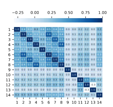
the number of bad votes received in previous time intervals. For both the number of votes and the number of bad votes received in previous time intervals we see that the correlation coefficient decreases as the time difference increases. It stands out that the number of bad votes received exactly one day earlier, Badd-1, has a stronger correlation than the number of bad votes received two time intervals earlier, Badt-2. This suggests that looking at the pre-vious day would be better than increasing the time window larger than one. It is also remarkable that the day of the week, the interval of the day and the gender of a restroom are not correlated at all to the number of bad votes. Furthermore the surface, the number of toilets and the rank of a restroom show only low correlation coefficients.
The dataset is not particularly high dimensional, ranging from 9 dimensions to 103 for time windows 1 and 48 respectively, with 48 being the largest used time window in this study. The dimensional-ity can be increased by 33 if the one-hot encoding method is used instead of rank-based restroom encoding. Because of this number of dimensions, model training times are expected to be reasonable and all features are included.
1 2 3 4 5 6 7 8 9 10 11 12 13 14
1
2
3
4
5
6
7
8
9
10
11
12
13
14
1.0 0.4 0.3 0.3 0.4 0.5 0.4 0.4 0.0 0.0 0.2 0.2 0.0 0.3 0.4 1.0 0.4 0.3 0.3 0.8 0.5 0.4 0.0 0.1 0.2 0.2 0.0 0.3 0.3 0.4 1.0 0.4 0.3 0.5 0.8 0.5 0.0 0.1 0.2 0.2 0.0 0.3 0.3 0.3 0.4 1.0 0.3 0.4 0.5 0.8 0.0 0.1 0.2 0.2 0.0 0.3 0.4 0.3 0.3 0.3 1.0 0.4 0.4 0.3 0.0 0.0 0.2 0.2 0.0 0.3 0.5 0.8 0.5 0.4 0.4 1.0 0.6 0.5 0.0 0.1 0.3 0.3 0.0 0.3 0.4 0.5 0.8 0.5 0.4 0.6 1.0 0.6 0.0 0.1 0.3 0.3 0.0 0.3 0.4 0.4 0.5 0.8 0.3 0.5 0.6 1.0 0.0 0.1 0.3 0.3 0.0 0.3 0.0 0.0 0.0 0.0 0.0 0.0 0.0 0.0 1.0 0.0 0.0 -0.0 0.0 0.0 0.0 0.1 0.1 0.1 0.0 0.1 0.1 0.1 0.0 1.0 0.0 -0.0 0.0 0.0 0.2 0.2 0.2 0.2 0.2 0.3 0.3 0.3 0.0 0.0 1.0 0.5 0.3 0.2 0.2 0.2 0.2 0.2 0.2 0.3 0.3 0.3 -0.0 -0.0 0.5 1.0 -0.3 0.2 0.0 0.0 0.0 0.0 0.0 0.0 0.0 0.0 0.0 0.0 0.3 -0.3 1.0 0.1 0.3 0.3 0.3 0.3 0.3 0.3 0.3 0.3 0.0 0.0 0.2 0.2 0.1 1.0
0.25 0.00
0.25
0.50
0.75
1.00
Figure 5: Pearson Correlation Heatmap Using Rank-based Restroom Encoding with Time Window Size 3. Feature Num-bers Correspond to Table 1
3.5
Numerical Feature Scaling
Because some machine learning models, like for example a multi-layer perceptron [2], are sensitive to feature scaling, we use two basic functions to scale numerical features: Normalization and stan-dardization. Normalization scales each value in a feature vector within the range [0, 1] and standardization scales each value in a feature vector such that the mean is zero and the variance is one.
3.6
Class Definition
The two defined classes for the binary classification problem at hand are: clean and unclean, which refers to the state of a restroom as observed by the users. We acknowledge the fact that user ob-servations are subjective and sometimes do not correspond to the actual state of a restroom, this will further be discussed in section 6.
0 10 20 30 40 50 60 70 80 90 100
81%
11%
4%
4%
Zero
One
Two
[image:5.612.319.556.93.317.2]Three or more
Table 2: Summary of the Dataset for Different Sliding Window Sizes and Class Definitions
Class Definition Sliding Window Size Number ofFeatures Classes Number ofDatapoints Clean:UncleanBalance Ratio
Strict 1 9 2 (Clean, Unclean) 114.240 6:1
Lenient 1 9 2 (Clean, Unclean) 114.240 16:1
Strict 24 55 2 (Clean, Unclean) 114.240 6:1
Lenient 24 55 2 (Clean, Unclean) 114.240 16:1
Strict 48 103 2 (Clean, Unclean) 114.240 6:1
Lenient 48 103 2 (Clean, Unclean) 114.240 16:1
Figure 6 shows the distribution of the number of bad votes per time interval of thirty minutes. It immediately becomes clear that we are dealing with an imbalanced dataset, regardless of how we define the two classes. The reason that more than 81% of the time intervals receive no bad votes at all is twofold. First of all, during the night there are much fewer passengers at the airport than during the day. This results in considerably fewer votes during the night, and most of the time no votes at all. Secondly, there are large differences between the number of visitors per restroom, which in turn influences the probability of receiving votes. Smaller restrooms that are not often visited have many intervals at which there are no votes at all.
3.6.1 Strict Class Definition. The most obvious class definition
would be to define zero bad votes received as clean, and one or more bad votes received as unclean. This would result in a clean:unclean balance ratio of around 6:1. When discussing this class definition with senior personnel and decision makers, it became clear that this would not be ideal because it would mean that in practice cleaners could be redirected to another restroom for only a single bad vote. This is considered too costly for the benefit that it could yield.
3.6.2 Lenient Class Definition. A logically following and slightly
different class definition would be to define zero or one bad vote received as clean, and two or more bad votes received as unclean. Resulting in a clean:unclean balance ratio of around 16:1. According to senior personnel and decision makers, this would make more sense because it doubles the possible benefit compared to the other class definition. Also, it is more unlikely that an observation of the class unclean is noise since multiple bad votes are received instead of a single bad vote.
We expect a certain trade-off between classification model per-formance and practical usability when defining the two classes. Therefore we include both above-mentioned class definitions in the research and compare the results to study the effect of differ-ent class definitions on classifier performance. A summary of the dataset for different class definitions and sliding window sizes is presented in table 2
3.7
Model Definition
Next to the distinction between two class definitions, there is also a distinction in the type of prediction model. The first type is a com-bined prediction model that includes features of all the restrooms and makes predictions for all the restrooms. The second type is a
restroom-specific prediction model that focuses only on a single restroom. The choice to also study restroom-specific prediction models is based on the fact that there is a lot of variation between the restrooms and we assume that this will lead to differences in model performance. Figure 7 shows the occurrences of unclean samples per restroom in the case of a lenient class definition. The red lines indicate how often an unclean sample occurs on average per day, on two different levels. We observe that restrooms 60 Male and 60 Female are responsible for many of the unclean occurrences, roughly twice as much as the runner-up, restrooms 43. Next to that, we see that almost half of the restrooms do not even have one unclean sample per day on average. If the number of unclean occurrences decreases, the class imbalance logically increases. This raises the question of whether restrooms to the far right of the plot are even worth considering when the objective is to improve user satisfaction.
Figure 7: Number of Unclean Samples per Restroom
4
RESEARCH METHOD
In order to study the usefulness of real time feedback data and clas-sification techniques to distinguish and predict clean and unclean restrooms in practice, we are searching for the best performing clas-sifiers on different settings of the problem. This section explains the experimental setup and metrics used for performance evaluation.
4.1
Classifiers
type. This is also done for the two different class definitions, strict and lenient. For the restroom-specific prediction models, Random Forrest (RF), Support Vector Machine (SVM), AdaBoost (AB) and K-Nearest Neighbors (KNN) algorithms have been applied. For the combined prediction models RF, AB and KNN were applied. SVM was not included here because the dataset is too large to have a reasonable model fit time. The fit time scales at least quadratically with the number of samples [3]. The selection of algorithms was based on the results obtained during a preliminary classification experiment. Algorithms that were also included in this preliminary experiment but not selected were: Decision Tree, EasyEnsemble, RUSBoost, Complement Naive Bayes and Multilayer Perceptron. The results of this preliminary experiment are presented in ta-bles 15, 16, 17, 18, 19, 20, 21, 22 of appendix B.
To identify the best model settings for each classification algo-rithm, exhaustive grid search is performed. The grid search method uses the validation set for hyperparameter optimization. All op-tions that were included in the search can be found in table 25 in appendix B.
4.2
Baselines
To evaluate the performance of the best classifier models, they are compared to three baselines. The first baseline is the prior probability (PP) baseline that uses the prior probabilities to make a prediction. In other words, in case of a strict class definition, it predicts clean in 81% of the observations. The second one is the average bad vote (ABV) baseline that uses the average number of bad votes for a given time interval to make a prediction. If for example the time interval to predict is 9:00-9:30, then the average number of bad votes for all intervals 9:00-9:30 is calculated from the training set. If the calculated average is smaller than 1, clean is the predicted class in case of a strict class definition. The third one is the daily average bad vote (DABV) baseline which is nearly the same as the ABV baseline but next to time interval it also takes the day of the week into account. So if the time interval to predict is 9:00-9:30 on a Monday, then the average number of bad votes for all the intervals 9:00-9:30 on a Monday is calculated from the training set. If the calculated average is again smaller than 1, clean is the predicted class in case of a strict class definition.
4.3
Sampling Techniques
Related work has pointed out that sampling techniques might of-fer a solution when working with an imbalanced dataset or class overlap. To evaluate whether these techniques indeed improve the performance on this particular dataset, we include them in the ex-haustive grid search. The included sampling techniques are Random Undersampling (RUS), Random Oversampling (ROS), Adaptive Syn-thetic Oversampling (ADASYN), SynSyn-thetic Minority Over-sampling Technique (SMOTE), SMOTE with data cleaning using Tomek links (SMOTE + Tomek) and SMOTE with data cleaning using Edited Nearest Neighbours (SMOTE + ENN)
4.4
Evaluation Metrics
In an imbalanced learning scenario, the traditional accuracy metric turns out to be quite ineffective for evaluating the performance of a classifier [9]. Therefore there is a need for a different kind of
evaluation metric. Reasoning from a practical point of view, we want to predict unclean as accurately as possible and after that as many as possible. This means that for the class unclean, precision is more important than recall. High precision is important because redirecting a cleaner is a costly intervention, so the model needs a high degree of certainty about the prediction. A high recall is less important because there are only a few cleaners to respond to an alert that is caused by an unclean prediction. If there are too many alerts in a short time period, the cleaners will not be able to adequately respond to all of them. Because of this, the main metric that we focus on is the F-Beta score of the class unclean with a beta of 0.5. This F0.5-score means that precision is twice as important as recall in calculating the weighted harmonic mean of both. Next to the F0.5-score of the class unclean, we also present the corresponding precision and recall scores.
4.5
Visualization
In order to visualize the data, PCA is performed to obtain the first two principal components and plot them in a two-dimensional space. Visualization of the dataset is important because different time windows, rescaling methods and sampling methods lead to different projections of the data. By visualizing the problem at hand, it becomes clear what task the prediction models are actually trying to perform and what the difficulties will be to correctly predict the datapoints. To evaluate classifier performances it is also important to look at the decision regions of a model, these are plotted on the same two-dimensional space to show how the datapoints are being classified. Looking at the decision regions makes it easier to interpret the numeric results of the evaluation metrics.
5
RESULTS
5.1
Visualization
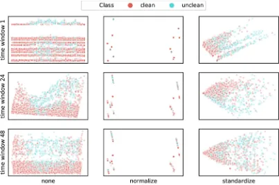
Figures 8 and 9 show how different time windows, data rescaling methods and restroom encodings lead to different 2D PCA visu-alizations of the data. The visuvisu-alizations are obtained using all restrooms and a strict class definition. We observe clear visualiza-tion differences between the different rescaling methods and also between the different time windows. Between the one-hot encoded restrooms in figure 8 and rank-based encoded restrooms in figure 9 we only see very small, negligible, differences when looking at the normalization and standardization plots. Only the plots without data rescaling, indicated bynone, show noticeable but no significant
differences. From this, we conclude that the different time windows and rescaling methods will probably lead to different classifier per-formance, where different restroom encodings will probably not. Although we see some concentrated unclean (blue) datapoints in some of the plots, they are still intertwined with many clean (red) datapoints, which indicates major class overlap. By looking at the visualizations, one would say that the cases without data rescaling and time windows 24 and 48 and standardization with time win-dow 24 would be best separable, but the results of section 5.2 will show that they are not. This confirms that even those, by eye quite separable, cases have a large degree of class overlap.
Figure 8: 2D PCA Visualization for Different Time Windows and Rescaling for OHE Restrooms with Strict Class Definition
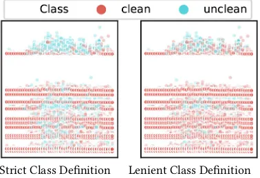
[image:8.612.104.510.380.649.2]Strict Class Definition Lenient Class Definition
Figure 10: 2D PCA Visualization Differences Between Class Definitions Strict and Lenient for One-hot Encoded Re-strooms Without Data Rescaling and Time Window 1
considered as clean (red). The lenient class definition is basically a subset of the strict class definition. The hypothesis is that lenient class definition reduces class overlap compared to a strict class definition. This could be the case if for example lower located unclean (blue) points would turn into clean (red) points while upper located unclean (blue) points would remain when switching from a strict class definition to a lenient class definition. From this figure, we conclude that a different class definition does not significantly reduce class overlap, but that classifier performance is likely to be different because of different balance ratios.
5.2
Combined Prediction Model
5.2.1 Strict Class Definition.Table 3 lists the performance results
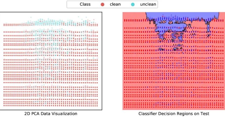
[image:9.612.83.272.84.214.2]for a combined prediction model that includes all restrooms. In this table, we see that the two more informed baseline classifiers, ABV and DABV, perform much better than the naive baseline, PP. When comparing the F0.5 scores of the RF, AB and KNN algorithms, we see that all three perform slightly better than the baselines and that AB and KNN perform roughly the same. The main difference is that KNN has better precision, where AB has better recall. Because precision is deemed more important than recall, we select KNN as the best model. The best performance was found with ranked restroom encoding, no data rescaling and a time window of one, settings for all algorithms in the table can be found in Table 23 of appendix B. We observe approximately the same results when using the first two principal components as input features and can therefore give a representative visualization of the performance using decision regions of the model. Figure 11 shows the 2D PCA visualization of the whole dataset as well as the decision regions as used by the KNN model. Visual inspection shows that the model is capable of classifying many of the unclean datapoints in the upper part of the plot, but not capable of classifying unclean datapoints that are located more towards the center of the plot, leading to a low recall. Although the model correctly classifies many unclean datapoints in the upper part, it also misclassifies a lot of clean datapoints within this region, leading to an unsatisfying precision. A remarkable result is that despite the findings of Batista et al. [6], who conclude that SMOTE-based methods are very effective when dealing with highly imbalanced and overlapping data, we
Table 3: Performance Metrics for Class Unclean for Com-bined Prediction Model with Strict Class Definition
Train Test
F0.5 Prec Rec F0.5 Prec Rec
PP 0.14 0.14 0.14 0.14 0.14 0.14
ABV 0.47 0.74 0.19 0.45 0.70 0.19
DABV 0.51 0.75 0.22 0.44 0.64 0.20
RF 0.91 1.00 0.68 0.47 0.58 0.27
AB 0.56 0.63 0.39 0.50 0.56 0.35
KNN 0.57 0.72 0.31 0.49 0.62 0.27
KNN PCA 0.54 0.70 0.28 0.49 0.64 0.26
KNN SMOTE+ENN 0.92 0.92 0.92 0.38 0.34 0.79
PP: Prior Probability Baseline, ABV: Average Bad Vote Baseline, DABV: Daily Average Bad Vote Baseline
Table 4: Performance Metrics for Class Unclean for Com-bined Prediction Model with Lenient Class Definition
Train Test
F0.5 Prec Rec F0.5 Prec Rec
PP 0.06 0.06 0.06 0.05 0.05 0.06
ABV 0.49 0.55 0.34 0.41 0.44 0.33
DABV 0.52 0.56 0.39 0.37 0.38 0.33
RF 0.60 0.77 0.31 0.41 0.51 0.22
AB 0.52 0.67 0.28 0.42 0.52 0.23
AB PCA 0.48 0.66 0.23 0.41 0.51 0.22
KNN 0.47 0.71 0.20 0.42 0.56 0.21
KNN PCA 0.10 0.56 0.02 0.01 0.08 0.00
AB SMOTE+Tomek 0.93 0.93 0.93 0.23 0.19 0.77
PP: Prior Probability Baseline, ABV: Average Bad Vote Baseline, DABV: Daily Average Bad Vote Baseline
observe severe performance decrease when implementing sampling methods. The best performing sampling method is SMOTE + ENN, which decreases the F0.5 score of the KNN model from 0.49 to 0.38 and precision from 0.62 to 0.34. We do observe a large increase in recall, which means that the sampling caused an expansion of the unclean decision region.
5.2.2 Lenient Class Definition.Table 4 lists the performance
Figure 11: K-Nearest Neighbors PCA Visualization with Strict Class Definition, Ranked Restroom Encoding, No Data Rescaling and Time Window One. Left: All Datapoints. Right: Test Set Datapoints and KNN PCA Model Decision Regions
Figure 12: AdaBoost PCA Visualization with Lenient Class Definition, Ranked Restroom Encoding, No Data Rescaling and Time Window One. Left: All Datapoints. Right: Test Set Datapoints and AB PCA Model Decision Regions
poor performance when using the first two principal components as input features. Therefore we select the AdaBoost algorithm, which performed best with ranked restroom encoding, no data rescaling and a time window of one, to visualize the classifier decision re-gions. Figure 12 shows this visualization. Inspection of the decision regions clarifies the low precision and even lower recall, the model
[image:10.612.80.532.366.596.2]5.3
Restroom-specific Prediction Model
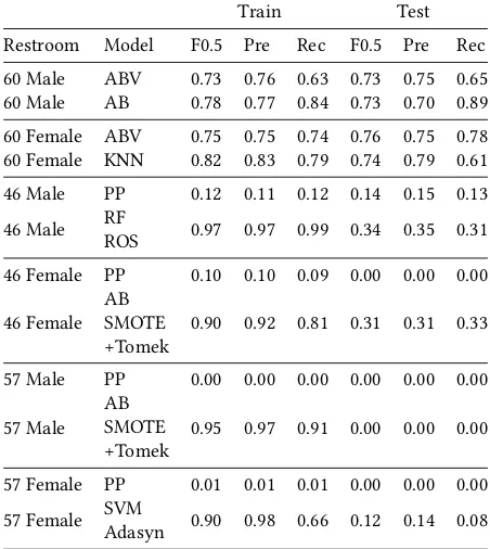
To train and evaluate restroom-specific prediction models, six differ-ent restrooms were selected. This selection is based on the number of unclean sample occurrences as shown in figure 7. Restrooms 60 male and female have a high number of unclean samples, restrooms 57 male and female have a low number of unclean samples and restrooms 46 male and female are somewhere in the middle. Using a single restroom to train a model means that the size of the dataset is reduced to 3.360 datapoints, obtained by 70 days times 48 intervals.
5.3.1 Strict Class Definition. Table 5 shows the best baseline and
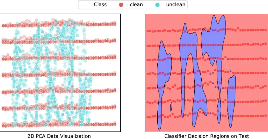
the best classification algorithm for every selected restroom. The results show that the best models of restrooms 60 male and female perform equal to the best performing baselines whereas the other restrooms best models outperform their best baselines. Next to that, we observe that except for restrooms 60, the exhaustive grid search designated a model using a sampling method to be the best model. This is in contrast to the results of the combined prediction model, where sampling methods decrease performance. We believe that the reason for improved performance using sampling methods with some restroom-specific prediction models is the greater class imbal-ance of the corresponding datasets. For example, the unclean:clean balance ratio of restroom 57 male is 1:37. It is also worth mentioning that, when comparing the results on train and test data, the models with sampling methods seem to be overfitting on the training data. This results in poor performance on the unseen data of the test set, of which restroom 57 female is an example. The dataset and deci-sion regions of this restroom SVM model are plotted in figure 13. On the left side of the figure, we see that the Adasyn sampling method has created a lot of synthetic unclean (blue) datapoints, to which the model has overfitted. This is visualized by the decision regions depicted on the right side of the figure, which show that the model is hardly capable of classifying the new unclean samples of the test set. Figure 14 shows data and decision regions of the best performing restroom-specific prediction model, 60 female KNN. This figure shows that in some parts the classes can be reasonably separated and that the model does quite a good job in classifying new, unseen datapoints.
5.3.2 Lenient Class Definition.Table 6 again shows the best
[image:11.612.322.548.128.381.2]base-line and the best classification algorithm for every selected restroom, but for the lenient class definition. We see that for restrooms 60 and 46, the best models outperform the best baselines, if only by a little. Next to that, we again observe that for the restrooms with less unclean samples, the best model is one that uses a sampling technique, which is again overfitting the training data. The result of restroom 57 female is suspicious because the best model performs very different from the best baseline result. Inspection of the model shows that there are only four unclean samples in the test set of which one is classified as unclean. Every other sample is classified as clean, resulting in a recall of 0.25 and a precision of 1.00. From the visual inspection of the model decision regions, we conclude that this correct classification was a coincidence and that the numerical results give a distorted view of reality. Table 24 reports the optimal hyperparameters for both class definitions.
Table 5: Performance Metrics for Class Unclean for Restroom-specific Prediction Models with Strict Class Definition
Train Test
Restroom Model F0.5 Pre Rec F0.5 Pre Rec
60 Male ABV 0.73 0.76 0.63 0.73 0.75 0.65
60 Male AB 0.78 0.77 0.84 0.73 0.70 0.89
60 Female ABV 0.75 0.75 0.74 0.76 0.75 0.78
60 Female KNN 0.82 0.83 0.79 0.74 0.79 0.61
46 Male PP 0.12 0.11 0.12 0.14 0.15 0.13
46 Male RFROS 0.97 0.97 0.99 0.34 0.35 0.31
46 Female PP 0.10 0.10 0.09 0.00 0.00 0.00
46 Female ABSMOTE
+Tomek 0.90 0.92 0.81 0.31 0.31 0.33
57 Male PP 0.00 0.00 0.00 0.00 0.00 0.00
57 Male ABSMOTE
+Tomek 0.95 0.97 0.91 0.00 0.00 0.00
57 Female PP 0.01 0.01 0.01 0.00 0.00 0.00
57 Female SVMAdasyn 0.90 0.98 0.66 0.12 0.14 0.08
PP: Prior Probability Baseline, ABV: Average Bad Vote Baseline, DABV: Daily Average Bad Vote Baseline
Table 6: Performance Metrics for Class Unclean for Restroom-specific Prediction Models with Lenient Class Definition
Train Test
Restroom Model F0.5 Pre Rec F0.5 Pre Rec
60 Male ABV 0.61 0.59 0.72 0.56 0.53 0.73
60 Male AB 0.68 0.69 0.68 0.58 0.58 0.56
60 Female ABV 0.63 0.60 0.81 0.54 0.49 0.84
60 Female KNN 0.73 0.76 0.61 0.58 0.59 0.57
46 Male PP 0.03 0.03 0.03 0.00 0.00 0.00
46 Male SVM 0.53 1.00 0.18 0.31 0.33 0.23
46 Female DABV 0.06 0.12 0.02 0.00 0.00 0.00
46 Female KNNRUS 0.69 0.69 0.67 0.10 0.09 0.14
57 Male PP 0.00 0.00 0.00 0.00 0.00 0.00
57 Male RFSMOTE 1.00 1.00 1.00 0.00 0.00 0.00
57 Female PP 0.00 0.00 0.00 0.00 0.00 0.00
57 Female RFROS 1.00 1.00 1.00 0.62 1.00 0.25
[image:11.612.321.556.471.655.2]Figure 13: Restroom 57 Female Support Vector Machine PCA Visualization with Strict Class Definition, No Data Rescaling and Time Window 24. Left: All Datapoints. Right: Test Set Datapoints and SVM PCA Model Decision Regions
Figure 14: Restroom 60 Female K-Nearest Neighbors PCA Visualization with Strict Class Definition, Data Standardization and Time Window 48. Left: All Datapoints. Right: Test Set Datapoints and KNN PCA Model Decision Regions
6
DISCUSSION AND RECOMMENDATIONS
In the case of users voting for the cleanliness of a restroom, class overlap means that under similar circumstances people tend to vote differently. We think that this has three main causes. Firstly, people have a different perception of cleanliness. A toilet that one person
[image:12.612.83.533.365.596.2]solution to this would be to place a smiley box in every separate toilet, asking people to rate the cleanliness of that particular toilet instead of the whole restroom. This will definitely improve the practical usability because it will reduce the number of contradict-ing votes per time interval. Especially for restrooms that do not receive a large number of votes, it will be advantageous because it will point out an unclean toilet faster. The third cause is the lack of representative data. The overlapping classes mean that the current data is not capable of separating the unclean samples from the clean samples. This can be improved by creating or searching for more meaningful features that are capable of distinguishing the two classes. Two possible meaningful features that directly come to mind are the actual number of visitors per restroom and the exact cleaning time of a restroom. The number of visitors could prove useful because not every visitor casts a vote and therefore at this moment we do not exactly know how busy a restroom is. The exact cleaning time of a restroom could improve the performance because at this moment we do not exactly know when a restroom was cleaned, while it certainly has an impact on the cleanliness of a restroom.
An attempt was made to obtain the exact cleaning time of a restroom but the result of this did not yield any benefit. During one week, cleaners reported during which thirty-minute time interval a restroom was cleaned. Afterward, the number of good and bad votes before and after the cleaning was observed, but we were unable to detect any positive or negative trend. A possible cause for this is the fact that many of the restrooms do not receive many votes during a thirty-minute time interval, resulting in only small differences before and after cleaning. Another cause could be that cleaners only reported when they visited a specific restroom, without any details. Whenever a cleaner visits a restroom, he or she inspects what has to be cleaned or whether there has to be cleaned at all. Sometimes only a single toilet is cleaned or only the floor is mopped. These details were not included in the attempt to obtain the restroom cleaning times and might influence the detection of trends.
7
CONCLUSIONS
Data visualizations of the combined prediction model with all re-strooms show that there is a certain amount of class overlap present in the data. It turns out that the class imbalance is not a major prob-lem because the decision regions of the best models show that datapoints of the class unclean are correctly classified. The problem is that within this region there are also many datapoints of the class clean that are being misclassified, which negatively affects the precision of the class unclean. The combined prediction models are capable of outperforming their baselines, but still they are not good enough to be useful in practice because of unsatisfying precision. Using a lenient class definition instead of the strict class definition only reduces the performance. The best performing combined pre-diction model is the k-nearest neighbor algorithm with a strict class definition, rank-based restroom encoding, no data rescaling and a time window of one. With these settings, a F0.5 score of 0.49 is obtained with a corresponding precision of 0.62 and a recall of 0.27, all with respect to the class unclean.
When we treat every restroom separately, we see that the re-strooms with the most unclean samples perform way better than
the combined prediction model. However, this performance is not due to the classification algorithms, since they do not outperform the informed baselines. We conclude that only the restrooms with most unclean samples show decent results, restrooms with less unclean samples perform very poor and sometimes are not even capable of correctly classifying a single unclean sample. For the combined prediction model we concluded that sampling methods do not improve the classifier performance. For the restroom-specific prediction models we conclude that for the restrooms with a lower number of unclean samples, sampling methods do improve the classifier performance. Using a lenient class definition instead of the strict class definition again reduces the performance. The best performing restroom-specific prediction model is the average num-ber of bad votes baseline for restroom 60 Female. With this baseline, a F0.5 score of 0.76 is obtained with a corresponding precision of 0.75 and a recall of 0.78, all with respect to the class unclean.
To conclude, the performance of combined prediction models is not good enough to be useful in practice and from the restroom-specific prediction models only restrooms 60 male and female per-form decently. But since these are the busiest restrooms and clean-ing personnel already visits these restrooms often, it is questionable whether using the best performing baseline or algorithm will actu-ally improve the current situation. The major cause of the unsatis-fying performance is not class imbalance, but the data ambiguity that leads to class overlap.
REFERENCES
[1] [n. d.]. Amsterdam Airport Schiphol Transport and Traffic Figures. https://www. schiphol.nl/en/schiphol-group/page/transport-and-traffic-statistics/. Accessed: 2019-06-12.
[2] [n. d.]. Sci-kit Learn Neural Network Models, paragraph 1.17.8. https://scikit-learn.org/stable/modules/neural_networks_supervised.html. Accessed: 2019-06-13.
[3] [n. d.]. Sci-kit Learn SVC Model. https://scikit-learn.org/stable/modules/ generated/sklearn.svm.SVC.html. Accessed: 2019-06-26.
[4] [n. d.]. Top 30 European Airports. https://www.aci-europe.org/policy/position-papers.html?view=group&group=1&id=11. Accessed: 2019-06-12.
[5] Hervé Abdi and Lynne J. Williams. 2010. Principal compo-nent analysis. Wiley Interdisciplinary Reviews: Computational Statistics 2, 4 (2010), 433–459. https://doi.org/10.1002/wics.101
arXiv:https://onlinelibrary.wiley.com/doi/pdf/10.1002/wics.101
[6] Gustavo E. A. P. A. Batista, Ronaldo C. Prati, and Maria Carolina Monard. 2004. A Study of the Behavior of Several Methods for Balancing Machine Learning Training Data.SIGKDD Explor. Newsl.6, 1 (June 2004), 20–29. https://doi.org/10.
1145/1007730.1007735
[7] D. Canora. 2008. System and method for distributed and real-time collection of customer satisfaction feedback. Patent No. US8231047B2.
[8] Charles Elkan. 2001. The Foundations of Cost-sensitive Learning. InProceedings of the 17th International Joint Conference on Artificial Intelligence - Volume 2 (IJCAI’01). Morgan Kaufmann Publishers Inc., San Francisco, CA, USA, 973–978. http://dl.acm.org/citation.cfm?id=1642194.1642224
[9] E. A. Garcia and H. He. 2009. Learning from Imbalanced Data.IEEE Transactions on Knowledge Data Engineering21, 09 (sep 2009), 1263–1284. https://doi.org/10. 1109/TKDE.2008.239
[10] Haibo He, Yang Bai, E. A. Garcia, and Shutao Li. 2008. ADASYN: Adaptive synthetic sampling approach for imbalanced learning. In2008 IEEE International Joint Conference on Neural Networks (IEEE World Congress on Computational Intelligence). 1322–1328. https://doi.org/10.1109/IJCNN.2008.4633969
[11] X. Liu, J. Wu, and Z. Zhou. 2009. Exploratory Undersampling for Class-Imbalance Learning.IEEE Transactions on Systems, Man, and Cybernetics, Part B (Cybernetics)
39, 2 (April 2009), 539–550. https://doi.org/10.1109/TSMCB.2008.2007853 [12] M. A. Maloof. 2003. Learning When Data Sets Are Imbalanced and When Costs
Are Unequal and Unknown. InProc. Int. Conf. Machine Learning, Workshop Learning from Imbalanced Data Sets II.
[13] L. O. Hall W. P. Kegelmeyer N. V. Chawla, K. W. Bowyer. 2002. SMOTE: Synthetic Minority Over-sampling Technique.Journal of Artificial Intelligence Research16
[14] A. L. Prodromidis S. J. Stolfo P. K. Chan, W. Fan. 2000. The Semantic Web And Its Languages. IEEE Intelligent Systems14, 06 (nov 2000), 67–73. https:
//doi.org/10.1109/MIS.2000.10025
[15] Ronaldo C. Prati, Gustavo E. A. P. A. Batista, and Maria Carolina Monard. 2004. Class Imbalances versus Class Overlapping: An Analysis of a Learning System Behavior. InMICAI 2004: Advances in Artificial Intelligence, Raúl Monroy, Gustavo
Arroyo-Figueroa, Luis Enrique Sucar, and Humberto Sossa (Eds.). Springer Berlin Heidelberg, Berlin, Heidelberg, 312–321.
[16] D. Connolly Jr. R. W. Bossemeyer. 1999. Customer feedback acquisition and processing system. Patent No. US7058625B2.
[17] R. Bharat Rao, Sriram Krishnan, and Radu Stefan Niculescu. 2006. Data Mining for Improved Cardiac Care.SIGKDD Explor. Newsl.8, 1 (June 2006), 3–10. https:
//doi.org/10.1145/1147234.1147236
[18] S. Rodda and U. S. R. Erothi. 2016. Class imbalance problem in the Net-work Intrusion Detection Systems. In2016 International Conference on Elec-trical, Electronics, and Optimization Techniques (ICEEOT). 2685–2688. https:
//doi.org/10.1109/ICEEOT.2016.7755181
[19] C. O. S. Sorzano, J. Vargas, and A. Pascual Montano. 2014. A survey of dimension-ality reduction techniques.arXiv e-prints, Article arXiv:1403.2877 (Mar 2014), arXiv:1403.2877 pages. arXiv:stat.ML/1403.2877
A
APPENDIX: REGRESSION
As mentioned in the introduction of the paper, the first approach to find a solution to the problem was the use of regression techniques. In contrast to the exhaustive grid search that was performed for the classification problem in the paper, the search for the best regression model was done manually and without a validation set. Next to this, there are some other key differences. First of all the dataset used for the regression analysis consisted of only the first eight weeks of the original dataset as used in the paper. Secondly, the problem is phrased as multi-target, meaning that all 34 restrooms target values are predicted at once. Another difference is that for the regression analysis only the time window related features are included, concerning the number of total and bad votes of previous time intervals.
To evaluate the performance of the different regression models, the Root Mean Squared Error (RMSE) and Mean Average Percentage Error (MAPE) metrics are reported. In order to compare the machine learning models to some naive and informed baselines, we use the same three baselines that were used in the paper. Baseline PP uses prior probabilities to predict a value, baseline ABV uses the average amount for a given time interval to predict a value and baseline DABV uses the average amount for a given time interval at a given day to predict a value. Additionally, we add one baseline, zero predictor (ZP), that only predicts the value of zero. Table 7 shows the results of those baselines.
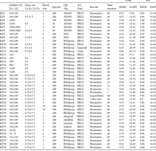
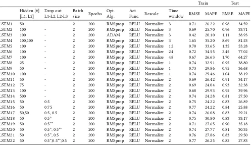
Tables 8, 9, 10, 11, 12 and 13 present the results for different types of regression algorithms. Table 14 presents the results for different dataset lengths for the best selected algorithms. The dataset with a length of 30 weeks was obtained in the period from October 8th till May 5th and consists of only 12 of the original 34 restrooms, it was studied to see whether the relatively small size of the dataset had a negative effect on the results. Below we enumerate some of the key findings.
(1) In terms of RMSE on the test set, RF6 and LSTM14 perform best with a score of 0.81.
(2) The simplest regression model, LR1 comes very close with a score of 0.83.
(3) In terms of MAPE on the test set, baseline ZP performs best together with several machine learning models. This means that those models also predict only zeros. The best model in terms of MAPE that does not predict only zeros is MLP25 with a MAPE score of 15.69.
(4) When looking at both RMSE and MAPE, MLP20 is selected as the best regression model.
(5) For the MLP algorithm in general, normalization outper-forms standardization.
(6) Machine learning algorithms outperform baselines in most cases.
(7) LSTM models seem to perform better than MLP models on input where the actual target value is greater than 0. A model with a low RMSE and a high MAPE gives performs better when the actual target value is greater than 0.
(8) Decision Trees with a max depth of ’None’ seem to heavily overfit to the training set.
(9) Using the longer dataset of 30 weeks decreases performance.
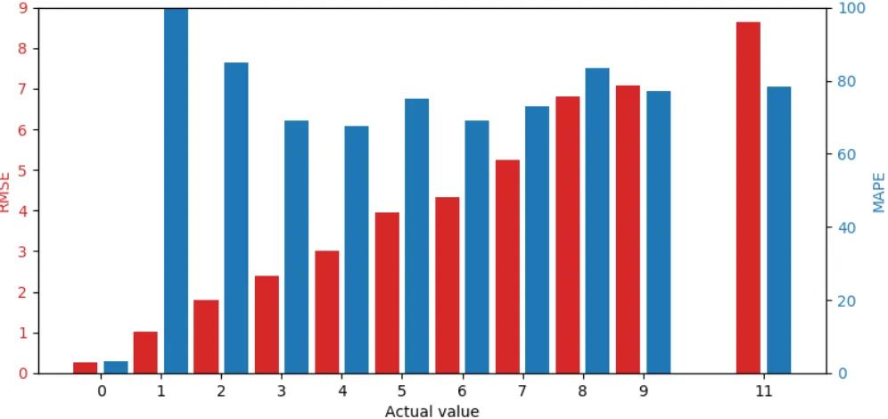
Figure 15 shows the RMSE and MAPE per actual value for best performing model MLP20, note that actual value ten does not exist in the dataset. From this figure, we clearly observe that the RMSE linearly increases, which indicates that the model performs poorly and seems to be predicting the same values for every actual value. When looking at the differences between the RMSE and the actual value itself, we see that the model nearly always predicts a value that is close to 0. Next to that, we see that the MAPE is very high, except for when the actual value is 0. When looking at every other actual value above 0, we observe a MAPE of somewhere around 80%. This means that the MAPE value is not representative for the actual performance of the model. The imbalance of the dataset, in which the actual value of 0 occurs much more often than any other value, has a very strong bias on the results.
Table 7: Regression Baseline Results
Train Test
Time window RMSE MAPE RMSE MAPE
PP 1 1.26 37.22 1.36 39.27
ABV 1 1.01 35.42 1.06 35.51
DABV 1 1.04 35.38 0.83 24.10
ZP 1 0.93 14.32 1.00 15.56
[image:16.612.204.409.224.305.2]PP: Prior Probability Baseline, ABV: Average Bad Vote Baseline, DABV: Daily Average Bad Vote Baseline, ZP: Zero Predictor Baseline
Table 8: Linear Regression Model Tweaking
Train Test
Time window RMSE MAPE RMSE MAPE
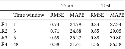
LR1 1 0.74 24.79 0.83 27.34
LR2 3 0.71 24.88 0.85 29.05
LR3 5 0.69 25.27 0.88 30.80
LR4 48 0.38 21.61 1.56 86.58
Table 9: Decision Tree Regression Model Tweaking
Train Test
Criterion Splitter Max_depth Rescale Time window RMSE MAPE RMSE MAPE
DT 1 mse best None Normalize 1 0.14 1.54 1.08 29.49
DT 2 mse best None Normalize 2 0.08 0.56 1.14 30.52
DT 3 mse best None Normalize 5 0.07 0.37 1.08 30.06
DT 4 mse best None Normalize 48 0.00 0.00 1.17 31.53
DT 5 mse best 2 Normalize 1 0.76 26.53 0.83 29.06
DT 6 mse best 5 Normalize 1 0.72 24.71 0.83 27.54
DT 7 mse best 10 Normalize 1 0.59 19.76 0.94 28.52
DT 8 mse random 5 Normalize 1 0.74 25.40 0.83 28.16
Table 10: Random Forrest Regression Model Tweaking
Train Test
N_estimators Max_depth Rescale Time window RMSE MAPE RMSE MAPE
RF 1 20 None Normalize 1 0.34 10.21 0.85 27.51
RF 2 20 None Normalize 3 0.31 9.58 0.83 26.99
RF 3 20 None Normalize 12 0.31 9.60 0.83 27.00
RF 4 20 None Normalize 24 0.30 9.35 0.83 26.60
RF 5 20 None Normalize 48 0.30 9.27 0.83 27.58
RF 6 50 None Normalize 24 0.29 9.14 0.81 26.42
RF 7 100 None Normalize 24 0.28 9.07 0.81 26.43
RF 8 200 None Normalize 24 0.28 9.08 0.81 26.49
RF 9 50 2 Normalize 24 0.76 26.47 0.83 28.74
RF 10 50 5 Normalize 24 0.71 24.82 0.83 27.28
RF 11 50 10 Normalize 24 0.61 21.84 0.81 26.46
RF 12 50 15 Normalize 24 0.50 18.25 0.81 26.47
[image:16.612.108.501.336.462.2] [image:16.612.119.491.490.671.2]Figure 15: RMSE and MAPE per Actual Value for MLP20. Actual Value 10 Does not Exist
Table 11: Gradient Boosting Regression Model Tweaking
Train Test
N_estimators Max_depth Rescale Time window RMSE MAPE RMSE MAPE
GB 1 25 3 Normalize 1 0.67 23.64 0.83 27.29
GB 2 50 3 Normalize 1 0.64 22.37 0.83 27.14
GB 3 100 3 Normalize 1 0.61 21.11 0.85 27.37
GB 4 150 3 Normalize 1 0.59 20.23 0.85 27.62
GB 5 250 3 Normalize 1 0.56 18.94 0.86 28.06
GB 6 50 5 Normalize 1 0.53 18.73 0.85 27.31
GB 7 50 10 Normalize 1 0.25 7.27 0.90 29.30
GB 8 50 20 Normalize 1 0.14 2.05 1.04 32.15
GB 9 50 3 Normalize 2 0.62 22.03 0.83 27.46
GB 10 50 3 Normalize 4 0.61 21.89 0.83 27.40
GB 11 50 3 Normalize 12 0.59 21.88 0.83 27.48
GB 12 50 3 Normalize 24 0.58 21.91 0.83 27.54
[image:17.612.119.491.373.554.2]Table 12: MLP Regression Model Tweaking
Train Test
Hidden [#]
[L1, L2] Drop outL1-L2, L2-L3 Batchsize Epochs Opt.Alg. Act.Func. Rescale Timewindow RMSE MAPE RMSE MAPE
MLP1 100,100 - 2 200 ADAM RELU Normalize 48 0.37 7.80 0.92 21.28
MLP2 100,100 0.5, 0.5 2 200 ADAM RELU Normalize 48 0.67 14.45 0.86 18.20
MLP3 1000 - 2 100 ADAM RELU Normalize 48 0.94 14.32 1.00 15.56
MLP4 1000 0.5 2 10 ADAM RELU Normalize 48 0.94 14.32 1.00 15.56
MLP5 1000,1000 - 2 10 ADAM RELU Normalize 48 0.94 14.32 1.00 15.56
MLP6 1000,1000 0.5,0.5 2 10 ADAM RELU Normalize 48 0.94 14.32 1.00 15.56
MLP7 100,100 - 2 200 SGD RELU Normalize 48 0.76 20.85 0.85 23.56
MLP8 100,100 0.5,0.5 2 200 SGD RELU Normalize 48 0.81 21.90 0.88 22.43
MLP9 100,100 - 2 200 RMSprop RELU Normalize 48 0.56 9.28 0.90 18.67
MLP10 100,100 0.5,0.5 2 200 RMSprop RELU Normalize 48 0.74 13.64 0.86 16.44
MLP11 100,100 0.5,0.5 2 200 RMSprop Sigmoid Normalize 48 0.67 20.89 0.85 25.05
MLP12 100,100 0.5,0.5 2 200 RMSprop Tanh Normalize 48 0.66 24.72 0.94 35.71
MLP13 100 - 2 200 RMSprop RELU Normalize 48 0.48 9.11 0.96 21.63
MLP14 100 0.5 2 200 RMSprop RELU Normalize 48 0.64 12.44 0.88 17.09
MLP15 200 0.5 2 200 RMSprop RELU Normalize 48 0.61 11.94 0.86 17.17
MLP16 500 0.5 2 200 RMSprop RELU Normalize 48 0.58 11.59 0.85 18.21
MLP17 1000 0.5 2 100 RMSprop RELU Normalize 48 0.59 11.64 0.86 19.18
MLP18 1500 0.5 2 100 RMSprop RELU Normalize 48 0.92 14.31 1.00 15.56
MLP19 100,100 0.25,0.25 2 200 RMSprop RELU Normalize 48 0.58 11.92 0.88 18.44
MLP20 100,100 0.75,0.75 2 200 RMSprop RELU Normalize 48 0.81 14.14 0.86 16.01
MLP21 100,100 0.75,0.75 2 200 RMSprop RELU Normalize 24 0.83 14.21 0.88 15.83
MLP22 100,100 0.75,0.75 2 200 RMSprop RELU Normalize 12 0.79 15.20 0.86 17.22
MLP22 100,100 0.75,0.75 2 200 RMSprop RELU Normalize 2 0.81 15.03 0.88 16.84
MLP23 100,100 0.75,0.75 2 200 RMSprop RELU Normalize 1 0.81 14.90 0.86 16.63
MLP24 100,100 0.75,0.75 2 200 RMSprop RELU Logarithmic 48 0.79 14.46 0.86 16.45
MLP25 100,100 0.75,0.75 2 200 RMSprop RELU Cube root 48 0.83 13.95 0.9 15.69
MLP26 100,100 0.75,0.75 5 200 RMSprop RELU Normalize 48 0.79 14.21 0.86 16.13
MLP27 100,100 0.75,0.75 10 200 RMSprop RELU Normalize 48 0.76 14.24 0.86 16.60
MLP28 100,100 0.75,0.75 25 200 RMSprop RELU Normalize 48 0.74 20.09 0.86 21.59
MLP29 100,100 0.75,0.75 1 200 RMSprop RELU Normalize 48 0.81 13.93 0.88 15.76
MLP30 100,100 0.75,0.75 2 200 adagrad RELU Normalize 48 0.76 14.09 0.88 16.26
MLP31 100,100 0.75,0.75 2 200 adadelta RELU Normalize 48 0.77 14.74 0.86 16.88
MLP32 100,100 0.75,0.75 2 200 adamax RELU Normalize 48 0.74 18.89 0.86 20.65
MLP33 100,100 0.75,0.75 2 200 nadam RELU Normalize 48 0.94 14.32 1.00 15.56
MLP34 50,50 0.75,0.75 2 200 RMSprop RELU Normalize 48 0.81 13.99 0.88 15.81
MLP35 75, 75 0.75,0.75 2 200 RMSprop RELU Normalize 48 0.79 14.38 0.86 16.71
MLP36 125,125 0.75,0.75 2 200 RMSprop RELU Normalize 48 0.79 14.22 0.86 16.35
MLP37 150,150 0.75,0.75 2 200 RMSprop RELU Normalize 48 0.79 14.89 0.86 16.99
MLP38 200,200 0.75,0.75 2 200 RMSprop RELU Normalize 48 0.81 14.69 0.88 16.68
Table 13: LSTM Regression Model Tweaking
Train Test
[image:19.612.185.425.424.581.2]Hidden [#]
[L1, L2] Drop outL1-L2, L2-L3 Batchsize Epochs Opt.Alg. Act.Func. Rescale Timewindow RMSE MAPE RMSE MAPE
LSTM1 50 - 2 200 RMSprop RELU Normalize 3 0.71 26.22 0.98 34.59
LSTM2 100 - 2 200 RMSprop RELU Normalize 3 0.69 25.70 0.96 33.71
LSTM3 100 - 2 200 ADAM RELU Normalize 3 0.42 20.10 1.11 38.93
LSTM4 100,100 - 2 200 RMSprop RELU Normalize 3 1.65 35.20 8.69 81.53
LSTM5 100 - 2 200 RMSprop RELU Normalize 12 0.70 33.65 1.35 53.28
LSTM6 100 - 2 200 RMSprop RELU Normalize 24 0.72 34.55 2.45 77.02
LSTM7 100 - 2 200 RMSprop RELU Normalize 48 0.67 26.63 1.70 64.27
LSTM8 25 - 2 200 RMSprop RELU Normalize 1 0.74 32.91 0.95 38.80
LSTM9 50 - 2 200 RMSprop RELU Normalize 1 0.73 29.86 0.95 36.68
LSTM10 100 - 2 200 RMSprop RELU Normalize 1 0.74 29.46 1.04 38.19
LSTM11 50 - 2 200 RMSprop RELU Normalize 2 0.69 26.42 0.91 34.17
LSTM12 75 - 2 200 RMSprop RELU Normalize 2 0.69 24.04 0.93 32.38
LSTM13 100 - 2 200 RMSprop RELU Normalize 2 0.68 29.93 0.95 39.96
LSTM14 500 - 2 200 RMSprop RELU Normalize 2 0.74 24.28 0.81 27.50
LSTM15 50 0.5 2 200 RMSprop RELU Normalize 2 0.75 24.22 0.83 26.89
LSTM16 50 0.75 2 200 RMSprop RELU Normalize 2 0.77 24.22 0.84 25.88
LSTM17 50,50 0.5, 0.5 2 200 RMSprop RELU Normalize 2 0.74 26.08 0.83 29.21
LSTM18 50 0.5* 2 200 RMSprop RELU Normalize 2 0.75 30.80 0.83 33.17
LSTM19 50 0.5** 2 200 RMSprop RELU Normalize 2 0.71 27.65 0.90 35.18
LSTM20 50 0.5*, 0.5** 2 200 RMSprop RELU Normalize 2 0.74 27.77 0.81 30.35
LSTM21 50 0.5*, 0.5 2 200 RMSprop RELU Normalize 2 0.76 27.86 0.83 29.50
LSTM22 50 0.5*,0.5**,0.5 2 200 RMSprop RELU Normalize 2 0.77 26.25 0.82 27.83
Table 14: Comparison of Best Regression Models for Different Dataset Lengths
Train Test
Data set length RMSE MAPE RMSE MAPE
LR1 8 weeks 0.74 24.79 0.83 27.34
LR1 30 weeks 1.18 46.10 1.21 44.66
RF6 8 weeks 0.29 9.14 0.81 26.42
RF6 30 weeks 0.44 16.46 1.18 41.55
DT6 8 weeks 0.72 24.71 0.83 27.54
DT6 30 weeks 1.17 45.02 1.22 42.35
GB2 8 weeks 0.64 22.37 0.83 27.14
GB2 30 weeks 1.13 43.31 1.19 42.13
MLP21 8 weeks 0.81 14.14 0.86 16.01
MLP21 30 weeks 1.30 31.42 1.29 28.52
LSTM20 8 weeks 0.74 27.77 0.81 30.35
B
CLASSIFICATION
As mentioned in section 4 of the paper, experiments with several machine learning algorithms have been carried out to select those that are most likely to perform best. The dataset is exactly the same as the one in the paper, the only difference is that not all features are used in these experiments. Only the features related to previ-ous time intervals such as the number of votes and the number of bad votes have been used. All experiments were conducted us-ing a lenient class definition and the performance evaluation was done on the validation set, results for the test set are not reported. Tables 15, 16, 17, 18, 19, 20, 21 and 22 present the results for all the different types of classification algorithms that have been tried. All metrics are related to the class unclean, just as in the paper. Whenever the F0.5 score did not significantly improve compared to
the best model at that time, the other metrics are not reported and only the F0.5 score is listed in the table.
Table 25 shows the parameter values that were included in the exhaustive grid search to find the best performing models. For restroom-specific prediction models, the restroom encoding was not included as a parameter. In the case of a restroom-specific prediction model for a restroom with a low number of unclean samples, the larger values for the N_neighbors parameter could not always be included.
Table 15: Evaluation Metrics for ClassUncleanfor Decision Tree Classification Tweaking, Lenient Class Definition
Train Validation
Features Timewindow Sampling Weights Criterion, Splitter, Max_depth F0.5 Pre Rec F0.5 Pre Rec
DT1 0,2,3,4 1 - - Entropy, best, 7 0.51 0.66 0.27 0.44 0.55 0.25
DT2 1,2,3,4 1 - - Entropy, best, 9 0.51 0.67 0.26 0.45 0.56 0.24
DT3 1,2,3,4 2 - - Entropy, random, 8 0.50 0.63 0.27 0.45 0.55 0.27
DT4 1,2,3,4 6 - - Gini, random, 8 0.51 0.63 0.29 0.43 0.53 0.25
DT5 1,2,3,4 48 - - Entropy, random, 7 0.51 0.63 0.29 0.44 0.53 0.27
DT6 2,3,4 1 - - Gini, random, 10 - - - 0.41 -
-DT7 1,2,3 1 - - Gini, best, 4 - - - 0.44 -
-DT8 1,4 1 - - Gini, random, 9 - - - 0.44 -
-DT9 1,2,3,4,5 1 - - Gini, random, 10 - - - 0.45 -
-DT10 1,2,3,4,5,6 1 - - Gini, best, 9 - - - 0.46 -
-DT11 1,2,3,4,5,6,7 1 - - Gini, best, 8 - - - 0.46 -
-DT12 1,2,3,4,5,6,7,8 1 - - Gini, best, 8 - - - 0.46 -
-DT13 1,2,3,4,5,6,7,8,9 1 - - Gini, best, 8 0.54 0.68 0.30 0.46 0.56 0.27
DT14 1,2,3,4,5,6,7,8,9 1 - 1, 1.1 Entropy, random, 9 0.51 0.63 0.30 0.47 0.56 0.28
DT15 1,2,3,4,5,6,7,8,9 1 - 1, 1.5 Gini, random, 8 - - - 0.46 -
-DT16 1,2,3,4,5,6,7,8,9 1 - 1, 2 Gini, best, 5 - - - 0.46 -
-DT17 1,2,3,4,5,6,7,8,9 1 - 1, 3 Gini, random, 4 - - - 0.40 -
-DT18 1,2,3,4,5,6,7,8,9 1 - 1, 5 Gini, best, 2 0.47 0.49 0.41 0.39 0.40 0.37
DT19 1,2,3,4,5,6,7,8,9 1 rus - Gini, best, 8 0.84 0.84 0.84 0.21 0.18 0.79
DT20 1,2,3,4,5,6,7,8,9 1 ros - Gini, best, 8 0.82 0.82 0.85 0.22 0.18 0.80
DT21 1,2,3,4,5,6,7,8,9 1 adasyn - Gini, best, 8 0.89 0.90 0.86 0.28 0.24 0.60
DT22 1,2,3,4,5,6,7,8,9 1 smote - Gini, best, 8 0.90 0.91 0.88 0.28 0.25 0.58
DT23 1,2,3,4,5,6,7,8,9 1 smoteenn - Gini, best, 8 0.94 0.94 0.94 0.25 0.22 0.68
DT24 1,2,3,4,5,6,7,8,9 1 smotetomek - Gini, best, 8 0.90 0.91 0.88 0.28 0.25 0.58
DT25 1,2,3,4,5,6,7,8,9 1 smote - Gini, best, 21 0.98 0.99 0.97 0.33 0.32 0.39
DT26 1,2,3,4,5,6,7,8,9 1 smote(0.9) - Gini, best, 16 - - - 0.33 -
-DT27 1,2,3,4,5,6,7,8,9 1 smote(0.8) - Gini, best , 17 - - - 0.34 -
-DT28 1,2,3,4,5,6,7,8,9 1 smote(0.7) - Gini, best, 13 - - - 0.35 -