Abstract
This thesis uses a difference-in-difference analysis to find out what the impact of two
treatments was on New York City housing prices. The first treatment is hurricane Sandy that hit the city in October 2012. This treatment measures the effect of direct flood experience on housing prices. The second treatment is the introduction of an official new flood risk map by the Federal Emergency Management Agency (FEMA). This second treatment measures the effect of indirectly experiencing higher flood risk. Both these treatments where hypothesized to have a negative effect on housing prices. Sandy through direct damage in the short run and increased risk perception in the long run. The new flood risk map only through increased risk perception.
This thesis uses changes housing prices as an operationalization of damage done and increased risk perception. For this thesis an entirely new geospatial dataset was constructed by merging three existing datasets, the old flood risk map, the new flood risk map and 600
thousands coordinates that represent different real estate sales in New York City between 2003 and 2015. The treatment groups of this thesis are based on whether or not a sold property was situated in an area that changed in flood risk with the new flood risk map of 2015. The treatment areas are the areas where the old and the new flood risk map overlap. These are the areas in which flood risk officially changed in 2015. To determine which houses where sold in these areas (treatment groups) and which were not (control group), a Point-in-Polygon (PIP) analyses was conducted using Geographical Information System (GIS)
software. This analysis determines if a point (sold property) was in a polygon (changing flood risk zone). 117 such PIP analyses were conducted to determine the treatment or control group for each observation.
Table of contents
1. Introduction ...4
2. Literature review ...9
3. Data ... 20
4. Empirical Methodology ... 33
5. Results ... 38
6. Conclusion and discussion ... 62
1. Introduction
Although climate change is still a vague concept to some, it is becoming a real problem for the citizens of coastal cities all around the world. For example, the amount of flood days has more than doubled since 1980 in the United States (Climate Central, 2016). Furthermore, it is projected that by 2100 the homes of between 4.2 and 13.1 million Americans will be at risk of flooding because of the rising sea levels (Hauer, Evans and Mishra, 2016). This risk is very hard or even impossible to insure, as floods can be seen as a ‘common shock’ that hits everyone at the same time, while the idea of insurance is based on the idea that risk is randomly distributed and independent of someone else’s risk (Barr, 2012: 88). Furthermore, these common shocks will occur more often as sea levels are rising with 3.4 mm per year according to NASA (2016). As a result, by 2050 between $66 billion and $160 billion worth of American real estate will be under sea level (Bloomberg et al, 2014: 4). By 2100 this amount will be between $238 billion and $507 billion. To put this in perspective, the 2007-2008 subprime mortgage crisis happened when a $600 billion real estate bubble burst (Bernanke, 2008).
Although rising sea levels have been studied extensively in the past, this was mostly done because of the interest in the natural phenomenon itself. Since rising sea levels start to have a more socio-economic impact, science should look into these socio-economic effects of rising sea levels. It is known that, due to rising sea levels, coastal floods are going to occur more frequently. It is however still quite unclear if and how how rising flood risk impacts risk perception, housing markets and the way governments can best circumvent the negative effects of increased flood risk. Therefore it is of big economic and societal importance that science gets insight into the causal mechanisms at play in the interaction between flood risk, risk perception, housing markets and the role that government communication plays in this interaction.
Management Agency (FEMA) introduced its first flood risk map for New York City. This map showed exactly in which flood risk zone a property was. Rising sea levels, erosion, physical flood defence structures and better information on flooding mechanisms influenced the actual flood risk over time. Therefore, on January 31st 2015 FEMA introduced an update of the flood risk map, called the Preliminary Flood Insurance Rate Map (FIRM). On this new map big parts of New York City had their flood risk changed (typically the flood risk
increased). On March 27th 2015 every NYC property owner that was in or close to a new flood risk zone received a letter, informing them about this new flood risk map1. The new flood risk map is preliminary, meaning that it does communicate the updated flood risk, but it is not yet used for calculating flood risk insurance premiums. This map update thus captures the information of increased flood risk, while filtering out the direct effect of increased
premiums. Of course there might still be an anticipation effect. It is hypothesized that this new information will increase flood risk perception and thus reduce housing prices of the
properties situated in the new flood risk zones. Both Sandy and the flood risk map update are thus treatments that are hypothesized to impact flood risk perception.
Research question
By exploiting Hurricane Sandy and a FEMA flood risk map update in a experimental design, this study will provide insight into the effects of natural flood hazards and publicly provided flood risk information on housing prices. The research question of this thesis therefore is: “To what extent did Hurricane Sandy and the introduction of FEMA’s Preliminary Flood Insurance Rate Map (FIRM) impact New York City’s housing prices?”
The logic here is that both Hurricane Sandy and the flood risk map update provide the NYC housing market with new information on flood risk. This new information is then
hypothesized to increase the risk perception of buyers and sellers in this market. Increased risk perception will eventually cause housing prices to decrease. As mentioned before, a second option is that Sandy influenced housing prices through direct damages. These two mechanisms thus happen at the same time. I argue however, that the damage only affects housing prices in the short run, while increased risk perception would also influence housing prices in the long run.
Methodology and data
Increased risk perception reduces housing prices (Oates, 1969). In this thesis I use NYC housing prices to operationalize and measure flood risk perception. This “hedonic” approach is based on the notion that the value of a house is defined by a bundle of its characteristics (Rosen, 1974). These separate characteristics, such as flood risk, can thus be seen as having implicit costs and benefits where people are (not) willing to pay for. If one of the
characteristics changes, its effect can thus be measured as a change in housing prices. In this thesis the dependent variable are the housing prices of sold real estate, while the explanatory variables will be events that are hypothesized to increase risk perception, Hurricane Sandy and FEMA’s flood risk map update, along with a number of control variables like the type of housing and area fixed effects.
has a bigger impact on both treatment groups than the flood risk map update. Finally, it is hypothesized that the impact of the flood risk map is bigger for the city districts (boroughs) that were hit harder by Hurricane Sandy. We also consider a number of robustness checks.
Results
I find that Hurricane Sandy did significantly impact housing prices in New York City. For some boroughs this effect was temporary and thus most likely caused by direct damages. For Brooklyn and Queens the effects of Sandy were still found for the year 2015 by using
quarterly interaction effects. Since direct damages did not take that long to repair, I argue that this effect is due to increased risk perception. The quarterly interaction effects also provided evidence for the effect being causal. The quarterly interactions were not statistically
significant before Sandy and highly significant (and negative) after Sandy. Contrary to the hypotheses I do not find a negative effect of the introduction of the new flood risk map on housing prices. In a few specifications I do find a statistically significant effect, which however is not robust to changes in the specification. This might be due to the fact that the risk perception of homeowners was already corrected by hurricane Sandy and thus was not be furtherly adjusted with the flood risk map. I discuss this interpretation and some other
possibilities in the conclusion section.
Societal relevance
(Western) governments at the same time are “rolling back” in size and thus are less capable of dealing with these kinds of natural hazard risks (Wachinger et al, 2012: 1059). A better understanding of how risk perception works in relation to publicly provided flood risk information and natural hazards could help solving this potential problem.
Relation to the literature
Previous studies have found that providing new flood risk information to the market
significantly increases risk perception and decreases real estate prices (Pope, 2008; Votsis and Perrel, 2016) and that floods caused by hurricanes have an even bigger impact (Ortega and Taspinar, 2016; Bin and Laundry, 2013). In this thesis I will look at both hurricane Sandy and the flood risk map update at once while controlling for each effect. To my knowledge, this design has not been used before in researching flood risk perception. If after a big storm a new flood risk map does no longer impact housing prices, where it normally did, there is probably a different mechanism at play. It could be that the storm already updated the risk perception and therefore the map update no longer shows an effect. Of course it is of scientific relevance to uncover this causal mechanism. Finally, this thesis is innovative as it merges three geospatial datasets to produce the dataset the analysis of this thesis is based upon.
Outline of the thesis
2. Literature review
This section consists of two parts. First, I discuss the theory of risk perception , with a focus on the relation of risk perception in the context of natural hazards. Second, I discuss the main empirical findings from related studies on flood risk.
Theoretical Framework
Almost all of the studies we discuss are based on the theoretical notion of “hedonic pricing” and it’s methodological equivalent “hedonic regressions”. In his classic article, Rosen (1974) proposes the idea of hedonic prices and implicit markets. Rosen states that goods can be seen as a package of multiple characteristics. Prices reflect these different characteristics. In
practice this means there is an implicit market for flood risk. For instance, when the flood risk increases by 1% this will be seen as an implicit cost to homeowners. This implicit cost will then reduce the price of the house. The idea is that a decrease in value is then the price of living in an area in which the risk increased by 1%. The prices of flood risk can thus be calculated using a hedonic regression model in which the dependent variable is housing prices and (changing) flood risk is one of the explanatory variables. The hedonic regression
empirically measures the willingness to pay for a certain characteristic of a house. As mentioned earlier, it is important to realize that risk perception is not the only way in which the housing prices get influenced. Damage by hurricane Sandy probably also negatively impacted housing prices in the short run (Ortega and Taspinar, 2016). A hedonic regression just tells us whether or not the housing prices decreased, not per se what exactly caused it. I argue that the effects of direct damage and increased risk perception can be partly
The availability heuristic
Theory on judgement under uncertainty, biased perceived risk, heuristics and bounded rationality find their origin in cognitive psychology (Tversky and Kahneman,
1973;1974;1981; Kahneman, 2003). Most of the studies mentioned below use the theory of `the availability heuristic’ of Tversky and Kahneman (1973) as their theoretical framework. They argue that individuals are not completely rational when making decisions. They can be in theory, but in practice humans are guided by heuristics or cognitive rules-of-thumb when facing difficult decisions under uncertainty. The availability heuristic is such a short cut that the brain uses when making difficult decisions. Kahneman and Tversky (1973; 1981; 1982) did research on individuals that had to make complex decisions under uncertainty and found that a significant amount of these individuals based their decision on the ease with which the brain could produce an answer to a question. For example, people decided that there are more words in the English language that start with a “K” than of which the third letter is a “K” (Tversky and Kahneman, 1973: 211). In fact however, there are more words with a “K” as a third letter than as a first letter. It is however easier to think of words that start with a “K”, these words are more “available” to the brain. This in short is the availability heuristic. As can be seen in the example above this heuristic can easily lead to irrational decision making, called biases in cognitive psychology. For research on risk perception in combination with natural hazards the availability heuristic is used (not always explicitly mentioned) to explain why sometimes risk perception is high and sometimes low. If a flood is still “fresh in
memory” and thus more available to the human brain, the risk perception is higher and thus effects choices. If time goes by and the flood is slowly forgotten, this memory is less available to the brain and thus the impact of risk and thus housing prices decreases. This is relevant for this thesis, as hurricane Sandy hit New York City in 2012, while the introduction of the updated flood risk map was in 2015. During this time the flood risk might have become less “available” to the brain, which might to a reduction in Sandy’s effect over time.
The availability heuristic is one of the reasons that the market is not constantly fully informed on flood risk. The perception of flood risk is higher after a flood, but this
risk perception in relation to natural hazards. That is why, on top of using the availability heuristic in the theoretical framework of this thesis, it will be supplemented with theory on risk perception in combination with natural hazards, especially in relation with government and government communication.
Risk perception in relation to natural hazard risk
Wachiger et al. (2012) review 35 empirical studies on natural hazard risk perception and try to come up with a more general framework. They find four categories to be present in almost all reviewed empirical studies, namely: “risk factors”, “informational factors”, “personal factors” and “contextual factors”. Also they provide a useful definition of risk perception: “the process of collecting, selecting, and interpreting signals about uncertain impacts of events, activities or technologies”. The four categories will now be discussed.
Risk factors can be seen as the “scientific” definition of risk, such as calculatable probability and frequency, thus not “Knightian” unknowable uncertainty (Knight, 1921). According to Wachiger et al (2012: 1051) perceived likelihood, perceived frequency and perceived magnitude do not impact risk perception significantly in the case of natural hazards such as flooding. This has interesting implications for evaluating the impact of the treatments, as homeowners receive a letter at home that their flood risk increased or decreased by 0.2%, 0.8% or 1%. With a risk of 0.2% a flood happens once in 500 years. Based on Wachiger et al (2012: 1051) it can be argued that this kind of small probabilities of hazardous events are not tangible for individuals and might therefore not have an effect. This case is even further strengthened by the fact that FEMA’s 0.2% flood risk zone has not mandatory flood
insurance. These notions will be used later on in the thesis to create “condensed” treatment groups were the 0.2% flood risk is seen as 0% flood risk to create two treatment groups instead of six.
Informational factors can be seen as information sources and the perceived quality of information. According to Wachiger et al (2012: 1051) these factors are only important for risk perception if the particular individual did not directly experience such a risky event in the past. Trust also plays an important role when receiving information. If the organization or individual providing the information is considered trustworthy, the impact on the risk perception is higher. In a growingly more complex world, trusting experts on their
information can be seen as a “shortcut” to a decision, preferred to making a rational decision (Wachinger et al, 2012: 1053).
gender, educational level, profession, personal knowledge, personal disaster experience, trust
in authorities, trust in experts, confidence in different risk reduction measures, involvement in
cleaning up after a disaster, feelings associated with previously experienced floods, world views, degree of control, and religiousness” (Wachiger et al, 2012: 1051-1052). Most of these
personal factors are deemed to have an ambiguous impact on risk perception. Direct experience of disasters, trust in authorities and confidence in protective measures however were found to significantly impact risk perception in multiple studies (Wachiger et al, 2012: 1051-1052). It is important to realize that this thesis uses transactional data from the NYC housing market to assess risk perception. The dataset used for this thesis does not include information on the buyer or seller of NYC property. Therefore, it is impossible to control for individual characteristics that might have an influence on risk perception. Although this thesis cannot control for personal characteristics, it does control for time-invariant effects of
different neighbourhood levels. Since neighbourhoods can reflect certain personal factors at an aggregate level, such as income and unemployment rates, it can be argued that this thesis takes some of the personal factors into account (at an aggregate level) by using
neighbourhood fixed effects.
Contextual factors are influences from the environment that an individual is in, such as “economic factors, vulnerability indices, home ownership, family status, country, area of living, closeness to the waterfront, size of community and age of the youngest child”
(Wachinger et al, 2012: 1052). Contextual factors mainly impact risk perception in combination with other personal factors. Ruin et al (2007) found that experience with flooding in the past tends to lead to overestimating danger, while for not having experienced floods makes people underestimate flood risk. Other studies find that this causal effect only exists if property was damaged (Wachinger et al, 2012: 1052). Again, it should be noted that these contextual factors mainly influence personal perception of risk. And as this thesis looks at differences in housing transactions only, these factors cannot be controlled for. What is possible however, is to look at the different boroughs separately, as they have their own socio-economic and cultural factors at play. This will be done in the analysis of this thesis.
Important for this thesis is also the fact that proximity to a disaster was found to have a stronger effect on risk perception than the probability of a similar disaster (Wachinger et al, 2012: 1052-1053). This is one of the reasons why the control group for this thesis is defined as the real estate transactions that happened in a 500 meter buffer around the treatment groups.
well (Wachinger et al, 2012: 1052-1053). Indirect experience are ways in which an individual can gain information on the risk at hand, such as via education, the media, hazard witnesses and government communication. The flood risk map update, can thus be seen as indirect experience, while Sandy’s “treatment” is direct experience. From the literature on risk perception we know that indirect experience has an ambiguous effect on risk perception, depending on contextual and personal factors. It is however clear that indirect experience has a smaller effect (if any) than direct experience. It is therefore hypothesized that the map update has a smaller impact than the direct experience of hurricane Sandy.
Wachinger et al (2012) state that indirect experience such as government
communication, if any, has a relatively weak effect on risk perception and thus housing prices. Therefore in their discussion they recommend governments to make people envision “the negative emotional consequences of natural disasters” and to use “communication methods close to personal experience” (Wachinger et al, 2012: 1059-1060). This
recommendation can be used to assess the effectiveness of the FEMA letter, of which a part has been quoted below:
“Flooding is the most frequent and costly disaster in the United States. The risk for flooding changes over time due to erosion, land use, weather events and other factors. The likelihood
of inland, riverine and coastal flooding has changed along with these factors. The risk for
flooding can vary within the same neighbourhood and even property to property, but exists
throughout New York City. Knowing your flood risk is the first step to flood protection. The
Federal Emergency Management Agency (FEMA) is in the process of developing updated
flood maps for New York City. The new maps -- also known as Preliminary Flood Insurance
Rate Maps (FIRMs) -- reflect current flood risks, replacing maps that are up to 30 years old.
This letter is to inform you that your property is mapped in or near a Special Flood Hazard Area.” (FEMA, 2016).
Empirical findings of related studies
There are two ways of implementing a hedonic regression. First there is cross-sectional research, which looks at if there is a significant price difference between living in a FEMA flood risk zone and living in a none risk zone. Zhang (2016) uses a spatial quantile regression model on real estate transaction data in Fargo-Moorhead (North Dakota) and finds that buildings that are situated in a river flood risk zone have a significantly lower value. This difference between being inside or outside a flood risk zone ranges between 4% and 12% depending on the value of the property (Zhang, 2016: 12). Such a cross-sectional research design has its limitations however, as the difference in price can also be explained by
heterogeneity between the two groups instead of by a causal effect of flood risk. For instance, property that is not in a flood zone might have more value because it is situated on a hill with a nice view or because it is close to a good school. A more credible research design for retrieving the causal effect is that of natural experiments. These studies rely on exogenous variation in treatment. The studies discussed below exploit such situations by measuring whether or not there is a difference between the housing prices before and after a treatment for the treatment group relative to a control group. The control group is the group of
observations that did not receive a treatment. Studies looking at natural experiments typically use differences-in-differences (DID). Three types of these natural experiments and their outcomes will now be discussed: the effect of floods on housing prices, the effect of providing flood risk information on housing prices and specifically the effect of updating flood risk maps.
discounted over time (Bin and Landry, 2013; Atreya, Ferreira and Kriesel, 2013). Bin and Landry (2013) for instance find that effects induced by storm-related floods disappeared after six year.
Pope (2008) studies the effect of a flood risk information disclosure law in North Carolina.North Carolina is an American state on the East Coast that has seen an increase in coastal flooding, both in magnitude and in frequency. In 1995 it introduced the Residential Property Disclosure Act (Pope, 2008: 559). This law stated that homeowners are obliged to fill in a form with 20 questions in which they disclose information of interest about the building and its surroundings to potential buyers. The last question was formulated as
following: “Do you know of any FLOOD HAZARD or that the property is in a FEDERALLY-DESIGNATED FLOOD PLAIN?”. The 1% flood risk zone did not significantly differ in price
with the control group before the mandatory disclosure, significant cross section differences where thus not found before the treatment. After the treatment however, the housing prices in the flood zone decreased by between 3.8% and 4.5%, which is between $5400 and $6400 in real value (Pope, 2008: 569). The information about the flood risk zones are always publicly available. The most striking finding in Pope’s (2008: 570) study is therefore that simply providing the same information through mandatory disclosure has a statistically and economically significant effect on housing prices. It is therefore important to understand to which extent buyers and sellers on the real estate market have full information on flood risk before the regression results can be interpreted.
Based on a survey of buyers’ knowledge on flood risk and insurance premiums Chivers and Flores (2002) found that 60% of the individuals found out about the flood risk after the bidding on the house already closed, 4% after moving into the new house and 6% even later when their property actually flooded. 70% of the buyers on the researched housing market were thus not fully informed about the flood risk their potential property was in. This information asymmetry can be used to explain significant negative effects of risk information on housing prices. To explain why there is no hypothesized significant negative effect by using information theory requires the assumption of full information and full rationality to hold. Unfortunately for the interpretation of the DID-regression results of this thesis there is no empirical study on on the knowledge of flood risk of (potential) property buyers in New York City.
new information, namely floods, change in flood risk insurance premiums, new flood risk disclosure rules or increased media coverage (Daniel et al, 2009: 359). It is important to realize that all these studies check whether some form of flood risk information provision changes the prices of property that is already in a risk zone. These new batches of information thus can be seen as a “reminder” of this risk, rather than a provision of completely new
knowledge.
Votsis and Perrels (2016) study whether the introduction of completely new flood risk maps in Finland impacts housing prices for property that was close to the coast of river beddings. Based on geospatial real estate transaction data and the new flood risk map they found a significant negative effect on housing prices for property that was designated as “flood risk area” by the new flood risk map. These effects ranged from -0.105% and -1.067% differing from 0.20 yearly flood probability and 0.001 yearly flood probability. These effects are somewhat smaller than that of the American studies as discussed above. It is important to note that this could be because of two reasons. Firstly, because of differing housing market mechanisms. Secondly, because the “reminding” effects on houses that are already in designated zones are inherently different from the “completely new information” effect of introducing maps where there first were none. The 0% to 1% flood risk treatment group in this thesis do not see the “reminder effect” and thus it would be interesting to see if they experience the “completely new information” effect.
Ortega and Taspinar (2016) use an experimental design to study whether New York City adjusted its real estate prices to the risk of living close to the waterfront after hurricane Sandy hit on October 29th 2012. They find a relatively large negative and statistically
significant effect of Sandy on housing prices. Interesting here is that they find this effect to be significant for both damaged and undamaged houses.. This study is interesting for two
reasons. Firstly, because it looks at the same city as this thesis, which creates a great deal of new insights2. Secondly it is interesting, because it uses other treatment and control groups than the research mentioned above. It compares prices of damaged houses with non-damaged houses and that of flooded houses with non-flooded houses (Ortega and Taspinar, 2016: 2). To define whether property was damaged or flooded or not, geospatial damage assessment data of FEMA was used. It is important to realize that areas that were flooded by Sandy (the treatment group) are not per se the same areas that FEMA designated as flood risk areas. Therefore the treatment areas of this thesis and Ortega’s and Taspinar’s research do not
2I only found this article when I was done constructing the dataset. Otherwise, I could have used their way of
necessarily overlap. If they did exactly overlap, the treatment effect of Sandy in this thesis should be of the same magnitude as the effect as found by Ortega and Taspinar (2016) which found a long term effect ranging from -0.06 and -0.26 logistic points, depending on the specification. To check whether these effects are causal, they check whether quarterly interaction effects are significant before and after Sandy (Ortega and Taspinar, 2016: 23). They deem that Sandy’s effect is causal, because the treatment-year interaction term is positive but not significant before Sandy and negative and highly significant after Sandy. Sandy’s effect will arguably not be exactly the same in this thesis, as this thesis controls for FEMA’s flood risk map update in 2015, while Ortega and Taspinar (2016) do not. It might therefore be possible that they overestimated the effect of Sandy.
Ortega and Taspinar (2016) use the same transaction data of real estate for their DID-regression as this thesis does. Next to doing a DID fixed effects DID-regression on repeated cross-sections, also a smaller dataset was devised of buildings that were sold both before and after Sandy. This also allowed them to also estimate property fixed effects of Sandy in a panel data analysis, which gave approximately the same results (Ortega and Taspinar, 2016: 14;30). It is important to realize that the strategy of using individual property fixed effects is not used in this thesis, which only uses a repeated cross-sections design to estimate the treatment effects by running different DID-regression models. The downside of the repeated cross-sections approach is however, that it introduces a new assumption that has to hold before a found significant effect can be deemed “causal”, namely that there is homogeneity between the cross sectional observations before and after the treatments. After the map update or after Sandy the characteristics of sold houses may thus not differ from the sold houses before these
Hypotheses
From the literature we deduce three hypotheses that we test in the empirical analysis. Firstly, rational choice theory states that by providing the housing market with more and better information on flood risk the prices will be adjusted accordingly. According to the empirical findings of other studies there seems to be a difference between that property is in a flood risk zone and increasing the actual flood risk level. The effects for the two different treatment groups thus seem to be based on different causal mechanisms. Although the magnitude may thus differ between the two treatment groups, the direction is hypothesized to be the same for both the “Hurricane Sandy treatment” and the “flood risk map update treatment”. This leads to the first two hypotheses:
Hypothesis 1: Hurricane Sandy negatively affected the housing prices of both the treatment
groups in New York City.
Hypothesis 2: The introduction of the new Preliminary Flood Insurance Rate Map (FIRM) in
New York City in 2015 negatively affected the housing prices of both treatment groups.
Irrational behaviour such as heuristics and emotional memories of directly experiencing floods influence housing prices through higher risk perception (Wachinger et al, 2012). The notion that direct experience is a significant factor in risk perception is of theoretical value for this thesis. In the price movement per borough we namely see that certain areas were hit harder than others in the past by Hurricane Sandy. Therefore it is hypothesized that these areas should see a higher increase in housing prices once the flood risk map is updated. For individuals that did not experience any floods, the mechanism works the other way around. Ortega and Pensinar (2016: 28) find that 0.68% of New York City was experienced major flooding during Hurricane Sandy. The Bronx saw 0.01% of its borough flooded, Manhattan 0.23%, Queens 0.45%, Brooklyn 0.65% and Staten Island 3%. It is therefore hypothesized that because direct experience of past flooding has a significant effect on risk perception, the boroughs that got the highest percentage of flooding will see a higher impact on housing prices after the map update. Also, since direct experience seems to have a bigger effect than indirect experience it is hypothesized that Hurricane Sandy has a bigger treatment effect than the flood risk map update.
Hypothesis 3: The NYC boroughs that had more major flooding because of Hurricane Sandy
To test these hypotheses a difference-in-difference regression with the two different treatments will be run simultaneously. This will be explained in the methodology section. However we first discuss the construction of the data set.
3. Data
New York City experienced two events that this thesis exploits in a natural experiment setup: Hurricane Sandy than came ashore on October 26th 2012 and the introduction of a new flood risk map on January 31st 2015. This section discusses how information on these two events were distracted from multiple sources and then combined so that the hypotheses of this thesis could be tested.
The first source of data for this thesis is the National Flood Hazard Layer (NFHL), the map that FEMA uses to calculate flood insurance premiums. This is the old flood risk map. This map was updated in 2015 significantly for the first time since 1983. This updating produced the second source, the new flood risk map (the Preliminary FIRM of 2015). These two maps were used in the QGIS open source software for Geographical Information Systems (GIS) to determine different treatment and control areas. In these areas the risk of flooding increased, decreased or stayed the same. The actual observations that will be used in a differences-in-differences regression are real-estate sales from January 2003 up to and including December 2015. These sales are made public by the NYC Financial Department and have been converted to geospatial data by New York University. These geospatial data can be thought of as coordinate points on a map that contain rows of usable information, namely: year, borough, neighbourhood, zip code, lot, block, building category, total square feet, year in which the building was built, the sale date, price of the transaction, longitude, latitude and Borough-Block-Lot unit (BBL). This BBL number is the unique identifier for property in the dataset.
Figure 2. Google Base Map of New York City
Figure 3. New York City with pre- and post-2015 flood risk layers. Produced in QGIS®
The red, yellow and orange areas are the areas that increased in flood risk in the FEMA update of January 2015 by 1%, 0.2% and 0.8% respectively. The pink and blue areas did not have their flood risk changed, they stayed at 1% and 0.2% flood risk respectively. The light-green areas are the areas in which the flood risk went down from 0.2% to 0%. From figure 4 we can conclude that the area in which the flood risk went up (red, yellow and orange) is relatively large as it covers big parts of southern Brooklyn and half of the Rockaway
peninsula. Also the area in which the risk of floods that year remained 1% (pink) is relatively large. The blue and light-green areas are rather small however. These six areas were used to construct two treatment groups. To go down from six to two treatment groups, all the 0.2% areas were labelled as 0% risk zones. This is discussed in more detail later one.
The method to determine treatment areas has been discussed above. But how do we go from treatment areas to different treatment groups? This will be done by combining NYU’s geospatial real estate transaction data and the treatment areas in a Point-in-Polygon (PIP) Analysis. In a Point-in-Polygon Analysis an algorithm is asked to determine whether or not a transaction (point) falls within a certain area (polygon). These areas are the different treatment areas. The points used are the spatial points of the NYC Geocoded Real Estate Sales
Geodatabase3. These points are thus not just points on a geographical map, but represent the sale of actual real estate within the years 2009-2015.
For understanding the point-in-polygon analysis it is important to understand the concept of polygons. Polygons are objects that are made up from ordered coordinates that are connected with lines. The polygons as used in thesis are two dimensional, as they represent flat flood risk maps, but polygons can be 3D objects or 1D objects (one point of coordinates) as well. The FEMA flood risk maps are made up from hundreds of different polygons and
3
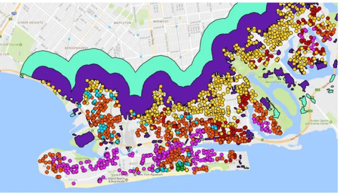
Figure 5. NYC South Brooklyn Area with the real estate sales of 2015
each polygon has information attached to it, such as which flood zone it represents. As already discussed in the data segment, treatment zones (changing flood risk) are created by calculating the overlap betweenthe old and the new flood risk maps.
The GIS Lab of the Newman Library (2016) of the New York University used the address of every real estate sale as provided yearly by the NYC Financial Department and used an algorithm to turn these addresses into a geospatial point (a coordinate). By then asking the QGIS software program to calculate whether a this spatial point was in a changing flood zone polygon (point-in-polygon analysis) the treatment group was established.
By using a Point-in-Polygon algorithm in QGIS it can be determined in which
Figure 6. NYC South Brooklyn Area with the different treatment areas and their sales
There are six treatment zones and three control zones (as will be discussed later). The real estate transaction data consists of thirteen years and 600.000+ observations. For each year nine PIP analyses had to be conducted to determine the treatment and control groups.
Therefore in total at least 117 PIP analyses were conducted to create the dataset for this thesis. Each PIP analysis took between 40 minutes and six hours to complete. It can thus be stated that creating the data used was relatively labour intensive and time consuming.
Figure 7. New York City with all different flood risk change transactions
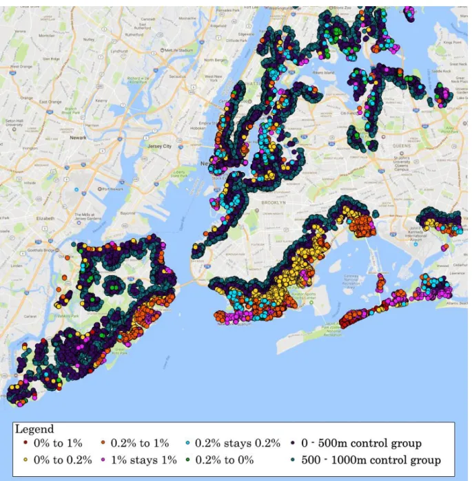
The dark blue points in figure 6 are outside the treatment areas. These observations will later be used to create the control groups. Finally, in figure 7 the six different treatment groups can be seen covering all parts of the New York City coastline. It is important to notice that the treatment groups exists in all five boroughs; Manhattan, The Bronx, Queens, Brooklyn and Staten Island. Manhattan as can be seen on the map as the borough in the north. In the east, Manhattan is connected to The Bronx. South of The Bronx and across the East River the borough Queens is situated. In the west Queens is connected to Brooklyn. Finally, Staten Island is the island in the southwest only connected to Brooklyn by the Verrazano-Narrows Bridge. Brooklyn, Queens and Staten Island on first sight seem to have the most treatment observations. This could be a deception however, as Manhattan has a lot of high buildings, which “stacks” observations on top of each other.
will get the TREAT dummy variable for this particular treatment group. Since the transaction data also gives a date of sale, also the post treatment dummies could be constructed.
Figure 8. Different treatment groups in southern Brooklyn and the broadly defined control group.
Figure 1. Southern Brooklyn. The different risk changes and the idea of a buffer zone to define the control group.
As said earlier, in this thesis a different approach is followed to make it more credible that the homogeneity assumption holds. Namely, the control group still has 0% flood risk before and after the map update, but now they fall in a 0 to 500 meter buffer from the treatment group transactions. These buffers were created in QGIS. All treatment observations were merged into one group that thus contained all different treatment groups of all different years. Then the two different buffers were drawn around all these treatment group observations. Since this buffer overlapped with several treatment areas, QGIS was asked to generate the overlap of these two buffers with the 0% stays 0% risk area. This created the final buffers, which are thus defined as being at least 0 meters from a treatment observation and being in the 0% stays 0% control area. The final 500m buffer can be seen in figure 9. After the buffers is defined as a separate polygon, the 500m control group was created through the same Point-in-Polygon analysis that was used to define the treatment groups. All different treatment groups and the buffer control group can be seen in figure 10.
By using this approach of using buffer zone to define control groups, a lot of
observations that are too far away from the shore lines are left out from the dataset used in the first regression. If the control groups were “broadly defined” as Ortega and Taspinar (2016) even observations up to 3 km from the shoreline would be taken into account. For this thesis this approach makes less sense, because when studying flood risk the buffer control groups can be assumed to be more relevant as they lie closer to the coast and also have roughly the same characteristics as the treatment group. This makes the homogeneity assumption between the control and treatment group more plausible.
It is important to note that in the first DID-analysis that follows there are only two treatment groups considered. Since the DID-regressions are run per borough there were not enough observations per borough for each of the six flood risk changes. Therefore all
4. Empirical Methodology
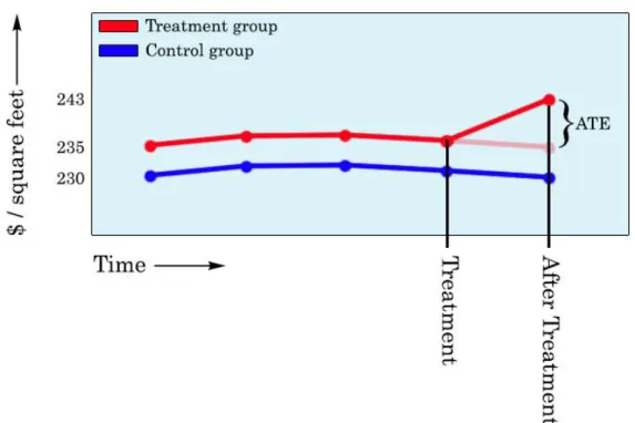
We use differences-in-differences to estimate the treatment effect of hurricane Sandy and the map update. The DID analysis is based on the philosophy of the counterfactual definition of causality (Angrist and Pischke, 2009: 221-246). This counterfactual way of thinking is
depicted in Figure 12. The transparent red line is the assumed counterfactual. The assumption is that that this transparent line would have been the outcome for the treatment group if they would not have received the treatment in the shape of hurricane Sandy and the updated flood risk map. In this case, that would be the group that goes down in risk, as the price goes up. The difference between the counterfactual point and the observed point is the Average
Treatment Effect (ATE). This method is called a Differences-in-Differences analysis, because it takes the differences between the two groups after the treatment and subtracts the difference between the two groups before the treatment to get the Average Treatment Effect.
The example in figure 12 only uses two different groups over two different moments in time. Also in a simple DD with only four points it is impossible to check whether the ATE is significant or just an effect caused by chance. To be able to say something the about
statistical significance of the treatment effect, the method of DD-regression is most commonly used (Angrist and Pischke, 2009: 233). In its simplest form a DD-regression model looks like this:
𝑌𝑑𝑡 = 𝛼 + 𝛽𝑇𝑅𝐸𝐴𝑇𝑑+ ɣ𝑃𝑂𝑆𝑇𝑡+ 𝛿𝑟𝐷𝐷(𝑇𝑅𝐸𝐴𝑇𝑑∗ 𝑃𝑂𝑆𝑇𝑡) + 𝑒𝑑𝑡
Where 𝑌𝑑𝑡 is the dependent variable, 𝛼 is the intercept, 𝑇𝑅𝐸𝐴𝑇𝑑 is a dummy variable which has a value of 1 if a specific observation is inside the treatment area, 𝑃𝑂𝑆𝑇𝑡 is a dummy variable which has a value of 1 if the specific observation happened after the treatment,
(𝑇𝑅𝐸𝐴𝑇𝑑 ∗ 𝑃𝑂𝑆𝑇𝑡) is an interaction variable which coefficient measures the Average
Figure 12. Visualization of the differences-in-differences example
Since the DD-regression model is relatively easy to expand, in this study we also control for area fixed effects. Central in the idea of fixed effects models is that every individual or group inherently has certain unobserved and fixed characteristics that do influence the dependent variable (Angrist and Pischke, 2009: 222). This effect is called fixed as it does not vary over time. Since it does not vary over time this fixed effect can be thought of as a different intercept and slope for every single group or cluster in the model. The coefficients of these dummies will therefore represent the unobserved individual or group effects and the time effects, quarters in this thesis.
A difference-in-differences approach in a way already captures unobserved fixed group-level variables, because it already captures the unobserved fixed effects of the treatment and control group (Angrist and Pischke, 2009: 227). However, since both the control and treatment groups are present in most parts of New York City, the model used will control for fixed effects by including dummy variables for all different neighbourhood levels included in the dataset. Furthermore, we will also control for neighbourhood-specific trends (Angrist and Pischke, 2009: 238). Ortega and Taspinar (2016: 13) in their research on the price effects on Hurricane Sandy use different group-levels fixed effects in their DID-regression: borough, neighbourhood, zip code and building block. They prefer to control for fixed effects on city block level and cluster the standard error at the same level. Since their analysis also uses the transactions data set from the Finance Department, this research will follow their example and control for the same fixed effects levels.
In the DID-regression standard errors need to be clustered, because observations in the same cluster are not independent from each other (Angrist and Pischke, 2009: 293-325). By clustering the standard error on the city block level the estimated effects are adjusted for the fact that observations within a city block are not independent from each other, as they are influenced by the same characteristics of the geographical area4. For this approach it is important that there are enough different clusters. With too few clusters, the serial correlation or intraclass correlation is underestimated (Angrist and Pischke, 2009: 319). Angrist and Pischke (2009: 319) as a rule of thumb state that standard errors can only be effectively adjusted for clustering if there are at least 42 clusters in the analysis. Therefore in the DID-regression only controls for fixed effects for the level that has at least 42 clusters.
The data used in this thesis is “repeated cross sections” data. This means that a house sold in 2003 is typically not sold again in 2004, 2005, etc. Most of the real estate sold in
between 2003 and 2015 only appears once in the dataset. This characteristic of the transaction data makes that it is not fit for panel data analysis, such as Panel OLS with a “within” fixed effects or random effects estimators (Field, 2012: 855-909). Since controlling for
time-invariant fixed effects of different geographical areas in which the transactions took place, the Least Squares Dummy Variables (LSDV) method is used. This means that the cluster above the transaction, the neighbourhood for example, is added as a dummy variable in a normal OLS regression to control for its time-invariant fixed effects. The same goes for the time fixed effects as for each of the fifty-two different quarters a dummy variable is added. The number of groups in a level determines the amount of dummy variables. While adding more
observations (rows) to a regression causes no problems, adding too many dummy variables (columns) does. For this reason not all fixed effects could be taken into consideration. However, since the data was split up per borough it was possible to control for fixed effects on the city block level. Fixed effects for zip codes were excluded from the regression, as the number of zip code areas within each borough is lower than 42. In the analysis therefore the regression is run four times for every borough. Once with neighbourhood fixed effects, once with lot fixed effects, once with block fixed effects and finally once with block fixed effects while also controlling for the year in which the building was built and the building category. Some boroughs have more zip code areas than neighbourhoods. In this case the zip codes are used as a clusters, as this will increase the amount of clusters to above 42.
Ortega and Taspinar (2016) find that Hurricane Sandy had a significant negative effect on real estate prices in New York city. This hurricane happened in 2012, but still had a time-varying coefficient that was significant for 2015. We also know that the effect of Hurricane Floyd on housing prices diminished over 5 or 6 years (Bin and Landry, 2013). Since there are only just over 2 years between Hurricane Sandy hit New York City and the flood risk map update, the effect of Hurricane Sandy needs to be controlled for in the DID-analysis. This is done by not only including the interaction effect of (POST * TREAT) for the treatment groups and the time after the map update, but also for the treatment group and the time after Hurricane Sandy. This will hopefully disentangle the effects of Sandy and the flood risk map update. If the effect of the flood risk map update is significant when controlled for Sandy, the effect can be seen as causal. This brings us to the following base specification of the
Log(price) = α + β1(Treatment_0_to_1) + β2(Treatment_1_stays_1) + β3(Post Sandy) + β4(Post Map Update) + β5(Treatment_0_to_1 * Post Sandy) +
β6(Treatment_1_stays_1 * Post Sandy) + β7(Treatment_0_to_1 * Post Map
Update) + β8(Treatment_1_stays_1 * Post Map Update) + β9(Quarter Time
Dummies) + β10(geographical fixed effects)
The dependent variable in this DID-analysis is the natural log of the inflation corrected transaction price. Treatment_0_1 is a dummy variable that is “1” for the observations which flood risk goes up from 0% to 1% in 2015. Treatment_1_stays_1 is a dummy variable that is “1” for the observations which flood risk remains 1% after 2015. “Post Map Update” is a dummy variable that is “1” after the introduction of the preliminary FIRM on January 31st 2015. “Post Sandy” is a dummy variable that is “1” for all the transactions after Hurricane Sandy hit New York City on October 29th 2012. β5 and β6 are coefficients of the interaction effect between being in a treatment group and being a transaction after the flood risk map update. These dummy variables are thus “1” if a transaction is in the specific treatment group and after the flood risk map update. These two coefficients are the treatment effects of the flood risk map update. β7 and β8 are the coefficients of the interaction effects between being in a specific treatment group and being a transaction after Hurricane Sandy. These two coefficients are the treatment effects of being in a treatment zone after Sandy. These dummy variables are thus “1”if a transaction in the specific treatment group was made after Hurricane Sandy. These two coefficients are in the model to control for Sandy’s effect on housing prices. Finally β9 and β10 are the coefficients of the variables that are included to control for
5. Results
In this section we discuss the results separately per borough. The order of discussed borough results is based on the extent to which Hurricane Sandy flooded each borough5. This is done, because it is hypothesized that the borough that got hit hardest by Sandy will also show the biggest effects. The borough that got the biggest part of its area flooded (Staten Island) is discussed first, while the borough that go hit the least (Manhattan), will be discussed last6. The amount of flooding caused by Sandy is not the only reason to analyse the NYC boroughs separately. Each of these boroughs namely also differs in culture, socio-economic
composition, city planning, demand on the housing market and in type of buildings. First the descriptive statistics of each borough will be discussed. This is important, as the DID-analysis requires that both treatment groups are comparable with the control group (Angrist and
Pischke, 2009: 241-243). Secondly, the price movements per treatment group are analysed graphically per borough. This is important because the causal inference of the difference-in-difference analysis is based on the common trend assumption (Angrist and Pischke, 2009: 227-233). This assumption is thus tested graphically. Thirdly, this section will discuss the DID-regression results per borough. Finally, to check whether these findings are robust, in the last part of this section several robustness checks are implemented and their results discussed.
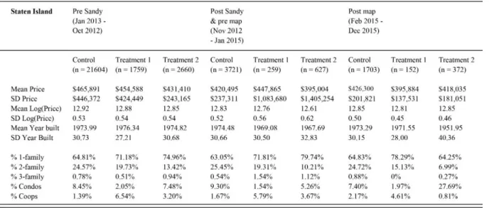
In table 1 the descriptive statistics of the real estate sold on Staten Island is shown. It covers three periods in time, before Hurricane Sandy, between Sandy and the flood risk map update and after this map update. For each of these periods it shows the descriptive statistics for the control group and both the treatment groups. The first thing that can be seen in this table is that the mean of transaction prices is very similar for the three groups in all three periods. In the middle period the standard deviation of the first and second treatment group are large compared to that of the control group. This could be due to price shocks after Hurricane Sandy. For all three groups the years in which the sold property was built is very similar over the years. Finally, if we look at the composition of building types, we can
conclude that the composition is relatively similar, although treatment group 2 has less condos and more coops than the other two groups7.
5 The Bronx saw 0.01% of its borough flooded, Manhattan 0.23%, Queens 0.45%, Brooklyn 0.65% and Staten
Island 3% (Ortega and Taspinar, 2016: 28)
6 The borough of The Bronx was not analysed in thesis due to multiple long periods of missing data for the
treatment groups. On top of that it saw only 0.01% of its area flooded by Hurricane Sandy.
7 A condo or “condominium” is a type of building that consists of multiple units that can be owned
Descriptive statistics Staten Island
Table 1. Descriptive statistics Staten Island
Average price movements per treatment and control group for Staten Island
Figure 13. Price movements Staten Island, 2003-2015
buildings. Coops is not a distinct building type per se. Its name originates from the fact that multiple people are member of a co-operative association that is the owner of the property that the members live in.
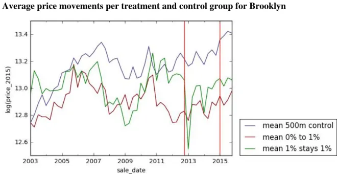
Figure 13 shows the average price movements per quarter for the control group and the two treatment groups on Staten Island. There are two vertical red lines shown in the graph. The first one depicts the date that Hurricane Sandy hit New York City (26-10-2012). The second vertical line depicts the introduction of FEMA’s new preliminary FIRM (31-01-2015). According to Ortega and Taspinar (2016: 28) Staten Island saw the highest percentage of floods due to Hurricane Sandy as compared to the other boroughs. The graph seems in line with this statement as it shows a large drop in housing prices for both treatment groups after Sandy. This price drop is deeper and wider when compared to the price drop in other
boroughs. Apart from an upward spike for treatment group 1 in 2010 and the effects of Sandy, the price movements of the three groups are relatively similar. This is important in the light of the common trend assumption on which the DID-regression is based. Before the map update both treatment groups see their housing prices rise, while the control group stays stable. After the map update however, the prices drop for both the treatment groups. This partly recovers after two or three quarters. The price of the control group goes up after the flood risk map update
Difference-in-differences regression results Staten Island
Table 2 shows the DID-regression results for Staten Island. Each of the five columns depicts a different model that was run. These models differ on the level of fixed effects and the level at which the standard error is clustered. The first model has highest level of fixed effects and clustering at a neighbourhood level, while the models after that have smaller clusters, namely the lot and block levels. The table will be discussed per model.
In the model (1) we see that both the treatment group fixed effects are not significant, meaning that the time-invariant effects of the treatment groups in comparison with the control group are not significant. The same goes for the “Post Sandy” and the “Post Map” variables. In general there is thus no significant difference between the time before Sandy and the time after Sandy and between the time before the map update and after the map update. Being in the first treatment group (0% to 1% flood risk) and in the post Sandy period has no significant effect as compared to being in the control group. For the first treatment group Hurricane Sandy thus does not induce a significant treatment effect. The interaction effect between treatment group 2 (1% stays 1%) and the Post Sandy variable is negative and significant however. The treatment effect is -16.8 logistic points, which is roughly an effect of -16.8%. This significant effect says nothing without interpretation. The housing prices could be affected because of directed damage caused by hurricane Sandy. Another possibility is the “reminding” effect. Hurricane Sandy as a bringer of information might have reminded the market that those houses were in a flood risk zone, leading to lower housing prices. If we look at the effect of the introduction of the updated flood risk map on the treatment groups we see two things. First, the map has no significant effect on treatment group 1, even though this was hypothesized. The interaction effect between the flood risk map and treatment group 2 is statistically significant and positive. This is strange, as I hypothesized that increased flood risk information would decrease the housing prices. This significant effect might therefore be due to other reasons. For instance, the control group might have dropped in value more than the treatment group after the map update. The price movements in figure 1 do not show this however. Another possibility is that property with waterfront view increased highly in demand in 2015. This is also implausible however, because treatment group 1 does not show such an effect. Another interpretation could therefore be that the effect of Sandy faded out in the year 2015. Other studies found that the effects of storms only fade out after five or six years, so this interpretation is rather speculative (Bin and Polasky, 2004).
fixed effects and building block fixed effects. Also the effect of the post map period on treatment group 2 remains positive and significant for the other models. This effect also decreases when more precise fixed effects are controlled for. Interesting to notice is that when the same specification is run on a subset of family houses (model 5) while controlling for age and building type, these effects still do not change.
Results Brooklyn
In table 3 the descriptive statistics of the real estate sold in Brooklyn is shown. The first interesting thing it shows is that for the first and second period the average prices of sold real estate is relatively similar. For the period after the flood risk map update however, the control group sees a sharp increase in the mean price. Also the standard deviation of the price sees a relatively large increase. The composition of housing types is relatively balanced, with the remark that treatment group 2 has less 2-family houses and treatment group 1 has less condos. Overall it can be concluded that the treatment and control groups for Brooklyn are quite similar in their characteristics.
Descriptive statistics Brooklyn
Tabel 3. Descriptive statistics Brooklyn
Average price movements per treatment and control group for Brooklyn
Difference-in-differences regression results Brooklyn
After Staten Island the borough of Brooklyn was had the highest percentage of floods due to Hurricane Sandy in 2012. The DID-regression results of this borough are shown in table 4. Again the models represent the same DID base specification, while each model controls for fixed effects at another level. Model 1 shows highly significant effects for three of the four treatment effects. First, hurricane Sandy’s effect is -15.3 logistic points on treatment group 1 and -13.0 logistic point on treatment group 2. Both these effects are in the hypothesized direction. What is also interesting about the first model is that the introduction of the new flood risk map seems to have a negative effect of -9.3 logistic points on treatment group 1. This effect was also hypothesized. This map update effect does not show for treatment group 2 however. When we look at model 2, it can be seen that the effect of the flood risk map update disappears when controlling for the fixed effects of more clusters, namely blocks. The effect of Sandy on both treatment groups remains highly significant and negative however. Also the post map period becomes significant and negative in this model. The post Sandy dummy and the treatment fixed effects do not show significant correlations. In model 3, controlling for fixed effects at the lot level, a significant effect of treatment group 1 can be seen. Compared to the control group this treatment group thus has lower housing prices independent of time in this model. Also the treatment effect of Hurricane Sandy is significant and negative again for both treatment groups. The flood risk map update is significant for treatment group 1 and almost significant (p < 0.1) for treatment group 2. When model 4 also controls for building type and age the effect of the map update becomes insignificant again for both treatment groups. The effect of Hurricane Sandy remains negative and highly significant however. This remains unchanged when running the same model on a subset of family houses in model 5.
Results Queens
Descriptive statistics Queens
Table 5. Descriptive statistics Queens
Average price movements per treatment and control group for Staten Island
Figure 15 shows the average price movements per quarter for the control group and the two treatment groups for Queens between 2003 and 2015. Of all the boroughs analysed Queens shows the most similar price movements between the three groups. The similar trend assumption thus seems to hold for this borough. After Hurricane Sandy all three groups see their average housing prices fall. Treatment group 2 sees the biggest price drop, followed by treatment group 1 and then by the control group. Since the control group also drops in price after Sandy, this could mean that the effect of Sandy on the treatment groups is
underestimated in the DID-regressions. This is the case because the DID-regression results are the results as compared to the control group. If this same control group is also affected by a treatment, the estimated treatment effect is thus underestimated. After the flood risk map update treatment group 2 and the control group initially drop in price, to recover after in the next quarters. For treatment group 1 this is the other way around, its average price first rises before it drops in the following quarters. These graphical effects might be due to chance or quarterly trends. Therefore now the DID-regressions will be discussed.
Difference-in-differences regression results Queens
Results Manhattan
In table 4 the descriptive statistics of the real estate sold in Manhattan are shown. This table shows that Manhattan is very different from the other boroughs for multiple reasons. Firstly, it has very few family houses. Most of Manhattan consists of condos and coops. This big
amount of high-rise buildings is also the reason that the control group is very large in
comparison to the treatment groups. The treatment groups do have a higher price mean, which could be due to the proximity to the waterfront and the view that comes with it. Furthermore, the standard deviation of these prices is relatively large as well. This shows that within Manhattan there is a big difference in housing prices. Finally the buildings in the control group are older relative to the treatment groups in the first two periods. Overall it can be concluded that Manhattan with big differences within its borough has less balanced data. Overall it can be concluded that Manhattan has big differences within its borough and between treatment groups. This makes it a rather problematic case for a DID analysis.
Figure 16 shows the average price movements per quarter for the control group and the two treatment groups for Manhattan between 2003 and 2015. The first thing that stands out is that the housing market of Manhattan is more volatile compared to the other boroughs, as can be seen at the extreme ups and downs of especially the second treatment group. What is also interesting, is that while in the other boroughs the control group seems to have a higher average price than the treatment groups, this is not the case for Manhattan. The two treatment groups, that are closer to the water, have a higher average price for almost every quarter between 2003 and 2015. Since Manhattan has mostly high-rise buildings, that probably has to do with the fact that buildings close to the waterfront have a view that is in high demand. If we look at the period following Hurricane Sandy we see that only treatment group 1
Descriptive statistics Manhattan
Table 7. Descriptive statistics Manhattan
Average price movements per treatment and control group for Staten Island
Difference-in-differences regression results Manhattan
Table 8. Difference-in-differences regression results for Staten Island. Each model (column) runs the same base
specification, but differs in the fixed effect level and the level at which the standard error is clustered. One asterisk (*)
In the descriptive statistics table and the price movement graph we saw that Manhattan’s housing market as a case in a DID analysis is rather problematic. Table 8 shows the DID-regression results with different fixed effect level models for this borough. Since the case of Manhattan is deemed problematic and shows no consistent outcomes, this table will only be discussed briefly. The main thing that should be understood from reading this table is that both the Sandy treatment and the flood risk map update treatment show no consistent negative significant effects. Also the treatment group dummies and the post dummies show
inconsistent outcomes. To strengthen the impression that Manhattan’s housing market is too volatile and therefore a problematic case for DID analysis, see model 6. When running the base specification on a subset of Manhattan family houses the post map interaction with treatment group 2 becomes extremely large and positive with 100.8 logistic points. Also Sandy has an incredibly large negative effect on treatment group 1, which did not show an effect in the previous models. Of course this extreme outcome is also due to the fact that it only uses 847 observations over thirteen years while including 198 fixed effects clusters and 52 time fixed effects, depriving the degrees of freedom for this model.
Robustness checks
Above the results of the first DID-regression results were discussed. To check whether these results are robust, now different robustness checks will be implemented and their outcomes discussed. The tables of these robustness checks are included in the appendix. In all these tables the preferred model without robustness checks is shown first as a point of reference. In the first DID analysis we already found that Manhattan showed no consistent treatment or dummy effects. This does not change in the robustness check models. Therefore these outcomes will not be discussed.