Techniques for Precision-Based Visual Analysis of Projected
Data
Tobias Schreck
aand Tatiana von Landesberger
a,band Sebastian Bremm
a aTechnische Universitaet Darmstadt, Germany
b
Fraunhofer IGD, Darmstadt, Germany
ABSTRACT
The analysis of high-dimensional data is an important, yet inherently difficult problem. Projection techniques such as PCA, MDS, and SOM can be used to map high-dimensional data to 2D display space. However, projections typically incur a loss in information. Often uncertainty exists regarding the precision of the projection as compared with its original data characteristics. While the output quality of these projection techniques can be discussed in terms of algorithmic assessment, visualization is often helpful for better understanding the results. We address the visual assessment of projection precision by an approach integrating an appropriately designed projection precision measure directly into the projection visualization. To this end, a flexible projection precision measure is defined that allows the user to balance the degree of locality at which the measure is evaluated. Several visual mappings are designed for integrating the precision measure into the projection visualization at various levels of abstraction. The techniques are implemented in a fully interactive system which is practically applied on several data sets. We demonstrate the usefulness of the approach for visual analysis of classified and clustered high-dimensional data sets. We thereby show how our novel interactive precision quality visualization system helps to examine preservation of closeness of the data in original space into the low-dimensional space.
Keywords: High-dimensional data analysis, projection quality, point cloud visualization.
1. INTRODUCTION
In many data analysis applications such as clustering, classification, retrieval, and fingerprinting, the data under concern is high-dimensional. Typical data sets used in these applications consist of data instances characterized by multiple describing attributes, or of vectors of features extracted by appropriate extraction functions. For visual analysis of data embedded in a metric or high-dimensional vector space, this data often is mapped to 2-dimensional display space by means of projection algorithms. Projection is a popular tool for analyzing the structure of high-dimensional data. Different projection techniques exist, supporting visual analysis of key data characteristics. Projections usually incur a loss in information, introducinguncertaintyabout the global or local quality of the projection visualization shown to the analyst (cf. Figure 1 for an illustration).
Projection visualization is very useful in different application scenarios. In analysis of unclassified data, a main task includes assessment of the overall data structure, finding clusters of data instances, and analyze the relationships within and between the clusters. In analysis of classified data, class labels are known for the different classes, and the relationship between the classes is of interest. Often, questions regarding the compactness of class distributions, the overlap of a class with other classes, and the discrimination between classes are posed.1
While projection is a popular data analysis tool, the analyst needs to be aware that projection may suppress original information, or may even introduce erroneous information. Specifically, the spatial relationship between the data instances in projected space may not appropriately reflect those present in original (high-dimensional, or metric) data space. So whenever visual analysis of data in projected space is performed, the degree ofprojection precision underlying the visualization needs to be considered.
Further author information: (Send correspondence to Tobias Schreck)
Tobias Schreck: E-mail: [email protected], Telephone: +49 6151 155-125
Tatiana von Landesberger: E-mail: [email protected], Telephone: +49 6151 155-631 Sebastian Bremm: E-mail: [email protected], Telephone: +49 6151 155-623
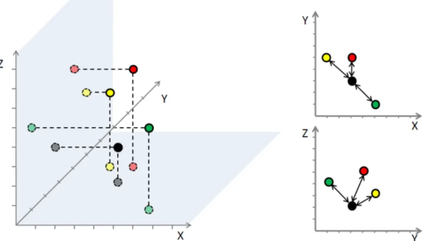
Figure 1. Projections from original metric or high-dimensional input data space (left figure) to low-dimensional projection spaces (right top and bottom figures) typically introduce an information loss. As a consequence, data element relationships as indicated in the projection may not be representative for those given the original data space. The loss of information can be measured e.g., in terms of element distances or topology, and should be adequately reflected in the projection visualization.
Precision of a projection may be regarded objectively or subjectively. Subjectively, we could argue that the quality of any projection can be judged by the usefulness of the projection in a given data analysis case. If the data analyst can successfully interpret a projection based on domain knowledge, then it could be assumed that the projection was appropriate for the task. This assessment of course is user subjective and data dependent. Better suited are objective projection precision assessments based on the resemblance of properties in original and projected space.
We therefore want to objectively measure and visually integrate the notion of projection precision into the visualization, to allow the analyst to assess the reliability of the analysis while working with the projection visualization. To consider the degree of precision in any projection visualization is important (a) to assess the trustworthiness of the projection-based data analysis, and (b) as a feedback mechanism for the analyst to interact with the projection algorithm. The first argument refers to a static projection visualization, where the analysis is enriched by the degree of confidence that can be placed into the projection. An appropriate consideration of projection precision in the visualization should allow statements such as “Classes xand y separate from each other and share overlap with class z with high reliability; and classes aand b do not share overlap with z, but here we can not be so sure.” Based on these considerations, the analyst could also leverage the projection precision information to configure the projection algorithm, to generate improved projection views which allow more reliable analysis of data parts which were not being analyzable with high precision in an original projection. The contribution of this paper is to propose a flexible projection precision measure for evaluating the precision of point-based projections. Furthermore, options for incorporating this measure into projection visualization approaches are introduced, and applied to several example data sets. The remainder of this paper is structured as follows. Section 2 recalls important projection techniques, projection analysis tasks, and potential problems resulting from projections of insufficient projection precision. Section 3 discusses our projection precision concept and introduces a flexible measure to assess the degree of projection precision. Section 4 presents suitable visual mappings to integrate it into point- or hull-based projection visualization. Section 5 describes a visual analysis system into which our proposed approach was implemented. In Section 6, we apply the techniques on multiple high-dimensional data sets, demonstrating the usefulness of the approach for various tasks. Key aspects of our approach and options for further development are discussed in Section 7. Finally, Section 8 concludes.
2. BACKGROUND AND RELATED WORK
We recall prominent projection and visualization techniques. We also briefly discuss work on data quality and uncertain visualization related to our work.
2.1 Projection Techniques
There exist a wealth of algorithms to project data embedded in metric or high-dimensional vector space to low-dimensional display space. Data projection techniques can be divided into linear and non-linear. Linear projection methods such as Principal Component Analysis2 (PCA) calculate a linear combination of original
attributes to construct derived attributes. Specific linear projection techniques include Factor Analysis (FA), Independent Component analysis (ICA), Kernel PCA, and Projection Pursuit, each of these aiming at specific projection goals. For example, while PCA captures a maximum of data variance in the projection, Projection Pursuit maximizes a specific notion of interestingness defined as the deviation from normal distribution in the projection. Non-linear techniques do not restrict calculation of derived attributes to linear combinations of original attributes. Techniques include non-linear PCA, multi-dimensional scaling3 MDS), and Sammon’s
Mapping (SM). Both MDS and SM try to preserve relative distances between objects in the input and output space by minimizing an objective function dependent on distance differences. Neural networks, specifically the Self-Organizing Map are also applicable for dimensionality reduction. The Self-Organizing Map (SOM) algorithm4 is a combined vector quantization and projection algorithm, mapping arbitrary numbers of data vectors onto a limited number of prototype vectors arranged on a regular grid of low dimensionality.
Projection techniques typically either implicitly or explicitly optimize certain statistical properties of the projection. Recent work has started to consider also user-dependent notions of interestingness when forming projections. The Scagnostics approach5 defines different measures of projection interestingness based on
con-vexity, correlation, degree of outliers etc. in a given projection. The Class Consistency approach6 proposes two
measures rating the discrimination of labeled data in 2D projection space. In7 two interestingness measures for labeled and unlabeled point cloud data based on correlation and class separation properties were proposed. All these scores were applied to filter or sort a large space of candidate projections, to show the most interesting ones to the user, thereby allowing efficient exploration of large projection spaces. Our approach relates to these works in that we also propose a score which can be used to filter candidate projections. It complements the aforementioned techniques and is applicable to labeled and unlabeled data. In addition, we also visualize our score embedded with the projection display.
2.2 Projection-Based Data Visualization
Given a projection of data instances to low-dimensional display space, appropriate visualization methods are needed to support the data analysis task at hand. Point-based projection visualizations such as scatter plots are commonly used.1 These visualize the projected data instances by individual marks in the display, e.g., by dots,
symbols, or textual labels. Optionally, color can be assigned as a qualitative visual variable for supporting the visual discrimination of different class labels.
For large data sets, the scatter plot approach may lead to crowded, over-plotted displays which can be difficult to interpret. To address this scalability issue, numeric or visual data aggregation can be performed. Hull-based visual representation of large point clouds is an approach to address the large data set problem. A statistically motivated approach to represent 2D point clouds by hulls was introduced in.8 In previous work, we
discussed usage of convex hulls9and spline-based refinements thereof10 for abstraction of large point clouds by
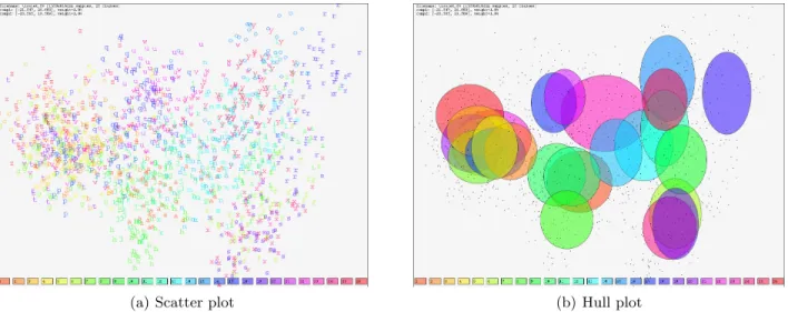
enclosing hulls. Figures 2(a) and 2(b) show point- and hull-based 2D plots of projected high-dimensional data (cf. also Section 6.1). While plots such as these are standard, they usually do not include a measure for the actual projection precision. Depending on the precision of the plots, their visual analysis without considering the precision may therefore result in imprecise or even misleading findings.
2.3 Visualization of Data Uncertainty and Quality
An important data aspect relates to the degree of certainty or quality which encompass the data to be analyzed. Information Visualization researchers have proposed various techniques to incorporate the notion of data certainty or quality into specific data visualization applications. The proposed techniques usually capture data quality or uncertainty by a quantitative or qualitative variable which is mapped to one or more graphical variables still free for use in the given visualization. These may be any typical visual variable including color, hue, or saturation, size and position of visual element, and others. Also, the integration of additional graphical objects into the given data display, including uncertainty glyphs, labels, isosurfaces, or textures are possible. Furthermore, usage of
(a) Scatter plot (b) Hull plot
Figure 2. PCA-based projection of the high-dimensional ISOLET spoken letter data set (cf. Section 6.1) to 2D. Each data sample belongs to one of 26 classes. (a) Shows a scatter plot using printed class labels. (b) Shows a plot using hull-based aggregation of points by class membership. Specifically, ellipses of radii set to the variance of the class points inxand
ydirection are used. Rainbow colors are used to help distinct point classes by the user. Plot such as these are standard but usually do not reflect the precision of the projection.
animation, interactivity (e.g., for quality detail on demand), and leveraging other human senses such as acoustic or haptic senses (e.g. sound or vibration) are possible. Extensive overviews of methods for visualizing data error, quality and uncertainty are presented in surveys.11–14
3. MEASURING PROJECTION PRECISION
We introduce a simple, flexible mechanism for evaluating the precision of a projection. The basic idea is to calculate a precision score for every projected data point.
From the family of MDS projection algorithms, the so-calledstress function is known, which is an aggregate measure for the difference between pairwise point distances in original and in projected space. Inspired by this stress function, we define a measure for the precision of each projected data point. The measure is based on comparing the distances between a given point to its nearest neighbors in original and in projected space.
LetO be a data set consisting ofN data elements embedded in an original (e.g., high-dimensional vector) metric space. LetP be the projection of the data elements fromO to low-dimensional vector space (e.g., two-dimensional display space). Let dO() and dP() be distance functions for measuring the distance between any pair of elements inO and inP. Given a point o∈O, we consider a numbern,1< n < N of nearest neighbors. Letio,0, . . . , io,ndenote the sorted list of nearest neighbors, where the first index io,0 is the index ofo. We then
consider the vector of nearest neighbor distances inO as
dOo,n=< dO(o, O[io,1]), . . . , dO(o, O[io,n])> .
Let p∈ P be the projection of data element o. Then, consider the vector of distances betweenp and the projection of itsnnearest neighbors in O as
dPo,n=< dP(p, P[io,1]), . . . , dP(p, P[io,n])> .
Based on these distance vectors, we define the projection precision scorepps(o, n)≥0 for data elementoand itsnnearest neighbors as
pps(o, n) =k d O o,n kdOo,nk − d P o,n kdPo,nk k.
ppsis measured as the norm of the difference vector between the scaled distance vectors. The distance vectors are scaled to unit length to normalize distances measured inOandP, which might otherwise not be comparable. Note that the list of nearest neighbors to o need not be identical in O and P. It is therefore important to determine the nearest neighbor list in eitherOorP, and apply it to the other space as well. While we determine the nearest neighbot list in O, determining it inP would be viable as well.
Parametern reflects the locality at which projection precision is evaluated. Small values imply that only a local neighborhood is considered, while for larger values, the scope of the measure increases. For n=N−1, all data elements in the data set are considered. nis determined interactively by the analyst, to support evaluation of projection precision at different scales.
The value ofppscan be regarded as a measure for the stress of the projection of data elemento. Projections of high precision are expected to yield a high resemblance of the distribution of distances, indicated by lowpps
values.
In terms of an example, consider the black circle in the diagram of Figure 1 right top and bottom as the point for which to evaluate pps. Theppsmeasure for n= 3 in the top and bottom projections evaluates to 4.5 and 4.2, respectively. Therefore, the bottom projection is attributed a higher projection precision, as compared to the projection shown at the top.
4. VISUALIZING PROJECTION PRECISION
We use our precision measure to extend a given projection-based visualization by reflecting this precision measure. We consider two principal approaches to this end. First, we offer the analyst an additional precision map view which can be considered in addition to the existing projection visualization. We also devise methods to directly integrate the projection precision measure into the visualization, by mapping it to appropriate visual variables. We discuss both approaches in turn.
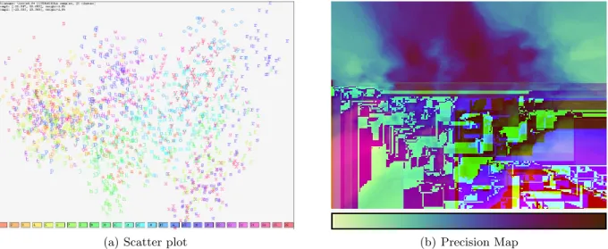
(a) Scatter plot (b) Precision Map
Figure 3. Projection precision plot. (a) Original visualization of projected data. (b) Visualization of projection precision in a map.
4.1 Projection Precision Maps
The first approach renders a projection precision map to complement a given projection-based visualization. The precision map can be used to gain an understanding of the distribution of the projection precision over the projected display space.
To obtain theprecision map, we start with theppsvalues of all data points in 2-dimensional projected space. These give a discrete distribution of precision scores in the pixel raster display. We calculate a screen-filling precision image by interpolating the precision scores at each display pixel. The precision map image is obtained from the interpolated precision map by color-coding the appropriately normalized original and interpolated scores. For interpolation, we implemented Nearest Neighbor, Weighted Average, and Median interpolation schemes. From these, the user may chose interactively. Figure 3(b) illustrates a precision map using a dark-to-bright color-coding scheme. Lower projection precision (higherpps) is visualized by darker color tones.
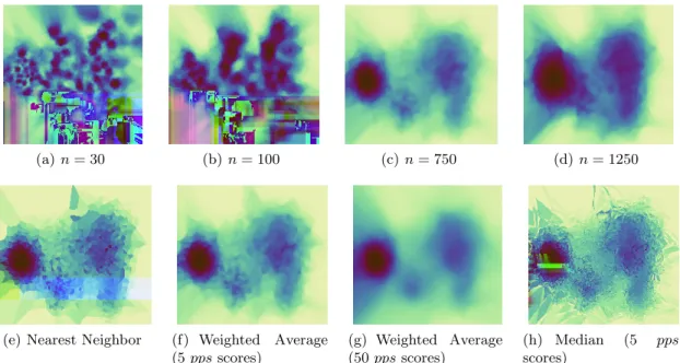
The calculation of the proposedppsmeasure requires the numbernof nearest neighbor points to consider. For generation of the precision maps, also aninterpolation functionneeds to be chosen. We illustrate the sensitivities of these parameters by application on an example data set in Figure 4. Regarding parametern, Figures 4 (a-d) show precision maps obtained for Weighted Average interpolation and increasingn. Smaller settings fornreflect more local precision details, while larger settings perform an aggregation over the precision map.
Figures 4 (e-h) show the effect of using different interpolation schemes, to obtain the display filling precision maps from the pixel-basedppssamples. We compared Nearest Neighbor interpolation with Weighted Average and Median interpolation. The latter two methods allow for a selectable number of neighbor samples to be aggregated. Compared to simple Nearest Neighbor interpolation, Weighted Average introduces a controllable degree of smoothing to the images, removing high-frequency precision changes over the map as more samples are aggregated. Median aggregation, like Nearest Neighbor interpolation, forms a rather sharp image with high-frequency features. We regard Weighted Average a good candidate method, as it allows the user to focus on the overall distribution of projection precision over the map, not getting distracted by too much local variance. While we have not performed an evaluation of the relation between data sets and interpolation method, we currently default to Weighted Average interpolation and let the user interactively set the number of sample measures as a parameter.
(a)n= 30 (b)n= 100 (c)n= 750 (d) n= 1250
(e) Nearest Neighbor (f) Weighted Average (5ppsscores)
(g) Weighted Average (50ppsscores)
(h) Median (5 pps
scores)
Figure 4. Comparing the effect of different settings for the number of nearest neighborsnconsidered in the evaluation of theppsmeasure, for a given display interpolation scheme (top row). Different display interpolation functions are shown in the bottom row, where the number of nearest neighborppsscores considered in the interpolation is given in brackets where relevant.
4.2 Integrating Precision Maps with Point- and Hull-based Projection Visualization
The precision map may also be directly integrated into an existing projection visualization by mapping it to certain visual variables. We implemented mappings based on points, enclosing hulls, and a combination of both.4.2.1 Point-based visualization
In point-based visualization, each data item is represented by a glyph. Simple glyphs include dots, characters, or symbols, but also, more complex glyphs can be designed. Theppsof each projected point may be visualized by scaling an appropriate visual attribute of the points’ respective glyph. Candidate variables include glyph shape, size, or color. We implemented both scaling of color opacity and of mark size. Figure 5(a) illustrates a point cloud plot in which both opacity of the point color and the point size are scaled to reflect the projection precision of each point. Note that in this example, size and opacity redundantly indicate projection precision, and that larger and more opaque marks indicate higher projection precision (lowerpps).
4.2.2 Hull-based visualization
In case classification labels or other grouping information is associated with the data points, an option is to form enclosing hulls over the points belonging to the same class. This may improve the visual differentiability of point groups, specifically in case of large data sets. If such hulls are given, we map the aggregated precision score of each point being a member in the group by scaling one or more visual attributes of the enclosing hull shape. The resulting hulls both compactly visualize the distribution of point classes in projected space, and indicate the aggregate projection precision of the classes’ member points. In our implementation, we rely on scaling the opacity of the hulls’ fill color. Figure 5(b) shows an example.
4.2.3 Combined point and hull-based precision visualization
Point-based precision visualization is inherently local and applicable to any point-based projection visualization. Hull-based projection visualization relies on availability of grouping information and is more global in that it aggregates point-based precision scores up to the group level. Also, a combination is possible: If class information is available, a hull-based class visualization may be visually integrated with the precision map in several ways. For instance, we can use the precision map to scale the brightness channel, a “dark cloud” metaphor can be implemented, “hiding” more imprecise projection regions from the analyst’s view. Yet another option is to introduce local image blur, where the degree of blur applied at each pixel is determined in proportion to the precision map value at that pixel coordinate. We implemented these techniques and let the user chose from them, to find the best visual representation of the projected data set. Figure 5(c) shows an example which combines using color, shape and blur to reflect the projection precision. Note that combined representations such as this introduce visual redundancy, however, depending on user and application, can significantly improve perception of the projection precision information by the user.
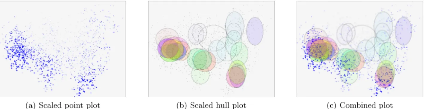
(a) Scaled point plot (b) Scaled hull plot (c) Combined plot
Figure 5. (a) Shows a scaled point cloud plot, where opacity and size of the point marks indicate respective projection precision. (b) Shows a scaled hull plot, where each class is represented by an ellipse, and the opacity of each hulls’ color is scaled to reflect average precision of the class points in the projection. (c) Shows a view which redundantly uses multiple visual attributes (here: saturation, size, blur) to reflect projection precision in the plot. Note that the ellipses were centered on the average of the class point clouds, and their radii were set to reflect the variance of the class point clouds along thexandyaxes.
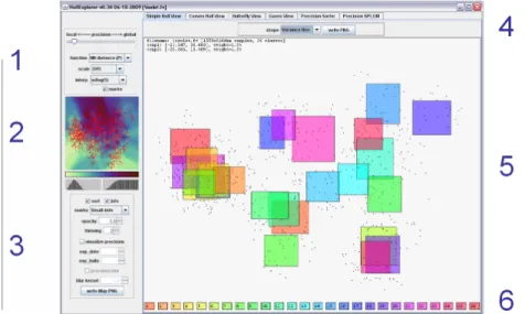
5. INTERACTIVE VISUALIZATION SYSTEM
We have integrated our projection precision approach with point- and hull-based projection visualizations to form an interactive system. Figure 6 gives an overview over the main components of the system, which we detail next. The system is arranged around a main view which shows a 2D scatter plot of the projected data, shown in panel 5. To improve the visual ability to distinguish data sets with many labeled classes, the user can chose from different coloring schemes. Panel 6 shows the color palette, from which colors are sampled and mapped to the labeled classes. Via panel 4, the user may select from different point visualization modules including labeled scatter plots and formation of basic and more complex enclosing hulls.
To the left of the main visualization is panel 2 showing the interpolated precision map as well as main parameters for obtaining the precision map and integrating it into the 2D visualization. The precision map is updated interactively in response to the user changing corresponding parameters. The data points can optionally be overlaid over this map. We integrated also bar charts for showing the histogram and cumulated histogram of theppsscores occurring in the given precision image.
Panel 1 allows setting the parameters for calculation and interpolation of the precision score. The user can determine the parametern as described in Section 3 via a slider, select the interpolation method to form the screen filling precision image, and control the color map normalization. Interpolation currently supports Nearest Neighbor, Weighted Average, and Median interpolation as described in Section 4.1. Color map scaling includes quantile scaling, histogram scaling, and linear min-max scaling.
Pane 3 offers the main parameters for mapping the precision map to the scatter plot diagram. Specifically, mapping of pps scores to scatter dot size, hull color, and blur option can be activated. Additional scaling parameters for all mappings are included in the control pane. As projection techniques, we currently support PCA and axis-parallel projection, however further projection techniques could be incorporated.
Figure 6. Our projection precision visualization system allows to explore many different views on a given data set.
6. APPLICATION
We present three applications of our visual analysis system for assessment of projection precision. The applica-tions show a variety of tasks which can be addressed by our system. Firstly, we examine the projection precision of a PCA-based plot of the well-known ISOLET dataset. Secondly, by means of a correspondence plot, we compare SOM-based and PCA-based projections of a data set, leveraging theppsmeasure to assess areas of high and low projection precision in the PCA-based plot. Thirdly, we use our approach to rank the cells in a scatter plot matrix for projection precision, automatically highlighting the most precise projections.
6.1 Integrated Projection Precision Analysis of ISOLET Data Set
We first apply our system to visualize the UCI ISOLET-5 spoken letter recognition data set.15 It consists of
1559 audio samples of the letters A to Z spoken by different persons, forming 26 classes. The samples are represented by 616-dimensional feature vectors encoding certain aural properties of the samples. The ISOLET vector representation of the samples provides high discrimination power, as classification precision up to 95% have been reported on this data set.15 The task is to identify properties of the relationships among the 26 classes,
in terms of similarity and dissimilarity of groups of data instances. We use PCA projection of this data set to visually assess the discrimination capability in this data set.
We analyze the data set using an integrated projection precision display. As a base display, a point-based precision plot is shown in Figure 5(a), where the size and opacity of simple point marks (circles) were scaled in proportion to the projection precision. The larger points show better projection precision, and could be more meaningfully interpreted. Figure 5(b) presents a shape-based precision plot, where the opacity of the shapes’ colors were scaled in proportion to the projection precision scores averaged over the class member points. We see that the area of low precision involves specifically a densely populated area of overlapping clusters of letters in the top-middle area (letters UQWNM; clusters linked by comparison with label plot in Figure 3(a)). Other classes, e.g., cluster for letters (BCDEGPTVZ) or (FSX), are better represented according to the averaged precision measure. This is apparent from the integrated projection and precision plot, and allows the analyst to better assess the certainty of interpretations as performed in this specific projection.
6.2 Comparative SOM and PCA Analysis
As a second application, we show how our projection precision visualization can be used to validate the result of a SOM cluster analysis. As an example, we consider a data set from our previous work.16 In this, we applied the Self-Organizing Map algorithm to cluster and project a set of 5000 trajectory data elements. Specifically, the trajectories were described by a set of simple geometric features, and a 12*9 Self-Organizing Map was trained from this data.16 Figure 7(a) shows the distribution of SOM prototype vectors on a 12*9 SOM grid, by visualizing
the trajectory representation of the prototype vectors in their respective SOM grid cells. Considering each SOM prototype vector with the best matching data samples as a data cluster, we generate a PCA projection for these clusters. We define a color-coding scheme illustrated in Figure 7(b), which assigns each adjacent SOM cluster a specific color, where color similarity indicates spatial neighborhood in the SOM grid.
Figure 7(c) shows the resulting PCA projection, using color-coded ellipses to indicate the distribution of each data cluster in projection space. Two features are apparent from the display. First, the distribution of SOM clusters is closely mapped in PCA projection space, which is seen from the globally similar distribution of class colors in the PCA and SOM plot (cf. Figure 7(b) for the reference spatial color map). We note that the SOM was linearly initialized (using PCA), and that the subsequent training iterations did not change that initial ordering, but refined it. Second, looking the point precision indicated by point size, we see that the precision is better on the outer areas of the projection space, and lower on the inner space.
In summary, from this display we conclude that the SOM projection could be validated by the PCA projection in terms of global mapping, however there is indication that the precision is not of high quality, which should lead the analyst to be specifically careful when interpreting the inner parts of the projected data in the view.
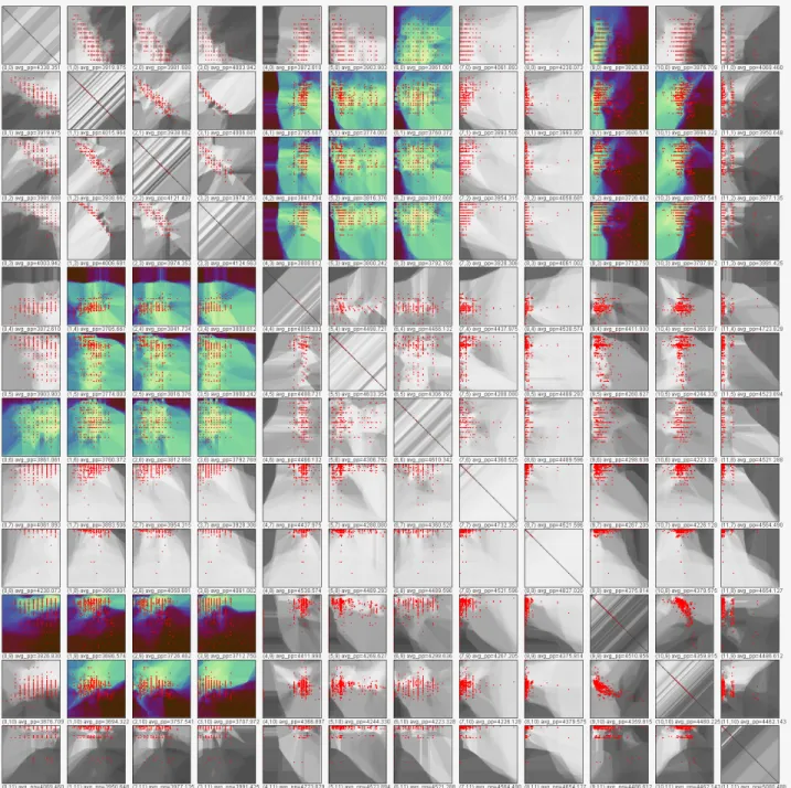
6.3 Precision-Based Scatterplot Matrix Filtering
Besides more complex projections techniques such as PCA or SOM, also a simple orthogonal projection technique consisting of selecting 2 dimensions from the original data space can often be effective. They are especially popular because of their easy interpretation. However, and especially for data sets of large dimensionality, it is often not clear a priori which pair of dimensions to select. Therefore often all possible combinations of two dimensions from all dimensions are considered by forming a scatterplot matrix. However, for high-dimensional datasets, the corresponding scatterplot matrices tend to be very large and therefore not easily interpretable. In this respect, it is useful to assist the user in screening the projections by emphasizing the most interesting views in the matrix. In5it was proposed to sort the scatter views based on certain statistical interestingness measures. In our approach, the proposedppsscore is also suitable for this task. In this respect, we use the score for filtering scatter plot matrix view and highlighting the most interesting projections.
(a) SOM Analysis (b) Coloring Scheme (c) Projection Visualization Figure 7. Using our system for assessment of the projection properties of a Self-Organizing Map projection. (a) Shows a SOM trained for trajectory data. Mapping of a spatially continuous coloring scheme (b) to the PCA-projection of the SOM clusters yields a correspondence plot (c). This can be used to compare both projections for similarities and as a means of validation.
We apply our scatterplot filtering approach on thecamera data set introduced in.17 This data set consists
of 12 numeric attributes of digital cameras, listing attributes such as price, weight, and resolution. Figure 8 shows a scatter plot matrix of this data set, constructed from the precision plots of each pair of dimensions. We filtered this display for the 25% of scatter plots yielding the best projection precision. For all non-qualifying plots, we convered the precision plots to grey scale images. The resulting display effectively shows the overall scatter plots space, and allows to quickly identify the most interesting plots in the projection precision sense for detailed inspection. The specific interpretation is that the identified pairs of dimensions account for much of the overall point differences in original space, and should therefore be particulary interesting to explore.
7. DISCUSSION, LIMITATIONS, AND POSSIBLE EXTENSIONS
Our approach to integrate the notion of projection precision into projection plots relies on two main aspects: The definition of a projection precision measure, and the visual mapping of that measure.
The pps score is a measure of stress of points in projected space. It allows the user to set the number of neighbor pointsnconsidered in the measure. By changing n, evaluation of ppscan be balanced between local and global scope. Which setting will be best suited is expected to depend on the application, and currently in our system, the user fixes this parameter. An interesting extension would be to provide an interactive zooming facility, by which the user can zoom into a part of the projection plot. Based on the zoom factor, the system could automatically determinento focus only on the selected plot area. ppsby definition is based on comparison of distances in original and projected data space. Alternative measures based e.g., on nearest neighbor rank correlation, or structural measures for comparing data spaces would be interesting to explore.
Regarding the visual mapping, we support visualization of precision maps based on interpolation, and map-ping the precision score to points and hulls using simple visual attributes such as size and color. On the interpolation side, several interpolation schemes have been discussed. Yet no strong recommendation regarding the best scheme can be given, but more evaluation is required. Based on the interpolation scheme and the given data distribution, the colormap in the precision map might give a biased perception of the distribution of preci-sion in the plot. The latter is obvious in terms of outlier points and nearest neighbor interpolation, where large display areas may represent only small fractions of the data. To address this point, non space-filling interpolation would be an option. Regarding the mapping ofppsto points and hulls, more advanced mappings are possible. Glyph techniques could be explored for representing e.g., structural or other, more complex notions of precision.
8. CONCLUSIONS
We presented original techniques for measuring the notion of projection precision, and integrate it into point- and shape-based projection visualizations. We argued that as projection usually incurs a loss in information, that information loss should be communicated to the user. We consider projection precision an important aspect for
Figure 8. Automatic filtering of a scatter plot matrix for the projections of highest projection precision. In this case, the 25% projections of highest projection precision are highlighted by outgraying the remaining plots.
inclusion in projection based visualizations, to support the assessments made by the analyst based on the given projection. We presented precision visualization tools that can be combined with different projection techniques and furthermore, can accommodate any appropriately defined precision measure defined for the data set under concern. Our findings are one step toward the visual incorporation of projection quality in projection plots, and next steps for research have been outlined above.
Acknowledgment
This work was partially supported by the German Research Foundation (DFG) within the project Visual Feature Space Analysis as part of the Priority Program on Scalable Visual Analytics (SPP 1335).
REFERENCES
[1] Dhillon, I., Modha, D., and Spangler, W., “Class visualization of high-dimensional data with applications,”
Computational Statistics and Data Analysis4(1), 59–90 (2002). [2] Jolliffe, I., [Principal Components Analysis], Springer, 3rd ed. (2002).
[3] Cox, M. and Cox, M., [Multidimensional Scaling], Chapman and Hall (2001). [4] Kohonen, T., [Self-Organizing Maps], Springer, 3rd ed. (2001).
[5] Wilkinson, L., Anand, A., and Grossman, R., “Graph-theoretic scagnostics,” IEEE Symposium on Infor-mation Visualization, IEEE Computer Society (2005).
[6] Sips, M., Neubert, B., Lewis, J. P., and Hanrahan, P., “Selecting good views of high-dimensional data using class consistency,”Computer Graphics Forum (Proc. EuroVis 2009) 28(3) (2009).
[7] Tatu, A., Albuquerque, G., Eisemann, M., Schneidewind, J., Theisel, H., Magnor, M., and Keim, D., “Combining automated analysis and visualization techniques for effective exploration of high-dimensional data,” in [Proc. IEEE Symposium on Visual Analytics Science and Technology], (10 2009).
[8] Rousseeuw, P., Ruts, I., and Tukey, J., “The bagplot: A bivariate boxplot,”The American Statistician53(4), 382–387 (1999).
[9] Schreck, T. and Panse, C., “A new metaphor for projection-based visual analysis and data exploration,” in [Proc. IS&T/SPIE Conference on Visualization and Data Analysis], (2007).
[10] Schreck, T., Schuessler, M., Zeilfelder, F., and Worm, K., “Butterfly plots for visual analysis of large point cloud data,” in [Proc. Int. Conf. in Central Europe on Computer Graphics, Visualization and Computer Vision], (2008).
[11] Pang, A., Wittenbrink, C., and Lodha., S., “Approaches to uncertainty visualization,” The Visual Com-puter13, 370–390 (Nov. 1997).
[12] Johnson, C. R. and Sanderson, A. R., “A next step: Visualizing errors and uncertainty,” IEEE Computer Graphics and Applications23, 6–10 (Sept. 2003).
[13] MacEachren, A. M., Robinson, A., Hopper, S., Gardner, S., Murray, R., Gahegan, M., and Hetzler, E., “Visualizing geospatial information uncertainty: What we know and what we need to know,”Cartography and Geographic Information Science32, 139–160 (July 2005).
[14] Griethe, H. and Schumann, H., “The visualization of uncertain data: Methods and problems,” in [ Proceed-ings of Simulation und Visualisierung 2006 (SimVis 2006)], 143–156 (2006).
[15] Blake, C. and Merz, C., “UCI repository of machine learning databases,” (1998).
[16] Schreck, T., Tekuˇsov´a, T., Kohlhammer, J., and Fellner, D., “Trajectory-based visual analysis of large financial time series data,”SIGKDD Explorations9, 30–37 (December 2007).
[17] Elmqvist, N., Dragicevic, P., and Fekete, J.-D., “Rolling the dice: Multidimensional visual exploration using scatterplot matrix navigation,”Visualization and Computer Graphics, IEEE Transactions on14, 1539–1148 (Nov.-Dec. 2008).