HUMAN BRAIN DATA
A Dissertation Submitted to the Faculty
of
Purdue University by
Huang Li
In Partial Fulfillment of the Requirements for the Degree
of
Doctor of Philosophy
August 2019 Purdue University Indianapolis, Indiana
THE PURDUE UNIVERSITY GRADUATE SCHOOL
STATEMENT OF DISSERTATION APPROVAL
Dr. Shiaofen Fang, Chair
Department of Computer and Information Science Dr. Li Shen
Department of Computer and Information Science Dr. Snehasis Mukhopadhyay
Department of Computer and Information Science
Approved by:
Dr. Shiaofen Fang
ACKNOWLEDGMENTS
I would like to express my special thanks to my advisor Prof. Shiaofen Fang and Prof. Shen Li for funding my research and guiding me during my Ph.D. program.
For the medical data in my research, I would like to thank the neuroscientists from IU Health Neuroscience Center including Prof. Andrew J. Saykin, Prof. Olaf Sporns, Prof. Joaqu´ın Go˜ni Cort´es and Prof. Yu-Chien Wu.
I would also like to thank Prof. Hongyang Chao of Sun Yat-sen University for the enlightenment of doing research during my Master program and further recommend-ing me to pursurecommend-ing my Ph.D. degree.
TABLE OF CONTENTS
Page
LIST OF TABLES . . . vi
LIST OF FIGURES . . . vii
ABSTRACT . . . ix
1 Introduction . . . 1
2 Related Work . . . 7
3 Brain Imaging Data and Connectome Construction . . . 13
4 Methods and Results . . . 16
4.1 Multi-modal Visualization . . . 16
4.1.1 Visualizing Structural Connectivity Networks . . . 16
4.1.2 Visualizing fMRI Data and Functional Connectivity . . . 18
4.1.3 Visualizing Discriminative Patterns among Multiple Classes . . 21
4.1.4 Spherical Volume Rendering (SVR) . . . 23
4.1.5 Visualizing fMRI Data and Discriminative Pattern . . . 30
4.1.6 User Interface and Interaction . . . 30
4.1.7 Performance and Evaluation . . . 30
4.2 Interactive Machine Learning . . . 38
4.2.1 System Overview . . . 38
4.2.2 User Space and User Interactions . . . 40
4.2.3 The Visualization Platform . . . 42
4.2.4 Test Applications . . . 46
4.3 Interactive Visualization of Deep Learning for 3D Brain Data Analysis 52 4.3.1 The Visualization Framework . . . 55
4.3.2 Importance Factor Backpropagation. . . 56
Page 4.3.4 Experimental Results . . . 62 5 Conclusions . . . 65 REFERENCES . . . 68
LIST OF TABLES
Table Page
LIST OF FIGURES
Figure Page
1.1 An example of iterative model improvement by interactively adding new
samples. . . 4
4.1 Building a Bezier curve connecting two ROIs. . . 17
4.2 (a) DTI fiber tracts; (b) MRI-ROIs and DTI fibers; (c,d) Network edges as Bezier curves (thresholded by edge intensity) . . . 18
4.3 Offset contours with different colors or different shades of the same color. . 19
4.4 (a) Original ROI. (b) ROI mapping. (c) Iterative erosion. (d) Overlaying. (e) Gaussian blurring. (f) Applying the texture. . . 20
4.5 Some examples of a connectome network with time-series data. Various transparencies are applied. . . 21
4.6 Blending RYB channels with weights 0.5, 0.25 and 0.25. . . 23
4.7 Examples of connectome networks with noise patterns. . . 24
4.8 Ray casting towards the center of the brain (sliced). . . 25
4.9 An example of layer sorting for regions of interest (ROIs). . . 27
4.10 A brain map. . . 28
4.11 Layers of a brain map. . . 29
4.12 Textured brain map for fMRI data. . . 31
4.13 Textured brain map for disease classification.. . . 32
4.14 Displaying network edges between layers. . . 33
4.15 A screenshot of the user interface. When user drag the camera (intersec-tion of the white lines) on the top, the 2D map on the bottom which will be re-rendered in real-time. . . 34
4.16 Reverse the direction of rays. . . 36
4.17 A structural flowchart of the interactive machine learning system. . . 40
4.18 A configuration of the scatterplot matrix visualization. . . 43
Figure Page 4.20 1D illustrations of model visualization as cross-sections in feature space
and in user space. . . 46 4.21 Interactive machine learning interface for 4-class handwriting classification. 48 4.22 Performance chart for handwriting classification experiment. . . 49 4.23 A sequence of model improvement iterations.. . . 50 4.24 Interactive machine learning interface for human brain data regression. . . 51 4.25 Performance chart for brain data regression. . . 52 4.26 A sequence of model improvement iterations for MMSE score prediction. . 53 4.27 Overall system flowchart.. . . 57 4.28 An example of the importance backpropagation. . . 59 4.29 User interface for editing a node. . . 60 4.30 (a) the interactive visualization system. (b) the discriminative ROIs for
class AD . . . 61 4.31 Interactively adding nodes and layers. Classification accuracies are (a)
ABSTRACT
Li, Huang, Ph.D., Purdue University, August 2019. Visual Analytics and Interactive Machine Learning for Human Brain Data. Major Professor: Shiaofen Fang.
This study mainly focuses on applying visualization techniques on human brain data for data exploration, quality control, and hypothesis discovery. It mainly consists of two parts: multi-modal data visualization and interactive machine learning.
For multi-modal data visualization, a major challenge is how to integrate struc-tural, functional and connectivity data to form a comprehensive visual context. We develop a new integrated visualization solution for brain imaging data by combin-ing scientific and information visualization techniques within the context of the same anatomic structure. In this study, new surface texture techniques are developed to map non-spatial attributes onto both 3D brain surfaces and a planar volume map which is generated by the proposed volume rendering technique, Spherical Volume Rendering. Two types of non-spatial information are represented: (1) time-series data from resting-state functional MRI measuring brain activation; (2) network properties derived from structural connectivity data for different groups of subjects, which may help guide the detection of differentiation features. Through visual exploration, this integrated solution can help identify brain regions with highly correlated functional activations as well as their activation patterns. Visual detection of differentiation features can also potentially discover image based phenotypic biomarkers for brain diseases.
For interactive machine learning, nowadays machine learning algorithms usually require a large volume of data to train the algorithm-specific models, with little or no user feedback during the model building process. Such a big data based automatic learning strategy is sometimes unrealistic for applications where data collection or
processing is very expensive or difficult. Furthermore, expert knowledge can be very valuable in the model building process in some fields such as biomedical sciences. In this study, we propose a new visual analytics approach to interactive machine learn-ing. In this approach, multi-dimensional data visualization techniques are employed to facilitate user interactions with the machine learning process. This allows dynamic user feedback in different forms, such as data selection, data labeling, and data cor-rection, to enhance the efficiency of model building. In particular, this approach can significantly reduce the amount of data required for training an accurate model, and therefore can be highly impactful for applications where large amount of data is hard to obtain. The proposed approach is tested on two application problems: the hand-writing recognition (classification) problem and the human cognitive score prediction (regression) problem. Both experiments show that visualization supported interactive machine learning can achieve the same accuracy as an automatic process can with much smaller training data sets.
1. INTRODUCTION
Human brain data including structural-MRI, function-MRI and diffusion MRI [1] hold great promise for a systematic characterization of human brain connectivity and its relationship with cognition and behavior. This study mainly focus on applying visualization techniques on human brain data for data exploration, quality control, and hypothesis discovery.
The analysis of human brain data faces two major challenges:
1. How to seamlessly integrate computational methods with human knowledge and how to translate this into user-friendly, interactive software tools that optimally combines human expertise and machine intelligence to enable novel contextually meaningful discoveries. Both challenges require the development of highly inter-active and comprehensive visualization tools that can guide researchers through a complex sea of data and information for knowledge discovery.
2. How to incorporate modern machine learning methods such as neural networks and support vector machines that use data to build computational models that are representations of nonlinear surfaces in high dimensional space. The trained models can then be used for analysis tasks such as classifications, regressions and predictions. Recent progress in deep learning has further empowered machine learning as an effective approach to a large set of big data analysis problems. As an automatic method, machine learning algorithms act mostly as a black box, i.e. the users have very little information about how and why the algorithm work or fail. The underlying machine learning models are also designed primarily for the convenience of learning from data, but they are not easy for the users to understand or interact with.
To address these challenges, this study breaks down to mainly two parts: the first part is multi-modal data visualization which focus on using advance techniques to give users an integrate view various the human brain data; the second part is about interactive machine learning which aims to provide a mechanism through visualization to allow users to understand and interact with the learning process.
For the first part, scientific visualization has traditionally been playing a role of visually interpreting and displaying complex scientific data, such as medical image data, to reveal structural and material details so as to help the understanding of the scientific phenomena. Example studies include diffusion tensor imaging (DTI) fiber tract visualization [2–7], network visualization [8–11], and multi-modal data vi-sualization [12–14]. In this context, recent development in information vivi-sualization provides new ways to visualize non-structural attributes or in-depth analysis data, such as graph/network visualization and time-series data visualization. These, how-ever, are usually separate visual representations away from the anatomic structures.
In order to maximize human cognitive abilities during visual exploration, this study proposes to integrate the visual representations of the connectome network attributes onto the surfaces of the anatomical structures of human brain. Multiple visual encoding schemes, combined with various interactive visualization tools, can provide an effective and dynamic data exploration environment for neuroscientists to better identify patterns, trends and markers. In addition, we develop a spherical volume rendering (SVR) algorithm using omni-directional ray casting and information encoded texture mapping. It provides a single 2D map of the entire rendered volume to provide better support for global visual evaluation and feature selection for analysis purpose.
Our primary contributions in the first part of this study include:
1. Development of a method to represent rich attribute information using infor-mation encoded textures.
2. Development of a new spherical volume rendering (SVR) technique that can generate a complete and camera-invariant view (volume map) of the entire structure.
3. Application of this approach to human brain visualization. Our experiments show great potential that this approach can be very useful in the analysis of neuroimaging data.
As to the second part, visualization, particularly multi-dimensional data visualiza-tion, has been playing an increasing important role in data mining and data analytics. This transformation of visualization from data viewing to being an integrated part of the analysis process led to the birth of the field of visual analytics [15]. In visual analytics, carefully designed visualization processes can effectively decode the insight of the data through visual transformations and interactive exploration. Many suc-cessful applications of visual analytics have been published in recent years, ranging from bioinformatics and medicine to engineering and social science. These success ex-amples demonstrate that visualization is a powerful tool in data analytics that needs to be seriously considered in any big data application. On the other hand, automatic data mining and data analytics have made tremendous progress in the past decade. Machine learning, particularly deep learning, has become the mainstream analytics method in most big data analysis problems. The effective integration of visualization and machine learning/data mining is a new challenge in big data research.
Interactive machine learning aims to provide a mechanism through visualization to allow users to understand and interact with the learning process [16]. It has several important potential benefits.
1. Understanding. It is often difficult to improve the efficiency and performance of the algorithms without a clear understanding of how and why the different components work in machine learning algorithms. It is even more so in deep learning where there are large number of layers and interconnected components.
2. Knowledge Input. Human knowledge input can significantly improve the per-formance of machine learning algorithms, particularly in areas involving profes-sional expertise such as medicine, science and engineering. Human instinct from visual perception can also out-perform computer algorithms. Hence, it is impor-tant to develop a visualization supported user feedback platform to allow user input to the machine learning system in the form of feature selection, dimension reduction, parameter setting, or addition / revision of rules and associations. 3. Data Reduction. Automatic machine learning usually requires a large volume
of data to train the underlying computational model. This strategy sometimes is not realistic for applications in which data collection, labeling or processing is very expensive or difficult (for example, in clinical trials). Interactive visual-ization of the machine learning process allows the user to iteratively select the most critical and useful subset of data to be added to the training process so that the model building process is more data efficient (Figure 1.1). This is also our primary focus in this paper.
Fig. 1.1. An example of iterative model improvement by interactively adding new samples.
Our goal in the second part of this study is to develop a visualization supported user interaction platform in a machine learning environment such that the user can observe the evolution and performance of the internal structures of the model and
provide feedback that may improve the efficiency of the algorithm or correct the direction of the model building process. Although the visualization platform we develop can be used to support understanding and knowledge input functions, we focus specifically in this paper on data reduction. In our approach, the interactive system will allow the user to identify potential areas (in some visual space) where additional data is needed to improve or correct the model (as shown in Figure 1.1). This way, only the necessary amount of data is used for learning a model. The aim is to solve a big data problem using a small data solution. In practice, this approach can not only save costs for data acquisitions / collections in applications such as clinical trials, medical analyses, and environmental studies, but also improve the efficiency and robustness of machine learning algorithms as the current somewhat brute-force approach (e.g. in deep learning) may not be necessary with smaller and higher quality data. To achieve this goal, we will need to overcome the following two challenges:
1. How to visualize the dynamics of a machine learning model is technically chal-lenging. Previous works often depend on the specific machine learning algo-rithms. But in this paper, we will develop an approach and a general strategy that can be applied to most machine learning algorithms. In our test applica-tions, support vector machines will be used as an example to demonstrate the effectiveness of this approach.
2. How to identify problematic areas from the visualization to revise the model, and how to efficiently and effectively provide user feedback to the algorithm are challenging. This is because machine learning features are often non-trivial properties of the data which cannot be easily used to pre-screen potential data collection target in real world applications.
In interactive machine learning, we will present a solution to these two challenges. Our approach will be tested on two practical applications with real world datasets.
In the following, we will first, in Section 2, discuss previous work related to human brain data visualization and interactive machine learning or other visual analytics
solutions. In Section 3 we will describe the human brain data we used in this study. In Section 4, we will introduce the two parts of this study in detail, respectively. Conclusions and future work will be given in Section 5.
2. RELATED WORK
Human brain connectomics involves several different imaging modalities that require different visualization techniques. More importantly, multi-modal visualization tech-niques need to be developed to combine the multiple modalities and present both details and context for connectome related data analysis. Margulies, et al [3] provided an excellent overview of the various available visualization tools for brain anatomical and functional connectivity data. Some of these techniques are capable of carrying out multi-modal visualization involving magnetic resonance imaging (MRI), fiber-tracts as obtained from DTI and overlaying network connections. Various graphics render-ing tools, along with special techniques such as edge bundlrender-ing (to reduce clutter), have been applied to visualize DTI fiber tracts [2–5]. Due to tracking uncertainties in DTI fibers, these deterministic rendering can sometimes be misleading. Hence, rendering techniques for probabilistic DTI tractography have also been proposed [6, 7]. Sev-eral techniques have been developed to provide anatomical context around the DTI fiber tracts [12–14]. This typically require semi-transparent rendering with carefully defined transfer functions.
Multi-modal visualization is typically applied in the scientific visualization do-main. The integration of information visualization and scientific visualization re-mains a challenge. In brain connectomics, connectome networks connectivity data are usually visualized as graphs. Graph visualization have been extensively studied in information visualization. For connectomics application, the networks can be ei-ther visualized as separate graphs, away from the anatomical context, but connected through interactive interfaces [8–11] or embedded into the brain anatomical con-text [17–19]. The embedded graphs, however, have their nodes constrained to their anatomical locations, and therefore do not need a separate graph layout process as in other graph visualization algorithms. Aside from embedded graphs, there has been
little work in integrating more sophisticated information visualization, such as time-series data and multi-dimensional attributes, within the context of brain anatomical structures.
Many visualization techniques for time-series data have been developed in in-formation visualization, such as time-series plot [20], spiral curves [21], and The-meRiver [22], for non-spatial information and time-variant attributes. Several varia-tions of ThemeRiver styled techniques have been applied in different time-series visu-alization applications, in particular in text visuvisu-alization [23]. Depicting connectivity dynamics has been mostly done via traditional key-frame based approach [24, 25] or key frames combined with time-series plots [26, 27].
Texture-based visualization techniques have been widely used for vector field data, in particular, flow visualization. Typically, a grayscale texture is smeared in the direction of the vector field by a convolution filter, for example, the Line Integral Convolution (LIC), such that the texture reflects the properties of the vector field [28–30]. Similar techniques have also been applied to tensor fields [31, 32]].
As to volume datasets, volume rendering is a classic visualization technique. Both image-space and object-space volume rendering algorithms have been thoroughly studied in the past several decades. The typical image-space algorithm is ray cast-ing, which was first proposed by Levoy [33]. Many improvements of ray casting have since been developed [34–37]. Splatting is the most common object-space approach. It directly projects voxels to the 2D screen to create screen footprints which can be blended to form composite images [38–42]. Hybrid approaches such as shearwrap algorithm [43] and GPU based algorithms provide significant speedup for interactive applications [44, 45]. Although iso-surfaces are typically extracted from volume data as polygon meshes [46], ray casting methods can also be applied towards volumetric isosurfacing [47, 48].
Although interactive machine learning has been previously proposed in the ma-chine learning and AI communities [16,49], applying visualization and visual analytics principles in interactive machine learning has only been an active research topic in
recent years. Most of the existing studies focus on using visualization for better un-derstanding of the machine learning algorithms. There have also been some recent works on using visual analytics for improving the performance of machine learning algorithms through better feature selection or parameter setting.
While there have been many literatures on using interactive visualization to di-rectly accomplish analysis tasks such as classification and regression [50, 51], we will focus mostly on approaches that deal with some machine learning models [52]. Pre-vious works on using visualization to help understand the machine learning processes are usually designed for specific types of algorithms, for example, support vector machines, neural networks, and deep learning neural networks.
Neural Networks received the most attention due to its black box nature of the learning model and the complexity of its internal components. Multi-dimensional visualization techniques such as scatterplot matrix have been used to depict the re-lationships between different components of the neural networks [53, 54]. Typically, a learned component is represented as a higher dimensional point. The 2D pro-jections of these points in either principal component analysis (PCA) spaces or a multi-dimensional scaling (MDS) space can better reveal the relationships of these components that are not easily understood, such as clusters and outliers. Several techniques have applied graph visualization techniques to visualize the topological structures of the neural networks [55–57]. Visual attributes of the graph can be used to represent various properties of the neural network models and processes.
Several recent studies tackle specific challenges in the visualization of deep neural networks due to the large number of components, connections and layers. In [58]. Liu et al. developed a visual analytics system, CNNVis, that helps machine learning experts understand deep convolutional neural networks by clustering the layers and neurons. Edge bundling is also used to reduce visual clutter. Techniques have also been developed to visualize the response of a deep neural network to a specific input in a real-time dynamic fashion [59, 60]. Observing the live activations that change in response to user input helps build valuable intuitions about how convnets work.
There are several literatures discussing visualizations roles in support vector ma-chines. In [61], visualization methods are used to provide access to the distance measure of each data point to the optimal hyperplane as well as the distribution of distance values in the feature space. In [62], multi-dimensional scaling technique is used to project high-dimensional data points and their clusters onto a two-dimensional map preserving the topologies of the original clusters as much as possible to preserve their support vector models.
Visualization and visual analytics methods have been proposed for the perfor-mance analysis of machine learning algorithms in different applications [63–65]. In-teractive methods have also been proposed to improve the performance of machine learning algorithms through feature selection and optimization of parameter settings. Some general discussions are given in [52] and [66]. In [67], a visual analytics system for machine learning support called Prospector is described. Prospector supports model interpretability and actionable insights, and provides diagnostic capabilities that communicate interactively how features affect the prediction. In [68], a multi-graph visualization method is proposed to select better features through an interac-tive process for the classification of brain networks. Other performance improvement methods include training sample selection and classifier tuning [69] and model ma-nipulations by user knowledge [70–72].
The incremental visual data classification method proposed in [69] has some sim-ilarities conceptually to what we propose in this paper. In [69], neighbor joining tree is used to classify 2D image data. The model building process is done incremen-tally by adding additional images that are visually similar to the test samples that were misclassified. This approach puts a very heavy burden on the user as finding similar images by the user from a large image database or other sources is difficult and time-consuming. Our approach, on the other hand, is a more general framework that works for all machine learning algorithms and all data types. It is designed to allow incremental addition of training data with any user defined characteristics (attributes) that are easy to identify and collect.
There have been a number of previous works on using visualization to help under-stand the machine learning processes. Neural Networks received the most attention due to its black box nature of the learning model and the complexity of its internal components. Multi-dimensional visualization techniques such as scatterplot matrix have been used to depict the relationships between different components of the neural networks [73, 74]. Typically, a learned component is represented as a higher dimen-sional point. The 2D projections of these points in either principal component analysis (PCA) spaces or a multi-dimensional scaling (MDS) space can better reveal the re-lationships of these components that are not easily understood, such as clusters and outliers. Several techniques have applied graph visualization techniques to visualize the topological structures of the neural networks [75–77]. Visual attributes of the graph can be used to represent various properties of the neural network models and processes.
Several recent studies tackle specific challenges in the visualization of deep neural networks due to the large number of components, connections and layers. In [78]. Liu et al. developed a visual analytics system, CNNVis, that helps machine learning experts understand deep convolutional neural networks by clustering the layers and neurons. Edge bundling is also used to reduce visual clutter. Techniques have also been developed to visualize the response of a deep neural network to a specific input in a real-time dynamic fashion [79, 80]. Observing the live activations that change in response to user input helps build valuable intuitions about how convnets work. The DQNViz system [81] provides a visual analytics environment for the understanding of a deep reinforcement learning model. GAN Lab system [82] uses visualization to help non-expert users to learn how a Deep Generative Model works.
Several studies focus on visualizing the features captured by deep neural network. Class Activation Mapping (CAM) [83] was proposed by Zhou et al as a method for identifying discriminative locations used by the convolutional layers in deep learning model without any fully-connected layer. By extending CAM with gradient, Selvaraju et al proposed Grad-CAM [84] which works with fully-connected layers. But these
methods did not reveal how the nodes in the hidden layer capture features from those discriminative locations and aggregate them together in the feed-forward process, which is important for users to make sense of the deep learning model.
Visualization and visual analytics methods have been proposed for the perfor-mance analysis of machine learning algorithms in different applications [85–87]. In-teractive methods have also been proposed to improve the performance of machine learning algorithms through feature selection and optimization of parameter settings. Some general discussions are given in [88] and [89]. In [90], a visual analytics system for machine learning support called Prospector is described. Prospector supports model interpretability and actionable insights, and provides diagnostic capabilities that communicate interactively how features affect the prediction. In [91], a multi-graph visualization method is proposed to select better features through an interac-tive process for the classification of brain networks. Other performance improvement methods include training sample selection and classifier tuning [92] and model ma-nipulations by user knowledge [93–95].
More generic visualization methods for general machine learning models have been developed in recent years. The Manifold system [96] provides a generic framework that does not rely on or access the internal logic of the model and solely observes the input and output. An ontology, VIS4ML, is proposed in [97] for VA-Assisted machine learning. [98], A generic visualization method for machine learning model is proposed to help select the optimal set of sample input data.
Compared to the existing methods on visualization in machine learning and deep learning applications, our approach emphasizes building association relationships be-tween hidden layer nodes and the brain image features (phenotypes) such that user can observe and interact directly with the complex anatomical structures of the brain during the deep learning process. This work is also a good example of how to integrate scientific visualization and information visualization techniques in a deep learning vi-sual analytics platform.
3. BRAIN IMAGING DATA AND CONNECTOME
CONSTRUCTION
We first describe the MRI and DTI data used in this study, then present our methods for constructing connectome networks from the MRI and DTI data, and finally discuss the resting state functional MRI (fMRI) data used in our time-series visualization study.
The MRI and DTI data used in the preparation of this article were obtained from the Alzheimers Disease Neuroimaging Initiative (ADNI) database (adni.loni.usc.edu). The ADNI was launched in 2003 as a public-private partnership, led by Principal In-vestigator Michael W. Weiner, MD. The primary goal of ADNI has been to test whether serial MRI, positron emission tomography (PET), other biological markers, and clinical and neuropsychological assessment can be combined to measure the pro-gression of mild cognitive impairment (MCI) and early Alzheimers disease (AD). For up-to-date information, see www.adni-info.org.
We downloaded the baseline 3T MRI (SPGR) and DTI scans together with the corresponding clinical data of 134 ADNI participants, including 30 cognitively normal older adults without complaints (CN), 31 cognitively normal older adults with signif-icant memory concerns (SMC), 15 early MCI (EMCI), 35 late MCI (LMCI), and 23 AD participants. In our multi-class disease classification experiment, we group these subjects into three categories: Healthy Control (HC, including both CN and SMC participants, N=61), MCI (including both EMCI and LMCI participants, N=50), and AD (N=23).
Using their MRI and DTI data, we constructed a structural connectivity network for each of the above 134 participants. Our processing pipeline is divided into three major steps described below: (1) Generation of regions of interest (ROIs), (2) DTI tractography, and (3) connectivity network construction.
(1) ROI Generation. Anatomical parcellation was performed on the high-resolution T1-weighted anatomical MRI scan. The parcellation is an automated operation on each subject to obtain 68 gyral-based ROIs, with 34 cortical ROIs in each hemisphere, using the FreeSurfer software package (http://freesurfer.net/). The Lausanne parcel-lation scheme [99] was applied to further subdivide these ROIs into smaller ROIs, so that brain networks at different scales (e.g., N roi = 83, 129, 234, 463, or 1015 ROIs/nodes) could be constructed. The T1-weighted MRI image was registered to the low resolution b0 image of DTI data using the FLIRT toolbox in FSL, and the warping parameters were applied to the ROIs so that a new set of ROIs in the DTI image space were created. These new ROIs were used for constructing the structural network.
(2) DTI tractography. The DTI data were analyzed using FSL. Preprocessing in-cluded correction for motion and eddy current effects in DTI images. The processed images were then output to Diffusion Toolkit (http://trackvis.org/) for fiber track-ing, using the streamline tractography algorithm called FACT (fiber assignment by continuous tracking). The FACT algorithm initializes tracks from many seed points and propagates these tracks along the vector of the largest principle axis within each voxel until certain termination criteria are met. In our study, stop angle threshold was set to 35 degree, which meant if the angle change between two voxels was greater than 35 degree, the tracking process stopped. A spline filtering was then applied to smooth the tracks.
(3) Network Construction. Nodes and edges are defined from the previous results in constructing the weighted, undirected network. The nodes are chosen to be N roi ROIs obtained from Lausanne parcellation. The weight of the edge between each pair of nodes is defined as the density of the fibers connecting the pair, which is the number of tracks between two ROIs divided by the mean volume of two ROIs [100]. A fiber is considered to connect two ROIs if and only if its end points fall in two ROIs respectively. The weighted network can be described by a matrix. The rows
and columns correspond to the nodes, and the elements of the matrix correspond to the weights.
To demonstrate our visualization scheme for integrative exploration of the time-series of resting-state fMRI (rs-fMRI) data with brain anatomy, we employed an additional local (non-ADNI) subject, who was scanned in a Siemens PRISMA 3T scanner (Erlangen Germany). A T1-weighted sagittal MP-RAGE was obtained (TE =2.98 ms, TR partition = 2300ms, TI = 900ms, flip angle = 9, 128 slices with 111mmvoxels). A resting-state session of 10 minutes was also obtained. Subject was asked to stay still and awake, and to keep eyes closed. BOLD acquisition parameters were: TE = 29ms, TR = 1.25s, Flip angle = 79, 41 contiguous interleaved 2.5 mm axial slices, with in-plane resolution = 2.5 2.5 mm. BOLD time-series acquired were then processed according to the following steps (for details see [101]): mode 1000 nor-malization; z-scoring and detrending; regression of 18 detrended nuisance variables (6 motion regressors [X Y Z pitch jaw roll], average gray matter (GM), white matter (WM) and cerebral spinal fluid (CSF) signals, and all their derivatives computed as backwards difference); band-pass filter of 0.009 to 0.08 Hz using a zero-phase 2nd order Butterworth filter; spatial blurring using a Gaussian filter (FWHM=2mm); re-gression of the first 3 principal components of WM (mask eroded 3 times) and CSF (ventricles only, mask eroded 1 time). The Desikan-Killiany Atlas (68 cortical ROIs, as available in the Freesurfer software) was registered to the subject. The resulting processed BOLD time-series where then averaged for each ROI. Note that the Lau-sanne parcellation scheme (mentioned above) at the level of N roi = 83 consists of the above 68 cortical ROIs together with the brain stem (as 1 ROI) and 14 subcortical ROIs. As a result, we will use 68 time series (one for each cortical ROI) in our time series visualization experiments.
4. METHODS AND RESULTS
4.1 Multi-modal VisualizationIn this section, we propose a few information visualization methods. Using the VTK (www.vtk.org) C++ library, we have implemented and packaged these methods into a software tool named as BECA, standing for Brain Explorer for Connectomic Analysis. A prototype software is available at http://www.iu.edu/~beca/.
4.1.1 Visualizing Structural Connectivity Networks
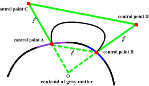
3D visualization of a connectivity network within an anatomical structure can provide valuable insight and better understanding of the brain networks and their functions. In a brain network, we render nodes as ROI surfaces, which are generated using an iso-surface extraction algorithm from the MRI voxel sets of the ROIs. Draw-ing the network edges is, however, more challengDraw-ing since straight edges will be buried inside the brain structures. We apply the cubic Bezier curves to draw curved edges above the brain structure. The four control points of each edge are defined by the centers of the ROI surfaces and the extension points from the centroid of the brain, as shown in Figure 4.1. Figure 4.2 shows visualization examples of a connectome network, along with the cortical surface, the ROIs, and the DTI fibers.
Fig. 4.1. Building a Bezier curve connecting two ROIs.
Brain connectivity networks obtained through the above pipeline can be further taken into complex network analysis. Network measures (e.g., node degree, between-ness, closeness) can be calculated from individuals or average of a population. Dif-ferent measures may characterize difDif-ferent aspects of the brain connectivity [102]. In order to visualize these network attributes, we propose a surface texture based ap-proach. The main idea is to take advantage of the available surface area of each ROI, and encode the attribute information in a texture image, and then texture-map this image to the ROI surface. Since the surface shape of each ROI (as a triangle mesh) is highly irregular, it becomes difficult to assign texture coordinates for mapping the texture images. We apply a simple projection plane technique. A projection plane of an ROI is defined as the plane with a normal vector that connects the center of the ROI surface and the centroid of the entire brain. The ROI surface can then be projected onto its projection plane, and the reverse projection defines the texture mapping process. Thus, we can define our attribute-encoded texture image on this project plane to depict a visual pattern on the ROI surface. Visually encoding at-tribute information onto a texture image is an effective way to represent multiple
(a) (b)
(c) (d)
Fig. 4.2. (a) DTI fiber tracts; (b) MRI-ROIs and DTI fibers; (c,d) Network edges as Bezier curves (thresholded by edge intensity)
attributes or time-series attributes. Below we will demonstrate this idea in two dif-ferent scenarios: Time-series data from rs-fMRI and multi-class disease classification.
4.1.2 Visualizing fMRI Data and Functional Connectivity
As a functional imaging method, rs-fMRI can measure interactions between ROIs when a subject is resting [103]. Resting brain activity is observed through changes in
blood flow in the brain which can be measured using fMRI. The resting state approach is useful to explore the brain’s functional organization and to examine if it is altered in neurological or psychiatric diseases. Brain activation levels in each ROI represent a time-series that can be analyzed to compute correlations between different ROIs. This correlation based network represents the functional connectivity networks and, analogously to structural connectivity, it may be represented as a square symmetric matrix.
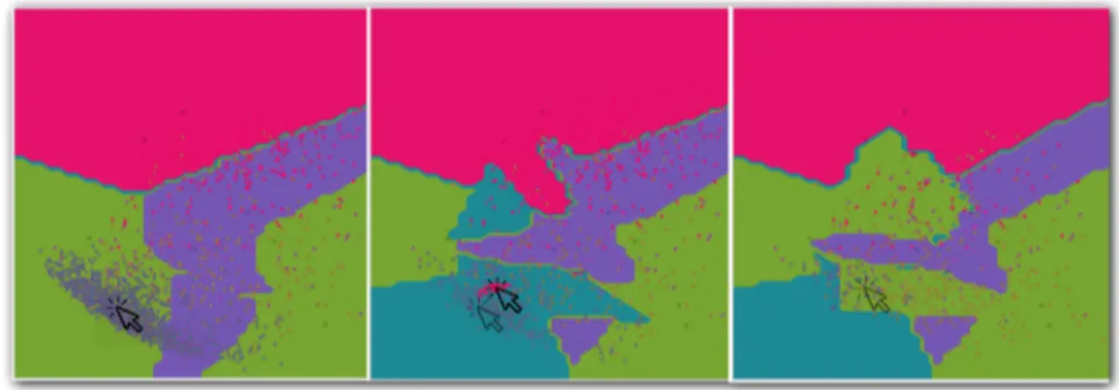
Using the surface texture mapping approach, we need to first encode this time-series data on a 2D texture image. We propose an offset contour method to generate patterns of contours based on the boundary of each projected ROI. The offset contours are generated by offsetting the boundary curve toward the interior of the region, creating multiple offset boundary curves, as shown in Figure 4.3. There are several offset curve algorithms available in curve/surface modeling. Since in our application, the offset curves do not need to be very accurate, we opt to use a simple image erosion algorithm [104] directly on the 2D image of the map to generate the offset contours.
Fig. 4.3. Offset contours with different colors or different shades of the same color.
In time-series data visualization, the time dimension can be divided into multiple time intervals and represented by the offset contours. Varying shades of a color hue can be used to represent the attribute changes over time. Figure 4.4 shows the steps
for constructing the contour-based texture. First, we map each ROI onto a projection plane perpendicular to the line connecting the centroid of the brain and the center of this ROI. The algorithm then iteratively erodes the mapped shape and assigns colors according to the activity level of this ROI at each time point. Lastly we overlay the eroded regions to generate a contour-based texture. We also apply a Gaussian filter to smooth the eroded texture image to generate more gradual changes of the activities over time. Figure 4.5 shows a few examples of the offset contours mapped to the ROIs. The original data has 632 time points, which will be divided evenly across the contours depending on the number of contours that can be fitted in to the available pixels within the projected ROI.
Fig. 4.4. (a) Original ROI. (b) ROI mapping. (c) Iterative erosion. (d) Overlaying. (e) Gaussian blurring. (f) Applying the texture.
(a) (b)
(c) (d)
Fig. 4.5. Some examples of a connectome network with time-series data. Various transparencies are applied.
4.1.3 Visualizing Discriminative Patterns among Multiple Classes
In this case study, we performed the experiment on the ADNI cohort mentioned before, including 61 HC, 50 MCI and 23 AD participants. The goal is to gener-ate intuitive visualization to provide cognitively intuitive evidence for discriminating ROIs that can separate subjects in different classes. This can be the first step of a diagnostic biomarker discovery process.
The goal of the visual encoding in this case is to generate a color pattern that can easily distinguish bias toward any of the three classes. To do so, we first assign a distinct color to each class. Various color patterns can be generated using different color blending and distribution methods. In our experiment, a noise pattern is applied with 3 colors representing the 3 classes. The same noise pattern approach can also accommodate more colors.
Since color blending is involved in a noise pattern, we choose to use an RYB color model, instead of the RGB model. This is because color mix using RYB model is more intuitive in a way that the mixed colors still carry the proper amount of color hues of the original color components. For example, Red and Yellow mix to form Orange, and Blue and Red mix to form Purple. Thus, RYB model can create color mixtures that more closely resemble the expectations of a viewer. Of course these RYB colors still need to be eventually converted into the RGB values for display. For the conversion between these two color models, we adopt the approach proposed in [105, 106], in which a color cube is used to model the relationship between RYB and RGB values. For each RYB color, its approximated RGB value can be computed by a trilinear interpolation in the RYB color cube.
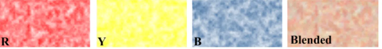
We first construct noise patterns to create a random variation in color intensity, similar to the approach in [105]. Different color hues are used to represent the at-tributes in different classes of subjects. Any network measurement can be used for color mapping. In our experiment, we use the node degrees averaged across subjects in each class. A turbulence function [107] is used to generate the noise patterns of dif-ferent frequencies (sizes of the sub-regions of the noise pattern). An example is shown in Figure 4.6, we blend RYB channels with weights 0.5, 0.25and 0.25 respectively. The blended texture is red-dominated with a little yellow and blue color.
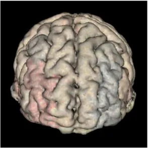
Figure 4.7 shows some examples of the texture mapped views of the three classes: HC (Red), MCI (Yellow) and AD (Blue). The colors of the edges also represent the blended RYB color values, based on the average edge weights in the three classes. From the resulting images, we can identify a specific ROI that exhibits bias toward
Fig. 4.6. Blending RYB channels with weights 0.5, 0.25 and 0.25.
one or two base colors. This can be a potential indication that this ROI may be a good candidate for further analysis as a potential imaging phenotypic biomarker.
4.1.4 Spherical Volume Rendering (SVR)
In previous sections, we mapped attributes onto the ROI surface. However, each rendering shows only one perspective, and subcortical structures remain unseen. Therefore, it does not provide an overall view of the complete structure. In this section, we develop a spherical volume rendering algorithm that provides a single 2D map of the entire brain volume to provide better support for global visual evaluation and feature selection for analysis purpose.
Traditional volume rendering projects voxels to a 2D screen defined in a specific viewing direction. Each new viewing direction will require a new rendering. There-fore, users need to continuously rotate and transform the volumetric object to gener-ate different views, but never have the complete view in one image. Spherical volume rendering employs a spherical camera with a spherical screen. Thus, the projection process only happens once, providing a complete image from all angles.
Spherical ray casting
A spherical ray casting approach is taken to produce a rendering image on a spherical surface. A map projection will then be applied to construct a planar image (volume map). The algorithm includes three main steps:
(a) ROIs with noise textures (perspective 1) (b) ROIs with noise textures (perspective 2)
(c) ROIs with noise textures and color bended edges (perspective 1)
(d) ROIs with noise textures and color bended edges (perspective 2)
Fig. 4.7. Examples of connectome networks with noise patterns.
1. Define a globe as a sphere containing the volume. The center and radius of the sphere may be predefined or adjusted interactively.
2. Apply spherical ray casting to produce an image on the globes spherical surface (ray casting algorithm).
3. Apply a map projection to unwrap the spherical surface onto a planar image (similar to the world map).
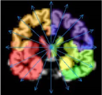
Rays are casted towards the center of the global from each latitude-longitude grid point on the sphere surface. In brain applications, the center of the global needs to be carefully defined so that the resulting image preserves proper symmetry, as shown in Figure 4.8.
Fig. 4.8. Ray casting towards the center of the brain (sliced).
Along each ray, the sampling, shading and blending process is very similar to the regular ray casting algorithm [33, 36]. The image produced by this ray casting process on the spherical surface will be mapped to a planar image using a map projection transformation, which projects each latitudelongitude grid point on the spherical surface into a location on a planar image. There are many types of map projections, each preserving some properties while tolerating some distortions. For our application, we choose to use Hammer-Aitoff Projection, which preserves areas but not angles. Details of this map projection can be found in [108].
Layered Rendering
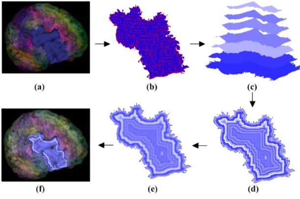
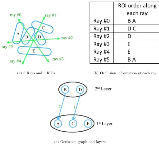
Volume rendering often cannot clearly show the deep interior structures. One remedy is to use layered rendering. When objects within the volume are labelled (e.g. segmented brain regions), we can first sort the objects in the spherical viewing direction (i.e. along the radius of the sphere), and then render one layer at a time. The spherical viewing order can usually be established by the ray casting process itself as the rays travel through the first layer of objects first, and then the second layer, etc. If we record the orders in which rays travel through these objects, we can construct a directed graph based on their occlusion relationships, as shown in Figure 4.9. Applying a topological sorting on the nodes of this graph will lead to the correct viewing order.
Since the shapes of these labelled objects may not be regular or even convex, the occlusion orders recorded by the rays may contradict each other (e.g. cyclic occlusions). Our solution is to define the weight of each directed edge as the number of rays that recorded this occlusion relationship. During the topologic sorting, the node with minimum combined incoming edge weight will be picked each time. This way, incorrect occlusion relationship will be kept to the minimum.
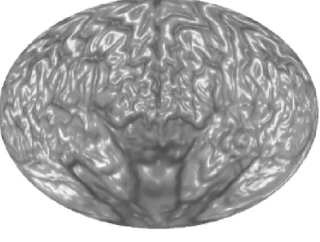
Using a spherical volume rendering algorithm, we can generate a 2D brain map that contains all the ROIs in one image. This allows the users to view clearly rela-tionships between different ROIs and the global distributions of network attributes and measurements for feature selection and comparison.
Figure 4.10(a) shows a brain map generated by SVR without any ROI labelling. Figure 4.10(b) shows the same brain map with color coded ROI labels.
Layered rendering was also applied to brain ROIs. With opacity at 1, Figure 4.10 shows the first layer of the ROIs. Figure 4.11 shows all the layers. Different scaling factors are applied to the layers to adjust their relative sizes. This is necessary because the spherical ray casting will create enlarged internal ROIs, just like perspective projection will make closer objects larger, except that in this case the order is reversed.
(a) 6 Rays and 5 ROIs (b) Occlusion information of each ray.
(c) Occlusion graph and layers.
Fig. 4.9. An example of layer sorting for regions of interest (ROIs).
In the following two subsections, we demonstrate two approaches to overlay ad-ditional information on top of the brain map: (1) Encoding attribute information onto a texture image and then mapping the texture to the ROI surface; (2) Drawing network edges directly over the brain map. Below, we apply the first approach to an application of visualizing discriminative patterns among multiple classes. In addition, we combine both approaches to visualize fMRI data and the corresponding functional connectivity network.
(a) Without ROI labels
(b) With ROI labels.
(a) 2nd layer. (b) 3rd layer.
(c) all layers stacked.
4.1.5 Visualizing fMRI Data and Discriminative Pattern
Figure 4.12 shows the fMRI textured brain map for the first two layers. Figure 4.14 shows the network edges across multiple layers for both time-series and multi-disease textures.
4.1.6 User Interface and Interaction
Compared with traditional volume rendering in the native 3D space, this approach views the brain from its center. On one hand, this can reduce the volume depth it sees through. On the other hand, it renders ROIs in a polar fashion and arranges ROIs more effectively in a bigger space. With more space available, it is easier to map attributes onto the ROIs and plot the brain networks among ROIs. Compared with traditional 2D image slice view, this approach can render the entire brain using much fewer layers. The user interface (Figure 4.15) is flexible enough for users to adjust camera locations and viewing direction. Users can conveniently place the camera into an ideal location to get an optimized view. Users can also easily navigate not only inside but also outside the brain volume to focus on the structures of their interest or view the brain from a unique angle of their interest.
4.1.7 Performance and Evaluation
The SVR algorithm is implemented on GPU with OpenCL [32] on NVIDIA GeForce GTX 970 graphics card with 4GB memory. We pass the volume data to kernel function as image3d t objects in OpenCL in order to make use of the hardware-accelerated bilinear interpolation when sampling along each ray. The normal of each voxel, which is required in BlinnPhong shading model, is pre-calculated on CPU when the MRI volume is loaded. The normal is also treated as a color image3d ob-jects in OpenCL, which can save lots on time on interpolation. We make each ray one OpenCL work-item in order to render each pixel in parallel. The global work-item
(a) 1st layer textures
(b) 2nd layer textures.
Fig. 4.12. Textured brain map for fMRI data.
(a) 1st layer textures.
(b) 2nd layer textures. A noise pattern is applied with 3 colors repre-senting the 3 categories (i.e., red for HC, yellow for MCI, and blue for AD).
(a) Network edges over multiple layers for time-series textures.
(b) Network edges over multiple layers for multi-disease textures.
Fig. 4.14. Displaying network edges between layers.
which is shown in Table 4.1. With an 800×600 viewport size, the performance is around 29.41 frames per second.
We have developed tools using Qt framework and VTK to allow user to interact with the 2D map [33, 34]. Users can drag the sphere camera around in the 3D view and the 2D map will update in real-time. A screenshot of the user interface is shown in Figure 4.15. The upper half is the brain in 3D perspective view while the lower half
Fig. 4.15. A screenshot of the user interface. When user drag the camera (intersection of the white lines) on the top, the 2D map on the bottom which will be re-rendered in real-time.
Table 4.1.
Frame rates for different output resolutions on NVIDIA GTX 970 Output Resolution Avg. fps
640×480 45.45 800×600 29.41 1024×768 11.76 1600×1200 7.04
is the 2D brain map generated by the SVR algorithm. When user move the position of spherical camera (intersection of the white lines in Figure 4.15) in the 3D view,
the 2D map will change accordingly. The software enable user to navigate in the 3D brain and build the visual correspondence between the 3D and 2D representation. We also provide users with a switch to reverse the direction of rays. As shown in Figure 4.16(a), rays are travels outward and we can see the exterior of the brain. On the contrary, when we reverse the direction of the ray in Figure 4.16(b), we can see the interior structures of the brain. We demonstrated our prototype system and the resulting visualization to the domain experts in Indiana University Center for Neuroimaging. The following is a summary of their evaluation comments.
(a) Rays travel outwards
(b) Rays travel inwards.
Fig. 4.16. Reverse the direction of rays.
Evaluation on the visualization of the discriminative pattern. The discriminative pattern shown in Figure 4.13 has the promise to guide further detailed analysis for identifying disease-relevant network biomarkers. For example, in a recent Nature Review Neuroscience paper [35], C. Stam reviewed modern network science findings in
neurological disorders including Alzheimers disease. The most consistent pattern the author identified is the disruption of hub nodes in the temporal, parietal and frontal regions. In Figure 4.13, red regions in superior temporal gyri and inferior temporal gyri indicate that these regions have higher connectivity in HC than MCI and AD. This is in accordance with the findings reported in [35]. In addition, in Figure 4.13, the left rostral middle frontal gyrus shows higher connectivity in HC (i.e., red color) while the right rostral middle frontal gyrus shows higher connectivity in AD (i.e., blue color). This also matches the pattern shown in the Figure 4.3 of [35], where the hubs at left middle frontal gyrus (MFG) were reported in controls and those at right MFG were reported in AD patients. These encouraging observations demonstrate that our visual discriminative patterns have the potential to guide subsequent analyses.
Evaluation on the visualization of fMRI data and functional network. It is helpful to see all the fMRI signals on the entire brain in a single 2D image (Figure 4.14). Drawing a functional network directly on the flattened spherical volume rendering image (Figure 4.14) offers an alternative and effective strategy to present the brain networks. Compared with traditional approach of direct rendering in the 3D brain space, while still maintaining an intuitive anatomically meaningful spatial arrange-ment, this new approach has more spatial room to work with to render an attractive network visualization on the background of interpretable brain anatomy. The net-work plot on a multi-layer visualization (Figure 4.14) renders the brain connectivity data more clearly and effectively.
Evaluation on the user interface and interaction. Compared with traditional vol-ume rendering in the native 3D space, this approach views the brain from its center. On one hand, this can reduce the volume depth it sees through. On the other hand, it renders ROIs in a polar fashion and arranges ROIs more effectively in a bigger space. With more space available, it is easier to map attributes onto the ROIs and plot the brain networks among ROIs. Compared with traditional 2D image slice view, this approach can render the entire brain using much fewer layers (4 in our case) than the number of image slices (e.g., 256 slices in a conformed 1 mm3 isotropic brain volume).
The user interface (Figure 4.15) is flexible enough for users to adjust camera locations and viewing direction. Users can conveniently place the camera into an ideal location to get an optimized view. Users can also easily navigate not only inside but also outside the brain volume to focus on the structures of their interest or view the brain from a unique angle of their interest.
4.2 Interactive Machine Learning
In this section, I will introduce the second part of my study: a framework of interactive machine learning by visualization, and the application of this framework to two test examples.
4.2.1 System Overview
Our goal is to develop a new interactive and iterative learning technique built on top of any machine learning algorithm so that the user can interact with the machine learning model dynamically to provide feedback to incrementally and iteratively im-prove the performance of the model. Although there can be many different forms of user feedback, such as knowledge input, features selection and parameters setting, in this paper we focus primarily on adding the optimal subset of training data samples such that the added training samples can provide maximal improvement of the model using minimum number of additional training points. Hence, the problem statement can be formulated as follows:
Let F be the feature space of a machine learning algorithm,X =x1, x2, ..., xn ⊂
F be the starting training set, and Y =y1, y2, ..., ym ⊂ F be an internal test set.
We defineU as user space of the same dataset containing some user defined attributes. These user defined attributes are selected based on two criteria: (1) they are part of the attributes of the original dataset; and (2) they can be used to identify data points (to be collected) easily. Let Z =z1, z2, ..., zm ⊂U be set Y represented in the user
space U, and M0(y) :F → C be the learned model using the initial training set X, whereC is the application value range (e.g. class labels or regression function values). We want to find a set of k new data points (where k is a constant), X0 ⊂F, such that points in X0 satisfy a set of user defined conditions of attribute values in U. These conditions in U is defined interactively from the visualization of the model and its test results on set Z in the user space U. The users goal is to provide additional training samples such that the learned model M1(y) using training set X∪X0 ⊂ F is an improved model overM0(y).
The above process can continue iteratively until the performance of the model is satisfactory or until the model can no longer be improved.
This framework can be summarized by the structural flowchart in Figure 4.17. At each iteration, a machine learning model is constructed using the current training set. The model will be tested on an internal test set. The visualization engine will then visualize the model along with the labeled internal test results. Based on this visualization, the user can decide to add new samples in the areas where the model performed poorly. These new samples will be added to the current training set to enter the next iteration.
Fig. 4.17. A structural flowchart of the interactive machine learning sys-tem.
4.2.2 User Space and User Interactions
A critical idea in our interactive machine learning framework is the separation of feature space and user space. During each iteration of the learning process, the addi-tional training data is often not readily available, and needs to be acquired separately using some easy to use attributes.
A machine learning algorithm learns a model based on the features of the training samples. These features are either pre-computed by some dimension reduction meth-ods (e.g. PCA) or selected through some feature selection algorithms. It is generally not feasible to obtain features of any data item before the data is collected. This is
particularly true for complex datasets where the collection of each data item requires significant effort and cost. For example, in medical analysis, the collection of detailed medical and health data for each patient or a control individual is very expensive and time-consuming.
In our approach, a specific subset of conditions for data is identified through the interactive visualization process and targeted for collection. Thus, the attribute conditions for this subset of data need to be something that are easy to be used for the identification and collection of data. For this reason, we define user space as a data representation space containing attributes that can be used as the identifiers of the target data subset for iterative data collection. This also means that the interactive visualization also needs to be presented in this user space so that the user can interactively define the attribute conditions for additional data samples.
A user space is typically defined by the user based on the application needs. The attributes in the user space may contain:
• Common attributes. These include simple common characteristics of data that can be used to identify the data easily. For instance, in medical diagnosis applications, these may include common demographic information and behavior data such as age, gender, race, height, weight, social behavior, smoking habit, etc.
• Special attributes. These are attributes the analysts have special interests in. For example, in bioinformatics, certain group of genes or proteins may be of special interests to a particular research problem, and can be extracted from a large database.
• Visual attributes. Visual data such as images or shape data maybe directly visualized as part of the user space so that the user can visually identify similar shapes or images as new samples.
Through the visualization of the model and the associated labels of the testing samples, the user can specify conditions for user space attributes to identify new training samples. This is done based on several different principles:
• Model Smoothness. The visualization will show the shape of the learned model at each iteration. Visual inspection of the shape of the model can reveal potential problem areas. For example, if the model is mostly smooth but is very fragmented in a certain region, it is possible that the learning process does not have sufficient data in that region.
• Testing Errors. Errors from the test samples can provide hints about areas where the model performs poorly. These may include misclassified samples and regression function errors. In areas with significant errors, new samples may be necessary to correct the model.
• Data Distribution. There may be a lack of training data in some area in the user space. This can affect the models accuracy and reliability. For example, a medical data analysis problem may lack sufficient data from older Asian female patients. To show this type of potential issues, the visualization system will need to draw not only the test samples, but also the training samples within the user space.
4.2.3 The Visualization Platform
The visualization platform in our interactive machine learning framework serves as the user interface to support user interaction and the visualization of data and the model.
Although there are many different visualization techniques for multi-dimensional data [27], we choose scatterplot matrix as our main visualization tool as it provides the best interaction support and flexibility. We also choose to use heatmap images to visualize the machine learning model within the scatterplots since it treats the
machine learning model as a black box function and thus allows the approach to be machine learning algorithm independent.
Figure 4.18 shows a general configuration of the scatterplot visualization interface. The upper-right half of the matrix shows the feature space scatterplots, the lower-left half shows the user space scatterplots and the diagonal shows the errors of the corresponding feature space dimensions. Within each scatterplot sub-window, two types of visualizations will be displayed: (1) the data (training or testing data points); (2) the current learned model. Each of the 2D sub-windows can also be enlarged for detailed viewing and interaction. In principle, the dimensionality of the feature space and the dimensionality of the user space are not necessarily the same. But for convenience, we may select the same number of features and user space attributes to visualize in this scatterplot matrix. It is certainly not hard to use different numbers of variables in these two spaces.
Fig. 4.18. A configuration of the scatterplot matrix visualization.
The primary challenge in this visualization strategy is the visualization of a ma-chine learning model in a 2D subspace of the feature space or user space. A heatmap
image filling approach will be used to visualize the model. Each pixel of the 2D sub-window will be sampled against the model function, and the result will be color-coded to generate a heatmap-like image. An example is shown in Figure 4.19 for a 3-class classification model.
Fig. 4.19. Model visualization example.
Let the machine learning model be a function over the feature space, M(y) :F →
C, where F is the feature space and C is the range of the model function. The projection of the model in a 2D subspace is, however, not well defined, and hard to visualize and understand. A better way to understand and visualize the model in a 2D subspace is to draw a cross-section surface (over the 2D subspace) of the model function that passes through all training points. Mathematically, this is equivalent to the following:
For a pixel point P = (a, b) in a 2D subspace where a and b are either two feature values or two user space attributes, compute M(y), where the feature vector yF at P
is calculated by interpolating the feature vectors of the training samples on this 2D subspace.
Any 2D scattered data interpolation algorithm can be used here to interpolate the feature vectors. In our implementation, since we need to interpolate all pixels in a 2D sub-window, a triangulation-based interpolation method is more efficient as the triangulated interpolants only need to be constructed once. The training data samples are triangulated by Delaunay triangulation first. A piecewise smooth cubic Bezier spline interpolant is constructed over the triangulation using a Clough-Tocher scheme [28]. An alternative method is to apply piecewise linear interpolation over the triangular mesh. But the cubic interpolation provides better smoothness. Please note that this interpolation scheme interpolates only the feature vectors, which will then be inputted to the model function to generate model output values for color coding. Figure 4.20 shows two types of cross-sections. For simplicity of illustration, we use a 1D analog to the 2D cross-sections. So, the sample points on a 1D axis in the figure should be understood as the sampling points on a 2D scatterplot sub-window. Here (f1, f2) is the feature space. C is the model value, U is a 1D subspace of the user space. P1 to P5 are the training samples we use for interpolation. In Figure 4.20(a), f1 axis is a subspace we use to visualize the model in the feature space. In Figure 4.20(b), U is a subspace we use to visualize the model in the user space. In this figure, we assume U is a linear combination (rotation) of the feature dimensions. But U sometimes can be wholly or partially independent of the features. In that case, interpolation will just simply be done within the user space similarly as in Figure 4.20(a). Since we have many 2D sub-windows in the scatterplot matrix, the combinations of these cross-sections provide a cumulative visual display of the model function at every iteration of the learning process.
(a)
(b)
Fig. 4.20. 1D illustrations of model visualization as cross-sections in fea-ture space and in user space.
4.2.4 Test Applications
The framework described in the last section has been implemented using Python and a Python 2D plotting library: Matplotlib. In this section, we will apply this framework to two different types of test applications: handwriting recognition (clas-sification) and human cognitive score prediction (regression) using real world datasets.