The visualization of archetypes through
the use of colors in logos
Master Thesis Niels uit het Broek S0171115
University of Twente
Master Communication Studies Marketing Communication
First supervisor: W. Bolhuis Second supervisor: J. Karreman
2
Index
Summary ... 4
Samenvatting ... 4
1. Introduction ... 5
2. Theoretical framework ... 6
2.1 Brands ... 6
2.2 Brand equity ... 6
2.3 Positioning ... 7
2.4 Brand personality ... 8
2.5 Brand archetypes... 8
2.6 Corporate Visual Identity (CVI) ... 11
2.7 Color ... 12
2.7.1 Color associations ... 12
2.7.2 Colors and archetypes ... 13
3. Method ... 15
3.1 Preliminary study ... 15
3.1.1 Respondents ... 15
3.1.2 Measuring instruments ... 15
3.1.3 Procedure ... 16
3.1.4 Results ... 16
3.1.5 Conclusion ... 18
3.2 Main study ... 20
3.2.1 Measuring instrument ... 20
3.2.2 Data analysis ... 21
3.2.3 Respondents ... 21
4. Results ... 22
4.1 Logo selection ... 22
4.2 Archetype framework... 22
4.3 Archetypes and logos ... 23
5. Discussion ... 28
5.1 Archetype framework... 28
5.2 Logo design ... 31
5.3 The main question ... 35
5.4 Added value ... 35
3
6. Acknowledgements ... 37
7. References ... 38
8. Appendices ... 43
Appendix A: Colors used in the preliminary study ... 43
Appendix B: Form used in the preliminary study ... 46
Appendix C: The logo sets used in the main study ... 47
Appendix D: Evaluations for each fit between a logo and an archetype ... 48
Appendix E: Results one-way ANOVA ... 49
4
Summary
The logo is the most eye-catching element of a brand, as it is visible on buildings, clothing, products, packaging, letters, brochures, and commercials. Therefore, the identity of a brand should be embedded in its logo. The color is an important aspect of the corporate visual identity. This study examined to what extent a brand identity, in the form of an archetypical personality, can be visualized with colors in logos. Differences in hue, saturation and brightness were measured in the main study. An online questionnaire was used to measure the fit between logo colors and brand archetypes. The results of this study show that colors can be used in logos to visualize archetypes. Colors are a helpful tool to express an archetype of a brand. Directives for the use of colors in logos are presented for every archetype and clusters of archetypes are formed and discussed.
Samenvatting
5
1.
Introduction
“The average Caucasian sees 377 advertisements a day”, is a headliner in the NRC Next. In addition, companies in the Netherlands invest €4.285.000.000,- a year on media (Niewold, et al., 2010). These are dazzling numbers. How is it possible, in this tsunami of Euros and commercials, to stand out with your brand?
[image:5.595.75.456.281.468.2]Strong brands no longer differentiate on product characteristics, such as price and quality, alone. Consumers are being pushed by a company to build a relationship with a brand. Companies can do this, for example, by adding personality traits to a brand. Brand personality is defined as the set of human characteristics that are associated with a brand (Aaker, 1997, p. 347). In figure 1, Magnum uses one of the seven deadly sins to characterize their ice-cream. This is a personal characteristic transformed in a product of a company. The person on the couch, represents Bentley literally as a person. The brand can be seen as classy, but it does not care about the rest of the world.
Figure 1. Advertising posters of Magnum (left) and Bentley (right).
Brand personality is an interesting part of marketing and the last decades it is used numerously by companies to differentiate from others. A rather new part of brand personality are archetypes. Carl Gustav Jung (1938), the founding father of the archetypes, combined personalities with human characteristics. Archetypes are congenital, universal prototypes for ideas and may be used to interpret observations. Mark and Pearson (2001) reduced the archetypes to twelve, for the use of brand personalities. Since then, companies started to use the archetypes as a branding tool.
The logo is the most eye-catching element of a company, because it is visible on buildings, clothing, products, packaging, letters, brochures, and commercials. A logo consists of a word mark, a
figurative, or a combination of these two (Henderson & Cote, 1998). The visibility of a logo makes it for an organization of vital importance to use a logo that fits the positioning strategy in every possible way. This study examines if the colors in logos can express an archetypical identity. Therefore, this study focuses on the following research question:
“To what extent can archetypes be visualized with colors?”
6
2. Theoretical framework
2.1 Brands
Brands are used for centuries to differentiate different kinds of products. The word ‘brand’ comes from the Norwegian word ‘brandr’, which means ‘burn’. In former times, livestock traders branded their cattle to keep them apart (Keller, Apéria, & Georgson, 2008). The use of brands in marketing originates from the 19th century, i.e. the industrialization. However, after the second world war, branding became generally known and accepted. The introduction of the radio, television, and later the Internet, made it possible for companies to reach a large audience using different methods. Brands are the symbol of the transformation from the supply model to the demand model (Blackett, 2004). Companies are motivated to offer a high quality, a low price, and a good accessibility, because for every product, the consumer has numerous choices. Nowadays, this is a precondition and
branding is the basis of success. Only since the 1990’s marketing strategies are studied and used, whereby, for example, product design and point-of-purchase marketing are taken into consideration (Moor, 2007).
The last couple of decades, different definitions of a brands are formed. Lury (2004) gives a broad definition. She defines brands as open, changing concepts, that only exist in the minds of consumers. A more tangible description is that brands are shown through a design, name, symbol, or a
combination of these three (O'Mally, 1991; Kotler, 1991). Thus, a brand is more than the product itself. Pearson (1996) suggests that a brand represents a promise to a customer. This promise states that the product or service the consumer is looking for, can be satisfied the best by that specific brand. A brand that uses this concept is McDonald’s. McDonald’s promises the consumer simple, but tasty and reliable food. That is why a lot of tourists go to a McDonald’s instead of a local restaurant. They know what they can expect when going to the McDonald’s. This promise represents the identity of McDonald’s. McDonald’s is competing with other companies by using its identity. This is called branding. Branding focuses primarily on the perception around a brand (Riezebos, 2002).
2.2 Brand equity
As described above, organizations are striving for differentiation. Besides differentiation, it is also important for an organization to give meaning to the brand (Kay, 2006). There are so many brands in the world, that differentiation based on price and quality alone, is not enough. There must be a meaning in the differentiation. A strong brand is a brand that is distinctive on more than one ground. This is called brand value, or brand equity. There is also a difference in the meaning that a company wants to give to a brand, and the meaning that a consumer gives to the same brand (Batey, 2008). If a brand succeeds in conveying the desired meaning and a strong brand is created, this will bring some significant advantages for that company.
In the first place, brand equity can influence the evaluation of specific products. Familiarity with the brand provides a more positive attitude towards the product (Hoeffler & Keller, 2003).
7
and in the second place, the products should be in the same product category (Dacin & Smith, 1994; Broniarczyk & Alba, 1994).
The third advantage of a strong brand is that it makes its customers less price sensitive (Kay, 2006). An example of a product that shows this advantage is water. Customers are willing to pay more for a bottle of Spa than for a bottle of an unknown brand, while the product characteristics are practically the same. Firth (1993) concluded that customers are willing to pay more for a strong brand than for an unknown brand. He studied accountancy bureaus and found that strong brand names increased the perceived quality of the company. Pope (1993) did a similar study and found that customers are willing to buy a computer brand with a low brand equity (Packard Bell) only when they receive a discount, if compared with brands with a high brand equity (IBM).
The fourth advantage of a strong brand is that commercials are better watched by consumers and negative expressions about the brand are less likely believed. This can cause less advertising costs and/or a better reach of the advertisements (Hoeffler & Keller, 2003).
The fifth advantage of a strong brand is that it sustains itself. Because it is a strong brand, the brand will have the best spots on the shelf. Because it has the best spots on the shelf, it will remain a strong brand (Hoeffler & Keller, 2003).
Davis (2002) states that having a strong brand can be as precious as having extra financial resources.
2.3 Positioning
To create a strong brand, it is important to take in a clear position. A couple of decades ago,
companies focused mainly on the visual input that consumers received and what they picked up from advertisements. Old-fashioned positioning strategies focused mainly on price, quality, and service. Because of the increased competition and mass-media, it became more difficult to differentiate on these product characteristics alone. Ries and Trout (1986) were the first who studied the way the human brain saves and uses information to make (buying) decisions. Positioning is the position a brand takes in the mind of a customer, compared with other brands in the same product category. For a brand, positioning creates a unique, credible, sustainable, and valued position in the head of the customer (Segupta, 2005, p. 17). Ries and Trout (1986) stated that information is stored in different categories. They called this the categorization theory. Categories are networks of associations (Maathuis, 2003). For a company, the goal of positioning is to create value for the stakeholders. To fulfill this goal, the internal and external environment should be analyzed. After that, the added value should be communicated with the stakeholders (Van Bekkum, 2005).
8
2.4 Brand personality
To position themselves, companies develop a positioning strategy. Personality is what makes people different. By applying this concept to organizations, they have more possibilities to differentiate than by differentiating on price, quality, and service alone. A positioning strategy that uses brand
personality adds human traits to a brand. Brand personality can be defined as the set of human characteristics that are associated with a brand (Aaker, 1997, p. 347). Adding personality to a brand has several advantages.
In the first place, product characteristics are more difficult to differentiate than personality characteristics. Brand personality can differentiate on more levels than just price and quality (Biel, 1992). Second, personality characteristics can develop in time, while staying timeless (Aaker, 1997). Third, a brand personality is convenient for brands that operate in different markets. Nike, for example, sells different types of clothing, but their brand personality is the same in every category. The fourth benefit that companies can have from using brand personalities is the stronger
connection between the customer and the brand (Aaker, 1997; Biel, 1992). Studies show that consumers have the tendency to identify themselves with brands (Aaker, 1999; Aaker & Biel, 1993; Kotler, 2003; Plummer, 2000; Siguaw, Matilla & Austin, 1999). In this way, a company can generate trust, which leads to a higher value of, and greater customer loyalty towards, the brand (Aaker, 1997).
The model of Aaker (1997) connects personality characteristics with brands. She uses the so-called big five dimensions: sincerity, excitement, competence, sophistication, and ruggedness. Added features, such as happy (excitement) or successful (competence) give a broader view of the different dimensions. The big five model is used by marketing managers to shape and design a brand. Swatch is an example of a brand that uses brand personality to position their brand. Swatch wants to be a trendy brand. That is why they focus on the dimension excitement. By making fresh commercials and using trendy words, they try to get a place in the minds of the youthful market.
2.5 Brand archetypes
The use of archetypes is a comprehensive way to put the brand personalities in a framework. Plato is the founder of archetypes, which he then called the theory of forms. Carl Gustav Jung developed this theory and argued that archetypes are unconscious patterns of ideas that live in the mind of
everyone, the collective unconscious. These patterns of ideas are embedded in humans so they can react in situations that need a quick response, such as danger or birth. The collective unconscious contains experiences and information about human ideas and concepts. These patterns are
meaningful, that is why they evoke such strong reactions (Mark & Pearson, 2001). An example of this is the maternal instinct that is triggered by seeing a baby (Jansen, 2006). Jung (1938) defines
archetypes as the forms or images of a collective nature which occur practically all over the earth, as constituents of myths and at the same time as individual products of unconscious origin.
According to Jung, the patterns of ideas are the same in every culture. Also, the number of
9
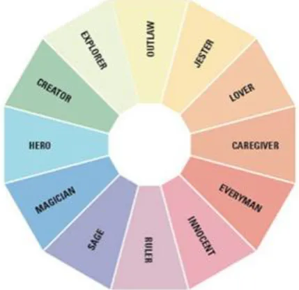
The use of an archetype has several advantages for a company. However Mark and Pearson (2001) only describe twelve archetypes (figure 2), there is enough space for numerously different sub archetypes, all with their own values. This also makes the archetypes unambiguous. Because archetypes are hidden in every human, archetypes are universal and applicable to everyone. Thus, for an identity based on archetypes it is not necessary to adapt it to every country or culture. By using the archetype as the spine of the organization, the brand stays timeless, but still can be refreshed over time. Finally, archetypes are a source of inspiration. Within one archetype, there can be different kinds of brands that develop their own identity. For example, Harley-Davidson, Linux, and Mini all share the archetype Outlaw, but are unique in their own way (Jansen, 2006).
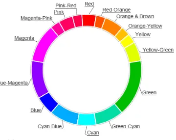
Mark and Pearson (2001) mentioned twelve archetypes, but this does not mean that they are all equally different. Some archetypes show similarities. By adding two axes to the archetype framework, mastery versus stability and independence versus belonging, four clusters of three archetypes each are formed. On one hand, humans feel the need to be alone and independent. On the other hand, they also have moments when they want to help others and be social. The same is true for mastery and stability. Mastery represents the archetypes Caregiver, Ruler, and Creator. This distribution has never been scientifically proven. Other authors classified the archetypes in different ways. Jansen (2006) called the axes freedom and order, and ego and social. Bolhuis (2011) combines the quadrants ego and freedom from Jansen (2006) and calls it freedom. The other clusters are order and social. Van Nistelrooij (2013) found another variation. He found three clusters: expressive, social, and competence. Oosterhout (2013) also found three clusters and calls them social, freedom and order. The clusters have the same names as Bolhuis (2011), but with different archetypes in each cluster. Faber and Mayer (2009) found five different clusters: the knower, carer, striver, conflicter, and everyperson. They also added the archetype shadow. Although the classifications can differ, the twelve archetypes stay the same.
[image:9.595.189.404.467.675.2].
10
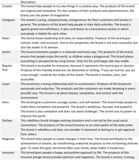
[image:10.595.69.540.191.738.2]The twelve archetypes of Mark en Pearson (2001) are called: Innocent, Everyman, Caregiver, Lover, Jester, Outlaw, Explorer, Creator, Hero, Magician, Sage en Ruler. The descriptions of every archetype can be found in table 1.
Table 1
Definitions of the archetypes (Mark & Pearson, 2001).
Description
Creator: This brand helps people to try new things in a creative way. The products of this brand are original and innovative. For the creation of their products and advertisements, the brand uses the power of imagination.
Caregiver: This brand is caring, compassionate, and generous for their customers and society in general. The products of this brand help people in their daily activities. The brand is against greed and selfishness. It also contributes to a harmonious society in which everybody is helpful for each other.
Ruler: This brand shows leadership and takes its responsibility. Products of this brand give control, order, and structure. Due to this properties, the brand is not only successful, but also the leader in its domain.
Jester: This brand entertains people in a clownish and funny way. The products of this brand ensure that people enjoy the world, as children enjoy a playground. This brand places everything in perspective by using humor. Only the fun and happy side stay visible. Regular
Guy:
This brand is accessible for everyone, because it represents the normal guy or woman. Products of this friendly brand are not distinctive or striking. ‘If you act normal, you act crazy enough’, could be the motto of this brand. The brand is realistic, wise, and accessible.
Lover: This brand has a loving relationship with its environment. Products of this brand are passionate and seductive. The products and the customers are made tempting in every possible way. This brand is all about beauty, temptation, and contact with the
environment.
Hero: This brand gives customers courage, power, and self-esteem. This brand helps people to make them competent and powerful. The brand is ambitious, focused, and powerful. The brand is also combative and does not avoid challenges. The brand uses its power to improve the world.
Outlaw: This rebellious brand changes existing situations and is not led by the usual social conventions. The products of this brand function as an interruption of the daily order. The brand is rebellious and does not consider it important to belong to or get approval from others.
Magician: This brand helps people to create changes in their lives. The brand contributes to the achievement of dreams, by transforming undesired situations to the enchanting ultimate goal. To reach this goal, the brand often uses rituals, what makes it mysterious.
11
and wants to do good for everyone. The brand is based on the good in people and wants to reward this.
Explorer: This brand helps people to achieve freedom and independence. The brand is
continuously searching for new adventures and products. The products are made to help people enjoy life. The products of this brand give people the possibility to explore what they can be or what they can achieve.
Sage: This brand uses intelligence and analysis to understand the world and to develop themselves. The brand is continuously gathering information and knowledge to increase their experience and expertise. Customers can learn from this brand. The brand has a strong self-reflection and is appreciated because of it.
2.6 Corporate Visual Identity (CVI)
Brands can communicate their personality through behavior, communication, and symbolism. Communication is all the verbal and visual characteristics within an organization that is expressed to all the stakeholders. In this context, behavior is the attitude of employees, based on expertise or rules of conduct. Symbolism is all visual expressions of a company that stakeholders can come across with. Examples of these visual expressions are: logos, illustrations, offices, and corporate clothing (Birkigt & Stadler, 1986).
The symbolism of an organization is the easiest and cheapest part to change for an organization. The CVI is the dominant representative of symbolism (Birkigt & Stadler, 1986). The CVI can differentiate one company from another. The CVI consists of a logo, typography, the use of colors, the layout, pictures, illustrations, and signs (Van den Bosch et al., 2005). To create a consistent image of a company, it is important that the CVI is also visible on the buildings, the interior, and the car fleet. The CVI has three main advantages. It provides differentiation (Melewar & Akel, 2005), makes the brand recognizable (Kohli & Suri, 2002), and creates a positive attitude towards the brand (Walsh, 2005).
The logo is the most eye-catching element of a company, because it is visible on buildings, clothing, products, packaging, letters, brochures, and commercials. A logo consists of a word mark, a
figurative, or a combination of these two (Henderson & Cote, 1998). The logo can contain fonts, colors, and/or symbols (Sharma & Garikaparthi, 2013). Sharma en Garikaparthi (2013) state that the logo represents the image and the brand promise of an organization.
A logo can bring a competitors advantage and can improve the corporate reputation (Baker and Balmer, 1997; Olins, 1989). Logos last longer in the memory of a customer than words. This is an advantage, because most of the time, logos are only briefly visible. But more important, a logo can communicate the characteristics and the identity of an organization (Aaker, 1997; Ajala, 1991; Batra, Lehman & Singh, 1993; Blijlevens, Creusen & Schoormans, 2009; Bromley, 2001; Shimp, 2003; Van Riel, Van den Ban & Heijmans, 2001; Zhang, Feick, & Price 2006). A logo can complement the name of a company. Even a logo without the name of the company can be enough to recognize it. By seeing a large M on the side of the road, a lot of people know that there is a McDonald’s nearby (figure 3). An important characteristic of the M of McDonald’s, is the yellow color. A color can be a very
12 Figure 3. The logos of Nike, McDonald’s and Apple.
2.7 Color
As Sharma and Garikaparthi (2013) described, a logo consists of fonts, colors, and/or symbols. The logo of McDonald’s is recognizable because of the shape (the two arches), but also because of the color. Rabhubir (2010) provides a model that clearly describes how visual processing works. The model states that there are various visual properties that can influence the judgment of consumers. One of these properties is color. A color can influence a brand identity in such a way, that it increases the brand recognition and the desired image (Bottomley & Doyle, 2006). A color consists of three dimensions: hue, brightness, and saturation. Hue is the pigment. The three primary hues, from which all colors are made are red, yellow, and blue. A color is bright in a scale from white to black.
Saturation refers to the depth in a color (Valdez & Mehrabian, 1994).
Gorn et al. (1997) studied the knowledge of marketing managers in theories about the use of colors. They found that most marketing managers are not familiar with most of the theories and use their gut feeling instead. Bellizzi and Hite (1992) studied the influence of the colors red and blue on the buying behavior of consumers in the retail environment. They argue that blue resulted in more purchases, less purchase delays, and a stronger tendency to go shopping. People are influenced binominal. By arousal, which shows a higher brain and heart activity, and by evaluative reactions, which cause a different attitude towards a brand.
2.7.1 Color associations
Associative learning is the process whereby two stimuli are connected. The combination of colors and feelings can realize the same effect for people. The color yellow, for example, is associated with a happy feeling (Collier, 1996). Hue, saturation, and brightness determine the way a color looks, but color aspects determine the way a color feels. There are different color aspects. Bright colors are determined by the amount of pure color. Bright colors are vivid and attract attention. Dark colors are hues that contain black in their composition. They close up space. Dark colors are concentrated and serious. Light colors are the palest pastels. They take their lightness from an absence of visible colors. Light colors are open and suggest airiness. Warm colors are hues that contain red, orange, or yellow. They are warm, welcoming and spontaneous. Cold colors are hues that contain purple, blue or green and are calming and refreshing (Sutton & Whelan, 2004).
13
The use of colors is a widely studied area in the world of branding. A color should fit to a company’s identity. Keller (1993) states that the cohesion between brand associations creates a stronger and more positive brand. Bottomley and Doyle (2006) have applied this to the use of logos. They argue that there is a connection between the use of colors and the logo.
Jacobs et al. (1991) studied the associations that colors evoke. Participants of the study associated black with expensive and powerful (Nike), blue with trust, purple with progressive and elegant (Yahoo), and gray with luxury (Swarovski). Colors also evoke different emotions in different
countries. In the United States, blue is the most used color in logos, while red is the most used in Asia (Schmitt & Pan, 1994). In Asia, white is associated with death, while it stands for purity in the Anglo-Saxon world. Blue, which is the most popular American corporate color, is perceived as cold and evil in East Asia, coldness in Sweden, death in Iran and purity in India. In addition, red means unlucky in Chad, Nigeria and Germany, but lucky in China, Denmark and Argentina (Aslam, 2006). Wallace et al. (2006) state that minimizing the number of colors in a logo can reduce the ambiguity of the
corporate visual identity. A well chosen color can increase the brand equity (Bottomley & Doyle, 2006). Studies show that generally, red stands for active, warm, and lively. Brown and black stand for old/antique and blue, green, and white stand for peaceful, calming, and soft. However, these color associations do not say everything about the use of colors in logos (Madden, Hewett, & Roth, 2000).
2.7.2 Colors and archetypes
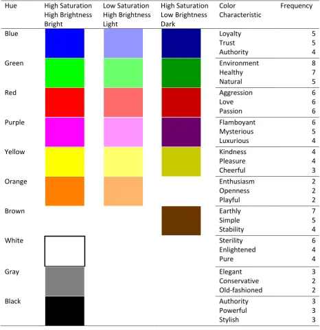
[image:13.595.56.533.503.742.2]Berlin and Kay (1969) established the universal color spectrum. This spectrum contains the colors black, white, red, green, yellow, blue, brown, purple, pink, orange, and gray. These basic colors cover the complete color palette. Johnson (2007), Frank and Gilovich (1988), and Sabanovich (2008) studied which characteristics colors have, when used in a logo. These color characteristics show similarities with the characteristics of the different archetypes. In table 2, the characteristics of the colors are discussed, and if possible, linked to archetypes or a cluster of archetypes (Johnson, 2007; Frank & Gilovich, 1988; Sabanovich, 2008).
Table 2
Colors, color characteristics and the relation with archetypes.
Color Characteristics Explanation Gray Solid; modest;
intelligent; conservative; old-fashioned; boring; elegant
Gray is a color that provokes little reactions. It is quite boring. It could be used in the order cluster.
White Peace - purity - bright - enlightened - sterility - hope
Because white is the reflection of all colors and stands for peace and purity, the link with the Innocent archetype is easily made.
Black Powerful - authority - elegance - stylish - bravery - mysterious - rebellious
The characteristics of the color black have a lot of similarities with the cluster stability (Mark & Pearson, 2001). Powerful, authority and rebellious are corresponding characteristics. Because of its characteristics powerful and authority, it also has a link with the archetype Ruler.
Red
Emotional- aggression-passion-love
14 drawing
attention-revolution
& Pearson, 2001) cluster. The best fitting archetype should be the lover.
Blue Authority - dignity - security - trust - loyalty - conservative - wisdom
The characteristics of the color blue fit the cluster order (Jansen, 2006). The archetypes in that cluster share the characteristics loyalty and trust. This could also fit the archetype Everyman that is very close to the cluster order.
Green Calming - healthy - natural - refreshing - environment - inexperience
Green stands for nature. The archetype explorer could be the best fit, because it stands for adventure, nature, and the environment. The cluster freedom (Jansen, 2006)could be the best fit here.
Yellow Cheerful - optimistic - cheerfulness -
pleasure - friendship
The cheerfulness and friendship characteristics of the color yellow are leaning towards the cluster social, while optimism and pleasure lean towards freedom. The Jester is right between these clusters and could be a good representation for this color.
Purple Elegance - luxury - authority - spirituality - mysterious -
flamboyant
The Hero and the Magician are both in the clusters ego and stability. These clusters stand for authority, elegance, and luxury. The spiritual and mysterious character of purple also fits the archetype Magician very well.
Orange Openness - kindness - cheerful - enthusiasm - energy - modern - playful
The Jester wants to lighten up the world and is fun and humorous. Orange represents a lot of these features. The cluster freedom probably fits this color the best.
Brown Simple - natural - earthy - characteristic - calming - stability
Because of the natural and earthy associations, the Explorer is the only archetype that has some common ground with this color.
Pink Femininity - softness - innocent - calming - love - sympathetic
Pink is has some similarities with red, but is more feminine. The social cluster could be the best fit for this color. Because of the softness and loving character, the archetypes Caregiver and Lover could be the best fit.
Previous studies found that colors in logos can have different associations (Johnson, 2007; Frank & Gilovich, 1988; Sabanovich, 2008). These associations show similarities with the archetypical characteristics. This study is set up to find out if archetypes can be visualized with colors with the following research question:
15
3. Method
To answer the research question, the first step was to conduct a preliminary test. The preliminary test is important to select the colors for the main study. The characteristics that are associated with the colors are used in the discussion to link the colors to the archetypes. The main study is set up to answer the research question.
3.1 Preliminary study
To determine the final colors and the corresponding characteristics, a preliminary study was necessary.
3.1.1 Respondents
Eight respondents participated in this study. The respondents were selected at random. The average age was M=34.5 with a standard deviation of SD=14.15. The youngest was 22 and the oldest was 54. Among the respondents were four men and four women.
3.1.2 Measuring instruments
In this preliminary study the so-called photosort method was used. The photosort method is a non-verbal method to measure affection and emotional factors. Individuals have to associate, in this case, colors and characteristics. Respondents are asked to divide the colors in homogenous groups. Usually respondents have to make two groups and divide these groups in subgroups until no more subgroups can be made. In this case, respondents are free to make the groups as big as they want.
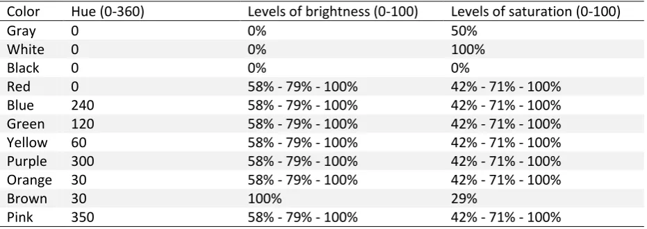
As stated before, there are eleven hues in the universal spectrum of colors. To determine which colors should be used in the main study, all hues are printed in three different types of brightness (low, medium, high), and three types of saturation (low, medium, high). The stimuli are created with Adobe® Illustrator® CS6 to alter the hue and saturation and brightness levels of the logo. Appropriate levels for saturation (high=100%, low=42%) and brightness (high=100%, low=58%) match the levels used in previous work in this area (Gorn et al. 2004). To determine the best colors for the study, an extra brightness and saturation level is added. The saturation level between 42% and 100% is 71%. The brightness level between 58% en 100% is 79%.
16
Table 3
Hue, brightness, and saturation levels per color used in the preliminary study.
Color Hue (0-360) Levels of brightness (0-100) Levels of saturation (0-100)
Gray 0 0% 50%
White 0 0% 100%
Black 0 0% 0%
Red 0 58% - 79% - 100% 42% - 71% - 100%
Blue 240 58% - 79% - 100% 42% - 71% - 100%
Green 120 58% - 79% - 100% 42% - 71% - 100%
Yellow 60 58% - 79% - 100% 42% - 71% - 100%
Purple 300 58% - 79% - 100% 42% - 71% - 100%
Orange 30 58% - 79% - 100% 42% - 71% - 100%
Brown 30 100% 29%
Pink 350 58% - 79% - 100% 42% - 71% - 100%
3.1.3 Procedure
The selected respondents were first presented a photo to test colorblindness. After that, the respondents were asked to sort the cards in different groups, based on external characteristics. There were no boundaries to the sizes of the different clusters. The colors that, according to the respondents, did not fit to a group could be left separately. In the end, the respondent had to give names to the different clusters.
After the first part of the study, the respondents were given fifty-eight color characteristics that they had to address to the different clusters, such as cheerful, passion, flamboyant or authority. The characteristics used in this study are based on the characteristics of Johnson (2007), Frank and Gilovich (1988), and Sabanovich (2008). The form used in the preliminary study can be found in appendix B.
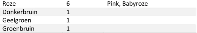
3.1.4 Results
[image:16.595.65.387.621.752.2]It was remarkable to see that most respondents selected the groups based on the different hues. Most of the times, the groups were also named after the color, for example, blue, green or red. All colors from the universal spectrum of colors of Berlin and Kay (1969) were named at least by 6 of 8 respondents. Table 4 shows the names that were chosen for the separate groups the most.
Table 4
The most chosen cluster names.
Cluster name Frequency Other names
Blauw 8 Marineblauw, Lucht, Zee
Groen 8 Leger, Natuurlijk, Boskleur
Rest 8 Saai, Restant, Overig
Rood 8 Felrood
Paars 7 Lila, Magenta
Geel 7
Bruin 7 Herfstkleuren, Donker
17
Roze 6 Pink, Babyroze
Donkerbruin 1
Geelgroen 1
Groenbruin 1
As the table shows, black, gray, and white were placed in one group by 8 of 8 respondents (rest). Because these colors were in one group, white, black, and gray are all part of the main study. Not because of their similarities, but because of their misfit with other colors.
[image:17.595.67.384.99.152.2]All colors in the spectrum were recognized, but the selection of the right color to a cluster name was more problematic. For example, some pink colors were grouped in the ‘red’ cluster and the other way around. In table 5 the most used cluster names are compared with the hues that were put in that cluster.
Table 5
Cluster names against hues.
Hue Blue Green Red Purple Yellow Brown Orange Pink Rest
Blue 100%
Green 82% 18%
Red 46% 13% 41%
Purple 8% 75% 17%
Yellow 8% 2% 71% 19%
Brown 4% 28% 2% 6% 43% 17%
Orange 7% 93%
Pink 31% 24% 2% 43%
Rest 15% 85%
18 Figure 4. Hue ranges map.
3.1.5 Conclusion
The preliminary study showed that respondents selected the colors in most of the cases on basis of the hue of a color. This could explain why a color with a red hue was grouped in a pink cluster. Because of its high brightness, the color red looks very light and pinkish. This could mean that a red hue evokes different emotions when its brightness and saturation are altered, because the hue red is put in different cluster names with different color characteristics. This can even be true for the hue blue. While they are all put in the same cluster, there can still be differences in color characteristics for colors with a higher/lower saturation or higher/lower brightness.
Therefore three different variants are selected for every hue for the main study (high saturation/high brightness, high saturation/low brightness and low saturation/high brightness). This does not apply for the colors black, white, and gray, because these colors only have one saturation and brightness level. There is also made an exception for the red hue with a high saturation and a low brightness. Six of the eight respondents grouped this color in the cluster ‘brown’. This color is replaced by a red hue with high saturation and medium brightness. All eight respondents placed this color in the cluster ‘red’. The same applies to the yellow hue with high saturation and low brightness. This color is replaced with a yellow hue with high saturation and medium brightness.
19
Table 6
Selected colors and mentioned color characteristics for the main study.
Hue High Saturation High Brightness Bright Low Saturation High Brightness Light High Saturation Low Brightness Dark Color Characteristic Frequency
Blue Loyalty
Trust Authority
5 5 4
Green Environment
Healthy Natural
8 7 5
Red Aggression
Love Passion
6 6 6
Purple Flamboyant
Mysterious Luxurious
6 5 4
Yellow Kindness
Pleasure Cheerful
4 4 3
Orange Enthusiasm
Openness Playful
2 2 2
Brown Earthly
Simple Stability
7 5 4
White Sterility
Enlightened Pure
6 4 4
Gray Elegant
Conservative Old-fashioned
3 2 2
Black Authority
Powerful Stylish
20
3.2 Main study
The goal of the main study was to determine to what extent archetypes can be visualized with colors. An online questionnaire was used to collect the data. The respondents were asked through social media to fill in the survey. This gives respondents the opportunity to answer the questions whenever and wherever they want.
3.2.1 Measuring instrument
The questionnaire started with some demographic questions. A question to test colorblindness was added to indicate colorblind respondents. Then the actual questionnaire started.
3.2.1.1 Independent variables
This study investigates different color characteristics. The preliminary study showed that the
respondents based the clustering mainly on the hue of a color. Also, differences were found between colors with different levels of brightness and saturation. Therefore, the colors in this study are based on its hue first. Blue, green, red, purple, yellow and orange were selected from the preliminary study. For every hue, three variants are selected. A high saturation level (100%) with a high brightness level (100%) makes a bright color. A low saturation level (42%) with a high brightness level makes a light color. A high saturation level with a low brightness (58%) level makes a dark color. Also, black, gray, and white are added to the study. This makes a total of twenty-one colors used in the main study (see table 6). Thus, the color characteristics that are measured are the hue, the level of saturation and the level of brightness.
However, there are more characteristics that are taken into account. The influence of the three primary hues red, yellow, and blue is also measured by the extent of a primary hue in a color. Red, for example, has a full extent of red in its color, while orange (between yellow and red) has a medium extent of red in its color. Beside these color characteristics, there are color aspects that focus on the lightness, darkness, and brightness of a color, as well as the temperature (warm and cold colors) (Sutton & Whelan, 2004). Bright colors are defined by the amount of pure color within a hue. The clarity of bright colors is achieved by its omission of black and gray and are vivid and attracting attention. Light colors take their lightness from an absence of visible color in their
composition and are almost transparent. Light colors open up the surroundings and suggest airiness. Dark colors are hues that contain black in their composition. They close up space and make it seem smaller. Dark colors are serious. Red, yellow, and orange are associated with warmth. Warm colors are comforting, spontaneous, and welcoming. Blue, green, and purple are associated with cold. Cold colors are strong, dominating, and calming. By measuring these color characteristics, more than recommendations about a hue on its own can be made.
The colors are presented in logos. This study used three neutral logo shapes to test if color was the only factor that influenced the choice of the respondents. These logo shapes were tested before in a color study by Labrecque and Milne (2011). The three logo shapes were applied to all twenty-one colors. This makes a total of (21 x 3 =) sixty-three logos.
3.2.1.2 Dependent variables
21 3.2.1.3 Research design
Each respondent was given a description of all twelve archetypes. To reduce boredom effects, each respondent had to evaluate seven of the sixty-three logos. To get evaluations of all sixty-three logos, logo sets were made.
The preliminary study showed that the respondents based the clustering mainly on the hue of a color. Every logo set contained one variant of all six hues, complemented with a black, white, or gray logo. This makes a total of nine different logo sets with seven logos in each set. To reduce order effects, variations in the logo shapes were applied in every logo set. Also, every logo set contained a variation of light, bright, and dark logos. The logo sets can be found in Appendix C. Finally, the sequence of the archetypes was reversed for all nine variations of the questionnaire. This makes a total of eighteen variations of the survey. Each fit between a color and an archetype is evaluated by at least thirty-eight and up to eighty-nine respondents (Appendix D).
3.2.2 Data analysis
The data from the survey were used in different data sets. The first data set showed the data of every single respondent in the rows. The columns showed the results for all sixty-three different logos per archetype. This data set was used to remove errors. For example, respondents who filled in the same answer to every question, colorblind people, or respondents who quit the questionnaire before rating the fit between at least one archetype and one logo set.
In the second data set, the results from the first data set were transformed. The rows contained the (21 x 3) logos and the columns contained the mean scores on the fit with each archetype. This data set was set up to see if the color shape influenced the results.
The third data set combined the sixty-three logos to the twenty-one colors. The twenty-one colors were placed in the rows. The columns contained the mean scores on the archetypes and the independent variables: hue, brightness, saturation, dark, light, bright, temperature (warm/cold), extent of blue/red/yellow. This data set was used to find relations between archetypes and the use of colors in logos.
3.2.3 Respondents
22
4. Results
In this chapter, the results of the main study are presented. Information about logo selection is followed by findings about the archetype framework. The chapter concludes with the results of the correlations between the archetypes and the logos.
4.1 Logo selection
In the survey, three different logo shapes were used. To find out if the different logo shapes had no significant influence on the results, a one-way ANOVA was performed. It was found that the diamond shaped logo and the triangular shaped logo had no significant influence on the results. However, the hexagonal logo influenced the results significantly for the creator archetype (p = .018) and the regular guy archetype (p = .016). In appendix E, all results are presented.
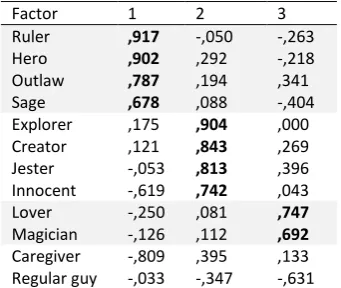
4.2 Archetype framework
To analyze the archetypical framework in general, a mean score was calculated for every combination of archetypes and colors. These scores were used as variables to perform a rotated varimax factor analysis (Table 8).
[image:22.595.65.236.441.585.2]The matrix distinguished three components, or clusters. The first cluster is formed by the archetypes ruler, hero, outlaw and sage. The second cluster holds the archetypes explorer, creator, jester, and innocent. The third cluster consists of the archetypes magician and lover. The caregiver archetype does not fit in a cluster. It has a small fit with the second cluster, but this fit is not striking. The regular guy archetype does not have a positive fit with any cluster at all.
Table 8
Results of the rotated varimax factor analysis
Factor 1 2 3
Ruler ,917 -,050 -,263
Hero ,902 ,292 -,218
Outlaw ,787 ,194 ,341
Sage ,678 ,088 -,404
Explorer ,175 ,904 ,000 Creator ,121 ,843 ,269 Jester -,053 ,813 ,396 Innocent -,619 ,742 ,043
Lover -,250 ,081 ,747
Magician -,126 ,112 ,692
23
4.3 Archetypes and logos
This section presents the results per archetype. The mean scores per archetype of the different hues (blue, green, purple, yellow, orange, red, black, white, gray) were calculated, because the preliminary study showed that the hue was an important factor to allocate the colors to the different clusters. To investigate the relation between archetypes and the different hues, a correlation analysis was performed. The characteristics saturation, brightness, light, bright, dark, temperature (warm/cold), extent of red, extent of yellow, and extent of blue are also included in the correlation analysis. The results are presented¹ for each individual archetype. First the significant correlations for each color characteristic are presented, followed by the best and worst fitting colors for a logo, based on the mean scores. In appendix F, all correlations are presented, including the correlations which are not significant.
Ruler
The correlation analysis showed a significant negative correlation for the ruler archetype with the characteristics brightness ,476**), light ,580***), and the extent of yellow in a logo (r=-,537**). The correlation analysis showed a significant positive relation for the ruler archetype with the characteristic dark (r=,436**). Although hues are not significantly correlated to the ruler archetype, blue (r=,402*), red (r=,391*) and black (r=,402*) showed a tendency towards a positive correlation.
It was found that blue logos (M=4.72, SD=1.87) and red logos (M=4.70, SD=1.60) are the best fitting logos for the ruler. Below, the five best and least fitting logos are presented. The best fitting logos are bright or dark and have a red or blue hue. The worst fitting logos are mostly light.
5.30 5.11 4.93 4.92 4.92 M: 4.01 3.44 3.15 3.03 2.95 2.80 SD: .73
Hero
The correlation analysis showed a significant positive correlation for the hero archetype with the characteristic saturation (r=,521**) and dark (r=,436**). A significant negative correlation was found for the characteristics brightness (r=-,500**) and light (r=-,774***). No significant correlations between the hero and the different hues were found.
It was found that blue logos (M=4.71, SD=1.87) and red logos (M=4.67, SD=1.79) are the best fitting logos for the hero. Below, the five best and least fitting logos are presented. The best fitting logos are red, blue or black and have a medium or dark hue. The worst fitting logos are all light, or completely white.
5.47 5.31 5.31 5.14 5.10 M: 4.06 3.15 3.08 3.05 3.04 2.88 SD: .87
24 Outlaw
The correlation analysis showed a significant positive correlation for the outlaw archetype with the characteristic bright (r=,459**) and a significant negative correlation with the characteristic light (r=-,569***). Although hues are not significantly correlated with the outlaw archetype, red (r=,378*) and black (r=,397*) showed a tendency towards a significant positive correlation.
It was also found that red logos (M=4.59, SD=1.81) and logos without colors (M=4.33, SD=1.88) are the best fitting logos for the hero. Below, the five best and least fitting logos are presented. Red, black, and bright colors are among the best fitting logos, while light colors and dark yellow and dark orange form the worst fitting group.
5.20 5.03 4.98 4.64 4.36 M: 4.03 3.46 3.43 3.36 3.35 3.23 SD: .99
Sage
The correlation analysis showed a significant positive correlation for the sage archetype with the extent of blue in a logo (r=,488**). In addition, it was found that the sage has a significant positive correlation with blue hues (r=,567***).
It was also found that blue logos (M=4.75, SD=1.68) and logos absent of color (white, gray, black) (M=4.34, SD=1.88) are the best fitting logos for the sage. Below, the five best and least fitting logos are presented. Blue, bright and dark logos are among the best fitting logos, while the worst fitting logos are orange, purple and green and mostly light.
5.00 4.96 4.68 4.65 4.39 M: 4.07 3.65 3.62 3.47 3.41 3.29 SD: .82
Explorer
The correlation analysis showed a significant positive correlation for the explorer archetype with the characteristic saturation (r=,562***), and a significant negative correlation with the characteristic light ,504**). In addition, the explorer has a significant negative correlation with black (r=-,454**).
It was also found that green logos (M=4.24, SD=1.65) and purple logos (M=4.14, SD=1.64) are the best fitting logos for the explorer. Below, the five best and least fitting logos are presented. The worst fitting logos are light or absent of color. The best fitting logos have high levels of saturation.
25 Creator
The correlation analysis showed no significant correlations between the creator and any of the color characteristics, except for the hue. It was found that the creator has a significant negative correlation with white logos (r=-,467**) and gray logos (r=-,483**).
It was found that purple logos (M=4.26, SD=1.67) and red logos (M=4.26, SD=1.77) are the best fitting logos for the creator archetype. Below, the five best and least fitting logos are presented. It stands out, that logos absent of color, are the worst fitting logos and bright, dark, red, and purple are the best fitting logos.
4.49 4.48 4.27 4.27 4.23 M: 4.02 3.82 3.73 3.63 3.41 3.39 SD: .84
Jester
The correlation analysis showed a significant positive correlation for the jester archetype with the characteristic bright (r=,592***). No significant correlations between the jester and the different hues were found.
It was found that purple logos (M=4.29, SD=1.79) and green logos (M=4.10, SD=1.66) are the best fitting logos for the jester. Below, the five best and least fitting logos are presented. The best fitting logos are bright and have a diverse hue. The worst fitting logos are mostly absent of any color.
4.92 4.90 4.73 4.59 4.29 M: 3.69 3.18 2.84 2.76 2.60 2.55 SD: 1.00
Innocent
The correlation analysis showed a significant negative correlation for the innocent archetype with the extent of red in a logo (r=-,511**). It was found that the innocent has a significant positive
correlation with a green hue (r=,440**). The analysis also showed a significant negative relation with black (r=-,642***).
It was also found that green logos (M=4.46, SD=1.60) and yellow logos (M=4.27, SD=1.64) are the best fitting logos for the innocent. Below, the five best and least fitting logos are presented. The green logos are in the best fitting logos, while logos absent of color are in the group with the worst fitting logos.
4.60 4.43 4.42 4.42 4.37 M: 4.01 3.58 3.50 3.27 2.73
26 Lover
The correlation analysis showed a significant positive correlation for the lover archetype with the characteristics brightness (r=,477**), light (r=,506**), and the extent of red in a logo (r=,626***). In addition, it was found that the lover has a positive correlation with a red hue (r=,579***).
It was also found that red logos (M=4.60, SD=1.85) and purple logos (M=4.21, SD=1.60) are the best fitting logos for the lover. Below, the five best and least fitting logos are presented. The logos are light, bright or have an extent of red in the color. The worst fitting logos are mostly dark or absent of any color.
5.25 4.62 4.52 4.26 4.15 M: 3.90 3.43 3.43 3.26 3.21 3.12 SD: .86
Magician
The correlation analysis showed no significant correlations between the magician and any of the color characteristics. Although hues are not significantly correlated with the magician archetype, purple (r=,391*) showed a tendency towards a positive correlation and gray (r=-,377*) showed a tendency towards a negative correlation.
It was found that purple logos (M=4.45, SD=1.70) and red logos (M=4.31, SD=1.72) are the best fitting logos for the magician. Below, the five best and least fitting logos are presented. It seems that purple and light logos are the best fitting logos, while the worst fitting logos are dark, gray, and blue.
4.86 4.61 4.45 4.39 4.33 M: 4.18 3.95 3.93 3.72 3.69 3.57 SD: .97
Caregiver
The correlation analysis showed a significant positive correlation for the caregiver archetype with the characteristic light (r=,552**). In addition, the caregiver has a significant negative correlation with black (r=-,530**).
It was also found that yellow logos (M=4.35, SD=1.58) and orange logos (M=4.26, SD=1.58) are the best fitting logos for the caregiver. Below, the five best and least fitting logos are presented. The best fitting logos are light. Logos absent of color have the worst fit.
27 Regular guy
The correlation analysis showed no significant correlations between the regular guy and any of the color characteristics, except for the hue. It was found that the regular guy has a significant negative correlation with a purple hue (-,663***).
It was also found that blue logos (M=4.31, SD=1.79) and logos absent of colors (M=4.21, SD=1.83) are the best fitting logos for the regular guy. Below, the five best and least fitting logos are presented. The best fitting logos are blue, red or white, while all purple logos belong to the worst fitting logos.
28
5. Discussion
There are numerous successful brands that have an archetypical character. Only the last couple of years, empirical studies about archetypes are conducted. The main goal of this study was to find out if colors in logos can visualize archetypes for brands. In this chapter, the conclusions of the study are presented. Based on the results, the main question will be answered. First, the archetype framework will be discussed, followed by a more in-depth discussion per archetype. After that, the value of this study will be discussed, as well as the limitations. In the end there will be given some suggestions for future research.
5.1 Archetype framework
Because of the ambiguous distribution of the different archetypes into the different clusters in previous studies (Oosterhout, 2013; Van Nistelrooij, 2013; Bolhuis, 2013; Faber & Mayer, 2009; Jansen, 2006; Mark & Pearson, 2001), this study took another look at the archetype framework. The factor analysis conducted in this study revealed three cluster, presented in figure 5. The names assigned to the clusters are explained in this paragraph, as well as the overlap with archetype frameworks from other studies.
Power
Expressive
[image:28.595.170.471.349.621.2]Freedom Figure 5. Archetype framework
29
Table 9
Overview of defined clusters.
Ooster-hout (2013) Van Nistelrooij (2013) Bolhuis (2011) Faber and Mayer (2009) Jansen (2006) Mark and Pearson (2001) Current study
Ruler Order Competence Order Striver Order Mastery Power Hero Order Competence Order Striver Ego Stability Power Outlaw Freedom n/a Freedom Conflicter Freedom Stability Power Sage Order Competence Order Knower Order Independence Power Explorer Freedom Competence Freedom Everyperson Freedom Independence Freedom Creator Social Expressive Freedom Knower Ego Mastery Freedom Jester n/a Expressive Freedom Everyperson Freedom Belonging Freedom Innocent Social Social Social Carer Order Independence Freedom Lover Social Expressive Freedom Carer Social Belonging Temptation Magician n/a Expressive Freedom Knower Ego Stability Temptation Caregiver Social Social Social Carer Social Mastery n/a
Regular Guy
Order Social Social Everyperson Social Belonging n/a
Shadow n/a n/a n/a Conflicter n/a n/a n/a
Carer, Social Conflictor, Expressive, Freedom, Independence Order, Stability, Power Competence, Ego, Mastery, Striver n/a = not applicable
The cluster with the outlaw, the hero, the ruler, and the sage holds the same archetypes as the cluster of Oosterhout (2013) and Bolhuis (2011), except with the addition of the outlaw. The outlaw is placed in the Freedom cluster or in the Conflicter cluster (see table 9). This can be explained by the different characteristics of one singular color. Black, for example, is among the five best fitting logos in all archetypes in the Order cluster. However, black can stand for powerful in the ruler archetype, while it stands for rebellious in the outlaw archetype. The addition of the outlaw in this cluster makes it difficult to call this cluster Order, while the outlaw is the opposite of Order. Red, black, and blue are among the five best fitting logos in almost all archetypes in this cluster and share the characteristic power. The ruler has power, because it is the leader. The hero is strong and wants to make the customer feel powerful. The sage gets its power from its knowledge and the outlaw is powerful and brave enough to fight against the status quo. That is why this cluster is called Power.
The cluster with the creator, the explorer, and the jester holds the same archetypes as the Freedom cluster of Bolhuis (2011). The explorer and jester are in the Freedom cluster in the study of Jansen (2006). The innocent is the stranger in our midst, while it is mostly placed in the Social (Oosterhout, 2013; Van Nistelrooij, 2013; Bolhuis, 2011) or Carer (Faber & Mayer, 2009) cluster. The results showed that black is among the worst fitting logos for all archetypes in the Freedom cluster. Black stands for authority and power, the opposite of freedom. The innocent archetype stands for a happy and positive approach to life. This could also be explained as a free way of living. Therefore, in this study, it fits in the Freedom cluster.
30
Since the introduction of the twelve archetypes in 1919, times have changed. Jansen (2006) and Mark and Pearson (2001) argued that archetypes are timeless. This could be, but the meaning or the interpretation can change. A couple of decades ago, the magician could be associated with rituals and the church, while these influences have decreased the last years. The interpretation of the characteristic mysterious could be changed. A mysterious woman can be elegant, passionate, and loving. These characteristics belong to the colors purple and red, the best fitting logos for both archetypes. The lover is also passionate, loving, and seductive. That is why the cluster is called Temptation in this framework.
The caregiver and the regular guy do not fit in any of the clusters. An explanation could be that the caregiver and regular guy are not as outstanding archetypes as the others. This study measured extreme color differences (high/low saturation and brightness), while these two archetypes are very down-to-earth and simple. It could be that less prominent colors fit the archetypes caregiver and regular guy better. Because these colors are not present in this study, the two archetypes have no connection with the other archetypes.
Similarities in clusters are found when it comes to color characteristics. The ruler, the hero and the outlaw, three of the four archetypes in Power cluster, have a significant negative relation with the color characteristic light. Furthermore, the ruler and the hero have a significant positive relation with the color characteristic dark and a negative correlation with brightness. Although not significant, the ruler and the outlaw show a tendency towards a positive relation with black and red logos. For the explorer, creator, and innocent, there are significant negative correlations with logos absent of color (black, white, gray). For the other cluster, no significant relations were found.
When comparing the archetype framework of this study to archetype frameworks from other studies, it can be concluded that no consistency can be achieved between the different studies (Oosterhout, 2013; Van Nistelrooij, 2013; Bolhuis, 2011; Faber & Mayer, 2009; Jansen, 2006; Mark & Pearson, 2001). It can be concluded that every archetype is exclusive on its own and it therefore is difficult to place them in a cluster. Although some archetypes show similarities, the hero and sage are more orderly or powerful than the explorer and the jester for example, every archetype is unique and it is unlikely that they can be clustered in one comprehensive framework. For example, the magician and lover are clustered in this study, while it are opposites in other frameworks
31
5.2 Logo design
This paragraph will discuss the use of colors in logos per archetype. Every discussion about an archetype is ended with an example of an existing brand.
Ruler
The ruler shows leadership and takes its responsibility. A ruler brand is the leader in its domain (Mark & Pearson, 2001). Black, red, and blue hues show a tendency towards a fit with the ruler. Authority, trust and power are characteristics of these hues (Johnson, 2007; Frank & Gilovich, 1988;
Sabanovich, 2008) and match with the characteristics of the archetype. According to Labrecque and Milne (2011), blue stands for competence, also a characteristic of the ruler. High levels of brightness, light logo colors and the use of a yellow hue in a logo do not fit ruler brands. This is not surprising, while light colors are associated with softness and openness. Darker colors, who have a more serious character, fit the ruler brand (Sutton & Whelan, 2004). This is in line with the results of Van
Nistelrooij (2013), who found that grayscale logos are the best fit for this archetype. Labrecque and Milne (2011) also found that brightness has a negative relation with ruggedness, a characteristic of the ruler. BMW and American Express are examples of the ruler archetype and are in line with the results. They have blue and black logos and stay away from the yellow hue.
Hero
The hero gives customers courage, power, and self-esteem. The brand is ambitious, focused, and powerful (Mark & Pearson, 2001). Blue and red logos are the best fitting logos for the hero. Authority, trust, and power are characteristics that fit these colors, as well as the archetype (Johnson, 2007; Frank & Gilovich, 1988; Sabanovich, 2008). In addition, excitement is a good description of the hero (Labrecque & Milne, 2011), which is also a characteristic of red. The hero brand can be visualized by dark logos and logos with a high level of saturation, while a high level of brightness and light logos should be avoided. Except the extent of yellow in the color, the hero has similar results as the ruler. An explanation for this is that both archetypes stand for power and self-esteem. The dark logo of Nike is an example of the expression of the hero in a logo. Another example, although not brand related, is interesting. Some of the most famous super heroes
correspond with the results when it comes to colors. Spiderman (red and blue), batman (dark), and superman (red and blue) all use colors that are in line with the findings.
Outlaw
32 Sage
This brand uses intelligence and analysis to understand the world and to develop themselves. The brand is continuously gathering information and knowledge to increase its experience and expertise (Mark & Pearson, 2001). Positive relations were found for a blue hue and logos with an extent of blue in them. Blue stands for authority, wisdom, and loyalty (Johnson, 2007; Frank & Gilovich, 1988; Sabanovich, 2008), which is in line with the sage archetype. Colors with an extent of blue, like green or purple, also show a fit with the archetype. Green is a calming color and a characteristic of purple is authority. Labrecque and Milne (2011) found that blue has a relation with competence. This is all in line with the characteristics of the sage. The blue and simple logo of IBM is an example of the expression of the sage in a logo.
Explorer
The explorer helps people to achieve freedom and independence. The brand is continuously
searching for new adventures and products (Mark & Pearson, 2001). The use of black and white logos should be avoided. A logo absent of color is not challenging the explorer. Light logos should also be avoided. Explorer brands can be visualized by logos with a high saturation level. These colors are less striking, more natural, and fuller. For example, orange with a high level of saturation looks like brown. This is in line with the other findings, since positive relations were found for saturation and dark logos. The logo of Landrover is green and has a logo with a high level of saturation. This is in line with the findings of this study.
Creator
The creator helps people to try new things in a creative way. The products of this brand are original and innovative (Mark & Pearson, 2001). Although no positive relations were found, the creator has a negative correlation with white and gray logos. This is in line with the expectations, because gray stands for conservative and old-fashioned (Johnson, 2007; Frank & Gilovich, 1988; Sabanovich, 2008). This is the opposite of a creative brand. White is absent of any hue, which could explain the negative correlation. No correlations with other color characteristics were found. This study only measured the effects of logos with one color, while more colors increase the richness of a logo and therefore the possibility to use the colors on a creative manner (Van Nistelrooij, 2013). Examples of the creator archetype are Lego and Google. Lego and Google use multiple colors in their logo. It seems that a good visualization of the creator brand is a logo with multiple colors.
Jester
33 Innocent
The innocent gives people a happy and positive approach to life. The brand is sincere, trusting, and wants to do good for everyone (Mark & Pearson, 2001). The identity of the innocent brand can be visualized by the use of a green hue in the logo The innocent has a positive relation with a green hue. The color contains characteristics like calming, natural, and inexperience (Johnson, 2007; Frank & Gilovich, 1988; Sabanovich, 2008), which is in line with the characteristics of the archetype. In addition, black logos and logos with an extent of red in it do not visualize the identity of the innocent brand. Red is an emotional color that expresses aggression and passion, while black is a rebellious and powerful color (Johnson, 2007; Frank & Gilovich, 1988; Sabanovich, 2008). This is in line with previous research. Van Nistelrooij (2013) stated that an innocent brand should be colorful and open. The green color in the logo of The Body Shop is appropriate to express its reliable and honest personality.
Lover
The lover is all about beauty, temptation, and contact with others. Its products are passionate and seductive (Mark & Pearson, 2001). The lover has a positive relation with a red hue. Love, passion, femininity, and softness are characteristics of the color red (Johnson, 2007; Frank & Gilovich, 1988; Sabanovich, 2008) and fit with the description of the lover. Labrecque and Milne (2011) found that excitement is positively correlated with a red hue. This endorses the findings in this study. In real life, red and love are inseparable. A heart is red, just as lipstick that stands for seduction. The identity of a lover brand can be visualized with bright and light logos, and with logos with an extent of red in it, while dark logos do not fit the lover archetype. This is in line with other research. Dark colors stand for winter, while light and bright logos stand for attracting attention and opening up (Sutton & Whelan, 2004). The red and pink colors that Victoria’s Secret uses are appropriate to express its romantic and passionate personality.
Magician
The magician helps people to create changes in their lives. To reach this goal, the brand often uses rituals, what makes it mysterious (Mark & Pearson, 2001). The identity of a magician brand can be visualized by the use of a purple hue in the logo. Characteristics of purple are flamboyant and mysterious (Johnson, 2007; Frank & Gilovich, 1988; Sabanovich, 2008). This is in line with the characteristics of the magician. The absence of significant relations can be explained by the lack of associations people nowadays can make with the magician, that stands for rituals and mystery. The purple color that Hallmark uses is appropriate to express its mysterious and dreamy personality.
Caregiver
The caregiver is caring, compassionate, and generous for their customers and the society in general. The products of this brand help people in their daily activities (Mark & Pearson, 2001). The caregiver has a negative correlation with black. A black hue stands for authority and power (Johnson, 2007; Frank & Gilovich, 1988; Sabanovich, 2008), which is not in line with the generous and caring character of the caregiver. The identity of the caregiver brand can be visualized with the