Measuring and Visualizing Code Stability - A
Case Study at Three Companies
Miroslaw Staron, Jörgen Hansson, Robert Feldt
Software Centre/Computer Science and EngineeringChalmers | University of Gothenburg [email protected], jorgen.hansson/[email protected]
Anders Henriksson
Software Centre/AB VolvoWilhelm Meding
Software Centre/Ericsson Ericsson AB [email protected]Sven Nilsson, Christoffer Höglund
Software Centre/Saab AB Electronic Defence SystemsSaab AB
sven.sn.nilsson/[email protected]
Abstract— Monitoring performance of software development
organizations can be achieved from a number of perspectives – e.g. using such tools as Balanced Scorecards or corporate dashboards. In this paper we present results from a study on using code stability indicators as a tool for product stability and organizational performance, conducted at three different software development companies – Ericsson AB, Saab AB Electronic Defense Systems (Saab) and Volvo Group Trucks Technology (Volvo Group). The results show that visualizing the source code changes using heatmaps and linking these visualizations to defect inflow profiles provide indicators of how stable the product under development is and whether quality assurance efforts should be directed to specific parts of the product. Observing the indicator and making decisions based on its visualization leads to shorter feedback loops between development and test, thus resulting in lower development costs, shorter lead time and increased quality. The industrial case study in the paper shows that the indicator and its visualization can show whether the modifications of software products are focused on parts of the code base or are spread widely throughout the product.
Index Terms—Quality, metrics, code churns.
I.INTRODUCTION
The ability to quickly deliver products has been on the radar of software development for decades. Using processes which realize principles of Lean and/or Agile software development shows that it is possible to deliver software product in an iterative manner with good quality [1]. When applied to medium or large software development projects these principles usually entail parallel development by multiple development teams [2], continuous integration, and focusing on end-user feature development. When increasing the focus on continuous deliver of new features and introducing multiple self-organized software development teams there is a risk of introducing instability to product development. The multiple teams deliver “their” features at a high pace, and the features might require
modifications or development of code which affects other features. The dependencies in the code base can make the integration effort-intensive or introduce defects which need to be fixed before release. The difficult integration and defects require extra effort and often results in quick changes in the code base thus making the code base unstable.
This paper addresses the following research question: How to monitor the stability of software products by monitoring changes in source code? We address this question by using heatmaps to visualize changes in source code [3]. By monitoring and visualizing the changes we are able to understand the magnitude, pace and spread of changes and thus assess the stability of the code base (aka the product). We distinguish between controlled and uncontrolled changes and define the term code stability. The source code is stable when changes to it are delimited to interrelated parts of the source code base (e.g. architecturally related components) and it is unstable when changes occur at unrelated parts of the source code.
To evaluate the code stability measure and its visualization with heatmaps in a realistic setting we focused on self-organized teams from large organizations working with large software products. We chose three companies in three different domains – Ericsson AB, Saab Electronic Defense Systems and Volvo Group Truck Technology. The method presented in this paper was applied and evaluated at these companies, where the evaluation showed that this type of visualization can effectively trigger discussions about development patterns and lead to improvements. It also showed that there is a correlation between certain trends in changes and quality problems. The visualization of software metrics using heatmaps had been developed during a case study with another software company (RUAG Space) [4]. The original use of heatmaps included visualizations of test progress, and was expanded to visualize revision histories of source code. Initial results at RUAG indicated a positive effect in project discussions. Here we expand on these results in
relation to source code changes and investigate use of the technique at more and larger companies.
The remaining of the paper is structured as follows. Section 2 presents the theoretical background of this study, which is followed by the research design presented in section 3. Section 4 presents the evaluation of the resulting method and its impact. Section 5 summarizes the most related work in the area. Section 6 summarizes the main conclusions from this work.
II.TOWARDSCONTINUOUSSOFTWARE
DEPLOYMENT
Modern software engineering often focuses on customer needs, providing software products frequently and being agile in addressing market demands. These needs form the context of our work in terms of continuous deployment and the method used to visualize source code stability – heatmaps [3]. In the paper we show how an unstable source code base (i.e. source code where changes occur to multiple, unrelated components) evolves into a stable source code base (i.e. where changes occur to delimited, related source code components).
A. Continuous deployment
Growing competitiveness in market-driven software development requires companies to release products to the market at high frequency and provide their customers with the possibility of continuous updates [5]. The trend which is observed in the market-driven software development in large scale systems is a shift from product-line based systems towards software ecosystems where new features are developed incrementally with multiple releases by the company itself, its partners or even users [6].
This trend towards adding new functionality post-release is growing and it poses new requirements on measuring organizational performance. In the context of continuous deployment the organizational performance can then be defined as the time between releases of new features of a product. Given this definition we can also develop an indicator (according to ISO/IEC 15939 [7, 8]) which supports monitoring continuous deployment. Thus the indicator related to that is the number of releases per given time frame. This indicator helps to monitor long-term trends at the management level [9]. This indicator, however, cannot really be used to steer the development since it does not enable immediate actions at the level of software teams. Therefore another type of indicator is needed – operational indicator – an indicator which can help organizations to move towards the continuous deployment. Based on the case study presented in the next section, we argue that this indicator is code stability – i.e. number of code churns per week or per month [10, 11].
B. Source code stability metrics
The starting point for identification of relevant software metrics in our research was the set of studies on MS Windows conducted at Microsoft Research [10, 11]. Bell et al. defined the concepts of code churn and change bursts as important in
1 The original research conducted at Microsoft assumed a threshold for
the values of code churns. However, since we did not want to neglect
predicting risky areas in source code. Their research showed that 3 or more consecutive changes to the same source code component within a period of 5 days indicated that the changed module would cause problems with post-release quality.
In this research we used the same approach – we monitored how many changes each software module had during a particular time frame. By visualizing these changes we identified which modules were more prone to changes and how the change patterns looked like – all in order to focus the attention of stakeholders who prioritized testing efforts or other quality assurance tasks if needed. We used heatmaps for the purpose of visualizations, exemplified in Figure 1.
2012 -0 1-01 2012 -0 1-08 2012 -0 1-15 2012 -0 1-22 2012 -0 1-29 2012 -0 2-05 Component A 1 0 0 0 0 0 Component B 0 1 0 2 0 2 Component C 0 0 3 0 3 3 Component D 1 0 0 0 4 4
Figure 1. Example heatmap for source code changes The heatmap visualized the source code change history as shown by the numbers in the figure – the larger the number, the more intensive the color in a cell. The number in the cell shows the sum of added, deleted and changed lines of code in the component during a period of one week [11]. Naturally, the software products explored in this case study were significantly larger and were developed significantly longer than the period of 6 weeks. Therefore, the numbers in the heatmaps were on larger scales, which required a transformation to the logarithmic scale, a transformation which exposed small changes and did not let the “large” numbers for large components to dominate in the heatmap1.
III.RESEARCHDESIGN
This section describes the context of our study, which is a part of an action research [12] project conducted with the three companies involved. We elaborate on the choice of companies, the set-up at the companies and the data collection/analysis methods. This study was preceded with a pilot study on using different visualizations to monitor effort of software development in an organization with moderate code base [4]. This reduced the risk in applying the methodology at these larger companies.
A. Selection of companies
The sample of companies in this study was based on convenience sampling given certain criteria. Since the study was designed to be quantitative there was a need for large quantities of data, which dictated working with large companies developing large products. In this study we had the unique opportunity to work with 3 large companies – Ericsson AB (development of telecom network equipment), Saab AB (development of software for defense systems) and AB Volvo
small changes in small modules, the logarithmic scale was more appropriate.
(development of software for trucks). The criteria for choosing the projects within these companies to investigate were: Use of source code for product development – although
almost all companies execute projects in model-driven manner, we chose the projects where source code was the main artifacts, i.e. designers used programming languages like Java or Erlang for development. This choice was motivated by the fact that frequent code (re-) generations from models make it difficult to automatically filter out the relevant code changes in the code base from the non-relevant changes caused solely by re-generation of previously existing code.
Initiated changes towards continuous deployment – the projects started changing their ways-of-working towards continuously deploying functionality to their customers. This choice was made due to the fact that we wanted to observe whether the frequent deliveries of high-quality code have impact on the stability of the code base compared to non-frequent releases with similar quality requirements.
Size of the product – the products developed should be of significant size (more than 100.000 LOC) and should be developed during a period of time longer than 1 year (with multiple releases since the beginning of the product lifecycle). This was dictated by the fact that we intended to study contexts where the coding practices of individual developers do not confound the study. In larger projects the number of designers is usually bigger which means that there is wider spectrum of how designers work – e.g. how often they check-in their code or how frequently they integrate modules.
The ability to work with three different companies provided us with an opportunity to check whether our method is company specific or bound to a specific software development process.
1) Ericsson AB
The organization and the project within Ericsson, which we worked closely with, developed large products for the mobile telephony network. The size of the organization was several hundred engineers and the size of each project was up to a few hundreds designers2. Projects were increasingly often executed according to the principles of Agile software development and Lean production system referred to as Streamline development (SD) within Ericsson [13]. In this environment various disciplines were responsible for larger parts of the process compared to traditional processes: design teams (cross-functional teams responsible for complete analysis, design, implementation, and testing of particular features of the product), network verification and integration testing, etc.
At the studied unit of Ericsson the Agile and Lean principles have been successfully applied and lead to shortening development cycles from years to months or weeks [13, 14]. Using processes like Ericsson’s Streamline Development
2 The exact size of the unit and projects cannot be provided due to
confidentiality reasons.
increases the development speed and makes the product “grow” in a constant pace of the market by distributed development, e.g. by self-organized software development teams [15]. The teams usually focus on features visible for the customers (aka customer value) rather than subsystems or components of the software product. This means, in practice, that multiple teams might work on the same code base of the same component from multiple perspectives and integrating them continuously as efficiently as possible [16]. The self-directed software development teams working simultaneously on a single code base to deliver individual features usually require automated tools to monitor the holistic product perspective. Ericsson’s case of adopting Streamline Development addressed mainly the need to increase speed of delivery of new functionality to customers [17] and required novel methods for visualizing and monitoring how multiple self-organized teams contribute to the development of the entire code base of the product. We addressed this need by using measures of code stability and visualizing the measures using heatmaps.
The organization used a number of measurement systems for controlling the software development project (per project) described above, a number of measurement systems to control the quality of products in field (per product) and a measurement system for monitoring the status of the organization at the top level. All measurement systems were developed using the in-house methods described in [7, 18], with the particular emphasis on models for design and deployment of measurement systems presented in [19, 20].
The needs of the organization had evolved from metric calculations and presentations (ca. 5 years before the writing of this paper) to using predictions, simulations, early warning systems and handling of vast quantities of data to steer organizations at different levels and providing information from teams to management. These needs were addressed by action research projects conducted in the organization since 2006.
2) Saab AB
The organizational unit within Saab AB that we worked with develop embedded software and graphical user interfaces for ground based radar systems. The specific product we worked on was part of a larger product developed by several hundred developers, designers, testers, analysts etc. The historic project developing the product was driven in increments and did not utilize cross functional teams. The project management did some manual metrics on trouble reports.
The organization has since this project evolved into using more agile processes and cross functional teams. A lot of improvements and optimizations have also been done regarding software build and delivery times.
Also to improve customer value, market competitiveness and profit, the studied organization at Saab AB Electronic Defence Systems in Gothenburg is going through a Lean transformation.
3) AB Volvo
The organization which we worked with at Volvo Group developed software for embedded software for trucks for such
brands like Volvo, Renault, UD Trucks and Mack. The collaborating unit developed software for two ECUs (Electronic Control Units) and consisted of over 40 designers, business analysts and testers at different levels. The process was iterative, agile and involved cross functional teams.
The company used measurements to control the progress of its projects, to monitor quality of the products and to collect data semi-automatically, i.e. automatically gathering of data from tools but with manual analysis of the data. The metrics collected at the studied unit fall into the categories of contract management, quality monitoring and control, predictions and project planning. The intention of the unit was to build a dashboard to provide stakeholders (like project leaders, product and line managers or the team) with the information about the current and predicted status of their products.
B. Data collection and analysis
The process of collecting the data consisted of four steps: 1. Joint workshop with all representatives where the
desired patterns for source code stability were identified and discussed.
2. Mining source code repositories and visualizing the patterns at each company.
3. Validation of the interpretation of collected data through individual interviews at each company.
4. In-depth analyses of the impact of changes on software quality.
In the first step we expected the company representatives to actively engage in defining how a well-functioning organization would work with their products in order to achieve continuous deployment. After a short training session about heatmaps and how to read them, all company representatives were asked to draw a heatmap with source code changes that would show a pattern corresponding to source code changes in a continuous deployment project/organization. They were organized in six teams with representatives from all companies in each team - architects, process experts, lead designers, integration responsible, research coordinators, and managers.. Although the primary goal was to collect data on patterns, it was important to capture which aspects are important for company representatives when discussing continuous deployment. Examples of these aspects are test processes, development processes, or project management.
During the second step we conducted three field studies – one at each company. In each field study we worked closely with dedicated contact persons who were experienced designers, managers or people responsible for software quality. The contact persons provided us with access to one source code repository per company and explained the structure of the source code required for the study. The repositories were mined using Perl or Ruby scripts, which collected data on the differences between all available source code revisions. In short the algorithm was as follow:
1. Create full revision history (check-ins) of all source code files.
3www.r-project.org
2. Find the added, removed, or modified lines of source code for each file.
3. Group the changes at the component level per week. Transform the results to the logarithmic scale.
4. Use the statistical tool R3 to create the heatmap.
In the third step we verified that the heatmaps are correct through interviews with experienced designers at each company. We also discussed the results during a joint workshop with all three companies. In particular in step 4, we asked a priori the experienced designers to provide us with the name of two components, one which they considered to change often and one considered to change seldom.
IV.RESULTSANDIMPACT
In this section we present the results from each step of our action research project. We also describe what impact these results had on the organization in terms of changed ways-of-working.
A. Expectations from industrial experts
During the workshop each team was provided with a table similar to the one in Figure 1, with 30 rows and 26 columns (6 months period divided into 26 weeks) which resulted in 6 different heatmaps. The patterns in the heatmaps showed three different ways of reasoning (out of seven heatmaps produced during the exercise). The first reasoning was that all components should have the same pace of change in order to minimize the risk of “large” deliveries to testing and integration. This kind of pattern is presented in Figure 2.
w1 w2 w3 w4 w5 w6 w7 w8 w9 w1 0 w 1 1 w 1 2 w 1 3 w 1 4 w 1 5 w 1 6 w 1 7 w 1 8 w 1 9 w 2 0 w 2 1 w 2 2 w 2 3 w 2 4 w 2 5 w 2 6 Comp 1 Comp 2 Comp 3 Comp 4 Comp 5 Comp 6 Comp 7 Comp 8 Comp 9 Comp 10 Comp 11 Comp 12 Comp 13 Comp 14 Comp 15 Comp 16 Comp 17 Comp 18 Comp 19 Comp 20 Comp 21 Comp 22 Comp 23 Comp 24 Comp 25 Comp 26 Comp 27 Comp 28 Comp 29 Comp 30
Figure 2. Heatmap representing code change patterns for continuous integration – all components change at the same pace, thus the same intensity of the color.
The reasoning behind this pattern was that in order to achieve continuous deployment the product needs to be continuously developed in the same pace. Uneven deltas of changed code would require uneven testing effort and thus neither flexibility in resource allocation (availability of extra resources on demand) nor uneven release cycles (depending on the test progress).
One group explicitly recognized the fact that different components might be prone to changes to a different extent, although at the constant rate. This meant that the change pattern would be constant for each component but the changes would be of different sizes and therefore this group’s heatmap contained horizontal lines.
Another group recognized the fact that there are two periods in product lifecycle that expose different patterns of code change. This pattern is shown in Figure 3 – starting product development phase (weeks 1-11) and controlled functional growth phase (weeks 12-25).
w1 w2 w3 w4 w5 w6 w7 w8 w9 w1 0 w 1 1 w 1 2 w 1 3 w 1 4 w 1 5 w 1 6 w 1 7 w 1 8 w 1 9 w 2 0 w 2 1 w 2 2 w 2 3 w 2 4 w 2 5 w 2 6 Comp 1 Comp 2 Comp 3 Comp 4
Figure 3. Heatmap representing code change patterns for continuous integration – two different periods in product lifecycle. The reasoning of this group was similar to the second group except that the initial product development was expected to be a bit “chaotic” in the heatmap. This could be caused by the fact that architecture needs to be stabilized, and after the product become mature adding new features to it gets more controlled and the change patterns are more stable. This group stressed the fact that in mature products the changes seldom require altering all components at the same time and can be more focused to certain components, although there can exist components which change more often than others. The remaining four teams presented patterns similar to those two.
The discussions during the workshop led to the conclusion that the pattern similar to the heatmap in Figure 3 was the most probable one to be experienced in the mature product where continuous integration and deployment are practiced.
B. Heatmaps showing stable/unstable periods
After the workshop we collected the data from source code repositories to visually map the patterns at example systems/subsystems at each company with the patterns discussed at the workshop. The heatmaps presented in this section depict the existing products and therefore due to the confidentiality agreements no component names or time scales can be provided explicitly.
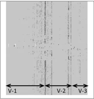
Figure 44 shows a heatmap with changes per software component of a software product (software for an ECU – Electronic Control Unit at Volvo Group). Each point shows the number of changed LOC per component per week on a logarithmic scale. The rows were organized by grouping architecturally dependent components together.
4 Since the heatmaps show the actual code base we are not able to
provide component names or the time scales for the development
Figure 4. Heatmap for changes in the code (one subsystem) The diagram shows a positive evolution of a source code base – from an unstable source code to the stable one. There were three periods of lifecycle of this product. To the left, the first phase is the start-up where the code is quite unstable and changes are introduced at many components simultaneously (denoted V-1). In the middle there is the second phase where the development started to stabilize and was release based (the vertical lines in revisions, V-2). Finally, in the right hand side of the figure the development becomes more scope-based where only subset of components is worked on at a time (V-3, which is similar to the pattern in Figure 3). To the very right of the figure we could even see the trend of working with selected components at a time, which shows more evolutionary development of the product.
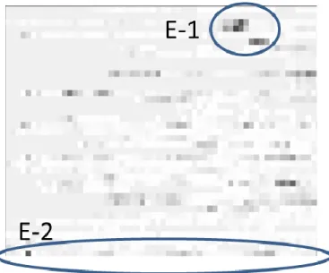
Figure 5 shows a heatmap with changes of code for one subsystem in a telecom node. The pattern is unlike the one in the Figure 4 since the ways of working were different. In this case, the company – Ericsson – used a proprietary Agile+Lean software development process with continuous builds and integrations (Streamline development).
projects. This is due to the confidentiality agreements with the companies.
Figure 5. Heatmap of changes in the code (one subsystem) This heatmap shows that this development was done on a stable code base since the changes are grouped to a subset of components at a time – we could see that the dark areas with large changes occur in periods without the “release” pattern as in the heatmaps in Figure 4 – for example area E-1. Some components (e.g. area E-2) change continuously and those were also identified by designers as the unstable ones.
Figure 6 presents a heatmap for one entire system of one of the products at Saab AB, which had a code base similar in size to the products presented in the previous two heatmaps. The development process in the company was structured around the V-model for the whole project with multiple teams working according to Agile principles.
Figure 6. Heatmap of changes in the code (the entire system, one row represents one component)
The heatmap in Figure 6 shows two distinct phases in the product development: development phase (S-1) and test phase (S-2). This was confirmed by discussions with the company representatives that the development is quite intensive and the testing is about fixing defects in the product. The development is spread all over the product and there are a few components which are developed constantly (the components with virtually constant changes, for example S-3). Since this company worked according to the V-model, this pattern corresponds to the main product development pattern in Figure 3.
In short the three heatmaps show that code changes indicate the ability of the company to continuously integrate or release products given their development processes. Unstable code base with many parallel and distributed changes could make it hard to continuously assure high quality of the software whereas stable code base with changes collocated to specific components were aligned with the desired patterns for continuous deployment.
C. Follow-up analyses: data validation
The heatmaps presented in section B required deeper analysis to validate whether the patterns identifying stable and unstable periods reflect designers’ views on the periods (empirical metrics validation according to Fenton [21]) as well as understand whether there are correlations between change bursts and number of defects (using Pearson’s correlation coefficient).
1) Interviews
Since this project was conducted according to the principles of action research [12] where the researcher was a part of operations of each company, we were able to validate the data based in ongoing projects. At each company we asked the practitioners to identify two components – one which changes very often (considered unstable) and one which changes relatively seldom which could be considered as a stable component. We created graphs with change history and number of changed LOC in the programs, which we discussed with the designers or architects who worked with these components. We asked the question whether this change history corresponds to their understanding of stable/unstable periods.
During the interviews, the respondents identified the need to link the change patterns to defect inflow profiles to be able to predict whether large changes lead to quality problems.
2) In-depth change analyses
In order to perform the first analysis of correlations between the changes and the defect inflow we summed all changes per week and the sum of all reported defects per week. An example of this chart is presented in Figure 7 where the data comes from Volvo Group - the scales are removed due to confidentiality reasons.
Figure 7. Total changes (solid line) and defect inflow (dotted line) per week. Each measure is on different scale.
In the figure we observe the time shift between large changes in the subsystem and the defect inflow in the project. This trend shows (which was confirmed by the practitioners at the company) that the testing was done with approximately this time shift. This shows that even this simple indicator of total number of changed lines of code can be a good predictor of defects in the project. The defect inflow and changed lines of code presented in Figure 7 were not correlated since the changes came from one subsystem while the defect inflow came from the entire system. Despite that, the discussions with the designers confirmed the validity of this time-shift pattern is valid since the amount of time between the two largest peaks happened at the same period as handing over the subsystem to system testing.
A similar analysis at Saab AB, where we had the possibility to filter the defect inflow data per component, the analysis showed significant Person’s correlations at 0.5 - 0.7 levels for 6 components (pairwise) during a period of 1-7 months. These time periods corresponded to handing over periods between system construction and system verification, and the significant correlations showed that there is a connection between the amount of change in the components and the number of defect inflow from these components.
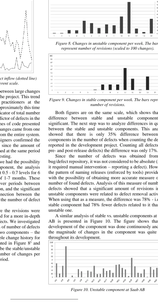
Finally, Ericsson had a process where the revisions were tagged with defect numbers, which allowed for a more in-depth analysis of links between changes and defects. We investigated whether there is a large difference in terms of number of defects reported in defect database between the two components – the stable one and the unstable one. An example change history for stable and unstable components is presented in Figure 85 and Figure 9. The components were judged to be the stable/unstable by experts and by measuring the total number of changes per component within the latest 1-7 months period.
5 In figures 8-13 the scale is rescaled to 100 to show the magnitude of
changes, but not to reveal the real values.
Figure 8. Changes in unstable component per week. The bars represent number of revisions (scaled to 100 changes).
Figure 9. Changes in stable component per week. The bars represent number of revisions.
Both figures are on the same scale, which shows that the difference between stable and unstable components is significant. The next step was to analyze differences in quality between the stable and unstable components. This analysis showed that there is only 35% difference between the components in the number of defects when counting the defects reported in the development project. Counting all defects (i.e. pre- and post-release defects) the difference was only 17%.
Since the number of defects was obtained from the bug/defect repository, it was not considered to be absolute (since it required manual intervention – reporting a defect). However, the pattern of naming releases (enforced by tools) provided us with the possibility of obtaining more accurate measure of the number of found defects. Analysis of this measure of number of defects showed that a significant amount of revisions in the unstable components were related to defect removal activities. When using that as a measure, the difference was 78% - i.e. the stable component had 78% fewer defects related to it than the unstable one.
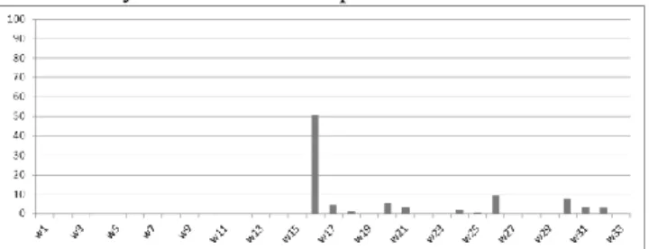
A similar analysis of stable vs. unstable components at Saab AB is presented in Figure 10. The figure shows that the development of the component was done continuously and that the magnitude of changes in the component was quite high throughout its development.
The corresponding stable component at the same company and product on the same time scale is presented in Figure 11. The pattern shows that the magnitude of changes was considerably lower for that component.
Figure 11. Stable component at Saab AB
The visual analysis of the trends shows that the pattern of change in stable and unstable components is similar to the corresponding components at Ericsson. Figure 11 shows that a stable component has been developed during week w16 and later on the functionality was added gradually.
Number of changes of LOC in an unstable component at Volvo Group is shows in Figure 12. The trend is similar to the trend in unstable components at Saab AB and Ericsson – considerable amount of changes throughout its lifecycle.
Figure 12. Unstable component at Volvo Group
Figure 13 shows the trend of changes in the stable component at Volvo Group, which again is similar to the trend of stable components at Saab AB and Ericsson – distinct periods of development of component.
Figure 13. Stable component at Volvo Group
The trend shows that there are two periods of development – the main functionality development in weeks 1-41 and the growth of functionality in weeks 80-90 and weeks 109-113. As the trend shows the second and third periods of growth result in considerable smaller code changes than the main period.
D. Impact – indicators of code stability
The results presented in the previous sections were found useful by the collaborating companies and led to establishing indicators of product stability at two of them. The purpose of the indicators is to notify software development teams about potential risks of too many/too large changes to code base in short time frames – which can lead to large number of defects cumulated in shorter time frames later in the development cycle.
The results presented in previous sections together with established research show that there is a close relation between defects in the code and changes of the code (e.g. [11, 22]). What is more, the analysis of differences between primary defect measures (release names) and secondary defect measures (defect reports) showed that the revision names are more reliable as measures. These results led to establishing of measurement systems [18] which serve as early warning of quality risks and improve test analyses. The measurement system consists of Microsoft Vista gadgets with two information sets: top 5 components affected by changes and top 5 defects affecting the largest number of components. The heatmaps are used to put this information in context, the list of components helps to focus test efforts while the list of defects helps in prioritizing Root Cause Analysis efforts [23]. The gadget is shown in Figure 14.
Figure 14. MS Vista gadget for teams monitoring code stability The gadget shows top 5 component names with the number of revisions related to bug fixing during the last month (greyed due to confidentiality reasons). The link in the gadget (“Details & Heat Map”) opens a web page with detailed information about what was changed and statistics of the number of components that were affected by each bug fix. The information is used by the teams to prioritize test efforts and to identify components that “age” and need rework.
V.RELATEDWORK
Ball and Nagappan [11] studied the impact or relative code churn measures on software quality at Microsoft. Their work, based on the source code of MS Vista and MS Windows Server showed that these simple measures can predict defect-prone modules with high likelihood.
A similar study was conducted by Bell et al. [22] at AT&T on a product with 18 releases. Bell et al. checked whether there are other metrics that could improve the results of defect predictions and came to conclusion that the churn measures were indeed the strongest predictors.
Buse and Zimmermann [24] reported on a survey conducted at Microsoft where information needs were collected from 110 Microsoft designers, project managers and architects. Defect- and code stability related information was among the top information needs – what the managers would like to know. Not
only were these aspects important for the historical analyses, they were important for the future insights of the company. The survey from Microsoft shows that the indicators presented in our paper fill an important need in software industry.
IBM has also identified metrics related to technical product development (in line with the code stability indicator) as important for Agile software development [25]. In the category of technical progress, the indicators should show that there is a growth of the product. Our code stability indicators take it one step further and show how “controlled” this growth is.
Complementary measures to code stability should show the business aspects of software development, e.g. business value, which is one of important measures which should be used by Agile teams and companies [26]. The awareness of how the team contributes to the value is an important driver for the success of Agile projects. What the authors of the cited article postulate is similar to what we intend to achieve – provide key information without introducing manual work overhead. The focus of the cited article is on the customer value, whereas the focus of this article is on quality risk monitoring and predicting delivery time – both articles complement each other.
Another important measure which is claimed to stimulate agility in software development teams, and thus complement the technical aspects of code stability, is the RTF (Running Tested Features) measure, popular in XP [27]. This measure stimulates smart continuous deployment strategies and is intended to capture similar aspects as our release readiness indicator although in smaller projects.
A set of other metrics useful in the context of continuous deployment can be found in the work of Fritz [28] in the context of market driven software development organization. The metrics presented by Fritz measure such aspects as continuous integration pace or the pace of delivery of features to the customers – the metrics complement the indicators presented in this paper.
Visualization is considered important in agile development and Cockburn [29] propose the concept of an 'information radiator' which 'displays information in a place where passersby can see it'. However, Sharp et al in [30] studied the use that agile teams made of such visualization and found that it was mostly used for progress tracking with little to no application-specific information. Instead Sharp et al focus on the physical artifacts of story cards and how they are (physically) pinned to a wall to create a shared view and common understanding of the system under development. Sharp et al conclude that the social perspective is critical when developing methods and techniques to support agile teams.
This view is supported by the study of Whitworth et al [31]. Agile practitioners in that study considered 'information radiators' to be a source of inspiration, excitement and team cohesion. However, also in this case the visualization discussed was basically a burn-up chart, i.e. progress tracking. It seems possible that the group-based, reflective discussions that our use of heatmaps created could be of general use in strengthening the social processes both in agile development, but also in more plan-driven development approaches. The quality patterns it can
help reveal could complement the progress tracking described in existing research.
VI.CONCLUSIONS
Focusing on customer value and continuous delivery of functionality in short cycles has gained significant popularity in the software development industry. Modern software development companies address the need for continuous deployment using diverse means – Agile and Lean software development principles being prominent examples. With the focus on end-user features the companies usually need to control the stability of the product as a whole, in particular to control risks towards service degradation or faulty new features.
In this paper we presented a method for quantifying and visualizing code stability using heatmaps. The method was evaluated through action research projects at three companies developing embedded software products – Ericsson AB, Volvo Group, and Saab AB. The results showed that code churn and change bursts measures (previously used by Microsoft to predict post-release software quality) can be effectively used to identify risky components and, in consequence, help prevent degradation of product quality.
The presented method effectively supports software development teams and their management in discussing and reasoning about their development practices. The discussions at the companies and the introduction of daily monitoring of code stability at Ericsson showed that this method is indeed useful for the companies.
In our further work we are focusing on adding multiple dimensions to these metrics – for example code complexity, development breadth, or test coverage.
ACKNOWLEDGMENT
This research has been carried out in the Software Centre, Chalmers, Göteborgs Universitet and Ericsson AB, Saab AB, AB Volvo.
REFERENCES
[1] X. Wang, K. Conboy, and O. Cawley, "“Leagile” software development: An experience report analysis of the application of lean approaches in agile software development," Journal of Systems and Software, vol. 85, pp. 1287-1299, 2012.
[2] S. Jeff, V. Anton, B. Jack, and P. Nikolai, "Distributed Scrum: Agile Project Management with Outsourced Development Teams," in System Sciences, 2007. HICSS 2007. 40th Annual Hawaii International Conference on, 2007, pp. 274a-274a.
[3] L. WILKINSON and M. FRIENDLY, The History of the
Cluster Heat Map vol. 63. Alexandria, VA, ETATS-UNIS: American Statistical Association, 2009.
[4] T. Alette and V. E. Fritzon, "Introducing Product and Process Visualizations to Support Software Development," MSc Master Thesis, Department of Computer Science and Engineering, Chalmers University of Technology, 2012.
[5] P. Trott, Innovation management and new product
development, 4th ed. Harlow, England ; New York: Financial Times/Prentice Hall, 2008.
[6] J. Bosch, "From software product lines to software ecosystems," presented at the Proceedings of the 13th International Software Product Line Conference, San Francisco, California, 2009.
[7] M. Staron, W. Meding, G. Karlsson, and C. Nilsson,
"Developing measurement systems: an industrial case study,"
Journal of Software Maintenance and Evolution: Research and Practice, pp. n/a-n/a, 2010.
[8] International Standard Organization and International
Electrotechnical Commission, "ISO/IEC 15939 Software engineering – Software measurement process," International Standard Organization / International Electrotechnical Commission,, Geneva2007.
[9] M. Staron, "Critical role of measures in decision processes: Managerial and technical measures in the context of large software development organizations," Information and Software Technology, 2012.
[10] N. Nagappan, B. Murphy, and V. Basili, "The influence of organizational structure on software quality," in Software Engineering, 2008. ICSE '08. ACM/IEEE 30th International Conference on, 2008, pp. 521-530.
[11] T. Ball and N. Nagappan, "Use of relative code churn measures to predict system defect density," in 27th International Conference on Software Engineering, St. Louis, MO, USA, 2005, pp. 284-292.
[12] G. I. Susman and R. D. Evered, "An Assessment of the Scientific Merits of Action Research," Administrative Science Quarterly, vol. 1978, pp. 582-603, 1978.
[13] P. Tomaszewski, P. Berander, and L.-O. Damm, "From Traditional to Streamline Development - Opportunities and Challenges," Software Process Improvement and Practice,
vol. 2007, pp. 1-20, 2007.
[14] M. Staron and W. Meding, "Monitoring Bottlenecks in Agile and Lean Software Development Projects – A Method and Its Industrial Use," in Product-Focused Software Process Improvement, Tore Cane, Italy, 2011, pp. 3-16.
[15] N. Dzamashvili Fogelström, T. Gorschek, M. Svahnberg, and
P. Olsson, "The impact of agile principles on market-driven software product development," Journal of Software Maintenance and Evolution: Research and Practice, vol. 22, pp. 53-80, 2010.
[16] P. Duvall, S. Matyas, and A. Glover, Continuous Integration: Improving Software Quality and Reducing Risk: Addison-Wesley Professional, 2007.
[17] S. J. Towner, "Four ways to accelerate new product development," Long Range Planning, vol. 27, pp. 57-65, 1994.
[18] M. Staron, W. Meding, and C. Nilsson, "A Framework for Developing Measurement Systems and Its Industrial Evaluation," Information and Software Technology, vol. 51, pp. 721-737, 2008.
[19] M. Staron and W. Meding, "Using Models to Develop Measurement Systems: A Method and Its Industrial Use," presented at the Software Process and Product Measurement, Amsterdam, NL, 2009.
[20] W. Meding and M. Staron, "The Role of Design and Implementation Models in Establishing Mature Measurement Programs," presented at the Nordic Workshop on Model Driven Engineering, Tampere, Finland, 2009.
[21] N. E. Fenton and S. L. Pfleeger, Software metrics : a rigorous and practical approach, 2nd ed. London: International Thomson Computer Press, 1996.
[22] R. M. Bell, T. J. Ostrand, and E. J. Weyuker, "Does measuring code change improve fault prediction?," presented at the Proceedings of the 7th International Conference on Predictive Models in Software Engineering, Banff, Alberta, Canada, 2011.
[23] B. Andersen and T. Fagerhaug, Root cause analysis : simplified tools and techniques. Milwaukee, WI: ASQ Quality Press, 2000.
[24] R. P. L. Buse and T. Zimmermann, "Information Needs for Software Development Analytics," presented at the 34th International Conference on Software Engineering (ICSE 2012 SEIP Track), Zurich, Switzerland, 2012.
[25] N. Ward-Dutton. (2011, Software Econometrics: Challenging
assumptions about software delivery. IBM.com podcast companion report.
[26] D. Hartmann and R. Dymond, "Appropriate agile
measurement: using metrics and diagnostics to deliver business value," in Agile Conference, 2006, 2006, pp. 6 pp.-134.
[27] R. Jeffries. (2004). A Metric Leading to Agility. Available: http://xprogramming.com/xpmag/jatRtsMetric
[28] T. Fitz. (2009). Continuous Deployment at IMVU: Doing the impossible fifty times a day. Available: http://goo.gl/qPT6 [29] A. Cockburn, Agile software development: the cooperative
game: Addison-Wesley Professional, 2006.
[30] H. Sharp, N. Baddoo, S. Beecham, T. Hall, and H. Robinson, "Models of motivation in software engineering," Information and Software Technology, vol. 51, pp. 219-233, 2009. [31] E. Whitworth and R. Biddle, "The social nature of agile
teams," presented at the Agile conference (Agile), 2007. .