DATA CLEANING ON EDGE
A Thesis by
MAYURESH BASAVARAJ HOOLI
Submitted to the Office of Graduate and Professional Studies of Texas A&M University
in partial fulfillment of the requirements for the degree of MASTER OF SCIENCE
Chair of Committee, Rabi Mahapatra Co-Chair of Committee, Vivek Sarin
Committee Members, Krishna Narayanan Head of Department, Scott Schaefer
December 2019
Major Subject: Computer Engineering
ii ABSTRACT
Internet of Things (IoT) has become a game changer and has facilitated the creation of new ecosystems and business models that are impacting every aspect of human life today. AI has stamped itself as the key component of these emerging ecosystems. The data generated by these ecosystems and the machine learning algorithm together act as the brain through a centralized cloud model. However, to address the challenges of critical applications requiring low latency and to take advantage of private data, the machine learning is shifting from centralized cloud system to the distributed edge. The ML models are as good as the input data and hence, quality of data becomes the key success factor which facilitates the need for real time cleaning at the edge. The techniques used today require manual intervention to clean the data and the ones that are completely automated do not work efficiently. The two-phase process proposed in this research combined two different techniques that complement each other well to remove almost all the outliers. The first phase prepares a base for the second phase to avoid overfitting, while the second phase splits the data into subsets based on the trends to remove the outliers. The data is then imputed which gives us a near-perfect representation of the cleaned data in a completely automated way. We compare the two techniques we have derived through this technique with the standard algorithms and find that both these algorithms are a lot better than the standard algorithms. This is a univariate technique and can be transformed into a multivariate technique through an ensemble method with which we can clean the entire data set and get a better representation of the complete data. This technique is useful not
iii
just in the IoT domain but can also be used in the Telecom domain where data driven decisions at the Edge are becoming critical through the advent of 5G. This algorithm also facilitates auto-ML and federated learning.
iv DEDICATION
This is dedicated to all the Data Scientists in the industry who spend long hours in the industry trying to figure out the data set. Without my former job as a Data Scientist and without the support of the Data Scientists around me, this research would have been very difficult to complete.
v
ACKNOWLEDGEMENTS
I would like to thank my committee chair, Dr. Rabi Mahapatra, co-chair, Dr. Vivek Sarin and committee member Dr. Krishna Narayanan, for their guidance and support throughout the course of this research. I would also like to thank Dr. Atlas Wang, Dr. Hank Walker and Dr. N. K. Anand for their support and a special thanks to Seunghyun Shim and Jyotikrishna Dass for helping me with this project.
Thanks go to my friends Nikhil Deshpande, Krati Rokadiya, Mathew Jerome, Aditya Wagholikar, Pejman Honarmandi, Mary Krath and Vamshi Krishna Vemula for their moral support.
Thanks also go to all my other friends and colleagues and the department faculty and staff for making my time at Texas A&M University a great experience.
Finally, thanks to my mother, father, Dr. Rajan Nikam, Dr. Uday Wali, Mr. Ajit Sarnaik, Dr. Abhay Hake, Dr. S. Jayaprakash and Mr. Pulin Chhatbar for their encouragement.
vi
CONTRIBUTORS AND FUNDING SOURCES
Contributors
This work was supervised by a thesis committee consisting of Dr. Rabi Mahapatra [advisor], Dr. Vivek Sarin [co-advisor] and Dr. Hank Walker of the Department of Computer Science and Dr. Krishna Narayanan of the Department of Electrical and Computer Engineering.
The data analyzed for Chapter 3 was provided by Mr. Ajit Sarnaik of Cognito Networks.
All other work conducted for the thesis was completed by the student independently.
There are no outside funding contributions to acknowledge related to the research and compilation of this document.
vii
NOMENCLATURE
IoT Internet of Things
AI Artificial Intelligence
5G 5th Generation Cellular Network Technology
WSN Wireless Sensor Network
IQR Interquartile Range
Loess Local Regression
SVM Support Vector Machine
SVR Support Vector Regression
viii TABLE OF CONTENTS Page ABSTRACT ... ii DEDICATION... iv ACKNOWLEDGEMENTS ... v
CONTRIBUTORS AND FUNDING SOURCES ... vi
NOMENCLATURE ... vii
TABLE OF CONTENTS ... viii
LIST OF FIGURES ... x
LIST OF TABLES ... xii
CHAPTER I INTRODUCTION ... 1
Motivation ... 1
Basis and the Dawn of New Machine Learning Models ... 3
Perishable Insights ... 6
Challenges Today ... 8
CHAPTER II SYSTEM ARCHITECTURE ... 10
Device Layer ... 11
Edge ... 12
Cloud ... 14
CHAPTER III LITERATURE REVIEW ... 16
Errors with Standard Data Sets ... 16
Outlier Analysis ... 17
Global Outliers ... 17
Contextual Outliers ... 18
ix
CHAPTER IV STANDARD TECHNIQUES ... 21
Outlier Analysis Using IQR ... 21
Loess ... 22
Rule-based Data Cleaning ... 23
Ensemble SVR for Time Series Analysis ... 24
Data Cleaning Tools ... 26
Autoregressive Models... 27
Techniques and Their Uses ... 29
CHAPTER V PROPOSED TECHNIQUES ... 30
First-Phase of Outlier Treatment ... 30
Split Data Set into Subsets ... 37
Phase-II of Outlier Treatment ... 42
Data Imputation ... 45
CHAPTER VI EXPERIMENT AND RESULTS ... 48
Test Setup ... 48
Test Results ... 48
CHAPTER VII SOLUTION AND CONCLUSION ... 59
CHAPTER VIII FUTURE SCOPE ... 61
Multivariate Analysis ... 61
Telecom ... 62
Benchmark ... 62
x
LIST OF FIGURES
Page
Figure 1 Internet Connected Devices Today ... 2
Figure 2 Ericsson Mobility Forecast ... 4
Figure 3 Different Stages of Machine Learning Process ... 5
Figure 4 The IoT Ecosystem ... 6
Figure 5 The IoT System Architecture ... 10
Figure 6 Types of Edge Networks ... 13
Figure 7 Sample data set (log transformed) ... 18
Figure 8 Contextual Outliers ... 19
Figure 9 Collective Outliers ... 20
Figure 10 Outliers Using IQR ... 21
Figure 11 A sample Loess Regression ... 23
Figure 12 Sample Ensemble SVR Where the Outlier Is Detected ...26 Figure 13 Cleaned Data after the Outliers Have Been Removed Using the IQR Rule ...32
Figure 14 Cleaned Data after the Outliers Have Been Removed Using the SVR ... 33
Figure 15 Cleaned Data after the Outliers Have Been Removed Using the s-SVR ... 36
Figure 16 First Difference between Consecutive Points ...38
Figure 17 A Figure When the First Difference Is at a Frequency of 5... 40
Figure 18 A Figure When the First Difference Is at a Frequency of 25 ... 40
Figure 19 Linear Regression for Phase-2 ... 42
Figure 20 SVR for Phase-2 ... 43
Figure 21 Loess for Phase-2 ... 44
xi
Figure 23 Clean Data with IQR Phase-1 ... 47
Figure 24 Data Cleaning Using Loess (Span=0.75) ...50
Figure 25 Data Cleaning Using Loess (Span=2) ...51
Figure 26 Data Cleaning Using Loess (Span=0.075) ...52
Figure 27 Data Cleaning Using Loess (Span=0.0075) ...52
Figure 28 Data Cleaning Using Loess (Span=0.00075) ...53
Figure 29 Data Cleaning Using ARIMA (log transformed) ...54
xii
LIST OF TABLES
Page
Table 1 Comparison of Outlier Removal Techniques ... 29
Table 2 Proposed Technique vs. Standard Techniques for Outlier Removal ... 56
Table 3 Effect on Actual Data and Imputation ... 57
1 CHAPTER I INTRODUCTION
Motivation
Internet of Things has been a buzzword for many years. With the advent of Internet of Things, IDC projects that the amount of data created by the connected devices consisting of smart homes, heating systems, fitness trackers, vehicles and more will increase significantly. IoT devices will see a compound annual growth rate (CAGR) of 28.7% over the 2018-2025 forecast period and it has been estimated that there will be 41.6 billion connected IoT devices, or “things”, generating 79.4 zettabytes (ZB) of data in 2025. This growth will drive the need for edge computing for data collection and processing. Edge computing processes data close to the source, allowing real-time analysis and improves reliability, performance, and cost.
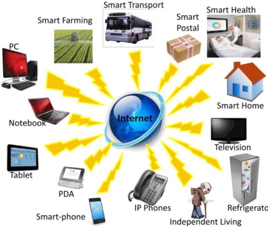
The volume of data generated by IoT Devices is growing as rapidly as the number of devices themselves. In some cases, the data from these devices is small, at times indicating only a single metric of a machine’s health, while in some other cases, large amounts of data are generated by devices like video surveillance cameras which use computer vision to analyze crowds of people. Figure 1 shows the myriad types of devices that will get connected to create new value system and help solving some complex problems and create new opportunities
2
Figure 1 Internet connected devices today. As we can see, a lot of devices are connected to the Internet today that were traditionally not. Reprinted with permission from [6].
As the volume of data generated is increasing and the economy becoming more and more data driven, the new breed of applications is demanding the need for faster response time and reduced latency. This is forcing the data processing (Analytics) to move from the cloud to the edge. At the same time, all these devices connect using different protocols which may or may not be reliable and the type of devices may at times generate noisy data. This noisy data which has been generated needs to be cleaned before being used by any Machine Learning models. The best way to clean the data is at the source itself and at devices closer to the source, namely the edge. Many of the devices may not
3
be intelligent to do that and cannot take care of the communication interference. Hence, ‘Cleaning at the Edge’ is becoming more relevant.
Another reason for shifting the data processing from cloud to edge is, not all the data is being shared to the cloud in the centralized cloud model. Hence, some of the insights may be missed. Edge processing will eliminate this drawback. Thus, demand for faster processing, lower latency and insights from the local data is motivating the new research for solving new breed of applications and identifying the new opportunities.
Basis and the Dawn of New Machine Learning Models
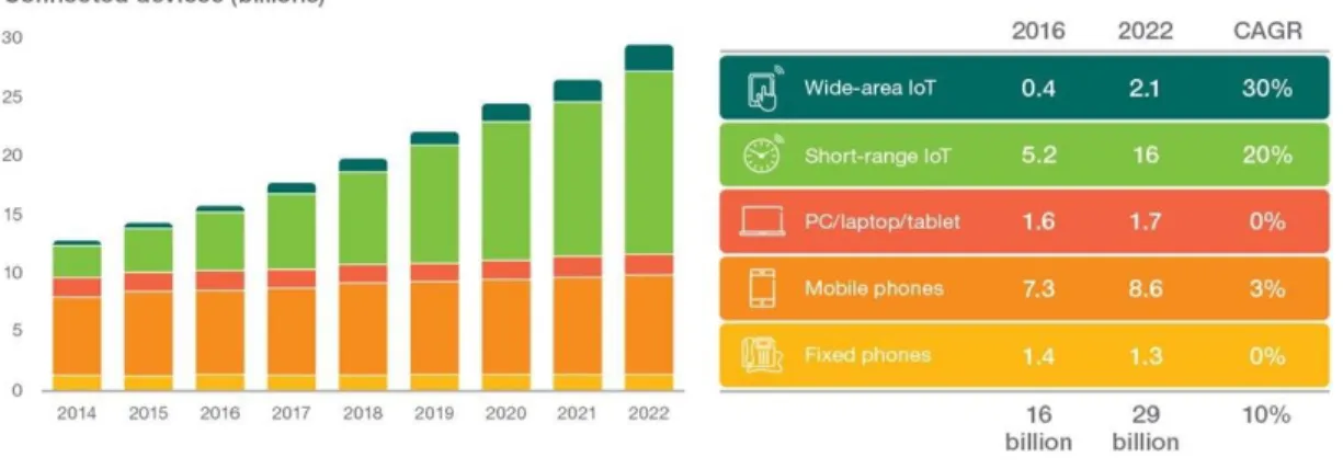
The significant consumer demand for higher speeds has led to the advent of 5G, which focuses on mobile broadband, low-latency communications and massive machine technologies such as autonomous vehicles (AV). 5G technology is truly ubiquitous, reliable, scalable, and cost-efficient, and has ushered in the age of IoT. According to Ericsson’s Mobility forecast, the number of Internet connected devices will grow to around 29 Billion by the year 2022. 18 Billion of these devices will be connected to IoT in some way, compared to just over 7 Billion people in the World we have today. We will have an average of almost 4 internet connected devices per person across the globe by 2022. From smart cars to smart agricultural tools, these devices have entered most aspects of our life and will continue to do so in the foreseeable future. This is illustrated in Figure 2 given below.
4
Figure 2 Ericsson’s Mobility Forecast. This explains the rise in the number of Internet connected devices from 2014 to 2022. As we can see, the number of devices will be twice as much in 2022 as they were in 2014 owing to the rise in short-range IoT devices. Reprinted with permission from [3].
All these devices will generate data, some of them just a small amount while others will generate a large amount. But just the data isn’t useful on its own. Decisions need to be taken based on this. After the data collection, the next thing is about making sense of the data to get the insights and make appropriate business decisions. Machine Learning models are being used for getting the insights from the data thus making Machine Learning as the central force for the new eco systems.
The conventional model of Machine Learning is to collect the data at the edge and transfer it to the centralized cloud server for the insights by training and running the ML models on the cloud. Following diagram describes the machine learning process:
5
Figure 3 Different stages of Machine Learning Process. The data received is then cleaned and prepared for analytics. The machine learning model is trained on this data and then tested to see if there are any improvements required.
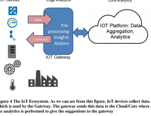
In the centralized cloud model, only the stage 1, data collection is done at the edge and then sent to the cloud. Rest of the stages are performed on the cloud. However, the centralized cloud model has some drawbacks which includes it not scaling well and the risk of data privacy as well as the delays in response. This is forcing the system to shift from the centralized cloud model to the distributed edge model. Figure 4 gives the overall perspective of the edge-based system. From the Figure 4 it can be noted that Edge computing allows data from IoT devices to be analyzed at the edge itself before it is being sent to the cloud. This helps in making local decisions thus avoiding the delays for critical applications. When the Machine learning and decision-making shifts to the Edge, it requires that all the Machine Learning stages of Figure 3 are also to be performed at the
6
Edge. This involves the process of data preparation and data cleaning. This distribution gives the advantage of federated learning.
Figure 4 The IoT Ecosystem. As we can see from this figure, IoT devices collect data which is used by the Gateway. The gateway sends this data to the Cloud/Core where the analytics is performed to give the suggestions to the gateway
Perishable Insights
Forrester defines perishable insights as urgent business solutions (risk and opportunities) that firms can only detect at a moment’s notice. Many IoT solutions use analytics that they obtain from the Cloud. By processing the data streams on the edge, we can reduce the amount of uploaded data as well as the time it takes to upload and process it and take advantage of the private data that is not shared on the Cloud.
7
Streaming analytics solutions can help firms detect and act on a moment’s notice. Streaming analytics enables the detection of such insights in high-velocity streams of data to perform actions on them in real-time. The stream analytics should not be dismissed as a form of traditional analytics for postmortem analysis. In fact, stream processing analyzes data ‘right now’ to make applications of all kinds contextual and smarter.
The perishable nature of the data is when the data depreciates in value over time. This decay period may span from a few seconds to a few decades. Based on different applications, the timeline for the decay may change. For example, the machine fault detection in industry requires highly real-time monitoring data stream, while the face recognition or verification may just need an image database that is not too outdated. The freshness of the data impacts the service quality and leads to greater profits. We focus on examining the perishable external data that a service provider controls, e.g., the cloud image database for face verification. If the external data includes the service provider’s own cloud databases which are perishable, it is known as perishable service. Otherwise, it is simply called nonperishable service.
This makes it important to move the analytics from the Cloud to the Edge. With the perishability of data, it is important that not just the Machine Learning algorithms, but the entire data science process is shifted from the cloud to the Edge which includes data cleaning and preprocessing. While the cleaning on the cloud is mostly done manually in the industry today, the perishability of the data requires an automated cleaning technique on the Edge to make use of the data.
8
Challenges Today
Most of the Machine Learning models used today are developed using standard data sets. These data sets are usually cleaned and may not tell the entire story behind how the data was collected on the field. This causes a gap in requirements of the academia and the industry. The data generated by the industry is almost always dirty. Billions of Dollars are spent every year and thousands of Data Scientists are hired who spend most of their working hours cleaning the data. The purpose of this research is to bridge the gap between academia and the industry by cleaning the data in real time after which the insights can be identified without spending time on the preprocessing step. This would help improve the efficiency of the industry and companies can use the algorithms developed by the academia directly.
There are many different types of errors in a dataset, but for the purpose of this research on Edge devices, we focus on the outliers and the NULL values as the two main types of errors. Outliers are defined as the values that are far removed from the rest of the data set. But these are only one type of outliers. There are two other types of outliers: contextual and collective which we will study and remove in this research.
There are many standard algorithms available today for outlier removal. These algorithms do not accurately remove all the outliers. Most of these techniques do not remove collective outliers while the ones that do remove them, take a lot of the actual data with them as well. We derive a two-phase hybrid process where two of these techniques complement each other and remove all three types of outliers. These algorithms are tested against the standard algorithms to identify the amount of improvement we have over those
9
algorithms. While none of these techniques impute the NULL values, these two-phase hybrid techniques can identify the trend and impute the NULL values to get the closest possible representation to the actual data set.
10 CHAPTER II
SYSTEM ARCHITECTURE
IoT is growing at an exponential rate. There are sensors in nearly every household today. Many of these sensors are connected to the Internet as to enable them to take decisions remotely. These sensors are not directly connected to the Internet and need a gateway in between. We call this gateway as the Edge. The gateway then sends the data it collects from the sensor devices to the Cloud where the decisions are taken and sent back to the sensors through the gateway. Based on this, we divide the IoT System into 3 parts as shown in Figure 5:
Figure 5 The IoT System Architecture. This diagram explains the 3 different parts of the IoT system, the device layer, where the data is collected, the Edge, where the initial data is stored and the Cloud where the data is processed. The edge is important to enable the device layer to connect to the internet where it can send data to the Cloud.
11 Device Layer
IoT Devices, usually referred to as ‘Smart Devices’ or ‘Sensor Nodes’ in IoT terminology, are the small, memory-constrained, often battery-operated electronics devices with onboard sensors and actuators. These could either function as standalone sensing devices or be used as part of a larger system for sensing and control. These devices are typically deployed in an environment that require communication and collaboration between themselves. Such an environment is part of the IoT ecosystem. Three main capabilities of a typical IOT device are:
• sense and record data • perform light computing
• connect to a network and communicate the data
Communication of the data is normally with wireless protocols like ZigBee, Wi-Fi, BLE, Z-Wave, LoRa etc. But with the advent of 5G, the cellular body’s like 3GPP are trying to push 5G for device communication. The devices get connected to each other either directly or through the gateway using combination of wireless protocols thus forming what is called as Wireless Sensor Network (WSN). WSN is often a technology used within an IoT eco-system where a large collection of sensors, as in a mesh network, can be used to individually gather data and send data through a gateway to the internet in an IoT system. In some cases, IoT eco-system also consist of wired sensor devices.
Examples of IoT devices include fitness trackers, agricultural soil moisture sensors, medical sensors for measuring blood glucose levels and more.
In the case of Industrial IoT, the legacy machines are now being modernized by adding a digital layer consisting of IoT devices to communicate some of the machine parameters to the Analytics layer of Edge or to the cloud through Edge.
The data is generated by these wireless (or at times wired) devices. These devices, then send the data to the Edge where they can be processed. In a few cases, the process is done at the Device itself. Sometimes, the devices have microprocessors or microcontrollers which enable the preprocessing step to be completed on the device itself before sending the cleaned data to the Edge.
Edge
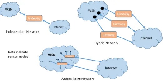
Edge is a gateway for the IoT devices to connect to the Internet (Cloud). The connection between the WSN and the Internet happens through the edge. It is referred to as ‘Gateway’ device because it connects the two heterogeneous networks i.e. WSN on one side (south bound) and IP (Internet Protocol) on the other side (North bound). Figure 6 describes few of the ways in which the WSN connects to the Internet.
13
Figure 6 Types of Edge Networks. Independent, Hybrid and Access Point Networks are the three types.
For example, in home automation, we have access point to help us connect our devices to the Internet.
The gateway contains a microprocessor or a microcontroller which enables it to perform computations. It may also contain memory to store the data temporarily. Thus, we can perform low power computations on the gateway device. Now with the new kind of applications and use cases that require low latency and real time responses in cases like Industrial control etc., the requirement is to move some part of ‘Intelligence’ (Analytics) to the Edge (Gateway). Hence the new generation of Gateway devices are more powerful with more computing power and more memory. Hence, the gateway devices have become more generic and now being referred as ‘Edge’ Devices.
14
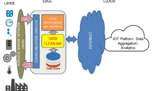
The Edge devices today have more computing power than ever before, and their storage capacity has been increased significantly over the last few years. With this, a lot of machine learning algorithms are being developed at the Edge to make use of the perishable data as well as the private data. This gives a better insight and helps localize the problem statement. Localization of problem statement is critical as there may be different requirements for different Edges. The edge-based distributed learning is becoming a reality every passing day. Since we are moving the Machine Learning algorithm on the Edge, we need to move the Data Cleaning component as well as designing algorithm for data cleaning at the edge is our area of research.
Cloud
Internet of Things (IoT) generate a huge amount of data. The raw data that is collected from the sensors is not too useful on its own. We need to get the insights from this raw data which require several steps of converting the raw data into useful data including the step of ‘Cleaning the data’. The data need to be stored prior to processing which will require database and analytics engine and other IT infrastructure. Cloud infrastructure is used for the purpose.
The cloud will lower the entry bar for providers who lack infrastructure. It will make it easier for such innovators to join the IoT revolution and offering a ready-made infrastructure into which they can just plug in their devices and services. The cloud will help in analytics and monitoring that will help to provide a more seamless experience. The cloud will smoothen inter-service and inter-device communications.
15
The very nature of the Internet of Things is to demand infrastructure around reliability, connectivity, and computing power. However, cloud technologies can deal with these concerns and bring up the world where everything is connected. The Cloud will be the backbone of the IoT revolution. It will play a huge role in improving accessibility and lowering barriers to entry. With the advent of Edge-based distributed processing, the Cloud can be used to enable Federated Learning.
16 CHAPTER III LITERATURE REVIEW Errors with Standard Data Sets
The Machine Learning Algorithms usually require reliable and accurate data. Inaccurate data cannot be used to test the efficiency of a machine learning algorithm. The results obtained from data sets with NULL values and outliers may confuse these algorithms and would return inaccurate results. Thus, we first run the data through the data cleaning process. Data Cleaning is the process of removal and/or correcting the dirty data of a data set. Whenever data is collected or stored, the occurrence of errors is inevitable. These errors cause the Machine Learning algorithm to fail. Clean data helps minimize these errors by identifying and eradicating dirty data. It is a valuable process that allows companies to save time and money, and at the same time increase the efficiency of their transactions.
The presence of NULL values and outliers is especially true with the real-time data. A data transmitted in real-time may be easily affected by a variety of issues. There may be errors with the communication, or the sensors may not work as intended. As such, the data collected is highly inaccurate and the entire process would fail. As the real-time systems require perishable insights, the latency becomes critical and thus the data needs to be cleaned at the edge itself. We have identified NULL values and outliers as the two most important issues with any data set and the focus of this paper is to identify and possibly replace them with the closest possible real value.
17
Outlier Analysis
Outliers are data points that differ significantly from the other points in the data set. An outlier is defined as an observation which deviates so much from the other observations as to arouse suspicions that it was generated by a different mechanism. Outliers are also referred to as abnormalities, anomalies, discordant or deviants. In most applications, the data is created by one or more generating processes that reflect the activity or collect the observations. When the generating process behaves unusually, it results in the creation of outliers. Thus, the outlier may, at times contain useful information as well. On the other hand, they may also be present to indicate experimental error. This may cause problems to the statistical analysis.
While NULL values are just blank values in the data set and are easy to identify, outliers are a whole different thing. While we call extreme values as outliers, they are not the only type. There are 3 different types of outliers:
Global Outliers
A point in a data set is considered a global outlier if the value very different from the rest of the data set. This is the simplest type of outlier and the focus of majority of the research on outlier analysis. These outliers can be easily observed in a data set. Removing them is straightforward and does not require a whole lot of computation.
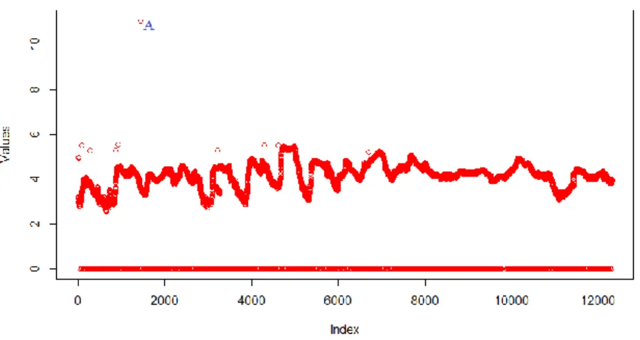
Consider Figure 7 given below. All the points at 0 are global outliers since they are completely anomalous from the rest of the data set. The point A is also a global outlier as it lies far away from the rest of the data.
18
Figure 7 Sample data set (log transformed). In this data set, we observe that points at 0 and the point A are global Outliers as they are far removed from the rest of the data set.
Contextual Outliers
A data point is considered Contextual outlier if the value deviates from the rest of the data in the same context. The context is always data specific and is usually specified as a part of the problem. In a time-series data, the time is the context which determines the position of the instance in the entire sequence.
Contextual outliers have been most commonly explored in a time-series data or spatial data. As an example, a temperature of 90F may be common during summer, but would be an outlier in winter.
Applying a contextual outlier detection technique makes sense if contextual attributes are readily available and therefore defining a context is straightforward. But it becomes difficult to apply such techniques if defining a context is not easy.
19
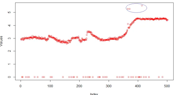
As shown in the Figure 8, we see that the points in blue are contextual outliers while the ones in green are global outliers. Contextual outliers are not global outliers which can be easily detected.
Figure 8 Contextual Outliers. The points are the same as in Figure 7 but zoomed in to show points from 501 to 1000. Here, the global Outliers are present at 0, but we also have the Outliers given in blue. These are the contextual Outliers as they are outliers in the context of this data.
Collective Outliers
A set of data points is considered a collective outlier if the points vary from the entire data set, but do not fall under the category of global or contextual outliers. An individual point in a collective outlier may not be an outlier to themselves, but their collective occurrence is what makes them anomalous.
20
Collective outliers have been explored for sequence data, graph data, and spatial data. While global outliers can occur in any data set, collective outliers can occur only in data sets in which data instances are related. On the other hand, occurrence of contextual outliers depends on the availability of context attributes in the data. A global outlier or a collective outlier can also be a contextual outlier if analyzed with respect to a context.
Figure 9 shows us the collective outliers in the data set from Figure 7. The points that are in blue are collective outliers while the ones at 0 are global outliers.
Figure 9 Collective Outliers. The points are the same as in Figure 7 but zoomed in to show points from 3101 to 3300. Here, the global outliers are present at 0, and the contextual outlier is in green. In addition to this, we have another set of outliers given in blue. These are the collective Outliers and as we see here, they appear together.
21 CHAPTER IV
STANDARD TECHNIQUES Outlier Analysis Using IQR
Outliers are usually detected using IQR rule, but as we will see in the next part, these are only one type of Outliers. This is the most basic type of outlier detection technique though this may not detect all the outliers. The interquartile relationship is given by
IQR = Q3 − Q1 (1)
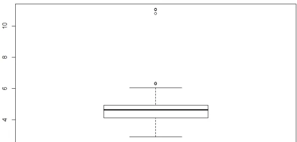
Figure 10 illustrates simple outliers in a data set as well as the box plot to identify outliers.
22 Loess
Loess/Lowess is short for Local Polynomial Regression, also known as Moving Regression. Loess is a nonparametric method as the linearity assumptions of conventional regression methods have been relaxed.
Non parametric methods are great tools for determining the shape of the graph. The oldest and the simplest non-parametric technique is the moving average. A local regression is far superior to the moving average. To obtain the smoothed value of Y at X=x, we take all the data having X values within a suitable interval about x and fit a regression to all these points. The predicted value of regression at these points is taken as the estimate of E(Y|X=x). Loess uses local weighted least squares method. The weights are chosen so that points near X=x are given the most weight in calculating the slope and the intercept. The points near the extremes receive almost no weight in the calculation of the slope and intercept. Because loess uses a moving straight line rather than a moving flat one, it provides much better behavior at the extremes of X.
Distance from x is controlled using the span setting α. The value of the span setting is usually set to 0.75, though it can be changed. If the span is too small then there will be insufficient data near x for an accurate fit, resulting in a large variance. On the other hand, if the span is too large than the regression will be over-smoothed, resulting in a loss of information, hence a large bias. The weights are given by a tricubic equation:
23
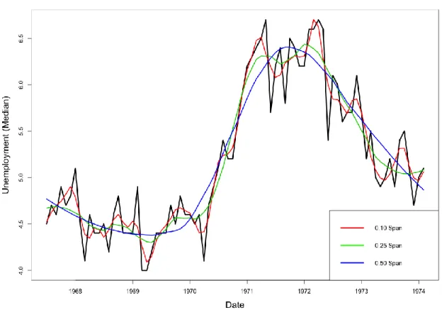
Loess can also look for outliers off the trend. It can then delete or reduce the weight of these apparent outliers to obtain a more robust trend estimate. The different points will appear to be outliers to this second trend. The new set of outliers is considered, and another trend is derived. A sample Loess Regression is observed in Figure 11.
Figure 11 A sample Loess Regression. The black line is the real data, while the blue line is 0.50 span smoothing, yellow is 0.25 span smoothing and red is 0.10 span smoothing.
Rule-based Data Cleaning
A system, called Bleach achieves real time violation detection and data repair on a dirty data stream. Bleach relies on efficient, compact and distributed data structures to
24
maintain the necessary state to repair data, using an incremental version of the equivalence class algorithm. Additionally, it supports rule dynamics and uses a cumulative sliding window operation to improve cleaning accuracy.
While this works well, the requirement in the processing power is significantly greater than the one available for Edge devices. As a real-time system, this requires low latency, so powerful machines are used for this. This makes it inappropriate for the Internet of Things domain where the Edge doesn’t have multiple powerful cores.
Ensemble SVR for Time Series Analysis
Support Vector Machine (SVM) is one of the more popular machine learning techniques used today. In SVM, we predict the classes based on the linear classifier that separates the points. This can also be used as a Regression technique by maintaining all the main features of the algorithm such as the max margin principle. Unlike SVM, where there may be only two classes, the output in SVR is a real number which are infinite numbers. We need to set the margin of tolerance in approximation to that of the SVM. The equation of SVR is given by 𝑦 = ∑(𝑎𝑖− 𝑎𝑖∗) ∙ ⟨𝑥 𝑖, 𝑥⟩ + 𝑏 𝑁 𝑖=1 (3)
The max margin principle of the SVR is good for linear data. Most of the real data that we find in the industry is non-linear. Thus, we need to find a way to solve it. In SVM,
25
we use the kernel trick to transform the data to a higher dimension where we would get a linear relationship. The same principle can be followed by a non-linear SVR
𝑦 = ∑(𝑎𝑖 − 𝑎𝑖∗) ∙ 𝐾⟨𝑥
𝑖, 𝑥⟩ + 𝑏 𝑁
𝑖=1
Where, K is the kernel
(4)
SVR is accurate by itself. But an ensemble technique is usually more accurate than the individual techniques that make up the regression. Bagging and Boosting are two popular ensemble methods that are used to combine the SVMs. The learning algorithm is run several times, each time with a different subset of the training set.
Bagging is the most straightforward way of manipulating the training data set. Bagging randomly selects a set of n samples from the training set. This is known as the bootstrap replicate of the original training set. The final decision of SVR bagging is given by
𝑆𝑉𝑅𝐵𝑎𝑔𝑔𝑖𝑛𝑔(𝑥) = 1
𝑇∑ 𝑆𝑉𝑅𝑖 𝑖(𝑥)
(5)
Boosting is a general method for improving the accuracy of any given learning algorithm. Boosting can boost a ‘weak’ learning algorithm to make it a strong algorithm. Each time we use boosting, the base algorithm generates a new weak prediction rule, and after multiple iterations, the boosting algorithm combines these weak rules into a single prediction rule that may be much more accurate than any one of the weak rules. Boosting is given by
26
𝑆𝑉𝑅𝐵𝑜𝑜𝑠𝑡𝑖𝑛𝑔(𝑥) = ∑𝑇𝑖=1[∈𝑡∙ 𝑆𝑉𝑅𝑡(𝑥)]/ ∑ ∈𝑡 𝑡 (6)
While this technique is powerful, it does not address the issue of real-time data. Ensemble learning is too computationally intensive to work well with real-time data where the latency becomes important. A sample Ensemble-SVR for Outlier detection is observed in Figure 12.
Figure 12 Sample Ensemble-SVR where the Outlier is detected
Data Cleaning Tools
There are several off the shelf data cleaning tools that helps in keeping the data clean and consistent to let organizations analyze data to make informed decision visually and statistically.
Most of these tools are used for visualization and identifying the parameters that need cleaning. They provide intuitive way of presenting the data and provide graphical tools to help in data cleaning. These tools will scan through your information and find the
27
data which stands out as being problematic. Depending on the system and your preferences, you can either have that data automatically scrubbed or replaced, or you can just have it flagged for manual review and updating.
These tools are enterprise tools and are not designed to work on edge devices. As an example, Tableau, which is a powerful visualization tool, can interpret data, merge the columns, create pivot tables and help with cleaning the data. However, it needs the user’s intervention in defining the process of cleaning.
In addition to this, Tableaus minimum system requirements include a Pentium processor or newer, 2 GB of Memory and 1.5 GB of disk space. These requirements may not always be met by Edge device.
The system requirements of Tableau, along with the fact that it is not enough on its own for data cleaning, makes this and other similar tools not suitable for edge computing and hence, there is need for building new algorithms to work on the edge.
Autoregressive Models
Autoregressive models are extremely useful in the context of univariate time series analysis. If X1, X2, … Xt are the values in the univariate time series, then the autoregressive
model for the value of Xt is defined in terms of the p values immediately preceding it.
𝑋𝑡 = ∑ 𝑎𝑖 ∙ 𝑋𝑡−𝑖+ 𝑐 + 𝜖𝑡 𝑝
𝑖=1
28
A model that uses the previous p values is referred to as an AR(p) model. The values of the regression coefficients a1, a2, … ap, c are learned from the training data,
which is the previous history of the time series. Here, the values of 𝜖𝑡 are assumed to be error terms, which are not correlated with the other terms. Since these error terms represent the unexpected behavior, they can be considered as candidates for the outlier score.
The autoregressive model can be improved even further by combining it with a moving average model. This model predicts the time series values as a function of the previous deviations. The moving average model can be written as
𝑋𝑡 = ∑ 𝑏𝑖 ∙ 𝜖𝑡−𝑖 + 𝜇 + 𝜖𝑡 𝑞
𝑖=1
(8)
In practice, we combine these two models to give the ARMA model which is given by 𝑋𝑡 = ∑ 𝑎𝑖 ∙ 𝑋𝑡−𝑖 𝑝 𝑖=1 + ∑ 𝑏𝑖 ∙ 𝜖𝑡−𝑖 + 𝑐 + 𝜖𝑡 𝑞 𝑖=1 (9)
In some cases, the time series may contain trends due to which the mean would change. This is known as the non-stationarity of time series. In this, the older data is not too useful over a time. For this, we de-trend the time series before using the ARMA model. This is known as the Autoregressive Integrated Moving Average (ARIMA).
29
Techniques and Their Uses
We have observed quite a few techniques for outlier analysis, but we haven’t seen how useful they are for different types of outliers that will be explained in Chapter IV. Table 1 gives us these details.
Techniques Global outliers Contextual Outliers Collective Outliers
IQR Rule ✓ × × Loess ✓ ✓ × SVR ✓ ✓ × Ensemble-SVR ✓ ✓ × Auto Regression ✓ ✓ × ARMA ✓ ✓ ×
30 CHAPTER V
PROPOSED TECHNIQUES
Removing all the outliers in one go is extremely difficult and time consuming. Not all three types of outliers can be removed easily. There is no one technique to remove all the outliers. As we saw in the table above, none of the standard techniques can remove all 3 types of Outliers. In fact, some suggest that the collective outliers cannot be removed at all. These techniques do not impute the data as well.
So, we look for a two-phase approach where the first phase removes certain outliers while the second phase removes the rest of the outliers. We need to keep in mind that these two phases need to supplement each other to give us the right results as they may target the same type of outliers. As in our case, we need to identify how the solution from phase-I can be built upon and improved by phase-II.
First-Phase of Outlier Treatment
The outliers that can be easily seen are removed through the first phase of outlier treatment. We identify two techniques for our first phase of outlier treatment: Interquartile Range Rule and SVR. The interquartile range rule is useful in detecting the presence of outliers. Outliers are usually vaguely defined and so, the IQR rule helps put some perspective into global outliers.
According to the IQR rule, any set of data can be described by its five-number summary. These five numbers consist of:
31
• The first quartile Q1 – which represents a quarter of the way through the list of all the data, also known as 25 percentile
• The median of the data set – which represents the midpoint of the list of all the data, also known as 50 percentile
• The third quartile Q3 – which represents three quarters of the way through the list of all the data, also known as 75 percentile
• The highest value of the data set, the maximum, also known as the 100 percentile
These 5 numbers tell us a lot about our data. It tells us not only the range, but also the interquartile range. The interquartile range is given by:
IQR = Q3 − Q1 (10)
To detect the outliers using this, we use do the following: • Multiply the interquartile range (IQR) by the number 1.5
• Add 1.5 x (IQR) to the third quartile. Any number greater than this is a suspected outlier.
• Subtract 1.5 x (IQR) from the first quartile. Any number less than this is a suspected outlier.
Upper = Q3 + 1.5 × IQR Lower = Q1 - 1.5 × IQR
32
IQR takes a relatively short time and is useful in removing only the global outliers. The contextual and collective outliers are relatively unaffected by this. The Figure 13 explains the outliers removed by this.
Figure 13 Cleaned data after the Outliers have been removed using the IQR rule. As we can see in the diagram, the contextual and collective outliers are still present in the data
As we see in Figure 13, time series data that we have is non-linear. Thus, linear models such as IQR rule do not have a big impact on the data. We need to find a non-linear technique to fit the data and identify the outliers. One of the most popular techniques for non-linear regression is Support Vector Regression. Support Vector Regression requires more time to run than IQR rule, but it would usually fit the data much better and would help sort out more outliers. Since all the points do not fit the data perfectly, we need
33
to define a range within which the points should lie. We define the range using the standard deviation of the prediction.
top = predicted + σ bottom = predicted – σ
(12)
The points below the bottom and above the top are considered as outliers and are removed. The Figure 14 illustrates the working of this algorithm:
Figure 14 Cleaned data after the Outliers have been removed using the SVR. As we can see in the diagram, while many of the Outliers are removed, some of the actual data points are removed as well. While this can be removed by trying to use a more accurate fit, it will take time due to which this technique is inefficient for real-time data.
SVR may be one of the best non-linear techniques, but as we see here, it needs to be tuned based on the data set. If the data set, we are working on has a high number of
34
variations, the fit won’t be accurate and as we see in the diagram above. The fit can be made more accurate by adjusting the parameters. But to do this, we need to spend more time. The complexity of SVR is of the order n3. So, to get a better fit on a data set, it would take a longer time for computation. To make the data fit the curve almost perfectly, it would take nearly 44 minutes in this case on a Laptop with Intel Core i7-4750 Processor running at 2.00 GHz and 16 GB RAM. That is why we look elsewhere for inspiration on how to run this algorithm.
To reduce the time required, we split the data and use the SVR and then combine the results. We call this technique split-SVR (s-SVR). This model gives us an additional margin of tolerance to the original margin. In dynamic environment, in which noise and real-time input data fluctuate, it is more appropriate to allow tolerance up to some point. This approach consists of three steps: splitting data, applying filter, and merging.
The time complexity of SVR is not linear. Splitting the original data given in Figure 7 into subsets of the same size serves one purpose: it allows to expedite training. In edge computing, process time is paramount. We split data and train s-SVR on the subsets of data to perform data cleaning. To obtain hyperparameters, cross-validation is performed. Once all the data has been cleaned, we merge them together. This process is plausible because we are merging the data and not merging s-SVRs. With the exponential time complexity of SVR, this process expedites the process, while lowering the computational cost. One disadvantage of the splitting is that we split the data based on the dataset. This is not a completely automated process.
35
After training a model on a subset of data, predicted values are available from e-SVR. The predicted values themselves are good reference points which approximately show how clean data should look like. Outliers may disturb this process but cross-validated hyperparameters prevent it from happening. Figure shows a subset of data and its corresponding predicted values. Since the predicted values are not completely accurate all the time, we add certain variation to this data. The standard deviation of the predicted values is represented by the two lines parallel to the fitted values. The offsets of the lines are computed as a standard deviation of the predicted values i.e. top filter and bottom filter are:
top = predicted + (σ of SVR) bottom = predicted – (σ of SVR)
(13)
respectively. These lines remove global outliers while also helping us to identify the contextual outliers. In Figure 15, it is observable that our filters have cleaned such outliers. In addition, this filter method is static method by nature which is computationally inexpensive, and it produces synergy effect with SVR. It provides safe margins to s-SVR. With this filter, users are less concerned about choosing hyperparameters for training. This is a basic first-phase technique and even though the curves do not fit the data perfectly, they are good enough to be able to remove outliers.
Now that the cleaning is done, the s-SVR model we have is no longer necessary. This is because the time-frame is a sliding window making the insights of this data perishable. We discard this model and move on to the next phase of the algorithm. Simple
36
array merging operation can complete this process. After merging the data, scaling up to the original scale is performed. In this work, simple antilog function is used. Figure below shows the outliers removed by s-SVR. It is observable that this cleaning technique preserves variances in the original data as much as possible while it removes most of the outliers.
Figure 15 Cleaned data after the Outliers have been removed using the s-SVR. For the sake of this experiment, we have divided the data set into 5 parts. As we can see in the diagram, most of the Outliers including many contextual Outliers are removed. Many of the data points that are not Outliers stay intact in this case. The splits in the prediction are visible here for the upper (orange) and lower (green) bounds.
37
Split Data Set into Subsets
As we see from the figures above, the IQR rule isn’t too accurate, but SVR and s-SVR remove most of the outliers. On the other hand, s-SVR removes a lot of the actual data if not trained properly, while the data isn’t removed in IQR and s-SVR. Thus, we do not consider SVR going further and test the data on IQR and s-SVR. While IQR and s-SVR work in some cases, there were cases where some contextual outliers that were difficult to remove as well as the collective outliers which are a cause for some of the errors in the prediction. For this, we need a second phase of outlier removal to remove the outliers that still exist. It is important that this second phase be in complete sync with the first phase. To do this, we use unconventional techniques by combining some part of time series analysis with Regression Analysis to give us the right results. As we know that the second phase will be the same after IQR or s-SVR, we perform the tests here using IQR as the template as that will give us a greater number of outliers to work with.
38
Figure 16 First difference between consecutive points. This tells us the rate of change in the data.
As the data is highly non-linear, we separate out the different trends that make up the data. The first difference is usually used to identify the trend. We calculate the first difference at a frequency of 1, i.e., we calculate the difference of every 2 consecutive points. But these points do not give us the entire story behind the data as the points vary wildly. Thus, we need to find a different frequency at which the points would vary.
Consider we have the points a1, a2, … an. The first difference of these points with
a frequency of 1 can be calculated by the equation
39 𝑏2 = 𝑎3 − 𝑎2
..… 𝑏𝑛−1 = 𝑎𝑛 − 𝑎𝑛−1
As we see in the zoomed in data in Figure 16, the trend changes continuously due to this being a real-time system, but the general trend over a span of time remains the same. Thus, we need to work on a generalized trend over a span of a few points.
After trial and error, we observe that the minimum number of data points required for the moving average to work properly is 5. We use this on 5 data points to give us the ideal smoothing on which we can perform the first difference to give us the trend.
𝑏1 = 𝑎2 − 𝑎1 𝑏2 = 𝑎3 − 𝑎1 𝑏3 = 𝑎4 − 𝑎1 𝑏4 = 𝑎5 − 𝑎1 𝑏5 = 𝑎6 − 𝑎1 𝑏6 = 𝑎7 − 𝑎2 ….. 𝑏𝑛−1 = 𝑎𝑛 − 𝑎𝑛−5 (15)
Mathematically, we observe that the standard deviation over 5 points seen in Figure 17 is far less than that over 25 points seen in Figure 18, so it tells us a better story at that instance.
40
Figure 17 A figure when the first difference is at a frequency of 5. As we can see here, the variation is not too high for us to work with the data.
Figure 18 A figure when the first difference is at a frequency of 25. As we can see here, the variation is higher than at 5 while we are working with the data.
41
With this, we can observe the trends in the data. But not all trends tell the complete story even now. Some of the trends contain fewer values as compared to the other trends. This does not help us gain any significant results. We will be removing outliers through an algorithm like the ones used in phase-I, so we need to identify a certain number of points which can use for the outlier analysis by data splitting.
For this, we separate the data based on the trend since one single trend in a subset can help us predict outliers much faster. We have the values of first difference with a frequency of 5. We check the change in the sign of the first difference based on the following equation
𝑐𝑝 =
𝑏𝑝+1∗ 𝑏𝑝
|𝑏𝑝+1∗ 𝑏𝑝| (16)
If the value of cp is 0 or 1, then we can say that the trend does not change. But
when the value is -1, we say that the trend has shifted. We create new subsets where the value of cp is -1.
Some of the subsets have fewer values as compared to the other subsets. Based on testing various Regression techniques, we identify 5 to be a good number of points which we can use to identify the trend. So, if 5 or more consecutive data points follow the same trend, we consider that as one data frame. If the corresponding value is less than 5, we combine the data frame with the previous and the next data frame, so that the trend remains the same. This way, we get a proper trend and can work on the data.
42
Phase-II of Outlier Treatment
Now, we have multiple data sets which we can test for Outliers. Since the trend for most of the data sets is the same, we can use simple linear regression. Following are the results we obtain with simple linear regression on a sample with collective outliers
Figure 19 Linear Regression for Phase-2. This figure explains the removal of Outliers using the linear regression after the trends are separated. As we see here, the linear regression doesn’t fit the line and barely any points are left inside the parameters defined.
Even though we have separated trends, many of these trends may have sub-trends and the data may be non-linear as seen in Figure 19. We need to identify Outliers again here since the contextual and collective outliers are still present. Since the phase-2 techniques and phase-1 techniques are not completely dependent on each other, we test this technique on IQR and then generalize is for the entire phase-1.
43
The linear regression to remove outliers doesn’t seem to work based on the test case above. While some of the points at the end stay, the outliers at the beginning are present as well. Due to this, we cannot proceed further.
Since most of the data points are non-linear, we try to experiment with a non-linear technique. As we saw in the first phase, SVR is pretty good for non-linear data. Here, since there aren’t many data points, we do not need to use the split-SVR. Using SVR, we try to identify the outliers and get the following results.
Figure 20 SVR for Phase-2. This figure explains the removal of Outliers using SVR after the trends are separated. As we see here, SVR overfits the data and none of the outliers are removed.
The SVR is a good technique for identifying non-linear points. However, the subset of data given in the diagram above doesn’t seem to be a good fit for SVR. As we
44
see above, there is overfitting as SVR tries to include all the points in the data set. With contextual outliers, you find very rare instances of points being outside the particular range due to which the technique works, As in the case of collective outliers, all these points are together, due to which, we cannot identify which point is good or bad based on SVR as it tries to fit all the points together.
Thus, we need a new algorithm. As we have studied earlier, loess or local regression is an algorithm that can detect outliers. Since it is a non-linear technique, but not as powerful as SVR, we try to use it to avoid overfitting of data. The Figure 21 explains how loess would work.
Figure 21 Loess for Phase-2. This figure explains the removal of Outliers using loess/local regression after the trends are separated. As we see here, SVR overfits the data and none of the outliers are removed.
45
As we see in loess/local regression, the outliers are removed, but at the same time, only the first few points and the last few points are available to us. Even though most of the points are removed, we see that the trend in the data set is not lost. We can make use of this.
The data set includes NULL values, the number of which increases significantly with the removal of outliers. Now, we need to impute this data since we have lost a few points. Standard techniques for removal of outliers is replacement by mean or median. While the median is a good value to replace, the mean may not be a real value. A better way to replace the value would be the Mode since this is the maximum occurring value in the data set.
Data Imputation
The two-phases of outlier treatment have removed most of the outliers, by replacing them with NULL values. But now, these NULL values need to be replaced with the closest approximation of the true data that we can get. This will help us make sense of the data set. The most common data imputation techniques are Mean, Median and Mode
The most basic technique is mean, where the NULL values are imputed with the mean of all the values in the subset. While this is a useful technique, the mean may not be a true value due to which we don’t use it. Median and Mode are better techniques to replace the NULL values. These values replace the NULL values with only one value. But the subset has a trend and this trend cannot be explained with just one value. Thus, we need to find a new solution to replace these values rather than the standard ones.
46
The data we have in our subset is non-linear and the values we need to impute may not be the same. Thus, we need to find a technique that can overfit the data. As we saw in Figure 20, SVR overfits the data, thus we apply it on the subset and impute the values based on the predicted results.
Figure 22 SVR for Data Imputation. The red is the original data while orange is the cleaned data.
Figure 22 shows that the outliers are completely removed, and the imputed data is very close to the actual data. It shows the process for only one subset of data. This technique is performed on all the subsets of data to remove the outliers and then impute the NULL values to give the most accurate representation of data as possible in a completely automated manner.
47
Figure 23 Clean Data with IQR Phase-1. Red is original data, while orange is cleaned data.
Figure 23 gives us the results of outlier removal and imputation. As we see from Figure 23, the data is nearly completely cleaned, and the contextual and collective outliers can be observed outside the data set. The global outliers have been removed since they can be easily observed and removed.
48 CHAPTER VI
EXPERIMENT AND RESULTS Test Setup
The algorithm was tested for an air quality monitoring system. The set-up consisted of air quality sensors in an office environment. The air quality sensors were connected to a Gateway. The data from the air quality sensors was collected continuously by the gateway. This data is was then aggregated for every two minutes. The data was collected and stored on the storage of the gateway. This data was also sent to the cloud server which has a larger repository. The gateway used to collect data for some time and delete the oldest records. The dataset used was real-time air pollution data collected from wireless sensors. It consisted 12,312 data points collected between 01/23/2019 and 02/19/2019.
We test these algorithms on a 2015 Asus Republic of Gamers G551JW with a Core i7-4750 CPU operating at 2.00 GHz and 16 GB of RAM using the R Programming Language.
Test Results
We discuss here the results from a dataset that we have used to evaluate the performance of our two-phase process. The results we compare this algorithm with are Loess and Time Series which are the two standard techniques for outlier removal. Experimental results show that the two-phase process can eliminate more outliers than loess while keeping variances in the original data at the maximum.
49
In this comparison, we use Loess, Time Series, phase IQR process and two-phase s-SVR process. Loess is the simplest technique, and that is why it takes the least amount of time. But on the other hand, the accuracy that we get with loess is the lowest.
ARIMA is a standard technique used to identify outliers in a time series data. While this may seem ideal, ARIMA cannot detect collective outliers. In addition to this, all the outliers cannot be detected using ARIMA. This technique doesn’t work on larger data sets as it requires a lot of time and processing power. Thus, for this data set, we split the data and perform the time series on each of those data sets individually before combining them. The advantage with this is the time taken, but the disadvantage is that the outliers identified are different based on how you split the data set. Thus, this technique isn’t a completely automated technique. For the sake of convenience, we split the data set into 124 groups of 100 data points each to get us faster results.
50
Figure 24 Data Cleaning Using Loess (span=0.75). Red is original data, while blue is predicted data. Green is lower limit and orange is upper limit. Data beyond green and the orange is removed.
The standard span for Loess is 0.75. As we see in Figure 24, the loess with this span removes a lot of the actual data, while keeping many of the outliers. This becomes quite inefficient as the data is completely changed rather than keeping the same patterns. Thus, we know that the model doesn’t work. We try to change the span of Loess to make the model work.
51
Figure 25 Data Cleaning Using Loess (span=2). Red is original data, while blue is predicted data. Green is lower limit and orange is upper limit. Data beyond green and orange is removed.
The results with a span of 2 aren’t much better. As we see in Figure 25, there are even more points removed with this. Thus, we realize that we need to keep changing the span till we find the right one. We lower the span till we get the right result.
52
Figure 26 Data Cleaning Using Loess (span=0.075). Red is original data, while blue is predicted data. Green is lower limit and orange is the upper limit. Data beyond green and orange is removed.
Figure 27 Data Cleaning Using Loess (span=0.0075). Red is original data, while blue is predicted data. Green is lower limit and orange is upper limit. Data beyond green and orange is removed.
53
Figure 28 Data Cleaning Using Loess (span=0.00075). Red is original data, while blue is predicted data. Green is lower limit and orange is upper limit. Data beyond green and orange is removed.
The results get much better when we change the span to 0.0075. The Loess underfits when the span is 0.075 and overfits when we try to reduce the span further. While the Loess with span 0.0075 removes most outliers, we need to manually adjust the span based on the data set due to which we cannot automate the entire task.
While the span 0.0075 doesn’t remove as many outliers as span 0.075 and span 0.00075, we can observe that the actual data which isn’t considered an outlier isn’t removed in this process. Thus, we say that this is the best fit.
54
Figure 29 Data Cleaning Using ARIMA (Log Transformed). As we can see in this graph, a lot of Outliers remain, including the 0 values and the data isn’t cleaned properly.
As we see in Figure 29, ARIMA is not too useful while removing outliers. It may not remove most of the actual data, but it doesn’t remove many of the outliers as well. In addition to this, it takes a longer time to run than the other algorithms and isn’t completely automated as we need to manually separate the seasonality for better results, which hasn’t been done here for the sake of automation.
Now, according to Figure 22, the two-phase process is a good approach to remove the outliers. The cleaned data fits the actual data set almost perfectly. The data is separated into 384 different sets and then each of them is cleaned individually.
55
We try using the s-SVR as the first phase in Figure 30 to see the results that we get.
Figure 30 Data Cleaning Using the two-phase s-SVR process. The red is original data, while orange is cleaned data.
Based on Figure 23 and Figure 30, we get nearly the same results. Table 2 illustrates the different results we get using the different algorithms.
56
Method Global outliers Contextual Outliers Collective Outliers
1082 14 34 Loess (Span=0.75) 100% 85.71% 14.71% Loess (Span=0.075) 100% 78.57% 91.18% Loess (Span=0.0075) 100% 85.71% 32.35% Loess (Span=0.00075) 1080 7.14% 100% Loess (Span=2) 100% 0% 97.06% ARIMA 57.12 % 14.29% 0% IQR 2-Phase 100% 85.71% 100% Split-SVR 2-Phase 100% 85.71% 100%
Table 2 Proposed Technique vs. Standard Techniques for Outlier Removal
Table 2 indicates the number of outliers removed by each technique. We observe that the Loess techniques are quite effective against the Global Outliers. On the other hand, ARIMA can’t remove the Global Outliers. Both the techniques derived in this research can the Global Outliers.
As far as the contextual outliers are concerned, Loess can remove them till the time we reduce the span from 0.75 to 0.00075. The overfitting of points at span 0.00075 does not allow contextual outliers to be removed. On the other hand, underfitting with a span of 2 doesn’t remove contextual outliers as well. ARIMA doesn’t remove many contextual outliers. Both the techniques in this research can remove most of the contextual outliers, but not all in this case.