Using Visual Analytics to Discover Bot Traffic
Ignatius Hananto Herlambang
A thesis submitted in partial fulfilment of the requirements of Liverpool John Moores University
for the degree of Master of Philosophy
Acknowledgements
First and foremost, I would like to thank my supervisors, Professor Qi Shi and Dr. Bo Zhou, who have given me the support and guidance throughout this research project.
Finally, I would like to express a special and graceful thank to my family which this thesis is dedicated to.
Abstract
With the advance of technology, the Internet has become a medium tool used for many malicious activities. The presence of bot traffic has increased greatly that causes significant problems for businesses and organisations, such as spam bots, scraper bots, distributed denial of service bots and adaptive bots that aim to exploit the vulnerabilities of a website. Discriminating bot traffic against legitimate flash crowds remains an open challenge to date.
In order to address the above issues and enhance security awareness, this thesis proposes an interactive visual analytics system for discovering bot traffic. The system provides an interactive visualisation, with details on demand capabilities, which enables knowledge discovery from very large datasets. It enables an analyst to understand comprehensive details without being constrained by large datasets. The system has a dashboard view to represent legitimate and bot traffic by adopting Quadtree data structure and Voronoi diagrams. The main contribution of this thesis is a novel visual analytics system that is capable of discovering bot traffic.
This research conducted a literature review in order to gain systematic understanding of the research area. Furthermore, the research was conducted by utilising experiment and simulation approaches. The experiment was conducted by capturing website traffic, identifying browser fingerprints, simulating bot attacks and analysing mouse dynamics, such as movements and events, of participants. Data were captured as the participants performed a list of tasks, such as responding to the banner. The data collection is transparent to the participants and only requires JavaScript to be activated on the client side. This study involved 10 participants who are familiar with the Internet. To analyse the data, Weka 3.6.10 was used to perform classification based on a training dataset. The test dataset of all participants was evaluated using a built-in decision tree algorithm. The results of classifying the test dataset were promising, and the model was able to identify ten participants and six simulated bot attacks with an accuracy of 86.67%. Finally, the visual analytics design was formulated in order to assist an analyst to discover bot presence.
Table of Contents
ACKNOWLEDGEMENTS I
ABSTRACT II
ACRONYMS VI
LIST OF FIGURES VII
LIST OF TABLES VIII
CHAPTER 1 INTRODUCTION 1
1.1 BACKGROUND 1
1.2 RESEARCH CHALLENGES AND QUESTIONS 2
1.3 RESEARCH METHODOLOGY 3
1.4 RESEARCH AIMS, OBJECTIVES AND NOVELTIES 4
1.4.1 AIMS 4 1.4.2 OBJECTIVES 4 1.4.3 NOVELTIES 4 1.5 RESEARCH SCOPE 5 1.6 PROJECT RESULTS 5 1.7 THESIS OUTLINE 6
CHAPTER 2 LITERATURE REVIEW 7
2.1 VISUAL ANALYTICS 7
2.2 MALICIOUS BOTS 9
2.3 WEBSITE HEATMAP 11
2.4 BROWSER FINGPERINT 12
2.5 BANNER ADVERTISEMENT 13
2.6 PROOF-‐OF-‐WORK SYSTEM 14
2.7 DISCRIMINATING BOTS AGAINST LEGITIMATE FLASH CROWDS TRAFFIC 15
2.8 VISUAL ANALYTICS APPLICATIONS 16
2.9 SUMMARY 18
CHAPTER 3 VATRIX 20
3.1 INTRODUCTION 20
3.2 QUADTREE DATA STRUCTURE 22
3.3 VORONOI DIAGRAM 22
3.4 GENERATING VORONOI DIAGRAM 24
3.5 PRIORITY QUEUING METHOD 25
3.6 VATRIX INTERACTIVE USER INTERFACE 26
3.6.1 DETAILS ON DEMAND 29
3.6.2 WEIGHT SCORE 30 3.6.3 EXTENDED VIEW 31 3.7 VATRIX RESPONSE 33 3.7.1 APACHE WEB SERVER 33 3.7.2 PROCESS MAPPING 34 3.8 SUMMARY 36 CHAPTER 4 X-‐MAP 38
4.2 DECISION TREE LEARNING 39
4.3 PROPOSED ALGORITHM X-‐MAP 43
4.4 PROPOSED ALGORITHM FOR MACHINE IDENTIFICATION 46
4.5 PROPOSED ALGORITHM FOR HEATMAP TRACKER 47
4.6 PROPOSED TECHNIQUE FOR BANNER REACTION 49
4.7 SUMMARY 50
CHAPTER 5 EXPERIMENT SETTINGS 51
5.1 INTRODUCTION 51 5.2 EXPERIMENT METHOD 51 5.2.1 TEST ENVIRONMENT 52 5.2.2 PARTICIPANTS 53 5.2.3 ATTACK SIMULATION 53 5.3 DATA COLLECTION 54 5.3.1 IP AND TCP HEADER 55
5.3.2 HTTP HEADER AND REQUEST BEHAVIOUR 55
5.3.3 PROOF-‐OF-‐WORK 55
5.3.4 FORM SUBMISSION FREQUENCY 56
3.3.5 AUTHENTICATED SESSION 56 5.3.6 WEBSITE HEATMAP 56 5.3.7 BANNER REACTION 56 5.3.8 SCREEN RESOLUTION 57 5.3.9 BROWSER FINGERPRINT 57 5.4 DATA PRE-‐PROCESSING 57 5.5 DATA ANALYSIS 58 5.6 TRAINING DATASET 58
5.6.1 DEPENDENT AND INDEPENDENT VARIABLE 59
5.6.2 DATA CLEANING 59
5.7 VISUAL ANALYTICS REQUIREMENTS 59
5.8 LIMITATIONS 59 5.9 SUMMARY 60 CHAPTER 6 EVALUATION 61 6.1 INTRODUCTION 61 6.2 HTTP REQUESTS 62 6.2.1 LANDING PAGE 62
6.2.2 PRODUCT DETAIL PAGE 63
6.2.3 CATEGORY PAGE 63
6.2.3 LOGIN PAGE 64
6.3 OVERALL PERFORMANCE SCORE 64
6.4 AJAX REQUEST TIMING 65
6.5 SIMULTANEOUS REQUESTS 66
6.5.1 ATTACK SIMULATION 67
6.6 CLASSIFIER PERFORMANCE 68
6.6.1 TESTING ON A TRAINING DATASET 69
6.6.2 BANNER REACTION 70
6.6.3 DISCRIMINATING TRAFFIC 72
6.7 VISUAL ANALYTICS DESIGN 73
6.7.1 INTERACTIVE VISUALISATION 73
6.7.2 LARGE DATASET 75
6.7.3 KNOWLEDGE DISCOVERY 76
6.7.4 INFORMATION OVERLOAD 79
6.9 SUMMARY 81
CHAPTER 7 CONCLUSIONS AND FUTURE WORK 84
7.1 CONCLUSION 84
7.2 FUTURE WORK 85
REFERENCES IX
APPENDIX A – DATA COLLECTION SCRIPTS XIV
APPENDIX B – TRAINING AND TEST DATASET (ARFF) XVIII
APPENDIX C – WEBSITE PAGES XXV
APPENDIX D – ATTACK SIMULATION CLI XXIX
Acronyms
ARFF Attribute-Relation File Format
AJAX Asynchronous JavaScript and XML
CAPTCHA Completely Automated Public Turing test to tell Computers and
Humans Apart
CLI Command Line Interface
CPU Central Processing Unit
NAT Network Address Translation
DDOS Distributed Denial of Service
HTML HyperText Markup Language
HTTP HyperText Transfer Protocol
HTTPS HyperText Transfer Protocol Secure
I/O Input Output
IP Internet Protocol
OSN Online Social Network
OTP One Time Password
ROC Receiver Operating Characteristic
SNMP Simple Network Management Protocol
SSL Secure Socket Layer
TCP Transmission Control Protocol
VPS Virtual Private Sever
List of Figures
Figure 1.1. Research Methodology _________________________________________________________________________ 3 Figure 2.1. Visual analytics integration [11] ______________________________________________________________ 8 Figure 2.2. Visual analytics process [12] ___________________________________________________________________ 9 Figure 2.3 Application layer attacks [2] _________________________________________________________________ 10 Figure 2.4. Distribution of attacks [17] __________________________________________________________________ 11 Figure 2.5. Website heatmap [18] ________________________________________________________________________ 12 Figure 2.6. Browser fingerprint [23] _____________________________________________________________________ 13 Figure 2.7. Banner advertisement [25] __________________________________________________________________ 14 Figure 2.8. Challenge-‐response [33] ______________________________________________________________________ 15 Figure 3.1. VATRIX architecture __________________________________________________________________________ 21 Figure 3.2. An example of Quadtree representation _____________________________________________________ 22 Figure 3.3. A typical Voronoi diagram ___________________________________________________________________ 23 Figure 3.4. Construct Voronoi ____________________________________________________________________________ 24 Figure 3.5. Constructing Voronoi diagram ______________________________________________________________ 24 Figure 3.6. Priority queue _________________________________________________________________________________ 26 Figure 3.7. An example of conventional network traffic visualisation _________________________________ 27 Figure 3.8. Vatrix interface _______________________________________________________________________________ 27 Figure 3.9. Bot selection __________________________________________________________________________________ 28 Figure 3.10. Flash crowds activities ______________________________________________________________________ 28 Figure 3.11. Heatmap view rendered with d3.js _________________________________________________________ 29 Figure 3.12. Heatmap View _______________________________________________________________________________ 30 Figure 3.13. Weight score selection ______________________________________________________________________ 31 Figure 3.14. Website heatmap using plugin [59] ________________________________________________________ 31 Figure 3.15. Calendar view _______________________________________________________________________________ 32 Figure 3.16. Histogram view _____________________________________________________________________________ 32 Figure 3.17. Generating View _____________________________________________________________________________ 32 Figure 3.18. Apache server-‐status ________________________________________________________________________ 34 Figure 3.19. Apache scoreboard key _____________________________________________________________________ 35 Figure 3.20. MxN matrix __________________________________________________________________________________ 35 Figure 3.21. Process state visualisation using nvd3.js [65] _____________________________________________ 36 Figure 4.1 X-‐Map Architecture ___________________________________________________________________________ 38 Figure 4.2. Observe Visitor ________________________________________________________________________________ 41 Figure 4.3. Prediction model ______________________________________________________________________________ 41 Figure 4.4. A possible training dataset ___________________________________________________________________ 42 Figure 4.5. A possible classifier ___________________________________________________________________________ 42 Figure 4.6. Classifying bot ________________________________________________________________________________ 43 Figure 4.7. Attribute set ___________________________________________________________________________________ 44 Figure 4.8. Traffic classification __________________________________________________________________________ 45 Figure 4.9. System Flowchart _____________________________________________________________________________ 45 Figure 4.10. Machine identification ______________________________________________________________________ 46 Figure 4.11 Machine identification flowchart ___________________________________________________________ 47 Figure 4.12. Matrix model of heatmap ___________________________________________________________________ 48 Figure 4.13. Heatmap tracker ____________________________________________________________________________ 49 Figure 4.14 Heatmap tracker flowchart _________________________________________________________________ 49 Figure 6.1. Landing page _________________________________________________________________________________ 62 Figure 6.2. Product detail page ___________________________________________________________________________ 63 Figure 6.3. Category page ________________________________________________________________________________ 64 Figure 6.4. Login page ____________________________________________________________________________________ 64 Figure 6.5. Overall performance score ___________________________________________________________________ 65 Figure 6.6. AJAX request timing __________________________________________________________________________ 65 Figure 6.7. Attack simulation _____________________________________________________________________________ 67 Figure 6.8. Classifier performance _______________________________________________________________________ 68 Figure 6.9. Decision tree learning curve _________________________________________________________________ 69 Figure 6.10. Receiver operating characteristic for the training dataset _______________________________ 72
Figure 6.12. Quadtree representation using d3.js _______________________________________________________ 74 Figure 6.13. Voronoi diagram using d3.js ________________________________________________________________ 74 Figure 6.14. Time series format using d3.js ______________________________________________________________ 75 Figure 6.15. Heatmap graph example using d3.js _______________________________________________________ 76 Figure 6.16. Latest hits ____________________________________________________________________________________ 76 Figure 6.17. Process states visualisation using d3.js ____________________________________________________ 77 Figure 6.18. Group selection using d3.js _________________________________________________________________ 77 Figure 6.19. Further exploration _________________________________________________________________________ 78 Figure 6.20. Time series format using d3.js ______________________________________________________________ 78 Figure 6.21. Apache process states _______________________________________________________________________ 79 Figure 6.22. Visual status [70] ____________________________________________________________________________ 79
List of Tables
Table 4.1. Predictive Detection model ___________________________________________________________________ 40 Table 5.1. Participant characteristics ____________________________________________________________________ 53 Table 5.2. Attack simulation tools ________________________________________________________________________ 54 Table 5.3. Data collection _________________________________________________________________________________ 55 Table 6.1. Apache benchmark results ____________________________________________________________________ 66 Table 6.2. Participants requests /sec _____________________________________________________________________ 66 Table 6.3 X-‐Map Comparison Table ______________________________________________________________________ 82 Table 6.4 VATRIX Comparison Table _____________________________________________________________________ 83
Chapter 1
Introduction
1.1 BackgroundApplication layer attacks are on the rise, and the majority of them target the Hypertext Transfer Protocol (HTTP). A recent study by Incapsula reported that bot traffic has increased up to 61.5% of all website traffic, of which 30.5% is likely to perform malicious activities [1]. Another study by Arbor Networks highlighted a growing trend in the attack threat, impact and frequency [2]. Interestingly, the Cloud Security Alliance listed Distributed Denial of Service (DDoS) as one of the top notorious threats to the Internet [3]. Therefore, a defence system relying on machine learning and artificial intelligence alone is insufficient in defeating adaptive adversaries. In a world of persistent threats, there will always be an open door to new attacks. Attacks that target zero-day vulnerabilities are unstoppable by nature. Similarly, application layer HTTP DDoS attacks, scrapper bots and social bots are relatively new types of attack. These attacks are difficult to mitigate because they possess legitimate requests[13, 14]. They are able to perfectly mimic legitimate human behaviour in order to evade detection [6, 7]. However, their sources of addresses are exposed because a complete Transmission Control Protocol (TCP) handshake is required [15]. Although they consume less bandwidths, orchestrated attacks can slow down or even disrupt a network, and they can render the victim website inaccessible with very limited resources [13, 14]. In the presence of genuine flash crowds, a condition where a large number of users are accessing the website simultaneously [34], victims may not even realise that they have been targeted.
Orchestrated bot attacks produce vast amounts of data, and a command line interaction is not an efficient way in responding to these threats. Normally, filtering out the log file in a primitive way, such as line-by-line processing, can be overwhelming. Even an automatically generated script could not provide a measure of certainty in order to determine the final destiny of an incoming packet. Automated blocking will result in a high rate of penalised access for legitimate users. Therefore, actions need to be taken in an effective and efficient manner. Visual analytics, in contrast, allows an insight for understanding complex data
enhances situational awareness for a better decision-making process [45]. Visual analytics is a multidisciplinary field that exploits analytical reasoning techniques, which support innovative visualisation in order to gain insight and reasoning from large dataset [11].
1.2 Research Challenges and Questions
Discriminating bot traffic against legitimate flash crowds remains an open challenge to date. The increasing rate of malicious bot attacks has attracted many researches to address this challenge. One way of defence against bots is to use the Completely Automated Public Turing test to tell Computers and Humans Apart (CAPTCHA) [37], which enforces human responses to answer a given question and to determine whether the user is a human. On the other hand, previous studies by Yu, Shui et al. have demonstrated that by using statistic based techniques, bots could generate attack traffic that poses similar behaviour to legitimate traffic [4]. Such manipulated traffic follows the patterns based on statistical distributions. The result of this study has shown the difficulties of using statistic based methods to distinguish legitimate traffic against bot generated traffic [4, 5]. In addition, Lee, Myungjin et al. developed AjaxTracker that automatically imitates a human interaction [6]. The tool provides automatic workload generation to test specific web applications. Jin, Jing et al. developed an evasive web bot system based on human behavioural patterns [7]. Their system provides a flexible and extensible framework to ensure direct interactions with a web browser. It enables automatic event generation aimed at the application user interface. Guo, Song et al. have demonstrated that “it is almost impossible to detect mimicking attacks from statistics if the number of active bots of a botnet is sufficient” [8]. These studies have demonstrated that legitimate browsing behaviour can be perfectly imitated to evade detection [4, 5, 6, 7, 8].
The studies presented so far provide evidence that bots are able to perfectly mimic human behaviour. In order to address these challenges, the following two research questions are raised for this research to answer:
Question 1. Can we find a new solution to classify bot presence against legitimate traffic, without requiring too many user interventions?
Question 2. By using visual analytics, how can the result of classification be presented in a decision-oriented way?
1.3 Research Methodology
The research was conducted by utilising experiment and simulation approaches. A number of participants were invited in the experiment. The experiment was conducted by capturing website traffic, identifying browser fingerprints, simulating bot attacks and analysing mouse dynamics, such as movements and events, of a participant. A novel visual analytics system was proposed in order to discover bot traffic and provide a measure of certainty for the decision making process.
Figure 1.1. Research Methodology
Figure 1.1 illustrates the activities of the research work. In the data acquisition phase, participants’ data were collected transparently. The objective is to extract certain characteristics of legitimate visitor and simulated bot attacks. Their browsing behaviour data were captured. The implementation of the data acquisition was written using C, PHP and JQuery.
The next phase is the pre-processing, which reads all the data obtained by the previous phase and performs Attribute-Relation File Format (ARFF) conversion. The objective of this phase is to segment and map every input into a probability value. This is to enable the classification to process data.
These data were then normalised and analysed. An initial training dataset was generated by comparing the activity patterns of the participants’ legitimate behaviour against simulated bot attacks. To analyse the data, Weka 3.6.10 was
was J48 Decision Tree C4.5 algorithm [57]. Finally, the visualisation was rendered by using D3.js, a comprehensive JavaScript library for data-driven visualisation.
1.4 Research Aims, Objectives and Novelties 1.4.1 Aims
The aim of this research is to investigate the effectiveness of visual analytics in order to provide a defence mechanism and to discover bots traffic efficiently.
1.4.2 Objectives
The objectives of this research are summarised as follow:
• to collect the data from participants versus the simulated bot attacks in order
to obtain a threshold limit value,
• to develop an initial training dataset in order to best classify between
legitimate traffic and bots traffic,
• to build an initial model and evaluate the model using a decision tree
classifier algorithm,
• to formulate a visual analytics design that is capable of discovering
unexpected bots traffic.
1.4.3 Novelties
This research’s main contribution is a novel visual analytics system that is capable of discovering bot traffic and providing a measure of certainty for the decision making process. Overall the result of this research contributes to these following novelties:
• VATRIX, a visual analytics system for discovering bots presence.
A custom algorithm is implemented for generating a voronoi diagram of connected components, which takes a Quadtree data structure.
• X-Map, a standardised method for separating flash crowds from bots traffic.
An observation input model is developed based on a decision tree algorithm, that analyses user interaction in the application-layer, such as website heatmap data and banner reaction results.
The proposed methods aim to overcome low and slow bandwidth attacks that exploit the vulnerability of an application layer. Several attempts have been made
on the transport and network layers, but they are not specifically designed to mitigate mimicking attacks that masquerade as flash crowds.
All these approaches were incorporated into a single system for interactive visual analytics design in order to overcome the limitations of current approaches, which are not specifically designed to mitigate mimicking attacks that exploit the vulnerability of an application layer.
1.5 Research Scope
CAPTCHA and other automated Turing test methods are effective in restraining the presence of bots [37]. However, an adaptive adversary can evade those protections by hiring human labours to solve the test. This phenomenon has shown that even the most sophisticated CAPTCHA technology will fail to guarantee protection [9, 10]. As a result of this phenomenon, organised labour attacks are outside the scope of this research. This research studies causal relationships of legitimate participants and simulated bot attacks to be identified and analysed. Finally, this research presents the prototype of our visual analytics design.
1.6 Project Results
Data were collected as the participants performed the set list of tasks and while the simulated bot attacks were running. The threshold value for each website page was measured according to all page requests, where the value will be used to indicate a normal legitimate page request and preliminary comparison against simulated bot attacks, as to be described in Section 6.2. The objective is to find the total number of HTTP requests made for each page. A minimal threshold value was then set to indicate the acceptance level of legitimate page requests. An initial training dataset was built based on an observation input model in order to classify incoming traffic.
This research was taken in a fully controlled and structured environment, which will be discussed in Chapter 5. The following are the steps for this research project:
1. Initial website capable of tracking visitor data. 2. Simulated bot attacks
5. Generating the Voronoi diagram 6. Evaluating the system
The results of classifying the test dataset were promising,and the model was able to identify ten participants and six simulated bot attacks with an accuracy of 86.67%. Finally, the visual analytics design was formulated in order to assist an analyst to discover bot presence. The main contribution of this thesis is a novel visual analytics system that is capable of discovering bot traffic. Two methods have been developed. The first is VATRIX, a visual analytics system for discovering bots presence. The second one is X-Map, a standardised method for separating flash crowds from bots traffic, which employs a classification technique to make accurate detection based on visitors’ past observations.
The research presented in this thesis was also published in the following conference:
• Herlambang, I. H., Shi, Q. and Zhou, B., Interactive Visual Analytics for
Discovering Bots Traffic, PGNet, The Annual Postgraduate Symposium on the Convergence of Telecommunications, Networking and Broadcasting, pp. 89-94, Liverpool, UK, June 2014.
1.7 Thesis Outline
The remaining chapters of this thesis are organised as follows.Chapter 2 discusses the literature review in order to carry out a systematic understanding of the research domain.Chapter 3 presents the proposed visual analytics system. Chapter 4 presents the classification method. Chapter 5 describes the research settings and outlines the overall experiment of the simulation.Chapter 6 provides the evaluation of the system. Finally, Chapter 7 concludes this thesis by highlighting the main contributions and discussing directions for future research.
Chapter 2
Literature Review
The presence of malicious bots has emerged as real threats to the Internet. Previous studies have demonstrated that legitimate browsing behaviour can be perfectly imitated to evade detection [4, 5, 6, 7, 8]. This research is focused on discriminating bots traffic against legitimate traffic, which can be applied to mitigate malicious bot attacks. The objectives presented in this thesis are suitable for discovering bots traffic, including visualisation. One major problem with application layer attacks is to transparently detect orchestrated bot attacks. The challenges of visualisation are associated with large and complex data.
Using a classification algorithm to distinguish between legitimate traffic and bot traffic has been an interesting research area. With the objective to automatically learn to make accurate predictions based on visitor past observations, this research used browser fingerprint, banner advertisement and other techniques to achieve its goal.
The remaining sections of this chapter provide the background of the research and describe an overview of current work in the area of visual analytics and malicious bots. It discusses the use of a website heatmap, browser fingerprint, banner advertisement and proof-of-work system in order to transparently discriminate bots traffic against legitimate traffic, which is one major challenge in application layer attacks. In addition, the application of visual analytics in the security domain is presented.
2.1 Visual Analytics
Visual analytics is a new emerging scientific field. In 2008, Keim et al. published a book in which they described the definition of visual analytics, “Visual analytics combines automated analysis techniques with interactive visualizations for an effective understanding, reasoning and decision making on the basis of very large and complex data sets” [11]. Visual analytics tackles the information overload problem and aims to turn them into an opportunity [12]. The broad use of visual analytics is to discover knowledge through visualisation and analytical reasoning.
Figure 2.1. Visual analytics integration [11]
Relationship between visual analytics and scientific disciplines has been widely investigated. Keim et al. described that Visual analytics has wide combinations of interdisciplinary research fields, such as data mining, data management and statistics [11]. The integration of these scientific disciplines, as illustrated in Figure 2.1, provides a broader way of analytic reasoning. However, there are a number of important differences between visual analytics and information visualisation. Visual analytics aims to break the barriers of information visualisation limitation by enhancing the knowledge discovery algorithms [11]. In contrast to information visualisation, visual analytics employs the strengths of data analysis algorithms to support interactive analysis tasks [11]. The application areas of visual analytics are significantly different from those of information visualisation, especially, in gaining insight by processing large amounts of data [12].
The visual analytics process has different stages and transitions, which is more extensible compared to conventional information visualisation. As illustrated in Figure 2.2, these are to provide interactions and increase interoperability between stages [12]. The end result will enable users to acquire new knowledge from vast amounts of raw data.
Figure 2.2. Visual analytics process [12]
The initial phase requires data sources integration before visualisation representation [12]. Prerequisite steps need to be taken before going further for applying automated data analysis. Initially, it will preprocess and transform the data in order to gain insight for further analysis. [2]. The preprocessing tasks consist of data cleaning, normalisation, grouping or data source integration [12]. Once the data has been processed and transformed, the next step can progress further to either visualisation mapping or model building. The interactions with automatic methods are characterised through parameter refinement and analysis algorithms selection [12]. This step enables a user to evaluate the model by using data mining techniques in order to verify preliminary results. Key characteristics of this visual analytics process include being able to discover misleading results to ensure a measure of certainty. However, this requires an advanced user to confirm an initial hypothesis that is matched to the automated analysis to reveal hidden results. Finally, the new knowledge can be discovered, by using automatic analysis the interactions between visualisation and model can be performed by human analyst to support their task“ [12].
2.2 Malicious Bots
An Internet bot, also identic with robot or bot, is automated software that performs specific tasks. A website crawler, such as Googlebot, is an example of a bot. However, this kind of bot is specific to website indexing tasks and can be regarded as a non-malicious bot. In a world of persistent threats, there are many other
The evolution of scrapper bots, social bots and distributed denial of service bots has a significant impact resulting in financial and reputation consequences. These malicious bots presence has emerged as real threats to the Internet. Large and growing bot traffic has increased up to 61.5% of all website traffic according to a study by Incapsula, which 30.5% of the traffic are likely to perform malicious activities [1].
Figure 2.3 Application layer attacks [2]
Adaptive and persistent attacks have proven to evade detection and prevention system, hardware devices, such as firewall and IPS, are insufficient and susceptible to DDoS attacks [2]. Previous study, conducted by Moustis and Kotzanikolaou, has reported that “more recent DDoS attacks targeting at the HTTP layer can be very effective even with a small number of infected bots” [13]. Their study has demonstrated that application layer attacks can be deployed with a very limited resource, which only require a small size botnet to disrupt web servers. They examined HTTP SYN-flooding DDoS attacks with a small number of bots by using Slowloris [13]. A similar study, conducted by Zargar et al., has identified several key difficulties in mitigating application layer attacks, because the new adaptive application layer DDoS attacks require small number of bandwidth and target the vulnerabilities of application layer protocol. [14]. Moreover, Durcekova et al. investigated sophisticated attacks aimed at the application layer [15]. They proposed two detection mechanisms for monitoring web traffic in order to discover abnormal burst traffic.
Interestingly, a study by Juniper Networks revealed that DDoS attacks could be purchased with a little cost [16]. The new breed of slow and low application-layer DDoS attacks can stay under a threshold limit of detection systems. A similar study by Prolexic reported that the peak attack bandwidth in 2014 has increased 133% compared to the previous year [17]. The new reflection and amplification attacks are the most prevalent and disruptive compared to the traditional botnet infection method, generating peak traffic of more than 200 Gbps and 53.5 Mpps, [17]. These attacks constitute a real threat to industries. Figure 2.4. illustrates the distributions of attacks targeting key industries, in which 49.80% of the attacks target the media and entertainment industry. This provides insight into the motivation of attackers, which is for press exploitation in order to effectively reach out and recruit others to join their cause [17].
Figure 2.4. Distribution of attacks [17]
A relationship exists in showing the effectiveness of application layer attacks and their impact on service availability. Together these studies provide important insights into the disastrous results of application layer attacks that can be launched effectively.
2.3 Website Heatmap
Recently, there are various cloud-based services that offer a website heatmap solution. The open source JavaScript library that produces real-time website heatmaps are also widely available [18]. A website heatmap provides an effective tool in order to analyse visitor behaviour. The technique aims to produce a
page. These interactions, for instance, are mouse movement, click density, form usability and scroll movement. An advance website heatmap enables usability study for many mobile and table specific devices.
Figure 2.5. Website heatmap [18]
The flexibility of this technique allows data to be created from many different types, such as mouse and keyboard tracking, to enhance usability and design study. One of the limitations with this technique is that it requires JavaScript to be enabled in the browser side, while some requires a HyperText Markup Language
(HTML) version 5 enabled browser. Recent Online Social Network (OSN), however, demands significant usage of JavaScript.
A study by Huang and White discovered the correlation between mouse movement and search results, which will be examined by a visitor [19]. Although the website heatmap technique could predict high presence of a human, but currently it is not widely applied for detecting bots presence. However, previous studies have demonstrated that legitimate browsing behaviour can be perfectly imitated to evade detection [4, 5, 6, 7, 8]. Currently, no empirical studies on the potential benefits of website heatmaps have been conducted to detect the presence of bots.
2.4 Browser Fingperint
Tracking users can vary in techniques, such as generating browser cookies or using browser fingerprints. Previous study by Eckersley has shown that web browser attributes can be used to transparently fingerprint clients, even when browser cookies are disabled by default [20]. The result indicated that browser fingerprinting enables web browser identification without relying on User Agent string headers. Browser fingerprinting provides a method to discriminate machines
behind a single source address, such as Network Address Translation (NAT) and proxy server.
Figure 2.6. Browser fingerprint [23]
The approach is based on research study that at least one in 286,777 browsers shares the same fingerprint [20]. The demonstration estimates that under current active session only one in 3,987,090 browsers will share the same fingerprint [23]. The browser fingerprinting technique allows browsing sessions to be linked together. The finding suggests that browser fingerprint can be effectively used to replace browser cookies in order to track visitor uniqueness [20]. A similar study, conducted by Mulazzani et al., confirmed the reliability and efficiency of browser fingerprinting in terms of bandwidth and computational overhead [21]. Moreover, Mowery et al. study has shown that it is difficult to simulate or impersonate browser fingerprint unique session that belongs to other user. [22].
However, browser attributes are constantly changing, due to plugin installation and setting configuration. In making decisions based on dynamic attributes, it is important to present to the analyst the results and impact of that uncertainty. This is to ensure unique identification between clients.
2.5 Banner Advertisement
Website banner advertisement is becoming pervasive, and the ability to attract customers has been adopted by online news websites, such as Forbes and InformationWeek [24, 25]. The banner can be in a form of full page or only at a small fraction of size. Typically, a banner resides in a floating area, while others prefer an embedded banner in a single page. A banner has a closing or a skip link, which forces a visitor to close them in order to continue browsing the website. A proof-of-concept demonstration of this situation is taken from the
InformationWeek website, as illustrated in Figure 2.7 below. This condition requires the visitor to respond or wait in order to access the main news.
Figure 2.7. Banner advertisement [25]
So far, several studies have been conducted to investigate visitor behaviour towards advertisement [26, 27]. Similarly, Kitts et al. proposed a method for click fraud bot detection, by calculating mix adjusted traffic and bot signatures [28, 29]. However, no empirical studies of the potential benefits of user tracking advertisement reaction have been conducted to provide a measure of certainty of a human presence. Such methods would have a high possibility to replace CAPTCHA in the future [29]. While the results are still uncertain, however, this allows a combination of security protection with the opportunity of banner advertisements, which can lead to beneficial revenue behind them.
2.6 Proof-of-work System
Kaiser and Feng defined the goal of a proof-of-work system, it aims to maximize the amount of workload that adversaries must conduct and minimize the legitimation process on the server side. [30]. Typically, a proof-of-work system enforces clients in committing their computational resources. According to a study conducted by Pandey and Rangan, it has been shown that this technique effectively protects system resources against denial of service attacks [31]. In their study, a variety of algorithms, Token Bucket and Fair Queue Algorithm, were used to prevent brute force attacks. However, a previous study by Laurie and Clayton argues that proof-of-work itself can be a better solution for e-mail spams [32].
They examined the approach from both economic and security perspectives. Their study indicated that an uncomplicated scheme for email challenge-response is not a guaranteed solution to mitigate spams. Despite the wide usage of the proof-of-work system for security purposes, however, determining how much processing power and how much work are required in order to provide stability remains uncertain. An active monitoring system, that supports visualisation, would be an ideal solution in providing insight. Figure 2.8 illustrates challenge-response - a part of the proof-of-work system.
Figure 2.8. Challenge-response [33]
In the application of user behaviour tracking, the proof-of-work system can be combined with session tokens or One Time Password (OTP). This is to ensure protection against brute force and replay attacks.A randomly generated JavaScript code, containing the task to solve,can be securely delivered to the client by using Secure Socket Layer (SSL). Hardening methods such as code obfuscation can also be applied. However, the key challenge is to maintain integrity of each session in order to ensure such accuracy.
2.7 Discriminating Bots against Legitimate Flash Crowds Traffic
The increasing rate of malicious bot attacks has attracted many researches to address this challenge. One major difficulty in application layer attacks is to distinguish bots from legitimate flash crowds traffic, “A flash crowd is a surge in traffic to a particular Web site that causes the site to be virtually unreachable” [34]. Several attempts have been made on the transport and network layers to provide solutions. Yu et al. reported the effectiveness of their method by using flow correlation coefficient [35]. The result of Thapngam et al.’s study reported that linear discriminant analysis could approach the problem with a high rate of accuracy [36]. However, these methods are not specifically designed to mitigate
mimicking attacks that exploit the vulnerability of an application layer [4, 5, 6, 7, 8].
A number of studies on the application layer have been conducted in order to discriminate bots against legitimate flash crowds traffic. Kandula et al. developed Kill-Bots in order to guard web servers against DDoS attacks [37]. During intense traffic spikes, Kill-Bots enforces clients to solve graphical tests before allowing them access to the server. One major drawback of this approach is that the method requires CAPTCHA puzzles to be solved.
Xie and Yu proposed their method based on user browsing behaviour [38, 39]. Their method applied a Hidden Semi-Markov Model to detect anomaly of a user browsing behaviour. The browsing behaviour was observed by the request rate, page viewing time and request sequence. The result presented in their study reveals the effectiveness of defence against application layer DDoS attacks. However, previous studies have demonstrated that legitimate browsing behaviour can be perfectly imitated to evade detection [4, 5, 6, 7, 8].
Oikonomou and Mirkovic proposed their method by using human behaviour modelling [40]. They investigated request dynamics of a human interaction in order to learn request patterns. In addition, a deception approach, by embedding invisible objects, was used to detect bots presence. However, their method cannot effectively defence against flash crowds attacks. Yu et al. have demonstrated the difficulties to detect mimicking attack, especially when the number of active bots is massive [8].
2.8 Visual Analytics Applications
Visual analytics approach can significantly support the process of knowledge discovery from very large and complex datasets. Considerable amounts of literature have been published on the topic of visual analytics.
Zhang and Huang studied visual analytics model to detect DDoS flood attacks [41]. They proposed Density-Workload Model with three coefficients in order to investigate the attacks and their impact level.Their study analyses the relationship between system performance and attack density by using clustered visualisation.A graph model, consisting of nodes and edges, was mainly used to represent the flood attacks. The result has shown that the model produces high accuracy to measure
different types of flood attacks. However, their method of visual analytics model has a number of limitations. This model lacks the ability to identify bot attacks and flash crowd attacks, which have different traffic patterns with flood attacks. An interactive respond to handle flood attacks is missing in their study.In the absence of intense traffic spikes, it is very difficult to identify low-bandwidth and slow HTTP attacks with this technique. They limited issue with this method is that it does not identify legitimate flash crowds traffic against flood attacks.
Zhao et al. developed NetSecRadar, a real-time visual analytics system to monitor network security events [42]. A radial graph, composed of hosts and attack correlation, was mainly used to aid monitoring Intrusion Detection System (IDS) alerts. Their system supports filtering, animation and direct interaction with the user. Preliminary result has shown the ability to illustrate attacks and visually correlate the events. However, NetSecRadar is IDS dependent. The ability to identify malicious bot attacks largely depends on the IDS database. Therefore, a key feature to discriminate flash crowds against DDoS attacks is missing.
Fischer et al. developed VisTracer, a visual analytics tool to investigate routing anomalies [43]. They introduced novel glyph-based and graph-based visual representations. The interesting part of their study is the ability to distinguish between legitimate routing changes and malicious activities from legitimate addresses. However, the visualisation is only specifically designed to detect routing anomalies on large traceroute datasets, which has not been applied to discriminate malicious bots traffic.
Keim and Fischer developed VACS, a novel visual analytics suite for cyber security [44]. The system allows visual exploration to identify suspicious host behaviour by using Graph Viewer and Hierarchical ClockMap. Their study has demonstrated the ability to identify and explain unusual activities in the network by using visual analytics. The evidence presented in this study suggests that VACS is best used on a large display to enhance situational awareness. However, no explanation is given on how to detect unusual happenings inside the network.
Shurkhovetskyy et al. studied visual analytics for network security [45]. The study investigated visualisation tools to assist network forensic analysts. They use a
view of network activities. However, the visualisation makes no attempt to differentiate between various types of DDoS attacks. Another weakness is that the detection method for suspicious events inside the network was not fully described. Yassem presented a visual analytics approach to network security hygiene [46]. The research investigated visualisation methods and techniques to enhance situational awareness. The visualisation implements a stacked bar chart, hierarchical edge bundle and Hilbert curve into a single dashboard. However, it is unclear how situational awareness can be enhanced from an analyst perspective. The research fails to fully define what types of attacks were detected by the visualisation. Another weakness is that the visualisation fails to provide user interactions, which is an important feature for visual analytics.
Mansmann et al. presented a real-time visual analytics system for dynamic event data streams [47]. A loosely coupled modular visual analytics system was introduced. The extensible framework allows internal threats identification and suspicious events investigation. The result has shown that “it can be used to smoothly switch between historic events and the most recent events for monitoring purposes and relate incoming data with historic events” [47]. The visualisation system enables suspicious user behaviour tracking and recognises abnormal patterns. Although this is the most comprehensive modular system of visual analytics produced so far. However, there are limits to how far the idea of burst and anomalous behaviour can be identified, which is missing in this framework. In this study, no attempt was made to classify malicious bot attacks.
2.9 Summary
After conducting the above literature review, the following shows a summary of the identified weaknesses with the existing work:
• Several attempts have been made on the transport and network layers, but
they are not specifically designed to mitigate mimicking attacks that exploit the vulnerability of an application layer.
• Some existing solutions such as Kill-Bots offer effective protection but this
relies on CAPTCHA puzzles to be solved. This method only focuses on preventing DDoS attacks that masquerade as flash crowds, which is not suitable for low bandwidth attacks.
• Most of the existing solutions still rely on the use of statistic-based methods
that can be perfectly imitated to evade detection.
• The existing solutions lack the ability to identify bot attacks and flash
crowd attacks, which have different traffic patterns with flood attacks.
• In the absence of intense traffic spikes, it is very difficult to identify
low-bandwidth and slow HTTP attacks with the existing solutions.
This chapter has outlined the literature review and explained the necessary understanding of the visual analytics, malicious bots, website heatmap, browser fingerprint, banner advertisement and proof-of-work system. It was found that related studies have been conducted in the domains of visual analytics and malicious bot attacks. Although these studies did not evaluate specific classification methods for adaptive bot attacks, they provide valuable insight for our research study. A combination of visual analytics and traffic discrimination techniques could provide a measure of certainty and give a strong indicator of human or bot presence, which is missing in the current proposed methods. Therefore, the limitations of current approaches have motivated this research. There are several studies on the effective use of CAPTCHA in order to discriminate the presence of bots. However, existing studies have not dealt with the use of banner advertisement to predict the presence of a legitimate visitor, based on the response behaviour. The next chapter will describe our research methodology, which was defined using experiment and simulation approaches for undertaking the research to fill these gaps.
Chapter 3
VATRIX
In the previous chapter, an overview of visual analytics and malicious bots attacks has been introduced. In addition, the challenges of this research area have been discussed. Furthermore, the applications of visual analytics and the technique used in order to discriminate bot traffic have been identified. Recent work in the domain of visual analytics and network security has presented techniques that allow an analyst to monitor network security events, such as analysing the flow of DDoS flood attacks. However, the prior work in network security visualisation mostly applies graphs directly without the use of any classification technique. On the other hand, visual analytics is an emerging scientific field with the ability of interactive visualisation to provide collaboration among analysts. The approach presented in this chapter aims to create an interactive visual analytics system, VATRIX, that automatically discriminates bot traffic and provides a rich user interface in a multiple dashboard view. VATRIX embraces the use of a Voronoi diagram, Quadtree data structure and priority queuing technique in order to provide a defence mechanism and to allow an analyst to gain insight from large amounts of data. VATRIX also employs X-Map in order to classify incoming traffic and discriminate them against bot traffic, which will be discussed in Chapter 4, whilst also producing a system that observes visitor behaviour.
3.1 Introduction
This chapter presents the visualisation techniques employed in VATRIX - Visual Analytics Through Responsive Interactive X-Map, which was mainly developed during this research study. It covers the user interface, mapping specification and architecture of the entire system. The aim of VATRIX is to provide a defence mechanism, by using interactive visual analytics, with fair allocation across all the visitors in the presence of attacks. By using advanced interaction the advantage is that it does not increase the amount of representation complexity. Therefore, action can be taken more effectively and efficiently. The next section will present the VATRIX architecture. The architecture consists of two main parts and three stages, the data acquisition and visualisation. Data acquisition was used to collect computing and network resource usage data. On the other hand, visualisation presents interactive graph to the end user in order to explore the large datasets.
VATRIX is a web application using HTML5, JavaScript, mixed libraries and several toolkits. To produce the visualisation D3.js was used.
Figure 3.1. VATRIX architecture
Stage 1, the data acquisition stage aims to gather all traffic entering the network. It filters all incoming HTTP and HTTPS requests inside the network. It is expected to handle over millions of packets per second. Several raw data are extracted to provide details on demand in the visualisation stage, for instance IP address and source port. In the application layer, visitor data, such as website heatmap, browser fingerprint and other attributes are also extracted. This stage is constantly comparing current profile with previous history profile to avoid duplication and performance overhead.
Stage 2, the classification objective is to classify incoming network traffic, especially HTTP and HTTPS requests. The classification is based on visitor behaviour training data set. It analyses previous patterns to identify legitimate or illegitimate behaviour and combining the results with details on demand information to provide a measure of certainty. The result of this classification will be visualised according to the final class.
Stage 3, the visualisation stage renders all the classification results. This stage provides interaction to the analyst. Analyst is now able to discover bots presence. Analyst can quickly block or route suspicious requests from the interface to divert malicious bots activities, for example forwarding requests to puzzle server with a banner challenge. All other legitimate requests will not be affected.
3.2 Quadtree Data Structure
A data structure for visualization is of significant interest in representing elements including points, areas and lines. A quadtree data structure is “a tree data structure in which each internal node has exactly four children [68]. The node has a similarity with a binary tree. The partitioning of this data structure suits well for mapping multiple IP addresses, as illustrated in Figure 3.2. Each leaf node of the data structure has four branches, which each region represents a partition of one octet of a valid IP address.
Figure 3.2. An example of Quadtree representation
The data structure allows adding, deleting or replacing elements dynamically according to practical situation. By using this data structure, the disadvantage of redundant IP address mapping can be enhanced because current visualisation tools are restricted to represent constraints of massive list of IP addresses. Thus, the rendering for the Voronoi diagram can be grouped into four different regions making the first octet of the IP address to be adjacent for each group.
3.3 Voronoi Diagram
Voronoi diagrams are considered to be the most useful technique in the area of visualisation and computational geometry, “a Voronoi diagram is a way of dividing space into a number of regions.” [69]. The definition of a Voronoi diagram consists of a set of n distinct points, P = {P1, P2, P3 …, Pn} [69], where
as the division of a plane into multiple regions showing vertices and edges. A connected line segments of the boundary regions are the voronoi edges and each endpoints of the edges would represent voronoi vertices [78]. The application of the diagram can be plotted to the bound cells for the points of a dataset to represent all elements that will be visualised. This enables interactive visualisation to be presented into multiple regions and manage in a more compact way. Figure 3.3illustrates a typical Voronoi diagram also known as a point diagram.
Figure 3.3. A typical Voronoi diagram
The division of space for any point that lies in the region has a site that is nearest to each other for rendering the final visualisation. This is to enable linking of multiple points, such that all points in the region are closed to each other. Thus, it supports grouping and filtering for a large dataset because a Voronoi diagram provides a useful representation for generating a minimal number of elements [69]. For all layers in the Voronoi diagram, the following requirements apply:
• The region contains at least one point to represent the first octet of the IP
address.
• The layer contains a finite number of points.
• The diagram is represented in a two dimensional grid.
• Each point that is closest to each other contains a unique value, which is
the first octet of the IP address. For instance, the same first octet of the IP address that will be grouped together will be adjacent to each other.
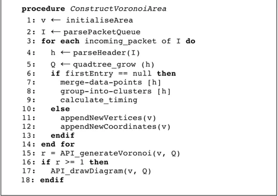
3.4 Generating Voronoi Diagram
Generally, constructing a Voronoi diagram is time-consuming, especially for a large dataset with a huge number of pixels. In this section, a custom, fast and efficient algorithm is implemented for generating a Voronoi diagram of connected components, which takes a quadtree data structure, as illustrated in Figure 3.4. The proposed algorithm for constructing the area of a Voronoi diagram is:
Figure 3.4. Construct Voronoi
To illustrate the above algorithm, the steps can be visualised as follows:
Figure 3.5. Constructing Voronoi diagram
procedure ConstructVoronoiArea
1: v
←
initialiseArea 2: I←
parsePacketQueue
3: for each incoming_packet of I do 4: h
←
parseHeader(I)
5: Q
←
quadtree_grow (h)
6: if firstEntry == null then 7: merge-data-points [h] 8: group-into-clusters [h] 9: calculate_timing 10: else 11: appendNewVertices(v) 12: appendNewCoordinates(v) 13: endif 14: end for 15: r = API_generateVoronoi(v, Q) 16: if r >= 1 then 17: API_drawDiagram(v, Q) 18: endifThe Voronoi diagram takes a quadtree data structure, which is a group of four different regions, for all IP address entries as computed by using a decision tree algorithm to perform the classification task for making detection based upon past observations. The chosen algorithm was J48 Decision Tree C4.5 algorithm. Then the Voronoi diagram is calculated in an optimal time for every created layer. Therefore, in the generated Voronoi diagram of all dataset the vertices are presented, where a region label indicates the first octet of the IP address. By using these vertices, multiple layers of Voronoi diagrams can be generated to provide visualisation interaction. These layers are stored in main memory, which can be used when required. In order to plot an IP address into the diagram, the initial step is to obtain all octets from the quadtree data structure (set IP). To generate the first order of the block in the diagram, it starts with first IP set and mapped each cell found in the structure of X = {x1, x2, x3, x4}, where the order of the cell will follow
the structure of the quadtree data structure. For a given set of IP address, the farthest-point divides the plane into several cells where the same point of the octet will be adjacent to each other. For instance, an entry of IP address in class C network will be adjacent and formed together into one single group of cell.
The role is to divide continuous space into mutually disjoint subspaces according to the nearest rule. Therefore, a selection of multiple regions, containing multiple layers, is possible by decomposing the space into regions around each point.
3.5 Priority Queuing Method
One of the most time-consuming aspects of analysing visitor behaviour is to prioritise incoming traffic. The system must capture every behaviour and perform classification. For instance, a huge amount of traffic may be taken before decision can be made. In order to optimise the task, in this section, the priority queuing method is presented to classify visitor behaviour. The method has a role to prioritise incoming request patterns of a legitimate visitor by controlling the order of activities. The queue is implemented in an abstract data type, which has functionality for enqueuing and dequeuing operations. Figure 3.6 illustrates the queuing and dequeuing process.
Figure 3.6. Priority queue
The result of the priority queuing method enables traffic to be grouped in one object and constructed in a prioritised way. Thus, classification can be performed more effectively, especially for large datasets. There are several implementations of First In First Out (FIFO) queues which have more advantage over fixed length arrays, such as a singly or doubly linked list [73]. This enables new elements to be added dynamically without any capacity constraint. To construct the priority queue, it can be visualised as follows:
1. A buffer starts with an empty element. 2. An object is added into the queue.
3. The object will be processed to perform classification.
4. The object will be removed from the queue upon successful classification. This shows how the queue buffer is managed to support classification. The data structure of an object can be defined as follow:
typedef struct {
int size; int first; int last;
vType *elems; } QueueBuffer; 3.6 VATRIX Interactive User Interface
Our research in visual analytics combines interactive information visualisation and automated analysis techniques. This allows the development of an interactive user interface and the ability to render large amounts of data. The purpose of the user interface in VATRIX is to allow an analyst to interactively gain insight from large amounts of data. The diagrams presented in this section use Voronoi diagrams, a Quadtree data structure and priority queueing method in combination with d3.js for the presentation.
In the absence of intense traffic spikes, it is very difficult to justify whether a system is under attack. As network traffic produces vast amounts of data, using
conventional visualisation tools alone, as illustrated in Figure 3.7, can be difficult to grasp a good feel of the data, especially when trying to identify the class of the traffic.
Figure 3.7. An example of conventional network traffic visualisation
The VATRIX visual analytics system provides a main dashboard view to represent human, bots and unclassified traffic. This behaviour is rendered in a real-time mode by the help of X-Map. It visually represents the current network traffic. Therefore, the visualisation in VATRIX is presented as illustrated in Figure 3.8, so that fast interactive responses can be made, such as blocking all bots traffic or taking further investigation. Using this mechanism, it allows a high-level traffic priority for legitimate users accessing the website. It can help to get further insights into the structure of dataand interactively explore each plot.
Figure 3.8. Vatrix interface
Given vast amounts of network traffic, an analyst could interactively select part of the data to determine its destiny or visualise it in detail. The analyst could grasp more comprehensive details without being constrained by large data.
The output of the current selection, as presented in Figure 3.9, can be exported in a CSV or text format containing the source of addresses and observation data. This brings a simple action without changing the representation of the overall
![Figure 2.1. Visual analytics integration [11]](https://thumb-us.123doks.com/thumbv2/123dok_us/441784.2551108/17.892.217.718.134.330/figure-visual-analytics-integration.webp)
![Figure 2.2. Visual analytics process [12]](https://thumb-us.123doks.com/thumbv2/123dok_us/441784.2551108/18.892.220.717.126.395/figure-visual-analytics-process.webp)
![Figure 2.3 Application layer attacks [2]](https://thumb-us.123doks.com/thumbv2/123dok_us/441784.2551108/19.892.206.734.306.610/figure-application-layer-attacks.webp)
![Figure 2.4. Distribution of attacks [17]](https://thumb-us.123doks.com/thumbv2/123dok_us/441784.2551108/20.892.240.704.493.790/figure-distribution-of-attacks.webp)
![Figure 2.7. Banner advertisement [25]](https://thumb-us.123doks.com/thumbv2/123dok_us/441784.2551108/23.892.229.675.177.477/figure-banner-advertisement.webp)