Inaugural-Dissertation
zur Erlangung der Doktorwürde derNaturwissenschaftlich-Mathematischen
Gesamtfakultät
derRuprecht-Karls-Universität
Heidelberg
vorgelegt von Diplom-MathematikerBastian Alexander Rieck
aus HeidelbergPersistent Homology in
Multivariate Data Visualization
byBastian Alexander Rieck
Supervisors: Prof. Dr. Heike Leitte Prof. Dr. Michael Gertz
The fool doth think he is wise,
but the wise man knows himself to be a fool.
—William Shakespeare, As You Like It, Act V, Scene I
Dedicated to the loving memory of my maternal grandmother Dorothea Barbara Ortlieb (née Beierbach)
Abstract
Technological advances of recent years have changed the way research is done. When de-scribing complex phenomena, it is now possible to measure and model a myriad of different aspects pertaining to them. This increasing number of variables, however, poses significant challenges for the visual analysis and interpretation of suchmultivariate data. Yet, the effective visualization of structures in multivariate data is of paramount importance for building mod-els, forming hypotheses, and understanding intrinsic properties of the underlying phenomena. This thesis provides novel visualization techniques that advance the field of multivariate visual data analysis by helping represent and comprehend the structure of high-dimensional data. In contrast to approaches that focus on visualizing multivariate data directly or by means of their geometrical features, the methods developed in this thesis focus on their topological properties. More precisely, these methods provide structural descriptions that are driven by persistent homology, a technique from the emerging field of computational topology.
Such descriptions are developed in two separate parts of this thesis. The first part deals with thequalitative visualization of topological features in multivariate data. It presents novel visualization methods that directly depict topological information, thus permitting the comparison of structural features in a qualitative manner. The techniques described in this part serve as low-dimensional representations that make the otherwise high-dimensional topological features accessible. We show how to integrate them into data analysis workflows based on clustering in order to obtain more information about the underlying data. The efficacy of such combined workflows is demonstrated by analysing complex multivariate data sets from cultural heritage and political science, for example, whose structures are hidden to common visualization techniques.
The second part of this thesis is concerned with thequantitative visualizationof topological features. It describes novel methods that measure different aspects of multivariate data in order to provide quantifiable information about them. Here, the topological characteristics serve as a feature descriptor. Using these descriptors, the visualization techniques in this part focus on augmenting and improving existing data analysis processes. Among others, they deal with the visualization of high-dimensional regression models, the visualization of errors in embeddings of multivariate data, as well as the assessment and visualization of the results of different clustering algorithms.
All the methods presented in this thesis are evaluated and analysed on different data sets in order to show their robustness. This thesis demonstrates that the combination of geometrical and topological methods may support, complement, and surpass existing approaches for multivariate visual data analysis.
Zusammenfassung
Der technologische Fortschritt der letzten Jahre hat die Art, in der Wissenschaft betrieben wird, nachhaltig verändert. Es ist nun möglich, bei der Beschreibung komplexer Phänomene eine Vielzahl von Aspekten zu erfassen. Die immer größer werdende Anzahl an Variablen, die hierzu benötigt werden, stellt existierende Verfahren zur Darstellungmultivariater Datenvor erhebliche Probleme. Dabei ist gerade die Visualisierung von Strukturen in multivariaten Da-ten von höchster Wichtigkeit für die Modellierung, das Aufstellen von Hypothesen, sowie das intrinsische Verständnis von Daten. Diese Dissertation stellt neue Visualisierungsmethoden vor, welche die Repräsentation und das Verständnis von Strukturen in hochdimensionalen Daten erlauben. Im Gegensatz zu Methoden, die sich auf die direkte Darstellung von multiva-riaten Daten beziehen oder deren geometrischen Eigenschaften nutzen, konzentrieren sich die Methoden dieser Dissertation zusätzlich auf die topologischen Eigenschaften von Daten, d.h. auf ihren Zusammenhang. Sie stellen dabei strukturelle Beschreibungen zur Verfügung, die durch das Konzept derpersistenten Homologieermöglicht werden.
Derartige Beschreibungen werden in den zwei unterschiedlichen Teilen der vorliegenden Arbeit genutzt. Der erste Teil befasst sich mitqualitativen Visualisierungentopologischer Merkmale in Daten. Er stellt neue Visualisierungsmethoden vor, die eine direkte Darstel-lung topologischer Informationen erlauben und es somit ermöglichen, Strukturen in Daten qualitativ zu vergleichen. Die Methoden in diesem Teil stellen niedrigdimensionale Repräsen-tationen dar, welche die ansonsten hochdimensionalen topologischen Merkmale erfassbar machen. Wir zeigen, wie sie in Arbeitsabläufe zur Datenanalyse, welche sich bestimmter Clusteringverfahren bedienen, integriert werden können, um eine genauere Beschreibung der zugrundeliegenden Daten zu erhalten. Die Nützlichkeit einer solchen kombinierten Herange-hensweise belegt die Arbeit durch die Analyse komplexer multivariater Datensätze, deren Strukturen sich der Visualisierung durch gewöhnliche Methoden entziehen.
Der zweite Teil der Arbeit beschäftigt sich mit derquantitativen Darstellung von topolo-gischen Eigenschaften. Er beschreibt neue Methoden, die verschiedene Aspekte von Daten messen, um quantifizierbare Informationen zu erhalten. Die topologischen Charakteristika von Daten dienen somit als Merkmalsbeschreibung. Diese Beschreibungen nutzen wir unter anderem zur Darstellung von hochdimensionalen Modellen in der Regressionsanalyse, zur Visualisierung von fehlerhaften Regionen in Einbettungen multivariater Daten, sowie zur Bewertung und Darstellung von Ergebnissen unterschiedlicher Clusteringverfahren. Alle vorgestellten Methoden werden zudem auf ihre Robustheit hin untersucht, indem sie auf unterschiedlichen Datensätze evaluiert werden. Diese Arbeit zeigt damit, dass die Kombinati-on vKombinati-on geometrischen und topologischen Methoden bereits bekannte Ansätze zur visuellen multivariaten Datenanalyse unterstützen, ergänzen, und sogar übertreffen kann.
Acknowledgements
I owe my deepest gratitude to my supervisor Prof. Dr. Heike Leitte. She gave me guidance and support when and where I needed it the most, but was always willing to give me leave to find my own paths. Her enthusiasm and kind words spurred me on to developing my own style in writing, researching, teaching, and mentoring. These are truly the best gifts anyone could have received. Furthermore, I would like to extend my thanks to my second supervisor, Prof. Dr. Michael Gertz, with whom I enjoyed fruitful discussions that opened my eyes beyond the field of visualization. I am also grateful to Prof. Dr. Filip Sadlo and P. D. Dr. Wolfgang Merkle for being part of my thesis committee.
Over the years, I have had the pleasure to discuss my work with many people. No amount of stale words can do their influence justice. However, Marcus Aurelius—my mentor in many things—taught me to attempt it anyway, and so I shall. From Andreas Beyer, I always obtained the right nudge at the right time. From Daniel Beyer, I learned the value of endurance and how to question my work without rancour. From Bartosz Bogacz, the merits of a more realistic perspective. From Lutz Büch, calmness and serenity. From Hamish Carr, the desire to look for the intuition behind concepts. From Christoph Garth, a healthy mixture of enthusiasm and pragmatism. From Katja Hauser, the importance of resting body and mind. From Christian Heine, the drive to search for knowledge beyond my own area of work. From Markus Kurz, exuberant joy and how to love what I do. From Matthias Maier, to put more trust in my own work. From Julia Portl, the ambition to let graphics tell a story. From Maria Rupprecht, the faith in things both permanent and impermanent. From Filip Sadlo, the awe, humility, and bearing that is the hallmark of a scientist. From Julia Seifert, an unwavering positivity and the belief in myself. From Julien Tierny, an appetite for self-contained explanations.
I am fortunate to have experienced the influence of so many remarkable people in my life. They contributed to shaping me into the person I am today. I am indebted to my teachers, in particular Markus Banagl, Sigrid Böge, Susanne Krömker, and Matthias Kreck, who instilled me with a passion for algebra and topology. Furthermore, I want to thank my students Alexander Eck, Daniel Beyer, Jan Greulich, Markus Kurz, Karsten Hanser, Katja Hauser, and Sophia Stahl, for giving me the honour of advising them. It was a privilege.
Computational Methods for the Sciences (HGS MathComp), represented by Dr. Michael J. Winckler.
I am also thankful for the people who read this thesis completely or in parts. Even though the number of pages seemed daunting, they did not despair and helped me accomplish my work. Great thanks are due to Daniel ‘The Proofreading Machine’ Beyer, Katja Hauser, Markus Kurz, Florian Rieck, Filip Sadlo, Maria Rupprecht, and Niky Yaneva.
I wish to thank my friends and colleagues Andreas Beyer, Bartosz Bogacz, Alexander Eck, Jens Fangerau, Christopher Kappe, Ole Klein, Susanne Krömker, Hubert Mara, Julia Portl, Filip Sadlo, and Boyan Zheng, and all the many marvellous companions on this journey. You provided a friendly atmosphere for which I am grateful. Moreover, I thank the administrative staff of HGS MathComp, IWR, and TU Kaiserslautern, who always tamed the bureaucratic beast and removed the frictions that inevitably arise when it comes to IT, funding, extensions, or travel expenses. I was also fortunate to be a part of two research groups in two different locations. Even though my visits to Kaiserslautern were brief, I was always received with open arms. I am grateful that Prof. Dr. Hans Hagen takes care to maintain such a welcoming environment and is willing to go to any lengths to support his students. Last, but certainly not least, I thank my parents, my brother, and the rest of my family for their continuous support. Whatever I did to deserve you, it could not have been enough.
Thank you.
I would not wish
Any companion in the world but you, Nor can imagination form a shape, Besides yourself, to like of.
Contents
1 Introduction 1
1.1 Motivation . . . 1
1.2 What is topology? . . . 2
1.3 Why topology? . . . 4
1.4 Aims & scope of this thesis . . . 5
1.5 Contributions . . . 7
1.6 Structure of this thesis. . . 9
2 Related work 13 2.1 Multivariate statistics . . . 13
2.2 Multivariate visualizations . . . 14
2.3 Glyph-based visualizations . . . 16
2.4 Dimensionality reduction methods . . . 17
2.5 Projection-based visualizations . . . 18
2.6 Morse theory . . . 18
2.7 Feature-based & hybrid methods . . . 22
3 Algebraic topology 25 3.1 Topological spaces & their invariants . . . 26
3.2 Simplicial homology. . . 27
3.3 Relative simplicial homology. . . 34
3.4 Calculating simplicial homology. . . 35
3.5 Discussion . . . 38
4 Persistent homology 41 4.1 Nerves, covers, and complexes . . . 42
4.2 Calculating the Vietoris–Rips complex . . . 47
4.3 Calculating 0-dimensional persistent homology. . . 51
4.4 Calculating persistent homology. . . 55
4.5 Visualizing persistent homology . . . 64
4.5.2 Persistence barcodes . . . 67
4.6 Quantifying topological similarity. . . 68
4.6.1 Distances between persistence diagrams . . . 68
4.6.2 Stability . . . 72
4.6.3 Comparing topological & geometrical distances . . . 75
4.7 Discussion . . . 77
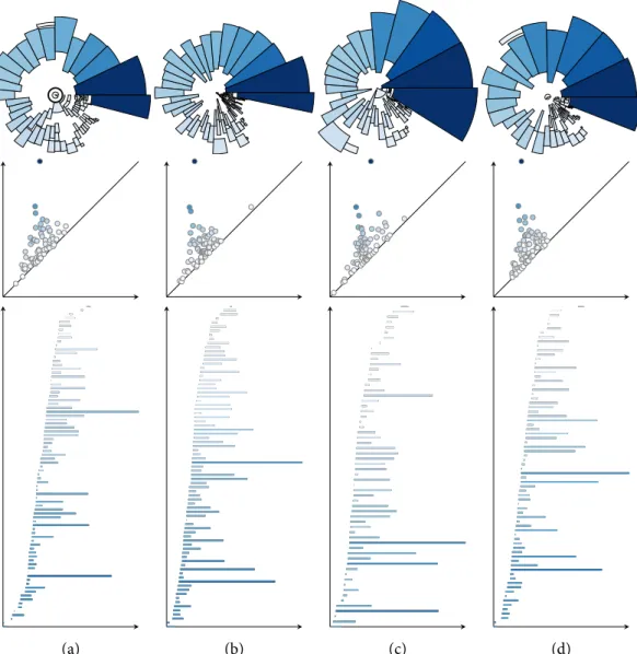
I Visualizing qualitative topological information 81 5 Topological fingerprints in cluster analysis 83 5.1 Persistence rings . . . 83
5.2 Combining topological analysis & clustering. . . 87
5.3 Persistence-based clustering . . . 90
5.3.1 Density estimation . . . 91
5.3.2 Peak estimation using persistent homology. . . 92
5.3.3 An example . . . 94
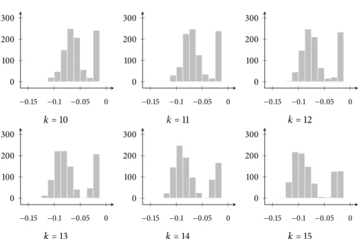
5.4 Rips graph parameter selection . . . 96
5.5 Application to synthetic test data . . . 98
5.6 Application to cultural heritage data . . . 100
5.6.1 Multi-scale integral invariant filters . . . 102
5.6.2 Synthetic data set . . . 106
5.6.3 Real data set. . . 108
5.7 Discussion . . . 111
6 Structural analysis of point clouds using simplicial chains 115 6.1 Why do we need geometrical information? . . . 116
6.1.1 The localization problem . . . 117
6.1.2 A notion of conciseness . . . 117
6.2 Localizing simplicial chains . . . 118
6.2.1 Approximating & extending geodesic distances . . . 123
6.2.2 Finding the smallest geodesic ball . . . 123
6.2.3 Removing a homology class fromVє . . . 126
6.3 The simplicial chain graph . . . 126
6.3.1 Properties . . . 130
6.3.2 Stability & extensions . . . 131
6.4 Analysis of several data sets . . . 132
Contents
6.4.2 Tropical Atmosphere Ocean array data . . . 137
6.5 Discussion . . . 142
II Visualizing quantitative topological information 145 7 Evaluating embeddings 147 7.1 Dimensionality reduction methods . . . 148
7.2 Quality measures. . . 151
7.3 Agreement analysis . . . 156
7.4 Results of agreement analysis. . . 159
7.4.1 Handwritten digits . . . 160
7.4.2 Concrete compressive strength . . . 166
7.5 Data descriptors . . . 170
7.6 Using data descriptors to evaluate embeddings . . . 172
7.7 An example . . . 176
7.7.1 Global quality. . . 177
7.7.2 Local quality . . . 179
7.8 Stability & performance. . . 180
7.9 Results. . . 184
7.9.1 Synthetic faces . . . 184
7.9.2 Concrete compressive strength . . . 186
7.9.3 Climate data. . . 189
7.10 Discussion . . . 191
8 Landscape metaphors for multivariate data 197 8.1 Visualizing regression analysis models . . . 197
8.1.1 Related work . . . 198
8.1.2 Quality measures for regression analysis . . . 199
8.1.3 A quality measure based on persistent homology . . . 201
8.1.4 Solubility analysis . . . 204
8.2 Visualizing properties of embeddings. . . 214
8.2.1 Depicting multiple data descriptors . . . 214
8.2.2 Results . . . 216
8.3 Discussion . . . 221
9 Assessing & visualizing clusterings 225 9.1 Related work . . . 226
9.2 Methods. . . 228
9.2.1 Choosing a data descriptor . . . 228
9.2.2 Extended persistent homology . . . 229
9.2.3 Total persistence . . . 232
9.2.4 Assessing clusterings . . . 233
9.2.5 Comparison with existing clustering validity indices . . . 238
9.2.6 Visualization methods . . . 244
9.3 Results. . . 248
9.3.1 ‘Iris flower’ data. . . 249
9.3.2 ‘Olive oils’ data . . . 253
9.3.3 ‘El Niño’ data . . . 257
9.4 Discussion . . . 260 10 Conclusion 263 Acronyms 267 Glossary 269 Index 271 Bibliography 275
1
Introduction
The last few decades demonstrated that we live in an age that is teeming with data. It is not only the ever-increasing amount of internet users—more than 3 billion in 2015 according to theInternational Telecommunication Unionof the United Nations—that results in more and more data being created. The sciences also regularly generate large data sets along with their experiments. It has been said that nowadays, data sets have the same significance as the microscope for scientists in the 18thcentury1. With more and more data sets being available to the public for scientific and non-scientific purposes2, significant challenges arise—the most pressing beinghow to make senseof these data. Two independent factors make this endeavour difficult. First, the sheeramountof data requires new storage strategies and high-performance algorithms. Second, thedimensionalityof a data set—measured, for example, by the number of variables—necessitates novel ways for processing, internalizing, and visualizing it for humans. In this thesis, we only focus on the second aspect and develop methods that are capable of visualizing high-dimensional data.
1.1
Motivation
While there is some controversy whether the figural deluge of high-dimensional data sets resulted in the creation of a new field of science—data science—or not[131],scientists agree on one thing: The overabundance of data requires new instruments for looking at them. The goal of this thesis is to provide and describe some of these new instruments, which appear in the form of methods from computational topology.
Developing and deploying new instruments has a long-standing tradition in the visual-ization community. John Tukey, for example, is seen by many as the forefather of modern data analysis. He proposed interactive visualizations for making sense of multivariate data. As early as 1962, Tukey[370]thus envisioned the potential of analysing data in an inferential
1Erik Brynjolfsson & Andrew McAfee, ‘The big data boom is the innovation story of our time’.The Atlantic,
November 2011.
2The platform for the U.S. Government’s open data,data.gov, contains almost 200,000 data sets at the last count
in early 2016. This does not even include various other initiatives by U.S. cities, for example Seattle, who provide their own platforms for accessing data.
5 10 15 20 4 6 8 10 12 5 10 15 20 4 6 8 1012 5 10 15 20 4 6 8 10 12 5 10 15 20 4 68 10 12
Figure 1.1: Anscombe’s quartet. The mean and sample variance ofxandyis equal in each data set. Likewise, Pearson’s correlation coefficient is 0.816 and the linear regression line is given byy=3+1/2x.
and incisive3manner. Several years later, he coined the termexploratory data analysis(EDA) for these procedures. In an influential monograph of the same title[369],Tukey argued that analysing data without preconceived notions and models helps in forming hypotheses, which in turn lead to models that accurately describe the properties of data. This view is shared by scientists within the visualization community who know that summary statistics tend to fail when it comes to capturing interesting patterns in data. The classical example isAnscombe’s quartet, a collection of data sets sharing the same summary statistics. However, when shown as a scatterplot, every data set exhibits unique properties. Figure1.1demonstrates this.
F
This thesis presents and develops novel methods for the visualization of multivariate data. All these methods are firmly rooted in algebraic topology, the branch of mathematics that deals with measuring connectivity of spaces. More specifically, we shall employ concepts from the newly-emerging area oftopological data analysis(TDA). The subsequent sections give a brief overview of algebraic topology and motivate its use. We pay particular attention to highlighting the advantages of topological methods over traditional data analysis methods, but also comment on their shortcomings.
1.2
What is topology?
Topology studies certain mathematical objects, thetopological spaces, using concepts such as transformations and invariants. The ideas of modern topology can be traced back to Gottfried Wilhelm Leibniz, who referred to this field asgeometria situs4andanalysis situs5,
3Tukey understood that some patterns in data cannot be perceived by ‘simple and direct examination of the raw
data’. The obstructions thus need to becutaway, leading to the term ‘incisive’.
4Literally the ‘geometry of (a) place’. This indicates that (at least initially) geometry played an important role in
describing connectivity.
5Literally the ‘picking apart of (a) place’. This term indicates that a space is to be closely examined to expose its
1.2 What is topology? A B C D E F G
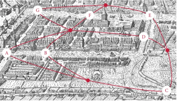
Figure 1.2: The seven bridges of Königsberg. Leonhard Euler was tasked to find out whether it was possible to devise a walk through the city that only used every bridge exactly once. By reducing the problem to a graph, Euler was able to show that such a solution does not exist because the desired walk would require that thedegreeof every vertex in the graph is even. and Leonhard Euler, whose ‘Seven bridges of Königsberg’ problem constitutes one of the first theorems in the field. Figure1.2depicts a slightly-abstracted version of the problem. The question was whether it was possible to walk through the city of Königsberg, crossing every bridge exactly once, and returning to the starting position. In 1736, Leonhard Euler approached this problem and realized that the geometrical information is irrelevant here. He thus reduced the map to a simple graph in which a vertex represents a land mass and an edge indicates that two land masses are connected by a bridge. This course of action is characteristic for topological methods. Everything that does not contribute to the connectivity of the problem is ignored. Euler realized that in order for the desired walk to exist, every vertex in the graph needs to have an even degree. This follows from the fact that as one enters a land mass via one bridge, one needs to exit it via another one. However, the graph only has vertices with an odd degree. Thus, the desired walk does not exist.
F
At its core, modern topology analyses topological spaces, such as subsets of someRnwith
a notion of distance. Beginning with this simple definition, a variety of objects with different properties can be defined.Manifolds, a special class of such objects, play a central role in this setting. Informally (we shall encounter more formal definitions later on), a manifold ‘looks and
A coffee mug A torus
Figure 1.3: A coffee mug and a torus. In the sense of algebraic topology, these two objects are the same because they can be transformed into each other without tearing anything apart.
behaves like someRn’, meaning that it exhibits a smooth local structure. One goal of topology
involves the classification of manifolds so that one may decide whether two descriptions of a manifold actually refer to the same manifold. For low-dimensional manifolds, such as the torus, this is rather easy; see Figure1.3for an example. In general, classifying manifolds up to homeomorphism turns out to be infeasible. A less discriminative but computationally feasible classification requires some algebraic machinery, known as homology groups. These groups count the holes in a manifold. The holes of a torus, for instance, are different from the holes of a hollow sphere. Hence, these two manifolds are fundamentally different. Again, we will re-encounter this example later on. About a decade ago, Edelsbrunner and Harer[142] discovered that methods from algebraic topology could be of use when analysing real-world data sets. In their seminal paper, Edelsbrunner et al.[148]assume that a given discrete, noisy data set has actually been sampled from some unknown high-dimensional manifold. This ‘manifold assumption’ is known in many other fields that try to analyse data sets, albeit under different names[31,133].In image analysis, for example, it is very common to assume that the discrete samples one works with are actually part of a continuous object in a high-dimensional space. Having seen that this assumption is justified, Edelsbrunner et al. describe their vision of a homology theory for discretely-sampled data. This marked the beginning of topological data analysis based on methods from algebraic topology.
1.3
Why topology?
What is the appeal of using topology-based methods, especially given the strong performance by geometrical and statistical methods over the last decades?Persistent homology, the main concept used in this thesis, has numerous beneficial properties for data analysis:
• It is independent of coordinate definitions and coordinate frames because it only depends on pairwise distances in the data. The same patterns can thus be found regardless of the orientation of data, for example.
1.4 Aims & scope of this thesis • It is invariant under many deformations—as long as the underlying space is not ‘torn
apart’, its topology will not change.
• It automatically assigns features in a data set information about their scale, which accommodates the fact that real-world data commonly contain patterns at not just a singlescale but atmultiplescales.
Furthermore, numerous stability theorems[92,104,105]are known for the constructions used in this thesis—we shall describe them in more detail in Chapter4. As a consequence, the behaviour of persistent homology under the assumption of noise—an inevitability when deal-ing with real-world data—is well-studied and well-known, which makes persistent homology very suitable for data analysis. However, as the famous adage ‘There ain’t no such thing as a free lunch’ reminds us, the stability, robustness, and expressiveness of persistent homology come with a price. First, and most crucially, there is the abstractness of features it calculates. The visualization techniques presented in this thesis mitigate this issue by showing more accessible representations of topological information. Another issue concerns the complexity requirements of calculating higher-dimensional topological features. None of the known approaches for persistent homology exhibits particularly good scalability properties. While some progress[220]has been made so that at least the calculation of distances between persist-ence diagrams may be improved, the computational requirements are overall very high. This leaves a large number of open topics for future research, which we discuss in the individual chapters and return to in the concluding chapter.
1.4
Aims & scope of this thesis
This thesis is motivated by a simple question: How can methods from algebraic topology sup-port the visualization—and subsequent analysis—of scientific data? Research in topological data analysis has so far been performed with a very mathematical perspective. The goal of this thesis is to make the wealth of topological methods accessible and usable in other domains. This requires effective visualization techniques that express patterns in high-dimensional space. In the context of visualizing and comprehendingmultivariate data, we will adopt a pragmatic view and consider a multivariate data set to consist of a set of points from a d-dimensional Euclidean spaceRd, possibly equipped with some notion of distance measure.
We have the following definition.
Definition 1.1 (Multivariate data set). A multivariate data set consists of measurements or observations of two or more variables that are not necessarily independent. In particular, the measurements areunstructuredin the sense that there is no underlying order such as a grid or graph. The number of variables in each instance must not change, however.
A variable in this sense is something that can be easily quantified, such aslengthorage, or requires more advanced measurement techniques, such as determining aprotein docking siteor arelationshipin a social network—hence, our definition is not restricted to certain data sources. We will also refer to multivariate data aspoint cloud datato signify that they exist in no particular arrangement. The definition is sufficiently broad to encompass all sorts of interesting data sets, such as oceanographic measurements, shape descriptors of handwritten digits, and feature vectors of cultural heritage data. Within this context, the term ‘high-dimensional’ refers to the number of variables that is usually much larger than three. Mathematically speaking, this only pertains to theambient dimensionof the data—the intrinsic dimension, i.e. the amount of variables that are actually required to describe the data succinctly, is often much smaller. We shall investigate several examples of this later on, especially in Chapter7, where we develop a new method for assessing the suitability of dimensionality reduction methods.
F
Given a set of measurements with different variables, we follow the conceptual model of Stevens[350],who proposed a classification for them. According to this classification, a variable may have a nominal, ordinal, interval, or ratio scale. Nominalscales, the most primitive ones, permit only to determine whether two values are equal or not—one may think of names of persons, for example.Ordinalscales additionally permit the ranking and sorting of values but nothing else. Clothing sizes, for example, may be ordered from extra-small to extra-large, but we cannot define what a ‘large minus medium’ shirt is going to look like. Intervalscales furthermore permit the determination of equality of intervals and differences, i.e. there is an underlying metric. The zero point of such a scale may not be well-defined, though. A typical example of an interval scale is room temperature measured in degrees Celsius. It is perfectly valid to calculate the difference between two room temperatures in order to determine whether a room has been heated up or cooled down. However, it is not justified to observe that a room is ‘twice as hot’ as another room. For these statements to make sense, we require aratioscale. These scales permit determining the equality of ratios of values. Room temperature measured in degrees Kelvin, for example, is an absolute scale.
Keeping the theory of measurements in mind, we thus permit Definition1.1to apply to data sets whose variables have different measurement scales. We may of course have other information available. For example, there may be specific attributes, such as a physical location, or variables may be ordered in a grid. However, our methods explicitly do not require more information than the variables and the observations themselves, making them almost universally applicable.
1.5 Contributions
1.5
Contributions
The major contributions of this thesis are:
• In Chapter5, we develop a novel visualization method for topological information—the persistence ring—which has several perceptual advantages over existing approaches. As there is no fixed order in which to display topological attributes, we devise a layout heuristic that maximizes the amount of discriminative information that can be displayed without overlaps. Furthermore, we establish a new workflow for analysing complex multivariate data sets, in which we integrate the persistence ring visualization and show its efficacy[318].
• In Chapter6, we present a new algorithm for integrating geometrical information into the calculation of persistent homology. This combination of geometry and topology increases the discriminative properties of our technique and permits it to detect a larger class of features. Our algorithm uses an optimization strategy to provide topological features that are as concise as possible with respect to their geometry. We use the algorithm as the foundation for a novel visualization technique—thesimplicial chain graphof structural information in multivariate point clouds[316].
• In Chapter7, we detail a novel method for assessing embeddings of high-dimensional data sets. We first develop a new algorithm for the decomposition of scalar fields. This lets us derive a way of measuring theagreementof several quality measures for high-dimensional embeddings. Following this, we establish a new way of calculating persistent homology that permits us to evaluate embeddings both globally and loc-ally. We derive an upper bound for the resulting values, which makes it possible to declare certain embeddings to be unsuitable because they are incapable of preserving geometrical–topological information. Our evaluation is based on a novel set of special functions, the data descriptors, that we use to quantify certain salient properties of multivariate data sets.[310,315]
• In Chapter8, we presentmodel landscapesanddata descriptor landscapes, two topology-driven embeddings for depicting structural dissimilarities of multivariate data sets in a manner that may be easily understood. We show that these landscape metaphors permit the quick assessment of different high-dimensional data sets. Moreover, we show that persistent homology does not suffer from the same instabilities and limitations as existing quality measures. [311,313]
• In Chapter9, we develop a new topology-based quality measure that permits assessing high-dimensional clusterings both globally and locally without requiring class labels.
We then go on to integrate this quality measure into two new visualizations, the cluster-ing similarity graphand thecluster map, which permit a holistic analysis of a clustering. Furthermore, we use numerous example data sets to show that our topology-based measure outperforms existing quality measure, both in terms of stability & robustness and in expressive power.[314]
This thesis is partially based on several publications by the author, which are indicated using brackets in the list above. In comparison to the original publications, this thesis contains novel experiments and a more in-depth treatment of results. A detailed list of publications in reverse chronological order follows.
• B. Rieck and H. Leitte. ‘Exploring and comparing clusterings of multivariate data sets using persistent homology’.Computer Graphics Forum35:3, 2016, pp. 81–90. doi:10. 1111/cgf.12884
• B. Rieck and H. Leitte. ‘Comparing dimensionality reduction methods using data descriptor landscapes’. In:Symposium on Visualization in Data Science(VDS)at IEEE VIS. Chicago, IL, USA, 2015
• B. Rieck and H. Leitte. ‘Persistent homology for the evaluation of dimensionality reduction schemes’.Computer Graphics Forum34:3, 2015, pp. 431–440. doi:10.1111/ cgf.12655
• B. Rieck and H. Leitte. ‘Agreement analysis of quality measures for dimensionality reduction’. In: Workshop on Topology-Based Methods in Visualization (TopoInVis). To appear inTopological Methods in Data Analysis and Visualization IV. Annweiler, Germany, 2015
• B. Rieck and H. Leitte. ‘Structural analysis of multivariate point clouds using simplicial chains’.Computer Graphics Forum33:8, 2014, pp. 28–37. doi:10.1111/cgf.12398
• B. Rieck and H. Leitte. ‘Enhancing comparative model analysis using persistent homo-logy’. In:Workshop on Visualization for Predictive Analytics at IEEE VIS. Paris, France, 2014
• B. Rieck, H. Mara and H. Leitte. ‘Multivariate data analysis using persistence-based filtering and topological signatures’.IEEE Transactions on Visualization and Computer Graphics18:12, 2012, pp. 2382–2391. doi:10.1109/TVCG.2012.248
The author also contributed to the following publications that do not directly relate to the core topic of this thesis:
1.6 Structure of this thesis • B. Rieck and H. Leitte. ‘Shall I compare thee to a network?— Visualizing the
topolo-gical structure of Shakespeare’s plays’. In: Workshop on Visualization for the Digital Humanities at IEEE VIS. Baltimore, MD, USA, 2016
• J. Fangerau, B. Höckendorf, B. Rieck, C. Heine, J. Wittbrodt and H. Leitte. ‘Interactive similarity analysis and error detection in large tree collections’. In: Visualization in Medicine and Life Sciences III. Towards making an impact. Ed. by L. Linsen, B. Hamann and H.-C. Hege. Mathematics and Visualization. Springer, Cham, Switzerland, 2016, pp. 287–307. doi:10.1007/978-3-319-24523-2_13
• B. Rieck, H. Mara and S. Krömker. ‘Unwrapping highly-detailed 3D meshes of rotation-ally symmetric man-made objects’.ISPRS Annals of Photogrammetry, Remote Sensing and Spatial Information SciencesII-5/W1, 2013, pp. 259–264. doi: 10.5194/isprsannals-II-5-W1-259-2013
1.6
Structure of this thesis
We shall start with a discussion of related work in Chapter2. This chapter provides an overview of methods for multivariate data visualization, adopting viewpoints from statist-ics, visualization, and dimensionality reduction. Furthermore, it briefly introduces related topological methods and concepts, such asMorse theory, which are intrinsically connected to computational topology in general.
Chapter3explains important concepts fromalgebraic topology. This is required in order to obtain a firm understanding of persistent homology later on. Choosing this approach also makes this thesis self-contained, so that readers without a strong background in topology will be able to benefit from its contents.
Chapter4describes how to calculatepersistent homologyfor real-world data sets. It also contains important correctness proofs and discusses two standard visualizations of topological features—persistence diagramsandpersistence barcodes. This discussion is followed by an introduction of different notions of distances between topological feature descriptors. After describing algorithms for their computation and analysing their stability properties, the chapter compares topological distances to function space distances, which are more commonly used. The comparison demonstrates the benefits of topology-based distances, especially in the presence of noise.
F
Thus, the introductory part of the thesis is concluded. The first part pertaining to the ana-lysis of real-world data sets deals with the visualization of qualitative topological information.
Chapter5first presentspersistence rings, a novel visualization technique for topological attrib-utes in high-dimensional data sets. This technique requires the development of an optimized layout strategy to ensure that all available topological information is displayed concisely and without overlaps. Chapter5also discusses the integration of topological information into a standard clustering analysis workflow and describes a clustering algorithm that combines peak estimation with concepts from persistent homology. Moreover, the chapter analyses the stability of the proposed workflow and demonstrates its efficacy on complicated real-world data sets that are not amenable to standard multivariate data analysis techniques.
Chapter6takes a different viewpoint and presents a novel visualization—thesimplicial chain graph—of the connectivity of a high-dimensional point cloud. Thesimplicial chain graphis based on the amalgamation of geometrical and topological features. This endeavour also requires the description of a novel algorithm for thelocalizationof topological features, which Chapter6provides, describes, and analyses in great detail. Finally, the merits of thesimplicial chain graphare discussed by means of high-dimensional ‘multi-run’ data sets, comprising complex varying behaviour. This concludes the first part of this thesis.
F
The second part deals with the visualization and analysis of quantitative topological inform-ation, in effect treating persistent homology as afeature extractionalgorithm. This requires the usage of the previously-introduced metrics between topological feature descriptors.
Having already established the practical utility of using persistent homology as a fea-ture descriptor, Chapter7presents a generic workflow—including novel visualizations and topology-based quality measures—for the quantitative analysis of multivariate data sets by means of persistent homology. This is demonstrated on a highly-relevant topic for data ana-lysis, namely the evaluation of different dimensionality reduction methods. This evaluation has two parts. First, theagreementof different quality measures is being investigated, using a new scalar field decomposition algorithm. This leads to an easy-to-understand visualiz-ation in which parts of the data that feature a different error distribution than the rest are highlighted. Second, after introducing a novel set of feature descriptors for high-dimensional data sets—thedata descriptors—the chapter presents a generic workflow for the comparison and analysis of embeddings. The efficacy of this method is demonstrated on synthetic data sets—in order to have a ground truth— as well as on complex multivariate data sets from real-world applications.
Following this, Chapter8presents a novel visualization, based on thelandscape metaphor, in order to visualize complex multivariate data sets under multiple aspects. The chapter contains a detailed quality analysis of high-dimensional regression models, and the novel
1.6 Structure of this thesis topological approach is shown to surpass common quality measures. As a second use case, the chapter analyses numerous embeddings of complex high-dimensional data sets with respect to their ‘topological quality’.
Chapter9assesses and visualizes clusterings based on their topological attributes. The chapter introduces novel global and local quality measures for clusters and clusterings, fol-lowed by an in-depth comparison to existing measures to assess clusterings. It turns out that in the absence of label information, the new measure outperforms the previous meas-ures. Chapter9also provides two novel visualizations, theclustering similarity graph, which is capable of comparing multiple clusterings with each other, and thecluster map, which shows clusterings on a local level. The chapter demonstrates the utility of these visualizations, coupled with our novel measures, by analysing multiple data sets with varying complexities. The thesis ends with Chapter10, which briefly summarizes the contributions, discusses them, and points out new areas of research that arise as a result of this work.
2
Related work
This chapter briefly reviews existing literature on the visualization of multivariate data and brings the methods presented here into context. In addition, it pinpoints where the methods in this thesis may support, complement, or even surpass existing methods for analysing mul-tivariate data. Moreover, to acquaint the reader with the field of visualization, this chapter also presents examples of several common visualization techniques that will be used throughout the thesis.
2.1
Multivariate statistics
We first shortly explain the statistical perspective on multivariate data. Mathematical statistics presumes little to no knowledge about a data set to draw some inferences from it. Given a set of multivariate observations, the classical construction is to calculate asample meanand asample covariance matrix. If data are assumed to follow a multivariate normal distribution, several inferences about a sample mean vector may be made. Chiefly among those is Hotelling’sT2
test[203], which permits hypothesis testing in the multivariate setting, i.e. the ability to determine whether two multivariate sets of observations have been drawn from the same underlying distribution. Similar calculations may be made for hypothesis testing of covariance matrices, for example. We refer to the classical textbooks by Mardia et al.[261]or Anderson[7] for more details.
While this view is extremely precise, it lacks expressive power. When analysing multivariate data, we require more information about their structure. As a consequence, many publications are concerned with multivariate data analysis in the context of data models. The basic idea is to assume that some of the variables arepredictorvariables and one or more variables are responsevariables. A classical example is thelinear multivariate regressionmodel
Y=X⋅B+U, (2.1)
whereYis ann×pmatrix ofpresponse variables,Xis ann×qmatrix ofqpredictor variables, Bis aq×qmatrix of unknown regression parameters, andUis ann×rmatrix of noise. The linear regression model must be robust in the sense that perturbations and outliers do not
affect the matrixBtoo much. See Rousseeuw and Leroy[321]for an extensive introduction into the topic of robust regression methods.
The model-based approach is very useful but it is often not applicable for real-world data sets because the assumptions that need to be made are unclear. In the opinion of the author, visualizations should eventually lead to a model so that an analyst may hypothesize about the data. Following this line of thought, another large branch of mathematical statistics employs methods such asprincipal component analysis(PCA)to describe the whole data set through linear combinations of its variables. Thesedimensionality reductionmethods are useful because they permit us to compress a data set to its most important variables, measured e.g. in terms of their variance. We will re-encounter dimensionality reduction methods in Chapter7, where we analyse several embeddings of high-dimensional data and visualize both their local and global errors.
2.2
Multivariate visualizations
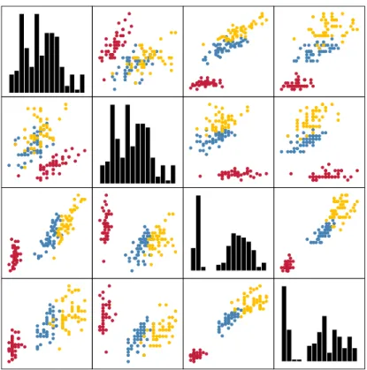
There are a few methods that permit the direct visualization of multivariate data. Among the classical approaches in the visualization community areparallel coordinate plots(PCPs), introduced by Inselberg[210],andscatterplot matrices(SPLOMs), pioneered by Chambers et al.[86]under the name ‘draftman’s display’. Figure2.1and Figure2.2shows examples of these two visualizations when being applied to the ‘Iris flower’ data set, which we will thoroughly analyse using different clustering algorithms in Chapter9.
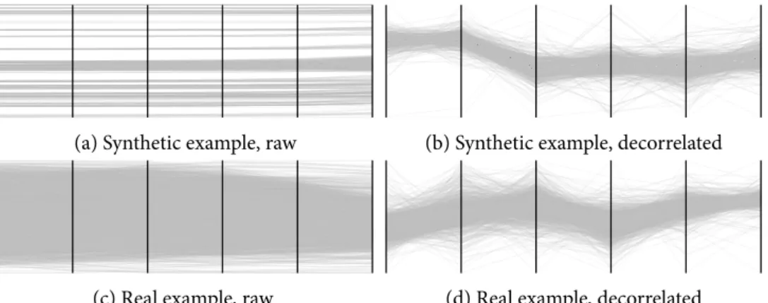
Both approaches work reasonably well for approximately ten variables, but they inevitably have their drawbacks. PCPs, for example, do not have a well-defined axis ordering. Givend dimensions, there ared! different axis arrangements. Ankerst et al.[9]showed that find-ing the best arrangement—with respect to certain similarity measures, for example—is an NP-complete problem. It is common to employ heuristics, such as the ones introduced by Yang et al.[398],when working with PCPs in practice. Another issue with PCPs is that they work less well for nominal variables or ordinal variables. Likewise, too many observations may result in visual clutter. One strategy against this is to employ filtering[154]or aggrega-tion[156]techniques. Due to their flexibility, PCPs remain an active research topic. Heinrich and Weiskopf[197],for example, extended them to continuous data and showed that these continuous parallel coordinatescontain less misrepresentations than traditional PCPs.
SPLOMs share some disadvantages with PCPs. Primarily, they scale quadratically with the number of variables—and not all combinations of scatterplots are informative. To discover informative combinations of variables, Friedman and Tukey[171]propose aprojection pursuit algorithm that looks for ‘interesting’ projections using certain quality measures. To find these projections more rapidly inscatterplot matrices, we may use thescagnosticsapproach.
2.2 Multivariate visualizations
Sepal length Sepal width Petal length Petal width
4.5 5 5.5 6 6.5 7 7.5 2 2.5 3 3.5 4 1 2 3 4 5 6 0.5 1 1.5 2 2.5
Figure 2.1: An example of a PCP. Every point in the multivariate data set becomes a line in the visu-alization, while the different axes are parallel to each other. Colours indicate the species of a flower. We can readily see thatI. setosaflowers have smaller petal lengths and petal widths thanI. versicolor orI. virginica .
Figure 2.2: An example of a SPLOM. Every non-diagonal element in the matrix is a scatterplot that depicts a certain projection of the data. The diagonal plots often contain additional visualiz-ations such as histograms that display the distribution of the corresponding feature. Points have been coloured according to their species. We can see that there is a pronounced split in some projections between flowers of the speciesI. setosa and the two speciesI. versicolor
andI. virginica . This visualization also shows that the remaining two species cannot be easily separated by their attribute values. We shall return to this point in Chapter9, in which we analyse the performance of different clustering algorithms on this data set.
This is a neologism for thescatterplot diagnosticsby Wilkinson and Wills[392],who define different interestingness measures for rating a given projection. Elmqvist et al.[155]build on this concept by providing interaction concepts for scatterplot matrices that support spatial navigation between different projections. Lehmann et al.[240]approach the scaling problem by pre-processing aSPLOMprior to visualizing it.
Another technique for visualizing certain types of data is themultivariate heatmap. It has seen extensive use in the context of bioinformatics, for example. The basic idea of a heat map is to assign colours to the values in different attributes and organize them in a display of columns. Weinstein et al.[390]showed that this approach may be very effective when combined with hierarchical clustering. Even a decade later, it ranks among the most powerful visualization tools for messenger RNA and microRNA expression, protein expression, and gene expression data[389].
Certain types of multivariate data also permit a direct visualization. If all variables of the observations are nominal, one may usemosaic plots[190]to visualize their proportions. Likewise, if hierarchical data are to be presented,tree maps[336]are a very powerful visualiz-ation technique. Originally meant for displaying rectangular regions, they have since been expanded to different shapes[22]. For document collections or texts, theword cloud[349, Chapter 3]or ThemeRiver[193]visualizations have proved useful. However, because this thesis deals with generic multivariate data, these visualization techniques are not applicable. All multivariate visualization approaches are prone to exhibit much clutter if either the number of observations or the number of variables starts to increase. Peng et al.[290]present a generic framework that mitigates this issue.
2.3
Glyph-based visualizations
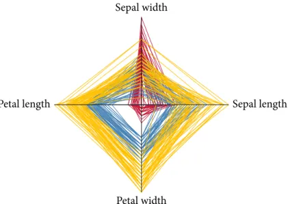
Multivariate data may also be visualized using special glyphs. One well-known approach involvesstar plots[86],where individual variables are arranged radially and different ‘spokes’ encode their respective values. This visualization, which is also referred to asstar glyphor radar chart, is simple but powerful because it makes use of the ability of humans to quickly distinguish between different shapes. Figure2.3depicts an example of a star plot for the ‘Iris flower’ data set. However, star plots do not scale well with respect to the number of variables that can be depicted. Likewise, the amount of visual clutter quickly increases and different variable types in the sense of Stevens[350]may not be easily shown.
Star glyphs—or variants of them—are nevertheless often employed to create information-rich displays. The DataMeadow by Elmqvist et al.[157],for example, helps explore even large multivariate data sets. Similarly, the ‘stick figure’ icons pioneered by Pickett and Grinstein[293] enable the creation of plots that permit the rapid overview of multivariate data as long as
2.4 Dimensionality reduction methods
Sepal length Sepal width
Petal length
Petal width
Figure 2.3: An example of a star plot. Here, every high-dimensional data point forms a closed band. The star plot can thus also be seen as aPCPwhose first and last axis ave been glued together. Using species-based colours, we again observe thatI. setosa may be easily separated from
I. versicolor andI. virginica .
the number of variables does not exceed a certain amount. With a growing number of observations, glyph placement strategies become increasingly important and complex to handle[383].We will use star glyphs in various contexts within this thesis in order to augment existing visualizations.
2.4
Dimensionality reduction methods
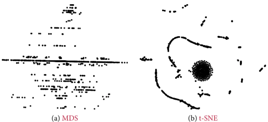
A somewhat orthogonal technique to the direct visualization of multivariate data is employed bydimensionality reductionalgorithms. Briefly put, these algorithms attempt to search for low-dimensional structures in the multivariate data space and visualize them directly. A clas-sical example is given by Tenenbaum et al.[359],who showed that their Isomap algorithm is capable of unrolling a manifold that is intrinsically planar, whereas traditional dimensionality reduction techniques fail to do so. Likewise,multidimensional scaling(MDS)is commonly used to obtain low-dimensional embeddings of multivariate data. It is one of the few tech-niques that is capable of working solely with a matrix of pairwise distances between the data points. Multiple variations of the original algorithm exist; see Borg and Groenen[49]for an excellent overview. Thet-distributed stochastic neighbour embedding(t-SNE)algorithm[256], by contrast, is one of the few algorithms specifically geared towards yielding high-quality visualizations in low dimensions. Dimensionality reduction methods are not restricted to
generating embeddings that are interpretable by users, though. Often, they are used to ‘com-press’ a set of multivariate observations. Data sets in computational linguistics, for example, typically have several hundred variables, of which only dozens are relevant.
The crux with dimensionality reduction methods is that they always yieldsomeanswer. Determining the quality or the ‘suitability’ of a given embedding, however, may become very complex—in fact, it turns out that existing methods have shortcomings, some of which can be fixed by the methods presented in Chapter7.
2.5
Projection-based visualizations
Some approaches for visualizing multivariate data employ methods from data mining, coupled with projection-based approaches. Liu et al.[252],for example, use subspace clustering[250]to find low-dimensional structures in the data. Each of the detected subspaces is then visualized using a 2D projection. Similarly, Nam and Mueller[281]extract different subspaces using a map metaphor. Interesting subspaces are referred to as ‘sights’ and the user may plan a ‘trip’ connecting different sites. Other approaches generate useful projections using statistical methods. The ‘Grand Tour’ algorithm by Asimov[13],for instance, chooses a sequence of subspaces that is dense in the set of all two-dimensional subspaces. Over the years, these ideas have been refined to include projections that show certain patterns[241],or to aid in outlier detection[24].For high-dimensional data, even arandom projectionmay be shown to yield useful results, both in theory[23]and in practice[47].
The methods in this thesis are complementary to these approaches. In particular in the second part of this thesis, we will use topological methods in order to obtain feature-based descriptions of data. We will then use different projection-based visualizations for augmenting these descriptions.
2.6
Morse theory
When analysing a set of multivariate observations, it is often assumed that they are discrete samples of a continuous manifold of some dimension. This is also known as the ‘manifold hypothesis’. The manifold hypothesis is especially prevalent when natural phenomena are being analysed. The reason for choosing manifolds as a model is that they afford a smooth mathematical structure. However, there is no single algorithm for verifying or refuting the manifold hypothesis. If a certain manifold is suspected to be underlying a given data set, an algorithm of Narayanan and Mitter[282]is capable of determining how many samples are required for verifying the hypothesis. In a similar context, Niyogi et al.[285]show how to
2.6 Morse theory ‘learn’ thehomology groups—a concept which we will discuss at length in Chapter3—of an
unknown manifold with high confidence.
Although manifolds are well-understood in a mathematical sense[236,238],this under-standing does not necessarily result in an improved visualization. Instead of analysing the manifolddirectly, mathematicians aim to describe it by analysing the behaviour of certain functions that are definedonit. Somewhat surprisingly, this results in a precise and expressive description of the underlying object. This observation was one of many seminal insights by Marston Morse[273],leading ultimately to the creation of what we today consider to be Morse theory. Morse theory, in its modern formulation by Milnor[270],concerns itself with the behaviour of non-degenerate smooth functions on manifolds. It turns out to be possible to relate the critical points—the singularities—of such a function to the homotopy type of the underlying manifold. In order to see how this abstract notion can be used to visualize multivariate data, we first restrict ourselves to analysing changes in the connectivity of their level sets.
Definition 2.1 (Level set). LetD ⊆ Rd be a domain and f∶D → Rbe a scalar-valued
function. Given a valuey∈R, alevel setis the pre-image of f,
Ly(f) ∶= f−1(y) ∶= {x∈D∣ f(x) = y}, (2.2)
which is allowed to be empty. IfLy(f)is not empty, each of its connected components is referred to as acontour.
Similarly, we may also definesuperlevel setsandsublevel setsof a function. These may be thought of as ‘filling the domain with water’.
Definition 2.2 (Sublevel & superlevel set). LetD⊆Rdbe a domain and f∶D→Rbe a
scalar-valued function. Lety∈Rbe a threshold. Thesublevel setL−y(f,y)and thesuperlevel
setL+
y(f,y)are the pre-images off with points whose function value is either below or above the selected threshold:
L−
y(f,y) ∶= {x∈D∣ f(x) ≤y} (2.3) L+
y(f,y) ∶= {x∈D∣ f(x) ≥y} (2.4) Both types of sets are again allowed to be empty. Sublevel and superlevel sets are commonly used in scalar field topology and vector field topology[195]. We shall re-encounter these different sets in Chapter4, for example, when calculating persistent homology.
Figure2.4illustrates the concepts of level sets, sublevel sets, and superlevel sets. The level sets of a function on a manifold induce aquotient topology[53, pp. 39–44]by identifying two
A level setLy(f) A sublevel setL−
y(f,y) A superlevel setL+y(f,y)
Figure 2.4: An illustration of level sets, sublevel sets, and superlevel sets. In this example, the level set contains two different contours, while the sublevel set and the superlevel set only have a single connected component.
pointsxandyif and only if they are in the same connected component of some level set off. If we identify points using this equivalence relation, we obtain theReeb graph. Figure2.5depicts a simple Reeb graph whose domain is a 2-manifold. Reeb graphs have been successfully employed for shape modelling[361]and shape analysis, either by visually comparing different graphs[43]or by defining similarity metrics[45]for their semi-automated comparison.
The Reeb graph may be computed very efficiently. Doraiswamy and Natarajan[134]present an algorithm that permits the calculation of the Reeb graph ford-dimensional manifolds with a complexity ofO(nlogn⋅ (log logn)3), wherenis the number of triangles in a triangulation of the manifold. For 2-manifolds, an algorithm of Cole-McLaughlin[108]even manages to obtain a complexity of merelyO(nlogn), making the Reeb graph highly-scalable.
Persistent homology, the main method of this thesis, may be considered a ‘superset’ of the Reeb graph and related methods. It is not restricted to level set analysis and furthermore, it includes higher-dimensional connectivity information. From the perspective of quantitative data analysis, we shall see that persistent homology permits more mature metrics with known stability properties, whereas efficiently-computable metrics for Reeb graphs are still an open problem[28]and the topic of current research.
If the domainDof a Reeb graph is simply-connected, i.e. it is path-connected and any
path can be contracted to a point, the graph becomes a tree and is referred to as thecontour tree. Contour trees are often used in the context of scalar field topology in order to support the extraction and simplification of isosurfaces[80].Using an algorithm by Carr et al.[79], they may be computed inO(nlogn+Nα(N))time, wherenis the number of vertices,Nis the number of simplices, andα(⋅)is the extremely slow-growing inverse of the Ackermann
2.6 Morse theory
Figure 2.5: An illustration of a Reeb graph. The graph is drawn on top of the manifold whose level sets it describes. Its vertices correspond to the critical points of the height function. Edges signify paths along which the topology of the level set does not change.
function. This is a very efficient construction becauseNis typically of the order ofn, i.e. N=θ(n). The visualization of contour trees turns out to be challenging. Pascucci et al.[288], for example, use the metaphor of an ‘orrery’ to produce a ‘toporrery’ that is drawn radially. Heine et al.[196]developed an algorithm that draws contour trees according to different æsthetic criteria. It is capable of producing readable representations even for larger contour trees with hundreds of branches.
The concepts of the contour tree or the Reeb may be applied to obtain auxiliary repres-entations of scalar functions on multivariate data. A particularly powerful metaphor is the topological landscape. Originally pioneered by Weber et al.[388],it has since been expanded to ensembles of scalar functions[191]. The basic idea of these approaches is to generate a landscape in 3D whose contour tree—or Reeb graph, or merge tree, or split tree—coincides with the contour tree of the original data. Since humans are better at spatial reasoning about objects they know, the landscape helps them compare different functions rapidly. Oesterling et al.[286]refined and generalized the original landscape metaphor by exploring density estimates of high-dimensional point clouds. In a follow-up publication, Oesterling et al.[287] refined their approach and concentrated only onlandscape profiles, i.e. two-dimensional pro-jections of the merge tree structure. This visualization was used to analyse clusters and other substructures in multivariate data.
A more holistic description of multivariate data—still in the context of Morse theory— is obtained by calculating the Morse–Smale complex. TheMorse–Smale complex[344]is a combinatorial segmentation of the domain into regions of homogeneous gradient flow. This decomposition was represented as a ‘spine’ in the plane by Correa et al.[116]to obtain simpler descriptions of scalar fields. Gerber et al.[176]use a simplified representation of
the Morse–Smale complex in order to permit the exploration of high-dimensional scalar functions. In lower dimensions, the Morse–Smale complex may be visualized directly. The challenge thus lies more in making the calculations scalable. Due to efficient algorithms[184], approaches based on the Morse–Smale complex are often employed for analysing simulation data, both for large-scale simulations in inertial confinement fusion[55],as well as micro-scale simulations for nanosphere battery materials[185].Again, there are numerous overlaps between this established usage of Morse theory in visualization and persistent homology. However, persistent homology is applicable even if the domain is not connected. In addition, it permits the description of higher-dimensional features in data, whereas the Morse–Smale complex can only be easily calculated in lower dimensions[144,146].
In recent publications, efforts have been made to extend concepts from Morse theory to the analysis of multivariate functions. The theoretical basis for this is theReeb space[145],which may be seen as the higher-dimensional equivalent to the Reeb graph. Building on this, Carr and Duke[76,77]developed thejoint contour net(JCN), which uses a graph-based approach to show changes in multiple variables. TheJCNwas already successfully used in analysing complex nuclear scission data sets[137],which have not been amenable to ordinary analysis methods. Current research focuses on generalizing theJCNto multivariate fields with more than two variables[78].
2.7
Feature-based & hybrid methods
Multifield analysis is related to multivariate analysis. In this context, data usually have an underlying domain such as a structured grid. Multiple variables then express themselves as scalar fields, leading to the termmultifield visualizationwhen multiple scalar fields are to be analysed in the same setting.
Multifield analysis permits numerous different viewpoints. An approach by Sauber et al.[323],for instance, considers correlations between individual scalar fields to be interesting features. These are summarized in themultifield graph. Jänicke et al.[214]calculate an Euc-lidean minimum spanning tree (EMST)on multivariate data and use graph layout techniques to obtain a 2D visualization. Users may then explore relationships in the data by interacting with thisattribute cloud. Hüttenberger et al.[207]proposed a new framework based on mul-tivariate optimization strategies to describe features in multiple scalar functions. This yields a new set of features that may be used to understand and compare the behaviour of different vortex criteria, for example.
Additionally, many methods use ideas from persistent homology and Morse theory, without being firmly footed in either one of these fields. The Mapper algorithm[342],for example, combines hierarchical clustering with basic data structures from computational topology
2.7 Feature-based & hybrid methods to form a low-dimensional simplicial complex. This complex describes connectivity rela-tions between different data points. It is commonly visualized using graph drawing methods. Mapper is very effective in describing complex network data such as folding pathways[400], phylogenetic trees[87],and ‘omics’ data[283].However, the numerous parameters and quant-ization parameters of the Mapper algorithm make assessing its stability complicated. Formal theorems are hence an ongoing area of research[81].
3
Algebraic topology
Most of the methods that are used and developed in this thesis are based on algebraic topology to some extent. This chapter introduces and motivates the required concepts. We will briefly expand onsimplicial homology, a method for calculating certain invariants of topological spaces. These ideas lay the foundation forpersistent homology, a powerful data analysis tool, which we will describe at length in Chapter4.
F
Algebraic topology is one of the more recent branches of mathematics. It is concerned with the identification, description, and discrimination of high-dimensional objects. In contrast to the more geometrically-inclined field of differential topology, methods from algebraic topology rely solely on the connectivity of a space. Geometry is left out for reasons we will address later on. While the connection is not immediately obvious, the problems of algebraic topologists and visualization researchers share some commonalities. Given high-dimensional data, we attempt to visualize it in some way, such that it is possible to see intrinsic structures. Our visualization needs to beefficientin the sense that it should be obtainable by reasonable computational means, but alsodiscriminativein the sense that it should permit us to distinguish some forms of data from other forms of data. Similarly, algebraic topologists want to understand and distinguish high-dimensional objects. Since human intuition fails beyond even three or four dimensions, topologists approach the problem by identifying intrinsic properties of high-dimensional spaces that do not change under some transformations. These properties are referred to asinvariants. Invariants are similar to our visualizations. To be useful, they need to be efficiently computable and sufficiently discriminative at the same time.
Topology reduces the complex task of classifying and discerning high-dimensional objects by disregarding the effects of certain transformations. A reasonable set of transformations that may be ignored is the set of affine transformations, such as movements and rotations. In algebraic topology, we ignore an even larger class of operations, namely all operations that are described by homeomorphisms.
Definition 3.1 (Homeomorphism). A functionf∶X→Ybetween two topological spaces XandYis ahomeomorphismif f is bijective, continuous, and its inverse f−1∶Y → Xis
Figure 3.1: Examples of homeomorphic and non-homeomorphic objects. The cube (left) can be de-formed into a sphere (middle). Both objects are non-homeomorphic to the torus (right), though, because it is impossible to obtain the hole of the torus without cutting the sphere. In other words, a homeomorphism is any transformation that involves stretching, translat-ing, and bending—but neither cutting nor gluing. It is reasonable to demand that characteristic properties of a space must not change under this type of transformation. Figure3.1shows several examples of homeomorphic and non-homeomorphic objects. The classification up to homeomorphism might seem weak with too much leeway to be highly-discriminative. For the properties that topologists aim to study, this classification is sufficient, though. Later on, when we introduce persistent homology, we will also see that while this method is based on concepts of algebraic topology, it has a much higher discriminative power. The discrete and multi-scale nature of real-world data makes it possible for persistent homology to detect more variation in data sets.
3.1
Topological spaces & their invariants
Topologists are interested in studyingtopological spaces. In this thesis, we think of a topological space as a set of points, usually sampled from someRn, with a neighbourhood relation. The
neighbourhood relation permits us to query any point about its connectivity. Figure3.2
illustrates this concept. This definition is purposefully vague and excludes many other objects in order to permit a better exposition of the relevant theoretical concepts. A topological space does not presuppose the existence of a metric, such as the Euclidean distance. It is thus fundamentally different from the metric spaces we are used to. Later on, we will extend the definition of a topological space when we have some means of ascertaining the dissimilarity of points in our data.
A very simple topological invariant, for example, is given by the dimension of the space. To distinguishRnfromRm, we only need to look at whethern≠m. The dimensionality of the
input space is of course not a great invariant and will be insufficient in most cases—especially for real-world data where the ‘correct’ dimension is often unknown. Simplicial homology, which we shall focus on in this chapter, is a more balanced invariant. The motivation for simplicial homology is to use the number of ‘holes’ in a topological space as an invariant.
3.2 Simplicial homology
Figure 3.2: The notion of a topological space is less intuitive than that of a metric space. To the left, we have a set of points fromR2. The right part shows one particular topological space of the
points. Edges indicate neighbours but those neighbours do not necessarily correspond to our sense of proximity.
Returning to Figure3.1, two of the depicted objects—the sphere and the cube—do not have a hole. The torus, by contrast, has at least one hole. Since homeomorphisms do not permit tearing, we will never be able to transform the cube or the sphere into a torus. Thus, they are fundamentally different. The idea of using connectivity information to classify spaces has already found an application in theBetti numbers[192, p. 130]of a space—we shall return to this concept shortly. Simplicial homology is effectively computable, but requires a somewhat complex algebraic set-up, which the subsequent sections are going to cover.
3.2
Simplicial homology
To identify holes in a space, we first need a notion of its connectivity. For this, we require the topological space being described by asimplicial complex, one of the basic building blocks in algebraic topology. A simplicial complex is a data structure that explains how to ‘glue together’ a topological space from points, edges, triangles, tetrahedra, and their higher-dimensional generalizations. Simplicial complexes thus serve as ‘blueprints’ of a space. The points, edges, and other entities that make up a simplicial complex are known assimplices. There are other complexes, such asCW complexes[192, p. 5 ff.],but we prefer a description in terms of simplicial complexes because they are significantly easier to handle.
In the following, we shall define simplicial complexes and simplices in a combinatorial way because we want to perform calculations on a computer with them later on. However, it is also possible to define everything in a geometrical manner—see Bredon[53, pp. 245–250],for example. We start by describing simplices and simplicial complexes.
Definition 3.2 (Abstract simplex). Given a family of sets, any subset of cardinalityk+1 is called ak-simplex. In a graph-theoretic context, we may think of 0-s
![Figure 4.13: Histograms showing the distances between the test functions. All distances have been scaled to [0, 1] in order to make the comparisons fair](https://thumb-us.123doks.com/thumbv2/123dok_us/785316.2599292/94.892.289.657.124.468/figure-histograms-showing-distances-functions-distances-scaled-comparisons.webp)
![Figure 5.12: Dendrogram and persistence diagram for the ‘Kaskal’ data set. Most distance variability is encountered within a scale of [0.075, 0.125]](https://thumb-us.123doks.com/thumbv2/123dok_us/785316.2599292/122.892.177.707.122.371/figure-dendrogram-persistence-diagram-kaskal-distance-variability-encountered.webp)
