Open Research Online
The Open University’s repository of research publications
and other research outputs
Visualisation of Linked Data – Reprise
Journal Item
How to cite:
Dadzie, Aba-Sah and Pietriga, Emmanuel (2016).
Visualisation of Linked Data – Reprise.
Semantic Web,
8(1) pp. 1–21.
For guidance on citations see FAQs.
c
2017 IOS Press and The Authors
Version: Accepted Manuscript
Link(s) to article on publisher’s website:
http://dx.doi.org/doi:10.3233/SW-160249
Copyright and Moral Rights for the articles on this site are retained by the individual authors and/or other copyright
owners. For more information on Open Research Online’s data policy on reuse of materials please consult the policies
page.
Visualisation of Linked Data – Reprise
Aba-Sah Dadzie
a,∗, Emmanuel Pietriga
b aKMi, The Open University, UKE-mail: [email protected]
bINRIA, France
E-mail: [email protected]
Abstract.Linked Data promises to serve as a disruptor of traditional approaches to data management and use, promoting the push from the traditional Web of documents to a Web of data. The ability for data consumers to adopt a follow your nose approach, traversing links defined within a dataset or across independently-curated datasets, is an essential feature of this new Web of Data, enabling richer knowledge retrieval thanks to synthesis across multiple sources of, and views on, inter-related datasets. But for the Web of Data to be successful, we must design novel ways of interacting with the corresponding very large amounts of complex, interlinked, multi-dimensional data throughout its management cycle. The design of user interfaces for Linked Data, and more specifically interfaces that represent the data visually, play a central role in this respect. Contributions to this special issue on Linked Data visualisation investigate different approaches to harnessing visualisation as a tool for exploratory discovery and basic-to-advanced analysis. The papers in this volume illustrate the design and construction of intuitive means for end-users to obtain new insight and gather more knowledge, as they follow links defined across datasets over the Web of Data.
Keywords: linked data, linked open data, visualisation, visual analysis, exploratory discovery, visual querying
1. Introduction
Linked Data is a key component of the Seman-tic Web vision. The ability for data consumers to adopt afollow your noseapproach, traversing links de-fined within a dataset or across independently-curated datasets, is an essential feature of what we now call theWeb of Data, enabling richer knowledge retrieval thanks to synthesis across multiple sources of, and views on, inter-related datasets. Since its early days, Linked Data (LD) promised to serve as a disruptor of traditional approaches to data management and use, promoting the push from the traditionalWeb of docu-mentsto thisWeb of data[13,14,44]. But the advan-tages of following LD principles have now become even more apparent [30,43], as the boundary between the data available on the (online) Web and users’ own (personal) data gets ever more fuzzy. Users in our in-creasingly data- and knowledge-driven world are be-coming more and more dependent on applications that
*Corresponding author. E-mail: [email protected]
build upon the capability to transparently fetch het-erogeneous yet implicitly connected data from mul-tiple, independent sources. It has become clear that we must rethink how those users interact with the very large amounts of this complex, interlinked, multi-dimensional data, throughout its management cycle, from generation to capture, enrichment in use and reuse, and sharing beyond its original context.
The Linked Data community introduces its founda-tional concept as follows [5]:
“Linked Data is about using the Web to connect re-lated data that wasn’t previously linked, or using the Web to lower the barriers to linking data cur-rently linked using other methods.”
This sentiment is echoed across academia, state or-ganisations and industry [see 12,13,21,31,43,44,53,54, among others]. But despite the initiative’s recognised value, and even though it is now well past its infancy,
Linked (Open) Data1 extension and adoption beyond the Semantic Web (SW) community remains limited. This is due largely to three key challenges:
1. The very large amount of available LD, which keeps increasing [see, e.g., 35,43,54]. For in-stance, as at mid-2016 Ermilov et al. [22] report 9,960 RDF datasets containing over 130 billion triples, with connectedness up to 40% from 3% in 2011. These measures originate from LOD-Stats[7], which provides the most up-to-date set of statistics about LOD datasets referenced on
datahub.io[1] and selected public and open gov-ernment stores.
2. The inherently heterogeneous nature of LD, com-prising independently-curated datasets backed by both standard and custom ontologies, with varia-tion in granularity, quality, completeness and ad-herence to the five-star model of Linked Data de-sign [13]. This is further complicated by differ-ences in source and target domains, and the im-pact this has on data structure and content. 3. The focus in the SW community on automated,
machine-driven data processing, which has so far resulted in data management and use solutions that require an advanced level of technical know-how to properly generate, clean and link new data into the Linked Data cloud. Importantly, this has also translated into the need for a correspondingly advanced level of technical know-how at the other end of the workflow, in end-user-driven explo-ration, analysis and presentation to diverse audi-ences of LD-backed content. Even though custom tools can be, and often are, developed for spe-cific use cases and datasets [12,20,41,50,54], this situation constitutes a significant obstacle to the adoption of LD as a framework by a wider range of data producers and consumers.
Linked Data already spans a wide range of applica-tion areas, a strong indicaapplica-tion that its potential value is already largely acknowledged. The open challenges mentioned here, among others, are being tackled by the research community which, beyond the publication of academic papers, is developing and making publicly available numerous pieces of software to test differ-ent approaches to the managemdiffer-ent and use of LD. The adoption and promotion of LD can also be observed at institutional and governmental levels as part of various
1We use LD and LOD interchangeably throughout this paper, the latter mainly to stress where data is also open to public (re)use.
open datainitiatives, as well as in the industry, where efforts include investigating LD as a way to more effi-ciently handlebig data[43,44].
At the simpler level of individual data consumers,
lay(non-expert) users may eventually employ Linked Data as a portal to timely, context-based knowledge for everyday activities, doing so either implicitly or ex-plicitly. Such activities could range from simple ones, such as comparing the price of groceries or planning a journey using public transport, to more complex ones involving important decisions, such as purchasing life insurance or a new home. LD has the potential to make such activities more efficient by giving users access to a rich Web of interlinked data relevant to the task at hand; however, this should not be accompanied by technical barriers that are difficult to overcome by a majority of users.
The design of user interfaces for LD [31,32,54], and more specifically interfaces that represent the data vi-sually, play a central role in that respect. Well-designed visualisations harness the powerful capabilities of the human perceptual system, providing users with rich representations of the data. Combined with appropri-ate interaction techniques, they enable users to navi-gate through, and make sense of, large and complex datasets, help spot outliers and anomalies, recognise patterns, identify trends [17,52]. Visualisation can pro-vide effective support for confirming hypotheses, and favours deriving new insight. Visual analytics systems complement human cognitive and perceptual abili-ties with automated data processing and mining tech-niques [20,43,50,55]. Such systems not only support the presentation of data, but processes for the full data management cycle as well, from data capture to analy-sis, enrichment and reuse.
However, visualisation in and of itself is not an absolute solution to the challenges inherent to com-plex data sense-making, analysis and reuse. To con-tribute to the realisation of LD’s potential, visualisa-tions have to be tailored to specific tasks, and effec-tively support users in the performance of these tasks by providing visual representations of the data at a rel-evant level of detail and abstraction. Following Shnei-derman’s mantra [52], users should be able to navi-gate from an overview of the data to detailed repre-sentations of specific items of interest. But the sys-tem should also providerelevantrepresentations of the data at these various levels of detail [17]. This is a major challenge, considering thefollow-your-nose ap-proach to data exploration mentioned earlier, and given the potentially high level of heterogeneity of the
inter-linked datasets involved in most LD-backed applica-tions. Only then will the results of visual exploration and analysis lead to new insights about LD, with an increased level of confidence in drawing conclusions from the data and the supporting visual analysis, and in decision-making based on the knowledge thus ac-quired.
We review the state of the art in section 2, and look at increasing efforts to evaluate front-end tools with target end-users in section 3. In section 4 we discuss on-going research in Linked Data visualisation and the range of challenges tackled by contributors to the spe-cial issue, as part of the process followed in designing and building effective visual presentation and analysis solutions for Linked Data. We conclude in section 5 with a vision for the role of visualisation in advanc-ing research in, analysis of, and applications based on Linked Data.
2. The State of the Art: Linked Data Visualisation
Tackling the challenges associated with the repre-sentation of Linked Data and its visual exploratory analysis requires considering related, supporting tech-nologies. Halpin and Bria [26], Klímek et al. [35], Mai et al. [41], Mitchell and Wilson [43], for instance, highlight reliance on data structuring, typically using ontologies as a backbone; the identification and encod-ing of links via ontology mappencod-ing and alignment; and the need to integrate such technologies into the visual discovery and analysispipeline. Formal querying is a powerful tool for extracting specific information either from one or across multiple datasets. However, formu-lating any but very simple queries in SPARQL (thede factoRDF query language [24]) or any other formal query language, is tedious even for SW experts. It is also error-prone, especially with each additional graph and optional or required relationship [20,43]. Further, the textual results returned by query engines, which typically take the form of machine-readable RDF, are not easily interpreted by users, even if they have a good level of domain understanding. Even when consider-ing expert users, meanconsider-ingful overviews are required to obtain a good understanding of data structure, content and relationships for any but very small result sets. Pre-defined query templates serve as an aid here, and as a foundation on which more intuitive support for guided querying and question-answering may be built.
Valsecchi et al. [54] demonstrate the advantages gained in identifying suitable entry points to LD
explo-ration, as a key initial step to improving access, espe-cially for non-SW and non-domain experts. Benedetti et al. [12], Haag et al. [25] discuss the need to sup-port visual querying to overcome technical challenges in the formulation of formal queries by lay users and, as complexity grows, even technical experts. Mai et al. [41] further demonstrate the added value in provid-ing multiple visual perspectives that support the fol-low your noseparadigm when exploring query results across multiple, heterogeneous, albeit linked, datasets. Halpin and Bria [26] describe the process followed to map how Digital Social Innovation is being used throughout the European Union (EU) across multiple aspects of people’s lives, and measure the resulting social impact. They illustrate the benefits gained in employing SW technology to overcome several chal-lenges – chalchal-lenges posed by differences in structure, granularity and completeness of the data sources in-volved. Indeed, multiple sources have to be queried to capture all data required to create a DSI map (of the EU), a process that may be used to generate a linked open dataset synthesising this data.
Beyond tools that help initiate exploration by iden-tifying entry points into LD, users should also be pro-vided with support for identifying and selecting more focused resources. Depending on the use case, this might involve increasingly customised (or customis-able) tools for in-depth exploration and analysis, along with support for reviewing content and sharing both this content and the results of discovery and analysis beyond its initial point of generation or use. Toward this aim, it may be instructive to follow best practice and verified frameworks and models for the design of visualisation and visual analytics such as in [50,52,55], adapting these where necessary for the specific case of LD and SW data in general. As in [20], we use Shnei-derman’s seminal visual information-seeking mantra
as a guiding principle in evaluating the usability and utility of visualisation-driven approaches and tools for different users and their tasks – looking at support for: (i) generating overviews on the underlying and related data; (ii) filtering out noise and less important data in order to focus on ROIs (Regions of Interest); and (iii) visualising ROIs in detail.
We review selected work in the SW community that illustrate advancement of the state of the art in Linked Data visualisation in the five years since the 2011 sur-vey about linked data visualisation [20], looking at models, approaches and tools that focus on one or more of the following visualisation-driven tasks:
– identification of suitable entry points into this large, complex data space,
– navigation inside individual, and across multiple, linked datasets to support exploratory discovery,
– analysis of data structure and alignment,
– basic to advanced data querying and question-answering,
– sense-making and guided, in-depth analysis,
– content enrichment through data annotation and identification or derivation of new links,
– presentation and sharing of data and results de-rived from their analysis to different audiences. This review of the state of the art differs from the 2011 survey [20] in two key areas. First, here we look in more detail at the larger visual exploration and anal-ysis process, examining supporting technologies that,
e.g., minimise how much pre-processing is required before the data can be visualised. Secondly, we con-sider text-based browsers only where they make signif-icant use of graphics to generate effective visual rep-resentations. This is not to detract from the value and utility of text-based browsers in general, but to allow more in-depth focus on the merits and challenges of visualisation-driven approaches.
Sections 2.1, 2.2 and 2.3 look at the roles of each of (i) ontologies, (ii) formal querying and exploration and (iii) content analysis and presentation respectively, and their role in the broader task of LD visualisation. However, the discussion that follows shows a good amount of overlap between all three aspects, reinforc-ing the benefits in integratreinforc-ing these component parts of the process and/or building seamless pipelines be-tween them.
2.1. The Role of Ontologies in Linked Data Visualisation
Dowd [21], Hitzler and Janowicz [30], Ivanova et al. [32], Mitchell and Wilson [43], Welter et al. [58], among others, highlight the importance of on-tologies in the effective use of SW technology and other data-driven research and applications. Ontolo-gies provide structure and a practical means to cap-ture, encode, categorise, index and retrieve data. Fo-cusing specifically on LD, ontologies are a critical el-ement in linking independently-created datasets. By also supporting the encoding of colloquial, domain-and community-specific use of language domain-and terminol-ogy using commonly-agreed, formal terms and con-cepts, ontologies aid correct interpretation of content and identification of both implicit and explicit links
across data using non-standard or unambiguous lan-guage and terminology [27].
Research on and about the use of ontologies is well established and significantly predates LD. However, employing ontologies to structure LD and support the creation of links within and between linked datasets, as with other ontology engineering tasks, is mostly re-stricted to technical and domain experts. This is often because of the dearth of effective user interfaces (UIs), which are needed to reduce complexity in all but the simplest of ontological structures. This complexity in-creases when considering the alignment and mapping of ontologies and LD [32,35,40,41], and impacts cor-rectness and interpretation of data and links between those data. While ideally all LD would follow the five-star LOD design guidelines [13], in practice, the qual-ity and granularqual-ity of data on the Web varies signifi-cantly. Ontologies are especially useful in such cases, where independently-curated datasets with incompati-ble structure and representation – but with related con-tent – must be linked. Research on ontology visuali-sation is therefore both relevant to, and often closely linked to, research on Linked Data visualisation and interactive analysis.
Weise et al. [57], for instance, extend VOWL, the Visual Notation for OWL Ontologies [40], to visualise linked dataset schemas. They aim at supporting users in getting an understanding of LD content, especially where datasets do not conform strictly to defined onto-logical structures or other defined schemas. Their web-based tool, LD-VOWL, follows principles of ontology engineering to extract schema information using a set of SPARQL queries, and visualises the results using a graph layout. Kazemzadeh et al. [34] demonstrate the benefits of defining a unifying ontology to allow the synthesis of biological data, to support more com-plete and far-reaching analysis of the large amounts of detailed-but-disconnected experimental data generated in this field. Halpin and Bria [26] collated data to map digital social innovation across the European Union (EU). They concluded that an ontology provided the most flexible means for capturing, in a single struc-ture, the varied information required to map this in-formation space. They also used ontologies as a sup-port for queries required during the subsequent analy-sis steps, involving the linked data generated by merg-ing the multiple data resources describmerg-ing this activ-ity. Further, they found that structuring data using an ontology allowed them to continue to add new data “on the fly”, including their own survey data. Finally, it also enabled them to create social networks from the
information gleaned about individuals and organisa-tions, due to the inherent network structure of the LD encoded in RDF.
We see a cyclical relationship between ontologies and LD, with ontologies guiding initial structuring dur-ing data capture, and the structured LD feeddur-ing back into ontology evolution. This can be seen as a virtuous circle, where LD and the backing ontologies contribute to refining one another. This process further aids align-ment and linking of disparate, yet related datasets that reuse the ontologies in question.
2.2. Visual Querying & Exploratory Discovery
Haag et al. [25], recognising the challenges faced by users in querying LD and RDF in general without good knowledge of the SPARQL query language [24], extend the concept of “Filter/Flow Graphs” [59] to enable relatively sophisticated visual SPARQL query-ing. The authors carry out a usability evaluation with a small group of users familiar with the Semantic Web, but who were not SW experts. Their findings demonstrate high learnability of the UI, with users self-correcting as the visual representation illustrates the effect of flow construction on the result-set ob-tained. Benedetti et al. [12] in theLODeXprototype, which is targeted at both non-technical users and tech-nical experts, explore requirements for easier construc-tion of SPARQL queries.LODeX, which serves as a query construction guide for users, combines a detailed table view on focused elements with a graph layout summarising the schema of linked datasets.
Mai et al. [41] tackle the challenges inherent in linking and exploring “data silos”. Among these chal-lenges, they study the need for seamless transition be-tween different perspectives on heterogeneous data, and questions related to fusing differences in data in terms of accuracy and granularity, by using a federated approach to exploration. By following the links within a dataset and across datasets to related data, they pro-vide user support for successively revealing more de-tail about an entity of interest while switching between coupled representations of query results as tables and graphs. When items in the result-set feature geoloca-tion informageoloca-tion, the data may addigeoloca-tionally be plotted on a map.
Valsecchi et al. [54] use a cartographic metaphor to generate overviews, aiming to help users obtain an un-derstanding of data structure and content. They rely on interaction techniques that follow Shneiderman’s vi-sual information-seeking mantra [52]. The vivi-sual
lay-out maps types and sub-types defined in backing on-tologies to pseudo-geographicalregionsand their sub-divisions. Instances of a type are mapped to cities
within their (parent) region. Disconnected (isolated) types and untyped data lie on islands outside the
mainland cluster of inter-linked data. From this ini-tial overview, keyword search and interaction with the map (including click and zoom) transparently trigger SPARQL queries to retrieve more detailed information about ROIs and support jumping via links to other re-lated entities in the same region or in other regions. The user may swap between layers over the base map to reveal additional visual cues about data density and structure (e.g., data and object properties, class depth within the ontology).
Similarly, Halpin and Bria [26], mentioned earlier, use a map of the European Union to represent infor-mation about digital social innovation (DSI) captured as Linked Data. Complementing SPARQL queries backed by a dedicated ontology with a combination of map-based representation and social network lay-out showing the links between collaborating organisa-tions, they were able to carry out a relatively detailed analysis that revealed both new information about DSI and areas on the map where information was missing. The ultimate aim of the project is to feed the results of the analysis into EU and state policy on opening up access to funding and other resources to improve DSI.
2.3. Visual Content Analysis & Presentation
Being a large, continuously growing, heteroge-neous, multi-dimensional collection of independently generated, albeit inter-linked, datasets, LOD con-tributes to today’sbig data[43], bringing with it both value and challenges for content analysis. One aspect of managing LD involves the collection of statistics and other metrics that describe the data itself, help-ing to obtain an overview of content and structure and a means for identifying points of entry into the data. Open review and access for the Semantic Web Jour-nal [9] allow capture of the full review and editorial process in addition to metadata (e.g., topics) about paper content as Linked Data. Hu et al. [31] illus-trate the benefits in this approach that simplifies link-ing to further information such as author networks, to enable, among others, tracking current and pre-dicting future trends in research. The authors use a
semantically-enabled journal portal[8] to present sci-entometrics derived from analysis of data retrieved from the SPARQL endpoint for this dataset and the
re-sults of statistical, trend and topical analysis. The inter-active portal uses a number of visualisation types in a dashboard to provide multiple perspectives for brows-ing content and the metrics derived from the data. By linking to other LD describing research activity, the dashboard also illustrates spatial distribution of author influence based on network and citation analysis.
The field of Bioinformatics emerged as a result of the introduction of computational techniques to aid the analysis and use of the very large, open, multi-media databases generated in the Biological and Life Sci-ences, due to the introduction of advanced technology for experimentation. This has enabled significant re-search and discoveries such as the mapping of the hu-man genome [18], which in turn have led to the gen-eration of further data, enabling further scientific re-search. Welter et al. [58] discuss the benefits of adopt-ing SW technology to aid data structuradopt-ing and increase automation in the periodic update of the growing cat-alogue for the Human Genome project [see 18]. They demonstrate additional benefits such as a reduction in the reliance on manual generation of representative vi-sual overviews of the data, and, further, the ability to create additional, interactive visualisations by appro-priating other technology, using the data encoded to simplify and widen (re)use. Welter et al. [58] illustrate extensibility of the approach to capture relevant infor-mation from other related, open biological data stores and publications, as well as seamless linking to and more expressive querying of data both within and out-with the field. For example, by extending their ontolo-gies, domain experts are able to retrieve key informa-tion not captured in experimental data and study re-sults, such as the ethnicity of participants, by linking to geographical and ethnology databases.
Kazemzadeh et al. [34] also discuss the challenges in obtaining overviews of biological data generated in different ways and for different purposes. Although structured using standard ontologies, these data sel-dom define explicit links between related attributes. The authors therefore make the case for unifying frameworks that support synthesis of and analysis across these datasets, to enable more comprehensive analysis that considers relevant information captured by different experiments and in disconnected datasets. They use the construction of a custom domain ontol-ogy describing links across data of interest and LD principles to demonstrate how this may be achieved, to improve the discovery of biological interaction at the molecular level, a key component of research into human diseases. To support domain experts who may
have difficulty formulating formal (SPARQL) queries, Kazemzadeh et al. [34] provide an interactive visuali-sation dashboard to enable intuitive search and explo-ration, employing pre-specified query templates that return results using a colour-coded, force-based net-work layout that depicts component type, interaction type, and strength of the relationship between compo-nents.
Another area outside the SW community where LD plays a key role is in data journalism, due to the clearly recognised benefits in following (structured) links between related-but-independent sources of data and knowledge. LD can contribute to improve explo-ration and enrich information retrieval, complement-ing new approaches to curatcomplement-ing and delivercomplement-ing news stories that threaten to disrupt traditional journalistic practice. Dowd [21] highlights the need to (re)train and upskill a new generation of investigative journalists to enable them to transformbigandopendata into basic to advanced graphics and interactive visualisation, to meet expectations for redefining and augmenting tradi-tional news reporting and storytelling. The study also recognises how LOD, along with the use of data col-lected via social media platforms, enables the ordinary “interested” public to aggregate existing and/or create and report their own news stories, with both profes-sional and such “lay journalists” typically appropriat-ing the medium to provide additional context for sto-ries using statistical charts and geo-visualisation. Pro-fessionals with access to high-end display hardware such as smart screens are further able to improve their art by overlaying this related data and corresponding analytics on the visual story.
Data journalism, whether by professionals lay jour-nalists, as well as other content creators and aggrega-tors such as bloggers, employs tools for data explo-ration, retrieval, recommendation and annotation. re-fer[53] is an example of a text-based, visual explo-ration prototype that uses Named Entity Linking to re-trieve and recommend entities for annotating text us-ing data retrieved from DBpedia [3,37]. By exploit-ing the links present in LD,refer provides end-users with support for navigating from their start point to ex-plore other related entities, by traversing data across four categories, colour-coded to aid recognition as
Person, Place, Event and the general, abstract concept ofThing.
Javed et al. [33], similarly, illustrate the importance of intuitive navigation of LD inVIZ-VIVO, which uses radial network maps and sunburst diagrams to gen-erate information overviews describing research
com-munities, by building on the structure of a custom on-tology. The aim is to support exploratory navigation through the data graph, and, as a result, richer, context-driven information retrieval. Javed et al. [33] demon-strate how this approach enables users to answer ques-tions about interaction within research communities and measure the impact of research at different levels. Rakhmawati et al. [48] illustrate the application of LD principles to financial data reporting and the col-lection of information on crowdsourcing, to promote more equal distribution of funds to mosques in Indone-sia, where such institutions also serve a social func-tion. The authors use a web-based portal and a Twitter portal to collect data about individual and joint contri-butions to mosques, and merge the financial data into a (centralised) LD store. This approach enables further data enrichment by linking to geolocation and other relevant information, allowing the aggregated finan-cial information to be displayed on a map of mosques coupled with statistical charts displaying more detail, highlighting where non-uniform distribution of fund-ing occurs. Rakhmawati et al. [48] indicate the poten-tial to carry out further analysis as their approach sim-plifies the porting of the resulting LD to other applica-tions.
3. Evaluating Usability & Utility
Recognition of the need to support human end-users (in addition to the focus on machines) is receiving greater traction within the SW community, especially for applications targeted at lay users and even domain experts who are not necessarily technological experts. This is critical to extending reach of the technology beyond the SW community, and especially important as expectations of end users grow with advances in technology. Further, as data size and complexity in-crease exponentially with ubiquitous use of said tech-nology [43,58, among others], the need for intuitive, user- and task-focused tools for navigating through the noise to identify and make effective use of relevant knowledge, within the user’s context of use and field of reference, increases. This is true for domain and tech-nical experts and lay users, the latter of whom range from technophobic or low technology awareness, to those who routinely use a range of advanced techno-logical devices and software in their personal, social and working lives.
One benefit in the pipeline or integrated approach to tackling requirements for LD visualisation is that the
process itself serves as a knowledge retrieval task and a form of evaluation of both the approach and the tools and techniques that feed into it [see, e.g., 30,41,50]. The development team can only progress to the next stage in what is often an iterative pipeline or work-flow if they have been successful in: (a) correctly identifying relevant resources; (b) extracting data and metadata that meet the user’s context and the require-ments of their task or end goal; (c) preprocessing this data, where necessary, to feed into the visualisation tools available and the analysis required; (d) carrying out initial exploratory analysis, using analytical and/or mining models, statistical and/or visualisation-driven methods. These initial steps will confirm whether the input data and preprocessing will feed into solving the problem at hand, and therefore guide the identification of suitable approaches for more detailed analysis, or may need to be reviewed to improve the process or cor-rect issues found.
We therefore now see an increase in usability eval-uation of tools built on SW technology. Further, the open data initiative has spurred the sharing of what is typically considered personal or in-house research data (such as interim analysis and evaluation data) along with final analysis results, to encourage verification of research by third parties and contribute to benchmark datasets. Tietz et al. [53], for instance, make available online anonymised evaluation data for their toolrefer. They evaluate usability of the text visualisation tool with a range of regular Web users, a quarter of whom described themselves as LD experts, while the oth-ers had passing to no knowledge of Linked Data. The study found that while the UI was, overall, seen as use-ful, and navigation sufficiently intuitive to allow both user types to discover the information sought, some UI features for revealing additional information were not recognised especially by the lay users. An interesting finding: criteria for categorising the data and propos-ing recommendations, a key component in obtainpropos-ing more complete understanding of relationships revealed as users navigate through data, was assumed by some users to be the whole document, rather than the entity with the focus. This highlights a significant knowledge gap between SW experts and lay users, with the push in the SW from a Web ofdocumentsto a Web ofdata, and the finer granularity available with the latter.
Benedetti et al. [12] in what they describe as qual-itative evaluation, involving both lay and technical users, report high satisfaction and accuracy across both user types for tasks requiring browsing of their visual schema summaries (91% with up to 5min to complete)
and successful task completion based on visual query generation (90% with up to 15min to complete). It should be noted that the authors restrict the tasks to those that can rely on browsing the schema summaries, and do not compare their results with benchmarks, nor mention whether or not relevant benchmarks exist.
Valsecchi et al. [54] target technological experts and evaluate their tool only with users who have a Com-puter Science background. Participants worked with two maps generated from highly inter-connected DB-pedia [3] data and very disconnected LinkedMDB [28, 6] data, respectively. The evaluation solicited qualita-tive and quantitaqualita-tive information on intuiqualita-tiveness and learnability of the UI, and how well it supported users in obtaining an understanding of data structure, includ-ing connectedness and content. Results were mixed: success and correctness in completing tasks ranged from 65% to 100%, with higher scores overall for the DBpedia layout. However, participants were able to discover only some of the key functions, including a subset of those required for navigation. A key finding was the importance of providing additional textual de-tail to complement and confirm the conclusions drawn from the visual overviews. This is not an unusual find-ing: Ware [56] illustrates how text may be used to com-plement visual thinking and understanding.
We conclude this section with a summary in Table 1 of prototypes built and new approaches described in this section and in section 2, by comparing these ac-cording to a set of criteria for usable visualisation, de-rived from guidelines for interactive visualisation and visual information seeking found in [52] [see also 20]. It should be noted that the assessment is made using authors’ descriptions where an implemented prototype is not available publicly; such cases are highlighted with an asterisk after the tool name.
4. The Special Issue
The call for papers for a special issue of the Se-mantic Web Journal on “Visual Exploration and Anal-ysis of Linked Data” was posted in June 2014. We re-ceived 13 formal expressions of interest and 11 com-plete submissions. Of these, 6 were accepted for pub-lication, addressing between them the three key com-ponents identified in the call, that feed into effective Linked Data visualisation (see also section 2).
Linked Data, open or closed, evokes discussions about big data, within the SW community and further afield, in government and in industry, due to its size,
complexity, heterogeneity, dynamicity, distributed na-ture and differences in granularity, quality and verac-ity. But LD goes beyond simply being big, serving as anenablerwith potential to address some of the key issues in managing vast amounts of data. While not re-quired to follow a schema, a situation that contributes to challenges in its use, the inherent structure of LD supports identification of the links within a dataset and across to other independently generated data, enabling more seamless exploration and richer information dis-covery. The authors in this special issue highlight the importance of following guidelines and best practice for curating Linked Data as well as those for visual information presentation and analysis, to work toward realising the full potential of LD.
Fuet al.discuss the need to evaluate visualisation-based techniques used in ontology understanding, a task that contributes to the process of ontology map-ping, which is in turn a contributor to linking indepen-dent datasets. The authors argue that such evaluation is key to the design of usable, intuitive, user-facing tools. Nuzzolese et al.mine the link structure in LD to rank importance of data associated with a knowl-edge entity of interest, based on popularity with re-spect to the contributions of the crowd to ency-clopaedic knowledge. The results are used to gener-ate visual summaries about the topic of interest and support step-wise navigation to other related data. Bikakiset al.aggregate LD hierarchically based on its backing ontological structure, to improve navigation through the data using a variety of visualisation tech-niques built on top of the resulting aggregates. Schei-der et al.harness the familiar metaphor provided by maps to improve navigation through LD, and hence, exploration and querying of LD with spatio-temporal attributes.
A number of one-off visualisation solutions exist. However, low to no reusability limits their usefulness. An important challenge being tackled is, therefore, the design of workflows, pipelines and integrated, multi-perspective solutions that tackle different stages in the complete Linked Data management cycle, typically focusing on data selection and pre-processing, initial exploration and a selection of tools for more detailed analysis of ROIs and for presenting the results of anal-yses. Brasoveanuet al.describe the task-centred pro-cess they followed to build a visualisation dashboard for decision support, comprising a set of coupled tools for aggregation and analysis of linked open statistical data. Del Rio et al.extend the five-star methodology for generating high quality LD. They define a
seam-Table 1
Features addressed for the LD visualisation approaches and tools re-viewed
•“x∗”: partial implementation or limited scope in tool/approach
• “ ”: feature is not provided but could be implemented for the tool/approach
•“–”: feature not relevant to or within scope for tool/approach
Usability Criterion LD-V OWL SparqlFilterFlo w LODeX NHGRI GW AS Diag ram Link edPPI Ear thCube GeoLink OpenDataZIS ∗ Link ed Data Maps VIZ-VIV O∗ SWJ Scientometr ics ref er Visual overview x x∗ x x x x Multiple perspectives x x x x x x Coordinated views x x x Data overview x∗ Graph visualisation x x x x∗
Ontology / RDF graph view x x x x x
Detail on demand x x∗ x x x x x x x∗ x x
RDF URIs & labels x∗ x x x
Highlight links in data x x x x x x x x x x
Support for scalability x∗ x∗ x∗ x x∗ x x∗
Query (formal syntax) x
Query (forms / keyword) x∗ x x∗ x x∗ x x
Visual querying x x x x∗ x∗
Filtering x x x x x x x x x∗ x
History x∗ x∗
Presentation templates x x x x x
Keyword / DMI entry point x x x x x x
Non-domain specific x x x x∗ x∗ x x x∗ x
Reusable output x∗ x x
Target – Lay-users x∗ x x∗ x∗ x x∗
Target – Domain experts x x x x x x
Target – Tech-users x x x x∗ x x x∗
lessness metric for visual analytics, with the goal of improving reuse of the interim and final results ob-tained during visual analysis, by embedding semantic data into the process and the analyses’ output.
Cartography is an oft-used metaphor when generat-ing visualisations, as it takes advantage of users’ fa-miliarity with, and consequent ability to read, maps to aid exploratory discovery. For example, a user may wish to explore Napoleon’s march to Russia in the War
of 1812 [42]. The classic map requires mainly human perception to understand its content; expert knowledge in history and cartography may provide some advan-tages but are not strong requirements. However, mak-ing the visualisation and its content searchable in a digital data store requires additional annotations, both textual and using visual overlays, to be stored with the map. Scheider, Degbelo, Lemmens, van Elzakker, Zimmerhof, Kostic, Jones & Banhatti inExploratory Querying of SPARQL Endpoints in Space and Time
ex-amine challenges of this type, faced by users in for-mal querying of data stores as part of the exploration and question-answering process. Even if assuming that such annotations exist, end users, whether technologi-cal experts or lay persons, require additional expertise to successfully retrieve information required to answer their questions; namely, the need for expertise in for-mal query languages such as SPARQL, at least basic understanding of data structure and content, and de-pending on the data types involved, understanding of complex data constructs.
The authors therefore look at two data types – spa-tial (physical or geographical space) and temporal
(time) – that occur frequently across many domains. Scheideret al.employspaceandtimeas features that may be used to explore individual data sets and as a bridge between data silos, by harnessing the everyday metaphor of maps coupled with a timeline. They also follow Shneiderman’s mantra [52] to define a set of design requirements to support intuitive, visual explo-ration. They aim to enable a broad range of users, that do not necessarily have much domain or technologi-cal expertise, to progressively build and edit queries as they explore linked datasets along attributes defining “space and time”.
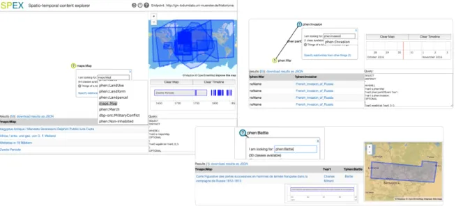
Scheideret al.describe a qualitative usability evalu-ation carried out with six participants: two librarians, two PhD students in Geography, and two ITC lectur-ers. The goal of this study was to assess the extent to which their prototype SPEX, the SPatio-temporal
ContentExplorer (shown in Fig. 1), satisfies the design guidelines they specify. The authors report between 45 and 90 minutes for familiarisation with the tool using a printout of its help file, followed by 30 to 45 min-utes to complete a set of exploratory tasks. Participants made good use of all query features, including func-tionality for reuse of previous results. However, none were successful at completing all tasks, with an over-all success rate of 52%. The authors note, though, that even where participants were not successful in com-pleting the tasks, in some cases they tried alternative strategies to answer the questions, with some of these alternatives leading to partial success or a correct an-swer(s).
Key challenges faced by the participants were re-lated to the unfamiliar use of terminology and label-ing of data – which, derived directly from the RDF, would be relatively easily interpreted by a SW expert, but did not translate easily otherwise, especially for the more ambiguous terms. A simple example is dis-tinguishing between a mapentityand the (visual)
geo-graphicalmap. Other challenges were due to user in-terface design issues such as what were found to be re-dundant steps to trigger events in the dialogs, and how to generate sub-queries using the timeline.
The authors conclude the paper with future direc-tions for research to more effectively translate their de-sign guidelines into more intuitive support for a non-technical, lay user audience.
Ontologies typically serve as a backbone for struc-turing Linked Data, and play a key role in defining links within a dataset and across datasets, to other re-lated data. Tools for constructing and exploring ontolo-gies and especially for mapping and alignment of con-cepts and properties therefore contribute to effective management and (re)use of LD. Fu, Noy & Storey in
Eye Tracking the User Experience – An Evaluation of Ontology Visualization Techniquesrecognise a gap be-tween work to develop ontology visualisation tools and the usability evaluation required to ensure best prac-tices are followed in the design and development of such tools. They highlight the resulting negative im-pact on the appropriation of useful and usable tech-niques that map to user expertise and knowledge re-quirements in ontology engineering and related knowl-edge management tasks, Linked Data being one obvi-ous example.
Fu et al.use eye tracking to collect empirical evi-dence about usability in a comparative study of two of the most widely used visualisation techniques in on-tology understanding: indented lists and trees. The au-thors argue that eye tracking, being able to directly capture user actions, provides more in-depth measures, at a micro level, to help determinewhyan approach or tool may be effective, as opposed to reliance only on traditional measures of performance during usability evaluation such as time to completion and success rate, that provide indirect means for capturing usability.
The study examined four hypotheses: (i) search, (ii) information processing, (iii) ability to reduce cog-nitive load, (iv) why a particular technique supports more efficient and/or effective use by particular types of users.
The study involved 36 participants, graduates and undergraduates from a wide range of disciplines within the Sciences. They were instructed to perform map-ping tasks between two sets of ontologies for approx-imately 2 hours. Participants were required to ver-ify whether existing mappings were correct and com-plete (identifying missing mappings otherwise). Visu-alisations of each ontology were provided to aid task
Fig. 1. Building queries using the click-and-select UI in SPEX, the visual query editor built to support non-technical end users exploring Linked Data.
completion, which relied on exploration of each pair of ontologies, both created from standard benchmark datasets. One pair was simple and described confer-ences. The second pair from the biomedical domain, describing organisms, was more complex. The authors note deliberate effort to reduce participant bias due to familiarisation with the data domains and the visual-isation techniques, in order to simulate as closely as possible challenges faced by novices (with no knowl-edge of SW technologies and especially ontologies). This restriction allowed measurement of the visuali-sation support for completing the task while reducing confounding factors, on the basis that domain- or SW experts would require less intuitive support to com-plete the tasks successfully. Further, the visualisations were generated to be as representative of current appli-cations as possible, by implementing the most typical cues for navigation and browsing, focusing on ROIs, filtering and hiding data. Further, each task started with only the root node visible, so that participants had full control over their navigation paths.
The results, based on 31 participants (five were dis-carded due to incomplete eye tracking data), found in-dented lists to be more effective for searching, while graphs better supported information processing. Par-ticipants completed tasks more quickly using the lists, at least in part due to the more compact visualisa-tion requiring less time to scan. However, they did not improve in accuracy over the use of graphs. Ev-idence on which of the two resulted in higher cogni-tive load was inconclusive, with no statistical
differ-ence between the two visualisation techniques. Over-all, participants spent more time on information search than in processing; Fuet al.suggest that more research be conducted about building support for search in on-tology visualisation.
The paper concludes with pointers to a more de-tailed investigation of affordances for information search and processing in ontology visualisation tools, including more efficient use of screen space and inves-tigation of the specific requirements of different user types across a wider set of visualisation techniques.
InAemoo: Linked Data Exploration based on Knowl-edge PatternsNuzzolese, Presutti, Gangemi, Peroni & Ciancarini extend previous work on the use of knowl-edge patterns to counter challenges faced by humans and machines attempting to explore the knowledge content of Linked Data. Nuzzoleseet al.argue that en-cyclopaedic knowledge patterns (EKPs), being derived from a collective intelligence store spanning multi-ple domains, provide a “cognitively sound” base from which to carry out exploratory discovery of complex, often dynamic, heterogeneous data such as LD.
EKPs are essentially mini-ontologies that define a class, and by mining the links to instances in Wikipedia, retrieve relationships to other classes ranked based on popularity or frequency of use. EKPs map to how humans [contributors to Wikipedia] view (knowl-edge about) entities and inter-relationships within this knowledge. By retrieving the most important/highly ranked relationships (above a variable threshold),
EKPs can be used to summarise knowledge about an entity.
Nuzzoleseet al.describeAemoo(see Fig. 2), a tool targeted at users with neither particular knowledge of the structure or content of a data store, nor expertise in SW technologies. Aemoo demonstrates how EKPs may be used to explore knowledge bases. The aim is to help users focus on the most “important” in-formation about an entity and then navigate to other related information. The authors employ a concept map coupled with a text-based detail window, argu-ing that mappargu-ing the visualisation to the data struc-ture of EKPs aids end-users in forming mental mod-els that support exploration. However, acknowledging potential challenges in the use of the large, complex, unwieldy graphs entailed by the inter-linking of large-scale, multi-dimensional datasets, they restrict their concept maps to a depth one level below the root. Their approach filters out less relevant or important infor-mation, thereby also reducing noise. Because Aemoo queries Wikipedia on-the-fly, the information retrieved reflects all updates to the knowledge base. This is in addition to dynamic data retrieved from Twitter and Google news that correspond to the entity in question. Aemoo includes a switch that allows users to retrieve what is described aspeculiar knowledgeorcuriosities
– entities linked to the focus that fall below the pop-ularity threshold. This enables users to also visualise information about an entity, that would usually not be considered important or relevant.
Nuzzoleseet al.present the results of a comparative evaluation, taking Google as a baseline for exploratory search, and RelFinder [39] to test Aemoo’s automatic summarisation against manual filtering and existing approaches to visual querying and exploration. Thirty-two non-technical undergraduates from Thirty-two universi-ties completed three tasks using Aemoo and, alter-nately, one of the other two tools. The authors report that each of the three tools performed better than the other two for one task – RelFinder at summarisation, Aemoo at discovering related entities, and Google at discovering relations between entities. Overall, how-ever, Aemoo outperformed both RelFinder and Google search, with RelFinder performing worst. While Ae-moo also scored higher for learnability and usability, based on the SUS questionnaire [see 16], there was no significant difference with the other tools.
Based on these evaluation results, Nuzzoleseet al.are considering, among others, reusing functionality in RelFinder to present relationships in Aemoo. They conclude with pointers to additional work to improve
presentation of, and navigation in, knowledge bases. Bikakis, Papastefanatos, Skourla & Sellis inA Hi-erarchical Aggregation Framework for Efficient Multi-level Visual Exploration and Analysistackle the chal-lenges faced in exploratory analysis of today’s big, het-erogeneous, dynamic data, to support immediate and on-going analysis online. Bikakiset al.posit that a hi-erarchical approach to data processing and aggregation enables customisable construction of data overviews on the fly, from both static and especially dynamic, numerical and temporal data. Followed by support for identifying and drilling into the details of ROIs, the au-thors aim to provide support for end users in navigat-ing through and maknavigat-ing sense ofbig data.
Their generic model takes as input data regardless of structure and generates output structured to allow the use of varied visualisation techniques for presentation and analysis, hierarchical or not, complemented by sta-tistical summaries of the input data. The authors note also that while they focus on data encoded as RDF, the approach is reusable for data in other forms, provided it is numerical and/or temporal.
Fig. 3 showsSynopsViz, a prototype built to demon-strate the results of applying this hierarchical aggre-gation model to Linked Data. Three visualisation op-tions, a timeline, a treemap and chart views, are pro-vided for visualising the output.
Bikakiset al.assess the effectiveness and efficiency of their approach by comparing it with a baseline de-scribed asFLAT – displaying all detail for a dataset. The test measured (initial) response time for data pre-processing and subsequent response time for display-ing data of interest, usdisplay-ing the DBpedia 2014 dataset [2]. Construction and response time for the two hierar-chical approaches presented were roughly equivalent, with minor improvement for the range-based over the content-based tree. For data up to 10,000 triples, FLAT performance approaches that of hierarchical aggrega-tion. Significant cost in construction of the hierarchi-cal approaches was found to be due to communication, notable for small datasets, but decreasing proportion-ally for larger datasets due to additional time required to render the latter. To improve overall response time, the authors also enable incremental construction for the hierarchical approach. With respect to data proper-ties, the test results show that FLAT was restricted to a maximum of 305,000 triples, while the hierarchical approach successfully processed all data subsets. Fur-ther, the latter was found to outperform FLAT for all
Fig. 2. Illustrating from left to right, navigation from the EKP for the entity retrieved for the search term “Napoleon” to the EKP corresponding to the “French Invasion of Russia” in “The War of 1812” (see lower snapshot), through an entity of typeMilitary Conflict
Fig. 3. Visualising the results of hierarchical aggregation of Linked Data in theSynopsVizprototype. Clockwise from top, left: dataset statistics; selected classes in a treemap; selected spatial attributes. Bottom, left: middle snapshot zooms in to show detail, before zooming back out and including another temporal attribute.
tests, with increasing difference in response time with dataset size.
Usability evaluation of the SynopsViz tool was also carried out with ten participants with a background in Computer Science. The evaluation involved three sets of tasks across all three approaches to measure users’ ability to (i) discover specific information, (ii) discover data within defined ranges and (iii) com-pare and rank data subsets. The comparative evalua-tion was carried out with two datasets, one containing 970 triples and the second almost 38,000. For all three approaches, the authors found significant differences in task completion time for the larger dataset size, due to the much longer time spent navigating through data structure and content. The hierarchical approaches sig-nificantly outperformed FLAT for the larger datasets, because data clustering reduced the number of navi-gation steps required to find matching responses. For the smaller dataset, however, time to completion for FLAT approached that of the hierarchical approach, due mainly to the need for a larger number of naviga-tion steps through the hierarchy. The range task was also particularly difficult to perform using the FLAT approach – cognitive load may have contributed to this as participants had to browse a significant por-tion of the data (displayed in detail) to complete the task. The range-based and content-based approaches differed slightly in performance time depending on which approach better matched data clustering to task type. The authors note also a key concern of partici-pants that hampered navigation: getting lost during the exploration.
The authors conclude with pointers to future work, including a hybrid version that would employ a weighted combination of each of the content-based and range-based approaches to aggregation.
Del Rio, Lebo, Fisher & Salisbury inA Five-Star Rating Scheme to Assess Application Seamlessness as-sess the cost of coupling multiple visualisation tools together on different platforms, with the aim to pro-mote seamless reuse of visualisation solutions and therefore more effective analysis.
The authors use the munging task in Visual Ana-lytics (VA) – processing of input data to fit a specific tool’s requirements – to illustrate variations in cost due to data structure and semantics, from high-cost 1–3 star mundane data to low-cost, inter-connected, semantically-enriched, 4–5 star data. They extend the PROV ontology [36] to capture data and the analytical process, and to illustrate how inter-connected,
seman-tic, Linked Data may be used to build a bridge between independent datasets and the results of analyses, thus lowering the cost of performing those analyses.
Del Rioet al.describe an application scenario where a student with technological expertise analyses data from multiple stores to obtain information about de-commissioned satellites and other equipment aban-doned in space. The scenario illustrates the need to switch constantly between semantically-rich data de-scribing the student’s focus, and more mundane rep-resentations of this data in visual form, that are eas-ier to interpret but whose content cannot be reused for further analysis. The analysis is therefore constrained, with significant cost incurred by moving between men-tal models of the data formed as the analysis pro-gresses and alternative representations that break these models. Some of these require further data munging, resulting in attention loss with respect to the data and their semantics. The student then passes on her initial results to a fellow student, who reviews and extends the analysis to confirm her results and answer open ques-tions. The scenario illustrates further difficulty reusing the initial results, due to limited provenance informa-tion about the data and the lack of traces about the an-alytical process followed. Cost again increases when the first student attempts to reuse the analysis results of her colleague; while the new visualisations provide further information, they are not directly connected to the underlying linked and semantically-enriched data.
Del Rioet al.utilise the outcomes of this scenario to derive anapplication seamlessnessmetric that takes into account the initial cost of analysis and the cost of reusing the results of prior analyses. The metric is de-fined using ontology restrictions that assign costs rang-ing from one to five stars. The costs reflect the impact of employing a set of applications or following specific approaches in the data analysis process. The proposal harnesses the strengths of both the VA and SW com-munities for managing data to avoidpain pointsand re-duce cost in data analysis, instead increasing effective-ness. A key component of the approach is maintain-ing the links between the analyst, the analytical tools in use, and input data (including previous analysis re-sults).
The authors conclude with proposals for future work to also take into account analysts’ expertise and back-ground in measuring the cost of using selected tools or approaches. They also discuss refining their guidelines to capture more effectively the cost difference between individual star ratings, as opposed to ranges, in their
seamlessness metric.
Today’s inter-connected, data-driven economy re-quires decision-makers to consider the impact of mul-tiple external factors using data from a variety of sources and increasingly outside their domain, in order to feed wider contextual data into informed decision-making. However, the cost of access to third party data, especially where proprietary, and support for effec-tive analysis of the resulting heterogeneous datasets, are often beyond the means of smaller organisations and research institutions. Brasoveanu, Sabou, Scharl, Hubmann-Haidvogel & Fischl inVisualizing Statisti-cal Linked Knowledge Sources for Decision Support
look at the potential of the growing collection of sta-tistical Linked Open Datasets to fill this need. These datasets, including the Eurostat database [4] and the World Bank Catalog [10] are built on the RDF Data Cube Vocabulary [19].
Brasoveanuet al.identify a set of challenges inher-ent to the exploration and analysis of large-scale, het-erogeneous, inter-connected data, made more com-plex by the unique challenges found in statistical LD analysis – including variations in data structure and content, inconsistent and poor use of data schemas, and frequent failures of dynamic data portals such as SPARQL endpoints. They therefore highlight the need for integrated visual, multi-perspective analysis solutions that enable complex question-answering over such data, that scale, and that are reusable beyond spe-cific use cases.
The authors describe the iterative, scenario-driven process they followed through requirement collection, design and prototyping, following best practices and guidelines for visual analysis, with a focus on the specific requirements of Linked Data and statistical data. This process resulted in a dashboard contain-ing multiple, coordinated components for data prepro-cessing and integration, visualisation-driven analysis, and for effective presentation of the often also multi-dimensional analysis results. Based on their findings – challenges faced and successful application of re-search – they propose a set of guidelines and work-flows for tackling the challenges in building decision support systems over Linked Statistical Data.
Brasoveanu et al.illustrate the advantages in pro-viding multiple perspectives on the data (slices) and the results of analyses using a set of scenarios about decision support in the tourism and telecommunica-tion industries. They then summarise the results of exploratory evaluation of theirETIHQ dashboard, to
measure usability against traditional approaches to cross-domain analysis for decision support, and iden-tify additional functionality required by target users. Sixteen participants took part in the evaluation, all in their usual work environment: ten tourism experts based in different countries, and six researchers. They completed two activities with the dashboard, com-prising preset and user-defined tasks, and a third ac-tivity using their usual working tools. The ETIHQ
dashboard was observed to perform significantly bet-ter than manual (traditional) approaches to question-answering, with participants providing more detailed and precise responses, accompanied by a gain in task completion time of almost 30%. Recommendations for improvements to the dashboard included, among oth-ers, the use of a simpler workflow, the implementa-tion of search features, and the use of domain termi-nology (as opposed to termitermi-nology reflecting the use of SW technology for encoding data). Participants also requested the inclusion of news and social media data. The authors conclude with a description of updates to the dashboard based on feedback from the usability evaluation.
We summarise in Table 2 the contributions in this special issue by looking at the set of visual presenta-tion and analysis features that was also used in Table 1 to compare other related work. For completeness, two additional features relevant to LD visualisation and analysis are included:faceted search/browseand sup-port forediting underlying data. Neither of these fea-tures was implemented in any of the tools in Table 1, and we only see limited implementation here.
4.1. Reviewers
This special issue would not have been possible without the support of our reviewers, who provided detailed and informed feedback to authors throughout the multiple iterations on each paper. We thank all re-viewers for their contribution to the special issue, and list them below in alphabetical order.
Mark GaheganUniversity of Auckland, New Zealand
Roberto García González Universitat de Lleida, Spain
Luc Girardin Macrofocus GmbH, Switzerland
Florian Haag University of Stuttgart, Germany
John Howse University of Brighton, England, UK
Valentina Ivanova Linkoöping University, Sweden
Tomi Kauppinen Aalto University School of Sci-ence, Finland
Table 2
Design features for visual presentation and analysis of Linked Data addressed in contributions to the special issue LEGEND:- “x∗”: partial implementation/limited scope|“ ”: could be implemented|“–”: not relevant/out of scope
Usability Criterion Scheider et al. Fu et al.∗ Nuzzolese et al. Bikakis et al. Del Rio et al.∗ Brasoveanu et al.∗ Visual overview x∗ x∗ x∗ x x x Multiple perspectives x x x x x Coordinated views x∗ x x Data overview – x x∗ Graph visualisation x x x
Ontology / RDF graph view x x x∗
Detail on demand x x x x x x
RDF URIs & labels x x x
Highlight links in data x x x x
Support for scalability x x∗ x∗
Query (formal syntax) x –
Query (forms / keyword) x x x
Visual querying x x x
Faceted Search / Browse x∗ x
Filtering x∗ x∗ x x x
History x x x
Presentation templates x
Keyword / DMI entry point x x x x∗ x
Non-domain specific x x x x x x
Edit underlying data x∗
Reusable output x∗ x∗
Target – Lay-users x∗ x x∗
Target – Domain experts x∗ x x x
Target – Tech-users x x∗ x∗ x x
Steffen Lohmann Fraunhofer IAIS, Germany
Heiko Paulheim University of Mannheim, Germany
Jan Polowinski TU Dresden, Germany
Mariano Rico Universidad Politecnica de Madrid, Spain
Bernhard Schandl mySugr GmbH, Austria
Thomas Wischgoll Wright State University, USA
5. Future Challenges for Linked Data Visualisation
In their introduction to the Semantic Web Journal’s first set of LD description papers in 2013, Hitzler and Janowicz [30] identify Linked Data as“enablers in re-search”, stating its importance. We reiterate this
state-ment confidently: even if many challenges remain, LD has significant value as a rich, structured source of knowledge for both research and practical applica-tions.
The challenges discussed in this special issue re-volve mainly around making LD accessible to end-users, primarily through interactive, visual represen-tations of this novel form of data whose characteris-tics are quite unique, as discussed earlier. While these characteristics are what make LD suchenablers, they are also the reason why it is proving so difficult to de-sign effective user interfaces for LD and for the Web of Data at large.
As demonstrated in the papers in this special issue, we continue to see advances in research on the use of visualisation for making LD more accessible.
Ef-forts have been moving from producing simple, basic demonstrators of LD browsing to more elaborate tools that integrate data capture, exploration, analysis and/or presentation in a visualisation-driven front-end. How-ever, there is still significant room for improvement.
Hendler [29] in 2008 raised the “chicken-and-egg problem” regarding the adoption of Semantic Web technology outside the community. The technology was not sufficiently proven at the time, even though RDF and SPARQL had been introduced several years before, and examples of success using ontologies to describe data already existed. Government, state-run institutions and industry were reluctant to dedicate resources to encoding and sharing their varied data to grow this new “Web of Data”, but data was re-quired to feed into the development of sophisticated tools for managing and interacting with this new Web. Seven years later, Neish [44] describes several exam-ples of successful use of Linked Data in different do-mains outside the Semantic Web community, in gov-ernment, education and industry. He stresses, however, that links across independently created datasets rarely span across domains. Further, technological barriers continue to hamper the adoption of LD principles in data generation and sharing, with a corresponding in-crease in economic and other risks following these principles for data management.
User interface design for LD is still in its infancy. This is reflected in publications describing design and prototypes developed within the research community for LD visualisation, which are targeted predominantly at workshops rather than journals or research tracks in conferences. However, workshops dedicated to discus-sion of research on interactive visualisation tools for LD are one avenue that will help foster research as the generation and consumption of LD increases, and as LD use spreads over more and more application ar-eas. Interestingly, Neish [44] concludes that incremen-tal adoption of LD may help avoid the acknowledged “chicken-and-egg problem”, by ensuring that the tech-nology is well developed and proven before the Linked Data initiative starts to play a key role in helping to re-solve newer challenges such as those posed by today’s complex, distributed, heterogeneous, big data [see also 43,58].
5.1. Breaking Away from Graph Visualisation
The review of the state of the art (section 2) shows a predominance of LD representations based on graph visualisation techniques. This is probably due
to the following key factors that encourage the use of node-link diagrams to depict tree and graph struc-tures: (i) ontologies are often hierarchically structured, rooted atThingor another general, abstract topic or domain concept; (ii) RDF’s data model is a directed labeled graph, “ipso facto we use graphs to repre-sent it”[51]; (iii) network analysis is one of the more common visualisation-driven tasks carried out within the field, to explore, e.g., collaborations and other in-terrelationships between researchers and within re-search data, and social networks at large. It is thus not particularly surprising that many attempts have been made over the years to visualise these tree and graph structures. Such approaches, however, have had lim-ited success; even those that have explored alternatives to the typical representation based on node-link dia-grams, such asOntoTrix, which investigated the poten-tial of a hybrid representation involving adjacency ma-trices [11]. While node-link diagrams may be effective representations when considering very small graphs, they fail to provide meaningful visualisations beyond a few dozen nodes and edges, even when styled to better convey the resources’ and properties’ semantics [46]. Benedetti et al. [12], for instance, report that evalua-tion participants wondered how usable their graphical schema-based summaries would be for large datasets. In this special issue, Nuzzoleseet al.acknowledge this challenge by restricting the concept maps they use to visualise encyclopaedic knowledge to only a single level below the root (and focus), in addition to setting a threshold below which data directly linked to the focus is hidden.
Indeed, node-link diagrams quickly become very cluttered and illegible, and generate a lot of viscos-ity [23] both in terms of interactive exploration and content manipulation. Furthermore, and perhaps more importantly, exposing the data’s graph structure might not always be relevant. Doing so may therefore have the unintended consequence of over-emphasising the data model to the detriment of the content. In many cases, the model is of little importance to users, and it is interesting to observe that early attempts at cre-ating general-purpose LD browsers, no matter the tar-geted level of audience expertise, have tended to rely on presentation solutions such as Fresnel [47], that do not expose the graph structure to users, but rather pro-videlenseson this structure that employ, for example, metaphors that relate more closely to end users’ tasks and context.
More recent work, including some of the articles in this special issue, are continuing to investigate this