Interactive Visualization of Spatial and Temporal
Patterns of Diversity and Abundance
in Ecological Data
Tuan Pham
1, Steven Highland
1, Ronald Metoyer
1, Donald Henshaw
2, Jeff Miller
1, Julia Jones
11 Andrews LTER, Oregon State University, Corvallis, Oregon
2
US Forest Service, Pacific Northwest Research Station, Corvallis, Oregon
[email protected], [email protected], [email protected], [email protected], [email protected], [email protected]
Abstract—Analysis of spatial and temporal patterns of diversity
and abundance in ecological data has been an important focus in ecology. Nevertheless, ecological data such as multi-species data sets are often difficult to analyze because species are usually unevenly represented and multiple environmental covariates may describe their distributions. Although typical univariate, bivariate, and multivariate statistics provide rigorous tests of hypotheses, they have limited capacity to quickly identify relationships among multiple species and environmental covariates, or detect change over time. We propose a novel visualization technique, the Diversity Map, which facilitates the visual inspection of the distribution, abundance, and covariates of large multi-species data sets using an interactive web-based visual interface. To develop this tool, we have taken a user-centered design approach, in which our team of ecologists, information managers, and computer scientists collaborate closely during the development process. Initial findings indicate that this tool is extremely valuable for ecologists in the early stages of data exploration, prior to further statistical analysis. In this paper, we discuss our design approach, the design elements, and implementation of the Diversity Map tool and we demonstrate how the tool can help scientists gain insights into spatial and temporal patterns of ecological data. The use of this tool is illustrated with data on moth diversity and abundance from the HJ Andrews Experimental Forest.
Keywords—interactive data visualization; web-based application; multivariate data; user-centered design; moth diversity and abundance; HJ Andrews Forest
I. INTRODUCTION
Understanding how spatial and temporal patterns of species diversity and abundance respond to environmental gradients and temperature are fundamental problems in ecology. For example, ecologists hypothesize that the emergence, abundance, and distributions of moths may be indicators of phenology and its effects in mountain landscapes as well as of broader biological diversity in plant types and physical environments [1, 2]. Therefore, the conservation of moths, especially rare moths, may depend on the conservation of associated vegetation habitat [3].
A common approach to verifying these hypotheses is to
collect data and then utilize statistical tests to draw conclusions.
In addition, recent developments in statistics and data mining have resulted in methods to describe patterns and make predictions automatically [4]. These approaches work well when the number of testing variables is small and/or hypotheses are preconceived. Otherwise, a more comprehensive approach may be to enable ecologists to directly explore the data, form hypotheses, and discuss their findings with others, prior to specific hypothesis testing. Interactive visualizations of the data offer the potential to allow this kind of exploration, if the representation can reveal patterns and/or trends across variables. While typical static charts such as scatter plots and histograms have traditionally been utilized by ecologists to explore diversity and abundance patterns, little work has been done to develop interactive visualizations that support multivariate multi-species data.
Before we introduce our visualization tool, consider our particular ecological problem of studying diversity and abundance of moths. Ecologists have sampled moths in the 64-km2 H.J. Andrews Experimental Forest (HJA) and Long Term Ecological Research (LTER) site within the Willamette National Forest, Lane County, Oregon. Moths were sampled at 20 sites every two weeks from May-October from 2004 to 2008. The data set has been difficult to analyze because the data set is large (>69,000 individual moths), many species (>500) are present, common species are widespread, and most species are rare (see Section II.A). Typical univariate and bivariate statistics utilized by ecologists have limited capacity to identify relationships among species and environmental covariates, or detect change over time in such complex multivariate datasets. For example, a tremendous amount of information is concealed in diversity indices (e.g. Shannon Index [5, 6]); regressions limit researchers to species-by-species tests; and some multivariate methods have limited tests of species-environment relationships. Yet while exploration of single variables (attributes) via static histograms is useful (or rank/abundance curves [6], in particular as shown in Fig. 1), these approaches are visually overwhelming when a large number of variables and/or subsets of data are involved.
Visualizations may assist in the process of data exploration and manipulation, and serve as a complement to statistical approaches. From the computing perspective, the moth data set presents 1) a challenging large multivariate data set
This work is licensed under a Creative Commons Attribution 3.0 Unported License (see http://creativecommons.org/licenses/by/3.0).
Figure 1. Log Abundance curve showing the distribution of moth species in the moth dataset. ‘A’ shows the common moths, ‘B’ shows the rare
moths, and ‘C’ shows the common through rare moths.
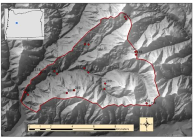
Figure 3. Map showing the location of the Andrews Forest in the central western Cascades, Oregon with 20 moth trap sites (red dots).
The red line is the boundary of the forest.
visualization problem, 2) a unique visual exploration process that involves inspecting distributions and relationships of distributions as opposed to specific data samples, and 3) valuable supporting materials for sharing of scientific findings, if the representation of the data is readily available.
In our research, we have developed a novel visualization technique, the Diversity Map (DM) [9], that facilitates the visual inspection of the diversity, abundance, and relationships among multiple variables using an interactive web-based visual interface. To develop the tool, we have taken the user-centered design approach in which ecologists work closely with computer scientists during all stages of the design process [10], [11]. Initial findings from the application of the tool to the HJA moth data set indicate that it is highly valuable for ecologists in the early stages of data exploration and collaboration. In particular, ecologists can use this tool to quickly form an overview of their entire data, drill down to subsets of data, detect relationships among variables, identify and share hypotheses for further exploration, and download subsets of data for standard statistical analysis. Moreover, since the tool is web-based and readily available, it may potentially target a broader user pool, including educators and students.
II. METHODS
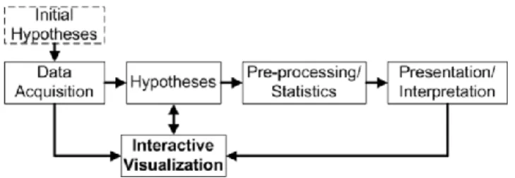
We have developed the DM tool based on the information visualization reference model [7, 8], a widely-used software architecture pattern that models the visualization process as discrete steps from collecting the source data and transforming them to appropriate formats to mapping data to visual representations and ultimately supporting view transformation via user interactions (Fig. 2). The outcome of the process is an interactive visualization that helps users complete their tasks and/or gain additional insights into their data. In addition to utilizing this model, we have integrated the users (ecologists) into the design process with the user-centered design approach [10, 11]. This section describes data sets and the steps
involved in development of the tool. A. Source Data – Moth Trapping
Moths were collected at 20 locations in the Andrews Forest (Fig. 3) 10 times per year during the summers of 2004 to 2008 (2-week sampling periods), using UV light traps. Moth abundance refers to the number of individuals caught in a single trap in a single night, or the total number of individuals in any aggregated assemblage of trapping events. Host plants for moths, if known, were based on Miller and Hammond [12]. Additionally, the following environmental variables were used to explain the distributional patterns of moths: calendar day (sampling period), temperature (accumulated heat-units), vegetation type, watershed, and elevation. Values of vegetation type, watershed, and elevation are determined based on trap sites and values of temperature are based on sampling periods.
In summary, a total of 69,168 individual moths from 514 species were captured (Fig. 1). Species richness was high, but most species were rare, producing highly varied patterns of diversity (Fig. 1). Fifty-four (10%) of the 514 moth species were represented by only 1 individual, and 46 (9%) were represented by 2 individuals.
We used two subsets of the entire moth dataset in the analyses: 26 common moth species and 66 rare moth species. We define common moth species (n=26) as those for which 500 or more individuals were captured over the entire five-year sampling period. We define rare moth species (n=66) as those for which a total of 5-10 individuals were captured over the five year sampling period. Note that we do not include moths with 1-4 individuals as part of the rare moths because we assume that an average abundance of at least one per year will provide enough information to identify the moth's spatial and temporal associations. Moth species with 1-4 individuals will not provide the level of detail needed to sufficiently identify the environmental associations of the moth species. For example, singletons and doubletons are very difficult to understand because they do not occur often enough to analyze statistically.
The 26 most common moth species (‘A’ in Fig. 1) accounted for 41,889 individuals (60.6% of the total abundance). The 66 moth species considered as rare (‘B’ in Fig. 1) accounted for 467 individuals (0.7% of the total abundance).
Figure 2. Information Visualization Reference Model [7, 8] illustrating the steps involved in building an interactive visualization.
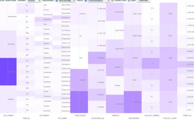
Figure 4. The DM representation of common moths. The data set contains 41,889 individual moths and 11 attributes (columns from left to right: LEP_FAMILY, TRAP_ID, LEP_GENUS, LEP_NAME, FOOD_PLANT, ELEVATION, HABITAT, WATERSHED, COLLECT_PERIOD, COLLECT_YEAR,
TEMPERATURE)
B. Data Transformation
We compiled the common and rare moth data sets into a table format, with each column corresponding to an attribute (variable) and each row corresponding to a sampled moth species. Specifically, each row represents a moth species with non-zero individual abundance collected at a trap site on a sampling date. We augment each sampled species with the aforementioned environmental variables. The structure of the data set is described in Table I. Note that the DM representation, which we describe in the next section, is currently designed to visualize only categorical data. We transform quantitative attributes into categorical attributes by discretizing or binning values into ranges.
C. Visual Mappings – The Diversity Map Representation The DM representation is based loosely on the parallel coordinates [13] and small multiple histograms techniques for visualizing multivariate data. In this representation (Fig. 4 and 5), each attribute is represented as one of a set of parallel (vertical) axes, similar to the layout of a parallel coordinates visualization. Unlike traditional parallel coordinates, however, each data object (or each sampled moth individual in the case of the moth data sets) is represented with a semi-transparent rectangle placed on each attribute axis at the discretized range corresponding to the individual’s value for that particular attribute. The representation is designed primarily for categorical data, so continuous numerical attributes are discretized into bins called “buckets.” The sizes and numbers of buckets for discretized continuous attributes were based on convenient divisions of the data (e.g., 100-m intervals for elevation, two-week intervals for calendar date, and 100-degree intervals for accumulated heat units).
TABLE I. STRUCTURE OF THE MOTH DATA SET
Attribute Name Type Description
LEP_NAME categorical Lepidoptera (moth) scientific name; includes genus and species
LEP_FAMILY categorical Lepidoptera taxonomic family LEP_GENUS categorical Lepidoptera taxonomic genus FOOD_PLANT categorical Host functional feeding group TRAP_ID categorical Identifier for a trap site
ELEVATION numerical Elevation. Discretized by 100m band. HABITAT categorical Habitat
WATERSHED categorical Watershed
COLLECT_PERIOD categorical 2-week collect period. E.g., ‘7.2’ represents the second half of July COLLECT_YEAR categorical Collect year
TEMPERATURE numerical Temperature (Heat unit). Discretized by 100 unit band.
NO_INDIV numerical Number of individuals
We treat all individual moths equally; each semi-transparent rectangle representing one moth individual contributes an equal, fractional amount of opacity to the bucket in which it is placed. Because the range of opacity levels is limited, we scale the number of individuals in each bucket according to the total abundance of all individuals in the visualization. Thus, the opacity of each bucket x is calculated as f(x) = |x|/|total|, where |x| denotes the number of individuals in bucket x and |total| is the total number of individuals from the visualized data set. Although we use linear scaling in our implementation, the method can accommodate other forms of scaling, such as logarithmic, for species whose abundances span multiple orders of magnitude [14]. We choose white as the background color and blue as the foreground color, because the human eye is known to be more sensitive to changes in blue than in other colors [15]. We map opacity values to values in
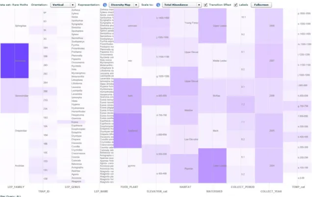
Figure 5. The DM representation of rare moths. The data set contains 467 individual moths and 11 attributes ordered as in Fig. 4
the CIELAB color space [16], which is perceptually uniform, meaning that a visual difference in color opacity is equally perceptible across the range of that color. We then convert CIELAB values to RGB values for representation on a computer screen.
Alternatively, the DM representation can be understood by imagining each attribute axis as a histogram over the values of that attribute, constructed in 3D space by stacking semi-transparent tiles on top of each other. When viewed from above, the taller stacks of tiles appear darker, while the shorter stacks appear lighter, according to the total combined contribution of the tiles in each stack to that stack’s opacity. In addition to the DM representation (opacity encoding), the visualization tool also allows users to switch to a small multiple histograms representation (bar length encoding) (Fig. 6).
The DM created in this analysis expresses diversity and abundance patterns of an attribute by the number of buckets with non-zero opacity and by the color distribution across the opaque buckets of that attribute, respectively.
D. View Transformations – Interactivity
A primary characteristic that differentiates the DM tool from static charts typically employed by ecologists is that the tool supports a wide range of interactive features. These features allow the transformation of the view to alternative views so that users can interact with and explore their data. In particular, these features can be used to query the data (e.g., filtering), to change the representation of the data (e.g., switch between the Diversity Map and small multiple histograms representations, re-order the attribute axes, or sort the buckets within an attribute), or to show additional relevant information (e.g., tooltips, rich data pop-ups).
Data filtering extends the static DM to facilitate subsetting of data. For example, a user can constrain, or “filter,” a single attribute or multiple attributes to one or more particular values (buckets) (e.g. show all moths that were sampled at TRAP_ID X and in COLLECT_YEAR Y) (Fig. 7). The remaining attributes then display the distribution of only those individuals that fall within the specified range of the filtered attribute values. Filtering facilitates direct comparison of the attributes of a subset of specific samples as well as comparisons of subsets of data.
Filtering is accomplished through direct manipulation of buckets. Users can simply click on a bucket to add/remove the corresponding attribute value to/from the filter. A filter ‘status’ bar at the bottom will show the current filter query. To construct a complex filtering query consisting of multiple buckets (or attribute values), we follow a simple and commonly used rule articulated by ecologists: buckets within an attribute are connected by the “OR” condition, whereas groups of filtered buckets across attributes are connected by the “AND” condition. Additionally, we plan to add an ‘export’ feature to the tool to allow users to export and download subsets of data for standard statistical analysis. To some extent, the tool can be used as a visual query builder to construct the query quickly and intuitively.
To further support comparison of attributes of interest, users are also given the ability to reorder the axes horizontally and to sort the buckets of a single attribute by abundance or by alphabetical order of value name if desired. Users can also hold the mouse pointer over a particular bucket to display the number of individuals falling into that bucket, and they can rotate the representation to accommodate their orientation preference (portrait or landscape) or their screen dimensions.
Figure 8. The collaboration between ecologists and computer scientists taking an iterative user-centered, participatory design approach Figure 6. The small multiple histograms representation of common
moths. Users can select their preferred representation in the drop-down list located on the control bar at the top.
Figure 7. The DM representation of common moths sampled at TRAP_ID ‘26H’ and in COLLECT_YEAR of ‘2008’. Rich data pop-up showing an
aerial photo of the trap location.
Furthermore, the tool allows interactive identification of additional relevant information. The DM tool supports rich data pop-ups, which may display researcher-provided information on any of the buckets. For example, double-clicking on a trap ID pops up the aerial photo of that trap site in the Andrews forest (Fig. 7). Each bucket can potentially be linked to other data sources such as a GIS map, a Wikipedia page, or even another visualization.
E. Implementation
The DM tool was developed using Flex 3 and the Degrafa graphics framework. Flex 3 (available at <http://opensource.adobe.com/wiki/display/flexsdk/Download +Flex+3>) is an open-source framework by Adobe for creating Flash rich internet applications. Degrafa (available at <http://www.degrafa.org/>) is an open-source graphics framework that facilitates the process of creating pre-composed graphics in Flex 3. In particular, Degrafa helps create lightweight geometry building blocks such as rectangular buckets and attribute axes in the DM tool. Since Flash is web-based, no installation of the tool is required and it can be accessible on any browser or device that supports Flash.
In addition to the input data table as described in Section II.B, each application requires an additional metadata table that describes the valid domain for each of the visualized attributes. This metadata table enumerates all possible values for each attribute (e.g., lists each Lepidoptera family name present in the data for attribute LEP_FAMILY) and determines the default ordering for each axis. Additionally, any enumerated value in the metadata table can be augmented with other relevant data such as a URL link to an image of the actual trap indicated by TRAP_ID, or to a GIS map for any listed WATERSHED). Currently, both tables (input data and metadata) are stored in comma-separated values (CSV) format. In future work, we plan to extend the tool to load the input data and metadata directly from a database management system (DBMS), and take advantage of the highly structured metadata employed by the HJA LTER website [17] to make this tool more generic and easily applicable to other population data, such as HJA plant and birds data sets.
F. User-Centered Design with Ecologists
A close collaborative effort between ecologists and computer scientists was required to understand the analysis process for integration of the DM into active research. We employed a user-centered, participatory design approach (Fig. 8) [10, 11] where the ecologists were included as part of the design team from the beginning of the collaborative effort. The initial prototype of the DM served as the starting point for this particular collaboration.
The initial prototype was initially developed for a small subset of the data, and it proved invaluable as a means for stimulating discussion and identifying design alternatives. In early meetings, the prototype served as a way to introduce the ecologists to the visual representation in the particular context of their data set. Subsequent meetings followed a very informative and dynamic process. In particular, each session generally started with the computer science team running the visualization, projecting the view onto a large screen for the entire team to view. The ecologists would then begin to explore the data set in an iterative fashion, asking questions and modifying views to answer those questions, and repeating. The process was typically very fast-paced and very collaborative with team members posing questions to each other and devising views together to answer those questions. When a question could not be answered using the provided
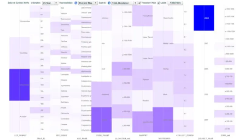
Figure 9. The DM representation of common moths sampled in COLLECT_YEAR of ‘2004’ (left) and ‘2008’ (right)
representation and interactions, the entire team would break from the exploration cycle to discuss how the system could be modified to further enhance the application. In the weeks following each meeting, the computer science team would integrate the design modifications into the system in preparation for the next design meeting. As the design matured, the work centered more on dedicated exploration and analysis of the data set.
III. RESULTS AND DISCUSSION
In this section, we illustrate the value of the DM tool by several example scenarios of ecologists exploring the moth data sets and we discuss what we have learned from our interdisciplinary collaboration.
A. Exploration of the moth data sets – Example scenarios Visualizations of common moths and rare moths can be accessed at <http://purl.oclc.org/diversitymap/commonmoth> and <http://purl.oclc.org/diversitymap/raremoth>, respectively. The ecological findings presented in this section are primarily for demonstrating the utility of the tool. Ecology readers are encouraged to refer to [18] for more detailed analysis of these findings.
First, without requiring any interactions from users, the overview of moths (Fig. 4 and 5) quickly suggests that common moths are associated with common habitats (conifer forests in the HJA) and rare moths are associated with rare habitats (meadows in the HJA). In addition, the visualization shows that common moths are mostly conifer-feeders and rare moths are mostly hardwood, herb, and grass-feeders. That is, the view of common moths (Fig. 4) shows ‘gymno’ is the most opaque bucket within FOOD_PLANT axis and the view of rare moths (Fig. 5) shows ‘herb’ and ‘hardwood’ are the most opaque buckets within the same axis.
Second, consider this example, which demonstrates how interactions facilitate the investigation of temporal relationships in the moth data sets. Because moth development is temperature dependent, ecologists hypothesize that adult moths emerge earlier in warm years and later in colder years. According to the temperature records, while 2004 was a warm year, 2008 was a much colder year. Ecologists can filter the
moth records by COLLECT_YEAR and/or
COLLECT_PERIOD to observe temporal trends. The views
help verify that the peak in common moth abundance occurred earlier in 2004 (and 2006) than in 2008 (Fig. 9 left and right). Note that they show moth capture by 2-week sampling period (8th column) and by degree days (last column). In 2004, most moths were captured in sampling periods 7.2 and 8.1 with very few/no moths captured after 8.1, whereas in 2008, moths were captured in sampling periods 7.1 to 8.1 and continued to be captured until 9.1. Common moths were initially captured in a much more concentrated time span in 2004 than 2008, with many more moths initially captured later in the year in 2008 than in 2004. In this example, while ecologists need to observe
only three attributes (COLLECT_YEAR,
COLLECT_PERIOD, and TEMPERATURE) to answer their question, they can potentially look at other attributes for additional insights. For example, they may initially pre-define the ordering of moth species in LEP_NAME attribute (e.g., by abundance) and then quickly verify whether the ordering pattern remains consistent over these two years.
B. User-Centered Design
The user-centered design process was important in reaching a design that truly met the needs of the target users (ecologists). An initial prototype was a key component in starting the ‘discussion’ between ecologists and computer scientists and helping the design team to understand the exploration process. Although the prototype may not be the final design, some means for rapidly exploring the data allows the team members to begin to understand the typical process and types of questions they can and would like to ask of the data.
Characteristics/Process. Given interactive tools,
ecologists were able to quickly and iteratively explore data that was originally in a very inaccessible format. The visualization provided an environment in which ecologists could rapidly answer questions and visually verify expected relationships. The process was typically iterative with several cycles of starting with a question, taking an exploration path, getting insight, and then starting over with a different path through the data. In some cases, ecologists felt the need to explore two paths simultaneously to observe the differences in the outcome. This multiple path exploration capability is a fundamental requirement of creativity tools [19]. Data analysis through visualization must support the creative process of hypothesis generation (Fig. 10).
Figure 10. The visualization driven data analysis process
visualization served as a means for rapid high-level exploration of complex data that was then followed with detailed statistical analyses. Data exploration tools, such as the DM, which overview the data, should provide mechanisms for exporting subsets of data associated with the current view so that scientists can conduct appropriate statistical analyses.
Communication. On several occasions an ecologist sought to explain a particular insight or finding by walking the team through the necessary interactions to produce a specific view. Exploration tools must provide mechanisms for storing and retrieving history in order to help users tell their stories. In addition, the tools need to permit users to mark and recreate paths of exploration in order to explain ideas to one another.
Context of Collaboration. Our meetings were typically held in a conference room in the computer science building. On several occasions, the team would have benefited from being located in the context of the ecologist so that the team could refer to or use artifacts that are typically at their disposal – such as topographic maps. A more contextual design process that included, for example, sessions in the office of an ecologist or visits to field sites, might have revealed additional useful views/tools that would provide powerful insight capabilities when combined with the visual representation.
Educational Outreach. Education and outreach are key components of the H.J. Andrews Experimental Forest and LTER. We believe that visualization tools are promising in this setting, because they provide a mechanism for clearly communicating complex ideas and data through images, which are often more easily explained than data sets and scientific findings. We are currently integrating the tool into the HJA LTER website (<http://andrewsforest.oregonstate.edu/ data/tools/software.cfm?topnav=149>) to make it accessible to a broader audience, including scientists, students (K-12 and undergraduate), and educators. The tool will allow users to explore existing HJA data sets or upload and explore their own data sets.
IV. CONCLUSIONS
We have presented the design and implementation of the Diversity Map, an interactive visualization tool and its application to the moth data set. Collaboration between ecologists, information managers, and computer scientists can potentially provide powerful tools for ecologists and managers for identifying important ecological patterns and trends as well as data sharing. We anticipate that other LTER research projects and data sets will also benefit from this kind of interactive visualization tool and collaboration.
ACKNOWLEDGMENT
Ecologists (Steven Highland, Jeff Miller, and Julia Jones), information managers (Donald Henshaw), and computer scientists (Tuan Pham and Ronald Metoyer) collaborated in this project. Funding was provided by the HJ Andrews LTER (NSF 0823380, 0218088, and 9632921), NSF grant ARC 0941748, the Ecosystem Informatics IGERT (NSF 0333257), and NSF IIS-0546881.
REFERENCES
[1] P.C. Hammond and J.C. Miller. “Comparison of the biodiversity of Lepidoptera within three forested ecosystems” Annals of the Entomological Society of America 91: 323-328, 1998.
[2] S. Raimondo, A.M. Liebhold, J.S. Strazanac, L. Butler, “Population synchrony within and among Lepidoptera species in relation to weather, phylogeny, and larval phenology” Ecological Entomology 29: 96-105, 2004.
[3] J.C. Miller, P.C. Hammond, and D.N.R. Ross, “Distribution and functional roles of rare and uncommon moths (lepidoptera: noctuidae: plusiinae) across a coniferous forest landscape” Annals of the Entomological Society of America 96(6):847-855, 2003.
[4] J. Elith and J.R. Leathwick, "Species Distribution Models: Ecological Explanation and Prediction Across Space and Time," Annual Review of Ecology Evolution and Systematics, vol. 40, 2009, pp. 677-697. [5] C. Shannon and W. Weaver. “The mathematical theory of information,”
Urbana: University of Illinois Press, 97, 1949.
[6] R. Whittaker, “Dominance and Diversity in Land Plant Communities: Numerical relations of species express the importance of competition in community function and evolution,” Science, 147(3655):250, 1965. [7] Ed H. Chi, “A Framework for Information Visualization Spreadsheets,”
Ph.D. Thesis, University of Minnesota, March, 1999.
[8] S.K. Card, J.D. Mackinlay, B. Shneiderman, Readings in Information Visualization: Using Vision to Think, Morgan Kaufmann, 1999. [9] T. Pham, R. Hess, C. Ju, E. Zhang, and R. Metoyer, “Visualization of
diversity in large multivariate data sets,” IEEE Transactions on Visualization and Computer Graphics, vol. 16, 2010, pp. 1053-1062. [10] D. Schuler and A. Namioka, Participatory Design: Principles and
Practices, Routledge, 1993.
[11] J. Preece, Y. Rogers, and H. Sharp, Interaction Design: Beyond Human-Computer Interaction, Wiley, 2007.
[12] J.C. Miller and P.C. Hammond, “Lepidoptera of the Pacific Northwest: Caterpillars and Adults,” Forest Health Technology Enterprise Team, USDA Forest Service: Morgantown, West Virginia, 2003.
[13] A. Inselberg and B. Dimsdale, “Parallel coordinates: a tool for visualizing multi-dimensional geometry,” Proceedings IEEE Conference on Visualization, IEEE Computer Society Press, 1990, pp. 361-378. [14] A.E. Magurran, Measuring biological diversity, Blackwell Publishing,
2004.
[15] D.L. MacAdam, “Visual Sensitivities to Color Differences in Daylight,” Journal of the Optical Society of America, vol. 32, 1942, pp. 247-274. [16] C. Ware, Information Visualization: Perception for Design, Morgan
Kaufmann, 2004.
[17] D.L. Henshaw, G. Spycher, “Evolution of ecological metadata structures at the HJ Andrews Experimental Forest Long-Term Ecological Research (LTER) site,” North American science symposium: toward a unified framework for inventorying and monitoring forest ecosystem resources, 1998, pp. 2-6
[18] S.A. Highland, “The historic and contemporary ecology of western Cascade meadows: archeology, vegetation, and macromoth ecology,” Ph.D. Dissertation, Oregon State University, Corvallis, 2011.
[19] B. Shneiderman, G. Fischer, M. Czerwinski, M. Resnick, B. Myers, L. Candy, E. Edmonds, M. Eisenberg, E. Giaccardi, T. Hewett, P. Jennings, B. Kules, K. Nakakoji, J. Nunamaker, R. Pausch, T. Selker, E. Sylvan, and M. Terry, “Creativity Support Tools: Report From a U.S. National Science Foundation Sponsored Workshop,” International Journal of Human-Computer Interaction, vol. 20, 2006, pp. 61-77.