Introduction to k Nearest Neighbour Classification and
Condensed Nearest Neighbour Data Reduction
Oliver Sutton
February, 2012
Contents
1 Introduction 1 1.1 Example . . . 1 1.2 Example . . . 1 1.3 The General Case . . . 22 The k Nearest Neighbours Algorithm 2
2.1 The Algorithm . . . 3 2.2 An Example Using the Applet . . . 3
3 Condensed Nearest Neighbour Data Reduction 8
1
Introduction
The purpose of the k Nearest Neighbours (kNN) algorithm is to use a database in which the data points are separated into several separate classes to predict the classification of a new sample point. This sort of situation is best motivated through examples.
1.1
Example
Suppose a bank has a database of people’s details and their credit rating. These details would probably be the person’s financial characteristics such as how much they earn, whether they own or rent a house, and so on, and would be used to calculate the person’s credit rating. However, the process for calculating the credit rating from the person’s details is quite expensive, so the bank would like to find some way to reduce this cost. They realise that by the very nature of a credit rating, people who have similar financial details would be given similar credit ratings. Therefore, they would like to be able to use this existing database to predict a new customer’s credit rating, without having to perform all the calculations.
1.2
Example
Suppose a botanist wants to study the diversity of flowers growing in a large meadow. However, he does not have time to examine each flower himself, and cannot afford to hire assistants who
know about flowers to help him. Instead, he gets people to measure various characteristics of the flowers, such as the stamen size, the number of petals, the height, the colour, the size of the flower head, etc, and put them into a computer. He then wants the computer to compare them to a pre-classified database of samples, and predict what variety each of the flowers is, based on its characteristics.
1.3
The General Case
In general, we start with a set of data, each data point of which is in a know class. Then, we want to be able to predict the classification of a new data point based on the known classifications of the observations in the database. For this reason, the database is known as our training set, since it trains us what objects of the different classes look like. The process of choosing the classification of the new observation is known as the classification problem, and there are several ways to tackle it. Here, we consider choosing the classification of the new observation based on the classifications of the observations in the database which it is “most similar” to.
However, deciding whether two observations are similar or not is quite an open question. For instance, deciding whether two colours are similar is a completely different process to deciding whether two paragraphs of text are similar. Clearly, then, before we can decide whether two observations are similar, we need to find some way of comparing objects. The principle trouble with this is that our data could be of many different types - it could be a number, it could be a colour, it could be a geographical location, it could be a true/false (boolean) answer to a question, etc - which would all require different ways of measuring similarity. It seems then that this first problem is one of preprocessing the data in the database in such a way as to ensure that we can compare observations. One common way of doing this is to try to convert all our characteristics into a numerical value, such as converting colours to RGB values, converting locations to latitude and longitude, or converting boolean values into ones and zeros. Once we have everything as numbers, we can imagine a space in which each of our characteristics is represented by a different dimension, and the value of each observation for each characteristic is its coordinate in that dimension. Then, our observations become points in space and we can interpret the distance between them as their similarity (using some appropriate metric). Even once we have decided on some way of determining how similar two observations are, we still have the problem of deciding which observations from the database are similar enough to our new observation for us to take their classification into account when classifying the new observation. This problem can be solved in several different ways, either by considering all the data points within a certain radius of the new sample point, or by taking only a certain number of the nearest points. This latter method is what we consider now in the k Nearest Neighbours Algorithm.
2
The k Nearest Neighbours Algorithm
As discussed earlier, we consider each of the characteristics in our training set as a different dimension in some space, and take the value an observation has for this characteristic to be its coordinate in that dimension, so getting a set of points in space. We can then consider the similarity of two points to be the distance between them in this space under some appropriate metric.
The way in which the algorithm decides which of the points from the training set are similar enough to be considered when choosing the class to predict for a new observation is to pick the k closest data points to the new observation, and to take the most common class among these. This is why it is called the k Nearest Neighbours algorithm.
2.1
The Algorithm
The algorithm (as described in [1] and [2]) can be summarised as: 1. A positive integerk is specified, along with a new sample
2. We select the k entries in our database which are closest to the new sample 3. We find the most common classification of these entries
4. This is the classification we give to the new sample
2.2
An Example Using the Applet
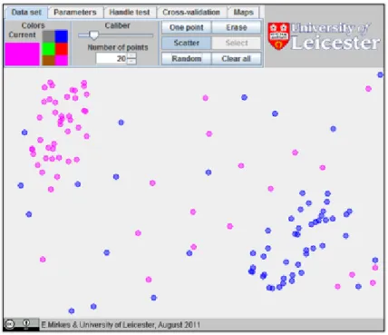
First we set up the applet [1] as shown in Figure 1, with 40 points of two different colours in opposite corners of the screen, and 20 points of random for each colour. Now, these points will
Figure 1: The initial set up of the applet
make up our training set, since we know their characteristics (their x and y coordinates) and their classification (their colour). Clicking on the handle test tab at the top will allow us to place a new test point on the screen by clicking anywhere, as shown in Figure 2. The applet finds an highlights with a star the 3 nearest neighbours of this point. Then, the most common colour among these nearest neighbours is used as the colour of the test point (indicated by the large circle).
Similarly, clicking on the map tab allows us to plot the map generated by the data, as shown in Figure 3. This colours each point on the screen by the colour which a test point at that
Figure 2: The classification of a test point based on the classes of its nearest neighbours position would be coloured, so essentially gives us all the results from testing all possible test points.
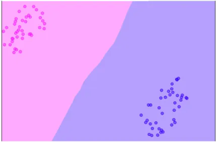
Figure 3: The map generated by our data set, essentially the classification of a test point at any location
This can be particularly useful for seeing how the algorithm’s classification of a point at a certain location would compare to how we might do it by eye. For example, notice the large band of blue beside the pink cluster, and the fact that the lower right hand corner got coloured pink. This goes very much against how we would classify a point in either of those locations by eye, where we might be tempted to just split the screen down the middle diagonally, saying anything above the line was pink and anything below the line was blue.
However, if we create the map of a dataset without any noise (as shown in Figure 4), we can see that there is a much clearer division between where points should be blue and pink, and it follows the intuitive line much more closely.
Figure 4: The map generated by the dataset without any random noise points added The reason for this is not too hard to see. The problem is that the algorithm considers all points equally, whether they are part of a main cluster, or just a random noise point, so even just having a few unusual points can make the results very different.
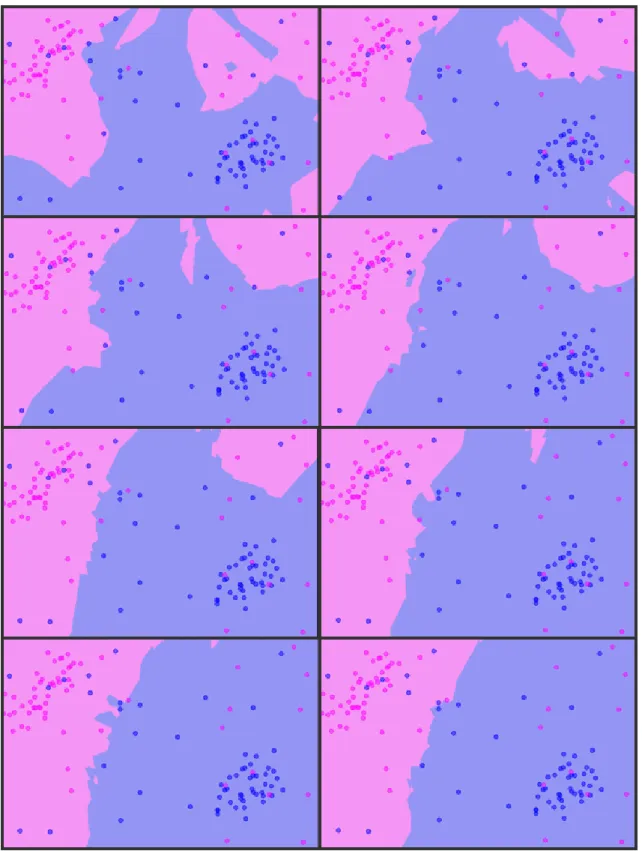
However, in reality, we certainly expect to get some unusual points in our sample, so we would like to find a way to make the algorithm more robust. With a view to finding a way to make the results look more like the map in Figure 4, we first add in 20 random points from each colour, going back to where we were started. Plotting the map at this stage will produce something fairly unintuitive, like Figure 3, with seemingly random sections mapped to different colours. Instead, we try changing the value ofk. This is achieved using the ‘Parameters’ tab at the top. Clearly, when choosing a new value for k, we do not want to pick an even number, since we could find ourselves in the awkward position of having an equal number of nearest neighbours of each colour. Instead, we pick an odd number, say 5, and plot the map. We find that as we increase the value of k, the map gets closer and closer to the map produced when we had no random points, as shown in Figure 5.
The reason why this happens is quite simple. If we assume that the points in the two clusters will be more dense than the random noise points, it makes sense that when we consider a large value of nearest neighbours, the influence of the noise points in rapidly reduced. However, the problem with this approach is that increasing the value of k means that the algorithm takes a long time to run, so if we consider a much bigger database with thousands of data points, and a lot more noise, we will need a higher value of k, and the process will take longer to run anyway.
An alternative method for dealing with noise in our results is to use cross validation. This determines whether each data point would be classified in the class it is in if it were added to the data set later. This is achieved by removing it from the training set, and running the kNN algorithm to predict a class for it. If this class matches, then the point is correct, otherwise it is deemed to be a cross-validation error. To investigate the effects of adding random noise points to the training set, we can use the applet. Setting it up as before, with two clusters in opposite corners, we can use the “Cross Validation” feature to run a cross validation on the data in our training set. This was done for 6 different data sets, and the number of noise points
Figure 5: The maps generated as we increase the value of k, starting withk = 3 in the top left and ending with k= 17 in the bottom right
in each one was increased. These results were averaged, and the average percentage of points misclassified is shown in the table:
Questions 2, 3, and 4
Generating two dense data groups in opposite corners of the screen and random noise of the same colours produces a data set like the one seen in Figure 1
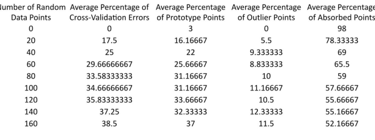
To investigate how the number of cross-validation errors depends on the number of random noise points, a data set similar to this was created 6 times and the percentage of data points wrongly classified by the cross-validation were calculated as the number of random noise points for each colour is increased in steps of 20 from 0 to 160. Since the setup is symmetric for each colour, we can average the results of the cross-validation tests for both colours, obtaining the results shown in Table 1 and Chart 1. Number'of'Random'Data'Points Average'Percentage'of'Cross8Valida;on'Errors 0 0 20 17.5 40 25 60 29.66666667 80 33.58333333 100 34.66666667 120 35.83333333 140 37.25 160 38.5
For clarity, these data are also presented in the graph in Figure 6. As can be seen, the number of mis-classifications increases as we increase the number of random noise points present in our training data. This as we would expect, since the random noise points should show up as being unexpected. Indeed, if we extrapolate the data using the general trend of the graph, we can expect that the percentage of mis-classifications would increase to approximately 50% as we continue increasing the number of random noise points. This agrees with how we would intuitively expect the cross-validation to behave on a completely random data set.
Average'Number'of'Errors 0 10 20 30 40 0 50 100 150 200 Average'Percentage'of'Errors Pe rc en tag e' of 'e rr or s Number'of'random'points'added
Clearly, there is a definite upward trend as the number of random points is increased, although the rate of increase seems to slow down when the number of random points gets large. Testing on a purely random dataset shows that one expects the percentage of points misclassified to tend to about half for 3 Nearest Neighbours, as would be expected (since the chance of any neighbour of a data point being from either data group is about equal). From Chart 1, it can be seen that the percentage of errors would be expected to eventually (as the number of data points tends to infinity) tend to about 50%. Taking both these observations together, it suggests that perhaps the percentage of errors follows a relationship similar to y = 1/(kx+0.02) + 50.
Condensed Nearest Neighbour data reduction was also implemented on 3 different data sets as described in Figure 1, to obtain the percentage of data points classified as outlier points (those which would not be recognised as the correct class if they were added to the data set later), prototype points (the minimum set of points required in
Average'Percentage'of'Outliers
Average'Percentage'of'Prototype'Points
Figure 6: A graph demonstrating the effect of increasing the number of random noise points in the data set on the number of mis-classifications
It is also found that increasing the size of the training set makes classification of a new point take much longer, due simply to the number of comparisons required. This speed problem is one of the main issues with the kNN algorithm, alongside the need to find some way of comparing data of strange types (for instance, trying to compare people’s favourite quotations to decide their political preferences would require us to take all sorts of metrics about the actual quotation such as information about the author, about the work it is part of, etc, that it quickly becomes very difficult for a computer, while still relatively easy for a person).
To solve the first of these problems, we can use data reduction methods to reduce the number of comparisons necessary.
3
Condensed Nearest Neighbour Data Reduction
Condensed nearest neighbour data reduction is used to summarise our training set, finding just the most important observations, which will be used to classify any new observation. This can drastically reduce the number of comparisons we need to make in order to classify a new observation, while only reducing the accuracy slightly.
The way the algorithm works is to divide the data points into 3 different types (as described in [1]):
1. Outliers: points which would not be recognised as the correct type if added to the database later
2. Prototypes: the minimum set of points required in the training set for all the other non-outlier points to be correctly recognised
3. Absorbed points: points which are not outliers, and would be correctly recognised based just on the set of prototype points
Then, we only need to compare new observations to the prototype points. The algorithm to do this can be summarised as:
1. Go through the training set, removing each point in turn, and checking whether it is recognised as the correct class or not
• If it is, then put it back in the set
• If not, then it is an outlier, and should not be put back 2. Make a new database, and add a random point.
3. Pick any point from the original set, and see if it is recognised as the correct class based on the points in the new database, using kNN with k= 1
• If it is, then it is an absorbed point, and can be left out of the new database
• If not, then it should be removed from the original set, and added to the new database of prototypes
4. Proceed through the original set like this
5. Repeat steps 3 and 4 until no new prototypes are added
As described in [3] and [4], this algorithm can take a long time to run, since it has to keep repeating. The problem of trying to improve this algorithm to make it faster can, however, we tackled by using extended techniques, such as that described in [4]. However, once it has been run, the kNN algorithm will be much faster.
The applet can also handle CNN data reduction, and an example of its use is given in the slides.
CNN is also quite affected by noise in the training set. In order to investigate this, three data sets were produced as usual, and for each one the number of noise points was increased, and CNN was run, recording the percentage of points assigned to each type. The results from averaging these three different data sets are shown in the table below:
These data are also presented as a graph in Figure 7 for clarity. As can easily be seen, increasing the number of random noise points affected the results of the CNN algorithm in three main
group is more likely to have its nearest neighbours from the other group, so making it more likely for it to be classified as an outlier. Similarly, the points which are not classified as outliers from each data group will be more disparate, so we will require more prototype points to represent our whole group. Then, since the absorbed points must be the points which are neither outliers nor prototypes, we can expect the percentage of these to decrease as more random points are added, which is represented by the green curve in Chart 2.
Question 5
As with any algorithm, when using the K Nearest Neighbours algorithm it is
important to balance the accuracy of the results against how expensive it is to run. For this reason, the effects of varying the parameters of the KNN algorithm were
compared with the results produced. Clearly, as the value of k (the number of neighbours to consider) is increased the algorithm becomes more expensive to run. On the other hand, implementing data reduction means that any new point to be classified needs to be compared against fewer points from the data set, although it
Number'of'Random'
Data'Points Cross8Valida;on'ErrorsAverage'Percentage'of' Average'Percentage'of'Prototype'Points Average'Percentage'of'Outlier'Points Average'Percentage'of'Absorbed'Points
0 0 3 0 98 20 17.5 16.16667 5.5 78.33333 40 25 22 9.333333 69 60 29.66666667 25.66667 8.833333 65.5 80 33.58333333 31.16667 10 59 100 34.66666667 31.16667 11.16667 57.66667 120 35.83333333 33.66667 10.5 55.66667 140 37.25 32.33333 12.33333 55.16667 160 38.5 37 11.5 52.16667 0 25 50 75 100 0 50 100 150 200 Condensed'NN'Data'Reduc;on Pe rc en tag e' of 'P oi nts 'A ss ig ne d' Eac h' St atu s Number'of'Random'Data'Points Average'Percentage'of'Outliers Average'Percentage'of'Prototype'Points Average'Percentage'Of'Absorbed'Points ways:
1. The percentage of points classed as outliers increased dramatically 2. The percentage of points classed as absorbed decreased
3. The percentage of points classed as prototypes increased slightly
All of these are as would be expected. The percentage of outliers increases because there are increasingly many noise points of the other colour in each cluster, which will lead them to be mis-classified. The percentage of points deemed to be prototypes increases because our data set now has a much more complex structure once we have included all these random noise points. The percentage of absorbed points therefore must decrease since the other two types are increasing (and the three are mutually exclusive).
group is more likely to have its nearest neighbours from the other group, so making it more likely for it to be classified as an outlier. Similarly, the points which are not classified as outliers from each data group will be more disparate, so we will require more prototype points to represent our whole group. Then, since the absorbed points must be the points which are neither outliers nor prototypes, we can expect the percentage of these to decrease as more random points are added, which is represented by the green curve in Chart 2.
Question 5
As with any algorithm, when using the K Nearest Neighbours algorithm it is
important to balance the accuracy of the results against how expensive it is to run. For this reason, the effects of varying the parameters of the KNN algorithm were
compared with the results produced. Clearly, as the value of k (the number of neighbours to consider) is increased the algorithm becomes more expensive to run. On the other hand, implementing data reduction means that any new point to be Number'of'Random'
Data'Points Average'Percentage'of'Cross8Valida;on'Errors Average'Percentage'of'Prototype'Points Average'Percentage'of'Outlier'Points Average'Percentage'of'Absorbed'Points
0 0 3 0 98 20 17.5 16.16667 5.5 78.33333 40 25 22 9.333333 69 60 29.66666667 25.66667 8.833333 65.5 80 33.58333333 31.16667 10 59 100 34.66666667 31.16667 11.16667 57.66667 120 35.83333333 33.66667 10.5 55.66667 140 37.25 32.33333 12.33333 55.16667 160 38.5 37 11.5 52.16667 0 25 50 75 100 0 50 100 150 200 Condensed'NN'Data'Reduc;on Pe rc en tag e' of 'P oi nts 'A ss ig ne d' Eac h' St atu s Number'of'Random'Data'Points Average'Percentage'of'Outliers Average'Percentage'of'Prototype'Points Average'Percentage'Of'Absorbed'Points
Figure 7: A graph showing the effects of increasing the number of random noise points in the training data on the percentage of points assigned each of the three primitive types by the CNN algorithm.
References
[1] E. Mirkes, KNN and Potential Energy (Applet). University of Leicester. Available: http: //www.math.le.ac.uk/people/ag153/homepage/KNN/KNN3.html, 2011.
[2] L. Kozma, k Nearest Neighbours Algorithm. Helsinki University of Technology, Available: http://www.lkozma.net/knn2.pdf, 2008.
[3] N. Bhatia et al, Survey of Nearest Neighbor Techniques. International Journal of Computer Science and Information Security, Vol. 8, No. 2, 2010.
[4] F. Anguilli, Fast Condensed Nearest Neighbor Rule. Proceedings of the 22nd International Conference on Machine Learning, Bonn, Germany, 2005.