web
KPI
®Dashboard Designer – Introduction Guide
Page 1
web
KPI
®
Dashboard Designer
Introduction Guide
Basic step by step guide to creating a Dashboard
web
KPI
®Dashboard Designer – Introduction Guide
Page 2
Table of Contents
Introduction ... 3
webKPI BI Dashboards - Glossary ... 4
Install Dashboard Designer ... 5
Using Dashboard Designer ... 6
Saving and Publishing a Dashboard ... 8
Set Default Dashboard ... 8
Various Component Examples From webKPI ... 9
Dimensions component: ... 9
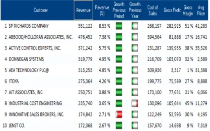
Dynamic table component: ... 9
Table component: ... 9
Chart created from Table component ... 10
Speedometer component: ... 10
Image components: ... 10
Text and cell components: ... 10
web
KPI
®Dashboard Designer – Introduction Guide
Page 3
Introduction
Dashboard Designer is the tool used to create and publish dashboards to the webKPI platform. When it comes to building dashboards, think of it like designing a PowerPoint slide – you start with a blank screen, and then start adding data and elements to the slide. There are many, many options available in Designer to assist you in building your one-of-a-kind dashboard.
To get you started, this basic step-by-step guide has been created to assist you in creating your first dashboard. (Tip: don’t forget to save your dashboard often. To save, click the save icon .)
web
KPI
®Dashboard Designer – Introduction Guide
Page 4
webKPI BI Dashboards - Glossary
Advisor – alert and notification engine – can be used to schedule report delivery via email
Alarm – specific condition of an indicator. For example, you can set an alarm so that when revenue is
above a certain threshold, the number will appear in green. When it’s below a certain threshold, it
will appear in red.
Connector Manager – application used to create new database connectors or modify existing
connectors
Dashboard – graphical interface of data – contains charts, tables, graphs, etc. Sample dashboards
include Top 15 Customers, Revenue trends, Cost Center Analysis, etc…
Dashboard Designer – tool used to create and publish new dashboards or modify existing dashboards
Dimension – data element that is used for grouping. Examples include: customer, product, product
category, sales representative, cost center
Dimension filter – filter options available for dimensions
Enterprise Analysis Server (EAS) / Decision Support System – embedded tool in KPI Online, allows
end users to build their own reports and save reports, dice / slice into data, schedule automatic
delivery of reports, etc. (activated by left-clicking on any value or bar / line in charts and selecting a
dimension)
Indicator / Metric / KPI (Key Performance Indicator) – data that can be measured. Examples include:
revenue, cost of sales, units, gross profit, gross margin, accounts payable balance, etc.
KPI Online – brand name for the Bitam Business Intelligence application via software-as-a-service
platform
Model – a KPI Online solution, such as Revenue model, Inventory model, Accounts Payable model
Model Manager – tool used to build new models or modify existing models, set user security levels,
create alarms
web
KPI
®Dashboard Designer – Introduction Guide
Page 5
Install Dashboard Designer
Install the webKPI development tool kit and Dashboard Designer:
•
Log into your webKPI account.• Click the Support tab and then click Downloads
• Double-click Dashboard Designer
• Unzip SaaS Development Tools
and extract to c:\program files\
• If you get the message that you
need to install the MySQL Driver, go to the webKPI Support tab and double-click MySQL ODBC Connector (4th
down in list from the top). You’ll need to reboot your computer to make this effective.
web
KPI
®Dashboard Designer – Introduction Guide
Page 6
Using Dashboard Designer
•
After installation, launch the Dashboard Designer application by clicking the Windows Start button and going to All Programs, Bitam SaaS, Dashboard Designer. For step-by-step instructions on starting webKPI Dashboard Designer, see this video: http://www.screencast.com/t/0ADEVXa7M• The Designer login window will appear. Login to the Designer using your webKPI id and password.
•
After logging in, you will be viewing the default dashboards we have built for your use. On the lefthand side, you will find a variety of dashboard groups, such as Accounting, Finance, etc. Click on one of the dashboard groups to open that group and see the dashboards related to the dashboards in the group.
•
To create a new dashboard group, right click in the empty white area under one of the dashboard groups and select Dashboard Group, New.• Enter the new dashboard
group name and click OK.
•
To create a new dashboard, click the appropriate dashboard group. Right click in the white area and select Dashboard New.• Enter the name of the new
dashboard and click OK.
•
Once you have created a new dashboard, you will have a blank screen to the far right. This is your new dashboard. To begin creating your dashboard, you should firstadd a background image. Right click in the new dashboard and go to Format, Image, Select an Image. Browse out to the location of your image.
• webKPI will be happy to provide you with our standard background images. Please ask your webKPI
representative for these images, or you can create your own images. Background images must be saved in the C:\Bitam\ Folder.
• Once you have placed a background image, you are now ready to start adding components to your new
dashboard. Components can be added by clicking the appropriate component icon on the icon bar near the top of the screen.
web
KPI
®Dashboard Designer – Introduction Guide
Page 7
-
Table component-
Cell component-
Plus cell component- Pivot table component - Chart component
- Dynamic table component - Text component
- Image component - Gif component - Rectangle component
- Line component - Multi-line component - Ellipse component
- Circle component - Linker component - Progress bar component
- Internet URL Address component - Banner component
- Periods component - Dimension component - Operand component - Divisor operand component
- Speedometer component
- Thermometer component - Map component
• After selecting the appropriate component, draw the component on the dashboard. Based on the type
of component selected, you will need to either identify the data elements for the component, enter text, etc. Examples below:
1. To use the text component – click the text icon and draw the text box on your dashboard. Enter the text in the text dialog box and click OK.
2. To use the cell component – click the cell or plus cell icon and draw the cell on your dashboard. Open the metadata tab and drag the metric and a time period into the cell.
3. To use the dynamic table component – click the dynamic table icon and draw the table on your dashboard. Open the metadata tab and drag the appropriate dimension under the appropriate metric and a time period into the table. (You will need to expand the metric list in order to see the dimensions – with the dynamic table you must use a dimension and time period.)
4. To use the table component – click the table icon and draw the table on your dashboard. Open the metadata tab and drag the appropriate metric and time period(s) into the table. 5. To create a chart easily – build the table first and right click on the table, select draw chart.
Chart will appear. Click the chart properties icon to change the properties of the chart. 6. To add a time period filter on the dashboard – select the Periods icon and draw the time filter
box on the dashboard. Right click on the time filter box and select period to choose the time period format. Synchronize the time filter option by right clicking on the time filter box and
web
KPI
®Dashboard Designer – Introduction Guide
Page 8
selecting synchronize – choose the components that need to be synchronized to the time period.
7. To add a dimension filter on the dashboard – select the Dimensions icon and draw the dimension filter box on the dashboard. Click the metadata option and drag the correct dimension into the filter box. Synchronize the dimension filter option by right clicking on the dimension filter box and selecting synchronize – choose the components that need to be synchronized to the dimension period.
• Components can be easily moved on the dashboard by clicking in the component until blue lines
around the component flash. Once the lines flash, simply drag the component to the desired area.
Saving and Publishing a Dashboard
• After creating or modifying a dashboard, you are ready to publish the dashboard.
1. First, save the dashboard by clicking on the . It’s a good idea to click on the disk symbol from time to time as you are working on your dashboard design.
2. When you’re ready to publish your dashboard, go to File Dashboards Publish – select User Group, select Client Dashboards in the drop-down list, click Apply and click OK.
• This section prepares the code to transmit to the server.
3. click the PHP icon on the tool bar. Drag the new or updated dashboards from the left pane to the right pane. Select “All” for users, select “All Cubes: select “Replace Images” and click OK. The dashboards will then be exported to a PHP format.
4. After the PHP format export is complete, click File on the top menu bar, select Export Metadata to php and click All Users. This will start the dashboard upload process to your account. When the upload process completes, click OK
5. Click File on the top menu bar, select Export phps to server and, if using Backgrounds, click to put check in box for Replace Image, click OK, and when Export is complete, click OK.
•
Once the dashboards have been uploaded to webKPI, you can now view them by logging into webKPI and going to the Dashboard Explorer. (To access Dashboard Explorer, click the colored block icon in the upper left hand corner and go to Dashboard Explorer.•
If when you log into webKPI and either default to a particular Company, or select View for a particular Company and then you are unable to access dashboards – you’ll see a funny icon – then the Admin will need to log into the Dataspace as the Dataspace owner, open the Dashboard Library, open the Tools folder, Click on KPI Model Manager, click Users which will display the users for this dataspace. Check to see if each user has a Default Dashboard defined by clicking on the users Long Name. If their Default Dashboard is set to none, you’ll need to click on the pencil icon, select a Default Dashboard from the drop down and click Save.Set Default Dashboard
• When the webKPI users accesses a webKPI Company, either by the Company automatically
appearing in the opening dashboard (user only has access to one webKPI dataspace), or user has access to multiple Companies and clicks View in the Company Detail, the opening dashboard is the default dashboard for that webKPI user in that dataspace. While in Dashboard Designer, to set a
web
KPI
®Dashboard Designer – Introduction Guide
Page 9
dashboard as the default, click the name of the Dashboard and press the F6 key or right-click on the Dashboard.
• When you press the F6 key, Dashboard Designer will request a confirmation to set the dashboard
as the default for the dataspace.
Various Component Examples From webKPI
To assist in selecting the appropriate component to add to your new dashboard, below you find examples from the standard webKPI dashboards, and the type of component that was used to create it.
Text component Cell component
Linker components: Used to link to dashboards or call a command, such as print.