Open Access
Methodology
The Shivplot: a graphical display for trend elucidation and
exploratory analysis of microarray data
Owen Z Woody
1,2and Robert Nadon*
1,3Address: 1McGill University and Genome Quebec Innovation Centre, 740 avenue du Docteur Penfield, Montreal, Quebec, H3A 1A4, Canada, 2David R. Cheriton School of Computer Science, University of Waterloo, Waterloo, Ontario, N2L 3G1, Canada and 3Department of Human
Genetics, McGill University, Montreal, Quebec, Canada
Email: Owen Z Woody - [email protected]; Robert Nadon* - [email protected] * Corresponding author
Abstract
Background: High-throughput systems are powerful tools for the life science research community. The complexity and volume of data from these systems, however, demand special treatment. Graphical tools are needed to evaluate many aspects of the data throughout the analysis process because plots can provide quality assessments for thousands of values simultaneously. The utility of a plot, in turn, is contingent on both its interpretability and its efficiency.
Results: The shivplot, a graphical technique motivated by microarrays but applicable to any replicated high-throughput data set, is described. The plot capitalizes on the strengths of three well-established plotting graphics – a boxplot, a distribution density plot, and a variability vs intensity plot – by effectively combining them into a single representation.
Conclusion: The utility of the new display is illustrated with microarray data sets. The proposed graph, retaining all the information of its precursors, conserves space and minimizes redundancy, but also highlights features of the data that would be difficult to appreciate from the individual display components. We recommend the use of the shivplot both for exploratory data analysis and for the communication of experimental data in publications.
Background
Microarrays [1] have provided a wealth of gene expression data for the biological community to interpret. The tech-nology presents a snapshot of cellular transcription at an unprecedented level of detail, with certain array designs containing probes to assess expression levels of every known gene within the target organism's genome.
Micro-The analysis of microarray data remains challenging, how-ever, for a number of reasons. The technology is expen-sive, often restricting the number of replications that can be run in an experiment. Moreover, the validity of various statistical models and their corresponding processing algorithms for gene expression data are being actively debated [2,3].
Published: 08 November 2006
Source Code for Biology and Medicine 2006, 1:6 doi:10.1186/1751-0473-1-6
Received: 30 May 2006 Accepted: 08 November 2006
This article is available from: http://www.scfbm.org/content/1/1/6
© 2006 Woody and Nadon; licensee BioMed Central Ltd.
each of the millions of data points available in a typical microarray data set. Multi-display graphical methods are thus key for reaching an understanding of the data, for assessing analysis assumptions, and for examining the effects of data pre-processing methods.
Plotting allows the rapid and concise representation of the data as a whole, and allows trends and local aberrations to be spotted with relative ease [4]. These trends are useful for more than just diagnostic assessments; due to the rel-ative paucity of replicate observations in many studies, supplementary information is frequently gathered from observations with similar expression properties. This information can be used, for example, to obtain an improved estimate of inter-array variability [5].
A further motivation for concise and elegant graphics is the space restrictions typically imposed by scientific jour-nals. A thorough and well designed graphic needs to be explained just once, and its subsequent re-use can allow the reader rapid insight into volumes of visual data.
The construction of comprehendible graphics, however, is a challenge of its own. Unnecessary ink must be kept to a minimum, and it is easy to obscure or even mask impor-tant points through graphs that are complex or confusing. Efficiency, readability, and relevance are of paramount concern.
With these criteria in mind, the present work illustrates an aggregate graphical approach, inspired by (but not restricted to use with) microarray data. The proposed tech-nique pools the strengths of several other graphical meth-ods which are commonly applied to microarray data: a boxplot, a probability density function plot, and a plot illustrating variability as a function of signal intensity. The present work demonstrates that these plots can be produc-tively combined, facilitating integration of complemen-tary information. Although this plot design is motivated by microarray analysis, we present this technique as a via-ble tool for both exploration and publication of other types of high volume multivariate data sets.
Component plots
This section reviews the component plots that are assem-bled in our proposed graphical method. Simulated and empirical microarray data are used to illustrate the strengths and weaknesses of these respective plots when presented individually. The microarray data used in this section were obtained from the publicly available Affyme-trix GeneChip spike-in data [6].
Boxplots
The boxplot [7] is an example of a concise graphic in which several critical pieces of information are presented
about a univariate distribution. Firstly, the median is illus-trated as a dot in the "box", with the position of the dot relative to the axis giving the specific value. The interquar-tile range (IQR), which contains the middle 50% of the data, is shown by the length between the outer edges of the box. The points farthest from the median that are not classified as outliers are marked as the tips of the whiskers extending from the box. In addition to these five distribu-tional landmarks, outliers are explicitly plotted as lines or dots beyond the ends of the whiskers. A rule of thumb, such as 1.5 times the IQR beyond the edges of the box, is typically employed to distinguish how far from the center an observation must be to be classified as an outlier. Examples of boxplots can be seen in Figures 1a–c.
The five-point summary delivered in the box-and-whisker portions of boxplots allows rapid access to many aspects of the distribution. For example, indications of skewness can be seen both in the position of the median within the interquartile range box (closer to either end implicates skewness) and the lengths of the respective whiskers extending from the box (if one whisker is much longer than the other, skewness is a possible explanation).
Boxplots, however, have shortcomings. Although they are easily interpreted and are pleasing to the eye, they have poor data-ink ratio [8]. The "box" component of a box-plot can be disassembled into its 5 composite values, with the remaining ink merely providing assistance to the eye. For example, only one half of the boxplot, as divided by the horizontal axis of bilateral symmetry through the center of the boxplot, is necessary.
Furthermore, enclosing a "boxed" region encourages the interpretation of area, a quantity which is arbitrarily deter-mined by the boxplot's vertical width. This two-dimen-sional depiction only distracts from the interpretation of one-dimensional distance. Although the marked quanti-ties and their positions relative to one another are rele-vant, a majority of the lines surrounding and joining these values are not. Boxplots also potentially mask underlying features of the distribution, such as tail densities and mul-tiple modes [9]. As an illustration of this hazard, compare the boxplot generated from a normal distribution (Figure 1a) to the boxplot of a distinctly bimodal (mixture of two non-overlapping normals) distribution (Figure 1b). From these two illustrations alone, it would be very difficult to discern that the two distributions have a different number of modes. This information can be recovered, however, through use of the density plot.
Density plots
Examples of Existing Plot Devices
Figure 1
Examples of Existing Plot Devices. An illustration of some popular plotting techniques for distributional data. Panels a-c show horizontal boxplots; panels d-f show histograms; panels g-h show probability density plots. Plots in column 1 were con-structed based on a sample of 1000 from an N(10, 1) distribution. Plots in column 2 were concon-structed based on a mixture; 500 drawn from N(5, 1) and 500 from N(15, 1). Column 3 applies these same plots to microarray data. The RMA algorithm was performed using 6 chips from the Affymetrix HG_U133A_tag spike-in data set; mean intensities were obtained by averaging log (base 2) summary expression measures across a subset consisting of three technical replicates.
● ●
●
● ● ●●
7 8 9 10 11 12 13
a) Boxplot
magnitude
Normal Distribution Data
5 10 15
b) Boxplot
magnitude
Bimodal Distribution Data
● ● ● ● ●●● ● ● ●●● ●●● ● ●●●●●●●●●●●●● ●●●●●●●●●● ●● ●●●●●●●●● ●● ● ●●●●●●●●●●●●●●● ●●●● ● ●●●●●●●●● ●●●●●●● ●● ●●● ● ●●●●●●●●●●●●●●●● ●●●● ● ●●●●●●●●●● ●●● ●● ● ● ●●● ●● ●● ●●●● ●●●● ●●● ●●● ●●●● ● ●● ●●●● ●● ● ●● ●●●●●●● ● ●●●●● ●●●●● ●●● ●●●●●●●●●●●●●●●●●●● ●●● ●●●● ● ● ●● ●●●●●●● ● ●●●● ●●● ●●●●●●●●●●●●●●●●●●●●●●●● ●●●●●● ●● ●● ●●●●●● ●●●●●●●● ●●● ●●●●●●●●●●●● ●●●●●●●●●●●● ●●●●
4 6 8 10 12
c) Boxplot
RMA
(mean intensity across replicate arrays)
RMA Microarray Data
magnitude
frequency
7 8 9 10 12
0
50
100
200
d) Histogram
magnitude
frequency
5 10 15 20
0
100
200
300
e) Histogram
RMA
(mean intensity across replicate arrays)
frequency
4 6 8 10 12
0
500
1500
f) Histogram
8 10 12 14
0.0
0.1
0.2
0.3
0.4
magnitude
density
g) Density Plot
0 5 10 15 20
0.00
0.04
0.08
0.12
magnitude
density
h) Density Plot
2 4 6 8 10 12 14
0.00
0.10
0.20
RMA
(mean intensity across replicate arrays)
density
the data into "bins" based on value, and then plotting the population count of each bin. The resulting graph dis-plays how the data values are distributed; bins containing many observations have taller bars than sparsely popu-lated bins. Histograms are excellent for detecting multiple modes, skewness, and kurtosis. Examples of histograms can be seen in Figures 1d–f.
Density plots [11] offer what is in essence a "smoothed" histogram; instead of using discrete bins and counts, den-sity plots employ a continuous curve to communicate the same information. Area is used to convey the probability of observations within specified ranges. Specifically, were a sample value drawn from the depicted distribution, the probability of this value lying within a given interval can be determined by taking the integral of the curve bounded by that interval. Example density plots can be seen in Fig-ures 1g–i. Like the histogram, density plots are excellent for detecting multiple modes, skewness, and kurtosis. The limitation of any approach that employs frequency as a metric is that extreme values and outliers are given little credence. These outlying values can carry a high leverage on important quantities such as the mean, yet they have only a subtle effect on the density curve. Although density plots do an excellent job estimating the position and number of modes, the mode is itself a highly variable esti-mator of the center of a distribution, and it is challenging to visually estimate the position of a mean or median from the density curve.
Variability-versus-intensity plots
It is typical for the variability of replicated microarray data to exhibit a dependence on intensity, whether replication is across or within arrays and whether the variability reflects processing effects only or processing plus biologi-cal effects. One common approach is to log gene expres-sion data, which tends to stabilize error variance across replicates for mid-to-upper range intensity values but which has the disadvantage of inflating additive error for low intensity values. Alternative approaches to microarray data transformation model both additive and propor-tional error components (see the "generalized log" meth-ods of [12-16]). Variability versus intensity plots can be used to assess how successfully such transformations have stabilized the variance throughout the entire intensity range. Additionally, the plot can also be used as a visual aid for pooling estimates of random error associated with genes of similar expression intensity [3,17,18].
The relationship of variability to mean intensity (i.e. the trend line) is the important piece of information to be obtained from this plot. The vast majority of points on the plot are of little interest to the viewer and can make the visual estimation of the trend challenging when data points are densely packed. As a method of capturing the
trend of variability as a function of mean intensity, one can employ any of the loess family of smoothers [4,19], which perform local weighted least squares regression to capture nonlinear trends in data. (An example loess fit can be seen in Figure 2c.)
Results and discussion
The ShivplotAs can be seen from Figure 2a–c, all three of the discussed plots – boxplot, density plot, and variability-versus-inten-sity (standard deviation vs mean) – have an axis in com-mon. Figure 2d presents the shivplot, an amalgamation of the three plots. To first capture the essence of the boxplot, we eliminate its vertical width, thereby reducing it down to point components: the five distributional landmarks along with the outliers. These points can be displayed as ticks across the middle of the graph, at y = 0. Then, in the region below, we can draw the reflection of the density function plot (with the scale starting at zero and increas-ing downward along the lower half of the y-axis). The area enclosed by this curve below y = 0 represents the probabil-ity densprobabil-ity. Lastly, we can draw the loess fit from the vari-ability-versus-intensity plot in the upper half of the graph. One can quickly isolate the information in any of the three precursor graphs from the final image – there is no significant loss of information when the plots are super-imposed. (The values along the right side of the graph provide maximum values: the maximum standard devia-tion above, and the maximum density below.)
The data interpreter needs to adjust to two aspects of this graph: The upper and lower halves of the plot have dis-tinct y-axes, with different scales and units, and the den-sity distribution is inverted. However, having the three graphs simultaneously available provides the advantage that each plot can readily be interpreted in the context of the other two. The advantages of this feature are best illus-trated by examining empirical data, as provided in the fol-lowing section.
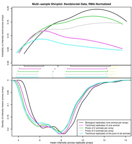
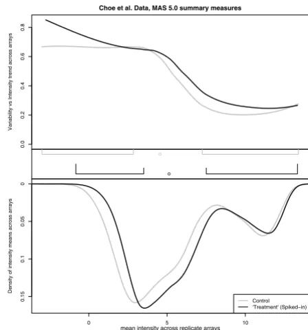
Examples
There is an ongoing debate about the appropriate analysis of data derived from microarrays. As such, it is of great interest to biologists and statisticians alike to observe the impact of different statistical algorithms on microarray data. Having approachable visual tools with which to make such comparisons greatly expedites this tedious and iterative process.