Identifying and Modeling Spatio-temporal Structures in High
Dimensional Climate and Weather Datasets with Applications to
Water and Energy Resource Management
David J. Farnham
Submitted in partial fulfillment of the requirements for the degree of
Doctor of Philosophy
in the Graduate School of Arts and Sciences
COLUMBIA UNIVERSITY 2018
c
2018
David J. Farnham All rights reserved
ABSTRACT
Identifying and Modeling Spatio-temporal Structures in High Dimensional Climate and Weather Datasets with Applications to Water
and Energy Resource Management
David J. Farnham
Weather and climate events are costly to society both financially and in terms of human health and well being. The costs associated with extreme climate events have motivated governments, NGOs, private investors, and insurance companies to use the data and tools at their disposal to estimate the past, present, and future hazards associated with a wide range of natural phenomena in an effort to develop mitigation and/or adaptation strategies.
The nonstationary nature of climate risks requires the use of numerical climate models, often general circulation models (GCMs), to project future risk. The climate risk field, however, currently finds itself in a predicament because GCMs can be biased and do not provide a clear way to credibly estimate their uncertainty with respect to simulations of future surface climate conditions. In response to this predicament, I lay the groundwork for a set of GCM credibility assessments by identifying the large-scale drivers of surface climate events that evolve over a range of timescales ranging from daily to multi-decadal. I specifically focus on three types of climate events relevant to the water and energy sectors: 1) seasonal precipitation, which impacts drinking water supplies and agricultural productivity; 2) extreme precipitation and the costly associated riverine flooding; and 3) temperature, wind, and solar radiation fields that
modulate both electricity demand and potential renewable electricity supply.
In chapter I, I derive a set of atmospheric indices and investigate their efficacy to predict distributed seasonal precipitation throughout the conterminous United States. These indices can also be used to diagnose the impact of tropical sea surface temperature heating patterns on conterminous United States precipitation. This is particularly of interest in the aftermath of the unexpected precipitation patterns in the conterminous United States during the 2015-2016 El Ni˜no event. I show that the set of atmospheric indices, which I derive from zonal winds over the conterminous United States and portions of the North Atlantic and Pacific oceans, can skillfully predict precipitation over most regions of the conterminous United States better than previously recognized mid-latitude atmospheric and tropical oceanic indices. This work contributes a set of intermediate atmospheric indices that can be used to assess the efficacy of forecasting and simulation climate models to capture signal that exists between tropical heating, mid-latitude circulation, and mid-latitude precipitation.
In chapter II, I first show that the frequency of regional extreme precipitation events, which are predictive of riverine flooding, in the Ohio River Basin are poorly simulated by a GCM relative to historical precipitation observations. I then illustrate that the same GCM is much better able to simulate the statistical characteristics of a set of atmospheric field-derived indices that I show to be strongly related to the precipitation events of interest. Thus, I develop a statistical model that allows for the simulation of the precipitation events based on the GCM’s atmospheric fields, which allows me to estimate future hazard based on credibly simulated GCM fields. Lastly, I validate the fully Bayesian statistical model against historical observations
and use the statistical model to project the future frequency of the regional extreme precipitation events. I conclude that there is evidence of increasing regional riverine flood hazard in the Central US river basin out to the year 2100, but that there is high uncertainty regarding the magnitude of the trend. This work suggests that the identification of atmospheric circulation patterns that modulate the probability of extreme precipitation and riverine flood risk may improve flood hazard projections by allowing risk analysts to assess GCMs with respect to their ability to simulate relevant atmospheric patterns.
In chapter III, I present the first comprehensive assessment of quasi-periodic decadal variations in wind and solar electricity potential and of covariability between heating and cooling electricity demand and potential wind and solar electricity pro-duction. I focus on six locations/regions in the conterminous United States that represent different climate zones and contain major load centers. The decadal varia-tions are linked to quasi-oscillatory variavaria-tions of the global climate system and lead to time-varying risks of meeting heating + cooling demand using wind/solar power. The quasi-cyclical patterns in renewable energy availability have significant ramifications for energy systems planning as we continue to increase our reliance on renewable, weather- and climate-dependent energy generation. This work suggests that certain modes of low frequency climate variability influence potential wind and solar energy supplies and are thus especially important for GCMs to credibly simulate.
All of the investigations are designed to be broadly applicable throughout the mid-latitudes and are demonstrated with specific case studies in the conterminous United States. The dissertation sections represent three cases where statistical techniques
can be used to understand surface climate and climate hazards. This understanding can ultimately help to mitigate and adapt to climate variabilities and secular changes, which impact society, by assisting in the development, improvement, and credibility assessment of GCMs capable of reliably projecting future climate hazards.
Contents
List of Figures iv
List of Tables xviii
Acknowledgments xix
Introduction 1
Motivations . . . 1
Selecting variables for GCM/RCM - observation/reanalysis comparison 7 Chapters I & II: Seasonal and extreme precipitation and atmospheric circulations . . . 10
Chapter III: Climate variability and electricity generation/demand . . 12
1 Chapter I: Zonal wind indices to reconstruct CONUS winter pre-cipitation 16 1.1 Introduction . . . 18
1.2 Zonal wind indices, CONUS precipitation reconstruction, and the 2015/2016 El Ni˜no . . . 22
1.3 Sea surface temperature patterns and potential predictability . . . 30
1.4 Summary and Discussion . . . 33
1.4.1 CONUS precipitation reconstruction model . . . 35
1.4.3 Predicting Zonal Wind PC1 . . . 37
1.4.4 Zonal wind index applications . . . 38
1.5 Additional Data and Methods . . . 40
1.5.1 Zonal wind principal component analysis . . . 40
1.5.2 Cross-validated reconstruction model . . . 41
1.5.3 Tropical sea surface temperature principal component analysis 41 1.5.4 Zonal wind PC1 prediction model . . . 42
2 Chapter II: Regional extreme precipitation events: robust infer-ence from credibly simulated GCM variables 44 2.1 Introduction . . . 47
2.1.1 Research questions . . . 48
2.1.2 Flooding, extreme precipitation, and atmospheric circulations in the Ohio River Basin . . . 49
2.2 Methods and Data . . . 51
2.2.1 Methodological overview . . . 51
2.2.2 Regional extreme precipitation days and extreme streamflow . 53 2.2.3 Atmospheric reanalysis for event diagnostics . . . 55
2.2.4 General circulation model . . . 56
2.3 Regional extreme precipitation days and streamflow . . . 56
2.4 Regional extreme precipitation in a GCM vs. observations . . . 57
2.5 Circulation patterns associated with regional extreme precipitation . 62 2.6 Atmospheric Indices . . . 65
2.7 Conditional simulation . . . 71
2.7.1 Model checking . . . 72
2.7.2 Simulation results . . . 73
2.7.3 Moisture trend contribution . . . 78
2.8.1 Summary . . . 80
2.8.2 Relationship to bias correction and downscaling approaches . 81 2.8.3 Caveats and further discussion . . . 82
3 Chapter III: Climate induced risks from decadal variations in re-newable energy potential and heating/cooling energy demand 85 3.1 Introduction . . . 87
3.2 Methods and Materials . . . 89
3.2.1 Data . . . 90
3.2.2 Electricity demand . . . 92
3.2.3 Electricity supply . . . 93
3.2.4 Spectral analysis of seasonal and annual data . . . 95
3.3 Results . . . 96
3.3.1 Time-series characteristics and correlations . . . 96
3.3.2 Quasi-periodic decadal variability and demand-supply imbalance 98 3.3.3 Relation to large scale climate indices . . . 102
3.4 Key Findings, Implications, and Discussion . . . 104
3.5 Supplemental information, figures, and tables . . . 109
3.5.1 Indications of expanding solar and wind power . . . 109
3.5.2 Additional literature on solar/wind and weather . . . 111
3.5.3 Demand-supply correlation interpretations . . . 112
3.5.4 Tables and figures . . . 113
Summary, future work, and broader perspectives 129 Summary . . . 129
Future work . . . 131
Broader perspectives . . . 133
Appendix: Complementary Analyses to Chapter III 156
List of Figures
0.1 (Top) Average Southwest U.S. winter (January-March) precipitation (points and solid black line) defined by the domain west of 110◦W to the Pacific Ocean and between 32◦N and 36◦N. Dashed horizontal line shows the mean and the smoothed line with the shading shows the 30-year mov-ing average with 50 percent confidence interval via bootstrap. (Bottom) 30-year moving coefficient of variation (CV) with 50 percent confidence interval via bootstrap of the same record as (Top). The underlying data is the Global Precipitation Climatology Center’s gridded V7 + monitoring gridded precipitation product. . . 4 0.2 A proposed conceptual dynamical structure for the global climate system.
The surface conditions (white blocks) ultimately define the climate risks, while the mid-latitude circulations (light grey block), as encoded in indices, are useful to compare between the models and observations. The upstream variables (dark grey blocks) make up the rest of an attempt to encode a simplified and truncated causal structure of the dynamical climate system. All links are in reality bi-directional, although in this stylized depiction of the system I have only represented the direction in which I assume the primary influence propagates. Adapted from Lall, 2015. . . 9 1.1 (Top, left) Composite January-March standardized precipitation
anoma-lies from the 10 historic El Ni˜no years (i.e. excluding 2016). (Top, right) Composite January-March standardized precipitation anomalies from the 10 historic La Ni˜na years. (Middle, left) 1983 January-March standardized precipitation anomalies. (Middle, right) 2003 January-March standard-ized precipitation anomalies. (Bottom, left) 1998 January-March stan-dardized precipitation anomalies. (Middle, right) 2016 January-March standardized precipitation anomalies. ENSO ”warm” and ”cold” phases are defined as years in which the Ni˜no3.4 index was greater than 1 or less than -1 during the December-February season. . . 19
1.2 (Top) January-March zonal wind (500 mb) principal component analysis empirical orthogonal function loading patterns. The western U.S. states are shaded in the plot and contain all states north and west of Texas. (Bottom) The principal components over time. . . 23 1.3 The estimated correlations between January-March precipitation and the
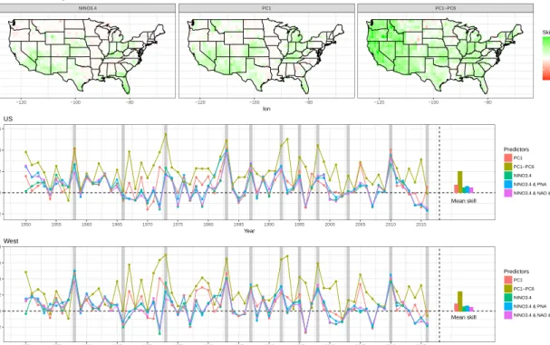
zonal wind PCs, the Ni˜no3.4, PNA, NAO, and PDO indices based on the 67 years of data. Correlations that are significant at 95% are indicated with an ”x”. . . 24 1.4 (Top) Heidke skill score by location and model (columns) calculated from
all 67 cross-validated years. For each of the years, predictions were made based on the model fit to all other years and the climatological values are defined by all other years of data besides the current year. (Middle) The cross-validated Heidke skill score of five models over CONUS. The Heidke skill score is computed after the predictions and observations have been transformed into below normal, near normal, or above normal based on the historic tercile into which the observation falls. A positive Heidke skill score indicates a more skillful prediction than climatology. The solid lines and points indicate the skill score for each of the candidate models (indicated by different colors) when each of the 67 years is predicted from all other years. Vertical thick gray lines show El Ni˜no years. The bars on the right side of each panel indicate the mean cross-validated skill score across the 11 events for each of the candidate models. (Bottom) Same as (Middle) for the western United States. . . 26 1.5 Same as Fig 1.4 but for the mean absolute skill score. Mean absolute skill
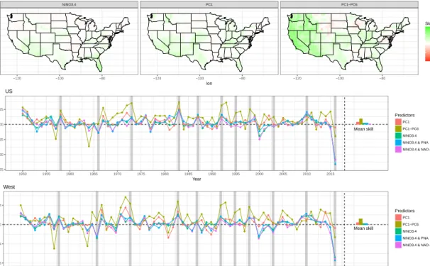
score is the standardized mean absolute error skill score vs. a climatologi-cal prediction. A score<0 indicates that the model prediction would have been outperformed by a climatological prediction, a score > 0 indicates that the model is skillful. . . 27 1.6 (Top) The probability density functions of Heidke skill scores for three of
the candidate models (columns) by ENSO phase (colors) for the whole US across all years (solid lines). The average Heidke skill score for each of the models is shown (dashed vertical lines). (Second from top) Same as (Top) but for the Western CONUS. (Second from bottom) Same as (Top) but for the mean absolute error skill score. (Bottom) Same as (Top) but for the Western CONUS. . . 28
1.7 (Top) January-March three month average Ni˜no 3.4 index values by year. (Bottom) The January-March zonal wind PC median values (points) and middle 75th percentile (vertical lines) by ENSO phase (colors). We also show all six PC values from the years 1983, 1998, 2003, and 2016 in (black lines of different types). ENSO ”warm” and ”cold” phases are defined as years in which the Ni˜no3.4 index was greater than 1 or less than -1, respectively, during the December-February season. . . 29 1.8 (Left) December detrended SST anomalies for the years 1982, 1997, 2002,
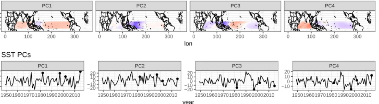
and 2015. (Right) January-March (JFM) detrended SST anomalies for the corresponding El Ni˜no events as are shown on the (Left). Solid contours show positive increments of 1◦C, while the dashed contours show negative increments of 1◦C. . . 31 1.9 (Top) December sea surface temperature principal component analysis
empirical orthogonal function loading patterns. (Bottom) The principal components over time. December 1982, 1997, 2002, and 2015 are marked with a point. . . 33 1.10 The observed January-March (JFM) zonal wind PC1 Index vs. the
pre-dicted PC1 index based on December SSTs. (Top) The black line shows the observed zonal wind PC1 Index. The blue lines show the mean (solid line) and 80th percent interval (dashed lines) predicted by the weighted k nearest neighbor model fit using only the December SST PC1 index on all years prior to 2016. The red dot and lines show the mean and 80th percent prediction interval for JFM zonal wind PC1 based on the fit on all years prior to 2016. (Bottom) Same as (Top) except for the weighted k nearest neighbor model fit using the December SST PC1, PC2, PC3, and PC4 indices. The observed value and the mean model predictions for the years 1983, 1998, 2003, and 2016 are highlighted with blue and red points, respectively, for both models. . . 34 1.11 (Left) Composite mean of sea surface temperature anomalies by Ni˜no3.4
tercile (rows) and whether the JFM zonal wind PC1 was less than (or equal to) or greater than its median value (left and right columns, respectively).
n shows the number of years contained within each composite. (Right) The difference between the left and right columns of (Left) minus the mean SST between 20◦ S and 20◦ N for that Ni˜no3.4 tercile. We call this zonally centered sea surface temperature SST*. SST* is used to emphasize zonal variations in the composite differences. ”x” symbols mark grid cells where SST anomaly values for PC1 ≤ P50(PC1) and PC1 >P50(PC1) years are
statistically significantly different from each other by a Wilcoxon rank sum test (p ¡ 0.05). All solid and dashed contours are at increments of 0.4 and -0.4 deg C, respectively. . . 35
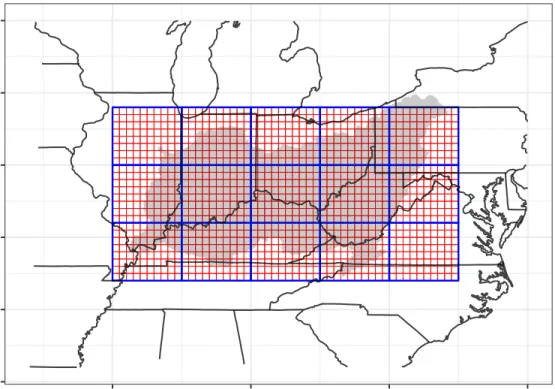
1.12 (Left) The rank correlations between detrended December sea surface tem-peratures (scale from blue to red over water) and January-March (JFM) CONUS precipitation (scale from brown to green over CONUS) and the JFM zonal wind PC indices. (Right) The seasonal partial correlations between December detrended sea surface temperatures and JFM CONUS precipitation and the JFM zonal wind PC1 index given the Ni˜no3.4 in-dex. Locations with correlations greater than the 95% significance level are indicated with an ”x”. The fact that removing the linear effect of the Ni˜no3.4 index dramatically changes the tropical SST signal related to zonal wind PC1, but does little to degrade the significant correlations of CONUS precipitation with zonal wind PC1, illustrates that the zonal wind PC1 index carries information relevant to CONUS precipitation that is separate from the information provided by the Ni˜no3.4 index. . . 36 2.1 Map of study area. Blue grid shows resolution of Geophysical Fluid
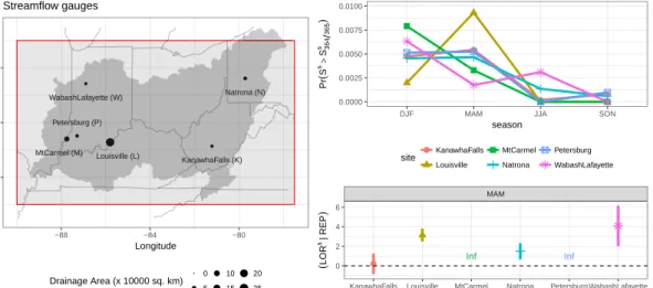
Dy-namics Laboratory CM3 coupled model cells. Red grid shows native reso-lution of CPC precipitation data cells. The shaded area indicates the Ohio River Basin (∼ 530 000 km2) as defined by the United States Geological Survey. . . 53 2.2 (Left) Locations and drainage areas of the six long record streamflow
sta-tions. (Top, right) The seasonality of extreme streamflow (> ≈ 99.7th percentile) for each site in colors as expressed through the probability of extreme streamflow occurrence during each season. (Bottom, right) The log odds ratio (eq. 2.1) and confidence interval associated with MAM days when one of more REP days have occurred in the previous fifteen days vs. those when no REP days have occurred in the previous 15 days and streamflow being above or below the ≈ 99.7th percentile. The odds ratio confidence interval was calculated via the unconditional maximum likelihood estimation (or the Wald method) via the epitools package of the R statistical programming language. . . 57
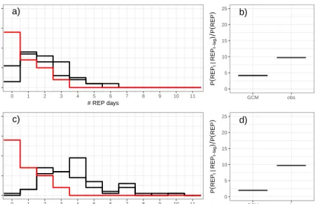
2.3 (Top left; a) The frequency distribution of the number of MAM REP days by year for the observed record (red solid line) and the two GFDL CM3 ensemble members (black solid lines). (Top right; b) The probability of a REP event on a day given that a REP event occurred the day prior divided by the marginal probability of a REP event for the MAM season for the observed record and the two ensemble members. (Bottom; c and d) Same as (Top) but with the observed 99th percentile precipitation thresholds used to derive the model REP records. The bottom panels show that the discrepancy between the GCM runs and the observed REP records is even more stark when the observed precipitation data is used to calculate the 99th percentile thresholds for the model and REP records, an indication of a significant positive bias with respect to the GCM’s 99th percentile precipitation. In fact, the median of the study region’s 99th percentiles is 31 mm/day in the GFDL CM3 model, and only 25 mm/day in the CPC data. . . 58 2.4 The difference of frequency distributions (between the observed and two
GCM ensemble members) of local (one cell) extreme precipitation days by season (columns) over the historic record for all days with at least 1 local extreme precipitation event in the study region. . . 60 2.5 The distribution of the regional extreme precipitation days by month for
the observed record and each of the two GCM ensemble members. Note that the GCM ensemble members are very similar and averaging across them does not significantly reduce the bias with respect to spring (MAM, or months 3, 4, and 5) and summer (JJA, or months 6, 7, and 8) regional extreme precipitation day frequency. . . 60 2.6 The precipitation percentiles (shading) averaged over all days when at
least one of the 15 study area cells received rainfall greater than the 99th percentile for the observed and two GCM ensemble members. All cells with mean percentile less than the 75th are shaded white. . . 61 2.7 The difference between each GCM ensemble member and the observed
record of precipitation percentiles (shading) averaged over all regional ex-treme precipitation days. . . 62 2.8 Daily composites of Z700 anomalies (shades) and Q700 (contours at
4×10⁻⁴kg kg−1) from four days before each MAM REP event to one
day following the event for the observed-reanalysis record. Solid con-tours represent positive anomalies and dashed concon-tours represent negative anomalies. An “X” indicates that at least 80% of composite members (i.e. at least 37 of the 46 REP events) had Z700 anomalies of the same sign in
2.9 Same as fig. 2.8 but for the day of the REP event (lag = 0) and each of the GFDL CM3 GCM ensemble members and the observed-reanalysis record (panels). As in fig. 2.8, an “X” indicates that at least 80% of composite members had Z700 anomalies of the same sign in that location. This 80%
criteria translates to at least 83 out of 103 REP events, 92 out of 115 REP events, and 37 out of 46 REP events, for the two CM3 ensemble members and the observed-reanalysis record, respectively. . . 64 2.10 MAM REP day composites ofZ700 anomalies (shading) and absoluteZ700
(contours in 50 m increments with 3000 m marked with a thicker con-tour) for both the observed/reanalysis (i.e. reanalysis Z700 during
ob-served REPs) and each of the two GCM ensemble members. Solid con-tours represent positive anomalies and dashed concon-tours represent negative anomalies. An “X” indicates that at least 80% of composite members had Z700 anomalies of the same sign in that location. This 80% criteria
translates to at least 83 out of 103 REP events, 92 out of 115 REP events, and 37 out of 46 REP events, for the two CM3 ensemble members and the observed-reanalysis record, respectively. . . 66 2.11 The difference in standard deviation of daily MAM geopotential height at
700 hPa for the reanalysis and each of the two GCM ensemble members. Note that the pattern associated with each ensemble member looks very similar, i.e. averaging across ensemble members does not meaningfully reduce the bias with respect to the reanalysis record. . . 66 2.12 The climatological zonal wind 200 hPa (shading and contours) in m s−1 for
the reanalysis and each of the two GCM ensemble members. The contours show 15 m s−1, 25 m s−1 and 35 m s−1. Note that the pattern associated with each ensemble member looks very similar, i.e. averaging across en-semble members does not meaningfully reduce the bias with respect to the reanalysis record. . . 67
2.13 (Top) the regions that define each of the atmospheric indices. The index names are shown in red. The Ohio River basin, shown in more detail in fig. 2.1 is shaded in dark gray. The ZPindex is defined by the averageZ700
within the area between 130◦W and 155◦W and 30◦N and 55◦N (leftmost dashed box), the ZL index is defined by the average Z700 within the area
between 87.5◦W and 102.5◦W and 30◦N and 45◦N (middle dashed box), and the ZH index is defined by the average Z700 within the area between
62.5◦W and 77.5◦W and 30◦N and 45◦N (rightmost dashed box). The OMG and HUM indices are defined using the average atmospheric vertical velocity and specific humidity within the area between 77.5◦W and 90◦W and 36◦N and 42◦N (solid box). (Middle and bottom) The index values prior to and after the REP events. The black line shows the median index value. The dark shaded area shows the range capturing the middle 50% of days, while the light shaded area shows the range capturing the middle 90% of days. All panels use the observed REP record and the corresponding reanalysis-based atmospheric indices. . . 68 2.14 (Top) Cumulative distribution function for the MAM indices. (Middle)
The serial correlation function for the MAM indices. (Bottom) The serial tail persistence of the MAM indices when in high states as shown by the probability of the index being above the 90th percentile on day t, given that the index was above that percentile on day t-lag, where lag values of 1 through 10 are shown along the x-axis. In all panels the solid line is the reanalysis-based indices and the dashed lines are the GCM ensemble member-based indices. Negative OMG and ZL are shown for
easier interpretation since low values of these two indices are associated with REP days. . . 70
2.15 (Top) Yearly record of the number of REP days per year for the observed record (solid black points and line), the mean of the regression predicted record during the calibration period (solid blue points and line) and testing period (solid red points and line). The 50th percentile prediction intervals are also shown for each year with blue and red vertical lines for calibration and testing periods, respectively. (Second from top) The probability that the model simulates the observed number of REPs in a year divided by the calibration sample probability of observing that same number of REPs in a year for the calibration and testing samples (blue and red points and lines, respectively). A ratio greater than one indicates skill. The training and testing sample median ratios are shown with blue and red dashed lines. (Third from top) The probability that the simulated number of REPs in a year were less than the observed number of REPs in a year. Random noise with mean zero and standard deviation of 0.001 is added to the simulation derived yearly time-series to avoid the ties that result from the discrete nature of the data. (Bottom) The discrete probability distribution of simulated number of REP days for years where 0, 1, 2, or 3 REP days were observed. That is, each column of tiles sums to 1. A 1:1 line is shown via dashed lines. . . 74 2.16 The probability of a REP event on a day given that a REP event occurred
the day prior divided by the marginal probability of a REP event for the MAM season for the observed record (obs) and 1000 simulated records from the Bayesian regression model (sims) for the calibration (left) and testing (right) periods. The boxplot whiskers extend to points within 1.5 of the interquartile range, and any observation outside of this range is shown as a point. . . 75 2.17 (Top) Wavelet power spectrum for the observed # of REP events by year.
Color indicates power and regions inside of the white borders are signif-icant at the 90% level as determined by shuffling the given time-series (i.e. bootstrapping). (Bottom) Same as (Top) but for the mean model predicted # REP by year. . . 76
2.18 (a) The number of MAM REP days by year based on the two GFDL CM3 ensemble member’s precipitation fields (black solid lines), the mean of the simulated REP counts obtained via the regression on the indices derived from the two GFDL CM3 ensemble member’s Z700,Q700, andω700
fields (black dashed lines), and the 50th and 95th percentile prediction intervals based on the 1000 simulations (dark and light shaded regions, respectively). All data has been Gaussian kernel smoothed (bandwidth = 10 years) before the mean and prediction intervals are computed. The first and last 5 years of the smooths have been truncated from the fig-ure to avoid edge effects. (b) The counts for the number of MAM REP days by year for the observed record (solid red line), the record derived from the GFDL GCM CM3 precipitation fields (solid black lines), and the mean of the simulations for each ensemble member (dashed black lines). (c) Probability of a MAM REP day on a day given that a REP day oc-curred the day prior divided by the marginal probability of a REP day for the observed record and the REP simulated records for the two ensemble members and the observed record. The boxplot whiskers extend to points within 1.5 times the interquartile range above the 75th percentile, and any observation outside of this range is shown as a point. . . 77 2.19 (a) The projected number of MAM REP days by year based on the GFDL
CM3 RCP 8.5 ensemble member precipitation field (black solid line), the mean of the simulated REP counts obtained via the regression on the GCM-based indices (black dashed lines), and the 50th and 95th percentile prediction intervals based on the 1000 simulations (dark and light shaded regions, respectively). The blue dashed line is the projected MAM REP record when we assume that the historical bias between the GCM and observed REP frequency is multiplicative and stationary and we rescale the projection based on the GCM precipitation field. In this case, this amounts to dividing the solid black line by about 2.2. All data has been Gaussian kernel smoothed (bandwidth = 10 years) before the mean and prediction intervals are computed. The first and last 5 years of the smooths have been truncated from the figure to avoid edge effects. (b) The counts for the number of MAM REP days by year with corresponding line colors and types as in (a). . . 78 2.20 Kernel density smoothed probability density functions showing the mean
number of simulated MAM REP days over the 30 year periods of 1970-1999 (red line) and 2070-2099 (short-dashed green line) and 2070-2099 after the trend in the HUM index has been removed (long-dashed blue line). Each curve is composed from 1000 points that represent the mean # of REPs per year in a 30 year simulation. . . 79
3.1 Yearly time-series of DJF heating + cooling demand (top), solar power (middle) and wind power (bottom) as a deviation from the full record mean is shown in black for Atlanta, Chicago, Fort Worth, Los Angeles, Newark, and Seattle (from left to right). A local regression smooth with a band-width of 21 years is shown via a dashed blue line. Significant (p < 0.05) monotonic trends (Mann Kendall test) are indicated in the correspond-ing panel. Significance testcorrespond-ing is done uscorrespond-ing block bootstrappcorrespond-ing (with a block length of 10 years) to address potential autocorrelation in the time series. We highlight the winter (DJF) season because a) DJF is generally when the mid-latitude atmosphere is most active and the potential for high amplitude variations in the demand and supply time-series is great-est, and b) DJF demand is only heating (rather than heating + cooling) and thus inter-annual to inter-decadal variations that result from cycles in temperature are clearly manifest in our demand time-series. Quasi-decadal scale cycles are present in all three time-series for most stations. . . 96 3.2 The yearly (left), DJF (center), and JJA (right) rank correlations
be-tween the linearly detrended wind and solar power (colors) and linearly detrended heating + cooling demand (top). The uncertainty of each corre-lation is estimated via 100 bootstrapped samples and shown via a boxplot. The yearly (left), DJF (center), and JJA (right) positive tail dependence between the wind and solar power (colors) and heating + cooling demand (bottom). The tail dependence is the probability that the wind or solar value is greater than its 80th percentile given that the heating + cooling demand is greater than its 80th percentile. The boxplot whiskers extend to points within 1.5 of the interquartile range, and any observation outside of this range is shown as a point. There are horizontal dashed black lines to indicate the expected values if the supply and demand are independent of one another. Heating and cooling demand are positively related to solar power potential at all sites, while the strength and sign of the relationship between heating and cooling demand and wind power potential varies by site. . . 98
3.3 Morlet wavelet transform plots for the annual wind power time-series for each of the six candidate sites, and mean power for each frequency av-eraged across time (right side of each panel). A bootstrapping test is used to assess whether the variability at a particular frequency is higher than what may be expected by chance. The black bounding areas on the wavelet plots indicate significance at the p <0.05 level. The blue and red dots on the average wavelet plots indicate significance at the p<0.05 and p < 0.1. Significant spectral power is noted in the 10 to 20 year band for all stations with the exception of Fort Worth. . . 100 3.4 The annual normalized (divided by mean) potential solar power (top),
wind power (middle), and half solar + half wind power (bottom) minus the normalized heating + cooling demand by site are shown in solid black line and points in the left six columns. Years when supply is greater than demand are marked by blue points, and years when demand is greater than supply are marked by red points. A local regression smooth with a bandwidth of 21 years is shown via a dashed black line. The probabil-ity densprobabil-ity function of annual normalized supply minus heating + cool-ing demand is shown in the rightmost column for all sites and each of the three wind/solar supply mixes. The demand-supply imbalance has significant secular trends in the case of solar and significant quasi-decadal scale variability in the case of wind and wind + solar. . . 100 3.5 The scatter plot between select climate indices and supply or demand
variables during DJF with a loess smooth shown via a blue line (left). The middle and right panels are the same as Same as fig. 3.3 but for the DJF wavelet coherence between heating demand, solar supply, and wind supply with NAO, Ni˜no4, and PDO at Atlanta, Fort Worth, and Seat-tle, respectively. The strong relationships between known modes of climate variability and the demand and supply time-series shown here and in figs. 3.23 and 3.24 provide evidence that the quasi-decadal scale variations in the wind power, solar power, and heating demand are in part manifestations of low-frequency structured variation of the complex global climate system. . . . 102 3.6 Study station locations. The locations investigated in this study
cover many of the population dense regions of the contiguous US. 116 3.7 Same as fig. 3.1 but for wind power during each season (columns) and for
3.8 Same as fig. 3.1 but for solar power during each season (columns) and for each site (rows). The modest variability in the solar power time-series, as compared to the wind power time-series, suggests that the year-to-year risk of under-performance associated with a solar farm is less than that of a wind farm for the locations represented here. . . 118 3.9 Same as fig. 3.1 but for heating + cooling demand during each season
(columns) and for each site (rows). The positive trends in most of the JJA demand are likely manifestations of steadily warming temperatures that act to increase summer cooling loads. . . . 119 3.10 Pearson correlations between the annual (left), DJF (middle), and JJA
(right) linearly detrended solar power between all of the six sites. Non-significant correlations (at 95%) are marked via an ”X”. Solar power is generally positively correlated across the country at interannual timescales, with the exception of Seattle, which is less strongly related to the other five stations. . . 119 3.11 Same as fig. 3.10 but for wind power. . . 120 3.12 Same as fig. 3.10 but for heating + cooling demand. . . 120 3.13 The yearly (left panels), DJF (center panels), and JJA (right panels) rank
correlations between the linearly detrended wind and solar power (colors) and linearly detrended heating/cooling demand (top). The uncertainty of each correlation is estimated via 100 bootstrapped samples and shown via a boxplot. The boxplot whiskers extend to points within 1.5 of the interquartile range, and any observation outside of this range is shown as a point. The same as the (top) but for mutual information (bottom). . . 120 3.14 Morlet wavelet transform plots for the yearly annual, DJF, and JJA wind
power time-series for each of the four candidate sites, and mean power for each frequency averaged across time (right side of each panel). The black bounding areas on the wavelet plots indicate significance at the p < 0.05 level by randomly shuffling the time-series 100 times and estimating the 95th percentile of power. The blue and red dots on the average wavelet plots indicate significance at the p <0.05 and p < 0.1. . . 121 3.15 Same as fig. 3.3 but for solar power. . . 122 3.16 Same as fig. 3.3 but for heating and cooling demand. The quasi-decadal
scale structured variations are mostly absent in the annual heat-ing + coolheat-ing demand, presumably because the annual heatheat-ing + cooling demand mixes the heating and cooling signals that respond oppositely to a warming trend. . . 123
3.17 Same as fig. 3.3 but for the coherence of wind power and heating/cooling demand. The directions of the arrows indicate the phase difference be-tween the wind power and demand time-series within the regions with sta-tistically significant coherence. Rightward pointing arrows indicate that the wind power and demand time-series are in phase, leftward pointing ar-rows indicate that the wind power and demand time-series are antiphase, and upward pointing arrows indicate that demand leads wind power by 90◦. . . 124 3.18 Same as fig. 3.17 but for the coherence of solar power and heating/cooling
demand. . . 125 3.19 Same as fig. 3.4 but for DJF heating demand and DJF wind and solar
power only. The demand-supply imbalance has significant secular trends in the case of solar and significant quasi-decadal scale variability in the case of wind and wind + solar. . . 125 3.20 Same as fig. 3.17 but for the coherence of wind and solar power. . . 126 3.21 Yearly average DJF climate indices (black lines) with a local regression
smooth with a bandwidth of 21 years (light blue line) and a 95% confidence interval (light grey shaded area). . . 126 3.22 Same as fig. 3.3 but for the yearly average DJF climate indices. . . 127 3.23 Same as fig. 3.5 but for different combinations of stations and climate
indices. . . 127 3.24 Same as fig. 3.5 but for different combinations of stations and climate
indices. . . 128 AI.1 The locations of the solar and wind energy generation (boxes) and the
location of NYC (purple star). The Western New York State region is shown in red, the Offshore region is shown in blue, and the NYC regional is shown in purple. . . 160 AI.2 The mean, the 75th and the 99th percentile demand hours are shown
by season and hour of day by the line, dark shaded, and light shaded regions. The top row of panels shows the current electric heating for New York City, while the bottom panels shows the hypothetical scenario with significantly increased electric heating in New York City. The colors of the lines indicate the temperature scenario. DJF is December-February, JJA is June-August, MAM is March-May, and SON is September-November. 162 AI.3 The hour of day (left) and month (right) of the top 25% (top) and 2.5%
(bottom) of both heating (DJF) and cooling (JJA) demand hours. . . . 163 AI.4 The mean wind speed throughout the Northeast US for the winter (DJF)
and summer (JJA) seasons (left). The diurnal cycle by UTC hour for each season as expressed by the deviation from the mean wind speed (right). 164 AI.5 Same as fig. AI.4 but for solar radiation. . . 164
AI.6 Measure of tail dependence as shown by the conditional probability (shad-ing) of supply being greater than the 97.5th (top) and the 75th (bottom) percentiles given that the heating (left) and cooling (right) demand were greater than the 97.5th (top) and the 75th (bottom) percentiles. The de-mand center is New York City and the wind power is shown for each grid cell separately. The mean wind vector during the top 2.5th (top) and 25th (bottom) percent of demand hours are shown via arrows. . . 166 AI.7 Same as the shaded field in fig. AI.6 but for available solar power by
station. . . 167 AI.8 Measure of tail dependence as shown by the conditional probability of
supply (blue is wind and red is solar) being greater than the 97.5th (top) and the 75th (bottom) percentiles given that the heat (left) and cooling (right) demand were greater than the 97.5th (top) and the 75th (bottom) percentiles. The demand center is always New York City and each of the supply regions (from fig. AI.1 are shown as separate boxplots). The box-plots are constructed from 100 bootstrap samples. The horizontal dashed lines indicate the expected probability if no dependence exists between the demand and supply. . . 168 AI.9 The smoothed distribution of the wind and solar energy in the regions
outlined in fig. AI.1 six hours prior, three hours prior, one hour prior, and the hour of the top 2.5% of heating demand hours in NYC. The dashed vertical line indicates no deviation from the climatological DJF value, and the solid vertical line indicates the mean for the distribution of supply during the high demand hours. . . 170 AI.10Same as fig. AI.9 but for the cooling season (JJA). . . 170
AI.11Estimates of the reliability of offshore wind for all DJF hours where NYC demand was greater than a specified percentile. The dashed line shows the observed record, while the solid line, and dark and light shaded regions show the block bootstrapped mean, 50th and 95th percentile estimates. The blocks are of length 24 hours and are used to retain the autocorrelation and diurnal cycle. We assumed that the offshore wind power was sized to generate the same amount of power as was required for DJF heating (i.e. the average demand and supply are equal). To clarify, the observed reliability for all DJF demand hours greater than the 25th percentile is 55%, while the observed reliability for all DJF demand hours greater than the 75th percentile is about 59%. . . 172
List of Tables
2.1 Two-sample Wilcoxon rank sum test. The null hypothesis is that it is equally likely that a randomly selected value from sample A (observed in this case) is greater than or less than a randomly selected value from sample B (GCM ensemble member in this case) . . . 59 2.2 Same as Table 2.1 but for the historical period observed REPs vs. mean
of simulation model predicted REPs . . . 75 3.1 Summary statistics for wind power potential, solar power potential, and
heating + cooling power demand. . . 114 3.2 The minimum percent error that occurs with given probability (columns)
if the decade mean is estimated from the previous 10 years of data for wind power, solar power, and heating + cooling demand (sub-columns) for each site and season (rows). For example, there is a 25% chance that the estimate for average annual wind power for Atlanta has a percent error greater than 25%. . . 115
Acknowledgments
This thesis would not have been possible without the support of my family, who remind me that life is about more than work, but that when we do work, we should strive to do something meaningful.
First and foremost, I am thankful to my partner, Elisabeth Gawthrop, for her support, patience, constructive criticism, and love throughout the past several years. I am especially thankful to her for her masterful editorial feedback, which always helped me to improve my writing.
I am thankful to my mother, Diane Farnham, for her love, support, and guidance throughout my life. She taught me how to stand up for myself and exemplified how to have a strong work ethic while leaving time and energy for fun with friends and family.
I am thankful to my father, Richard Farnham, for his love, support, and guidance throughout my life. He has always been there for me in stressful times and his boundless fascinations and musings are a joy to hear about and discuss with him.
I am thankful to my sister, Mollie Farnham-Stratton, for her love, friendship, wisdom, and support. Her far-reaching compassion continues to encourage those around her (including me) to open ourselves up to the world.
I am thankful to my brother, Andy Farnham, for his love, friendship, support, and guidance. I am thankful to him for allowing me to tag along with him and his friends when I was younger. It was during those far-ranging adventures in the fields/woods that my interest in the natural environment was sparked.
I am also especially thankful to my uncle Dale and aunt Kathy, for their support and frequent invitations to head up the Hudson River, escape the busy city for a day or weekend, and relax.
I am thankful to the rest of my family, for their love, support, and roles in my journey thus far. In particular, I am thankful to my brother in-law Bill Stratton, my aunt Mandy and late uncle David, my uncle Kevin and aunt Kathy, my cousins, Max, Helen, and Evan, my niece and nephew Aela and Charlie, both sets of my late grandparents Maxine and Will, and David and Mary, and Elisabeth’s parents Jane and Richard.
I am extraordinarily thankful to my adviser, Manu Lall. His intellect and panoply of interests make being around him (and being on his email lists) fascinating, exciting, and inspiring. He is quick to offer to bring supplies if you are home ill, and also willing to tell you that your latest paper’s introduction was totally off the mark. Most of all, I admire him for the way that he treats everyone: with kindness and respect. I look forward to continuing to work with him long after I leave Columbia.
I am thankful to everyone at the Earth and Environmental Engineering Depart-ment and the Columbia Water Center for their help and camaraderie. In particular, I am thankful to Margo and Lisa for all of their assistance with administrative mat-ters. I am thankful to James Doss-Gollin for all of our stimulating conversations and
collaborations – there is more to come I am sure. I am thankful to many others for conversation, coffee breaks, and friendship, especially Adam Massmann, Pradipta Parhi, Masa Haraguchi, Marceau Guerin, Yu Cheng, Ipsita Kumar, Julia Green, Paulina Concha, Laureline Josset, and Luc Bonnafous.
In addition to Manu, I am thankful to each member of my thesis committee including Pierre Gentine, Vijay Modi, Yochanan Kushnir, and Ngai Yin Yip. I am thankful to all of my other mentors and collaborators, especially, Scott Steinschneider, Hyun-Han Kwon, Casey Brown, Trish Culligan, and Wade McGillis.
I am especially thankful to Han and everyone in his lab at Chonbuk National University in Jeonju, South Korea, for making my 2015 stay in Korea so wonderful.
I am thankful for everyone at Dodge fitness center for all of the great basketball games in the evenings, which helped to clear my head and rejuvenate my enthusiasm for research.
I am thankful to my friends near and far that continue to make this journey exciting, fulfilling, and joyful.
Lastly, I am thankful to the National Science Foundation, the Department of Defense, and the Korean National Research Foundation for support.
For my parents and siblings, who have loved and supported me over 29 years, For Mrs. Ewing and Todd, who sparked my love of mathematics and science,
For Ian S., who introduced me to engineering and research, For Joe A., who taught me how to pursue a career in research, For Manu, who guided and inspired me throughout my time at Columbia, And for Elisabeth, who continues to inspire me with her love and kindness.
Introduction
All models are wrong but some are useful.
George Box
Motivations
Reliable estimates of climate risk at subseasonal to decadal timescales are valuable to the hydrological, energy engineering, and risk management communities. Examples of costly climate hazards include reduced seasonal precipitation that can contribute to water shortages and negatively impact agricultural productivity, especially in semi-arid and semi-arid regions (Muller, 2018; Krishna Kumar et al., 2004); riverine floods that can be destructive to human wellbeing, particularly when no advanced warning is provided (Nang and Paddock, 2018); and wind droughts (Leahy and McKeogh, 2013; Raynaud et al., 2018) that can impact regional power systems that rely on wind energy. The characterization and future projection of hazards can support the development of risk management strategies.
However, there is significant room for improving our understanding, short-term prediction, and long-term projection of many climate hazards (Merz et al., 2014).
Moreover, trends into the future are only likely to increase the value associated with improved hazard estimation and projection. For example, reliable flood risk estimates will become more important as trends in population and urbanization expose more people and assets to hydroclimate extremes (Jongman, Ward, and Aerts, 2012). In the energy sector, more reliance on wind and solar power generation (Obama, 2017) will make electrical grids more vulnerable to climate swings. As such, improving our estimation and future projection of the trends and variability of climate hazards, such as reduced seasonal water availability, riverine floods, and wind droughts, is important.
Statistical climate risk estimation has been developed over the past century, in-cluding by those focusing on estimating flood frequencies and the risks thereof, such as Hurst, 1956, Stedinger, 1997, and Wright, Smith, and Baeck, 2014. While these efforts have enabled us to characterize past and present climate risks given sufficient historic data, there has not yet emerged a consensus approach for projecting future risk. There has, however, been a consensus within the hydrological and engineering communities on the notion that climate is nonstationary (i.e. that the mean, variance, and/or other statistical properties of many climate time-series are time variant).
There are two sources of nonstationarity in climate: anthropogenic climate change, and natural variability. The former refers to the continuous and cumulative impact that humans have on the climate system, primarily through the emission of green-house gases, while the latter refers to embedded cycles within the climate system (e.g. El Ni˜no Southern Oscillation, ENSO) that result from the complex and chaotic na-ture of atmosphere-ocean-land surface-biosphere interactions, feedbacks, and internal
dynamics (Williams et al., 2017).
Climate nonstationarity invalidates the convenient assumption that climate haz-ards are independent and identically distributed, which is traditionally used for flood frequency estimation (Milly et al., 2008; Steinschneider, Wi, and Brown, 2014; Wright, Smith, and Baeck, 2014), and thus brings into question the veracity of many flood risk estimates as we move into the future. Moreover, this nonstationary applies to most societally relevant climate events, such as seasonal precipitation, extreme rainfall and riverine flooding, coastal flooding, cold spells, and heat waves (Ward et al., 2014; Francis and Vavrus, 2012; Partridge et al., 2018; Screen and Simmonds, 2014; Messori, Caballero, and Faranda, 2017; Mo, 2010; Alexander et al., 2006; IPCC, 2012; Cheng and Aghakouchak, 2014; Cioffi et al., 2014; Merz et al., 2014; Jongman, Ward, and Aerts, 2012). An illustration of nonstationarity in climate can be seen in the wintertime precipitation record for the southwestern United States (fig. 0.1). (In particular, notice how the variance of the time-series changes over time.)
A robust statistical model predicting the frequency and/or magnitude of climate conditions and hazards should consider the influence of both climate change and variability. Unfortunately, our lack of comprehensive understanding of the nonlinear, chaotic, and noisy nature of the dynamical global climate system (Rind, 1999; Held, 2005; Bony et al., 2006; Palmer, 2013; Hannachi et al., 2017) precludes the use of a purely statistical approach for estimating climate hazards into the future since the correct way to parameterize such a model is unknown.
This limitation of purely statistical models has motivated the development and use of physics-based numerical climate models, primarily in the form of general
cir-● ● ● ● ● ● ● ● ● ● ● ●● ● ● ● ● ● ● ● ● ● ● ● ● ● ● ●● ● ● ● ● ● ● ● ● ● ● ● ● ● ● ● ● ● ● ● ● ● ● ● ● ● ● ● ● ● ● ● ● ● ● ● ● ● ● ● ● ● ● ● ● ● ● ● ● ● ● ● ● ● ● ● ● ● ● ● ● ● ● ● ● ● ● ● ● ● ● ● ● ● ● ● ● ● ● ● ● ● ● ● ● ● ● ● ● 0 25 50 75 100 1900 1925 1950 1975 2000 Year JFM Precip &
30−yr rolling mean of JFM Precip
10 20
1900 1925 1950 1975 2000
year
30−yr rolling CV of JFM Precip
Figure 0.1: (Top) Average Southwest U.S. winter (January-March) precipitation (points and solid black line) defined by the domain west of 110◦W to the Pacific Ocean and between 32◦N and 36◦N. Dashed horizontal line shows the mean and the smoothed line with the shading shows the 30-year moving average with 50 percent confidence interval via bootstrap. (Bottom) 30-year moving coefficient of variation (CV) with 50 percent confidence interval via bootstrap of the same record as (Top). The underlying data is the Global Precipitation Climatology Center’s gridded V7 + monitoring gridded precipitation product.
culation models (GCMs). Coupled ocean-atmosphere GCMs combine our theoretical and empirical understanding of the small-scale physics of the oceans, atmosphere, and land surfaces with our growing computational resources in an effort to simulate realizations of the historic and future climate system. The ability of GCMs to simu-late many of the key features of climate phenomena, such as ENSO, (Bellenger et al., 2014; Wengel et al., 2018) is a testament of their potential for providing insights into future manifestations of floods, heat waves, etc.
GCMs also come with their own set of limitations, however. These limitations include an inability to reliably reproduce extreme precipitation event characteristics (Dai, 2006; Stephens et al., 2010; Kendon et al., 2012) and storm track location (Farnham, Doss-Gollin, and Lall, 2018; Pithan et al., 2016) over the twentieth century. Regional climate models (RCMs) can often improve the simulation of regional climate events through their increased resolution relative to GCMs (Kendon et al., 2012; Giorgi and Mearns, 1999). On the other hand, RCMs can themselves be biased (Durman et al., 2001; Teutschbein and Seibert, 2013), sometimes due to the fact that RCMs are embedded within GCMs to constrain computational burden and thus inherit GCM biases.
The typical response to GCM and RCM biases has been to use bias correction methods, whereby the raw GCM/RCM simulation outputs (e.g. surface precipitation flux or temperature) are statistically corrected before being used in impact models, decision analysis, or for forecasts (Durman et al., 2001; Yuan et al., 2013; Pierce et al., 2015). Bias correction schemes essentially assume that a post-processing trans-formation can convert GCMs from being biased into being useful. This assumption, however, generally cannot be defended for extrapolation decades into the future since biases can be nonstationary. For example, the GCM bias in some cases may be a function of evolving parameters such as surface albedo (Ehret et al., 2012; Maraun, 2012; Teutschbein and Seibert, 2013; Vannitsem, 2011; Lanzante et al., 2017). As such, the efficacy of bias correction for future simulations is sensitive to the GCM’s ability to simulate future albedo and also to the ability of the bias correction scheme to accurately estimate the dependence of bias on surface albedo.
Bias correction too often allows us to ignore the fact that our GCMs have funda-mental deficiencies. Said another way, bias correction hides uncertainty rather than reducing it (Ehret et al., 2012; Vannitsem, 2011). The fact that we have to bias-correct GCM outputs in the context of the nonlinear and dynamical climate system should cast doubt on the ability of our GCMs to accurately project conditions in specific regions into the future.
This thesis is being written at a time when disciplines focused on estimating future climate risks are increasingly inundated by GCM projections of future risks from floods, droughts, heat waves, etc, often without rigorous assessment of the uncertainty of these projections (Ehret et al., 2012). Currently, the predominant method of estimating uncertainty in GCMs is through the use of repeated simulations, with each simulation called an ensemble member. Each of the ensemble members have randomly perturbed initial conditions (and/or slightly modified parameterizations) and thus explore different possible realizations of the climate system into the future (e.g. Bengtsson, Hodges, and Roeckner, 2006; Siler et al., 2017; Matsueda and Endo, 2017). However, the correlated nature of the ensemble members obtained from a single GCM, or even a set of GCMs, can lead to the underestimation of uncertainty (Haughton et al., 2014; Raftery et al., 2005; Tebaldi and Knutti, 2007). Thus, the climate risk field currently finds itself in a predicament where the nonstationary nature of climate risks require the use of GCMs/RCMs, but there is not generally good understanding of GCM/RCM biases and uncertainties with respect to their future projections.
term (coming decades), as well as the short term (next season), requires that we examine further the underlying climate/weather circulations in order to understand the efficacy of GCMs to simulate the climate system and ultimately the surface events that create hazards. Thus, a premise of this thesis is that the responsible use of GCMs for projecting climate risk requires rigorous validation of a GCM’s ability to simulate the climate circulation features that generate societally relevant climate events. I facilitate this validation by identifying and understanding the atmospheric, oceanic, and land surface circulations and conditions that accompany climate events relevant to the water and energy management sectors. Furthermore, I provide insights that are practically useful for the water and energy planning and management communities through a series of case studies.
Selecting variables for GCM/RCM - observation/reanalysis
comparison
Assessing the credibility of physics-based GCMs/RCMs, and ultimately contribut-ing to their improvement, requires comparcontribut-ing statistical summaries of relevant GCM/RCM fields (e.g. the average sea level pressure time-series averaged over a region, or the 99th percentile of daily precipitation over a region) to corresponding statistical summaries from observed and/or reanalysis datasets. A GCM/RCM can be said to credibly simulate a feature of the climate system if there are not excessively large biases in either a) the distributions that summarize the feature (e.g. the mean,
variance, and skew of the monthly average latitude where the jet stream enters the conterminous United States along the west coast), or b) the temporal properties of these features (e.g. the lag 1 autocorrelation and dominant periodicity of the jet stream latitude). The determination of what is ”excessively large” will depend on the application and the observed variability of the feature.
The choice of which statistics to use when comparing GCMS/RCMs to observa-tions/reanalyses is a primary question. The most obvious subjects for comparison are 1) indices of known modes of climate variability, such as the North Atlantic Oscil-lation (NAO) index or the Ni˜no 3.4 index, which benchmarks the El Ni˜no Southern Oscillation, or 2) the climate/weather event of interest (e.g. seasonal or extreme daily precipitation time-series in a region). (1) is a good place to start but falls short when none of the common modes of variability in the literature relate closely to surface events or regions of interest. (2) is helpful as a first look at the reliability of a model. However, comparing GCM/RCM and observed gridded surface temperature or pre-cipitation in a point by point manner may be sensitive to small spatial biases in the GCM/RCM and, more critically, does not allow for the investigator to understand why a bias exists, or even whether unbiased surface conditions are unbiased for the correct reasons.
Combining (1) and (2) is proposed in this research. Combining (1) and (2) allows for the comparison of indices that both relate well to surface hazards of interest and allow for diagnostics through their intermediate position along a causal chain (e.g. fig. 0.2). Here I focus on indices that benchmark mid-latitude circulations, which influence surface conditions and drive climate hazards, but do not necessarily
Mid-Latitude Circulation Equator-to-Pole Temperature Contrast Ocean-Land Temperature Contrast High-Latitude Temperatures Tropical Temperatures Surface Temperature Surface Precipitation Surface Winds Surface Radiation
Figure 0.2: A proposed conceptual dynamical structure for the global climate sys-tem. The surface conditions (white blocks) ultimately define the climate risks, while the mid-latitude circulations (light grey block), as encoded in indices, are useful to compare between the models and observations. The upstream variables (dark grey blocks) make up the rest of an attempt to encode a simplified and truncated causal structure of the dynamical climate system. All links are in reality bi-directional, al-though in this stylized depiction of the system I have only represented the direction in which I assume the primary influence propagates. Adapted from Lall, 2015.
correspond to previously identified atmospheric or oceanic indices.
I now offer a brief introduction to each of the chapters of this thesis. I then present each chapter in its entirety. Finally, I conclude with a brief recap of each chapter and discussions of future work and broader perspectives.
Chapters I & II: Seasonal and extreme precipitation and
atmospheric circulations
The origins of floods, and precipitation more generally, have fascinated humans for thousands of years. The ancient Babylonians attributed floods to an insomniac god named Enlil who was angered by the amount of noise made by humans. The Chippewa in North America tell of a mouse who gnawed through a leather bag that contained the sun’s heat, which in turn melted all of the ice and snow in the world and caused a massive flood. Through these stories and in science today, humans have sought to understand rain and floods through a causal framework, and I continue the scientific line of inquiry.
Floods have garnered so much fascination in part because of their destructive power and ability to reshape landscapes and cities. The cost of floods was estimated at $USD 8 billion (in 2014 dollars) and 82 fatalities per year from 1984 to 2013 in the United States (NWS Internet Services Team, 2015) and up to $USD 85 billion (in 2012 dollars) worldwide in 1993 alone (Kundzewicz et al., 2013). Improved es-timation and prediction of future hydroclimate extremes could help mitigate these impacts by allowing for the development of rationally priced flood insurance products and enabling information-driven decision making with regard to 1) the development of better early warning systems where high risk exists, and 2) flood protection infras-tructure investments.
Reliable hydroclimate hazard estimation and projection is key to the develop-ment of risk managedevelop-ment instrudevelop-ments and systems. Unfortunately, GCMs generally
struggle to reliably simulate extreme precipitation (Dai, 2006; Stephens et al., 2010; Kendon et al., 2012), which casts doubt on projections of extreme precipitation and riverine flood hazard. Understanding the bias and uncertainty is additionally diffi-cult in the case of riverine flooding since chains of models (e.g. GCM → statistical precipitation downscaling model→ hydrological model → flood damage model) and ad hoc bias corrections are often used (Merz et al., 2014). Thus, without the defi-ciencies of individual GCMs being well established and documented, the reliability and uncertainty inherent in many future flood risk estimates is opaque.
The lack of a systematic assessment of GCM/RCM performance focused on cli-mate hazards is a central impediment to the engineering and impact community’s ability to address questions related to What can and what can’t the models tell us about the past, present, and future as it pertains to precipitation-related climate haz-ards? Coupled Model Intercomparison Project (CMIP) experiments (Taylor, Stouf-fer, and Meehl, 2012) provide the raw model runs necessary for such an assessment, but the fundamental question of how to compare the GCMs/RCMs to observations and reanalyses in a way that focuses on hydroclimate has not been addressed. I propose that the following steps are necessary before precipitation and flood-specific GCM/RCM credibility assessments can be completed.
1. Identify the atmospheric, oceanic, and land surface circulations and conditions that modulate seasonal precipitation or the probability of extreme precipitation to occur in a given basin or region.
observations. While several previously identified items for comparison exist in the form of indices of atmospheric circulation (e.g. the North Atlantic Oscil-lation; NAO), these indices don’t always correlate directly with distributed or location-specific precipitation extremes or seasonal totals.
I illustrate the completion of these steps for winter precipitation across the con-terminous United States and flood-related regional extreme precipitation in the Ohio River Basin in the first two chapters of this thesis, respectively. In chapter II, I ex-tend this concept further and use the atmospheric indices derived in step (2) above to propose an alternative method for estimating future regional extreme precipitation hazard.
This work provides the starting place for hydroclimate-focused GCM credibility assessments that will be valuable to both public and private entities that manage climate risks.
Chapter III: Climate variability and electricity
generation/demand
The credibility of climate models to simulate near-surface temperature, solar insola-tion, and wind fields into the future will have profound impacts on energy system planning, particularly if we rely more on climate-dependent electricity generation such as wind and solar power. Increased reliance on solar and wind is in fact a likely scenario based on aging electricity infrastructure (ASCE, 2017), ongoing reductions in solar and wind capital costs (Lazard, 2017), socio-political pressures to mitigate
anthropogenic warming (Obama, 2017; European Climate Foundation, 2016), and the capacity of renewable energy sources to meet all global energy needs (Hoogwijk and Graus, 2008; Jacobson and Delucchi, 2011; Delucchi and Jacobson, 2011).
Increasing reliance on climate-dependent energy generation comes with a myriad of planning and operational challenges and opportunities, including 1) low frequency variability in available at-site power and 2) a coupling, or dependency, of electricity demand and supply.
The presence of quasi-periodic low frequency variability in available solar and wind power is plausible given the quasi-periodic interannual and longer variations (e.g., El Ni˜no Southern Oscillation (ENSO), Pacific Decadal Oscillation (PDO), North Atlantic Oscillation (NAO), Pacific North American (PNA) oscillation) that have been shown to modulate temperature, precipitation, and winds.
The coupling of electricity demand and supply is easiest to understand at higher-frequency (hourly to sub-weekly) time-scales. Heat waves, for example, bring high temperatures that drive up air conditioning energy demands and also often bring calm winds that limit the potential output of nearby wind farms. This presents a challenge because it can create large demand-supply imbalances regionally, particularly in areas with a high reliance on wind power. Cold outbreaks, on the other hand, can drive up electricity demand, especially where electric heat pumps are common. At the same time, cold outbreaks are often associated with frontal systems that bring high winds and increase the available wind power. Thus, higher reliance on wind power can (in some cases) result in elevated available power to match enhanced heating demands. Understanding the consistency and sign of the relationship between electricity
de-mand and renewable supply across timescales is critical for energy system resilience planning.
In chapter III, I focus at seasonal to decadal timescales to explore low frequency variability in wind/solar power and heating/cooling demand and investigate how the covariation of wind/solar electricity generation and heating/cooling electricity demand manifest at these longer timescales. Specifically, I investigate 1) whether there is evidence of systematic (quasi-cyclical) interannual to interdecadal variation in available wind and solar power and heating plus cooling demand, 2) whether these energy supplies and demands covary at interannual to interdecadal timescales, and 3) whether the variations are explained by global climate oscillations. I present an analysis in the context of the conterminous United States and discuss the implications of the results for the power sector. Very few academic papers have explored these issues, and even those papers have explored temporally short data sets. (see Chapter III for discussion of past literature.)
Looking to the future, projecting changes in available solar and wind resources, the dominant variations of solar and wind resources, and the coupling of solar and wind power with electricity demand are all important for energy planning. However, the goal of projecting future climate for the purpose of energy planning lands us in the same predicament as for hydroclimate events: we must rely on GCMs but have not yet established their credibility for this application. Thus, similarly to the first two chapters, the results I present in chapter III are intended to provide groundwork for the assessment and improvement of GCMs with respect to their ability to simulate aspects of the climate system that are relevant for climate risk management.
All three of the aforementioned chapters both a) present novel applications of statistical analyses to answer societally relevant scientific questions, and b) lay the groundwork for future advances in our understanding of the efficacy of numerical climate models to simulate climate events that are relevant to our effective manage-ment of water and energy resources. Point b) is particularly important because it will help the scientific community to understand whether the improved parameterization of numerical climate model processes, which is increasingly possible due to increased data and computational power, results in marked improvements in the climate models ability to reproduce societally relevant climate statistics.
Chapter 1
Chapter I: Zonal wind indices to reconstruct
CONUS winter precipitation
Abstract
Seasonal precipitation forecasts over the contiguous United States (CONUS) during the 2015-2016 El Ni˜no exhibited significant bias over many regions, especially in the western United States where seasonal information is particularly valuable for reservoir operation. Diagnosing the origin of this bias requires understanding the empirical signal from tropical heating to midlatitude precipitation. In this paper, we find that atmospheric zonal wind indices computed over the region typically associated with the winter jet stream provide a skillful, spatially distributed, linear prediction of precipitation over CONUS, over all winters (January-March; JFM). Furthermore, we show that more (less) central (eastern) Pacific Ocean heating may have contributed to the unexpected 2016 JFM CONUS precipitation and that this was likely predictable based on antecedent (December) sea surface temperatures. The zonal wind indices act as intermediate variables in a causal chain and our analyses provide support for the potential for empirical prediction and also a diagnostic for physics based models to help improve forecasts.
Citation: Farnham, David J., Scott Steinschneider, and Upmanu Lall (2017), Zonal Wind Indices to Reconstruct CONUS Winter Precipitation, Geophys. Res. Lett., 44(24), 12,236-12,243, doi:10.1002/2017GL075959.