Goal-Based Selection of Visual Representations
for Big Data Analytics
?Matteo Golfarelli1,2, Tommaso Pirini1, and Stefano Rizzi1,2
1
DISI – University of Bologna, V.le Risorgimento 2, 40136 Bologna, Italy
{matteo.golfarelli|tommaso.pirini|stefano.rizzi}@unibo.it
2
CINI, Via Salaria 113, 00198 Roma, Italy
Abstract. The H2020 TOREADOR Project adopts a model-driven ar-chitecture to streamline big data analytics and make it widely available to companies as a service. Our work in this context focuses on ization, in particular on how to automate the translation of the visual-ization objectives declared by the user into a suitable visualvisual-ization type. To this end we first define a visualization context based on seven pri-oritizable coordinates for assessing the user’s objectives and describing the data to be visualized; then we propose a skyline-based technique for automatically translating a visualization context into a set of suitable visualization types. Finally, we evaluate our approach on a real use case excerpted from the pilot applications of TOREADOR.
Keywords: Big data, Visual analytics, Skyline queries
1
Introduction
As a consequence of the wide diffusion of big data technologies and of the in-creasing amounts of valuable data generated by sensors, devices, social media, etc., companies of all sizes have become aware of the opportunities lying withbig
data analytics (BDA), where advanced analytic techniques operate on big data
sets aimed at complementing the role of traditional OLAP and data warehouses [15]. However, the lack of in-house technical skills often prevents companies from really benefiting of BDA, or even discourages them from taking this direction because of the outsourcing costs. In this context, the H2020 TOREADOR (Trust-wOrthy model-awaRE Analytics Data platfORm) Project adopts amodel-driven
architecture(MDA [11]) to streamline BDA processes and make them widely and
easily available to companies following a BDA-as-a-service approach. Following the basic principles of MDAs, TOREADOR builds on three models to support BDA [2]:
1. Declarative Model: an abstract and platform-independent model that specifies the user goals (what BDA should achieve) in terms of data collec-tion, preparacollec-tion, analysis, and visualization. It corresponds to the
computation-independent model in MDA terminology.
?This work was partly supported by the EU-funded project TOREADOR (contract n. H2020-688797).
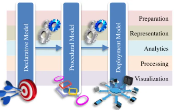
Visualization Preparation Representation Analytics Processing D epl oym ent M ode l P roc edura l M ode l D ec la ra ti ve M ode l
Fig. 1.The TOREADOR framework
2. Procedural Model: a platform-neutral, vendor-independent model that specifies the algorithms for data preparation and for parallelizing and exe-cuting the analytics, as well as the way to present the results to users (how BDA should work). It corresponds to the platform-independent model in MDA terminology.
3. Deployment Model: the computational components and other resources for the process on a specific target execution platform (e.g., Hadoop-as-a-service). It corresponds to theplatform-specific model in MDA terminology. Remarkably, as required by the MDA paradigm, each model is (semi-)automatically derived from the previous one.
As sketched in Figure 1, within the TOREADOR framework the three mod-els are grouped into five conceptual areas:preparation,representation,analytics, processing, andvisualization. The focus of this paper is on the visualization area, in particular on (i) how to specify the users objectives and describe the dataset to be visualized within the declarative model (e.g., comparison-oriented visual-ization of 4-dimensional numerical data with low-cardinality domains), and (ii) how to translate this specification into a concrete platform-independent solution (e.g., bar chart) within the procedural model, which will be eventually translated into a deployment model on the target execution platform (e.g., stacked-to-group bar chart in the D3 Java library,d3js.org). Specifically, the main contributions of this paper are:
– As part of the declarative model we define avisualization context based on seven prioritizable coordinates for assessing the user’s objectives and con-ceptually describing the data to be visualized (Section 3).
– We describe a skyline-based technique for automatically translating a visu-alization context from the declarative model onto the procedural model in the form of a set of suitable visualization types (Section 4).
The paper outline is completed by Section 2, which discusses the basic related literature, and by Section 5, which evaluates our approach through a real use case excerpted from the pilot applications of TOREADOR and draws the conclusions.
2
Related Work
Visualization has a key role in BDA to enable users to understand the problem, generate hypotheses and define the solution, as well as to steer the analysis process in dealing with massive, incomplete, and incorrect data [9].
Several papers propose principles and taxonomies to classify the different approaches to visualizing data and interacting with them. A seminal paper in this field is the one by Shneiderman, who proposes a classification taxonomy for data visualization based on two coordinates:task (e.g., overview, zoom, and details-on-demand) and data type (e.g., multi-dimensional, tree, and temporal) [16]. Another influential paper is [10], where Keim proposes a different classification of data visualization and visual data mining techniques by considering, besides the data type, the visualization technique and the interaction and distortion technique. A few years later, Abela listed four possible goals for visualization, namely relationship, comparison, distribution, and composition [1].
More recently, B¨orner surveyed the main classifications proposed in the lit-erature and made a significant effort to integrate them into a single, consistent framework [4]. Her visualization framework is based on six coordinates, namely insight need type (which integrates [18] and [7]),data scale type(based on [17]), visualization type (based on [3] and [16]),graphical symbol type, graphical vari-able type, andinteraction type (which integrates [16] and [10]). A more detailed classification of data types, including for instance datetime components and IRIs, is introduced in [14] with reference to the visualization of linked open data; the paper also relates each common type of chart to the user goals it is most compli-ant with. Finally, in [6] a new coordinate is introduced to visualize linked open data: theuser type. Users are distinguished intolay-users andtechies.
Despite the richness and detail of the classifications available, to the best of our knowledge only few papers focus on the criteria for deciding which type of chart is best suited for a given combination of data type, dimensionality, user goal, etc. In [1], a simple decision tree is proposed to select the best visualization according to the user’s goal and to the main features of data (namely, the number of variables, the cyclicality, and the size). A description of the pros and cons of different charts to be used in the security domain is provided in [12]; the specific aspects of data considered include their dimensionality, cardinality, and type. A flow-chart is also provided to help users in choosing the right visualization for different goals and data dimensionality, but not all combinations are taken into account. In the context of big data, a framework for choosing the best visualization is outlined in [5]; specifically, the main types of charts are related to the user goals they fulfill and to the data dimensionality, cardinality, and type they support.
3
A Declarative Model for Visualization
In this section we describe the coordinates we use to enable users to declare their objectives and describe the dataset to be visualized. The method we followed to select these coordinates can be summarized as follows:
1. We analyzed the literature on the taxonomies of data visualization and in-teraction paradigms to derive a set of candidatecoordinates (e.g., data type) and, for each coordinate, a set of candidatevalues (e.g., ordinal).
2. From these candidate coordinates/values we derived a set of questions to be submitted to users for requirement elicitation.
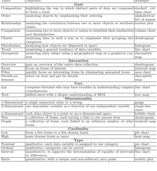
3. Based on the elicitation, we selected a final set of coordinates and values. For requirement elicitation we adopted the Kano model [8], a useful tool for understanding needs and expectations of a stakeholder based on how they affect his/her satisfaction with a given product. The Kano model classifies requirements intomust-be,one-dimensional,attractive,indifferent, andreverse based on their location along two dimensions, namely, the degree of satisfaction and the level of functionality. To position each requirement a questionnaire is submitted to each user (in our context, the key users of the pilot applications of TOREADOR), then the results are aggregated and evaluated. In the following we list the coordinates we selected, see Table 1 for the values each coordinate can take: (1) Goal, which enables users to declare their analysis goal. This classification
follows the one intobasic task types proposed in [4].
(2) Interaction, which enables users to declare the type of interactions to be sup-ported by the visualization. This classification derives from the one proposed in [4]; specifically, based on requirement elicitation, we selected a subset of most common and intuitive interaction types out of those proposed in [10]. (3) User, which enables users to declare their skill as in [6].
(4) Dimensionality, which enables users to declare the number of variables they wish to visualize. Here, as done in [1], we count all variables without distin-guishing between independent and dependent variables.
(5) Cardinality, which enables users to qualitatively declare the cardinality of the data to be visualized like in [1].
(6) Type, which enables users to declare the type of each variable to be analyzed. The classification we adopt here is the one in [17], but as in [12] we distinguish independent from dependent variables.
Definition 1 (Visualization Context). Let O1, . . . , O7 be the sets of goals,
interactions, users, dimensionalities, cardinalities, independent types, and de-pendent types, respectively, as listed in Table 1 (O6 ≡ O7); let C = {1, . . . ,7}
and O = S
i∈COi. A visualization context is defined by a function c : C →
O∪ {NULL} (where c(i)∈Oi∪ {NULL}) and by a weak order
c
on the setC
that expresses the priorities between the seven coordinates. Example 1. An example of visualization context is
c(1) = Comparison, c(2) = NULL, c(3) = Tech,
c(4) = n-dimensional, c(5) = High, c(6) = Interval, c(7) = Ratio
(3∼c 6)c 1c (2∼c 4∼c 5∼c 7)
where the user expresses three levels of priority: high (for the user and inde-pendent type coordinates), medium (for the goal coordinate), and low (for the
Table 1.Visualization coordinates
Value Objective Example
Goal
Composition highlighting the way in which distinct parts of data are composed to form a total
stacked col-umn chart Order analyzing objects by emphasizing their ordering alphabetical
list of names Relationship analyzing the correlation between two or more objects or attribute
values
scatter plot Comparison examining two or more objects or values to establish their similarities
and dissimilarities
column chart Cluster analyzing data in such a way as to emphasize their grouping into
categories
dendrogram Distribution analyzing how objects are dispersed in space histogram Trend examining a general tendency of data variables line chart Geospatial analyzing data values using a geographical map as a graphical
con-text
choropleth map Interaction
Overview gain an overview of the entire data collection dendrogram
Zoom focus on items of interest network map
Filter quickly focus on interesting items by eliminating unwanted items area chart
Details-on-demand
select an item and get its details choropleth map User
Lay computer-literates who may have troubles in understanding complex visualizations
line chart Tech skilled users with a deeper understanding of BDA tree map
Dimensionality
1-dimensional a single numerical value or a string gauge 2-dimensional one dependent variable as a function of one independent variable single-line
chart n-dimensional each data object is a point in ann-dimensional space bubble chart Tree a collection of items, each having a link to one parent item dendrogram Graph a collection of items, each linked to an arbitrary number of other
items
network map Cardinality
Low from a few items to a few dozens items pie chart
High some dozens items or more heat map
Type
Nominal qualitative, each data variable is assigned to one category pie chart Ordinal qualitative, categories can be sorted histogram Interval quantitative, it supports the determination of equality of intervals
or differences
line chart Ratio quantitative, with a unique and non-arbitrary zero point scatter plot
4
Going Procedural
To translate the visualization context stated by the user in the declarative model into a set of suitable visualization types in the procedural model, we first need to assess to which extent each visualization type is suitable for each value of each coordinate introduced in Section 3.
Definition 2 (Suitability Function). A suitability function is a function
σ : O ×V → s where O is the set of all coordinate values, V is the set of
all visualization types, and s ∈ {unfit,discouraged,neutral,acceptable,fit} is a suitability score.
(a) (b)
(c) (d) (e)
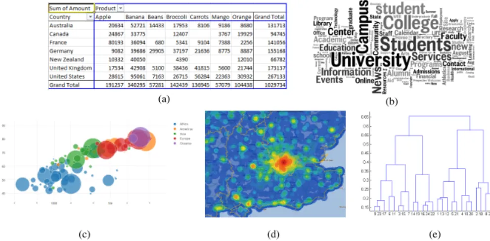
Fig. 2.A pivot table (a), a tag cloud (b), a bubble chart (c), a heat map (d), and a dendrogram (e)
Our approach is general enough to be applicabile to each possible visualization typevas long as a suitability evaluation is done forvbased on our seven coordi-nates. Currently we consider a set of 25 widely used visualization types classified as shown below [4]:
– Tables are ordered arrangements of rows and columns in a grid, with data values stored in cells (e.g., pivot table —Figure 2.a).
– Charts visually depict quantitative and qualitative data without using a well defined reference system (e.g., tag cloud —Figure 2.b).
– Graphsplot quantitative and qualitative data using a well-defined reference system, such as Cartesian coordinates (e.g., bubble chart —Figure 2.c).
– Maps display data according to their spatial relationships and show how data are distributed geographically (e.g., heat map —Figure 2.d).
– Network layoutsuse nodes to represent sets of data records, and inter-node connections to represent relationships (e.g., dendrogram —Figure 2.e). Then we defined a suitability function by assigning a score to each visualization type / coordinate value pair; the scores were derived from the literature (mostly from [1, 12, 4]). For instance, in Table 2 we show the suitability scores for three popular visualization types.
The next problem is that of using the suitability function to find, given a visualization context c, one or more “most suitable” visualization types. To this end we start by observing that, with reference to c, visualization type v is evaluated through a 7-tuple hσ(c(1), v), . . . , σ(c(7), v)i where each element expresses the suitability ofv forc along one coordinate. On the other hand, the suitability scores introduced in Definition 2 are obviously related by a (strict) total order expressing a preference:
Table 2.Suitability scores for three visualization types
pie chart bubble chart heat map
Goal: Composition fit unfit unfit
Order neutral unfit unfit
Relationship unfit fit unfit Comparison neutral fit acceptable Cluster unfit acceptable acceptable Distribution discouraged fit fit
Trend unfit fit unfit
Geospatial unfit unfit fit
Interaction: Overview fit acceptable fit
Zoom unfit acceptable fit
Filter neutral neutral neutral Details-on-dem acceptable neutral neutral
User: Lay fit acceptable acceptable
Tech acceptable fit fit
Dimensionality: 1-dimensional unfit unfit unfit 2-dimensional fit unfit unfit n-dimensional unfit fit fit
Tree unfit unfit unfit
Graph unfit unfit unfit
Cardinality: Low fit acceptable acceptable
High discouraged discouraged fit
Independent Type: Nominal fit unfit neutral
Ordinal acceptable neutral acceptable Interval discouraged fit fit
Ratio discouraged fit fit
Dependent Type: Nominal unfit fit unfit
Ordinal unfit fit discouraged
Interval unfit fit fit
Ratio fit fit fit
So we can compare any two possible visualization types v, v0 ∈ V along each single coordinate: for thei-th coordinate,vis strictly better thanv0ifσ(c(i), v)> σ(c(i), v0).
Now, we have to combine the seven resulting one-dimensional preferences into a composite one for the whole 7-tuple. A popular way to cope with this problem is to look for tuples (corresponding in our case to visualization types) that are Pareto-optimal. A tuple is Pareto-optimal when no other tuple dominates it, being better in one dimension and no worse in all the other dimensions. In the database community, the set of tuples satisfying Pareto-optimality is called a skyline [13]. The definition of dominance is given below in flat (non-prioritized) form; it is given with reference to a subset of coordinate C0 to be more easily generalized to the prioritized case in Definition 4.
Definition 3 (Flat Dominance). Given visualization contextc and two visu-alization types v and v0, and given the set of coordinatesC0 ⊆C, we say that v is flat-substitutable tov0 onC0, denoted v∼C0 v0, iff σ(c(j), v) =σ(c(j), v0)
for all j ∈C0 such thatc(j)6= NULL. We say that v flat-dominates v0 on C0, denoted v C0 v0, iff (a) ∃i∈ C0 : σ(c(i), v)> σ(c(i), v0) and (b) for all other
j∈C0 such thatc(j)6= NULLit isσ(c(j), v) =σ(c(j), v0).
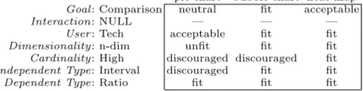
Example 2. With reference to the visualization context in Example 1, we
Table 3. Suitability tuples for three visualization types with reference to the visual-ization context in Example 1
pie chart bubble chart heat map
Goal: Comparison neutral fit acceptable
Interaction: NULL — — —
User: Tech acceptable fit fit
Dimensionality: n-dim unfit fit fit
Cardinality: High discouraged discouraged fit
Independent Type: Interval discouraged fit fit
Dependent Type: Ratio fit fit fit
three suitability 7-tuples to be compared are shown in Table 3; the scores are excerpted from Table 2. Considering all the six specified coordinates (the interaction coordinate is not specified), it is bubble chart C pie chart and
heat map C pie chart. Specifically, bubble chart flat-dominates pie chart
be-cause it is better on all coordinates except dependent type and cardinality, on which it is equivalent; similarly for heat map. On the other hand, there is no flat-dominance or flat-substitutability relationship between bubble chart and heat map because the first is better on the goal coordinate, while the second is better on the cardinality coordinate. So overall, if coordinate priorities are not considered, both bubble chart and heat map would belong to the skyline while
pie chart would not.
The last step is that of considering the priorities c declared by the user as part of the visualization context. To this end we resort to the concept of prioritized skyline given in [13] and redefine dominance as follows.
Definition 4 (Dominance). Given visualization context c,c and two visual-ization types v and v0, , and given the set of coordinates C0 ⊆C, we say that v dominates v0 on C0 (denoted v
BC0 v0) iff either (a) v max(C0) v0 or (b)
(v ∼max(C0))∧(v BC0\max(C0) v0), where max(C0) denotes the top coordinates
in thec order restricted to C0.
Intuitively, if v is better that v0 with reference to the coordinates that take highest priority for the user, then it is unconditionally better thanv0; otherwise, ifvis equivalent tov0 with reference to those coordinates, we have to check if it is better with reference to the coordinates taking second priority, and so on.
Definition 5 (Skyline). The skyline for c,c is the set of visualization types inV that are not dominated by any other visualization type.
Example 3. Considering again the visualization context in Examples 1 and 2,
and taking now into account the coordinate priorities, it is bubble chart BC
heat mapBC pie chart. Indeed, since bubble chart and heat map are equivalent
on the two top-priority coordinates (i.e., user and independent type), we have to check the second-priority coordinate (goal), on which bubble chart are bet-ter than heat map. So, taking into account priorities, the skyline only includes
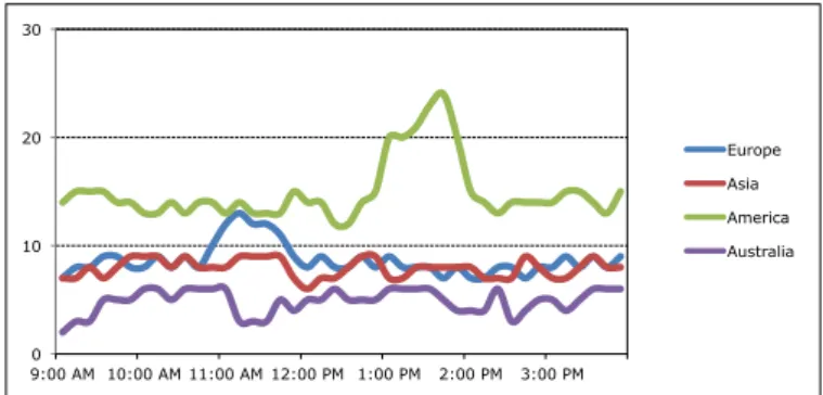
0 10 20 30 9:00 AM 10:00 AM 11:00 AM 12:00 PM 1:00 PM 2:00 PM 3:00 PM Europe Asia America Australia
Fig. 3.Data visualization using a multiple line chart for the fraud detection use case
5
Evaluation and Conclusions
In this paper we have described an approach to automate the translation of the objectives declared by the user for visualizing the results of BDA into a set of most suitable visualization types. The approach enables users to specify a value for seven visualization coordinates, assigns a qualitative suitability score to each visualization type, then computes the skyline to determine the set of Pareto-optimal visualization types.
To evaluate our approach we have implemented a Java prototype whose in-terface supports the declaration of the visualization context and returns the prioritized skyline of visualization types. Then we have let the users of the three pilot applications of TOREADOR use this prototype to express a visualization context for their BDA use cases, and checked that they are satisfied with the visualization types proposed. For space reasons here we will describe only one use case out of the dozen use cases evaluated.
Fraud Detection. The goal of this use case is the identification of fraudulent clicks generated by bots in paid online advertising. Starting from a dataset de-scribing the traffic through search engines and the related clickstreams, cluster-ing and outlier detection algorithms are applied to determine a list of fraudulent IPs. The resulting data to be visualized describe the total number of clicks orig-inated from the IPs of each country during 10 minutes slots of a single day. The visualization context declared by the users is
c(1) = Trend, c(2) = Filter, c(3) = Lay,
c(4) = n-dimensional, c(5) = High, c(6) = Ordinal, c(7) = Ratio
(1∼c 3∼c 4)c (2∼c 5∼c 6∼c 7)
The skyline for the three top-priority coordinates of c includes multiple line chart, stacked line chart, and multiple line chart. However, when the remaining four coordinates are considered, only multiple line chart is left in the skyline (its
suitability scores are neutral for filter, and fit for all other coordinate values). The resulting visualization is shown in Figure 3, and was declared by the users
to perfectly fit their needs.
Our future work mainly concerns the translation from the procedural to the deployment level of the TOREADOR platform. Specifically, one the user has chosen her preferred chart (e.g., bubble chart) among those suggested, and based on the types of the single (independent and dependent) data variables to be visualized, the system will support the user in mapping each data variable onto a specific dimension of the chart (e.g., first variable onto X axis, second variable onto Y axis, third variable onto bubble color, fourth variable onto bubble size).
References
1. Abela, A.: Advanced presentations by design. Pfeiffer (2008)
2. Ardagna, C., Bellandi, V., Damiani, E., Bezzi, M., Hebert, C.: A model-driven methodology for big data analytics-as-a-service. In: Proc. IEEE Int. Congress on Big Data. Honolulu, Hawaii (2017)
3. Bertin, J.: Semiology of Graphics. Esri Press (1983)
4. B¨orner, K.: Atlas of knowledge: anyone can map. MIT Press (2015)
5. Chandra, J., Madhu Shudan, S.: IBA graph selector algorithm for big data visu-alization using defense data set. International Journal of Scientific & Engineering Research 4(3), 1–7 (2013)
6. Dadzie, A.S., Rowe, M.: Approaches to visualising linked data: A survey. Semant. web 2(2), 89–124 (2011)
7. Few, S.: Show Me The Numbers: Designing Tables and Graphs to Enlighten. An-alytics Press (2004)
8. Kano, N., Nobuhiku, S., Fumio, T., Shinichi, T.: Attractive quality and must-be quality. Journal of the Japanese Society for Quality Control 14(2), 39–48 (1984) 9. Keim, D.: Exploring big data using visual analytics. In: Proc. EDBT/ICDT
Work-shops (2014)
10. Keim, D.A.: Information visualization and visual data mining. IEEE Trans. Vis. Comput. Graph. 8(1), 1–8 (2002)
11. Kleppe, A., Warmer, J., Bast, W.: MDA explained - the Model Driven Architecture: practice and promise. Addison-Wesley (2003)
12. Marty, R.: Applied security visualization. Addison-Wesley (2009)
13. Mindolin, D., Chomicki, J.: Preference elicitation in prioritized skyline queries. VLDB J. 20(2), 157–182 (2011)
14. Pe˜na, O., Aguilera, U., L´opez-de-Ipi˜na, D.: Exploring LOD through metadata ex-traction and data-driven visualizations. Program 50(3), 270–287 (2016)
15. Russom, P.: Big data analytics. Tech. rep., TDWI Best Practices Report (2011) 16. Shneiderman, B.: The eyes have it: A task by data type taxonomy for information
visualizations. In: Proc. IEEE Symposium on Visual Languages. pp. 336–343 (1996) 17. Stevens, S.S.: On the theory of scales of measurement. Science 103(2684), 677–680
(1946)
18. Wehrend, S., Lewis, C.: A problem-oriented classification of visualization tech-niques. In: Proc. IEEE Conference on Visualization. pp. 139–143 (1990)