Considering Agency and Data Granularity in the Design of
Visualization Tools
Gonzalo Gabriel Méndez
1,2Miguel A. Nacenta
1Uta Hinrichs
1 1SACHI, University of St Andrews, UK
{ggm, mans, uh3}@st-andrews.ac.uk
2
Escuela Superior Politécnica del Litoral, Ecuador
[email protected]
ABSTRACT
Previous research has identified trade-offs when it comes to designing visualization tools. While constructive “bottom-up” tools promote a hands-on, user-driven design process that enables a deep understanding and control of the visual mapping, automated tools are more efficient and allow people to rapidly explore complex alternative designs, often at the cost of transparency. We investigate how to design visualization tools that support a user-driven, transparent design process while enabling efficiency and automation, through a series of design workshops that looked at how both visualization experts and novices approach this problem. Participants produced a variety of solutions that range from example-based approaches expanding constructive visualization to solutions in which the visualization tool infers solutions on behalf of the designer, e.g., based on data attributes. On a higher level, these findings highlight agency and granularity as dimensions that can guide the design of visualization tools in this space.
Author Keywords
Visualization; Constructive Visualization; iVoLVER; Agency; Granularity; Tool Design; Tableau.
ACM Classification Keywords
H.5.m Information Interfaces and Presentation (e.g. HCI): Miscellaneous; D.1.7 Software: Visual Programming
INTRODUCTION
An increasing number of tools support visualization construc-tion without requiring programming skills or design expertise from the users’ end. This enables a larger proportion of the population to take advantage of visualization, from students and other learners, to researchers who are non-experts in vi-sualization. Many modern commercial visualization tools, such as Tableau or MS Excel, allow the rapid creation of so-phisticated visualizations and, sometimes, encourage better visualization choices. For example, Tableau makes sugges-tions of specific visualization types based on the selected data attributes (e.g., a bar chart, which is known to be perceptually
Permission to make digital or hard copies of all or part of this work for personal or classroom use is granted without fee provided that copies are not made or distributed for profit or commercial advantage and that copies bear this notice and the full citation on the first page. Copyrights for components of this work owned by others than the author(s) must be honored. Abstracting with credit is permitted. To copy otherwise, or republish, to post on servers or to redistribute to lists, requires prior specific permission and/or a fee. Request permissions from [email protected].
CHI 2018,April 21–26, 2018, Montreal, QC, Canada
© 2018 Copyright held by the owner/author(s). Publication rights licensed to ACM. ISBN 978-1-4503-5620-6/18/04. . . $15.00
DOI:https://doi.org/10.1145/3173574.3174212
efficient for displaying groups of scale quantities). As visual-ization tools become more sophisticated, they tend to make more choices and actions on behalf of the designer. In some extremes the tool can generate a visualization from provided data with minimal or no human intervention [25].
Somewhat in opposition to these tools stands the subarea of constructive visualization [28, 30, 32], which is based on educational theories [1, 51, 52]. Constructive visualization promotes a more hands-on, even manual approach to visual-ization for a better understanding of its principles and values. Some existing evidence shows that requiring more effort from the designer has advantages in terms of learning and under-standing [30], as well as an increased feeling of authorship and transparency [44]. However, the fundamental limitation of these constructive tools (e.g., [45], and their physical coun-terparts [6, 29, 32]) is that they do not scale to larger datasets and can be tedious and repetitive to use [44].
In this paper we investigate how to reconcile automation and computer-assisted design with the benefits of constructive vi-sualization. To gain an understanding of this design space we conducted an iterative in-house design process as well as a series of design workshops with people of different back-grounds and expertise levels. Based on our detailed analysis of resulting solutions, also in the light of existing tools, we describe possible ways to design visualization tools that retain the advantages of both worlds. Our paper contributes: (1) a conceptualization of the problem of designing more automated constructive visualization tools, (2) a catalog of categorized design examples, (3) a characterization of this design space in terms of agency and granularity, and (4) a discussion on the implications for designing better visualization tools.
RELATED WORK
Our research draws on previous design approaches to visu-alization tools, including constructive visuvisu-alization, and the concepts of automation, agency, and abstraction in relation to designing visualization tools as described below.
Visualization Tools: Types and Approaches
takes place within a canvas where graphical elements of dif-ferent types process and exchange data through connections. Such tools do not require textual programming skills as op-posed to specialized languages and libraries (e.g., D3 [7]). Méndez et al. [44] discuss approaches supported by visu-alization tools as a continuum between two ends: bottom-up and top-down. The former, represented by tools such as
iVoLVER [45], promote a hands-on,constructivevisualization
process [28, 30, 32], but are limited in terms of scalability. The latter (e.g., Tableau) allow rapid design at the cost of trans-parency. Aiming to marry the benefits of both approaches, we investigate design strategies that support the visualization of large datasets while maintaining a constructive, transparent, and largely user-controlled visualization process.
Automation and Agency
In visualization tools, automation facilitates visual mapping of large datasets enabling designers to rapidly explore differ-ent visual represdiffer-entations [44]. Many existing tools feature recommendation modules that suggest designs as users ma-nipulate data elements (e.g., Tableau’s “Show Me” [40] and similar strategies in other tools [8, 18, 56, 58, 72]). In general, automation is meant to ease tasks that would be otherwise un-necessarily difficult, repetitive, or tedious. However, research from psychology and cognitive sciences has shown that too much automation may lead to complacency and bias [54, 53]. Relying on the computer, people are less likely to reflect on how automated routines act on their behalf [13]. Furthermore, people often give more weight to the computer’s decisions even in the presence of contradicting evidence [10].
In digital tools, excessive automation can also affect how
people perceive agency. Agency“refers to a person’s ability to
control their actions and, through them, events in the external
world.”[20, p. 242]. The experience of agency is an important
aspect of HCI research because users“strongly desire the
sense that they are in charge of the system and that the system
responds to their actions.”[59, p. 75]. As shown by Coyle
et al. [12], too much computer assistance can harm people’s sense of agency in a point-and-click task.
The InfoVis community has also paid attention to agency. People experience different levels of control and authorship of the visualization design process when working with tools that implement opposite levels of automation [44]. Tori and Möller’s taxonomy emphasizes the human aspect of
visual-ization techniques by considering“how much the designer
chooses display attributes”[69, p. 154]. Koytek et al. showed
that incorporating personal agency into brushing and linking interaction [37] can increase the transparency of a visualization tool. To better preserve people’s sense of agency while exploit-ing computational power, other works combine automation and human involvement (e.g., [4, 47, 55]). Along these lines, Yu and Blackwell investigated the role of timing on people’s perception of agency in mixed-initiative interaction [73].
Abstraction
To cope with datasets of different types and scales, visualiza-tion tools often create abstracvisualiza-tions of the data and visual map-ping processes. While constructive visualization approaches have a low level of abstraction (as values are directly mapped
to visual elements), most commercial tools implement higher levels of abstraction on a data, visual, or interaction level. Ab-straction is a cognitive process that plays an important role in human language and thought [24, p. 184]. It is a complex term discussed across many areas of study such as philosophy [57], psychology [16, 60] and mathematics [21]. It is used in engi-neering to cope with complexity [36], although it necessarily implies hiding of detail. In the remainder of this paper we will refer to one specific type of abstraction—generalization abstraction—which we define narrowly as the ability to refer to a set of items with a symbol. For example, when dealing with data, the name of a column becomes an abstraction of all the values contained in that column. Abstraction can also be recursive: we can abstract a group of abstractions (e.g.,
re-ferring to theName,Surname, andAgecolumns as thePerson
data tableincreases abstraction). Our definition of
abstrac-tion is related to encapsulaabstrac-tion in Software Engineering and Object-oriented Programming [61], and it has been discussed in the context of visualizing algorithms [46].
GOALS AND METHODOLOGY
Our research aims at bringing together the benefits of bottom-up and top-down approaches to visualization tools. This is a difficult challenge as the advantages of bottom-up visual-ization tools—a deep involvement and understanding of the visualization process—seem to be incompatible with the ben-efits of top-down visualization tools: the quick and easy vi-sualization, even of large datasets, made possible through automation [44]. To investigate possible solutions to this chal-lenge in-depth and from multiple perspectives, we followed a mixed design methodology driven by: (1) our own expertise as visualization researchers with significant experience in design-ing visualization tools and UIs, and (2) the ideas from a larger group of people with varying degrees of expertise in visual-ization and visualvisual-ization tools, who took part in four design workshops we organized. In the search of design approaches to visualization tools that would be suitable not only to experts but also to visualization novices, we found the involvement of a larger group of people with different backgrounds to be important. The constructive visualization tool iVoLVER [45] provided a starting point for our explorations, which focused on revising its design to make it suitable for visualizing larger datasets while maintaining transparency and user-involvement in the visualization process. In the following we first discuss the in-house design solutions that we came up with as experts in visualization tool design. This is followed by a discussion of the design workshops and the solutions proposed by the workshop participants.
IN-HOUSE DESIGN SOLUTIONS
To explore solutions to the problem of visualizing large-scale datasets in the constructive tool iVoLVER, two of the authors of this work engaged in an iterative design process. We aimed at finding a “sweet spot” between the two ends of the bottom-up vs. top-down continuum [44], balancing their trade-offs from an expert perspective. This process consisted of four
meetings of about 1.5 hours each in which we developed and
incrementally refined a large number of initial paper sketches At the end we consolidated the designs into three
Charles Name Chris Rachel Gabriel City Kansas Dallas Miami San Jose Chicago DoB 21/02/1983 07/09/1985 19/02/1988 26/04/1989 03/03/1999 Salary (dollars) 1270 1580 3300 1220 3620 Department Supplies Sales Marketing Sales Marketing Service (years) 4 5 10 6 13 Emily
aND bring in a new rECTANGULAR MARK 1 Width Label Color Height record
WE ACTIVATE THE RECORDING
2
THE MACRO RECORDER REGISTERS all user’s ACTIONs AND ADD them TO ITS HISTORY
4
3 9
8 5
6
Charles Rachel Emily
Width Label Color Height Select data Charles Name Chris Rachel Gabriel City Kansas Dallas Miami San Jose Chicago DoB 21/02/1983 07/09/1985 19/02/1988 26/04/1989 03/03/1999 Salary (dollars) 1270 1580 3300 1220 3620 Department Supplies Sales Marketing Sales Marketing Service (years) 4 5 10 6 13 Emily Charles Name Chris Rachel Gabriel City Kansas Dallas Miami San Jose Chicago DoB 21/02/1983 07/09/1985 19/02/1988 26/04/1989 03/03/1999 Salary (dollars) 1270 1580 3300 1220 3620 Department Supplies Sales Marketing Sales Marketing Service (years) 4 5 10 6 13 Emily
WE CONNECT VALUES FROM THE TABLE TO THE
LABEL AND HEIGHT PROPERTIES OF THE MARK
Width Label
Color
Height
record
stopping the RECORDING allows us to SELECT THE DATA for the GENERALIZation step
WE SELECT data records by clicking rows of the table
Create new rectangular mark
Rectangular mark moved
Rectangular mark labelled Height of rect mark set to salary
Select data APPLY MAPPINGS
APPLY MAPPINGS record
WE START THE GENERALIZATION
7AFTER SELECTING THE DATA, WE can SPECIFY THE ACTIONS WE WANT TO GENERALIZE
Create new rectangular mark
Rectangular mark moved
Rectangular mark labelled Height of rect mark set to salary
Select data APPLY MAPPINGS THE VISUALIZATION RESULTS FROM REPEATING THE ACTIONS WE SELECTED
Chris Create new rectangular mark Chris Chris Rectangular mark moved
[image:3.612.79.537.62.222.2]Rectangular mark labelled Height of rect mark set to salary
Figure 1: In-house Macro Recorder.
Macro Recorder: In this solution, users specify visual map-pings by connecting individual values of the dataset (i.e., cells of the data table) to a mark’s visual properties while an
ad-ditional interface element, theMacro Recorder, registers the
history of manual actions throughout the visualization process (Fig. 1, left). The recording is activated upon request. When finished it allows the selection of (1) a subset of the performed actions and (2) a set of data (i.e., rows of the dataset) to which the selected actions will be applied (Fig. 1, middle). This generalization step results in a set of new marks that represent the selected data according to the mappings specified by the actions on the initial mark (Fig. 1, right).
This design is based on the concept of demonstrational
inter-faces that“let the user perform actions on concrete example
objects [...] while constructing an abstract program”[48,
p. 61]. It preserves iVoLVER’s bottom-up approach as it allows people to drive the visualization design process by specifying mappings at the level of individual data values and marks. The recording feature allows for generalization and, in this way, resolves the problem of having to repeat individual interaction steps, one of iVoLVER’s main drawbacks [44, 45].
Smart Assistant: This solution proposes a visualization pro-cess based on a mixed-initiative interaction approach [2]. Vi-sual mappings are specified based on a single mark and data value. The system monitors the designer’s mapping actions and provides guidance on how to proceed in further stages of
the visualization construction process. As thisSmart
Assis-tantdetects a new mark or modification of a visual property,
it infers how the mapping applies to other data and shows previews of the corresponding visualization based on all data values (Fig. 2, left). The user can accept or reject these sug-gestions, or explore alternatives (Fig. 2, middle & right).
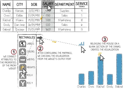
Proxy Mark Widget: In this solution mappings are specified not directly on marks, but through a widget which acts as a
proxyfor a group of marks and provides access to their visual
properties. Users specify visual mappings by feedingsetsof
data values to the widget’s graphical representations of visual properties (see Fig. 3.1) . These sets can contain either all the values associated to a data attribute or just some parts. In our design, the former are available through the column headers of the data table while the latter can be manually constructed with a vertical dragging gesture that spans across the desired
values. Once all the data mappings have been specified, an output port in the widget allows users to drag the resulting visualization to the canvas (see Fig. 3.2 & 3.3).
This solution is similar to Tableau’s “Marks Card” [65], with the important difference that the user is in full control of the visual properties of marks, including their position on the canvas which can be defined explicitly, rather than implicitly as in Tableau through the “Columns and Rows” shelves [63].
DESIGN WORKSHOPS
We conducted four design workshops to expand and validate our ideas on how to facilitate the visualization of large-scale datasets in iVoLVER. We deliberately chose participants from a range of backgrounds and expertise to engage with the prob-lem for half a day in groups of 3–4. Since the expert perspec-tive is already represented (see above), we wanted to encour-age solutions from other fields, beyond experts’ perspectives on current tools and beyond the state of the art. To provide participants with some background and to expose them to con-trasting visualization authoring approaches, they first worked with Tableau and iVoLVER (two extremes in the space be-tween top-down and bottom-up visualization approaches [44]), before they sketched and discussed their own design ideas.
Participants
We recruited 14 participants from a local university (8 female, 19–49 years old; median 26) ; 12 were undergraduate or grad-uate students in computer science, mathematics, English liter-ature, or museum studies; one was a research communication practitioner, and one a lecturer in economics.
Expertise in visualization varied from no knowledge (n=1), web or print from a consumer perspective (n=7), awareness of concepts without practical experience (n=3), and visualization practitioners with at least one year experience (n=3).
Charles Name Chris Rachel Gabriel City Kansas Dallas Miami San Jose Chicago DoB 21/02/1983 07/09/1985 19/02/1988 26/04/1989 03/03/1999 Salary(dollars) 1270 1580 3300 1220 3620 Department Supplies Sales Marketing Sales Marketing Service(years) 4 5 10 6 13 Emily Charles Name Chris Rachel Gabriel City Kansas Dallas Miami San Jose Chicago DoB 21/02/1983 07/09/1985 19/02/1988 26/04/1989 03/03/1999 Salary(dollars) 1270 1580 3300 1220 3620 Department Supplies Sales Marketing Sales Marketing Service(years) 4 5 10 6 13 Emily Charles Name Chris Rachel Gabriel City Kansas Dallas Miami San Jose Chicago DoB 21/02/1983 07/09/1985 19/02/1988 26/04/1989 03/03/1999 Salary(dollars) 1270 1580 3300 1220 3620 Department Supplies Sales Marketing Sales Marketing Service(years) 4 5 10 6 13 Emily
value from the table CONNECTED TO THE label property of thE mark
new rECTANGULAR MARK 1 Width Label Color Height
Would you like to create a rectangular mark per each name of the dataset?:
NEXT pREV.
THe tool suggestS A MAPPING based on the lABEL property assignment
2
We accept the ASSISTANT’S suggestion
4 3
Would you like to set the height of all the other rectangular marks to 1580?
NEXT pREV.
THe tool suggestS A MAPPING based on the HEIGHT property assignment
This does not seem like a good suggestion, so we look for another one.
9
8 7
5 value from the table CONNECTED TO THE
height property of thE ‘chris’ mark
6
Charles Rachel Emily Gabriel
Width Label
Color
Height new marks are created and added to the canvas
Would you like to map the salary to the
height of all the other rectangular marks?
NEXT pREV.
THe tool suggestS A new MAPPING based on the HEIGHT property
This time, We accept the ASSISTANT’S suggestion
10 11
Charles Rachel Emily Gabriel
Width Label
Color
Height
The height of the marks is modified
Chris
CharlesChrisRachel Emily Gabriel CharlesChrisRachel Emily Gabriel Charles Chris Rachel Emily Gabriel
Chris Chris
YES NO NO
[image:4.612.80.537.62.218.2]YES NO YES
Figure 2: In-house Smart Assistant.
one year of experience (n=4; their experience ranged from designing touch interfaces, UIs for domain specialists, and visualization-based interfaces including Tableau dashboards.)
Procedure
Each workshop session consisted of the following phases (see supplementary material for data and workshop material):
Introduction to Visualization Concepts. After filling out a
questionnaire about their background, participants watched a
4-minute video1explaining the concepts of marks and visual
variables and their relevance to visualizing data. Participants kept a printed summary of the video to have at hand during the subsequent tasks. This stage ensured that all participants had a minimum knowledge of basic visualization concepts.
Tool Introduction. A 20-minute session consisted of a
live demonstration, introducing participants to the first tool (iVoLVER or Tableau). This included an overview of its in-terface features, a demonstration of how it implements the visualization concepts, and how to map data to visuals and cre-ate visualizations based on a small dataset. Participants were given a printed “tool cheatsheet” to facilitate the subsequent visualization tasks.
Visualization Task.Participants received one of two datasets
and corresponding tasks to complete using the tool at hand. The tool order was counterbalanced across groups; dataset order was counterbalanced across participants within a group.
1Available athttp://ivolver.cs.st-andrews.ac.uk/scalability
WE CONNECT ATTRIBUTES TO THE PROPERTIES OF THE PROXY WIDGET Widths Labels Colors Heights Pos x Pos y Charles Name Chris Rachel Emily Gabriel City Kansas Dallas Miami San Jose Chicago DoB 21/02/1983 07/09/1985 19/02/1988 26/04/1989 03/03/1999 Salary (dollars) 1270 1580 3300 1220 3620 Department Supplies Sales Marketing Sales Marketing Service (years) 4 5 10 6 13
Charles Chris Rachel Emily Gabriel 1
RELEASING THE MOUSE ON A BLANK SECTION OF THE CANVAS
CREATES THE VISUALIZATION
3
after configuring the mappings, we can drag the visualization from the widget’s output port
2
Charles Chris Rachel Emily Gabriel
RECTANGLES
Figure 3: In-house Proxy Mark Widget.
Each dataset (one about oil production, one about movies, both used also in [44]) consisted of five data points and five attributes. The tasks included the creation of three different visualizations involving different data attributes. The tasks for both datasets were equivalent in the type and number of involved attributes. Participants had 30 minutes to complete the tasks using a laptop computer with their preferred input method (e.g., mouse, touchpad). After this, they were intro-duced to the second tool and completed the visualization tasks using this tool with the second dataset.
Group Discussion on Tools.The workshop attendees briefly
discussed their overall experience with Tableau and iVoLVER, including differences, advantages and limitations.
Design Briefing.These hands-on visualization sessions were
followed by a briefing highlighting the main goals for the sketching session: To revise iVoLVER as a constructive visu-alization tool that would (1) scale to large datasets, (2) support a speedy visualization process, and (3) avoid repetitive interac-tion steps; all while still supporting transparency and keeping the user in charge of the design decisions.
Sketching Session.Participants then spent approx. 45 minutes
sketching design solutions that would meet these goals. They were advised to revising iVoLVER by either modifying its cur-rent features or creating new ones. Participants were provided a sketching toolkit that, among other materials, contained sev-eral printed cutouts of a sample dataset (different from the data used in the visualization exercise) that they could glue to A3 sketching sheets as a starting point for sketching a new idea and as a common ground to discuss all participants’ solutions later in the workshop. The dataset representations came in small (five records/rows) and large (36 records) versions.
Presentation of Sketches. Participants presented their
sketched solutions to the group, explaining their ideas toward a better constructive visualization tool.
Participants did not collaborate at any point during the work-shop session. The workwork-shops ended with us presenting our in-house design solutions leading into a concluding discussion of the ideas that had come up in the workshop.
Data Collection & Analysis
[image:4.612.75.276.556.701.2](a) Displaying [P8]. (b) Formatting [P4]. (c) Formatting [P5]. (d) Setting the data type [P2]. (e) Sorting/filtering [P5]. (f) Rearranging [P3].
Figure 4: Designs that address data-related aspects of the visualization construction process .
(41 pages). This data forms the basis for our findings. One of the authors of this work (the facilitator of the workshops) analyzed the video data following a video coding process as proposed by Heath et al. [22]. Observational notes taken throughout the workshops informed this process. Initial coding focused on the visualization stages as addressed by partici-pants and how they envisioned particular features and their implementation. This was followed by grouping these initial codes to classify the different design solutions based on sim-ilarities and higher-level design strategies. All three authors participated in this grouping of codes.
RESULTS
Participants’ approaches to the introductory visualization tasks confirm observations of previous research that com-pared bottom-up versus top-down visualization authoring us-ing iVoLVER and Tableau [44]: participants explored more alternative designs when working with Tableau, and produced
a more varied set of visualizations when working in iVoLVER2.
Along the same lines, the group discussions focused on the trade-offs of the two tools’ approaches, namely the speed of construction and automation (Tableau) and the transparency and flexibility of the visualization process (iVoLVER). This validates the setup of the workshops and the understanding of the problem in preparation for the sketching session.
Categorizing the participants’ sketches, we found that these address three aspects of the visualization process as described below: (1) data preparation (e.g., formatting, sorting, filtering), (2) interactions with the data (e.g., grouping, creating data subsets), and (3) visual mappings specification. Note that some sketches are annotated in yellow for better comprehension.
Data Preparation Support
Six sketches (all produced by participants with a computer science background) included solutions to pre-process the data before starting the actual visualization process. Participants with non-technical backgrounds simply assumed that the tool would recognize the data’s structure automatically.
Most of these designs extract and format the data from the table to reflect the relationships between values and attributes. For example, P8 proposed an automatic approach where the tool generates a “data breakdown” pane which organizes the data according to attribute types (see Fig. 4a), resembling Tableau’s Data Pane [64] in appearance and functionality. Other partici-pants proposed a more manual approach for data configuration and extraction. For example, P4 designed a widget to extract
2The produced visualizations and complete set of design sketches are available athttp://ivolver.cs.st-andrews.ac.uk/scalability
and format the values from an attribute’s column (Fig. 4b) which also allows other specifications (e.g., the number of values to extract). P5 proposed a similar element that extracts and formats values also across columns (Fig. 4c), P2 designed a widget to set the data type of each attribute (Fig. 4d). Other participants designed configurable canvas elements to filter and sort data (Fig. 4e) and to rearrange the individual values of an attribute (Fig. 4f).
Interactions with the Data
Although some design ideas required interaction with indi-vidual data values, most participants proposed manipulating several values at a time, highlighting that working with
indi-vidual values makes the process tedious: “Both of my ideas
[image:5.612.328.554.608.699.2]are targeted towards improving efficiency, because I found that [in iVoLVER] some of the tasks were quite tedious. Especially
since it’s all geared towards single values.”[P8].
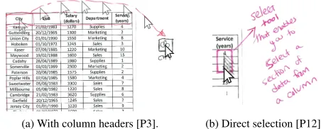
11/14 participants proposed accessing all values of an at-tribute by interacting with the column headers of the data table
(Fig. 5a):“We want to go from creating data bindings between
a single value to some property of an object [a mark]. And we want to go from that to potentially manipulating thousands of objects [marks] at the same time. So, the natural thing to do is to consider the headings, the column headings for the
data that we have.”[P7]. The creation of value subsets of an
attribute was commonly supported, for example, via dragging gestures to select the values of interest (Fig 5b). Similar to the selection of nonadjacent cells in MS Excel, P13 proposed to “select multiple parts of your data [...] via drag-and-drop or
‘control plus click’”.
Specifying Visual Mappings
17 design ideas presented by participants focused on how to specify mappings between data and visual properties. We categorized these into eight groups representing unique ideas.
Mapping Replication
P6 proposed an idea that directly builds on iVoLVER’s stan-dard way of mapping data to visuals, but replicates this
map-(a) With column headers [P3]. (b) Direct selection [P12].
ping process to multiple values and/or attributes. As shown
in Figure 6a, a data valueCharles has been dragged into
thelabelproperty of a circular mark, creating a visible link (the visual properties of the mark are not displayed in the sketch). The same is done to a quantitative value of the
Salaryattribute, linked to the mark’s radius. Finally, a value ofSuppliesis converted to color through an additional widget
before being mapped to the mark’scolorproperty. Now that
the first visual mapping step is completed, the user can press the “plus” popup button to replicate the same process using other data records by selecting rows in the table (Fig. 6b).
Macro Recorder
P13’s idea was to“record macros to automate actions”as
described in his presentation:“You would get one mark and
say ‘I want to take the country’s name for the label, and I want to take the height of the bar—if it’s a rectangle—for the population of that country’. And you would kind of record your actions. Not as literal ‘go to this part of the screen with the mouse cursor and click here’, but just to say ‘now rinse, repeat, wax on, wax off ’ all the way down the table, reapplying the same set of actions as I have.”
Propagation of Individual Mapping Steps
P10’s approach (verbally presented) allows users to connect individual data values to visual properties and propagate the underlying mapping to other existing marks on the canvas via a gesture that takes into account the values’ and marks’ spatial arrangement in the data table and canvas. For example, after
connecting aSalaryvalueV to theheightof a rectangular
markM, swiping right on the canvas would modify theheight
of all marks located to the right ofMwith values fromSalary
that are located belowV in the data table. Swiping left would
apply the values aboveVto the marks to the left ofM.
Bulk Modification of Mark Properties
P2 proposed a selection tool to group marks in the visual-ization canvas: Figure 7a shows a sketch where four marks (highlighted in green) have been grouped. Users can access the visual properties of a mark and connect individual data
values to it, which directly affects the other marks: “If you
change [a visual property] for one thing [mark] in that group,
that [property] changes in the same way for all of them.”[P2].
This operation can make use of actual data, but it can also fa-cilitate changing a particular visual property across all marks: “It’s not intended for large datasets where the attributes need to
be different for every one. It’s intended for, like, if you wanna
change the color of several marks at the same time.”[P2].
[image:6.612.329.549.593.700.2](a) Setting properties of a mark. (b) Replicated mappings.
Figure 6: The plus popup button [P6].
P11 proposed an idea that also involves a group selection tool (Fig. 7b). Here, the tool automatically associates a widget to any user-created group of marks. Double-clicking a group evokes this widget which provides access to the marks’ visual properties. Sets of data values can be connected to each of these properties. When receiving a new data link, the corre-sponding property of each mark within a group changes.
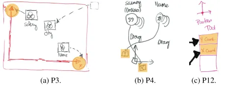
Collective Proxy Objects
Five participants (P2, 5, 6, 7, and 12) proposed specifying the mappings of several marks using a single graphical ob-ject (Fig. 8). The circular obob-ject in Figure 8a, for example, is not a mark, but a widget that provides a list of four visual
properties. The sketch shows the data attributesName,Salary,
andServiceconnected to the widget’slabel,heightand
widthvisual properties. The widget eventually generates the visualization by instantiating a group of marks representing
the specified mappings. We refer to these designs ascollective
proxy objectsas they support a visualization process that
in-volves an object that acts as a proxy for a collection of marks. Participants’ ideas differed in the following aspects:
a) Shape Property.Three participants sketched ideas where
the visual appearance of the proxy object determines the shape of the marks it generates. For example, a rectangular proxy object creates a bar chart like visualization (e.g., Fig. 8b). P2 and P6’s ideas (Fig. 8a and 8c) are also based on a predefined shape property. To overcome the inherent limitation of this solution that only allows the construction of visualizations
whose marks have the same shape, P7 proposed ashapeless
proxy object with an additionalshapeproperty to be specified
for each mark independently. P12 proposed a similar idea (see Fig. 8e; here, this property is called “mark”).
b) Time & Space of Rendering.Four proposed ideas require
the user to explicitly trigger the generation of the visualization once the visual mappings are configured. For example, in P2’s design (Fig. 8a), this is done via the button located at the bottom-right of the circular proxy object. Other participants proposed using drag-and-drop gestures from the proxy object onto the canvas. Only one participant proposed a design that does not require a rendering step but allows changes on marks to take place in real time, as data is connected to the proxy object’s visual properties. As shown in Figure 8d (left) marks (the three black rectangles) reside within the proxy object itself, which also acts as a container for the resulting visualization.
c) Position Mappings.The proxy objects of four participants
lack location properties; they implement position mappings
as in iVoLVER: by linking marks to an externalpositioner
Grouped Marks
(a) P2.
Widget
Visual propertie
s
Grouped Marks
[image:6.612.61.284.596.700.2](b) P11.
(a) P2. (b) P5. (c) P6.
With integrated positioner widget (d) P7.
Set of values
[image:7.612.63.562.60.162.2](e) P12.
Figure 8: Designs that specify visual mappings through a proxy object. The yellow highlighting shows the proxy’s properties where data is connected.
widget. In contrast, P7 incorporated the positioner widget within his proxy object design (Fig. 8d, right).
Axis-based Solutions
Three participants proposed widgets that include axes as a fundamental component to enable the specification of position mappings when sets of quantitative values are connected to the widget’s axes (Fig. 9). When the connected data contains cate-gorical values, the widget applies heuristics to determine other types of visual encodings. For example, when connecting a set of quantitative values to one axis and a set of categorical val-ues to the other, the widget generates a bar chart. The widget therefore decides on the marks that compose the visualization, i.e., the data input and the order in which it is connected deter-mines the type and layout of the resulting visualization. This idea is comparable to Tableau’s “Columns and Rows” system where marks and visual properties are determined by the data attributes dropped onto each shelf.
Simple Representations as Building Blocks
P1 proposed an idea where the tool determines the visualiza-tion design based on the involved data attribute types. For example, Figure 10a (top row) shows two visualizations
auto-matically generated by the tool for two data attributes:“[the
tool] knows it [thecityattribute] is categorical, so it makes
up something like this. For thesalary, it creates a
distribu-tion [histogram] of the actual values themselves.”[P1]. To
define more complex visualizations, the user can merge simple representations via drag-and-drop gestures (see Fig. 10b,
bot-tom, showing“the average salary of every city”[P1]). In this
solution, all visualization design decisions are made by the tool based on the data attributes. The more attributes involved, the more complex the decisions inferred by the tool. Although
not sketched, P1 mentioned that“there will be ways to sort of
customize this [resulting visualization], ’cause you are gonna want to customize them in different ways, presumably. But it [the tool] will give you something for a start. It will give you something basic to work with and then you can carry that on.”
[image:7.612.334.556.596.698.2](a) P3. (b) P4. (c) P12.
Figure 9: Axis-based solutions. The yellow highlighting indicates the axes’ points where data can be connected.
Chart Galleries
In their designs P3, 4 and 13 proposed a gallery of charts for the user to select in order to represent data attributes (Fig. 11). P13 explained that this part of his design was similar to MS Excel’s charts gallery or Tableau’s “Show Me” pane. The galleries by P3 and P4 additionally provide access to other type of designs. For example, dragging a bar chart from P3’s gallery onto the canvas creates an axis-based widget.
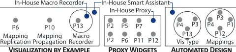
FAMILIES OF DESIGN SOLUTIONS
Our participants’ design ideas presented above and our own in-house solutions can be grouped into three vis tool design
families: visualization by example,collective proxy objects,
andautomated principled design(see Fig. 12). We
character-ize these below alongside their underlying design strategies:
automated iteration,abstraction, andautomated choices.
Visualization-by-Example: Automated Iteration
Four of the presented design ideas require the manual specifi-cation of visual mappings based on a single data instance (e.g., one table row) which are then automatically applied to other data or the entire set (Fig. 12, left). The P6’s “plus button” (Fig. 6) and P10’s gesture-based mapping propagation idea represent this visualization-by-example approach, as well as
P13’s, our own description of aMacro Recorder(Fig. 1), and
comparable solutions in commercial tools such as MS Excel. These solutions directly address the issue of having to repeat-edly specify the mapping between individual data points and visual elements as common in bottom-up visualization tools.
Visualization-by-example solutions implementautomated
it-erationas a strategy that allows the automatic application of
design decisions reflected by an individual data-driven visual element to a larger scale. As shown above, implementations
of this strategy differ in terms ofhowautomated iterations
actions are specified andwhenresults become visible. For
example, P6’s “plus button” idea specifies how a data instance is represented by a mark’s visual properties. In contrast, macro
(a) Individual views. (b) Resulting Visualization.
[image:7.612.64.295.604.691.2](a) P3. (b) P4. (c) P13.
Figure 11: Sketched chart galleries.
recorder solutions specify mappings as ordered sequences of actions carried out within a particular temporal interval. Both solutions apply mappings in bulk, while others, such as P10’s gesture-based mapping propagation, do this as new individ-ual mappings steps are specified, showing how the automated iteration is progressively carried out across the data.
Collective Proxy Objects: Abstraction
Eight sketches implement interface elements (e.g., a widget), separate from the resulting visualization, to specify visual mappings between data and visual elements (Fig. 12, middle). Such proxy objects can take connections carrying individual values, sets, or data attributes. Modifications to the visual mapping happen through the proxy object and are propagated to all the corresponding visualization elements. The design so-lutions in Figures 3, 7b, and 8 show different implementations of collective proxy objects. Other examples include Tableau’s “Marks Card”. P2’s presents a different implementation of this design approach in which every visualization element is also a proxy for all other elements within its group (Fig. 7a).
Design solutions in this family are based onabstractionas a
design strategy: a single interface element represents multiple data items and the visual properties of corresponding marks while the individual constituents are hidden. Abstraction as a general term is well discussed in psychology, semiotics and other areas, but here it best conveys this strategy’s meaning. As a design strategy to scale constructive visualizations, abstrac-tion affects access to visual properties and mapping opabstrac-tions, and to the data itself: a high degree of abstraction may allow visual mappings at an attribute-level, while a low degree will enable mappings at the level of individual data values.
Automated Principled Design: Automated Choices
Seven of the presented designs support a top-down approach to visualization construction [44], where visual mappings are determined and automatically applied by the visualization tool based on pre-defined principles as specified in its implementa-tion (Fig. 12, right). For example, in P4’s soluimplementa-tion (Fig. 9b) the designer selects the data attributes and loosely specifies the visualization type by mapping each to the chart’s axes. The tool then determines the chart type that fits these data types. Similarly, in P1’s design, two visualizations are au-tomatically merged into one, based on the initial data types involved (Fig. 10). In P13’s solution, the tool offers a variety of chart types which will fit the attribute types selected by the
V������������ �� E������ P���� W������ A�������� D�����
Macro Recorder Mapping Propagation Mapping
Replication
In-House Macro Recorder
In-House Proxy In-House Smart Assistant
P7
P6 P11 P12
P6 P10 P13 P2 P5
P2 Vis Type
P4 P13
P3 P12
P3
Mappings
P4 P1
Figure 12: Families of visual mapping strategies. Gray circles represent the participants’ designs; in-house solutions appear in blue.
designer. Once the designer selects the chart type, the tool applies the necessary visual mappings. This is similar to how MS Excel or Tableau’s “Show Me” pane operate. P3’s solution (Fig. 9a) supports scenarios where the designer chooses a visu-alization type (e.g., a bar chart), but then maps data attributes of an unsuitable type (e.g., two continuous attributes): the tool automatically performs operations to make the data fit the visualization type (e.g., bin or average data values).
The underlying strategy of this family of designs is that of
automated choiceswhere explicit decisions by the designer
are minimized, and the tool makes choices on: (1) the visu-alization type (e.g., the type of marks and visual attributes), (2) the mappings between data and visual variables, (3) the data or data subset to which to apply mappings (e.g., eliminat-ing outliers), and (4) the data transformations (e.g., binneliminat-ing a continuous data attribute to map to a discrete visual variable). While this strategy leaves many design decisions to the tool, automated choices can be implemented as mere suggestions or as configurable by the designer.
The three strategies to scale constructive visualization ap-proaches to large datasets—automated iteration, abstraction, and automated choices—are not mutually exclusive, but can be combined. For example, our “Smart Assistant” solution (Fig. 2) can be considered as an implementation of the au-tomated choices strategy, as it makes unprompted decisions about generalizing visual mappings, but it also implements the automated iteration strategy as it allows the designer to explicitly apply visual mappings to additional data points.
AGENCY AND DATA GRANULARITY: A DESIGN SPACE
The families described above are clusters of design solutions based on strategies to implement constructive visualization tools that scale to larger datasets. In this section we present a design space emerging from these strategies which is defined
by two qualitative dimensions:agencyandgranularity. This
design space summarizes the differences between the proposed solutions also in relation to previous research and existing commercial visualization tools.
Agency
Agency refers towhocarries out the visualization process: the
tool or the human designer. A visualization tool can make a variety of decisions throughout the design process, such as how to transform a continuous data value to map it to a discrete visual variable ([P3]), selecting the visualization type suitable for a designer-selected data subset (Fig. 11c [P13]), or even performing actions on behalf of the designer, such as applying a mapping repetitively to the full dataset (Fig. 9b [P4]) or just to the subsequent record (Fig. 6 [P6]).
This dimension is represented as the horizontal axis in the design space diagram shown in Figure 13. Design solutions where more agency is placed on the visualization tool, that is, where the tool is in charge of important mapping decisions and actions, are located more to the right. To the left on this
axis are purely constructive tools, such as iVoLVER.3
[image:8.612.55.295.638.691.2]Agency is not exclusively linked to the automatic choices strategy. Abstraction and automated iteration also place some agency on the tool, as it takes over designer activities.
Granularity
Granularity refers to the level at which the tool allows the manipulation of both data and visual representations, that is,
whatdesigners can see and manipulate. At the level of
fine-granularity the tool provides access to individual data values (e.g., a single number in a table cell) and allows for the manip-ulation of individual marks (e.g., a single bar in a bar chart). This is how iVoLVER operates. Tools with a coarse granu-larity operate on groups of values, at an attribute level, or on groups of attributes (or on groups of marks, or even groups of small multiples on the visual side). For example, the solutions of the collective proxy objects family specify the visual map-pings of many marks through a single widget that takes data attributes—not individual values—(e.g., Fig. 8a [P2]).
This dimension is represented as the vertical axis in the design space diagram of Figure 13. Solutions lower in this axis have a fine granularity (e.g., iVoLVER, which is based on the ma-nipulation of individual values and marks); solutions higher up represent data mostly at an attribute level (e.g, the data column becomes a single element to manipulate in Tableau, ExPlates [35], Many Eyes [70], and the designs of Fig. 8). In DataMeadow [14], the visualization process involves ma-nipulating data attributes, but the entire dataset can also be represented and manipulated through a single visual element. Lark [68] supports an even more coarse-grained approach: a complete dataset is represented as a single visual element that moves through different transformation steps and the visual-ization’s components cannot be manipulated directly.
The Design Space: Strategies, Quadrants & Limitations
The set of strategies described in the Families of Design Solu-tions section can also be described as a collection of design tropes that allow visualization tool designers to explore and dis-cuss important options and their corresponding consequences. For example, adding automatic iteration to a purely construc-tive tool will place more agency on the tool: now the tool does something for the designer. Adding abstraction, decreases the level of granularity (abstraction hides access to the more atomic elements) and also places agency on the tool: as with automatic iteration the tool applies operations to all individual data values and visuals on behalf of the designer. Finally, im-plementing automated choices shifts the agency balance to the tool side; adding automated decisions to any tool will move it closer to the right end of the design space.
Besides the in-house (red) and workshop (blue) design solu-tions, we have placed a selection of representative existing visualization tools (green) into this design space defined by four quadrants Q1–Q4 (see Fig. 13). While not exhaustive in terms of included tools, the resulting distribution leads to interesting observations. First, most included tools (green) gravitate towards the upper part of the space (Q3 and Q4). Second, the right side of Q1 is populated mostly by solutions from the workshop (red). Third, Q2, which represents tools that make many decisions on behalf of the designer but stay at a coarse-grained granularity level, is barely populated. We
Q2
Q1
Q4
Q3
VoyagerExcel Recommended Charts Google Spreadsheet Explore
TOOL
AGENCY
C
OARSE
F
INE
G
RANULARITY
DESIGNER
iVoLVER
P11 Macro Recorder
In-house Macro Recorder
LARK
Tableau “Show Me”
P1 Merger Watson Analytics
Participants
P6 Mapping replication P10 Mapping propagation
Tableau “Columns & Rows” DataMeadow
In-house Excel Chart Gallery
In-house Smart Assistant
Visualization by demonstration ExPlates
PROXY OBJECTS
[image:9.612.321.565.61.219.2]Tableau Marks CardSPSS Chart Builder Many Eyes
Figure 13: Design space defined by agency & granularity with existing tools (green), including MS Excel [15], the Google Sheets Explorer fea-ture [17], and SPSS Chart Builder [33], alongside in-house (blue) and workshop solutions (red).
believe that there is potential for tools in this category. For example, a Q2 tool could be a “visualization tutor” that walks a learner step-by-step through a visual mapping process based on individual data values.
The design space should be understood as a qualitative tool as opposed to an exact quantitative metric to specify tool dif-ferences. Therefore the positioning of tools and solutions in Figure 13 is open to interpretation and is meant to promote discussion. Some tools also appear in several places because they incorporate multiple approaches to creating visualizations (e.g., Tableau’s “Show Me” pane and “Columns and Rows”). Similarly, the workshop solutions that we grouped as “collec-tive proxy objects” span horizontally because they combine abstraction at different levels of automated choices.
DISCUSSION
In this section we interpret our results, explain the relevance of our work, discuss its implications, and provide a critical look at the current landscape of visualization tools.
The Agency-Granularity Design Space
Our design explorations generate a design space based on agency and granularity that conceptualizes the challenge of scale in visualization tools. We see this design space as a lens to look at and discuss existing design solutions and strategies and to inspire new ones. It brings constructive approaches into view in relation to more conventional tools, offering designers a catalog of examples and a deeper understanding of available solutions. It might also help the visualization community to identify promising unexplored spaces which we have started to highlight. We believe that this space complements and further refines other characterizations of the existing landscape of visualization tools, such as Tory and Möller’s taxonomy [69] and Méndez et al.’s top-down vs. bottom-up continuum [44].
Building Better Visualization Tools
The strategies presented here help deal with the scalability issue, but not all of them address the other desirable outcomes listed above. Previous research indicates that tools located far from the bottom-left corner of the design space, while increasing scalability, can have a negative impact on other desirable characteristics [44]. The next step is therefore to find the “sweet spot” that maximizes the advantages. Our work supports this goal but further research is needed to investigate how different levels of agency and granularity affect the use of visualization tools. Moreover, where the sweet spot is will depend on the particular task at hand (e.g., new vs. familiar data), the audience (e.g., expertise), and the usage scenario.
We suspect that, from the strategies described as part of the families of design solutions, automated iteration could retain most of the advantages of constructive tools while addressing the scalability problem. A possible alternative is to design tools that adapt their interfaces to support different stages of the design process and expertise depending on the circum-stances. To a small extent some tools such as MS Excel and Tableau already address different levels of agency and granu-larity, but we believe there is much space for improvement.
A Critical Look at the Current Landscape of Vis Tools
Placing a selection of existing visualization tools into our design space defined by agency and granularity (see Fig. 13) suggests that much effort has gone into creating tools that support the rapid design of visualizations through coarse data granularity and, arguably, little effort from the designer (see Q3 and Q4). From our own experience, such tools are highly valuable, and we use them ourselves as part of our design, research, and teaching practice. However, while supporting rapid visualization creation in this way (through pre-defined or AI-inferred design choices) has its place, we argue that there is a need for more alternatives. Recent work on supporting more manual constructive visualization processes [30, 45] and physicalization [29, 31] is already going in this direction, but there is an urgency for more approaches like this. Data analysis and required literacy [9] is starting to have an effect beyond professional scenarios and on our personal lives [26] including even the youngest members of society [3, 42].
A visualization is not just a means to an end. Reflection on
the data and insight generation take place alsoduringthe
pro-cess of constructing the visualization [23, 71]. Supporting a fast visualization process is therefore not necessarily more “efficient”, as it may gloss over important details of the data, patterns, uncertainties, open questions, and opportunities for exploration and critique. We know from (data) design prac-tice that active involvement [49], and repetition [5] can foster creativity and critical thinking. When we consider visualiza-tion as an active data exploravisualiza-tion process, the visualizavisualiza-tion tool itself might heavily influence insights and reflections. But even if we consider visualization as something to be consumed rather than actively explored and manipulated in a hands-on way, the tool plays an important role. There is a rhetorical nature to visualizations [27], where choices in visual repre-sentation and composition steer our thinking of the presented topics. Visualization tools influence the design process of visualizations and, through their implementations, can make
decisions on behalf of the designer. Their power to influence messages “by design” should not be underestimated. As visu-alization tool designers we have a responsibility, and we hope that the design space presented in this paper will fuel a discus-sion in the community and inspire new and alternative avenues to visualization tool design. In fact, linking our findings to philosophy and cognitive science, cognitive embodiment [11], media studies [41], feminist theory [66] and, most relevantly, the study of agency and technology [38, 66] may lead to even more research avenues.
LIMITATIONS AND QUESTIONS FOR FUTURE WORK
Although our conceptualization of the problem, the catalog of examples and strategies, and the proposed design space advance our understanding in the area, there is much left to do, especially characterizing the effects of the different design strategies on the outcomes that we care about. Perhaps most interesting for future research is to investigate how different design strategies impact the visualization design process, in particular, regarding mindful and critical design, transparency, and authorship.
We also highlight that the outcomes of our design workshops should not be interpreted as quantitative evidence of what strat-egy or type of tool is best understood or comes most “naturally” to participants. Our workshops were designed to find as many divergent solutions as possible, that is, to expose the nature of the design space, rather than identifying a “best” design. They were not meant to serve as a faithful characterization of what people desire or understand. Although we explicitly set out to include people with different backgrounds and levels of expertise, our sampling is small and not fully representative of all potential audiences. Additional studies are needed to in-vestigate approaches of other populations (e.g., professionals). Our workshops are also limited in other ways: participants are influenced (1) by the tools they know, and (2) by the tools we used in our study to contextualize the problem; and (3) they might need more time to provide a wider variety of designs.
CONCLUSION
We have explored the design space of visualization tools that could combine the benefits of constructive, “bottom-up” visu-alization tools, namely transparency and active involvement in the visualization process, with those of “top-down” ap-proaches, such as rapid visualization creation and applicability to large datasets. We analyzed solutions proposed by ourselves and a group of participants with a range of skill sets and levels of expertise in visualization. From this data we derived a cat-alog of solutions, a set of three design strategies (automated iteration, abstraction, and automated choices) and propose a conceptualization of the design space of visualization tools based on agency and granularity. Finally, based on our analy-sis we provide a critical discussion of the existing landscape of tools, which we hope will help designers and the community consider better options in the design of visualization tools.
ACKNOWLEDGMENTS
REFERENCES
1. Edith Ackermann. 2001. Piaget’s constructivism, Papert’s
constructionism: What’s the difference.Future of
learning group publication5, 3 (2001), 438.
2. James F. Allen, Curry I. Guinn, and Eric Horvitz. 1999.
Mixed-initiative interaction.IEEE Intelligent Systems14,
5 (1999), 14–23.DOI:
http://dx.doi.org/10.1109/5254.796083
3. Basak Alper, Nathalie Henry Riche, Fanny Chevalier, Jeremy Boy, and Metin Sezgin. 2017. Visualization
Literacy at Elementary School. InProceedings of the
2017 CHI Conference on Human Factors in Computing
Systems (CHI ’17). ACM, New York, NY, USA,
5485–5497.DOI:
http://dx.doi.org/10.1145/3025453.3025877
4. Daniel Archambault, Tamara Munzner, and David Auber. 2008. GrouseFlocks: Steerable Exploration of Graph
Hierarchy Space.IEEE Transactions on Visualization and
Computer Graphics14, 4 (July 2008), 900–913.DOI:
http://dx.doi.org/10.1109/TVCG.2008.34
5. Alex Bigelow, Steven Drucker, Danyel Fisher, and Miriah Meyer. 2014. Reflections on How Designers
Design with Data. InProceedings of the 2014
International Working Conference on Advanced Visual
Interfaces (AVI ’14). ACM, New York, NY, USA, 17–24.
DOI:http://dx.doi.org/10.1145/2598153.2598175
6. Fearn Bishop and Uta Hinrichs. 2017. Challenges of Running Constructive Visualization Studies with
Children. InDIS’17 workshop on Pedagogy &
Physicalization: Designing Learning Activities around
Physical Data Representations.
http://dataphys.org/workshops/dis17
7. Michael Bostock, Vadim Ogievetsky, and Jeffrey Heer.
2011. D3; Data-Driven Documents.IEEE Transactions
on Visualization and Computer Graphics17, 12 (Dec.
2011), 2301–2309.DOI:
http://dx.doi.org/10.1109/TVCG.2011.185
8. Fatma Bouali, Abdelheq Guettala, and Gilles Venturini. 2016. VizAssist: an interactive user assistant for visual
data mining.The Visual Computer32, 11 (01 Nov 2016),
1447–1463.DOI:
http://dx.doi.org/10.1007/s00371-015-1132-9
9. Jeremy Boy, Ronald A. Rensink, Enrico Bertini, and Jean-Daniel Fekete. 2014. A Principled Way of Assessing
Visualization Literacy.IEEE Transactions on
Visualization and Computer Graphics20, 12 (Dec 2014),
1963–1972.DOI:
http://dx.doi.org/10.1109/TVCG.2014.2346984
10. Liz Carver and Murray Turoff. 2007. Human-computer Interaction: The Human and Computer As a Team in
Emergency Management Information Systems.Commun.
ACM50, 3 (March 2007), 33–38.DOI:
http://dx.doi.org/10.1145/1226736.1226761
11. Andy Clark and David Chalmers. 1998. The Extended
Mind.Analysis58, 1 (1998), 7–19.
http://www.jstor.org/stable/3328150
12. David Coyle, James Moore, Per Ola Kristensson, Paul Fletcher, and Alan Blackwell. 2012. I Did That! Measuring Users’ Experience of Agency in Their Own
Actions. InProceedings of the SIGCHI Conference on
Human Factors in Computing Systems (CHI ’12). ACM,
New York, NY, USA, 2025–2034.DOI:
http://dx.doi.org/10.1145/2207676.2208350
13. Frédéric Dehais, Mickaël Causse, François Vachon, and Sébastien Tremblay. 2012. Cognitive conflict in human–automation interactions: a psychophysiological
study.Applied ergonomics43, 3 (2012), 588–595.DOI:
http://dx.doi.org/10.1016/j.apergo.2011.09.004
14. Niklas Elmqvist, John Stasko, and Philippas Tsigas. 2008. DataMeadow: A Visual Canvas for Analysis of
Large-scale Multivariate Data.Information Visualization
7, 1 (March 2008), 18–33.DOI:
http://dx.doi.org/10.1145/1391107.1391110
15. Microsoft Excel. 2017. Create a chart with recommended charts - Excel. (2017).
https://support.office.com/en-gb/article/
Create-a-chart-with-recommended-charts-cd131b77-79c7
-4537-a438-8db20cea84c0[Online; accessed
16-September-2017].
16. Sara Carolyn Fisher. 1916. The process of generalizing
abstraction; and its product, the general concept.The
Psychological Monographs21, 2 (1916), i–218.DOI:
http://dx.doi.org/10.1037/h0093097
17. Google. 2017. See and use suggested charts and analysis in a spreadsheet. (2017).
https://support.google.com/docs/answer/6280499[Online;
accessed 16-September-2017].
18. David Gotz and Zhen Wen. 2009. Behavior-driven
Visualization Recommendation. InProceedings of the
14th International Conference on Intelligent User
Interfaces (IUI ’09). ACM, New York, NY, USA,
315–324.DOI:http://dx.doi.org/10.1145/1502650.1502695
19. Lars Grammel, Chris Bennett, Melanie Tory, and Margaret-Anne Storey. 2013. A Survey of Visualization
Construction User Interfaces. InEuroVis - Short Papers,
Mario Hlawitschka and Tino Weinkauf (Eds.). The
Eurographics Association.DOI:http://dx.doi.org/10.
2312/PE.EuroVisShort.EuroVisShort2013.019-023
20. Patrick Haggard and Manos Tsakiris. 2009. The
Experience of Agency.Current Directions in
Psychological Science18, 4 (2009), 242–246.DOI:
http://dx.doi.org/10.1111/j.1467-8721.2009.01644.x
21. Orit Hazzan. 2003. How Students Attempt to Reduce Abstraction in the Learning of Mathematics and in the
Learning of Computer Science.Computer Science
Education13, 2 (2003), 95–122.DOI:
22. Christian Heath, Jon Hindmarsh, and Paul Luff. 2010.
Video in Qualitative Research. SAGE Publications.
https://books.google.co.uk/books?id=MtmViguNi4UC
23. Uta Hinrichs and Stefania Forlini. 2017. In defense of sandcastles: research thinking through visualization in
DH. InProceedings of the conference on Digital
Humanities. International Alliance of Digital Humanities
Organizations (ADHO).
https://dh2017.adho.org/abstracts/133/133.pdf
24. Douglas Hofstadter and Emmanuel Sander. 2013. Surfaces and Essences: Analogy as the Fuel and Fire of
Thinking. Basic Books.
https://books.google.ca/books?id=XkQT5eTnurYC
25. Eugene Robert Hoyt, Dallas Snider, Carla Thompson, and Sarita Mantravadi. 2016. IBM Watson Analytics: Automating Visualization, Descriptive, and Predictive
Statistics.JMIR Public Health Surveill2, 2 (11 Oct 2016),
e157.DOI:http://dx.doi.org/10.2196/publichealth.5810
26. Dandan Huang, Melanie Tory, Bon Adriel Aseniero, Lyn Bartram, Scott Bateman, Sheelagh Carpendale, Anthony Tang, and Robert Woodbury. 2015. Personal
Visualization and Personal Visual Analytics.
Visualization and Computer Graphics, IEEE Transactions
on21, 3 (March 2015), 420–433.DOI:
http://dx.doi.org/10.1109/TVCG.2014.2359887
27. Jessica Hullman and Nick Diakopoulos. 2011. Visualization Rhetoric: Framing Effects in Narrative
Visualization.IEEE Transactions on Visualization and
Computer Graphics17, 12 (Dec 2011), 2231–2240.DOI:
http://dx.doi.org/10.1109/TVCG.2011.255
28. Samuel Huron. 2014.Constructive Visualization : A
token-based paradigm allowing to assemble dynamic
visual representation for non-experts. Theses. Université
Paris Sud - Paris XI.
https://tel.archives-ouvertes.fr/tel-01126892
29. Samuel Huron, Sheelagh Carpendale, Jeremy Boy, and Jean-Daniel Fekete. 2016. Using VisKit: A Manual for Running a Constructive Visualization Workshop. In Pedagogy of Data Visualization Workshop at IEEE VIS
2016. Baltimore, MD, United States.
https://hal.inria.fr/hal-01384388
30. Samuel Huron, Sheelagh Carpendale, Alice Thudt, Anthony Tang, and Michael Mauerer. 2014. Constructive
Visualization. InProceedings of the 2014 Conference on
Designing Interactive Systems (DIS ’14). ACM, New
York, NY, USA, 433–442.DOI:
http://dx.doi.org/10.1145/2598510.2598566
31. Samuel Huron, Pauline Gourlet, Uta Hinrichs, Trevor Hogan, and Yvonne Jansen. 2017. Let’s Get Physical: Promoting Data Physicalization in Workshop Formats. In Proceedings of the 2017 Conference on Designing
Interactive Systems (DIS ’17). ACM, New York, NY,
USA, 1409–1422.DOI:
http://dx.doi.org/10.1145/3064663.3064798
32. Samuel Huron, Yvonne Jansen, and Sheelagh Carpendale. 2014. Constructing Visual Representations: Investigating
the Use of Tangible Tokens.Visualization and Computer
Graphics, IEEE Transactions on20, 12 (Dec 2014),
2102–2111.DOI:
http://dx.doi.org/10.1109/TVCG.2014.2346292
33. IBM. 2017. IBM Knowledge Center - Chart Builder layout and terms. (2017).
https://www.ibm.com/support/knowledgecenter/en/SSLVMB_20.
0.0/com.ibm.spss.statistics.help/chart_create_layout.htm
[Online; accessed 16-September-2017].
34. Waqas Javed. and Niklas Elmqvist. 2013. ExPlates: Spatializing Interactive Analysis to Scaffold Visual
Exploration.Computer Graphics Forum32, 3pt4 (2013),
441–450.DOI:http://dx.doi.org/10.1111/cgf.12131
35. Waqas Javed and Niklas Elmqvist. 2013. ExPlates: Spatializing Interactive Analysis to Scaffold Visual
Exploration.Computer Graphics Forum32, 3pt4 (2013),
441–450.DOI:http://dx.doi.org/10.1111/cgf.12131
36. Gregor Kiczales. 1996. Beyond the black box: open
implementation.IEEE Software13, 1 (Jan 1996), 8,
10–11.DOI:http://dx.doi.org/10.1109/52.476280
37. Philipp Koytek, Charles Perin, Jo Vermeulen, Elisabeth André, and Sheelagh Carpendale. 2017. MyBrush:
Brushing and Linking with Personal Agency.IEEE
Transactions on Visualization and Computer Graphics
PP, 99 (2017), 1–1.DOI:
http://dx.doi.org/10.1109/TVCG.2017.2743859
38. Bruno Latour and Couze Venn. 2002. Morality and
Technology.Theory, Culture & Society19, 5-6 (2002),
247–260.DOI:
http://dx.doi.org/10.1177/026327602761899246
39. Shixia Liu, Weiwei Cui, Yingcai Wu, and Mengchen Liu. 2014. A survey on information visualization: recent
advances and challenges.The Visual Computer30, 12 (01
Dec 2014), 1373–1393.DOI:
http://dx.doi.org/10.1007/s00371-013-0892-3
40. Jock Mackinlay, Pat Hanrahan, and Chris Stolte. 2007. Show Me: Automatic Presentation for Visual Analysis. IEEE Transactions on Visualization and Computer
Graphics13, 6 (Nov 2007), 1137–1144.DOI:
http://dx.doi.org/10.1109/TVCG.2007.70594
41. Marshall McLuhan. 2002.Understanding Media: The
Extensions of Man(critical edition ed.). Gingko Press,
Inc, Corte Madera, CA.
42. Emily McReynolds, Sarah Hubbard, Timothy Lau, Aditya Saraf, Maya Cakmak, and Franziska Roesner. 2017. Toys That Listen: A Study of Parents, Children, and
Internet-Connected Toys. InProceedings of the 2017 CHI
Conference on Human Factors in Computing Systems
(CHI ’17). ACM, New York, NY, USA, 5197–5207.DOI:


![Figure 13: Design space defined by agency & granularity with existingtools (green), including MS Excel [15], the Google Sheets Explorer fea-ture [17], and SPSS Chart Builder [33], alongside in-house (blue) andworkshop solutions (red).](https://thumb-us.123doks.com/thumbv2/123dok_us/8659643.375004/9.612.321.565.61.219/dened-granularity-existingtools-including-explorer-alongside-andworkshop-solutions.webp)
